Blog

  • Modular Website Design: Reusable Components Without the Chaos

    Modular Website Design: Reusable Components Without the Chaos

    Modular website design builds pages from reusable, governed components instead of treating every page like a fresh art project. Done well, it lets a team publish faster, protects brand and accessibility decisions, and makes future changes less painful. Done badly, it gives you 47 nearly identical blocks, three “final” button styles, and a content editor quietly plotting your murder.

    Before that component architecture grows into a full design system, use our design-system readiness guide to test whether repetition, cross-team use, real loss, design-code equivalence, and stewardship justify the extra machinery.

    TL;DR: A modular website needs a system, not a bucket of blocks

    • A module is a reusable section or component with a defined purpose, content structure, design, and behavior.
    • Modularity pays off when the same needs recur across pages and approved variations cover real situations.
    • It does not automatically make a site faster, cheaper, more accessible, or easier to maintain.
    • Use Scope Design’s RAIL test: every module should be Reusable, Adaptable, Intentional, and Limited.
    • If every module accepts every option, you have not created flexibility. You have rebuilt the page builder, only with worse documentation.

    What is modular website design?

    Modular website design is an approach that divides a website into reusable building blocks. A block might be a hero, testimonial, service comparison, pricing table, article card, call to action, form, or another recurring interface pattern. Teams assemble approved blocks into pages rather than redesigning and redeveloping the same ideas repeatedly.

    The important word is not “block.” It is system.

    A useful module includes more than a pretty rectangle. It defines:

    • what job the component performs;
    • what content fields it accepts;
    • which layouts or states are allowed;
    • how it behaves on different screens;
    • what happens when content is missing, unusually long, or translated;
    • how keyboard, screen-reader, and touch users interact with it;
    • who can change its content, design, and behavior;
    • how it is tested and maintained.

    WordPress describes blocks as composable units for structuring content, while patterns can provide reusable arrangements of blocks. WordPress also distinguishes between synced patterns, which update everywhere they are used, and unsynced patterns, which provide a reusable starting layout that can be edited locally. That distinction matters because “reuse this layout” and “keep every instance identical forever” are very different business rules. See the official WordPress block architecture and pattern documentation.

    Components, modules, patterns, templates, and page builders are not the same thing

    The vocabulary gets sloppy because the concepts overlap. Here is the useful business distinction.

    TermWhat it controlsBest useCommon failure
    ComponentA smaller interface element or behavior, such as a button, card, accordion, or form fieldRepeated interaction and presentation rulesDozens of almost-identical variants
    Module or sectionA meaningful page section assembled from componentsReusable content and conversion jobsA block with so many options it becomes a mini page builder
    PatternA reusable arrangement of blocks or componentsStarting layouts or synchronized repeated contentEditors cannot tell what is global and what is local
    TemplateThe larger structure for a page typeConsistent service, article, product, or landing-page structureEvery exception creates another template
    Page builderThe editing tool used to assemble and style contentGiving authorized users visual controlTool freedom replaces architectural decisions

    A modular system can live inside WordPress, a custom application, a headless CMS, or a proprietary platform. The editing tool is not the architecture. Buying a page builder does not magically produce a component system any more than buying a toolbox makes the garage organized.

    The Scope Design RAIL test for useful website modules

    Before a block joins the system, it should pass four tests.
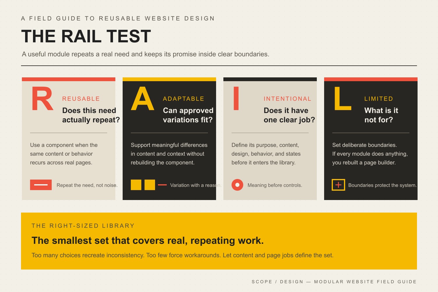
    The RAIL test for website modules: Reusable, Adaptable, Intentional, and Limited. Build the smallest component set that covers real recurring work.
    The Scope Design RAIL test: reusable, adaptable, intentional, and limited components enter the approved library.

    Reusable: Does this need actually repeat?

    A reusable module solves a recurring content, interface, or conversion problem. “We might use this someday” is not a recurring problem. It is how component libraries become retirement homes for abandoned ideas.

    Look for repetition in:

    • service and product explanations;
    • proof such as case studies, results, credentials, and testimonials;
    • common buyer questions and objections;
    • related-content displays;
    • forms and calls to action;
    • comparison, pricing, process, and team sections;
    • repeated application states such as empty, loading, error, and success.

    If a section appears once and has no credible second use, a well-built custom section may be the cleaner choice.

    Adaptable: Can approved variations handle real content?

    Reusable does not mean rigid. A useful component can adapt to the legitimate contexts in which it appears.

    A hero module might support a short or long headline, optional supporting media, a primary action, and an approved secondary action. It probably does not need 19 alignment controls, seven animation styles, independent padding sliders, and a field that lets an editor paste arbitrary JavaScript. That is not adaptability. That is a cry for help.

    Adaptation should come from known content and business needs, not speculative settings. Each variation adds design, development, testing, documentation, and maintenance work.

    Intentional: Does the module have one clear job?

    Every module should explain why it exists. “Two columns with stuff” is a layout description, not a job.

    Better module definitions sound like:

    • explain the service outcome and direct the ready buyer;
    • compare two options using the criteria buyers care about;
    • answer a high-friction question without forcing a sales call;
    • show proof beside the claim it supports;
    • help the reader choose the correct next step;
    • collect the minimum information needed to route an inquiry.

    This is where website strategy and the development process matter. Architecture should follow the business argument and user journey. Otherwise the team efficiently reuses sections that never should have existed.

    Limited: What is the component deliberately prevented from doing?

    Limits are what make a component system governable.

    A module should constrain choices that could damage:

    • reading order and heading hierarchy;
    • color contrast and legibility;
    • keyboard and screen-reader behavior;
    • responsive layout;
    • image dimensions and performance;
    • brand typography and spacing;
    • analytics and conversion tracking;
    • structured content needed by search engines and integrations.

    W3C explains that accessible experiences depend on content, code, authoring tools, developers, browsers, and assistive technologies working together. A reusable component can help encode good decisions, but only if the system limits unsafe variations and the people using it supply appropriate content. Accessibility is not a checkbox hidden in the component props. Read the W3C overview of accessibility components.

    What are the real business benefits of modular website design?

    Faster page creation after the system exists

    A content team can assemble approved sections instead of waiting for design and development to restart from zero. The important qualifier is after the system exists. Defining, designing, developing, testing, documenting, and migrating a component library is real work. The savings arrive through repeated use, not through agency PowerPoint magic.

    More consistent customer experiences

    Shared components reduce accidental differences in spacing, interaction, messaging structure, and responsive behavior. A pricing comparison should not behave one way on the services page and another way on a landing page because two developers solved it during different coffee emergencies.

    Consistency is not merely cosmetic. Familiar interaction patterns reduce guesswork, and shared content models make it easier to keep important information complete.

    Safer change at scale

    When a component is genuinely shared, a tested improvement can propagate across every appropriate use. WordPress synced patterns provide one example: editing the synced pattern updates every location where it is used.

    That power cuts both ways. A global mistake also propagates globally. Shared components need ownership, previews, revision history, testing, and a rollback plan.

    Better collaboration between content, design, and development

    A documented component library creates a shared vocabulary. Marketing can request a “comparison module with proof” instead of attaching a screenshot and saying, “Something like this, but make it pop.” Designers define intentional states. Developers implement and test those states. Editors understand the available tools and their boundaries.

    Tools such as Storybook let teams build interface components in isolation, document them, and represent multiple states and edge cases. The tool is optional; the discipline is not. See Storybook’s component documentation for the underlying approach.

    A website that can evolve without constant demolition

    Good modules let a site absorb new services, campaigns, proof, content types, and integrations without forcing a redesign every time the business learns something. They also make it easier to identify what can change centrally and what must remain specific to a page or workflow.

    That supports the larger goal described in our business website development pillar: a technical foundation should keep working as the business changes, not merely survive launch day.

    What are the disadvantages of modular website design?

    The upfront architecture costs more than improvisation

    A modular build requires discovery, content modeling, design states, component development, responsive behavior, accessibility decisions, documentation, and testing. If the site has five simple pages and changes twice a year, a sophisticated system may never repay that investment.

    Simple is allowed. Overengineering a brochure site is still overengineering, even when the component names sound impressive.

    Too many choices recreate inconsistency

    Teams often say they want flexibility, then request controls for every color, width, font size, alignment, order, animation, and spacing value. The result is technically reusable and visually ungoverned.

    Approved variations should cover credible use cases. Anything outside those cases should trigger a design decision, not another universal toggle.

    Too few choices force ugly workarounds

    The opposite failure is a rigid system that cannot represent actual content. Editors duplicate modules, paste important information into the wrong fields, insert images containing text, or ask a developer to hard-code exceptions. The system looks consistent in the component library and becomes a mess in production.

    Shared defects spread efficiently

    A repeated accessibility error, tracking bug, security flaw, or layout problem can affect many pages at once. Reuse magnifies quality; it does not create quality.

    Component changes should be tested against representative states, browsers, and screen sizes. Our responsive web design guide explains why the real standard is whether important business tasks work on every relevant screen—not whether the homepage screenshot shrinks nicely.

    The library can become a graveyard

    Without governance, nobody knows which modules are current, which are deprecated, or whether two blocks solve the same problem. Editors keep using old components because they still appear in the inserter. Developers hesitate to remove anything because usage is unclear.

    Every component needs an owner, status, documented purpose, and retirement path.

    Does modular design automatically improve website speed?

    No. Modularity can support cleaner implementation, but it can also ship unnecessary styles, scripts, dependencies, and variations to every page.

    A fast modular system loads only what the page needs, uses appropriate images, avoids duplicated libraries, limits animation, caches responsibly, and tests real templates. A slow modular system is still slow. It just has better naming conventions.

    Performance belongs in the acceptance criteria for each component and the assembled page. If speed problems already exist, use a diagnostic process such as our website speed optimization guide rather than assuming a rebuild is the first answer.

    Does modular website design reduce cost?

    It can reduce the marginal cost of repeated page creation and repeated maintenance, but there is no honest universal percentage.

    The economic case depends on:

    • how many pages and content types the business manages;
    • how often the site changes;
    • how much repetition actually exists;
    • how many teams or editors publish content;
    • how expensive inconsistency and developer queues are;
    • how long the system will remain in use;
    • how well the library is governed and documented.

    The old version of this article claimed large percentage savings. We removed that claim because a tidy number without a valid baseline is marketing confetti, not evidence.

    Can WordPress support a modular website?

    Yes. WordPress blocks, patterns, synced patterns, templates, template parts, custom fields, and custom blocks can support modular editing. The right combination depends on who edits the site, what content repeats, which elements must stay synchronized, and how much design freedom is safe.

    A clean WordPress system might use:

    • core blocks for common content;
    • unsynced patterns for repeatable starting layouts;
    • synced patterns for centrally managed repeated content;
    • custom blocks for structured business-specific components;
    • templates for consistent page types;
    • tightly controlled design settings for colors, spacing, and typography.

    It should not require a new plugin for every section somebody saw on another website. Plugin count alone is not a quality metric, but every dependency adds an owner, update path, compatibility surface, and failure mode. Our WordPress plugin update guide covers the operational side of that decision.

    When is modular website design worth it?

    Modular design is usually worth considering when several of these are true:

    • the site has many pages or several repeatable page types;
    • marketing publishes campaigns or landing pages regularly;
    • multiple people create or approve content;
    • brand inconsistency is already visible;
    • common sections require developer help every time;
    • the business expects new services, locations, audiences, or integrations;
    • accessibility and performance decisions need to remain consistent;
    • the website will be maintained for years rather than discarded after a campaign.

    It may be overkill when the site is small, rarely changes, has one capable editor, and has little repeated structure. In that case, a few strong templates and patterns may solve the problem without building a full component platform.

    How to plan a modular website without creating a block landfill

    1. Inventory real content and page jobs

    Review the current site, sales material, campaigns, FAQs, case studies, and operational workflows. Identify repeated communication jobs, not merely repeated visual layouts.

    2. Group repetition into candidate modules

    Document where each pattern appears, who uses it, what content varies, and what must remain consistent. Reject speculative modules until a credible use exists.

    3. Define content before controls

    Specify required and optional fields, length expectations, media behavior, actions, and empty states. Structured content is easier to reuse than one giant rich-text box where every editor can invent a new civilization.

    4. Run every candidate through RAIL

    Confirm that the module is Reusable, Adaptable, Intentional, and Limited. If it fails, revise it, merge it with another module, or leave it as a custom section.

    5. Design and test representative states

    Test short and long content, missing media, multiple links, mobile screens, keyboard navigation, zoom, and real browser behavior. Component demos should include awkward states, not only the pristine version approved in a presentation.

    6. Document ownership and change rules

    Record who can edit content, who can change design or code, how global changes are reviewed, where usage is tracked, and how modules are deprecated.

    7. Measure whether the system removes real friction

    Useful measures include page-production time, developer requests avoided, error rates, accessibility findings, publishing bottlenecks, component reuse, and time required to update repeated content. “We now have 63 components” is not an outcome. It is an inventory count wearing a lanyard.

    Frequently asked questions about modular website design

    What is an example of modular website design?

    A service website might use a reusable service hero, proof strip, process section, comparison table, FAQ, related case studies, and call to action. Each module has approved content fields and variations, and the team assembles them differently for each service without redesigning the underlying system.

    Is modular website design the same as a template?

    No. A template defines a larger page structure, while modules are reusable sections or components that can appear within templates or be assembled in approved combinations. A modular system can include templates, but the terms are not interchangeable.

    What is the difference between a synced and unsynced pattern in WordPress?

    A synced pattern remains connected, so editing it updates every use. An unsynced pattern is a reusable starting layout; after insertion, each copy can be edited independently. Use syncing only when the business rule genuinely requires the content or structure to remain global.

    What are the biggest disadvantages of modular design?

    The main disadvantages are upfront architecture work, overcomplicated controls, rigid components that do not fit real content, shared defects that spread across pages, and libraries that become cluttered without ownership and retirement rules.

    Does a modular website look repetitive?

    It can if the system has too few meaningful variations or every page uses the same sequence. Good modular design creates a consistent visual language while allowing the hierarchy and combination of modules to reflect each page’s specific job.

    Does modular design make a website more accessible?

    Not automatically. A tested accessible component can preserve good behavior across many pages, but inaccessible code or poor content can also repeat everywhere. Accessibility must be designed, implemented, authored, and tested as a system.

    Does modular design improve SEO?

    Not by itself. It can make it easier to maintain headings, structured content, internal-link patterns, performance standards, and complete page sections. Search visibility still depends on useful content, intent match, authority, technical health, and a site architecture that helps people and crawlers understand the material.

    How many components should a website have?

    There is no ideal number. The correct library is the smallest set that represents recurring content and interface needs without forcing constant exceptions. Count coverage and usefulness, not blocks.

    Who should own the component library?

    Ownership is usually shared but explicit: business or content leadership owns communication needs, design owns visual and interaction rules, development owns implementation quality, and an identified product or website owner approves changes and retirement. Shared responsibility without a named decision-maker is how libraries rot.

    When is modular website design overkill?

    It is overkill when the cost of defining and maintaining the system exceeds the repeated work it prevents. A small, stable site may need only a handful of good templates and patterns. Custom architecture should earn its place.

    Build the system your business will actually use

    The right modular website is not the one with the most components. It is the one that lets the business publish what customers need while protecting the decisions that should not be reinvented on every page.

    Scope Design starts with the content, workflows, ownership, and business constraints before recommending blocks, builders, or custom development. If your current site is expensive to change—or flexible enough to make a fresh mess every Tuesday—our website development team can help define the smallest maintainable system that solves the actual problem.


  • 15+ Critical Web Development Mistakes Killing Your Business Growth

    15+ Critical Web Development Mistakes Killing Your Business Growth

    Bottom line: the most damaging web development mistakes are not cosmetic imperfections. They are failures that break a critical customer journey, make search or measurement unreliable, create security or accessibility risk, or leave the team unable to release and recover safely. Fix those before polishing lower-risk details.

    If you are auditing a business website, start with three questions: Can a person complete the job they came to do? Can search and measurement systems access and record the experience correctly? Can your team change the site and roll back safely? Those questions catch more consequential problems than a generic checklist of design pet peeves.

    (more…)
  • WordPress Plugin Updates: How to Update Safely Without Breaking Your Site

    WordPress Plugin Updates: How to Update Safely Without Breaking Your Site

    The safest way to handle WordPress plugin updates is to treat each update as a controlled production change: capture a working baseline, confirm a restorable backup, review the release, update one plugin or one understood dependency group, test the actual business journeys, and roll back only the change that failed. Clicking “Update All” is easy. Knowing what broke, restoring it cleanly, and proving the site works afterward is the job.

    TL;DR: update promptly, but do not update blindly

    • Keep plugins current because updates can contain security patches, bug fixes, compatibility changes, and useful improvements.
    • Before changing production, confirm that you can restore both the site files and database.
    • Capture a baseline of important pages, forms, checkout, login, search, bookings, and integrations.
    • Update one plugin at a time when the site or plugin is high risk.
    • Test the things that make or save money—not just the homepage.
    • If an update fails, roll back that plugin, verify recovery, hold the known-good version, and continue with unrelated updates when it is safe.
    • Use automatic updates selectively. Automation without monitoring and recovery is just unattended optimism.

    In this WordPress plugin update guide

    1. Why WordPress plugin updates matter
    2. The Scope Design One-Change Rule
    3. How to update WordPress plugins safely
    4. When to use a staging site
    5. When automatic plugin updates make sense
    6. What to test after an update
    7. What to do when an update breaks the site
    8. How often to update plugins
    9. How to reduce plugin risk
    10. WordPress plugin update FAQ

    Why WordPress plugin updates matter

    WordPress plugin updates matter because plugins are software running inside a larger software system. A release may fix a security issue, repair a bug, add compatibility with a newer WordPress or PHP version, improve accessibility, change an integration, or introduce a feature. Leaving every plugin frozen forever is not a stability strategy. It is technical debt wearing sensible shoes.

    Updating does not automatically make a site faster, improve its SEO, or prevent every compromise. Those are the sort of muscular promises that look lovely in a sales deck and fall apart when someone asks for evidence. The honest reasons to update are simpler:

    • Security: a vendor may patch a disclosed or undisclosed vulnerability.
    • Compatibility: WordPress core, PHP, themes, browsers, APIs, and adjacent plugins continue changing.
    • Reliability: releases often fix known errors, edge cases, and data-handling problems.
    • Support: vendors generally troubleshoot supported versions, not archaeological specimens.
    • Capability: updates may add features or improve workflows that the business actually uses.

    The risk is not “updates versus no risk.” The choice is between managed change now and larger, less predictable change later.

    WordPress provides both manual and per-plugin automatic update controls. Its documentation also warns that auto-updates can fail and recommends having current backups available for rollback. That is the correct frame: update the software, but own the recovery.

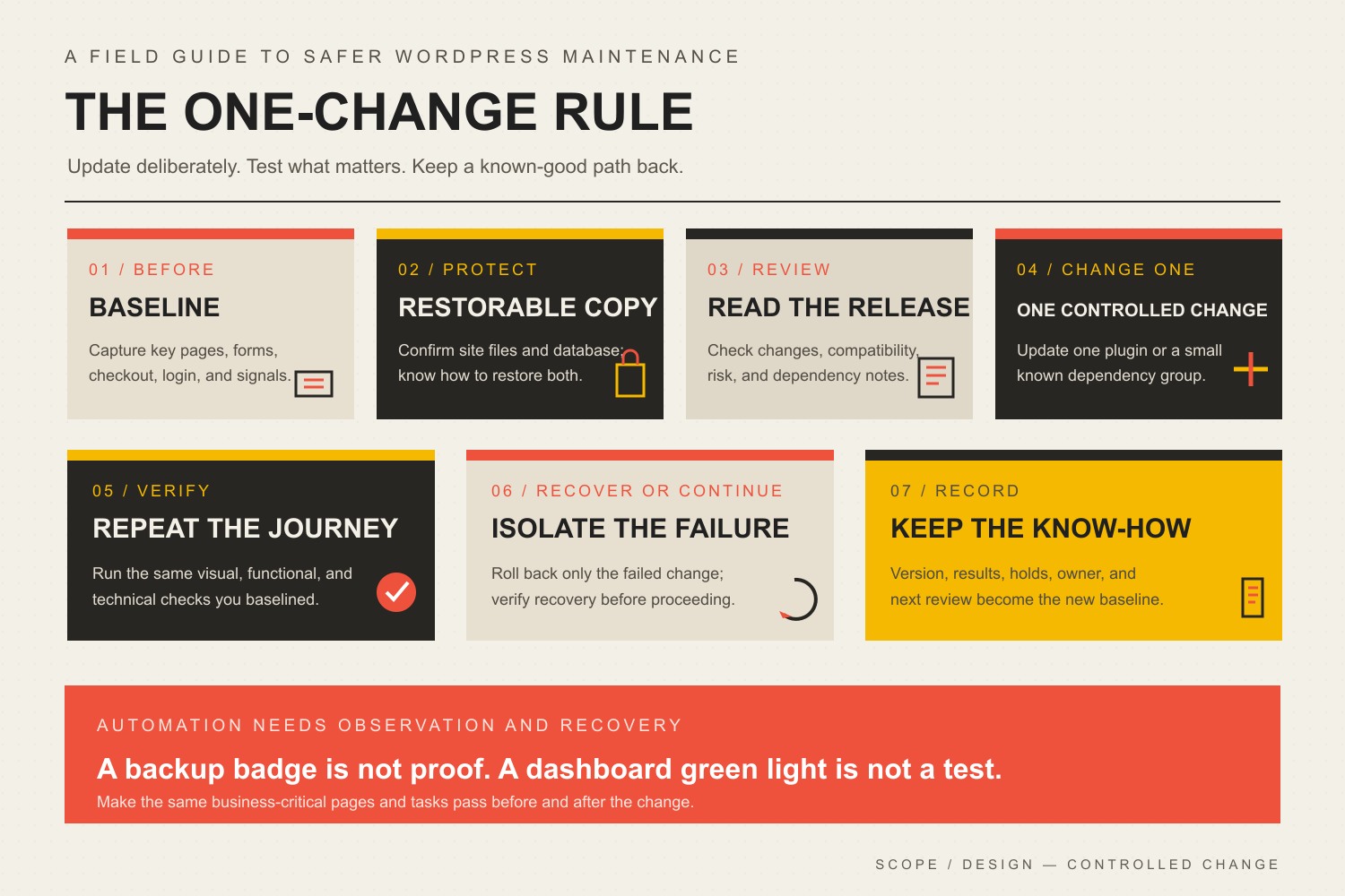
    The Scope Design One-Change Rule

    The Scope Design rule is simple: when the consequence of failure matters, change one diagnosable thing at a time.

    That does not mean every brochure site requires a committee meeting before updating a tiny utility plugin. It means the size of the update batch should match the site’s risk, complexity, and ability to recover.

    If 17 plugins update at once and the checkout breaks, you now have 17 suspects plus the theme, cache, PHP environment, database changes, and any integrations touched along the way. That is not efficiency. It is a group project where every suspect has an alibi.

    For a business-critical site, the controlled sequence is:

    1. Baseline: record what working looks like.
    2. Protect: confirm backup, access, and rollback.
    3. Review: understand the release and its dependencies.
    4. Change: update one plugin or one deliberately grouped dependency set.
    5. Verify: compare the site and test critical journeys.
    6. Recover or continue: roll back the failed change or move to the next update.
    7. Record: preserve the result, version, exception, and owner.
    The One-Change Rule: capture a baseline, confirm a restorable copy, review the release, update one plugin or understood dependency group, verify the same journeys, recover or continue, and record the result.

    This is the plugin-specific application of the broader Scope Design Maintenance Proof Loop. The WordPress dashboard saying “Update successful” proves that an update process finished. It does not prove that a lead reached the inbox, a customer completed checkout, or the mobile menu still opens.

    How to update WordPress plugins safely

    1. Inventory the plugin and its business risk

    Before updating, identify what the plugin touches. A cookie-banner add-on and the payment system do not deserve identical treatment.

    Classify the plugin by consequence:

    Risk levelTypical examplesSensible update approach
    Lowerisolated admin utility, noncritical display helper, mature plugin with simple outputselective auto-update or routine monitored batch
    Mediumpage builder add-on, forms, SEO controls, caching, multilingual featuresbackup, review, controlled update, targeted functional test
    Highecommerce, membership, bookings, authentication, payments, CRM/ERP integration, custom data flowstaging when practical, one-change update, full journey test, immediate rollback access

    Risk is contextual. A form plugin is medium risk on a hobby blog and high risk when every sales inquiry depends on it.

    2. Confirm the backup is complete and restorable

    A WordPress recovery point normally needs both the database and site files. The database holds content, orders, users, settings, and plugin data. The files include plugins, themes, uploads, and configuration. WordPress’s backup guidance treats both as necessary parts of a complete backup.

    Before a consequential update, verify:

    • the backup completed recently;
    • it is stored somewhere other than the same server failure could destroy;
    • someone knows where it is;
    • the necessary hosting, database, SFTP, or control-panel access works;
    • the restoration procedure is documented;
    • the recovery point matches the moment before the update.

    “Backups are enabled” is not the same as “we can restore this site.” A backup no one has tested is a theory with a timestamp.

    3. Capture a working baseline

    The baseline gives you evidence of the site before the change. Capture screenshots or visual comparisons of priority pages and record the status of critical functions.

    At minimum, check:

    • homepage and primary service or product templates;
    • desktop and narrow-screen navigation;
    • contact, quote, registration, or lead forms;
    • checkout, payment, coupon, tax, shipping, and transactional email when relevant;
    • login, account, membership, or gated content;
    • search, filtering, calculators, maps, and booking tools;
    • consent controls and analytics events;
    • important third-party integrations;
    • current PHP and browser-console errors;
    • recent application and server logs when available.

    The baseline prevents two expensive arguments: blaming the update for an old defect and dismissing a new regression as something that “probably looked like that already.”

    4. Read the release before installing it

    Review the plugin changelog, release notes, support notices, version jump, required WordPress or PHP version, and known compatibility issues. Pay special attention to:

    • major-version releases;
    • database migrations;
    • template overrides;
    • deprecated hooks or APIs;
    • changes to payment, authentication, or permissions;
    • changes affecting cached markup or generated assets;
    • companion plugins that must be updated together;
    • licenses or update channels that are no longer active.

    Do not assume the dashboard compatibility label is a guarantee. It is one signal, not a signed affidavit from every plugin on the site.

    5. Decide whether production or staging is the right first stop

    Use staging when failure would affect revenue, data, customers, staff, or a high-stakes launch—or when the update changes a tightly coupled system. A staging site is also useful for major releases and neglected sites with a large update backlog.

    Production can be reasonable for lower-risk updates when the site has a current backup, low complexity, reliable monitoring, immediate verification, and a clear rollback route.

    The point is not staging theater. A stale staging copy that cannot reproduce production is a costume, not a test environment.

    6. Update one plugin or understood dependency group

    Use the WordPress Plugins screen, the Updates screen, a trusted management platform, or WP-CLI when the operator and environment support it. The button is not the strategic part. The scope of the change is.

    For high-risk plugins, update one at a time. If a vendor documents that a core plugin and its add-ons must move together, treat them as one understood dependency group and record that choice.

    Do not combine plugin updates with a PHP upgrade, theme replacement, caching migration, DNS change, and hopeful little database cleanup unless you enjoy debugging a murder mystery with no timeline.

    7. Verify the same pages and journeys you baselined

    Run the visual and functional checks immediately after the update. Compare like with like: same URL, viewport, login state, product, form, or workflow.

    Check the logs as well as the pixels. Some failures are silent to the visitor but noisy in PHP logs, browser console errors, failed scheduled tasks, email queues, payment webhooks, or API responses.

    If the site is clean, record the new version and continue. If it is not, stop the rollout and identify the smallest failed change.

    8. Roll back only the failed plugin when possible

    If one update introduced the regression, restore that plugin to the previous known-good version, then rerun the same tests. A full-site restore may be necessary after a database migration, corrupted update, or broader failure, but it should not be the reflex for every CSS glitch.

    After recovery:

    • verify the site is actually back to its baseline;
    • hold the plugin at the known-good version;
    • document the failed version and evidence;
    • check vendor support and release notes;
    • continue unrelated updates only when the failure is isolated;
    • schedule a retest when a patched release becomes available.

    That last point matters. One bad plugin release should not freeze every other plugin indefinitely.

    When should you update plugins on a staging site?

    Use a staging site first when the plugin is tightly coupled to revenue, customer data, authentication, custom code, or multiple integrations. Staging is especially useful for:

    • WooCommerce, payment, shipping, tax, or subscription changes;
    • memberships, learning platforms, and account permissions;
    • booking and inventory systems;
    • page builders or themes with broad template impact;
    • major-version upgrades;
    • plugins with custom templates, hooks, or extensions;
    • sites carrying a large update backlog;
    • changes during a campaign, launch, event, or seasonal sales period;
    • sites where even a short failure creates serious operational damage.

    Staging must be representative enough to test the risk. Refresh appropriate code, settings, and sanitized data; preserve environment differences in the change record; and never trigger real customer emails or charges from a test site.

    Should you enable automatic WordPress plugin updates?

    Yes—selectively. WordPress supports per-plugin auto-update controls, and its auto-update documentation explains both the feature and its recovery behavior. The useful policy is not “automatic updates everywhere” or “automatic updates are terrifying.” It is automate the low-risk, observable changes and deliberately manage the high-risk ones.

    Automatic updates are a reasonable fit when:

    • the plugin has low business impact;
    • the site has reliable offsite backups;
    • uptime and visual monitoring are active;
    • someone receives and acts on failure alerts;
    • the plugin has a stable release history;
    • rollback is quick;
    • critical journeys are checked on a schedule.

    Disable or delay automatic updates for a specific plugin when:

    • it controls checkout, authentication, bookings, forms, memberships, or other critical journeys;
    • it has custom templates or custom code dependencies;
    • a release is known to be problematic;
    • staging and scheduled testing are part of the operating process;
    • the site is in a change freeze;
    • the vendor requires coordinated companion updates;
    • no reliable backup or rollback route exists.

    Do not use a global update freeze as a substitute for management. If automatic updates are disabled, a named person and cadence must replace them.

    What should you test after a WordPress plugin update?

    Test what the plugin can affect and what the business cannot afford to lose.

    Visual checks

    • priority pages at desktop and narrow widths;
    • headers, menus, popups, banners, forms, and footers;
    • typography, spacing, images, icons, and interactive states;
    • product, category, archive, search, and account templates;
    • logged-in and logged-out experiences when relevant.

    Functional checks

    • submit forms and confirm receipt in the correct inbox or CRM;
    • complete a test purchase or booking using a safe test method;
    • verify payment, tax, shipping, coupons, inventory, and confirmation messages;
    • test login, password reset, registration, and permissions;
    • run search, filters, calculators, downloads, and uploads;
    • confirm transactional email delivery;
    • verify webhooks, API calls, and scheduled tasks;
    • check consent behavior and important analytics events.

    Technical checks

    • PHP and server error logs;
    • browser console errors;
    • failed cron jobs and background queues;
    • cache generation and asset loading;
    • database migration notices;
    • uptime, response time, and unexpected redirect behavior.

    The test list should live with the site, not in the head of whichever developer happens to be awake.

    What should you do when a plugin update breaks the site?

    Stop making additional changes. Capture the failure, identify the update that immediately preceded it, and choose the smallest safe recovery.

    If the dashboard still works, deactivate or roll back the offending plugin through the controlled management route. If WordPress cannot load, use hosting, SFTP, command-line, recovery mode, or the documented emergency process available for that site. If the update changed the database or the damage cannot be isolated, restore the complete pre-update recovery point.

    Then verify recovery using the baseline. Do not stop at “the homepage loads.” Test the broken journey, related templates, logs, and data.

    If you suspect the problem is part of a compromise rather than an ordinary regression, use the website hacking detection and recovery guide instead of repeatedly reinstalling things and hoping the attacker becomes bored.

    How often should WordPress plugins be updated?

    Review available plugin updates at least weekly for a typical business site, and evaluate known security releases as soon as the alert arrives. The actual installation cadence should depend on urgency and risk:

    SituationResponse
    Confirmed security fix affecting the siteassess and patch promptly, with an accelerated controlled test
    Routine bug-fix or minor releaseinclude in the next scheduled maintenance window
    Major version or database migrationreview, stage when appropriate, test, and schedule deliberately
    Known problematic releasehold the known-good version, document the exception, and monitor the vendor
    Abandoned or unsupported pluginreplace or remove it; waiting harder is not a roadmap

    Weekly review does not mean blindly installing every release every Friday at 4:58 p.m. It means somebody owns the queue and makes evidence-based decisions.

    Plugin management starts before the update button

    The safest plugin is often the one the site does not need.

    Keep WordPress lean by reviewing:

    • whether every active plugin still has a business purpose;
    • whether inactive plugins should be removed;
    • whether multiple plugins duplicate the same job;
    • whether the vendor is active and the plugin remains supported;
    • whether licenses and update access are current;
    • whether customizations survive updates cleanly;
    • whether a plugin has become an operational single point of failure;
    • whether functionality belongs in a maintained custom plugin instead of scattered snippets;
    • whether account ownership and credentials belong to the client rather than a vanished contractor.

    More plugins do not automatically mean a bad website. One enormous plugin can create more risk than ten small focused ones. Count is a crude signal. Ownership, quality, necessity, coupling, and recoverability are the useful questions.

    DIY plugin updates or professional management?

    DIY is reasonable when the site is simple, the owner understands the stack, backups and rollback work, critical journeys are documented, and someone has time to test the result.

    Professional management becomes sensible when:

    • the website generates leads, orders, bookings, or member access;
    • the stack is complex or customized;
    • updates require staging or coordinated dependencies;
    • nobody internally owns monitoring and recovery;
    • failures must be handled quickly;
    • the update queue keeps becoming an archaeological layer;
    • the business wants evidence and accountability rather than another dashboard.

    The value is not paying someone to click the same button. It is paying for risk classification, controlled change, testing, recovery, documentation, and a person who owns the result. The WordPress maintenance services buyer guide explains how to compare that responsibility before buying a care plan.

    WordPress plugin update FAQ

    Do WordPress plugins need to be updated?

    Yes. Plugin updates can contain security fixes, compatibility changes, bug repairs, and useful improvements. Delaying every update indefinitely increases technical debt and can leave the site running unsupported software.

    How often do WordPress plugins need to be updated?

    Review the update queue at least weekly for a typical business website and assess security-related releases promptly. Install routine releases in a scheduled window; stage and test major or high-risk updates deliberately.

    Is it safe to update all WordPress plugins at once?

    It can be acceptable on a simple, low-risk site with a verified backup and immediate testing. On a complex or revenue-producing site, updating everything at once makes failures harder to isolate. Use one-plugin or small understood dependency batches instead.

    Should I back up WordPress before updating plugins?

    Yes, especially before consequential updates. Confirm the backup includes both database and files and that you know how to restore it. A scheduled backup that cannot be found or restored is not much of a safety net.

    Can plugin updates break a WordPress site?

    Yes. An update can conflict with WordPress core, PHP, a theme, another plugin, custom code, cached assets, or an external integration. That is why the process needs a baseline, testing, monitoring, and rollback.

    Are automatic WordPress plugin updates safe?

    They are appropriate for selected lower-risk plugins when backups, monitoring, alerts, and rollback are reliable. Business-critical or tightly coupled plugins usually deserve scheduled testing before production.

    Should I update plugins on staging first?

    Use staging for high-risk plugins, major releases, custom integrations, ecommerce, membership, bookings, authentication, or any site where a production failure would be expensive. Keep staging representative enough for the test to mean something.

    What should I do if a plugin update breaks my site?

    Stop other changes, capture the failure, roll back the offending plugin or restore the pre-update recovery point, and rerun the baseline tests. Then hold the known-good version and investigate the release before trying again.

    Can I roll back only one WordPress plugin?

    Often, yes, when the plugin did not perform an irreversible database migration and you have the previous version. If the update changed stored data or caused broader corruption, a complete restore may be safer.

    Should inactive WordPress plugins be updated?

    Inactive plugins should usually be removed if they are not needed. If an inactive plugin must remain installed for a legitimate reason, keep it current because its files still exist on the server and may still matter to security or recovery.

    Does updating WordPress plugins improve SEO?

    Not automatically. An update may fix errors, performance problems, structured-data bugs, or compatibility issues that affect search performance, but the act of updating is not an SEO ranking bonus.

    What is the difference between plugin maintenance and website maintenance?

    Plugin maintenance covers selection, updates, compatibility, testing, licenses, version holds, and removal. Website maintenance is broader: it also includes backups, uptime, security, content accuracy, forms, email, performance, domains, analytics, accessibility, and incident response.

    Make plugin updates boring—in the good way

    The best WordPress plugin update is uneventful because the process did its job. The baseline existed. The backup was real. One controlled change went live. The site passed the visual and business tests. The result was recorded. Nobody had to discover at dinner that checkout stopped working six hours earlier.

    If your team can own that process, use it. If “update strategy” currently means waiting until the dashboard badge becomes emotionally uncomfortable, compare Scope Design’s WordPress support and maintenance plans or contact Scope Design to scope the actual risk.

    Safe updates depend on maintainable architecture, ownership, staging, and recovery established before launch. Our business website development pillar explains those foundation requirements.

  • ADA Website Compliance Guide: WCAG, Accessibility Testing, and What Actually Applies

    ADA Website Compliance Guide: WCAG, Accessibility Testing, and What Actually Applies

    The direct answer: ADA website compliance is not one magic checklist for every organization. Website accessibility means people with disabilities can perceive, understand, navigate, and complete the same meaningful tasks as everyone else. For most modern sites, WCAG 2.2 Level AA is a responsible technical target. The legal standard that actually applies depends on who you are, what you offer, where you operate, and whether a law, regulation, contract, or procurement rule names a specific requirement. Start by removing real barriers. Do not start by buying a widget and declaring victory.

    That distinction matters because accessibility advice on the internet tends to arrive in one of two costumes: a blood-pressure-raising lawsuit pitch or a 97-point checklist with no connection to what people are trying to do. Neither is a strategy.

    An accessible website lets a person read the offer, understand the choices, use the navigation, complete the form, play the media, recover from an error, and get the result using the tools and interaction methods they need. That may include a keyboard, screen reader, voice input, switch device, captions, magnification, increased text spacing, reduced motion, or simply a tired brain on a terrible Wi-Fi connection.

    This guide explains what WCAG does, how the major U.S. accessibility frameworks differ, what a useful website accessibility test includes, how to prioritize repairs, and why the little accessibility icon floating in the corner is not a civil-rights force field.

    This is practical website guidance, not legal advice. A qualified attorney should evaluate obligations for your specific organization, location, customers, contracts, and risk.

    Website accessibility is access to the outcome

    Accessibility is often reduced to individual ingredients: alt text, contrast, keyboard focus, labels, captions. Those ingredients matter, but the business and human question is larger:

    Can a person get the intended outcome without being blocked, misled, trapped, or forced to ask someone else for help?

    If a visitor can read a product description but cannot select an option, the page is not functionally accessible. If a job applicant can open the form but the date picker cannot be operated by keyboard, the process is not accessible. If a customer can reach checkout but the error message is communicated only by turning a border red, the system has failed at exactly the moment the person needs help.

    This is why accessibility belongs inside user experience. Our UX diagnosis guide treats access as a condition across the whole decision path—not a cleanup task after the visual design has been approved.

    The Scope Design version is blunt: user needs overrule taste when comprehension, access, or completion is at stake. Your art director may adore pale gray type. The person trying to read it still wins.

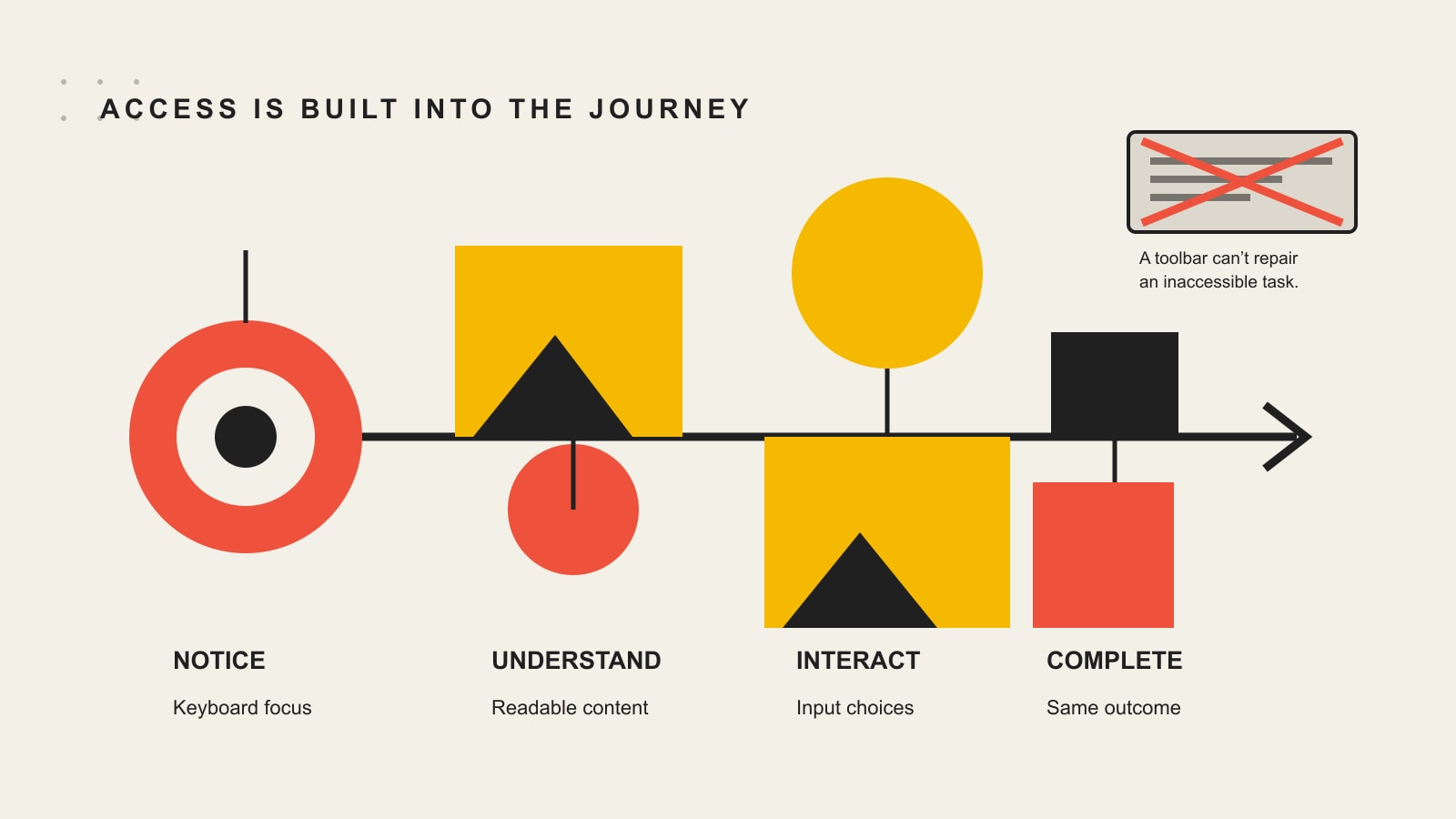
    Accessibility is integrated from notice through understanding and interaction to task completion; an overlay toolbar cannot repair an inaccessible task.

    What WCAG 2.2 actually is

    The Web Content Accessibility Guidelines 2.2 are a technical standard developed through the World Wide Web Consortium. WCAG covers a wide range of barriers affecting people with visual, auditory, physical, speech, cognitive, language, learning, and neurological disabilities.

    WCAG is organized around four principles, usually shortened to POUR:

    • Perceivable: People can access the information through available senses or alternatives. Examples include text alternatives for meaningful images, captions for prerecorded video, and sufficient contrast.
    • Operable: People can operate controls and navigation with the interaction methods they use. Keyboard access, visible focus, adequate target sizes, and alternatives to dragging live here.
    • Understandable: Content and interactions make sense. Labels are clear, navigation is consistent, errors are identified, and help appears where people expect it.
    • Robust: Browsers, assistive technologies, and other user agents can reliably interpret the content. Semantic HTML, correct names and roles, and accurate component states matter here.

    The standard has three conformance levels:

    • Level A addresses foundational barriers.
    • Level AA adds requirements commonly used as the practical target in laws, policies, and contracts.
    • Level AAA contains additional criteria, but WCAG does not expect every page or site to satisfy all AAA criteria.

    Conformance is not achieved by collecting a certain number of points. A page must satisfy every applicable success criterion at the claimed level. A glowing score of 97 is not “basically compliant” if the remaining failure prevents somebody from paying, applying, booking, or reading the answer.

    Why target WCAG 2.2 when some rules name WCAG 2.1?

    WCAG 2.2 extends WCAG 2.1. W3C advises using 2.2 to maximize the future applicability of accessibility work, and content conforming to WCAG 2.2 also conforms to 2.1 and 2.0. The newer version adds criteria covering issues such as obscured keyboard focus, alternatives to dragging, minimum target size, consistent help, redundant entry, and accessible authentication. W3C summarizes the changes in its What’s New in WCAG 2.2 guide.

    That makes WCAG 2.2 AA a sensible engineering and design target for a new or substantially rebuilt site. It does not mean every law automatically names WCAG 2.2. Legal requirements, contractual targets, and a responsible modern build can overlap without being identical.

    ADA website compliance: which rules actually apply?

    There is no honest universal answer to “Does my website have to be ADA compliant?” without knowing what kind of organization operates it. The better starting point is to identify the applicable framework before pretending one acronym answers everything.

    FrameworkWho it generally coversWebsite standard or practical meaning
    ADA Title IIState and local governments and covered public entitiesDOJ’s web and mobile rule names WCAG 2.1 Level A and AA, with limited exceptions and defenses.
    ADA Title IIIBusinesses open to the public, also called public accommodationsDOJ says the ADA applies to goods, services, and activities offered online, but its general Title III web guidance does not provide one detailed technical regulation. WCAG is helpful technical guidance.
    Section 508Information and communication technology developed, procured, maintained, or used by U.S. federal agenciesA federal ICT and procurement standard, not a blanket rule for every private business website.
    European Accessibility ActCertain covered products and services offered in the EUApplies through EU member-state law to covered areas such as e-commerce, banking, transport, and electronic communications, with scope rules and exemptions.
    Contracts and procurement policiesVendors, grantees, schools, healthcare organizations, enterprise suppliers, and others bound by specific agreementsMay require a named WCAG version, conformance report, testing process, remediation timeline, or accessible deliverables regardless of a general public-web rule.

    ADA Title II: state and local government websites

    The U.S. Department of Justice issued a specific rule for web content and mobile apps provided by state and local governments. The rule uses WCAG 2.1 Level A and AA as its technical standard for covered content and apps.

    The dates deserve special attention because they changed. In April 2026, DOJ extended the compliance deadlines. According to the department’s current Title II web-rule fact sheet:

    • State and local governments with a population of 50,000 or more have until April 26, 2027.
    • State and local governments with fewer than 50,000 people, plus special district governments, have until April 26, 2028.

    The rule covers content and apps a public entity provides directly or through contractual, licensing, or other arrangements. Hiring a vendor does not cause the obligation to evaporate into the procurement portal.

    The rule also contains specific exceptions and legal concepts that need careful application. A summary article is not a substitute for reading the rule or obtaining counsel.

    ADA Title III: private businesses open to the public

    DOJ’s Guidance on Web Accessibility and the ADA says Title III applies to businesses open to the public and that inaccessible website features can limit access to the goods, services, and privileges those businesses offer online. The department says businesses must provide full and equal enjoyment and effective communication where required.

    The same guidance also says DOJ does not have a detailed regulation that supplies one technical web checklist for Title III. It points to WCAG and the Section 508 Standards as helpful technical guidance while explaining that businesses have flexibility in how they meet the ADA’s general requirements.

    The practical conclusion is not “private websites can ignore accessibility.” It is also not “WCAG 2.2 AA is the exact federal regulation for every private website.” The responsible conclusion is that businesses open to the public should make their online goods and services accessible, use a recognized technical standard to organize the work, and get legal advice when they need a determination about their own obligations.

    Section 508 is not shorthand for every website

    Section 508 covers information and communication technology developed, procured, maintained, or used by federal agencies. The U.S. Access Board’s Section 508 overview includes websites, software, documents, kiosks, and other ICT in that federal context.

    A private contractor may encounter Section 508 through federal work or procurement. A local restaurant does not become a federal agency because somebody installed an accessibility scanner.

    The European Accessibility Act has a defined scope

    The European Accessibility Act applies to specified products and services sold in the EU, including areas such as e-commerce, consumer banking, payment services, passenger transport information, and electronic communications. The European Commission’s accessibility overview explains that covered products and services have been subject to common requirements since June 2025.

    It is not a single sentence that makes every website everywhere subject to the same rule. Scope, exemptions, member-state implementation, and the nature of the product or service matter.

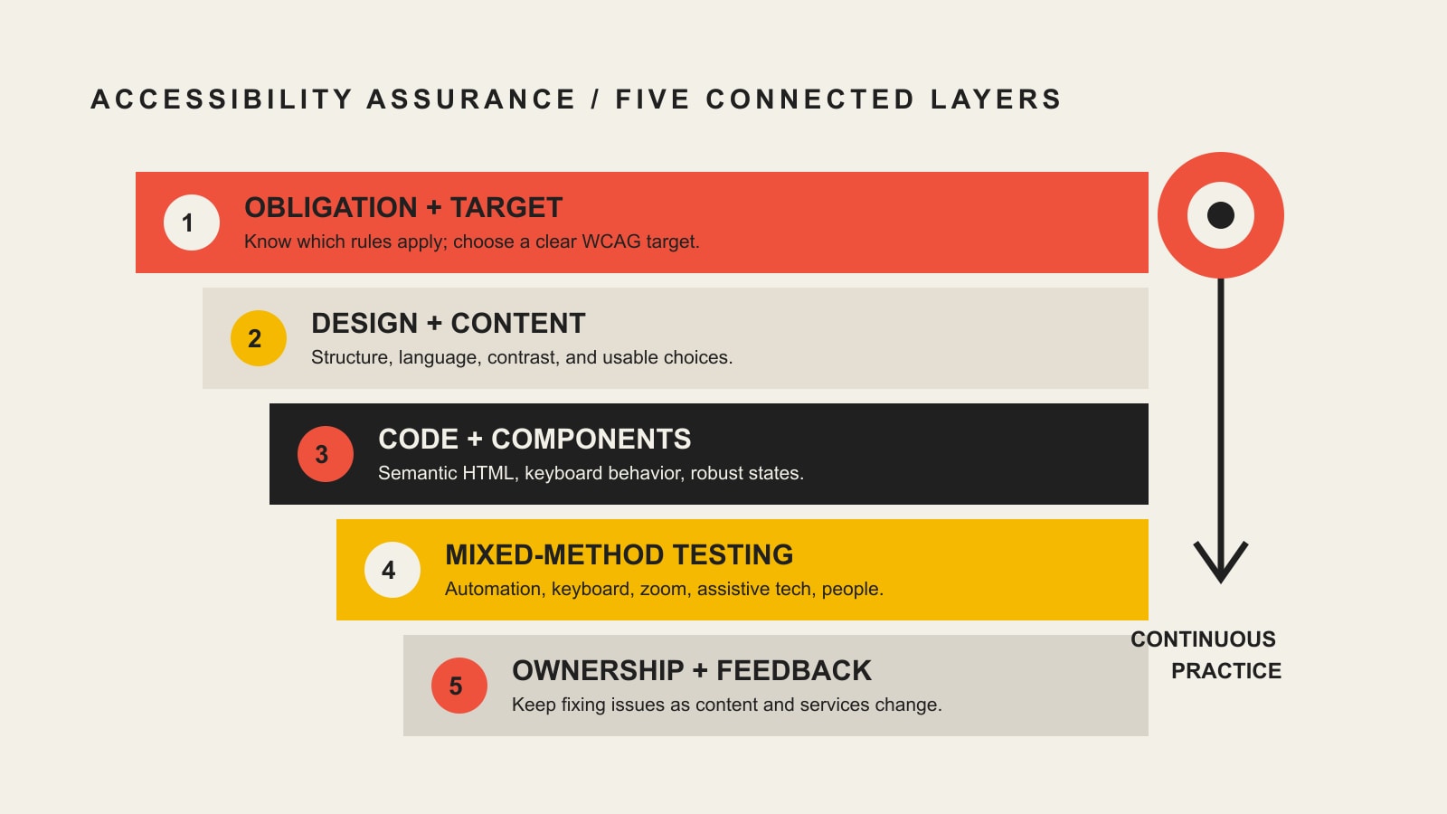
    The Scope Design Accessibility Assurance Stack

    Accessibility fails when it is assigned to one person at the end. A developer cannot fix a video that was never captioned. A content editor cannot repair a custom menu whose state is invisible to assistive technology. A scanner cannot decide whether the available instructions make sense to the person completing the task.

    The work holds together through five connected layers:

    1. Obligation and target: Define who needs access, what experience is in scope, and which law, policy, contract, and WCAG version apply.
    2. Design and content: Build understandable structure, language, contrast, media alternatives, forms, error recovery, motion controls, and readable typography.
    3. Code and components: Use semantic markup, reliable keyboard behavior, accurate names and roles, visible focus, correct states, and resilient components.
    4. Mixed-method testing: Combine automation with keyboard testing, zoom and reflow, assistive technology, and representative user tasks.
    5. Ownership and feedback: Name the people responsible, test releases, provide a way to report barriers, prioritize repairs, and prevent regressions.
    Five connected accessibility layers: obligation and target, design and content, code and components, mixed-method testing, and ownership and feedback.

    How to test a website for accessibility

    A useful accessibility evaluation does not begin and end with a browser extension. It combines different methods because each method sees a different part of the problem.

    1. Define the scope and target

    List the site areas, applications, documents, third-party tools, user roles, languages, authenticated states, and critical tasks in scope. Identify the intended WCAG version and level. Include templates and representative pages rather than scanning only the homepage and admiring the green score.

    Critical tasks usually include things such as:

    • finding and understanding a service;
    • navigating menus and search;
    • completing contact, application, registration, or checkout forms;
    • signing in and recovering an account;
    • reading or downloading essential documents;
    • using calculators, maps, booking tools, chat, or customer portals;
    • playing media and accessing captions or transcripts; and
    • recognizing and recovering from errors.

    W3C’s WCAG-EM evaluation methodology provides a structured approach for defining scope, exploring a site, selecting a representative sample, auditing that sample, and reporting findings.

    2. Run automated checks

    Automated tools are excellent at finding repeatable, machine-detectable issues across many pages. They can surface missing attributes, certain label and name problems, some color-contrast failures, invalid relationships, duplicate IDs, and patterns that deserve review.

    They are fast. They are consistent. They are also incapable of deciding everything.

    W3C’s evaluation tools overview says some accessibility checks cannot be automated and require human intervention. Tools can also produce inaccurate results. Use them to accelerate evaluation and regression detection, not to outsource judgment.

    3. Test with a keyboard

    Put the mouse aside. Start at the address bar and use Tab, Shift+Tab, Enter, Space, arrow keys, Escape, and any documented shortcuts.

    Verify that:

    • every interactive element can be reached and operated;
    • focus order follows a sensible path;
    • focus is visible and not hidden behind sticky headers, cookie banners, or chat widgets;
    • menus, dialogs, accordions, tabs, carousels, and custom controls behave predictably;
    • focus moves into and out of dialogs correctly;
    • there is no keyboard trap;
    • skip links work where needed; and
    • the person can recover after an error without starting the entire process over.

    Keyboard testing catches failures that a scanner may never understand because the problem exists in the sequence and behavior, not in one isolated line of markup.

    4. Test zoom, reflow, spacing, contrast, and motion

    Increase text size and browser zoom. Test at narrow viewports. Apply increased text spacing. Check Windows High Contrast Mode or other forced-color environments where relevant. Verify that content does not disappear, overlap, clip, or require two-dimensional scrolling for ordinary reading.

    Our website typography guide explains why font size alone is not an accessibility guarantee. Line height, line length, contrast, spacing, layout behavior, and user control all contribute to whether text remains readable.

    Pause animation. Use reduced-motion settings. Make sure essential instructions are not hidden inside a hover effect or conveyed only through color.

    5. Test with assistive technology

    At minimum, test representative tasks with commonly used screen-reader and browser combinations appropriate to the audience and platform. Listen to page structure, headings, landmarks, link names, form labels, instructions, errors, status messages, image alternatives, and component states.

    Assistive-technology testing is not “turn on a screen reader and see if it talks.” It requires understanding the expected interaction model and distinguishing a product failure from unfamiliarity with the tool.

    6. Include people with disabilities

    Conformance testing and usability testing answer related but different questions. A page can satisfy individual technical criteria while the real experience remains confusing or needlessly difficult.

    W3C recommends involving users with disabilities in accessibility evaluation because they can identify usability barriers that conformance evaluation alone does not discover. This does not replace standards-based evaluation. It adds reality to it.

    Common website accessibility failures

    The most damaging failures are not always the most visually dramatic. They are the barriers sitting between a person and the reason they came.

    • Missing or illogical heading structure.
    • Vague links such as “click here” repeated without context.
    • Menus that open only on hover.
    • Keyboard focus that jumps unpredictably.
    • No way to bypass repeated navigation.
    • Page titles that fail to identify the page.

    Form and transaction failures

    • Inputs without programmatic labels.
    • Placeholder text used as the only instruction.
    • Required fields indicated only by color.
    • Errors announced visually but not programmatically.
    • Date pickers, sliders, uploads, or CAPTCHA challenges that cannot be completed with alternative interaction methods.
    • Time limits that cannot be extended.
    • Authentication that requires memory puzzles or inaccessible drag actions without an alternative.

    Visual and reading failures

    • Text or controls with insufficient contrast.
    • Fixed-size layouts that break when zoomed.
    • Tiny targets packed together.
    • Important content embedded in images without a text alternative.
    • Long, dense copy with weak headings and no usable hierarchy.
    • Low-contrast minimalist design approved because it looked expensive on one designer’s monitor.

    Media and document failures

    • Video without accurate captions.
    • Audio without an equivalent transcript where needed.
    • Meaningful visuals without appropriate text alternatives.
    • PDFs that are scanned images, have no tag structure, or use a reading order that resembles a shuffled deck of cards.
    • Instructions that depend only on color, shape, sound, or position.

    Custom component failures

    • Buttons built from generic containers without button semantics.
    • Dialogs that do not announce their name or trap focus incorrectly.
    • Status updates that appear visually but are never announced.
    • Tabs, accordions, carousels, and comboboxes with invented keyboard behavior.
    • Third-party scheduling, payment, chat, map, or portal tools that introduce barriers outside the site’s main templates.

    What to fix first

    An audit can produce hundreds of findings. Treating all of them as equal is an efficient way to make nobody responsible for anything.

    Prioritize using four factors:

    1. User impact: Does the issue block, seriously hinder, or mildly inconvenience someone?
    2. Task importance: Does it affect payment, application, booking, account access, safety information, essential documents, or another critical outcome?
    3. Reach: Is it in a shared template or component affecting hundreds of pages, or on one rarely used page?
    4. Repair leverage: Can one component fix remove the same barrier everywhere?

    Start with complete blockers on critical tasks. Then repair shared components and templates. Then address severe issues in high-use content. Continue through lower-impact and isolated findings while protecting the fixes with regression tests.

    Do not postpone easy content repairs while waiting for a perfect rebuild. Add the missing label. Correct the heading. Caption the video. Replace the unreadable PDF. Accessibility programs become credible by removing barriers, not by producing a magnificent spreadsheet about them.

    Why an accessibility overlay is not a compliance strategy

    An accessibility overlay is software added on top of a website, often through one script and a floating interface. Some tools may provide individual features that certain users find helpful. That is a different claim from automatically making the underlying website conform to WCAG or satisfy every legal obligation.

    Overlays do not reliably repair inaccessible source code, content, workflows, documents, third-party tools, or design decisions. They can also conflict with the assistive technology and preferences a person already uses.

    The claim “install this and any site becomes compliant” is not merely aggressive marketing. In 2025, the Federal Trade Commission finalized an order requiring accessiBe to pay $1 million over allegations that it deceptively advertised an AI-powered overlay as capable of making any website WCAG-compliant. The FTC’s accessiBe case summary is a useful reminder: automation can support accessibility work, but magical compliance claims still need evidence.

    Use tools where they are useful. Fix the experience where it is broken. Do not confuse adding a control panel with rebuilding the staircase.

    What website accessibility costs

    There is no responsible universal price because “make the website accessible” can describe radically different scopes.

    Cost depends on:

    • the number of unique templates and components;
    • the complexity of forms and transactions;
    • custom applications and authenticated areas;
    • the number and quality of PDFs, videos, and other media;
    • third-party tools and vendor cooperation;
    • the current codebase and design system;
    • the target standard and contractual reporting requirements;
    • whether the team needs training and workflow changes; and
    • whether the engagement covers evaluation only, remediation, validation, monitoring, or all four.

    A ten-page brochure site with clean semantic code is not the same project as an e-commerce system with 6,000 product documents, account management, recurring payments, and three vendor-controlled portals.

    Ask a potential accessibility partner to explain:

    • what standard and conformance level they will evaluate;
    • what pages, components, documents, and tasks are in scope;
    • which automated and manual methods they use;
    • which assistive technologies and browser combinations they test;
    • how findings are prioritized and reproduced;
    • whether remediation and validation are separate;
    • how they handle third-party systems;
    • what they mean by “compliant,” “certified,” or “guaranteed”; and
    • how the team will prevent the same issues from returning.

    If the entire methodology is “we run our proprietary scanner,” you are buying a scanner report.

    A practical website accessibility action plan

    This week

    Use W3C’s Easy Checks to review page titles, image alternatives, headings, contrast, text resizing, keyboard access, focus, forms, moving content, and media alternatives. Test your highest-value task with a keyboard. Submit every important form and confirm the response is understandable.

    This month

    Define the target and scope. Inventory templates, components, documents, videos, and third-party tools. Run automated scans, but pair them with manual testing. Fix critical blockers and shared-component failures first. Add a visible way for people to report accessibility problems.

    During the next release cycle

    Put accessible acceptance criteria into design, content, development, and procurement. Add automated checks to the development pipeline. Create reusable accessible components. Train the people who publish content. Validate the repaired experience with manual and assistive-technology testing.

    After launch

    Accessibility can regress every time someone changes a heading, uploads a PDF, swaps a plugin, adds a popup, edits a form, or installs the latest shiny conversion toy. It belongs inside website maintenance, not in a forgotten audit folder. Use our website accessibility monitoring guide to establish change gates, testing cadence, ownership, feedback, and repair workflows.

    Website accessibility FAQ

    Is ADA compliance required for every website?

    Not under one identical federal technical rule. DOJ says the ADA applies to online goods, services, programs, and activities offered by state and local governments and businesses open to the public. Title II now has a specific web and mobile rule naming WCAG 2.1 AA. DOJ’s general Title III web guidance does not provide the same detailed technical regulation for private businesses. Other laws, state requirements, contracts, procurement policies, and international rules may also apply. Get legal advice for your actual situation.

    What does ADA website compliance mean?

    In practical terms, it means providing people with disabilities equal access to the relevant online goods, services, programs, activities, and communications. WCAG supplies testable technical criteria commonly used to evaluate that access, but the legal framework and exact target depend on the organization.

    Is WCAG a law?

    WCAG is a technical standard, not a statute. A law, regulation, contract, or policy can incorporate a WCAG version and level. DOJ’s Title II web rule, for example, names WCAG 2.1 Level A and AA. For private businesses under Title III, DOJ identifies WCAG as helpful technical guidance while applying the ADA’s broader nondiscrimination and effective-communication requirements.

    Should a website target WCAG 2.1 or WCAG 2.2?

    Follow the version explicitly required by an applicable law or contract. For current design and development, WCAG 2.2 AA is a responsible target because it adds useful criteria and remains backward compatible with WCAG 2.1 and 2.0. Document the decision so the team understands the difference between the required baseline and the modern engineering target.

    What are the four principles of web accessibility?

    WCAG’s four principles are Perceivable, Operable, Understandable, and Robust—POUR. They mean people can access the information, operate the interface, understand the content and behavior, and use the experience through a range of browsers and assistive technologies.

    How can I tell whether my website is accessible?

    Evaluate representative pages, components, documents, and critical user tasks against a defined WCAG target. Combine automated scans, manual keyboard testing, zoom and reflow checks, assistive-technology testing, and evaluation with people with disabilities. A single score cannot establish full conformance or usability.

    What are the main types of accessibility testing?

    The useful categories are automated testing, expert manual review, assistive-technology testing, and testing with users with disabilities. Teams also need content and document review. These methods overlap, but none makes the others unnecessary.

    Is automated accessibility testing enough?

    No. Automation is valuable for speed, consistency, coverage, and regression detection, but many criteria require human judgment. A tool cannot reliably decide whether alternative text communicates the purpose of an image, whether instructions make sense, whether focus order supports the task, or whether an error-recovery experience is usable.

    What is the best website accessibility checker?

    There is no single best checker for every stack and workflow. Choose tools based on the standards they support, the pages they can reach, integration options, reporting quality, false-positive behavior, and the team’s ability to act on results. Use more than a score, and keep manual testing in the process.

    Can an accessibility widget make a website compliant?

    Do not assume so. A widget may offer individual interface adjustments, but it cannot automatically repair every problem in source code, content, documents, transactions, or third-party systems. Treat broad automatic-compliance promises with skepticism and ask for evidence.

    Can a business be sued over an inaccessible website?

    Website accessibility disputes and enforcement actions do occur, but the legal analysis depends on jurisdiction, the organization, the relationship between the website and the goods or services offered, and other facts. This article does not predict liability. The more productive business response is to identify and remove barriers rather than gamble on a slogan from either side.

    Does an accessibility statement make a website compliant?

    No. A useful statement can identify the accessibility target, known limitations, contact method, and response process. It cannot substitute for an accessible experience. A beautifully worded statement attached to a broken application form is documentation of the problem, not a fix.

    How often should a website be audited for accessibility?

    The right cadence depends on change frequency, risk, complexity, and audience. Test significant releases and changed components before launch. Monitor high-value templates continuously where practical. Run scheduled manual reviews and periodic broader evaluations. A fast-moving e-commerce site needs a different cadence than a small site updated twice a year.

    Who is responsible for website accessibility?

    Leadership owns the expectation and resources. Designers own usable patterns. Writers and editors own structure and alternatives. Developers own semantic and interactive behavior. QA owns verification. Procurement owns vendor requirements. Site owners own ongoing monitoring and response. When accessibility belongs only to “the accessibility person,” everyone else is free to reintroduce the same failures.

    Does accessibility help SEO?

    Some accessibility practices—descriptive titles, meaningful headings, semantic structure, text alternatives, captions, and understandable link text—can also help search engines interpret content. That overlap is useful, but accessibility is not an SEO tactic. A page can rank while blocking people, and a technically accessible page can still be irrelevant to a search query.

    Build access into the work, not around it

    Accessibility is not a favor to a theoretical edge case. It is the discipline of making sure the people you claim to serve can actually use the thing you built.

    Start with the outcome. Choose the applicable target. Design and write for access. Build components that behave correctly. Test with more than one method. Give somebody ownership after launch. Listen when users report a barrier, then fix the barrier instead of defending the score.

    That is less glamorous than installing a miracle script. It is also how serious websites get built.

  • How to Find the Right Images for Your Facebook Ads

    How to Find the Right Images for Your Facebook Ads

    There is no universally “best” Facebook ad image. The right image is the one that makes this offer easier for this audience to recognize, understand, and act on—and gives you a clean hypothesis you can test. If your creative process starts with “What picture looks nice?”, you are already one step too late.

    For most Facebook ad images, start with three practical questions: What job must the visual do? Will the intended buyer recognize what it means without decoding a generic stock metaphor? And can you test the image without changing the offer, audience, copy, and objective at the same time?

    TL;DR: choose the image after you know the job

    • Make the offer visible. A product, result, process, person, proof point, or contrast is usually more useful than decorative “business” imagery.
    • Use one focal point. Meta’s own photo-ad guidance recommends keeping the visual clear rather than turning the image into a miniature flyer.
    • Design for placements. Feed creative commonly uses 1:1 or 4:5 framing; full-screen placements need their own vertical treatment. Preview crops before launch.
    • Check permission before performance. Stock licenses, photographer rights, customer/creator permission, trademarks, and AI-generated elements all deserve a real review.
    • Test one visual idea at a time. If you change the image, headline, audience, landing page, and offer together, you will not know what actually helped.

    If the bigger question is whether paid social is even the right channel for the job, start with our small-business marketing system and channel guide. This article stays narrower: choosing the image.

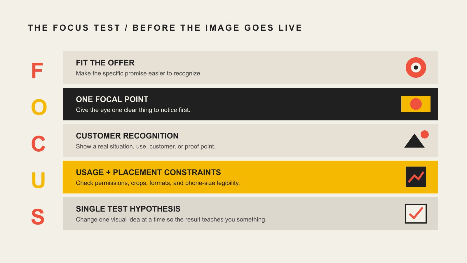
    How to choose Facebook ad images: the Scope Design FOCUS Test

    We use a simple five-part check to move image selection out of the “I like this one” zone. Before an image becomes paid creative, run it through FOCUS.

    F — Fit the offer

    Does the image make the specific product, service, promise, or outcome easier to understand? A roofing company advertising storm-damage inspections should probably show a roof, damage, an inspector, or the inspection outcome—not two people shaking hands in a glass office.

    O — One focal point

    At feed size, is there one obvious thing to notice first? Meta’s photo-ad guidance explicitly recommends a single focal point and advises advertisers not to cram too many competing things into one image. If the viewer needs a tour guide, simplify it.

    C — Customer recognition

    Can the intended buyer recognize their situation, aspiration, proof, product use, or problem? “Recognition” matters more than generic polish. A homeowner should be able to see a home problem. A manufacturer should be able to see the machine, process, part, or result. A professional-service buyer may need to see the person, environment, deliverable, or evidence that makes an intangible service concrete.

    U — Usage + placement constraints

    Do you have the right to use the asset in advertising? Does the important subject survive a square crop, a vertical crop, and the interface elements around the ad? Is any on-image text still legible on a phone? These are not glamorous questions, but they are the difference between “finished artwork” and usable campaign creative.

    S — Single test hypothesis

    What are you actually testing? “This version has a woman holding the product while that one shows the product by itself” is a testable visual hypothesis. “This one has a different image, offer, audience, headline, CTA, and landing page” is a different campaign wearing an A/B-test costume.

    The FOCUS Test: Fit the offer, One focal point, Customer recognition, Usage and placement constraints, and Single test hypothesis.

    Start with the job the image has to do

    Before choosing stock versus original photography—or debating whether an AI image looks “real enough”—decide what the visual is supposed to contribute to the ad.

    Image jobUseful visual directionsWhat can go wrong
    Show the productProduct hero, detail, scale, before/after state, product in contextBeautiful shot with no sense of why the product matters
    Show use or processCustomer using it, technician at work, behind-the-scenes step, hands-on demonstrationPosed “people at work” stock that does not resemble the real service
    Supply proofCustomer photo, result, review excerpt, recognizable deliverable, real projectPermission problems, unverifiable claims, tiny screenshots no one can read
    Make the problem or contrast visibleBroken vs. repaired, cluttered vs. organized, old vs. improved, confusing vs. clearManipulative fear imagery or a contrast the offer cannot honestly deliver
    Explain an ideaSimple graphic, diagram, comparison, one-number visual, branded illustrationTurning the ad into a dense infographic that requires zooming

    Meta’s current guidance also recommends making the product or service the focal point and, where it helps, showing people benefiting from the product. That is useful direction—not a guarantee. The correct image still depends on your offer and customer.

    Where to get Facebook ad images: original, stock, UGC, or AI

    Image source is a production decision, not a strategy. Original photography can be generic. Stock can be specific. User-generated content can feel forced. AI can be useful or spectacularly wrong. Choose the job first, then choose the source that can do it credibly and legally at the pace your campaign needs.

    Original photography and graphics

    Use original assets when the real product, team, location, process, or customer context is part of the value. You do not necessarily need a giant commercial shoot. A planned half-day can produce a useful library of product-in-use shots, people, details, horizontal and vertical compositions, negative space for occasional text, and multiple crops for testing.

    Professional production earns its keep when premium positioning, technical accuracy, controlled lighting, consistency, or a long campaign life matters. The point is not “professional photos always perform better.” The point is having assets that accurately communicate the offer.

    Stock photography

    Stock is useful when speed and breadth matter more than documenting something only your business can show. The mistake is searching for abstractions such as “success,” “innovation,” or “teamwork” and settling for the first polished cliché.

    1. Search for the situation, not the marketing concept: “homeowner checking roof shingles” beats “home improvement success.”
    2. Match the real audience: age range, environment, clothing, tools, geography, product category, and level of formality.
    3. Avoid images that accidentally make promises your offer cannot support.
    4. Check the actual license for paid advertising and any restrictions around recognizable people, property, trademarks, or sensitive uses.

    The U.S. Copyright Office notes that photographs and other visual works can be protected by copyright and that using someone else’s work generally requires permission from the owner. “I found it on Google” is not a license.

    Customer, creator, and UGC-style imagery

    Customer or creator content can be especially useful when the ad needs proof or a believable product-in-use moment. But “user-generated” does not mean “free to reuse.” Get clear permission for advertising use, understand what the agreement covers, and be careful about implying endorsements or results that are not actually true.

    Also separate UGC as a look from actual customer evidence. A creator holding a product can be a production style; a real customer describing a real experience is proof. Those are different jobs.

    AI-generated or AI-assisted images

    AI can help with concept exploration, backgrounds, object cleanup, variations, illustration, and production speed. It can also hallucinate product details, logos, hands, interfaces, locations, people, or results that your business never delivered. Treat generated imagery like any other commercial asset: inspect it, verify it, document rights and source terms, and ask whether it changes what a reasonable customer would believe.

    There is also a current transparency consideration. Meta’s June 1, 2026 update on generative-AI ad transparency says “AI info” labeling can apply to ads created or significantly edited with Meta’s generative tools, and Meta is expanding detection and labeling toward third-party AI tools using industry-standard signals. Do not build your creative process around the assumption that AI involvement is invisible.

    Facebook ad image sizes: build for placements, not one magic dimension

    Image size is important, but it is a constraint—not the strategy. Meta’s current business guidance recommends mobile-friendly 1:1 or 4:5 framing for photos in feed contexts. A July 2026 spec refresh from Hootsuite, citing Meta’s Ads Guide, lists 1440×1440 for 1:1 feed images and 1440×1800 for 4:5 feed images, with JPG or PNG files up to 30 MB. Full-screen Stories-style creative uses a 9:16 canvas, commonly 1440×2560 in the same current spec sheet.

    Placement starting pointRatioPractical production note
    Facebook Feed — square1:1Versatile fallback; keep the focal point centered enough to survive related crops.
    Facebook Feed — vertical4:5Uses more mobile feed height; re-compose rather than simply stretching a square design.
    Full-screen Stories-style placement9:16Create a dedicated vertical version and keep key copy/subjects away from interface areas.

    Do not create one master image and assume automatic cropping will protect every important detail. Export deliberate variants, use the highest useful resolution, and preview the live placements. Meta changes products and specs over time, so confirm the current Meta Ads Guide before a large production batch.

    What about text on the image?

    The old “20% text rule” still haunts Facebook-ad advice long after it stopped being a useful universal policy shortcut. Current Meta guidance is simpler: keep the image clean, make text legible, and do not clutter the visual. Use on-image text when it makes the message faster to understand—not because you are trying to squeeze the entire landing page into a JPEG.

    Your image, primary copy, headline, and button need to act like one unit. If the next problem is wording the action itself, our guide to better CTA words and phrases goes deeper without relying on manipulative “magic words.”

    Use the Meta Ad Library for patterns, not proof

    The Meta Ad Library lets you search ads that are currently active across Meta products. That makes it useful for creative research. It does not tell you that an ad is profitable, that the image is the reason it is running, or that the same concept will work for your market.

    A better competitor-review process is to look for repeated patterns across several advertisers:

    1. Collect, do not copy. Save 15–30 relevant ads from competitors and adjacent categories.
    2. Label the visual job. Product, process/person, proof, problem/contrast, or explanation.
    3. Notice repeated structures. Is the product large? Are people present? Is there on-image text? Is the visual polished, documentary, screenshot-based, or creator-style?
    4. Turn patterns into hypotheses. “Three competitors show the service technician with the homeowner; we should test real technician/customer-context imagery against equipment-only creative.”
    5. Build your own execution. Use your offer, customers, proof, brand, and production—not a traced copy of someone else’s ad.

    This matters because tactics without a strategy are easy to imitate and hard to diagnose. Our article on using marketing tactics with a solid strategy covers that broader problem.

    How to test Facebook ad images without learning the wrong lesson

    The cleanest image test changes one meaningful visual idea while holding the rest of the campaign as stable as practical. You are not trying to prove that one color “wins Facebook.” You are trying to learn something useful about how your buyer responds to the way you present the offer.

    Good test: product-only vs. product-in-use

    Keep the product, offer, primary copy, headline, CTA, audience, optimization goal, and landing page stable. Change the visual from a clean product hero to the same product being used in the intended context. Now the result can teach you whether use-context helps this audience understand or want the offer.

    Bad test: “new creative” vs. “old creative”

    If “new creative” also has a different discount, landing page, audience, headline, CTA, campaign objective, and image, you have no clean answer about the image. You may still discover a better campaign, but do not tell yourself you proved that “lifestyle photography beats product photography.”

    Choose the metric that matches the business job

    CTR can tell you an image attracted clicks. It cannot tell you whether those clicks were qualified. If one image earns cheaper clicks but produces worse leads or fewer purchases, it may be generating curiosity instead of alignment.

    • For a lead-generation campaign, compare qualified lead cost or downstream lead quality—not only CTR.
    • For ecommerce, look at purchases, revenue, or contribution margin alongside click behavior.
    • For awareness, use the metrics appropriate to the campaign objective and do not retroactively pretend the campaign was built for direct-response conversion.
    • Watch frequency and performance trends, but avoid fixed “refresh every X days” rules that ignore audience size and spend.

    If the campaign is failing before the image test even matters—unclear offer, weak signal, wrong audience, bad objective, broken follow-up—see our guide to Facebook ad mistakes that kill ROI.

    Facebook ad image mistakes to avoid

    • Choosing by taste alone. “I like blue” is not a creative brief.
    • Using a generic metaphor instead of the offer. Handshakes, light bulbs, chess pieces, and mountains have committed enough marketing crimes.
    • Making the image do all the copy’s work. If the visual needs six text boxes, a disclaimer, three arrows, and a paragraph, simplify the message.
    • Ignoring crop behavior. The person, product, logo, or proof point disappears in another placement.
    • Using customer or creator content without documented permission. “They tagged us once” is not an advertising-use agreement.
    • Letting AI invent facts. Fake product details, fake UI, fake results, or fake people can create a trust problem before the campaign creates a lead.
    • Copying active competitor ads as if they were benchmarks. Ad Library visibility is not profitability evidence.
    • Declaring a visual winner from CTR alone. The image should help the campaign produce the outcome it was built to produce.

    Frequently asked questions about Facebook ad images

    What are the best Facebook ad images?

    The best Facebook ad image is the one that clearly supports the specific offer for the intended audience and performs better against the campaign’s real goal in a controlled test. Product images, people, proof, UGC, graphics, and stock can all work; none is a universal winner.

    What size should a Facebook ad image be?

    For feed creative, current Meta guidance supports 1:1 and 4:5 framing. A current July 2026 spec sheet citing Meta’s Ads Guide lists 1440×1440 for 1:1 and 1440×1800 for 4:5. If you are using full-screen Stories-style placements, create a dedicated 9:16 version rather than relying on an automatic crop. Always confirm the live Ads Guide before a large production run because platform specs can change.

    Are stock photos okay for Facebook ads?

    Yes—when the license allows paid advertising and the photo accurately fits the audience, situation, and offer. Stock becomes weak when it is merely decorative or so generic that it could advertise fifty unrelated businesses.

    Should I use people in Facebook ad images?

    Use people when they make the product use, service experience, customer identity, emotion, scale, or outcome easier to understand. Meta’s own photo guidance recommends showing people benefiting from a product when that fits the story. Do not add a smiling model just to check a box.

    Can I use AI-generated images in Facebook ads?

    AI-assisted images can be part of an ad-production workflow, but review them for factual accuracy, trademarks, product details, people, rights, and the impression they create. Meta is also expanding AI-transparency labeling for ads, including detection of some third-party AI-generated or edited content.

    How much text should be on a Facebook ad image?

    There is no useful reason to design around the old “20% rule” as if it were the current creative law. Meta’s present guidance is to keep images simple and uncluttered. Use only the on-image text that makes the idea faster to grasp, keep it readable at phone size, and let the surrounding ad copy do its job.

    How often should I change Facebook ad images?

    Change or expand creative when the data gives you a reason: performance deterioration, rising frequency, audience saturation, a new offer, a new placement, or a test question you need answered. A fixed calendar rule can make you replace good creative too early or leave stale creative running too long.

    The image is part of the argument, not decoration

    The strongest Facebook ad images do not need to win a beauty contest. They need to make the offer easier to recognize, keep the viewer oriented around one idea, survive the practical constraints of paid placements, and give the campaign a clean learning loop.

    Use the FOCUS Test before you approve creative: Fit the offer. One focal point. Customer recognition. Usage + placement constraints. Single test hypothesis. Then let the campaign data—not a designer’s favorite, a competitor screenshot, or an unsupported internet percentage—tell you what deserves the next dollar.

    If the hard part is turning your offer into a repeatable creative and paid-media system, Scope Design can help connect the strategy, message, visuals, landing experience, and measurement instead of treating the ad image as an isolated trick.

  • How Customer Reviews Influence Buying Decisions

    How Customer Reviews Influence Buying Decisions

    Customer reviews influence buying decisions when they reduce a specific uncertainty at the moment a buyer feels it. A useful review helps someone answer: Did this work for a person like me, under constraints like mine, and what happened after they bought? A wall of five-star adjectives may look impressive, but applause without context is weak evidence.

    Scope Design TL;DR: Buyers do not need more praise. They need credible proof close to the decision. Use the PROOF Review Test: check the review’s proximity to the decision, relevance, origin, outcome specificity, and the friction it answers. Then place the strongest evidence beside the claim or objection it supports. That is review marketing. Everything else is decorative optimism.

    What this guide covers

    Customer reviews influence buying decisions by reducing uncertainty

    A buyer rarely arrives asking, “Does this company possess testimonials?” They arrive with risk questions:

    • Will this work for my situation?
    • Will the result justify the cost?
    • What will implementation be like?
    • What happens if something goes wrong?
    • Is the company describing reality or performing marketing karaoke?

    Customer reviews are useful because they provide information from outside the seller’s voice. Researchers usually describe this as electronic word of mouth, or eWOM. The practical point is less academic: a buyer is trying to estimate an outcome with incomplete information, and another customer’s experience can reduce that uncertainty.

    That does not mean any review increases sales. A generic “Great company!” review may confirm that somebody somewhere was pleased. It does not help a cautious buyer evaluate fit, process, risk, or results. Reviews influence purchase decisions when the content is credible, relevant, diagnostic, and available where the doubt occurs.

    That last part matters. If your strongest review answers a pricing objection but lives on a testimonial page nobody visits, you have created evidence and then hidden it from the jury.

    The research supports review influence, but not every recycled statistic

    The internet has spent years photocopying the same review statistics until the source disappeared and the caveats died of neglect. We are not doing that here.

    A 2024 open-access meta-analysis of 156 studies combined 214 effect sizes and 69,006 observations. It found significant relationships between purchase intention and review factors including valence, usefulness, credibility, rating, sidedness, argument quality, volume, and reviewer characteristics. Review valence had the strongest combined relationship in that analysis, but the researchers also found substantial differences by context, product type, culture, research method, and other moderators.

    Translation: reviews matter, but there is no universal percentage you can staple onto every restaurant, software company, law firm, roofer, and industrial supplier.

    A meta-analysis of review helpfulness found positive influences from review depth, review age, reviewer information disclosure, and reviewer expertise. It did not find significant effects for readability or rating in its pooled helpfulness analysis, and it found that platform and product type helped explain inconsistent results. That is another warning against pretending one rating number explains the whole decision.

    A separate source-credibility meta-analysis synthesized 20 research papers and found that expertise, trustworthiness, and similarity between source and reader influenced review usefulness, credibility, information adoption, and purchase intention. Buyers are not merely counting stars. They are deciding whether the reviewer knows what they are talking about and whether the experience applies to them.

    What about the famous “270% more likely to purchase” claim?

    The Medill Spiegel Research Center reported that purchase likelihood for a product with five reviews was 270% greater than for a product with none. That is a real finding from its retail research, not permission to claim that five Google reviews will increase every business’s sales by 270%.

    The result compares reviewed and unreviewed products in a particular research setting. It is valuable evidence that the presence of reviews can matter, especially early in review accumulation. It is not a universal forecast, a service-business guarantee, or a substitute for measuring your own buyer journey.

    Specific evidence gets stronger when its boundaries remain attached. Marketing gets dumber when the footnote is thrown into the sea.

    Use the Scope Design PROOF Review Test

    The PROOF Review Test determines whether a customer review is decision-grade evidence or just a pleasant sentence taking up space.

    1. Proximity: Is the review close to the claim, concern, or decision it supports?
    2. Relevance: Does the reviewer share the buyer’s situation, use case, industry, constraint, or desired outcome?
    3. Origin: Can the experience be traced to a real source, platform, transaction, or permitted customer identity?
    4. Outcome: Does the review describe what changed, how the work unfolded, or what result occurred?
    5. Friction: Does the review answer a real hesitation about cost, time, fit, complexity, risk, support, or switching?
    The PROOF Review Test assesses proximity, relevance, origin, outcome specificity, and friction addressed by customer evidence.
    The PROOF Review Test turns a customer quote into decision-grade evidence by testing proximity, relevance, origin, outcome, and friction.

    The test is deliberately stricter than “Is it positive?” Positive is a sentiment. Proof is useful information expensive to fake.

    Proximity: put the evidence where the doubt happens

    Evidence loses power when it is separated from the claim it should support. Put a review about response time near the service promise. Put implementation evidence beside the process. Put a review about value near pricing or scope. Put a recovery story near the support commitment.

    Do not force a buyer to remember a vague compliment from three pages ago and mentally attach it to a new concern. That is not persuasion. That is homework.

    Relevance: help the buyer recognize themselves

    A review becomes more useful when the reader can say, “That sounds like our situation.” Relevant details may include:

    • business type or industry;
    • project size or complexity;
    • starting problem;
    • important constraint;
    • role of the buyer;
    • product or service used;
    • desired outcome;
    • location, when location affects delivery.

    This does not require exposing confidential information. “A regional healthcare practice replacing a legacy scheduling workflow” can create more recognition than “Acme Medical Group” while protecting the client. Specificity and privacy are not enemies; lazy writing makes them look that way.

    Origin: make the evidence inspectable

    The strongest public evidence lets a reasonable reader understand where it came from. Useful origin signals include a link to the original platform review, a verified-purchase label controlled by a platform, a dated case study, a real person’s permitted name and role, or a clearly described anonymized client context.

    Do not manufacture a headshot, invent a company, or turn a customer’s private email into public marketing without permission. If the evidence cannot survive a polite “Who said this, and how do you know?” it is not ready to carry a commercial claim.

    Outcome: replace adjectives with a before-and-after

    “Professional, responsive, and amazing” is nice. It is also nearly interchangeable with praise for a dentist, an accountant, a dog groomer, or a taco truck.

    Outcome-rich reviews explain what happened:

    • what problem existed before the purchase;
    • why the customer chose the business;
    • what the process was like;
    • which obstacle was handled;
    • what changed afterward;
    • who would or would not be a good fit.

    Not every review needs a revenue number. A credible process outcome—fewer handoff failures, clearer decisions, faster onboarding, less confusion, a problem resolved without drama—can be highly diagnostic.

    Friction: answer the question keeping the buyer from acting

    The most commercially useful review often addresses a hesitation the company cannot resolve credibly by praising itself.

    Buyer hesitationUseful review evidenceWeak substitute
    “Will they understand our unusual situation?”A customer with a comparable constraint explains how discovery changed the solution“They are creative”
    “Will this become an operational mess?”A review describes communication, milestones, ownership, and handoff“Great service”
    “Is the higher price worth it?”A customer explains avoided rework, improved decisions, or a more durable result“Worth every penny” with no context
    “What happens when something goes wrong?”A credible recovery story shows response, correction, and accountabilityA suspicious wall of perfection
    “Are we the right fit?”A reviewer identifies the kind of buyer or project most likely to succeedA universal claim that the business is perfect for everyone

    Buyers use a bundle of review signals—not one magic metric

    Review platforms compress complex evidence into visible shortcuts: average rating, review count, dates, distribution, reviewer identity, response, photos, verified status, and written content. Buyers combine these cues differently depending on the decision.

    Rating and valence create a fast first impression

    Positive or negative direction matters. The 2024 meta-analysis found review valence had the strongest combined relationship with purchase intention among the factors it examined. But an average rating is an entry cue, not the entire case.

    A 4.8 rating can still feel untrustworthy if the reviews are generic, arrive in a suspicious burst, or describe a different service. A lower rating can remain credible when the distribution makes sense, critical reviews receive accountable responses, and the content answers real questions.

    Volume creates consensus—until context changes

    Review count can reduce the risk that one unusual experience is carrying the whole signal. Its value depends on category, competition, recency, and the cost of the decision. Ten detailed reviews may be meaningful for a specialized B2B service and practically invisible for a busy restaurant.

    Do not chase a universal count. Compare relevant competitors, track the rate at which eligible customer experiences produce honest reviews, and examine whether buyers are reaching decision pages with enough evidence to judge fit.

    For the ethical operating process behind asking, use our guide to getting more Google reviews without gaming customers. This article owns how reviews influence decisions; that one owns how the requests should work.

    Recency tells buyers whether the evidence still describes the business

    An old review can remain true, especially for durable results. A profile containing only old reviews raises a different question: is this still how the company operates?

    Use the date as context, not an automatic expiration rule. Reviews about current service quality, staff, inventory, software, pricing, or response practices often need fresher corroboration than reviews documenting a long-lived result.

    Detail increases diagnostic value

    Review depth repeatedly appears in research on helpfulness. Details help buyers distinguish a real experience from a generic claim and decide whether the experience matches their situation.

    The goal is not maximum word count. A concise review can be highly useful when it names the problem, process, and outcome. A 700-word emotional fog bank can still say nothing.

    Source credibility changes how the message is interpreted

    Reviewer expertise, trustworthiness, and similarity to the reader influence credibility and adoption. For a technical purchase, demonstrated experience may matter. For a subjective service, similarity of goals or circumstances may matter more.

    This is why a relevant three-star review can sometimes teach a buyer more than an anonymous five-star sentence. The buyer is evaluating the source and the argument, not merely admiring the icon color.

    Business responses reveal accountability

    A response cannot erase the customer’s experience. It can show whether the business listens, protects privacy, accepts responsibility, explains appropriate context, and offers a next step.

    Responses belong to online reputation management, where monitoring and recovery are handled systematically. Here, the buyer-decision lesson is simple: the original review and the business response form one visible evidence unit.

    Relevance usually beats a giant pile of generic praise

    Suppose a business has 400 reviews saying “Great job,” while a competitor has 80 reviews describing specific situations, constraints, process decisions, and outcomes. The larger count may win the first glance. The more diagnostic evidence may win the considered decision.

    That distinction grows with price, complexity, risk, and buyer accountability. A person choosing a $20 lunch may rely heavily on aggregate cues. A team choosing a six-month website engagement needs evidence about discovery, communication, technical judgment, handoff, and what happens when reality refuses to follow the original plan.

    Scope Design’s authority standard applies here: authority is usefulness expensive to fake. A real framework, a shown decision, a named constraint, or an honest refusal does more work than another self-awarded adjective. Customer reviews should corroborate that usefulness, not become a glitter cannon pointed at the About page.

    This is also why selected customer quotations and public-platform reviews should not be managed as identical assets. Our guide to testimonials and social proof covers permission, editing, selection, and on-site presentation. Public reviews are customer-authored platform evidence. Testimonials are curated marketing assets. They can support one another, but pretending they are the same weakens both.

    Place review evidence beside the decision it supports

    The default “Testimonials” page is usually a storage closet. Serious buyers do not want a museum tour of praise; they want an answer near the point of doubt.

    A buyer journey links credibility, fit, risk, and action decisions to relevant customer evidence placed at each point.
    Relevant review evidence belongs beside the buyer decision it supports—not marooned in a testimonial museum.

    Use this placement map:

    Decision momentBuyer questionReview evidence to place nearby
    First credibility check“Do they solve the kind of problem I have?”A concise review naming the problem, audience, and relevant service
    Service or product evaluation“How does this work in a situation like mine?”Context-rich reviews grouped by use case, industry, or constraint
    Pricing and scope“Is the cost justified, and what am I actually paying for?”Evidence about decisions, avoided rework, durability, support, or business outcome
    Process and implementation“Will this be painful?”Reviews describing communication, milestones, collaboration, migration, or handoff
    Objection or risk section“What happens if the project gets complicated?”Honest recovery evidence or an example of a difficult constraint handled well
    Call to action“Is taking the next step sensible?”A brief, highly relevant review plus a clear expectation for the next step

    Use review excerpts without rewriting the customer’s meaning

    Shortening a review for layout is not permission to upgrade the claim. Preserve the meaning, indicate omissions when necessary, retain the source, and link to the original review where practical. Get permission when the usage, identity, platform terms, or context requires it.

    If the edited version sounds more impressive than the customer’s actual experience, you did not “tighten the copy.” You created a better review than the customer wrote.

    Build evidence groups around buyer questions

    Organize review evidence by the decision it helps make:

    • fit and audience;
    • process and communication;
    • results and outcomes;
    • technical competence;
    • speed and responsiveness;
    • recovery and support;
    • value and scope;
    • long-term relationship.

    This creates reusable evidence modules for service pages, proposals, sales follow-up, and content. It also exposes gaps. If you have 200 compliments about friendliness and no evidence supporting your most important commercial promise, you have learned what the next case study or feedback prompt needs to investigate.

    Negative reviews can increase credibility—but do not fetishize them

    Buyers know perfect systems are rare and fake systems are plentiful. A mix of opinions can make review evidence feel more realistic, show tradeoffs, and help the right customer self-select.

    That does not mean “negative reviews increase sales” is a universal law. A study summarized by Harvard Business Review found that a negative review from a dissimilar reviewer increased purchase intent in a specific experiment involving NFL fans and a team-branded hoodie. The mechanism was identity distance: participants could treat the disliked reviewer’s objection as evidence that the product might fit them.

    Interesting? Yes. A reason to engineer one-star reviews? Absolutely not.

    Use negative reviews as information:

    • Is the complaint a real service failure?
    • Does it reveal a wrong-fit customer or an unclear promise?
    • Is the response accountable and privacy-safe?
    • Has the operating problem been corrected?
    • Would the criticism help a future buyer understand a genuine tradeoff?

    One bad review does not automatically ruin a business. A pattern of similar failures, defensive responses, or unanswered complaints can. The correct response is not to hide the signal; it is to diagnose the operation.

    Fake, suppressed, and sentiment-conditioned reviews destroy the evidence

    The United States Federal Trade Commission’s Consumer Reviews and Testimonials Rule addresses fake or false reviews, certain insider reviews, sentiment-conditioned incentives, company-controlled review sites presented as independent, review suppression, and fake social indicators. The rule took effect on October 21, 2024.

    For a business trying to create credible proof, the operational rules are straightforward:

    • do not buy or create reviews from nonexistent people;
    • do not ask people who did not have the claimed experience to review it;
    • do not condition compensation or incentives on positive or negative sentiment;
    • do not threaten or intimidate people to suppress honest negative reviews;
    • do not present a company-controlled “independent” review property without clear disclosure;
    • do not move a review from one product or service to a substantially different one;
    • follow the platform’s rules when they are stricter than the federal baseline.

    The FTC’s guide for marketers soliciting reviews also warns against asking only people expected to leave positive reviews and against treating supposedly independent rankings as pay-to-play decorations.

    Authenticity is not merely a compliance chore. It is the product. Once buyers suspect the review system has been manipulated, the business has converted proof into another claim it must defend.

    Measure whether review evidence improves decisions—not whether the widget exists

    Raw review count and average rating are useful diagnostics. They are not complete business outcomes.

    For a considered service, the website’s job is often to produce better-informed, better-fit conversations. Track review evidence through that job:

    Evidence coverage

    List the important claims and objections on each commercial page. Record whether each has relevant customer evidence beside it. Coverage reveals whether review content supports the actual sale or simply accumulates in a gallery.

    Evidence engagement

    Measure interactions that represent real evaluation: expanding a review, selecting a use-case filter, following a source link, opening a case study, or continuing from an evidence module to the next decision step. Do not treat time staring at a giant carousel as strategy.

    Qualified conversion

    Compare meaningful outcomes for visitors who encountered relevant review evidence: qualified inquiries, completed applications, held appointments, purchases, or the last website-controlled step in the buyer journey. Segment by page and traffic source. Avoid claiming causation from a tiny sample.

    Sales feedback

    Ask sales which reviews, case studies, or examples prospects mention. Record whether the evidence shortened explanations, answered an objection, improved fit, or created a new concern. Qualitative evidence matters when traffic is too low for a defensible experiment.

    Review-to-reality consistency

    Compare public praise and criticism with support tickets, refunds, project retrospectives, churn reasons, and delivery data. If the website says “responsive” while unresolved requests collect birthdays, the review strategy is not the constraint.

    Responsible testing

    High-traffic sites can test evidence placement and presentation. Lower-traffic B2B and service sites should prioritize large, theory-backed changes and qualitative evaluation. A three-week button-color test on 200 visitors is random variance wearing a lab coat.

    The website strategy and measurement system should connect traffic, buyer intent, evidence, qualified action, and downstream revenue. Our website strategy and conversion playbook explains how those pieces fit without pretending the website closes a complex sale by itself.

    Run this practical customer-review evidence audit

    Use this audit on one high-value service, product, or landing page at a time.

    1. List the buyer’s real uncertainties

    Interview sales, support, and delivery. Review search queries, sales-call notes, lost-deal reasons, and customer questions. Write the five to ten uncertainties that actually delay a decision.

    2. Inventory every available proof asset

    Include public reviews, customer emails with permission status, survey responses, case studies, call transcripts, support recoveries, referral notes, project retrospectives, and measurable outcomes. Record the exact source and what can be used publicly.

    3. Score each asset with PROOF

    Give each element one point for proximity potential, relevance, inspectable origin, outcome specificity, and answered friction. A low score does not make the customer unimportant. It means the quotation cannot carry a large claim alone.

    4. Match evidence to claims and objections

    Build an evidence ledger with these columns:

    Page or decisionClaim or buyer questionEvidence assetPROOF scoreSource and permissionPlacementGap or next action
    Pricing section“Is the investment justified?”Review describing avoided rework5Public review; link verifiedBeside pricing rationaleAdd evidence for ongoing support

    This turns review marketing from decoration into content architecture.

    5. Remove weak, duplicate, or misleading presentations

    Retire invented names, vague anonymous quotes, screenshots with no readable context, duplicates presented as separate endorsements, and excerpts that change the original meaning. Keep a recoverable archive and source record.

    6. Place the best evidence in the buyer journey

    Move relevant evidence beside the decision it supports. Use a smaller number of strong examples before adding carousels, sliders, badges, and other widgets that make the page move while the argument stands still.

    7. Create an evidence backlog

    Document unsupported claims and unanswered objections. Feed those gaps into customer interviews, case-study development, project retrospectives, and the ethical review-generation process. Do not ask customers to repeat your preferred marketing claim; ask about the real decision and experience.

    8. Measure and revisit

    Review evidence coverage quarterly and after major offer, team, process, or product changes. The goal is not a permanently polished wall. It is current, inspectable evidence that helps the right buyer make a better decision.

    Reviews are one part of an authority system

    Customer reviews corroborate what other authority assets explain in more depth:

    That separation prevents five articles from competing to say “reviews are important” with different clip art. Each page owns a job, links to the next decision, and makes the cluster more useful as a whole.

    Frequently asked questions

    What is a customer review?

    A customer review is a customer’s evaluation of a real product, service, or business experience, usually published on a business-controlled or third-party platform. It may include a rating, written account, photos, video, reviewer information, date, and a business response.

    How do customer reviews influence buying decisions?

    Customer reviews influence buying decisions by reducing uncertainty, shaping perceived quality, and providing evidence outside the seller’s own claims. Their impact depends on factors such as valence, usefulness, credibility, detail, source, volume, product type, and relevance to the buyer’s situation.

    Why are customer reviews important?

    Customer reviews help buyers evaluate fit, risk, process, and likely outcomes. They also give businesses evidence about recurring strengths, expectation gaps, service failures, and buyer language that can improve operations and communication.

    Are customer reviews reliable?

    Some are more reliable than others. Look for specific experience details, a traceable source, reviewer context, a plausible distribution of opinions, recency appropriate to the purchase, and consistency across independent sources. A star average alone does not establish reliability.

    What makes a customer review credible?

    A credible review has an inspectable origin, describes a real and relevant experience, includes diagnostic detail, preserves the customer’s meaning, and does not show signs of sentiment-conditioned incentives or manipulation. Reviewer expertise and similarity to the buyer can also increase usefulness.

    What is an example of a good customer review?

    A useful review might say: “We hired the team after two failed migration attempts. They mapped the old data first, identified records that could not be carried over safely, and gave our staff a staged handoff. The launch took longer than the original estimate, but we understood why and did not lose customer records.” It provides context, process, tradeoff, and outcome instead of empty praise.

    Do customer reviews increase sales?

    Research finds meaningful relationships between online-review factors and purchase intention or sales, but no universal lift applies to every business. The effect changes with product type, price, familiarity, platform, review content, buyer context, and the quality and placement of the evidence.

    How many reviews do customers read before buying?

    There is no defensible universal number for every buyer and purchase. A low-risk routine purchase may require only a fast aggregate check, while an expensive or unfamiliar decision can lead buyers to examine multiple positive and negative reviews across several sources.

    Are five-star reviews always best?

    No. Positive ratings generally help, but a five-star review with no detail may be less useful than a balanced review describing the buyer, problem, process, and result. An implausibly perfect profile can also create suspicion when the content or review pattern looks manipulated.

    Can negative reviews help a business?

    Negative reviews can make the evidence set more realistic, reveal tradeoffs, help wrong-fit buyers self-select, and show how the business responds. They can also hurt when they reveal repeated failures. The effect is contextual; businesses should learn from legitimate criticism rather than manufacture, suppress, or celebrate it.

    Should a business respond to negative reviews?

    Usually, yes. A useful response acknowledges the concern, protects private information, corrects factual errors without hostility, explains an appropriate next step, and moves detailed resolution to a private channel. The operational problem must still be fixed behind the response.

    Where should reviews appear on a website?

    Place reviews beside the claim or buyer concern they support: fit evidence on service pages, implementation evidence near the process, value evidence near pricing, recovery evidence near support commitments, and a highly relevant proof point near the call to action.

    Is a testimonial the same as a customer review?

    Not exactly. A public review is generally customer-authored content published through a review platform or review system. A testimonial is a customer endorsement selected and presented by the business, often with permission and light editing. Both require accurate sourcing and preservation of meaning.

    Can businesses offer incentives for reviews?

    Rules depend on the platform and circumstances. The FTC rule prohibits incentives conditioned on positive or negative sentiment, and material connections may require disclosure. Platforms can be stricter; Google prohibits incentives for posting, changing, or removing Google reviews. Check the current platform and legal requirements before using incentives.

    How should a business measure review marketing?

    Measure evidence coverage, engagement with relevant proof, qualified conversions after evidence exposure, sales feedback, and consistency between public reviews and operational data. Track review count and rating as diagnostics, not as the only business outcomes.

    Turn customer praise into evidence a buyer can use

    Your business does not need a louder testimonial carousel. It needs an honest map from buyer uncertainty to credible proof.

    Scope Design can audit the claims, objections, customer evidence, and conversion paths across your website; identify where proof is missing or marooned; and build an evidence architecture that helps the right buyers reach a confident next step. Start with Impact Consulting.

  • 15 Essential Sources of Creative Inspiration for Artists

    15 Essential Sources of Creative Inspiration for Artists

    Creative inspiration is easier to find when you stop treating it like a mood and start treating it like an input system. If your work is beginning to look like everything else in your feed, the answer is usually not to scroll harder. Change what you are looking at, where you are looking, or the constraint you are working under.

    The best sources of creative inspiration for artists include personal archives, museums, historical collections, nature, architecture, books, music, film, other creative disciplines, curated design platforms, cultural archives, community spaces, creative constraints, and AI used as a brainstorming partner. The important part is variety: different inputs create different associations.

    Here are 15 sources worth rotating through when you need new ideas.

    Creative inputs from personal archives and the wider world feed observation and a chosen constraint, then become original work.

    1. Your own sketchbooks, photos, and unfinished work

    Start with material that already belongs to you. Old sketches, phone photos, abandoned concepts, notes, color studies, rejected compositions, and half-finished pieces contain decisions you made before the current project existed.

    Instead of asking, “What can I make from this?” look for fragments: a shape, crop, texture, color combination, sentence, or mistake that still has energy. Reworking your own material also helps keep your visual vocabulary rooted in your experience rather than in whatever is currently popular online.

    Try this: choose ten old images or sketches, crop each one to a small square, and make a new piece using only what appears inside those crops.

    2. Museums and galleries

    Museums are useful because they put work from different periods, cultures, media, and intentions next to one another. In person, you also get scale, surface, material, and physical context that a thumbnail cannot communicate.

    Do not limit yourself to the room that matches your medium. A painter can study furniture. A designer can study ceramics. A photographer can study sculpture. The useful question is not “Do I like this?” but “What decision did the maker make here that I would not have made?”

    When you cannot visit in person, Google Arts & Culture offers access to thousands of museum and cultural collections from around the world.

    3. Historical archives and public-domain collections

    Archives are especially valuable when contemporary feeds start to feel visually repetitive. Posters, maps, scientific illustrations, advertisements, textiles, packaging, letters, photographs, and ephemera can expose you to visual systems built for very different audiences and technologies.

    The Smithsonian Open Access collection, for example, provides millions of digitized 2D and 3D items across its museums, libraries, archives, research centers, and the National Zoo. Many assets are made available for reuse under its open-access program.

    Try this: search an archive for a subject unrelated to your current work—weather instruments, seed catalogs, transit maps, anatomical drawings—and build a small moodboard from the results.

    4. Books, magazines, catalogs, and printed ephemera

    Printed material slows you down. There is no infinite scroll, and the sequencing has been chosen for you. That makes old magazines, exhibition catalogs, field guides, typography books, record sleeves, instruction manuals, cookbooks, and mail-order catalogs surprisingly useful inspiration sources. The same close reading is useful when developing marketing collateral, where format and sequencing shape how a message is experienced.

    Pay attention to more than the artwork. Look at margins, paper, grids, captions, printing limitations, color separations, binding, image crops, and the rhythm from one page to the next.

    Used bookstores, library sales, flea markets, and your own shelves can be more productive than another hour of algorithmic recommendations.

    5. Nature and direct observation

    Nature offers structure without prescribing a style. Branching systems, erosion, cloud formations, shells, insects, shadows, reflections, decay, repetition, camouflage, and seasonal color changes can all become visual starting points.

    The key is to observe instead of collecting generic “nature inspiration.” Draw the same leaf five ways. Photograph one surface under different light. Record the colors in a roadside ditch. Notice how a pattern changes as you move closer.

    Direct observation gives you raw material that has not already been flattened into someone else’s composition.

    6. Architecture, streets, and public spaces

    A walk through a neighborhood can become a study in proportion, typography, rhythm, material, aging, wayfinding, color, and human behavior. Storefront signs, utility markings, construction barriers, tile patterns, old paint, transit maps, shadows between buildings, and improvised repairs are all design decisions—even when nobody intended them to be art.

    Change the route you normally take. Visit an industrial area, historic district, train station, campus, or unfamiliar town. Photograph details rather than landmarks.

    Try this: take 20 photos on a walk without photographing a single complete building. Look only for edges, joints, lettering, textures, and repeated shapes.

    7. Music, sound, and performance

    Not all visual ideas need a visual starting point. Music can suggest pace, density, repetition, contrast, silence, movement, and mood without giving you an image to copy.

    Choose a track and translate it into marks. Give different instruments different shapes. Let tempo determine spacing. Use a live performance as a study in gesture or lighting. Record ambient sounds and make a visual response to the rhythm you hear.

    This is especially useful when you feel trapped inside a visual reference loop.

    8. Film, photography, and cinematography

    Film gives you composition plus time. It is also a useful reference point for animation and video work, where framing and pacing have to work together. Watch how a scene changes through framing, camera distance, lighting, color, movement, props, and cuts. Freeze a frame and ask why your eye goes where it does.

    Photography can be studied in the same way: not simply for subject matter, but for viewpoint, negative space, depth, contrast, and what the photographer chose to exclude.

    Avoid building a board of images that all create the same feeling. Collect examples that solve the same problem in different ways.

    9. Science, history, maps, and other disciplines

    Cross-disciplinary inspiration is powerful because the source material was not made to solve your artistic problem. Botanical diagrams, geological strata, astronomical imagery, mathematical notation, old maps, engineering drawings, data visualization, choreography, fashion construction, and archaeological records all contain systems you can reinterpret.

    The goal is not to decorate your work with “science” or “history.” Study how another discipline organizes complexity, represents scale, categorizes information, or communicates change.

    When every art reference leads to another art reference, step outside art.

    10. Behance and curated creative platforms

    Behance can be useful when you use it as research rather than as a popularity feed. Its Discover area is built around curated projects and browsing by creative field and tools, which makes it possible to compare complete projects instead of isolated images.

    Look beyond the final hero image. Study process images, iterations, case-study structure, typography, mockups, and how a project explains its decisions.

    Set a narrow research question before you browse: “How are editorial illustrators handling limited palettes?” is far more useful than “show me cool art.”

    11. Google Arts & Culture

    Google Arts & Culture deserves its own place because it lets you move across institutions, periods, artists, places, materials, themes, and collections without limiting yourself to one museum.

    Use it for deliberate contrast. Compare portraits separated by 300 years. Look at one color across different movements. Move from fashion to architecture to folk art. Explore an unfamiliar region instead of searching for artists you already know.

    This kind of structured wandering can create connections that a tightly personalized social feed may never surface.

    12. Pinterest—used deliberately

    Pinterest can still be useful, but only if you resist letting “more like this” narrow the search until every image looks related.

    Start with a specific question, save a small number of references, then deliberately change one variable. If you begin with “blue editorial illustration,” switch to “blue ceramic glaze,” “blue stage lighting,” or “blue transit maps.”

    Treat Pinterest as a branching research tool, not as permission to reproduce somebody else’s finished solution. Save what explains a principle, not just what matches an aesthetic.

    13. Local artists, makers, shops, and community events

    Inspiration gets more specific when it has a place attached to it. Open studios, gallery openings, craft fairs, maker spaces, murals, theater sets, independent shops, libraries, community workshops, and artist talks expose you to work that may never dominate a global feed.

    Talk to people about process. Ask what material failed, what changed during the project, or why they chose a particular constraint. Those conversations reveal decisions that polished portfolio images hide.

    Local input also gives you visual and cultural details that are difficult to discover by searching from a desk.

    14. Creative constraints, prompts, and chance

    When the problem is “I can make anything,” adding a restriction is often more useful than adding another reference image.

    Limit yourself to two colors. Work with one brush. Make 20 variations in 20 minutes. Use only circles. Start with the ugliest version you can think of. Reverse your normal process. Pull a random word from a book. Use a tool such as Brian Eno and Peter Schmidt’s Oblique Strategies to introduce an unexpected instruction.

    A constraint reduces the number of decisions you have to make at once. It gives your creativity something to push against.

    15. AI as a question generator, not an art director

    AI can help when you use it to expand the problem rather than outsource the answer. Ask for unusual analogies, combinations of unrelated fields, alternative constraints, research directions, or questions you have not considered.

    For example, instead of asking an AI tool to “give me a logo idea,” ask: “What five natural systems could inspire a visual identity about resilience?” Then research those systems yourself.

    Use the response as a set of doors to open. Keep authorship, taste, source verification, and final judgment with the human making the work.

    How to turn inspiration into original work

    Collecting references is not the same as creating. A useful inspiration practice has a second step: transform what you found.

    A simple process is collect → notice → translate → combine → make:

    1. Collect: gather a small set of inputs from more than one source.
    2. Notice: name the specific principle that interests you—rhythm, crop, texture, contrast, structure, color, movement.
    3. Translate: recreate the principle in a different medium or context.
    4. Combine: pair it with a second, unrelated influence.
    5. Make: produce something before going back to collect more references.

    This prevents research from becoming procrastination and makes it harder to drift into imitation.

    If you are stuck, use a simple rule: choose one source from your own life, one source from outside your discipline, and one constraint. That is usually enough material to begin.

    A seven-day creative inspiration reset

    When your inputs have become stale, rotate them instead of bingeing on one platform.

    • Day 1: revisit your own sketchbooks, photos, and unfinished work.
    • Day 2: explore a museum, gallery, or digital collection.
    • Day 3: take a walk and document details from nature or the built environment.
    • Day 4: study a book, catalog, film, or piece of music outside your usual medium.
    • Day 5: research one unfamiliar field such as maps, science, textiles, or architecture.
    • Day 6: use a creative constraint or prompt to make fast variations.
    • Day 7: combine two discoveries into a small finished experiment.

    The goal is not seven masterpieces. It is seven days of changing the material your brain has to work with.

    Frequently asked questions about creative inspiration for artists

    Where do artists find inspiration?

    Artists can find inspiration almost anywhere, but the most useful sources usually give them something specific to observe or transform: personal experience, other art forms, nature, places, historical material, cultural collections, conversation, and constraints.

    How do I find art inspiration when I feel stuck?

    Stop searching for a finished idea. Change the input. Leave the screen, switch mediums, visit a collection, look through old work, or impose a small constraint. Then make a quick study before deciding whether the direction is good.

    What are the best websites for art inspiration?

    Behance is useful for complete creative projects and process, Google Arts & Culture is strong for museum and cultural collections, and Smithsonian Open Access is valuable for historical and public-domain material. Pinterest can also help when you search deliberately rather than relying entirely on recommendations.

    How can I use inspiration without copying another artist?

    Identify the principle you like rather than reproducing the finished form. Translate that principle into a different subject, medium, scale, palette, or context, and combine it with influences from unrelated sources. Keep reference gathering broad enough that no single finished work becomes the blueprint.

    Build a better input system

    The best source of creative inspiration is not a single website, museum, book, or tool. It is the habit of moving between different kinds of input and turning what you notice into experiments.

    If your work feels repetitive, do not automatically assume you need more talent, more software, or more time. You may simply need different material to think with.

    Scope Design works across branding, graphics, web design, animation, video, and marketing—disciplines that constantly borrow from one another. See how those disciplines connect in our Branding & Graphics services if you need a creative partner to help turn a rough direction into something usable.

  • Shareable Content: Give People Something Worth Forwarding

    Shareable Content: Give People Something Worth Forwarding

    Shareable content gives one person a credible reason to send something to someone specific. It helps the recipient understand, decide, avoid, feel, or do something useful. It also protects the sender’s reputation, because forwarding a piece of content is a tiny endorsement. If your only reason for wanting a share is “please give us free reach,” you do not have a shareability strategy. You have a digital panhandling problem.

    Scope Design TL;DR: Create for the handoff, not the algorithm. Name who would send the content, who should receive it, why the exchange helps both people, what makes the asset worth attaching a reputation to, and what useful next step follows. Then measure whether the share produced qualified attention or action. A big share count attached to the wrong audience is just a louder way to accomplish nothing.

    Shareable content belongs inside a complete content marketing system. It is not a substitute for positioning, original evidence, useful offers, distribution, or follow-up. Those little omissions are how a business gets a meme with a huge view count and absolutely no idea why the phone is still silent.

    What is shareable content?

    Shareable content is an article, video, graphic, tool, email, story, checklist, or other asset that gives someone a meaningful reason to pass it to another person. The transfer may happen through a public repost, a private message, an email, a team chat, a sales conversation, or a link dropped into a meeting note.

    The public share is only one version. For many small businesses, the most valuable handoff is private:

    • a manager sends a decision guide to the owner;
    • a customer texts a checklist to a friend;
    • a salesperson emails an article to the rest of a buying committee;
    • a client forwards a diagnostic to someone with the same problem;
    • an employee shares a process explanation with a prospect;
    • a partner includes a useful resource in a referral introduction.

    Those exchanges will not all produce a giant visible share counter. They may still be far more commercially useful than a burst of public attention from people who were never plausible customers.

    Shareable is not the same as viral

    Shareable content is deliberately designed to earn an interpersonal handoff. Viral content achieves unusually large or fast distribution, often through network effects that no creator fully controls.

    Something can be highly shareable inside a small, valuable community without going viral. A technical comparison forwarded among a handful of decision-makers may outperform a comedy clip seen by an enormous crowd of strangers. If the business needs broad distribution, our separate guide explains how to pursue virality without losing the plot. This article has a narrower job: make the individual handoff worth making.

    Shareable is not the same as repurposed

    Content repurposing changes a useful source asset for a different audience moment, channel, or decision. Shareability describes why one person would pass an asset to another. A repurposed checklist may become easier to share, but changing the format does not automatically make the idea worth forwarding.

    You can turn one weak article into a carousel, short video, email, and PDF. Congratulations. You now have weak content in a coordinated outfit.

    A share is a reputation handoff

    Every time someone forwards your content, they attach a little of their judgment to it. The recipient does not only evaluate the asset. They also make an inference about the sender:

    • This person understands my problem.
    • This person finds this funny.
    • This person believes this source.
    • This person wants me to know this.
    • This person thinks this reflects our values.
    • This person may be trying to sell me something.

    That is why a “Share this!” button cannot rescue content that is vague, embarrassing, dishonest, painfully promotional, or irrelevant. The button reduces mechanical friction. It does not create a reason for another human to put their name behind the thing.

    Research offers useful clues without producing a universal recipe. Berger and Milkman’s study of New York Times articles found that practical usefulness, surprise, interest, and high-arousal emotions were associated with greater transmission in that dataset. Their experiments also supported a causal role for arousal. That does not mean anger, awe, or anxiety is a magic share button on every platform. It means emotion and usefulness can affect whether people pass information along, and context still matters.

    Berger’s work also describes social currency, practical value, triggers, emotion, public observability, and stories as drivers of transmission. In a Penn interview about the research, he explains that people often share things that make them look informed, useful, or in the know.

    Scope Design’s practical translation is blunter: if sharing your content makes the sender look gullible, annoying, careless, or like an unpaid member of your sales team, the handoff is dead.

    The Scope Design FORWARD Test

    The FORWARD Test evaluates whether content deserves a handoff and whether that handoff can produce something useful for the business.

    The FORWARD Test checks Fit, Outcome, Reputation, Worth, Accessibility, Route, and Data for a useful content handoff.
    The Scope Design FORWARD Test for shareable content: Fit, Outcome, Reputation, Worth, Accessibility, Route, and Data.

    1. Fit: who sends this to whom?

    Name the sender, recipient, relationship, and moment. “Our audience will share it” is too vague to guide anything.

    Useful definitions sound like this:

    • A homeowner sends our pre-hire checklist to a spouse before choosing a contractor.
    • A marketing manager sends our comparison to the owner before requesting budget.
    • A current client sends our maintenance guide to a colleague whose website keeps breaking.
    • A parent sends our event schedule to another parent deciding what to do Saturday.
    • A salesperson sends our implementation article to a technical reviewer after the first call.

    Fit prevents a business from confusing large audiences with relevant networks. It also determines tone. A founder forwarding something to a board member needs a different artifact than a friend sending a joke in a group chat.

    2. Outcome: what should the recipient gain?

    Define what becomes easier after the handoff. The recipient might understand a risk, compare options, complete a task, avoid a mistake, articulate a frustration, laugh at a shared experience, or start a more informed conversation.

    The outcome must belong to the recipient before it belongs to the brand. “They become aware of us” is a company wish, not an audience benefit. A better outcome is “They can identify the five warning signs of a weak website proposal and know what to ask next.” Brand awareness can follow because the business supplied the useful thinking.

    3. Reputation: is it safe to attach a name to this?

    Ask what sharing the asset says about the sender. Does it make them look helpful, perceptive, funny, prepared, generous, credible, or aligned with the recipient’s values? Or does it make them look like they fell for a loud headline attached to a steaming pile of nothing?

    Reputation safety requires:

    • a claim the sender can defend;
    • language appropriate to the relationship;
    • credible sourcing where facts matter;
    • no bait-and-switch between headline and substance;
    • no fabricated urgency, fake proof, or emotional manipulation;
    • enough context that the recipient will not misunderstand the point;
    • a brand presence that supports the idea without hijacking it.

    This does not require bland content. A sharp point of view can be highly shareable because it gives the sender language for something they already believe. The test is whether the position is earned, useful, and honest.

    4. Worth: what earns the handoff?

    The asset needs a real payload. That may be practical value, original evidence, a fresh explanation, a useful framework, a vivid demonstration, a well-told story, a genuinely funny observation, or an emotional truth the audience recognizes.

    Common worthwhile payloads include:

    • a checklist that reduces risk;
    • a comparison that clarifies a tradeoff;
    • a calculator that makes a hidden cost visible;
    • a diagram that explains a confusing process;
    • an example that makes an abstract lesson concrete;
    • a first-hand lesson competitors keep pretending is not true;
    • a customer story with permission, context, and honest boundaries;
    • a phrase that helps someone explain the problem internally;
    • a small delight that strengthens a real community connection.

    Generic advice does not become valuable because the graphic has rounded corners. “Know your audience,” “be authentic,” and “post consistently” are not insights. They are the decorative parsley of marketing content.

    Google’s people-first content guidance asks whether a page provides original information or analysis, substantial additional value, and something a reader would bookmark or share. That is a useful pre-publication standard even when Google is not the distribution channel.

    5. Accessibility: can people understand and pass it?

    The core idea should survive the handoff. A recipient may see the asset without the caption, previous post, campaign context, or helpful employee standing nearby.

    Make it easy to receive:

    • write a headline that states the real subject;
    • make the central idea self-contained;
    • use legible type and sufficient contrast;
    • caption video and provide transcripts where appropriate;
    • add descriptive alternative text to meaningful images;
    • avoid burying the conclusion beneath an autobiography nobody requested;
    • ensure the linked page works on a phone;
    • give files recognizable names and reasonable sizes;
    • check that a private recipient can open the destination without an account wall.

    Accessibility is not an extra polishing pass after the “real” creative work. It determines who can receive the idea at all. W3C’s guidance for accessible images and audio and video provides practical starting points.

    6. Route: where should useful attention go?

    A share can be valuable without an immediate click, but business content still needs an honest route. The next step may lead to a canonical article, a calculator, a product page, a consultation, an email subscription, a store visit, a reply, or simply the next useful decision.

    The route should match the recipient’s readiness. A stranger receiving a useful checklist may not be ready to “BOOK A CALL NOW!!!” in seventeen different buttons. They may be ready to read a deeper explanation or compare approaches. Someone who received a recommendation from a trusted colleague may be ready to contact the business immediately.

    This is where shareability connects to omnichannel marketing. The handoff should continue the customer journey instead of dropping a person into an unrelated homepage and wishing them luck.

    7. Data: did the handoff matter?

    Measure shares as evidence that people chose to distribute the content. Do not confuse that evidence with the final business result.

    Use a measurement chain:

    StageUseful signalsQuestion
    HandoffPublic shares, private sends where reported, email forwards, partner uses, sales-team usesDid anyone consider the asset worth passing along?
    ReceiptReferred visits, landing-page views, video completion, document opensDid recipients actually receive or consume it?
    EngagementUseful scroll depth, return visits, saves, replies, tool use, related-page visitsDid the asset help them investigate or act?
    Qualified actionRelevant signup, inquiry, booking, product view, estimate request, store visitDid the right person take a meaningful next step?
    Business effectQualified opportunity, sale, retention, reduced support work, faster decisionDid the handoff improve a business outcome?
    LearningSender, recipient, context, format, message, objectionWhat deserves another version, better distribution, or retirement?

    Google Analytics documents campaign URL measurement for identifying the campaigns, sources, media, and creative variants that refer traffic. UTMs help identify the route. They do not prove that one post single-handedly caused a sale, healed the funnel, and deserves its own awards dinner.

    Shareable content that also helps the business

    The most shared content is not automatically the most valuable content. Akpinar and Berger’s Valuable Virality research examined the difference between content that spreads and content that improves brand-related outcomes. In their studies, emotional appeals were more likely to be shared, while informative appeals strengthened brand evaluation and purchase intent. Emotional content performed better on both dimensions when the brand was integral to the narrative.

    That last part matters. If the story could belong to any company after swapping the logo, the attention may have little reason to return to you.

    Brand-integral does not mean interrupting a useful story every six seconds to yell the company name. It means the expertise, product, process, customer experience, or point of view is necessary to the value of the asset.

    For Scope Design, an article about the hidden operational systems beneath a website is brand-integral because that diagnostic work is what we actually do. A random dancing mascot with our logo in the corner might earn attention, but it teaches the audience nothing about why they should remember, trust, or hire us.

    Shareable content examples by business situation

    Formats are not universally shareable. The sender, recipient, and decision determine the useful container.

    Business situationSender to recipientShareable assetWhy it earns the handoffUseful next step
    Professional serviceInternal champion to ownerDecision checklist or risk comparisonHelps justify a considered purchaseRead the full approach or schedule discovery
    Local home serviceCustomer to neighborSeasonal warning-sign guideHelps someone avoid damage or a bad hireRequest an inspection or save the number
    B2B softwareUser to operations leaderWorkflow diagram and cost calculatorMakes an operational problem visibleRun the calculator or evaluate fit
    Retail or ecommerceCustomer to friendProduct-use demonstration or gift guideSolves a specific use or buying problemView the relevant product collection
    Nonprofit or community groupMember to local networkEvent explainer or action checklistMakes participation understandable and timelyRegister, attend, donate, or volunteer
    Existing customer programCustomer to colleagueHonest case story or implementation lessonTransfers proof from a credible peer contextReview the process or ask a technical question

    The best format is the one that carries the idea through the actual relationship. Stop crowning video, carousels, infographics, or memes as universal winners. A buyer who needs to convince a CFO may prefer a one-page comparison they can forward without apologizing for it.

    A practical shareable-content workflow

    Start with a real audience moment

    Collect recurring questions from sales, support, delivery, search, community conversations, and customer interviews. Look for moments when one person naturally needs to explain something to another.

    Useful prompts include:

    • What does the buyer need to show someone else before a decision can move?
    • What warning do customers repeatedly give friends after learning it the hard way?
    • What internal objection stalls an otherwise good opportunity?
    • What useful explanation does the sales team keep rewriting in email?
    • What tool, checklist, or visual would help a customer complete the job correctly?
    • What honest position does the audience wish someone in the industry would say clearly?

    Write the forwarding sentence first

    Before creating the asset, write the message you hope accompanies it:

    “You should read this because it explains why the cheap proposal is missing half the work.”

    “This is the checklist I mentioned for spotting the problem before it gets expensive.”

    “This says what we have been trying to explain to the team.”

    “This is painfully accurate and also useful.”

    If the imagined message is only “Thought you might like this,” the idea may still work, but the value is not yet sharp enough to guide production.

    Build one complete source asset

    Create a durable source with the full evidence, reasoning, limitations, examples, and next step. That may be an article, demonstration, research note, case study, or tool. It becomes the source of record for later derivatives.

    This protects accuracy and gives recipients somewhere deeper to go. It also makes later adaptation more efficient through the Scope Design RECAST workflow.

    Adapt the handoff, not just the dimensions

    The same idea may need a private email version, a public social version, a sales-enablement version, and a visual explanation. Change the opening, level of context, pace, evidence, and next step for each use.

    The ongoing channel decisions belong in a governed social media content strategy and a relationship-based small-business email system. Shareability is one operating requirement, not the boss of every channel.

    Test the handoff with real people

    Ask a few people from the intended audience:

    1. Who would you send this to, if anyone?
    2. What would you say when sending it?
    3. What does sharing it say about you?
    4. What is the main point after one pass?
    5. What would you do next?

    These questions expose more than “Do you like it?” People cheerfully like content they would never risk forwarding.

    Publish, distribute, and document the route

    Use consistent campaign tags, a known destination, and a named owner for follow-up. Tell the sales or service team the asset exists and when to use it. Shareable content hidden in a blog archive is a beautifully prepared referral tool nobody can find.

    Review the entire chain

    Compare handoffs, receipt, engagement, qualified action, and business effects. Identify patterns by sender, recipient, topic, and use case. Do not merely crown the post with the largest public share count and clone it until everybody is sick of you.

    What AI should and should not do

    AI can help extract repeated questions, identify possible sender-recipient pairs, generate format alternatives, summarize performance patterns, draft accessibility descriptions, and challenge whether the handoff logic is clear.

    AI should not invent the insight, customer story, statistic, controversy, or emotional stakes. It should not manufacture forty versions of an unproven idea because the scheduling tool has empty boxes. It should not flatten a sharp expert opinion into the verbal oatmeal most models produce when nobody is supervising.

    Use AI to support the workflow:

    • cluster real customer questions;
    • suggest forwarding sentences for human review;
    • identify missing context or evidence;
    • adapt an approved source for a specific destination;
    • compare outcomes across tagged variants;
    • flag claims that need verification;
    • run a final clarity and accessibility pass.

    Keep a human accountable for truth, usefulness, tone, permissions, and the business decision behind the asset.

    Shareability does not excuse bullshit.

    Do not fabricate customer stories, disguise employees as ordinary customers, purchase undisclosed praise, remove qualifications from a result, or ask partners to repeat claims the business cannot substantiate.

    The FTC’s Endorsement Guides guidance explains that endorsements must be honest and not misleading, and that material connections which could affect how people evaluate an endorsement should be disclosed clearly and conspicuously. The context matters, so treat specific legal questions as legal questions rather than improvising compliance from a marketing blog.

    Also protect the people and material inside the asset:

    • obtain permission for customer names, images, quotes, and identifiable stories;
    • preserve the context around results and unusual outcomes;
    • confirm rights for music, footage, photography, illustrations, and quotations;
    • make disclosures visible in the content where the audience will encounter them;
    • avoid emotional tactics that exploit vulnerable people;
    • provide an accessible equivalent when the chosen format creates a barrier.

    Trust travels with the handoff. Lose it once and the audience will become extremely efficient at not sharing the next thing.

    Common shareability mistakes

    Asking for shares before earning them

    “Like, comment, and share” is not a value proposition. A call to share can help once the content already creates a reason. Without that reason, it is a request for unpaid distribution work.

    Chasing emotion without business relevance

    An emotional story may spread while leaving the brand invisible or interchangeable. Connect the emotion to a truth, product, process, or perspective the business can legitimately own.

    Making the brand the only beneficiary

    People rarely forward an ad because the company would enjoy more reach. Give the recipient a payoff and the sender a credible reason to deliver it.

    Confusing provocation with courage

    Controversy can attract attention, but borrowed outrage is a flimsy content strategy. Take positions you can defend, that matter to your customers, and that connect to how the business actually operates.

    Optimizing the public feed while ignoring private sharing

    Screenshots of share counts miss email forwards, team chats, direct messages, sales uses, and referral conversations. Build tracking where practical, but also ask sales, support, partners, and customers how the asset travels.

    Measuring distribution without consequence

    A share is a handoff, not a sale. Track what happens next and decide whether the audience, route, offer, or follow-up needs work.

    Shareable content FAQ

    What makes content shareable?

    Content becomes shareable when a specific person has a credible reason to send it to someone else. It usually provides practical value, a useful insight, emotional resonance, identity relevance, or a story worth passing along. It must also be easy to understand and safe for the sender’s reputation.

    What are examples of shareable content?

    Examples include decision checklists, comparison tables, calculators, demonstrations, concise how-to guides, original research, customer stories with permission, diagrams, useful templates, relevant humor, event explainers, and well-supported points of view. The format only works when it fits the sender, recipient, and moment.

    What type of content is most shareable?

    There is no universal winning format. Practical, surprising, interesting, and emotionally activating content can be more likely to travel, but audience and context determine the useful container. A private one-page comparison may outperform a public video for a complex B2B decision.

    Why do people share content?

    People share to help others, express identity, strengthen relationships, participate in a community, evoke emotion, start a conversation, or signal what they know and value. The same person may have different motives in a work chat, family text, public feed, or customer referral.

    How do I make content more shareable?

    Name the sender and recipient, define the recipient’s benefit, protect the sender’s credibility, supply a worthwhile payload, remove access and comprehension barriers, create an honest next step, and track what happens after the handoff. Use the FORWARD Test before polishing the format.

    Does emotional content get shared more?

    Some research has found that high-arousal emotions can increase transmission in the studied contexts. That does not make emotion a universal hack. The emotion must fit the audience, message, brand, and ethical boundary, and a highly shared asset can still fail to help the business.

    Is controversial content more shareable?

    It can be, but attention from conflict may attract the wrong audience or damage trust. Publish a challenging position when it is true, relevant, useful, and connected to how the business works. Manufactured outrage is rented attention with an ugly security deposit.

    Should every business post be designed for shares?

    No. Some content should convert, educate, support customers, answer a narrow search question, document a process, or help sales close an objection. Shareability is one possible job. Making it the goal of every asset produces distorted content and terrible judgment.

    How is shareable content different from viral content?

    Shareable content earns an individual handoff. Viral content achieves unusually large or fast distribution. Something can be valuable and shareable inside a small relevant network without becoming viral, and something can go viral without producing a useful business outcome.

    Do social-sharing buttons increase shares?

    They can reduce mechanical friction, but they do not create motivation. Place sharing controls where they are useful, especially on mobile, but fix the idea, value, and trust problem before rearranging buttons.

    How many shares is a good result?

    The useful number depends on audience size, channel, intent, and downstream effect. Ten shares into ten qualified buying teams may be more valuable than ten thousand shares into an irrelevant audience. Compare the result with the asset’s stated job and the actions that followed.

    How should I track shared content?

    Use consistent UTM parameters for links you control, platform share and send data where available, referral traffic, landing-page behavior, qualified actions, CRM source notes, and sales or partner feedback. Treat attribution as evidence with limitations, not a bedtime story where one post heroically caused every later event.

    Can AI create shareable content?

    AI can help identify patterns, test angles, adapt formats, and improve clarity. It cannot supply first-hand expertise, honest emotion, customer permission, or a defensible point of view on its own. Without those inputs, AI usually scales generic content faster than humans can ignore it.

    Create something a person can forward without apologizing

    The practical test is not whether the business wants more shares. Every business wants more free attention. The test is whether one real person would spend a little credibility to put the asset in front of another real person.

    Build for that exchange. Make the recipient better informed. Make the sender look helpful rather than manipulated. Keep the brand integral to the value. Create a route that respects readiness. Measure the consequence.

    Do that consistently and shareable content becomes part of building real brand authority, not another frantic attempt to appease a platform.

    If your content calendar is full but nobody would forward the work to someone they respect, talk to Scope Design. We will help diagnose the audience, evidence, handoff, and business route before producing more extremely polished noise.

  • How to Choose Brand Colors That Actually Work

    How to Choose Brand Colors That Actually Work

    Brand colors should make your business recognizable, appropriate, readable, and easy to reproduce—not merely satisfy a chart that says blue is trustworthy and red is exciting. Choose them by testing the whole palette against your position, competitors, customers, accessibility requirements, and real applications. Then assign each color a job and document the rules so employees do not improvise a new brand every Tuesday.

    TL;DR

    The psychology of color in branding matters, but it is contextual—not a cheat code. A color does not arrive carrying one universal emotion in its little HEX-code suitcase.

    Use Scope Design’s COLOR Test instead:

    1. Character: Does the palette express the position and personality the business can actually support?
    2. Ownable: Is it distinctive in the competitive setting, or did you accidentally join the category’s blue-logo witness protection program?
    3. Legible: Do approved combinations meet accessibility needs and communicate without relying on color alone?
    4. Operational: Does the system survive websites, print, signs, clothing, slides, office printers, and one-color production?
    5. Ruled: Does every color have a defined role, specification, and usage rule that ordinary people can follow?

    Do not choose a business color because an infographic promised it would manufacture trust. Choose a brand color system that fits, distinguishes, works, and can be governed.

    In this guide

    What are brand colors?

    Brand colors are a defined set of colors and usage rules that helps a business create recognition, express its position, organize communication, and operate consistently across touchpoints. A useful system includes more than attractive swatches. It defines primary, supporting, neutral, accent, and functional roles; approved combinations; accessibility constraints; production values; templates; and governance.

    That distinction matters. A palette tells you which colors exist. A color system tells you what they do.

    Your signature blue may identify the brand. A darker blue may handle readable text. A warm accent may draw attention to selected actions. Neutrals may carry most backgrounds and long-form content. Separate status colors may communicate error, warning, success, and information without forcing the primary palette to perform jobs it was never built to do.

    Color is one part of a larger brand identity system, not a replacement for one. The logo, typography, image language, composition, voice, and recurring graphic devices also create recognition. If the only identifiable thing about the business is “we use blue,” congratulations: so does half the internet.

    Does color psychology really work in branding?

    Color can influence perception, attention, association, and judgment. What it does not provide is a universal dictionary where one hue always produces one emotion and one business result.

    Research by Lauren Labrecque and George Milne examined how hue, saturation, and value can shape perceived brand personality and purchase intent. Their work supports a useful point: color choices can help signal traits, but those effects operate through a complete brand and product context—not a lonely swatch floating in a vacuum. See the original study, “Exciting red and competent blue: the importance of color in marketing”, in the Journal of the Academy of Marketing Science.

    Another open-access study, “Color in Context”, found that the psychological influence of red changed with the situation. That is fatal to the lazy version of color psychology. If the same color can support different responses under different conditions, “red means urgency” is not a strategy. It is a sentence missing most of its nouns.

    For a business, at least six things shape how a color is interpreted:

    • the product or service category;
    • the other colors, typography, imagery, and language around it;
    • saturation, brightness, proportion, and contrast;
    • the audience’s culture, experience, and existing associations;
    • the competitive environment;
    • the application and moment in which the color appears.

    A deep blue bank and a deep blue children’s aquarium may use the same nominal hue. The type, imagery, materials, language, and context make them different experiences. Color contributes. It does not work alone.

    Why color-meaning charts fail

    Color charts fail when they turn a starting hypothesis into a business verdict.

    ShortcutWhat it ignoresBetter question
    Blue means trustCategory saturation, tone, contrast, and the fact that trust must be earnedWhich color system feels credible for this offer and remains recognizable among alternatives?
    Red creates urgencyContext can change whether red feels energetic, celebratory, risky, aggressive, or ordinaryWhat deserves attention, and how should hierarchy create it without shouting everywhere?
    Green means naturalGreen can signal finance, health, sustainability, permission, sport, or simply a competitorWhich associations already exist for this audience and product?
    Purple means luxuryShade, material, typography, imagery, and execution determine whether it feels premium or like a discount bath bombWhat complete visual territory supports the intended position?
    Yellow attracts attentionAttention is not the same as comprehension, preference, accessibility, or purchaseWhere is attention useful, and can the chosen yellow perform that role legibly?

    Color psychology should generate questions to test, not answers to obey.

    That is especially important for small businesses. You probably do not have the media budget to hammer an arbitrary color into public memory through repetition. Your choices must do several jobs immediately: feel relevant, create useful contrast with competitors, work in the formats you can afford, and remain simple enough for staff to use correctly.

    The Scope Design COLOR Test

    The COLOR Test turns a subjective palette debate into five practical decisions.

    TestDecision questionFailure signal
    CharacterDoes this feel like the strategic position and business experience?The palette is fashionable but says nothing particular about the company
    OwnableCan the business become recognizable with it in the real category?It disappears into a wall of nearly identical competitors
    LegibleCan people read, distinguish, and use it?The “on-brand” combinations fail contrast or rely on color alone
    OperationalDoes it reproduce across actual touchpoints and constraints?It works in a mood board and falls apart in print, signage, or office documents
    RuledAre roles, values, combinations, templates, and owners defined?Every employee invents a new tint and calls it close enough
    The COLOR Test checks Character, Ownable distinction, Legibility, Operational performance, and clear Rules for consistent use.

    Character: does it express the right business?

    Start with a specific strategic description, not an adjective pile.

    “Modern, professional, and trustworthy” describes every mediocre brand brief ever written. Try something that can guide a decision: “seasoned experts who make a complicated purchase feel straightforward; warm but never sugary; premium because the work is thorough, not because the website whispers in beige.”

    Then ask whether the proposed palette supports that position alongside the type, photography, language, and materials. Character is not personal preference disguised as strategy. The owner’s favorite color can participate, but it does not receive diplomatic immunity.

    Ownable: can you become known for it?

    Audit the choices customers will actually compare. Collect competitor homepages, signage, packaging, social profiles, uniforms, vehicles, proposals, marketplace thumbnails, or app icons—whatever appears in the buying environment.

    Look for category conventions that help people identify the type of business. Then look for visual whitespace. You do not need to reject every convention. You need enough distinction to be recognized without becoming inappropriate for the category.

    “Ownable” does not necessarily mean legally protectable by itself. It means the color system can become strongly associated with the brand through consistent, distinctive use. Trademark questions are fact-specific; use qualified counsel where legal protection matters.

    Legible: can people actually use it?

    Separate color choices for character from color pairings for comprehension. A bright signature yellow can be an excellent identifying color and a miserable body-text color. That is not a contradiction. Give it the right job.

    For WCAG 2.2 Level AA, ordinary text generally needs a contrast ratio of at least 4.5:1, while qualifying large text may use 3:1. Meaningful graphical objects and interface components generally need 3:1 contrast against adjacent colors. The W3C contrast criteria provide the actual requirements and exceptions.

    The W3C guidance on use of color also says color cannot be the only visual means of communicating information, indicating an action, or prompting a response. Pair color with text, icons, patterns, shapes, position, or another visible cue.

    Accessibility does not order your brand to become boring. It requires a system intelligent enough to know where each color works.

    Operational: does it survive reality?

    Greg’s rule at Scope Design is blunt: taste is legitimate when it creates character and distinction; comprehension wins when people need to read, navigate, or complete something. Those decisions should be separated explicitly.

    The same separation applies to production. A palette may include a vivid color that looks extraordinary on a backlit screen but shifts badly in four-color printing. Another may work in print but disappear when embroidered on a uniform. Thin reversed type may look elegant on a large monitor and become lint on a vinyl sign.

    Test the palette in the business’s ugliest real conditions, not only its prettiest presentation.

    Ruled: can other people use it without guessing?

    A working system names every color, assigns a role, provides the correct values, lists approved combinations, shows failures, and identifies who can add or change colors.

    The rule should be closer to “use Signal Coral for selected calls to action on Ink or Cream; never for paragraph text” than “use accent colors dynamically.” One can be followed. The other is an agency sentence hoping to age into wisdom.

    How to choose brand colors

    Choose brand colors in this order: strategy, competitive context, visual territories, system roles, real applications, accessibility, production, and audience testing.

    1. Define the decision the palette must support

    Clarify the audience, offer, position, desired expectation, meaningful competitors, and important touchpoints. If the business has not made those decisions, start with brand strategy and a clear brand message.

    Color cannot rescue a vague position. It can only decorate one.

    2. Audit the competitive color environment

    Create a contact sheet of competitors as customers encounter them. Note repeated hues, dominant lightness, typical proportions, and combinations—not merely “three competitors use blue.” Navy occupying 10 percent of a white layout behaves differently from electric blue covering an entire storefront.

    Classify findings:

    • Category cues worth retaining: choices that help people recognize what kind of business this is.
    • Category clichés worth questioning: combinations so common they erase attribution.
    • Distinctive opportunities: territories that feel relevant without looking like a stunt.
    • Constraints: legacy recognition, partner requirements, product materials, safety conventions, or environmental needs.

    3. Build several visual territories

    Do not begin by tweaking one favorite swatch until everyone becomes too tired to object. Build two or three complete directions using color, typography, imagery, texture, and composition.

    Each territory should make a different strategic argument. That lets decision-makers compare consequences instead of debating whether teal is “more us” than blue.

    4. Assign colors to jobs

    Define roles before expanding the palette:

    • signature or primary brand color;
    • supporting brand colors;
    • neutrals for text, backgrounds, borders, and space;
    • accent colors for deliberate emphasis;
    • link and interactive colors;
    • status colors for error, warning, success, and information;
    • chart or data-visualization colors where needed.

    People should choose a role, not rummage through twelve equally approved swatches.

    5. Test complete applications

    Build the website header, article page, proposal, presentation, social post, sign, invoice, shirt, vehicle, package, or other high-frequency materials before approving the palette. Use real copy and realistic content density.

    If the system only looks good as giant rectangles labeled with poetic names, you have selected a mood board—not a brand color system.

    6. Test with the right questions

    Do not ask only, “Which palette do you like?” Liking produces opinions; strategy needs evidence.

    Ask intended customers or representative users:

    • Which option feels most appropriate for this business and why?
    • Which is easiest to distinguish from the alternatives?
    • What would you expect this company to be like?
    • Which details can you remember after a delay?
    • Can you identify the business when the name or logo is covered?
    • Can you read and use the important content comfortably?

    The test is not whether everyone loves the same shade. It is whether the system creates the intended expectation, recognition, and usability.

    7. Document and deploy

    Publish the approved values, roles, pairings, proportions, templates, production notes, examples, and owner in one source of truth. Then make the correct choice easier than the improvised one.

    Scope Design’s Branding & Graphics services connect the identity work to the websites, collateral, presentations, animation, video, and practical materials where the system has to perform.

    What should a brand color palette include?

    A complete brand color palette should include the colors, their roles, their technical values, approved foreground/background combinations, functional states, production guidance, examples, templates, and governance.

    System componentWhat to document
    Core colorsName, swatch, role, priority, and recommended proportion
    Digital valuesHEX and RGB; design tokens or CSS variables where useful
    Print valuesCMYK recipes and spot-color references when required, with proofing notes
    Accessible pairingsApproved text/background and interface combinations with contrast ratios
    NeutralsText, surface, background, border, and disabled-state roles
    Functional colorsLink, focus, error, warning, success, and information states
    VariantsAny approved tints, shades, dark-mode values, or constrained alternatives
    Production fallbacksOne-color, black, white, grayscale, embroidery, vinyl, or low-quality print versions
    ExamplesCorrect and incorrect applications using realistic content
    GovernanceAsset location, system owner, approval process, and version date

    The system may live inside broader brand guidelines or a design system. The format matters less than whether people can find and use it.

    How many brand colors should you have?

    Most small-business identities need fewer signature colors than their original mood board suggests and more functional colors than their logo designer mentioned.

    A practical starting system might contain:

    • one primary signature color;
    • one or two supporting colors;
    • one deliberate accent;
    • a useful neutral scale;
    • separate functional colors where the website or product requires them.

    That is not a universal three-color rule, a 70/20/10 law, or numerology wearing a turtleneck. The correct number is the smallest set that covers the brand’s real communication jobs without making recognition muddy or use confusing.

    Logo colors are not automatically the entire palette. A one-color logo can live inside a rich system. A multicolor logo may still require restrained layouts. The number of swatches is less important than the clarity of their roles.

    How accessibility changes color use

    Accessibility changes how colors are paired and assigned, not whether your company is allowed to have personality.

    Create an approved-combination matrix that tells staff what works for:

    • paragraph text and headings;
    • buttons and their hover, active, focus, and disabled states;
    • links within surrounding text;
    • form labels, errors, and confirmation messages;
    • charts, maps, and diagrams;
    • text placed over images;
    • light, dark, and colored surfaces.

    Then bake the correct combinations into website components, presentation themes, document styles, and social templates. A training slide that says “remember WCAG” is not a system. A template that makes the accessible choice by default is.

    For a deeper implementation guide, see Scope Design’s website accessibility and WCAG guide.

    How to specify color for screen and print

    HEX and RGB describe additive screen color. CMYK describes process-print ink proportions. Spot-color systems can specify a premixed ink. These values are not interchangeable promises that every monitor, printer, paper, vinyl, paint, and fabric will reproduce the same appearance.

    A production-ready guide should include:

    • HEX and RGB values for digital use;
    • CMYK recipes tested with the intended print process;
    • spot-color references where consistency justifies them;
    • coated and uncoated proofing guidance when relevant;
    • one-color, black, white, and grayscale alternatives;
    • notes for signage, vinyl, paint, apparel, embroidery, or packaging materials;
    • a responsible person who can approve production substitutions.

    Proof important applications on the intended material. The screen is emitting light. Paper is reflecting it. Pretending those are identical is how the cheerful web orange becomes the unfortunate brown brochure.

    How to test a brand color palette

    Use a stress-test set built from the company’s real work:

    1. Recognition test: Cover the logo and company name. Does anything still feel attributable?
    2. Competitor test: Place the work beside real alternatives. Does it fit the category without vanishing into it?
    3. Contrast test: Check every approved text, control, and meaningful graphic combination—not just one hero pairing.
    4. Color-independent test: View key information in grayscale or with simulated color-vision differences. Is meaning still available?
    5. Scale test: Inspect a favicon, phone screen, presentation, storefront, banner, and other extremes.
    6. Production test: Print it on the actual stock or reproduce it in the constrained medium.
    7. Staff test: Give the guide and templates to a capable non-designer. Watch where they guess.
    8. Maintenance test: Add a new campaign, chart, or product state. Can the system expand without inventing random colors?

    Every hesitation identifies a missing rule, value, example, or template. Fix the system before blaming the employee.

    Common brand-color mistakes

    Choosing a color meaning instead of a position

    “We need blue because we want trust” skips the harder questions: why should anyone trust you, what makes your version recognizable, and what complete experience supports that claim?

    Copying category leaders

    Large brands can use minimal, generic assets because years of distribution have trained recognition. A growing business rarely has that luxury. Copy the category leader and you may inherit its familiarity while donating all attribution back to it.

    Approving swatches instead of applications

    Five colors can look gorgeous side by side and become chaos when text, photos, data, calls to action, and production constraints arrive. Approve the work people will see.

    Treating the logo palette as the whole system

    Logos identify. Interfaces communicate, respond, warn, organize, and enable action. They need neutral, interactive, and status roles that may not belong in the logo.

    Specifying only HEX values

    Businesses print signs, wrap vehicles, embroider shirts, present slides, and use office printers. A web-only color specification abandons everyone else at the exact moment money reaches production.

    Ignoring governance

    Without one current source, named owner, and approved templates, color drift is inevitable. Soon the company has six blues, four “official” logos, and a PowerPoint green nobody can explain.

    Frequently asked questions

    What colors represent what in branding?

    Colors can support common associations, but no color carries one universal brand meaning. Context, culture, category, surrounding design, saturation, brightness, and prior experience all affect interpretation. Use common associations as hypotheses to test, not instructions to obey.

    What colors attract customers?

    There is no universally best customer-attracting color. A color attracts useful attention when it is relevant, sufficiently distinct, legible, and deployed with clear hierarchy in the right context. Attention from the wrong expectation is not a branding victory.

    How do I choose colors for my brand?

    Define the position, audit competitors, build multiple visual territories, assign colors to specific roles, test complete applications, verify accessibility and production behavior, test with representative users, and document the final system.

    What is a good brand color palette?

    A good palette fits the brand, creates useful distinction, supports readable combinations, works across actual media, and gives each color a clear job. It should remain usable when content becomes dense and production becomes inconvenient.

    How many colors should a brand have?

    Use the smallest set that covers the required recognition and communication roles. Many small businesses can begin with one primary color, one or two supporting colors, one accent, neutrals, and separate functional colors as needed.

    What is the three-color rule?

    The three-color rule is a simplifying guideline, not a law. Limiting dominant colors can create cohesion, but a complete brand system may need neutrals and functional colors beyond the three visible signature colors.

    What is the 70/20/10 color rule?

    It is a proportional starting point in which one color dominates, another supports, and a third accents. It can help control hierarchy, but actual proportions should follow the content, medium, accessibility requirements, and brand strategy.

    Is three colors too many for a logo?

    Not automatically, but every additional color increases reproduction complexity and can weaken clarity at small sizes or in one-color applications. A multicolor logo still needs reliable one-color, black, white, and constrained-production versions.

    Should my logo color and website colors match?

    They should belong to the same identity system, but the website needs additional neutral, interaction, status, and accessibility-safe roles. Matching does not mean forcing every logo color into every interface job.

    Can a brand use a color that competitors already use?

    Yes. Categories often develop useful conventions. The question is whether your complete combination of hue, proportion, typography, imagery, composition, and repeated use remains attributable rather than interchangeable.

    Do brand colors need to meet WCAG contrast?

    Brand swatches and logos do not all have to meet one contrast ratio in isolation. The combinations used for meaningful text, controls, and graphics must meet the applicable requirements. Document which pairings are approved for which roles.

    What color formats should brand guidelines include?

    Most systems should include HEX and RGB for digital use and tested CMYK values for process printing. Add spot-color, material, paint, vinyl, embroidery, or other specifications when the business regularly uses those production methods.

    Should a small business hire a designer to choose brand colors?

    Hire professional help when the choice affects many touchpoints, the category is crowded, accessibility or production is complex, internal opinions are stuck, or mistakes will be expensive. A useful designer should deliver a working system and rationale—not merely attractive swatches.

    The final decision

    The best brand colors are not the ones with the most flattering psychological biography. They are the ones your business can use consistently to create the right expectation, stand apart, communicate clearly, and survive real production.

    Run the palette through the COLOR Test:

    • Does it have the right Character?
    • Is it meaningfully Ownable?
    • Is it Legible?
    • Is it Operational?
    • Is it Ruled well enough for other people to use?

    If yes, you have more than colors. You have a working part of the brand.

    If not, do not ask what blue means. Ask which decision the system failed to make.

    Need a color system that survives the website, print shop, staff PowerPoint, and the occasional terrible office printer? Explore Scope Design’s Branding & Graphics services or start with professional logo design.

    Sources

  • Google Ads Quality Score: Fix Relevance Without Worshipping the Number

    Google Ads Quality Score: Fix Relevance Without Worshipping the Number

    Google Ads Quality Score is a keyword-level diagnostic that compares the expected quality of your Search ads and landing pages with other advertisers. It uses a 1–10 score plus three component ratings: expected clickthrough rate, ad relevance, and landing-page experience.

    That is the useful answer. Here is the part many “ultimate guides” mangle: Quality Score is not your campaign goal, it is not a key performance indicator, and the visible 1–10 number is not an input in the ad auction. Google says all three of those things plainly. A better score can point toward a better search experience, but a beautiful 10/10 cannot rescue rotten economics, useless leads, broken tracking, or an offer nobody wants.

    Treat Quality Score like a smoke alarm. When it complains, investigate. Do not frame the smoke alarm, put it on the executive dashboard, and congratulate everyone while the kitchen burns.

    TL;DR: What should you do about Google Ads Quality Score?

    • Use Quality Score to identify a possible relevance problem, not to declare a campaign successful.
    • Examine the three component ratings before touching the overall 1–10 score.
    • Fix the weakest connection between search intent, keyword, ad promise, landing-page answer, and measured business action.
    • Compare Quality Score with conversion quality, cost per qualified outcome, search terms, and sales follow-through.
    • Do not assume a specific score creates a guaranteed CPC discount. Google makes no universal promise like that.
    • Leave a commercially successful keyword alone when the score is merely average and the underlying business results are strong.
    • Investigate a high-scoring keyword that produces junk leads. The platform diagnostic and the business outcome are answering different questions.

    What is Google Ads Quality Score?

    Quality Score is a diagnostic available for keywords in Google Search campaigns. Google calculates it on a scale from 1 to 10 using historical performance associated with exact searches for the keyword. A higher number means Google estimates that the ad and landing page are more relevant and useful to that search than those of other advertisers.

    The score is useful because “the campaign feels off” is not a diagnosis. Its component ratings can narrow the investigation to one of three areas:

    Quality Score componentWhat Google is estimatingWhat you should investigate
    Expected clickthrough rateHow likely the ad is to be clicked when shownSearch intent, offer clarity, ad usefulness, differentiation, and whether the query deserves the click
    Ad relevanceHow closely the ad matches the intent behind the searchSearch terms, keyword grouping, ad language, intent changes, and mixed themes
    Landing-page experienceHow relevant and useful the destination is after the clickMessage match, usefulness, transparency, mobile usability, speed, accessibility, and action clarity

    Each component is reported as Above average, Average, or Below average. Google bases the comparison on advertisers whose ads appeared for the same exact search during the previous 90 days. The comparison is competitive and contextual, not a permanent grade tattooed onto your account.

    If the interface shows a dash instead of a score, Google says there may not have been enough searches that exactly match the keyword to calculate one. A missing score is not automatically a disaster. Sometimes the platform simply does not have enough evidence yet.

    What Quality Score is not

    Quality Score attracts nonsense because a tidy number feels easier to manage than a messy business. Let us remove several myths before they reproduce.

    Quality Score is not a KPI

    Google explicitly says Quality Score is not a key performance indicator and should not be optimized or aggregated with the rest of your data. Your business does not deposit Quality Score points at the bank. It needs profitable sales, qualified opportunities, useful calls, completed bookings, retained customers, or another outcome that survives contact with accounting.

    The number may help explain performance. It is not performance by itself.

    The 1–10 score is not an auction input

    The visible score is not plugged into the live auction as a neat multiplier. Ad Rank is calculated at auction time using the bid, auction-time assessments of ad and landing-page quality, Ad Rank thresholds, competition, search context, and the expected impact of assets and formats.

    Quality Score summarizes related ideas for diagnosis. Ad Rank uses current auction signals. They are cousins, not twins wearing the same name tag.

    Quality Score does not guarantee conversions

    Google can evaluate relevance without knowing whether a lead is profitable, whether the caller is qualified, whether the sales team responds, or whether the customer stays. If the conversion event is weak or the business never sends useful downstream data back to the advertising system, Google may optimize toward behavior that looks productive and creates operational garbage.

    A relevant ad for the wrong offer is still the wrong offer.

    Quality Score does not come with a universal CPC discount table

    Higher ad quality can often contribute to better Ad Rank and lower CPCs. Google says as much. But the familiar charts claiming that a score of 10 always earns a 50% discount or a score of 2 always creates a fixed penalty are not current Google guarantees.

    Actual CPC depends on the auction, competition, bid strategy, context, thresholds, quality signals, and other factors. Anyone promising exact savings from a score change without seeing the account is selling numerology with a dashboard.

    The Scope Design Relevance Chain

    Five linked stages: search intent, keyword or theme, ad promise, landing page answer, and measured business action, with a potential mismatch highlighted for diagnosis.

    Quality Score becomes much more useful when it is connected to the entire customer path. We use a five-part diagnostic called the Scope Design Relevance Chain:

    1. Search intent: What is the person actually trying to accomplish?
    2. Keyword or theme: What targeting decision allowed the business to enter that search?
    3. Ad promise: What did the ad lead the person to expect?
    4. Landing-page answer: Did the destination satisfy that expectation and help the person decide?
    5. Measured business action: Did the resulting action have commercial value?

    The first four stages closely affect the experience Google can observe. The fifth protects the business from celebrating activity that does not matter.

    This chain also prevents the usual silo fight. The media buyer blames the landing page. The designer blames targeting. The copywriter blames the offer. Sales blames lead quality. Everyone may be partially right, which is why changing one headline and announcing an optimization victory is a bit premature.

    Trace one real search from query to outcome. Find the first broken promise. Fix that before launching another redesign, bidding experiment, or twelve-tab reporting ritual.

    Diagnose the component before prescribing the fix

    Do not attack every setting because the overall score looks emotionally disappointing. Add the current and historical component columns, identify where the rating is weak, and check the business evidence beside it.

    Diagnostic patternLikely investigationBad reflex
    Below-average expected CTR; relevance and landing page are healthyOffer presentation, ad usefulness, differentiation, asset coverage, and whether the keyword deserves attentionStuff the keyword into every headline until the ad reads like a malfunctioning robot
    Below-average ad relevance; other components are healthyMixed search intent, loose themes, query drift, or ad language that does not match the searchCreate hundreds of microscopic ad groups without enough data or operational value
    Below-average landing-page experienceMessage mismatch, thin answers, poor mobile experience, intrusive friction, speed, trust, or accessibilityRemove navigation, forms, and useful detail merely to make the page look “clean”
    High Quality Score; poor lead qualityTargeting, offer, conversion definition, qualification, or sales processKeep spending because the platform gave you a lovely number
    Average Quality Score; strong qualified economicsMonitor and look for material opportunitiesRebuild a profitable path to chase cosmetic perfection
    No Quality ScoreLow exact-search volume or insufficient historyPanic, duplicate campaigns, or make daily changes that prevent learning

    How to improve expected clickthrough rate

    Expected CTR estimates whether people are likely to click the ad when it appears. It is not simply your raw account CTR, and a click is not automatically good. A sensational ad can attract the wrong people with great enthusiasm.

    Start with the search terms, not the ad-writing screen. Ask:

    • Does this query reflect a problem, product, comparison, location, or buying stage we actually serve?
    • Is the person looking for information while the ad demands a sales call?
    • Is the query ambiguous enough to represent several incompatible intentions?
    • Does the offer provide a credible reason to choose this result now?
    • Does the ad reveal enough to repel obvious bad fits?

    Then write ads that are specific enough to be useful. Match the searcher’s language where it remains accurate. State the result or category plainly. Add a differentiator you can prove. Include the next step without manufacturing panic. Use assets when they genuinely help people reach relevant pages or understand the offer.

    Do not use fake scarcity, empty superlatives, or promises the landing page cannot support. You might win the click and lose the customer’s trust one second later. That is not a conversion strategy. It is borrowing attention at predatory interest.

    Google’s own guidance recommends making the offer more compelling and ensuring the ad details match keyword intent. That is refreshingly sensible. The work is not “increase CTR at any cost.” The work is “earn the right click from the right person.”

    How to improve ad relevance

    Ad relevance asks whether the ad matches the intent behind the search. The important word is intent, not merely keyword.

    Someone searching “what does CRM implementation cost” is not asking for the same experience as someone searching “hire CRM implementation consultant.” Both may contain the same product category. One is evaluating cost; the other may be selecting help. Sending both to a vague “transform your business” ad wastes the information the searches already gave you.

    Review the actual search terms that triggered ads. Separate distinct intentions when doing so gives you enough control to create a materially better message and destination. Google recommends splitting ad groups when different keywords need ads that better match the searches, but do not turn account structure into competitive origami. More ad groups are useful only when the separation changes the message, page, offer, measurement, or decision.

    Look for:

    • keywords collecting unrelated search terms;
    • brand, comparison, problem, and purchase searches forced through one ad;
    • locations or services the business does not serve;
    • informational queries sent to a hard-sell destination;
    • ads that repeat a keyword but never answer why the person should care;
    • negative keywords blocking useful intent or failing to block obvious waste.

    The goal is coherent intent, not an account that wins a prize for having the most folders.

    How to improve landing-page experience

    The landing page must keep the promise made by the search and ad. If the ad says “commercial roof repair pricing” and the page opens with “Welcome to our family,” the visitor has been mugged by irrelevant hospitality.

    Google recommends matching the landing page to user searches, keeping the message consistent from ad to page, and making the destination useful. Our Landing Page Intent Contract expands that into five practical checks: known arrival, matched promise, relevant proof, appropriate action, and operational follow-through.

    Audit the destination for:

    Message match

    The opening should confirm that the visitor reached the right place. Use the same problem, service, product, location, or comparison language the ad promised. Do not require people to translate brand poetry before finding the answer.

    Useful decision content

    Answer the questions that matter for the level of commitment: fit, process, cost factors, timing, tradeoffs, evidence, risks, and next steps. Short copy is not automatically better. Complex and expensive decisions often require depth. The page should be as long as necessary and no longer than useful.

    Credible proof

    Place specific proof near the claim it supports. A testimonial page hidden in the navigation cannot rescue an unsupported promise beside the form. Use documented examples, relevant credentials, transparent explanations, and real limitations. Avoid invented counters, decorative logos, and testimonials that say little beyond “great job.”

    Mobile usability, performance, and accessibility

    Test the actual task on a phone. Can a person read the text, dismiss overlays, use the navigation, understand errors, complete the form, and receive confirmation? Speed matters because a page that does not become usable cannot persuade anyone, but a perfect lab score does not compensate for incoherent content.

    Appropriate action

    The requested commitment should fit the searcher’s stage and the business model. A low-risk product may justify immediate checkout. A complicated service may need an assessment, consultation, pricing explanation, or qualification form. Removing every field can increase submissions and drown sales in junk. Friction should clarify and qualify, not punish.

    Does Quality Score affect CPC and Ad Rank?

    The careful answer is: the visible Quality Score does not directly enter the auction, but the underlying quality concepts matter.

    Google explains that Ad Rank uses auction-time quality assessments, including expected CTR, ad relevance, and landing-page experience among other signals. Better-quality ads can often qualify for lower CPCs, stronger eligibility, and more useful ad formats. The auction also considers the bid, thresholds, competition, search context, and expected asset impact.

    Therefore:

    • improving a genuinely weak relevance chain may improve both user experience and advertising economics;
    • moving a displayed score does not guarantee a specific CPC change;
    • optimizing only the score can shift attention away from conversion quality and profit;
    • a CPC change cannot be attributed to Quality Score alone without controlling for the auction conditions that also changed.

    Quality Score is a clue in the causal story, not the entire story wearing a cape.

    What is a good Google Ads Quality Score?

    There is no universal target that deserves to override commercial performance. A score above average for the relevant search can indicate a coherent experience, but “good” depends on what the keyword produces and what improving it would cost.

    Use this order of judgment:

    1. Does the keyword generate qualified, valuable outcomes at acceptable economics?
    2. Do the search terms match the business and offer?
    3. Does the ad make an accurate, useful promise?
    4. Does the landing page satisfy that promise?
    5. Do the component ratings reveal a specific improvement worth testing?

    A score of 7 is commonly described online as “good,” but that shorthand is not a business rule. A profitable keyword with an average component may deserve monitoring. A 10/10 keyword producing unqualified leads deserves intervention.

    When should you stop chasing a higher score?

    Stop treating Quality Score as the priority when:

    • qualified conversion economics are already healthy and the proposed change risks weakening the offer;
    • the keyword has too little exact-search volume to produce a stable diagnostic;
    • the weak result is caused by intentionally narrow or specialized language that accurately qualifies the audience;
    • the real bottleneck is broken conversion tracking, poor lead handling, sales delay, pricing, capacity, or retention;
    • a higher-CTR ad would attract more people who should not become customers;
    • the landing page needs necessary detail, navigation, disclosures, accessibility, or form fields that a generic “best practice” says to remove;
    • the team is changing campaigns so frequently that it cannot learn what caused anything.

    An optimization is worthwhile when it strengthens the customer path or produces reliable learning. It is busywork when its only result is making one column greener.

    Where can you find Quality Score in Google Ads?

    Google’s interface changes, but its current instructions place Quality Score in the keyword reporting columns:

    1. Open the Search campaign’s keyword view.
    2. Select the columns control.
    3. Open the Quality Score section.
    4. Add Quality Score, landing-page experience, expected CTR, and ad relevance.
    5. Add the historical versions of those columns for trend analysis.
    6. Segment by day when you need to inspect when the diagnostic changed.

    Google documents the current and historical columns. The Google Ads API also exposes historical Quality Score and component fields for reporting, which is helpful for larger accounts where manual checking turns into clerical punishment.

    Do not aggregate the score across the entire account and call that insight. Diagnose at the keyword and component level, then roll findings up by a meaningful theme such as intent, service, landing page, or business outcome.

    A practical Google Ads Quality Score audit

    Use this sequence to avoid fixing the most visible symptom before the actual cause.

    1. Validate measurement

    Confirm that conversions fire correctly, duplicate events are not inflating totals, calls and forms reach the business, and the team can distinguish qualified outcomes from noise. If the measurement is wrong, every optimization downstream is being graded by a drunk substitute teacher.

    2. Segment business results

    Review spend, conversions, qualified outcomes, cost per qualified outcome, and pipeline or revenue where traceable. Segment by campaign, keyword, search term, device, location, and landing page. Find where the business result breaks, not merely where the platform metric looks unfriendly.

    3. Add component and historical columns

    Locate below-average components and changes over time. Do not react to the overall number without knowing which ingredient produced it.

    4. Read real search terms

    Classify them by intent and fit. Add negatives where the query is clearly irrelevant. Separate themes when the search needs a different ad, page, or offer. Preserve useful ambiguity when the data does not justify false precision.

    5. Compare the ad promise with the landing-page answer

    Read the ad and page in sequence. Does the page immediately confirm the promise? Can the visitor find the proof, tradeoffs, cost context, and action appropriate to the query? Complete the task on mobile.

    6. Form one diagnosis

    Choose the strongest evidence-supported problem: weak expected CTR, mixed intent, message mismatch, poor landing-page utility, bad conversion definition, or operational follow-up. State what evidence would prove the diagnosis wrong.

    7. Make a bounded change

    Change enough to test the diagnosis without replacing the entire system. Keep a record of the date, affected entities, reason, and expected business effect. Watch both the diagnostic component and the qualified outcome.

    8. Decide using business evidence

    Keep, refine, or reverse the change based on useful outcomes and sufficient evidence. A higher score with worse lead quality is not a win. A flat score with better qualified economics may be.

    An example: the keyword was not the whole problem

    Consider a professional service campaign targeting several searches about audits, implementation, consulting, and free templates in one ad group. The ad promises “expert solutions” and sends everyone to a broad services page. Expected CTR and ad relevance are below average, while the landing page is average.

    The lazy prescription is “write punchier ads.” The relevance-chain diagnosis is more useful:

    • Search intent: four distinct needs are mixed together.
    • Keyword theme: the grouping gives one ad too many jobs.
    • Ad promise: “expert solutions” says almost nothing.
    • Landing-page answer: the general page cannot immediately satisfy every query.
    • Business action: free-template visitors are counted beside serious consulting inquiries.

    A grounded intervention would separate the materially different intent, exclude searches the business does not want, write accurate ads for the remaining themes, route each theme to the most relevant page, and track qualified inquiries separately from raw forms.

    That example is illustrative, not a fabricated Scope Design performance case. The point is diagnostic: Quality Score may reveal a relevance problem, but the business has to repair the whole path and measure whether the repair produces better customers.

    Frequently asked questions about Google Ads Quality Score

    What is Google Ads Quality Score?

    Google Ads Quality Score is a 1–10 keyword-level diagnostic for Search campaigns. It compares the expected quality of your ad and landing-page experience with other advertisers using expected CTR, ad relevance, and landing-page experience.

    What are the three components of Quality Score?

    The three reported components are expected clickthrough rate, ad relevance, and landing-page experience. Each is labeled Above average, Average, or Below average so you can identify where investigation may be useful.

    Is Quality Score used in the Google Ads auction?

    No. Google states that the visible Quality Score is not an input in the ad auction. Ad Rank uses auction-time assessments of quality plus the bid, thresholds, competition, search context, and expected impact of assets and formats.

    Does Quality Score affect cost per click?

    The displayed 1–10 score does not directly set CPC. However, the auction-time quality factors related to expected CTR, relevance, and landing-page experience can affect Ad Rank and often contribute to lower CPCs. There is no guaranteed discount for moving from one score to another.

    What is considered a good Quality Score?

    Many advertisers use 7 or higher as a rough reference, but Google does not present that as a universal business target. A good result is a coherent search experience that produces qualified outcomes at acceptable economics. Use the component ratings and business performance together.

    How can I raise my Google Ads Quality Score?

    Identify the weak component first. Improve expected CTR by earning the right click with a clear, useful offer; improve ad relevance by aligning ads with actual search intent; and improve landing-page experience by matching the promise, answering the decision, proving claims, and making the page usable.

    How long does it take Quality Score to change?

    There is no fixed public timetable for every account. Quality Score depends on historical exact-search activity, and Google compares component performance over a 90-day context. Low-volume keywords may take longer to produce a score or meaningful change.

    Why does my keyword show a dash instead of a Quality Score?

    Google says a dash can appear when there are not enough searches that exactly match the keyword to determine its Quality Score. Check search activity and the underlying campaign rather than treating the missing number as a penalty.

    Does changing keyword match type improve Quality Score?

    Not by itself. Google says Quality Score is based on historical impressions for exact searches of the keyword, so changing match type does not directly change the score. Match type can change which searches you enter, which may affect campaign performance for other reasons.

    Can a high Quality Score still produce poor results?

    Yes. The ad and page can be relevant while the offer, pricing, qualification, conversion tracking, sales response, or customer economics remain weak. Quality Score measures a search-experience relationship, not profit.

    Should I pause every low-Quality-Score keyword?

    No. First inspect the component ratings, search terms, qualified outcomes, and strategic role. A low score may reveal a fixable relevance problem, insufficient data, or a specialized query. Pause a keyword because the evidence says it is commercially wrong, not because one column hurt your feelings.

    How often should I review Quality Score?

    Review it during a structured account audit and after enough activity has accumulated following a material change. Historical columns are more useful than daily score-watching. High-spend or rapidly changing campaigns may warrant more frequent checks, but constant reaction creates noise.

    Fix the relevance chain, then measure what matters

    Quality Score is useful when it leads to a better question: where does this searcher’s path stop making sense?

    Inspect the intent. Check the targeting. Read the promise. Use the destination. Follow the lead into the business. Then decide whether the campaign is attracting and converting the right people at economics the business can support.

    For broader paid-media planning, use Scope Design’s Marketing & Advertising strategy guide. For the relationship between bids, competition, quality, and spend, continue with How to Lower Google Ads Cost Per Click. If your reports are full of activity but short on decisions, the Analytics & SEO measurement guide will help separate diagnostic metrics from business outcomes.

    If you want someone to diagnose the entire path instead of polishing one platform number, talk with Scope Design. We will look at the search, ad, page, measurement, and operational follow-through before prescribing another pile of changes.