

For most business websites, start body copy around 16–18 CSS pixels on smaller screens and 18–20 pixels when the reading context supports it. Then test the actual typeface, line length, line height, contrast, zoom, language, and device. There is no universally perfect website font size, and WCAG does not prescribe a minimum pixel size for ordinary web content. Sixteen pixels is a practical starting point, not a commandment delivered on a stone tablet by the Department of Fonts.
TL;DR: practical website font-size recommendations
- Body copy: start at 16–18px; consider 18–20px for long-form reading, older audiences, low-contrast environments, or typefaces with a small x-height.
- Form controls and buttons: keep their text comfortably readable and give the control enough space to survive zoom and longer labels.
- Small supporting text: avoid shrinking important instructions, prices, errors, consent language, or eligibility details into decorative dust.
- Headings: size them by hierarchy and available space, not by copying a “perfect” scale from a design-inspiration post.
- Line height: 1.45–1.7 is a useful body-copy starting range, adjusted for the typeface, size, measure, and language.
- Line length: roughly 45–80 characters can be a useful working range for sustained Latin-script reading; treat it as a design range, not a criminal statute.
- Units: use a root-relative system such as
remfor most typography, while preserving browser zoom and user settings. - Accessibility: verify 200% text resizing, reflow at 320 CSS pixels, spacing overrides, contrast, semantic structure, and real task completion.
- Performance: load only the font files and weights you need, use strong fallbacks, and prevent font swaps from turning the page into a furniture-moving contest.
- Testing: inspect real content on real devices, at narrow widths, at 200% zoom, with browser text changes, and with people who actually have to read it.
The number matters. It just does not matter alone.
Why there is no single best font size for every website
A CSS font size describes the em box used to lay out type. It does not tell you exactly how large the lowercase letters will look, how wide the words will run, how open the counters are, how heavy the strokes feel, or whether two similar characters can be distinguished.
Two typefaces set to 18px can look and behave very differently. One may have a generous x-height and wide characters. Another may look delicate, compact, and noticeably smaller. Add weight, letter spacing, screen density, viewing distance, glare, language, browser settings, and a 72-year-old reader trying to use the site on a phone in a parking lot, and the fantasy of one perfect number falls apart quickly.
Font size also interacts with the width of the text column. Eighteen-pixel text in a 620px reading column may feel calm and readable. The same text stretched across a 1,400px monitor becomes a cross-country eye-tracking exercise. Making it 22px does not fix the badly designed measure; it just creates larger words on the same terrible road.
That is why a serious typography decision accounts for:
- the typeface’s actual letterforms and x-height;
- the reading task and content density;
- the expected audience and context;
- line length, line height, paragraph spacing, and alignment;
- contrast and font weight;
- responsive layouts and zoom behavior;
- language, script, and content variation;
- fallback fonts and loading states;
- headings, forms, buttons, tables, captions, and error messages;
- the user’s own browser and operating-system settings.
The right question is not “What number looks premium?” It is “Can the intended person find, distinguish, read, understand, and use this text in the conditions that matter?”
The Scope Design Website Type Stack
Website typography works as a stack. A failure near the bottom contaminates everything above it.
- Glyph: Can the reader distinguish individual characters and symbols?
- Word: Do the weight, spacing, language shaping, and word forms support recognition?
- Line: Do font size, line length, and line height support comfortable tracking?
- Block: Can the reader scan, keep their place, and understand paragraph boundaries?
- Hierarchy: Do headings, labels, emphasis, links, lists, and captions explain the structure?
- System: Does the type survive devices, zoom, user settings, fallbacks, loading, localization, and real content?
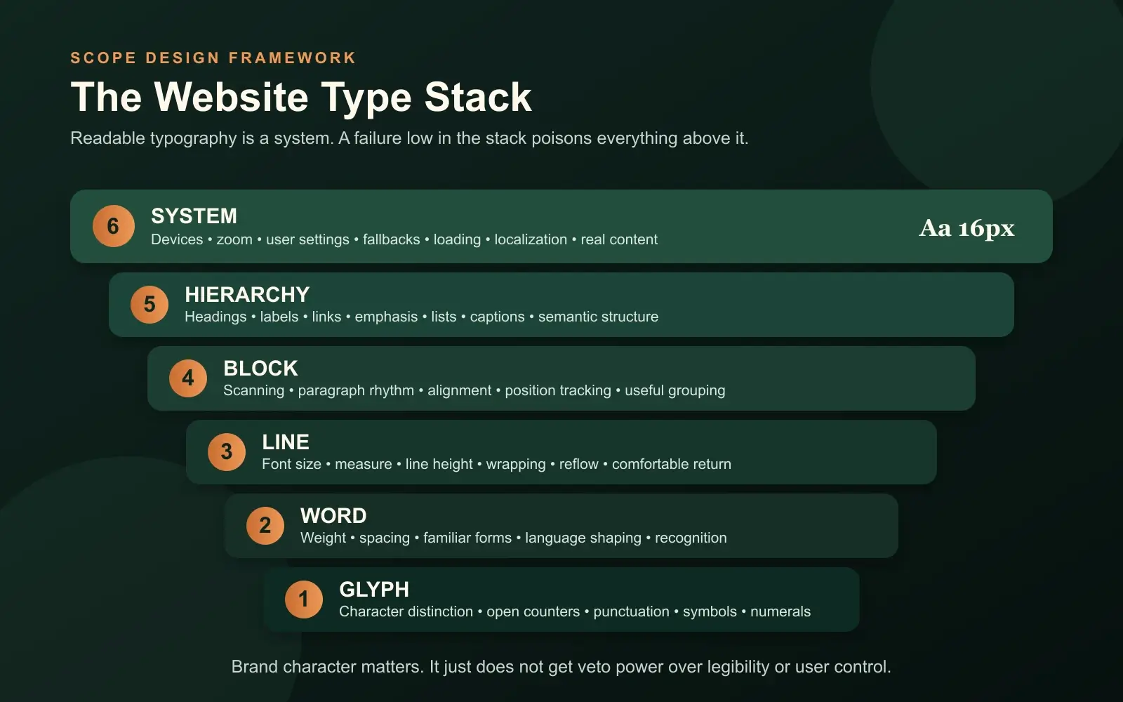
This stack prevents a common design mistake: arguing about a headline font while the body copy is too faint, the lines are 120 characters wide, the form errors are 12px gray, and the web font has not loaded yet.
Typography is interface infrastructure. Brand character matters, but character does not get veto power over legibility, accessibility, or completion. A beautiful typeface that nobody can read is not refined. It is decorative obstruction with a licensing fee.
A practical website font-size table
Use these values as starting ranges for common Latin-script business websites, then test the actual implementation.
| Content role | Practical starting range | What to verify |
|---|---|---|
| Body copy | 16–20px | sustained reading, x-height, line length, zoom, audience |
| Compact UI or navigation | 14–17px | clarity, contrast, control size, localization |
| Form labels and input text | 16–18px | zoom, errors, autocomplete, long labels, mobile input |
| Buttons | 16–18px | clear action label, weight, spacing, full control size |
| Captions and metadata | 13–16px | whether the text is genuinely secondary and still readable |
| H3 | 20–28px | distinction from body copy and H2 |
| H2 | 26–40px | section hierarchy, wrapping, narrow screens |
| H1 | 36–64px | comprehension, line breaks, viewport fit, actual title length |
These ranges are deliberately broad. A font with a small x-height may need more size. A dense dashboard may require a tighter scale than an editorial article. A short marketing headline can tolerate a larger display size than a 14-word technical heading. A Japanese, Arabic, Devanagari, or multilingual interface cannot be treated as Latin typography with different characters pasted in.
Start with a defensible system. Then use evidence, not vibes in a turtleneck.
Body text: start around 16–18px and adjust the whole reading system
Sixteen pixels remains a useful minimum starting point for many body-copy systems because it aligns with common browser defaults and gives readers a reasonable base. That does not make every 16px design readable. A thin font, faint contrast, long lines, tight leading, and tiny link differences can make 16px fail spectacularly.
For articles, detailed service explanations, pricing guidance, instructions, and other sustained reading, 18px is often a stronger starting point. Twenty pixels can work well when the typeface, column width, and content support it. Larger text is not automatically more readable either: oversized body copy creates short, choppy lines on narrow screens and can make dense information harder to compare.
Evaluate body copy as a package:
- Size: Is the text visibly comfortable without requiring immediate zoom?
- Measure: Can the eye move from the end of one line to the start of the next?
- Line height: Do lines feel separated without floating apart?
- Weight: Do strokes remain visible on real screens and in glare?
- Contrast: Does the text stand apart from the actual background?
- Paragraph rhythm: Can the reader identify blocks and changes in thought?
- Links and emphasis: Are they distinguishable without relying only on color?
- Content: Does the writing deserve to be read, or is typography being asked to disguise a paragraph that says nothing?
Our content-readability guide owns the writing and structure side of that last question. Font size cannot rescue corporate fog. It can only make the fog larger.
Headings: build hierarchy, not a monument
Heading sizes should reveal the structure of the page. The H1 identifies the main subject. H2s divide major sections. H3s explain subsections. Their HTML levels should represent that structure even when the visual design varies.
A useful heading system has clear steps between levels, but the ratio does not need to be mathematically identical. Display type often needs optical correction. A very bold font may look larger than the numbers imply. An all-caps label may need different spacing. A long H2 may need a lower maximum size than a short hero headline.
Use fluid sizing when it improves the transition between narrow and wide layouts:
:root {
  --font-body: 1.125rem;
  --font-h3: clamp(1.25rem, 1.1rem + 0.7vw, 1.75rem);
  --font-h2: clamp(1.75rem, 1.35rem + 1.6vw, 2.75rem);
  --font-h1: clamp(2.25rem, 1.6rem + 3vw, 4rem);
}
clamp() sets a minimum, a fluid preferred value, and a maximum. MDN’s clamp documentation explains the function and its use for font sizing. The minimum and maximum still need to work with real titles. “Our Services” and “What Separates a Basic Website From a Serious Business Website?” are not the same layout problem.
Avoid pure viewport-unit typography such as font-size: 5vw with no floor or ceiling. It can become microscopic on small screens, absurd on large ones, and hostile to user zoom. The W3C’s Resize Text guidance specifically identifies incorrect viewport-unit resizing as a common failure risk.
Form labels, buttons, errors, and the text businesses love to shrink
Typography becomes operational when a person must complete something.
Labels, required-field instructions, input values, validation messages, prices, eligibility rules, shipping details, consent text, and confirmation messages are not decorative supporting actors. They determine whether somebody can finish the task and whether the business receives usable information.
Do not shrink legally or operationally important text because the layout “feels cleaner.” Clean for whom? The person who designed the comp at 150% scale on a 32-inch monitor?
For forms and controls:
- keep labels visible rather than relying on disappearing placeholder text;
- use readable text inside inputs, selects, date pickers, and buttons;
- give errors enough contrast and space to wrap;
- pair color changes with text, icons, or other understandable signals;
- allow labels and controls to grow at 200% without clipping;
- test long names, addresses, translated labels, validation details, and autofill;
- make the entire control appropriately sized, not just the letters inside it;
- state what happens after submission.
The Scope Design UX pillar places typography inside the complete decision path. People must recognize, understand, trust, choose, act, and recover. Tiny errors and clipped labels break the path even if the homepage headline is magnificent.
Line length: control the reading distance
Line length is also called measure. For sustained Latin-script reading, roughly 45–80 characters per line is a useful working range. Shorter lines can suit compact instructions or narrow interfaces. Longer lines may work in tables, code, or specialized layouts where two-dimensional relationships matter.
The important test is whether readers can track the line comfortably and return to the correct starting point. The U.S. Web Design System explains that controlling line length helps attention move naturally from one line to the next. WCAG’s Visual Presentation criterion, which is Level AAA, includes a mechanism for limiting blocks of text to 80 characters or glyphs, or 40 for CJK scripts.
Do not misstate that AAA criterion as a universal AA requirement. It is useful design guidance and an accessibility outcome to understand, not permission to write a fake legal rule.
A practical CSS limit:
.article-copy {
  max-inline-size: 68ch;
}
The ch unit is based on the advance measure of the “0” glyph, so it is an approximation rather than a precise character counter. That is fine. The goal is a readable column, not a forensic investigation into line 37.
Line height and paragraph spacing: give the text somewhere to breathe
Body-copy line height often lands between 1.45 and 1.7. Larger display headings commonly need tighter leading because the letters already occupy more visual space. Small text, long lines, or typefaces with tall ascenders and descenders may need more.
Avoid fixed pixel heights on text containers. They are a reliable way to clip translated, zoomed, or user-spaced text.
WCAG 2.2 Text Spacing does not require every website to ship with a 1.5 line height, 2em paragraph spacing, 0.12em letter spacing, and 0.16em word spacing. It requires content to survive when a user overrides the author’s presentation to those values without losing content or functionality. That distinction matters.
Use unitless line height so it scales with the element’s font size:
body {
  font-size: 1.125rem;
  line-height: 1.6;
}

p + p {
  margin-block-start: 1em;
}
Then test overrides. Do headings collide? Do buttons clip? Do cards with fixed heights eat their last line? Does a navigation label disappear? Accessibility testing is where elegant little boxes meet actual words.
Alignment, emphasis, and scanability
For left-to-right languages, left-aligned body text is usually easier to scan than fully justified text. Full justification changes word spacing and can create visible rivers through paragraphs. Centered text can work for short headings or compact statements; it becomes tiring for long copy because every line begins in a different place.
Use bold weight selectively to create emphasis. If everything is bold, the page has no hierarchy; it merely sounds like it is shouting from several rooms at once.
Avoid long passages in italics, all caps, or condensed display faces. They can work as accents, labels, or brand moments, but sustained reading needs distinguishable, familiar forms and enough spacing.
Underline links in body copy or provide another strong, consistent cue beyond color alone. A beautiful muted blue that nobody recognizes as interactive is not subtle. It is hiding the exit.
Accessible font size: what WCAG and the ADA actually require
Neither WCAG nor Section 508 specifies a universal minimum typeface or pixel size for ordinary web content. Section508.gov states that directly. The ADA does not hand web designers a magic “16px” rule either.
That does not mean size is irrelevant. It means accessibility is judged through outcomes and requirements broader than a single number.
For typography, key WCAG 2.2 considerations include:
- Contrast Minimum, 1.4.3, Level AA: ordinary text needs at least 4.5:1 contrast; large-scale text needs at least 3:1. The W3C’s contrast explanation defines large-scale text and warns that thin or unusual fonts can appear fainter in practice.
- Resize Text, 1.4.4, Level AA: text must resize to 200% without loss of content or functionality.
- Reflow, 1.4.10, Level AA: most content must work at a width equivalent to 320 CSS pixels without requiring two-dimensional scrolling. Some content, such as data tables and diagrams, has a meaningful two-dimensional exception.
- Text Spacing, 1.4.12, Level AA: user spacing overrides must not cause lost content or functionality.
- Images of Text, 1.4.5, Level AA: use real text instead of images of text when the visual presentation can be achieved with available technologies, subject to the criterion’s exceptions.
- Info and Relationships, 1.3.1, Level A: visual structure such as headings and lists also needs programmatic structure.
Sixteen pixels is a sensible baseline recommendation for many websites because it gives the design a fighting chance. It is not proof of conformance. A 16px sentence can still fail through weak contrast, clipping, poor reflow, inaccessible structure, or a container that breaks when the user changes spacing.
Our website-accessibility guide covers the broader evaluation process. Typography is one part of access, not the entire legal department compressed into a font-size dropdown.
Is 12px too small for a website?
For important body copy, instructions, labels, form input, prices, and error messages, 12px is usually too small to use as the default. It creates unnecessary difficulty for many readers and leaves little room for imperfect screens, viewing distance, glare, low vision, or a typeface that renders small.
Twelve pixels can appear in genuinely secondary metadata or dense specialist interfaces if the context supports it, contrast is strong, zoom works, and users are not forced to decode essential information at that size. Even then, ask why it must be 12px. “The card component is too short” is a layout confession, not a user need.
If the information changes a decision, establishes a requirement, explains an error, or protects the user, do not hide it in mouse-print and congratulate the layout on its cleanliness.
Serif, sans serif, and the myth of the morally superior typeface
Serif and sans-serif typefaces can both be highly readable. Legibility depends more on the specific design, size, weight, spacing, contrast, rendering, language, and context than on the presence of serifs alone.
Choose a body typeface with:
- open, distinguishable letterforms;
- clear differences among characters such as
I,l, and1; - enough weights for the hierarchy without loading a small family reunion;
- useful punctuation, symbols, numerals, and language coverage;
- strong rendering at the sizes and platforms that matter;
- fallback metrics that can be matched reasonably;
- a license and delivery method the organization can maintain.
Use display faces where their personality helps recognition and brand character. Keep them out of sustained reading when their novelty slows decoding.
Font psychology is often presented as a lookup table: serif equals trustworthy, geometric sans equals modern, script equals luxury. Context and learned association can influence perception, but those tables are not universal laws. The same typeface can feel established on a financial report, theatrical on a restaurant menu, or dated on a software product. Meaning comes from the complete visual and verbal system.
Do not ask the typeface to perform brand strategy alone. That is an unreasonable amount of emotional labor for a set of glyphs.
Is there a dyslexia-friendly font?
There is no single typeface guaranteed to work best for every person with dyslexia. Specialized fonts may help some readers and make little difference for others. Familiarity, letter distinction, spacing, line length, contrast, layout, language, and user control all matter.
Build flexibility instead of declaring a mascot font:
- choose distinguishable letterforms;
- avoid long italic or all-cap passages;
- use clear headings and short, meaningful sections;
- allow zoom and spacing changes;
- avoid justified paragraphs;
- keep line lengths manageable;
- preserve browser and operating-system preferences;
- test with people who use the experience.
Accessibility is not accomplished by installing a font called “Accessible” and going home early.
Responsive typography: adapt the system, not just the number
Mobile type should not automatically be smaller than desktop type. The screen is narrower, the device may be closer, the context may be shakier, and the reader may be dealing with glare or motion. Those factors push in different directions.
A responsive type system adapts:
- font size within sensible limits;
- column width and margins;
- heading wrap and line breaks;
- navigation and control layout;
- table and code presentation;
- spacing around sections;
- the amount and order of secondary information.
The W3C Reflow criterion explains why people should not have to scroll back and forth to read ordinary text at the 320 CSS-pixel equivalent. A responsive layout benefits mobile users and people who zoom a desktop viewport.
Do not disable zoom. Do not use fixed heights around live text. Do not shrink headings until they technically fit while destroying the hierarchy. Let text wrap. Rewrite a bad label when necessary. Change the layout before blaming the reader’s settings.
Web-font performance: the text has to arrive
Web fonts can delay text rendering, affect Largest Contentful Paint, and create layout shifts when the fallback and final fonts occupy different space. web.dev’s font best practices covers the relationship among font loading, delivery, rendering, and Core Web Vitals.
Use a small, intentional font set:
- load only the families, styles, weights, and character sets the site uses;
- prefer WOFF2 for modern delivery;
- subset carefully when language coverage is known and maintained;
- self-host when it improves control and the licensing permits it;
- preload only fonts needed immediately—preloading everything is just moving the traffic jam;
- use
font-displaydeliberately; - provide a fallback stack;
- match fallback metrics where practical to reduce layout shift;
- cache font files with appropriate versioning;
- test the first visit, not only a warm-cache victory lap.
MDN documents font-display and its values. swap displays fallback text quickly and swaps when the web font arrives, but the swap can move the layout if metrics differ. optional can avoid a late swap under some conditions, but it may mean the custom font does not appear during that visit. Choose based on the content and brand dependency.
@font-face {
  font-family: "Scope Sans";
  src: url("/fonts/scope-sans-regular.woff2") format("woff2");
  font-style: normal;
  font-weight: 400;
  font-display: swap;
}
Our web-development and performance pillar owns the deeper delivery work. The typography rule is simple: text that remains invisible is not on brand, and text that jumps after the visitor starts reading is not particularly gracious.
A practical CSS typography foundation
This is a starting system, not drop-in proof of accessibility:
:root {
  font-size: 100%;
  --text-body: clamp(1rem, 0.95rem + 0.25vw, 1.125rem);
  --text-small: 0.875rem;
  --text-h3: clamp(1.25rem, 1.1rem + 0.7vw, 1.75rem);
  --text-h2: clamp(1.75rem, 1.35rem + 1.6vw, 2.75rem);
  --text-h1: clamp(2.25rem, 1.6rem + 3vw, 4rem);
  --measure-reading: 68ch;
}

body {
  font-family: "Scope Sans", system-ui, sans-serif;
  font-size: var(--text-body);
  line-height: 1.6;
}

main p,
main li {
  max-inline-size: var(--measure-reading);
}

h1 {
  font-size: var(--text-h1);
  line-height: 1.05;
}

h2 {
  font-size: var(--text-h2);
  line-height: 1.15;
}

h3 {
  font-size: var(--text-h3);
  line-height: 1.25;
}

small,
.meta {
  font-size: var(--text-small);
}
Why these choices:
100%respects the browser’s root-size baseline.rem-based values create a coherent root-relative scale.clamp()lets selected sizes respond within tested limits.- unitless line height inherits proportionally.
chconstrains sustained reading measure.- system fallbacks make text available while the brand font loads.
Then comes the part people skip: test it with the actual theme, content, languages, browser settings, components, and devices. CSS copied from an article does not know what your navigation does in German.
How to test website typography
Use this sequence:
- Read the page at 100% without designer context. Can you identify the subject, hierarchy, important details, links, and next action?
- Check representative devices and browsers. Include a narrow phone viewport, a common laptop, and a larger display.
- Zoom text to 200%. Look for clipping, overlap, hidden controls, lost labels, and broken navigation.
- Check reflow at 320 CSS pixels. Ordinary content should not require back-and-forth scrolling.
- Apply WCAG text-spacing overrides. Confirm that content and controls remain available.
- Test contrast using the actual foreground, background, weight, and state.
- Turn off the web font or throttle the network. Confirm that fallback text appears and the final font does not cause disruptive shifts.
- Try real titles, errors, prices, addresses, names, and translations. Placeholder Latin is an unusually cooperative customer.
- Use keyboard and assistive technology. Visual hierarchy should align with semantic structure.
- Observe representative readers. Ask them to complete realistic tasks and explain where they hesitate.
The website-strategy pillar explains why the task and business context come before the deliverable. Typography testing should connect to a real job: understand a service, compare options, complete an application, read instructions, or recover from an error.
Do not declare a typography win because the homepage looks nicer in a presentation. Verify that people can use it.
Frequently asked questions about website font size
What is the best font size for a website?
Start body copy around 16–18px and increase it when the typeface, reading task, audience, or environment needs more. Evaluate size with line length, line height, weight, contrast, zoom, and device context. There is no universal best number.
Is 16px always the correct body font size?
No. Sixteen pixels is a practical baseline for many websites, not a guaranteed optimum or legal requirement. Some typefaces look small at 16px; sustained reading or older audiences may benefit from 18–20px. Dense interfaces may use smaller supporting text while preserving readability and zoom.
Is 12px too small for a website?
It is usually too small for essential body copy, labels, instructions, errors, pricing, and consent language. It may work for genuinely secondary metadata in a carefully tested context, but important information should not be hidden at 12px to protect a cramped layout.
What font size does WCAG or the ADA require?
WCAG does not specify a universal minimum pixel size for ordinary web text, and the ADA does not provide a magic website-font number. WCAG requires outcomes including sufficient contrast, 200% text resizing, reflow, and resilience to text-spacing overrides.
What is an accessible font size?
An accessible size is large enough for the intended readers and works as part of a system that supports contrast, zoom, reflow, spacing changes, clear structure, and user preferences. Sixteen pixels is a common baseline, but accessibility cannot be proved by font size alone.
Should mobile text be smaller than desktop text?
Not automatically. Mobile screens are narrower and often used in glare, motion, or distracted conditions. Body text may remain the same size while the column, spacing, headings, and layout adapt. Test the complete reading experience instead of applying a desktop-minus-two-pixels formula.
Should website font sizes use px, em, or rem?
rem is a strong default for a consistent root-relative type system, while em is useful when a component should scale from its local context. CSS pixels can still participate in accessible designs because browser zoom scales them, but fixed assumptions around text and containers can break user resizing. Test outcomes rather than treating one unit as holy.
What line height should website body text use?
About 1.45–1.7 is a useful starting range for many body typefaces. Adjust for font design, size, line length, language, and content density. Use unitless line height and verify that user spacing overrides do not clip or overlap content.
How long should a line of website text be?
Roughly 45–80 characters is a useful range for sustained Latin-script reading. The best measure depends on font size, typeface, line height, language, and task. Control the reading column and watch whether readers can return to the next line comfortably.
How many fonts should a website use?
Use as few families and weights as the hierarchy genuinely needs. One well-designed family can handle an entire site. Two can create useful contrast between display and reading roles. More families add visual complexity, files, maintenance, and opportunities for the page to resemble a ransom note.
Are serif or sans-serif fonts more readable?
Both can be readable. The specific letterforms, size, weight, spacing, contrast, rendering, familiarity, and context matter more than the category alone. Test the actual typeface with the actual audience and content.
Is there one dyslexia-friendly font?
No single font works best for everyone with dyslexia. Distinguishable letterforms, manageable line length, clear structure, spacing, alignment, zoom, and user control are more responsible than claiming a specialized font solves dyslexia universally.
Do web fonts hurt page speed or SEO?
They can delay rendering, affect Largest Contentful Paint, and create layout shifts if poorly delivered. Search visibility is affected indirectly when performance and usability suffer. Limit files and weights, use WOFF2, strong fallbacks, suitable caching, and an intentional font-display strategy.
How should headings scale?
Headings should create an obvious hierarchy and fit real content at narrow and wide widths. Use tested minimum and maximum sizes, often with clamp(), and adjust line height as headings grow. Do not rely on a universal ratio or pure viewport units.
How do I test website typography?
Test real pages at 100% and 200% zoom, at the 320 CSS-pixel reflow equivalent, with WCAG spacing overrides, real devices, slow font loading, fallback fonts, long content, translations, keyboard navigation, assistive technology, and representative users performing actual tasks.
Make the words usable before calling the site beautiful
Website typography is not a finishing touch. It decides whether the message can be perceived, scanned, understood, and used.
Start with a practical size. Build the glyphs, words, lines, blocks, hierarchy, and system around real readers. Preserve user control. Load the type responsibly. Test the ugly edge cases. Then give the brand a voice people can actually read.
If your typography looks expensive but behaves like a tiny gray obstacle course, talk with Scope Design. We will fix the reading system, not merely make the font picker feel important.

