

UI is what people see and interact with. UX is what happens when they try to accomplish something. On a website, UI includes the buttons, type, colors, menus, fields, icons, and feedback states. UX includes whether the right person can find the page, understand the offer, trust the evidence, complete the task, recover from a mistake, and get the result they were promised.
A gorgeous button is UI. Whether anyone can find it, knows what it does, can use it with a keyboard, gets an error when the form fails, and receives a response after clicking it is UX.
That distinction matters because “we need better UI/UX” is often professional-sounding fog. Your actual problem may be strategy, content, accessibility, development, performance, or a sales process that treats qualified inquiries like decorative inbox clutter. Repainting the button will not fix any of those.
TL;DR: UI and UX Are Related, Not Interchangeable
- User interface (UI) is the presentation and interaction layer: layout, visual hierarchy, typography, controls, states, and feedback.
- User experience (UX) is the broader experience of pursuing a goal across the website and the surrounding business system.
- A site can have attractive UI and terrible UX. It can also have plain UI and work remarkably well.
- UX is not a synonym for conversion optimization. A usable experience cannot create demand for a bad offer or close a sale your team never follows up on.
- Accessibility overlaps with UI and UX but has distinct technical and human requirements. Calling something “good UX” does not prove it is accessible.
- Diagnose the failing layer before commissioning a redesign. Otherwise, you are buying prettier uncertainty.
Use the Scope Design Website Failure Stack to find the real problem: business decision, information, task path, interface, implementation, access, and evidence. UX is what a person experiences when all seven layers collide with reality.
What Is the Difference Between UI and UX?
What is UI?
User interface design determines how a digital product presents information, accepts input, and communicates its state. On a business website, that includes:
- page layout and visual hierarchy;
- typography, color, spacing, and imagery;
- navigation, buttons, links, forms, filters, and search;
- hover, focus, selected, loading, success, warning, and error states;
- responsive behavior across screen sizes;
- patterns that make similar actions look and behave consistently.
UI is not merely “make it pretty.” A skilled interface designer decides what deserves attention, which elements are interactive, how the system communicates cause and effect, and how much visual effort a person must spend to interpret the page.
Graphic design contributes to the interface, but the interface also has behavior. A brand color palette is visual design. A button that visibly responds to keyboard focus, becomes disabled while a payment is processing, and clearly reports success or failure is interface design.
What is UX?
User experience is the broader result of interacting with the company, its services, and its products while trying to meet a need. That is close to the durable definition from the Nielsen Norman Group, which also warns that UI is only one part of the total experience.
For a website, UX includes questions such as:
- Did the person arrive with the problem this page solves?
- Can they tell what the business offers and whether it is for them?
- Is the information organized around their decision rather than the company org chart?
- Can they compare options and resolve reasonable doubts?
- Can they complete the intended task on their device and with the tools they use?
- If something goes wrong, can they understand and recover?
- Does the company deliver the response or service the website promised?
UX therefore crosses research, strategy, information architecture, content, interface design, accessibility, development, operations, and measurement. That does not mean one “UX person” secretly performs every discipline. It means the customer experiences the combined result, including the parts your project plan politely assigned to someone else.
The shortest useful comparison
| Question | UI | UX |
|---|---|---|
| Primary concern | How the interface presents, behaves, and communicates | Whether a person can achieve the intended goal across the experience |
| Typical elements | Layout, type, color, controls, states, icons, feedback | Research, task flow, information, usability, trust, accessibility, service handoff |
| Common evidence | Visual review, consistency audit, interaction states, prototype evaluation | Task observation, interviews, analytics, errors, support and sales feedback, outcomes |
| Typical failure | An action is hard to see, interpret, or operate | The person cannot understand, complete, trust, or recover from the journey |
| Relationship | UI is an important part of UX | UX is the experienced result of UI plus the rest of the system |
UI and UX Examples
Consider an appointment form for a professional service.
The UI includes the calendar layout, readable labels, field spacing, selected-date state, button styling, validation messages, focus indicator, and confirmation screen.
The UX includes whether the visitor knows which appointment type to choose, sees the information needed before committing, can find an available time, understands timezone and cancellation terms, completes the form without unnecessary questions, receives a trustworthy confirmation, and gets the promised follow-up.
Now imagine the form is visually beautiful, but:
- the service descriptions are vague;
- every appointment type sounds the same;
- the calendar has no mobile availability for six weeks;
- an error deletes all entered information;
- keyboard users cannot select a time;
- the confirmation email goes to spam;
- nobody on the business side checks the booking calendar.
That is polished UI sitting inside a lousy experience. The gradient did its best. It was simply outnumbered.
The reverse can also happen. A plain government or utility form may look dated but use clear labels, sensible sequencing, saved progress, specific error messages, and an immediate receipt. Its UI could use refinement while its core task experience is sound.
The Scope Design Website Failure Stack
When a website underperforms, teams often point at the visible layer because it is the easiest thing to see. That is how businesses end up buying a redesign when the offer, content, code, or follow-up process was broken.
Use this stack from the top down. Upstream failures distort the evidence beneath them.
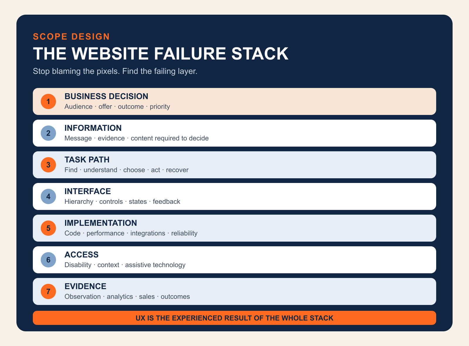
1. Business decision
What is the website supposed to help which audience do, and why should that action matter to the business?
This layer includes audience priority, positioning, offer, commercial outcome, qualification, and the role the website plays in acquisition or service. If the project has five equal audiences and nine equally urgent calls to action, the interface did not create the indecision. It inherited it.
This is the territory of website strategy: determining the job before arguing about the curtains.
2. Information
What must a person understand, compare, and believe before taking the next step?
This layer includes message, page hierarchy, explanations, evidence, pricing context, risks, objections, and readable content. If the headline says “Transforming Tomorrow Through Innovative Excellence,” the UI designer can make the type enormous, but the sentence will remain a beautifully typeset refusal to communicate.
Our guide to design versus content explains how the message and its presentation hand work to each other. The website readability guide goes deeper on making that information understandable and scannable.
3. Task path
What sequence helps a person recognize the right option, understand it, choose, act, and recover?
This is the most familiar UX-design layer: navigation, information architecture, task flows, progressive disclosure, forms, checkout, account creation, search, and recovery. A task path should reflect what the person is trying to accomplish, not the departments that attended the kickoff meeting.
4. Interface
How does the screen make the structure and available actions perceptible?
This is the UI layer: visual hierarchy, layout, controls, states, typography, color, iconography, responsive patterns, and feedback. The interface should make important differences obvious without turning the page into a casino carpet.
5. Implementation
Does the built system faithfully and reliably perform the intended design?
This layer includes semantic markup, responsive code, integrations, form delivery, data handling, browser behavior, reliability, and performance. A prototype can test beautifully and still become miserable when the production form times out or a script shifts the button as someone tries to click it.
Google’s Web Vitals guidance treats loading, interactivity, and visual stability as measurable aspects of experience. Those signals matter, but they are engineering evidence—not a complete UX score. A fast page can still say nothing useful, and a perfect lab score cannot confirm that the sales team answered the inquiry.
For the engineering side, see our web development and performance pillar.
6. Access
Can people with disabilities and people operating in varied real-world contexts perceive, understand, navigate, and interact with the experience?
Accessibility overlaps with UI and UX, but it is not automatically satisfied by either label. The W3C Web Accessibility Initiative explains that accessibility includes underlying technical requirements as well as visual and interaction requirements. It also makes an important point: user involvement alone cannot cover the full diversity of disabilities and assistive technologies, while standards alone can miss the human interaction.
That means “our designer thought it was usable” is not accessibility evidence. Neither is “the automated checker was green.” Our website accessibility guide explains the mixed evaluation required.
Access is shown as a layer for diagnosis, but it is also a condition across every other layer. An inaccessible task is not a good experience with a minor compliance footnote. It is a task some people cannot complete.
7. Evidence
How will the team know where people succeed, hesitate, fail, abandon, complain, qualify, buy, or return?
Evidence includes analytics, form errors, search queries, support questions, sales-call confusion, usability observation, accessibility evaluation, interviews, and downstream business outcomes. None is sufficient alone.
Analytics can show where something happened, not reliably explain why. Interviews reveal perception, not always behavior. A heatmap shows that people clicked, not whether the click solved their problem. Sales feedback can expose poor fit or recurring objections, but it can also reflect a broken follow-up process. The point is triangulation, not worshipping whichever dashboard has the nicest gradient.
How to Diagnose What Is Broken
Start with the symptom, then identify the earliest failing layer that could produce it.
| Observed symptom | Likely layer to inspect first | What to verify |
|---|---|---|
| Visitors cannot explain what the business does | Business decision or information | audience priority, offer, headline, message hierarchy |
| The right people understand the offer but do not value it | Offer, evidence, or sales positioning | objections, comparisons, proof, price-to-value logic |
| People repeatedly get lost or choose the wrong route | Task path | navigation labels, information architecture, sequence, recovery |
| People miss actions or mistake text for controls | Interface | hierarchy, affordance, states, contrast, consistency |
| A form works in a prototype but fails on real devices | Implementation | validation, integrations, browsers, performance, delivery |
| Keyboard or screen-reader users cannot complete the task | Access and implementation | semantic structure, focus, labels, instructions, errors, testing |
| The page gets little qualified traffic | Acquisition or search intent | query and channel alignment, distribution, audience fit |
| Leads arrive but nobody responds promptly | Operations | routing, ownership, notifications, response process |
| The team debates taste because nobody knows what happened | Evidence | outcome definition, instrumentation, observation, feedback |
Diagnose in that order whenever possible. If almost no relevant people reach the page, conversion data will be noisy. If the form is broken, messaging tests are contaminated. If traffic is unqualified, improving completion may simply produce more efficiently processed junk.
This is also why a broad “UX audit” can become a decorative PDF. The audit must connect observed problems to representative tasks, business consequences, and an owner who can fix the responsible layer.
When Better UI Is the Right Fix
UI work is likely appropriate when the structure and content are sound, but the presentation or interaction makes them difficult to perceive or operate.
Typical UI problems include:
- weak hierarchy makes every element look equally important;
- interactive elements do not look interactive;
- similar controls behave inconsistently;
- important states such as loading, error, success, or disabled are missing;
- typography or spacing makes useful content exhausting to read;
- responsive layouts obscure the intended priority;
- focus, hover, selected, and error states are unclear;
- dense visual styling adds noise without adding meaning.
The fix may involve a component system, clearer hierarchy, better responsive rules, explicit interaction states, more disciplined typography, or a visual redesign. But the brief should identify the specific interaction or comprehension problem. “Make it pop” is not a problem statement. It is how a meeting asks to become three more meetings.
When UX Work Is the Right Fix
UX work is likely appropriate when people have a meaningful goal but the structure of the experience makes success uncertain, inefficient, or frustrating.
Typical UX problems include:
- navigation reflects internal departments rather than customer intent;
- important information appears after the decision that requires it;
- forms ask for data the business does not need yet;
- choices are difficult to compare;
- users cannot tell what happens next;
- error recovery forces people to start over;
- mobile tasks require impractical precision or excessive steps;
- support and sales repeatedly answer questions the site should address;
- the digital handoff and the actual service contradict each other.
Appropriate work may include research, task analysis, information architecture, journey mapping, prototypes, content design, usability testing, service-process changes, or interface changes. The deliverable depends on the diagnosed constraint.
Our broader UX diagnosis and user-centered design guide covers how to identify and prioritize those experience failures.
When the Problem Is Neither UI nor UX
Sometimes the website is being blamed because it is visible and available for criticism.
The traffic is missing or wrong
A clear, usable page cannot convert people who never arrive. Nor can it rescue traffic generated by a misleading ad or an irrelevant search query. Segment the audience by source, landing page, and intent before rewriting the button.
The offer is weak
If qualified prospects understand the offer, navigate successfully, and consistently reject the value, the problem may be price, risk, timing, differentiation, or the offer itself. Better usability makes the rejection easier. That is not the lift the quarterly report had in mind.
The content is evasive
People cannot decide without useful information. Hiding price context, constraints, drawbacks, process, comparisons, or proof does not remove those questions. It leaves the visitor to answer them pessimistically.
The technology is broken
Lost form submissions, slow responses, layout shifts, failed integrations, browser bugs, and unreliable email delivery are implementation problems with UX consequences. Fix the system, not the mockup.
The business drops the handoff
The website produces a qualified inquiry. The notification goes to an abandoned inbox. Two days later, someone sends “just checking whether you still need help.” That is not a UI problem. It is the business mugging its own marketing in the parking lot.
How to Evaluate UI and UX Without Making Up Certainty
Observe representative people performing representative tasks
The core of usability testing is gloriously unsexy: recruit people who resemble the intended audience, give them realistic tasks, and observe where they succeed or struggle without coaching them through the interface. The Nielsen Norman Group’s usability introduction frames usability through learnability, efficiency, memorability, errors, and satisfaction and recommends repeated testing throughout design.
Do not ask, “Do you like this page?” Ask someone to determine whether a service fits their situation, find the relevant evidence, choose an option, submit the form, and explain what they expect to happen next.
Review the built interface, not only the design file
Check real devices and browsers. Use keyboard navigation. Enlarge text. Trigger validation errors. Use slow network conditions. Test interrupted and failed states. Confirm that form submissions arrive and confirmations are sent. A pristine design file is not the product customers use.
Pair behavior with business evidence
Connect page behavior to qualified outcomes:
- Which sources produce people with the problem you solve?
- Which tasks predict a useful sales conversation or successful self-service outcome?
- Where do valid prospects stop?
- What do sales and support repeatedly have to explain?
- Which errors or questions signal confusion?
- What happens after the website action?
Sessions, clicks, scroll depth, bounce rate, and time on page are diagnostic signals, not business outcomes. A person who finds the phone number in ten seconds may be more successful than someone who spends six minutes trapped in your “immersive brand journey.”
Use field and lab performance data correctly
Lab tests help reproduce and debug performance problems under controlled conditions. Field data shows what eligible real users experienced over time. Neither tells you whether they understood the offer or trusted the business. Use performance data to diagnose the implementation layer, then combine it with task and outcome evidence.
Prioritize by harm, reach, and leverage
Fix failures that block important tasks, exclude people, corrupt data, or destroy trust before polishing minor inconsistencies. Then consider how many people encounter the problem, how severe the consequence is, and whether fixing an upstream issue resolves several downstream symptoms.
Who Should You Hire: A UI Designer, UX Designer, Web Designer, or Developer?
Hire for the diagnosed problem, not the trendiest job title.
| Need | Likely lead discipline |
|---|---|
| Visual hierarchy, component styling, interaction states, responsive interface | UI or product designer |
| Research, task flows, information architecture, prototypes, usability testing | UX designer or researcher |
| Messaging, page narrative, explanations, evidence, readability | Content strategist or web copywriter |
| Positioning, audience priority, offer, conversion architecture | Website strategist |
| Semantic implementation, performance, integrations, reliability | Web developer or engineer |
| Standards review plus disabled-user evaluation | Accessibility specialist working with design and development |
| A business website where all of these interact | A multidisciplinary web team with clear ownership |
A capable web designer may cover UI, portions of UX, and visual communication. A capable developer may make excellent usability contributions. Titles overlap. Evidence matters more than labels: ask what the person will investigate, which decisions they own, how they test them, and what they do when the requested redesign is not the real fix.
Our guide to what website design actually includes maps those responsibilities in more detail.
A Better Brief Than “Improve the UI/UX”
Replace the fog with a brief like this:
Qualified visitors reach the service page from organic search, but many contact sales asking what the three service levels include. On mobile usability sessions, participants open multiple tabs and still cannot compare the options. We need to verify the information requirements, redesign the comparison task, implement it accessibly, and measure whether qualified visitors can choose the correct next step without assistance.
That brief identifies the audience, observed problem, task, evidence, likely disciplines, implementation requirement, and desired outcome. It may produce content, UX, UI, accessibility, and development work. More importantly, it gives the team something better to discuss than whether the blue feels “premium enough.”
If you need help determining which layer is actually failing, talk to Scope Design. We would rather diagnose the constraint than sell you a handsome redesign of the wrong problem.
Frequently Asked Questions
What is the basic difference between UI and UX?
UI is the presentation and interaction layer of a digital product: layout, visual hierarchy, controls, and feedback. UX is the broader experience a person has while trying to achieve a goal across the interface, content, technology, and surrounding service.
What are examples of UI and UX?
A checkout button’s size, label, color, focus state, and loading state are UI. Whether a buyer can choose the right product, understand the total cost, complete payment, recover from an error, and receive the order confirmation is UX.
Is web design UI or UX?
Web design can include UI and portions of UX, but the label is broad. Some web designers focus mostly on visual presentation; others handle research, information architecture, content structure, accessibility, and testing. Ask what the actual process and responsibilities include.
Which comes first, UI or UX?
The business purpose, audience, information requirements, and core task should be understood before polishing the interface. UI and UX still develop iteratively: interface prototypes reveal experience problems, and testing changes both the flow and presentation.
Can a website have good UI but bad UX?
Yes. A site can look consistent and sophisticated while hiding important information, using a confusing task flow, failing accessibility requirements, breaking on real devices, or neglecting the customer after submission.
Can a website have good UX but unattractive UI?
It can have a useful core task experience despite dated or plain visual styling. However, unclear hierarchy, poor typography, weak interaction states, and inconsistent controls eventually affect usability and trust. “It works” is a baseline, not an excuse for visual neglect.
Is accessibility part of UX or UI?
Accessibility overlaps both and also has distinct requirements. Visual contrast and control states involve UI; task completion and error recovery involve UX; semantic code and assistive-technology support involve implementation. Accessibility needs standards-based evaluation and involvement from people with disabilities.
Does page speed affect UX?
Yes. Slow loading, delayed interaction, and shifting layouts can prevent or disrupt tasks. Performance is one contributor to UX, not a complete measure of it. A fast website can still be confusing, irrelevant, or inaccessible.
Why is my attractive website not converting?
Appearance is only one layer. The site may have the wrong traffic, an unclear offer, missing evidence, weak content, a confusing task path, technical failures, accessibility barriers, or poor sales follow-up. Diagnose the earliest failing layer before changing the visual design.
How do you measure website UX?
Use a combination of representative-task testing, completion and error evidence, accessibility evaluation, analytics, performance data, support and sales feedback, and downstream business outcomes. No single “UX score” explains the whole experience.
Do small business websites need UX research?
They need evidence from the people and tasks that matter, but not necessarily a giant research program. A few carefully chosen interviews and observed task sessions, combined with real inquiries, analytics, and support questions, can expose more than an underpowered button-color test.
Should I redesign my website to improve UX?
Only when the diagnosis shows that the structure or interface requires broad change. Many problems can be fixed through content, navigation, forms, accessibility, performance, or operational repairs. A redesign is a delivery option, not a diagnosis.
Do I need both a UI designer and a UX designer?
Not always as separate people. You need both responsibilities covered at the depth the project requires. A small site may use one multidisciplinary designer with specialist support; a complex application may require dedicated research, UX, UI, content, accessibility, and engineering roles.
The Useful Answer
UI and UX are not rivals, synonyms, or magic conversion dust. UI is the part of the system people see and operate. UX is what they experience while pursuing a goal through that system.
The responsible question is not “Should we invest in UI or UX?” It is: Which layer is preventing the right person from reaching a useful outcome, what evidence proves it, and who owns fixing it?
Answer that first. Then you can decide whether you need a clearer message, a better task path, a stronger interface, more reliable code, improved accessibility, a repaired handoff—or, occasionally, the redesign everyone had already put in the budget.

