Author: scopedesign

  • Shareable Content: Give People Something Worth Forwarding

    Shareable Content: Give People Something Worth Forwarding

    Shareable content gives one person a credible reason to send something to someone specific. It helps the recipient understand, decide, avoid, feel, or do something useful. It also protects the sender’s reputation, because forwarding a piece of content is a tiny endorsement. If your only reason for wanting a share is “please give us free reach,” you do not have a shareability strategy. You have a digital panhandling problem.

    Scope Design TL;DR: Create for the handoff, not the algorithm. Name who would send the content, who should receive it, why the exchange helps both people, what makes the asset worth attaching a reputation to, and what useful next step follows. Then measure whether the share produced qualified attention or action. A big share count attached to the wrong audience is just a louder way to accomplish nothing.

    Shareable content belongs inside a complete content marketing system. It is not a substitute for positioning, original evidence, useful offers, distribution, or follow-up. Those little omissions are how a business gets a meme with a huge view count and absolutely no idea why the phone is still silent.

    What is shareable content?

    Shareable content is an article, video, graphic, tool, email, story, checklist, or other asset that gives someone a meaningful reason to pass it to another person. The transfer may happen through a public repost, a private message, an email, a team chat, a sales conversation, or a link dropped into a meeting note.

    The public share is only one version. For many small businesses, the most valuable handoff is private:

    • a manager sends a decision guide to the owner;
    • a customer texts a checklist to a friend;
    • a salesperson emails an article to the rest of a buying committee;
    • a client forwards a diagnostic to someone with the same problem;
    • an employee shares a process explanation with a prospect;
    • a partner includes a useful resource in a referral introduction.

    Those exchanges will not all produce a giant visible share counter. They may still be far more commercially useful than a burst of public attention from people who were never plausible customers.

    Shareable is not the same as viral

    Shareable content is deliberately designed to earn an interpersonal handoff. Viral content achieves unusually large or fast distribution, often through network effects that no creator fully controls.

    Something can be highly shareable inside a small, valuable community without going viral. A technical comparison forwarded among a handful of decision-makers may outperform a comedy clip seen by an enormous crowd of strangers. If the business needs broad distribution, our separate guide explains how to pursue virality without losing the plot. This article has a narrower job: make the individual handoff worth making.

    Shareable is not the same as repurposed

    Content repurposing changes a useful source asset for a different audience moment, channel, or decision. Shareability describes why one person would pass an asset to another. A repurposed checklist may become easier to share, but changing the format does not automatically make the idea worth forwarding.

    You can turn one weak article into a carousel, short video, email, and PDF. Congratulations. You now have weak content in a coordinated outfit.

    A share is a reputation handoff

    Every time someone forwards your content, they attach a little of their judgment to it. The recipient does not only evaluate the asset. They also make an inference about the sender:

    • This person understands my problem.
    • This person finds this funny.
    • This person believes this source.
    • This person wants me to know this.
    • This person thinks this reflects our values.
    • This person may be trying to sell me something.

    That is why a “Share this!” button cannot rescue content that is vague, embarrassing, dishonest, painfully promotional, or irrelevant. The button reduces mechanical friction. It does not create a reason for another human to put their name behind the thing.

    Research offers useful clues without producing a universal recipe. Berger and Milkman’s study of New York Times articles found that practical usefulness, surprise, interest, and high-arousal emotions were associated with greater transmission in that dataset. Their experiments also supported a causal role for arousal. That does not mean anger, awe, or anxiety is a magic share button on every platform. It means emotion and usefulness can affect whether people pass information along, and context still matters.

    Berger’s work also describes social currency, practical value, triggers, emotion, public observability, and stories as drivers of transmission. In a Penn interview about the research, he explains that people often share things that make them look informed, useful, or in the know.

    Scope Design’s practical translation is blunter: if sharing your content makes the sender look gullible, annoying, careless, or like an unpaid member of your sales team, the handoff is dead.

    The Scope Design FORWARD Test

    The FORWARD Test evaluates whether content deserves a handoff and whether that handoff can produce something useful for the business.
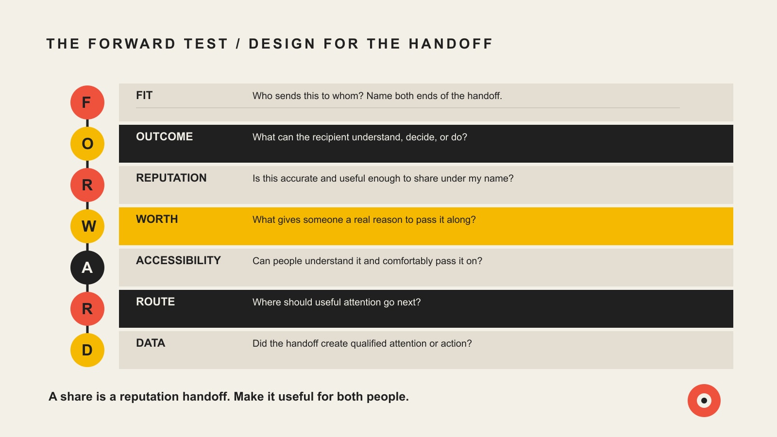
    The FORWARD Test checks Fit, Outcome, Reputation, Worth, Accessibility, Route, and Data for a useful content handoff.
    The Scope Design FORWARD Test for shareable content: Fit, Outcome, Reputation, Worth, Accessibility, Route, and Data.

    1. Fit: who sends this to whom?

    Name the sender, recipient, relationship, and moment. “Our audience will share it” is too vague to guide anything.

    Useful definitions sound like this:

    • A homeowner sends our pre-hire checklist to a spouse before choosing a contractor.
    • A marketing manager sends our comparison to the owner before requesting budget.
    • A current client sends our maintenance guide to a colleague whose website keeps breaking.
    • A parent sends our event schedule to another parent deciding what to do Saturday.
    • A salesperson sends our implementation article to a technical reviewer after the first call.

    Fit prevents a business from confusing large audiences with relevant networks. It also determines tone. A founder forwarding something to a board member needs a different artifact than a friend sending a joke in a group chat.

    2. Outcome: what should the recipient gain?

    Define what becomes easier after the handoff. The recipient might understand a risk, compare options, complete a task, avoid a mistake, articulate a frustration, laugh at a shared experience, or start a more informed conversation.

    The outcome must belong to the recipient before it belongs to the brand. “They become aware of us” is a company wish, not an audience benefit. A better outcome is “They can identify the five warning signs of a weak website proposal and know what to ask next.” Brand awareness can follow because the business supplied the useful thinking.

    3. Reputation: is it safe to attach a name to this?

    Ask what sharing the asset says about the sender. Does it make them look helpful, perceptive, funny, prepared, generous, credible, or aligned with the recipient’s values? Or does it make them look like they fell for a loud headline attached to a steaming pile of nothing?

    Reputation safety requires:

    • a claim the sender can defend;
    • language appropriate to the relationship;
    • credible sourcing where facts matter;
    • no bait-and-switch between headline and substance;
    • no fabricated urgency, fake proof, or emotional manipulation;
    • enough context that the recipient will not misunderstand the point;
    • a brand presence that supports the idea without hijacking it.

    This does not require bland content. A sharp point of view can be highly shareable because it gives the sender language for something they already believe. The test is whether the position is earned, useful, and honest.

    4. Worth: what earns the handoff?

    The asset needs a real payload. That may be practical value, original evidence, a fresh explanation, a useful framework, a vivid demonstration, a well-told story, a genuinely funny observation, or an emotional truth the audience recognizes.

    Common worthwhile payloads include:

    • a checklist that reduces risk;
    • a comparison that clarifies a tradeoff;
    • a calculator that makes a hidden cost visible;
    • a diagram that explains a confusing process;
    • an example that makes an abstract lesson concrete;
    • a first-hand lesson competitors keep pretending is not true;
    • a customer story with permission, context, and honest boundaries;
    • a phrase that helps someone explain the problem internally;
    • a small delight that strengthens a real community connection.

    Generic advice does not become valuable because the graphic has rounded corners. “Know your audience,” “be authentic,” and “post consistently” are not insights. They are the decorative parsley of marketing content.

    Google’s people-first content guidance asks whether a page provides original information or analysis, substantial additional value, and something a reader would bookmark or share. That is a useful pre-publication standard even when Google is not the distribution channel.

    5. Accessibility: can people understand and pass it?

    The core idea should survive the handoff. A recipient may see the asset without the caption, previous post, campaign context, or helpful employee standing nearby.

    Make it easy to receive:

    • write a headline that states the real subject;
    • make the central idea self-contained;
    • use legible type and sufficient contrast;
    • caption video and provide transcripts where appropriate;
    • add descriptive alternative text to meaningful images;
    • avoid burying the conclusion beneath an autobiography nobody requested;
    • ensure the linked page works on a phone;
    • give files recognizable names and reasonable sizes;
    • check that a private recipient can open the destination without an account wall.

    Accessibility is not an extra polishing pass after the “real” creative work. It determines who can receive the idea at all. W3C’s guidance for accessible images and audio and video provides practical starting points.

    6. Route: where should useful attention go?

    A share can be valuable without an immediate click, but business content still needs an honest route. The next step may lead to a canonical article, a calculator, a product page, a consultation, an email subscription, a store visit, a reply, or simply the next useful decision.

    The route should match the recipient’s readiness. A stranger receiving a useful checklist may not be ready to “BOOK A CALL NOW!!!” in seventeen different buttons. They may be ready to read a deeper explanation or compare approaches. Someone who received a recommendation from a trusted colleague may be ready to contact the business immediately.

    This is where shareability connects to omnichannel marketing. The handoff should continue the customer journey instead of dropping a person into an unrelated homepage and wishing them luck.

    7. Data: did the handoff matter?

    Measure shares as evidence that people chose to distribute the content. Do not confuse that evidence with the final business result.

    Use a measurement chain:

    StageUseful signalsQuestion
    HandoffPublic shares, private sends where reported, email forwards, partner uses, sales-team usesDid anyone consider the asset worth passing along?
    ReceiptReferred visits, landing-page views, video completion, document opensDid recipients actually receive or consume it?
    EngagementUseful scroll depth, return visits, saves, replies, tool use, related-page visitsDid the asset help them investigate or act?
    Qualified actionRelevant signup, inquiry, booking, product view, estimate request, store visitDid the right person take a meaningful next step?
    Business effectQualified opportunity, sale, retention, reduced support work, faster decisionDid the handoff improve a business outcome?
    LearningSender, recipient, context, format, message, objectionWhat deserves another version, better distribution, or retirement?

    Google Analytics documents campaign URL measurement for identifying the campaigns, sources, media, and creative variants that refer traffic. UTMs help identify the route. They do not prove that one post single-handedly caused a sale, healed the funnel, and deserves its own awards dinner.

    Shareable content that also helps the business

    The most shared content is not automatically the most valuable content. Akpinar and Berger’s Valuable Virality research examined the difference between content that spreads and content that improves brand-related outcomes. In their studies, emotional appeals were more likely to be shared, while informative appeals strengthened brand evaluation and purchase intent. Emotional content performed better on both dimensions when the brand was integral to the narrative.

    That last part matters. If the story could belong to any company after swapping the logo, the attention may have little reason to return to you.

    Brand-integral does not mean interrupting a useful story every six seconds to yell the company name. It means the expertise, product, process, customer experience, or point of view is necessary to the value of the asset.

    For Scope Design, an article about the hidden operational systems beneath a website is brand-integral because that diagnostic work is what we actually do. A random dancing mascot with our logo in the corner might earn attention, but it teaches the audience nothing about why they should remember, trust, or hire us.

    Shareable content examples by business situation

    Formats are not universally shareable. The sender, recipient, and decision determine the useful container.

    Business situationSender to recipientShareable assetWhy it earns the handoffUseful next step
    Professional serviceInternal champion to ownerDecision checklist or risk comparisonHelps justify a considered purchaseRead the full approach or schedule discovery
    Local home serviceCustomer to neighborSeasonal warning-sign guideHelps someone avoid damage or a bad hireRequest an inspection or save the number
    B2B softwareUser to operations leaderWorkflow diagram and cost calculatorMakes an operational problem visibleRun the calculator or evaluate fit
    Retail or ecommerceCustomer to friendProduct-use demonstration or gift guideSolves a specific use or buying problemView the relevant product collection
    Nonprofit or community groupMember to local networkEvent explainer or action checklistMakes participation understandable and timelyRegister, attend, donate, or volunteer
    Existing customer programCustomer to colleagueHonest case story or implementation lessonTransfers proof from a credible peer contextReview the process or ask a technical question

    The best format is the one that carries the idea through the actual relationship. Stop crowning video, carousels, infographics, or memes as universal winners. A buyer who needs to convince a CFO may prefer a one-page comparison they can forward without apologizing for it.

    A practical shareable-content workflow

    Start with a real audience moment

    Collect recurring questions from sales, support, delivery, search, community conversations, and customer interviews. Look for moments when one person naturally needs to explain something to another.

    Useful prompts include:

    • What does the buyer need to show someone else before a decision can move?
    • What warning do customers repeatedly give friends after learning it the hard way?
    • What internal objection stalls an otherwise good opportunity?
    • What useful explanation does the sales team keep rewriting in email?
    • What tool, checklist, or visual would help a customer complete the job correctly?
    • What honest position does the audience wish someone in the industry would say clearly?

    Write the forwarding sentence first

    Before creating the asset, write the message you hope accompanies it:

    “You should read this because it explains why the cheap proposal is missing half the work.”

    “This is the checklist I mentioned for spotting the problem before it gets expensive.”

    “This says what we have been trying to explain to the team.”

    “This is painfully accurate and also useful.”

    If the imagined message is only “Thought you might like this,” the idea may still work, but the value is not yet sharp enough to guide production.

    Build one complete source asset

    Create a durable source with the full evidence, reasoning, limitations, examples, and next step. That may be an article, demonstration, research note, case study, or tool. It becomes the source of record for later derivatives.

    This protects accuracy and gives recipients somewhere deeper to go. It also makes later adaptation more efficient through the Scope Design RECAST workflow.

    Adapt the handoff, not just the dimensions

    The same idea may need a private email version, a public social version, a sales-enablement version, and a visual explanation. Change the opening, level of context, pace, evidence, and next step for each use.

    The ongoing channel decisions belong in a governed social media content strategy and a relationship-based small-business email system. Shareability is one operating requirement, not the boss of every channel.

    Test the handoff with real people

    Ask a few people from the intended audience:

    1. Who would you send this to, if anyone?
    2. What would you say when sending it?
    3. What does sharing it say about you?
    4. What is the main point after one pass?
    5. What would you do next?

    These questions expose more than “Do you like it?” People cheerfully like content they would never risk forwarding.

    Publish, distribute, and document the route

    Use consistent campaign tags, a known destination, and a named owner for follow-up. Tell the sales or service team the asset exists and when to use it. Shareable content hidden in a blog archive is a beautifully prepared referral tool nobody can find.

    Review the entire chain

    Compare handoffs, receipt, engagement, qualified action, and business effects. Identify patterns by sender, recipient, topic, and use case. Do not merely crown the post with the largest public share count and clone it until everybody is sick of you.

    What AI should and should not do

    AI can help extract repeated questions, identify possible sender-recipient pairs, generate format alternatives, summarize performance patterns, draft accessibility descriptions, and challenge whether the handoff logic is clear.

    AI should not invent the insight, customer story, statistic, controversy, or emotional stakes. It should not manufacture forty versions of an unproven idea because the scheduling tool has empty boxes. It should not flatten a sharp expert opinion into the verbal oatmeal most models produce when nobody is supervising.

    Use AI to support the workflow:

    • cluster real customer questions;
    • suggest forwarding sentences for human review;
    • identify missing context or evidence;
    • adapt an approved source for a specific destination;
    • compare outcomes across tagged variants;
    • flag claims that need verification;
    • run a final clarity and accessibility pass.

    Keep a human accountable for truth, usefulness, tone, permissions, and the business decision behind the asset.

    Shareability does not excuse bullshit.

    Do not fabricate customer stories, disguise employees as ordinary customers, purchase undisclosed praise, remove qualifications from a result, or ask partners to repeat claims the business cannot substantiate.

    The FTC’s Endorsement Guides guidance explains that endorsements must be honest and not misleading, and that material connections which could affect how people evaluate an endorsement should be disclosed clearly and conspicuously. The context matters, so treat specific legal questions as legal questions rather than improvising compliance from a marketing blog.

    Also protect the people and material inside the asset:

    • obtain permission for customer names, images, quotes, and identifiable stories;
    • preserve the context around results and unusual outcomes;
    • confirm rights for music, footage, photography, illustrations, and quotations;
    • make disclosures visible in the content where the audience will encounter them;
    • avoid emotional tactics that exploit vulnerable people;
    • provide an accessible equivalent when the chosen format creates a barrier.

    Trust travels with the handoff. Lose it once and the audience will become extremely efficient at not sharing the next thing.

    Common shareability mistakes

    Asking for shares before earning them

    “Like, comment, and share” is not a value proposition. A call to share can help once the content already creates a reason. Without that reason, it is a request for unpaid distribution work.

    Chasing emotion without business relevance

    An emotional story may spread while leaving the brand invisible or interchangeable. Connect the emotion to a truth, product, process, or perspective the business can legitimately own.

    Making the brand the only beneficiary

    People rarely forward an ad because the company would enjoy more reach. Give the recipient a payoff and the sender a credible reason to deliver it.

    Confusing provocation with courage

    Controversy can attract attention, but borrowed outrage is a flimsy content strategy. Take positions you can defend, that matter to your customers, and that connect to how the business actually operates.

    Optimizing the public feed while ignoring private sharing

    Screenshots of share counts miss email forwards, team chats, direct messages, sales uses, and referral conversations. Build tracking where practical, but also ask sales, support, partners, and customers how the asset travels.

    Measuring distribution without consequence

    A share is a handoff, not a sale. Track what happens next and decide whether the audience, route, offer, or follow-up needs work.

    Shareable content FAQ

    What makes content shareable?

    Content becomes shareable when a specific person has a credible reason to send it to someone else. It usually provides practical value, a useful insight, emotional resonance, identity relevance, or a story worth passing along. It must also be easy to understand and safe for the sender’s reputation.

    What are examples of shareable content?

    Examples include decision checklists, comparison tables, calculators, demonstrations, concise how-to guides, original research, customer stories with permission, diagrams, useful templates, relevant humor, event explainers, and well-supported points of view. The format only works when it fits the sender, recipient, and moment.

    What type of content is most shareable?

    There is no universal winning format. Practical, surprising, interesting, and emotionally activating content can be more likely to travel, but audience and context determine the useful container. A private one-page comparison may outperform a public video for a complex B2B decision.

    Why do people share content?

    People share to help others, express identity, strengthen relationships, participate in a community, evoke emotion, start a conversation, or signal what they know and value. The same person may have different motives in a work chat, family text, public feed, or customer referral.

    How do I make content more shareable?

    Name the sender and recipient, define the recipient’s benefit, protect the sender’s credibility, supply a worthwhile payload, remove access and comprehension barriers, create an honest next step, and track what happens after the handoff. Use the FORWARD Test before polishing the format.

    Does emotional content get shared more?

    Some research has found that high-arousal emotions can increase transmission in the studied contexts. That does not make emotion a universal hack. The emotion must fit the audience, message, brand, and ethical boundary, and a highly shared asset can still fail to help the business.

    Is controversial content more shareable?

    It can be, but attention from conflict may attract the wrong audience or damage trust. Publish a challenging position when it is true, relevant, useful, and connected to how the business works. Manufactured outrage is rented attention with an ugly security deposit.

    Should every business post be designed for shares?

    No. Some content should convert, educate, support customers, answer a narrow search question, document a process, or help sales close an objection. Shareability is one possible job. Making it the goal of every asset produces distorted content and terrible judgment.

    How is shareable content different from viral content?

    Shareable content earns an individual handoff. Viral content achieves unusually large or fast distribution. Something can be valuable and shareable inside a small relevant network without becoming viral, and something can go viral without producing a useful business outcome.

    Do social-sharing buttons increase shares?

    They can reduce mechanical friction, but they do not create motivation. Place sharing controls where they are useful, especially on mobile, but fix the idea, value, and trust problem before rearranging buttons.

    How many shares is a good result?

    The useful number depends on audience size, channel, intent, and downstream effect. Ten shares into ten qualified buying teams may be more valuable than ten thousand shares into an irrelevant audience. Compare the result with the asset’s stated job and the actions that followed.

    How should I track shared content?

    Use consistent UTM parameters for links you control, platform share and send data where available, referral traffic, landing-page behavior, qualified actions, CRM source notes, and sales or partner feedback. Treat attribution as evidence with limitations, not a bedtime story where one post heroically caused every later event.

    Can AI create shareable content?

    AI can help identify patterns, test angles, adapt formats, and improve clarity. It cannot supply first-hand expertise, honest emotion, customer permission, or a defensible point of view on its own. Without those inputs, AI usually scales generic content faster than humans can ignore it.

    Create something a person can forward without apologizing

    The practical test is not whether the business wants more shares. Every business wants more free attention. The test is whether one real person would spend a little credibility to put the asset in front of another real person.

    Build for that exchange. Make the recipient better informed. Make the sender look helpful rather than manipulated. Keep the brand integral to the value. Create a route that respects readiness. Measure the consequence.

    Do that consistently and shareable content becomes part of building real brand authority, not another frantic attempt to appease a platform.

    If your content calendar is full but nobody would forward the work to someone they respect, talk to Scope Design. We will help diagnose the audience, evidence, handoff, and business route before producing more extremely polished noise.

  • How to Choose Brand Colors That Actually Work

    How to Choose Brand Colors That Actually Work

    Brand colors should make your business recognizable, appropriate, readable, and easy to reproduce—not merely satisfy a chart that says blue is trustworthy and red is exciting. Choose them by testing the whole palette against your position, competitors, customers, accessibility requirements, and real applications. Then assign each color a job and document the rules so employees do not improvise a new brand every Tuesday.

    TL;DR

    The psychology of color in branding matters, but it is contextual—not a cheat code. A color does not arrive carrying one universal emotion in its little HEX-code suitcase.

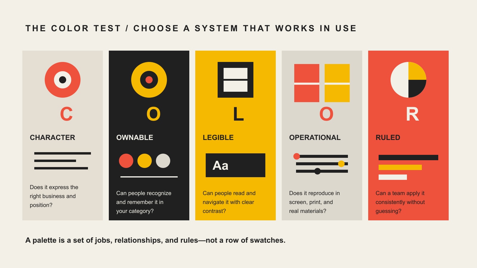
    Use Scope Design’s COLOR Test instead:

    1. Character: Does the palette express the position and personality the business can actually support?
    2. Ownable: Is it distinctive in the competitive setting, or did you accidentally join the category’s blue-logo witness protection program?
    3. Legible: Do approved combinations meet accessibility needs and communicate without relying on color alone?
    4. Operational: Does the system survive websites, print, signs, clothing, slides, office printers, and one-color production?
    5. Ruled: Does every color have a defined role, specification, and usage rule that ordinary people can follow?

    Do not choose a business color because an infographic promised it would manufacture trust. Choose a brand color system that fits, distinguishes, works, and can be governed.

    In this guide

    What are brand colors?

    Brand colors are a defined set of colors and usage rules that helps a business create recognition, express its position, organize communication, and operate consistently across touchpoints. A useful system includes more than attractive swatches. It defines primary, supporting, neutral, accent, and functional roles; approved combinations; accessibility constraints; production values; templates; and governance.

    That distinction matters. A palette tells you which colors exist. A color system tells you what they do.

    Your signature blue may identify the brand. A darker blue may handle readable text. A warm accent may draw attention to selected actions. Neutrals may carry most backgrounds and long-form content. Separate status colors may communicate error, warning, success, and information without forcing the primary palette to perform jobs it was never built to do.

    Color is one part of a larger brand identity system, not a replacement for one. The logo, typography, image language, composition, voice, and recurring graphic devices also create recognition. If the only identifiable thing about the business is “we use blue,” congratulations: so does half the internet.

    Does color psychology really work in branding?

    Color can influence perception, attention, association, and judgment. What it does not provide is a universal dictionary where one hue always produces one emotion and one business result.

    Research by Lauren Labrecque and George Milne examined how hue, saturation, and value can shape perceived brand personality and purchase intent. Their work supports a useful point: color choices can help signal traits, but those effects operate through a complete brand and product context—not a lonely swatch floating in a vacuum. See the original study, “Exciting red and competent blue: the importance of color in marketing”, in the Journal of the Academy of Marketing Science.

    Another open-access study, “Color in Context”, found that the psychological influence of red changed with the situation. That is fatal to the lazy version of color psychology. If the same color can support different responses under different conditions, “red means urgency” is not a strategy. It is a sentence missing most of its nouns.

    For a business, at least six things shape how a color is interpreted:

    • the product or service category;
    • the other colors, typography, imagery, and language around it;
    • saturation, brightness, proportion, and contrast;
    • the audience’s culture, experience, and existing associations;
    • the competitive environment;
    • the application and moment in which the color appears.

    A deep blue bank and a deep blue children’s aquarium may use the same nominal hue. The type, imagery, materials, language, and context make them different experiences. Color contributes. It does not work alone.

    Why color-meaning charts fail

    Color charts fail when they turn a starting hypothesis into a business verdict.

    ShortcutWhat it ignoresBetter question
    Blue means trustCategory saturation, tone, contrast, and the fact that trust must be earnedWhich color system feels credible for this offer and remains recognizable among alternatives?
    Red creates urgencyContext can change whether red feels energetic, celebratory, risky, aggressive, or ordinaryWhat deserves attention, and how should hierarchy create it without shouting everywhere?
    Green means naturalGreen can signal finance, health, sustainability, permission, sport, or simply a competitorWhich associations already exist for this audience and product?
    Purple means luxuryShade, material, typography, imagery, and execution determine whether it feels premium or like a discount bath bombWhat complete visual territory supports the intended position?
    Yellow attracts attentionAttention is not the same as comprehension, preference, accessibility, or purchaseWhere is attention useful, and can the chosen yellow perform that role legibly?

    Color psychology should generate questions to test, not answers to obey.

    That is especially important for small businesses. You probably do not have the media budget to hammer an arbitrary color into public memory through repetition. Your choices must do several jobs immediately: feel relevant, create useful contrast with competitors, work in the formats you can afford, and remain simple enough for staff to use correctly.

    The Scope Design COLOR Test

    The COLOR Test turns a subjective palette debate into five practical decisions.

    TestDecision questionFailure signal
    CharacterDoes this feel like the strategic position and business experience?The palette is fashionable but says nothing particular about the company
    OwnableCan the business become recognizable with it in the real category?It disappears into a wall of nearly identical competitors
    LegibleCan people read, distinguish, and use it?The “on-brand” combinations fail contrast or rely on color alone
    OperationalDoes it reproduce across actual touchpoints and constraints?It works in a mood board and falls apart in print, signage, or office documents
    RuledAre roles, values, combinations, templates, and owners defined?Every employee invents a new tint and calls it close enough
    The COLOR Test checks Character, Ownable distinction, Legibility, Operational performance, and clear Rules for consistent use.

    Character: does it express the right business?

    Start with a specific strategic description, not an adjective pile.

    “Modern, professional, and trustworthy” describes every mediocre brand brief ever written. Try something that can guide a decision: “seasoned experts who make a complicated purchase feel straightforward; warm but never sugary; premium because the work is thorough, not because the website whispers in beige.”

    Then ask whether the proposed palette supports that position alongside the type, photography, language, and materials. Character is not personal preference disguised as strategy. The owner’s favorite color can participate, but it does not receive diplomatic immunity.

    Ownable: can you become known for it?

    Audit the choices customers will actually compare. Collect competitor homepages, signage, packaging, social profiles, uniforms, vehicles, proposals, marketplace thumbnails, or app icons—whatever appears in the buying environment.

    Look for category conventions that help people identify the type of business. Then look for visual whitespace. You do not need to reject every convention. You need enough distinction to be recognized without becoming inappropriate for the category.

    “Ownable” does not necessarily mean legally protectable by itself. It means the color system can become strongly associated with the brand through consistent, distinctive use. Trademark questions are fact-specific; use qualified counsel where legal protection matters.

    Legible: can people actually use it?

    Separate color choices for character from color pairings for comprehension. A bright signature yellow can be an excellent identifying color and a miserable body-text color. That is not a contradiction. Give it the right job.

    For WCAG 2.2 Level AA, ordinary text generally needs a contrast ratio of at least 4.5:1, while qualifying large text may use 3:1. Meaningful graphical objects and interface components generally need 3:1 contrast against adjacent colors. The W3C contrast criteria provide the actual requirements and exceptions.

    The W3C guidance on use of color also says color cannot be the only visual means of communicating information, indicating an action, or prompting a response. Pair color with text, icons, patterns, shapes, position, or another visible cue.

    Accessibility does not order your brand to become boring. It requires a system intelligent enough to know where each color works.

    Operational: does it survive reality?

    Greg’s rule at Scope Design is blunt: taste is legitimate when it creates character and distinction; comprehension wins when people need to read, navigate, or complete something. Those decisions should be separated explicitly.

    The same separation applies to production. A palette may include a vivid color that looks extraordinary on a backlit screen but shifts badly in four-color printing. Another may work in print but disappear when embroidered on a uniform. Thin reversed type may look elegant on a large monitor and become lint on a vinyl sign.

    Test the palette in the business’s ugliest real conditions, not only its prettiest presentation.

    Ruled: can other people use it without guessing?

    A working system names every color, assigns a role, provides the correct values, lists approved combinations, shows failures, and identifies who can add or change colors.

    The rule should be closer to “use Signal Coral for selected calls to action on Ink or Cream; never for paragraph text” than “use accent colors dynamically.” One can be followed. The other is an agency sentence hoping to age into wisdom.

    How to choose brand colors

    Choose brand colors in this order: strategy, competitive context, visual territories, system roles, real applications, accessibility, production, and audience testing.

    1. Define the decision the palette must support

    Clarify the audience, offer, position, desired expectation, meaningful competitors, and important touchpoints. If the business has not made those decisions, start with brand strategy and a clear brand message.

    Color cannot rescue a vague position. It can only decorate one.

    2. Audit the competitive color environment

    Create a contact sheet of competitors as customers encounter them. Note repeated hues, dominant lightness, typical proportions, and combinations—not merely “three competitors use blue.” Navy occupying 10 percent of a white layout behaves differently from electric blue covering an entire storefront.

    Classify findings:

    • Category cues worth retaining: choices that help people recognize what kind of business this is.
    • Category clichés worth questioning: combinations so common they erase attribution.
    • Distinctive opportunities: territories that feel relevant without looking like a stunt.
    • Constraints: legacy recognition, partner requirements, product materials, safety conventions, or environmental needs.

    3. Build several visual territories

    Do not begin by tweaking one favorite swatch until everyone becomes too tired to object. Build two or three complete directions using color, typography, imagery, texture, and composition.

    Each territory should make a different strategic argument. That lets decision-makers compare consequences instead of debating whether teal is “more us” than blue.

    4. Assign colors to jobs

    Define roles before expanding the palette:

    • signature or primary brand color;
    • supporting brand colors;
    • neutrals for text, backgrounds, borders, and space;
    • accent colors for deliberate emphasis;
    • link and interactive colors;
    • status colors for error, warning, success, and information;
    • chart or data-visualization colors where needed.

    People should choose a role, not rummage through twelve equally approved swatches.

    5. Test complete applications

    Build the website header, article page, proposal, presentation, social post, sign, invoice, shirt, vehicle, package, or other high-frequency materials before approving the palette. Use real copy and realistic content density.

    If the system only looks good as giant rectangles labeled with poetic names, you have selected a mood board—not a brand color system.

    6. Test with the right questions

    Do not ask only, “Which palette do you like?” Liking produces opinions; strategy needs evidence.

    Ask intended customers or representative users:

    • Which option feels most appropriate for this business and why?
    • Which is easiest to distinguish from the alternatives?
    • What would you expect this company to be like?
    • Which details can you remember after a delay?
    • Can you identify the business when the name or logo is covered?
    • Can you read and use the important content comfortably?

    The test is not whether everyone loves the same shade. It is whether the system creates the intended expectation, recognition, and usability.

    7. Document and deploy

    Publish the approved values, roles, pairings, proportions, templates, production notes, examples, and owner in one source of truth. Then make the correct choice easier than the improvised one.

    Scope Design’s Branding & Graphics services connect the identity work to the websites, collateral, presentations, animation, video, and practical materials where the system has to perform.

    What should a brand color palette include?

    A complete brand color palette should include the colors, their roles, their technical values, approved foreground/background combinations, functional states, production guidance, examples, templates, and governance.

    System componentWhat to document
    Core colorsName, swatch, role, priority, and recommended proportion
    Digital valuesHEX and RGB; design tokens or CSS variables where useful
    Print valuesCMYK recipes and spot-color references when required, with proofing notes
    Accessible pairingsApproved text/background and interface combinations with contrast ratios
    NeutralsText, surface, background, border, and disabled-state roles
    Functional colorsLink, focus, error, warning, success, and information states
    VariantsAny approved tints, shades, dark-mode values, or constrained alternatives
    Production fallbacksOne-color, black, white, grayscale, embroidery, vinyl, or low-quality print versions
    ExamplesCorrect and incorrect applications using realistic content
    GovernanceAsset location, system owner, approval process, and version date

    The system may live inside broader brand guidelines or a design system. The format matters less than whether people can find and use it.

    How many brand colors should you have?

    Most small-business identities need fewer signature colors than their original mood board suggests and more functional colors than their logo designer mentioned.

    A practical starting system might contain:

    • one primary signature color;
    • one or two supporting colors;
    • one deliberate accent;
    • a useful neutral scale;
    • separate functional colors where the website or product requires them.

    That is not a universal three-color rule, a 70/20/10 law, or numerology wearing a turtleneck. The correct number is the smallest set that covers the brand’s real communication jobs without making recognition muddy or use confusing.

    Logo colors are not automatically the entire palette. A one-color logo can live inside a rich system. A multicolor logo may still require restrained layouts. The number of swatches is less important than the clarity of their roles.

    How accessibility changes color use

    Accessibility changes how colors are paired and assigned, not whether your company is allowed to have personality.

    Create an approved-combination matrix that tells staff what works for:

    • paragraph text and headings;
    • buttons and their hover, active, focus, and disabled states;
    • links within surrounding text;
    • form labels, errors, and confirmation messages;
    • charts, maps, and diagrams;
    • text placed over images;
    • light, dark, and colored surfaces.

    Then bake the correct combinations into website components, presentation themes, document styles, and social templates. A training slide that says “remember WCAG” is not a system. A template that makes the accessible choice by default is.

    For a deeper implementation guide, see Scope Design’s website accessibility and WCAG guide.

    How to specify color for screen and print

    HEX and RGB describe additive screen color. CMYK describes process-print ink proportions. Spot-color systems can specify a premixed ink. These values are not interchangeable promises that every monitor, printer, paper, vinyl, paint, and fabric will reproduce the same appearance.

    A production-ready guide should include:

    • HEX and RGB values for digital use;
    • CMYK recipes tested with the intended print process;
    • spot-color references where consistency justifies them;
    • coated and uncoated proofing guidance when relevant;
    • one-color, black, white, and grayscale alternatives;
    • notes for signage, vinyl, paint, apparel, embroidery, or packaging materials;
    • a responsible person who can approve production substitutions.

    Proof important applications on the intended material. The screen is emitting light. Paper is reflecting it. Pretending those are identical is how the cheerful web orange becomes the unfortunate brown brochure.

    How to test a brand color palette

    Use a stress-test set built from the company’s real work:

    1. Recognition test: Cover the logo and company name. Does anything still feel attributable?
    2. Competitor test: Place the work beside real alternatives. Does it fit the category without vanishing into it?
    3. Contrast test: Check every approved text, control, and meaningful graphic combination—not just one hero pairing.
    4. Color-independent test: View key information in grayscale or with simulated color-vision differences. Is meaning still available?
    5. Scale test: Inspect a favicon, phone screen, presentation, storefront, banner, and other extremes.
    6. Production test: Print it on the actual stock or reproduce it in the constrained medium.
    7. Staff test: Give the guide and templates to a capable non-designer. Watch where they guess.
    8. Maintenance test: Add a new campaign, chart, or product state. Can the system expand without inventing random colors?

    Every hesitation identifies a missing rule, value, example, or template. Fix the system before blaming the employee.

    Common brand-color mistakes

    Choosing a color meaning instead of a position

    “We need blue because we want trust” skips the harder questions: why should anyone trust you, what makes your version recognizable, and what complete experience supports that claim?

    Copying category leaders

    Large brands can use minimal, generic assets because years of distribution have trained recognition. A growing business rarely has that luxury. Copy the category leader and you may inherit its familiarity while donating all attribution back to it.

    Approving swatches instead of applications

    Five colors can look gorgeous side by side and become chaos when text, photos, data, calls to action, and production constraints arrive. Approve the work people will see.

    Treating the logo palette as the whole system

    Logos identify. Interfaces communicate, respond, warn, organize, and enable action. They need neutral, interactive, and status roles that may not belong in the logo.

    Specifying only HEX values

    Businesses print signs, wrap vehicles, embroider shirts, present slides, and use office printers. A web-only color specification abandons everyone else at the exact moment money reaches production.

    Ignoring governance

    Without one current source, named owner, and approved templates, color drift is inevitable. Soon the company has six blues, four “official” logos, and a PowerPoint green nobody can explain.

    Frequently asked questions

    What colors represent what in branding?

    Colors can support common associations, but no color carries one universal brand meaning. Context, culture, category, surrounding design, saturation, brightness, and prior experience all affect interpretation. Use common associations as hypotheses to test, not instructions to obey.

    What colors attract customers?

    There is no universally best customer-attracting color. A color attracts useful attention when it is relevant, sufficiently distinct, legible, and deployed with clear hierarchy in the right context. Attention from the wrong expectation is not a branding victory.

    How do I choose colors for my brand?

    Define the position, audit competitors, build multiple visual territories, assign colors to specific roles, test complete applications, verify accessibility and production behavior, test with representative users, and document the final system.

    What is a good brand color palette?

    A good palette fits the brand, creates useful distinction, supports readable combinations, works across actual media, and gives each color a clear job. It should remain usable when content becomes dense and production becomes inconvenient.

    How many colors should a brand have?

    Use the smallest set that covers the required recognition and communication roles. Many small businesses can begin with one primary color, one or two supporting colors, one accent, neutrals, and separate functional colors as needed.

    What is the three-color rule?

    The three-color rule is a simplifying guideline, not a law. Limiting dominant colors can create cohesion, but a complete brand system may need neutrals and functional colors beyond the three visible signature colors.

    What is the 70/20/10 color rule?

    It is a proportional starting point in which one color dominates, another supports, and a third accents. It can help control hierarchy, but actual proportions should follow the content, medium, accessibility requirements, and brand strategy.

    Is three colors too many for a logo?

    Not automatically, but every additional color increases reproduction complexity and can weaken clarity at small sizes or in one-color applications. A multicolor logo still needs reliable one-color, black, white, and constrained-production versions.

    Should my logo color and website colors match?

    They should belong to the same identity system, but the website needs additional neutral, interaction, status, and accessibility-safe roles. Matching does not mean forcing every logo color into every interface job.

    Can a brand use a color that competitors already use?

    Yes. Categories often develop useful conventions. The question is whether your complete combination of hue, proportion, typography, imagery, composition, and repeated use remains attributable rather than interchangeable.

    Do brand colors need to meet WCAG contrast?

    Brand swatches and logos do not all have to meet one contrast ratio in isolation. The combinations used for meaningful text, controls, and graphics must meet the applicable requirements. Document which pairings are approved for which roles.

    What color formats should brand guidelines include?

    Most systems should include HEX and RGB for digital use and tested CMYK values for process printing. Add spot-color, material, paint, vinyl, embroidery, or other specifications when the business regularly uses those production methods.

    Should a small business hire a designer to choose brand colors?

    Hire professional help when the choice affects many touchpoints, the category is crowded, accessibility or production is complex, internal opinions are stuck, or mistakes will be expensive. A useful designer should deliver a working system and rationale—not merely attractive swatches.

    The final decision

    The best brand colors are not the ones with the most flattering psychological biography. They are the ones your business can use consistently to create the right expectation, stand apart, communicate clearly, and survive real production.

    Run the palette through the COLOR Test:

    • Does it have the right Character?
    • Is it meaningfully Ownable?
    • Is it Legible?
    • Is it Operational?
    • Is it Ruled well enough for other people to use?

    If yes, you have more than colors. You have a working part of the brand.

    If not, do not ask what blue means. Ask which decision the system failed to make.

    Need a color system that survives the website, print shop, staff PowerPoint, and the occasional terrible office printer? Explore Scope Design’s Branding & Graphics services or start with professional logo design.

    Sources

  • Google Ads Quality Score: Fix Relevance Without Worshipping the Number

    Google Ads Quality Score: Fix Relevance Without Worshipping the Number

    Google Ads Quality Score is a keyword-level diagnostic that compares the expected quality of your Search ads and landing pages with other advertisers. It uses a 1–10 score plus three component ratings: expected clickthrough rate, ad relevance, and landing-page experience.

    That is the useful answer. Here is the part many “ultimate guides” mangle: Quality Score is not your campaign goal, it is not a key performance indicator, and the visible 1–10 number is not an input in the ad auction. Google says all three of those things plainly. A better score can point toward a better search experience, but a beautiful 10/10 cannot rescue rotten economics, useless leads, broken tracking, or an offer nobody wants.

    Treat Quality Score like a smoke alarm. When it complains, investigate. Do not frame the smoke alarm, put it on the executive dashboard, and congratulate everyone while the kitchen burns.

    TL;DR: What should you do about Google Ads Quality Score?

    • Use Quality Score to identify a possible relevance problem, not to declare a campaign successful.
    • Examine the three component ratings before touching the overall 1–10 score.
    • Fix the weakest connection between search intent, keyword, ad promise, landing-page answer, and measured business action.
    • Compare Quality Score with conversion quality, cost per qualified outcome, search terms, and sales follow-through.
    • Do not assume a specific score creates a guaranteed CPC discount. Google makes no universal promise like that.
    • Leave a commercially successful keyword alone when the score is merely average and the underlying business results are strong.
    • Investigate a high-scoring keyword that produces junk leads. The platform diagnostic and the business outcome are answering different questions.

    What is Google Ads Quality Score?

    Quality Score is a diagnostic available for keywords in Google Search campaigns. Google calculates it on a scale from 1 to 10 using historical performance associated with exact searches for the keyword. A higher number means Google estimates that the ad and landing page are more relevant and useful to that search than those of other advertisers.

    The score is useful because “the campaign feels off” is not a diagnosis. Its component ratings can narrow the investigation to one of three areas:

    Quality Score componentWhat Google is estimatingWhat you should investigate
    Expected clickthrough rateHow likely the ad is to be clicked when shownSearch intent, offer clarity, ad usefulness, differentiation, and whether the query deserves the click
    Ad relevanceHow closely the ad matches the intent behind the searchSearch terms, keyword grouping, ad language, intent changes, and mixed themes
    Landing-page experienceHow relevant and useful the destination is after the clickMessage match, usefulness, transparency, mobile usability, speed, accessibility, and action clarity

    Each component is reported as Above average, Average, or Below average. Google bases the comparison on advertisers whose ads appeared for the same exact search during the previous 90 days. The comparison is competitive and contextual, not a permanent grade tattooed onto your account.

    If the interface shows a dash instead of a score, Google says there may not have been enough searches that exactly match the keyword to calculate one. A missing score is not automatically a disaster. Sometimes the platform simply does not have enough evidence yet.

    What Quality Score is not

    Quality Score attracts nonsense because a tidy number feels easier to manage than a messy business. Let us remove several myths before they reproduce.

    Quality Score is not a KPI

    Google explicitly says Quality Score is not a key performance indicator and should not be optimized or aggregated with the rest of your data. Your business does not deposit Quality Score points at the bank. It needs profitable sales, qualified opportunities, useful calls, completed bookings, retained customers, or another outcome that survives contact with accounting.

    The number may help explain performance. It is not performance by itself.

    The 1–10 score is not an auction input

    The visible score is not plugged into the live auction as a neat multiplier. Ad Rank is calculated at auction time using the bid, auction-time assessments of ad and landing-page quality, Ad Rank thresholds, competition, search context, and the expected impact of assets and formats.

    Quality Score summarizes related ideas for diagnosis. Ad Rank uses current auction signals. They are cousins, not twins wearing the same name tag.

    Quality Score does not guarantee conversions

    Google can evaluate relevance without knowing whether a lead is profitable, whether the caller is qualified, whether the sales team responds, or whether the customer stays. If the conversion event is weak or the business never sends useful downstream data back to the advertising system, Google may optimize toward behavior that looks productive and creates operational garbage.

    A relevant ad for the wrong offer is still the wrong offer.

    Quality Score does not come with a universal CPC discount table

    Higher ad quality can often contribute to better Ad Rank and lower CPCs. Google says as much. But the familiar charts claiming that a score of 10 always earns a 50% discount or a score of 2 always creates a fixed penalty are not current Google guarantees.

    Actual CPC depends on the auction, competition, bid strategy, context, thresholds, quality signals, and other factors. Anyone promising exact savings from a score change without seeing the account is selling numerology with a dashboard.

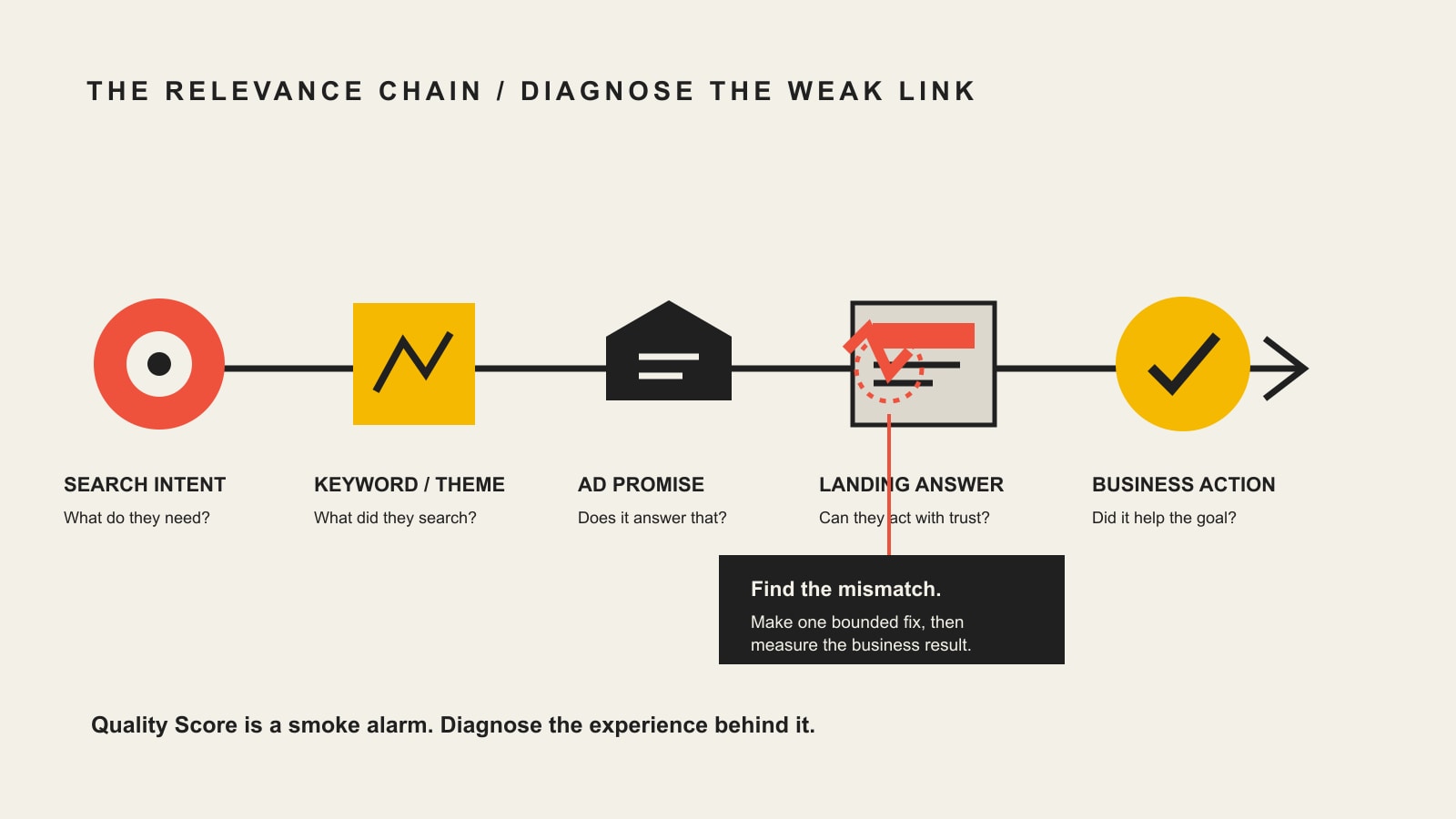
    The Scope Design Relevance Chain

    Five linked stages: search intent, keyword or theme, ad promise, landing page answer, and measured business action, with a potential mismatch highlighted for diagnosis.

    Quality Score becomes much more useful when it is connected to the entire customer path. We use a five-part diagnostic called the Scope Design Relevance Chain:

    1. Search intent: What is the person actually trying to accomplish?
    2. Keyword or theme: What targeting decision allowed the business to enter that search?
    3. Ad promise: What did the ad lead the person to expect?
    4. Landing-page answer: Did the destination satisfy that expectation and help the person decide?
    5. Measured business action: Did the resulting action have commercial value?

    The first four stages closely affect the experience Google can observe. The fifth protects the business from celebrating activity that does not matter.

    This chain also prevents the usual silo fight. The media buyer blames the landing page. The designer blames targeting. The copywriter blames the offer. Sales blames lead quality. Everyone may be partially right, which is why changing one headline and announcing an optimization victory is a bit premature.

    Trace one real search from query to outcome. Find the first broken promise. Fix that before launching another redesign, bidding experiment, or twelve-tab reporting ritual.

    Diagnose the component before prescribing the fix

    Do not attack every setting because the overall score looks emotionally disappointing. Add the current and historical component columns, identify where the rating is weak, and check the business evidence beside it.

    Diagnostic patternLikely investigationBad reflex
    Below-average expected CTR; relevance and landing page are healthyOffer presentation, ad usefulness, differentiation, asset coverage, and whether the keyword deserves attentionStuff the keyword into every headline until the ad reads like a malfunctioning robot
    Below-average ad relevance; other components are healthyMixed search intent, loose themes, query drift, or ad language that does not match the searchCreate hundreds of microscopic ad groups without enough data or operational value
    Below-average landing-page experienceMessage mismatch, thin answers, poor mobile experience, intrusive friction, speed, trust, or accessibilityRemove navigation, forms, and useful detail merely to make the page look “clean”
    High Quality Score; poor lead qualityTargeting, offer, conversion definition, qualification, or sales processKeep spending because the platform gave you a lovely number
    Average Quality Score; strong qualified economicsMonitor and look for material opportunitiesRebuild a profitable path to chase cosmetic perfection
    No Quality ScoreLow exact-search volume or insufficient historyPanic, duplicate campaigns, or make daily changes that prevent learning

    How to improve expected clickthrough rate

    Expected CTR estimates whether people are likely to click the ad when it appears. It is not simply your raw account CTR, and a click is not automatically good. A sensational ad can attract the wrong people with great enthusiasm.

    Start with the search terms, not the ad-writing screen. Ask:

    • Does this query reflect a problem, product, comparison, location, or buying stage we actually serve?
    • Is the person looking for information while the ad demands a sales call?
    • Is the query ambiguous enough to represent several incompatible intentions?
    • Does the offer provide a credible reason to choose this result now?
    • Does the ad reveal enough to repel obvious bad fits?

    Then write ads that are specific enough to be useful. Match the searcher’s language where it remains accurate. State the result or category plainly. Add a differentiator you can prove. Include the next step without manufacturing panic. Use assets when they genuinely help people reach relevant pages or understand the offer.

    Do not use fake scarcity, empty superlatives, or promises the landing page cannot support. You might win the click and lose the customer’s trust one second later. That is not a conversion strategy. It is borrowing attention at predatory interest.

    Google’s own guidance recommends making the offer more compelling and ensuring the ad details match keyword intent. That is refreshingly sensible. The work is not “increase CTR at any cost.” The work is “earn the right click from the right person.”

    How to improve ad relevance

    Ad relevance asks whether the ad matches the intent behind the search. The important word is intent, not merely keyword.

    Someone searching “what does CRM implementation cost” is not asking for the same experience as someone searching “hire CRM implementation consultant.” Both may contain the same product category. One is evaluating cost; the other may be selecting help. Sending both to a vague “transform your business” ad wastes the information the searches already gave you.

    Review the actual search terms that triggered ads. Separate distinct intentions when doing so gives you enough control to create a materially better message and destination. Google recommends splitting ad groups when different keywords need ads that better match the searches, but do not turn account structure into competitive origami. More ad groups are useful only when the separation changes the message, page, offer, measurement, or decision.

    Look for:

    • keywords collecting unrelated search terms;
    • brand, comparison, problem, and purchase searches forced through one ad;
    • locations or services the business does not serve;
    • informational queries sent to a hard-sell destination;
    • ads that repeat a keyword but never answer why the person should care;
    • negative keywords blocking useful intent or failing to block obvious waste.

    The goal is coherent intent, not an account that wins a prize for having the most folders.

    How to improve landing-page experience

    The landing page must keep the promise made by the search and ad. If the ad says “commercial roof repair pricing” and the page opens with “Welcome to our family,” the visitor has been mugged by irrelevant hospitality.

    Google recommends matching the landing page to user searches, keeping the message consistent from ad to page, and making the destination useful. Our Landing Page Intent Contract expands that into five practical checks: known arrival, matched promise, relevant proof, appropriate action, and operational follow-through.

    Audit the destination for:

    Message match

    The opening should confirm that the visitor reached the right place. Use the same problem, service, product, location, or comparison language the ad promised. Do not require people to translate brand poetry before finding the answer.

    Useful decision content

    Answer the questions that matter for the level of commitment: fit, process, cost factors, timing, tradeoffs, evidence, risks, and next steps. Short copy is not automatically better. Complex and expensive decisions often require depth. The page should be as long as necessary and no longer than useful.

    Credible proof

    Place specific proof near the claim it supports. A testimonial page hidden in the navigation cannot rescue an unsupported promise beside the form. Use documented examples, relevant credentials, transparent explanations, and real limitations. Avoid invented counters, decorative logos, and testimonials that say little beyond “great job.”

    Mobile usability, performance, and accessibility

    Test the actual task on a phone. Can a person read the text, dismiss overlays, use the navigation, understand errors, complete the form, and receive confirmation? Speed matters because a page that does not become usable cannot persuade anyone, but a perfect lab score does not compensate for incoherent content.

    Appropriate action

    The requested commitment should fit the searcher’s stage and the business model. A low-risk product may justify immediate checkout. A complicated service may need an assessment, consultation, pricing explanation, or qualification form. Removing every field can increase submissions and drown sales in junk. Friction should clarify and qualify, not punish.

    Does Quality Score affect CPC and Ad Rank?

    The careful answer is: the visible Quality Score does not directly enter the auction, but the underlying quality concepts matter.

    Google explains that Ad Rank uses auction-time quality assessments, including expected CTR, ad relevance, and landing-page experience among other signals. Better-quality ads can often qualify for lower CPCs, stronger eligibility, and more useful ad formats. The auction also considers the bid, thresholds, competition, search context, and expected asset impact.

    Therefore:

    • improving a genuinely weak relevance chain may improve both user experience and advertising economics;
    • moving a displayed score does not guarantee a specific CPC change;
    • optimizing only the score can shift attention away from conversion quality and profit;
    • a CPC change cannot be attributed to Quality Score alone without controlling for the auction conditions that also changed.

    Quality Score is a clue in the causal story, not the entire story wearing a cape.

    What is a good Google Ads Quality Score?

    There is no universal target that deserves to override commercial performance. A score above average for the relevant search can indicate a coherent experience, but “good” depends on what the keyword produces and what improving it would cost.

    Use this order of judgment:

    1. Does the keyword generate qualified, valuable outcomes at acceptable economics?
    2. Do the search terms match the business and offer?
    3. Does the ad make an accurate, useful promise?
    4. Does the landing page satisfy that promise?
    5. Do the component ratings reveal a specific improvement worth testing?

    A score of 7 is commonly described online as “good,” but that shorthand is not a business rule. A profitable keyword with an average component may deserve monitoring. A 10/10 keyword producing unqualified leads deserves intervention.

    When should you stop chasing a higher score?

    Stop treating Quality Score as the priority when:

    • qualified conversion economics are already healthy and the proposed change risks weakening the offer;
    • the keyword has too little exact-search volume to produce a stable diagnostic;
    • the weak result is caused by intentionally narrow or specialized language that accurately qualifies the audience;
    • the real bottleneck is broken conversion tracking, poor lead handling, sales delay, pricing, capacity, or retention;
    • a higher-CTR ad would attract more people who should not become customers;
    • the landing page needs necessary detail, navigation, disclosures, accessibility, or form fields that a generic “best practice” says to remove;
    • the team is changing campaigns so frequently that it cannot learn what caused anything.

    An optimization is worthwhile when it strengthens the customer path or produces reliable learning. It is busywork when its only result is making one column greener.

    Where can you find Quality Score in Google Ads?

    Google’s interface changes, but its current instructions place Quality Score in the keyword reporting columns:

    1. Open the Search campaign’s keyword view.
    2. Select the columns control.
    3. Open the Quality Score section.
    4. Add Quality Score, landing-page experience, expected CTR, and ad relevance.
    5. Add the historical versions of those columns for trend analysis.
    6. Segment by day when you need to inspect when the diagnostic changed.

    Google documents the current and historical columns. The Google Ads API also exposes historical Quality Score and component fields for reporting, which is helpful for larger accounts where manual checking turns into clerical punishment.

    Do not aggregate the score across the entire account and call that insight. Diagnose at the keyword and component level, then roll findings up by a meaningful theme such as intent, service, landing page, or business outcome.

    A practical Google Ads Quality Score audit

    Use this sequence to avoid fixing the most visible symptom before the actual cause.

    1. Validate measurement

    Confirm that conversions fire correctly, duplicate events are not inflating totals, calls and forms reach the business, and the team can distinguish qualified outcomes from noise. If the measurement is wrong, every optimization downstream is being graded by a drunk substitute teacher.

    2. Segment business results

    Review spend, conversions, qualified outcomes, cost per qualified outcome, and pipeline or revenue where traceable. Segment by campaign, keyword, search term, device, location, and landing page. Find where the business result breaks, not merely where the platform metric looks unfriendly.

    3. Add component and historical columns

    Locate below-average components and changes over time. Do not react to the overall number without knowing which ingredient produced it.

    4. Read real search terms

    Classify them by intent and fit. Add negatives where the query is clearly irrelevant. Separate themes when the search needs a different ad, page, or offer. Preserve useful ambiguity when the data does not justify false precision.

    5. Compare the ad promise with the landing-page answer

    Read the ad and page in sequence. Does the page immediately confirm the promise? Can the visitor find the proof, tradeoffs, cost context, and action appropriate to the query? Complete the task on mobile.

    6. Form one diagnosis

    Choose the strongest evidence-supported problem: weak expected CTR, mixed intent, message mismatch, poor landing-page utility, bad conversion definition, or operational follow-up. State what evidence would prove the diagnosis wrong.

    7. Make a bounded change

    Change enough to test the diagnosis without replacing the entire system. Keep a record of the date, affected entities, reason, and expected business effect. Watch both the diagnostic component and the qualified outcome.

    8. Decide using business evidence

    Keep, refine, or reverse the change based on useful outcomes and sufficient evidence. A higher score with worse lead quality is not a win. A flat score with better qualified economics may be.

    An example: the keyword was not the whole problem

    Consider a professional service campaign targeting several searches about audits, implementation, consulting, and free templates in one ad group. The ad promises “expert solutions” and sends everyone to a broad services page. Expected CTR and ad relevance are below average, while the landing page is average.

    The lazy prescription is “write punchier ads.” The relevance-chain diagnosis is more useful:

    • Search intent: four distinct needs are mixed together.
    • Keyword theme: the grouping gives one ad too many jobs.
    • Ad promise: “expert solutions” says almost nothing.
    • Landing-page answer: the general page cannot immediately satisfy every query.
    • Business action: free-template visitors are counted beside serious consulting inquiries.

    A grounded intervention would separate the materially different intent, exclude searches the business does not want, write accurate ads for the remaining themes, route each theme to the most relevant page, and track qualified inquiries separately from raw forms.

    That example is illustrative, not a fabricated Scope Design performance case. The point is diagnostic: Quality Score may reveal a relevance problem, but the business has to repair the whole path and measure whether the repair produces better customers.

    Frequently asked questions about Google Ads Quality Score

    What is Google Ads Quality Score?

    Google Ads Quality Score is a 1–10 keyword-level diagnostic for Search campaigns. It compares the expected quality of your ad and landing-page experience with other advertisers using expected CTR, ad relevance, and landing-page experience.

    What are the three components of Quality Score?

    The three reported components are expected clickthrough rate, ad relevance, and landing-page experience. Each is labeled Above average, Average, or Below average so you can identify where investigation may be useful.

    Is Quality Score used in the Google Ads auction?

    No. Google states that the visible Quality Score is not an input in the ad auction. Ad Rank uses auction-time assessments of quality plus the bid, thresholds, competition, search context, and expected impact of assets and formats.

    Does Quality Score affect cost per click?

    The displayed 1–10 score does not directly set CPC. However, the auction-time quality factors related to expected CTR, relevance, and landing-page experience can affect Ad Rank and often contribute to lower CPCs. There is no guaranteed discount for moving from one score to another.

    What is considered a good Quality Score?

    Many advertisers use 7 or higher as a rough reference, but Google does not present that as a universal business target. A good result is a coherent search experience that produces qualified outcomes at acceptable economics. Use the component ratings and business performance together.

    How can I raise my Google Ads Quality Score?

    Identify the weak component first. Improve expected CTR by earning the right click with a clear, useful offer; improve ad relevance by aligning ads with actual search intent; and improve landing-page experience by matching the promise, answering the decision, proving claims, and making the page usable.

    How long does it take Quality Score to change?

    There is no fixed public timetable for every account. Quality Score depends on historical exact-search activity, and Google compares component performance over a 90-day context. Low-volume keywords may take longer to produce a score or meaningful change.

    Why does my keyword show a dash instead of a Quality Score?

    Google says a dash can appear when there are not enough searches that exactly match the keyword to determine its Quality Score. Check search activity and the underlying campaign rather than treating the missing number as a penalty.

    Does changing keyword match type improve Quality Score?

    Not by itself. Google says Quality Score is based on historical impressions for exact searches of the keyword, so changing match type does not directly change the score. Match type can change which searches you enter, which may affect campaign performance for other reasons.

    Can a high Quality Score still produce poor results?

    Yes. The ad and page can be relevant while the offer, pricing, qualification, conversion tracking, sales response, or customer economics remain weak. Quality Score measures a search-experience relationship, not profit.

    Should I pause every low-Quality-Score keyword?

    No. First inspect the component ratings, search terms, qualified outcomes, and strategic role. A low score may reveal a fixable relevance problem, insufficient data, or a specialized query. Pause a keyword because the evidence says it is commercially wrong, not because one column hurt your feelings.

    How often should I review Quality Score?

    Review it during a structured account audit and after enough activity has accumulated following a material change. Historical columns are more useful than daily score-watching. High-spend or rapidly changing campaigns may warrant more frequent checks, but constant reaction creates noise.

    Fix the relevance chain, then measure what matters

    Quality Score is useful when it leads to a better question: where does this searcher’s path stop making sense?

    Inspect the intent. Check the targeting. Read the promise. Use the destination. Follow the lead into the business. Then decide whether the campaign is attracting and converting the right people at economics the business can support.

    For broader paid-media planning, use Scope Design’s Marketing & Advertising strategy guide. For the relationship between bids, competition, quality, and spend, continue with How to Lower Google Ads Cost Per Click. If your reports are full of activity but short on decisions, the Analytics & SEO measurement guide will help separate diagnostic metrics from business outcomes.

    If you want someone to diagnose the entire path instead of polishing one platform number, talk with Scope Design. We will look at the search, ad, page, measurement, and operational follow-through before prescribing another pile of changes.

  • How to Sell Services Online: 7 Strategies That Turn Interest Into Clients

    How to Sell Services Online: 7 Strategies That Turn Interest Into Clients

    If you want to know how to sell services online, start with this: do not copy an ecommerce product page and assume the sales process is solved. A professional-service buyer is usually deciding whether to trust a future outcome, whether your process fits their situation, and whether the next step is worth their time.

    That changes the job of your website, marketplace profile, referral page, or campaign. You are not only trying to generate a click. You are trying to make fit, value, proof, process, and the next action clear enough that a qualified buyer can move forward without guessing.

    The Scope Design take: selling services online is an uncertainty-reduction problem before it is a traffic or checkout problem. Traffic before clarity amplifies ambiguity. Lead volume before qualification creates sales labor.

    Selling services online is different from selling products

    A product buyer can often inspect specifications, compare models, read reviews, see a price, and buy the same thing another customer bought. Many services are different. The buyer is evaluating expertise, judgment, communication, scope, process, timing, and the chance that you can produce a useful result in their situation.

    That is especially true for consulting, design, development, marketing, accounting, legal-adjacent professional work, coaching, home services with variable scope, and other expertise-led offers. The buyer cannot put the finished outcome in a shopping cart before the work exists.

    So the strongest online sales path does three things well: it helps the right person recognize themselves, reduces uncertainty with specific evidence, and gives that person a next step that matches the complexity of the service. For a standardized service, that might be direct purchase or booking. For complex work, it may be an estimate, fit form, paid diagnostic, or discovery conversation.

    How to Sell Services Online: The SERVICE Sales System

    We use the SERVICE Sales System as a practical way to organize those decisions. It is a Scope Design editorial framework built from the same offer, qualification, discovery, proposal, and follow-up logic we use to think about professional-service sales.

    StepDecisionWhat the buyer needs
    S — Specific buyerWho is this really for?A fast way to recognize fit, the problem, and the desired outcome.
    E — Explicit offerWhat exactly are you selling?Outcome, scope, process, boundaries, and enough price logic to evaluate seriousness.
    R — Risk reductionWhy should they believe you?Real proof, a credible process, and claims that can be supported.
    V — VisibilityWhere will qualified buyers find you?Useful presence in search, referrals, communities, directories, or marketplaces.
    I — Intent-matched pathWhat should they do next?A next action that fits the complexity and risk of the service.
    C — Consultative saleIs there mutual fit?Qualification, discovery, clear recommendations, and a proposal tied to the goal.
    E — Evidence loopWhat is the process teaching you?Consistent follow-up and a sales process that improves from real objections and stage data.

    1. Specific buyer: make fit obvious

    Weak service marketing often starts with a list of capabilities: strategy, design, SEO, consulting, implementation, support. The seller sees flexibility. The buyer sees homework.

    A stronger starting point is a specific buyer with a specific expensive problem. That does not mean you must serve only one industry forever. It means each offer page should make the intended situation easy to recognize.

    • Who is this service for?
    • What problem or missed opportunity makes them look for help now?
    • What outcome are they trying to reach?
    • What conditions make someone a poor fit?
    • What do they already need to have in place?

    If those answers are fuzzy, solve the audience problem before buying more traffic. Our guide to identifying your target audience and finding them online covers that research job in more depth.

    Good qualification starts before a form. A visitor should be able to read the page and think either, “This sounds like my situation,” or, “This is probably not for me.” Both outcomes are useful.

    2. Explicit offer: sell the outcome, scope, and price logic

    Once fit is clear, make the offer concrete. “Custom solutions” and “tailored service” sound flexible, but they do not tell a buyer what they are actually evaluating.

    An explicit service offer should answer:

    • Outcome: What useful change are you helping create?
    • Scope: What is included, and what is not?
    • Delivery: What happens, in what sequence, and who participates?
    • Timing: What controls the schedule?
    • Price logic: Is this fixed, starting-at, ranged, retainer-based, hourly, value-based, or scoped after diagnosis?
    • Fit boundaries: What has to be true for the engagement to work?

    You do not always need to publish an exact price. You do need to provide enough price logic that a serious buyer can understand the kind of commitment being discussed. Hiding all commercial context can turn discovery into a basic budget-screening call. On the other hand, publishing a fake “package price” for work that genuinely cannot be scoped yet can create a different kind of confusion.

    The useful question is not “Should every service show pricing?” It is “What pricing information lets a qualified buyer decide whether the next step makes sense?”

    3. Risk reduction: put proof and process next to the claim

    Service buyers are buying a future result. Proof reduces the gap between what you say and what they can reasonably believe.

    Use evidence that is specific to the claim: a case example, real client review, before-and-after artifact, process screenshot, work sample, documented result, credential, guarantee with clear conditions, or explanation of how you handle a known risk. “Trusted by businesses” is weaker than evidence that shows why the process is credible.

    Keep the proof honest. The FTC’s small-business advertising guidance emphasizes that advertising claims should be truthful, non-deceptive, and supported by evidence. The FTC’s Consumer Reviews and Testimonials Rule guidance also addresses fake, false, and deceptive reviews and testimonials.

    That is one reason this revision does not preserve the old article’s unsupported conversion percentages. A made-up-looking statistic does not become stronger proof because it has a percent sign.

    A practical rule: put the evidence close to the claim it supports. If you say your process reduces project surprises, show the planning or approval step that does that. If you say clients value responsiveness, use a real review about communication. Do not make the buyer hunt for the reason to believe you.

    4. Visibility: go where qualified buyers already look

    Once the offer can survive scrutiny, distribution matters. Depending on the service, qualified buyers may find you through Google, local search, referrals, industry communities, directories, LinkedIn, partner relationships, email, events, paid campaigns, or service marketplaces.

    The mistake is treating the channel as the strategy. A marketplace can give you access to demand, but it cannot fix a vague offer. SEO can bring visibility, but it cannot make poor-fit leads valuable. Social content can create familiarity, but it cannot rescue a confusing next step.

    If search visibility is the bottleneck, use the Scope Design SEO strategy and analytics framework to work on acquisition and measurement. If you already have visitors but not enough business outcomes, our article on why traffic is not the business goal explains why adding more sessions can be the wrong first move.

    Visibility should feed a sales path that is ready for attention. Otherwise you are paying—in money, time, or reputation—to send more people into ambiguity.

    5. Intent-matched path: choose the right next action

    Not every service should end with “Buy now,” and not every service should force a 30-minute call.

    Service situationGood next actionWhy
    Standardized, low-risk, easy-to-scope serviceBuy or bookThe buyer can understand the deliverable without a high-touch sales step.
    Variable scope with a known estimating processRequest an estimateYou need a few facts before pricing.
    High-consideration professional serviceShort fit form, then discoveryBoth sides need to test fit before prescribing a solution.
    Problem is unclear or implementation could vary widelyDiagnostic or paid discoveryThe first useful product is clarity about the problem and options.
    Buyer is early and not ready to talkGuide, comparison, case study, or email follow-upForcing a sales call can be premature.

    This is where many service sites create accidental friction. A $150 standardized session does not need an enterprise sales process. A $20,000 custom engagement should not necessarily be reduced to a generic checkout button with three vague package names.

    Match the next action to the amount of uncertainty that still has to be resolved.

    6. Consultative sale: qualify before you prescribe

    For high-touch services, the form and sales call should protect both sides from a bad engagement. That means qualification is not a trick for manufacturing scarcity. It is a way to determine whether the problem, budget, timeline, decision process, and delivery model actually fit.

    A short fit form can ask for the service needed, current situation, primary goal, rough timing, budget range when appropriate, and anything that would materially affect scope. Keep it short enough to complete, but useful enough that the conversation does not start from zero.

    During discovery, confirm:

    • What is happening now?
    • What outcome matters, and why now?
    • What constraints could change the solution?
    • Who is involved in the decision?
    • What budget or investment reality applies?
    • What has already been tried?
    • What would make the engagement a poor fit?

    Then make the proposal do a job. It should connect the buyer’s stated goal to the recommended scope, timeline, assumptions, exclusions, responsibilities, and investment. A proposal is not stronger because it is longer. It is stronger when it reduces avoidable uncertainty.

    After the sale, the handoff matters just as much as the close. The larger customer lifecycle management system covers the transition from qualified lead through onboarding, delivery, retention, and referral so good leads do not get lost between owners.

    7. Evidence loop: follow up and learn from every stage

    A service-sales system gets better when you preserve what prospects are telling you. Track why people do not move forward, where they stall, what questions repeat, what proof they ask for, and what happens after a proposal.

    Follow-up should be useful, not needy. Recap the decision, answer the unresolved question, provide the promised evidence, state the next step, and make it easy to say “not now” or “not a fit.” If nothing changes after several sensible follow-ups, close the loop rather than turning the opportunity into permanent CRM clutter.

    Most importantly, diagnose the stage before changing the whole system. If qualified people reach the page but do not understand the offer, that is not automatically an SEO problem. If fit forms arrive but discovery calls are poor, that is not automatically a copy problem. If proposals stall, inspect scope, proof, decision authority, price logic, urgency, and follow-up.

    What a service sales page needs before you drive more traffic

    Before you spend more on traffic, see whether a qualified prospect can answer these questions from the page:

    Buyer questionWhat the page should provide
    Is this for me?Specific buyer, situation, or fit language.
    Do you understand my problem?A precise problem statement in the buyer’s terms.
    What result are we working toward?Outcome language without pretending the result is guaranteed.
    What do I actually get?Scope, deliverables, boundaries, and responsibilities.
    How does this work?A simple process or sequence.
    What does it cost?Exact price, starting point, range, pricing model, or a clear explanation of how price is determined.
    Why should I believe you?Relevant proof and process evidence.
    What would make us a bad fit?Real qualification boundaries.
    What happens next?One primary action that matches buyer intent.

    If the page cannot answer those questions, adding another traffic channel may simply create more confused visitors.

    Website vs. marketplace: where should you sell services online?

    Searches for where to sell services online often assume there is one best platform. There is not. Your best channel depends on how buyers discover the service, how much trust has to be built, how standardized the work is, and how much control you need over qualification and the customer relationship.

    ModelStrengthTradeoffBest fit
    Owned websiteMaximum control over positioning, proof, process, qualification, analytics, and brand.You must create or earn your own demand.Businesses building a durable brand, referral destination, search presence, or higher-consideration sales process.
    MarketplaceAccess to existing demand and familiar transaction mechanics.More direct comparison, platform rules/fees, and less control over presentation or relationship depending on the marketplace.Standardized services, early demand validation, or categories where buyers already shop on the platform.
    HybridUse marketplace demand while building an owned source of truth.Requires consistent positioning and operational discipline across channels.Businesses that benefit from marketplace discovery but do not want their entire sales system dependent on one platform.

    You can also sell services online without a full website at the beginning. A marketplace profile, booking page, referral network, or direct outreach can validate demand. But as the business matures, an owned page becomes increasingly useful as the place where your offer, proof, process, fit criteria, and next step live together.

    What to measure in a service-sales funnel

    You do not need a giant dashboard to improve selling services online. You need enough stage data to find the constraint.

    StageUseful signalIf it is weak, inspect
    Qualified attentionRelevant visitors or referrals reaching the offerChannel fit, search visibility, targeting, referral sources.
    Offer understandingEngagement with service/process/pricing/proof sectionsMessage clarity, buyer fit, page structure, unanswered questions.
    Fit actionQualified forms, estimate requests, bookings, or applicationsCTA fit, form friction, perceived risk, price logic, proof.
    DiscoveryQualified attendance and mutual-fit ratePrequalification, urgency, authority, expectations, meeting structure.
    ProposalProposal-to-decision progressionDiagnosis quality, scope, assumptions, proof, investment logic, decision process.
    Follow-upClear yes/no/not-now outcomesResponse time, unresolved objections, next-step clarity, cadence.

    The key is not to chase a universal benchmark. Compare your own stages over time and segment by service, channel, buyer type, and qualification quality when the volume is high enough to make that useful.

    Common mistakes that make services harder to buy online

    • Selling the toolbox. Buyers care less about your list of methods and software than about the problem, outcome, process, and fit.
    • Offering everything to everyone. Too many unrelated services can make the buyer assemble their own solution.
    • Hiding all price logic. If nobody can estimate the level of commitment, qualification starts too late.
    • Using vague or unsupported proof. Real evidence beats generic percentages and fabricated authority signals.
    • Calling every first step a “free consultation.” Give the interaction a job: fit check, estimate, diagnostic, strategy session, or discovery.
    • Optimizing traffic before the sales path. More visitors do not repair a confusing offer.
    • Sending every lead to a high-touch call. Self-service buyers should not need a call; poor-fit buyers should not consume scarce sales time.
    • Failing to follow up. A proposal with no explicit next step often becomes an open loop for both sides.

    Frequently asked questions about selling services online

    Can you sell services online without a website?

    Yes. You can validate and sell services through referrals, marketplaces, directories, booking tools, social platforms, direct outreach, or partner channels. A website becomes more valuable as you need one controlled place for positioning, proof, process, qualification, analytics, and a durable brand presence.

    Where is the best place to sell services online?

    The best place is where qualified buyers already look and where your service can be represented accurately. A standardized freelance service may fit a marketplace. A local service may depend heavily on local search and referrals. A complex B2B service often benefits from an owned website supported by search, referrals, partnerships, content, and direct relationships.

    Should a service business show prices online?

    Show enough pricing information to help a qualified buyer judge fit. That can be an exact price, starting price, range, retainer level, minimum engagement, or explanation of what determines scope. If price truly depends on diagnosis, say that and explain the estimating process instead of pretending the number is unknowable.

    How do you sell a high-ticket service online without a checkout page?

    Use the website to establish fit, value, process, proof, and price logic, then move qualified buyers into a fit form, discovery process, diagnostic, estimate, or proposal. The site still does sales work; it simply does not pretend a complex engagement can be responsibly scoped with one click.

    What services can you sell online?

    Almost any service with a describable buyer, outcome, process, and next step can use online sales—even if delivery happens offline. Consulting, coaching, design, web development, marketing, accounting, professional advice, repair estimates, appointments, training, creative services, subscriptions, retainers, and productized services can all be marketed or sold online with different levels of qualification.

    How do you qualify leads before a sales call?

    Use a short fit form that captures the problem, desired outcome, timing, relevant constraints, service needed, and budget context when appropriate. Then use discovery to confirm decision authority, urgency, willingness to participate, and delivery fit. The goal is not to interrogate prospects; it is to avoid prescribing before you understand the situation.

    Should consulting, coaching, design, or development services use the same funnel?

    No. The SERVICE principles transfer, but the next action should reflect risk and complexity. A one-hour standardized consultation may use direct booking. A custom development project may need a fit form and discovery. A coaching program may use an application when participation matters. A design audit may be productized and sold directly.

    How do I know whether my problem is traffic, offer, or sales process?

    Look at the stage where qualified prospects stop moving. If the right people never arrive, investigate visibility and targeting. If they arrive but cannot understand the offer, investigate positioning and page clarity. If they inquire but calls are poor-fit, investigate qualification. If good calls produce weak proposal outcomes, inspect diagnosis, scope, proof, decision authority, pricing logic, and follow-up.

    Build a service sales path prospects can understand

    The goal is not to make your service look more like a product than it really is. The goal is to remove avoidable uncertainty.

    Make the buyer specific. Make the offer explicit. Put real proof next to the claim. Get visible in the right places. Match the next action to intent. Qualify before prescribing. Then use what you learn from every stage to improve the system.

    If your service business is getting traffic or referrals but producing vague, inconsistent, or poor-fit inquiries, contact Scope Design. We can help diagnose the offer, service page, qualification path, and measurement together instead of changing one tactic at a time.

  • Pricing Psychology: 15 Strategies That Make Online Prices Easier to Choose

    Pricing Psychology: 15 Strategies That Make Online Prices Easier to Choose

    Pricing psychology is the way price presentation changes how people perceive, compare, and act on an offer. On a website, that includes the reference points you show, how plans are compared, whether the full commitment is clear, where proof appears, and how much work the buyer has to do to understand the decision.

    It is not a substitute for setting a viable price. If you are still deciding what to charge, start with our guide to pricing a product or service without guessing. This article starts one step later: you have a defensible price; now the website has to make that price easier to evaluate.

    That distinction matters because a pricing page can fail in two different ways. The number itself can be wrong, or the presentation can create unnecessary friction. Changing $100 to $99 will not rescue a confusing offer, hidden fees, meaningless packages, or a page that makes buyers hunt for the terms.

    Do not make a bad price look clever. Make a defensible price easier to evaluate.

    The 15 strategies below are built around that rule. Each has a job, a fit condition, and a reason not to use it. Before reaching for any of them, run the page through the CLEAR Pricing Page Test.

    What is pricing psychology?

    Pricing psychology is the study and practical use of how price format, context, comparison, and payment framing influence buyer perception and choice. It can affect what a buyer notices first, which reference price feels relevant, how difficult alternatives are to compare, and how risky the commitment feels.

    It cannot create value that is not there. It cannot repair bad unit economics. It cannot make the wrong audience want the offer. And it should not depend on the buyer misunderstanding the transaction.

    That is why we treat pricing psychology as a branch of conversion design rather than a bag of tricks. The wider principles overlap with ethical psychological marketing, but a pricing page has a narrower job: help a qualified buyer answer What do I get? What will I pay? Which option fits me? What happens next?

    Harvard Business School research commentary on psychological pricing makes a similar point: price presentation helps customers evaluate whether a purchase feels valuable and fair, and transparency can matter as much as the tactic itself. See Harvard Business School Working Knowledge on psychological pricing.

    The ethical line is understanding

    A useful pricing tactic makes a real choice easier to understand. A manipulative one wins because the buyer misses something important. If a crossed-out price never existed, the anchor is not informative. If a “most popular” badge is invented, it is not guidance. If the annual total is hidden behind a small monthly equivalent, the page is not simplifying the decision.

    A good internal test is: Would we still use this presentation if the buyer understood exactly how it works? If the answer is no, do not ship it.

    The CLEAR Pricing Page Test

    Before changing a price ending, adding a badge, or moving a pricing card, inspect the decision itself. CLEAR is Scope Design’s five-part pricing-page diagnostic.

    CLEARQuestionWhat good looks like
    C — ContextDoes the buyer know what the price is for and what makes it meaningful?The offer, buyer, scope, outcome, or useful comparison is obvious before the number has to carry the whole sales argument.
    L — LegibilityCan the buyer understand the full financial commitment?Amount, billing unit, billing timing, meaningful limits, mandatory add-ons, renewal or term, and important price-change triggers are explicit.
    E — EvidenceIs proof placed where price creates doubt?Testimonials, examples, scope, policies, savings math, or performance evidence answer the objection created by the price.
    A — ArchitectureDo the choices map to real buyer decisions?Tiers, anchors, defaults, bundles, and comparisons reflect meaningful differences rather than arbitrary feature withholding.
    R — ReversibilityIs justified risk reduced where the business can support it?Trial, cancellation, downgrade, guarantee, phased engagement, or a clear sales process makes the next step understandable.

    CLEAR is deliberately diagnostic. It does not tell every company to use three tiers, end prices in 9, or add a free trial. It tells you where the uncertainty lives so you can choose the smallest tactic that actually addresses it.

    That follows the same constraint-first logic we use in our broader website strategy and conversion optimization framework: fix the real bottleneck before decorating the page around it.

    Complete price line = amount + billing unit + billing timing + commitment + mandatory add-ons + the condition that changes the price.

    Not every offer needs every field. A $40 one-time product does not need subscription language. A usage-based plan probably does need a unit, reset period, overage rule, and calculator. A custom service may need a starting point or range rather than a fake fixed quote.

    15 pricing psychology strategies for clearer online decisions

    1. Put value context before a naked price

    A price is easier to judge when the buyer knows what the number represents. “$2,500” alone forces the reader to invent a comparison. “Brand identity system for a new multi-location business — starting at $2,500” gives the number a job.

    Use it when: the offer is differentiated by outcome, scope, quality, risk reduction, speed, or expertise. Avoid it when: value copy becomes an excuse to hide a price that buyers are actively looking for.

    Context should precede the number by seconds, not several scrolls. The goal is not to delay price visibility; it is to help buyers understand what they are pricing.

    2. Make the complete price legible

    A visible number is not the same as transparent pricing. Buyers also need to know per what, billed when, committed for how long, and what required charges remain. “$29/month” can mean billed monthly, billed annually at $348, or an introductory rate that changes later.

    Baymard’s ongoing checkout research identifies late extra costs as a major abandonment problem and recommends showing the total or a clear estimate early. See Baymard’s cart and checkout research.

    There is also a narrow U.S. regulatory example worth understanding. The Federal Trade Commission’s Rule on Unfair or Deceptive Fees, effective May 12, 2025, requires upfront total-price presentation for covered live-event tickets and short-term lodging. It is not a universal pricing-page rule for every industry. See the FTC’s official fee-rule FAQ for the actual scope.

    Use it when: always, with the exact fields adapted to the business model. Avoid: mandatory add-ons that look optional, “from” prices that are not realistically available, and a small monthly equivalent that visually buries a larger annual charge.

    3. Use real anchors, not invented list prices

    Buyers rarely evaluate a price in isolation. They compare it with something: the previous price, a competitor, a higher plan, the cost of doing nothing, or the price they expected. That makes anchors useful—but only if the comparison is legitimate.

    Use it when: the reference point is real, relevant, and understandable. Avoid it when: the anchor exists only to manufacture a bargain impression or relies on mismatched scope.

    The best anchor is not always another price. It may be a unit, outcome, or alternative: per user, per location, per project, versus hiring internally, versus buying separate components, or versus a lower-support plan.

    4. Build tiers around different buyer jobs

    Tiered pricing works best when each plan answers a different version of “What kind of buyer is this for?” The differences should map to real usage, support, risk, capacity, or workflow needs.

    There is no scientific rule that every pricing page should have exactly three options. A 2015 meta-analysis of 99 observations (N=7,202) found that choice-overload effects depend on factors including choice-set complexity, decision difficulty, preference uncertainty, and the buyer’s goal. See Chernev, Böckenholt, and Goodman’s choice-overload meta-analysis.

    Use it when: multiple buyer types need materially different versions of the offer. Avoid it when: tiers exist only to fill a three-column layout or buyers need a spreadsheet to discover which plan is safe. The practical target is the fewest choices that cover the meaningful buying decisions.

    5. Recommend a default only when it is truly a best fit

    “Most popular” and “recommended” badges reduce comparison work because they give the buyer a starting point. That is useful if the recommendation is based on something real.

    Use it when: you can state the fit rule in one sentence. If you actually know which plan most customers choose, “Most popular” can be factual. Otherwise use defensible fit language such as “Best for teams of 5–20.” Avoid it when: the badge is simply attached to the plan with the best margin.

    6. Use decoy effects carefully

    The decoy or attraction effect has a long research history. In a classic 1982 Journal of Consumer Research study, Joel Huber, John Payne, and Christopher Puto showed that adding an asymmetrically dominated option could increase the probability of choosing the option that dominated it. See the original decoy-effect research.

    That does not mean your pricing page needs a deliberately bad plan. Use it when: each option has a real customer and the comparison clarifies tradeoffs. Avoid it when: one plan is intentionally absurd or designed solely to push buyers into a target choice.

    Our test: could you confidently sell and support every displayed plan to the right buyer? If not, the architecture needs work.

    7. Treat charm pricing as a test, not a law

    Charm pricing uses just-below numbers such as $9.99, $49, or $199. The mechanism is often explained as a left-digit effect: under certain comparison conditions, $2.99 can be encoded as meaningfully lower than $3.00 because the first digit changes.

    Thomas and Morwitz’s 2005 Journal of Consumer Research paper tested this effect across five experiments. Importantly, the effect was conditional: it was tied to leftmost-digit changes and the numerical or psychological distance between compared prices. See “Penny Wise and Pound Foolish: The Left-Digit Effect in Price Cognition”.

    Use it when: just-below pricing fits the category, brand, and comparison environment. Avoid it when: the brand competes on premium simplicity, procurement buyers expect round budget numbers, or the ending makes the price feel gimmicky.

    8. Show savings math instead of decorative discounts

    If the offer saves money, make the math inspectable. For an annual plan, show the normal monthly total, the annual charge, and the real savings. For a bundle, show the standalone baseline only if those items are actually sold separately at those prices.

    Use it when: the baseline exists and the buyer can reproduce the calculation. Avoid it when: the “regular” price is fictional or the percentage depends on an unrealistic scenario.

    9. Make billing cadence and commitment explicit

    A monthly equivalent and a monthly bill are different financial decisions. If a plan is $20 per month billed annually, the buyer may be charged $240 today. A clearer pattern is: $20/month equivalent — $240 billed annually.

    If the annual plan renews automatically, say when. If the monthly plan has no long-term contract, say that too. If usage resets each month or unused credits expire, put that information where the number is evaluated.

    Use it when: subscriptions, retainers, memberships, usage credits, financing, and any recurring or term-based offer. Avoid: making the smallest mathematical unit look like the payable amount when it is not.

    10. Bundle only when the bundle simplifies a real decision

    Bundles are most useful when buyers already see the components as one job. A website launch package that combines design, development, analytics setup, and launch support may reduce coordination work. The bundle creates value because it removes a decision or operational burden—not because the page can display a bigger crossed-out total.

    Use it when: the components are complementary, commonly bought together, and easier to evaluate as one outcome. Avoid it when: unrelated items are added to inflate perceived value or the bundle makes the core offer harder to compare.

    11. Put relevant proof close to the price

    The pricing area is where broad interest becomes financial doubt. Proof should answer that doubt. A testimonial about “great people” may build warmth but do little to justify a premium plan. A short quote about a reliable launch, fewer support escalations, or a measurable outcome can be more useful if that is what the buyer is worried about.

    Our guide to testimonials that sell goes deeper on matching proof to the claim.

    Use it when: buyers need reassurance about implementation, reliability, support, quality, risk, or the outcome behind the price. Avoid it when: logos imply endorsements you do not have or proof is so far from the price that the buyer has to remember it.

    12. Prevent price surprises at checkout

    A pricing page can be clear and still lose trust one step later. Shipping, taxes, setup charges, processing fees, required add-ons, seat minimums, or trial-to-paid transitions can change the decision after the buyer thinks the math is settled.

    This is where pricing psychology becomes checkout UX. If ecommerce checkout is the actual bottleneck, use our deeper checkout page optimization guide rather than trying to solve the whole problem with pricing-card copy.

    Use it when: there is any step between the displayed price and the final payable amount. Avoid: moving unavoidable charges downstream simply because a smaller first number improves the top-of-funnel click rate. The pricing page and checkout should tell the same financial story.

    13. Reduce justified risk with reversibility

    Sometimes the obstacle is not the amount. It is fear of being stuck. Trials, guarantees, cancellation windows, downgrade paths, pilot engagements, phased projects, or clear change-order rules can make a price easier to accept because they reduce a legitimate risk.

    Use it when: your delivery model can support the promise and the policy reflects how the offer really works. Avoid it when: a guarantee would be misleading, a trial creates expensive implementation work with no realistic recovery, or “cancel anytime” hides notice periods.

    Reversibility does not need to mean “money back.” For a complex service, it may mean a paid diagnostic before a larger project, a milestone-based scope, or an explicit decision point before the next phase.

    14. Segment offers by buyer need, not opaque manipulation

    Different buyers can legitimately need different prices. Usage, service level, geography, support burden, volume, risk, or scope may change the economics. The website should make the segmentation rule understandable enough that a buyer can see why the options differ.

    Use it when: price differences correspond to real cost, value, usage, or service differences. Avoid it when: individualized pricing is secretly based on irrelevant or exploitative signals, or the same offer changes price without an understandable rule.

    15. Test one pricing-page decision at a time

    Pricing pages are high-leverage, which makes them dangerous places to “optimize” five things at once. Start with a hypothesis tied to one friction point.

    • If buyers misunderstand annual commitment, test clearer billing language.
    • If buyers cannot tell which plan fits, test use-case labels before changing prices.
    • If premium buyers doubt implementation quality, test relevant proof near the premium plan.
    • If checkout adds surprise costs, fix cost presentation before testing button copy.

    For sites with enough traffic to experiment, our conversion optimization guide covers how to turn this into a more disciplined testing process.

    Use it when: you can define the change, primary outcome, and guardrail metrics before launch. Avoid: declaring a winner after a handful of visits, changing price and architecture simultaneously without enough traffic to separate the effects, or optimizing CTA clicks while downstream economics get worse.

    How to use pricing psychology for services when there is no fixed price

    Service businesses often use “Contact us for pricing” because every project differs. Sometimes that is unavoidable. Often it is an incomplete answer. The goal is not to invent a fixed price. It is to give the buyer the most specific truthful boundary you can support.

    Standardized service: publish the exact price

    If the deliverable, scope, and process are repeatable, an exact price reduces unnecessary sales friction. Examples include audits, consultations, maintenance plans, workshops, or fixed-scope setup services. Show what is included, the time period, major exclusions, and what triggers extra work.

    Semi-custom service: publish a starting point or range

    If most projects fall into recognizable bands, show a realistic range or “starting at” price and explain what moves the number. A range without price drivers may still leave the buyer guessing whether they are a $5,000 or $50,000 prospect.

    • Starting at $X for one location and one core workflow.
    • Typical projects range from $X–$Y depending on page count, integrations, content migration, and approval complexity.
    • Additional locations or custom integrations are scoped separately.

    Bespoke or enterprise service: publish the decision rule

    Some work genuinely cannot be priced responsibly before discovery. In that case, show the minimum engagement, the variables that affect price, and the quoting process if you can. Instead of “Contact for pricing,” explain what happens next: discovery, diagnostic, requirements review, estimate, proposal, or phased scope.

    This is pricing psychology too. Reducing uncertainty can be more valuable than making a number look smaller.

    A 30-minute pricing-page audit

    You do not need to redesign the page to find the first pricing problem. Run this short audit.

    1. Pick one buyer and one offer. Do not audit the page as a generic visitor.
    2. Trace the full financial path. Follow the price through cart, checkout, sales form, proposal, or signup.
    3. Write down every assumption. Note what the buyer must infer about scope, billing, fees, commitment, fit, support, renewal, cancellation, or next step.
    4. Score CLEAR. Mark Context, Legibility, Evidence, Architecture, and Reversibility as clear, questionable, or missing.
    5. Remove one ambiguity before adding one tactic. Fix a hidden term before adding a badge; fix plan differentiation before testing a decoy.
    6. Choose one measurable hypothesis. State what will change, for whom, and what outcome should improve.

    The audit is intentionally boring. That is a feature. Most pricing-page problems are not solved by finding a cleverer digit; they are solved by making a decision easier.

    What to measure after a pricing-page change

    The right metric depends on the business model. Use the closest downstream outcome you can measure reliably.

    Ecommerce

    Primary outcomes may include completed purchases, revenue per visitor, contribution margin, or purchase conversion rate. Guardrails can include average order value, refund rate, checkout abandonment, support contacts, and discount dependence.

    SaaS or subscriptions

    Primary outcomes may include paid starts, activation, upgrade rate, or revenue per visitor. Guardrails can include trial-to-paid quality, cancellations, downgrades, support burden, and retention.

    Services and B2B

    Primary outcomes may include qualified inquiries, booked calls that meet fit criteria, proposals, wins, or revenue per opportunity. Guardrails can include lead quality, sales-cycle length, close rate, scope mismatch, and delivery margin.

    When recurring revenue matters, connect the experiment to customer quality rather than the first transaction alone. Our guide to customer lifetime value explains why a tactic that wins the first click can still lose the longer business decision.

    If traffic is low, be careful with “winner” language. Use customer questions, sales objections, recordings, checkout behavior, and longer observation windows to find obvious friction, but do not pretend a tiny sample proves a causal lift.

    Business outcome first → buyer-quality guardrails second → page interaction metrics third.

    Clicks, scroll depth, and time on page can help diagnose behavior. They are not the business result.

    Pricing psychology FAQ

    What is pricing psychology?

    Pricing psychology is the study and use of how price format, context, comparisons, and payment framing influence how buyers perceive and choose between offers. On a website, it includes tactics such as anchoring, tiers, charm pricing, billing presentation, proof placement, and risk reduction.

    Does psychological pricing still work online?

    Some underlying effects have research support, but they are conditional. Left-digit research, for example, supports certain just-below comparisons; it does not prove that every price ending in 9 will improve sales. Online performance also depends on the offer, audience, category, page context, trust, and checkout experience. Treat tactics as hypotheses to test, not universal laws.

    Is charm pricing better than round pricing?

    Not universally. Charm pricing may fit categories where buyers expect just-below prices and compare nearby numbers. Round prices can fit premium services, high-consideration B2B purchases, or brands where simplicity matters more. Use the format that fits the decision and test when traffic allows.

    Is decoy pricing unethical?

    The decoy effect describes how choices can shift when an asymmetrically dominated option is added. Ethical use depends on implementation. If every option has a legitimate customer and the comparison clarifies tradeoffs, it can be defensible. If a plan is intentionally useless or misleading solely to push buyers into another plan, it crosses the line we use at Scope Design.

    How many pricing tiers should a page have?

    There is no universal magic number. Use the fewest tiers that cover meaningful buyer needs without forcing distinct customers into the same plan. Three or four can be easy to scan in many layouts, but choice-overload research shows that difficulty depends on context, not simply the count of options.

    Should a service business show prices on its website?

    Show as much pricing information as you can state truthfully. Standardized services can publish exact prices. Semi-custom work can use realistic starting prices or ranges plus the variables that change cost. Bespoke work can publish a minimum engagement, representative range, price drivers, or at least a transparent quoting process.

    Should annual pricing show the full annual total?

    Yes. If a smaller monthly equivalent is useful, show it, but also show the amount actually billed and the commitment. “$20/month equivalent — $240 billed annually” is clearer than a large “$20/mo” with the annual charge hidden in fine print.

    What is the first thing to test on a pricing page?

    Start with the biggest CLEAR failure. If buyers do not understand the offer, improve Context. If they cannot calculate the commitment, fix Legibility. If they doubt the value, add relevant Evidence. If tiers are confusing, fix Architecture. If risk is stopping otherwise-qualified buyers, examine Reversibility. The first test should address the strongest observed friction, not the most fashionable tactic.

    Make the price easier to evaluate before you make it look cheaper

    Pricing psychology works best as decision design. Give buyers a real reference point. Make the complete commitment legible. Let tiers map to actual needs. Put proof where price creates doubt. Reduce legitimate risk. Then test the smallest change that addresses the bottleneck.

    If the page still struggles after that, the problem may not be the pricing card at all. It may be positioning, offer design, proof, checkout UX, lead quality, analytics, or the larger website journey.

    That is the work Scope Design’s website strategy and conversion services are built to diagnose. If you want help figuring out whether pricing presentation is the constraint—or just the visible symptom—contact Scope Design and tell us what you are trying to sell, how buyers currently see the price, and where the decision breaks down.

  • Responsive Web Design: Make Every Business Task Work on Every Screen

    Responsive Web Design: Make Every Business Task Work on Every Screen

    Responsive web design makes one website adapt its layout, content, controls, and media to the space and input method available without losing the task the visitor came to complete. The real test is not whether the homepage becomes narrower on a phone. It is whether a person can still understand the offer, use the navigation, complete the form, compare the options, buy the product, or get help without zooming, guessing, or inventing new profanity.

    TL;DR: A responsive website preserves the task, not just the layout

    • Use flexible layouts, media, and typography instead of shrinking a fixed desktop canvas.
    • Let the content tell you where a breakpoint is needed; do not build the site around this year’s device catalogue.
    • Keep important content and functionality available at every useful width.
    • Test navigation, forms, tables, checkout, booking, search, embedded tools, and business handoffs—not only screenshots.
    • Include zoom, keyboard, touch, slow networks, real devices, and intermediate widths in the test plan.
    • Measure completed business journeys by device and browser. “It looked fine in my laptop simulator” is not a quality-assurance strategy.

    What is responsive web design?

    Responsive web design is an approach in which a page responds to the viewing environment instead of assuming one fixed screen. MDN describes the foundation as fluid grids, fluid images, and media queries, while modern CSS adds flexible layout systems, intrinsic sizing, container queries, and fluid type.

    Google’s current mobile documentation describes responsive design as serving the same HTML on the same URL while allowing the presentation to change with screen size. Google recommends it because it is generally the easiest mobile configuration to implement and maintain. That recommendation is useful, but search is not the entire job. A responsive page also has to work for a person who zooms a desktop browser, rotates a tablet, increases the default font size, uses a keyboard, or opens a narrow window beside another application.

    Responsive design is therefore not a phone feature. It is the discipline of allowing content and functionality to survive changing space, capabilities, and interaction methods.

    Responsive does not mean “everything gets smaller”

    When a desktop layout is simply scaled down, the text becomes tiny, links become difficult to select, controls collide, and the visitor has to scroll sideways. That is a screenshot wearing a mobile costume.

    A responsive layout may stack columns, change spacing, simplify a visual treatment, move supporting information, turn a comparison into a scrollable region, or replace a mouse-dependent interaction with an equivalent control. It may look different because the available space is different. It must not quietly remove the evidence, options, or action the visitor needs.

    Responsive, adaptive, and separate mobile sites are not the same thing

    These terms are often thrown into one bucket, which is convenient right up until somebody has to maintain the damn thing.

    ApproachWhat changesTypical strengthTypical risk
    Responsive designThe same page and content respond fluidly through CSS and layout rulesOne URL and one primary content systemSloppy implementation can create bloated pages or hidden functionality
    Adaptive designThe page selects among several defined layoutsGreater control at chosen rangesGaps between planned layouts and more variants to maintain
    Dynamic servingThe same URL can return different HTML by user agentDevice-specific outputDetection, caching, parity, and testing become more complicated
    Separate mobile siteMobile content lives at another URL, often an m. subdomainCan isolate an old mobile experienceDuplicate systems, redirect errors, missing content, and divided maintenance

    Google supports multiple mobile configurations but recommends responsive web design for new sites. For most small and midsize organizations, one durable page is easier to govern than two versions that gradually disagree about what the company sells.

    Use the Scope Design REFLOW test

    At Scope Design, we judge responsive work by task continuity. Our REFLOW test asks whether the page can retain its business job as the context changes.

    TestQuestionEvidence
    R — Retain the jobDoes the same essential task remain available at every supported width?The full journey can be completed without missing content or controls
    E — Expand and contractDoes the layout adapt continuously rather than only at a few showroom widths?No collision, clipping, unreadable line length, or accidental horizontal page scroll
    F — Fit the hard partsDo navigation, forms, tables, media, embeds, and long content still work?Component-level checks with representative content and error states
    L — Load realisticallyDoes the experience remain usable with mobile hardware and imperfect networks?Appropriate assets, performance tests, and real-device checks
    O — Operate inclusivelyCan people use touch, keyboard, zoom, and assistive technology?Reflow, focus, label, target, contrast, and input testing
    W — Work end to endDoes the action reach the business system and human responsible for it?Delivered form record, completed purchase, confirmed booking, or verified handoff
    The REFLOW test: Retain the job, Expand and contract, Fit the hard parts, Load realistically, Operate inclusively, and Work end to end.
    The Scope Design REFLOW test evaluates whether a responsive website preserves the real business task.

    The last letter matters. A contact form that stacks beautifully but sends every submission into a dead mailbox is not responsive. It is well-aligned failure.

    Start with the business task and real content

    The most useful responsive-design question is not “What should the tablet breakpoint be?” It is “What must this person be able to understand and do?”

    List the critical journeys before designing components. A service business might need visitors to understand who the service is for, compare options, see relevant proof, call, and submit a qualified inquiry. An ecommerce site may need product discovery, variant selection, cart review, payment, and confirmation. An internal application may need staff to find a record, edit it, and complete a workflow without losing context.

    Then design with representative content. Use the longest plausible service name, an actual validation error, a real comparison table, an image with a difficult crop, and a navigation menu containing the sections the business truly needs. Placeholder text behaves impeccably because it has no job, no legal name, and no 47-character product option.

    Our business website development guide explains the larger technical foundation. Responsive design owns how each journey survives changing space; the foundation owns whether the whole system keeps working.

    Let content determine responsive breakpoints

    A breakpoint is the point at which a layout needs to change. It is not a memorial plaque for a popular phone model.

    MDN recommends flexible grids and content-driven changes: introduce a breakpoint when the content starts to look bad or a component stops working. A two-column section may collapse when either column becomes too narrow to read. A navigation pattern may change when the labels no longer fit. A row of cards may wrap naturally without any device-specific rule at all.

    Standard widths remain useful as test samples, but they should not define the architecture. Device dimensions change. Browser chrome changes. Split-screen use changes the available viewport. User zoom can activate the same layout pressure on a large monitor that a small screen creates on a phone.

    Mobile-first is a coding direction, not a content amputation plan

    Mobile-first CSS commonly begins with the simplest narrow layout and adds complexity as space becomes available. This can reduce overrides and force useful prioritization. It does not mean the mobile visitor receives the children’s-menu version of the business.

    Google uses the mobile version of content for indexing and ranking, and its mobile-first indexing guidance warns against omitting important content or requiring interaction before primary content loads. More importantly, customers need the facts whether they arrived with a phone or a projector.

    Prioritize presentation. Do not delete the answer.

    Build a flexible technical foundation

    Good responsive behavior usually comes from several layers working together rather than a heroic pile of media queries.

    Use a correct viewport and flexible layout

    The viewport meta element tells mobile browsers how the page should map to the device width. Layouts should then use CSS Grid, Flexbox, percentages, min(), max(), clamp(), minmax(), and intrinsic sizing where appropriate instead of relying on fixed page widths.

    The goal is not to ban pixels. Borders, icons, and minimum target dimensions may reasonably use them. The goal is to stop treating the whole page like a 1,440-pixel poster.

    Make components responsive to their containers

    Viewport queries answer questions about the page. Container queries can answer questions about the space a component actually receives. That distinction matters in modular sites where the same card, form, or callout may appear in a full-width section, a sidebar, or a grid.

    A component should know what it needs, not assume where marketing will drag it next Tuesday.

    Keep type readable without theatrical jumps

    Fluid typography can interpolate between sensible minimum and maximum sizes. Line length, line height, spacing, and user zoom still need testing. A headline that scales beautifully but pushes the call to action four screens down is technically responsive and commercially unhelpful.

    Our website font-size guide covers readable type, fluid sizing, zoom, and line-length decisions in more depth.

    Deliver responsive images, not merely flexible boxes

    CSS can stop an image from overflowing, but it cannot prevent a phone from downloading a giant desktop asset. Use srcset and sizes or the picture element when the browser needs image choices. Preserve explicit dimensions or an aspect ratio to reduce layout movement. Crop art direction intentionally when a narrow view changes what the image communicates.

    Responsive design and performance overlap here, but they are not identical. Our website speed optimization guide covers measurement, Core Web Vitals, server response, scripts, fonts, caching, and the rest of the performance system.

    Make the difficult components survive small screens

    Most responsive failures do not occur in the pleasant three-card section shown in the design review. They occur where the business actually asks someone to do something.

    Keep the primary destinations discoverable. A collapsed menu needs a clear name, keyboard operation, visible focus, a reliable open and close state, and enough space for actual labels. Hover cannot be the only way to reveal essential information because a finger does not hover and neither does a keyboard.

    Do not preserve every desktop navigation gimmick on mobile. Preserve the visitor’s ability to find the next step.

    Forms

    Use visible labels associated with their controls, logical field order, useful input types, autocomplete where appropriate, clear errors, and a submit button that remains reachable when the on-screen keyboard appears. W3C’s form-label guidance notes that labels above fields can reduce horizontal scrolling for mobile users and people with low vision.

    Test the unhappy paths. Long error messages, conditional fields, address lookup, file upload, date selection, payment authentication, and a failed submission can break a form that looked perfect when every field was empty.

    Then verify delivery. Submit the form and confirm the correct person or system receives a usable record. Pixels do not close leads; operational handoffs do.

    Tables and comparisons

    Do not make every data table pretend it is a stack of unrelated cards. Some tables need two-dimensional relationships to remain understandable. The W3C reflow guidance permits necessary two-dimensional content such as data tables to use its own scrollable region while the rest of the page reflows.

    Possible treatments include prioritizing key columns, adding a controlled horizontal scroll with an obvious cue, offering a compact alternative, or restructuring a true list into cards. Choose based on meaning, not a blanket CSS recipe.

    Checkout, booking, maps, chat, and embedded tools

    Third-party interfaces are frequent offenders because their dimensions and behavior are not fully controlled by the page. Test cookie banners, scheduling widgets, payment frames, maps, video players, chat bubbles, consent tools, and CAPTCHA together—not as polite isolated demos.

    Fixed elements can overlap each other, obscure the submit button, or leave six usable pixels of screen after the keyboard opens. Your vendors do not coordinate their floating widgets over lunch. You have to.

    Responsive design is part of accessibility

    Responsive implementation can help people using small screens, enlarged text, browser zoom, alternative input, or assistive technology. It can also create new barriers if information disappears or controls become difficult to operate.

    WCAG 2.2 Success Criterion 1.4.10 requires most vertically scrolling content to work at the equivalent of 320 CSS pixels without loss of information or functionality and without two-dimensional scrolling. This is not simply a phone check; a 1,280-pixel desktop viewport at 400% zoom creates an equivalent width.

    WCAG 2.2’s AA Target Size (Minimum) guidance uses 24 by 24 CSS pixels with defined exceptions and spacing provisions. The enhanced AAA criterion uses 44 by 44. Larger, well-spaced controls are often a sound usability choice, but do not casually call every target under 44 pixels a WCAG AA violation. Accuracy matters, especially when everybody is already anxious about compliance.

    Responsive QA should also cover:

    • text zoom and browser zoom;
    • visible keyboard focus and sensible focus order;
    • controls that do not depend on hover or precise pointing;
    • labels, instructions, errors, and status messages;
    • color contrast in every component state;
    • motion preferences and orientation changes;
    • sticky elements that do not obscure focused content;
    • content parity across layouts.

    Our website accessibility guide explains the broader compliance, testing, and remediation system.

    Responsive design must load under real conditions

    A layout can be responsive and still be miserably slow. Mobile devices may have less processing power, less memory, variable connectivity, and expensive data. Delivering the same enormous media and script bundle to every context defeats much of the point.

    web.dev’s performance-audit guidance recommends testing on mobile as well as desktop, using constrained bandwidth and latency, inspecting responsive-image delivery, and using real hardware when simulation cannot reproduce the behavior.

    Test the critical path on a representative midrange phone and a less-than-perfect connection. Watch for oversized images, third-party scripts, web fonts, video, long tasks, and components that shift while loading. Performance targets should apply to the actual business journey, not only the hero section of an empty page.

    Responsive web design and SEO: what actually matters

    Responsive design is Google’s recommended mobile configuration, not a magical ranking coupon. Google still needs crawlable content, useful pages, sensible internal links, valid metadata, and a site worth showing.

    The SEO advantages are operational:

    • one primary URL for each page;
    • the same core content and metadata across screen contexts;
    • fewer opportunities for mobile redirects, canonicals, or structured data to disagree;
    • a maintainable experience for smartphone crawling and human visitors;
    • less chance that important content is missing from the version Google evaluates.

    Google completed the transition to mobile-first indexing in 2023. That means the mobile rendering cannot be treated as a decorative afterthought. It does not mean “responsive” is a direct guarantee of rankings, traffic, or revenue.

    How should you test a responsive website?

    Use a risk-based matrix, then complete the real journeys.

    1. Drag through the widths between the presets

    Check continuously from narrow to wide. Presets such as 320, 375, 390, 768, 1,024, and 1,440 pixels are useful samples, not the whole universe. Awkward failures often live at the widths nobody put in the presentation.

    2. Test representative browsers and devices

    Start with analytics and audience requirements, then cover the major rendering engines and device classes that matter. Browser emulation is fast and useful. It does not reproduce every keyboard, safe-area inset, browser toolbar, font-rendering difference, memory limit, or touch behavior.

    3. Test zoom, text enlargement, keyboard, touch, and rotation

    Increase browser zoom to 400% on a 1,280-pixel viewport for the reflow check. Enlarge text. Navigate without a mouse. Rotate a phone or tablet. Try coarse touch. Confirm focus is visible and not hidden by sticky elements.

    4. Use representative content and every component state

    Test long labels, empty states, validation errors, success messages, open menus, modals, cookie banners, chat, translations, large data values, and user-generated content. The default happy state is the least demanding version of the interface.

    5. Complete the business journey

    Submit the inquiry, make the test purchase, schedule the appointment, download the file, search the catalogue, or update the record. Confirm the downstream system, email, payment, inventory, or staff handoff. A screenshot cannot prove that.

    LayerExample checksProof
    LayoutReflow, clipping, overlap, line length, safe areasContinuous-width visual review
    InteractionTouch, keyboard, focus, hover alternatives, orientationManual component tests
    ContentSame claims, evidence, options, metadata, and structured dataContent-parity review
    PerformanceAsset selection, loading, interaction, layout stabilityLab and real-user evidence
    CompatibilityBrowsers, operating systems, devices, embedsRisk-based test matrix
    Business pathForm, checkout, booking, search, handoffCompleted end-to-end transaction

    Measure task completion, not mobile vibes

    Segment important journeys by device category and, when volume supports it, browser or operating system. Look for differences in completed forms, purchases, bookings, errors, abandonment steps, and lead quality. A lower mobile conversion rate may indicate responsive friction, but it can also reflect different intent, acquisition sources, or buying behavior. Diagnose before declaring the CSS guilty.

    Record a baseline before a major change. Test the same path afterward. Confirm that tracking fires once, at the correct completion point, and that the business received the outcome. Otherwise the dashboard may be celebrating a button click while the customer is staring at an error.

    Should you retrofit the current site or redesign it?

    Retrofit when the content, information architecture, platform, and core components are sound and the failures are localized. A focused repair may fix a rigid grid, images, typography, forms, navigation, or a handful of embedded tools without rebuilding the business website.

    Redesign or rebuild when responsive problems are symptoms of a deeper system failure: desktop-only templates, duplicated mobile content, inaccessible component patterns, a page builder that cannot support the required behavior, inconsistent components across hundreds of pages, or business journeys that need to be rethought.

    Use our website development process to define requirements, acceptance evidence, launch gates, and ownership before the build begins. A redesign should solve a diagnosed constraint, not merely replace old breakpoints with fashionable new ones.

    Common responsive-design mistakes

    • Choosing breakpoints from device lists instead of component pressure.
    • Hiding essential content on narrow screens to make the page look cleaner.
    • Using fixed widths or heights that clip text and controls.
    • Downloading desktop-sized images while displaying phone-sized pixels.
    • Treating hover as a required interaction.
    • Making navigation compact but undiscoverable or inaccessible.
    • Testing empty forms but not keyboards, errors, autofill, or delivery.
    • Letting tables create horizontal scrolling for the entire page.
    • Stacking cookie, chat, booking, and sticky CTA widgets over one another.
    • Checking three screenshots instead of the widths between them.
    • Calling a page responsive before completing the business task.

    Frequently asked questions about responsive web design

    What are the three basic parts of responsive web design?

    The classic foundation is a fluid grid, flexible media, and media queries. Modern implementations also use Flexbox, Grid, intrinsic sizing, container queries, fluid typography, and responsive image delivery.

    Is responsive web design still necessary?

    Yes. Screen sizes, window sizes, zoom levels, input methods, and device capabilities vary more than ever. Responsive design is now a normal foundation of web development, not a decorative trend.

    What is the difference between responsive and mobile-friendly?

    “Mobile-friendly” describes an outcome: the page is usable on mobile. Responsive design is one implementation approach, usually using the same URL and HTML with presentation that adapts to available space.

    Is mobile-first the same as responsive design?

    No. Mobile-first is a design or CSS workflow that starts with narrow constraints and enhances for larger spaces. A responsive system can be created from another direction, although mobile-first often produces cleaner base rules.

    What breakpoint sizes should a responsive website use?

    Use breakpoints where real content or components need a layout change. Device widths can be testing samples, but content should determine the architecture.

    Can a responsive website use horizontal scrolling?

    The page generally should not require scrolling in two dimensions. A component whose meaning requires two-dimensional layout—such as a data table, map, or diagram—may use a clearly contained horizontal scroll while surrounding content reflows.

    How can I check whether my website is responsive?

    Resize the browser continuously, use responsive developer tools, test representative real devices, zoom and enlarge text, navigate with keyboard and touch, and complete every important business journey. A responsive preview tool is a starting point, not proof.

    Does responsive web design improve SEO?

    It can reduce mobile configuration and content-parity problems, and Google recommends it as an easy pattern to implement and maintain. It does not replace useful content, crawlability, performance, authority, or a sound search strategy.

    Should mobile pages have less content?

    They may present or prioritize content differently, but important information and functionality should remain available. Hiding the evidence needed to decide is not mobile optimization.

    How do responsive images work?

    The browser can choose among image candidates supplied through srcset, sizes, or picture based on layout and device capabilities. CSS then keeps the selected image within its container.

    Are 44-by-44-pixel touch targets required by WCAG?

    Not as a blanket WCAG 2.2 AA rule. The AA Target Size (Minimum) criterion uses 24 by 24 CSS pixels with defined exceptions and spacing provisions; 44 by 44 belongs to the enhanced AAA criterion. Larger targets may still be the better usability decision.

    Can WordPress websites be responsive?

    Yes. The theme, blocks, page-builder templates, plugins, media, custom CSS, and embedded services all affect the result. A theme advertised as responsive does not guarantee that every page, form, table, or plugin interface remains responsive after real content is added.

    How often should responsive behavior be tested?

    Test during component development, content entry, prelaunch QA, and after material changes to themes, plugins, embeds, navigation, forms, or business workflows. Monitor important device and browser segments after launch.

    Do I need to test on real phones if browser tools look correct?

    Yes, for important journeys. Browser tools are efficient for layout exploration, but real devices expose on-screen keyboards, browser chrome, touch behavior, performance limits, safe areas, and vendor-specific quirks that simulation may miss.

    Build for the task, then prove it works

    Responsive web design is successful when the same business journey remains understandable, operable, and complete across relevant screens and interaction methods. If your site passes three device previews but fails the contact form after the keyboard opens, the design did not almost work. The lead is still gone.

    If your website’s mobile experience feels like a desktop page being punished for shrinking, Scope Design can audit the critical journeys, identify the actual responsive failures, and build or repair the components that matter. Explore our website development service to start with requirements and evidence instead of another round of breakpoint roulette.

  • How to Build A Winning Business Marketing Strategy Online: Part V (Final) – Organic Traffic Generation in the AI Era

    How to Build A Winning Business Marketing Strategy Online: Part V (Final) – Organic Traffic Generation in the AI Era

    Organic traffic generation in the AI era is not a contest to produce the most pages or collect the most sessions. It is the work of making your business discoverable when the right buyer has a real question, giving that buyer a useful answer worth trusting, creating more than one route into that answer, and measuring whether the attention turns into a qualified next step.

    Search still matters. So do AI-generated answers, referrals, unpaid social reach, email, partners, communities, video, and people who remember your brand and come back directly. Your analytics may classify those visits into different channels, which is exactly why “organic traffic” can become a sloppy business objective. The better objective is organic acquisition: building unpaid and earned discovery around useful assets you control, then connecting discovery to an outcome the business actually values.

    This is the final installment of our five-part online marketing strategy series. If you need the earlier layers first, start with Part I: the strategy foundation, then continue through Part II, Part III, and Part IV on paid advertising. For the broader system that connects all of those decisions, use our small business marketing strategy guide.

    What organic traffic generation means in the AI era

    In the narrow search-marketing sense, organic traffic is traffic earned from unpaid search results rather than ads. In this guide, I am using organic acquisition as the wider business system around that traffic: search visibility, useful content, earned mentions, internal discovery paths, unpaid distribution, and repeat discovery that does not require buying every visit.

    That distinction matters because a business can improve its organic acquisition system without every gain appearing as “Organic Search” in a dashboard. Someone may discover your company in an AI answer, see you mentioned by a partner, read a useful article later through an email, and return directly when the problem becomes urgent. The path is messier than the channel report. Pretending otherwise makes the report tidy and the strategy stupid.

    AI search changes the shape of discovery, but it does not erase the basics. Google’s current guidance for AI Overviews and AI Mode says the same foundational SEO practices remain relevant and there are no additional technical requirements just to appear in those AI features. A page still needs to be accessible, indexable, eligible to appear with a snippet, relevant to the question, and worth surfacing.

    So the practical question is not, “What secret GEO hack will make the robots love us?” It is, “What useful thing should we become the best available source for, and how do we make sure the right people and systems can find it?”

    The CLEAR Organic Acquisition Loop

    Scope Design uses a constraint-first approach to marketing: Objective → Constraint → Positioning → Strategy → Tactics → Measurement. For organic traffic generation, that logic becomes a more specific five-stage loop:

    1. Constraint: find the real bottleneck before choosing a traffic tactic.
    2. Language: map the buyer’s real question and intent to one clear page or source asset.
    3. Evidence: publish an answer with enough expertise, proof, and usefulness to deserve discovery and citation.
    4. Amplification: connect and distribute the asset so publication is not the end of the job.
    5. Results: measure qualified action and business outcome, then use the evidence to identify the next constraint.

    That is CLEAR: Constraint, Language, Evidence, Amplification, Results. It is deliberately a loop. Organic acquisition is not a campaign you “finish.” You build an asset, observe how discovery and behavior change, improve the weak link, and compound what works.

    C — Constraint: find the bottleneck before choosing a traffic tactic

    A request for “more organic traffic” tells you what somebody wants to see in the dashboard. It does not tell you what is broken.

    Before you commission ten articles, hire a link builder, add a video channel, or sprinkle AI on the problem, identify the constraint. A low-traffic page can be suffering from very different failures: search systems cannot reliably access it; the topic has little relevant demand; the page targets the wrong intent; several pages compete for the same job; the answer is generic; the business has no distribution; the search result earns attention but the page does not move the buyer; or the leads are fine and the failure is actually follow-up.

    The correct tactic depends on which condition is true. If the page is not eligible to appear, writing another article is avoidance. If the right people already arrive but do not act, adding more traffic can simply deliver more people into the same leak. If the market barely searches for the problem, a brilliant SEO plan can still be a bad allocation of capacity.

    This is where the broader SEO strategy and analytics framework belongs. Part V is about organic acquisition execution; the SEO pillar owns the full visibility-to-business-outcome system.

    L — Language: own the buyer question, not a bag of keywords

    Keyword research is useful when it reveals how real people describe a problem, compare options, or look for a solution. It becomes cargo cult SEO when the output is a spreadsheet full of phrases that nobody has assigned to a specific page, buyer stage, or business decision.

    Give each important page one primary search job. A service page may own the commercial decision. A comparison may own “A vs. B.” A guide may own the problem and decision criteria. A case example may own proof. A FAQ section may resolve the objections that naturally belong on that page. You can cover related language, but the page should still have a coherent reason to exist.

    This reduces cannibalization and makes internal linking useful. Instead of five mediocre posts vaguely repeating “small business SEO,” you can build one strong canonical answer and let supporting pages handle distinct sub-decisions. Search systems get a clearer structure. Readers get fewer near-duplicate pages. Your editorial calendar stops behaving like a photocopier with anxiety.

    Language also needs to survive outside the ten-blue-links model. AI-assisted search often begins with longer, conversational questions and follow-ups. That does not mean chopping every article into context-free fragments. It means writing sections with descriptive headings, direct answers, clear entities, useful definitions, and enough surrounding explanation that the answer still makes sense when someone lands in the middle.

    E — Evidence: build a source asset worth finding and citing

    The easiest content to automate is also the easiest content to replace. A generic article that summarizes the same ten tips already ranking has very little reason to be chosen by a search engine, an AI system, a journalist, a partner, a prospect, or a human being with functioning pattern recognition.

    Build source assets instead. A source asset answers the question directly, then adds something defensible: firsthand experience, an original framework, a useful calculation, a process diagram, a before-and-after decision, screenshots, product or service constraints, a comparison, a failure mode, a checklist tied to real work, or a carefully sourced explanation.

    Google’s current guidance on helpful, reliable, people-first content explicitly asks whether a page provides original information or analysis, demonstrates first-hand expertise, makes sourcing and authorship trustworthy, and gives readers substantial value beyond other search results. That is a much more durable standard than “Did we mention the keyword 2.3% of the time?”

    Evidence does not mean turning every article into an academic paper. It means matching proof to the claim. If you make a technical claim, use current primary documentation. If you recommend a process, explain where it works and where it does not. If you claim a result, include the scope, conditions, timeframe, and permission to use it. If the answer is professional judgment, label it as judgment rather than laundering an opinion through a mystery statistic.

    For the full production side of this idea, our content marketing system for small businesses explains how to build durable assets instead of feeding a publishing treadmill.

    A — Amplification: publication is not distribution

    A good article with no route into it is a beautifully stocked store at the end of a road nobody built.

    Design distribution before you publish. Link the asset from pages that naturally establish context or pass readers to the next decision. Reference it from sales follow-up when it answers a recurring objection. Turn the strongest idea into an email, short video, social post, webinar segment, sales deck, or partner resource without pretending that resizing the same paragraph is a strategy. Share it where the intended audience already pays attention.

    Earned distribution matters too. Expert contributions, interviews, useful tools, original data, partnerships, community participation, and legitimate media mentions can create discovery and authority because somebody else decided the source was worth referencing.

    That is different from running a “guest post for backlinks” assembly line. Google’s current spam policies define link spam around links created primarily to manipulate rankings and specifically include paid or optimized links in articles and guest posts among the examples. Guest expertise can be good marketing. Manufacturing articles to smuggle ranking credit is a different job, and it is not one we recommend.

    The point of amplification is not to make every channel report “organic.” The point is to reduce dependence on a single distribution gatekeeper and give a useful asset more chances to meet the right buyer.

    R — Results: measure the qualified outcome

    Organic traffic is useful. It is not the finish line.

    Measure the system in layers. First, can the page be accessed, indexed, and understood? Then, does it appear for relevant questions or earn citations and mentions? Do the right visitors engage with the useful sections? Do they take the intended action? Are those actions from people the business can actually help? Does the outcome show up in pipeline, purchases, booked appointments, retention, saved staff effort, or another business result you chose before the campaign started?

    This hierarchy protects you from vanity reporting. Ten thousand irrelevant visits are not inherently better than five hundred visits from the exact audience evaluating a high-value service. A ranking improvement can be good diagnostic news without being revenue. An AI citation can expand visibility without proving that anyone became a customer. A form submission can be an action while still being a terrible lead.

    Our guide to SEO metrics that matter goes deeper on that measurement ladder. The operating rule here is simpler: use traffic and visibility to diagnose the system; use qualified outcomes to decide whether the system deserves more investment.

    What AI search actually changes—and what it does not

    AI-generated search experiences make it easier for a user to ask complicated questions, refine them conversationally, and sometimes get enough of an answer without following the classic search-result path. That increases the value of content that is clear, specific, well-supported, and easy to retrieve in context.

    What it does not do is create permission to ignore technical SEO, publish machine-written sludge at industrial scale, or install every new file format somebody on LinkedIn names after lunch.

    For Google specifically, the company says the same foundational SEO practices apply to AI features. That means the durable work is familiar: make important content accessible; use descriptive language; keep canonical page ownership clear; provide original value; use structured data only when it truthfully represents visible content; make the page experience usable; and maintain the underlying site well enough that crawlers and people can reach the answer.

    The new emphasis is editorial. A source that can answer a narrow question cleanly, support the answer, explain the exception, and identify who is speaking has more utility than a page that buries the answer under 900 words of throat-clearing. That helps humans even if no AI system ever cites the page.

    If AI-search citation work is a major objective, use our dedicated AI Search Optimization guide. It owns that job in depth. This article keeps AI in its proper place: one discovery surface inside the wider organic acquisition system.

    A practical 90-day organic acquisition plan

    Days 1–15: establish the objective and constraint

    Choose the business outcome first. For a professional service, that may be qualified opportunities. For a local appointment business, booked-and-attended appointments may matter more. For ecommerce, purchases and repeat behavior may be the relevant outcomes.

    Then verify the basics before judging content. Confirm that important pages are accessible and indexable, forms and calls are being recorded, the relevant market actually has demand, and current traffic can be segmented well enough to tell useful attention from noise. Inventory pages that already own important search jobs and identify obvious overlap.

    Days 16–30: repair ownership and buyer language

    Map the recurring buyer questions to the pages that should answer them. Strengthen one canonical owner before creating a new URL. Merge or reposition overlapping content when necessary. Improve titles and headings where they are vague, and make sure internal links connect prerequisites, evidence, comparisons, and next steps.

    Do not change established URLs just because a plugin wishes the keyword appeared in the slug. URL changes are migrations. Make them when the clarity or architecture benefit is worth the risk, not because a score turned orange.

    Days 31–60: build or upgrade one source asset

    Choose a question that matters to the buyer and that the business can answer with real expertise. Create the best available version you can defend: a direct answer, original framework or judgment, useful examples, corroborating primary sources, a visual where it helps, honest limitations, and a clear next action.

    One source asset that sales uses, partners reference, search systems surface, and prospects return to can be worth more than a month of content-calendar confetti.

    Days 61–90: amplify, observe, and choose the next constraint

    Distribute the asset intentionally. Add the relevant internal links. Send it to the audience segment that would actually benefit. Use it in follow-up. Give partners or industry contacts a reason to reference it. Repurpose the core idea when another format helps the audience consume it.

    Then review the measurement chain. If eligibility is weak, fix technical access. If visibility is weak, revisit intent, relevance, evidence, or authority. If traffic arrives but no qualified action follows, investigate the page, offer, next step, and sales handoff. The 90-day plan should end with a better diagnosis, not a victory slide full of arrows pointing up.

    Six organic-traffic habits to stop

    • Stop treating traffic volume as the objective. More of the wrong visitor is just more server logs.
    • Stop publishing generic AI summaries because a keyword has volume. If the page adds no judgment, evidence, or utility, it is competing on commodity supply.
    • Stop buying guest posts as a backlink quota. Pursue real audience access, credible mentions, partnerships, and expertise instead.
    • Stop changing established URLs for cosmetic SEO reasons. Preserve useful history unless the migration benefit is real and verified.
    • Stop calling publication a distribution plan. “We posted it on the blog” describes a location, not a route to an audience.
    • Stop forcing every unpaid touchpoint into one channel story. Search, AI discovery, referral, email, social, direct return, and sales-assisted content can work together without needing the same label in analytics.

    Frequently asked questions about organic traffic generation

    What is organic traffic in simple terms?

    Organic search traffic is website traffic that comes from unpaid search results rather than paid search ads. For business strategy, it is often more useful to think about the broader organic acquisition system: the owned assets and earned or unpaid discovery paths that help the right people find and return to your business without purchasing every visit.

    Is SEO dead now that AI can answer questions directly?

    No. Search behavior and result formats are changing, but Google’s current AI-search guidance says foundational SEO remains relevant to AI Overviews and AI Mode. The more useful adjustment is to make your content clearer, more original, better supported, technically accessible, and focused on the real buyer question instead of treating SEO as a keyword-placement exercise.

    Is organic traffic better than paid traffic?

    Not automatically. Paid media can create controlled reach quickly and is excellent when the economics, targeting, and conversion path support it. Organic acquisition can build durable assets and reduce dependence on paying for every exposure, but it takes expertise, production, maintenance, and time. The right mix depends on the objective and constraint. That is why Part IV covers paid advertising separately rather than pretending one channel wins every argument.

    Is organic traffic free?

    There is no media fee just to appear in an organic Google Search result, but the acquisition system is not free. Research, expert time, writing, design, development, technical maintenance, distribution, measurement, and opportunity cost are real costs. “Free traffic” is usually accounting with several columns hidden.

    How long does it take to increase organic traffic?

    There is no responsible universal timeline. Google notes that the effects of meaningful improvements can show up in days for some changes and take months for others, with no guaranteed ranking outcome. Your timeline also depends on crawlability, competition, demand, current authority, content quality, distribution, brand recognition, and whether the real bottleneck is even traffic. Use review windows and decision rules; do not buy a fixed ranking promise dressed up as a calendar.

    How should a business measure organic traffic?

    Start with eligibility and visibility, then move down the chain to engagement, action, lead or customer quality, and business outcome. Rankings, impressions, citations, sessions, and click-through rates are useful diagnostics. They become misleading when they are reported as if they were revenue, pipeline, retention, or qualified demand.

    Make organic discovery compound

    The durable version of organic traffic generation is not “publish more.” It is a system that makes your expertise easier to discover, easier to trust, easier to share, and easier to connect to a useful next step.

    Start with the constraint. Use the buyer’s language. Create evidence instead of filler. Build distribution into the asset. Measure the qualified outcome. Then run the loop again.

    If you need the broader channel and business framework around this work, return to our small business marketing strategy guide. If the problem is specifically search visibility and measurement, move into our SEO strategy and analytics system. The point is not to collect tactics. It is to fix the constraint that is keeping the right people from finding, trusting, and choosing you.

  • Paid Advertising Strategy: Test, Measure, and Scale Without Burning Budget

    Paid Advertising Strategy: Test, Measure, and Scale Without Burning Budget

    The best paid advertising strategy is not “pick a platform, turn on automation, and hope the dashboard turns green.” Build a measurable conversion chain, run one bounded experiment, and increase spend only when qualified outcomes—not cheap clicks—justify it. Paid ads can buy attention and evidence quickly. They cannot manufacture a good offer, repair a broken landing page, or make bad measurement tell the truth.

    If you still need to decide whether paid media belongs in the mix at all, start with our broader online advertising strategy guide. This article owns the next decision: how to operate a paid campaign so the first dollars buy useful learning and later dollars scale something worth scaling. For the larger system around it, see our small-business marketing strategy.

    TL;DR: Paid Advertising Should Buy Evidence Before It Buys Scale

    • Prepare the conversion chain before buying traffic: buyer, promise, destination, response owner, and operating capacity.
    • Attach trustworthy outcomes so the platform learns from actions the business actually values, not just whatever event is easiest to count.
    • Isolate a bounded test with one useful hypothesis, a spend boundary, and enough stability to learn.
    • Decide from qualified economics: scale, revise the first weak link, or stop.
    • Use automation to optimize a trustworthy signal. Do not ask an algorithm to infer your definition of a good customer from a pile of unqualified form fills.

    Where Part IV Fits in the Marketing Strategy Series

    Paid advertising belongs downstream of basic market and customer understanding. Part III of this series focuses on evidence about the market and the buyer. Once you have a plausible audience, offer, and channel hypothesis, paid media can become a controlled way to test that thinking.

    This Part IV is deliberately not another tour of Google, Meta, Microsoft, LinkedIn, TikTok, and YouTube. Scope already has dedicated owners for channel selection and platform mechanics. Here, the question is operational: what has to be true before a campaign deserves money, what should the campaign learn, and what evidence earns the next dollar?

    The final part of this series covers organic traffic generation and the longer-term assets that can reduce dependence on rented attention.

    Why Paid Ads Often Fail Before the First Click

    A campaign can be technically competent and still be a business failure because the weak link lives somewhere else. The real chain is longer than ad → click:

    • Buyer: Are you reaching a plausible customer in a relevant moment?
    • Promise: Does the ad make a clear, honest claim that matters to that buyer?
    • Destination: Does the landing page continue the promise instead of making the visitor start over?
    • Action: Is the next step appropriate for the buying stage?
    • Response: Does a person or system actually handle the lead, purchase, call, or booking well?
    • Economics: Is the qualified result valuable enough to justify acquisition cost and operating effort?

    If the ad gets the click but the destination loses the promise, that is a conversion-rate optimization problem before it is a bidding problem. If the campaign generates inquiries but nobody follows up quickly or captures source and qualification data, the failure is in the handoff. Our direct response marketing guide goes deeper on building the measurable action path.

    More traffic magnifies both good systems and bad ones with impressive fairness.

    Build a Paid Advertising Strategy With the PAID Learning Loop

    Scope Design uses the PAID Learning Loop to keep paid media from turning into a subscription to expensive confusion. PAID stands for Prepare, Attach, Isolate, Decide. It is a loop because every meaningful result changes what you know and what should be tested next.

    The PAID Learning Loop: Prepare the conversion chain, Attach trustworthy outcomes, Isolate a bounded test, and Decide to scale, revise, or stop.
    The PAID Learning Loop turns ad spend into a controlled cycle of readiness, measurement, testing, and decision-making.

    P — Prepare the Conversion Chain

    Before launch, write down what the campaign is supposed to connect. Name the buyer, the problem or desire, the offer, the promise, the destination, the desired action, the response owner, and the capacity constraint. If one of those fields is “we’ll figure it out after traffic arrives,” you have found a pre-launch risk.

    The landing page does not need to be a twelve-section conversion cathedral. It needs to continue the ad’s promise, provide enough proof for the decision, make the next step obvious, and work on the devices people actually use. If the destination is weak, fix that before increasing reach.

    Claims also need to survive contact with reality. The Federal Trade Commission’s advertising guidance for small businesses says advertising must be truthful and non-deceptive, objective claims need evidence, and ads cannot be unfair. Fake scarcity, invented savings, and claims you cannot substantiate are not “conversion psychology.” They are liabilities wearing marketing pants.

    Finally, separate the campaign budget from the business’s total marketing budget. If you need to decide how much the company can responsibly devote to acquisition across channels, use our small-business marketing budget guide. The campaign budget is a smaller decision inside that constraint.

    A — Attach Trustworthy Outcomes

    Platforms can optimize only toward the signals they receive. That makes measurement part of campaign design, not cleanup work for Friday afternoon.

    Google Ads describes conversion measurement around actions a business considers valuable, including purchases, sign-ups, calls, and other configured actions. Its conversion tracking guidance is a useful reminder to define the valuable action first and then implement the appropriate measurement. A click is evidence that somebody clicked. It is not automatically evidence of a qualified opportunity, profitable order, or good customer.

    Measurement layerUseful questionExamplesWhat it cannot prove alone
    DeliveryDid the platform serve and attract attention?Impressions, reach, clicks, video viewsThat the traffic was qualified or profitable
    ConversionDid the visitor complete the defined action?Form submit, call, booking, purchase, sign-upThat the action had business value
    QualificationWas the action from a plausible customer?Qualified lead, valid order, sales-accepted opportunityThat the customer will close, retain, or be profitable
    EconomicsDid the outcome justify the spend and operating cost?Gross contribution, qualified acquisition cost, tracked revenue, close ratePerfect attribution across every touchpoint

    For lead generation, connect ad-source data to whatever qualifies the lead downstream when practical. For ecommerce, include cancellations, refunds, margins, and repeat behavior where they materially change the answer. If all conversions are reported to the platform as equally valuable, automation has no magical side channel where it learns which customers your sales team quietly hates.

    I — Isolate a Bounded Test

    A good paid test answers a decision. “Let’s run some ads and see what happens” is not a hypothesis; it is a receipt generator.

    Choose one meaningful uncertainty at a time when possible: buyer segment, offer, message, destination, objective, or another major variable. Define the spend or time boundary you are willing to use for learning, the evidence you need, and the conditions that would make you continue, revise, or stop. Then give the campaign enough stability to produce interpretable evidence instead of changing five settings every morning.

    There is no universal learning budget. A $20-per-day search test can be plenty in one low-cost local auction and nearly useless in a category where a single relevant click is expensive. The correct budget is the smallest amount the business can responsibly risk that still gives the test a realistic chance to produce decision-worthy evidence. If the likely spend required to learn is more than the business can afford to lose, that is a valid reason not to run the test.

    The popular “70-20-10” split can be a planning heuristic in some contexts, but it is not a law of paid advertising and it does not override campaign economics. Do not force 70% of the budget into something merely because a tidy ratio looks strategic in a slide deck.

    When the test gets platform-specific, use the specialist owner rather than treating one article as an encyclopedia. For Google Search, our Google Ads Quality Score guide explains relevance diagnostics without worshipping the score. For Meta, our Meta campaign objectives guide explains how objective and performance-goal choices tell the delivery system what behavior to seek.

    D — Decide to Scale, Revise, or Stop

    A paid campaign is not successful because cost per click fell. It is successful when the campaign’s job is being done at economics the business can support. That may mean profitable purchases, qualified appointments, sales opportunities, calls that turn into booked work, or another clearly defined outcome.

    Evidence patternLikely first diagnosisBetter next move
    Relevant clicks, weak landing-page actionPromise/destination frictionFix the destination before buying more traffic
    Many form fills, poor lead qualityTargeting, message, offer, or qualification mismatchTighten who the campaign invites and what the form qualifies
    Qualified leads, weak close rateSales handoff, response, offer, or downstream fitRepair the sales path before blaming the ad platform
    Good qualified outcomes at workable economicsPromising campaign-system fitScale cautiously and keep watching marginal quality and cost
    Tiny sample with no stable patternInsufficient evidenceKeep the test stable if the learning boundary still makes sense
    Boundary reached with no useful signalBad hypothesis or weak systemStop or redesign the test instead of funding sunk-cost theater

    Scaling is not a victory lap. It is another test. More budget can change auction dynamics, audience quality, creative fatigue, response capacity, and the mix of customers you attract. The economics that worked at one spend level are evidence, not a lifetime guarantee.

    Automation Is Powerful After the Signal Is Worth Optimizing

    Google says Smart Bidding uses Google AI at auction time to optimize toward conversions or conversion value, and Google requires conversion tracking to use Smart Bidding. That is exactly why measurement quality matters. Google’s Smart Bidding guidance describes the machinery; your business still has to decide which result deserves to be fed into it.

    Automation can process more auction signals than a human can and can make bidding adjustments continuously. What it cannot do reliably is invent your business definition of a qualified lead, decide whether an unprofitable customer is strategically valuable, repair a slow sales team, or know that a conversion event fires on the wrong page unless the data exposes the problem.

    Platform language also changes. Google documented a June 2026 transition in how some Target CPA and Target ROAS options are labeled while saying the underlying bidding behavior remains the same. That is a useful operational lesson: learn the business logic behind the setting, not just the screenshot from last year’s tutorial.

    Use the Right Paid Advertising Metrics for the Business Model

    There is no universal “good ROAS” or “good conversion rate.” A 4:1 return on ad spend can be excellent for one business and terrible for another depending on gross margin, fulfillment, refunds, sales labor, repeat purchase, and what the revenue number actually includes.

    Use platform metrics for diagnosis and business metrics for decisions:

    • Search and social delivery: impression share, click-through rate, cost per click, reach, frequency, and engagement can help explain what the system is doing.
    • Lead generation: cost per conversion should be paired with qualified-lead rate, sales acceptance, booked appointments, opportunity value, close rate, and response time where available.
    • Ecommerce: tracked revenue and ROAS should be read alongside margin, average order value, refunds, repeat purchase, and acquisition cost.
    • Long sales cycles: use staged outcomes such as qualified opportunity or pipeline movement rather than pretending every click can be assigned a final sale immediately.
    • Capacity-constrained services: include whether the team can actually respond well to the volume being created.

    The point is not to build a spreadsheet with seventy-seven columns. It is to create a short chain from spend to a business result that somebody owns.

    Common Paid Advertising Mistakes That Waste the Learning Budget

    • Optimizing for the friendliest metric. Cheap clicks are not a consolation prize if the business needs qualified leads or sales.
    • Sending every ad to the homepage. The destination should continue the specific promise that earned the click.
    • Changing too many variables at once. Constant tinkering makes it hard to know what actually improved or damaged the result.
    • Turning on automation before validating the event. Fast optimization toward a bad signal is still bad optimization.
    • Calling every form fill a lead. Qualification belongs in the measurement chain.
    • Using platform-reported revenue as the whole business case. Margin, refunds, sales labor, fulfillment, and repeat behavior can change the economics.
    • Scaling past response capacity. More demand can create a worse customer experience if nobody can answer, quote, fulfill, or follow up.
    • Refusing to stop. A sunk cost is not evidence that the next dollar deserves to join it.

    A Practical 30-Day Paid Advertising Operating Sequence

    Thirty days is not a universal verdict window. Use it as an operating cadence for building the system and making the first disciplined review.

    1. Week 1 — Prepare. Confirm the buyer, offer, promise, destination, action, response owner, capacity, and the maximum learning loss the business is willing to accept.
    2. Week 2 — Attach. Implement and test conversion tracking, source capture, phone/form/booking paths, qualification, and downstream ownership. Confirm the event fires where it should.
    3. Week 3 — Isolate. Launch the bounded test, keep major variables stable long enough to learn, review obvious errors, and avoid panic-editing every morning.
    4. Week 4 — Decide. Compare delivery, conversion, qualification, economics, and capacity. Scale only the part that has earned more exposure; otherwise repair the first weak link or stop the test.

    If the campaign is still too small or the buying cycle too long for a confident economics decision after that period, say so. “Not enough evidence yet” is a legitimate conclusion. Invented certainty is not.

    Frequently Asked Questions About Paid Advertising Strategy

    What is a paid advertising strategy?

    A paid advertising strategy is the system for deciding what outcome paid media should produce, which audience and promise to test, where the attention should go, how results will be measured, what budget can be risked for learning, and what evidence will trigger a scale, revise, or stop decision. The platform setup is part of the strategy, not the whole thing.

    How much should a small business spend testing paid ads?

    There is no universal dollar amount. Set a loss boundary the business can responsibly absorb, then ask whether that amount can realistically generate enough relevant traffic or conversions to test the hypothesis in the chosen auction. If the minimum useful learning budget would strain cash flow, do not pretend the campaign is affordable just because the platform accepts a smaller daily budget.

    Is $20 a day good for Google Ads?

    It can be, but the number by itself says almost nothing. In a low-cost local niche, $20 a day might produce enough relevant activity to learn. In a competitive market with expensive clicks, it may produce too little data to judge the offer or campaign. Work backward from auction cost, realistic conversion volume, business economics, and the decision you need the test to answer.

    What does the 70-20-10 rule mean in advertising?

    Several marketing frameworks use a 70-20-10 split for different purposes, usually to separate proven activity, adjacent experimentation, and more speculative tests. It can be a discussion starter, not a law. A paid-advertising budget should follow the business’s risk tolerance, campaign economics, evidence quality, and opportunity set rather than a fixed ratio copied from somebody else’s deck.

    When should a small business scale a paid advertising campaign?

    Scale after the campaign produces enough qualified outcomes to show that the current economics are workable and the business has capacity to handle more. Increase gradually enough to notice whether lead quality, costs, conversion rate, or fulfillment changes. A campaign that works at one spend level has earned a larger test, not infinite budget.

    What should you track before using automated bidding?

    Track the conversion action the business genuinely wants the system to optimize, validate that it fires correctly, and connect that action to qualification or value when possible. For lead generation, that may mean distinguishing a qualified inquiry from any form submission. For ecommerce, it may mean using purchase value accurately and accounting for outcomes that materially change profitability.

    What is a good ROAS for paid advertising?

    A good ROAS is one that works with your actual gross margin, fulfillment cost, refunds, sales cost, repeat behavior, and growth goals. There is no responsible universal target. Treat ROAS as one ratio inside the economics, not as a magic score that makes an unprofitable customer profitable.

    Should a small business use Google Ads or Meta Ads first?

    Start with buyer behavior and the campaign job. Google Search can be strong when people already express high-intent demand. Meta can be strong when creative, audience signals, and demand creation or discovery matter. Neither platform is universally first. Use the broader channel-fit decision in our online advertising guide, then use the platform-specific objective and measurement guidance once the channel has a reason to exist.

    Buy Learning First. Buy More Attention Only When It Earns It.

    Paid advertising is valuable because it gives a business unusual control over audience, message, destination, timing, and spend. That control makes it a powerful testing system. It also makes it painfully easy to spend faster than you learn.

    Use the PAID Learning Loop: prepare the chain, attach trustworthy outcomes, isolate a bounded test, and decide from qualified economics. If the campaign works, scale carefully. If the first weak link is the landing page, sales handoff, offer, tracking, or qualification, fix that. If the evidence says stop, stop.

    If your paid campaigns are producing activity but nobody can clearly explain what deserves more budget, Scope Design can help audit the offer, destination, tracking, campaign structure, and measurement chain. The goal is not to make the ad account busier. It is to make the next dollar easier to justify.

  • How to Build A Winning Business Marketing Strategy Online: Part III

    How to Build A Winning Business Marketing Strategy Online: Part III

    A marketing campaign strategy is the bounded test inside your larger marketing strategy. It should connect one buyer situation to one message, one destination, one meaningful action, and a rule for what you will do with the result. If you cannot describe those decisions before launch, you do not have a campaign strategy yet. You have activity.

    That distinction matters for small businesses because every campaign consumes more than media budget. It consumes attention, production time, sales follow-up, delivery capacity, and management focus. Part III of this series is about turning the customer and market evidence you already have into a campaign you can actually evaluate—without pretending a fictional persona, a pile of clicks, or a dashboard full of green arrows is the same thing as business progress.

    If you still need the broader foundation, start with Part I of the business marketing strategy series and Part II. For the complete system around channels, destinations, response processes, capacity, and qualified outcomes, use our small-business marketing strategy guide.

    What a Marketing Campaign Strategy Actually Decides

    A marketing strategy answers the larger questions: which market matters, what you want to be known for, which buyers you can serve well, how you create value, and how attention becomes a business outcome. A campaign is narrower. It is a time-bounded attempt to move a defined audience toward a defined next step.

    LayerQuestion it answersExample
    Marketing strategyWhere will we compete, for whom, and how will marketing create business value?Become the preferred commercial cleaning partner for multi-site professional offices in our service area.
    Campaign strategyWhat specific buyer situation, message, path, action, and learning rule will we test?Reach facility managers evaluating a vendor change and test a disruption-reduction promise that leads to a site walkthrough request.
    TacticWhat execution will carry part of the campaign?Search ad, email, comparison page, webinar, direct mail piece, or retargeting audience.

    The channel is not the strategy. Neither is the ad creative, landing page, email sequence, or keyword list. Those are parts of the path. A useful campaign strategy tells each part what job it has and tells the business what evidence will change the next decision.

    Start With Evidence, Not a Fictional Avatar

    The legacy version of this article leaned heavily on personas. The useful idea underneath that advice is still worth keeping: your message should reflect a real customer situation. The problem begins when the persona becomes more detailed than the evidence.

    Before a campaign, separate what you know from what you assume. Useful evidence can come from sales calls, CRM notes, won-and-lost reasons, customer interviews, support questions, search behavior, form submissions, referral patterns, service-area data, and repeated objections. An assumption can still be worth testing; it just needs to stay labeled as an assumption.

    Use a buyer attribute only when it changes a decision. Does it change the promise, offer, eligibility, channel, proof, price sensitivity, buying authority, or follow-up? If not, it may be descriptive trivia rather than campaign intelligence. Our complete guide to identifying your target audience and finding them online owns that research job in more depth.

    Campaign rule: never let a polished persona hide a weak evidence base. “Operations Olivia likes podcasts and drives an SUV” is not useful unless one of those facts changes what you will actually do.

    Build the Scope Design Campaign Decision Record

    Our preferred marketing campaign strategy format is a one-page decision record. It forces the team to connect customer evidence to the campaign path before money or production effort starts flowing.

    FieldWrite downWhy it matters
    1. Evidence sourceWhere did this insight come from?Keeps observed behavior separate from assumptions.
    2. Buyer situationWhat is happening when this buyer becomes relevant?Situations usually produce better messages than generic demographics.
    3. Problem or desired changeWhat are they trying to fix, avoid, improve, or accomplish?Gives the campaign a real job.
    4. Message hypothesisWhat promise, angle, or proof do you believe will matter?Makes the idea testable.
    5. Channel jobWhy is this route appropriate for this buyer behavior?Prevents choosing a platform just because it is fashionable.
    6. DestinationWhere does the person go next?Forces continuity between the message and the page or experience.
    7. Meaningful conversion actionWhat online action signals useful progress?Separates the intended action from vanity activity.
    8. Qualification ruleWhat makes that action a useful business opportunity?Prevents easy conversions from masquerading as good leads.
    9. GuardrailWhat budget, margin, service area, response time, capacity, or brand constraint must hold?A campaign that overwhelms delivery can still be a bad decision.
    10. Review and decision ruleWhen will you review, and what would make you scale, revise, or stop?Reduces post-hoc storytelling after the results arrive.

    The point is not paperwork. The point is to make hidden assumptions visible. A six-person company does not need a 70-slide campaign deck if one page can tell the team what is being tested, how the handoff works, and what result changes the next decision.

    A Worked Small-Business Marketing Campaign Example

    Consider a hypothetical commercial cleaning company. Its recent sales notes show a recurring pattern: facility managers are less worried about finding any cleaning vendor than they are about changing vendors without disrupting employees, access schedules, or security procedures.

    Evidence sourceWon/lost notes and sales calls repeatedly mention switching risk, access coordination, and poor response from the current vendor.
    Buyer situationA facility manager is evaluating a vendor change after recurring service or communication problems.
    Message hypothesis“Change cleaning vendors without creating another facilities headache.”
    Channel jobCapture or reach people already showing vendor-evaluation behavior. The exact channel should come from audience evidence, not this example.
    DestinationA focused page explaining transition planning, access/security coordination, scope, proof, service area, and what happens during a walkthrough.
    Meaningful actionRequest a site walkthrough.
    Qualification ruleCommercial facility in the service area, minimum viable scope, appropriate buyer role, and plausible timing.
    GuardrailThe sales/operations team can respond to walkthrough requests promptly and has capacity for additional accounts.
    Review ruleReview the message-to-walkthrough path after enough real activity exists to make a business decision; diagnose attention, conversion, qualification, and follow-up separately.

    Notice what is missing: invented hobbies, arbitrary age brackets, a universal conversion-rate target, and a promise that one channel always works. The record stays close to evidence and to the actual business decision.

    Make the Campaign Message and Destination Agree

    A surprisingly common campaign failure happens after the click. The ad, email, post, referral, or event promises one thing, but the destination resets the conversation.

    If the campaign says “compare managed IT plans for a 25-person office” and the click lands on a generic homepage that says “innovative solutions for your digital future,” the buyer has to reconstruct the connection themselves. That is not a traffic problem. It is a handoff problem.

    • The first screen should confirm the reason the person clicked.
    • The proof should support the specific promise, not merely decorate the page.
    • The primary action should fit the visitor’s readiness.
    • The form should collect what the next owner genuinely needs.
    • The response process should have a real owner.

    Our landing page optimization guide owns the deeper page-design and conversion job. If several tactics hand people from one experience to another, our guide to using marketing tactics in tandem explains how to map the trigger, destination, owner, and evidence for each handoff.

    Define the Online Conversion and the Qualified Outcome Before Launch

    Do not wait until reporting day to decide what success means.

    Google Analytics defines a key event as an event that measures an action particularly important to the success of the business. Google also documents how a business can create an event for a specific lead-form submission and mark it as a key event.

    That is useful—but it is only the online action. A form submission does not automatically tell you whether the inquiry fits your service area, has the right need, comes from a decision-maker, meets minimum scope, has workable timing, or ever became a customer.

    Measurement layerExampleQuestion
    DeliveryImpression, delivered email, served adDid the message have a chance to be seen?
    AttentionVisit, click, engaged sessionDid the message earn a next step?
    Online conversionWalkthrough request, booking, purchase, applicationDid the intended website action occur?
    Qualified outcomeRight-fit opportunityWas the action commercially appropriate?
    Business outcomeSale, retained customer, expansion, contributionDid the campaign help create durable value?

    Do not collapse those layers into one number. A campaign can earn inexpensive clicks and terrible leads. It can produce fewer form submissions and better opportunities. It can also produce strong inquiries that the company mishandles after the form. The diagnosis changes depending on where the chain breaks.

    Use the Learning Loop: Scale, Revise, or Stop

    The best campaign review question is not “Did the dashboard go up?” It is “What did this test teach us about the buyer, message, path, and business system?”

    What you observeLikely questionNext move to consider
    Little relevant attentionWas the audience reachable here? Was the promise strong enough to earn attention?Revisit targeting, channel job, or message before redesigning everything else.
    Relevant attention, weak conversionDid the destination continue the promise? Is the next step appropriate?Inspect message-to-page continuity, proof, friction, and CTA.
    Conversions, poor qualificationDid the campaign attract the wrong situation, or is the offer/form failing to clarify fit?Tighten message, eligibility, proof, offer, or qualification.
    Qualified opportunities, weak sales outcomeIs marketing being blamed for a follow-up, pricing, capacity, or sales-process problem?Audit the downstream handoff before changing acquisition.
    Qualified outcomes within guardrailsCan the business absorb more demand without degrading service or economics?Scale carefully while watching quality and capacity.

    There is no universal “run every campaign for 30 days” rule. A seasonal retail promotion, a six-month B2B sales cycle, and an emergency local service produce evidence at different speeds. Define a review window that fits the volume and buying cycle, then stop sooner if tracking is broken, the customer experience is misleading, or the campaign creates operational harm.

    If the campaign uses paid media, go deeper with our current online advertising strategy for small businesses. That guide owns budget math, platform choice, paid-media economics, and scaling; this Part III stays focused on the campaign decision system that should exist before any channel gets more money.

    A 30-Minute Marketing Campaign Strategy Preflight

    You do not need an enterprise planning ceremony. Before launch, gather the people who own marketing, the website/destination, sales response, and delivery. Work through this list:

    • Evidence: What buyer behavior, conversation, objection, or first-party signal makes this campaign worth testing?
    • Assumptions: What are we still guessing?
    • Buyer situation: What is happening when the person becomes receptive?
    • Campaign job: What one change are we trying to create?
    • Message: What promise or angle will we test?
    • Channel job: Why is this route appropriate for the behavior we observed?
    • Destination: Where does the person go, and does it continue the promise?
    • Action: What meaningful online event counts?
    • Qualification: What makes that action useful to the business?
    • Owner: Who responds, and what is the expected response process?
    • Guardrail: What budget, margin, service-area, capacity, or experience limit must hold?
    • Decision: What evidence would make us scale, revise, or stop?

    If the team cannot answer one of those, that is not a reason to delay forever. It is a reason to label the uncertainty and design the test so you can learn something specific.

    Common Marketing Campaign Strategy Failures

    Starting with the platform

    “We need a TikTok strategy” or “we should run Google Ads” starts with inventory instead of the buyer. Start with the business problem and audience behavior, then give the channel a job.

    Trying to accomplish five primary goals

    A campaign can create secondary effects, but it needs one primary job. Awareness, lead generation, customer feedback, upsell, event registration, and hiring all produce different messages, paths, and measures.

    Measuring the easiest number

    Impressions and clicks are useful diagnostics. They are weak finish lines when the business needs qualified inquiries, bookings, purchases, or another meaningful outcome.

    Changing everything after a weak week

    If you change the audience, offer, ad, page, price, and form at the same time, you may improve the result while learning almost nothing about why. Change the constraint your evidence points to.

    Ignoring delivery capacity

    A campaign can be “successful” in the dashboard and still hurt the business if response time collapses, sales cannot follow up, inventory is unavailable, or service quality drops. Capacity belongs in campaign planning.

    Letting AI invent the evidence

    AI can help organize interview notes, generate variants, summarize patterns, or challenge a campaign brief. It should not quietly turn assumptions into customer facts. Keep the source of every important insight visible.

    Where Part III Fits in the Series

    This article has one job: turn evidence into a campaign you can learn from. It does not need to re-own every adjacent marketing topic.

    The result should be a knowledge group, not five articles trying to answer the same question with slightly different headings.

    Frequently Asked Questions About Marketing Campaign Strategy

    What is a marketing campaign strategy?

    A marketing campaign strategy is a bounded plan for moving a specific buyer situation toward a specific outcome. It should define the evidence behind the campaign, the message hypothesis, the channel’s job, the destination, the intended action, the qualification rule, the guardrails, and what result will lead you to scale, revise, or stop.

    What is the difference between a marketing strategy and a marketing campaign?

    Marketing strategy is the broader system: audience, positioning, offer, channels, customer journey, economics, capacity, and measurement. A marketing campaign is one bounded effort inside that system. A tactic is one execution method inside the campaign.

    How do you create a marketing campaign strategy?

    Start with a verified buyer situation or clearly labeled hypothesis. Define the campaign’s one primary job, message, channel job, destination, meaningful action, qualification rule, guardrails, review window, and decision criteria. Then build the assets needed to carry that path.

    What should a marketing campaign plan include?

    At minimum: evidence source, buyer situation, objective, message hypothesis, channel role, destination, conversion action, qualification, budget/capacity guardrails, owners, timeline, instrumentation, and a clear decision rule. A small business can often fit this on one page.

    How long should you run a marketing campaign before changing it?

    There is no universal number of days. Use a review window that fits your traffic volume, buying cycle, campaign type, and cost of waiting. Do not wait for an arbitrary date if tracking is broken, the campaign is misleading customers, or the business cannot safely handle the demand.

    Can a small business build a campaign strategy without expensive software?

    Yes. The decision record can live in a document or spreadsheet. You need reliable evidence, clear ownership, a working destination, a way to measure the intended action, and a downstream method for assessing lead or customer quality. Software can make collection easier; it does not replace the decisions.

    What is a good small-business marketing campaign example?

    A good example is one where the buyer situation, message, path, conversion, and qualification line up. The commercial-cleaning example above starts from repeated switching-risk evidence, tests a disruption-reduction message, sends the buyer to a focused destination, measures walkthrough requests, and separately qualifies whether each request fits the business.

    Build the Campaign You Can Explain Before You Launch It

    A good marketing campaign strategy makes the team less dependent on optimism after launch. You know what evidence led to the idea, what the message is supposed to change, where the buyer goes next, which action matters, what qualifies as useful business value, and what result changes the plan.

    That is a much stronger foundation than “we posted more” or “the campaign got clicks.” If you want help turning customer evidence, website paths, paid/organic channels, and conversion measurement into one practical plan, talk with Scope Design.

  • How to Build A Winning Business Marketing Strategy Online: Part II

    How to Build A Winning Business Marketing Strategy Online: Part II

    A winning business marketing strategy online is not a list of channels. Before you spend money or staff time on campaigns, one real buyer should be able to move from a real problem to a credible promise, a useful next step, a response owner, and a measurable business outcome. If that path is broken, more traffic usually makes the leak more expensive.

    That is the job of Part II. Part I covers the strategy foundation. This article turns those inputs into a buyer path the business is actually ready to operate. Part III then turns that ready path into a bounded campaign you can learn from.

    TL;DR: Build the path before you build the campaign

    • Problem + proof: Know the buyer situation, alternatives, promise, and evidence well enough to say something specific.
    • Action path: Give the buyer one useful destination and a clear next step.
    • Traffic roles: Give each selected channel a job instead of collecting platforms like refrigerator magnets.
    • Handoff + measurement: Decide who responds, how leads are qualified, and which outcome tells you the path is working.

    Scope Design calls this the PATH Readiness Test. PATH is not a replacement for a complete marketing strategy or marketing plan. It is the readiness check between strategy and campaign execution.

    Where Part II fits in your online marketing strategy

    Marketing language gets blended into beige paste, so the boundary matters. Strategy decides where you will focus and what you will deliberately not do. A plan translates those decisions into assets, channels, owners, resources, and measures. A campaign is a bounded execution package inside that plan.

    If you need the complete digital system, use our digital marketing strategy framework. If you need the full planning architecture, our MAPS internet marketing plan owns that job. Part II stays narrower on purpose: it asks whether the specific buyer path you want to promote is ready for traffic.

    That narrowness is useful. A small business can have a sensible strategy and still launch a lousy campaign because the landing page says one thing, the ad promises another, the form asks for too much, the sales team does not know what the lead saw, and the dashboard celebrates clicks. None of those problems are solved by “doing more marketing.”

    Why more traffic cannot fix a broken buyer path

    Traffic is an amplifier. It can amplify a clear offer and a functioning response process. It can also amplify confusion, weak proof, slow follow-up, poor qualification, and a page nobody trusts.

    This is why channel-first planning is dangerous. “We need LinkedIn,” “we should run Google Ads,” or “we need more social content” are not diagnoses. They are proposed delivery mechanisms. Before choosing one, you need to know what it is supposed to deliver people into.

    The U.S. Small Business Administration’s current market-research and competitive-analysis guidance treats direct and indirect competitors, barriers, strengths and weaknesses, and target-market relevance as evidence for finding an advantage. That is a better starting point than copying a competitor’s homepage, posting frequency, or ad format.

    The PATH Test for a business marketing strategy online

    Before a campaign earns budget, run the path through four questions: Problem + proof, Action path, Traffic roles, and Handoff + measurement. A “no” at any stage is not failure. It is a cheaper place to fix the system than after you buy attention.

    The PATH readiness test checks Problem plus proof, Action path, Traffic roles, and Handoff plus measurement before a campaign sends traffic.
    The Scope Design PATH Readiness Test checks whether the buyer path is ready before a campaign sends traffic into it.

    P — Problem + proof: are you solving a situation buyers actually recognize?

    Start with the situation that causes someone to look for help. Not an invented demographic. Not “small-business owners who value quality.” What happened? What changed? What are they trying to avoid, compare, fix, or achieve?

    Use actual evidence: sales calls, support questions, search queries, customer interviews, reviews, lost-deal reasons, CRM notes, and market research. Our small-business market research guide goes deeper on collecting that evidence, while the target-audience guide focuses on reconstructing behavior and buying situations rather than decorating a fictional persona.

    Then define the proof you can honestly bring to the situation. Proof may be a relevant case study, a demonstration, process evidence, credentials, a comparison, a clear guarantee boundary, customer testimony, or simply an unusually specific explanation of how the work gets done. The point is not to look impressive. The point is to reduce a real reason for doubt.

    PATH failure signal: your message works only after three paragraphs of explanation, your team cannot agree on the buyer’s problem, or the offer depends on adjectives such as “innovative,” “premium,” and “results-driven” instead of evidence.

    A — Action path: where does the buyer go, and what should happen there?

    A campaign needs somewhere useful to send people. That does not automatically mean a new landing page. It means the destination must match the promise, answer the next decision, show enough proof, and make the next action obvious.

    For one path, define one primary action. Request a quote. Book a consultation. Start a trial. Call the office. Buy the product. Download the specification. The business may have several actions across the whole website, but a single campaign path should not make the visitor solve an escape room to figure out what you want them to do.

    Check the handoff from message to page before you buy traffic:

    • Does the page repeat the promise in the language the visitor just saw?
    • Can the visitor tell who the offer is for and who it is not for?
    • Is the proof relevant to this decision rather than generic company praise?
    • Does the form or next step ask only for information the business can use?
    • Does the experience work on the device and context where the channel will reach people?
    • Can a staff member explain what happens immediately after the action?

    PATH failure signal: the team can describe the ad or post in detail but cannot describe the page, action, confirmation, and follow-up with the same confidence.

    T — Traffic roles: give every channel a specific job

    Channels are not interchangeable pipes. Search can capture existing demand. Email can re-engage people who gave you permission to follow up. Social can distribute proof, build familiarity, or start conversations. Paid media can accelerate a path that already has a plausible economic and operational case. The right mix depends on intent, evidence, capacity, and economics.

    Our online marketing channels guide goes deeper on channel jobs and sequencing. The rule here is simpler: if you cannot finish the sentence “this channel’s job is to ___ for this buyer at this stage,” it does not belong in the path yet.

    You do not need to be everywhere. You need enough coverage to solve the current acquisition problem without creating more work than the team can operate. Add a channel when it closes a real gap, not because a platform rep, competitor, or marketing thread made you nervous.

    PATH failure signal: success is defined as “post more,” “get traffic,” or “grow followers,” with no explanation of what those people should do next.

    H — Handoff + measurement: who owns the lead after the click?

    A conversion is not the finish line if the business still has to qualify, respond, sell, schedule, onboard, or deliver. The handoff is part of the marketing path because marketing can create demand the business then quietly wastes.

    Write down the owner and the rule. Who receives the inquiry? What information do they need? What makes it qualified? What happens if the first response fails? Where is the outcome recorded? Which signal will cause you to keep, repair, or stop the path?

    Google Analytics supports recommended lead-generation events such as generate_lead, qualify_lead, working_lead, and close_convert_lead, and its recommended-events guidance can support measurement deeper than a form submission when your implementation and sales process can provide the data. Google also defines a key event as an action especially important to the success of the business.

    That does not mean every small business needs an elaborate analytics architecture tomorrow. It means the deepest reliable outcome should win over vanity metrics. If you can reliably track qualified inquiries, use them. If you can connect customers or revenue, better. If you only have form fills today, record that limitation instead of pretending the form is the sale.

    PATH failure signal: the marketing dashboard is green while sales says the leads are wrong, slow, unqualified, or never followed up.

    Use this PATH readiness table before you launch

    PATH layerReadiness questionEvidence to haveDo not launch yet if…
    Problem + proofDo we know the buyer situation and why our promise is credible?Customer language, alternatives, proof, objectionsThe message is generic or based on assumptions
    Action pathCan the buyer take one useful next step without guessing?Destination, matching offer, CTA, confirmation, friction checkThe destination contradicts the promise or has no clear next step
    Traffic rolesDoes each channel have a job tied to buyer intent?Channel role, audience context, capacity, economicsThe goal is simply more reach, posts, clicks, or followers
    Handoff + measurementWho responds, qualifies, records, and reviews the outcome?Owner, response rule, qualification definition, meaningful eventNobody owns the lead or the scorecard stops at the click

    A “no” is useful. It tells you where the expensive uncertainty is hiding.

    What our audit of this exact article taught us

    We used the same rule on this revision: inspect the path before adding tactics. The old article had a healthy public URL and a valid self-canonical, but it had become a trend-heavy list with unsupported percentages, a bloated keyword set, almost no internal linking, and no distinctive ownership inside a much stronger marketing cluster.

    The performance evidence was tiny. In the 12 complete months we reviewed, GA4 recorded seven landing sessions, all Direct, with no engaged sessions and no key events. Search Console returned no exact-page query rows and currently reports the URL as “Crawled – currently not indexed.” Bing knows the URL but currently reports no clicks or impressions. Ubersuggest returned no exact-page ranking keywords or backlink rows.

    That does not prove the topic has no value, and Scope Design’s current GA4 attribution and key-event setup has known limitations. It does mean the old copy had no demonstrated search or conversion footprint strong enough to justify keeping claims we could not support. The better move was to preserve the established URL, give the page a defensible job, remove the bullshit numbers, and connect it to the articles that already own the broader topics.

    Common ways a business marketing strategy breaks before the campaign

    Starting with the channel

    “We need TikTok” and “we should run paid search” are proposed tactics. Diagnose the buyer problem and the path first. Sometimes the correct next move is a boring service-page repair, a better proof set, or a follow-up process. Boring is allowed to make money.

    Copying competitors instead of studying alternatives

    Competitor research should reveal expectations, gaps, objections, proof standards, and substitutes. If you copy their headline structure, channel mix, and content calendar, you may simply inherit their assumptions with a fresh coat of paint.

    Sending everyone to the same generic page

    A homepage can be the right destination, but “we already have a website” is not a routing strategy. The destination should answer the next decision created by the message that brought the visitor there.

    Measuring the easiest thing instead of the deepest reliable thing

    Impressions and clicks are useful diagnostics. They are terrible substitutes for qualified demand when the business can measure deeper. Build the scorecard around the best reliable business outcome you can actually observe.

    Leaving response ownership vague

    If a lead goes into a shared inbox nobody owns, the campaign did not magically stop at the form. The path includes the human or system responsible for the next move.

    When PATH is ready, build the campaign

    PATH does not tell you which ad creative wins, what bid to use, or which subject line gets the highest response. It tells you whether the business is ready to learn something from campaign activity instead of merely generating activity.

    Once the path is coherent, Part III of this series shows how to turn the evidence into a campaign decision record: one buyer situation, one message, one destination, one meaningful action, and a rule for what you will do with the result.

    For the complete acquisition system that surrounds these decisions, use the Small Business Marketing Strategy pillar. The goal is a connected knowledge system, not five articles yelling the same answer with different headings.

    Frequently asked questions about business marketing strategy

    What are the main parts of a business marketing strategy?

    A useful strategy defines the business problem, audience and buying situations, positioning and offer, proof, owned assets, channel roles, response process, customer lifecycle, measurement, and governance. Different frameworks group those pieces differently; there is no universal magic numbered list. This article focuses only on the readiness path between the strategy and a campaign.

    What is the difference between a marketing strategy, marketing plan, and campaign?

    Strategy decides where to focus and what tradeoffs to make. A marketing plan turns those choices into assets, channels, owners, resources, actions, and measures. A campaign is one bounded execution package inside the plan. If you need the full planning layer, use the MAPS internet marketing plan.

    How many marketing channels should a small business use?

    There is no responsible universal number. Use the smallest set you can operate well enough to cover the current buyer journey and acquisition problem. A channel earns a place because it has a specific job, not because every competitor appears to be using it.

    What should be ready before launching an online marketing campaign?

    You should be able to state the buyer problem, credible promise and proof, destination, primary action, channel job, response owner, qualification rule, and meaningful outcome. If one of those is still vague, fix it before paying to amplify the uncertainty.

    How do you measure whether an online marketing strategy is working?

    Measure the deepest reliable business outcome each part of the system can influence. Traffic and clicks explain what happened upstream. Qualified leads, customers, revenue, retention, or another business-specific outcome tell you whether the attention moved toward value. Do not pretend a deeper metric is reliable if your tracking or sales process cannot support it yet.

    Do you need competitor analysis before marketing online?

    You need enough competitive and alternative evidence to understand what the buyer compares, what claims are overused, what proof standards exist, and where a credible difference may matter. You do not need a surveillance bunker. The goal is a better decision, not a prettier spreadsheet.

    Ready to fix the path?

    If your marketing keeps generating activity but the path from attention to qualified business feels fuzzy, that is the problem to diagnose first. Scope Design can help audit the buyer path, clarify what each channel is supposed to do, and connect the website, response process, and measurement around a result the business can actually use.

    Talk with Scope Design about your marketing path.