Tag: website strategy

  • Website Design Conversion Optimization: 5 Friction Checks Before You Redesign

    Website Design Conversion Optimization: 5 Friction Checks Before You Redesign

    Website design conversion optimization is not about making a page prettier and hoping more people buy. Design affects conversion when it changes whether a qualified visitor can notice the important choice, understand it, trust it, complete it, and recover when something goes wrong. The useful question is not “Which design trick converts best?” It is “What is the first design-created obstacle in this path?”

    Short answer: yes, website design can affect conversion rates. But design is only one part of the system. Better hierarchy cannot rescue irrelevant traffic. A polished button cannot fix a weak offer. A modern layout cannot manufacture evidence that does not exist. If you are not sure which layer is failing, start with our broader guide to diagnosing why a website is not converting.

    Website Design Conversion Optimization Starts With Friction

    A conversion is any useful action you can define and measure: a qualified form submission, a scheduled consultation, a purchase, an account creation, a phone call, a donation, or another meaningful next step. Design influences that action through the interface people must use to get there.

    That distinction matters because web design and content solve different problems. Content explains the offer, the evidence, the objection, and the next step. Design changes hierarchy, attention, readability, perceived consistency, control states, navigation, form behavior, and the path through that content. A conversion problem can live in either layer—or somewhere else entirely.

    Scope Design uses five checks to keep a visual redesign from becoming the default diagnosis: Attention, Comprehension, Credibility, Ability, and Evidence.
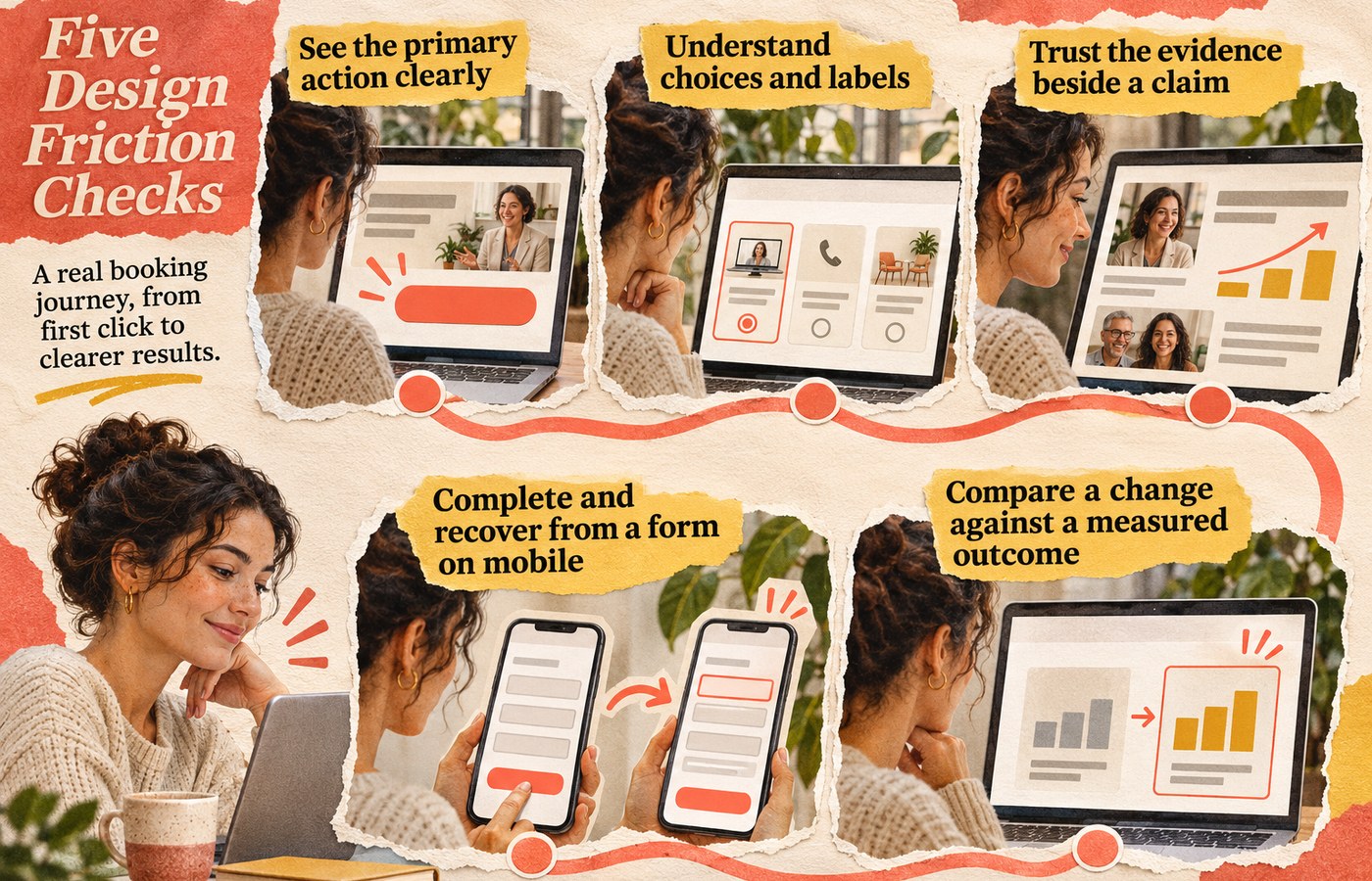
    Five connected checks for an online task: see the main action, understand choices, trust the evidence, complete and recover from a mobile form, and measure the outcome.

    The Five Design Friction Checks

    1. Attention: Can People See What Matters?

    Visual hierarchy should make the page’s important relationships obvious. Headings, spacing, type size, contrast, placement, and restraint can help a visitor distinguish the main action from supporting information. When every element shouts, nothing leads.

    Color is one tool, not a conversion spell. The better question is whether the action is distinguishable in context and remains usable for people with different visual abilities. If your palette is doing too much work, our guide to choosing brand colors that actually work explains why hierarchy and accessibility matter more than a mythical “highest-converting” hue.

    2. Comprehension: Can They Understand the Choice?

    A page can be attractive and still make the decision harder. Long line lengths, weak heading structure, labels that disappear when a field is active, decorative type, vague buttons, dense feature grids, or competing cards can force people to decode the interface before they can evaluate the offer.

    The W3C’s designing-for-accessibility guidance recommends sufficient contrast, identifiable interactive elements, clear and consistent navigation, associated form labels, identifiable feedback, useful headings and spacing, and designs that work at different viewport sizes. Those are accessibility requirements and good interface practices; they also remove avoidable effort from ordinary task completion.

    3. Credibility: Does the Interface Support Trust?

    Trust is not a badge collection. The interface earns credibility when what it promises matches what it shows: claims are near evidence, pricing and next steps are understandable, forms ask for information that makes sense, error states explain what happened, and the visual system stays consistent enough that the site feels maintained.

    The U.S. Web Design System’s design principles frame trust as something a service has to earn through reliability, consistency, honesty, respect for people’s time and data, and continued validation with real users. That is a stronger conversion principle than “add more trust icons.”

    4. Ability: Can They Complete the Task?

    If someone understands and wants the offer but cannot complete the action, the interface has failed at the most expensive moment. Check the real path on a phone, with a keyboard, at larger text sizes, with slow connections, and through common error states. Pay special attention to menus, forms, tap targets, focus states, sticky elements, validation, confirmation messages, and anything that shifts while the page loads.

    Responsive layout belongs here because “works on mobile” is a task requirement, not a screenshot requirement. Our guide to responsive web design goes deeper into preserving the same business task across screen sizes.

    Performance can also be part of ability. One useful controlled example comes from Rakuten 24. In a mobile A/B test documented by web.dev, the two versions were visually and functionally comparable, but the optimized version finished loading 0.4 seconds earlier and recorded a 33.13% higher conversion rate and 53.37% higher revenue per visitor. That is evidence that performance can affect a real conversion path; it is one retailer’s test, not a universal promise for every website.

    5. Evidence: Did the Change Help?

    A design change is not successful because the team likes the new version. Define the behavior you are trying to improve, preserve a baseline, make a controlled change when practical, and compare the result for the relevant audience. Watch the business outcome, not only a proxy such as button clicks.

    This is also where useful friction matters. A shorter form is not automatically better if the removed fields were qualifying poor-fit leads. A louder CTA is not automatically better if it causes more low-intent submissions. Our guide to website conversion mistakes explains the difference between accidental friction that wastes effort and intentional friction that protects a useful decision.

    What Should You Test First?

    Start with the symptom closest to a qualified visitor’s failed action. Do not redesign six variables at once and then credit the new font.

    Observed symptomLikely design constraint to inspectControlled first testUseful outcome
    People reach the page but miss the main actionAttention / hierarchyReduce competing emphasis and make one primary action visually dominantQualified progression to the next step
    People start but abandon a formComprehension or abilityClarify labels, required fields, validation, error recovery, and mobile layoutCompleted qualified submissions
    People read but hesitate before committingCredibilityMove specific proof, constraints, process details, or pricing context closer to the claim it supportsQualified action rate or fewer repeated objections
    Mobile behavior is materially worseAbilityTest the full path on narrow viewports; remove overlaps, layout shifts, tiny controls, and hidden informationMobile task completion compared with its own baseline
    A redesign “looks better” but results are unclearEvidenceChoose one measurable hypothesis and compare a controlled change or time-bounded baselineBusiness outcome tied to the hypothesis

    Website Design Conversion Optimization: What Design Cannot Fix

    Design matters. It is also an easy place to hide a non-design problem. Before commissioning a full visual overhaul, ask whether the actual constraint is one of these:

    • Wrong traffic: the page attracts people who were never likely to become customers.
    • Weak or confusing offer: the visitor understands the interface but does not see enough value to act.
    • Missing evidence: the page makes claims the business has not supported with examples, proof, process detail, or relevant experience.
    • Content problem: the copy does not answer the decision, objection, or next-step question. Stronger visual treatment cannot manufacture a clear offer or point of view that does not exist.
    • Operational friction: slow follow-up, broken scheduling, inventory constraints, unclear pricing, or a poor sales handoff happens after the interface did its job.
    • Measurement failure: analytics cannot distinguish a real lead, purchase, or qualified action from noise.

    If the question is specifically whether the page needs better design or better messaging, use the design-vs-content diagnostic before replacing both.

    Do You Need a Full Website Redesign?

    Not necessarily. A full redesign makes sense when the friction is systemic: the visual hierarchy is inconsistent across important pages, the responsive system repeatedly breaks tasks, the component library makes accessibility fixes difficult, the content architecture no longer matches how people buy, or the technology prevents reasonable iteration.

    Targeted changes are usually a better first move when one path is clearly broken: a confusing form, buried CTA, poor proof placement, unreadable content block, mobile overlap, or misleading control. Fix the smallest constraint that can test the diagnosis. If it works, you learned something. If it does not, you avoided rebuilding an entire site around a guess.

    What Auditing This Exact Article Taught Us

    We used the same evidence rule on this revision. In the 12 months ending August 20, 2026, this exact URL recorded only four GA4 landing sessions, all Direct, with zero engaged sessions and zero configured key events. Google Search Console returned no exact-page performance rows and currently reports the page as “Discovered – currently not indexed.” Bing reports zero clicks and zero impressions. Ubersuggest found no exact-page ranking keywords or backlinks.

    That is not enough traffic to conclude the old article did or did not convert, and Scope Design’s configured analytics events do not capture every possible business outcome. It is enough to reject a weaker editorial habit: preserving unsupported conversion percentages because the page has been online for years. We kept the established URL, removed the statistic soup, narrowed the article’s job, and rebuilt it around a testable design-friction framework.

    Frequently Asked Questions

    Does good website design automatically increase conversions?

    No. Good design can remove barriers to seeing, understanding, trusting, and completing an action, but conversion still depends on traffic quality, the offer, content, evidence, price, follow-up, and measurement. The right design change is the one tied to a diagnosed obstacle.

    What website design change should I make first?

    Fix the first broken step in the actual conversion path. If visitors miss the action, inspect hierarchy. If they start and abandon, inspect the form and error recovery. If they hesitate, inspect proof and expectations. If mobile users struggle, test the whole task on a small viewport. Pick the symptom before the pattern.

    What color CTA button converts best?

    There is no universal highest-converting button color. A CTA needs enough contrast to be identifiable, must fit the visual hierarchy, and must remain accessible. Its wording, placement, surrounding evidence, audience, and offer can matter more than the hue.

    What is a good website conversion rate?

    A generic industry average can be a weak diagnostic because a purchase, consultation request, newsletter signup, and highly qualified B2B lead are different actions with different economics. Start with your own baseline by page, source, device, audience, and conversion definition. Improve the business outcome that matters instead of chasing somebody else’s percentage.

    Design the Next Step, Then Measure It

    Website design conversion optimization is disciplined interface work: make the important choice visible, understandable, credible, usable, and measurable. When those five checks are healthy, visual polish has a job. When one is broken, that is where the next design decision should start.

    If you cannot tell whether your bottleneck is design, content, offer, traffic, accessibility, performance, or measurement, talk with Scope Design. We can diagnose the path before prescribing a redesign.

  • Are Websites Still Relevant? When Your Business Actually Needs One

    Are Websites Still Relevant? When Your Business Actually Needs One

    Are websites still relevant in 2026? Yes—but not every business needs a large or complicated one. The useful question is no longer “website or social media?” It is: Which business jobs require a destination you can control, change, measure, and connect to the rest of your operation?

    A website earns its place when it helps buyers verify your claims, take a useful next step, find durable answers, or complete tasks that a platform profile cannot handle well. If referrals, a Google Business Profile, a marketplace, social profiles, and a phone number already handle those jobs adequately, a profile-first presence—or a very small site—can be a rational choice for now.

    That is a different answer from “every serious business needs a 20-page website.” It is also different from declaring websites dead because discovery increasingly happens in search results, maps, social feeds, marketplaces, and AI-generated answers. Discovery and destination are separate jobs.

    Are websites still relevant in 2026?

    They are relevant when they do work the business actually needs. A website is not strategic merely because it exists. A forgotten brochure site with stale copy, no proof, no clear next step, and no useful connection to sales or operations does not become valuable by surviving another calendar year.

    At the same time, the argument that social media or AI has “replaced” websites confuses where a customer discovers a business with where the business can organize evidence, guide a decision, and complete a transaction or handoff. A buyer may first encounter you in Maps, a TikTok video, a referral text, a marketplace listing, an AI answer, or a search result. The website can still be the place where that scattered discovery becomes a coherent decision.

    Google itself makes the distinction visible. Its Business Profile guidance explains that eligible local businesses can appear in Search and Maps, show hours and contact information, collect reviews, and direct customers to a website, booking link, or other next step. In other words, basic local discovery does not always require a substantial website. That is exactly why the website has to justify its own job.

    Four jobs websites still do well

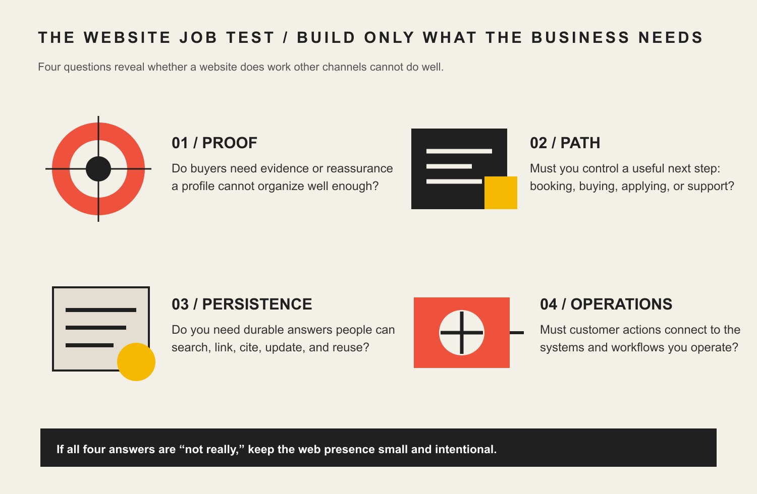
    At Scope Design, we use a simple decision model before talking about pages, templates, features, or redesigns. We call it the Website Job Test. A website becomes more valuable as it takes responsibility for one or more of four jobs.

    Four jobs to test before building a website: proof, a controlled customer path, durable discoverability, and operational integrations.

    1. Proof and authority

    Can a potential customer verify that you are credible, relevant, and capable of doing what you claim? A strong website can organize case studies, work examples, reviews, credentials, people, policies, process, pricing context, service boundaries, and answers to objections in one coherent system.

    Social profiles can provide excellent evidence, but they usually organize it according to the platform’s format and feed logic. A website lets the business decide which proof belongs next to which claim. That matters when the purchase is expensive, risky, technical, unfamiliar, or simply hard to evaluate. Our brand authority framework goes deeper into building a body of proof instead of decorating weak claims.

    2. A controlled conversion path

    Can the right visitor take the right next step without fighting the interface or guessing what happens next? That step might be a purchase, appointment, quote request, assessment, application, download, account login, support task, or detailed inquiry.

    This does not mean “put a form on every page.” It means designing the path around the customer decision and the business’s ability to respond. If your site sends every visitor to the same generic contact form, while nobody owns follow-up, the problem is not a shortage of buttons. If you are still deciding what the site should be accountable for, start with the purpose of the business website before buying more features.

    3. Durable discoverability

    Do customers ask questions that deserve stable, crawlable, linkable answers? A useful website gives those answers a durable address. Search engines can index them, people can bookmark or share them, salespeople can send them, newsletters can point to them, and other sites can cite them.

    That matters even as AI changes how search results are presented. Google’s current guidance for AI experiences in Search still tells site owners to make pages accessible, useful, technically eligible, and easy to use. A website can therefore be a source and a destination in AI-assisted discovery. It is not, however, a guarantee of ranking, indexing, mention, or citation.

    4. Operations and integrations

    Does the customer-facing experience need to connect to booking, ecommerce, CRM, email automation, inventory, support, payments, memberships, portals, documents, calculators, account data, or internal workflow? At that point the website is not merely “marketing.” It is part of how the business operates.

    This job is where the difference between a profile, a simple website, and a custom system becomes obvious. A restaurant that mainly needs hours, directions, a menu, and a reservation link has a different website problem from a manufacturer with specification libraries and distributor workflows, or a service company that must qualify leads across multiple locations and route them to the right team.

    The Website Job Test: do you actually need one?

    Before deciding how much website to buy, answer these questions without assuming the website is the solution.

    1. Proof: Do buyers need evidence, explanation, comparison, policies, or reassurance that a profile cannot organize well enough?
    2. Path: Do you need to control or improve a meaningful next step such as booking, buying, applying, requesting an estimate, or getting support?
    3. Persistence: Do you need durable pages that can be searched, linked, cited, updated, and reused outside a platform feed?
    4. Operations: Do customer actions need to connect reliably to business systems or workflows?

    If the honest answer is “not really” to all four, do not invent a 30-page website project because somebody said every business needs one. If two or three answers are clearly yes, a website is probably doing real work. If all four are essential and the workflows are complex, you are no longer choosing between “a website” and “social media.” You are designing part of the business system.

    This is the same diagnostic discipline behind Scope Design’s constraint-first website strategy: the deliverable somebody requests is evidence of dissatisfaction, not proof that the requested deliverable is the binding constraint.

    How much website do you need?

    Website levelUsually fits whenTypical jobsWarning sign
    Profile-first or minimalDemand is mostly referrals, local/maps, marketplace, or direct contact; offer is simpleBasic legitimacy, contact, location, one destinationYou are hiding real buyer questions because the profile cannot answer them
    Simple business siteBuyers need a clear offer, proof, FAQs, and direct next stepExplain, reassure, route, contactPages multiply without a distinct decision job
    Growth/marketing siteSearch, content, campaigns, lead quality, multiple services, or longer decisions matterDiscovery, evidence, segmentation, conversion, measurementTraffic is blamed for an offer, follow-up, or positioning problem
    Custom or app-like siteTransactions, portals, integrations, data, rules, account flows, or operational logic matterCommerce, self-service, workflow, automation, system integrationCustom development is purchased before the process is understood

    The point is not to graduate every business toward the bottom row. The point is to match the investment to the job. A simple site that does three important things reliably can be more valuable than a custom site full of features nobody uses.

    When a business can rationally start without a big website

    Some businesses can function well for a period with a verified local profile, marketplace presence, social account, direct messaging, phone, email, and a lightweight landing page—or even no substantial site. That can be rational when:

    • the offer is simple and low-risk;
    • most qualified demand already comes through referrals or one dominant marketplace;
    • customers mainly need hours, location, availability, a phone number, or a booking link;
    • the business is validating demand before investing in a larger system;
    • there is little unique information to publish yet; or
    • the operational constraint is somewhere else, such as slow response, capacity, pricing, sales follow-up, or fulfillment.

    The word yet matters. Platform-first can be a stage, not a doctrine. As the business accumulates proof, creates distinct intellectual property, serves more audiences, needs deeper qualification, invests in search/content, or integrates systems, the cost of squeezing everything through a profile often rises.

    Website vs. social media is the wrong comparison

    A website and social media usually solve different parts of the customer journey. Social platforms are excellent for native distribution, conversation, community, discovery, and repeated exposure. A website is better suited to organizing durable information, controlling information architecture, connecting proof to decisions, and integrating with systems.

    Use social media where people already spend attention. Use the website when the buyer needs depth, structure, persistence, or a controlled task. If you are deciding which social channels actually fit the business, our guide to which types of social media can benefit a business owns that platform-selection question.

    Also be precise about “ownership.” A business can usually control its domain, website content, information architecture, conversion paths, and integrations more directly than it can control a platform profile. That is valuable. But it is not absolute ownership of hosting infrastructure, analytics vendors, third-party software, search distribution, or every piece of customer data. Those systems still have contracts, technical dependencies, privacy obligations, and failure modes.

    What AI search changes—and what it does not

    AI answers can resolve simple questions before a person visits any website. That increases the pressure on weak pages whose only purpose was to restate generic information. It does not eliminate the need for original evidence, current facts, detailed proof, transactional destinations, account experiences, or operational tools.

    For website owners, the practical requirement is not a magical “AI SEO” file. Google says the ordinary technical requirements still matter across classic and AI Search experiences: the page needs to work, be accessible to Google, and contain indexable content. Helpful, unique content and a usable page experience still matter too. None of that guarantees an AI citation.

    That is why the safest AI-search strategy is also a sound website strategy: publish things worth finding. Document real expertise. Answer recurring customer questions clearly. Show evidence behind claims. Maintain important facts. Give each page a defined job. Then make sure the system can technically access the page.

    What auditing this exact page taught us

    We applied the same diagnostic rule to this article before rewriting it. The old version made confident claims about “digital dominance,” mixed in trend predictions about progressive apps, voice interfaces, augmented reality, blockchain, and serverless technology, and still did not answer the business decision with enough precision.

    The performance data was even more useful because it kept us from pretending. In the 12 months ending August 19, 2026, the exact URL recorded only 5 GA4 landing sessions, all Direct, with 0 engaged sessions and 0 key events. The prior comparison returned no row. Correct exact-page Search Console filters returned no query rows for either 12-month period, and URL Inspection currently reports the URL as unknown to Google. Bing recognizes the page historically but currently reports 0 clicks and 0 impressions. Ubersuggest found no ranking-keyword data and no discovered backlinks for the exact page.

    Those numbers do not prove nobody cares whether websites are still relevant. They prove this version of this page had almost no measurable search footprint. Separate keyword research still shows modest informational demand around “are websites still relevant” and “do I need a website for my business.” That distinction matters: low page performance is not the same thing as no audience demand.

    So we did not change the long-standing URL just to force the keyword into the slug. We changed the job of the article: direct answer, explicit exceptions, first-party framework, right-sizing guidance, current platform/search evidence, and links to the deeper pages that own website purpose and strategy.

    What should you do next?

    1. Write down the business outcome. What should become easier or more likely because the website exists?
    2. Run the Website Job Test. Identify whether proof, conversion, durable discoverability, or operations actually require a website.
    3. Choose the smallest useful level. Profile-first, simple, growth, or custom is a business decision—not a status symbol.
    4. Assign one leading purpose. If several jobs matter, decide which wins when priorities conflict.
    5. Measure the whole handoff. A form submission nobody answers is not website success.

    If you already have a site, do not assume a redesign is the first move. Use the Website Fitness Test to see whether the current site is actually failing its assigned job. If you are starting from scratch or the diagnosis is unclear, Scope Design can help define the job before pages and features turn into an expensive substitute for strategy.

    Frequently asked questions about whether websites are still relevant

    Do people need websites anymore?

    Not everyone needs a substantial website, but many businesses still benefit from one when buyers need organized proof, a controlled next step, durable searchable information, or integrations that profiles and feeds do not handle well.

    Do I need a website for my business?

    You probably need at least a simple website when customers regularly need more context than a profile provides, when you need to qualify or convert inquiries, when search/content is part of acquisition, or when customer actions connect to business systems. If none of those conditions applies yet, a profile-first approach may be sufficient temporarily.

    Can social media replace a website?

    It can replace some discovery and communication functions, especially for simple offers and early-stage businesses. It is weaker when you need structured proof, durable information architecture, controlled conversion paths, deep search content, or custom integrations. In most mature systems, social media and the website do different jobs.

    Is a Google Business Profile enough without a website?

    For some eligible local businesses, it can cover important basics such as discovery in Search and Maps, hours, location, phone, reviews, photos, and links to booking or other destinations. It becomes limiting when the buying decision needs deeper proof, unique information, qualification, content, or workflows the profile cannot own.

    Are websites obsolete because of AI?

    No. AI can answer more informational questions without a click, which makes generic pages less defensible. But AI systems still depend on sources, businesses still need destinations for proof and transactions, and many customer tasks cannot be completed inside an answer box. A website should contain useful evidence and functionality rather than exist as a ceremonial homepage.

    What is the minimum website a small business needs?

    The minimum is the smallest site that completes the jobs the business cannot reliably handle elsewhere. For one company that may be a single clear page with proof and contact information. For another it may require service pages, FAQs, case studies, booking, ecommerce, or an integrated application. Start with the job, not an arbitrary page count.

  • UX Web Design and Content Strategy to Boost Website Value

    UX Web Design and Content Strategy to Boost Website Value

    UX content strategy is the practice of planning what a website needs to say, how people will find and understand it, and what should happen next as one connected system. For a business website, the most useful unit is not the page. It is the decision the visitor is trying to make on that page.

    That changes the job of web design. Instead of creating a polished layout and filling it with copy later, you start with the visitor’s intent, the business objective, the evidence needed to resolve doubt, and the path to an appropriate next action. UX shapes how that path works. Content strategy determines what information belongs in it, why it exists, who owns it, and how it stays useful.

    Scope Design’s rule: A requested tactic is evidence, not a diagnosis. Before redesigning pages or rewriting copy, define the objective, identify the binding constraint, clarify the positioning, choose the strategy, then select tactics and measurement.

    What does UX content strategy actually mean?

    UX design, content strategy, and copywriting overlap, but they are not interchangeable.

    • UX design shapes the experience of completing a task: navigation, hierarchy, interaction, forms, feedback, accessibility, and the sequence of steps.
    • Content strategy decides what information should exist, what purpose it serves, how it is structured and governed, who maintains it, and how success is measured.
    • Copywriting and UX writing turn that strategy into the actual words people read and act on.

    Nielsen Norman Group’s Content Strategy 101 describes content strategy as an ongoing practice for planning the creation, delivery, governance, maintenance, and eventual retirement of useful content. Its more recent comparison of content strategy and UX writing makes the same distinction: strategy establishes goals, systems, standards, research, and measurement; writing executes within that system.

    For a marketing website, those disciplines meet everywhere. A navigation label is content and UX. A service-page heading is content and information hierarchy. A form field is both a business qualification choice and a usability choice. A case study is content, but where it appears in the decision path determines whether a visitor sees the proof when doubt actually occurs.

    If the underlying problem is simply weak, generic, company-centered writing, our guide to why website content fails goes deeper on content quality. This article is about the larger system: making content and UX work together.

    Before integrating UX and content, diagnose the real constraint

    A prettier website can still fail. Better copy can still fail. Faster pages can still fail. Each is valuable only when it addresses the constraint currently preventing the business outcome.

    Scope Design diagnoses website problems upstream to downstream:

    1. Measurement and technical integrity: Do analytics, forms, notifications, mobile behavior, speed, and tracking actually work?
    2. Sufficient relevant volume: Is there enough intent-bearing traffic to evaluate conversion behavior?
    3. Traffic quality and acquisition fit: Are the right people landing on pages that match the promise that brought them there?
    4. Messaging clarity: Can visitors understand what you do, who it is for, why it matters, and what to do next?
    5. UX friction: Are interested visitors getting lost, blocked, surprised, or forced to work too hard?
    6. Offer and positioning: Do qualified visitors understand the offer but still believe the trade is not worthwhile?
    7. Sales and operational follow-through: Does the business respond, qualify, route, and close the opportunities the site creates?

    That order matters. If your tracking is broken, a conversion-rate diagnosis is weak. If almost nobody relevant reaches the page, changing button copy is unlikely to be the highest-value move. If good-fit prospects arrive and understand the offer but do not believe it, navigation tweaks may be treating the symptom.

    If you are specifically deciding which discipline to fix first, see Web Design vs. Content: Which Should You Fix First? If the broader question is why qualified visitors are not converting, use our UX diagnosis guide. Here, we will assume the website genuinely needs UX and content to be planned together.

    Use a Website Decision Architecture instead of decorating a sitemap

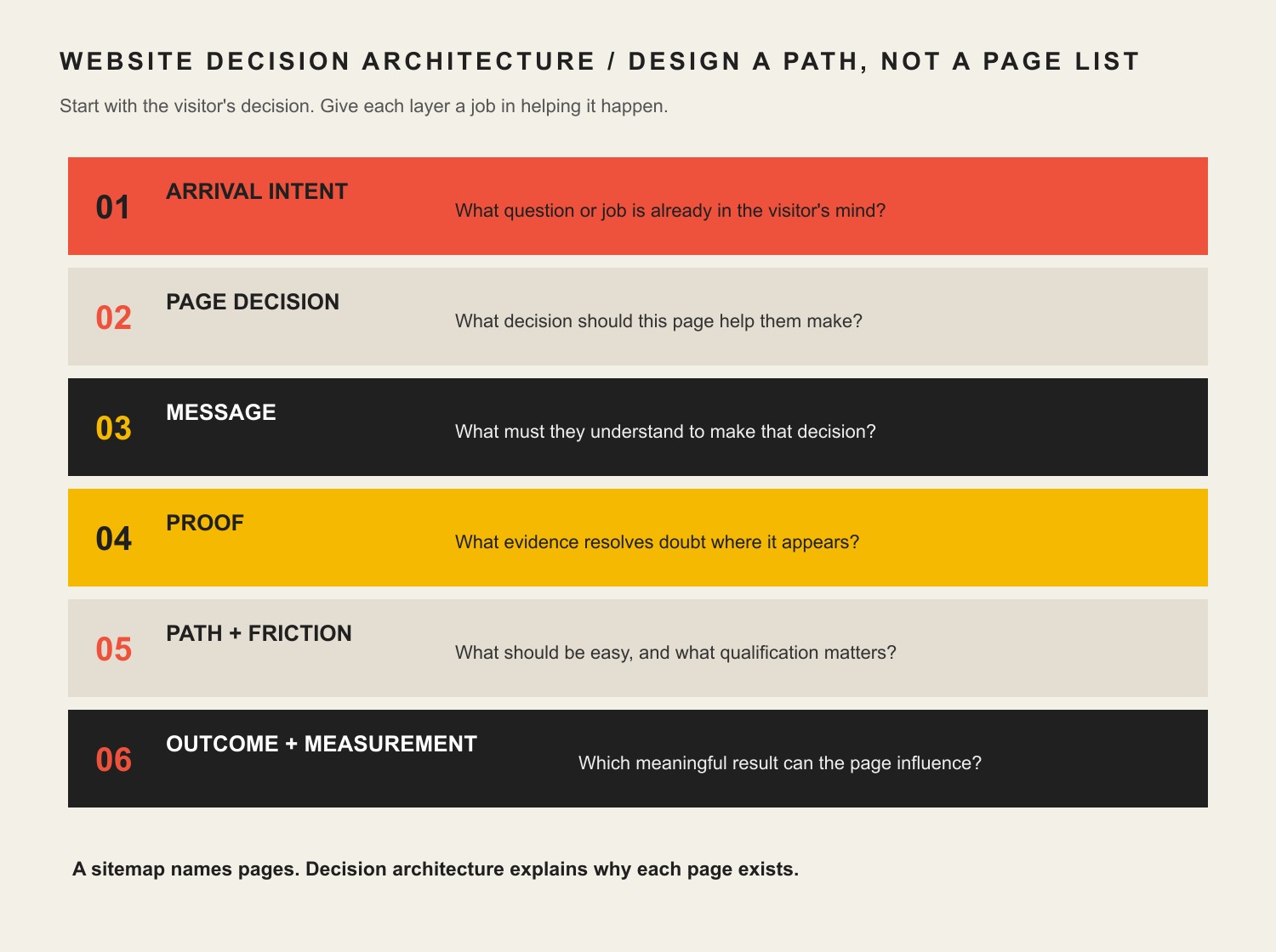
    A sitemap tells you which pages exist. It does not tell you whether those pages deserve to exist, what decision each page supports, what evidence belongs there, or how the visitor moves from uncertainty to action.

    Six layers of website decision architecture: arrival intent, page decision, message, proof, path and friction, and outcome measurement.

    For every important page, answer six questions before polishing the visual design:

    Decision layerQuestion to answerWhat it changes
    Arrival intentWhat question or job is in the visitor’s head when they land?Page promise, search/acquisition fit, opening message
    Page decisionWhat decision should this page help them make?Scope, hierarchy, what to include or remove
    MessageWhat must they understand before they can decide?Headings, explanations, comparisons, objections
    ProofWhat evidence resolves doubt at the moment it appears?Case studies, examples, credentials, reviews, process proof
    Path + frictionWhat should be easy, and what qualification friction is intentional?Navigation, CTAs, forms, progressive disclosure
    Outcome + measurementWhat is the last meaningful outcome this page can influence?Analytics events, CRM handoff, success criteria

    The key is sequencing. Content should not merely describe what the business wants to say. UX should not merely make that content attractive. Both should help the visitor make the next reasonable decision with enough context and confidence.

    How to integrate UX design and content strategy in a website project

    1. Define the business objective and the website’s job

    Start with the outcome, not the deliverable. “Redesign the website” is a tactic. “Generate more qualified opportunities from referral and organic traffic” is an objective that can guide strategy.

    Then decide what the website can realistically control. A considered B2B site may be responsible for generating qualified conversations, not closing the sale by itself. A local service page may be responsible for booked-and-attended appointments. An ecommerce product page can be held much closer to purchase.

    2. Research arrival intent, not just demographics

    “Small-business owner, age 35–55” rarely tells a designer what to build. The useful question is what the person is trying to figure out right now.

    • A search visitor may need a direct answer before they trust the company.
    • A referral may already trust the brand but need proof of fit.
    • A paid-ad visitor needs the landing page to continue the exact promise in the ad.
    • A prospect sent by a salesperson may need pricing, process, proof, or implementation detail to reduce uncertainty.

    Design the experience for that arrival state. The same person can need different content on different visits.

    3. Give every important page a job

    Before wireframes, define the decision each page supports. A service page might help someone decide, “Is this company a fit for my problem?” A case study may answer, “Have they solved something like this before?” A pricing page may answer, “Is this option financially realistic?”

    This is where information architecture becomes strategic. Navigation, internal links, page hierarchy, and content structure should mirror the questions people need answered—not the departments on your org chart.

    4. Draft content structure and proof before polished visual design

    This does not mean every final sentence must be approved before design begins. It means the designer should know the real content requirements: the message hierarchy, likely content length, proof assets, objections, comparisons, CTAs, data, forms, media, and edge cases.

    NN/g explicitly recommends bringing content into the design process early and planning structure, information architecture, metadata, accessibility, standards, and governance before last-minute content insertion. That matches our experience: lorem ipsum can hide the very constraints the finished page must solve.

    5. Put proof where doubt occurs

    Do not dump every testimonial into one carousel and call it trust. Match the proof to the claim. If you claim a complicated migration is safe, show how you handled one. If you claim industry expertise, show relevant work or insight. If you claim a process reduces risk, explain the checkpoints.

    This is also where UX, content, and brand authority intersect. Authority is more useful as a body of evidence than as a visual costume. Good UX makes the right proof easy to encounter; good content strategy makes sure the proof exists and stays current.

    6. Design actions and forms around fit, not raw conversion volume

    Many conversion checklists say to remove fields and eliminate friction. Sometimes that is right. Sometimes it is exactly wrong.

    If a considered-service business cannot serve a certain geography, project size, or timeline, asking about that constraint may reduce total form submissions while improving the percentage that become real opportunities. The goal is not to maximize button clicks. The goal is to improve the business outcome after lead quality, staff time, no-shows, churn, and trust are counted.

    We use two ethical tests for conversion tactics: would the improvement survive if the visitor understood why the tactic was used, and does the improvement remain after downstream costs and trust are included? That rules out fake urgency, hidden costs, inaccessible design, and other mechanics that make the metric look better by making the experience worse.

    7. Test the combined experience

    Do not test content and interface as if they live in separate universes. Give people realistic tasks and watch where meaning or interaction breaks down. A participant who understands the service but cannot find the next step has a UX problem. A participant who can navigate perfectly but cannot explain the offer has a messaging problem. A participant who completes the form but is a terrible fit may expose a qualification or acquisition problem.

    Performance and accessibility are part of UX content strategy

    Content is not useful if the experience prevents people from reaching, reading, understanding, or operating it.

    Google’s current Core Web Vitals guidance measures loading performance, responsiveness, and visual stability. Google recommends aiming for Largest Contentful Paint within 2.5 seconds, Interaction to Next Paint under 200 milliseconds, and Cumulative Layout Shift under 0.1 for a good experience. Those metrics matter, but Google also makes clear that page experience is broader than any single metric.

    Accessibility has the same integrated character. WCAG 2.2 organizes accessibility around content and interfaces being perceivable, operable, understandable, and robust. At Level AA, for example, headings and labels must describe their topic or purpose. That is simultaneously a writing, hierarchy, design, and implementation responsibility.

    A fast page can deliver the wrong answer very efficiently. A beautiful page can be inaccessible. A technically compliant page can still be confusing. Treat performance, accessibility, structure, and meaning as one experience.

    Example: the requested redesign was not the real problem

    A long-established specialty auction business came to Scope Design asking for a new website and new features. Discovery showed that a prettier website was not the real constraint.

    The public site sat on top of broken or incomplete customer-facing functions, disconnected data, manual processes, legacy software, and systems that could not support where the business needed to go. Starting with visual page design would have made the surface look newer while leaving the underlying customer and operational experience fragile.

    So we mapped the business processes and rebuilt the foundation around them before treating requested features as isolated page components. The strategic lesson is bigger than that project: the requested deliverable was a symptom; discovery exposed the constraint.

    Measure the last meaningful outcome the website can influence

    Sessions, impressions, rankings, scroll depth, time on page, and button clicks are diagnostic signals. They are not automatically business success.

    Choose a primary outcome based on the website’s actual job:

    • Ecommerce: purchases, repeat purchase behavior, and average order value.
    • Considered B2B: qualified opportunities and pipeline value.
    • Local services: booked-and-attended appointments and correctly tracked calls.
    • Subscription businesses: activation, retention, and lifetime value.
    • Operational/self-service sites: staff time saved, errors reduced, or issues resolved without manual intervention.

    Then use supporting metrics to locate the bottleneck. Search visibility can diagnose acquisition. Engaged sessions can help diagnose landing-page fit. Form completion can reveal friction. Qualified-opportunity rate can reveal whether the content and form are attracting and filtering appropriately. Follow the chain far enough that optimizing one metric does not quietly damage the next one.

    What revising this exact page taught us

    We applied the same diagnosis to this article before rewriting it. The old version was about 1,300 words and contained broad UX/content advice, unsupported conversion statistics, and essentially one context-free internal CTA.

    In the latest complete 12-month analytics window ending August 19, 2026, it recorded only one organic-search session and no tracked key event. Search Console returned no page/query performance rows for either of the two 12-month comparison periods, and URL Inspection reported the live page as Discovered – currently not indexed. Bing showed zero clicks and zero impressions. Ubersuggest found zero ranking page keywords, backlinks, and referring domains.

    That does not prove the topic has no demand. Ubersuggest estimates about 170 U.S. monthly searches for “ux content strategy,” and the current Google results include an AI Overview plus high-authority articles from Nielsen Norman Group, HubSpot, and specialist UX publications. The more useful conclusion is that the old article did not earn a distinct enough job in that result set.

    This revision therefore changes the value proposition instead of merely adding words: it removes unverified statistics, makes the Constraint-First diagnosis explicit, introduces a reusable Website Decision Architecture, adds first-hand project evidence, connects the article to relevant Scope resources, and gives both search engines and readers a clearer reason this page should exist.

    UX content strategy FAQ

    What does “UX content” mean?

    UX content is the information people encounter while using a digital experience: headings, navigation labels, service explanations, buttons, instructions, forms, error messages, help content, proof, and more. The important point is not the label. The content helps people understand where they are, what something means, what choice they are making, and what happens next.

    How do UX design and content strategy work together?

    Content strategy defines the purpose, information, structure, ownership, and measurement. UX design turns those requirements into an experience people can navigate and operate. They should iterate together: real content changes layout and hierarchy, while prototypes and user testing expose missing, confusing, or badly timed content.

    Should content come before web design?

    The strategy and real content requirements should come before polished visual design, but the work should not be a rigid waterfall. Designers need enough real content to understand hierarchy, length, proof, edge cases, and interactions. Writers and strategists need prototypes to see whether the information works in context. Plan early, then iterate together.

    What are the seven pillars of UX design?

    There is no single universally accepted set of seven UX-design pillars. Different authors use different frameworks. For a business website, a more useful question is whether the experience is useful for the intended visitor, understandable, findable, operable, accessible, credible, and connected to a measurable business outcome. Do not force a numbered framework onto the project unless it improves the diagnosis.

    What is an example of a UX content strategy?

    For a B2B service page, the strategy might define the visitor as a comparison-stage buyer, the page decision as “Is this firm a fit?”, the core message as the problem and outcome, the proof as a relevant case study, the intentional friction as project-size and timeline qualification, and the primary outcome as a qualified consultation request. UX then determines how those elements are ordered, revealed, labeled, navigated, and completed on desktop and mobile.

    How do you measure whether UX content strategy is working?

    Measure the last meaningful outcome the website or page can directly influence, then use diagnostic metrics to locate problems. For a service company that may be qualified opportunities rather than raw form submissions. For ecommerce it is much closer to purchase. Tie page and traffic data to CRM or revenue data where possible so you can distinguish activity from value.

    Build the website around the decision you need to improve

    The strongest UX content strategy does not begin with “How should this page look?” or “How many words should we write?” It begins with the business objective, the visitor’s intent, and the constraint preventing the desired outcome.

    From there, design the argument, proof, navigation, interactions, qualification, and measurement as one system. That is how a website becomes more than a collection of attractive pages—it becomes an asset that helps the right people make good decisions.

    If your website looks fine but you are not sure whether the real problem is traffic, messaging, UX, content, the offer, or follow-through, contact Scope Design. We can help diagnose the constraint before you invest in the wrong fix.

  • Online Presence for Small Business: 6 Steps to Win and Retain Customers

    Online Presence for Small Business: 6 Steps to Win and Retain Customers

    A strong online presence for small business growth is not a website, a Google Business Profile, a few social accounts, and an email list sitting beside one another. It is a connected system that helps the right people find you, understand you, take the next step, receive a competent response, and have a reason to come back.

    Most advice about an online presence for small business owners stops at the channel list. That distinction matters because customer retention is rarely won by one page or one channel. A site can generate a perfectly good lead and still fail if the form goes nowhere. Search can bring qualified visitors to a confusing offer. Social media can create attention that never reaches an owned audience. A polished redesign can hide the fact that slow follow-up—not design—is the real bottleneck.

    Scope Design’s approach is to treat the web presence as an acquisition-to-retention system and fix the earliest constraint in that system before adding more tactics downstream. We call the model the Presence-to-Repeat Loop: Home Base → Findability → Trust → Handoff → Follow-through → Feedback.

    If you remember one idea from this guide, make it this: build the loop, then improve the first stage that is actually failing. More channels are not automatically more presence, and more traffic is not automatically more business.

    TL;DR: Build the Smallest Complete Online Presence for Small Business Growth

    • Own the home base: keep the website clear, usable, accessible, measurable, and connected to the systems that receive customer actions.
    • Earn relevant discovery: use search, local listings, social, referrals, ads, and other channels only where they reach the right people.
    • Protect the handoff: test what happens after a form, call, booking, order, or signup so customer intent reaches a real owner and receives a useful response.
    • Improve the first constraint: use feedback and business outcomes to fix the earliest failing stage instead of stacking more tactics downstream.

    In This Guide

    Online Presence for Small Business: What It Should Actually Do

    Your online presence is every meaningful digital touchpoint where a prospect or customer can discover, evaluate, contact, buy from, or return to your business. That can include your website, search results, Google Business Profile, social profiles, review sites, marketplace listings, email, booking or ecommerce systems, and customer portals.

    The phrase online presence for small business can sound like a channel checklist. In practice, it is a customer-path problem: discovery only matters when it reaches a useful handoff and a customer experience worth repeating.

    Those touchpoints do not deserve equal strategic weight. Your website is normally the owned hub: the place where you control the message, structure, offers, calls to action, measurement, and integrations. Search, maps, social, directories, ads, and referrals are discovery or distribution surfaces that should send the right people toward that hub—or toward another intentional next step.

    That is why “being everywhere” is a poor goal. The better question is: what job should each channel perform, and what happens after it performs that job? Our broader SEO strategy and analytics framework applies the same logic to search: visibility matters only when it connects to a qualified business outcome.

    A useful web presence should do six jobs in sequence: provide an owned destination, earn relevant discovery, reduce uncertainty, make the next action easy, route that action into a real business process, and feed what you learn back into the system. That sequence is the Presence-to-Repeat Loop.

    The Presence-to-Repeat Loop

    The loop is not a funnel that ends when somebody submits a form. It continues through the operational handoff and customer experience, then brings evidence back to marketing and the website. That is what makes retention part of web strategy instead of an unrelated task owned by somebody else.

    1. Home Base: Own the Destination

    Your home base is the digital property where the business can explain what it does, for whom, why it is credible, and what should happen next. For most small businesses, that is the website. It should be stable enough to trust, easy enough to use, and structured around real customer decisions rather than around whatever pages came with the theme.

    Ownership also means maintainability. Forms need to work. Contact information needs to be current. Important pages need clear owners. Analytics should be installed correctly. Critical third-party dependencies should be understood. Accessibility belongs in this foundation, too: WCAG 2.2 is the current W3C Recommendation with testable, technology-neutral criteria for making web content more accessible, and W3C notes that following the guidance often improves usability more broadly.

    A redesign can help when the home base itself is the constraint, but redesign is not the default diagnosis. Before rebuilding, use a website redesign checklist that proves the need before the rebuild. If the real failure is lead routing, offer clarity, or follow-up, a prettier interface can leave the business problem untouched.

    2. Findability: Help the Right People Discover You

    Findability is not the same as traffic. The goal is relevant discovery from people who have a reasonable chance of becoming customers. Depending on the business, that can come from organic search, local search, paid media, referrals, social content, partnerships, directories, or direct demand created offline.

    Google’s SEO Starter Guide describes SEO as helping search engines understand content and helping users find a site. Google also says it primarily discovers new pages through links from pages it already crawled. In practical terms, useful content, logical internal links, clear page ownership, and crawlable navigation are part of being findable; publishing isolated pages and hoping search figures it out is not a strategy.

    For a local business, your website and your Google Business Profile should reinforce one another. Google says an eligible, verified Business Profile lets a business manage how it appears in Search and Maps, maintain key information, and interact through features such as photos and reviews. Our local SEO guide for small businesses goes deeper on being found and chosen in local search.

    3. Trust: Answer the Questions That Block Action

    Once the right person arrives, the site has to make a clear argument. What problem do you solve? Who is the offer for? What is included? What does the process look like? What proof supports the claim? What happens if the visitor is not ready to buy today?

    Trust is not a pile of badges. It is the reduction of relevant uncertainty. A service business may need strong examples, process clarity, scope boundaries, and credible reviews. A local retailer may need hours, inventory expectations, directions, policies, and real photos. A consultant may need a point of view that shows how decisions are made. Put proof near the doubt it resolves rather than hiding all credibility on a testimonial page.

    Social media can support this stage by showing activity, expertise, community participation, and evidence of work, but it should have a defined role. If social is one of your authority channels, our guide to building a social media presence that actually builds authority covers that specialist job without turning this article into a social-media checklist.

    4. Handoff: Make the Next Step Reach a Real Person or System

    This is the stage most “online presence” guides skip. A conversion is not complete because a form says “Thank you.” The business has to receive the inquiry, know what it means, assign responsibility, and act on it.

    Test the whole path. Submit the form. Call the tracked number. Make a test booking. Use a different email address. Check what reaches the CRM or inbox. Confirm who owns the response. Check mobile notifications. Verify that the customer receives the promised confirmation. If a lead can disappear into a generic mailbox or an integration can fail silently, the web presence has a business-process problem, not merely a page-design problem.

    The best handoff is usually boring: the visitor knows what will happen, the business knows who owns it, the data lands where staff can use it, and exceptions are visible instead of silently falling through the floor.

    5. Follow-through: Continue the Relationship After the Click

    Retention starts with delivering what the web presence promised. That can include prompt lead response, clear onboarding, appointment reminders, order updates, support information, replenishment or rebooking prompts, useful education, customer-only resources, and intentional requests for feedback or reviews.

    Email is useful here because it gives the business a direct channel it can operate intentionally rather than depending entirely on a social algorithm. But the job is not “send more email.” Each message should have a reason to exist and a useful next step. Our email newsletter strategy guide covers how to publish something worth opening.

    For U.S. commercial email, follow the rules as well as the strategy. The FTC’s CAN-SPAM compliance guide requires accurate sender information and subject lines, a valid postal address, a working opt-out method, and prompt honoring of opt-out requests. Retention does not mean trapping customers in a list they cannot leave.

    6. Feedback: Use Customer Evidence to Improve the Loop

    The final stage sends evidence back to the beginning. Search Console can show which queries and pages earn visibility. Analytics can show which landing pages and actions people use. CRM or booking data can show which leads become qualified opportunities. Support notes can expose confusion the website should prevent. Repeat purchases, renewals, referrals, cancellations, and reviews can show where the experience is helping or hurting the relationship.

    The important rule is to measure the last meaningful outcome the web system can control. A website cannot close every sale for a consultative service, but it can influence qualified inquiries, completed bookings, usable lead data, and clear handoffs. Measure those outcomes, then connect them to what happens next without pretending every downstream business result belongs to marketing.

    Find the Earliest Constraint Before Buying Another Tactic

    When performance is weak, small businesses often jump to the visible tactic: redesign the site, post more, run ads, add chat, buy a CRM, install another plugin, or publish more content. Scope Design uses a constraint-first diagnostic order instead. Start at the top and do not move down until the earlier stage is reasonably healthy.

    That makes online presence for small business planning a prioritization problem, not a shopping list. The first failed stage should determine the next investment.

    1. Measurement and technical integrity: Can the important pages load, forms submit, tracking record useful events, and systems pass data reliably?
    2. Sufficient relevant volume: Is there enough qualified discovery to judge what happens after arrival?
    3. Acquisition fit: Are the right people arriving for the right reasons, or are you attracting curiosity that will never become demand?
    4. Messaging clarity: Can a qualified visitor understand the offer, audience, difference, proof, and next step?
    5. UX friction: Is the site making a clear decision unnecessarily difficult through confusing navigation, unreadable layouts, broken mobile behavior, slow interactions, or forms that ask for the wrong things?
    6. Offer and positioning: Is the underlying offer compelling and appropriate for the market, or are you trying to optimize the interface around a weak proposition?
    7. Sales and operational follow-through: Once the site does its job, does the business respond, qualify, onboard, deliver, and follow up consistently?

    This ordering prevents expensive misdiagnoses. If tracking is broken, you cannot confidently diagnose conversion. If qualified traffic is tiny, a conversion-rate argument may be noise. If the right leads arrive but nobody responds for three days, another SEO campaign cannot fix the handoff. The constraint—not the trendiest tactic—should determine the next investment.

    What Should You Measure From First Visit to Repeat Customer?

    For an online presence for small business owners, measurement should follow the same customer path as the strategy. There is no universal dashboard that proves a web presence is working. The useful metric depends on the stage and the business model. A local service company, ecommerce store, professional practice, membership organization, and B2B consultant do not share one conversion definition.

    StagePrimary business signalUseful diagnosticsQuestion if weak
    FindabilityQualified discoveryRelevant impressions, visits, local actions, source/mediumAre enough of the right people finding us?
    TrustQualified next actionsService-page paths, calls to action, proof engagement, assisted pathsDo qualified visitors understand and believe the offer?
    HandoffUsable inquiries, calls, bookings, or ordersForm success, call routing, booking completion, integration errorsCan intent move into a real business process without getting lost?
    Follow-throughQualified opportunities and delivered customer actionsResponse time, appointment completion, onboarding completion, abandoned stepsDoes the business keep the promise made by the website?
    RetentionRepeat purchases, renewals, rebookings, referrals, or expansionCohorts, customer source, cancellation reasons, review themesWhat makes good customers return—or disappear?
    FeedbackBetter next decisionsSearch queries, support questions, lost-lead reasons, review languageWhat evidence should change the next website or marketing decision?

    Traffic still matters as a diagnostic. It simply does not deserve to be mistaken for the outcome. The same is true of rankings, followers, email opens, time on page, and any other intermediate signal. Use them to explain the system, not to replace the business result you actually care about.

    A First-Hand Example: The Website Was Not the First Constraint

    One Scope Design project involved a long-established specialty auction business that understandably wanted website and feature improvements. A superficial response would have started with layouts and a feature list.

    But the discovery work exposed a broader constraint. Important forms were unreliable, business data lived in disconnected places, staff depended on manual processes, and legacy systems shaped what could safely change. A new interface alone would have covered some of that complexity without fixing the operational handoff underneath it.

    So the first job was to map what happened from customer action through the internal process, identify fragile dependencies, repair foundation problems, and decide which changes would genuinely reduce friction. Design still mattered. It simply had to follow the constraint instead of pretending to be the diagnosis.

    That lesson generalizes: a requested deliverable is evidence of dissatisfaction, not proof of the binding problem. If somebody asks for a redesign, SEO, social media, automation, or a CRM, first trace the customer and data path far enough to see where value is actually leaking.

    Common Online-Presence Mistakes That Weaken Retention

    Treating Social Profiles as the Whole Business Presence

    Social networks can be excellent discovery and trust channels, but they are rented distribution. Account rules, reach, formats, and platform priorities can change. Use social where your audience actually participates, then give important prospects and customers an owned place to learn, act, subscribe, book, buy, or return.

    Adding Channels Without Giving Them Jobs

    A neglected TikTok account, a monthly newsletter with no purpose, an unused chat widget, and six directories do not become a strategy because they appear in the marketing plan. Every channel should have a job, an owner, a next step, and a reason to remain in the system.

    Collecting Leads Into a Dead End

    If form submissions land in an inbox nobody owns, booking exceptions are invisible, or sales staff cannot tell where an inquiry came from, the problem is not “conversion optimization.” Test handoffs as carefully as pages.

    Automating a Process You Have Not Defined

    Automation can make a good process faster, but it can also make a bad process fail at scale. Define ownership, required data, exceptions, response expectations, and escalation first. Then automate the repetitive parts that are actually stable.

    Promising an Experience Operations Cannot Deliver

    Marketing and retention separate when the website promises speed, customization, availability, or service quality that the operational system cannot consistently provide. The fix may be a better workflow, a narrower promise, clearer expectations, or more capacity—not a new headline.

    Measuring Activity Instead of Progress

    A rise in followers, traffic, impressions, or email sends can be useful, but those numbers do not tell you whether more suitable prospects became customers or whether good customers returned. Keep intermediate metrics attached to the customer path they are supposed to explain.

    Run a 90-Minute Online Presence for Small Business Audit

    A useful online presence for small business audit follows the customer path, not the marketing org chart. You do not need a three-month consulting engagement to find obvious breaks. In 90 minutes, a business owner or small team can walk the same loop and create a short constraint list. The goal is not to “audit everything.” It is to identify the first plausible failure that deserves deeper investigation.

    1. Minutes 0–15 — Home Base: Open the site on desktop and mobile. Check the main offer, contact details, key pages, primary calls to action, important forms, booking or checkout, security warnings, analytics presence, and obvious accessibility barriers. Write down anything that can stop a qualified visitor from using the site.
    2. Minutes 15–30 — Findability: Search your business name, core services, and local terms that real customers use. Check how your website, Business Profile, reviews, social profiles, directories, and ads represent the same business. Look for missing, stale, contradictory, or irrelevant discovery paths.
    3. Minutes 30–45 — Trust: Pretend you are a careful first-time buyer. Can you understand the audience, offer, process, proof, boundaries, and next step without calling to ask basic questions? Note every uncertainty that could reasonably delay action.
    4. Minutes 45–60 — Handoff: Submit a form, make a test call, or complete a booking. Follow the data. Who gets it? How quickly? What confirmation does the customer receive? What happens if the normal owner is absent? Record every place the inquiry can disappear.
    5. Minutes 60–75 — Follow-through: Map what happens from inquiry to onboarding, delivery, support, rebooking, renewal, review request, or next purchase. Look for promises that rely on memory instead of a defined process.
    6. Minutes 75–90 — Feedback: Pull only the evidence needed to judge the loop: search visibility, qualified actions, lead quality, response or completion data, repeat behavior, cancellations, reviews, and support themes. Choose the earliest stage with credible evidence of failure.

    Finish with one sentence: “The next constraint we need to prove or disprove is ______.” That sentence is more useful than a 40-item tactic list because it tells you what evidence to gather and what not to buy yet.

    Frequently Asked Questions About Online Presence for Small Business Owners

    How do I build my online presence?

    Start with an owned home base that clearly explains what you do and what visitors should do next. Then build the discovery channels your customers actually use, add proof that resolves buying doubts, connect every important action to a real internal owner or system, create intentional follow-up, and measure what happens through the first repeat-customer outcome. Do not launch every channel at once. Build the smallest complete loop first.

    Do small businesses need a website if they already use social media?

    Most established small businesses benefit from an owned website even when social media is important. Social platforms are useful discovery and authority channels, but the platform controls the account environment, reach, formats, and rules. A website gives the business more control over its message, customer paths, integrations, content organization, measurement, and owned conversion points. There are exceptions—especially very small or temporary businesses—but “we have social” is not the same as owning a durable digital hub.

    What should a small business website do after it generates a lead?

    It should hand the lead into a defined process. The inquiry needs to reach the right owner or system with enough context to respond, the prospect should receive a clear confirmation, and the business should have a response expectation plus a way to see failures. The website’s job is not finished at the form submission.

    Can a website redesign improve customer retention?

    Yes, when website friction is part of the retention problem—for example, customers cannot find support information, rebook easily, manage an account, understand next steps, or use the site reliably. But a redesign will not repair weak service delivery, an unclear offer, bad lead routing, or inconsistent follow-up. Diagnose the constraint first.

    Which online channels matter most for a small business?

    The channels that reach your real customers and perform a defined job in the Presence-to-Repeat Loop. A local service business may depend heavily on Google Search, Maps, reviews, its website, and direct follow-up. A B2B specialist may rely more on referrals, search, LinkedIn, email, and strong proof content. A retailer may need local discovery, ecommerce, social, and post-purchase communication. Start with customer behavior and the business model, not a generic platform list.

    How often should I review my online presence?

    Scope Design recommends lightweight monthly health checks for obvious technical, tracking, listing, and handoff problems, plus a deeper quarterly review of the customer journey. Revisit the loop sooner after a major offer change, site launch, system migration, staffing change, or repeated customer complaint. The cadence is a management recommendation, not a universal industry rule.

    Build the Loop, Not the Pile

    The strongest online presence for small business success is not the one with the most accounts, automations, pages, or dashboards. It is the one where discovery, trust, action, handoff, service, and feedback support one another.

    If your business is getting traffic but not good leads, generating leads but losing them after the form, or redesigning the site without knowing what problem the redesign is supposed to solve, start with the constraint. Map the Presence-to-Repeat Loop, identify the first failing stage, and make the next investment answer that evidence.

    That is also how Scope Design approaches website and digital strategy: diagnose the business job first, then choose the site, SEO, content, automation, or operational work that actually addresses it. If you need help mapping the system, Scope Design can start with the evidence instead of another pile of tactics.