
Category: Website Strategy & Conversion Optimization

  • Why a $500 Website Is Like Building a House With One Hammer

    Why a $500 Website Is Like Building a House With One Hammer

    Direct answer: Website development cost is not the price of “putting some pages online.” It is the price of deciding what the site must accomplish, writing the message, designing the experience, building and testing the technology, handling accessibility and measurement, and keeping the damn thing healthy after launch. A $500 website can be a perfectly sensible small scope. It just cannot honestly be every discipline, every feature, and every future responsibility wearing one suspiciously cheap trench coat.

    TL;DR

    • Website development cost should match the work and responsibility involved; a $500 website is simply a $500 scope.
    • Cheap becomes expensive when strategy, copy, accessibility, analytics, ownership, security, or maintenance are assumed but never assigned.
    • Every omitted task still belongs to someone: you, the builder, a platform, a future vendor, or the risk column.
    • Compare website proposals by deliverables, decisions, ownership, exclusions, definitions of done, and post-launch responsibility—not page count alone.
    • If all you need is a simple online calling card and you bring the copy, brand, photos, plan, and patience, a small budget may be completely reasonable.

    Imagine walking onto an empty lot with coffee in hand.

    “Nothing crazy,” you tell the contractor. “Just a four-bedroom custom house. Slap up some walls, toss on a roof, make it look expensive. Budget is $500.”

    The contractor looks at the single hammer in his hand. Then at you. Then back at the hammer.

    “Where are the blueprints?”

    You shrug. “You’re the builder.”

    “Plumbing plan?”

    “Can’t you figure that out while you’re doing the drywall?”

    “Electrician? Foundation crew? Permits? Drainage?”

    “I thought you hit things with the hammer and the house appeared.”

    Ridiculous, right?

    And yet businesses ask for websites this way every day—not because they are stupid, cheap, or secretly plotting against designers, but because digital work hides the trades. You see the finished screen. You do not see the research, decisions, writing, testing, integrations, compliance work, or maintenance plan holding it up.

    That is where website pricing conversations go sideways.

    Website development cost is really a map of responsibility

    The most useful question is not, “How many pages do I get?”

    It is: Who is responsible for every decision required to make those pages work?

    A quote is a map of responsibility. When an item is not in the quote, the work does not vanish into the digital mist. It moves somewhere else:

    • to your staff,
    • to a generic template,
    • to a plugin with a cheerful sales page,
    • to a future vendor,
    • or to the growing pile labeled “we’ll deal with that when it breaks.”

    That is the unique problem with comparing website prices. Two proposals can both promise a five-page website while describing completely different products.

    One may mean, “We will install a template and place the material you provide.”

    The other may mean, “We will define the business goal, plan the customer journey, write and edit the copy, design responsive components, build the site, configure measurement, test accessibility and performance, manage launch, train your team, and support the thing afterward.”

    Same five pages. Wildly different building.

    If you want the broader numbers, our small-business website cost guide breaks down budget categories. This article is about why those categories exist in the first place.

    The hidden trades behind a professional website

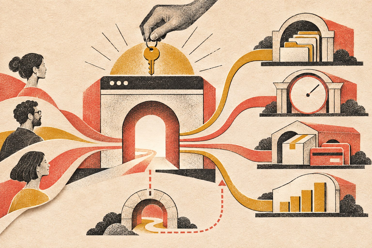
    Eight website responsibilities form one complete system: strategy, content, design, development, search, accessibility, measurement, and ongoing care.

    Nobody needs a parade of specialists for every tiny website. But every professional site still needs these disciplines handled by someone—even if one experienced person covers several roles. Website development cost changes according to how many of these responsibilities the project includes.

    Website discipline The house version What the work actually answers What happens when nobody owns it
    Business strategy and UX Architect and floor plan Who is the site for? What should they do? What information earns the next step? A pretty site with no useful job
    Copy and content Room purpose, signs, and instructions What do we say? What proof supports it? What objections must we answer? Generic mush, missing content, endless delays
    Visual and interface design Materials, finishes, and wayfinding How should the brand feel? What gets attention first? Does it work on every screen? Template soup and confused visitors
    Development Framing, plumbing, and electrical How does everything function, connect, load, and recover from errors? Fragile forms, broken layouts, mystery code
    Search and discoverability Street address and access roads Can search engines crawl, understand, and present the site correctly? A finished building nobody can find
    Accessibility and privacy Accessible entrances and code-aware planning Can people use the site with keyboards, screen readers, captions, and clear forms? Is data collection handled appropriately? Excluded users and preventable business risk
    Analytics and integrations Meters and connected utilities Are leads measured? Do forms reach the right system? Can anyone tell what works? Decisions made by vibes
    Maintenance and security Inspections, repairs, and insurance routines Who updates software, checks backups, monitors problems, and responds when something breaks? Expensive emergency archaeology

    This is also why the difference between a basic website and a professional business website is not simply how polished the homepage looks. The difference is how many business responsibilities the website is prepared to carry.

    A $500 website can be a good decision

    Yes, really. We are not going to clutch our pearls because somebody used a template.

    A $500 website may be completely appropriate when:

    • you need one focused landing page or a very small brochure site;
    • the offer, audience, positioning, copy, logo, brand rules, and images are already finished;
    • you do not need custom integrations or unusual functionality;
    • the builder clearly explains the limits;
    • you own the domain and understand the platform arrangement;
    • you accept that SEO strategy, content creation, legal review, ongoing optimization, and maintenance are separate;
    • the site is a temporary test, not the foundation of a mature sales operation.

    A disciplined template build can be smarter than custom-design theater you do not need. Tools, templates, and AI can reduce production time. They do not erase the business decisions, source material, testing, ownership, or accountability that the project still requires.

    The honest sentence is not “You cannot get a website for $500.”

    It is: You cannot get an undefined amount of professional work for $500.

    That distinction matters.

    Where the missing work becomes real business risk

    Accessibility is not a widget you sprinkle on at launch

    Accessibility work affects headings, color contrast, keyboard navigation, form labels, error messages, alternative text, captions, documents, and testing. Those are design, content, and development decisions—not one last-minute toggle.

    The U.S. Department of Justice’s web accessibility guidance explains that Title III applies to businesses open to the public and that goods and services offered online must be accessible to people with disabilities. The exact legal obligations vary by business and jurisdiction, so this is a planning issue to discuss with qualified counsel—not legal advice from a blog with a hammer joke.

    The litigation numbers are not imaginary. Seyfarth Shaw identified 3,117 federal website-accessibility lawsuits in 2025, a 27% increase from 2,452 in 2024. Its count is based on identified federal cases found through its search and manual-review methodology, not every demand letter or state-court filing.

    And the shortcut can be its own problem. In April 2025, the Federal Trade Commission approved a final order requiring accessibility-widget vendor accessiBe to pay $1 million and barring unsupported claims that its automated products can make any website WCAG-compliant or ensure continued compliance. See the FTC’s final-order announcement.

    Translation: accessibility needs actual ownership. “The plugin says we’re compliant” is not a strategy. Our website accessibility monitoring guide goes deeper into the ongoing work.

    Performance is engineering, not a speed-plugin séance

    Fast pages depend on hosting, media, fonts, scripts, caching, layout stability, and the code shipped to the browser. A bargain build can perform well. An expensive build can be bloated garbage. Price does not automatically produce speed; competent decisions do.

    Google defines Core Web Vitals around loading performance, responsiveness, and visual stability. Its current good-experience targets are LCP within 2.5 seconds, INP under 200 milliseconds, and CLS below 0.1. Google recommends good Core Web Vitals for Search success and user experience, but it does not say that buying a premium theme or installing a cache plugin automatically earns rankings.

    Performance must be measured and maintained. If that matters to the business—and it usually does—put it in the scope. Our website speed optimization guide explains the technical side without pretending there is one magic button.

    Launch is the beginning of ownership, not the end of a project

    WordPress core, themes, plugins, forms, integrations, and third-party services change. Backups need to exist, complete successfully, and be restorable. Somebody must notice when a payment form stops sending notifications.

    WordPress’s own site-maintenance documentation recommends regular maintenance, updates, and backups. That is not upselling. That is owning software connected to the public internet.

    Before launch, decide who owns:

    • software updates;
    • tested backups and restoration;
    • security monitoring;
    • uptime and form checks;
    • license renewals;
    • content changes;
    • analytics review;
    • emergency support.

    If the answer is “nobody, probably,” congratulations: you have hired a future emergency at rush pricing. See our website maintenance guide and website security guide for the unsexy work that keeps a launch from becoming a slow-motion hostage situation.

    The Scope Transfer Test: compare proposals without losing your mind

    Forget comparing page counts for a minute. Put each proposal through these five questions.

    1. What business outcome is the website responsible for?

    “Have a website” is not an outcome. Qualified inquiries, bookings, purchases, applications, reduced support requests, and clearer sales conversations are outcomes.

    If the project has no defined job, nobody can make intelligent decisions about structure, content, features, or measurement. Start with the purpose of the website before arguing about button colors.

    2. What inputs must the client supply—and in what condition?

    “Client provides content” can mean anything from “send us final approved copy in a tidy document” to “email us three old brochures, 47 phone photos, and a voice note recorded inside a moving truck.”

    Ask who supplies and approves:

    • copy;
    • brand guidelines;
    • logos and source files;
    • photography and video;
    • service details and pricing;
    • testimonials and proof;
    • privacy or legal language;
    • account credentials.

    Scope Design’s own proposal systems have long treated client-supplied copy, graphics, and unspecified add-ons as explicit responsibility boundaries. The modern lesson is simple: make those boundaries readable before the project starts, not while everybody is already angry in a comment thread.

    If professional messaging is not included, budget time or money for it. The benefits of hiring a website copywriter have nothing to do with filling boxes and everything to do with making the business understandable.

    3. What is explicitly excluded?

    A professional scope should tell you what it does not cover. That is not evasive; it is useful.

    Look for exclusions around copywriting, SEO campaigns, photography, premium software, e-commerce data entry, accessibility audits, legal review, hosting, email, maintenance, migrations, integrations, and post-launch changes.

    Ambiguity is not generosity. It is an invoice-shaped fog bank.

    4. Who owns the assets and accounts?

    The business should know who controls the domain, hosting, analytics, advertising accounts, source files, licenses, website administrator access, and content. Also ask whether the site can move to another provider and what that process costs.

    A cheap website you cannot take with you may be a rental wearing a fake mustache.

    5. What happens after launch?

    How long is the warranty period? What counts as a defect versus a new request? Who monitors the website? How quickly are urgent issues handled? What does ongoing support cost?

    The answer does not need to be “buy a giant retainer.” It needs to be an answer.

    Turn the proposal into a responsibility receipt

    Here is the practical version of the Scope Transfer Test. For every important promise, write down five things: what is being delivered, what the client must supply, how everyone will know the work is complete, and who owns it after launch. If a row cannot be filled in, that is not automatically a deal-breaker. It is a question that still needs an owner.

    Scope item Included deliverable Client supplies Definition of done Owner after launch
    Strategy and UX Goal, priorities, sitemap, key journeys Business goals, audience knowledge, constraints, approvals Priority audience and action are explicit; page jobs are agreed Business/marketing owner
    Copy and content Writing/editing and content placement as specified Facts, proof, pricing, approvals, source assets Priority pages have complete approved content Named content owner
    Build and integrations Responsive templates, forms, tracking, required connections Accounts, credentials, vendor access, business rules Target devices tested; forms deliver; required events/integrations work Developer or technical owner
    Accessibility and performance QA Defined testing and remediation within the project scope Known legal/industry requirements and third-party constraints Testing is documented; material exceptions are identified rather than hidden Named maintainer
    Maintenance and security Updates, backups, monitoring, recovery, support level Budget, access, renewal decisions Schedule, response expectations, backup/recovery process are documented Care provider or internal owner

    Page count can still matter. It just belongs downstream of this responsibility receipt. A five-page project with finished content and no integrations is not the same product as a five-page project that includes discovery, original copy, custom components, accessibility testing, analytics, migration, training, and managed care.

    Can AI build the website now?

    AI can generate layouts, draft copy, write code, propose images, and accelerate repetitive work. We use AI. We also use keyboards; neither one is the strategy.

    The hard part of a professional website is not producing more pixels or code per minute. It is deciding:

    • what the business should say;
    • what the customer needs to understand;
    • which claims are defensible;
    • which workflow should happen after a form is submitted;
    • what risks matter;
    • what quality is acceptable;
    • who owns the outcome when tools disagree.

    AI can swing the hammer faster. It still needs a blueprint, judgment, and somebody willing to sign their name to the result.

    Four questions to answer before you request a website quote

    If you want useful proposals instead of four unrelated numbers thrown at your head, answer these first:

    1. Strategy: What business problem must the website solve, and how will you know it worked?
    2. Content readiness: Is the copy written, approved, and supported by usable brand assets and photography—or is content creation part of the project?
    3. Requirements and risk: What accessibility, privacy, security, industry, or integration requirements apply to this business?
    4. Long-term ownership: Who will manage updates, backups, monitoring, licenses, analytics, and improvements after launch?

    Then ask each vendor to separate included work, optional work, client responsibilities, assumptions, exclusions, and recurring costs.

    That conversation tells you more than “five pages for $X” ever will. Our guide to choosing a web design company gives you the rest of the questions worth asking.

    The actual bottom line

    A low price is not proof of bad work. A high price is not proof of competence. Clarity is the tell.

    A legitimate $500 website has a narrow job, clean boundaries, known inputs, and realistic expectations. A professional website development cost is higher when the project includes more decisions, more expertise, more original work, more testing, more responsibility, and more support.

    You are not paying for pages on a screen. You are paying for a coordinated system that should make the business easier to understand, easier to trust, easier to find, and easier to buy from.

    If the proposal promises the digital equivalent of a custom house—but budgets for one person, one hammer, and a heroic amount of denial—someone is going to pay for the missing trades later.

    Usually you.

    Before deciding whether a $500 site is a bargain or a future demolition project, define the job with the Constraint-First Website Strategy, then use the Website Fitness Test to evaluate the proposed result. Price makes sense only after the responsibilities and success conditions are visible.

    Ready to define the job before pricing the hammer? Explore Scope Design’s website design and development services or start a project conversation.

    Frequently asked questions about website development cost

    How much should I pay to have a website built?

    Website development cost should reflect the scope your business actually needs. A simple, template-based presence with client-supplied content can cost far less than a custom lead-generation system with strategy, copy, integrations, accessibility work, analytics, and ongoing support. Compare responsibilities and deliverables before comparing totals.

    Is $1,500 a good price for a website?

    It can be. Price alone cannot tell you whether the offer is good. At $1,500, ask what is included, what you must supply, whether you own the site and accounts, how many revision rounds are allowed, what testing occurs, and what happens after launch.

    Is a $500 website worth it for a small business?

    Yes, when the business needs a small, clearly limited online presence and understands the exclusions. It is usually not enough for original strategy, professional copywriting, custom design, complex features, deep SEO work, accessibility auditing, and managed maintenance all at once.

    Is web design still worth it in 2026?

    Yes when the website has an important business job and better design, content, technology, or testing materially improves that job. No when “redesign” is just a prettier coat of paint on an undefined problem. AI and templates make production faster; they make clear strategy and responsible scope more important, not less.

    What is included in professional website design?

    A professional scope may include discovery, sitemap and user-flow planning, copy support, responsive interface design, development, forms and integrations, technical SEO setup, analytics, accessibility-conscious implementation, performance testing, launch support, training, and maintenance. “May” matters: get every inclusion in writing.

    What is a reasonable budget for a small-business website?

    There is no responsible universal number because a small-business brochure site and a custom booking or e-commerce platform are different products. Establish the business goal, required content, functionality, integrations, risk requirements, and ownership plan, then price that scope. Use our website cost guide for planning ranges.

    How much does a website cost per year after launch?

    Ongoing costs can include the domain, hosting, premium software licenses, backups, security monitoring, maintenance, support, content updates, analytics tools, and marketing. The total depends on the platform and service level. Ask for a first-year and recurring-cost schedule before signing.

    What is the cheapest way to have a website?

    The cheapest cash option is usually a DIY builder or a tightly limited template setup. The tradeoff is your time and responsibility for planning, content, setup, troubleshooting, accessibility, search basics, and maintenance. Cheap is fine when those tradeoffs are deliberate.

    Can ChatGPT design a website?

    ChatGPT and other AI tools can help draft layouts, copy, code, and images. They do not automatically know your positioning, validate your claims, interview customers, own legal decisions, test every workflow, or maintain the finished system. AI is a capable tool, not a complete accountable project team.

    Will AI replace web designers and developers?

    AI will replace some repetitive production tasks and change how professionals work. It is less likely to replace the strategy, judgment, communication, validation, risk management, and accountability required for serious business websites. Faster hammering does not eliminate architecture.

    Why are professional websites so expensive?

    Professional websites cost more because the price can include multiple disciplines and ownership of the result: research, strategy, copy, design, development, accessibility, SEO setup, integrations, testing, project management, launch, and support. Ask which of those you need and which the proposal actually includes.

  • Basic Website vs. Professional Business Website: What Separates a Serious Site?

    Basic Website vs. Professional Business Website: What Separates a Serious Site?

    Direct answer: A professional business website is not defined by custom code, a giant page count, or a designer price tag. It is defined by the business responsibility the site carries. A basic website mainly establishes a credible presence and provides essential information. A professional business website is scoped to help the business attract, persuade, qualify, serve, measure, connect, automate, and improve. The difference is the job the website is designed to do—and the consequences if it fails.

    TL;DR: A basic website is usually an online brochure: it explains who you are, what you do, and how to contact you. A serious business website has more responsibility. It supports customer decisions, creates clear conversion paths, connects to business systems, measures meaningful actions, and has an ownership plan for security, backups, maintenance, recovery, and change. A template-based site can be fully professional when that is all the business needs. Custom work should earn its place.

    A basic website and a professional business website can both be good investments. They simply have different jobs.

    Sometimes a business needs a clean, credible place online so people can verify that it is legitimate, understand the services, see proof, and make contact. That is a perfectly reasonable goal. Not every company needs a client portal, a quoting engine, six integrations, and enough automation to make a robot jealous.

    The problem starts when a business buys a digital business card and expects it to behave like a sales team, operations assistant, lead qualifier, customer-service desk, and marketing engine.

    That is not a website problem. That is an expectation problem.

    What Does a Basic Website Include?

    A basic website usually includes a homepage, an About page, service or product information, contact details, and a simple inquiry form. It may also include testimonials, a map, business hours, a gallery, FAQs, or a small blog. It should still look professional, load quickly, work on phones, use clear language, present the brand consistently, be reasonably accessible, and make contacting the business easy. “Basic” is not permission to build something slow, confusing, insecure, or held together with digital duct tape.

    It simply means the scope is focused.

    • Establish a credible online presence.
    • Explain a straightforward set of services.
    • Show hours, location, service area, or contact information.
    • Support referrals who already know the company name.
    • Launch quickly while an offer or market is still being validated.
    • Give customers one dependable place to verify the business.

    If that is the actual job, a well-built basic website may be exactly right. A focused site built from a strong theme, design system, or website builder can still be professional. The platform does not decide whether the work is serious; the fit between the business need and the execution does.

    But if the website is expected to generate qualified leads, support a complicated buying decision, connect to business systems, automate work, serve customers, or create measurable revenue, the project has crossed into different territory.

    Basic Website vs. Professional Business Website: The Difference at a Glance

    Area Basic website Professional business website
    Primary job Establish presence and provide information Improve marketing, sales, service, or operations
    Strategy Organized around pages and supplied content Organized around a business outcome, audience needs, and measurable actions
    Visitor journey Browse, read, contact Arrive with intent, find the right path, build confidence, take the next step
    Functionality Standard pages, forms, maps, galleries Workflows, portals, quoting, booking, ecommerce, search, or gated content when justified
    Integrations Few or none CRM, email, payments, scheduling, analytics, inventory, support, or internal tools
    Content Essential business information Content mapped to customer questions, proof, search intent, and conversion paths
    Measurement Traffic and form notifications Events, lead sources, conversion paths, funnel behavior, and business outcomes
    Ownership after launch Occasional updates Clear responsibility for maintenance, security, backups, monitoring, recovery, and iteration

    The visual design matters in both columns. It just is not the whole damn job.

    1. A Professional Business Website Starts With a Business Outcome

    A basic project often starts with a page list: Home, About, Services, Contact. A serious project starts with better questions.

    • What is the business trying to improve?
    • Who is the right customer?
    • What does that customer need to understand before taking action?
    • Where are leads or customers getting stuck?
    • Which repetitive tasks are wasting staff time?
    • What systems already exist, and where are the handoffs failing?
    • What result would make the project worth doing?
    • Who will own the site, accounts, data, and maintenance after launch?

    Those answers shape architecture, content, features, integrations, measurement, and calls to action. The website is not planned as a stack of pages. It is planned as part of the business.

    That is the core of website strategy: define the business outcome, understand the customer decisions, identify the constraint, and make the site responsible for the parts it can actually improve.

    “We need a new website” may actually mean:

    • Our leads are terrible.
    • Customers do not understand what makes us different.
    • Our sales team answers the same questions all day.
    • Quotes take too long to prepare.
    • We look smaller and less capable online than we are in real life.
    • Staff members are copying information between systems like it is still 2007.

    The website is often the visible part of the project. The thinking behind it is where much of the value lives.

    2. It Is Built Around Customer Decisions, Not a Navigation Menu

    Visitors do not arrive because they are excited to admire your menu structure. They arrive with a problem, a question, a concern, or a decision to make.

    A serious website helps a visitor answer three things quickly:

    1. Can you solve my problem?
    2. Can I trust you?
    3. What should I do next?

    That means the site needs clear positioning, useful proof, relevant service details, realistic expectations, and an obvious next step. Different visitors may need different paths. A first-time buyer may need education. A ready-to-buy prospect may want pricing context or a consultation. An existing client may need support, documents, or a portal.

    Good design makes those paths feel obvious. Good strategy makes sure they exist in the first place. If the site already attracts people but they do not act, the deeper issue may be conversion friction rather than appearance.

    3. It Does More Than Display Information

    A brochure site publishes information. A serious site can participate in the work.

    • Qualifying leads before they reach the sales team.
    • Guiding customers to the correct service or product.
    • Calculating estimates or configuring options.
    • Scheduling appointments or consultations.
    • Accepting payments, deposits, applications, or document uploads.
    • Providing a client, dealer, member, or employee portal.
    • Searching complex inventories, records, resources, or catalogs.
    • Routing inquiries based on location, service, urgency, or value.
    • Triggering follow-up messages and internal tasks.
    • Syncing information with a CRM, accounting system, ecommerce platform, or help desk.

    This is where “just a website” stops being an honest description. The site becomes software with a public face.

    That does not mean every business needs custom development. Standard tools should do the work when they solve the problem cleanly. Custom functionality becomes justified when the required workflow, integration, data model, transaction, or operational risk cannot be handled responsibly with standard patterns. Adding features because they sound impressive is how budgets disappear into a smoking crater. Adding the right feature because it removes friction or creates value is a different story.

    4. It Connects Systems Instead of Creating Another Silo

    Many businesses already have a website, CRM, email platform, scheduling tool, payment processor, accounting system, spreadsheets, and at least one mysterious workflow that only Linda understands.

    A serious website project considers that ecosystem. The public website may sit between customer intent and several business systems: a form creates a lead, a booking reserves time, a payment updates an order, a portal retrieves records, or an application launches an internal review.

    A considered website gateway routes customer pathways to records, bookings, commerce, and measurement, with a clear fallback path.

    If a form submission still has to be copied into three systems by hand, the website may look modern while the process behind it is wearing a powdered wig. The hard part is not drawing a line between two logos on a flowchart. It is deciding which system owns each piece of information, what should happen when data changes, how errors and duplicates are handled, what staff must approve, and what happens when an external service is unavailable.

    Those are operational decisions. They belong in website planning whenever the site is expected to do real work.

    5. The Content Has a Job

    Serious websites do not treat content as filler poured into a finished design five minutes before launch.

    • The homepage establishes the broad value and main routes.
    • Service pages help a buyer evaluate a specific solution.
    • Comparison pages support commercial research.
    • Case studies and reviews provide proof.
    • Blog articles answer informational questions and build topical depth.
    • FAQs remove friction and handle objections.
    • Contact and booking pages make the next step feel safe and clear.

    This is also where search and AI discoverability begin. The goal is not to repeat one keyword until the page sounds like it was written by a malfunctioning parrot. The goal is to make the answer genuinely useful, structurally clear, easy to crawl, and unambiguous about the question it owns.

    That is why the direct answer appears at the top of this article. Readers should not have to survive 900 words of throat-clearing before learning the point. Scope Design’s guide to front-loading content for AI search explains that approach in more detail.

    6. Technical Quality Is Part of the Product

    A serious website must work when real people use it under real conditions. That includes people on phones, people with slower connections, people using assistive technology, people who mistype information, and people who do things the project team did not expect.

    • Responsive behavior across screen sizes.
    • Performance optimization and sensible asset loading.
    • Accessibility-minded structure, contrast, controls, and content.
    • Secure configuration, updates, backups, and recovery planning.
    • Browser and device testing.
    • Form validation and spam protection.
    • Redirects, canonical URLs, sitemap behavior, and indexation controls.
    • Analytics and event tracking.
    • Clean integrations and documented custom functionality.
    • Staging, deployment, rollback, and post-launch checks.

    None of that is glamorous. Neither is a seatbelt, right up until the moment it matters.

    Google’s current Core Web Vitals guidance defines good field performance as Largest Contentful Paint of 2.5 seconds or less, Interaction to Next Paint of 200 milliseconds or less, and Cumulative Layout Shift of 0.1 or less, measured at the 75th percentile. Performance is not the whole website, but it is one part of whether the experience works well.

    Accessibility deserves the same seriousness. The U.S. Department of Justice explains in its web accessibility and ADA guidance that inaccessible web features can prevent people with disabilities from accessing the goods, services, programs, and activities of covered organizations. The practical point for a business website is simple: accessibility is part of usable design, not a decorative checkbox at the end.

    For more on the performance layer, see Fast & Functional: Web Development & Performance Mastery.

    7. A Serious Website Measures Outcomes

    Page views are interesting. Business outcomes are useful.

    A professional business website should make it possible to understand what is working. The exact measurements depend on the business, but they may include:

    • Qualified contact requests.
    • Phone calls or booked consultations.
    • Quote starts and completions.
    • Ecommerce revenue and checkout completion.
    • Downloads, applications, or registrations.
    • Lead source and campaign performance.
    • Movement through important page sequences.
    • Use of specific tools, searches, calculators, or portal features.

    The point is not to collect every possible event because dashboards are pretty. The point is to connect website behavior to decisions. If nobody can explain what success looks like, the team cannot reliably improve it. They can only rearrange things and hope. Hope is not an analytics strategy.

    8. It Is Built to Change Without Falling Apart

    Businesses evolve. Services change. Teams grow. Marketing campaigns launch. New systems appear. Old systems are finally taken behind the barn.

    • A maintainable content structure.
    • Reusable design patterns.
    • Sensible custom code rather than mystery snippets everywhere.
    • Documentation for important workflows and integrations.
    • A staging environment for safer updates.
    • Clear ownership of domains, hosting, accounts, analytics, code, and source assets.
    • A recovery path if an update, integration, or deployment fails.
    • A plan for extending features without rebuilding the whole thing.

    Scalability does not mean engineering a global platform for a company with twelve customers. It means making smart choices today so tomorrow’s reasonable change does not become a demolition project.

    9. Launch Is a Milestone, Not a Funeral

    Basic sites are often treated as one-time projects: launch it, celebrate, and slowly forget the login.

    Serious business websites need an explicit ownership plan. Software changes. Integrations change. Content changes. Search behavior changes. Security issues appear. Forms break at the worst possible moment because apparently software also enjoys comedy.

    • Updates and compatibility testing.
    • Security monitoring and backups.
    • Uptime and performance monitoring.
    • Broken-link and visual-change checks.
    • Analytics review and conversion improvements.
    • Content updates and search refinement.
    • Testing forms, payments, notifications, and integrations.
    • Recovery procedures and clear account ownership.
    • Planning new features as the business changes.

    A website that matters to the business cannot be treated like a lawn ornament. Ongoing care is part of the system’s reliability.

    10. Cost Follows Responsibility, Complexity, and Risk

    People often compare website prices as if every project is the same object sold in different boxes.

    It is not.

    A focused site using established patterns is not the same project as a site that needs discovery, original positioning, complex content architecture, several audiences, advanced forms, integrations, automation, ecommerce rules, data migration, accessibility work, analytics, testing, and a safe launch plan.

    The higher scope is not payment for extra pixels. It covers more thinking, specialized work, coordination, testing, responsibility, and risk. That still does not mean expensive automatically equals good. A bloated proposal can produce an impressive pile of nonsense. Price is evidence of scope, not proof of quality.

    If you need actual budget ranges and a framework for comparing proposals, use Scope Design’s small business website cost guide. This article’s job is narrower: decide what level of responsibility the website needs to carry before you compare numbers.

    Which Kind of Website Do You Need?

    Choose a focused basic website when:

    • The offer is straightforward.
    • Referrals and existing relationships drive most business.
    • The main goal is credibility and essential information.
    • Standard functionality covers the need.
    • The business is validating an idea or needs to launch quickly.
    • There is no strong business case for deeper integrations or automation yet.

    Consider a more serious website investment when:

    • The site must generate or qualify leads.
    • Buyers need education, proof, or multiple decision paths.
    • The business has complex services, products, audiences, or locations.
    • Staff members are repeating work the website could reduce.
    • Multiple systems need to exchange information.
    • Quoting, booking, ecommerce, search, portal, or workflow features are required.
    • The current site is limiting marketing or operations.
    • Measurement, reliability, ownership, security, and ongoing improvement matter.

    There is no prize for buying more website than you need. There is also no bargain in buying too little for a site that is expected to carry real business risk.

    If you are still deciding what to buy, Scope Design’s business website buyer guide covers the full process from requirements and ownership to budget, provider selection, launch, and maintenance.

    Frequently Asked Questions

    What counts as a professional business website?

    A professional business website is a site whose strategy, content, design, technical quality, measurement, and ownership match the business job it is expected to do. It should clearly explain the offer, help the right visitor decide, provide an obvious next step, work reliably, and have a plan for what happens after launch.

    Is a basic website unprofessional?

    No. A focused website can be professional, useful, fast, accessible, and well designed. It becomes a problem only when its limited scope does not match what the business expects it to accomplish.

    Does a professional website have to be custom-coded?

    No. Templates, design systems, WordPress builders, and hosted website platforms can all produce professional results when their capabilities fit the business need. Custom development makes sense when the required workflow, data, integration, transaction, or product behavior cannot be handled responsibly with standard tools.

    When has a business outgrown a basic website?

    A business has probably outgrown a basic site when the website is limiting lead generation, customer service, marketing, ecommerce, internal workflows, integrations, measurement, or the ability to clearly explain a more complex offer.

    What’s the best website for a small business?

    The best website is the smallest responsible solution that can do the job the business actually needs. A simple service company may need a focused site with excellent messaging and contact paths. A revenue-critical operation may need ecommerce, portals, integrations, automation, advanced search, or custom workflows. Start with the business outcome, not the software brand.

    How much does a professional website cost?

    There is no useful universal number because “professional website” can describe very different scopes. Cost should follow the amount of strategy, content, design, functionality, integration, testing, migration, risk, and ongoing responsibility involved. Compare what the website must accomplish and what the proposal includes before comparing totals.

    Is Wix a professional website platform?

    It can be. Wix and other hosted builders can be a professional fit when their standard design, content, ecommerce, booking, and marketing tools cover the need. The question is not whether the platform is “professional.” The question is whether its limits interfere with the business requirements, ownership, integrations, performance, accessibility, or future change.

    Can WordPress handle a serious business website?

    Yes. WordPress can support brochure sites, ecommerce, memberships, portals, structured content, advanced search, integrations, and custom workflows when it is architected and maintained properly. The platform is only one part of the system; implementation and ownership matter more than the logo on the admin screen.

    What should a business website measure?

    Measure actions tied to business value: qualified inquiries, bookings, calls, quote requests, applications, sales, lead sources, conversion paths, and use of important tools or workflows. Traffic can provide context, but it does not tell you by itself whether the site is doing its job.

    What happens after a serious website launches?

    The site should be monitored, maintained, backed up, secured, tested, measured, and improved. Important accounts and assets should have clear owners, and the team should know how to recover when something breaks. Launch is the beginning of real-world use, not the moment everyone walks away and hopes the plugins behave forever.

    Stop Asking Your Website to Coast

    If all you need is a clean online presence, build that well and do not apologize for it.

    But if the website is supposed to help the business sell, operate, serve customers, and grow, stop treating it like a decorative expense. Treat it like the business system it is.

    Before choosing a scope, use the Website Fitness Test to judge whether the result will actually be good, check the Buyer Decision File for the information it must contain, and audit the full path with the seven-link conversion checklist. Then explore Scope Design’s website development services or contact Scope Design to talk about what your website actually needs to accomplish.

  • Website Strategy Is Not a Sitemap: A Constraint-First Blueprint

    Website Strategy Is Not a Sitemap: A Constraint-First Blueprint

    A website strategy is the set of business, audience, messaging, evidence, technology, and conversion decisions that determines what a website should do and how it should do it. A sitemap only tells you where the pages live. Strategy determines why those pages exist, who they need to persuade, what proof they require, what systems they must connect to, and how success will be measured.

    Put less politely: a sitemap is an output. Website strategy is the thinking that makes the sitemap inevitable.

    TL;DR: Diagnose the constraint before prescribing the website

    • Do not begin with “How many pages do we need?” Begin with “What business problem is the website responsible for helping solve?”
    • Check technical and measurement integrity before interpreting behavior. A broken form is not a messaging insight.
    • Separate traffic volume from traffic quality. More of the wrong visitor is just a larger analytics bill.
    • Fix unclear messaging before polishing interface details.
    • Treat friction as either accidental or intentional. Some friction hurts conversion; some protects lead quality.
    • Measure the last meaningful outcome the website can reasonably influence, then track it through to revenue.
    • Build features only after the business process underneath them is understood. Otherwise, custom functionality is expensive theater.

    What is a website strategy?

    A website strategy is a commercial and operational blueprint for using a website to create a specific business result. It aligns the audience’s intent with the company’s positioning, proof, website content strategy, conversion paths, technology, measurement, and ability to maintain what gets built.

    That definition matters because plenty of documents get called “strategy” when they are really inventories wearing a blazer.

    A page list is useful. A sitemap is useful. A mood board can be useful. None of them explains:

    • which business constraint the website must address;
    • which audience and buying moment take priority;
    • what the site needs to make believable;
    • how visitors should move from question to evidence to action;
    • which systems and teams own what happens after the click;
    • what success looks like numerically;
    • what the business can realistically maintain after launch.

    Without those decisions, the project may still produce a beautiful website. It just cannot explain what the beauty is supposed to accomplish.

    Website strategy vs. sitemap: what is the difference?

    A sitemap answers A website strategy answers
    What pages will exist? Why does the website exist?
    How are pages grouped? Which audience and intent deserve priority?
    What sits in the navigation? What argument should the site make?
    Where does content live? What proof reduces doubt at each decision point?
    What links to what? Which conversion paths fit each stage of readiness?
    How is the information organized? How does the site connect to marketing, sales, service, and operations?
    What needs to be designed? What should be measured, maintained, improved, or deliberately left out?

    The sitemap is the skeleton. Strategy decides whether you are building a house, a warehouse, or a very expensive place to store decorative pillows.

    The project the client requests is not always the problem they need solved

    A long-established specialty auction business came to Scope Design asking for a new website and new features. Discovery showed that a prettier website was not the real problem.

    The site sat on top of years of broken customer-facing functions, disconnected data, manual processes, legacy software, and systems that could not support where the business needed to go. Treating the engagement as a page-design exercise would have put fresh paint over an operational foundation that was already cracking.

    So we did not begin with mockups. We mapped the business processes, identified the systems involved, clarified how information moved between them, and rebuilt the foundation before piling on more features.

    That is website strategy in the real world: not refusing to design, but earning the right to design the correct thing.

    The Scope Design Constraint-First Website Strategy framework

    A single coral channel passes through a narrowing diagnostic mesh, filtering noise before opening into a clear business handoff.

    When a website is “not working,” diagnose the system in order. Upstream failures distort everything below them, so skipping ahead produces confident nonsense.

    1. Verify measurement and technical integrity

    Before interpreting a bounce, drop-off, or failed conversion, make sure the thing actually works.

    Check forms, notification delivery, phone links, checkout, analytics, consent configuration, mobile layouts, browser behavior, tracking events, redirects, and the pages receiving important traffic. Submit the form yourself and confirm the lead arrives where a human can act on it. This catches an embarrassing number of “marketing” problems.

    Performance belongs here too. Google’s current Core Web Vitals guidance defines good thresholds as LCP of 2.5 seconds or less, INP of 200 milliseconds or less, and CLS of 0.1 or less, evaluated at the 75th percentile. These are useful technical health signals, not a complete business diagnosis. web.dev explains how the thresholds are defined and evaluated.

    Decision: If the path is broken or the measurement is untrustworthy, repair it before drawing strategic conclusions from the data.

    2. Confirm there is enough relevant traffic to diagnose

    A conversion rate built from a handful of visits is trivia, not a trend. Start by isolating intent-bearing traffic: people arriving from relevant searches, referrals, campaigns, sales conversations, or direct navigation with a plausible reason to buy.

    Low traffic with a promising conversion rate points toward an acquisition or distribution problem. High traffic with weak outcomes gives you enough signal to keep diagnosing the site. Low traffic and no conversion data means you need evidence, not a button-color séance.

    Decision: Determine whether you have a website problem or simply too little relevant attention to judge.

    3. Separate traffic quality from traffic quantity

    Segment visitors by source, query, campaign, landing page, geography, and device. Ask whether the people arriving have the problem you solve, the authority to act, and an expectation the page can satisfy.

    If organic visitors want free instructions while the business sells implementation, or an ad promises one thing and the landing page delivers another, rewriting the CTA will not repair the mismatch.

    Decision: Fix targeting and acquisition fit before optimizing a page for visitors who should never have been sent there.

    4. Test messaging clarity

    A visitor should quickly understand what the business does, who it helps, why the offer matters, and what to do next. This is not permission to flatten a complex service into a cute six-word slogan. It means the first screen should orient the reader instead of making them decode agency poetry.

    Good messaging also explains the customer’s problem accurately, states a defensible point of view, and gives the rest of the page a narrative job. A homepage should orient and route mixed-intent visitors, not serve as a storage unit for every sentence the company has ever approved.

    Decision: If qualified visitors arrive and leave before meaningfully engaging, clarify the argument before redesigning the furniture around it.

    5. Find user-experience friction

    Messaging problems usually happen early: people do not understand, so they leave. UX problems often happen later: people understand and engage, but cannot complete the action.

    Look for abandoned forms, mobile-only failures, confusing navigation, inaccessible interactions, unexpected steps, unclear errors, weak information hierarchy, and repeated attempts to click non-interactive elements.

    Accessibility is part of functional quality, not a decorative compliance sticker. WCAG 2.2 organizes accessibility around content and interfaces being perceivable, operable, understandable, and robust. The W3C publishes the complete WCAG 2.2 standard. In the United States, the Department of Justice also explains that businesses open to the public must ensure the goods and services they provide online are accessible, while noting that legal obligations depend on the applicable law and circumstances. Read the DOJ’s website accessibility guidance.

    Decision: Remove accidental effort while preserving the information and qualification steps a serious buyer needs.

    6. Evaluate the offer and positioning

    If the right people arrive, understand the page, find the path usable, and still decline to act, the page may not be the constraint.

    The offer may feel too risky, too generic, too expensive for the perceived outcome, too difficult to implement, or too similar to an easier alternative. The proof may be weak. The business may be attracting buyers it cannot credibly serve. No amount of whitespace can rescue an exchange the market does not want.

    Decision: Strengthen the value, evidence, positioning, terms, or delivery model before buying another aesthetic reset.

    7. Inspect sales and operational follow-through

    The website’s job does not end at the form, but its influence eventually does. What happens after a conversion matters: response time, routing, qualification, scheduling, sales conversations, proposal process, onboarding, delivery capacity, and retention.

    A website that creates qualified inquiries is doing its job even if leads sit unanswered for three days. A high-converting form can also make the business worse if it floods an overloaded team with junk.

    Decision: Assign accountability to the stage that actually failed. Do not redesign the website to hide a sales or operations problem.

    The nine decisions every website strategy should make

    Once the constraint is understood, a serious website strategy should resolve nine connected decisions.

    Purpose and priority

    What is the website’s primary job: create qualified conversations, support purchases, establish credibility, reduce service workload, help sales, or something else? A site can support multiple goals, but one should win when priorities conflict.

    Audience and arrival intent

    Who is arriving, what question is already in their head, how did they get here, and what do they need next? This is more useful than a fictional persona whose defining trait is drinking artisanal coffee.

    Positioning and narrative

    What does the business claim, why should anyone believe it, and why are the alternatives less suitable? Pages become chapters in that argument.

    Evidence strategy

    Which claims require case studies, demonstrations, testimonials, credentials, original research, comparisons, or transparent explanations? Put proof near the doubt it resolves instead of exiling every testimonial to a page nobody visits.

    Conversion architecture

    What action fits each level of readiness? A high-intent visitor may be ready to book. A cautious buyer may need pricing context, a comparison, a diagnostic, or an example first. The site should provide a coherent next step without turning every page into a carnival of buttons.

    Acquisition fit

    How will people arrive—organic search, AI answers, paid campaigns, referrals, social content, email, or a salesperson sending a link? Our landing page optimization guide explains why a page written for a cold ad click has a different job from one used to support a six-month B2B decision.

    Technology and operational integration

    Which systems must exchange data? Who receives the inquiry? What happens if an integration fails? What must connect to the CRM, email platform, payment system, scheduling tool, inventory, support process, or reporting stack?

    Measurement and feedback

    Define one primary outcome tied to the business, plus a small set of diagnostic metrics that explain movement. Traffic, rankings, engagement, and button clicks can be useful signals, but they are not interchangeable with business success.

    Governance and lifecycle

    Who owns the content, integrations, security, updates, testing, and future decisions? Strategy that ignores maintenance capacity produces a beautiful launch followed by slow digital composting.

    Why professionally designed websites still fail to convert

    Visual design can make information easier to understand, increase perceived credibility, reinforce a position, and guide action. It cannot invent a compelling offer, qualify the wrong traffic, repair a broken sales process, or create proof the business does not have.

    Common failures include:

    • The site talks about the company instead of the customer’s decision. Visitors cannot recognize whether their situation fits.
    • The value proposition is vague. “Transforming possibilities through innovation” may sound expensive, but it does not explain a damn thing.
    • The page has no point of view. It looks polished and interchangeable with three competitors.
    • Evidence appears too late or in the wrong place. The claim and the proof are separated when they need to work together.
    • The page asks for too much commitment too soon. Every visitor gets “Book a call,” including people who still need to understand the basics.
    • The design fights comprehension. Low contrast, ornamental motion, clever labels, and oversized images make the answer harder to find.
    • The traffic and page intent do not match. The wrong visitor cannot be converted into the right customer by force of typography.
    • The offer is the problem. The page communicates clearly; the market simply does not consider the exchange worthwhile.

    This is why our UX and conversion guide owns the deeper question of why individual experiences fail to convert, while this strategy pillar focuses on diagnosing which business constraint deserves attention first.

    Friction is not automatically bad

    “Remove friction” is useful advice until it becomes a religion.

    Accidental friction wastes effort: broken forms, unclear labels, surprise requirements, inaccessible controls, irrelevant fields, redundant steps, and errors that do not explain how to recover.

    Intentional friction improves fit: asking about budget before a complex consultation, requiring essential project information, explaining who a service is not for, or making a consequential action deliberately reviewable.

    For a high-ticket service, reducing a form to name and email may increase submissions while destroying lead quality and staff time. The goal is not the largest number above the funnel. The goal is the best business result after quality, workload, no-shows, and close behavior are counted.

    The useful question is not “How do we remove friction?” It is “Which effort is unnecessary, and which effort improves the decision?”

    Ethical conversion optimization: two tests Scope Design uses

    We use two tests before recommending a conversion tactic:

    1. Would the lift survive if the visitor understood why we used the tactic?
    2. Does the lift remain after lead quality, refunds, no-shows, churn, staff time, accessibility, and long-term trust are counted?

    That eliminates manufactured countdown timers, fake scarcity, invented proof, confirmshaming, hidden fees, obstructive cancellation, consent mazes, and proxy metrics that make the report look better while making the business worse.

    The Federal Trade Commission describes dark patterns as design practices that can trick or manipulate people into choices involving money or personal data, including hidden disclosures and difficult cancellation paths. Its staff report documents common patterns and enforcement concerns.

    Persuasion is part of good communication. Deception is not a growth strategy; it is a liability with a temporary conversion bump.

    What outcome should a website strategy optimize?

    Choose the outcome closest to money that the website can meaningfully influence.

    Business model Useful primary website outcome Quality or business check
    E-commerce Completed purchases Margin, refunds, repeat purchases, average order value
    Consultative B2B Qualified opportunities Pipeline value, held meetings, close rate, sales cycle
    Local service Booked and attended appointments Job quality, close rate, source, service area
    Subscription Qualified starts or paid accounts Activation, retention, lifetime value, support burden
    Operational or service-heavy business Successful self-service or automated process completion Staff time saved, error reduction, customer satisfaction
    Content-led business Qualified subscriber or inquiry Downstream engagement, opportunity creation, revenue contribution

    The website cannot close every sale, control service quality, or force the team to follow up. Hold it accountable for the last meaningful outcome it can produce, then track that outcome through the rest of the business so you learn what creates customers rather than merely contacts.

    Sessions, rankings, impressions, scroll depth, and time on page are diagnostic metrics. They can explain a result. They should not be allowed to impersonate one.

    What should a website strategy deliver?

    A strategy does not need to become a 180-page deck that requires its own forklift. It needs to create enough clarity to build, prioritize, and measure responsibly.

    A useful deliverable should include:

    • the primary business problem and desired outcome;
    • the prioritized audiences and arrival intents;
    • the diagnosis of the current constraint;
    • the positioning and core narrative;
    • the evidence available and the proof still needed;
    • the conversion paths for different readiness levels;
    • the acquisition channels each major page must support;
    • the content model, sitemap, and page responsibilities;
    • the required integrations and operational handoffs;
    • accessibility, privacy, security, and technical requirements;
    • the measurement plan and current baseline;
    • ownership, governance, and maintenance expectations;
    • a phased roadmap that separates foundation work from optional features.

    This is also what separates a professional business website from a collection of pages. Our guide to basic websites versus serious business websites explains the broader distinction, while the $500 website and one-hammer contractor analogy shows why strategy, copy, design, development, accessibility, security, and maintenance cannot be collapsed into one mystery task.

    When should you redesign a website?

    Redesign when the evidence shows that the current structure, interface, technology, positioning, or content cannot support the business’s priority outcome without disproportionate repair.

    Do not redesign merely because the site feels old, a competitor launched something shiny, or a stakeholder is bored. Those may begin a useful investigation, but they are not diagnoses.

    Sometimes the correct answer is a new foundation. Sometimes it is three repaired mobile templates, clearer positioning, better proof, faster sales follow-up, or a form that finally sends email to the right inbox. Discovery should be allowed to save the client from buying the project they originally requested.

    If a redesign is justified, Scope Design’s website design and development service begins with the business and conversion requirements instead of treating strategy as the paragraph before the mood board.

    Website strategy FAQ

    What is the main purpose of a website strategy?

    The main purpose of a website strategy is to align the website with a prioritized business outcome and the decisions required to produce it. It gives design, content, development, marketing, sales, and measurement a shared reason for what gets built.

    What is the difference between website strategy and web design?

    Website strategy determines the problem, audience, argument, evidence, conversion paths, requirements, measurement, and priorities. Web design turns those decisions into a usable visual and interactive experience. Design is essential, but it should not be asked to diagnose the business by accident.

    Is a sitemap part of website strategy?

    Yes. A sitemap is one output of website strategy. It organizes pages and relationships after the audience, intent, narrative, evidence, acquisition, and conversion decisions are understood.

    What are the steps in creating a website strategy?

    Start by defining the business outcome, auditing the current evidence, and diagnosing the tightest constraint. Then map audience intent, positioning, proof, conversion paths, acquisition channels, technical integrations, measurement, governance, and the sitemap. Prioritize foundation work before optional features.

    Why am I getting website traffic but no conversions?

    The traffic may be poorly matched, the message may be unclear, the experience may contain friction, the proof may be insufficient, or the offer may not be compelling. Segment traffic by source and landing-page intent, then diagnose messaging, UX, evidence, and offer in that order instead of assuming every visitor has the same problem.

    What is a healthy website conversion rate?

    There is no universal healthy conversion rate. The right baseline depends on the action, traffic source, buying stage, price, business model, and definition of a qualified conversion. Compare like with like, protect lead quality, and measure downstream outcomes rather than chasing a borrowed industry average.

    What is the difference between SEO and conversion rate optimization?

    SEO helps qualified people discover the right page through search. Conversion rate optimization improves how effectively the page helps suitable visitors take a useful action. SEO without conversion creates traffic without enough business value; CRO applied to irrelevant traffic optimizes the wrong audience.

    Does every business need a custom website?

    No. A template or simpler platform can be the correct choice when the needs are standard, the budget is limited, and the operational requirements are straightforward. Custom design or development should earn its cost by solving a real constraint, supporting differentiation, connecting systems, reducing work, or enabling an experience a standard solution cannot provide.

    For local and home-service companies, use the service business website strategy guide to decide whether a template can handle the job or whether the handoffs, integrations, service areas, and operating workflow justify custom work.

    How much does website strategy cost?

    The cost depends on the number of audiences, stakeholders, systems, research requirements, content complexity, legal or technical constraints, and depth of validation. A small service business may need a focused diagnostic; a multi-system organization may need process mapping, analytics work, user research, technical architecture, and a phased implementation plan. The useful comparison is not strategy versus no strategy—it is the cost of diagnosis versus the cost of building the wrong thing.

    Can a website strategy improve AI-search visibility?

    Yes, indirectly. A strong strategy creates clear topic ownership, direct answers, original frameworks, first-hand evidence, useful internal relationships, explicit entities, and authoritative sourcing. Those qualities make the content easier for search engines and AI systems to interpret and potentially cite. No structure or schema can guarantee a citation, despite what the glitter merchants are selling.

    Stop prescribing pages before you understand the problem

    If your website is underperforming, the next step may be a redesign. It may also be clearer positioning, better traffic, repaired infrastructure, stronger proof, a sharper offer, or a sales process that answers the damn phone.

    Put the strategy into practice

    Once the website has a defined job, run the Website Fitness Test to evaluate its purpose, audience, clarity, trust, experience, technical reliability, and business fit. Then use the Buyer Decision File to identify the information a qualified buyer needs and audit the complete path with the seven-link website conversion checklist. Together they test whether the site is fit for its job, contains the truth buyers need, and can turn that truth into a useful business outcome.

    Scope Design can help diagnose the constraint, map the business process, and build the right solution in the right order. Tell us what is not working, and we will start with the problem instead of arriving with a prewritten shopping list.

  • Homepage Design Best Practices: Build a Router, Not a Billboard

    Homepage Design Best Practices: Build a Router, Not a Billboard

    Homepage design best practices begin with one unglamorous fact: the homepage serves people whose intent is not fully known yet. Its job is to orient them, help them recognize the right path, prove the business is credible, and route them toward a more specific decision. It should not try to close every possible customer in one heroic screen. A beautiful billboard with five equally loud buttons is not conversion architecture. It is a panic attack in brand colors.

    TL;DR: Design the homepage as a wayfinding system. State what the business does and who it helps, give one business action visual priority, provide sensible routes for visitors who are not ready for that action, place relevant proof beside important claims, and send people to focused service, case-study, resource, or contact pages. The homepage wins when more of the right visitors know where to go next—not when every available thing is crammed above the fold.

    Homepage design best practices for mixed-intent visitors

    A business homepage is the primary orientation and routing page for visitors who may arrive through a brand search, referral, direct visit, shared link, or general research. It explains the business at a useful level, establishes relevance and trust, and gives different visitors clear routes into the site.

    That makes a homepage different from a service page, which resolves a narrower service decision, and different from a campaign landing page, which usually responds to a known traffic source and promise. The homepage has to handle uncertainty without becoming vague.

    The strongest current Google results agree on the basics. Nielsen Norman Group’s homepage principles emphasize easy access, clear communication of who the organization is and what it does, current content, and consistently good presentation. Scope Design takes that one step further: the homepage must not merely explain the organization. It must help a visitor choose the next useful page or action.

    Homepage vs. landing page: different traffic requires different architecture

    A homepage handles mixed intent. A landing page handles a more specific intent. Treating them as interchangeable usually produces a homepage that feels pushy or a landing page that lets the campaign leak into twelve unrelated directions.

    Decision factor Homepage Landing page
    Arrival Brand search, direct, referral, broad organic discovery, customer return Campaign, targeted email, ad, event, offer, audience, or known problem
    Visitor’s first question “What is this business, and is there something here for me?” “Does this specific promise solve the thing I clicked for?”
    Primary job Orient, differentiate, establish trust, and route Resolve one decision and prompt one appropriate action
    Navigation Full but disciplined access to important sections Only the routes needed to understand, verify, or complete the decision
    Calls to action One dominant business action plus supporting paths One primary outcome, usually repeated
    Measurement Useful next-page selection, path progression, qualified actions Completion and quality of the intended outcome

    If the visitor’s reason for arriving is known, use a focused page built around that reason. Our companion guide explains the full landing page optimization process. If their intent is broader, the homepage should help them self-select without turning the menu into a junk drawer.

    The Scope Design Homepage Wayfinding Model

    Most homepage checklists start with components: logo, headline, image, testimonials, button. Those parts matter, but a component list does not tell you why something belongs on the page or what order it should have.

    We use four jobs to judge homepage architecture:

    1. Orient: Tell visitors what the business does, whom it serves, where it operates when relevant, and what meaningful outcome it supports.
    2. Separate: Help different audiences, problems, or service needs recognize the route intended for them.
    3. Prove: Place specific evidence where a visitor is most likely to doubt a claim, the fit, or the risk.
    4. Route: Send each visitor to the page or action capable of resolving the next decision.

    Every homepage section should perform at least one of those jobs. If a section only exists because a theme shipped with a carousel and somebody felt guilty leaving it empty, delete it. Template archaeology is not strategy.

    1. Orient: make the business understandable

    The opening should answer four questions without requiring the visitor to decode agency poetry:

    • What does this business provide?
    • Who is it for?
    • What meaningful problem or outcome does it address?
    • What can the visitor do next?

    The answer does not need to fit into a slogan. A clear headline and supporting sentence are usually enough. “Transforming possibilities through connected innovation” is not enough. It could describe software, leadership coaching, kitchen cabinets, or a reasonably ambitious toaster.

    2. Separate: let visitors recognize their route

    A mixed audience needs meaningful choices, not every choice. Separate by the distinction that changes what the visitor should see next: service, problem, industry, role, location, or stage of readiness.

    A commercial contractor might route visitors by project type. A professional-services firm might route them by business problem. A school might route families, current parents, staff, and applicants differently. Those are legitimate paths because the following information changes.

    Do not split the page into audience cards merely because personalization sounds sophisticated. If every card leads to the same generic service page, the separation is decorative theater.

    3. Prove: answer doubt where it appears

    Proof works best when it supports a specific claim. Put a relevant project beside a capability claim, a process explanation beside implementation anxiety, a credential beside work where the credential matters, and transparent cost factors beside pricing uncertainty.

    A wall of client logos can establish familiarity, but it rarely explains what happened. One specific, relevant example may carry more decision value than twenty silent logos. If evidence is not available, the honest job is to create or collect it—not to invent a 247% improvement and hope nobody asks which client it belonged to.

    4. Route: make the next page earn the click

    The homepage is not the entire sales conversation. Its links should lead to pages that answer progressively narrower questions: service fit, approach, results, pricing factors, project examples, resources, or contact.

    Google says its systems analyze a site’s link structure to find useful shortcuts, and its sitelinks guidance recommends informative titles and headings, logical structure, important internal links, and concise, relevant anchor text. Those practices help search engines, but they also help the person standing on the homepage wondering where the hell to click.

    What should appear above the fold?

    The first screen should provide recognition and direction, not finish the entire argument. “Above the fold” is still useful as a priority concept, but it is not a fixed pixel measurement and it does not mean people refuse to scroll.

    For most service-business homepages, the first screen needs:

    • a recognizable logo and usable primary navigation;
    • a clear headline stating the category, problem, or outcome;
    • a supporting sentence adding audience, scope, or differentiation;
    • one visually dominant call to action;
    • an optional lower-commitment path when it serves a different readiness level;
    • a visual that clarifies the work, result, environment, or brand rather than occupying space.

    A visitor should be able to understand the page before every asset finishes loading. Do not bury the only useful sentence inside a background video, rotate three conflicting offers through a carousel, or make the visitor wait for an animation to reveal the navigation. Motion is allowed. Hostage-taking is not.

    What is the best homepage layout?

    There is no universal homepage layout because the right sequence depends on the business, buyer, evidence, and conversion path. A useful default is to move from recognition to relevance, then from proof to action.

    Homepage section Question it must answer Common failure
    Header and navigation Where am I, and what important routes exist? Clever labels, sprawling menus, hidden contact information
    Hero What do you do, who is it for, and what should I do next? Vague slogan, decorative video, five competing buttons
    Self-selection Which service, problem, or audience path fits me? Cards based on internal departments rather than visitor needs
    Outcome and differentiation Why does this matter, and why choose this approach? Feature dumping and interchangeable claims
    Proof Why should I believe the important claims? Generic testimonials detached from the claims
    Process and objections What happens, what will it require, and what risk remains? Mystery process and “contact us for everything”
    Resources or transitional path What can I learn or verify before I am ready? Random latest-post feed with no relation to the buying decision
    Final action and footer What is the sensible next step, and where are the utility links? A repeated hard sell followed by a legal-link graveyard

    This is a decision sequence, not a mandatory wireframe. Ecommerce, membership, publishing, software, local service, and complex B2B sites will arrange the parts differently. The sequence should follow the visitor’s uncertainty, not the preferences panel in the page builder.

    Should a homepage have one call to action or several?

    A homepage should usually give one business action visual priority while preserving several useful pathways. “One primary action” does not mean every other link must be removed. It means the hierarchy is obvious.

    A ready buyer may request a consultation. A skeptical buyer may inspect case studies. An early-stage visitor may compare services. An existing customer may need support. These are not equal sales goals, but they are real visitor needs.

    Use a simple hierarchy:

    • Primary action: the last meaningful outcome the homepage should directly encourage, such as requesting a diagnostic, estimate, application, or purchase.
    • Supporting routes: service, project, process, pricing, team, FAQ, and resource pages that help a visitor become ready.
    • Utility routes: login, support, careers, legal, accessibility, and account functions.

    The mistake is not having multiple links. The mistake is giving every link the same visual urgency and then blaming visitors for failing to read the designer’s mind.

    Homepage navigation should use the visitor’s language

    Navigation labels are not a branding contest. Use terms people can predict before clicking. “Services,” “Work,” “About,” and “Contact” may look ordinary because they are ordinary—and being understood is occasionally useful.

    Replace vague containers such as “Solutions,” “Capabilities,” or “Our Approach” when they conceal more than they reveal. If the business has several important services, a well-structured menu can expose them without forcing a detour through a generic overview. If it has one focused offer, a smaller menu may be better.

    The W3C page-structure guidance explains that well-structured pages improve navigation and orientation for screen-reader, keyboard, low-vision, cognitive, and mobile users. Use meaningful headings, identifiable regions, a functioning skip link, visible keyboard focus, and correctly marked navigation. Accessibility is not a final coat of compliance paint. It shapes the architecture.

    Homepage content should make an argument, not inventory the company

    A homepage does not need to mention every service, product, credential, team member, office, blog post, partnership, and award. It needs enough content to establish the business’s position and route people to the right depth.

    Build the argument in this order:

    1. The visitor’s situation: show that you understand the problem, goal, or decision.
    2. The business’s answer: explain the service or product category in plain language.
    3. The meaningful difference: state what changes in the method, ownership, outcome, or risk.
    4. The evidence: substantiate the important differences.
    5. The next decision: route to the page or action that resolves it.

    This is where the broader website strategy matters. The homepage cannot create a position the business has never chosen, proof nobody has collected, or a follow-up process nobody owns. Design can clarify the truth. It should not be hired to fabricate one.

    Homepage SEO is mostly clarity, structure, and internal linking

    The homepage often needs to rank for the business or brand name and explain the primary business entity, category, service area, and major offers. Stuffing every service-and-city combination into the first screen makes it worse for humans and does not create a coherent search strategy.

    Use a descriptive title and H1, natural entity language, organization or local-business schema when accurate, consistent contact and business information, and clear internal links to the pages that own specific service and location queries. Let those deeper pages do their jobs.

    Internal links from the homepage carry special discovery and wayfinding value because almost every visitor and crawler can reach it. Link to the pages that represent the actual business priorities—not just whichever blog posts happened to publish last.

    Performance and accessibility are part of homepage design

    A homepage that communicates clearly but arrives slowly, shifts under the pointer, or ignores keyboard access is not well designed. The visual layer and the technical layer share the same visitor.

    The current Core Web Vitals are Largest Contentful Paint, Interaction to Next Paint, and Cumulative Layout Shift. The recommended “good” thresholds are LCP at 2.5 seconds or less, INP at 200 milliseconds or less, and CLS at 0.1 or less, evaluated at the 75th percentile. Those metrics are diagnostics, not the whole user experience, but they are more useful than the old article’s obsolete FID recommendation.

    Keep the first experience lean:

    • use appropriately sized modern images;
    • avoid autoplay video unless it earns the bandwidth and attention;
    • reserve dimensions for media to prevent layout shifts;
    • limit scripts and personalization that do not improve a defined decision;
    • test real forms, menus, focus states, and tap targets on actual devices;
    • preserve readable contrast and text sizing.

    AI-powered personalization is not a homepage requirement. If traffic, content operations, data quality, consent, and measurement cannot support it, it is expensive theater with a machine-learning nametag.

    How should homepage performance be measured?

    Do not judge the homepage only by its direct form conversion rate. Many successful homepage visits continue onto a service, project, pricing, location, or contact page before the visitor acts.

    Measure the homepage as a routing system:

    • selection of primary service or audience paths;
    • movement from the homepage into high-intent pages;
    • use of the primary call to action;
    • qualified inquiries or purchases that included a homepage visit;
    • search use, navigation failures, and dead-end exits;
    • performance and error rates by device;
    • what happens after the inquiry, including response and lead quality.

    A homepage can route people correctly while another page, the offer, the form, or the sales follow-up still fails. Use the constraint-first CRO process before ordering random homepage changes from a heatmap. Hope is not an analytics strategy, and neither is changing a button color after twelve visits.

    A 30-minute homepage design audit

    1. Run the recognition test: show the first screen to someone outside the company and ask what the business does, who it helps, and what action is available.
    2. List the arrival intents: identify why prospects, customers, partners, applicants, and referrals reach the homepage.
    3. Trace each path: confirm that every important visitor can reach a relevant next page without guessing labels.
    4. Match proof to claims: move evidence beside the uncertainty it addresses and remove unsupported chest-thumping.
    5. Rank the actions: choose one primary action, supporting routes, and utility functions.
    6. Test the mechanics: check menu, forms, phone links, keyboard access, mobile layout, analytics, notifications, and page speed.
    7. Inspect the handoff: submit the form and confirm who receives it, how quickly they respond, and how the outcome is recorded.

    If the visitor understands the page but still does not act, the homepage may not be the binding constraint. Our guide to website conversion mistakes helps find the first broken promise instead of redesigning the nearest visible thing.

    Homepage design FAQ

    What should a homepage include?

    A homepage should include clear identification, a plain-language value proposition, useful navigation, one visually dominant action, routes to major services or audiences, relevant proof, objection-reducing information, contact and utility links, and an accessible footer. The exact sections depend on the visitor’s decision and the business’s evidence.

    What is the ideal homepage layout?

    The ideal homepage layout moves from orientation to self-selection, differentiation, proof, objection handling, and a useful next step. It is a decision sequence rather than a universal wireframe. Put information in the order visitors need it, not the order the organization chart suggests.

    Is a landing page the same as a homepage?

    No. A homepage serves a broad, mixed-intent audience and routes visitors into the site. A landing page usually serves a defined campaign, audience, offer, or problem and concentrates on one intended outcome.

    Should my landing page be my homepage?

    Only when the entire business effectively has one audience, one offer, and one meaningful action. Most established businesses need a homepage for exploration and separate landing pages for targeted campaigns or services.

    How many calls to action should a homepage have?

    Give one business action clear visual priority, then provide supporting routes for visitors who need services, proof, process, pricing, resources, or support before taking it. Avoid several equal-weight sales buttons competing in the same section.

    What should appear above the fold?

    The first screen should identify the business, state what it does and for whom, show one primary action, provide usable navigation, and use a relevant visual when helpful. It does not need to answer every objection before the visitor scrolls.

    How long should homepage content be?

    Long enough to orient, differentiate, prove, and route the visitor—and no longer. A simple local service may need a concise homepage. A complex organization with several audiences may need more structure and explanation. Word count is not the decision.

    Does a homepage need testimonials?

    It needs credible proof, which may include testimonials, project examples, recognizable customers, quantified results, credentials, process evidence, reviews, or transparent policies. Use the proof that addresses the buyer’s actual risk and can be substantiated.

    How often should a homepage be updated?

    Review it whenever the offer, audience, positioning, proof, navigation, business priorities, or important technical requirements change. Also schedule a substantive annual review for evergreen strategy and more frequent checks for forms, links, staff, pricing, platform behavior, and performance.

    Your homepage should make the next decision easier

    A serious homepage is neither a minimalist art poster nor the entire company stuffed into one URL. It is a clear front door with useful signs, believable evidence, and routes that lead somewhere worth going.

    If your homepage looks polished but visitors still wander, Scope Design can diagnose whether the problem is messaging, navigation, proof, traffic, the offer, technical performance, or follow-up before recommending a redesign. Talk with Scope Design about a website diagnostic. We would rather find the right constraint than sell you a prettier version of the wrong answer.

  • Landing Page Optimization: Match One Promise to One Action

    Landing Page Optimization: Match One Promise to One Action

    Landing page optimization is the process of aligning one known traffic source, one specific promise, the proof that makes it believable, and one measurable next step. It is not a ritual where you remove the navigation, delete half the form, paint the button orange, and wait for money to fall out. A good landing page makes the right decision easier for the right visitor without hiding information, manufacturing urgency, or generating leads your business cannot actually handle.

    TL;DR: Use a dedicated landing page when you know what brought the visitor there and what they are trying to accomplish. Match the page to that intent, answer the doubts blocking the decision, ask for only the information the next step genuinely requires, and measure qualified outcomes—not decorative conversion-rate confetti.

    A focused visitor path connects a relevant source, one clear promise, believable proof, and a single next action.

    What is landing page optimization?

    Landing page optimization improves a campaign destination so more of the intended visitors complete an appropriate business action. That action might be requesting an estimate, applying for a job, registering for an event, starting a purchase, or booking a diagnostic. The word appropriate matters. Doubling form submissions while tripling junk leads is not an improvement. It is a reporting win stapled to an operational loss.

    Google Ads recommends closely matching the landing page to the ad, keyword, and call to action. Google also evaluates usefulness, relevance, expected content, and ease of navigation as part of landing-page experience. In other words, the job is not merely to reduce links. The job is to make the promised information and action easy to find. Google’s landing-page guidance is considerably more nuanced than the internet’s usual “remove everything” summary.

    At Scope Design, we call the working model the Landing Page Intent Contract:

    1. Known arrival: You understand where the visitor came from and what they were promised.
    2. Matched promise: The page immediately confirms that they are in the right place.
    3. Relevant proof: The evidence addresses the risk in this particular decision.
    4. Appropriate action: The next step matches the visitor’s readiness and the business’s sales process.
    5. Operational follow-through: The lead, order, or application reaches an owner who can respond and measure what happened next.

    Break any part of that contract and prettier design will not rescue it. It will merely make the mismatch more photogenic.

    Landing page vs. homepage: which one should you use?

    A homepage helps a mixed audience understand and explore the business. A landing page helps a more specific audience act on a known reason for arriving. Neither is inherently “better.” They have different jobs.

    Decision factor Homepage Landing page
    Arrival intent Mixed, unknown, branded, direct, or referral Known campaign, offer, service, audience, or problem
    Primary job Orient and route visitors Resolve one decision and prompt one next step
    Navigation Broad access to services, proof, resources, and company information Only the paths needed to understand, verify, or complete the intended action
    Content depth Overview with routes to deeper pages Enough detail to satisfy the specific buyer’s uncertainty
    Measurement Multiple meaningful journeys One primary outcome with defined quality criteria
    Best use Brand searches, referrals, broad organic discovery, general evaluation Paid ads, email offers, events, targeted services, campaigns, lead magnets

    If you know exactly what the visitor wants, give them a page about that thing. If you do not know yet, let the homepage help them choose. Our companion guide to homepage design and visitor routing owns the broader exploration problem.

    When a dedicated landing page is probably the right choice

    • You are paying for traffic tied to a specific keyword, audience, or offer.
    • An email, social post, QR code, or event promotion makes a specific promise.
    • One service has different objections, proof, geography, or buying steps from your other services.
    • The visitor needs a focused application, registration, estimate, or purchase path.
    • You can define the intended outcome and what qualifies it as useful.

    When a landing page will not fix the problem

    • The offer is unclear or not attractive to the audience.
    • The traffic source sends people who do not need, want, or qualify for the service.
    • The business cannot respond quickly or consistently after the conversion.
    • The website or form is technically broken.
    • Nobody has agreed on what success means.

    Those are strategy problems, not landing-page-decoration problems. Start with constraint-first website strategy when the requested deliverable may not be the real bottleneck.

    Build the page around the promise, not a checklist of “high-converting elements”

    The search results are overflowing with lists of 12, 23, 37, or 101 landing-page elements. Some are useful. None are mandatory merely because somebody numbered them with confidence.

    A serious page needs a coherent argument:

    1. Recognition: “This page is about the thing I clicked for.”
    2. Relevance: “This applies to a business or situation like mine.”
    3. Value: “The outcome is worth the cost, time, or change.”
    4. Believability: “There is enough evidence to take this seriously.”
    5. Risk resolution: “My important questions have not been dodged.”
    6. Action: “I know what happens next and it feels proportionate.”

    The exact components depend on the decision. A $29 workshop registration and a $30,000 consulting engagement should not use the same amount of proof, the same form, or the same call to action. “Best practice” without context is just cargo cult marketing in nicer shoes.

    Match the ad, email, or link to the first screen

    The visitor should not have to reverse-engineer why the page relates to what they clicked. Repeat the substance of the campaign promise in the headline, reinforce the relevant outcome, and show the matching action early.

    For example, an ad for a paid website diagnostic should not land on a general agency homepage declaring “We create digital experiences.” It should land on a page explaining what the diagnostic examines, who it is for, what the buyer receives, what it costs, and how to begin. The first is a fog machine. The second respects the click.

    Message match also protects the business. A narrowly worded campaign and page can filter people who want a different service, lack the needed budget, or expect an outcome you cannot responsibly promise.

    Use proof at the moment of doubt

    Proof is not a decorative logo cemetery near the footer. It should support the claim beside it.

    • Use a relevant case example beside a results or process claim.
    • Use a client quotation beside the uncertainty it resolves.
    • Use credentials beside work where those credentials genuinely matter.
    • Use a process explanation where the buyer fears confusion, delay, or disruption.
    • Use transparent pricing factors where the buyer fears a blank-check sales call.

    Specific, modest proof beats inflated proof. If the evidence only shows that a process was implemented, say that. Do not magically upgrade it into a 347% conversion gain because the paragraph looks lonely without a number.

    And skip fake activity notifications, invented scarcity, and testimonials that cannot be verified. The Federal Trade Commission’s dark-pattern report specifically discusses false activity messages, deceptive testimonials, and false scarcity. Even when a trick produces a short-term click, it borrows against trust—and sends the bill to your brand.

    Should a landing page remove navigation?

    Remove navigation only when exploration is a distraction rather than a legitimate part of the decision. A tightly matched paid campaign for a simple offer may need little more than the page, essential legal links, and the action. A high-ticket buyer may reasonably need to inspect the company, team, case studies, process, or related services before sharing information.

    Use this decision rule:

    • Remove a link when it competes with the intended action and adds no decision value.
    • Keep a link when it helps a skeptical buyer verify a material claim or assess fit.
    • Move a link when it is useful but does not deserve equal visual priority.

    The goal is constrained choice, not hostage navigation. Three confident clicks are better than one suspicious click made because every exit was boarded shut.

    How many form fields should a landing page have?

    A landing-page form should ask for the least information required to complete, route, qualify, or safely follow up on the next step. That is not always the shortest form possible.

    The W3C’s accessible-forms guidance recommends asking only for information required by the transaction or process, while also providing clear labels, instructions, validation, error recovery, and completion feedback. That gives us a much better standard than “three fields convert best.”

    Remove useless friction

    • Information the visitor does not yet know.
    • Data collected merely because the CRM has an empty field.
    • Repeated questions that could be inferred or asked later.
    • Required fields with no effect on routing, qualification, safety, or service.

    Keep useful friction

    • Budget or scope information that prevents an obviously bad-fit sales call.
    • Location or eligibility information required to provide the service.
    • Problem details that determine who should respond.
    • Consent and disclosure needed for an honest transaction.

    In one Scope Design project, a fleet-services company asked us to make its job application easier. The first fix was not a redesign. We removed requests for a Social Security number and desired wage at the website-application stage and made only the fields the client had actually identified as necessary mandatory. Later, when the company began promoting applications, the intended action was instrumented for measurement. The documented lesson is simple: ask for less when the information is premature or irrelevant, then measure the action. We are not attaching a fictional percentage lift to make the story sound more impressive.

    Make technical quality part of the conversion argument

    A visitor cannot evaluate a promise hidden behind a slow, unstable, inaccessible page. Technical quality is not a magic ranking button, but it is the floor under the experience.

    Google’s current Core Web Vitals are Largest Contentful Paint, Interaction to Next Paint, and Cumulative Layout Shift. The “good” thresholds are LCP within 2.5 seconds, INP at 200 milliseconds or less, and CLS at 0.1 or less, evaluated at the 75th percentile of page loads. Web.dev documents the current metrics and thresholds. The old article on this URL still cited First Input Delay, which has been replaced by INP. This is why factual maintenance matters more than stapling a new year onto an old headline.

    At minimum, verify:

    • The page loads and remains stable on ordinary mobile connections.
    • The primary action works with keyboard and assistive technology.
    • Every form control has a real label, useful instructions, and understandable errors.
    • The successful submission reaches the right person or system.
    • Analytics records the intended action once—not zero times and not four.
    • Privacy, consent, terms, and contact information are available where relevant.

    Measure qualified outcomes, not raw conversions

    Landing-page conversion rate is the percentage of visitors who complete the defined action. It is useful, but it is not the business result by itself.

    Pair it with downstream quality:

    • Qualified inquiry rate.
    • Cost per qualified inquiry.
    • Booked-and-attended appointments.
    • Application eligibility or quality.
    • Opportunity or pipeline value.
    • Purchase, refund, and repeat-purchase behavior.
    • Response time and sales-team handling.

    If a shorter form increases submissions but buries the sales team in people who cannot buy, put the useful questions back. If the page generates strong leads that sit unanswered for two days, fix ownership and follow-up. A contact form is not a sales process wearing a tiny hat.

    For the full improvement loop—instrument, diagnose, prioritize, change, verify, and learn—use our guide to conversion rate optimization. If you are diagnosing failure rather than optimizing a specific campaign, start with the first broken promise in the conversion path.

    How to optimize a landing page when traffic is low

    Most small-business landing pages do not have enough traffic to support endless A/B tests. That is not a reason to do nothing. It is a reason to stop pretending random variation is science.

    Use stronger evidence first:

    1. Confirm the page, form, notifications, tracking, and mobile experience actually work.
    2. Compare the campaign promise with the page headline and offer.
    3. Review search terms, ad groups, emails, or referral sources for intent mismatch.
    4. Read the last 20 inquiries and identify fit, confusion, and repeated objections.
    5. Ask sales or whoever answers the phone what prospects misunderstand.
    6. Watch a few representative people attempt the task.
    7. Make one high-conviction change tied to a diagnosed problem and monitor qualified outcomes over a sensible period.

    Testing is valuable when the traffic can answer the question. When it cannot, use documented judgment, qualitative evidence, and larger changes that matter. Button-color roulette is not a strategy.

    Landing page optimization checklist

    • Can we name the traffic source and the promise that produced the click?
    • Does the first screen confirm the visitor reached the right page?
    • Is there one primary action appropriate to the visitor’s readiness?
    • Does every section help recognition, value, proof, risk resolution, or action?
    • Are navigation choices intentional rather than removed by superstition?
    • Does the form remove useless friction while preserving necessary qualification?
    • Are claims supported by relevant, honest evidence?
    • Are pricing factors, process, fit, timing, and limitations addressed where they matter?
    • Does the page work on mobile and meet accessible form and interaction basics?
    • Does the conversion reach a named owner with a defined response process?
    • Are analytics and downstream quality measures working?
    • Would the page still feel honest if the visitor knew why every element was there?

    Frequently asked questions about landing page optimization

    What is the main purpose of a landing page?

    The main purpose of a landing page is to help a specific audience complete one appropriate next step after arriving from a known source or promise. It narrows the decision more than a homepage does, but it still needs enough information and proof for the decision being asked.

    What makes a landing page high-converting?

    A high-converting landing page matches visitor intent, makes a credible promise, provides relevant proof, addresses material objections, and offers a clear next step with no unnecessary friction. “High-converting” should also include lead quality and downstream business value, not just raw form submissions.

    Should my landing page be my homepage?

    Usually not. Your homepage must orient several kinds of visitors, while a landing page typically serves one campaign, audience, offer, or action. A one-page business with one audience and one simple offer can be an exception, but do not force every visitor through a campaign-shaped page when they need to explore.

    Do I need a website if I have a landing page?

    Not always at the earliest validation stage, but an established service business normally needs a broader website for credibility, service depth, proof, search discovery, ownership information, and ongoing content. A landing page can validate or promote one offer; it rarely replaces the entire trust infrastructure indefinitely.

    Should landing pages have navigation?

    Landing pages should have only the navigation that helps the intended visitor decide or act. Remove irrelevant exits from a tightly matched campaign page, but keep access to proof, company information, legal material, or related details when a serious buyer reasonably needs them.

    How many form fields should a landing page have?

    Use as many fields as the next step genuinely requires—and no more. A newsletter signup may need one field. A high-value consultation may need enough information to route and qualify the inquiry. The correct number is determined by the process, not by a universal conversion statistic.

    What are common landing page mistakes?

    Common mistakes include message mismatch, vague offers, irrelevant traffic, unsupported claims, generic proof, premature or excessive form questions, fake urgency, poor mobile and accessible behavior, broken tracking, and no ownership after the form is submitted.

    Are landing pages good for SEO?

    They can be, when the page provides substantial, original information that satisfies a durable search intent. Thin paid-campaign pages may be useful for advertising without deserving organic visibility. Do not pad a campaign page into an encyclopedia merely to chase rankings; build the page around its real acquisition job.

    How often should a landing page be optimized?

    Review it whenever the campaign, offer, audience, traffic source, pricing, proof, form process, or technical environment changes. Otherwise, use a regular review cadence tied to meaningful traffic and business evidence. Constantly changing a low-traffic page creates noise rather than learning.

    Optimize the whole decision, not just the button

    A landing page is working when the right visitor recognizes the promise, gets the evidence needed to decide, takes an appropriate next step, and enters a follow-up process the business can actually deliver. That is a business system—not a stack of psychological tricks.

    If your campaign page is underperforming and you are not sure whether the problem is traffic, message, offer, page, form, tracking, or follow-up, talk to Scope Design about a paid website and business diagnostic. We will help identify the constraint before recommending a rebuild. Sometimes the page needs work. Sometimes buying more clicks would only help you waste money faster.

  • Website Conversion Mistakes: Find the First Broken Promise

    Website Conversion Mistakes: Find the First Broken Promise

    Website conversion mistakes happen when the wrong visitor, message, proof, action, technology, offer, or follow-up process breaks the path to a meaningful business result. The fix is not to install another popup and make the button aggressively orange. Find the first broken promise in the journey, fix that constraint, and measure whether more of the right people move forward.

    TL;DR: Audit conversion problems in this order: measurement, relevant traffic, message match, proof, action path, offer, and follow-up. Start with the first stage that cannot prove it is working. A prettier page built on top of bad traffic or a broken sales process is still a bad system—just with nicer typography.

    A website can be beautiful, fast, accessible, and still produce disappointing business results. It can also look a little dated and quietly generate excellent customers. That is why “conversion problem” is not a diagnosis. It is a symptom with excellent branding.

    This guide covers the website conversion mistakes that matter most for service businesses and considered purchases. It complements our constraint-first conversion rate optimization process: that guide explains how to run CRO; this one helps you recognize where the path is breaking.

    The Biggest Website Conversion Mistake Is Treating Conversion as One Number

    A single conversion rate collapses an entire buying process into one percentage. It cannot tell you whether visitors were qualified, understood the offer, trusted the evidence, completed the form, received a response, attended the meeting, or became customers.

    Worse, businesses often call every form submission a win. That makes a junk inquiry, a student request, a vendor pitch, and a qualified opportunity look identical in a dashboard. Congratulations: the spreadsheet is happy while sales wants to throw it out a window.

    The useful question is not “Why is the conversion rate low?” It is “Where does a qualified visitor first lose the ability or willingness to continue?”

    What you observe Investigate first Do not assume
    Very little relevant traffic reaches the page Acquisition and search intent The page design is failing
    People arrive but cannot explain the offer Messaging and positioning The CTA color is wrong
    People understand the offer but doubt the claim Evidence and risk You need more testimonials everywhere
    People click the CTA but abandon the process UX, forms, errors, and mobile behavior You need fewer fields automatically
    Qualified prospects understand everything but decline Offer, price, fit, or timing A redesign will manufacture demand
    Qualified inquiries arrive but rarely become customers Response, qualification, and sales follow-up The website failed

    The Seven Website Conversion Mistakes to Diagnose in Order

    The order matters. Upstream failures make downstream metrics unreliable. A dead form can impersonate weak messaging. Irrelevant traffic can make a strong offer look unwanted. Slow follow-up can make a productive website look useless.

    1. You Are Measuring Activity Instead of a Business Outcome

    Before fixing a conversion problem, confirm that the conversion can actually happen and be observed. That begins by giving the business website one clear primary job. Submit every important form. Check the confirmation state, notification email, CRM record, spam filtering, appointment handoff, analytics event, and responsible human.

    Google Analytics provides a landing-page report and lets you combine landing pages with session source and medium. That makes it possible to compare what happened after different visitors entered through different pages, rather than judging the entire website as one amorphous blob. Google also notes that key-event reporting depends on marking the appropriate event as a key event. If the event is missing or meaningless, the report cannot rescue the strategy. See Google’s documentation for the GA4 landing-page report.

    Fix: Define the last meaningful action the website controls. For a service business, that might be a qualified inquiry or a booked-and-attended consultation—not every click on a phone number. Connect that action to source, landing page, qualification status, and downstream disposition.

    2. The Traffic and the Page Are Solving Different Problems

    A page cannot convert people who should never have arrived. Search traffic looking for a free template, paid traffic responding to a broad promise, job seekers, vendors, students, and buyers outside your geography can all inflate sessions without creating commercial opportunity.

    The mismatch can also happen when the visitor is right but the destination is wrong. A person searching for a specific high-intent service lands on a generic homepage and must reverse-engineer whether the company can help. A dedicated page should follow the landing page intent contract: known arrival, matched promise, relevant proof, appropriate action, and operational follow-through. Every extra inference is a tiny tax on confidence.

    Fix: Compare source, query or campaign, landing page, device, geography, engagement, inquiry rate, and qualification rate. If one source produces a much higher share of qualified conversations, investigate the promise and intent match before rewriting the whole website.

    3. The Message Sounds Impressive but Explains Nothing

    “Transforming possibilities through innovative solutions” may have survived three meetings and a brand workshop. It still does not tell a visitor what you do.

    A conversion-ready message makes four things clear quickly: who the offer is for, what problem it solves, what changes after the work, and what the visitor should do next. It also gives the reader a reason to prefer this business over a row of interchangeable alternatives.

    This is where attractive websites often fail. The visual design was optimized to look credible in a presentation, while the actual visitor arrives skeptical, distracted, and carrying a specific question. If the page makes the company the hero, hides the tradeoffs, or buries the useful answer under a cinematic background, polish becomes camouflage. Our UX design and user-experience guide covers the behavioral and comprehension side in greater depth.

    Fix: Show the page briefly to someone who resembles the intended customer. Ask what the company does, who it serves, what outcome it offers, and what action comes next. Do not explain the page first. If the answers wander, the message is making the visitor do unpaid strategy work.

    4. The Proof Is Generic, Unbelievable, or in the Wrong Place

    A wall of logos does not answer every doubt. Neither does “Great service!” from Firstname L. Evidence works when it is specific to the claim and appears near the moment the reader starts questioning that claim.

    If a page promises a complex migration, show an example of a complex migration. If it claims a better operational process, explain the before-and-after workflow without inventing a tidy percentage. If price is the objection, clarify scope, ownership, and cost drivers instead of dropping a testimonial three screens later.

    For one long-established specialty auction business, the request sounded like a new website and additional features. Discovery found that the site sat in the middle of broken customer-facing functions, disconnected data, manual processes, legacy software, and post-sale operations. The useful proof is not “we improved UX by 300%.” We did not measure that. The useful proof is that discovery changed the work from decorative redesign to foundation-first systems planning.

    Fix: Build an evidence map. List each major claim, the doubt it creates, the best available proof, and where that proof belongs. Use case detail, demonstrations, screenshots, process artifacts, relevant credentials, transparent limitations, and identifiable testimonials with permission.

    5. The Next Step Does Not Match the Visitor’s Readiness

    Some sites hide the action. Others repeat “Book a Call” until it becomes wallpaper. Both ignore the buyer’s stage.

    A person comparing approaches may need a pricing explanation, a case study, or a readiness checklist before committing to a conversation. A person ready to hire should not be forced through seven articles and a downloadable PDF. Conversion architecture should create a clear primary path and sensible lower-commitment paths without turning the page into a buffet of identical buttons.

    Fix: Give the page one primary action that matches its intent. Add a secondary action only when it serves a genuinely different readiness level. Use descriptive language that explains what happens next. “Request a project diagnostic” sets a clearer expectation than “Submit.”

    6. You Remove Useful Friction and Keep the Accidental Kind

    Friction is not automatically bad. Accidental friction wastes effort. Intentional friction protects both sides.

    A broken mobile layout, unlabeled field, invisible validation error, surprise requirement, inaccessible control, or notification that never arrives is accidental friction. A budget range, service-area question, project-timing field, or right-fit statement may be intentional qualification. Removing every field can increase form fills while decreasing the percentage sales can use.

    The W3C recommends identifying form controls with clear labels and providing instructions where input requirements are not obvious. It also requires detected errors to identify the affected item and describe the problem in text. Those are accessibility requirements, but they are also basic respect for anyone trying to complete a task. See the W3C guidance on form labels and error identification.

    Fix: Watch real people complete the action on mobile and desktop. Record where they hesitate, misinterpret, fail, or abandon. Remove fields that do not affect routing, qualification, fulfillment, or compliance. Keep the questions that prevent wasted calls or bad-fit work, and explain why sensitive information is needed.

    7. The Website Works, but the Offer or Follow-Up Does Not

    If qualified people arrive, understand the message, trust the proof, and complete the intended action, the website may have done its job. The next failure can be an offer that feels too risky, undifferentiated, mistimed, or poorly packaged. It can also be an inquiry that sits unanswered until the buyer has moved on.

    Website teams often avoid this conclusion because it means the fix may not be a website project. Tough luck. Prescribing a redesign when the real constraint is response ownership is guessing with the client’s money.

    Fix: Track inquiry-to-contact time, contact rate, qualification rate, held meetings, proposal rate, close rate, reasons lost, and lead quality by source. Interview non-buyers. If the same objections appear after visitors clearly understand the offer, change the offer or sales process before rearranging the homepage again.

    Why Common Conversion Advice Can Make the Problem Worse

    Most conversion advice began as a useful observation in a particular context and was promoted into universal law by people who needed a carousel post.

    • “Remove form fields.” Remove irrelevant fields. Keep qualification that protects sales capacity and improves routing.
    • “Put every CTA above the fold.” Put the appropriate next step where the visitor has enough context to take it. Ready buyers and research-stage visitors are not the same person.
    • “Use urgency.” Communicate real deadlines, availability, or operational constraints. A countdown that resets on refresh is a lie with JavaScript.
    • “Add social proof.” Add relevant evidence beside the claim it supports. A logo cemetery is not a case study.
    • “Run A/B tests.” Test when traffic and decision stakes justify it. With low volume, repair known defects, conduct structured qualitative research, and make high-confidence changes.
    • “Remove navigation.” That may suit a tightly matched paid landing page. It can damage trust when an organic visitor needs to inspect services, people, proof, or policies.

    The Scope Design website strategy framework starts with the business constraint because tactics inherit their value from context.

    The Ethical Test for a Conversion Tactic

    Before using a tactic, ask two questions:

    1. Would the result survive if the visitor understood why the tactic was used?
    2. Does the improvement remain after lead quality, refunds, no-shows, churn, sales time, accessibility, and long-term trust are counted?

    If the answer is no, the “lift” is probably borrowed from the future. The Federal Trade Commission has documented deceptive interface practices that trick or manipulate people into choices they might not otherwise make. Scope Design does not use fabricated scarcity, confirmshaming, hidden costs, coerced consent, disguised ads, or deliberately difficult exits. See the FTC staff report Bringing Dark Patterns to Light.

    A 30-Minute Website Conversion Mistakes Audit

    1. Test the destination. Submit the form, call the number, book the appointment, and complete the purchase path on mobile and desktop.
    2. Confirm ownership. Identify who receives the action, how quickly they respond, and where the result is recorded.
    3. Segment the traffic. Compare source, landing page, device, geography, and qualification—not sessions alone.
    4. Run the comprehension test. Ask a target customer what the page offers, for whom, why it matters, and what comes next.
    5. Map the evidence. Put specific proof beside each high-stakes claim or objection.
    6. Observe the task. Watch people complete the conversion path without coaching them.
    7. Read the sales evidence. Review recent inquiries, response times, objections, lost reasons, and lead quality.
    8. Choose the first break. Fix one constraint and define what evidence would show improvement.

    This will not solve every conversion problem in half an hour. It will stop you from spending the next three months solving the wrong one.

    Website Conversion Mistakes FAQ

    What are the most common website conversion mistakes?

    The most common mistakes are broken measurement, irrelevant traffic, unclear messaging, weak or misplaced proof, a mismatched next step, accidental UX friction, an unconvincing offer, and poor follow-up. Diagnose them in that order because earlier failures distort the evidence for later ones.

    Why is my website getting traffic but not generating leads?

    Traffic without leads usually means the visitors are wrong, the landing page does not match their intent, the offer is unclear, the evidence is insufficient, or the next step asks for the wrong commitment. Segment traffic by source and landing page, then compare inquiry quality—not just form volume.

    What is a good website conversion rate?

    A good conversion rate is one that produces enough qualified business outcomes at an acceptable acquisition and operating cost. Industry averages mix different offers, traffic sources, devices, definitions, and buying processes. Compare your own segmented baseline and follow conversions through to qualified opportunities or revenue where possible.

    How do I improve my website conversion rate?

    Verify measurement and forms first, then find the earliest broken stage between qualified traffic, comprehension, trust, action, offer acceptance, and follow-up. Fix that stage and measure the quality of the outcome. The full method is in our conversion rate optimization guide.

    How many fields should a lead form have?

    A lead form should contain the minimum information required to complete, route, qualify, or legally support the next step. There is no universal number. A newsletter form and a custom-software inquiry perform different jobs, so treating both as “three fields maximum” is cargo-cult optimization.

    How often should a business website be redesigned?

    Redesign when the current system cannot support the business strategy, content, technology, accessibility, maintenance, or buyer journey—not because a calendar says the gradients have expired. Many conversion problems can be fixed without a full rebuild; some operational foundations genuinely require one.

    What is the difference between SEO and conversion optimization?

    SEO helps the right people discover the right page; conversion optimization helps those visitors understand, trust, and complete a useful action. They overlap at search intent and landing-page relevance. More visibility does not help when the destination disappoints, and a strong page cannot convert traffic it never receives.

    Fix the First Broken Promise, Not the Most Fashionable Symptom

    A conversion problem may lead to clearer copy, stronger evidence, better targeting, a repaired form, a different offer, faster follow-up, or a full redesign. It may also lead to the honest conclusion that the website is doing its job and another part of the business is not.

    If you need help separating traffic, messaging, proof, UX, offer, and follow-up problems, ask Scope Design for a diagnostic conversation. We would rather identify the real constraint than sell you a prettier version of the wrong solution.

  • Website Conversion Checklist: The 7 Links That Turn Visits Into Business

    Website Conversion Checklist: The 7 Links That Turn Visits Into Business

    A high-converting website needs seven connected conditions: the right visitor, a clear message, an obvious fit, credible proof, a useful next step, mechanics that work, and business follow-through after the click. That is the website conversion checklist. Miss one link and the rest of your clever little conversion machine may be expensive theater.

    A conversion is not automatically a sale, and it is definitely not “someone clicked the button, everybody high-five.” It is the meaningful action a page is responsible for producing: a qualified inquiry, a booked and attended consultation, a purchase, a useful self-service completion, or another outcome the business can actually value.

    The distinction matters because websites are often optimized for the easiest number to inflate. Shorten the form and submissions may rise. Make the promise vaguer and more people may click. Hide the price and inquiries may increase. None of that proves the business got better leads, better customers, or more profit. Sometimes it just proves you built a more efficient bullshit generator.

    The website conversion checklist, at a glance

    1. Intent match: Are the right people arriving for the right reason?
    2. Message clarity: Can they quickly understand what you do, who it is for, and why it matters?
    3. Fit and value: Can a buyer determine whether the offer fits the problem, budget, timing, and stakes?
    4. Decision-grade proof: Is there credible evidence beside the claims it supports?
    5. Useful action paths: Is there an appropriate next step for both ready and not-yet-ready visitors?
    6. Usable mechanics: Do the forms, booking tools, checkout, mobile experience, accessibility, and performance actually work?
    7. Operational follow-through: Does the business respond, route, qualify, measure, and learn from what happens next?

    This is the Scope Design Conversion Chain. It is intentionally shorter than the internet’s 87-point checklists because a checklist should help you find the constraint, not make you feel productive while you alphabetize button colors.

    Before the checklist: define what “conversion” means

    Choose one primary outcome for the page. Then attach a quality condition to it.

    • Not leads. Qualified leads.
    • Not booked calls. Booked calls that are attended by people you can help.
    • Not purchases. Purchases that remain profitable after returns, support, and fulfillment.
    • Not traffic. Relevant visitors reaching the pages that can move a real buying decision.

    The site should be accountable for the last outcome it can genuinely influence. A service website can create a qualified conversation; it cannot force the sales team to follow up or make an uncompetitive offer attractive. Track the result through revenue anyway, because otherwise you will never learn which conversions were worth having.

    If the website has no agreed job, start with defining the purpose of the business website. If the requested redesign may not be the real constraint, use our Constraint-First Website Strategy first.

    1. Intent match: are the right people arriving?

    A page cannot convert the wrong visitor into the right customer without lying to one of you. Start by checking the promise that brought the visitor there: the search query, ad, email, referral, social post, or sales link. Does the page continue that promise, or does it perform the digital equivalent of inviting someone to dinner and trying to sell them a timeshare?

    • Segment conversion performance by source, campaign, landing page, device, and meaningful audience where the data volume allows it.
    • Read the actual search queries and inbound messages, not only traffic totals.
    • Compare high-volume sources with sources that create qualified pipeline or profitable customers.
    • Check whether the page answers the intent promised by the result or promotion that earned the click.

    Pass condition: the visitor’s reason for arriving matches the page’s job and the business’s ability to help.

    2. Message clarity: does the page make an argument?

    A page needs more than a nice headline. It needs a coherent argument: here is your problem, here is what is causing it, here is the outcome we help create, here is why our approach makes sense, and here is what to do next.

    • The opening says what the offer is in language a customer would use.
    • The visitor can tell who the offer is for—and who it is not for.
    • The copy names a specific business problem or desired outcome instead of hiding behind “innovative solutions.”
    • Headings make the page understandable when scanned.
    • Every major claim is explained, supported, or appropriately qualified.

    Pass condition: after a quick scan, the right visitor can explain what the page offers, why it matters, and what decision the page is helping them make.

    3. Fit and value: can the buyer self-qualify?

    Conversion is not persuasion at any cost. Good conversion architecture helps people recognize fit and non-fit before everyone wastes an afternoon on a discovery call.

    • State the problem the offer solves and the conditions it requires.
    • Explain the expected outcome without promising a result you cannot control.
    • Provide useful investment context when an exact price is not possible: starting ranges, typical ranges, pricing factors, or a clear explanation of how scope is determined.
    • Explain timing, responsibilities, dependencies, and what the buyer must bring to the process.
    • Say who is a poor fit. Repelling the wrong lead is a conversion feature, not a marketing failure.

    Pass condition: a sensible buyer can determine whether continuing is worth both parties’ time.

    The content-specific version of this audit belongs in our companion guide to the information a business website should include. This checklist evaluates the whole system; that guide goes deeper on buyer questions and objection coverage.

    4. Decision-grade proof: is evidence where doubt happens?

    A logo wall is decoration until it helps answer a buyer’s question. Proof works when it is specific, relevant, believable, and placed near the claim or decision it supports.

    • Use case studies that name the starting problem, intervention, and measurable or observable result.
    • Use testimonials that address real objections rather than “Great service!”
    • Show process artifacts, examples, credentials, or demonstrations when they are more persuasive than praise.
    • Identify the source and timeframe for statistics.
    • Remove client logos, awards, and claims you cannot substantiate.

    Pass condition: the page gives the buyer enough relevant evidence to reduce the specific risk of taking the next step.

    5. Useful action paths: is the next step appropriate?

    Every page should have a job, but not every page should bark “BOOK A CALL” at strangers like a Labrador with a calendar link.

    Use a primary action for the visitor ready to move and, where useful, a lower-commitment path for someone still evaluating. A homepage may route several legitimate intents. A focused landing page usually needs one decision. That is why homepage design and landing page optimization should not be treated as the same discipline.

    • The primary CTA describes the action or outcome, not a vague “Submit.”
    • The action matches the visitor’s likely stage of awareness and commitment.
    • Buttons and links look interactive and remain visible without competing with a dozen equal choices.
    • Supporting content offers a logical next step instead of a dead end.
    • Intentional friction qualifies; accidental friction merely annoys.

    Pass condition: the right visitor can see and understand an appropriate next action without being cornered into it.

    6. Usable mechanics: can people complete the action?

    The page can have brilliant positioning and still lose because the form errors silently, the booking widget collapses on mobile, or the layout jumps while someone tries to tap the button. Conversion mechanics are part of the promise.

    • Test every conversion path on current mobile and desktop browsers.
    • Confirm successful submissions reach the correct person or system.
    • Use form fields that have a real routing, qualification, or service purpose.
    • Provide clear labels, useful error messages, keyboard access, visible focus states, and adequate contrast.
    • Check loading, responsiveness, and layout stability with field data where available.
    • Remove interruptions that block content before the visitor understands the offer.

    Google defines good Core Web Vitals as an LCP within 2.5 seconds, INP under 200 milliseconds, and CLS under 0.1 at the 75th percentile. Those metrics do not guarantee conversion, but they catch experience failures that can prevent the offer from getting a fair shot. See Google’s current Core Web Vitals guidance.

    Accessibility belongs in the same audit. The W3C’s WCAG 2 guidance organizes accessibility around content and interfaces being perceivable, operable, understandable, and robust. Excluding people from completing the action is not a clever conversion tradeoff. It is a broken website.

    For transactional sites, the mechanics deserve even more scrutiny. Baymard’s long-running checkout usability research repeatedly finds cases where the design and flow of checkout itself causes abandonment. Do not blindly transplant e-commerce benchmarks onto a consultative service site, but do learn the universal lesson: a conversion path must be observed and tested, not admired in a mockup.

    Pass condition: a real person can complete the action across relevant devices and assistive methods, and the result arrives where the business expects it.

    7. Operational follow-through: what happens after the click?

    This is the link most conversion articles conveniently ignore because it lives outside the pretty page.

    • Define who owns each conversion and the expected response time.
    • Route inquiries according to service, geography, urgency, budget, or another useful business rule.
    • Track whether booked calls are attended, whether leads become opportunities, and whether opportunities become profitable work.
    • Capture why prospects are disqualified, lost, delayed, or referred elsewhere.
    • Feed sales and service learning back into the website’s copy, proof, qualification, and offers.

    Pass condition: the business can identify what happened to the conversion and use that evidence to improve the system.

    How to score the website conversion checklist

    Score each link from zero to two:

    • 0 — Broken or unknown: there is no reliable evidence that this link works.
    • 1 — Plausible but unproven: the implementation looks reasonable, but the evidence is thin or inconsistent.
    • 2 — Working and observed: the link works in relevant contexts and the outcome is being measured appropriately.

    Do not simply total the score and congratulate yourself. Find the earliest weak link. If intent match scores zero, polishing the form is premature. If qualified visitors understand the offer and reach the form but cannot complete it on mobile, stop rewriting headlines and fix the damn form.

    Then use the appropriate evidence lane. High-traffic sites may run controlled experiments. Lower-traffic sites should combine analytics, observed task tests, sales feedback, technical checks, and message testing instead of pretending five conversions make a statistically meaningful A/B test. Our conversion rate optimization framework explains how to choose a method that matches the available evidence.

    What this checklist refuses to recommend

    • Fake countdown timers, fake scarcity, fake reviews, or fake activity notifications.
    • Removing useful qualification solely to inflate lead totals.
    • Hiding all pricing context merely to force a sales conversation.
    • Accessibility regressions for aesthetic minimalism or an unproven metric lift.
    • Copying a category leader whose brand awareness does work your page still needs to do.
    • Calling a redesign successful because traffic or clicks increased while lead quality and revenue got worse.

    If a tactic works only while the visitor misunderstands what you did, it is not conversion strategy. It is borrowing against trust.

    Frequently asked questions

    What is a website conversion?

    A website conversion is a meaningful action the page is designed to produce, such as a qualified inquiry, attended appointment, purchase, signup, download, or successful self-service task. The best definition includes a quality condition so the metric remains connected to business value.

    What is a good website conversion rate?

    There is no universal good conversion rate. It changes by traffic source, offer, audience, device, commitment level, price, and the event being measured. A lower rate of qualified, profitable opportunities can be far better than a higher rate of junk submissions. Establish your own baseline, segment it, and improve the business outcome rather than chasing a borrowed benchmark.

    What are the most important website conversion elements?

    The most important elements are the ones that support the seven links: intent-matched entry pages, clear messaging, fit and value information, relevant proof, appropriate calls to action, usable forms or transaction flows, reliable technical performance, and measured follow-through. The exact component matters less than the job it performs.

    How do you audit a website for conversions?

    Define the page’s primary qualified outcome, score each link in the Conversion Chain, and investigate the earliest weak link using analytics, source and query data, technical testing, observed user tasks, sales feedback, and actual form or checkout tests. Fix that constraint before moving downstream.

    Does every page need a call to action?

    Every useful page should provide a logical next step, but that step does not always need to be a sales call. It might be a related explanation, a comparison, a calculator, a pricing guide, a signup, or a contact action. Match the commitment to the visitor’s likely intent.

    Should a conversion form have fewer fields?

    A form should have fewer useless fields. That is not the same as having the fewest possible fields. For a high-consideration service, a small amount of intentional friction can improve routing and lead quality. Every field should earn its place by helping the visitor, fulfillment team, or sales process.

    Can better design fix a weak offer?

    No. Better design can clarify and support an offer, but it cannot make the wrong audience, weak economics, poor positioning, or an unwanted service desirable. If the right people understand the offer and still refuse it, diagnose the offer before buying another coat of pixels.

    How often should a conversion checklist be reviewed?

    Review critical conversion paths after any meaningful change to the offer, traffic source, form, integration, analytics, content, or sales process. Test forms and notifications routinely. A broader quarterly review works for many service businesses, with faster review when traffic, lead quality, or completion rates change unexpectedly.

    Stop collecting tactics. Fix the chain.

    A high-converting website is not a beautiful page sprinkled with trust badges, AI personalization, testimonials, and a red button because somebody’s webinar said red converts.

    It is a connected business system. The right person arrives. The message makes sense. The offer fits. The evidence earns trust. The next step is appropriate. The mechanics work. The business follows through.

    Find the first broken link and fix it. That is less sexy than promising 10X revenue. It is also how serious websites get better.

  • Website Content Strategy: What Should Your Website Actually Say?

    Website Content Strategy: What Should Your Website Actually Say?

    A good website content strategy decides what a qualified buyer needs to understand, believe, and do next-then organizes the site around that decision.

    It is not a list of pages. It is not “write 1,000 words for SEO.” It is not a copywriter sprinkling nicer adjectives over a confused offer.

    If your website is polished but visitors still cannot tell who you help, why your approach is different, whether they should trust you, or what happens after they click the button, you do not have a writing problem. You have a message-architecture problem.

    Scope Design’s approach is the DECIDE Content Map: identify the Desired buyer, their Existing knowledge, the Core decision they are trying to make, the Information they need, the Demonstration or proof that makes the claim believable, and the Easy next step that fits the commitment.

    TL;DR: Build the Website Around the Buyer’s Decision

    Before writing pages, answer six questions:

    1. Desired buyer: Who is this page really for?
    2. Existing knowledge: What do they already know about the problem, solutions, and your company?
    3. Core decision: What judgment are they trying to make right now?
    4. Information needed: What must they understand before that judgment feels reasonable?
    5. Demonstration or proof: What evidence makes the important claims credible?
    6. Easy next step: What action is proportional to the decision they are ready to make?

    That is website content strategy in practical terms.

    Everything else-headlines, page length, SEO keywords, testimonials, FAQs, diagrams, videos, calls to action-is a tool used to support that architecture.

    Website Content Strategy Is Not the Same as Website Copywriting

    These terms get mixed together constantly, which is how companies end up editing headlines for three weeks while the real message problem survives untouched.

    Website content strategy determines what information belongs on the site, how it supports the buyer’s decision, where it should appear, what evidence is needed, and how pages work together.

    Website copywriting turns that strategy into clear, persuasive language.

    SEO content strategy focuses more heavily on discoverability: what questions people search, which pages should own those queries, and how content earns visibility.

    Information architecture organizes pages and navigation so people can find what they need.

    They overlap. They are not interchangeable.

    A beautifully written page can still fail because it answers the wrong question. A technically perfect SEO article can attract the wrong audience. A clean sitemap can still organize a pile of company-centric nonsense.

    Start with the decision. Then decide what the site needs to say.

    The DECIDE Content Map

    The DECIDE Content Map is Scope Design’s framework for turning audience research, buyer awareness, psychology, proof, and conversion into a usable website message architecture.

    Step Question Website job
    D – Desired buyer Who should recognize themselves here? Establish relevance
    E – Existing knowledge What do they already understand? Set the right amount of context
    C – Core decision What judgment are they trying to make? Give the page a job
    I – Information needed What must they know to decide? Remove uncertainty
    D – Demonstration / proof What would make the claims believable? Reduce perceived risk
    E – Easy next step What action fits their readiness? Convert without over-asking
    A designer clears an unnecessary route from a customer’s path and makes useful proof and a welcoming next step visible.

    The framework is deliberately simple. A website already has enough moving parts without inventing a 37-box content matrix nobody will use after the kickoff meeting.

    D: Desired Buyer – Who Should Recognize Themselves Here?

    “Everyone” is not an audience. It is usually an admission that nobody has made the hard choice yet.

    The first job of website content is relevance. The right visitor should be able to recognize, quickly, that the site understands their situation.

    That does not mean every headline needs to scream an industry label. It means the message reflects the buyer’s actual context:

    • the problem they are trying to solve;
    • the outcome they care about;
    • the constraints they live with;
    • the language they naturally use;
    • the level of complexity they can tolerate;
    • the reasons they might reject the offer.

    If you are still fuzzy on who the site is for, start with Scope Design’s guide to identifying your target audience.

    The practical test is simple:

    Could the right buyer read the first screen and reasonably think, “This is for a business like mine with a problem like mine”?

    If the first thing they see is “We deliver innovative solutions with a customer-first approach,” the answer is probably no. That sentence can be pasted onto 40,000 agency websites without changing a comma.

    E: Existing Knowledge – What Does the Buyer Already Know?

    The same offer needs different content for different levels of awareness.

    A visitor who has only noticed the problem needs context. A visitor comparing three named vendors does not need a 900-word lecture explaining that the problem exists. They need differences, proof, risk reduction, implementation details, and maybe pricing.

    That is why this framework connects directly to Scope Design’s guide to the five stages of awareness.

    Awareness changes the amount and type of explanation a page needs.

    For example:

    • Problem-aware visitor: explain why the issue happens and what classes of solution exist.
    • Solution-aware visitor: explain which approach fits which situation.
    • Product-aware visitor: explain why your version is different and credible.
    • Highly aware visitor: remove friction around price, process, availability, implementation, or next steps.

    This is one reason “short copy always converts better” and “long copy always converts better” are both lazy rules.

    The right amount of content is the amount required to make the decision clearer for the buyer in front of you.

    C: Core Decision – What Judgment Is This Page Helping Someone Make?

    Every important page should have a decision job.

    Not a topic. A decision.

    A service page might help someone decide:

    • whether this service solves the problem they actually have;
    • whether Scope Design is a credible fit;
    • whether a custom engagement is worth the investment;
    • whether they should book a conversation now or keep researching.

    A pricing page helps someone decide whether the likely investment fits their constraints.

    A case study helps someone decide whether the promised outcome is believable in a situation similar to theirs.

    An FAQ helps someone decide whether unresolved concerns are serious enough to stop the process.

    This is different from our article on what information a business website should include. That article owns the information checklist. This one owns the architecture: why a piece of information belongs, where it belongs, and what decision it is supposed to support.

    A useful exercise is to finish this sentence for every major page:

    After reading this page, the right visitor should be better able to decide whether __________.

    If the blank is impossible to fill, the page may be doing three jobs badly instead of one job well.

    I: Information Needed – What Must the Buyer Understand?

    Once you know the decision, identify the uncertainty blocking it.

    That uncertainty usually falls into a handful of buckets:

    Fit

    • Is this built for my kind of business?
    • Is my problem too small, too complicated, or outside your scope?
    • Do you work with organizations my size?

    Outcome

    • What changes after this works?
    • What does success look like?
    • What should I realistically expect?

    Method

    • How does the process work?
    • What will you need from me?
    • What happens first?
    • How long does the work usually take?

    Cost and commitment

    • What does this cost or what affects the cost?
    • Is this a project, subscription, retainer, or ongoing obligation?
    • What happens after launch?

    Risk

    • What can go wrong?
    • What if we already tried this?
    • How disruptive will implementation be?
    • Who owns the final work, accounts, data, and assets?

    Comparison

    • Why choose this approach instead of another one?
    • When is a simpler option good enough?
    • When does custom work actually earn the extra cost?

    Do not answer every imaginable question on every page. Put the highest-value information near the decision it supports, then link deeper when the reader genuinely needs more detail.

    GOV.UK’s content-design guidance is built around a similar user-needs principle: content should be designed around what users need to accomplish, not around what the organization wants to say about itself. Their content design guidance is government-service focused, but the underlying discipline transfers nicely to business websites.

    D: Demonstration or Proof – What Makes the Important Claims Believable?

    A claim without proof is just a sentence wearing a tie.

    If your website says you are experienced, efficient, responsive, strategic, innovative, trustworthy, results-driven, or award-winning, the visitor still has to decide whether any of that means something.

    Proof can include:

    • specific case studies;
    • client testimonials with useful detail;
    • before-and-after examples;
    • screenshots or demos;
    • documented process;
    • credentials when they actually matter;
    • transparent pricing or scope information;
    • measurable results with methodology and context;
    • recognizable clients when permission exists;
    • reviews;
    • samples of the work;
    • guarantees you can genuinely honor;
    • plain explanations of limitations and tradeoffs.

    The type of proof should match the type of claim and the buyer’s perceived risk.

    A $30 template may need screenshots and a refund policy. A $30,000 website engagement may need process clarity, examples, ownership terms, implementation expectations, and evidence that the team understands the underlying business problem.

    Our guide to customer testimonials that actually sell goes deeper on using specific proof instead of vague praise.

    The broader rule is this:

    The bigger the promise and the bigger the perceived risk, the harder your proof needs to work.

    E: Easy Next Step – What Action Fits the Buyer’s Readiness?

    The call to action is part of the content strategy, not a button you bolt on after the page is written.

    The right CTA depends on what the visitor is ready to decide.

    A visitor early in the process may reasonably want to:

    • see examples;
    • understand the process;
    • compare options;
    • read pricing guidance;
    • download a useful checklist;
    • learn whether the service fits their situation.

    A visitor further along may be ready to:

    • request an estimate;
    • schedule a consultation;
    • start a trial;
    • buy;
    • book;
    • submit requirements.

    Do not ask for a proposal request when the page has not even explained what you do. That is the website equivalent of asking someone to help you move apartments on the first date.

    The CTA should be the smallest sensible commitment that advances the decision.

    How Website Content Strategy Connects Audience, Awareness, and Buyer Psychology

    These are separate layers of the same system.

    Target audience answers: Who is most likely to have this problem and value this solution?

    Awareness answers: What does this buyer already know about the problem, possible solutions, and your offer?

    Buyer psychology answers: What makes this specific decision feel attractive, risky, credible, confusing, or difficult?

    Our buyer psychology guide uses the MOTIVE Check to diagnose motive, obstacle, tradeoff, information, verification, and easy next step.

    Website content strategy takes those findings and decides where the answers belong across the site.

    That is the bridge:

    Audience → Awareness → MOTIVE → Website message architecture → Page copy → Conversion path

    The mistake is jumping from “our audience is small businesses” straight to writing homepage copy.

    There are several decisions missing in the middle.

    Build a Message Hierarchy Before You Build a Sitemap

    A sitemap tells you where pages live. A message hierarchy tells you what needs to be understood first.

    For many business websites, the hierarchy looks something like this:

    1. Relevance: Is this for me?
    2. Problem/outcome: Do you understand what I am trying to change?
    3. Approach: How do you solve it?
    4. Difference: Why this approach instead of the alternatives?
    5. Proof: Why should I believe you?
    6. Risk reduction: What happens if I move forward?
    7. Action: What should I do next?

    That sequence is not a rigid homepage template. The exact order changes with awareness, risk, business model, and traffic source.

    But it is a much better starting point than “hero, three icons, about us, testimonials, contact form.”

    A website is not a stack of trendy sections. It is a sequence of decisions.

    What Should a Homepage Say?

    A homepage normally has to orient several kinds of visitors quickly, so its job is broader than a dedicated service or landing page.

    At minimum, a strong homepage should make it easier to understand:

    • who the business helps;
    • what problem or outcome the business is relevant to;
    • what it actually offers;
    • why the approach is credible or different;
    • where a visitor should go next.

    That does not mean every detail belongs above the fold.

    Scope Design’s homepage architecture guide covers the structural side in more depth. The content-strategy question comes first: what decisions must the homepage help visitors make before sending them deeper?

    How Long Should Website Content Be?

    Long enough to remove important uncertainty. Short enough that the useful information is not buried under throat-clearing.

    That is not a satisfying magic number because there is no honest universal number.

    A visitor choosing between local emergency plumbers needs different information from a committee evaluating enterprise software. A familiar low-risk product needs less explanation than a custom professional service with a long implementation cycle.

    Page length should respond to:

    • complexity of the decision;
    • buyer awareness;
    • perceived risk;
    • number of meaningful alternatives;
    • novelty of the offer;
    • amount of proof required;
    • whether the page must answer questions before a sales conversation.

    Google’s current Search guidance is also a useful guardrail here: create content primarily to help people, not to hit an arbitrary word count or satisfy a search-engine ritual. See Google Search Central’s guidance on helpful, reliable, people-first content.

    Write for Scanning Without Writing Like a Robot

    Good website content should be easy to scan, but “scannable” does not mean every sentence deserves its own paragraph.

    Use:

    • descriptive headings;
    • short paragraphs where the idea changes;
    • lists for genuine sets of items;
    • tables for comparisons;
    • bold text sparingly for useful emphasis;
    • descriptive link text;
    • diagrams where relationships are easier to see than explain.

    The W3C’s Writing for Web Accessibility guidance recommends meaningful headings, clear instructions, descriptive link text, and content that works for different ways people access the page.

    Our guide to website content readability goes deeper on making content easier to find, understand, and act on.

    Do not confuse readable content with dumbed-down content. Experts also appreciate not having to excavate the answer from six paragraphs of corporate fog.

    SEO Should Support the Message, Not Replace It

    Search research matters because it reveals how people describe their problem and what questions they ask before arriving.

    That is useful input for content strategy.

    It should not become the strategy by itself.

    If a page ranks for the perfect keyword but fails to explain the offer, the traffic is decorative.

    Use SEO research to identify:

    • the language buyers use;
    • questions that deserve answers;
    • comparisons they are making;
    • objections revealed in search behavior;
    • topics that need dedicated ownership;
    • internal links that help the reader continue.

    Then write the page to solve the buyer’s problem better than the generic result set.

    Google explicitly recommends people-first content rather than content created primarily to manipulate rankings. That does not make SEO irrelevant. It means SEO should help useful content become discoverable instead of turning the page into a keyword terrarium.

    Copywriting Formulas Come After the Strategy

    AIDA, PAS, BAB, FAB, and the rest can be useful structures.

    They are not a substitute for knowing what the page needs to accomplish.

    Our guide to choosing a copywriting formula uses the REACH Formula Fit Test to match a formula to reader state, available evidence, required action, channel constraints, and honesty/risk.

    That is downstream from content strategy.

    First decide:

    • who is here;
    • what they know;
    • what they are deciding;
    • what they need to understand;
    • what proof fits;
    • what action is appropriate.

    Then choose the writing structure.

    Otherwise you are polishing the choreography before deciding what dance you are doing.

    A Practical Example: A Service Business Website

    Imagine a regional commercial HVAC company rebuilding its website.

    The easy approach is to create pages for Services, About, Projects, Careers, and Contact, then ask a writer to “make the copy sound professional.”

    The DECIDE approach starts differently.

    Desired buyer

    Facility managers and business owners responsible for commercial properties within the service area.

    Existing knowledge

    Some visitors have an urgent repair problem. Others are comparing maintenance contracts. Others are planning a replacement and trying to understand options and budget risk.

    Core decision

    “Is this company equipped to handle a commercial system like ours, and can I trust them to respond and communicate professionally?”

    Information needed

    • service area;
    • commercial capabilities;
    • equipment/systems handled;
    • emergency availability;
    • maintenance approach;
    • project process;
    • response expectations;
    • who coordinates the work;
    • what information is needed to request service.

    Demonstration / proof

    • commercial project examples;
    • specific service capabilities;
    • customer references or testimonials;
    • certifications if relevant;
    • photos of actual work;
    • clear process and communication expectations.

    Easy next step

    For an urgent visitor: call for service.

    For a planning-stage visitor: request an assessment or discuss maintenance/replacement options.

    Now the sitemap and copy have a reason to exist.

    That is content strategy.

    A Website Content Strategy Worksheet

    Before rewriting the site, complete this for each important page:

    Desired buyer: This page is primarily for __________.

    Existing knowledge: They probably already know __________, but may not understand __________.

    Core decision: This page should help them decide whether __________.

    Information needed: Before deciding, they need to understand __________.

    Demonstration / proof: The strongest evidence we can honestly show is __________.

    Easy next step: The smallest sensible action is __________.

    Then review the existing page.

    Anything that does not support one of those answers should have to defend its rent.

    Some content will survive. Some will move. Some will become a dedicated page. Some will get deleted.

    That is healthier than assuming every sentence written in 2019 deserves lifetime tenure.

    Frequently Asked Questions About Website Content Strategy

    What is a website content strategy?

    A website content strategy is the plan for what information and messages a website should contain, how they are organized across pages, what buyer questions they answer, what evidence supports important claims, and what action each page should encourage. It connects audience research, business goals, search intent, messaging, proof, and conversion.

    What content should every business website have?

    Most business websites need enough content to establish relevance, explain the offer, clarify who it is for, show why the business is credible, answer major objections, explain important process or pricing expectations, and provide a clear next step. The exact pages vary by business model and buyer decision. For the page-by-page information checklist, see our guide to essential business website information.

    Should I write website content before designing the site?

    You should define the message hierarchy and major content requirements before locking the design. Content and design can evolve together, but designing a finished layout around placeholder copy often forces the real message into boxes that were chosen before anyone understood what needed to be said.

    Is website content strategy the same as SEO content strategy?

    No. SEO content strategy focuses heavily on search demand, query ownership, topical coverage, and discoverability. Website content strategy is broader: it decides what the site needs to communicate to help buyers understand, trust, compare, and act. SEO is one input into that system.

    How often should website content be updated?

    Update content when the underlying reality changes: services, pricing, process, staff, regulations, products, proof, customer questions, search behavior, or business strategy. You should also revisit pages when analytics, search performance, sales conversations, or user feedback show that the current content is not doing its job. “Every six months” is not a strategy; evidence is.

    How do I know whether my website has a messaging problem?

    Common signs include prospects repeatedly asking questions the site should have answered, high-quality traffic reaching the site but not taking sensible next steps, sales teams refusing to send prospects to certain pages, visitors misunderstanding who the service is for, or copy that could describe almost any competitor. Conversion problems can have many causes, so diagnose before assuming messaging is the constraint. Scope Design’s conversion-rate optimization framework explains that constraint-first approach.

    Should every page have a call to action?

    Every important page should make the next sensible step clear, but that does not always mean a giant “Book a Call” button. The right action might be viewing pricing, comparing options, reading a case study, checking availability, exploring a service, or contacting the company. Match the ask to the reader’s readiness.

    Stop Writing Pages. Start Designing Decisions.

    Your website does not need more words simply because the old one feels thin.

    It needs the right information, in the right sequence, for the right buyer decision.

    Use the DECIDE Content Map:

    • Desired buyer
    • Existing knowledge
    • Core decision
    • Information needed
    • Demonstration / proof
    • Easy next step

    Then build the sitemap, page structure, copy, proof, SEO, and calls to action around that architecture.

    That is how website content stops being decoration and starts doing business work.

    If you are redesigning a website and the team is arguing about headlines, page counts, or what belongs above the fold before agreeing on the actual buyer decision, start with Scope Design’s constraint-first website strategy. Fix the message problem if messaging is the constraint-and do not spend redesign money solving the wrong problem more beautifully.

  • What Is the Purpose of a Business Website? Give It One Real Job

    What Is the Purpose of a Business Website? Give It One Real Job

    The purpose of a business website is to move a defined audience toward a business outcome while reducing uncertainty and operational friction. That outcome might be a qualified inquiry, a purchase, a booked appointment, a completed support task, or a better-informed sales conversation. A website can support several jobs, but one of them has to lead. Otherwise, you do not have a strategy. You have a committee with a URL.

    TL;DR: Give the website one primary job

    • Choose the business constraint: traffic, qualification, sales friction, service delivery, support load, credibility, or something else.
    • Define the audience and moment: who arrives, what they already know, and what uncertainty is blocking them.
    • Choose one meaningful next step: not “engage,” “explore,” or another fog-machine verb.
    • Add a quality gate: a qualified lead can be better than ten junk form fills.
    • Measure the last outcome the website genuinely controls: then track it through revenue without blaming the site for everything sales and operations do afterward.

    Website purpose is not the same as pages, features, or vague goals

    A sitemap tells you where content lives. A feature list tells you what the system can do. A goal such as “increase awareness” tells you what someone hopes will happen. The purpose of a business website explains why the site exists, who it is for, what change it should create, and how the business will know that change occurred.

    That distinction matters because teams routinely start with deliverables: five pages, a blog, a calculator, a chatbot, a slick animation, perhaps a small parade. Then everyone discovers halfway through the project that nobody agreed on the decision the visitor should be able to make.

    Google’s own people-first content guidance asks whether a site has a primary purpose or focus. That is useful far beyond SEO. Focus determines what evidence gets created, which pages earn priority, what the navigation emphasizes, which technology is justified, and which metrics matter.

    How to define the purpose of a business website: use the five-part test

    Before debating layouts or software, write one sentence that answers all five parts below. If the sentence turns into a paragraph stuffed with “and,” the project is already trying to serve too many masters.

    A customer and business owner move through a focused marketplace toward one useful interaction and outcome.

    1. What business constraint should the website influence?

    Start with the constraint, not the requested deliverable. Does the business lack qualified traffic? Do prospects arrive confused? Are good leads failing to book? Is the sales team answering the same basic questions over and over? Are customers calling because they cannot complete routine tasks online? A redesign is not a diagnosis. It is merely one possible treatment.

    This is the foundation of Scope Design’s constraint-first website strategy: find the tightest problem the business can influence, then decide what the site should do about it.

    2. Who is arriving, and what moment are they in?

    “Small-business owners” is not enough. A referral who already trusts you needs a different path from a cold search visitor comparing five options. A current customer trying to download an invoice needs something entirely different from a prospect deciding whether your service is worth the price.

    Define the audience by the question in their head, the evidence they need, and the risk they are trying to avoid. That is more useful than inventing a persona named Marketing Mary and documenting her fictional fondness for oat-milk lattes.

    3. What meaningful action should become easier?

    The action must connect to the constraint. It could be requesting a properly scoped consultation, buying the right product, finding an answer without calling staff, comparing service options, applying for a job, or giving a salesperson permission to continue the conversation.

    Not every visitor should be pushed into “Book a Call.” Sometimes the honest next step is a pricing guide, a requirements checklist, a relevant case study, or a clear explanation of who is not a fit. A website should reduce uncertainty, not mug every reader for their contact details.

    4. What quality gate protects the business?

    More conversions are not automatically better. A two-field form may create more leads while burying the sales team in students, vendors, spam, and people with a budget roughly equivalent to lunch. For a high-consideration service, useful friction can qualify. For emergency support, the same friction may be obnoxious.

    Define what a successful action includes: correct service need, viable location, realistic budget, purchasing authority, completed payment, resolved support question, or another quality condition. The gate should protect the visitor and the business.

    5. What is the last result the website genuinely controls?

    A site can produce a qualified inquiry. It cannot force the sales team to follow up quickly, run a competent discovery call, or deliver the work well. Hold the website accountable for the last meaningful outcome it can influence, then track what happens afterward so the business learns which website actions produce revenue and which produce noise.

    Google Analytics allows important business actions to be marked as key events. That setup is only useful after the business decides which actions actually matter. Tracking every click without a decision model is just hoarding numbers.

    Common business website purposes and the metrics that fit them

    Primary website job Meaningful action Useful quality gate Primary website metric
    Generate demand Qualified person requests the right conversation Fit, need, geography, or budget Qualified inquiries, not raw form fills
    Sell directly Customer completes a purchase Paid, non-fraudulent, supportable order Completed purchases and contribution margin
    Support customers Customer resolves a task without avoidable staff help Correct resolution, not a dead-end article view Resolved tasks and reduced support effort
    Build authority Right reader consumes evidence and takes a next step Relevant audience and topic depth Qualified assisted actions, citations, or sales use
    Recruit Qualified candidate completes an application Role requirements and realistic expectations Qualified applications
    Run an operation User completes a workflow accurately Valid data and successful downstream handoff Completion, error rate, and staff time saved

    The purpose of a business website determines which metric deserves priority. An ecommerce site can often connect the website directly to a purchase. A consultative B2B site usually controls a qualified conversation, not closed revenue. A support portal may create more value by eliminating repetitive support work than by generating a new lead.

    One primary purpose does not mean one page or one audience

    Defining the purpose of a business website does not mean every page serves the same person or action. A serious business website can educate prospects, support customers, recruit employees, publish thought leadership, and process transactions. The problem is not having secondary purposes. The problem is pretending they all deserve equal weight on every page.

    Choose a primary commercial job for the site and a specific job for each important page. The homepage may help visitors self-select. A pricing page may reduce cost uncertainty. A case study may prove the result in a relevant situation. A support page may help an existing customer finish a task. The whole system stays coherent because each page contributes to an agreed outcome.

    This is also what separates a basic website from a professional business website. The distinction is not the number of animations or the amount of custom code. It is whether the site supports real decisions, responsibilities, integrations, and measurable work.

    A redesign request can hide a completely different website purpose

    A long-established specialty auction business approached Scope Design about a new website and new features. A superficial response would have been to quote pages, polish the interface, and start moving boxes around.

    Discovery showed that the visible website sat on top of a much larger operational problem: broken customer-facing functions, disconnected data, manual processes, legacy software, and systems that could not support where the business needed to go. The useful website purpose was not “look modern.” It was to become a dependable bridge between the customer-facing experience and the business processes and systems behind it.

    So the strategy became foundation first, features second. That is less glamorous than unveiling a mood board, but it is considerably more useful. The thing a client asks you to build is not necessarily the problem they need you to solve.

    Accessibility, performance, privacy, and security are quality gates

    These responsibilities affect whether the website can fulfill its purpose, but they are not interchangeable with the purpose itself. “Be accessible” does not explain the commercial job of the site. It explains a condition the experience must meet so people can use it and the organization can manage its responsibilities.

    The W3C Web Accessibility Initiative treats accessibility as something to integrate through planning, assigned responsibility, implementation, and ongoing improvement. The same operational logic applies to security, privacy, performance, content ownership, and maintenance. If nobody owns them after launch, they are not requirements. They are wishes wearing business casual.

    How to write a useful website purpose statement

    To make the purpose of a business website operational, use this structure:

    For [specific audience in a specific moment], the website will make it easier to [meaningful action] so the business can improve [business constraint]. We will count success when [quality condition] occurs, and [named owner] will review [metric] on [cadence].

    For example: “For referred service-business owners comparing website partners, the site will make it easier to understand our approach, likely scope, and fit so we can improve the quality of discovery conversations. We will count a success when an appropriate prospect submits enough context for a useful response, and the owner will review qualified inquiries and downstream pipeline monthly.”

    Notice what is missing: “delight users,” “increase engagement,” “build awareness,” and “create a world-class digital presence.” Those phrases are not forbidden. They are simply too vague to make a design decision or settle an argument.

    Seven questions to answer before commissioning the website

    1. What business problem is closest to money, time, risk, or customer trust?
    2. Which audience and arrival moment matter most right now?
    3. What must that person understand before taking action?
    4. What evidence do we have, and what proof still needs to be created?
    5. What action should become easier, and what qualifies it as useful?
    6. What happens after the website action, and who owns that handoff?
    7. What number will tell us the site is helping, and who will review it?

    Only after those answers should the team decide whether it needs a landing page, a multi-page site, a portal, custom development, new copy, a redesign, or no new website at all. Our $500 website analogy makes the same point from the other direction: low prices usually mean disciplines and decisions have been omitted, not magically compressed.

    When should a website purpose change?

    Review the purpose of a business website when the business model, offer, buyer, sales process, support burden, technology, or regulatory environment materially changes. Also review it when the site is achieving its stated metric but the business is not benefiting. That usually means the quality gate is wrong, the handoff is broken, or the team optimized a proxy instead of an outcome.

    Do not rewrite the purpose because a competitor launched a chatbot or somebody on LinkedIn declared that every company now needs an AI concierge. New tools should earn their place by improving the agreed job. Otherwise they are expensive theater with a monthly subscription.

    Frequently asked questions about website purpose

    What are five important things every business website needs?

    Every business website needs a clear purpose, relevant messaging, credible evidence, a usable path to a meaningful action, and measurement tied to that action. Performance, accessibility, security, privacy, and maintenance are quality requirements that support all five.

    What are the 7 C’s of a website?

    Several marketing and design models use different “7 C” lists, so there is no single universal standard. A memorable acronym can help a workshop, but it should not replace the practical questions: who is here, what do they need, what should become easier, what qualifies the result, and how will it be measured?

    Do small businesses really need a website?

    Not every small business needs a large or custom website. A simple owned page may be enough when customers come through referrals, the offer is straightforward, and the main need is verification or contact information. A more capable site earns its cost when it must attract demand, educate buyers, qualify inquiries, process transactions, support customers, or integrate with operations.

    Can a website have more than one purpose?

    Yes, but it should have one primary purpose and a clear hierarchy of secondary jobs. Different sections and pages can serve prospects, customers, employees, and partners without giving all of them equal prominence everywhere.

    What is the purpose of a business website for a service company?

    For most service businesses, the main purpose is to help an appropriate prospect understand the problem, evaluate fit and evidence, and take a qualified next step. That may be a call, assessment, estimate request, paid diagnostic, or detailed inquiry—not necessarily the shortest possible contact form.

    What is the difference between a website purpose and a website goal?

    The purpose is the enduring job the website performs. A goal is a specific target within that job, such as increasing qualified consultation requests from ten to fifteen per month. Purpose guides the system; goals set measurable targets for a period.

    How do you measure whether a website is fulfilling its purpose?

    Choose the last meaningful action the website controls, add a quality condition, track it correctly, and connect it to downstream business results. Use one primary outcome and a few diagnostic metrics. Sessions, rankings, bounce rate, and time on page can explain behavior, but none of them proves the website is helping the business by itself.

    Who should own the website purpose?

    A named business owner or leader should own the purpose and outcome, with marketing, sales, service, operations, and technical partners contributing evidence. If ownership belongs to “the team,” it usually belongs to nobody once launch week is over.

    Define the job before you buy the deliverable

    If the purpose of a business website is still a list of page counts, templates, or features, pause. Define the constraint, audience moment, meaningful action, quality gate, measurement boundary, and owner first. Then the sitemap, copy, design, development, and technology choices have something real to serve.

    If the problem is still fuzzy, Scope Design’s Impact Consulting is built for the diagnostic work before a business commits to the wrong deliverable. When the purpose is clear and the work genuinely requires it, our website development work can turn that strategy into a system that actually earns its keep.

  • Facebook Ads Optimization: Build a Conversion System That Earns Its Spend

    Facebook Ads Optimization: Build a Conversion System That Earns Its Spend

    Facebook ads optimization works when you improve the whole conversion system, not just the ad. Start with the economics, give Meta a trustworthy conversion signal, choose the right objective, make the creative promise match the destination, judge lead or customer quality, and only then scale spend. A clever campaign cannot rescue an offer that loses money or a landing page that breaks the promise.

    TL;DR: Fix the First Weak Link Before You Increase the Budget

    • Know the math first. Define what a qualified lead or customer can cost before you decide whether a campaign is “working.”
    • Optimize for a business outcome you can measure. Cheap clicks are not a business model.
    • Give Meta clean signal data. Pixel, Conversions API, CRM, offline, and first-party data can help when they are implemented honestly and consistently.
    • Keep one promise from ad to action. Creative, offer, landing page, form, checkout, and follow-up should all feel like the same conversation.
    • Measure quality after the conversion. A lead that never answers the phone is not worth celebrating because the cost-per-lead chart is green.
    • Use automation as leverage, not judgment. Advantage+ can automate parts of delivery; it cannot decide whether your economics, offer, or sales process make sense.

    This is the paid-social version of a broader rule we use in website strategy and conversion optimization: do not optimize the easiest metric to see. Find the first constraint that is actually preventing a useful business outcome.

    Facebook Ads Optimization Starts Before Ads Manager

    The first question is not “Which audience should I target?” It is “What can I afford to pay for the result I want?”

    If you sell a $100 product with $25 of contribution margin before advertising, a $40 customer acquisition cost has a very different meaning than it would for a recurring service with strong retention. If you sell a high-ticket service, a lead can look expensive and still be excellent if enough qualified leads become profitable customers. The platform cannot answer that for you. It does not know your payroll, gross margin, close rate, cancellations, refunds, fulfillment cost, or cash-flow tolerance unless you deliberately feed useful business data back into the system.

    That is why “Is $10 a day enough for Facebook ads?” and “Is $1,000 enough?” are incomplete questions. A useful test budget depends on the cost of the event you are trying to learn from, how often that event happens, and how much uncertainty you can afford. Ten dollars might be enough to learn whether a simple local offer earns clicks. It may be nowhere near enough to learn whether a rare, high-value purchase is profitable. A thousand dollars can still be wasted quickly if the tracking is wrong or the offer is weak.

    Before opening Ads Manager, write down four numbers: your average gross profit or contribution margin per sale, your lead-to-sale close rate, your acceptable customer acquisition cost, and the value of a qualified lead. They do not have to be perfect. They do have to be more honest than “we want more sales.”

    The Six-Link Meta Conversion System

    Scope Design uses a six-link model for Facebook ads optimization: Economics → Signal → Objective → Promise → Path → Quality. It is deliberately sequential. If Link 1 is broken, polishing Link 5 will not save the campaign. If Link 2 is unreliable, Meta may be learning from noisy data. If Link 6 is invisible, you can accidentally teach the system to find more low-quality leads because those are the only “successes” it can see.

    Six connected links carry a buyer from economics and signals through offer, destination, and customer quality
    Scope Design’s Six-Link Meta Conversion System. Strengthen the first weak link before increasing spend.

    Link 1: Economics — Decide What a Conversion Is Worth

    Start with a break-even model that connects ad spend to actual business value. You do not need a finance department. You need enough math to know the difference between an expensive customer and an unprofitable one.

    • E-commerce: work from contribution margin, not top-line revenue alone.
    • Lead generation: connect cost per lead to qualification rate and close rate.
    • Recurring services: include retention and payback timing, but do not use optimistic lifetime value to excuse a campaign that creates immediate cash-flow pain.
    • Local services: separate booked jobs, qualified inquiries, spam, price shoppers, and out-of-area leads.

    A platform-reported ROAS can be useful, but it is not the final judge. Your accounting, CRM, order system, and sales outcomes are closer to the business truth. If Meta says the campaign is fantastic and your bank account disagrees, investigate the measurement gap before buying more traffic.

    Link 2: Signal — Make the Conversion Data Trustworthy

    Meta can only optimize toward signals it receives. For website events, that often means the Meta Pixel plus a server-side or platform integration through Meta’s Conversions API. Meta describes Conversions API as a direct connection between marketing data from sources such as servers, website platforms, apps, or CRMs and its systems for measurement and optimization. Meta also recommends using Conversions API alongside the Pixel for website events where appropriate.

    What Conversions API is not is a privacy loophole. Meta explicitly says it is not designed to bypass App Tracking Transparency or other privacy rules. Consent, lawful data handling, platform terms, and data minimization still matter.

    The practical goal is not “install every tracking thing.” The goal is to create a clean event chain that answers questions such as:

    • Did the person reach the intended landing page?
    • Did they complete the lead form, purchase, booking, or other meaningful action?
    • Can duplicate browser and server events be deduplicated correctly?
    • Can a lead be connected later to qualification or revenue?
    • Where does measurement stop because the customer moves into a system you do not control?

    A Real Tracking Boundary We Ran Into

    On one Scope Design project, visitors could browse an auction experience on the client’s website, but registration, account activity, bidding, and payment had to happen on a third-party auction platform. We instrumented the controlled handoff: the outbound click carried the auction and lot context plus campaign-source parameters into analytics. We did not pretend our browser tracking could magically see the downstream transaction inside somebody else’s account system.

    That distinction matters. When your lead or checkout process crosses into a scheduling platform, marketplace, financing portal, call center, franchise CRM, or other third-party system, document the boundary. Track what you control. Integrate downstream outcomes where the vendor provides a supported path. Treat everything else as an attribution limitation, not an invitation to invent certainty.

    Link 3: Objective — Tell Meta What Outcome to Optimize For

    Campaign objectives are not decorative setup fields. They tell the delivery system what kind of outcome you want it to pursue. If you want qualified leads but optimize for cheap traffic because the numbers arrive faster, you may get exactly what you asked for: lots of visitors who were never likely to buy.

    Our separate guide to Meta campaign objectives goes deeper on objective selection. The rule here is simpler: choose the deepest useful outcome you can measure with enough consistency to learn from it. If purchase data is reliable, optimize around purchase value or purchases as appropriate. If sales happen offline, use the strongest supported lead or CRM signal you can feed back. If the signal is too rare or too noisy, fix the measurement architecture instead of pretending a vanity event is equivalent to revenue.

    Meta’s own Ads Manager documentation separates decisions across campaign, ad-set, and ad levels and supports A/B testing. It also warns that its opportunity score and recommendations do not guarantee actual or future performance. That is a useful reminder: recommendations are inputs to judgment, not outsourced judgment.

    Link 4: Promise — Optimize Creative Before You Micromanage Targeting

    Your ad has one job before the click: make a relevant promise to the right kind of person. That promise can be a result, a problem solved, a product demonstrated, a proof point, a useful offer, or a reason to care now. The creative does not need to be cinematic. It needs to earn attention and set an accurate expectation for what happens next.

    Test meaningful creative differences instead of changing the button color and calling it experimentation. A useful creative test might compare:

    • problem-first versus outcome-first framing;
    • product demonstration versus customer story;
    • founder/expert explanation versus polished brand creative;
    • price/value transparency versus curiosity-led messaging;
    • a short direct offer versus a proof-heavy consideration message.

    Proof deserves special attention because an ad can create demand faster than a skeptical buyer can develop trust. Real reviews, demonstrations, guarantees you can actually honor, and specific evidence reduce that gap. Our guide to customer testimonials that sell without making things up covers how to use proof without turning it into marketing theater.

    Competitor research can help you understand the promises already saturating the market. Use it to identify sameness, not to photocopy somebody else’s campaign. If you need that research process, see how to research competitors’ Facebook ads.

    Link 5: Path — Keep the Promise After the Click

    A good ad that lands on a weak page is just an efficient way to buy disappointment. The destination should continue the same promise, answer the next obvious objection, load quickly enough to use, and make the desired action easy to understand.

    For focused campaign pages, the principle is simple: match one promise to one action. Our landing-page optimization guide goes deeper on that job. For broader diagnosis across a site, use the conversion-rate optimization framework instead of changing random page elements because a heatmap looked dramatic.

    Check the entire post-click path, not just the landing page:

    • Does the headline repeat or clarify the ad’s promise?
    • Is the mobile form painful to complete?
    • Does the checkout introduce surprise costs or unnecessary steps?
    • Does the booking flow dump people onto an unfamiliar third-party experience?
    • Does the confirmation page tell the buyer what happens next?
    • Does the sales team follow up fast enough and with enough context to recognize a paid lead?

    Do not blame Facebook for a broken handoff your own process created.

    Link 6: Quality — Measure What Happens After the Conversion

    This is where a lot of “high-converting” campaigns fall apart. The form conversion rate improves. Cost per lead drops. Everyone congratulates the dashboard. Sales says the leads are garbage.

    That is not a media-versus-sales argument. It is a missing feedback loop.

    For lead generation, track at least three stages when your systems allow it: lead → qualified lead → customer. If lead quality varies sharply, send supported first-party signals back through your CRM or Conversions API integration. Meta’s current lead-optimization guidance explicitly supports using CRM and Conversions API data to help optimize around lead quality.

    For e-commerce, connect platform-reported revenue to refunds, margin, repeat purchase behavior, and other costs that matter to the business. For local service businesses, distinguish booked work from form fills. For high-ticket sales, track pipeline progression and closed revenue rather than pretending every consultation request has equal value.

    What Advantage+ Should Automate in Facebook Ads Optimization

    Meta keeps moving more campaign decisions into Advantage+ and other automated systems. That can be useful. Automation can help with placement, delivery, audience expansion, creative variation, and budget allocation. Meta currently recommends Advantage+ placements when they are available, while still providing manual placement options.

    The mistake is treating automation as permission to stop thinking.

    • Automate delivery decisions when the system has a trustworthy outcome signal.
    • Do not automate the business definition of success. Meta cannot decide your acceptable acquisition cost.
    • Do not automate away creative strategy. More variants of a weak promise are still a weak promise.
    • Do not use automation to hide measurement gaps. A model can optimize only around the data it receives.
    • Do not assume “recommended” means guaranteed. Test the recommendation against your business outcome.

    Automation is a force multiplier. Make sure it is multiplying something worth scaling.

    Stop Fragmenting the Learning With Tiny, Duplicate Ad Sets

    One old-school habit is building a pile of nearly identical ad sets so every interest, age bracket, placement, and micro-audience gets its own little budget. That feels controlled. It can also starve each segment of useful learning data.

    Meta’s current ad-set guidance says similar ad sets running at the same time get fewer opportunities to learn and recommends consolidation where appropriate to improve efficiency and stability. That does not mean “one campaign forever” or “never segment.” It means segmentation needs a reason.

    Create separate structures when the economics, geography, offer, funnel stage, legal constraints, inventory, creative strategy, or measurement genuinely differ. Do not create them just because Ads Manager gives you another button.

    Facebook Ads Optimization Tests Should Answer a Business Hypothesis

    A useful test has a sentence behind it: We believe X will improve Y because Z.

    Examples:

    • “We believe showing the product in use will increase qualified product-page visits because buyers cannot understand the benefit from a static pack shot.”
    • “We believe a shorter lead form will increase inquiries, but we will judge success on qualified-lead rate so we do not simply buy more junk.”
    • “We believe consolidating two nearly identical prospecting ad sets will give the system a cleaner learning pool without changing the offer.”

    Meta provides A/B testing tools in Ads Manager. Use controlled tests when they fit the question, and avoid changing creative, targeting, budget, destination, and conversion event simultaneously unless you are intentionally testing a whole new system. Otherwise, you may get a different result without learning why.

    Facebook Ads Optimization Metrics That Actually Tell You Something

    No single metric owns the truth. Use metrics as clues at different links in the chain.

    Metric What it can tell you What it cannot prove
    CPM How expensive it is to buy exposure in the auction That your offer or funnel is good
    CTR / link CTR Whether the ad earns clicks from the delivered audience That those clicks are qualified
    CPC The cost of generating a click That the click creates business value
    Landing-page conversion rate How well the destination turns visits into the tracked action That the resulting lead/customer is profitable
    Cost per lead How much you pay for the tracked lead event That the lead is qualified or will close
    Cost per qualified lead Media efficiency after a quality check That sales will close enough of them
    Customer acquisition cost How much acquisition costs when connected to real customers That the customer has sufficient margin or retention
    ROAS / revenue attribution A useful revenue-to-ad-spend view when the underlying attribution is sound Profit, incrementality, or perfect causal attribution

    The further right you move from impression metrics toward qualified customers and profit, the closer you get to a metric worth scaling around.

    How to Scale Facebook Ads Without Turning a Working Campaign Into an Expensive Experiment

    There is no universal rule that says every good campaign should increase its budget by a fixed percentage every three days. That kind of advice feels satisfyingly specific because it removes judgment. Unfortunately, your conversion volume, audience size, sales cycle, margin, seasonality, inventory, and cash position did not agree to the rule.

    Scale in this order:

    1. Confirm economics. The result is worth buying.
    2. Confirm signal quality. The event is recorded consistently enough to trust.
    3. Confirm customer quality. Leads or purchases survive the downstream business check.
    4. Confirm repeatability. Performance is not one lucky day or one tiny audience pocket.
    5. Increase spend deliberately. Watch the business outcome, not only the platform’s cost-per-result.
    6. Expand creative and reach before the original audience is exhausted. Scaling is a creative and market problem as much as a budget problem.

    If performance changes after a budget increase, diagnose which link changed. Higher spend may reach a broader audience. Creative can fatigue. Lead quality can shift. The sales team may get slower as volume rises. “The algorithm broke” is usually a conclusion reached too early.

    A 30-Day Facebook Ads Optimization Sequence

    If your account has become a pile of campaigns, duplicated ad sets, stale creatives, and mystery conversions, use a controlled month to rebuild the feedback loop.

    Week 1: Rebuild the Measurement Contract

    • Define the primary business outcome and acceptable acquisition cost.
    • Map every conversion event from ad click to qualified lead or customer.
    • Verify Pixel/CAPI/CRM or other supported data connections.
    • Document third-party handoffs and what you can or cannot observe after them.
    • Remove duplicate or meaningless events from decision dashboards.

    Week 2: Simplify the Campaign Structure

    • Confirm each campaign has one clear job.
    • Merge needless duplicate ad sets when they are pursuing the same outcome.
    • Separate genuinely different economics, offers, locations, or funnel stages.
    • Choose an objective that matches the strongest reliable business event.

    Week 3: Test New Promises and Creative Concepts

    • Launch a small set of meaningfully different concepts.
    • Keep the post-click promise consistent with each concept.
    • Use proof you can substantiate.
    • Judge creative on downstream quality as well as CTR or cost per result.

    Week 4: Close the Quality Loop

    • Compare Meta conversions with CRM, sales, order, or booking outcomes.
    • Calculate cost per qualified lead or customer where possible.
    • Identify the first weak link in the six-link system.
    • Decide whether to fix, hold, scale, or stop based on business evidence.

    When the Campaign Is Already Failing, Diagnose Before You Rebuild

    This guide is the system-building owner: it explains what a healthy Facebook ads conversion system needs. If you are staring at an existing campaign and trying to figure out why CPM jumped, CTR collapsed, leads got worse, tracking disappeared, or spend stopped producing sales, use our separate Facebook ads mistakes and troubleshooting guide. It is designed to diagnose failure without turning this article into a duplicate list of everything that can go wrong.

    Facebook Ads Optimization FAQ

    How do I optimize my Facebook ads?

    Start with the first weak link in the conversion system: economics, signal, objective, promise, path, or quality. Do not begin by changing targeting because it is easy. If the campaign is generating cheap leads that never become customers, the next optimization job is lead quality and feedback—not cheaper leads.

    Is $10 a day enough for Facebook ads?

    Sometimes, but there is no universal threshold. Ten dollars a day may generate useful learning for a low-cost local event or offer. It may be too little to learn anything about a rare purchase or expensive qualified lead. Work backward from the expected event cost, the amount of data needed to make a decision, and what the business can afford to test.

    Is $1,000 enough for a Facebook ads campaign?

    It can be enough for a bounded test, but budget size alone does not make the test valid. Define the question first. A thousand dollars spent against broken tracking or an unprofitable offer is still a thousand dollars of expensive confusion.

    What is a good Facebook ads conversion rate?

    A “good” conversion rate is the rate that produces qualified customers at acceptable economics for your business. Raw conversion rate varies with the offer, audience, funnel stage, price, conversion definition, traffic source, and destination. Compare like with like, then connect the rate to lead quality, customer acquisition cost, margin, and payback rather than chasing a generic benchmark.

    Do I need Meta Conversions API?

    If important website or CRM events can be sent through a supported Conversions API implementation, it can strengthen the data connection used for measurement and optimization and can complement the Pixel. Whether you need it depends on your stack, events, privacy obligations, and implementation capacity. It is not a bypass for consent or platform privacy rules.

    Should I use Advantage+ targeting and placements?

    They are worth testing when your objective and signal are trustworthy. Meta currently offers Advantage+ automation across several parts of campaign delivery and recommends Advantage+ placements when available. Treat that as an optimization tool, not a guarantee. Compare business outcomes and keep manual controls when there is a real strategic, legal, geographic, inventory, or measurement reason.

    Why are my Facebook leads cheap but bad?

    The system may be optimizing toward the easiest version of the event you defined. Check the creative promise, form friction, qualification criteria, objective, follow-up process, and whether qualified-lead or customer outcomes can be fed back into your measurement stack. Cheap acquisition of the wrong person is not optimization.

    When should I hire someone to manage Facebook ads?

    Bring in help when the bottleneck is no longer “I need to click the right buttons” but “I need someone to connect campaign structure, tracking, creative, landing pages, CRM quality, and business economics into one operating system.” If you cannot provide a clear offer or sales capacity yet, fixing those constraints may be more valuable than hiring a media buyer.

    Build the System You Want Meta to Amplify

    Facebook ads can distribute a good offer quickly. They can also distribute a bad assumption quickly. The point of Facebook ads optimization is not to make Ads Manager prettier. It is to make the path from spend to profitable customer clearer, more measurable, and more repeatable.

    If you want help figuring out whether the real constraint is tracking, creative, landing-page friction, lead quality, or campaign structure, talk to Scope Design. We would rather fix the first broken link than sell you more traffic to the same problem.