Category: UX Design & User Experience

  • UI vs. UX: What’s the Difference—and Which One Is Actually Broken?

    UI vs. UX: What’s the Difference—and Which One Is Actually Broken?

    UI is what people see and interact with. UX is what happens when they try to accomplish something. On a website, UI includes the buttons, type, colors, menus, fields, icons, and feedback states. UX includes whether the right person can find the page, understand the offer, trust the evidence, complete the task, recover from a mistake, and get the result they were promised.

    A gorgeous button is UI. Whether anyone can find it, knows what it does, can use it with a keyboard, gets an error when the form fails, and receives a response after clicking it is UX.

    That distinction matters because “we need better UI/UX” is often professional-sounding fog. Your actual problem may be strategy, content, accessibility, development, performance, or a sales process that treats qualified inquiries like decorative inbox clutter. Repainting the button will not fix any of those.

    TL;DR: UI and UX Are Related, Not Interchangeable

    • User interface (UI) is the presentation and interaction layer: layout, visual hierarchy, typography, controls, states, and feedback.
    • User experience (UX) is the broader experience of pursuing a goal across the website and the surrounding business system.
    • A site can have attractive UI and terrible UX. It can also have plain UI and work remarkably well.
    • UX is not a synonym for conversion optimization. A usable experience cannot create demand for a bad offer or close a sale your team never follows up on.
    • Accessibility overlaps with UI and UX but has distinct technical and human requirements. Calling something “good UX” does not prove it is accessible.
    • Diagnose the failing layer before commissioning a redesign. Otherwise, you are buying prettier uncertainty.

    Use the Scope Design Website Failure Stack to find the real problem: business decision, information, task path, interface, implementation, access, and evidence. UX is what a person experiences when all seven layers collide with reality.

    What Is the Difference Between UI and UX?

    What is UI?

    User interface design determines how a digital product presents information, accepts input, and communicates its state. On a business website, that includes:

    • page layout and visual hierarchy;
    • typography, color, spacing, and imagery;
    • navigation, buttons, links, forms, filters, and search;
    • hover, focus, selected, loading, success, warning, and error states;
    • responsive behavior across screen sizes;
    • patterns that make similar actions look and behave consistently.

    UI is not merely “make it pretty.” A skilled interface designer decides what deserves attention, which elements are interactive, how the system communicates cause and effect, and how much visual effort a person must spend to interpret the page.

    Graphic design contributes to the interface, but the interface also has behavior. A brand color palette is visual design. A button that visibly responds to keyboard focus, becomes disabled while a payment is processing, and clearly reports success or failure is interface design.

    What is UX?

    User experience is the broader result of interacting with the company, its services, and its products while trying to meet a need. That is close to the durable definition from the Nielsen Norman Group, which also warns that UI is only one part of the total experience.

    For a website, UX includes questions such as:

    • Did the person arrive with the problem this page solves?
    • Can they tell what the business offers and whether it is for them?
    • Is the information organized around their decision rather than the company org chart?
    • Can they compare options and resolve reasonable doubts?
    • Can they complete the intended task on their device and with the tools they use?
    • If something goes wrong, can they understand and recover?
    • Does the company deliver the response or service the website promised?

    UX therefore crosses research, strategy, information architecture, content, interface design, accessibility, development, operations, and measurement. That does not mean one “UX person” secretly performs every discipline. It means the customer experiences the combined result, including the parts your project plan politely assigned to someone else.

    The shortest useful comparison

    QuestionUIUX
    Primary concernHow the interface presents, behaves, and communicatesWhether a person can achieve the intended goal across the experience
    Typical elementsLayout, type, color, controls, states, icons, feedbackResearch, task flow, information, usability, trust, accessibility, service handoff
    Common evidenceVisual review, consistency audit, interaction states, prototype evaluationTask observation, interviews, analytics, errors, support and sales feedback, outcomes
    Typical failureAn action is hard to see, interpret, or operateThe person cannot understand, complete, trust, or recover from the journey
    RelationshipUI is an important part of UXUX is the experienced result of UI plus the rest of the system

    UI and UX Examples

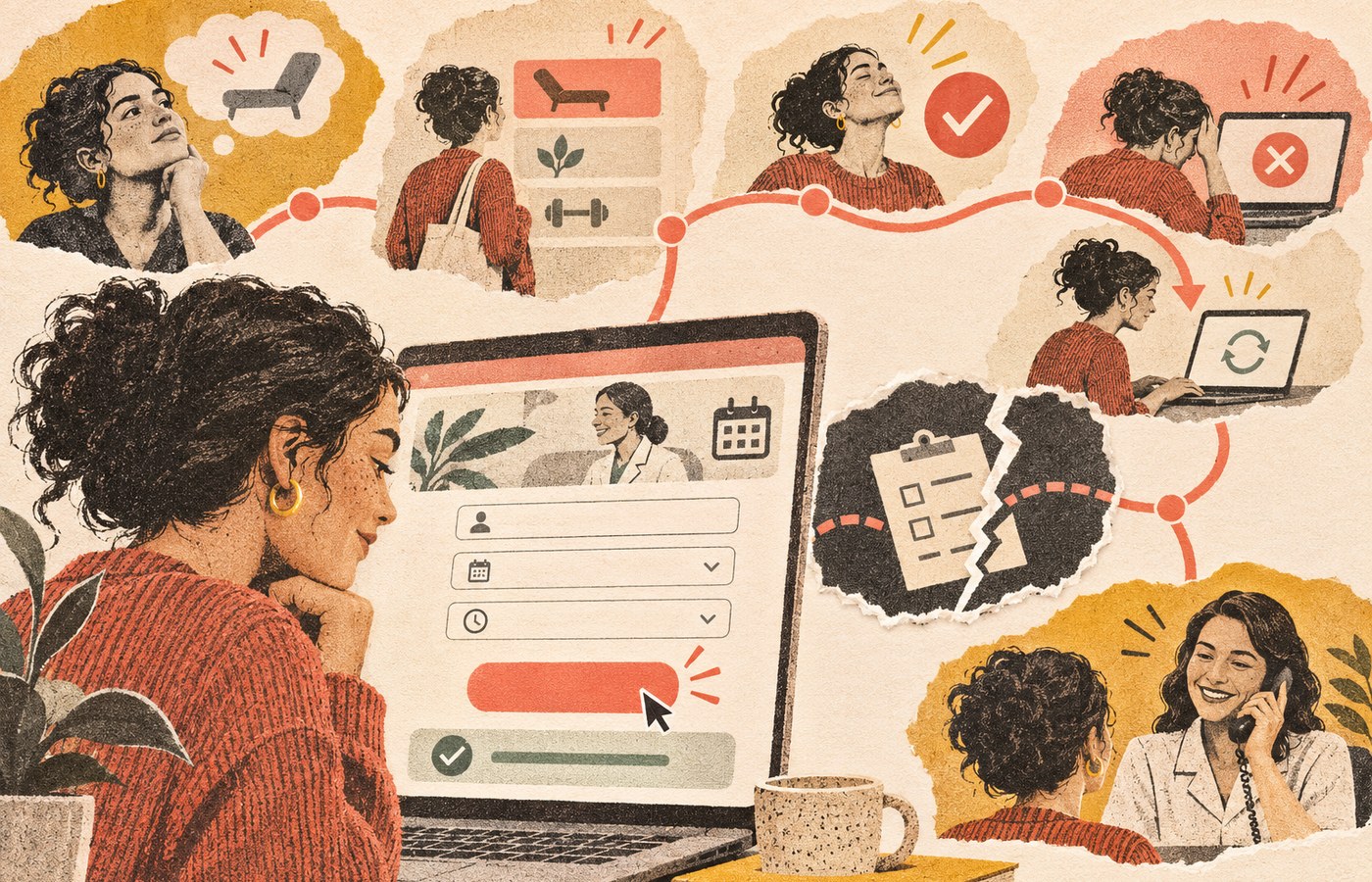
    Consider an appointment form for a professional service.

    The UI includes the calendar layout, readable labels, field spacing, selected-date state, button styling, validation messages, focus indicator, and confirmation screen.

    The UX includes whether the visitor knows which appointment type to choose, sees the information needed before committing, can find an available time, understands timezone and cancellation terms, completes the form without unnecessary questions, receives a trustworthy confirmation, and gets the promised follow-up.

    Now imagine the form is visually beautiful, but:

    • the service descriptions are vague;
    • every appointment type sounds the same;
    • the calendar has no mobile availability for six weeks;
    • an error deletes all entered information;
    • keyboard users cannot select a time;
    • the confirmation email goes to spam;
    • nobody on the business side checks the booking calendar.

    That is polished UI sitting inside a lousy experience. The gradient did its best. It was simply outnumbered.

    The reverse can also happen. A plain government or utility form may look dated but use clear labels, sensible sequencing, saved progress, specific error messages, and an immediate receipt. Its UI could use refinement while its core task experience is sound.

    The Scope Design Website Failure Stack

    When a website underperforms, teams often point at the visible layer because it is the easiest thing to see. That is how businesses end up buying a redesign when the offer, content, code, or follow-up process was broken.

    Use this stack from the top down. Upstream failures distort the evidence beneath them.

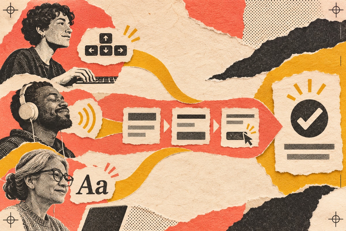
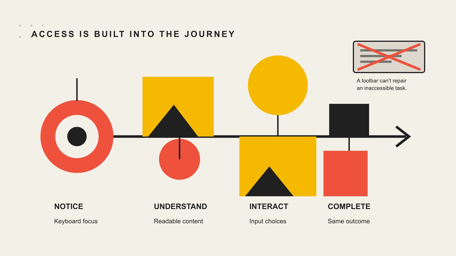
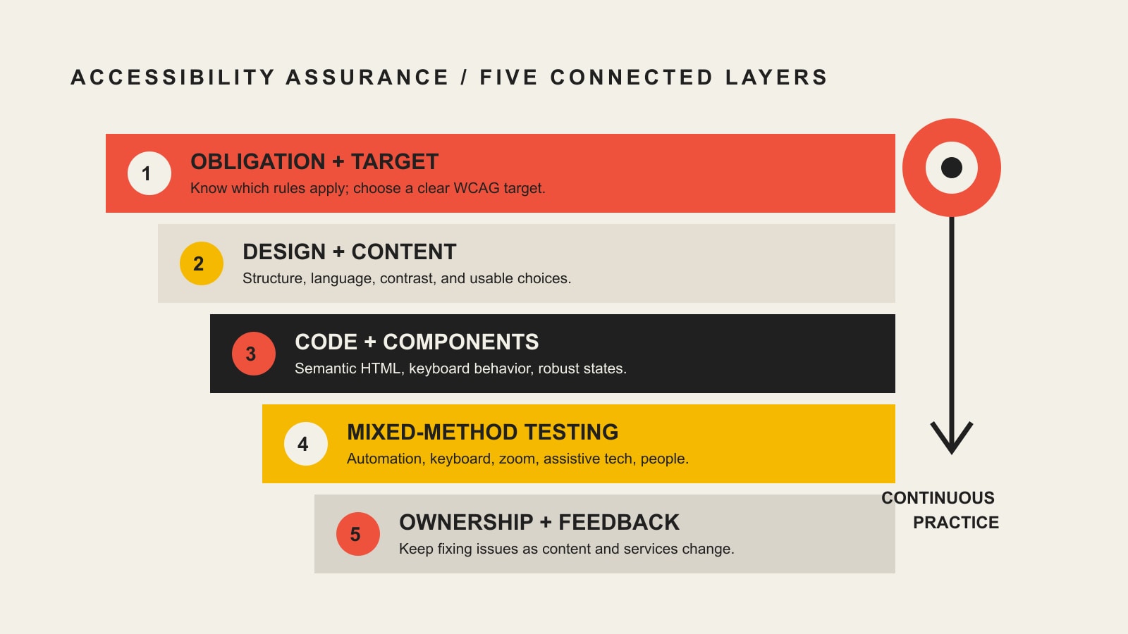
    A website journey passes through business purpose, information, task path, interface, implementation, accessibility, and evidence; a deeper break shows why visual polish alone may not fix the problem.
    The Website Failure Stack separates seven diagnostic layers. UX is what a person experiences when the whole stack meets reality.

    1. Business decision

    What is the website supposed to help which audience do, and why should that action matter to the business?

    This layer includes audience priority, positioning, offer, commercial outcome, qualification, and the role the website plays in acquisition or service. If the project has five equal audiences and nine equally urgent calls to action, the interface did not create the indecision. It inherited it.

    This is the territory of website strategy: determining the job before arguing about the curtains.

    2. Information

    What must a person understand, compare, and believe before taking the next step?

    This layer includes message, page hierarchy, explanations, evidence, pricing context, risks, objections, and readable content. If the headline says “Transforming Tomorrow Through Innovative Excellence,” the UI designer can make the type enormous, but the sentence will remain a beautifully typeset refusal to communicate.

    Our guide to design versus content explains how the message and its presentation hand work to each other. The website readability guide goes deeper on making that information understandable and scannable.

    3. Task path

    What sequence helps a person recognize the right option, understand it, choose, act, and recover?

    This is the most familiar UX-design layer: navigation, information architecture, task flows, progressive disclosure, forms, checkout, account creation, search, and recovery. A task path should reflect what the person is trying to accomplish, not the departments that attended the kickoff meeting.

    4. Interface

    How does the screen make the structure and available actions perceptible?

    This is the UI layer: visual hierarchy, layout, controls, states, typography, color, iconography, responsive patterns, and feedback. The interface should make important differences obvious without turning the page into a casino carpet.

    5. Implementation

    Does the built system faithfully and reliably perform the intended design?

    This layer includes semantic markup, responsive code, integrations, form delivery, data handling, browser behavior, reliability, and performance. A prototype can test beautifully and still become miserable when the production form times out or a script shifts the button as someone tries to click it.

    Google’s Web Vitals guidance treats loading, interactivity, and visual stability as measurable aspects of experience. Those signals matter, but they are engineering evidence—not a complete UX score. A fast page can still say nothing useful, and a perfect lab score cannot confirm that the sales team answered the inquiry.

    For the engineering side, see our web development and performance pillar.

    6. Access

    Can people with disabilities and people operating in varied real-world contexts perceive, understand, navigate, and interact with the experience?

    Accessibility overlaps with UI and UX, but it is not automatically satisfied by either label. The W3C Web Accessibility Initiative explains that accessibility includes underlying technical requirements as well as visual and interaction requirements. It also makes an important point: user involvement alone cannot cover the full diversity of disabilities and assistive technologies, while standards alone can miss the human interaction.

    That means “our designer thought it was usable” is not accessibility evidence. Neither is “the automated checker was green.” Our website accessibility guide explains the mixed evaluation required.

    Access is shown as a layer for diagnosis, but it is also a condition across every other layer. An inaccessible task is not a good experience with a minor compliance footnote. It is a task some people cannot complete.

    7. Evidence

    How will the team know where people succeed, hesitate, fail, abandon, complain, qualify, buy, or return?

    Evidence includes analytics, form errors, search queries, support questions, sales-call confusion, usability observation, accessibility evaluation, interviews, and downstream business outcomes. None is sufficient alone.

    Analytics can show where something happened, not reliably explain why. Interviews reveal perception, not always behavior. A heatmap shows that people clicked, not whether the click solved their problem. Sales feedback can expose poor fit or recurring objections, but it can also reflect a broken follow-up process. The point is triangulation, not worshipping whichever dashboard has the nicest gradient.

    How to Diagnose What Is Broken

    Start with the symptom, then identify the earliest failing layer that could produce it.

    Observed symptomLikely layer to inspect firstWhat to verify
    Visitors cannot explain what the business doesBusiness decision or informationaudience priority, offer, headline, message hierarchy
    The right people understand the offer but do not value itOffer, evidence, or sales positioningobjections, comparisons, proof, price-to-value logic
    People repeatedly get lost or choose the wrong routeTask pathnavigation labels, information architecture, sequence, recovery
    People miss actions or mistake text for controlsInterfacehierarchy, affordance, states, contrast, consistency
    A form works in a prototype but fails on real devicesImplementationvalidation, integrations, browsers, performance, delivery
    Keyboard or screen-reader users cannot complete the taskAccess and implementationsemantic structure, focus, labels, instructions, errors, testing
    The page gets little qualified trafficAcquisition or search intentquery and channel alignment, distribution, audience fit
    Leads arrive but nobody responds promptlyOperationsrouting, ownership, notifications, response process
    The team debates taste because nobody knows what happenedEvidenceoutcome definition, instrumentation, observation, feedback

    Diagnose in that order whenever possible. If almost no relevant people reach the page, conversion data will be noisy. If the form is broken, messaging tests are contaminated. If traffic is unqualified, improving completion may simply produce more efficiently processed junk.

    This is also why a broad “UX audit” can become a decorative PDF. The audit must connect observed problems to representative tasks, business consequences, and an owner who can fix the responsible layer.

    When Better UI Is the Right Fix

    UI work is likely appropriate when the structure and content are sound, but the presentation or interaction makes them difficult to perceive or operate.

    Typical UI problems include:

    • weak hierarchy makes every element look equally important;
    • interactive elements do not look interactive;
    • similar controls behave inconsistently;
    • important states such as loading, error, success, or disabled are missing;
    • typography or spacing makes useful content exhausting to read;
    • responsive layouts obscure the intended priority;
    • focus, hover, selected, and error states are unclear;
    • dense visual styling adds noise without adding meaning.

    The fix may involve a component system, clearer hierarchy, better responsive rules, explicit interaction states, more disciplined typography, or a visual redesign. But the brief should identify the specific interaction or comprehension problem. “Make it pop” is not a problem statement. It is how a meeting asks to become three more meetings.

    When UX Work Is the Right Fix

    UX work is likely appropriate when people have a meaningful goal but the structure of the experience makes success uncertain, inefficient, or frustrating.

    Typical UX problems include:

    • navigation reflects internal departments rather than customer intent;
    • important information appears after the decision that requires it;
    • forms ask for data the business does not need yet;
    • choices are difficult to compare;
    • users cannot tell what happens next;
    • error recovery forces people to start over;
    • mobile tasks require impractical precision or excessive steps;
    • support and sales repeatedly answer questions the site should address;
    • the digital handoff and the actual service contradict each other.

    Appropriate work may include research, task analysis, information architecture, journey mapping, prototypes, content design, usability testing, service-process changes, or interface changes. The deliverable depends on the diagnosed constraint.

    Our broader UX diagnosis and user-centered design guide covers how to identify and prioritize those experience failures.

    When the Problem Is Neither UI nor UX

    Sometimes the website is being blamed because it is visible and available for criticism.

    The traffic is missing or wrong

    A clear, usable page cannot convert people who never arrive. Nor can it rescue traffic generated by a misleading ad or an irrelevant search query. Segment the audience by source, landing page, and intent before rewriting the button.

    The offer is weak

    If qualified prospects understand the offer, navigate successfully, and consistently reject the value, the problem may be price, risk, timing, differentiation, or the offer itself. Better usability makes the rejection easier. That is not the lift the quarterly report had in mind.

    The content is evasive

    People cannot decide without useful information. Hiding price context, constraints, drawbacks, process, comparisons, or proof does not remove those questions. It leaves the visitor to answer them pessimistically.

    The technology is broken

    Lost form submissions, slow responses, layout shifts, failed integrations, browser bugs, and unreliable email delivery are implementation problems with UX consequences. Fix the system, not the mockup.

    The business drops the handoff

    The website produces a qualified inquiry. The notification goes to an abandoned inbox. Two days later, someone sends “just checking whether you still need help.” That is not a UI problem. It is the business mugging its own marketing in the parking lot.

    How to Evaluate UI and UX Without Making Up Certainty

    Observe representative people performing representative tasks

    The core of usability testing is gloriously unsexy: recruit people who resemble the intended audience, give them realistic tasks, and observe where they succeed or struggle without coaching them through the interface. The Nielsen Norman Group’s usability introduction frames usability through learnability, efficiency, memorability, errors, and satisfaction and recommends repeated testing throughout design.

    Do not ask, “Do you like this page?” Ask someone to determine whether a service fits their situation, find the relevant evidence, choose an option, submit the form, and explain what they expect to happen next.

    Review the built interface, not only the design file

    Check real devices and browsers. Use keyboard navigation. Enlarge text. Trigger validation errors. Use slow network conditions. Test interrupted and failed states. Confirm that form submissions arrive and confirmations are sent. A pristine design file is not the product customers use.

    Pair behavior with business evidence

    Connect page behavior to qualified outcomes:

    • Which sources produce people with the problem you solve?
    • Which tasks predict a useful sales conversation or successful self-service outcome?
    • Where do valid prospects stop?
    • What do sales and support repeatedly have to explain?
    • Which errors or questions signal confusion?
    • What happens after the website action?

    Sessions, clicks, scroll depth, bounce rate, and time on page are diagnostic signals, not business outcomes. A person who finds the phone number in ten seconds may be more successful than someone who spends six minutes trapped in your “immersive brand journey.”

    Use field and lab performance data correctly

    Lab tests help reproduce and debug performance problems under controlled conditions. Field data shows what eligible real users experienced over time. Neither tells you whether they understood the offer or trusted the business. Use performance data to diagnose the implementation layer, then combine it with task and outcome evidence.

    Prioritize by harm, reach, and leverage

    Fix failures that block important tasks, exclude people, corrupt data, or destroy trust before polishing minor inconsistencies. Then consider how many people encounter the problem, how severe the consequence is, and whether fixing an upstream issue resolves several downstream symptoms.

    Who Should You Hire: A UI Designer, UX Designer, Web Designer, or Developer?

    Hire for the diagnosed problem, not the trendiest job title.

    NeedLikely lead discipline
    Visual hierarchy, component styling, interaction states, responsive interfaceUI or product designer
    Research, task flows, information architecture, prototypes, usability testingUX designer or researcher
    Messaging, page narrative, explanations, evidence, readabilityContent strategist or web copywriter
    Positioning, audience priority, offer, conversion architectureWebsite strategist
    Semantic implementation, performance, integrations, reliabilityWeb developer or engineer
    Standards review plus disabled-user evaluationAccessibility specialist working with design and development
    A business website where all of these interactA multidisciplinary web team with clear ownership

    A capable web designer may cover UI, portions of UX, and visual communication. A capable developer may make excellent usability contributions. Titles overlap. Evidence matters more than labels: ask what the person will investigate, which decisions they own, how they test them, and what they do when the requested redesign is not the real fix.

    Our guide to what website design actually includes maps those responsibilities in more detail.

    A Better Brief Than “Improve the UI/UX”

    Replace the fog with a brief like this:

    Qualified visitors reach the service page from organic search, but many contact sales asking what the three service levels include. On mobile usability sessions, participants open multiple tabs and still cannot compare the options. We need to verify the information requirements, redesign the comparison task, implement it accessibly, and measure whether qualified visitors can choose the correct next step without assistance.

    That brief identifies the audience, observed problem, task, evidence, likely disciplines, implementation requirement, and desired outcome. It may produce content, UX, UI, accessibility, and development work. More importantly, it gives the team something better to discuss than whether the blue feels “premium enough.”

    If you need help determining which layer is actually failing, talk to Scope Design. We would rather diagnose the constraint than sell you a handsome redesign of the wrong problem.

    Frequently Asked Questions

    What is the basic difference between UI and UX?

    UI is the presentation and interaction layer of a digital product: layout, visual hierarchy, controls, and feedback. UX is the broader experience a person has while trying to achieve a goal across the interface, content, technology, and surrounding service.

    What are examples of UI and UX?

    A checkout button’s size, label, color, focus state, and loading state are UI. Whether a buyer can choose the right product, understand the total cost, complete payment, recover from an error, and receive the order confirmation is UX.

    Is web design UI or UX?

    Web design can include UI and portions of UX, but the label is broad. Some web designers focus mostly on visual presentation; others handle research, information architecture, content structure, accessibility, and testing. Ask what the actual process and responsibilities include.

    Which comes first, UI or UX?

    The business purpose, audience, information requirements, and core task should be understood before polishing the interface. UI and UX still develop iteratively: interface prototypes reveal experience problems, and testing changes both the flow and presentation.

    Can a website have good UI but bad UX?

    Yes. A site can look consistent and sophisticated while hiding important information, using a confusing task flow, failing accessibility requirements, breaking on real devices, or neglecting the customer after submission.

    Can a website have good UX but unattractive UI?

    It can have a useful core task experience despite dated or plain visual styling. However, unclear hierarchy, poor typography, weak interaction states, and inconsistent controls eventually affect usability and trust. “It works” is a baseline, not an excuse for visual neglect.

    Is accessibility part of UX or UI?

    Accessibility overlaps both and also has distinct requirements. Visual contrast and control states involve UI; task completion and error recovery involve UX; semantic code and assistive-technology support involve implementation. Accessibility needs standards-based evaluation and involvement from people with disabilities.

    Does page speed affect UX?

    Yes. Slow loading, delayed interaction, and shifting layouts can prevent or disrupt tasks. Performance is one contributor to UX, not a complete measure of it. A fast website can still be confusing, irrelevant, or inaccessible.

    Why is my attractive website not converting?

    Appearance is only one layer. The site may have the wrong traffic, an unclear offer, missing evidence, weak content, a confusing task path, technical failures, accessibility barriers, or poor sales follow-up. Diagnose the earliest failing layer before changing the visual design.

    How do you measure website UX?

    Use a combination of representative-task testing, completion and error evidence, accessibility evaluation, analytics, performance data, support and sales feedback, and downstream business outcomes. No single “UX score” explains the whole experience.

    Do small business websites need UX research?

    They need evidence from the people and tasks that matter, but not necessarily a giant research program. A few carefully chosen interviews and observed task sessions, combined with real inquiries, analytics, and support questions, can expose more than an underpowered button-color test.

    Should I redesign my website to improve UX?

    Only when the diagnosis shows that the structure or interface requires broad change. Many problems can be fixed through content, navigation, forms, accessibility, performance, or operational repairs. A redesign is a delivery option, not a diagnosis.

    Do I need both a UI designer and a UX designer?

    Not always as separate people. You need both responsibilities covered at the depth the project requires. A small site may use one multidisciplinary designer with specialist support; a complex application may require dedicated research, UX, UI, content, accessibility, and engineering roles.

    The Useful Answer

    UI and UX are not rivals, synonyms, or magic conversion dust. UI is the part of the system people see and operate. UX is what they experience while pursuing a goal through that system.

    The responsible question is not “Should we invest in UI or UX?” It is: Which layer is preventing the right person from reaching a useful outcome, what evidence proves it, and who owns fixing it?

    Answer that first. Then you can decide whether you need a clearer message, a better task path, a stronger interface, more reliable code, improved accessibility, a repaired handoff—or, occasionally, the redesign everyone had already put in the budget.

  • Website Design Conversion Optimization: 5 Friction Checks Before You Redesign

    Website Design Conversion Optimization: 5 Friction Checks Before You Redesign

    Website design conversion optimization is not about making a page prettier and hoping more people buy. Design affects conversion when it changes whether a qualified visitor can notice the important choice, understand it, trust it, complete it, and recover when something goes wrong. The useful question is not “Which design trick converts best?” It is “What is the first design-created obstacle in this path?”

    Short answer: yes, website design can affect conversion rates. But design is only one part of the system. Better hierarchy cannot rescue irrelevant traffic. A polished button cannot fix a weak offer. A modern layout cannot manufacture evidence that does not exist. If you are not sure which layer is failing, start with our broader guide to diagnosing why a website is not converting.

    Website Design Conversion Optimization Starts With Friction

    A conversion is any useful action you can define and measure: a qualified form submission, a scheduled consultation, a purchase, an account creation, a phone call, a donation, or another meaningful next step. Design influences that action through the interface people must use to get there.

    That distinction matters because web design and content solve different problems. Content explains the offer, the evidence, the objection, and the next step. Design changes hierarchy, attention, readability, perceived consistency, control states, navigation, form behavior, and the path through that content. A conversion problem can live in either layer—or somewhere else entirely.

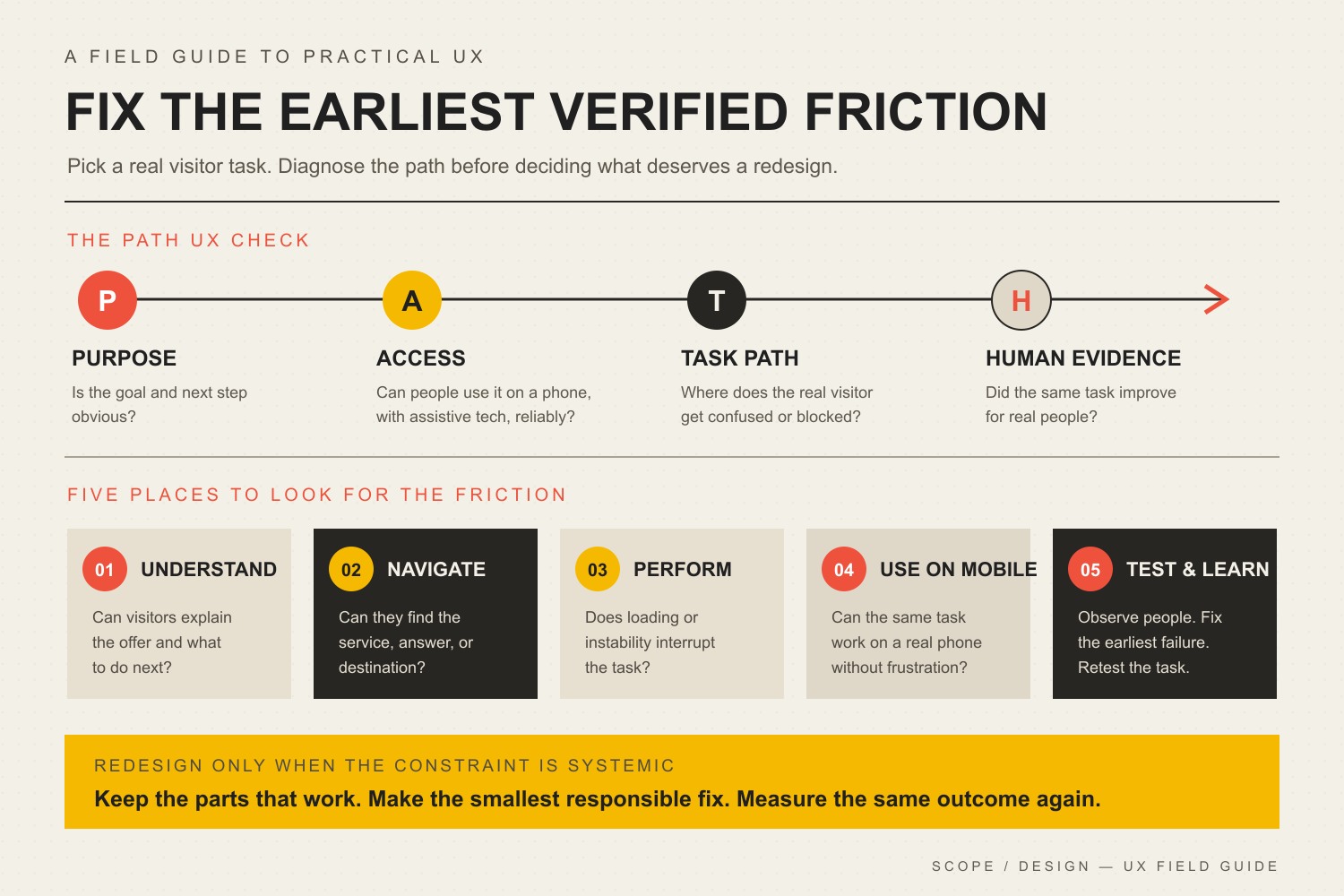
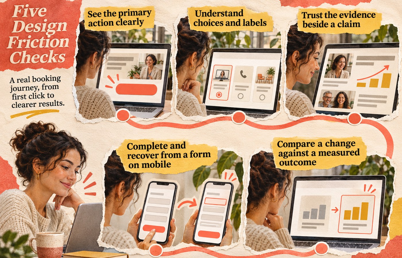
    Scope Design uses five checks to keep a visual redesign from becoming the default diagnosis: Attention, Comprehension, Credibility, Ability, and Evidence.

    Five connected checks for an online task: see the main action, understand choices, trust the evidence, complete and recover from a mobile form, and measure the outcome.

    The Five Design Friction Checks

    1. Attention: Can People See What Matters?

    Visual hierarchy should make the page’s important relationships obvious. Headings, spacing, type size, contrast, placement, and restraint can help a visitor distinguish the main action from supporting information. When every element shouts, nothing leads.

    Color is one tool, not a conversion spell. The better question is whether the action is distinguishable in context and remains usable for people with different visual abilities. If your palette is doing too much work, our guide to choosing brand colors that actually work explains why hierarchy and accessibility matter more than a mythical “highest-converting” hue.

    2. Comprehension: Can They Understand the Choice?

    A page can be attractive and still make the decision harder. Long line lengths, weak heading structure, labels that disappear when a field is active, decorative type, vague buttons, dense feature grids, or competing cards can force people to decode the interface before they can evaluate the offer.

    The W3C’s designing-for-accessibility guidance recommends sufficient contrast, identifiable interactive elements, clear and consistent navigation, associated form labels, identifiable feedback, useful headings and spacing, and designs that work at different viewport sizes. Those are accessibility requirements and good interface practices; they also remove avoidable effort from ordinary task completion.

    3. Credibility: Does the Interface Support Trust?

    Trust is not a badge collection. The interface earns credibility when what it promises matches what it shows: claims are near evidence, pricing and next steps are understandable, forms ask for information that makes sense, error states explain what happened, and the visual system stays consistent enough that the site feels maintained.

    The U.S. Web Design System’s design principles frame trust as something a service has to earn through reliability, consistency, honesty, respect for people’s time and data, and continued validation with real users. That is a stronger conversion principle than “add more trust icons.”

    4. Ability: Can They Complete the Task?

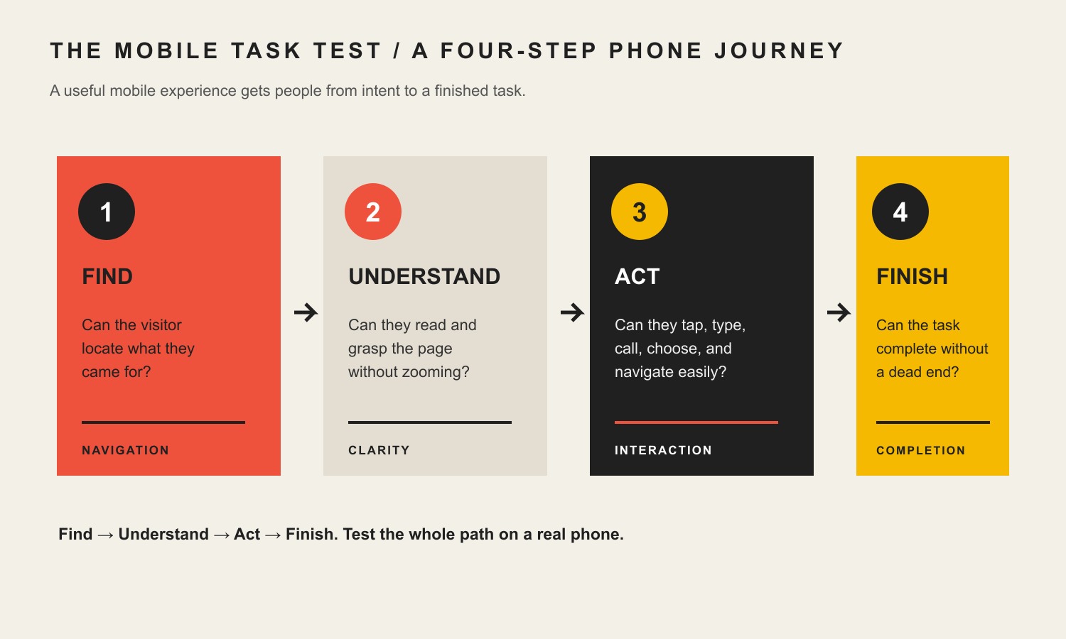
    If someone understands and wants the offer but cannot complete the action, the interface has failed at the most expensive moment. Check the real path on a phone, with a keyboard, at larger text sizes, with slow connections, and through common error states. Pay special attention to menus, forms, tap targets, focus states, sticky elements, validation, confirmation messages, and anything that shifts while the page loads.

    Responsive layout belongs here because “works on mobile” is a task requirement, not a screenshot requirement. Our guide to responsive web design goes deeper into preserving the same business task across screen sizes.

    Performance can also be part of ability. One useful controlled example comes from Rakuten 24. In a mobile A/B test documented by web.dev, the two versions were visually and functionally comparable, but the optimized version finished loading 0.4 seconds earlier and recorded a 33.13% higher conversion rate and 53.37% higher revenue per visitor. That is evidence that performance can affect a real conversion path; it is one retailer’s test, not a universal promise for every website.

    5. Evidence: Did the Change Help?

    A design change is not successful because the team likes the new version. Define the behavior you are trying to improve, preserve a baseline, make a controlled change when practical, and compare the result for the relevant audience. Watch the business outcome, not only a proxy such as button clicks.

    This is also where useful friction matters. A shorter form is not automatically better if the removed fields were qualifying poor-fit leads. A louder CTA is not automatically better if it causes more low-intent submissions. Our guide to website conversion mistakes explains the difference between accidental friction that wastes effort and intentional friction that protects a useful decision.

    What Should You Test First?

    Start with the symptom closest to a qualified visitor’s failed action. Do not redesign six variables at once and then credit the new font.

    Observed symptomLikely design constraint to inspectControlled first testUseful outcome
    People reach the page but miss the main actionAttention / hierarchyReduce competing emphasis and make one primary action visually dominantQualified progression to the next step
    People start but abandon a formComprehension or abilityClarify labels, required fields, validation, error recovery, and mobile layoutCompleted qualified submissions
    People read but hesitate before committingCredibilityMove specific proof, constraints, process details, or pricing context closer to the claim it supportsQualified action rate or fewer repeated objections
    Mobile behavior is materially worseAbilityTest the full path on narrow viewports; remove overlaps, layout shifts, tiny controls, and hidden informationMobile task completion compared with its own baseline
    A redesign “looks better” but results are unclearEvidenceChoose one measurable hypothesis and compare a controlled change or time-bounded baselineBusiness outcome tied to the hypothesis

    Website Design Conversion Optimization: What Design Cannot Fix

    Design matters. It is also an easy place to hide a non-design problem. Before commissioning a full visual overhaul, ask whether the actual constraint is one of these:

    • Wrong traffic: the page attracts people who were never likely to become customers.
    • Weak or confusing offer: the visitor understands the interface but does not see enough value to act.
    • Missing evidence: the page makes claims the business has not supported with examples, proof, process detail, or relevant experience.
    • Content problem: the copy does not answer the decision, objection, or next-step question. Stronger visual treatment cannot manufacture a clear offer or point of view that does not exist.
    • Operational friction: slow follow-up, broken scheduling, inventory constraints, unclear pricing, or a poor sales handoff happens after the interface did its job.
    • Measurement failure: analytics cannot distinguish a real lead, purchase, or qualified action from noise.

    If the question is specifically whether the page needs better design or better messaging, use the design-vs-content diagnostic before replacing both.

    Do You Need a Full Website Redesign?

    Not necessarily. A full redesign makes sense when the friction is systemic: the visual hierarchy is inconsistent across important pages, the responsive system repeatedly breaks tasks, the component library makes accessibility fixes difficult, the content architecture no longer matches how people buy, or the technology prevents reasonable iteration.

    Targeted changes are usually a better first move when one path is clearly broken: a confusing form, buried CTA, poor proof placement, unreadable content block, mobile overlap, or misleading control. Fix the smallest constraint that can test the diagnosis. If it works, you learned something. If it does not, you avoided rebuilding an entire site around a guess.

    What Auditing This Exact Article Taught Us

    We used the same evidence rule on this revision. In the 12 months ending August 20, 2026, this exact URL recorded only four GA4 landing sessions, all Direct, with zero engaged sessions and zero configured key events. Google Search Console returned no exact-page performance rows and currently reports the page as “Discovered – currently not indexed.” Bing reports zero clicks and zero impressions. Ubersuggest found no exact-page ranking keywords or backlinks.

    That is not enough traffic to conclude the old article did or did not convert, and Scope Design’s configured analytics events do not capture every possible business outcome. It is enough to reject a weaker editorial habit: preserving unsupported conversion percentages because the page has been online for years. We kept the established URL, removed the statistic soup, narrowed the article’s job, and rebuilt it around a testable design-friction framework.

    Frequently Asked Questions

    Does good website design automatically increase conversions?

    No. Good design can remove barriers to seeing, understanding, trusting, and completing an action, but conversion still depends on traffic quality, the offer, content, evidence, price, follow-up, and measurement. The right design change is the one tied to a diagnosed obstacle.

    What website design change should I make first?

    Fix the first broken step in the actual conversion path. If visitors miss the action, inspect hierarchy. If they start and abandon, inspect the form and error recovery. If they hesitate, inspect proof and expectations. If mobile users struggle, test the whole task on a small viewport. Pick the symptom before the pattern.

    What color CTA button converts best?

    There is no universal highest-converting button color. A CTA needs enough contrast to be identifiable, must fit the visual hierarchy, and must remain accessible. Its wording, placement, surrounding evidence, audience, and offer can matter more than the hue.

    What is a good website conversion rate?

    A generic industry average can be a weak diagnostic because a purchase, consultation request, newsletter signup, and highly qualified B2B lead are different actions with different economics. Start with your own baseline by page, source, device, audience, and conversion definition. Improve the business outcome that matters instead of chasing somebody else’s percentage.

    Design the Next Step, Then Measure It

    Website design conversion optimization is disciplined interface work: make the important choice visible, understandable, credible, usable, and measurable. When those five checks are healthy, visual polish has a job. When one is broken, that is where the next design decision should start.

    If you cannot tell whether your bottleneck is design, content, offer, traffic, accessibility, performance, or measurement, talk with Scope Design. We can diagnose the path before prescribing a redesign.

  • Website Content Readability: Help People Find, Understand, and Act

    Website Content Readability: Help People Find, Understand, and Act

    Content readability is how easily the intended reader can find, understand, and use the meaning on a webpage. A readability score can flag long sentences and complicated words. It cannot tell you whether a buyer understands your offer, trusts the explanation, or knows what the hell to do next.

    TL;DR: Treat a readability score like a dashboard warning light, not a certificate of clarity. Improve the page in this order: help people find the answer, decode the language, understand the meaning, make the decision, and take the next step. Then test whether real readers can complete the page’s actual job.

    That distinction matters. A page can earn a lovely green score while burying the answer under corporate throat-clearing, vague headings, undefined jargon, and a call to action that arrives wearing camouflage.

    What does content readability actually mean?

    Content readability is the ease with which a specific audience can locate, read, understand, and use written information. It includes sentence complexity, but it also includes organization, headings, terminology, examples, link text, and the relationship between the explanation and the reader’s task.

    The audience part is not optional. Plain language does not mean sanding every idea down to an eighth-grade nub. The current Digital.gov plain-language guidance explicitly frames clear writing around the knowledge and needs of the intended reader. A term can be perfectly readable to an engineer and useless to a homeowner. Context is doing real work here.

    The useful distinctions are these:

    QualityThe question it answersTypical failure
    LegibilityCan I physically perceive the text?Tiny type, weak contrast, cramped spacing, or broken reflow
    ReadabilityCan I process the words and sentences without unnecessary effort?Jargon, long constructions, vague references, or bloated prose
    ScannabilityCan I find the part that matters to me?Generic headings, walls of text, or a buried answer
    ComprehensionDo I understand the meaning, tradeoffs, and instructions?Missing context, unexplained concepts, or contradictory details
    ActionabilityDo I know what to do next?A weak CTA, unclear process, or unexplained consequence

    Scope’s website font size guide owns the typography and legibility layer. The inclusive-design guide asks whose context and limitations your assumptions exclude. This article owns the language, structure, meaning, and task handoff.

    A readability score is a warning light, not the finish line

    Common formulas such as Flesch Reading Ease and Flesch-Kincaid Grade Level estimate textual difficulty using features such as sentence length, word length, and syllables. That can be useful. It can also produce a precise-looking number that people worship far beyond its actual job description.

    A score does not know:

    • whether the reader found the correct section;
    • whether a technical term is necessary and familiar to the audience;
    • whether the page answered the question that brought them there;
    • whether examples clarified the concept;
    • whether the pricing table explains the meaningful tradeoff;
    • whether the reader chose the correct option;
    • whether the call to action makes sense.

    The W3C explanation of reading level describes formulas as methods for estimating the education level needed to read passages. It does not declare one magic score for every audience or page.

    WCAG 2.2 adds another useful correction. Its Readable guideline includes language identification, unusual words, abbreviations, reading level, and pronunciation. The reading-level criterion is Level AAA, while identifying the page language is Level A. In other words, “make everything Grade 8” is not a complete accessibility program. Our website accessibility guide explains the broader standards and testing baseline.

    Use a formula to find suspicious passages. Then use editorial judgment and real-user evidence to determine whether they are actually a problem.

    Use the Scope Design Readability Relay

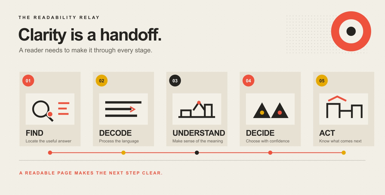
    Readable content has to carry meaning through five handoffs: Find, Decode, Understand, Decide, and Act. If the baton hits the floor at any stage, polishing the sentences at another stage will not rescue the page.

    The Readability Relay: Find the useful answer, decode the language, understand the meaning, decide with confidence, and act on a clear next step.

    1. Find: Can the reader locate the answer?

    The page title, opening, headings, table of contents, and link labels should reveal where the useful information lives. Someone scanning only the headings should understand the page’s argument and find the section that matches their question.

    Microsoft’s guidance on scannable content recommends organizing online material into discrete components and putting the most important information first. That is useful guidance without pretending every visitor follows one universal eye pattern.

    2. Decode: Can the reader process the language?

    Use familiar words where they are accurate. Shorten sentences that carry several ideas, exceptions, and qualifications at once. Expand acronyms on first use. Replace vague pronouns and passive constructions when they hide who does what.

    The goal is not baby talk. The goal is to stop charging readers an unnecessary jargon tax.

    3. Understand: Can the reader explain the meaning?

    Definitions are not enough. Readers need examples, boundaries, comparisons, and consequences. If you say a service is “strategic,” show what decisions the strategy changes. If two plans differ, explain who should choose each and why.

    Comprehension is where many polished pages quietly fall apart. The words are grammatical. The meaning is beige fog.

    4. Decide: Can the reader choose with confidence?

    Business content should reduce uncertainty around fit, price, timing, process, risk, ownership, and alternatives. A reader may understand every sentence and still be unable to decide because the page never addresses the uncomfortable question.

    That is not a reading-grade problem. It is an information problem.

    5. Act: Is the next step obvious and proportionate?

    The page should tell the reader what to do, what happens next, and what commitment the action requires. “Learn more” is rarely enough. “Compare the plans,” “Check your eligibility,” and “Schedule a website diagnosis” name the task.

    A readable page without an intentional next step is a pleasant hallway with no doors.

    How do you improve content readability?

    Start with the reader’s task, not the adjective count. Then revise the page from the outside in: purpose, order, headings, paragraphs, sentences, words, and action.

    Define one primary audience and task

    Write down who the page is for, what brought them there, what they already know, and what they need to accomplish. If one page serves several audiences, separate their paths instead of mixing instructions into a choose-your-own-confusion adventure.

    The Digital.gov guidance on writing for the reader recommends listening to real questions, talking with users, and checking web metrics to understand what people need. Search queries, sales-call objections, support requests, form errors, and on-site searches are all evidence.

    Put the answer before the background

    Lead with the conclusion, recommendation, eligibility rule, price range, or direct definition. Provide the reasoning next. Put company history and background where they support the decision, not where they block the front door.

    This answer-first approach also makes a page easier for search systems and AI tools to extract, but that is a side effect of helping the reader—not an excuse to produce robotic summary sludge. The separate guide to front-loading content for AI search covers that citation-oriented structure in depth.

    Make headings carry meaning

    Replace labels such as “Overview,” “Solutions,” and “Benefits” with headings that answer a question or state a conclusion. “Which plan fits a five-person team?” tells the reader more than “Our Plans.”

    Microsoft’s heading guidance treats headings as both structure and visual reference points. Specific headings help readers scan and help assistive-technology users navigate by heading.

    Give each paragraph one job

    A paragraph should answer one question, explain one point, provide one example, or qualify one claim. When it starts negotiating three unrelated treaties, split it.

    Do not enforce a mechanical sentence limit. A one-sentence paragraph can be useful. A five-sentence paragraph can also be clear. The test is whether the ideas belong together and remain usable on a narrow screen.

    Replace corporate fog with concrete language

    Corporate copy often uses abstract nouns to avoid saying anything falsifiable. Replace “delivery of optimized solutions that facilitate operational efficiency” with the actual action: “We connect the form to your CRM so staff stop retyping leads.”

    Prefer:

    • people and actions over abstractions;
    • specific outcomes over inflated adjectives;
    • active voice when responsibility matters;
    • concrete examples over decorative metaphors;
    • customer language over internal department labels.

    Explain necessary complexity instead of deleting it

    Some topics are genuinely technical, legal, financial, or medical. Simplicity does not give you permission to make them inaccurate.

    Use the precise term, then provide a plain-language explanation, example, or visual. For example: “A canonical URL tells search engines which version of a duplicated page you prefer them to index.” The technical entity survives; the reader does too.

    Use lists and tables only when they organize a real relationship

    A list is useful for steps, options, criteria, or grouped facts. A table is useful when readers need to compare the same attributes across several choices. Neither format is seasoning to sprinkle over an article that lacks structure.

    Keep list items parallel. Keep tables narrow enough to work on mobile, or place them inside a clearly scrollable container. Microsoft’s current responsive-content guidance recommends short sections and simple tables because content must still work on small screens and at larger text sizes.

    “Click here” forces the surrounding sentence to do the link’s job. Descriptive link text such as “review the UX diagnosis guide” helps readers decide whether the destination is useful and gives more meaning when links are encountered out of context.

    Make the next action match the reader’s readiness

    A research-stage visitor may need a checklist, comparison, or example before a sales call. A high-intent visitor may need the booking link immediately. Readability includes understanding the commitment attached to the button.

    Before-and-after readability examples

    These examples show why editing for meaning beats swapping long words for short ones.

    Vague service copy

    Before: “Our innovative team leverages a comprehensive suite of integrated solutions to facilitate transformative growth across your digital ecosystem.”

    After: “We diagnose where your website is losing qualified buyers, then fix the content, UX, tracking, or technical bottleneck that is actually causing it.”

    The revision is clearer because it names the reader, the problem, the work, and the boundary—not merely because the words are shorter.

    Buried eligibility rule

    Before: “Applications received by eligible organizations may be considered for review following the completion of all required documentation and verification procedures.”

    After: “Your organization can apply after you submit the required documents and we verify them.”

    The revision restores the actor and puts the sequence in the order it happens.

    Meaningless call to action

    Before: “Learn more.”

    After: “See what a website diagnosis examines.”

    The revision tells the reader what sits behind the click.

    How should readability be measured on a website?

    Use three layers of evidence: text diagnostics, comprehension tests, and page outcomes.

    Text diagnostics

    Check reading-ease or grade-level scores, average sentence length, long words, passive constructions, heading coverage, and paragraph density. These help locate passages worth reviewing. They do not determine whether the passage should be rewritten.

    Comprehension and usability tests

    Ask representative readers to perform a task and explain the answer in their own words. Useful prompts include:

    • “Which service would you choose for this situation, and why?”
    • “What will happen after you submit this form?”
    • “What does this term mean on this page?”
    • “Where would you look for the pricing exception?”
    • “What is the next step?”

    Watch where they hesitate, backtrack, choose incorrectly, or ask for clarification. Five real conversations can reveal more about meaning than a dashboard full of decimal places pretending to be wisdom.

    Page and business outcomes

    Choose measures that match the page’s job:

    • correct task completion;
    • CTA use by qualified visitors;
    • form completion and error rate;
    • successful plan or product selection;
    • internal-search refinements;
    • support questions caused by unclear content;
    • time to locate a specific answer;
    • abandonment at a decision point;
    • lead quality and sales objections.

    Time on page is not automatically good. A longer visit may mean engagement, confusion, or someone leaving the tab open while making lunch. Pair behavior with the task and qualitative evidence.

    Does content readability help SEO and AI citations?

    Readable, well-structured content can support a better search experience, but readability is not a magic direct ranking switch. Google recommends helpful, reliable, people-first content that serves an intended audience and helps people accomplish their goals. Google also explicitly says E-E-A-T is not one specific ranking factor.

    Clear titles, descriptive headings, direct answers, explicit entities, useful examples, and well-supported claims make a page easier for people and machines to interpret. They can also make a passage more useful to an AI system deciding what to quote or cite.

    None of that guarantees a ranking or citation. Anyone promising guaranteed AI citations has found a fresh bucket of glitter to sell.

    The durable approach is less exciting and more useful:

    1. Answer a real question better than the existing results.
    2. State the answer clearly enough to stand on its own.
    3. Add original expertise, a framework, or evidence worth referencing.
    4. Support factual claims with authoritative sources.
    5. Connect the page to a coherent expert topic cluster.
    6. Keep the content current and test whether readers succeed.

    A practical content readability audit

    Use this sequence on one important page before turning readability into a 97-tab content initiative.

    1. Name the reader and task. Write one sentence for each.
    2. Run the Readability Relay. Mark where people fail to find, decode, understand, decide, or act.
    3. Check the first screen. Confirm the page says what it offers, who it helps, and what to do next.
    4. Read only the headings. Verify that they form a useful outline.
    5. Circle jargon and abstractions. Explain necessary terms and replace ornamental ones.
    6. Split overloaded sentences and paragraphs. Keep related qualifications together without hiding the main point.
    7. Check mobile and text enlargement. A beautiful desktop paragraph can become a hostage note on a phone.
    8. Use a readability formula. Review the outliers; do not obey the score blindly.
    9. Test a realistic task with representative readers. Ask them to explain their choice.
    10. Measure the page’s outcome. Track comprehension, completion, errors, and qualified action.

    If the problem extends beyond the words—into navigation, trust, forms, performance, or the offer itself—use the broader website UX diagnosis guide. A copy edit should not be forced to cosplay as a business diagnosis.

    Frequently asked questions about content readability

    What does readability mean?

    Readability means how easily an intended reader can process and understand written text. On a website, useful readability also includes finding the relevant section and knowing how to use the information.

    How can I check the readability of content?

    Use a formula such as Flesch Reading Ease or Flesch-Kincaid Grade Level to flag complex passages, then review headings, organization, jargon, examples, and next steps. Finish by asking representative users to complete a realistic task and explain the page in their own words.

    What is a good readability score?

    There is no universal good score for every audience and purpose. Establish a reasonable range for the intended reader, investigate outliers, and verify comprehension. Technical precision can improve readability for an expert audience even when a formula penalizes the vocabulary.

    Is a Flesch Reading Ease score of 60 good?

    A score around 60 is often interpreted as reasonably accessible general prose, but the number is only a diagnostic. It does not prove that the information is accurate, well organized, understandable, or actionable for your audience.

    What does a Flesch-Kincaid grade level mean?

    It estimates the U.S. school grade associated with the text’s sentence and word characteristics. It does not measure the reader’s intelligence, subject expertise, motivation, or actual comprehension.

    Is plain language the same as dumbing content down?

    No. Plain language means using organization, wording, and design that help the intended audience understand the message. It preserves necessary complexity and explains it; it removes unnecessary complexity that mainly makes the writer sound impressed with themselves.

    What is the difference between readability and legibility?

    Legibility is whether people can visually perceive and distinguish the text. Readability is whether they can process the language and meaning. Font size, contrast, spacing, and reflow affect legibility; word choice, sentence structure, terminology, and organization affect readability. Both matter.

    What is the difference between readability and scannability?

    Readability helps people process the prose. Scannability helps them locate the prose that matters. Descriptive headings, short sections, lists, tables, and answer-first ordering improve scanning when they reflect a real information structure.

    How long should website sentences and paragraphs be?

    Keep them as short as the idea allows, not as short as a plugin demands. Aim for one main idea per sentence and one job per paragraph, vary the rhythm, and check the result on a narrow screen and at enlarged text sizes.

    How do you make technical content easier to read?

    Keep precise technical terms when they are necessary, define them at first use, show an example, explain the consequence, and layer optional detail after the direct answer. Accuracy and clarity are partners, not opponents.

    Does readability affect Google rankings?

    Google does not identify a readability score as a direct ranking factor. Clear, helpful, people-first content can support the overall experience and make the page easier to understand, but a green readability badge does not buy a ranking.

    Can AI rewrite content for readability?

    AI can flag long sentences, suggest alternatives, and produce useful drafts. It cannot independently know which nuance matters to your customer, whether a claim is true, or where the business process actually creates confusion. Use it as an editor, then apply subject expertise and test the result with people.

    Make the page easier to use, not merely easier to score

    The point of content readability is not to win a tiny green light inside a plugin. It is to help the right person find the answer, understand the tradeoff, make a confident decision, and take the right next step.

    If one important page is underperforming and you are not sure whether the failure is content, UX, the offer, traffic quality, or the technical foundation, talk with Scope Design about a website diagnosis. We will find the dropped baton before prescribing an expensive pile of prettier words.

  • Web Design vs. Content: Which Should You Fix First?

    Web Design vs. Content: Which Should You Fix First?

    Neither web design nor content matters more in every situation. Content carries the claim, proof, and instruction. Design determines whether people can notice, understand, trust, and act on it. Fix the first place that handoff fails—and make sure the actual problem is not bad traffic, a weak offer, broken technology, or sales follow-up taking a three-day nap.

    TL;DR: If visitors cannot tell what you do or why it matters, fix the content and message hierarchy first. If they understand the offer but cannot navigate, read, trust, or complete the action, fix the design and UX first. If the wrong people are arriving, the offer is weak, the form is broken, or leads disappear into an inbox crater, neither a redesign nor fresh copy is the first move.

    The “web design vs. content” debate survives because it produces tidy opinions and terrible diagnoses. Designers say people judge what they see. Copywriters say words sell. Both can be right, both can be wrong, and both can invoice you for solving a problem you do not have.

    The useful question is not, “Which discipline wins?” It is, “Where does the visitor stop moving from attention to understanding to confident action?”

    What is the difference between web design and website content?

    Website content is the information and meaning people use to make a decision: headlines, explanations, product details, comparisons, pricing context, proof, labels, instructions, images, video, data, and calls to action.

    Web design organizes and presents that information through layout, hierarchy, typography, color, spacing, navigation, interaction patterns, responsive behavior, states, and visual relationships. UX design extends beyond appearance into how the whole task works.

    That distinction is useful for assigning responsibility. It becomes nonsense when teams pretend the two can succeed independently.

    Consider a button:

    • Content tells the person what the action is and what happens next.
    • Design makes the control recognizable, locatable, legible, and usable.
    • Development makes it work.
    • Strategy determines whether it is the right action for that visitor.
    • Operations determine whether anyone does something useful after the click.

    Calling all of that “make the button pop” is how business problems become decorative projects.

    The W3C guidance on accessibility, usability, and inclusion makes a similar systems point: these concerns overlap, and addressing them together produces a more usable result. Content and interface are different disciplines, but the visitor experiences one page—not your org chart.

    Does web design affect conversions?

    Yes. Web design affects whether people can perceive the page, understand its hierarchy, navigate to the relevant information, identify controls, recover from errors, and complete the intended task. It also shapes the credibility cues people use while deciding whether the claims deserve attention.

    The design layer includes basic thresholds that copy cannot compensate for:

    • readable contrast and type;
    • obvious interactive elements;
    • clear, consistent navigation;
    • labels and instructions that stay connected to forms;
    • useful error and success feedback;
    • layouts that reflow on narrow screens;
    • stable, responsive pages that do not shift or stall;
    • a hierarchy that reveals what matters first.

    Those are not matters of taste. The W3C’s web-accessibility design tips explicitly cover contrast, identifiable controls, navigation, labels, feedback, headings, spacing, and different viewport sizes.

    Performance belongs in this conversation too. Rakuten 24 published a Core Web Vitals case study in which a visually and functionally comparable faster version produced a 33.13% conversion-rate lift in that company’s mobile A/B test. That is credible evidence that interface performance can affect business outcomes. It is not a coupon promising every slow site exactly 33.13% more money. One case study is a case study, not a universal law wearing a lab coat.

    If people cannot use the page, they never reach the brilliant paragraph your copywriter would like framed.

    Does website content affect conversions?

    Yes. Content tells the visitor what the business offers, who it is for, which problem it solves, how the options differ, why the claim is believable, what the risk is, and what to do next.

    Content failures usually look like this:

    • a vague headline that could belong to 400 competitors;
    • features without an explained business outcome;
    • claims without evidence near the moment of doubt;
    • company biography before the visitor’s actual question;
    • important price, fit, timing, or process information missing;
    • internal jargon used as navigation;
    • a call to action that says “Learn more” because apparently verbs are rationed;
    • pages that attract search traffic but never connect the answer to the offer.

    A visually polished page can make vague content look expensive. It cannot make it meaningful.

    Google’s current people-first content guidance asks whether content serves an intended audience, demonstrates first-hand expertise, provides original value, and helps someone accomplish a goal. The same guidance says Google’s systems also look for an overall good page experience. Search does not treat useful information and usable presentation as rival political parties. Neither should your website team.

    For the mechanics of making copy easier to find and understand, use Scope’s guide to website content readability. This article has a different job: deciding whether content is actually the first constraint.

    Use the Scope Design Conversion Handoff

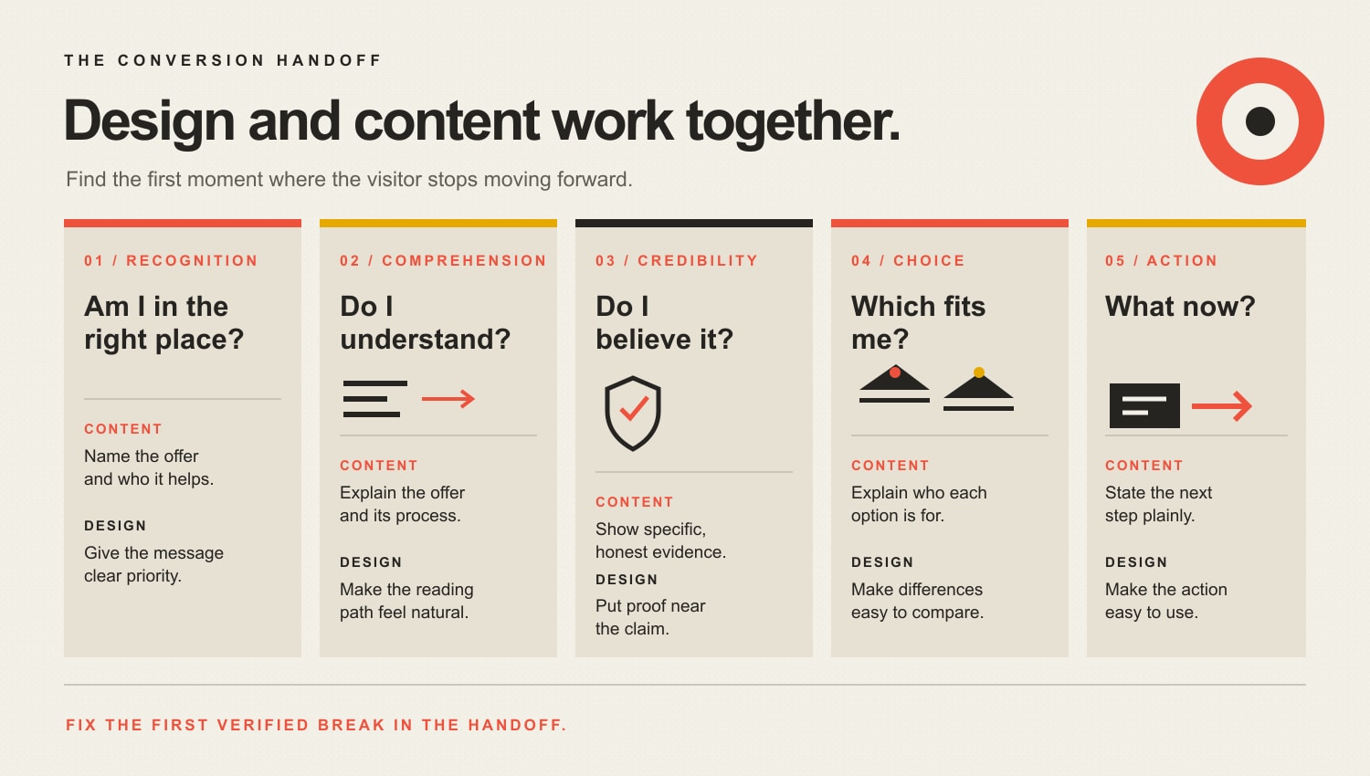
    A business page has to move a person through five handoffs: Recognition, Comprehension, Credibility, Choice, and Action. Design and content share every stage, but their responsibilities change.

    The Conversion Handoff: content and design work together at Recognition, Comprehension, Credibility, Choice, and Action. Content names and explains the offer, supplies evidence, explains fit, and states the next step; design prioritizes, organizes, places proof, clarifies comparisons, and makes the action usable.

    1. Recognition: “Am I in the right place?”

    Content names the problem, audience, offer, and outcome. Design gives that message priority and prevents decorative noise from mugging it in the parking lot.

    Content-first symptoms: People describe the company incorrectly, sales calls start with “So what do you actually do?”, or the headline is a generic promise such as “Transforming tomorrow through innovative solutions.”

    Design-first symptoms: The right message exists, but a hero video, rotating slider, weak contrast, cluttered header, or microscopic type keeps it from being perceived.

    2. Comprehension: “Do I understand it?”

    Content explains the offer, terms, process, and consequences. Design groups related ideas, creates a reading order, and makes the explanation work across devices and input methods.

    Content-first symptoms: Visitors read the page but misunderstand the service, confuse plans, or ask questions the page supposedly answers.

    Design-first symptoms: Information is accurate but scattered across tabs, buried under vague headings, trapped in an unreadable comparison, or rearranged nonsensically on mobile.

    3. Credibility: “Do I believe it?”

    Content supplies evidence: specific results, methods, limitations, authorship, case details, references, pricing context, and honest answers. Design places proof near the claim, distinguishes evidence from decoration, and creates a coherent professional presentation.

    Content-first symptoms: Testimonials say only “Great job,” claims have no source, case studies omit what changed, or every objection is hidden until a sales call.

    Design-first symptoms: Strong proof exists on a forgotten page, logos are unreadable, evidence appears detached from the claim, or inconsistent styling makes legitimate information look cobbled together.

    Scope’s current testimonial article is itself scheduled for a later evidence-led rebuild, so treat social-proof statistics there cautiously for now. The useful principle is simpler: proof should be specific, relevant, and close to the uncertainty it resolves.

    4. Choice: “Which option fits me?”

    Content defines options, tradeoffs, fit, exclusions, cost drivers, and decision criteria. Design makes comparison possible without forcing the visitor to keep five pages in working memory.

    Content-first symptoms: Every plan is “perfect for growing businesses,” nobody explains why prices differ, or the page refuses to say who should not buy.

    Design-first symptoms: The comparison requires horizontal gymnastics, the selected state is unclear, filters do not behave as expected, or essential details vanish behind interaction gimmicks.

    5. Action: “What do I do, and what happens next?”

    Content names the next step, commitment, required information, and follow-up. Design makes the control obvious, accessible, proportionate, and forgiving when someone makes a mistake.

    Content-first symptoms: The CTA is vague, the form asks questions without explaining why, or the booking page creates expectations the sales process does not meet.

    Design-first symptoms: The button blends into the page, the mobile form breaks, errors erase completed fields, keyboard users cannot proceed, or confirmation never appears.

    The handoff matters because a weakness upstream makes downstream metrics hard to interpret. You cannot judge CTA copy when half the audience never sees the button. You cannot judge a redesign when the offer still sounds like scented fog.

    Which should you fix first: design or content?

    Fix the earliest verified failure in the visitor’s path. Use the evidence you already have before ordering a deliverable.

    What you observeMost likely first priorityWhy
    Visitors cannot explain what you doContent and message hierarchyThe core claim is missing, vague, or visually subordinated
    Visitors understand the offer but cannot find informationInformation architecture and UX designThe content exists, but the route to it fails
    Mobile users convert far worse at the same stepTechnical and interaction designDevice-specific friction is a stronger lead than a universal copy problem
    People reach the form, start it, and abandon at one fieldUX, field content, or bothObserve the exact field, error, request, and expectation before deciding
    Traffic is relevant, engagement is strong, but buyers reject the valueOffer, proof, or pricing strategyPrettier cards and punchier verbs may not fix an unattractive trade
    The page converts qualified visitors, but volume is tinyAcquisition and distributionRewriting a working page may be lower priority than bringing the right people to it
    Leads convert on-site but go cold before a responseSales operationsThe website did its job; the follow-up did not
    Layout shifts, pages stall, or controls failTechnical performance and UXThe experience is functionally broken before persuasion can work
    The site looks dated but users complete tasks successfullyBrand/design review with outcome protectionAesthetic modernization may help positioning, but preserve the working task flow

    This is why Scope’s broader guide to diagnosing a website that is not converting starts before the design brief. A redesign request tells you the client is unhappy. It does not identify the cause.

    When should content come before design in a website project?

    Content should establish enough meaning before detailed visual design begins. The team needs to know the audiences, user tasks, message hierarchy, required evidence, content types, decision points, and approximate content shape. Otherwise designers create elegant boxes for imaginary sentences, then everybody acts surprised when the real material does not fit.

    That does not mean every comma must be legally notarized before a wireframe exists. Content and design should iterate together.

    A practical sequence is:

    1. Diagnose the business and user problem. Identify the page’s job and the last outcome it can realistically control.
    2. Inventory the required information. Claims, proof, objections, processes, comparisons, policies, media, and actions.
    3. Draft the message hierarchy. Write the direct answer, major section conclusions, and decision criteria.
    4. Prototype content and layout together. Test whether the real material works in the interface.
    5. Validate with representative users. Watch them recognize, understand, trust, choose, and act.
    6. Refine copy, design, and code from the same evidence. Do not let departments optimize different imaginary visitors.

    The GOV.UK design principles capture the underlying discipline well: start with user needs, design with data, do the hard work to make things simple, and build services rather than isolated screens.

    When should design come before a content rewrite?

    Prioritize design or technical UX when existing research shows people understand the message but cannot comfortably use the interface. Common examples include inaccessible contrast, unusable navigation, broken responsive behavior, unclear states, slow page performance, chaotic information architecture, and forms that fail at completion.

    Design may also lead when the business has changed positioning and its visual identity now creates the wrong expectation. A premium advisory service presented like a clearance-bin template may have a credibility problem before anyone reads the case study. But even then, define the intended position and evidence first. “Make it premium” is not a strategy; it is a mood board asking for adult supervision.

    The homepage design guide owns the page-level architecture. Scope’s typography guide owns physical legibility. Use those when the diagnosis points to presentation rather than message substance.

    Web design vs. content: how do you prove which problem is hurting conversions?

    Use multiple forms of evidence because each one answers a different question.

    Analytics show where behavior changes

    Segment outcomes by landing page, traffic source, device, viewport, browser, new versus returning users, and conversion step. Look for meaningful differences and enough observations to avoid writing strategy from six visits and a hunch.

    Analytics can show where people leave. They usually cannot tell you why.

    Search and campaign data show why people arrived

    Review organic queries, ad terms, referral context, and landing-page promises. A page can be clear and usable for the wrong intent. That is a traffic-message mismatch, not proof that the button needs a warmer orange.

    Usability testing shows what people understand and can do

    Give representative users realistic tasks. Ask them to explain the offer, find a detail, compare options, and complete the next step. Observe hesitation, errors, backtracking, and misinterpretation. Digital.gov describes usability testing as a way to validate design and content against user needs.

    Sales and support language exposes missing information

    Review sales-call questions, objections, lost-deal reasons, support tickets, chat logs, form responses, and follow-up time. If prospects repeatedly ask what implementation costs or who a service is for, the page has handed sales an information debt.

    Technical checks eliminate fake messaging problems

    Submit every important form. Confirm the notification arrives. Test keyboard access, mobile layouts, browser behavior, page speed, error states, analytics events, and confirmation paths. A dead inbox can make brilliant content look like a conversion failure.

    Experiments test a specific mechanism

    A/B testing is useful when traffic is sufficient, instrumentation is trustworthy, the change tests a real hypothesis, and the success metric includes quality. “Red beat blue by 18%” is not a transferable design principle. It is one result in one context—assuming the test was powered correctly and nobody peeked until the graph looked exciting.

    What should you measure after changing design or content?

    Measure the last outcome the page can influence, then connect it to business quality downstream.

    Useful measures include:

    • correct task completion;
    • qualified CTA use;
    • form completion and error rates;
    • plan or product selection accuracy;
    • booked-and-attended appointments;
    • qualified opportunities and pipeline value;
    • sales objections tied to missing page information;
    • support contacts caused by confusion;
    • conversion by device and relevant acquisition source;
    • Core Web Vitals alongside the page’s actual business outcome.

    Traffic, time on page, scroll depth, and bounce can help diagnose behavior. They are not automatically success. A visitor spending nine minutes trying to decode your pricing is not “highly engaged.” They are trapped.

    Frequently asked questions about web design vs. content

    What is more important for a website: design or content?

    Neither is universally more important. Content provides the meaning, evidence, and instruction; design makes that information perceivable, understandable, navigable, and actionable. The first verified failure in the user journey should receive priority.

    Should you write website content before designing the site?

    Define the audience, tasks, message hierarchy, required evidence, content types, and representative draft content before detailed design. Then iterate content and design together in realistic prototypes rather than finishing either discipline in isolation.

    Can good web design make up for weak content?

    No. Good design can increase attention, comprehension, and perceived coherence, but it cannot invent a differentiated offer, credible evidence, or a useful answer. It can only present the weak content more attractively.

    Can great content overcome bad web design?

    Only to a point. Strong information cannot help people who cannot read it, find it, navigate it, or complete the action. Broken mobile layouts, inaccessible controls, slow performance, and chaotic hierarchy impose hard limits.

    Does web design affect SEO?

    Design-related implementation can affect page experience, accessibility, mobile usability, crawlable structure, navigation, and performance. Google recommends considering overall page experience rather than treating one design metric as a magic ranking factor.

    Does website content affect SEO?

    Yes. Search systems need relevant, helpful, original, well-supported information that satisfies the query. Content also supplies the entities, explanations, headings, links, and evidence a search engine or AI system may use to understand and cite a page.

    What are the most important parts of a business website?

    The most important parts are a clear offer, audience relevance, useful proof, intuitive navigation, accessible and responsive interaction, trustworthy technical performance, an understandable decision path, and a next step connected to real business operations.

    What makes a good website design?

    A good design helps the intended user recognize the page, understand the information, trust appropriate evidence, compare choices, and complete the task across devices and abilities. Visual appeal supports those jobs; it does not replace them.

    What is the three-second rule in web design?

    There is no universal three-second law that determines whether every visitor stays or converts. Speed and immediate clarity matter, but the acceptable time and information depth depend on the device, task, audience, and purchase. Measure real behavior instead of designing around folklore.

    How much should a business spend on design versus content?

    There is no defensible universal percentage. Budget around the diagnosed constraint, the work required to fix it, the value of the outcome, and the evidence needed to validate the change. A 60/40 rule is tidy spreadsheet theater.

    Is AI replacing web designers or content writers?

    AI can accelerate drafts, variations, audits, prototypes, and production. It does not remove the need to diagnose the business, understand users, verify claims, make tradeoffs, test the experience, or accept responsibility for the result.

    How do you know whether a redesign worked?

    Define the baseline and success measure before changing the site. Compare qualified outcomes, task completion, errors, lead quality, device performance, and downstream business results. A launch is not evidence, and compliments from the project team are not a KPI.

    Stop choosing teams. Find the broken handoff.

    Content without design is information dumped on the floor. Design without content is a beautifully lit empty store. The business does not need a philosophical winner; it needs the earliest broken handoff fixed without damaging what already works.

    Start with Recognition, Comprehension, Credibility, Choice, and Action. Then check traffic quality, the offer, technology, and follow-up before prescribing a redesign or rewrite.

    If the evidence points in five directions and everyone has already chosen their favorite deliverable, talk with Scope Design about a website diagnosis. We will figure out whether the problem is design, content, UX, technology, the offer, or the business process before spending your money polishing the wrong damn thing.

  • How to Improve Your Website’s User Experience: The Complete 2025 Guide

    How to Improve Your Website’s User Experience: The Complete 2025 Guide

    If you are asking how to improve website user experience, do not start by redesigning the whole site. Start with one important visitor task, find the earliest point where a real person gets confused, delayed, blocked, or uneasy, fix that constraint, and then test the same task again. A faster page will not rescue a confusing offer. A prettier form will not fix a navigation path nobody can find. Good UX work improves the path people are already trying to use.

    Website UX includes what people understand, what they can find, what they can operate, how reliably the page responds, whether they trust the next step, and whether they can complete or recover from the task. Visual design matters, but it is only one part of the experience.

    This guide gives small and midsize businesses a practical way to improve an existing website without turning every usability problem into a redesign project.

    TL;DR: fix the earliest verified friction

    • Define the task. Pick one visitor outcome that matters to the customer and the business.
    • Run the PATH UX Check. Examine Purpose, Access, Task path, and Human evidence.
    • Fix the earliest failure. Do not optimize a later step while an earlier one is still blocking the task.
    • Keep useful friction. Qualification, safety, privacy, informed consent, and service quality can justify an extra step.
    • Measure the same outcome again. Judge useful leads, bookings, sales, applications, or successful task completion, not decorative engagement metrics.
    • Redesign only when the constraint is systemic. If a narrow responsible fix works, preserve the parts of the site that already do their job.

    What website user experience actually includes

    User experience is the quality of the path between a visitor’s goal and a successful outcome. On a business website, that path usually crosses several systems at once: message clarity, information architecture, navigation, responsive behavior, accessibility, performance, forms, trust signals, feedback, and content.

    That is why “the site looks dated” is a weak UX diagnosis. A dated-looking site can still help the right person finish a task. A beautiful site can still bury the service, hide the phone number, shift while loading, trap keyboard users, reject a form without explaining why, or make every button look equally important.

    If the larger problem is that visitors arrive but do not convert, our guide to diagnosing why a website is not converting owns that broader diagnosis. Here, the job is narrower: once you know there is friction, how do you improve it responsibly?

    Start with one real visitor task

    Pick one task that matters to both the visitor and the business. Examples include requesting a quote, booking an appointment, finding a service, checking whether you serve a location, buying a product, submitting an application, downloading a document, or calling the right department.

    If you cannot name that task, UX optimization is premature. First decide what real job the website is supposed to do. Otherwise you can spend weeks making individual components “better” while the page still asks the visitor to choose among several competing goals.

    Now run the task yourself on a phone and a desktop. Do not click like the person who built the site. Start from a realistic landing page and pretend you know only what a new visitor could know. Write down the first place where you hesitate, backtrack, zoom, wait, misread, wonder whether something is clickable, question whether the company is credible, or fail to understand what happens next.

    Five common places UX improvements happen

    Most business-site UX work lands in a handful of areas: understanding the user and task, simplifying navigation, improving performance, designing for real mobile behavior, and testing what actually changed. The visual below is a useful map of those areas. It is not a priority order. The right priority depends on where the task first breaks.

    The PATH UX Check covers Purpose, Access, Task path, and Human evidence, then five improvement areas: understand, navigate, perform, use on mobile, and test and learn.
    Five common website UX improvement areas. Diagnose the failing task before deciding which area deserves the next change.

    Use the Scope Design PATH UX Check

    The PATH UX Check is a simple way to stop a UX project from becoming a pile of unrelated best practices. Start at Purpose, then check Access, then the Task path, then Human evidence. When you find a verified constraint, fix the smallest responsible thing that can remove it and test again.

    PATH stepQuestionWhat to inspect
    P: PurposeWhat useful job is the visitor trying to finish?Offer clarity, page intent, qualification, primary next step, business outcome
    A: AccessCan the visitor reliably perceive and operate the experience?Performance, mobile behavior, accessibility, technical errors, input methods
    T: Task pathCan the visitor find, understand, trust, and complete each necessary step?Navigation, content, forms, controls, proof, feedback, error recovery
    H: Human evidenceWhat do real behavior and real outcomes show?Task observation, analytics, form errors, support questions, sales feedback, qualified outcomes

    PATH is not a claim that every journey is perfectly linear. Returning customers behave differently from first-time visitors, and people jump between pages. Its job is to keep the diagnosis ordered enough that you do not polish a later step while an earlier one is still failing.

    P: make the purpose and next step obvious

    Before you change colors, animations, or card layouts, read the page without the design language in your head. Can a visitor answer three questions: What is this? Is it for me? What should I do next?

    Use descriptive headlines instead of welcome copy. Name services the way customers recognize them. Make the primary call to action visually distinct from secondary actions. Put qualification details near the decision they affect instead of hiding them in an FAQ nobody has reached yet.

    Sometimes the first constraint is not “design” at all. If the page structure is sound but visitors still cannot understand the offer, compare the evidence before choosing between a layout change and a message change. Our guide to deciding whether design or content is the real conversion constraint goes deeper on that distinction.

    A: make the experience accessible, responsive, and reliable

    Test the task on a real phone

    “Responsive” is not the same as usable. A page can technically collapse to a narrow screen while still producing tiny controls, giant sticky elements, intrusive pop-ups, awkward forms, hidden comparison information, or a call to action that disappears several screens below the content that created intent.

    Use your actual phone. Try the same representative task in portrait orientation with the on-screen keyboard open. Check whether text remains readable, controls remain operable, focus is visible, the page survives zoom, errors appear near the right field, and fixed elements do not cover what you are trying to use.

    For a deeper treatment of responsive behavior, see why mobile optimization is more than shrinking the desktop layout.

    Fix performance that interrupts the task

    Speed matters because waiting, delayed responses, and unexpected movement interrupt what the visitor is trying to do. Google’s current Core Web Vitals cover Largest Contentful Paint (LCP), Interaction to Next Paint (INP), and Cumulative Layout Shift (CLS). For field data, the current “good” thresholds are LCP at 2.5 seconds or less, INP at 200 milliseconds or less, and CLS at 0.1 or less, evaluated at the 75th percentile. Those thresholds come from the official Core Web Vitals threshold guidance.

    Those metrics are useful diagnostics, not a complete definition of UX and not a ranking guarantee. Google explicitly recommends evaluating page experience holistically rather than treating it as a single signal. Its page experience guidance for Search is a useful guardrail against turning Core Web Vitals into superstition.

    • Resize and compress images instead of sending oversized files to every device.
    • Avoid loading scripts and widgets on pages that do not need them.
    • Reserve space for images, embeds, banners, and injected content so the interface does not jump.
    • Break up expensive JavaScript work that delays interaction.
    • Use field data when enough real-user data exists and lab tests to reproduce and diagnose individual problems.

    If performance is the verified constraint, use our website speed optimization guide for the implementation work instead of bloating this UX article into a performance manual.

    Treat accessibility as core usability

    Accessibility is part of UX because a task that cannot be perceived or operated is not a successful experience. The Web Content Accessibility Guidelines (WCAG) 2.2 organize accessibility around content that is perceivable, operable, understandable, and robust, with testable success criteria underneath those principles.

    Useful checks include keyboard navigation and visible focus, meaningful labels and instructions, identifiable errors, text that can resize without losing content or functionality, sufficient contrast, text alternatives where they carry meaning, and controls that do not depend on one input method. WCAG 2.2 also includes a Level AA Target Size (Minimum) criterion of 24 by 24 CSS pixels or one of its listed spacing, inline, equivalent, user-agent, or essential exceptions. The W3C’s Target Size explanation is the better reference than repeating an arbitrary “every button must be 44 or 48 pixels” rule.

    Accessibility requirements can intersect with legal obligations, but this article is not legal advice. Our detailed guide on improving website accessibility and ADA-related readiness covers the implementation problem in more depth.

    T: improve the task path, not just the interface

    Fix navigation and information architecture

    Navigation should help people predict where information lives. Clever labels create a tax on every click. “Solutions” might make sense internally, but if the customer is looking for “Commercial Roofing,” use the language that reduces interpretation.

    Audit the path, not just the menu. A visitor can have a tidy header and still get stuck because a service page has no next step, pricing context appears after the form, a location page dead-ends, or related information is scattered across pages with no useful cross-links.

    • Use labels that describe the destination.
    • Keep important routes consistent across templates.
    • Put supporting information near the decision it supports.
    • Use clear parent-child structure when the hierarchy is deep.
    • Check search, filters, account tools, or directories when they are necessary to a primary task.

    Reduce unnecessary form friction

    Forms fail for more reasons than “too many fields.” The better question is whether each step asks for information the business needs at that point, in a way the visitor can understand and recover from.

    Remove fields that exist only because somebody once thought they might be useful. Group related questions. Use persistent labels instead of placeholder-only instructions. Explain unusual requirements before the visitor triggers an error. Preserve entered information when validation fails. Make success unmistakable, including what happens next and when.

    Do not automatically shorten a form if qualification matters. A two-field lead form can create more submissions and worse leads. The UX target is not the least effort at any cost. It is the least unnecessary friction consistent with a useful outcome.

    Put trust and feedback where decisions happen

    Visitors hesitate when the cost of being wrong feels high. The useful response is not to dump a wall of testimonials at the top of every page. Put the right reassurance near the uncertainty it resolves.

    • Place relevant proof near the claim it substantiates.
    • Explain warranties, cancellation rules, returns, response times, or process steps before commitment.
    • Use real project examples or photographs when authenticity matters.
    • Show progress when a multi-step task takes time.
    • Confirm successful actions clearly.
    • Write error messages that explain what happened and how to recover.

    Feedback is UX, too. A button that looks dead after a click, a form that silently submits, or a filter that changes results without making the state clear forces the visitor to guess whether the interface heard them.

    A first-party example: ask for what the step actually needs

    On a fleet-services application flow we reviewed, the site asked people for information the business did not need at that stage. The reflexive UX answer could have been “make the form prettier” or “cut the form in half.” Instead, the useful question was what information the business needed now to move the application forward.

    Scope simplified the request to match that stage and instrumented the intended action so the business could judge what happened next. There is no honest universal conversion percentage to attach to that lesson. The information gain is the decision rule: remove unjustified friction, preserve justified friction, and measure the downstream outcome that matters.

    That distinction matters because UX can be made worse by chasing ease as the only goal. A financing application may need informed consent. A medical or safety workflow may need confirmation. A service business may need qualification details before promising a call. Good UX removes confusion and needless effort without removing safeguards the task genuinely requires.

    H: use human evidence before declaring a win

    Before changing the interface, record a baseline for the task you care about. Then compare the same task after the change. Pick measurements that reflect the actual job rather than whatever happens to be easiest to graph.

    • Task completion: Can representative users finish the task?
    • Time and effort: Where do they hesitate, backtrack, or ask for help?
    • Form or checkout completion: Where do people stop, and what errors occur?
    • Qualified outcome: Did the change improve useful leads, bookings, sales, applications, or support resolution rather than merely clicks?
    • Technical experience: Did mobile behavior, errors, accessibility failures, or Core Web Vitals improve where they were genuine constraints?
    • Qualitative evidence: What do user tests, support questions, sales conversations, and customer feedback reveal that analytics cannot explain?

    Do not declare a win because one chart moved. A shorter form that produces more junk leads may be worse. A new navigation that increases clicks because people now need two clicks instead of one is not automatically better. Connect the proxy to the outcome.

    Use symptoms to choose the first fix

    SymptomFirst questionLikely first fix to testWhat not to assume
    Visitors land but do not actDo they understand the offer and next step?Clarify message, qualification, and primary actionThat the page needs a visual redesign
    People cannot find key informationDo labels and page structure predict where it lives?Fix navigation, hierarchy, or contextual linksThat the menu simply needs fewer items
    Mobile users struggle with formsWhat breaks with a real phone and keyboard open?Fix layout, labels, controls, validation, or sticky UIThat “responsive” means usable
    Page feels slow or unstableWhich delivery problem interrupts the task?Fix the measured performance constraintThat a single score defines UX
    People start a form but abandon itIs the request justified and understood at that stage?Remove needless fields, explain requirements, improve recoveryThat shorter is always better
    Several templates fail in the same wayIs the constraint structural across the system?Evaluate a redesign or component-system changeThat local patches will stay cheaper

    How to know whether you actually need a redesign

    A redesign is justified when the constraint is structural enough that local fixes would create more complexity than they remove. That can happen when templates make essential content impossible to prioritize, the navigation model no longer matches the business, the component system cannot support accessible interaction, the mobile layout is fundamentally broken, performance problems are embedded in the architecture, or years of patchwork have made the site unsafe to change.

    “I am bored with it” is not the same thing. Neither is “a competitor changed theirs.” Preserve what works. If a narrow fix restores the task without creating another problem, take the narrow fix. If the same constraint appears across templates, journeys, devices, and content types, the evidence for redesign becomes stronger. Use the website redesign checklist when the problem has crossed that line.

    A 90-minute website user experience audit

    You can surface useful problems without commissioning a six-week research project. Use this website user experience audit as triage, not as a substitute for deeper research when the stakes are high.

    1. Choose one task. Name the visitor, starting page, intended outcome, and business value.
    2. Run the path cold. Use a phone and desktop. Record the first hesitation or failure rather than making a wish list.
    3. Check Purpose. Can the visitor understand the offer, qualification, and next step without insider knowledge?
    4. Check Access. Test mobile behavior, keyboard access, zoom, focus, performance, forms, and technical errors.
    5. Check the Task path. Can the person find, understand, trust, operate, complete, and recover?
    6. Collect Human evidence. Compare the observation with analytics, support questions, sales feedback, and form errors.
    7. Choose one constraint. Fix the earliest verified failure with the smallest responsible change.
    8. Repeat the same task. Compare behavior and outcomes to the baseline before opening a new round of work.

    Frequently asked questions about improving website UX

    What should I improve first on my website?

    Improve the earliest verified point of friction in an important visitor task. If people do not understand what the page offers, start with Purpose. If they understand it but cannot operate the experience, check Access. If the interface works but people cannot find, trust, or complete the next step, fix the Task path. Use Human evidence to decide whether the change actually helped.

    Do I need to redesign my website to improve user experience?

    Usually not. Many UX problems can be improved through content, navigation, forms, responsive behavior, performance, accessibility, trust, or feedback changes. Redesign when the underlying templates, architecture, component system, or accumulated technical debt prevent responsible local fixes.

    Are Core Web Vitals the same as user experience?

    No. LCP, INP, and CLS measure important aspects of loading, responsiveness, and visual stability. They do not tell you whether the offer is understandable, navigation is logical, a form asks the right questions, or the visitor trusts the business. Treat them as technical evidence inside a larger UX diagnosis.

    How do you measure website user experience?

    Measure the task and the outcome together. Useful evidence can include task completion, time and errors, form completion, qualified conversions, support questions, user-test observations, accessibility findings, and Core Web Vitals. Establish a baseline before the change so you can tell whether the fix improved the real job.

    What is the 3-second rule in website design?

    There is no universal UX standard saying every visitor leaves after exactly three seconds or that every page must fully load within that number. Use current performance measures such as LCP, INP, and CLS plus task evidence instead of treating a catchy timing rule as a law. More importantly, fix the specific delay or instability that interrupts the user’s task.

    What are the key factors in website user experience?

    There is no single official seven-factor list for every website. For practical business-site work, PATH covers the useful decision areas: Purpose, Access, Task path, and Human evidence. Inside those buckets you will inspect clarity, navigation, mobile behavior, accessibility, performance, forms, trust, feedback, completion, recovery, and real outcomes.

    Are the “7 C’s of a website” an official UX standard?

    No. Different articles use different “C” lists as teaching mnemonics. They can be useful if they help a team remember a real problem, but they are not a substitute for current technical standards, task observation, or business evidence. Use a mnemonic only when it improves the diagnosis rather than turning UX into a checklist contest.

    How to improve website user experience without replacing what works

    The best UX improvement is not the change with the most pixels attached to it. It is the change that removes the most important verified friction without creating a new one.

    Define the task. Run PATH. Find the earliest failure. Make the smallest responsible fix. Test the same task again. When the constraint is structural, redesign with evidence. When it is not, keep the working parts and solve the real problem.

    If your team knows the site is creating friction but cannot isolate the constraint, Scope Design’s web services team can audit the path across strategy, content, design, development, performance, accessibility, and measurement, then turn the findings into a prioritized plan instead of a cosmetic wish list.

    Sources and methodology

    This article was researched through a monitored Scope Design workflow on August 21, 2026. We reviewed Scope Design’s current UX doctrine in Open Brain, neighboring Content Studio articles and typed relationships, the literal internal-link graph, U.S. Ubersuggest keyword and SERP evidence, DataForSEO search and AI-query evidence, and current primary technical sources. Third-party search volumes were treated as directional research, not business-outcome facts.

    Primary technical references include web.dev’s Core Web Vitals threshold guidance, Google’s page experience guidance, the W3C’s WCAG 2.2 Recommendation, and the W3C’s Target Size (Minimum) explanation. We deliberately excluded legacy percentages about abandonment, UX ROI, universal conversion lifts, mobile traffic share, and navigation limits when the recovered evidence did not provide a defensible source chain.

  • ADA Website Compliance Guide: WCAG, Accessibility Testing, and What Actually Applies

    ADA Website Compliance Guide: WCAG, Accessibility Testing, and What Actually Applies

    The direct answer: ADA website compliance is not one magic checklist for every organization. Website accessibility means people with disabilities can perceive, understand, navigate, and complete the same meaningful tasks as everyone else. For most modern sites, WCAG 2.2 Level AA is a responsible technical target. The legal standard that actually applies depends on who you are, what you offer, where you operate, and whether a law, regulation, contract, or procurement rule names a specific requirement. Start by removing real barriers. Do not start by buying a widget and declaring victory.

    That distinction matters because accessibility advice on the internet tends to arrive in one of two costumes: a blood-pressure-raising lawsuit pitch or a 97-point checklist with no connection to what people are trying to do. Neither is a strategy.

    An accessible website lets a person read the offer, understand the choices, use the navigation, complete the form, play the media, recover from an error, and get the result using the tools and interaction methods they need. That may include a keyboard, screen reader, voice input, switch device, captions, magnification, increased text spacing, reduced motion, or simply a tired brain on a terrible Wi-Fi connection.

    This guide explains what WCAG does, how the major U.S. accessibility frameworks differ, what a useful website accessibility test includes, how to prioritize repairs, and why the little accessibility icon floating in the corner is not a civil-rights force field.

    This is practical website guidance, not legal advice. A qualified attorney should evaluate obligations for your specific organization, location, customers, contracts, and risk.

    Website accessibility is access to the outcome

    Accessibility is often reduced to individual ingredients: alt text, contrast, keyboard focus, labels, captions. Those ingredients matter, but the business and human question is larger:

    Can a person get the intended outcome without being blocked, misled, trapped, or forced to ask someone else for help?

    If a visitor can read a product description but cannot select an option, the page is not functionally accessible. If a job applicant can open the form but the date picker cannot be operated by keyboard, the process is not accessible. If a customer can reach checkout but the error message is communicated only by turning a border red, the system has failed at exactly the moment the person needs help.

    This is why accessibility belongs inside user experience. Our UX diagnosis guide treats access as a condition across the whole decision path—not a cleanup task after the visual design has been approved.

    The Scope Design version is blunt: user needs overrule taste when comprehension, access, or completion is at stake. Your art director may adore pale gray type. The person trying to read it still wins.

    Accessibility is integrated from notice through understanding and interaction to task completion; an overlay toolbar cannot repair an inaccessible task.

    What WCAG 2.2 actually is

    The Web Content Accessibility Guidelines 2.2 are a technical standard developed through the World Wide Web Consortium. WCAG covers a wide range of barriers affecting people with visual, auditory, physical, speech, cognitive, language, learning, and neurological disabilities.

    WCAG is organized around four principles, usually shortened to POUR:

    • Perceivable: People can access the information through available senses or alternatives. Examples include text alternatives for meaningful images, captions for prerecorded video, and sufficient contrast.
    • Operable: People can operate controls and navigation with the interaction methods they use. Keyboard access, visible focus, adequate target sizes, and alternatives to dragging live here.
    • Understandable: Content and interactions make sense. Labels are clear, navigation is consistent, errors are identified, and help appears where people expect it.
    • Robust: Browsers, assistive technologies, and other user agents can reliably interpret the content. Semantic HTML, correct names and roles, and accurate component states matter here.

    The standard has three conformance levels:

    • Level A addresses foundational barriers.
    • Level AA adds requirements commonly used as the practical target in laws, policies, and contracts.
    • Level AAA contains additional criteria, but WCAG does not expect every page or site to satisfy all AAA criteria.

    Conformance is not achieved by collecting a certain number of points. A page must satisfy every applicable success criterion at the claimed level. A glowing score of 97 is not “basically compliant” if the remaining failure prevents somebody from paying, applying, booking, or reading the answer.

    Why target WCAG 2.2 when some rules name WCAG 2.1?

    WCAG 2.2 extends WCAG 2.1. W3C advises using 2.2 to maximize the future applicability of accessibility work, and content conforming to WCAG 2.2 also conforms to 2.1 and 2.0. The newer version adds criteria covering issues such as obscured keyboard focus, alternatives to dragging, minimum target size, consistent help, redundant entry, and accessible authentication. W3C summarizes the changes in its What’s New in WCAG 2.2 guide.

    That makes WCAG 2.2 AA a sensible engineering and design target for a new or substantially rebuilt site. It does not mean every law automatically names WCAG 2.2. Legal requirements, contractual targets, and a responsible modern build can overlap without being identical.

    ADA website compliance: which rules actually apply?

    There is no honest universal answer to “Does my website have to be ADA compliant?” without knowing what kind of organization operates it. The better starting point is to identify the applicable framework before pretending one acronym answers everything.

    FrameworkWho it generally coversWebsite standard or practical meaning
    ADA Title IIState and local governments and covered public entitiesDOJ’s web and mobile rule names WCAG 2.1 Level A and AA, with limited exceptions and defenses.
    ADA Title IIIBusinesses open to the public, also called public accommodationsDOJ says the ADA applies to goods, services, and activities offered online, but its general Title III web guidance does not provide one detailed technical regulation. WCAG is helpful technical guidance.
    Section 508Information and communication technology developed, procured, maintained, or used by U.S. federal agenciesA federal ICT and procurement standard, not a blanket rule for every private business website.
    European Accessibility ActCertain covered products and services offered in the EUApplies through EU member-state law to covered areas such as e-commerce, banking, transport, and electronic communications, with scope rules and exemptions.
    Contracts and procurement policiesVendors, grantees, schools, healthcare organizations, enterprise suppliers, and others bound by specific agreementsMay require a named WCAG version, conformance report, testing process, remediation timeline, or accessible deliverables regardless of a general public-web rule.

    ADA Title II: state and local government websites

    The U.S. Department of Justice issued a specific rule for web content and mobile apps provided by state and local governments. The rule uses WCAG 2.1 Level A and AA as its technical standard for covered content and apps.

    The dates deserve special attention because they changed. In April 2026, DOJ extended the compliance deadlines. According to the department’s current Title II web-rule fact sheet:

    • State and local governments with a population of 50,000 or more have until April 26, 2027.
    • State and local governments with fewer than 50,000 people, plus special district governments, have until April 26, 2028.

    The rule covers content and apps a public entity provides directly or through contractual, licensing, or other arrangements. Hiring a vendor does not cause the obligation to evaporate into the procurement portal.

    The rule also contains specific exceptions and legal concepts that need careful application. A summary article is not a substitute for reading the rule or obtaining counsel.

    ADA Title III: private businesses open to the public

    DOJ’s Guidance on Web Accessibility and the ADA says Title III applies to businesses open to the public and that inaccessible website features can limit access to the goods, services, and privileges those businesses offer online. The department says businesses must provide full and equal enjoyment and effective communication where required.

    The same guidance also says DOJ does not have a detailed regulation that supplies one technical web checklist for Title III. It points to WCAG and the Section 508 Standards as helpful technical guidance while explaining that businesses have flexibility in how they meet the ADA’s general requirements.

    The practical conclusion is not “private websites can ignore accessibility.” It is also not “WCAG 2.2 AA is the exact federal regulation for every private website.” The responsible conclusion is that businesses open to the public should make their online goods and services accessible, use a recognized technical standard to organize the work, and get legal advice when they need a determination about their own obligations.

    Section 508 is not shorthand for every website

    Section 508 covers information and communication technology developed, procured, maintained, or used by federal agencies. The U.S. Access Board’s Section 508 overview includes websites, software, documents, kiosks, and other ICT in that federal context.

    A private contractor may encounter Section 508 through federal work or procurement. A local restaurant does not become a federal agency because somebody installed an accessibility scanner.

    The European Accessibility Act has a defined scope

    The European Accessibility Act applies to specified products and services sold in the EU, including areas such as e-commerce, consumer banking, payment services, passenger transport information, and electronic communications. The European Commission’s accessibility overview explains that covered products and services have been subject to common requirements since June 2025.

    It is not a single sentence that makes every website everywhere subject to the same rule. Scope, exemptions, member-state implementation, and the nature of the product or service matter.

    The Scope Design Accessibility Assurance Stack

    Accessibility fails when it is assigned to one person at the end. A developer cannot fix a video that was never captioned. A content editor cannot repair a custom menu whose state is invisible to assistive technology. A scanner cannot decide whether the available instructions make sense to the person completing the task.

    The work holds together through five connected layers:

    1. Obligation and target: Define who needs access, what experience is in scope, and which law, policy, contract, and WCAG version apply.
    2. Design and content: Build understandable structure, language, contrast, media alternatives, forms, error recovery, motion controls, and readable typography.
    3. Code and components: Use semantic markup, reliable keyboard behavior, accurate names and roles, visible focus, correct states, and resilient components.
    4. Mixed-method testing: Combine automation with keyboard testing, zoom and reflow, assistive technology, and representative user tasks.
    5. Ownership and feedback: Name the people responsible, test releases, provide a way to report barriers, prioritize repairs, and prevent regressions.
    Five connected accessibility layers: obligation and target, design and content, code and components, mixed-method testing, and ownership and feedback.

    How to test a website for accessibility

    A useful accessibility evaluation does not begin and end with a browser extension. It combines different methods because each method sees a different part of the problem.

    1. Define the scope and target

    List the site areas, applications, documents, third-party tools, user roles, languages, authenticated states, and critical tasks in scope. Identify the intended WCAG version and level. Include templates and representative pages rather than scanning only the homepage and admiring the green score.

    Critical tasks usually include things such as:

    • finding and understanding a service;
    • navigating menus and search;
    • completing contact, application, registration, or checkout forms;
    • signing in and recovering an account;
    • reading or downloading essential documents;
    • using calculators, maps, booking tools, chat, or customer portals;
    • playing media and accessing captions or transcripts; and
    • recognizing and recovering from errors.

    W3C’s WCAG-EM evaluation methodology provides a structured approach for defining scope, exploring a site, selecting a representative sample, auditing that sample, and reporting findings.

    2. Run automated checks

    Automated tools are excellent at finding repeatable, machine-detectable issues across many pages. They can surface missing attributes, certain label and name problems, some color-contrast failures, invalid relationships, duplicate IDs, and patterns that deserve review.

    They are fast. They are consistent. They are also incapable of deciding everything.

    W3C’s evaluation tools overview says some accessibility checks cannot be automated and require human intervention. Tools can also produce inaccurate results. Use them to accelerate evaluation and regression detection, not to outsource judgment.

    3. Test with a keyboard

    Put the mouse aside. Start at the address bar and use Tab, Shift+Tab, Enter, Space, arrow keys, Escape, and any documented shortcuts.

    Verify that:

    • every interactive element can be reached and operated;
    • focus order follows a sensible path;
    • focus is visible and not hidden behind sticky headers, cookie banners, or chat widgets;
    • menus, dialogs, accordions, tabs, carousels, and custom controls behave predictably;
    • focus moves into and out of dialogs correctly;
    • there is no keyboard trap;
    • skip links work where needed; and
    • the person can recover after an error without starting the entire process over.

    Keyboard testing catches failures that a scanner may never understand because the problem exists in the sequence and behavior, not in one isolated line of markup.

    4. Test zoom, reflow, spacing, contrast, and motion

    Increase text size and browser zoom. Test at narrow viewports. Apply increased text spacing. Check Windows High Contrast Mode or other forced-color environments where relevant. Verify that content does not disappear, overlap, clip, or require two-dimensional scrolling for ordinary reading.

    Our website typography guide explains why font size alone is not an accessibility guarantee. Line height, line length, contrast, spacing, layout behavior, and user control all contribute to whether text remains readable.

    Pause animation. Use reduced-motion settings. Make sure essential instructions are not hidden inside a hover effect or conveyed only through color.

    5. Test with assistive technology

    At minimum, test representative tasks with commonly used screen-reader and browser combinations appropriate to the audience and platform. Listen to page structure, headings, landmarks, link names, form labels, instructions, errors, status messages, image alternatives, and component states.

    Assistive-technology testing is not “turn on a screen reader and see if it talks.” It requires understanding the expected interaction model and distinguishing a product failure from unfamiliarity with the tool.

    6. Include people with disabilities

    Conformance testing and usability testing answer related but different questions. A page can satisfy individual technical criteria while the real experience remains confusing or needlessly difficult.

    W3C recommends involving users with disabilities in accessibility evaluation because they can identify usability barriers that conformance evaluation alone does not discover. This does not replace standards-based evaluation. It adds reality to it.

    Common website accessibility failures

    The most damaging failures are not always the most visually dramatic. They are the barriers sitting between a person and the reason they came.

    • Missing or illogical heading structure.
    • Vague links such as “click here” repeated without context.
    • Menus that open only on hover.
    • Keyboard focus that jumps unpredictably.
    • No way to bypass repeated navigation.
    • Page titles that fail to identify the page.

    Form and transaction failures

    • Inputs without programmatic labels.
    • Placeholder text used as the only instruction.
    • Required fields indicated only by color.
    • Errors announced visually but not programmatically.
    • Date pickers, sliders, uploads, or CAPTCHA challenges that cannot be completed with alternative interaction methods.
    • Time limits that cannot be extended.
    • Authentication that requires memory puzzles or inaccessible drag actions without an alternative.

    Visual and reading failures

    • Text or controls with insufficient contrast.
    • Fixed-size layouts that break when zoomed.
    • Tiny targets packed together.
    • Important content embedded in images without a text alternative.
    • Long, dense copy with weak headings and no usable hierarchy.
    • Low-contrast minimalist design approved because it looked expensive on one designer’s monitor.

    Media and document failures

    • Video without accurate captions.
    • Audio without an equivalent transcript where needed.
    • Meaningful visuals without appropriate text alternatives.
    • PDFs that are scanned images, have no tag structure, or use a reading order that resembles a shuffled deck of cards.
    • Instructions that depend only on color, shape, sound, or position.

    Custom component failures

    • Buttons built from generic containers without button semantics.
    • Dialogs that do not announce their name or trap focus incorrectly.
    • Status updates that appear visually but are never announced.
    • Tabs, accordions, carousels, and comboboxes with invented keyboard behavior.
    • Third-party scheduling, payment, chat, map, or portal tools that introduce barriers outside the site’s main templates.

    What to fix first

    An audit can produce hundreds of findings. Treating all of them as equal is an efficient way to make nobody responsible for anything.

    Prioritize using four factors:

    1. User impact: Does the issue block, seriously hinder, or mildly inconvenience someone?
    2. Task importance: Does it affect payment, application, booking, account access, safety information, essential documents, or another critical outcome?
    3. Reach: Is it in a shared template or component affecting hundreds of pages, or on one rarely used page?
    4. Repair leverage: Can one component fix remove the same barrier everywhere?

    Start with complete blockers on critical tasks. Then repair shared components and templates. Then address severe issues in high-use content. Continue through lower-impact and isolated findings while protecting the fixes with regression tests.

    Do not postpone easy content repairs while waiting for a perfect rebuild. Add the missing label. Correct the heading. Caption the video. Replace the unreadable PDF. Accessibility programs become credible by removing barriers, not by producing a magnificent spreadsheet about them.

    Why an accessibility overlay is not a compliance strategy

    An accessibility overlay is software added on top of a website, often through one script and a floating interface. Some tools may provide individual features that certain users find helpful. That is a different claim from automatically making the underlying website conform to WCAG or satisfy every legal obligation.

    Overlays do not reliably repair inaccessible source code, content, workflows, documents, third-party tools, or design decisions. They can also conflict with the assistive technology and preferences a person already uses.

    The claim “install this and any site becomes compliant” is not merely aggressive marketing. In 2025, the Federal Trade Commission finalized an order requiring accessiBe to pay $1 million over allegations that it deceptively advertised an AI-powered overlay as capable of making any website WCAG-compliant. The FTC’s accessiBe case summary is a useful reminder: automation can support accessibility work, but magical compliance claims still need evidence.

    Use tools where they are useful. Fix the experience where it is broken. Do not confuse adding a control panel with rebuilding the staircase.

    What website accessibility costs

    There is no responsible universal price because “make the website accessible” can describe radically different scopes.

    Cost depends on:

    • the number of unique templates and components;
    • the complexity of forms and transactions;
    • custom applications and authenticated areas;
    • the number and quality of PDFs, videos, and other media;
    • third-party tools and vendor cooperation;
    • the current codebase and design system;
    • the target standard and contractual reporting requirements;
    • whether the team needs training and workflow changes; and
    • whether the engagement covers evaluation only, remediation, validation, monitoring, or all four.

    A ten-page brochure site with clean semantic code is not the same project as an e-commerce system with 6,000 product documents, account management, recurring payments, and three vendor-controlled portals.

    Ask a potential accessibility partner to explain:

    • what standard and conformance level they will evaluate;
    • what pages, components, documents, and tasks are in scope;
    • which automated and manual methods they use;
    • which assistive technologies and browser combinations they test;
    • how findings are prioritized and reproduced;
    • whether remediation and validation are separate;
    • how they handle third-party systems;
    • what they mean by “compliant,” “certified,” or “guaranteed”; and
    • how the team will prevent the same issues from returning.

    If the entire methodology is “we run our proprietary scanner,” you are buying a scanner report.

    A practical website accessibility action plan

    This week

    Use W3C’s Easy Checks to review page titles, image alternatives, headings, contrast, text resizing, keyboard access, focus, forms, moving content, and media alternatives. Test your highest-value task with a keyboard. Submit every important form and confirm the response is understandable.

    This month

    Define the target and scope. Inventory templates, components, documents, videos, and third-party tools. Run automated scans, but pair them with manual testing. Fix critical blockers and shared-component failures first. Add a visible way for people to report accessibility problems.

    During the next release cycle

    Put accessible acceptance criteria into design, content, development, and procurement. Add automated checks to the development pipeline. Create reusable accessible components. Train the people who publish content. Validate the repaired experience with manual and assistive-technology testing.

    After launch

    Accessibility can regress every time someone changes a heading, uploads a PDF, swaps a plugin, adds a popup, edits a form, or installs the latest shiny conversion toy. It belongs inside website maintenance, not in a forgotten audit folder. Use our website accessibility monitoring guide to establish change gates, testing cadence, ownership, feedback, and repair workflows.

    Website accessibility FAQ

    Is ADA compliance required for every website?

    Not under one identical federal technical rule. DOJ says the ADA applies to online goods, services, programs, and activities offered by state and local governments and businesses open to the public. Title II now has a specific web and mobile rule naming WCAG 2.1 AA. DOJ’s general Title III web guidance does not provide the same detailed technical regulation for private businesses. Other laws, state requirements, contracts, procurement policies, and international rules may also apply. Get legal advice for your actual situation.

    What does ADA website compliance mean?

    In practical terms, it means providing people with disabilities equal access to the relevant online goods, services, programs, activities, and communications. WCAG supplies testable technical criteria commonly used to evaluate that access, but the legal framework and exact target depend on the organization.

    Is WCAG a law?

    WCAG is a technical standard, not a statute. A law, regulation, contract, or policy can incorporate a WCAG version and level. DOJ’s Title II web rule, for example, names WCAG 2.1 Level A and AA. For private businesses under Title III, DOJ identifies WCAG as helpful technical guidance while applying the ADA’s broader nondiscrimination and effective-communication requirements.

    Should a website target WCAG 2.1 or WCAG 2.2?

    Follow the version explicitly required by an applicable law or contract. For current design and development, WCAG 2.2 AA is a responsible target because it adds useful criteria and remains backward compatible with WCAG 2.1 and 2.0. Document the decision so the team understands the difference between the required baseline and the modern engineering target.

    What are the four principles of web accessibility?

    WCAG’s four principles are Perceivable, Operable, Understandable, and Robust—POUR. They mean people can access the information, operate the interface, understand the content and behavior, and use the experience through a range of browsers and assistive technologies.

    How can I tell whether my website is accessible?

    Evaluate representative pages, components, documents, and critical user tasks against a defined WCAG target. Combine automated scans, manual keyboard testing, zoom and reflow checks, assistive-technology testing, and evaluation with people with disabilities. A single score cannot establish full conformance or usability.

    What are the main types of accessibility testing?

    The useful categories are automated testing, expert manual review, assistive-technology testing, and testing with users with disabilities. Teams also need content and document review. These methods overlap, but none makes the others unnecessary.

    Is automated accessibility testing enough?

    No. Automation is valuable for speed, consistency, coverage, and regression detection, but many criteria require human judgment. A tool cannot reliably decide whether alternative text communicates the purpose of an image, whether instructions make sense, whether focus order supports the task, or whether an error-recovery experience is usable.

    What is the best website accessibility checker?

    There is no single best checker for every stack and workflow. Choose tools based on the standards they support, the pages they can reach, integration options, reporting quality, false-positive behavior, and the team’s ability to act on results. Use more than a score, and keep manual testing in the process.

    Can an accessibility widget make a website compliant?

    Do not assume so. A widget may offer individual interface adjustments, but it cannot automatically repair every problem in source code, content, documents, transactions, or third-party systems. Treat broad automatic-compliance promises with skepticism and ask for evidence.

    Can a business be sued over an inaccessible website?

    Website accessibility disputes and enforcement actions do occur, but the legal analysis depends on jurisdiction, the organization, the relationship between the website and the goods or services offered, and other facts. This article does not predict liability. The more productive business response is to identify and remove barriers rather than gamble on a slogan from either side.

    Does an accessibility statement make a website compliant?

    No. A useful statement can identify the accessibility target, known limitations, contact method, and response process. It cannot substitute for an accessible experience. A beautifully worded statement attached to a broken application form is documentation of the problem, not a fix.

    How often should a website be audited for accessibility?

    The right cadence depends on change frequency, risk, complexity, and audience. Test significant releases and changed components before launch. Monitor high-value templates continuously where practical. Run scheduled manual reviews and periodic broader evaluations. A fast-moving e-commerce site needs a different cadence than a small site updated twice a year.

    Who is responsible for website accessibility?

    Leadership owns the expectation and resources. Designers own usable patterns. Writers and editors own structure and alternatives. Developers own semantic and interactive behavior. QA owns verification. Procurement owns vendor requirements. Site owners own ongoing monitoring and response. When accessibility belongs only to “the accessibility person,” everyone else is free to reintroduce the same failures.

    Does accessibility help SEO?

    Some accessibility practices—descriptive titles, meaningful headings, semantic structure, text alternatives, captions, and understandable link text—can also help search engines interpret content. That overlap is useful, but accessibility is not an SEO tactic. A page can rank while blocking people, and a technically accessible page can still be irrelevant to a search query.

    Build access into the work, not around it

    Accessibility is not a favor to a theoretical edge case. It is the discipline of making sure the people you claim to serve can actually use the thing you built.

    Start with the outcome. Choose the applicable target. Design and write for access. Build components that behave correctly. Test with more than one method. Give somebody ownership after launch. Listen when users report a barrier, then fix the barrier instead of defending the score.

    That is less glamorous than installing a miracle script. It is also how serious websites get built.

  • Why You Need a Mobile-Optimized Website: A Practical Guide

    Why You Need a Mobile-Optimized Website: A Practical Guide

    A mobile-optimized website is a site where someone can find what they need, understand it, take the next step, and finish the task on a phone without fighting the interface. Responsive layout is part of that job, but it is not the whole job. Mobile optimization also includes content priority, readable type, touch behavior, form usability, performance, and the complete customer path.

    If your site merely squeezes a desktop page onto a smaller screen, it may technically “fit” while still failing the person using it. A button can be visible but hard to tap. A form can be responsive but miserable to complete. A page can look fine in a browser preview but break when a real customer opens the menu, accepts a cookie notice, tries to call, books an appointment, or checks out.

    This guide gives you a practical way to judge the difference—and a short list of fixes to make first.

    What does “mobile-optimized website” actually mean?

    Three terms get mixed together:

    • Responsive website: the layout adapts to available screen space using flexible grids, images, typography, and breakpoints. If you want the implementation details, see our guide to responsive web design.
    • Mobile-friendly website: a broad description for a site that is reasonably usable on phones. It tells you the result, not how the site achieved it.
    • Mobile-optimized website: a site deliberately tuned so the important customer task works well on a phone—from arrival to completion.

    That distinction matters. A responsive layout can still have a 12-field form, a giant hero video, tiny tap targets, a sticky banner covering the main button, a navigation menu that traps the user, or a checkout flow that becomes unusable when the keyboard opens.

    So the useful question is not, “Does the page resize?” It is, “Can a real customer finish the job on a phone?”

    Why mobile optimization matters

    Google evaluates the mobile version of your content

    Google’s mobile-first indexing guidance says Google uses the mobile version of a site’s content for indexing and ranking. Google also recommends responsive web design as the easiest mobile pattern to implement and maintain, and says the primary content on mobile should be equivalent to the desktop version.

    That is a more useful rule than “hide half the page on phones.” Mobile optimization should prioritize and reorganize information, not quietly remove the content that makes the page useful.

    A small screen exposes weak priorities

    Desktop layouts can hide indecision because there is room for everything: several navigation choices, multiple calls to action, long supporting copy, sidebars, comparison tables, and decorative elements. A phone forces choices. What does the visitor need first? What action matters? What can wait?

    That constraint is healthy. If the page cannot explain the offer and next step in a narrow viewport, the underlying information hierarchy may be weak on every device.

    Performance is part of the interaction

    Mobile usability is not only visual. A page can be beautifully responsive and still feel broken if the main content arrives late, the interface ignores a tap, or elements jump while the visitor is trying to use them.

    The current Core Web Vitals give three useful field-performance thresholds: good Largest Contentful Paint (LCP) is 2.5 seconds or less, good Interaction to Next Paint (INP) is 200 milliseconds or less, and good Cumulative Layout Shift (CLS) is 0.1 or less, evaluated at the 75th percentile. Those are diagnostics—not a promise that hitting three numbers automatically creates a good mobile experience.

    If performance is the main problem, use our deeper website speed optimization guide instead of treating this article as a full performance-remediation manual.

    Touch and typing change the interface

    A mouse pointer is precise. A thumb is not. Mobile users also have an on-screen keyboard consuming space, autofill behavior, browser chrome, orientation changes, and interruptions that do not exist in a tidy desktop mockup.

    WCAG 2.2’s Target Size (Minimum) criterion uses 24 by 24 CSS pixels or qualifying spacing/exceptions at Level AA. That is a compliance floor with exceptions, not a design goal that says every button should be exactly 24 pixels. Comfortable controls need enough size and spacing to avoid accidental taps.

    The Scope Design Mobile Task Test: Find → Understand → Act → Finish

    Instead of judging a mobile page by a screenshot, test the customer’s task in four stages. A page is only as mobile-optimized as the weakest stage.

    Four mobile experience stages: find the right information, understand the page, act through touch-friendly controls, and finish the task.

    1. Find: Can the visitor locate what they came for?

    Start with the likely reason someone opened the page. A local-service customer may want to know whether you handle their problem, whether you serve their area, and how to call. A shopper may need price, options, shipping information, and the add-to-cart button. A prospective client may need proof, scope, and a way to start a conversation.

    • Is the page’s main promise visible without hunting?
    • Is the primary action obvious and reachable?
    • Does the navigation expose the important destinations without becoming a puzzle?
    • Do sticky banners, chat widgets, or consent notices cover critical controls?

    If a visitor cannot find the next step, shrinking the font or moving a breakpoint will not solve the real problem.

    2. Understand: Can they read and grasp the page without zooming?

    Mobile copy does not need to be dumbed down. It needs a stronger hierarchy. Put the answer before the backstory, use descriptive headings, break dense paragraphs, and keep proof close to the claim it supports.

    • Can body text be read comfortably at the default zoom?
    • Are headings distinct enough to scan quickly?
    • Are lines, cards, tables, and labels understandable without horizontal scrolling?
    • Is essential content present on mobile instead of hidden only to make the page shorter?

    Typography is one of the most common hidden mobile problems. Our website font-size guide goes deeper into readable, responsive type systems.

    3. Act: Can they tap, type, call, choose, and navigate easily?

    Now use the controls. Do not just look at them.

    • Tap the menu, accordions, tabs, sliders, filters, and close buttons.
    • Try the primary call to action with one thumb.
    • Open every form field and check the keyboard type, labels, validation, and autofill behavior.
    • Tap the phone number and email address if those are intended actions.
    • Rotate the device and make sure controls do not disappear or overlap.

    This is where many “responsive” sites fail. The layout changed, but the interaction was never designed for touch.

    4. Finish: Can the customer complete the task without a dead end?

    The last stage is the one screenshots miss. Complete the form. Book the appointment. Add the item to the cart. Select the variation. Use the payment field. Open the confirmation message. If the business goal is a phone call, tap through to the dialer and confirm the number.

    • Does the form submit successfully?
    • Does validation explain exactly what needs to change?
    • Can checkout or booking be completed with the on-screen keyboard open?
    • Does the user get a clear confirmation and next step?
    • If something fails, is there a recovery path?

    A mobile experience that looks polished but fails at “Finish” is not optimized for the business outcome.

    What auditing this exact article taught us

    We applied the same evidence rule to this revision before protecting any of the old copy. On August 21, 2026, Scope Design’s current GA4 property returned no landing-page rows for this exact path across the reviewed 2025–2026 window. Google Search Console returned no exact-page query rows and reported the URL as “Discovered – currently not indexed.” Bing recognized the exact URL but reported 0 clicks and 0 impressions. Ubersuggest returned no current page-keyword data.

    That does not prove the topic is unimportant, that nobody has ever used the page, or that mobile optimization has no business value. The sample is too weak for those conclusions, and analytics attribution is never perfect.

    It supports a narrower editorial decision: there was no demonstrated search or conversion footprint strong enough to justify preserving unsupported legacy statistics. So we kept the established URL, removed percentage-heavy claims we could not substantiate, and rebuilt the article around a diagnostic model a business owner can actually use.

    The technical baseline for a mobile-optimized site

    Use one responsive content system unless you have a strong reason not to

    For most business websites, one responsive site is simpler to maintain than separate desktop and mobile versions. Google explicitly recommends responsive design as the easiest configuration to implement and maintain. It also reduces the chance that one version gets stale, loses structured data, or serves different primary content.

    Keep primary content equivalent

    You can change presentation on mobile. You can collapse supporting detail into accordions, reorder modules, shorten labels, or replace a multi-column layout with a single column. But do not make the mobile version materially less useful by omitting the main text, links, images, or data that people and search systems need.

    Measure field performance, not just a lab score

    PageSpeed Insights is useful because it can show both lab diagnostics and, when available, Chrome user-experience field data. Use it to find problems; do not optimize the site for a vanity score while the customer task remains awkward.

    For ongoing search and performance measurement, connect technical observations to actual visibility and business outcomes. Our SEO strategy and analytics guide explains that broader measurement layer.

    Make forms phone-native

    Keep fields only when the information is genuinely needed. Use persistent labels, sensible input types, autofill-friendly fields, clear error states, and a submit button that remains reachable when the keyboard opens. If a lead form requires a long explanation, consider whether the website is asking for information the sales conversation could collect later.

    Treat overlays and sticky elements as part of the viewport budget

    A desktop popup that covers 30% of a large screen can cover most of a phone. Cookie notices, chat launchers, sticky headers, bottom bars, accessibility widgets, and promotional overlays can stack on top of one another. Test them together, not one at a time.

    What should you fix first?

    Do not start with cosmetic polish. Fix mobile problems in this order:

    1. Task blockers: broken navigation, hidden actions, unusable forms, failed checkout/booking, overlays covering controls, or device-specific errors.
    2. Performance and stability: oversized media, unnecessary third-party scripts, slow server response, render-blocking assets, interaction delay, and layout shifts.
    3. Clarity and hierarchy: vague headlines, desktop-first content order, hard-to-scan sections, tiny text, confusing tables, and competing calls to action.
    4. Touch and input friction: cramped controls, poor spacing, the wrong keyboard type, weak validation, and fields that fight autofill.
    5. Polish: animation, decorative effects, micro-interactions, and other improvements that matter only after the core task works.

    That order protects you from an expensive trap: making a broken path prettier.

    A 20-minute mobile website audit

    You do not need a full redesign meeting to find obvious mobile friction. Pick the single most valuable customer task on one important page and run this audit.

    Minutes 0–5: Find

    • Open the page from a real phone, not only a desktop browser preview.
    • Start at the same entry point a customer would use: search result, ad, email, social post, or direct URL.
    • Time how long it takes to identify the offer, essential proof, and main next step.
    • Capture anything that blocks the viewport.

    Minutes 5–10: Understand

    • Read the page at default zoom.
    • Scan every heading and ask whether the outline makes sense by itself.
    • Check whether important content disappeared on mobile.
    • Look for sideways scrolling, clipped text, broken tables, or oversized media.

    Minutes 10–15: Act

    • Use the menu and all interactive components.
    • Tap the main CTA and secondary actions.
    • Start the form, search, booking, or checkout flow.
    • Watch what happens when the keyboard opens and closes.

    Minutes 15–20: Finish

    • Complete the task using realistic test information.
    • Confirm validation, error recovery, and success messages.
    • Run the page through PageSpeed Insights and note LCP, INP, CLS, and the biggest diagnostics.
    • Write down the first three problems that directly blocked or slowed the task. Those are your first fixes.

    If you can, repeat the test on both iOS and Android and on more than one viewport size. Browser emulation is excellent for development, but it cannot reproduce every real-device keyboard, browser, network, and touch behavior.

    Mobile optimization FAQ

    Is a responsive website the same as a mobile-optimized website?

    No. Responsive design describes how the layout adapts across screen sizes. Mobile optimization is broader: the content, controls, performance, forms, and end-to-end task also need to work well on a phone. A responsive site can still provide a poor mobile experience.

    How can I tell if my website is optimized for mobile?

    Choose the most important customer task and complete it on a real phone using the Find → Understand → Act → Finish test. Then check field performance in PageSpeed Insights. If you only resize the homepage and declare victory, you are testing appearance, not the customer path.

    What screen sizes should I design for?

    Do not build around a short list of device models. Use fluid layouts and set breakpoints where the content or interaction actually stops working. Test narrow and wide phones, tablets, desktop widths, portrait and landscape, and unusually long translated or user-generated content when relevant.

    Should the mobile version have less content?

    It can have a different presentation, but Google recommends equivalent primary content across mobile and desktop. Prioritize, reorder, group, and progressively disclose supporting detail instead of deleting the information that makes the page complete.

    Do I need a separate mobile site?

    Usually not. For most business websites, responsive design gives you one URL and one content system to maintain. Google recommends responsive web design as the easiest mobile configuration to implement and maintain.

    What are good Core Web Vitals targets for mobile?

    For current Core Web Vitals, “good” means LCP at 2.5 seconds or less, INP at 200 milliseconds or less, and CLS at 0.1 or less at the 75th percentile. Treat those thresholds as a technical baseline, then test whether the actual task feels clear and responsive.

    Does WCAG require 44-by-44-pixel buttons?

    Not as a blanket WCAG 2.2 Level AA rule. Success Criterion 2.5.8 sets a 24-by-24 CSS-pixel minimum target-size rule with spacing and other exceptions. Larger controls can still be the better usability choice. The right design goal is comfortable, distinguishable controls that do not create accidental taps—not blindly shrinking every target to the minimum.

    Does mobile optimization help SEO?

    It can remove problems that affect crawling, indexing, page experience, performance, and usability, but it is not a ranking guarantee. Google uses the mobile version of content for indexing and ranking, so missing mobile content or broken mobile rendering can create real search problems. Relevance, quality, authority, technical health, and competition still matter too.

    Make the phone path work before you add more traffic

    A mobile-optimized website does not need gimmicks. It needs a clear path that survives the real constraints of a phone. If a customer can find the answer, understand the offer, act without fighting the interface, and finish the task, you have a useful foundation. If one of those stages fails, our UX and conversion diagnosis guide can help you identify whether the problem is clarity, interaction, trust, or the path itself.

    If your mobile experience is creating friction and you want help diagnosing the real constraint, Scope Design’s web design and development team can audit the path, prioritize the fixes, and build the solution without turning the project into a checklist of cosmetic tweaks.

    Sources and further reading