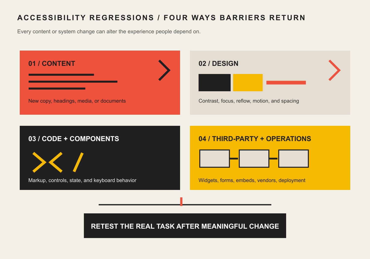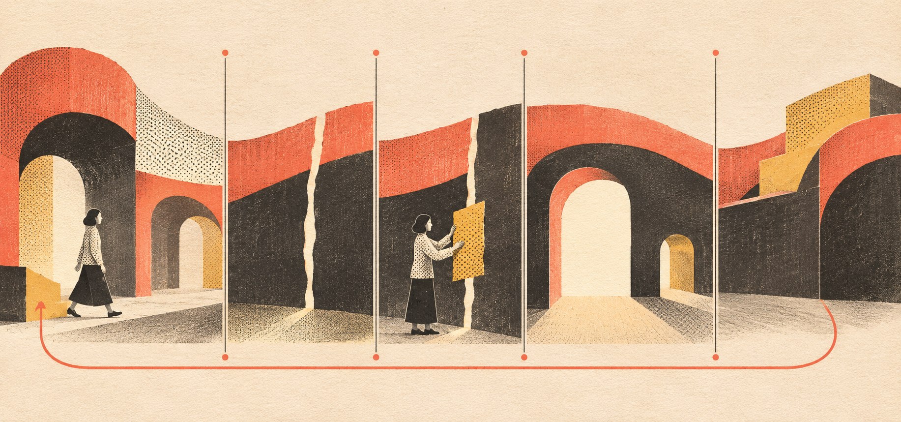
Category: UX Design & User Experience

  • Why Is My Website Not Converting? Diagnose the UX Before Redesigning It

    Why Is My Website Not Converting? Diagnose the UX Before Redesigning It

    Why is my website not converting? Often, the right visitor cannot quickly recognize that the page is for them, understand the offer, trust the evidence, choose a sensible next step, complete it without unnecessary effort, or recover when something goes wrong. That is a user-experience failure. But bad traffic, a weak offer, broken technology, missing measurement, and lousy follow-up can produce the same symptom. Diagnose the system before buying another redesign. Pretty pixels cannot rescue the wrong diagnosis.

    TL;DR: Why is your website not converting?

    • Confirm that enough of the right people are reaching the page. Forty random visits do not constitute a conversion crisis; they constitute forty visits.
    • Test the experience as a decision path: Recognize, Understand, Trust, Choose, Act, and Recover.
    • Treat accessibility as a condition across the whole path, not a compliance garnish sprinkled on at launch.
    • Remove accidental friction. Keep intentional friction when it protects qualification, safety, privacy, informed consent, or the quality of the next conversation.
    • Observe real people attempting real tasks. Analytics show where behavior changed; they rarely explain why.
    • Fix the earliest broken step. A button-color test is a particularly silly response when nobody understands the offer.
    • Measure the last meaningful outcome the website can influence, then follow it downstream to lead quality, sales, service, retention, or another business result.

    What UX design actually means for a business website

    User experience design is the discipline of making an experience effective, efficient, understandable, accessible, and satisfying for the people who must use it in a specific context. In plain English: decide who needs to accomplish what, then make that outcome possible without needless confusion or obstruction.

    That is broader than the interface. Our UI versus UX guide for business websites explains that boundary. It includes research, information architecture, content, interaction, forms, navigation, accessibility, performance, feedback, error recovery, and the operational handoff after somebody acts. The W3C explains that accessibility, usability, and inclusion overlap, while still requiring distinct attention. A technically compliant interface can remain frustrating. A generally usable interface can still exclude people with disabilities. Good UX has to deal with both realities.

    UX is not the tasteful coat of paint applied after everybody has already made the important decisions. It is the decision discipline that asks what the experience is for, who must succeed, and what evidence will show that they did.

    This is where some design conversations wander into the decorative wilderness. The client wants a giant looping video because it feels premium. The designer wants tiny gray type because restraint. The visitor wants to know whether the company can solve the problem before lunch. Guess which person the website actually needs to work for.

    Taste still matters. Distinctive visual character can improve recognition, memory, credibility, and brand preference. It just does not get veto power over comprehension, accessibility, or completion. A gorgeous interface that hides the answer is not sophisticated. It is expensive camouflage.

    Why is my website not converting? Confirm UX is actually the problem

    “The website is not converting” is a symptom, not a diagnosis. The failure can sit before the page, on the page, after the page, or inside the measurement pretending to describe the page.

    Use this sequence before prescribing UX work:

    Possible constraint What it looks like What to check before redesigning
    Measurement People say leads exist, but reporting shows none—or the reverse Submit every form, call every tracked number, inspect event definitions, notifications, consent behavior, CRM routing, and attribution
    Relevant volume Conversion rate swings wildly because only a handful of qualified people arrive Sessions by source and landing-page intent, sample size, seasonality, distribution, and whether the audience can reasonably act
    Traffic quality Visitors arrive for a different problem, geography, price point, or level of intent Queries, ads, referral context, entry pages, audience targeting, and sales feedback
    Messaging People leave early or ask sales what the company actually does Above-the-fold clarity, specificity, audience fit, message match, and the evidence supporting the promise
    UX People understand the offer but get lost, hesitate, fail, or abandon the action Navigation, hierarchy, choices, forms, accessibility, mobile behavior, feedback, errors, and task completion
    Offer Qualified people understand everything and still do not want the trade Price, risk, proof, differentiation, terms, urgency of the problem, and alternatives
    Operations The website produces an action that the business mishandles Response time, ownership, availability, qualification, sales process, onboarding, and service capacity

    Our website strategy guide goes deeper into diagnosing the commercial system. The important point here is simple: do not blame UX for every disappointing dashboard. A perfect booking experience cannot make an irrelevant offer desirable, and it cannot force the sales team to answer the phone.

    Once the evidence points to comprehension, navigation, interaction, access, or completion, UX becomes the right operating lens.

    The Scope Design UX Decision Path

    Most business websites ask a visitor to move through six decisions:

    1. Recognize: Is this page for my situation?
    2. Understand: What is offered, for whom, and why does it matter?
    3. Trust: Does the evidence support the claim?
    4. Choose: Which option or next step fits me?
    5. Act: Can I complete the task with appropriate effort?
    6. Recover: If I hesitate, make a mistake, or hit an exception, can I continue?

    Access is the foundation beneath all six. People using different devices, abilities, input methods, languages, network conditions, and contexts must be able to move through the path.

    A continuous path connects six stages of website experience: orientation, clarity, evidence, choice, action, and recovery, supported by an accessible foundation.

    The framework matters because businesses often optimize the last visible step while the first broken decision sits three screens earlier. They shorten a form when the visitor does not trust the company. They add testimonials when the page is attracting the wrong audience. They change the button from green to orange while the button says “Submit,” which is less a value proposition than an instruction from a parole officer.

    Find the earliest failing decision. Fix that first.

    1. Recognize: make the right person feel oriented

    A visitor arrives with a question, not an obligation to admire your homepage.

    Recognition means the page matches the context that brought the person there. The query, ad, referral, email, or sales conversation created an expectation. The page should continue that conversation instead of abruptly introducing a generic corporate personality disorder.

    Check whether the first useful screen makes these facts clear:

    • what situation or problem the page addresses;
    • who the offer is for;
    • what kind of outcome it supports;
    • whether geography, industry, timing, eligibility, or another constraint matters;
    • where someone with a different need should go.

    Recognition is not the same as cramming the entire company into a hero section. It is orientation. A person should know whether continuing is sensible.

    This is also where traffic and UX meet. If a search result promises a font-size guide and the landing page opens with a sales pitch for branding, the layout is not the main problem. The promise was broken before the visitor started reading.

    2. Understand: explain the offer without making people decode it

    Comprehension is the ability to explain the page’s essential meaning after a short, realistic encounter. It does not require reducing every complex service to three baby words. It requires a clear information hierarchy.

    Put the answer before the autobiography. Use concrete nouns and outcomes. Separate the primary promise from supporting detail. Explain unfamiliar terms when the audience needs them. Use headings that tell the story even when someone scans.

    People do read websites, despite the internet’s fondness for declaring reading dead every six months. They read selectively. They scan to decide what deserves attention, then read the sections that reduce uncertainty. That is why readable typography and useful structure matter. Our website typography guide covers font size, line length, hierarchy, and legibility; our content readability guide focuses on making the message easier to process without sanding off its intelligence.

    Comprehension fails when:

    • the headline could describe 400 competitors;
    • every service is “innovative,” “integrated,” and “tailored” but never explained;
    • internal company structure dictates the navigation;
    • critical conditions are buried in accordions nobody knows to open;
    • visual effects delay or interrupt the answer;
    • a wall of text contains the truth but gives it nowhere to stand.

    The fix is not automatically shorter copy. A considered purchase may require substantial detail. The goal is decision-ready copy: enough information, in the right order, at the moment the visitor needs it.

    3. Trust: put evidence where doubt appears

    Trust is not a logo carousel hiding near the footer like a witness in protective custody. It is the relationship between a claim and the evidence that makes the claim believable.

    Different claims require different proof:

    Claim Useful evidence
    “We understand this problem” Specific diagnosis, process knowledge, useful educational content, and questions that reveal real experience
    “We can do the work” Relevant examples, credentials, demonstrations, deliverables, team capability, and technical detail where appropriate
    “This creates value” Bounded case evidence, measurable outcomes with context, customer references, or a defensible economic explanation
    “Working with us is safe” Clear process, ownership, terms, security/privacy practices, accessibility, realistic expectations, and visible people
    “This is right for you” Fit criteria, limitations, pricing factors, comparisons, and honest wrong-fit guidance

    Generic praise is weak evidence. “Amazing service!” proves that somebody found an exclamation point. Specific proof explains the situation, work, constraint, and result without pretending correlation is magic.

    Trust also grows through candor. Explain price ranges when defensible. Discuss tradeoffs. Name who is not a fit. Do not hide every objection until a sales call and then act surprised when buyers suspect the website is withholding something.

    Place evidence beside the claim it supports. A testimonial about implementation belongs near implementation risk. A security explanation belongs near sensitive data entry. A case example about a specific industry belongs near that industry. Trust should arrive before the demand for commitment.

    4. Choose: make options understandable, not artificially scarce

    Choice architecture helps people compare realistic paths and select the next one. The goal is not always fewer choices. It is clearer consequences.

    A high-intent visitor may need a direct action such as booking, buying, applying, or requesting a quote. Someone earlier in the decision may need pricing factors, a diagnostic, an example, a comparison, or a useful guide. Those are different states, not failures to click the biggest button.

    Good choice design explains:

    • what each option is;
    • who it is for;
    • what happens next;
    • what commitment it requires;
    • what information is needed;
    • what the person can do if none of the options fit.

    Artificial urgency, fake scarcity, trap navigation, and confirm-shaming can move a short-term click metric while setting fire to trust. Scope Design will not call that optimization. If a tactic makes the visitor feel tricked once they understand it, the “lift” is a loan against the brand.

    Intentional friction can be useful here. A budget range on a consultation form may reduce raw submissions while improving fit. A warning before deleting data is good friction. A clear eligibility question can prevent wasted time on both sides. UX is not the cult of fewer clicks. It is the discipline of less uncertainty and appropriate effort.

    5. Act: remove accidental effort from the real task

    The action is where strategy meets fingers, thumbs, keyboards, screen readers, browsers, networks, forms, calendars, carts, and the occasional plugin that chose violence.

    Test the entire task, not the component in isolation:

    • Can the person find the action?
    • Does the label describe what happens?
    • Are requirements explained before work begins?
    • Are fields necessary for this stage?
    • Do labels, instructions, and errors remain available to assistive technology?
    • Does autofill work where appropriate?
    • Can the action be completed by keyboard?
    • Does the interface work at narrow widths and zoomed text sizes?
    • Does it preserve entered information after a correctable error?
    • Does the confirmation explain what happens next?
    • Does the submission actually reach the responsible person or system?

    The W3C’s web-accessibility design guidance calls for identifiable interactive elements, consistent navigation, associated form labels, useful feedback, logical grouping, and support for different viewport sizes. These are not exotic edge-case requests. They are basic conditions for completing work.

    Performance is part of the action because an interface that arrives late or responds unpredictably changes what people can do. Google’s current Core Web Vitals measure loading with Largest Contentful Paint, responsiveness with Interaction to Next Paint, and visual stability with Cumulative Layout Shift. Google recommends evaluating the 75th percentile rather than treating one fast lab run as universal truth. Our web-development and performance pillar owns the deeper technical work.

    Do not turn these metrics into conversion-rate fortune cookies. They are experience signals. Use field data, segment by device where useful, and connect performance changes to task outcomes in your own context.

    6. Recover: design for errors, hesitation, and real life

    People mistype email addresses. Cards fail. Calendars run out of slots. Eligibility gets complicated. Someone needs a human. A good experience does not punish ordinary uncertainty.

    Recovery includes:

    • specific error messages placed where the error occurred;
    • instructions that explain how to fix the problem;
    • preserved form input;
    • undo where the consequence warrants it;
    • visible alternative contact or support paths;
    • empty states that explain what to do;
    • confirmation pages and emails that set expectations;
    • routing when the visitor chose the wrong path;
    • respectful exits from subscriptions, trials, and accounts.

    The classic Nielsen Norman usability heuristics include visible system status, user control, error prevention, recognition over recall, and help recovering from errors. They remain useful because interfaces still need to communicate what happened and what a person can do next. The technology changed. Human uncertainty did not receive a software update.

    Recovery is also operational. A confirmation that promises a reply within one business day becomes bad UX when nobody owns the inbox. The experience does not end at the button.

    Access belongs across the entire path

    Accessibility is not a widget, an overlay, or a legal paragraph. It is whether people with disabilities can perceive, understand, navigate, interact with, and contribute through the experience. The W3C’s introduction to web accessibility emphasizes that barriers can make a site difficult or impossible to use and recommends evaluating accessibility early and throughout development.

    The WCAG 2 standard provides shared technical requirements for accessible content. Standards are essential, but a checklist alone cannot establish that a real task is usable. W3C describes “usable accessibility” as combining standards, usability practices, and involvement from people with disabilities.

    That means accessibility work should influence:

    • research and participant recruitment;
    • information hierarchy and language;
    • color, contrast, typography, spacing, and zoom behavior;
    • keyboard and alternative-input operation;
    • headings, landmarks, labels, names, roles, and states;
    • images, audio, video, animation, and time limits;
    • forms, errors, authentication, and support;
    • testing, content governance, and regression monitoring.

    Our website accessibility guide covers the standards and evaluation process in more detail. The business point is uncomplicated: if a person cannot use the experience, the experience failed them. A conversion dashboard does not get to vote that person out of the audience.

    A real example: the right UX fix was asking for less

    A fleet-services company wanted the intended job-application action measurable. The obvious project could have become a form redesign followed by campaign tracking.

    Discovery showed a more basic problem: the destination asked applicants for information the business did not need at that stage. The experience created unnecessary burden before the company could responsibly judge advertising performance.

    Scope Design simplified what applicants had to provide and instrumented the intended action. The safe, evidence-backed conclusion is not that a prettier form produced a tidy conversion lift. We do not have records supporting that claim. The conclusion is that the correct UX work was reducing unjustified effort and making the task observable before spending more money to send people into it.

    That distinction matters. “Redesign the form” describes a deliverable. “Help the right applicant complete the appropriate step and let the business measure it” describes the job.

    UX, UI, website strategy, CRO, and development are not interchangeable

    These disciplines overlap, but they ask different primary questions:

    Discipline Primary question
    Website strategy What commercial job must the site do, for whom, and how does it fit the business system?
    UX design Can the intended person understand and complete the job effectively in context?
    UI design How should the interface visually and interactively express that experience?
    Content design What information and language help the person decide and act?
    Development How should the experience be implemented, secured, maintained, and made performant?
    Conversion rate optimization Which constraint should be changed and evaluated to improve a defined outcome?

    Our conversion rate optimization guide explains how to diagnose and evaluate improvement work. The website conversion checklist checks the complete chain from intent match through operational follow-through.

    Calling all of this “web design” may be convenient, but it hides responsibility. A polished UI can sit on weak strategy. Excellent code can implement a confusing workflow perfectly. Strong copy can lead to a broken form. The customer experiences the whole system, not your org chart.

    How to diagnose UX on a low-traffic business website

    Most small-business sites cannot run statistically persuasive experiments on button colors, headline punctuation, or sixteen tiny layout variations. Pretending otherwise does not create evidence. It creates a spreadsheet wearing a lab coat.

    Low traffic does not mean you cannot learn. It means you should use methods suited to the decision:

    1. Verify the mechanics. Complete forms, bookings, calls, purchases, downloads, authentication, notifications, and CRM handoffs on real devices and browsers.
    2. Run task-based usability sessions. Give representative people a realistic goal. Ask them to think aloud. Observe where they misinterpret, hesitate, backtrack, or fail. Do not coach them through the interface you are trying to evaluate.
    3. Interview customer-facing staff. Sales, service, reception, recruiting, and support hear confusion the analytics platform never will.
    4. Review search and arrival intent. Compare queries, ads, referrals, and email promises with the landing-page answer.
    5. Inspect behavior by stage. Look at entry, scroll, navigation, CTA use, form starts, errors, completions, and downstream quality. Heatmaps can suggest where to investigate; they do not explain motives.
    6. Audit accessibility. Combine automated checks, keyboard review, screen-reader testing, zoom/reflow checks, and human evaluation. Automation catches only what it can detect.
    7. Use before-and-after task measures. Completion, error rate, time on task, abandonment stage, support burden, qualified outcomes, and participant confidence can be more useful than a sitewide conversion rate with a tiny denominator.
    8. Make larger, meaningful changes. When evidence shows that the value proposition is unclear, test a clearer proposition—not a slightly warmer shade of teal.

    For low-volume considered services, one relevant session can expose a severe failure. That does not prove how common the failure is, but it can prove the failure exists. Fixing a broken required field does not need a six-month controlled trial.

    A practical website UX audit sequence

    1. Define the user, task, and context

    Name the intended person, the job they are trying to complete, what they already know, what may limit them, what creates risk, and what happens afterward. “Everyone” is not a useful research participant.

    2. Map the decision path

    For the primary journey, document what the person must recognize, understand, trust, choose, do, and recover from. Mark where accessibility requirements affect each step—which is generally all of them.

    3. Gather evidence from multiple sources

    Use analytics, search queries, form data, sales feedback, support questions, usability observation, accessibility evaluation, performance field data, and content review. No single dashboard gets custody of the truth.

    4. Identify the earliest broken decision

    If people do not recognize the page as relevant, polishing the checkout is premature. If they understand and trust the offer but cannot submit the form, adding more testimonials is decorative procrastination.

    5. Prioritize by harm, reach, confidence, and effort

    Fix blockers and exclusion first. Then address high-reach confusion, repeated abandonment, and expensive operational failures. Keep a record of the evidence behind each priority so the loudest opinion does not become the roadmap.

    6. Change the smallest coherent part of the experience

    Small does not mean cosmetic. A coherent change may include the headline, comparison information, CTA label, form requirements, confirmation, and CRM routing because together they create one decision. Do not split a working idea into meaningless fragments merely to call it testing.

    7. Verify the complete experience

    Review visual rendering, keyboard operation, assistive-technology behavior, forms, errors, responsive layouts, performance, analytics events, notifications, and downstream ownership. Then observe the task again.

    8. Keep learning after launch

    Content changes. Plugins update. staff changes. Offers evolve. Accessibility regresses. UX is governed, not ceremonially completed and mounted above the conference table.

    What should you fix first?

    Use this order unless evidence gives you a better one:

    1. Broken or inaccessible actions.
    2. Security, privacy, safety, or legal-risk failures.
    3. Wrong traffic or severe arrival-message mismatch.
    4. Unclear offer, audience, or next step.
    5. Missing evidence at major moments of doubt.
    6. Navigation, choice, form, and mobile friction.
    7. Error recovery and operational handoff.
    8. Performance problems affecting real users.
    9. Readability, hierarchy, and visual refinement.
    10. Micro-optimization after enough meaningful evidence exists.

    This order is deliberately unglamorous. Business websites rarely fail because nobody found the secret gradient. They fail because people cannot figure out what is happening, do not believe it, cannot complete it, or receive nothing useful after they do.

    Frequently asked questions about website UX and conversions

    Why is my website getting traffic but no sales?

    Traffic without sales can indicate irrelevant visitors, unclear positioning, weak proof, a poor offer, UX friction, technical failure, or a broken sales handoff. Segment traffic by source and landing-page intent, verify the conversion mechanics, then find the earliest point where qualified visitors stop progressing.

    Why are people clicking but not converting?

    The click may promise something the destination does not deliver. Check message match, page speed, mobile rendering, offer clarity, trust, price expectations, CTA meaning, form requirements, errors, tracking, and what happens after submission. A click proves interest in the link, not acceptance of the entire offer.

    What is UX design for a website?

    Website UX design is the process of helping intended users understand, navigate, access, and complete meaningful tasks effectively in their real context. It includes research, information architecture, content, interaction, accessibility, performance, feedback, testing, and continuous improvement—not only visual styling.

    What is the difference between UX and UI design?

    UX concerns the complete experience and whether the intended person can succeed. UI concerns the visual and interactive interface through which part of that experience occurs. UI is one contributor to UX. A beautiful interface can still support a confusing or inaccessible experience.

    What are the most important UX design principles?

    Start with user and task clarity, visible system status, consistency, recognition over recall, error prevention and recovery, accessible operation, appropriate effort, readable hierarchy, and evidence-based iteration. Scope Design organizes a business website around six visitor decisions: Recognize, Understand, Trust, Choose, Act, and Recover.

    What makes a website user-friendly?

    A user-friendly website helps the intended person find relevant information, understand choices, operate controls, complete tasks, and recover from mistakes across devices and abilities. It is predictable where predictability helps, distinctive where character helps, and clear about what happens next.

    How do I know whether my website has bad UX?

    Watch representative people attempt real tasks. Warning signs include early confusion, repeated backtracking, missed navigation, unexplained hesitation, inaccessible controls, mobile failures, form abandonment, unhelpful errors, support questions the page should answer, and sales calls that begin by re-explaining the website.

    How can I improve my website’s user experience?

    Define the primary user and task, map the decision path, verify mechanics and accessibility, observe task attempts, review analytics and staff feedback, identify the earliest failure, make a coherent change, and test the full experience again. Do not begin with trend shopping.

    Does page speed affect user experience?

    Yes. Loading, responsiveness, and visual stability affect whether people can perceive and operate the page. Use field data where available, not only lab scores. Page speed is one part of UX, however; a fast page can deliver the wrong answer with impressive efficiency.

    How does accessibility affect UX?

    Accessibility determines whether people with disabilities can perceive, understand, navigate, and interact with the experience. It affects content, structure, visuals, input, media, forms, errors, and testing. Accessibility standards and usability evaluation should work together.

    What is a good website conversion rate?

    There is no universal useful rate. The answer depends on the action, traffic intent, price, business model, device, channel, qualification, sales process, measurement, and denominator. Compare equivalent cohorts, attach quality to the conversion, and judge whether the result supports the business economics.

    Can a website redesign fix poor conversions?

    It can fix UX, messaging, accessibility, performance, or technical constraints when those are the actual problem. It will not fix irrelevant traffic, an unwanted offer, missing proof the business does not possess, or slow sales follow-up. Diagnose before redesigning.

    How do I test UX on a low-traffic website?

    Use task-based observation, customer and staff interviews, form and error analysis, accessibility evaluation, technical verification, search-intent review, and meaningful before-and-after task measures. Make larger evidence-backed changes instead of pretending tiny A/B tests have statistical authority.

    Should every form have as few fields as possible?

    No. Every field should earn its place at that stage. Remove data that is unnecessary, premature, unsafe, or available elsewhere. Keep fields that protect qualification, routing, safety, consent, or service quality. The goal is appropriate effort, not the shortest form in captivity.

    Stop asking the redesign to diagnose the business

    A serious UX process does not begin with the assumption that the website needs to look different. It begins with a person, a task, a context, and evidence of where the experience breaks.

    Sometimes the right answer is a clearer page. Sometimes it is a different navigation structure, a faster implementation, accessible controls, better proof, fewer form requirements, a more honest choice, or a useful recovery path. Sometimes the website is fine and the follow-up process is the part quietly setting money on fire.

    If you need help determining whether the constraint is traffic, message, UX, technology, offer, measurement, or operations, talk with Scope Design. We will diagnose the path before prescribing another tasteful pile of pixels.
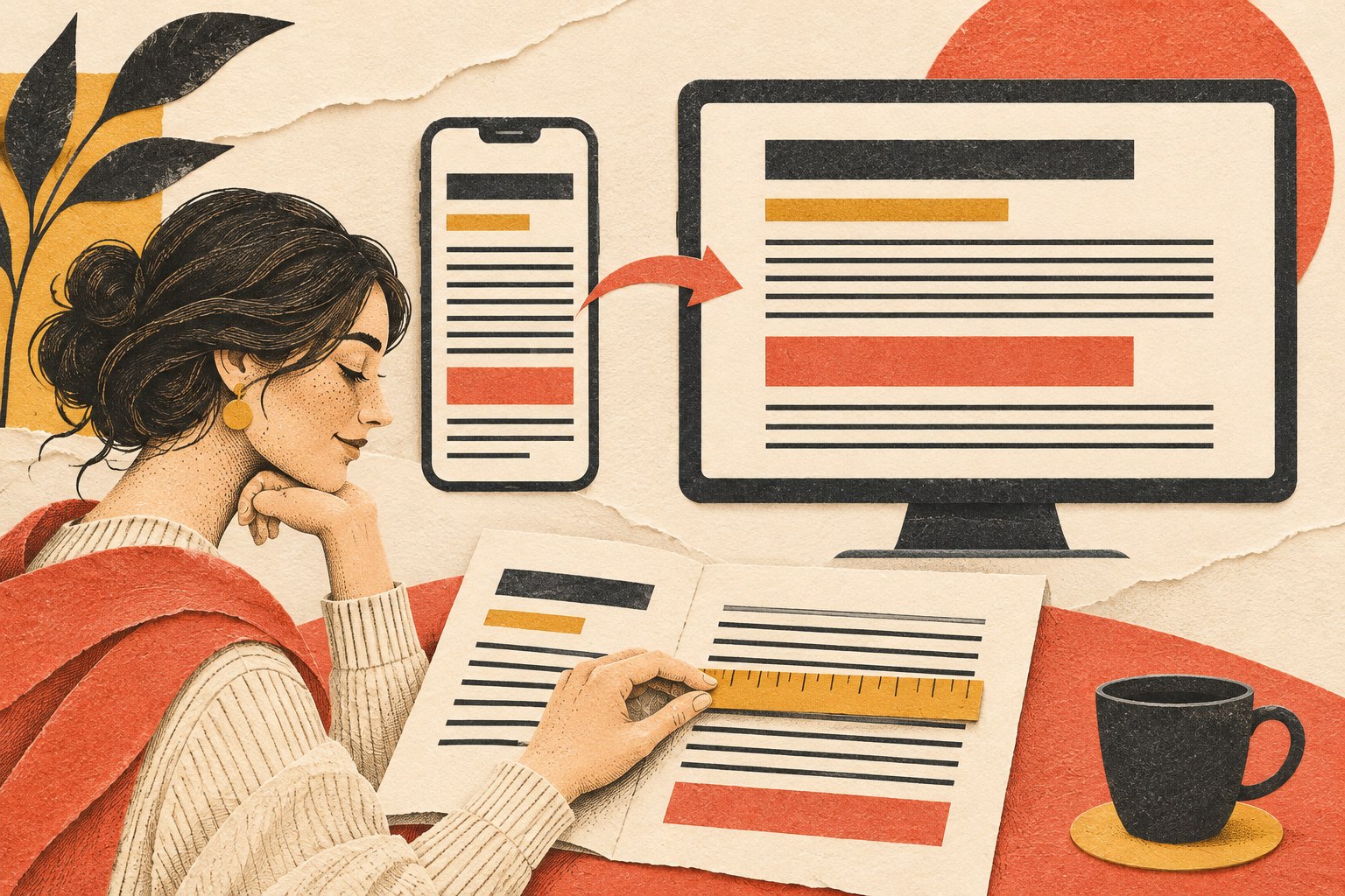
  • Website Font Size Guide: Readable, Responsive Type That Works

    Website Font Size Guide: Readable, Responsive Type That Works

    Warning: truncated output (original token count: 10449)
    Total output lines: 990

    For most business websites, start body copy around 16–18 CSS pixels on smaller screens and 18–20 pixels when the reading context supports it. Then test the actual typeface, line length, line height, contrast, zoom, language, and device. There is no universally perfect website font size, and WCAG does not prescribe a minimum pixel size for ordinary web content. Sixteen pixels is a practical starting point, not a commandment delivered on a stone tablet by the Department of Fonts.

    TL;DR: practical website font-size recommendations

    • Body copy: start at 16–18px; consider 18–20px for long-form reading, older audiences, low-contrast environments, or typefaces with a small x-height.
    • Form controls and buttons: keep their text comfortably readable and give the control enough space to survive zoom and longer labels.
    • Small supporting text: avoid shrinking important instructions, prices, errors, consent language, or eligibility details into decorative dust.
    • Headings: size them by hierarchy and available space, not by copying a “perfect” scale from a design-inspiration post.
    • Line height: 1.45–1.7 is a useful body-copy starting range, adjusted for the typeface, size, measure, and language.
    • Line length: roughly 45–80 characters can be a useful working range for sustained Latin-script reading; treat it as a design range, not a criminal statute.
    • Units: use a root-relative system such as rem for most typography, while preserving browser zoom and user settings.
    • Accessibility: verify 200% text resizing, reflow at 320 CSS pixels, spacing overrides, contrast, semantic structure, and real task completion.
    • Performance: load only the font files and weights you need, use strong fallbacks, and prevent font swaps from turning the page into a furniture-moving contest.
    • Testing: inspect real content on real devices, at narrow widths, at 200% zoom, with browser text changes, and with people who actually have to read it.

    The number matters. It just does not matter alone.

    Why there is no single best font size for every website

    A CSS font size describes the em box used to lay out type. It does not tell you exactly how large the lowercase letters will look, how wide the words will run, how open the counters are, how heavy the strokes feel, or whether two similar characters can be distinguished.

    Two typefaces set to 18px can look and behave very differently. One may have a generous x-height and wide characters. Another may look delicate, compact, and noticeably smaller. Add weight, letter spacing, screen density, viewing distance, glare, language, browser settings, and a 72-year-old reader trying to use the site on a phone in a parking lot, and the fantasy of one perfect number falls apart quickly.

    Font size also interacts with the width of the text column. Eighteen-pixel text in a 620px reading column may feel calm and readable. The same text stretched across a 1,400px monitor becomes a cross-country eye-tracking exercise. Making it 22px does not fix the badly designed measure; it just creates larger words on the same terrible road.

    That is why a serious typography decision accounts for:

    • the typeface’s actual letterforms and x-height;
    • the reading task and content density;
    • the expected audience and context;
    • line length, line height, paragraph spacing, and alignment;
    • contrast and font weight;
    • responsive layouts and zoom behavior;
    • language, script, and content variation;
    • fallback fonts and loading states;
    • headings, forms, buttons, tables, captions, and error messages;
    • the user’s own browser and operating-system settings.

    The right question is not “What number looks premium?” It is “Can the intended person find, distinguish, read, understand, and use this text in the conditions that matter?”

    The Scope Design Website Type Stack

    Website typography works as a stack. A failure near the bottom contaminates everything above it.

    1. Glyph: Can the reader distinguish individual characters and symbols?
    2. Word: Do the weight, spacing, language shaping, and word forms support recognition?
    3. Line: Do font size, line length, and line height support comfortable tracking?
    4. Block: Can the reader scan, keep their place, and understand paragraph boundaries?
    5. Hierarchy: Do headings, labels, emphasis, links, lists, and captions explain the structure?
    6. System: Does the type survive devices, zoom, user settings, fallbacks, loading, localization, and real content?

    This stack prevents a common design mistake: arguing about a headline font while the body copy is too faint, the lines are 120 characters wide, the form errors are 12px gray, and the web font has not loaded yet.

    Typography is interface infrastructure. Brand character matters, but character does not get veto power over legibility, accessibility, or completion. A beautiful typeface that nobody can read is not refined. It is decorative obstruction with a licensing fee.

    A practical website font-size table

    Use these values as starting ranges for common Latin-script business websites, then test the actual implementation.

    Content role Practical starting range What to verify
    Body copy 16–20px sustained reading, x-height, line length, zoom, audience
    Compact UI or navigation 14–17px clarity, contrast, control size, localization
    Form labels and input text 16–18px zoom, errors, autocomplete, long labels, mobile input
    Buttons 16–18px clear action label, weight, spacing, full control size
    Captions and metadata 13–16px whether the text is genuinely secondary and still readable
    H3 20–28px distinction from body copy and H2
    H2 26–40px section hierarchy, wrapping, narrow screens
    H1 36–64px comprehension, line breaks, viewport fit, actual title length

    These ranges are deliberately broad. A font with a small x-height may need more size. A dense dashboard may require a tighter scale than an editorial article. A short marketing headline can tolerate a larger display size than a 14-word technical heading. A Japanese, Arabic, Devanagari, or multilingual interface cannot be treated as Latin typography with different characters pasted in.

    Start with a defensible system. Then use evidence, not vibes in a turtleneck.

    Body text: start around 16–18px and adjust the whole reading system

    Sixteen pixels remains a useful minimum starting point for many body-copy systems because it aligns with common browser defaults and gives readers a reasonable base. That does not make every 16px design readable. A thin font, faint contrast, long lines, tight leading, and tiny link differences can make 16px fail spectacularly.

    For articles, detailed service explanations, pricing guidance, instructions, and other sustained reading, 18px is often a stronger starting point. Twenty pixels can work well when the typeface, column width, and content support it. Larger text is not automatically more readable either: oversized body copy creates short, choppy lines on narrow screens and can make dense information harder to compare.

    Evaluate body copy as a package:

    • Size: Is the text visibly comfortable without requiring immediate zoom?
    • Measure: Can the eye move from the end of one line to the start of the next?
    • Line height: Do lines feel separated without floating apart?
    • Weight: Do strokes remain visible on real screens and in glare?
    • Contrast: Does the text stand apart from the actual background?
    • Paragraph rhythm: Can the reader identify blocks and changes in thought?
    • Links and emphasis: Are they distinguishable without relying only on color?
    • Content: Does the writing deserve to be read, or is typography being asked to disguise a paragraph that says nothing?

    Our content-readability guide owns the writing and structure side of that last question. Font size cannot rescue corporate fog. It can only make the fog larger.

    Headings: build hierarchy, not a monument

    Heading sizes should reveal the structure of the page. The H1 identifies the main subject. H2s divide major sections. H3s explain subsections. Their HTML levels should represent that structure even when the visual design varies.

    A useful heading system has clear steps between levels, but the ratio does not need to be mathematically identical. Display type often needs optical correction. A very bold font may look larger than the numbers imply. An all-caps label may need different spacing. A long H2 may need a lower maximum size than a short hero headline.

    Use fluid sizing when it improves the transition between narrow and wide layouts:

    :root {
      --font-body: 1.125rem;
      --font-h3: clamp(1.25rem, 1.1rem + 0.7vw, 1.75rem);
      --font-h2: clamp(1.75rem, 1.35rem + 1.6vw, 2.75rem);
      --font-h1: clamp(2.25rem, 1.6rem + 3vw, 4rem);
    }

    clamp() sets a minimum, a fluid preferred value, and a maximum. MDN’s clamp documentation explains the function and its use for font sizing. The minimum and maximum still need to work with real titles. “Our Services” and “What Separates a Basic Website From a Serious Business Website?” are not the same layout problem.

    Avoid pure viewport-unit typography such as font-size: 5vw with no floor or ceiling. It can become microscopic on small screens, absurd on large ones, and hostile to user zoom. The W3C’s Resize Text guidance specifically identifies incorrect viewport-unit resizing as a common failure risk.

    Form labels, buttons, errors, and the text businesses love to shrink

    Typography becomes operational when a person must complete something.

    Labels, required-field instructions, input values, validation messages, prices, eligibility rules, shipping details, consent text, and confirmation messages are not decorative supporting actors. They determine whether somebody can finish the task and whether the business receives usable information.

    Do not shrink legally or operationally important text because the layout “feels cleaner.” Clean for whom? The person who designed the comp at 150% scale on a 32-inch monitor?

    For forms and controls:

    • keep labels visible rather than relying on disappearing placeholder text;
    • use readable text inside inputs, selects, date pickers, and buttons;
    • give errors enough contrast and space to wrap;
    • pair color changes with text, icons, or other understandable signals;
    • allow labels and controls to grow at 200% without clipping;
    • test long names, addresses, translated labels, validation details, and autofill;
    • make the entire control appropriately sized, not just the letters inside it;
    • state what happens after submission.

    The Scope Design UX pillar places typography inside the complete decision path. People must recognize, understand, trust, choose, act, and recover. Tiny errors and clipped labels break the path even if the homepage headline is magnificent.

    Line length: control the reading distance

    Line length is also called measure. For sustained Latin-script reading, roughly 45–80 characters per line is a useful working range. Shorter lines can suit compact instructions or narrow interfaces. Longer lines may work in tables, code, or specialized layouts where two-dimensional relationships matter.

    The important test is whether readers can track the line comfortably and return to the correct starting point. The U.S. Web Design System explains that controlling line length helps attention move naturally from one line to the next. WCAG’s Visual Presentation criterion, which is Level AAA, includes a mechanism for limiting blocks of text to 80 characters or glyphs, or 40 for CJK scripts.

    Do not misstate that AAA criterion as a universal AA requirement. It is useful design guidance and an accessibility outcome to understand, not permission to write a fake legal rule.

    A practical CSS limit:

    .article-copy {
      max-inline-size: 68ch;
    }

    The ch unit is based on the advance measure of the “0” glyph, so it is an approximation rather than a precise character counter. That is fine. The goal is a readable column, not a forensic investigation into line 37.

    Line height and paragraph spacing: give the text somewhere to breathe

    Body-copy line height often lands between 1.45 and 1.7. Larger display headings commonly need tighter leading because the letters already occupy more visual space. Small text, long lines, or typefaces with tall ascenders and descenders may need more.

    Avoid fixed pixel heights on text containers. They are a reliable way to clip translated, zoomed, or user-spaced text.

    WCAG 2.2 Text Spacing does not require every website to ship with a 1.5 line height, 2em paragraph spacing, 0.12em letter spacing, and 0.16em word spacing. It requires content to survive when a user overrides the author’s presentation to those values without losing content or functionality. That distinction matters.

    Use unitless line height so it scales with the element’s font size:

    body {
      font-size: 1.125rem;
      line-height: 1.6;
    }
    
    p + p {
      margin-block-start: 1em;
    }

    Then test overrides. Do headings collide? Do buttons clip? Do cards with fixed heights eat their last line? Does a navigation label disappear? Accessibility testing is where elegant little boxes meet actual words.

    Alignment, emphasis, and scanability

    For left-to-right languages, left-aligned body text is usually easier to scan than fully justified text. Full justification changes word spacing and can create visible rivers through paragraphs. Centered text can work for short headings or compact statements; it becomes tiring for long copy because every line begins in a different place.

    Use bold weight selectively to create emphasis. If everything is bold, the page has no hierarchy; it merely sounds like it is shouting from several rooms at once.

    Avoid long passages in italics, all caps, or condensed display faces. They can work as accents, labels, or brand moments, but sustained reading needs distinguishable, familiar forms and enough spacing.

    Underline links in body copy or provide another strong, consistent cue beyond color alone. A beautiful muted blue that nobody recognizes as interactive is not subtle. It is hiding the exit.

    Accessible font size: what WCAG and the ADA actually require

    Neit…449 tokens truncated…ch as headings and lists also needs programmatic structure.

Sixteen pixels is a sensible baseline recommendation for many websites because it gives the design a fighting chance. It is not proof of conformance. A 16px sentence can still fail through weak contrast, clipping, poor reflow, inaccessible structure, or a container that breaks when the user changes spacing.

Our website-accessibility guide covers the broader evaluation process. Typography is one part of access, not the entire legal department compressed into a font-size dropdown.

Is 12px too small for a website?

For important body copy, instructions, labels, form input, prices, and error messages, 12px is usually too small to use as the default. It creates unnecessary difficulty for many readers and leaves little room for imperfect screens, viewing distance, glare, low vision, or a typeface that renders small.

Twelve pixels can appear in genuinely secondary metadata or dense specialist interfaces if the context supports it, contrast is strong, zoom works, and users are not forced to decode essential information at that size. Even then, ask why it must be 12px. “The card component is too short” is a layout confession, not a user need.

If the information changes a decision, establishes a requirement, explains an error, or protects the user, do not hide it in mouse-print and congratulate the layout on its cleanliness.

Serif, sans serif, and the myth of the morally superior typeface

Serif and sans-serif typefaces can both be highly readable. Legibility depends more on the specific design, size, weight, spacing, contrast, rendering, language, and context than on the presence of serifs alone.

Choose a body typeface with:

  • open, distinguishable letterforms;
  • clear differences among characters such as I, l, and 1;
  • enough weights for the hierarchy without loading a small family reunion;
  • useful punctuation, symbols, numerals, and language coverage;
  • strong rendering at the sizes and platforms that matter;
  • fallback metrics that can be matched reasonably;
  • a license and delivery method the organization can maintain.

Use display faces where their personality helps recognition and brand character. Keep them out of sustained reading when their novelty slows decoding.

Font psychology is often presented as a lookup table: serif equals trustworthy, geometric sans equals modern, script equals luxury. Context and learned association can influence perception, but those tables are not universal laws. The same typeface can feel established on a financial report, theatrical on a restaurant menu, or dated on a software product. Meaning comes from the complete visual and verbal system.

Do not ask the typeface to perform brand strategy alone. That is an unreasonable amount of emotional labor for a set of glyphs.

Is there a dyslexia-friendly font?

There is no single typeface guaranteed to work best for every person with dyslexia. Specialized fonts may help some readers and make little difference for others. Familiarity, letter distinction, spacing, line length, contrast, layout, language, and user control all matter.

Build flexibility instead of declaring a mascot font:

  • choose distinguishable letterforms;
  • avoid long italic or all-cap passages;
  • use clear headings and short, meaningful sections;
  • allow zoom and spacing changes;
  • avoid justified paragraphs;
  • keep line lengths manageable;
  • preserve browser and operating-system preferences;
  • test with people who use the experience.

Accessibility is not accomplished by installing a font called “Accessible” and going home early.

Responsive typography: adapt the system, not just the number

Mobile type should not automatically be smaller than desktop type. The screen is narrower, the device may be closer, the context may be shakier, and the reader may be dealing with glare or motion. Those factors push in different directions.

A responsive type system adapts:

  • font size within sensible limits;
  • column width and margins;
  • heading wrap and line breaks;
  • navigation and control layout;
  • table and code presentation;
  • spacing around sections;
  • the amount and order of secondary information.

The W3C Reflow criterion explains why people should not have to scroll back and forth to read ordinary text at the 320 CSS-pixel equivalent. A responsive layout benefits mobile users and people who zoom a desktop viewport.

Do not disable zoom. Do not use fixed heights around live text. Do not shrink headings until they technically fit while destroying the hierarchy. Let text wrap. Rewrite a bad label when necessary. Change the layout before blaming the reader’s settings.

Web-font performance: the text has to arrive

Web fonts can delay text rendering, affect Largest Contentful Paint, and create layout shifts when the fallback and final fonts occupy different space. web.dev’s font best practices covers the relationship among font loading, delivery, rendering, and Core Web Vitals.

Use a small, intentional font set:

  • load only the families, styles, weights, and character sets the site uses;
  • prefer WOFF2 for modern delivery;
  • subset carefully when language coverage is known and maintained;
  • self-host when it improves control and the licensing permits it;
  • preload only fonts needed immediately—preloading everything is just moving the traffic jam;
  • use font-display deliberately;
  • provide a fallback stack;
  • match fallback metrics where practical to reduce layout shift;
  • cache font files with appropriate versioning;
  • test the first visit, not only a warm-cache victory lap.

MDN documents font-display and its values. swap displays fallback text quickly and swaps when the web font arrives, but the swap can move the layout if metrics differ. optional can avoid a late swap under some conditions, but it may mean the custom font does not appear during that visit. Choose based on the content and brand dependency.

@font-face {
  font-family: "Scope Sans";
  src: url("/fonts/scope-sans-regular.woff2") format("woff2");
  font-style: normal;
  font-weight: 400;
  font-display: swap;
}

Our web-development and performance pillar owns the deeper delivery work. The typography rule is simple: text that remains invisible is not on brand, and text that jumps after the visitor starts reading is not particularly gracious.

A practical CSS typography foundation

This is a starting system, not drop-in proof of accessibility:

:root {
  font-size: 100%;
  --text-body: clamp(1rem, 0.95rem + 0.25vw, 1.125rem);
  --text-small: 0.875rem;
  --text-h3: clamp(1.25rem, 1.1rem + 0.7vw, 1.75rem);
  --text-h2: clamp(1.75rem, 1.35rem + 1.6vw, 2.75rem);
  --text-h1: clamp(2.25rem, 1.6rem + 3vw, 4rem);
  --measure-reading: 68ch;
}

body {
  font-family: "Scope Sans", system-ui, sans-serif;
  font-size: var(--text-body);
  line-height: 1.6;
}

main p,
main li {
  max-inline-size: var(--measure-reading);
}

h1 {
  font-size: var(--text-h1);
  line-height: 1.05;
}

h2 {
  font-size: var(--text-h2);
  line-height: 1.15;
}

h3 {
  font-size: var(--text-h3);
  line-height: 1.25;
}

small,
.meta {
  font-size: var(--text-small);
}

Why these choices:

  • 100% respects the browser’s root-size baseline.
  • rem-based values create a coherent root-relative scale.
  • clamp() lets selected sizes respond within tested limits.
  • unitless line height inherits proportionally.
  • ch constrains sustained reading measure.
  • system fallbacks make text available while the brand font loads.

Then comes the part people skip: test it with the actual theme, content, languages, browser settings, components, and devices. CSS copied from an article does not know what your navigation does in German.

How to test website typography

Use this sequence:

  1. Read the page at 100% without designer context. Can you identify the subject, hierarchy, important details, links, and next action?
  2. Check representative devices and browsers. Include a narrow phone viewport, a common laptop, and a larger display.
  3. Zoom text to 200%. Look for clipping, overlap, hidden controls, lost labels, and broken navigation.
  4. Check reflow at 320 CSS pixels. Ordinary content should not require back-and-forth scrolling.
  5. Apply WCAG text-spacing overrides. Confirm that content and controls remain available.
  6. Test contrast using the actual foreground, background, weight, and state.
  7. Turn off the web font or throttle the network. Confirm that fallback text appears and the final font does not cause disruptive shifts.
  8. Try real titles, errors, prices, addresses, names, and translations. Placeholder Latin is an unusually cooperative customer.
  9. Use keyboard and assistive technology. Visual hierarchy should align with semantic structure.
  10. Observe representative readers. Ask them to complete realistic tasks and explain where they hesitate.

The website-strategy pillar explains why the task and business context come before the deliverable. Typography testing should connect to a real job: understand a service, compare options, complete an application, read instructions, or recover from an error.

Do not declare a typography win because the homepage looks nicer in a presentation. Verify that people can use it.

Frequently asked questions about website font size

What is the best font size for a website?

Start body copy around 16–18px and increase it when the typeface, reading task, audience, or environment needs more. Evaluate size with line length, line height, weight, contrast, zoom, and device context. There is no universal best number.

Is 16px always the correct body font size?

No. Sixteen pixels is a practical baseline for many websites, not a guaranteed optimum or legal requirement. Some typefaces look small at 16px; sustained reading or older audiences may benefit from 18–20px. Dense interfaces may use smaller supporting text while preserving readability and zoom.

Is 12px too small for a website?

It is usually too small for essential body copy, labels, instructions, errors, pricing, and consent language. It may work for genuinely secondary metadata in a carefully tested context, but important information should not be hidden at 12px to protect a cramped layout.

What font size does WCAG or the ADA require?

WCAG does not specify a universal minimum pixel size for ordinary web text, and the ADA does not provide a magic website-font number. WCAG requires outcomes including sufficient contrast, 200% text resizing, reflow, and resilience to text-spacing overrides.

What is an accessible font size?

An accessible size is large enough for the intended readers and works as part of a system that supports contrast, zoom, reflow, spacing changes, clear structure, and user preferences. Sixteen pixels is a common baseline, but accessibility cannot be proved by font size alone.

Should mobile text be smaller than desktop text?

Not automatically. Mobile screens are narrower and often used in glare, motion, or distracted conditions. Body text may remain the same size while the column, spacing, headings, and layout adapt. Test the complete reading experience instead of applying a desktop-minus-two-pixels formula.

Should website font sizes use px, em, or rem?

rem is a strong default for a consistent root-relative type system, while em is useful when a component should scale from its local context. CSS pixels can still participate in accessible designs because browser zoom scales them, but fixed assumptions around text and containers can break user resizing. Test outcomes rather than treating one unit as holy.

What line height should website body text use?

About 1.45–1.7 is a useful starting range for many body typefaces. Adjust for font design, size, line length, language, and content density. Use unitless line height and verify that user spacing overrides do not clip or overlap content.

How long should a line of website text be?

Roughly 45–80 characters is a useful range for sustained Latin-script reading. The best measure depends on font size, typeface, line height, language, and task. Control the reading column and watch whether readers can return to the next line comfortably.

How many fonts should a website use?

Use as few families and weights as the hierarchy genuinely needs. One well-designed family can handle an entire site. Two can create useful contrast between display and reading roles. More families add visual complexity, files, maintenance, and opportunities for the page to resemble a ransom note.

Are serif or sans-serif fonts more readable?

Both can be readable. The specific letterforms, size, weight, spacing, contrast, rendering, familiarity, and context matter more than the category alone. Test the actual typeface with the actual audience and content.

Is there one dyslexia-friendly font?

No single font works best for everyone with dyslexia. Distinguishable letterforms, manageable line length, clear structure, spacing, alignment, zoom, and user control are more responsible than claiming a specialized font solves dyslexia universally.

Do web fonts hurt page speed or SEO?

They can delay rendering, affect Largest Contentful Paint, and create layout shifts if poorly delivered. Search visibility is affected indirectly when performance and usability suffer. Limit files and weights, use WOFF2, strong fallbacks, suitable caching, and an intentional font-display strategy.

How should headings scale?

Headings should create an obvious hierarchy and fit real content at narrow and wide widths. Use tested minimum and maximum sizes, often with clamp(), and adjust line height as headings grow. Do not rely on a universal ratio or pure viewport units.

How do I test website typography?

Test real pages at 100% and 200% zoom, at the 320 CSS-pixel reflow equivalent, with WCAG spacing overrides, real devices, slow font loading, fallback fonts, long content, translations, keyboard navigation, assistive technology, and representative users performing actual tasks.

Make the words usable before calling the site beautiful

Website typography is not a finishing touch. It decides whether the message can be perceived, scanned, understood, and used.

Start with a practical size. Build the glyphs, words, lines, blocks, hierarchy, and system around real readers. Preserve user control. Load the type responsibly. Test the ugly edge cases. Then give the brand a voice people can actually read.

If your typography looks expensive but behaves like a tiny gray obstacle course, talk with Scope Design. We will fix the reading system, not merely make the font picker feel important.

  • Inclusive Design for Websites: Find Who Your “Normal User” Leaves Out

    Inclusive Design for Websites: Find Who Your “Normal User” Leaves Out

    Inclusive design is the process of finding who your website’s idea of a “normal user” excludes, identifying the mismatch between that person and the experience, and designing with affected people before the mismatch becomes somebody else’s problem. For websites, that includes disability and accessibility, but it also includes language, literacy, age, device, connectivity, culture, confidence, environment, and temporary or situational limitations.

    The “average user” is a spreadsheet ghost. Nobody has average vision, average dexterity, average bandwidth, average language fluency, average patience, and two perfectly free hands at every moment. Design for that imaginary creature and real people get stuck.

    TL;DR: Inclusive design does not mean promising that one interface will work perfectly for every human alive. It means deliberately looking for exclusion, involving people who experience the mismatch, testing the real journey, and extending what works. Accessibility and WCAG remain non-negotiable disciplines inside that broader process; inclusion does not replace them.

    What Is Inclusive Design?

    Inclusive design is a methodology for creating products and services by recognizing exclusion, learning from human diversity, and using that insight to make better design decisions.

    Microsoft Inclusive Design describes three principles: recognize exclusion, learn from diversity, and solve for one while extending the benefit to many. The useful word here is process. Inclusive design is not a look, a color palette, a badge, or a last-minute “could we make this more inclusive?” meeting held after the expensive decisions are already fossilized.

    W3C distinguishes inclusion from accessibility and usability. Accessibility focuses specifically on equivalent access for people with disabilities. Usability asks whether specified people can complete specified goals effectively, efficiently, and satisfactorily in a particular context. Inclusion is broader and can include disability, hardware and connectivity, literacy, economics, education, geography, culture, age, and language.

    These disciplines overlap. They should work together. They should not be melted into one vague bowl of “good UX” soup, because each catches different failures.

    Inclusive Design vs. Accessibility, Usability, and Universal Design

    The terms are related, but they do different jobs.

    Discipline Primary question What it protects against What it does not replace
    Accessibility Can people with disabilities perceive, understand, navigate, interact with, and contribute through this experience? Disability-related barriers in content, design, code, and interaction Human evaluation, usability research, or broader inclusion work
    Usability Can the specified users complete the specified task effectively and with reasonable effort? Confusing flows, poor feedback, preventable errors, and inefficient interactions Accessibility standards or inclusive recruitment
    Inclusive design Who is being excluded by our assumptions, and how can we design with them? Narrow definitions of the user, context, device, language, ability, or life situation WCAG, legal analysis, or rigorous usability evaluation
    Universal design How can one solution serve the widest practical range of people without special adaptation? Unnecessarily specialized or segregated experiences The iterative research process used to discover real mismatches

    If you need the standards, testing methods, and legal distinctions, use our ADA website compliance and WCAG guide. This article owns a different question: how do you stop designing around assumptions that quietly exclude people?

    Inclusive design does not replace accessibility

    This distinction matters. Saying “we designed for everyone” is not evidence that a site works with a screen reader, keyboard, magnification, voice input, or other assistive technology. Good intentions do not create semantic HTML. Empathy does not fix a broken focus order.

    W3C recommends combining accessibility standards with real-user involvement. Standards cover a breadth of disability-related needs that no small research sample can represent. User involvement reveals whether the technically conforming experience is actually understandable and usable. You need both.

    Inclusive design does not mean one design for literally everyone

    That promise sounds generous and collapses the moment real requirements conflict. Some people need more detail; others need less cognitive load. Some need animation stopped; others benefit from motion that explains change. Some need a translated interface; others need the original technical terminology preserved.

    Inclusive design looks for flexible paths, meaningful choices, and fewer unnecessary assumptions. Sometimes one well-designed experience can serve many people. Sometimes the honest answer is multiple formats, channels, or assistance options. “Everyone gets the same thing” is equality theater if the thing still does not work.

    Exclusion Is Usually a Mismatch, Not a Defect in the Person

    Traditional project language loves labeling people as edge cases. The person is “nontechnical.” The connection is “too slow.” The name is “unusual.” The assistive technology is “unsupported.” Notice how the design gets to remain innocent in every sentence.

    Inclusive design flips the diagnosis. The problem is the mismatch between what the experience demands and what the person can or wants to do in that context.

    • A form demands a mouse, but the person uses a keyboard or voice control.
    • A video demands hearing, but the person is deaf, in a loud shop, or avoiding audio beside a sleeping child.
    • A checkout demands a stable connection, but the person is on unreliable mobile data.
    • An address field demands a United States format, but the customer lives elsewhere.
    • A login demands rapid code entry, but the person needs more time to read, switch devices, or use assistive technology.
    • A service explanation demands fluent insider vocabulary, but the buyer is new to the category or reading in a second language.
    • A date picker demands precise touch, but the person has limited dexterity, a cracked screen, or one available hand.

    The person did not fail the interface. The interface made an assumption and charged the person for being different.

    That is why inclusive design belongs early in website strategy. Once the information architecture, technology, vendor, forms, content model, and operating process are locked, inclusion becomes a retrofit tax.

    The Scope Design Exclusion Hunt

    Scope Design uses a constraint-first mindset: diagnose what blocks the outcome before prescribing a deliverable. Inclusive design applies the same discipline to human variation.

    1. Define the outcome

    Start with what the person needs to accomplish, not the screen you plan to build.

    “Complete an appointment request and know what happens next” is an outcome. “Use our beautiful five-step form” is a design decision wearing a fake mustache.

    The outcome should be observable. Can the person find the right service, understand the tradeoff, submit accurate information, recover from an error, pay, download the document, or reach a human? If the finish line is vague, the team can declare victory because the page looks polished.

    2. Expose the assumptions

    List what the journey quietly assumes about the person and their situation.

    • ability to see, hear, remember, read, speak, type, point, or hold a device;
    • fluency in the interface language and the business’s vocabulary;
    • access to current hardware, a large screen, a printer, a scanner, or a second device;
    • stable bandwidth, private space, available time, and uninterrupted attention;
    • confidence with forms, file uploads, passwords, payments, and identity checks;
    • a name, address, family, gender, income, or documentation pattern that matches the database;
    • willingness and ability to use the only channel offered.

    Do not turn this into a demographic bingo card. The goal is to challenge a decision, not to collect stereotypes about groups.

    3. Find the mismatches

    Walk the complete journey and ask where each assumption can block, delay, confuse, embarrass, or overburden someone.

    Look beyond the homepage. Exclusion hides in validation messages, cookie banners, scheduling tools, payment processors, PDFs, confirmation emails, account recovery, support handoffs, and the awkward moment when the sales team asks for the same information the website already collected.

    Severity matters. A decorative carousel that annoys someone is not the same as a medical, financial, employment, or public-service form that prevents them from completing a necessary task. Prioritize by the importance of the outcome, the harm of failure, the number of people affected, and the cost of repair.

    4. Include people who experience the mismatch

    Do not simulate someone’s life from a conference room and call it empathy. Recruit people who use different access methods, have different abilities, bring different language or literacy needs, or face the context you are investigating.

    The GOV.UK guidance on inclusive services recommends recruiting participants who represent the people using the service, testing continually, and identifying points where groups may be excluded. Its research-planning guidance also recommends including disabled users and people who need support in every round when the service has a broad audience.

    Pay participants fairly. Ask what accommodations they need. Offer accessible scheduling and consent materials. Allow the technology, assistance, and environment they normally use. One participant does not represent an entire disability, culture, age group, or language community. They represent themselves—and they can still expose an assumption your team never noticed.

    5. Test the whole journey

    Test the boring parts. They are where businesses lose people.

    Can someone start on a phone and finish later? Does the form preserve entered information after an error? Does the error explain how to fix the problem? Can the person use a keyboard, zoom, larger text, reduced motion, or a screen reader? Does a translated page lead into an English-only checkout? Does the confirmation state what happened and what comes next?

    Testing a hero section and ignoring the booking widget is like inspecting the paint while the front door is welded shut.

    6. Extend what works and keep watching

    A solution created for one mismatch can often help many people, but test the extension rather than assuming it.

    Captions are essential for many deaf and hard-of-hearing people and useful when audio cannot be played. Large, well-spaced controls support people with motor disabilities and anyone tapping a phone while moving. Plain error messages can help people with cognitive disabilities, new customers, and tired humans at 11:47 p.m.

    Record why the decision was made, add it to the design system or content rules, assign an owner, and monitor changes. Otherwise the next plugin update, campaign landing page, or “quick” content edit can reintroduce the barrier. Our guide to website accessibility monitoring and regression prevention explains how to keep that ownership alive after launch.

    Practical Inclusive Design Examples for Websites

    Inclusive design examples are most useful when they show the original assumption, the mismatch, and the better decision.

    Forms that accept real people instead of database fantasies

    Assumption: Everyone has a short first name, last name, ten-digit phone number, and domestic address.

    Mismatch: Real names, addresses, family structures, and communication preferences do not obey a developer’s convenient field length.

    Better decision: Ask only for information the business needs. Use flexible field lengths and labels. Explain why sensitive information is required. Accept international formats when the service actually serves international people. Make optional fields genuinely optional. Preserve data after validation errors and put the correction message beside the field.

    Content that works when attention and language vary

    Assumption: Every visitor will read a dense page from top to bottom and understand the industry vocabulary.

    Mismatch: People scan. They may be new to the category, reading in a second language, under stress, or using text-to-speech.

    Better decision: Lead with the answer, use descriptive headings, define necessary jargon, keep sentences direct, and put critical instructions where the action happens. Plain language is not baby talk. It is respect for the reader’s time.

    Typography also matters. Our website font-size guide covers readable base sizes, responsive scaling, line length, spacing, and zoom behavior without turning type into decorative gravel.

    Media that does not demand one sense or one environment

    Assumption: Everyone can hear the narration and see the demonstration.

    Mismatch: A person may be deaf, blind, have low vision, use the page in a noisy environment, or conserve mobile data.

    Better decision: Provide accurate captions, useful transcripts, meaningful alternative text, and controls that do not autoplay chaos. Make sure the text alternative carries the same decision-making information—not a ceremonial “image of graph” label that withholds the graph.

    Authentication that does not turn security into a hostage situation

    Assumption: Everyone can remember a complex password, switch quickly between apps, read a time-limited code, and use a particular device.

    Mismatch: Cognitive disability, low vision, limited dexterity, unreliable service, shared devices, and assistive technology can make the supposedly simple flow fail.

    Better decision: Support password managers and paste. Provide more than one secure verification method when the risk model allows it. Explain time limits. Allow recovery without forcing a phone call during narrow business hours. Security matters; needless obstacle courses do not make it stronger.

    Performance that respects limited devices and expensive data

    Assumption: Everyone has a recent phone, unlimited data, and stable broadband.

    Mismatch: Heavy video, bloated scripts, and third-party widgets can make the page unusable before the content even arrives.

    Better decision: Prioritize essential content, compress media, minimize blocking scripts, and make the core task resilient when optional enhancements fail. A website that needs perfect conditions is not sophisticated. It is fragile.

    Choice without channel abandonment

    Assumption: Every customer wants to schedule online, call, chat, or create an account—whichever single path the business prefers.

    Mismatch: The available channel may be inaccessible, unaffordable, unsafe, or simply impossible in the person’s current situation.

    Better decision: Offer meaningful alternatives where the business can support them and let people move between channels without starting over. Do not advertise a support channel that nobody owns. Fake choice is just abandonment with extra buttons.

    How to Run Inclusive User Research Without Turning It Into Theater

    Inclusive research is not “find one diverse person and ask whether the colors feel welcoming.” It is a deliberate attempt to expose risk in decisions.

    Recruit around the mismatch

    If you are testing captions, recruit people who rely on captions and people who encounter situational audio limits. If you are testing an identity flow, recruit people whose names, documents, devices, or living situations challenge its assumptions. If you are testing an international checkout, include the countries, languages, addresses, currencies, and payment methods the business actually intends to support.

    Demographics can matter, but the behavior, access method, context, and outcome should drive recruitment.

    Make the research itself inclusive

    An inaccessible consent form poisons the study before it begins. So can rigid scheduling, an unfamiliar video platform, unpaid preparation, inaccessible prototypes, or requiring participants to explain private medical details they do not need to disclose.

    Ask about accommodations without making people justify their existence. Provide instructions in advance. Let participants use their own assistive technology when possible. Test remote and real-world conditions when context affects the result.

    Observe behavior, not just preference

    “Do you like this page?” produces taste. “Show me how you would confirm whether this service fits your situation” produces evidence.

    Watch where the participant hesitates, what they misunderstand, what they expect to happen, whether they recover from errors, and what assistance they need. Ask what made the step difficult. Do not explain the interface while testing it; your future customers will not have the designer whispering clues from behind the monitor.

    Turn findings into owned decisions

    Each finding needs:

    • the affected outcome;
    • the observed mismatch;
    • who was affected and in what context;
    • evidence from the session or supporting standard;
    • the proposed design or operational change;
    • an owner and priority;
    • a way to verify the fix;
    • a place in the design system, content standard, backlog, or monitoring plan.

    Otherwise research becomes a beautiful slide deck that everybody praises and nobody implements. We have enough decorative PDFs in the world.

    What Inclusive Design Can Do for a Business

    Inclusive design can widen the number of people who can complete a useful journey, reduce preventable support friction, expose risky assumptions earlier, and make design decisions more resilient across devices and contexts.

    Those are defensible business outcomes. They are not a universal revenue percentage.

    The actual value depends on the business model and the constrained journey. For an ecommerce site, the outcome might be completed purchases and fewer payment failures. For a service business, it may be qualified inquiries that contain usable information. For a member portal, it may be successful self-service without an emergency support call. For a public-facing information site, it may be whether people can find and understand a critical instruction.

    Measure the last outcome the website genuinely controls, then track what happens afterward. A higher form-submission rate is not a win if the form is now full of junk. Fewer support calls are not a win if customers simply gave up. Inclusive design should improve the person’s outcome and the business operation—not cosmetically massage a proxy.

    This is part of a larger UX diagnosis. If your site has traffic but people do not take the next step, use our guide to diagnosing why a website is not converting before buying another redesign on vibes.

    Common Inclusive Design Mistakes

    Treating inclusion as representation alone

    Diverse photography can matter, especially when the audience needs to see that a service recognizes them. But swapping stock images while keeping an exclusionary process is branding, not inclusive design.

    Using personas as permission to stereotype

    “Older users do not understand technology” is not insight. Which task, device, prior experience, ability, motivation, and context are relevant? Personas should organize evidence, not give assumptions a cartoon face and a fake quote.

    Adding an accessibility overlay and declaring victory

    An overlay does not transform inaccessible code, content, forms, documents, or third-party systems into an inclusive experience. It also does not replace human testing or standards-based evaluation.

    Inviting people after the important decisions

    If participants are only allowed to comment on button labels after the platform, process, data requirements, and vendor are locked, they are not shaping the design. They are decorating the cage.

    Assuming one person represents a group

    Disability, culture, age, language, and economic circumstances contain enormous variation. Recruit across relevant needs and contexts, run iterative rounds, and preserve disagreement. Consensus is not the only form of insight.

    Measuring popularity instead of successful outcomes

    The most popular option can still exclude a smaller group from an essential task. Inclusive design is not majority rule. Prioritize the importance of the outcome and harm of exclusion, not just the largest bar in a survey.

    A Quick Inclusive Website Audit

    Pick one high-value journey—not the entire internet—and work through these questions:

    1. What outcome must the person accomplish?
    2. What abilities, language, device, bandwidth, environment, documentation, money, time, and confidence does the journey assume?
    3. Where could those assumptions block, delay, confuse, expose, or embarrass someone?
    4. Which exclusion points affect essential outcomes or create the greatest harm?
    5. Have people who experience those mismatches shaped the research and design?
    6. Does the flow meet the relevant accessibility standards as well as work in real use?
    7. Can someone recover from errors without losing work or surrendering to support?
    8. Are third-party tools, PDFs, emails, and handoffs included in the test?
    9. What evidence will prove the revision worked?
    10. Who owns the decision after launch, and how will regression be detected?

    If the team cannot answer those questions, it does not need a prettier mockup yet. It needs discovery.

    Frequently Asked Questions About Inclusive Design

    What is inclusive design in simple terms?

    Inclusive design is a process for finding who a product or service excludes and designing with affected people to reduce that exclusion. It treats human variation as an input to the work, not an edge case to clean up later.

    What are the three principles of inclusive design?

    Microsoft Inclusive Design summarizes them as recognizing exclusion, learning from diversity, and solving for one while extending the benefit to many. These principles guide discovery; they are not a substitute for testing or accessibility standards.

    What is an example of inclusive web design?

    A checkout that supports keyboard use, clear labels, flexible address formats, preserved data after errors, plain-language feedback, multiple payment methods, and a working assistance path is an example. The inclusive part is not one feature; it is the way the team investigated and removed mismatches across the journey.

    What is the difference between inclusive design and accessibility?

    Accessibility focuses specifically on barriers affecting people with disabilities and is supported by standards such as WCAG. Inclusive design uses a broader process to investigate exclusion related to disability and other factors such as language, literacy, device, connectivity, age, culture, and context. Inclusive design must include accessibility, not blur it into vagueness.

    Is inclusive design the same as universal design?

    They share the goal of serving a wider range of people. Universal design is commonly framed as making one solution usable by as many people as possible, while inclusive design emphasizes an ongoing process of recognizing exclusion, involving diverse people, and iterating. Terminology varies, so describe the actual method instead of fighting a vocabulary war.

    Does inclusive design replace WCAG compliance?

    No. Inclusive research can reveal barriers that a checklist misses, but it cannot cover every disability, assistive technology, or technical requirement. WCAG evaluation and knowledgeable human testing remain necessary for web accessibility.

    Does an accessible website automatically have good inclusive design?

    No. A site can satisfy many technical accessibility requirements and still be confusing, culturally narrow, language-dependent, slow on limited devices, or hostile to unusual names and addresses. Accessibility is essential, but broader inclusion and usability still need attention.

    Who should participate in inclusive design research?

    Recruit people who experience the mismatches relevant to the journey: disabled people, assistive-technology users, people who need support, different language or literacy contexts, older or younger users where relevant, and people using the devices and connections the service expects. Do not ask one person to represent an entire group.

    When should inclusive design begin?

    Begin during discovery, before the technology, content model, user flow, and operating rules are locked. Continue through design, development, launch, and maintenance because content, vendors, business rules, and user needs change.

    Is inclusive design more expensive?

    It requires research, accessible implementation, testing, and ownership. That costs time and money. Finding exclusion early is usually more controllable than retrofitting a completed system, replacing a bad vendor, or staffing a support process around preventable failures. The right investment depends on the importance and risk of the journey.

    How do you measure inclusive design?

    Measure successful completion of the relevant outcome across the users and contexts you intended to support. Add diagnostic measures such as error rate, abandonment point, assistance needed, time to complete, support contacts, device or assistive-technology issues, and qualitative evidence from research.

    Can AI or automated tools test inclusive design?

    They can help identify some technical patterns, summarize feedback, or test specific conditions. They cannot determine whether a real person understands the experience, trusts it, can recover from failure, or is excluded by a business rule. Automation is a flashlight, not an alibi.

    What should a small business do first?

    Choose the journey closest to money or service delivery—such as booking, requesting a quote, buying, applying, or getting support. Run the Exclusion Hunt on that journey, fix severe mismatches first, and assign ongoing ownership. Do not begin with a 200-item wish list nobody will maintain.

    Stop Designing for the Spreadsheet Ghost

    Inclusive design is not a promise that every design decision will delight every person. It is a commitment to stop treating preventable exclusion as somebody else’s weird edge case.

    Define the outcome. Expose the assumptions. Find the mismatch. Include people who live with it. Test the whole journey. Extend what works and keep watching.

    If your website looks polished but important customers still get stuck, talk with Scope Design. We will diagnose the journey before prescribing another expensive pile of pages. Because “make it more inclusive” is not a scope. Finding the actual constraint is.

  • User Centered Design Excellence: Psychology-Driven UX That Converts Without Dark Patterns

    User Centered Design Excellence: Psychology-Driven UX That Converts Without Dark Patterns

    User centered design means making design decisions from evidence about the people who will use the thing: what they are trying to accomplish, what they understand, what gets in their way, and what feedback helps them finish. Psychology belongs in that process when it reduces uncertainty and mental work. It stops being user-centered when the interface depends on pressure, deception, obstruction, or the hope that somebody will not notice what just happened.

    For a business website, that distinction matters. A site can be visually polished and still make the visitor decode your navigation, compare five vague service options, hunt for pricing context, fight a form, and wonder whether clicking the button commits them to something. That is not a conversion problem wearing nicer typography. It is decision friction.

    TL;DR: Use the Scope Design CHOICE Test: Context, Hierarchy, Obstacles, Integrity, Completion, Evidence. Start with the user’s real task. Make the next useful choice obvious. Remove avoidable friction. Preserve the person’s ability to make an informed choice and say no. Make completion and recovery clear. Then measure whether the design helped both the user and the business.

    What user centered design means for a business website

    User centered design is not a mood board, a persona poster, or a promise to give visitors everything they ask for. It is a way of structuring design work around people, tasks, context, requirements, solutions, and evaluation. ISO 9241-210:2019, the current international standard for human-centred design of interactive systems, explicitly includes websites and applications within its scope and treats human-centred design as a lifecycle activity rather than a final coat of interface paint.

    That is the practical difference between a company-centered website and a user-centered one. The company-centered version asks, “What do we want to say?” The user-centered version asks, “What does this person need to understand or do next, and what evidence will tell us whether we helped?” Business goals still matter. They simply do not get to erase the user’s goal.

    Discipline Primary question What it does not replace
    User centered design Can the intended user understand and complete the important task in context? Business strategy, accessibility standards, or measurement
    UX design How does the overall interaction feel and work across the journey? A clear offer or healthy traffic source
    Conversion optimization Which evidence-backed change improves a defined business action? Usability diagnosis or an honest value proposition
    Accessibility Can people with disabilities perceive, understand, navigate, and interact without barriers? User research or broader inclusion work

    If your real question is broader than this article — for example, “Why is my website getting traffic but not producing useful inquiries?” — start with our website UX and conversion diagnosis. This guide owns a narrower job: how to make psychologically informed interface decisions without turning “conversion psychology” into manipulative nonsense.

    Use the Scope Design CHOICE Test before you polish the interface

    The CHOICE Test is a six-part decision check for website UX. It is not a universal scientific model. It is Scope Design’s practical way to make user-centered design inspectable before a team spends time polishing the wrong interaction.

    The Scope Design CHOICE Test turns “make the UX better” into six questions a team can actually investigate.

    C — Context: who is trying to do what?

    Start with the task, not the screen. Who is here? What are they trying to accomplish? What do they already know? Are they on a phone in a parking lot, on a desktop comparing vendors, using a keyboard instead of a mouse, returning to finish a form, or trying to undo a purchase? Context changes what “easy” means.

    Do not substitute demographic wallpaper for task evidence. “Busy homeowner, age 35–55” tells you less than “needs to know whether you service their ZIP code before they will invest time in a quote form.” The second statement can shape a design and be tested.

    H — Hierarchy: is the next useful choice obvious?

    Hierarchy is how the interface answers, “What matters here?” A page with six equally loud buttons is not flexible. It is a tiny committee meeting. Give the primary task a clear visual and content priority, keep secondary routes available, and use labels that describe the outcome rather than internal department names.

    Familiar conventions help because users should not need to learn your private interface language before they can buy, book, compare, or contact you. Nielsen Norman Group’s usability heuristics capture useful checks here: match the real world, maintain consistency, show system status, favor recognition over recall, and prevent errors where possible.

    O — Obstacles: what friction blocks the task?

    Friction can be cognitive, visual, technical, procedural, or emotional. A visitor may not understand the difference between two services. A form may ask for information before explaining why it is needed. A mobile menu may hide the one page people actually need. A slow or jumpy interface may make the site feel broken. An accessibility barrier may make the task impossible for some users.

    Do not remove every step automatically. Some friction is useful. Confirming a destructive action, reviewing an order before payment, or asking a qualifying question can protect the user and the business. The goal is not “fewer clicks.” The goal is fewer pointless obstacles between intent and a correct outcome.

    I — Integrity: can the user still make an informed choice?

    This is where psychology-driven UX either earns its keep or turns into a bag of tricks. Honest social proof can reduce uncertainty. Clear defaults can reduce effort. Progress feedback can help someone finish a task they chose. But fake scarcity, hidden fees, disguised opt-outs, preselected data sharing, or a cancellation maze use the interface against the user’s own decision.

    The Federal Trade Commission’s dark-pattern guidance documents designs that can obscure, subvert, or impair consumer autonomy and decision-making. Scope Design’s simpler integrity question is: would we still call this good UX if the user fully understood how the interface was influencing them? If the tactic only works because the person overlooks something, misunderstands the stakes, or gives up, it is not user-centered.

    C — Completion: can the user finish, recover, or undo?

    A good path has an ending. The user should know what happened, what happens next, and how to recover from a mistake. Forms need useful validation. Submission needs a clear confirmation. Account actions need understandable status. Reversible choices should be reasonably easy to reverse.

    This sounds basic because it is basic. It is also where a surprising amount of expensive “conversion work” falls apart. A beautiful CTA does not compensate for a confirmation page that leaves the customer wondering whether the request went through.

    E — Evidence: what will prove the design helped?

    Before changing the interface, write the hypothesis. “Make the button bigger” is a task. “People who understand the service but hesitate at the form cannot tell what happens after submitting it; adding clear next-step copy should improve successful submissions without reducing lead quality” is a hypothesis.

    Measure the user outcome and the business outcome together. Task success, errors, abandonment, completion time, support questions, qualified inquiries, and downstream sales quality tell different parts of the story. Our cognitive-bias decision guide is useful when a team is in danger of cherry-picking the metric that flatters its favorite design.

    Psychology should reduce mental work, not exploit it

    “Use psychology” is terrible design advice by itself. People hear it and immediately reach for loss aversion, urgency, scarcity, social proof, reciprocity, and a collection of pop-science shortcuts. Those concepts can be relevant, but the more reliable website question is simpler: what mental work are we forcing the user to do that the interface could do instead?

    • Replace recall with recognition. Keep relevant choices, labels, previous selections, and status visible instead of making people remember them from another screen.
    • Match the user’s language. “Schedule a roof inspection” is more useful than “Initiate service engagement.” Nobody should need your org chart as a decoder ring.
    • Group related decisions. Break a complicated process into meaningful chunks without hiding important costs or consequences.
    • Show feedback. Loading, saving, submitting, approving, and failing should all produce understandable status.
    • Make comparison possible. If the user has to open five tabs and build a spreadsheet to understand your own plans, the interface is outsourcing its job.
    • Design error recovery. Prevent avoidable mistakes and preserve work when something goes wrong.

    These patterns do not guarantee conversion. They make it easier for a motivated person to understand and act. That is a more defensible goal than pretending a cognitive bias is a cheat code for revenue.

    Ethical persuasion has an easy test: can the user still say no?

    Persuasion is not automatically manipulation. A clear value proposition persuades. A testimonial can reduce uncertainty. A comparison table can make tradeoffs visible. A well-timed reminder can help someone finish what they already intended to do. The line is crossed when the design weakens a person’s ability to make an informed choice.

    Pattern User-centered use Dark-pattern warning
    Scarcity Show a real capacity limit or deadline with accurate context. Fake or resetting countdowns that manufacture urgency.
    Social proof Show truthful reviews or evidence relevant to the decision. Fabricated activity, selective proof, or numbers designed to create panic.
    Defaults Choose a sensible, reversible option that primarily helps the user. Preselect a company-benefiting choice and hide the alternative.
    Progress Show where the user is in a meaningful multi-step task. Add steps and friction to stop cancellation or opt-out.
    Pricing Make the real cost and key conditions understandable before commitment. Hide mandatory fees or material terms until late in the process.

    If your team is testing conversion changes, our broader conversion optimization guide covers experimentation and measurement. If the site is solving the wrong business problem, step back to our constraint-first website strategy framework before optimizing the interface into a very efficient wrong answer.

    Accessibility is part of user-centered design, but it is not the whole job

    Accessibility, usability, and inclusion overlap, but they are not synonyms. W3C’s Web Accessibility Initiative distinguishes accessibility as addressing barriers that affect people with disabilities, usability as effectiveness, efficiency, and satisfaction in context, and inclusion as a broader concern involving diverse people and situations.

    That distinction prevents two common mistakes. First, a site can pass many technical checks and still be confusing in real use. Second, “we tested it with users” does not replace accessibility standards, because no small research sample can represent every disability, assistive technology, and interaction need.

    WCAG 2.2 is the current W3C Recommendation. Treat it as a technical accessibility baseline, then involve real people and test important tasks. For more depth, use our guides to website accessibility and WCAG and inclusive web design.

    Performance is user experience evidence, not a UX strategy

    People cannot complete a task on a page that will not load, respond, or hold still. Google’s current Core Web Vitals measure three specific parts of real-world experience: loading with Largest Contentful Paint (LCP), responsiveness with Interaction to Next Paint (INP), and visual stability with Cumulative Layout Shift (CLS). The recommended “good” thresholds are LCP at 2.5 seconds or less, INP at 200 milliseconds or less, and CLS at 0.1 or less, evaluated at the 75th percentile.

    Those are useful technical signals. They are not a complete user-experience score. A fast page can still explain the wrong thing, hide the next step, use inaccessible controls, or demand a terrible form. For the engineering side of that work, continue with our website development and performance guide.

    A hypothetical service-site example: diagnosing decision friction

    Imagine a local service company getting reasonable traffic to a “Request an Estimate” page but seeing inconsistent form completion. This example is hypothetical. The point is the reasoning process, not an invented case-study win.

    CHOICE check What the team observes Better next move
    Context Many visitors are on mobile and first need to confirm service area and timing. Answer location and availability questions before asking for contact details.
    Hierarchy The page gives equal weight to call, chat, financing, newsletter, and estimate CTAs. Make the estimate path primary and keep genuine alternatives secondary.
    Obstacles The form asks 14 questions, including information the company can collect later. Keep only fields needed to route and qualify the first conversation.
    Integrity The CTA says “Get Price” but submitting only starts a sales call. Rename the action so it accurately describes what happens next.
    Completion After submission, the page only says “Thanks.” Confirm receipt, expected response time, and what the customer should prepare.
    Evidence The team watches form completions alone. Track successful submissions, qualified lead rate, errors, abandonment, and common questions.

    The useful insight is not “short forms always win.” Sometimes qualification protects everyone’s time. The user-centered move is to make every required step earn its place and explain enough context for the person to decide whether continuing makes sense.

    Measure successful decisions, not just button clicks

    A conversion can be a good outcome, a bad outcome, or an incomplete story. If a redesign increases form submissions but floods the sales team with poor-fit inquiries, the button metric improved while the business system got worse. If a clearer pricing page reduces raw inquiries but increases qualified conversations, fewer clicks may be the healthier result.

    Evidence layer Useful questions Example measures
    Task Can the person complete the intended job? Task success, completion time, error rate, recovery
    Behavior Where do people hesitate, abandon, or choose another path? Form abandonment, path completion, repeated clicks, search behavior
    Qualitative Why did the interface make sense or fail? Usability observations, interviews, support questions, open-text feedback
    Business Did the completed task create the right business result? Qualified inquiries, booked work, support burden, retention, revenue quality

    Start with the smallest test that can answer the important uncertainty. Our design-friction checks provide a complementary diagnostic for finding problems before redesign work expands, while the UX pillar helps determine whether UX is even the first constraint.

    What rebuilding this guide taught us about UX advice

    We audited the previous version of this article and found a common content-marketing failure: muscular-looking percentages with weak or missing provenance. The old draft claimed universal lifts in conversion, revenue, engagement, personalization performance, and inclusive-design returns. We could not support those claims from the original collectors, so they are gone.

    That cleanup changed the article for the better. Instead of promising that user centered design magically increases conversion by a tidy number, this guide tells you what to inspect, which standards support the underlying principle, where ethical boundaries sit, and what evidence would show whether a change helped your particular users and business.

    Scope Design’s editorial rule is simple: if a percentage cannot survive a source check, it does not get to rent space on the page. Hope is not an analytics strategy, and a made-up benchmark is not user research.

    Frequently asked questions about user centered design

    What is meant by user centered design?

    User centered design is an iterative approach that grounds design decisions in evidence about intended users, their goals, tasks, context, requirements, and evaluation of proposed solutions. For a website, that means organizing important journeys around what people need to understand and accomplish rather than around internal departments or visual preferences.

    What are the stages of user centered design?

    Stage counts vary because different frameworks package the work differently. Do not treat “four,” “five,” or “seven” as magic. A defensible process repeatedly covers four jobs: understand the context of use, define user and business requirements, create design solutions, and evaluate those solutions against the requirements. Then iterate as the evidence changes.

    Can you give an example of user centered design?

    A service company discovers that mobile visitors will not start its quote form until they know whether the company serves their ZIP code. Instead of simply shortening the form or enlarging the CTA, the team puts service-area confirmation before the form, explains what happens after submission, tests task completion, and measures lead quality. The design changed because of the user’s task and uncertainty, not because a trend said “forms should be shorter.”

    How is user centered design different from UX design?

    User centered design is a process orientation: involve and understand users, design around their context and requirements, evaluate, and iterate. UX design is the broader practice concerned with the quality of the experience across interactions and touchpoints. They overlap heavily, but the terms are not identical.

    How can psychology improve UX without manipulating users?

    Use psychological insight to reduce memory burden, clarify hierarchy, match familiar mental models, show progress and feedback, and explain tradeoffs. Avoid tactics that rely on deception, hidden information, fabricated urgency, obstructive opt-outs, or the user’s failure to notice a consequence. A useful ethical test is whether the design still works when the user clearly understands how it is influencing the choice.

    Does accessibility automatically make a site user-friendly?

    No. Accessibility removes barriers for people with disabilities and is essential to quality web design, but a technically compliant experience can still have confusing information architecture, weak content, poor task flow, or a mismatched offer. Combine accessibility standards with usability work and involvement from real users, including people with disabilities.

    Does user centered design increase conversions?

    It can improve the conditions that support a useful conversion by making the offer, choices, controls, feedback, and task flow easier to understand. There is no honest universal percentage. Measure your baseline, define the user and business outcome, make a testable change, and evaluate what happened. If somebody promises a guaranteed lift because they moved a button, keep your wallet in the other room.

    How do you measure whether user centered design worked?

    Use multiple evidence layers. Measure task success, errors and recovery, completion or abandonment, qualitative observations, support friction, and the downstream quality of the business action. A good result helps the intended user complete the right task and helps the business receive a valuable outcome without hiding tradeoffs.

    Build the next decision around evidence, not tricks

    Good user centered design does not ask, “Which psychological trigger will make people click?” It asks, “What is this person trying to decide or accomplish, what unnecessary work are we making them do, and what would prove that the interface helped?” That is slower than copying a list of persuasion hacks. It is also how you avoid optimizing a website into something technically clever and deeply annoying.

    If people are reaching your site but the right action still feels harder than it should, use the CHOICE Test on one important journey first. If the problem is broader and you are not sure whether UX, traffic, the offer, technology, or follow-up is the actual constraint, use our UX diagnosis guide before commissioning a redesign.

    Research reviewed: August 21, 2026, United States. Sources include ISO 9241-210:2019, W3C WAI and WCAG 2.2, Federal Trade Commission dark-pattern materials, Google/web.dev Core Web Vitals documentation, Nielsen Norman Group usability heuristics, DataForSEO, Ubersuggest, Google Search Console, Bing Webmaster Tools, Google Analytics, and Scope Design’s Content Studio/Open Brain evidence.

  • Modern Web Design Trends 2026: What’s Worth Using—and What Needs Guardrails

    Modern Web Design Trends 2026: What’s Worth Using—and What Needs Guardrails

    Modern web design trends in 2026 are moving in two directions at once: interfaces are becoming more adaptive and expressive, while the best production work is also becoming more disciplined about accessibility, performance, privacy, and maintenance. The trends most worth using now are purposeful micro-interactions, flexible typography, performance-first delivery, and inclusive responsive defaults. AI-driven interfaces, immersive 3D, and voice or conversational controls can be useful, but only in the right task. Brutalist styling and experimental navigation are better treated as visual choices than automatic business improvements.

    The useful question is not “What looks futuristic?” It is “What makes this website clearer, faster, more usable, or more capable without creating a bigger problem somewhere else?” That distinction matters because broader design-technology trends can be exciting long before they are appropriate for a production website.

    Modern Web Design Trends 2026: The Quick Decision Map

    Trend How to treat it Best use Main guardrail
    Purposeful motion and micro-interactions Use now Status, feedback, transitions, progressive disclosure Reduced-motion support and restraint
    Variable and responsive typography Use now Flexible hierarchy and reading systems Test real font payload and legibility
    Performance-first, lower-transfer design Use now Every website Measure field performance, not aesthetics alone
    Inclusive responsive defaults Use now Every critical journey Keyboard, focus, zoom, mobile, and fallback testing
    AI and adaptive interfaces Use selectively Search, recommendations, assistance, bounded personalization Privacy, consistency, human review, fallback paths
    3D, WebGL, and WebXR Use selectively Product visualization, spatial explanation, training Device support, page weight, accessibility, privacy
    Voice and conversational controls Use selectively Hands-busy tasks, support, search, guided workflows Keep standard visual/input controls available
    Brutalist or raw visual styling Treat as style Distinctive brand expression Readability, hierarchy, contrast, audience fit
    Experimental navigation Treat as style Optional exploration and storytelling Preserve a conventional route to critical tasks

    Modern Does Not Mean Novel

    A website can look current and still be difficult to use. It can also look visually restrained while using very modern engineering underneath. That is why we separate visual novelty from useful innovation.

    Useful web design innovation changes something that matters: how quickly a person understands the page, how clearly the interface communicates state, how well the experience adapts across devices and input methods, or how efficiently the site delivers media and functionality. Novelty only changes what the interface looks or feels like.

    If a website has a basic usability problem, a new visual treatment will not diagnose it. Start with the underlying experience and diagnose the UX before redesigning it. Then use trends where they solve a defined problem rather than as decoration applied after the fact.

    Use the Scope Design PACE Test Before You Ship a Trend

    At Scope Design, we use a simple production question: will this innovation survive the real website? The PACE Test turns that question into four checks.

    P — Purpose

    What real user or business task improves? “It looks modern” is not a purpose. “The animation makes a loading state understandable,” “the product can be inspected in three dimensions before purchase,” or “the interface can answer a narrow support question without hiding the normal navigation” are testable purposes.

    A — Access

    Can people still complete the task with a keyboard, a smaller screen, zoom, reduced motion, an assistive technology, a slower device, or a fallback experience? A modern interface that only works for the designer’s preferred device is not modern enough.

    C — Cost

    What does the trend add in page weight, privacy exposure, development time, support complexity, ongoing content work, and maintenance? This is where a visually impressive idea often stops being a small design choice and becomes a recurring operating commitment.

    E — Evidence

    What will prove the change belongs? Define a baseline, a metric, a success threshold, and a stop condition before implementation expands. Evidence can include task completion, error rate, support volume, user feedback, field performance, qualified leads, or another outcome tied to the original purpose. Do not substitute an animation count or plugin score for a business result.

    Four Modern Web Design Trends Worth Using Now

    1. Purposeful Motion and Micro-Interactions

    Micro-interactions are small interface responses: a button confirms an action, a progress indicator explains that something is happening, a form field shows a useful validation state, or a panel transitions so the user understands where content moved. In those cases, motion communicates meaning.

    The mistake is treating every hover, scroll, and page change as an opportunity for spectacle. Decorative motion can delay reading, create distraction, and make the interface harder for people who reduce or avoid animation. Build the no-animation or reduced-motion experience as a first-class path, then add movement where it clarifies state or sequence.

    Do not claim that micro-interactions automatically improve conversion. If the goal is conversion, first identify the actual friction. Our guide to design friction and conversion shows why hierarchy, control states, navigation, form behavior, content, and offer quality must be diagnosed together.

    2. Variable and Responsive Typography

    Modern typography is less about choosing a fashionable font and more about building a resilient reading system. Fluid type scales, responsive spacing, variable-font axes, and better language support can help one design system adapt across viewports and content lengths without creating dozens of disconnected type rules.

    Variable fonts can consolidate multiple styles into one font resource in some implementations, but “variable” does not automatically mean “lighter.” Compare the actual files you plan to ship, subset when appropriate, preload only what earns it, and keep fallback fonts predictable. The production goal is readable hierarchy with a controlled payload.

    3. Performance-First and Lower-Transfer Design

    Performance-first design is one of the least flashy modern web design trends and one of the most durable. It means making media, interaction, and layout decisions with loading, responsiveness, and visual stability in mind from the start—not trying to optimize a heavy design after everything has been approved.

    Google’s current Core Web Vitals are Largest Contentful Paint (LCP), Interaction to Next Paint (INP), and Cumulative Layout Shift (CLS). The current “good” thresholds are LCP at 2.5 seconds or less, INP at 200 milliseconds or less, and CLS at 0.1 or less at the 75th percentile. These are useful experience metrics; they are not a promise that a page will rank or convert.

    The same discipline often aligns with lower-transfer and more sustainable delivery: compress media, avoid unnecessary scripts, cache intelligently, and make the simplest version of the task work well. The W3C’s Web Sustainability Guidelines address user-centered design, performant development, infrastructure, strategy, and emerging technology. The 2026 document is a Draft Note, so it should be treated as evolving guidance rather than a final normative standard.

    For implementation depth, a strong technical website foundation still matters more than any isolated visual trend.

    4. Inclusive Responsive Defaults

    Responsive design is no longer a novelty, but the definition of “responsive” is getting broader. A production interface has to respond not only to screen width, but also to zoom, text expansion, keyboard input, touch targets, orientation, motion preferences, network conditions, and the user’s chosen assistive technology.

    That makes inclusive design a design input, not a cleanup phase. It also means testing the actual critical journey on a phone rather than assuming a responsive breakpoint solved the problem. Our mobile-optimized website guide goes deeper on that operating layer.

    Three Modern Web Design Trends to Use Selectively

    5. AI and Adaptive Interfaces

    AI can make a website more capable without making it more mysterious. Useful applications include narrow conversational assistance, smarter search, content or product recommendations, summarization, form support, or adapting a secondary interface around a clearly stated preference.

    The dangerous version is an interface that changes unpredictably, hides why something was recommended, moves primary navigation based on inferred behavior, or treats every visitor as a profiling opportunity. NIST’s Generative AI Profile is a useful reminder that AI risk has to be managed through design, development, use, and evaluation—not bolted on after launch.

    For a web implementation, keep the normal route visible, minimize the personal data required, provide a human or deterministic fallback for consequential tasks, and measure whether the AI path actually improves the defined job. Personalization is a capability, not proof of engagement or conversion.

    6. 3D, WebGL, and Immersive Web Experiences

    3D is useful when depth communicates something the flat page cannot: inspecting a product, understanding a spatial relationship, demonstrating equipment, or teaching a physical procedure. It is much less useful when a rotating object is only there to make the homepage look expensive.

    Browser-based immersive work still requires selective implementation. MDN currently marks the WebXR Device API as limited availability and experimental. The W3C’s XR Accessibility User Requirements emphasize multimodal, navigable, personalized experiences, while NIST IR 8557 treats immersive technology privacy and cybersecurity as active design concerns.

    Use progressive enhancement: the core information and task should still work without the immersive layer. If 3D is valuable enough to keep, measure its payload, device behavior, accessibility path, and task outcome separately from the rest of the page.

    7. Voice and Conversational Controls

    Voice and conversational controls make sense when they reduce real input friction: hands-busy tasks, guided troubleshooting, site search, or a constrained question-and-answer flow. They do not make sense simply because “voice is the future.”

    Do not confuse a voice option with an accessible interface. Speech can be useful for some people and impossible or undesirable for others. Keep standard controls and text alternatives available, make system state visible, and avoid putting critical actions behind a conversation that cannot be navigated another way.

    Two Trends to Treat as Style, Not Strategy

    8. Brutalist and Raw Visual Design

    Brutalist and neo-brutalist web design can be memorable: oversized type, hard edges, blunt color relationships, visible grids, and deliberately unfinished-looking elements can create a strong voice. But the style is not inherently clearer, faster, more authentic, or more accessible.

    Use it when the brand and audience can support the tension. Then check the same basics you would check in any interface: readable hierarchy, sufficient contrast, recognizable controls, usable forms, coherent responsive behavior, and a clear next action. A visual language can differentiate a brand; it does not replace strategy.

    9. Experimental Navigation

    Horizontal scrolling, spatial navigation, scroll-driven storytelling, hidden menus, and non-linear exploration can create a distinctive experience. They can also remove the orientation cues people use to understand where they are and how to get somewhere important.

    For most business websites, keep the primary route boring in the best sense of the word: recognizable navigation, visible labels, predictable backtracking, and a direct path to the critical task. If an experimental layer adds value, make it optional rather than turning the entire website into a puzzle.

    A Trend-to-Production Workflow That Prevents Expensive Novelty

    You do not need a redesign every time the web-design conversation changes. Use a small controlled implementation loop instead.

    1. Write the problem before the trend. Define the task, failure, delay, confusion, or brand requirement you are trying to improve.
    2. Capture the baseline. Measure the current task with the smallest useful set of metrics: completion, error rate, field performance, qualified inquiries, support burden, or direct user feedback.
    3. Prototype one bounded change. Test the micro-interaction, variable type system, AI assistant, 3D viewer, or visual treatment without rebuilding unrelated parts of the site.
    4. Test the ugly edge cases. Keyboard, reduced motion, phone, zoom, slower network, long content, form errors, browser/device variation, unavailable AI/3D services, and real maintenance workflows belong in the test.
    5. Compare against the simpler version. If the new implementation is not materially better at the job, the simpler interface wins.
    6. Standardize only what proves useful. Document the successful pattern, its fallback, its performance budget, and who owns it after launch.

    This is also why modern web design should be coordinated with the team responsible for development and ongoing management. The prettier option can become the worse option if nobody can maintain it six months later.

    What Auditing This Exact Article Changed

    The previous version of this page said modern design innovations could produce up to a 200% improvement in engagement and a 150% increase in conversions. We could not substantiate those figures, and this page’s own performance data does not support that kind of conclusion.

    For the 12 complete months ending August 20, 2026, the exact URL recorded seven GA4 landing sessions, all Direct, with zero engaged sessions and zero configured key events. Google Search Console returned no exact-page query rows, and Bing reported zero clicks and zero impressions. Google has successfully crawled the page and allows indexing, but URL Inspection currently reports “Crawled – currently not indexed.”

    That is not enough data to declare that the old article failed, and it is certainly not enough to claim that any particular design trend caused a business result. It is enough to reject unsupported percentage claims. We preserved the established URL, narrowed the article’s ownership, and rebuilt the guidance around testable implementation decisions.

    Frequently Asked Questions About Modern Web Design Trends

    What web design trends matter most in 2026?

    The most useful 2026 trends are purposeful motion, flexible typography, performance-first delivery, inclusive responsive behavior, and selective use of AI, 3D, and conversational interfaces. The durable pattern is not one visual style; it is designing richer experiences without giving up accessibility, speed, clarity, or maintainability.

    Which modern web design trends should a small business actually use?

    Start with the low-regret improvements: clear interaction feedback, responsive typography, optimized media, stable layouts, mobile usability, and accessible controls. Add AI, 3D, or voice only when a specific customer task justifies the extra complexity.

    Is AI personalization a web design trend worth using?

    Sometimes. It is most defensible when personalization is bounded, explainable, privacy-conscious, and easy to bypass. Keep primary navigation and essential content predictable. Measure whether personalization improves the intended task instead of assuming “personalized” means “better.”

    Are 3D and immersive websites practical for most businesses?

    Not as a default. They are practical when spatial understanding is part of the job—product inspection, training, equipment explanation, architecture, or a similar use case. For a typical service-business homepage, the performance, accessibility, and maintenance cost may be larger than the benefit.

    Do modern web design trends automatically improve SEO or conversions?

    No. A modern design can improve a specific user task or technical condition, but no trend guarantees rankings or conversions. Search visibility depends on many factors, and conversion depends on the offer, audience, content, trust, UX, technical quality, and measurement. Treat trends as hypotheses to test, not outcomes to promise.

    How do you test a web design trend before making it permanent?

    Use PACE: define the Purpose, test Access, quantify the Cost, and specify the Evidence. Prototype the smallest useful version, compare it with the simpler alternative, test edge cases, and keep it only if the result improves the job enough to justify its operating burden.

    Build a Modern Website Without Turning It Into a Trend Demo

    Modern web design is not a contest to use the newest interface effect first. It is the discipline of combining visual communication, interaction, technology, and operational reality into an experience people can understand and use.

    Scope Design can help you evaluate a current website, identify the friction worth fixing, and decide where a new interaction, visual system, performance improvement, or AI-assisted capability actually earns its place. If you are planning a redesign or a focused modernization project, contact Scope Design and bring the problem you want the website to solve—not a shopping list of trends.

    Sources and Methodology

    This revision was researched on August 21, 2026. We combined the article’s own GA4, Google Search Console, Bing Webmaster, and Ubersuggest evidence with current primary-source technical guidance. We reused equivalent source observations verified earlier the same day before running one narrower AI-search demand check.

  • The Complete Web Redesign Strategy Guide: Essential Planning for 2025 Success

    The Complete Web Redesign Strategy Guide: Essential Planning for 2025 Success

    A website redesign strategy is the plan for changing your site without accidentally deleting the parts that already do their jobs. Before anyone opens Figma, picks a theme, or starts arguing about button colors, define the business outcome, diagnose the constraint, capture a baseline, inventory what must survive, map the systems the website touches, and decide how the finished redesign will be accepted and measured.

    At Scope Design, we use a simple rule: a requested redesign is evidence of dissatisfaction, not a diagnosis. Sometimes the site really is the constraint. Sometimes the actual problem is weak traffic, unclear positioning, a bad offer, broken tracking, slow lead follow-up, or one ugly piece of UX hiding inside an otherwise useful site. A redesign can be an expensive way to solve the wrong damn problem.

    This guide owns the strategy layer: what you need to decide before and around a redesign so the project improves the business without trashing search visibility, conversion paths, analytics continuity, useful content, or operational systems. If you are still trying to determine what is actually failing, start with our guide to diagnosing website UX before redesigning it.

    What a website redesign strategy actually is

    A website redesign strategy is not a mood board, a sitemap, or a list of trendy features. Those can be outputs. Strategy is the set of decisions that makes those outputs make sense.

    A useful redesign strategy answers five questions:

    1. Outcome: What meaningful business result should the website influence?
    2. Constraint: What is currently preventing that result?
    3. Preserve: Which URLs, content, proof, data, accounts, workflows, and integrations already work and must survive?
    4. Change: What exactly will change, and what evidence will prove the change is acceptable?
    5. Operate: Who owns measurement, maintenance, content, accessibility, and improvement after launch?

    That sequence matters. If you jump straight from “the site feels old” to “let’s redesign it,” you have skipped the two decisions most likely to prevent wasted work: what outcome matters and what is actually blocking it.

    First question: do you actually need a redesign?

    Do not let the requested deliverable smuggle in the diagnosis. “We need a new website” may be true, but it is still a hypothesis.

    We normally work through the constraint in roughly this order: measurement and technical integrity, sufficient relevant traffic, traffic quality, messaging clarity, UX friction, offer and positioning, then sales or operational follow-through. The order keeps a company from polishing the interface when the real failure happens before or after the interface.

    One long-established specialty auction business came to us asking for a new website and features. Discovery showed that the visual site was only part of the problem. Legacy web infrastructure and disconnected operational systems were creating the deeper constraint. The responsible plan became foundation first, features second: map how the business actually works, rebuild the system foundation, then decide which interface changes deserve to exist.

    That is why “redesign” should be a conclusion, not the opening assumption. When redesign is the right intervention, the next step is not random inspiration hunting. Use a structured readiness process. Our website redesign checklist covers the detailed operational gates; this article focuses on the strategy that tells those gates what they are protecting.

    The Scope Design Redesign Control Map

    The Redesign Control Map is our compact way to keep a website redesign strategy from turning into an uncontrolled pile of pages, preferences, and late discoveries. Every major decision should attach to one of five controls: Outcome, Constraint, Preserve, Change, or Operate.

    A renovation team diagnoses a building, preserves valuable original work, rebuilds a focused section, and prepares its ongoing care.
    Control Question Required artifact
    Outcome What business result must the site influence? One primary outcome plus a small set of diagnostic metrics
    Constraint What is actually blocking that outcome? Evidence-backed problem statement
    Preserve What already works or carries risk if lost? Preserve Register
    Change What will change, and how will we know it works? Scope map plus acceptance criteria
    Operate Who owns the site after launch? Owners, measurement cadence, maintenance plan

    1. Outcome: define success before the deliverables

    Pick the last meaningful outcome the website can reasonably control. For a service business, that may be a qualified inquiry or booked consultation. For ecommerce, it may be a completed order. For a membership organization, it may be an application or renewal. Sessions, rankings, scroll depth, and speed are useful diagnostics, but they are not automatically the business outcome.

    2. Constraint: prove what is blocking the outcome

    Write the constraint as an evidence-backed statement, not a vibe. “The homepage looks dated” is a preference. “Qualified prospects reach the service page but cannot understand the difference between our two offers” is a problem you can test.

    3. Preserve: identify the equity you refuse to lose by accident

    Preservation is not fear of change. It is change control. If a URL ranks, a form routes correctly, a product page answers the right objections, or an old integration quietly keeps the business moving, it deserves an explicit keep/change decision rather than accidental deletion.

    4. Change: turn redesign goals into testable decisions

    “Make it modern” is not acceptance criteria. “A buyer can identify the right service, understand the proof, complete the inquiry, and trigger the correct CRM/email workflow on mobile and desktop” is much closer.

    5. Operate: design the ownership model before launch

    A website that launches with no owner is already decaying. Decide who handles content, forms, analytics, updates, backups, accessibility checks, performance, search issues, and integrations. Launch is a milestone, not a retirement party.

    Build the baseline before you touch the site

    You cannot prove a redesign improved anything if you never captured what “before” looked like. The baseline also tells you what is worth preserving.

    Capture four kinds of evidence:

    • Business: qualified inquiries, bookings, orders, applications, revenue-connected outcomes, and the current sales/fulfillment process.
    • Acquisition and search: organic landing pages, paid campaign destinations, rankings that matter, indexed URLs, backlinks, branded search patterns, and traffic sources.
    • User behavior and conversion: critical paths, form completion, drop-off points, navigation failures, support questions, and known objections.
    • Technical and operational: performance, errors, accessibility findings, CMS/hosting, DNS/CDN, analytics, consent, email, CRM, payments, scheduling, search, APIs, webhooks, and ownership.

    Verify the instrumentation before trusting the numbers. Google’s current Analytics troubleshooting guidance recommends DebugView and other immediate verification methods for confirming that events and parameters are being sent correctly. Analytics that never fired correctly is not a baseline; it is a misleading spreadsheet.

    Save the baseline with a date and an owner. Screenshots are fine for context, but exports and documented definitions are better. “Conversion” should mean the same thing before and after launch.

    Create a Preserve Register: what must survive the redesign

    The Preserve Register is one of the highest-leverage redesign artifacts because it forces the team to distinguish intentional change from collateral damage. Make it before designs are approved, not the night before launch.

    • URLs and search equity: current URLs, top landing pages, inbound links, canonicals, titles, structured data, and any content with meaningful search demand.
    • Content and proof: useful copy, testimonials, case evidence, product/service details, FAQs, documentation, policies, downloads, media, and evergreen resources.
    • Conversion paths: forms, phone links, chat where it genuinely helps, booking flows, cart/checkout, payment confirmation, thank-you pages, and lead-routing logic.
    • Measurement: GA4 property/data stream, Google Tag Manager container, ad pixels, Search Console/Bing ownership, consent settings, event names, key events, and campaign conventions.
    • Operations: CRM, email delivery, automations, webhooks, scheduling, search, customer portals, inventory, subscriptions, APIs, DNS/CDN, backups, and deployment routines.
    • Control: registrar, hosting, CMS, analytics, ad accounts, payment accounts, API credentials, recovery methods, and the person responsible for each one.

    If a URL still accurately represents the content and is not creating a real technical or usability problem, changing it simply because a cleaner slug looks nicer usually creates work without creating value. When URLs do change, Google recommends an old-to-new URL mapping and server-side permanent redirects such as 301 or 308 where possible, with redirects pointing as directly as possible to the final destination. Its current site-move guidance also warns that significant moves can produce temporary ranking fluctuations while changed URLs are recrawled and reindexed.

    The redesign strategy should therefore say which URLs stay, which change, why they change, where they map, and who verifies the map. “We’ll handle redirects later” is not a strategy.

    Map redesign scope as a system, not a page list

    A sitemap tells you what pages exist. It does not tell you why those pages exist, what systems they depend on, or what breaks when they change. A redesign strategy needs a wider map.

    Layer Decisions to make Failure if ignored
    Positioning and message Audience, arrival intent, promise, differentiation, proof New design presents the same unclear argument more beautifully
    Information architecture and content Page roles, navigation, findability, content ownership, migration Useful content disappears or buyers cannot find it
    UX and conversion Tasks, decision paths, forms, qualification, checkout/booking More clicks, dead ends, or lower-quality leads
    Visual system Brand expression, hierarchy, responsive behavior, reusable components One-off pages and inconsistent experiences
    Technology CMS, hosting, performance, security, accessibility, integrations, deployment A pretty site that is fragile or impossible to maintain
    Operations CRM, email, fulfillment, ownership, analytics, content process The website succeeds technically while the business drops the handoff

    This is where project management matters. Requirements, responsibilities, approvals, content dependencies, acceptance tests, and launch decisions need named owners. Our guide to organizing a website design project goes deeper on keeping those moving parts from turning into chaos.

    Turn vague redesign goals into acceptance criteria

    Acceptance criteria answer a brutally useful question: what must be true before we call this redesign ready? They prevent “looks good to me” from becoming the only quality standard.

    Search and URL migration

    • Every changed URL has an intentional destination.
    • Permanent moves use appropriate server-side redirects where technically possible.
    • Internal links point to final destinations rather than relying on redirect chains.
    • Canonical tags, indexability, robots directives, XML sitemaps, titles, and key structured data are checked.
    • Important pre-redesign landing pages are compared against the Preserve Register.

    Google’s redirect documentation treats permanent redirects as a canonicalization signal, which is another reason redirect behavior belongs in the specification instead of the cleanup list.

    Performance

    Define measurable targets, not “fast.” Google’s current Core Web Vitals are LCP, INP, and CLS. Its published “good” thresholds are LCP at or below 2.5 seconds, INP at or below 200 milliseconds, and CLS at or below 0.1, evaluated at the 75th percentile. Those are useful web-performance targets; your project may also need page-weight, server-response, or business-specific performance budgets.

    Accessibility

    Name the accessibility target and how it will be tested. WCAG 2.2 is a W3C Recommendation with testable, technology-neutral success criteria. Use the standard as a technical target; do not turn “we ran an automated scanner” into a blanket promise of legal compliance. Automated checks are useful, but critical journeys also deserve human keyboard, focus, content, form, and assistive-technology review where appropriate. Our website accessibility monitoring guide covers the ongoing side of that work.

    Measurement

    • Analytics loads on the intended templates.
    • Critical events fire with the expected names and parameters.
    • Key events reflect the business outcomes defined in the strategy.
    • Consent behavior is tested.
    • Realtime/DebugView or equivalent verification proves the implementation is collecting what the team expects.

    Conversion and operations

    • Forms, calls, bookings, carts, checkout, account flows, and confirmations work on representative devices.
    • Leads and orders reach the correct CRM, inbox, automation, fulfillment, or payment system.
    • Error states are understandable and recoverable.
    • Every critical handoff has an owner.
    • The team knows how to update the site without rebuilding the whole damn thing six months later.

    Acceptance criteria should be written while scope is being decided. If you wait until QA, you are discovering what “done” means after most of the money has already been spent.

    Plan launch as a migration, not a reveal party

    A redesign launch is a controlled systems change. Treat it like one.

    • Freeze the moving target. Decide when content, configuration, and URL changes stop being casual edits and start going through launch control.
    • Keep a rollback path. Know what will be backed up, how restoration works, and who has authority to use it.
    • Run the redirect map. Check old URLs against their final destinations, not just the ones someone remembers.
    • Test critical journeys. Inquiry, checkout, booking, account access, search, email, CRM, analytics, consent, and payment flows deserve end-to-end tests.
    • Launch when the business can observe it. If timing is flexible, choose a lower-risk traffic/operational window and make sure the people who can fix problems are available.
    • Monitor after the change. Watch 404s, forms, integrations, analytics, performance, crawl/index behavior, and the primary business outcome against the baseline.

    Do not confuse migration volatility with failure, and do not dismiss real failures as “Google just needs time.” The baseline, Preserve Register, and acceptance criteria give you a way to tell the difference. For the operational sequence around launch, use the redesign checklist rather than improvising from a Slack thread.

    Measure the redesign against a business outcome

    Do not declare victory because the new site has better Lighthouse scores, longer sessions, more animation, or a stakeholder who finally likes the font. Those may be useful signals. They are not automatically the reason the business paid for the redesign.

    Choose one primary money-connected outcome the site can materially influence, then two or three diagnostics that help explain movement. Examples:

    • Service business: qualified inquiries as the outcome; organic landing-page quality, form completion, and lead-routing success as diagnostics.
    • Ecommerce: completed orders or contribution margin as the outcome; product discovery, checkout completion, performance, and error rate as diagnostics.
    • Membership or nonprofit: completed applications, registrations, or donations as the outcome; task completion and content findability as diagnostics.

    Compare the new site with a trustworthy baseline over enough business cycles to mean something. A one-day spike or dip is not a strategy review. The point is to learn whether the redesign relieved the diagnosed constraint, not to manufacture a “before and after” victory chart.

    Decide who owns the site after launch

    Website strategy does not end at launch because the website does not stop changing. Plugins and platforms update. Content ages. Staff changes. Integrations break. Offers evolve. Accessibility regressions appear. Analytics tags drift. Search behavior moves.

    Assign ownership for forms and integrations, uptime/security, backups, software updates, accessibility, performance, search monitoring, analytics, content, and improvement. The cadence should reflect risk and change rate, not a ritual calendar. Our website maintenance guide explains how to turn that into an operating cycle instead of emergency work.

    If your redesign partner disappears the moment the launch checklist is green, make sure the handoff leaves your team with administrative access, documentation, data ownership, and a clear path for maintenance. If you are still comparing providers, our guide to choosing a web design company includes the questions that expose those ownership gaps early.

    Website redesign strategy FAQ

    How often should a website be redesigned?

    There is no responsible universal redesign schedule. Redesign when evidence shows the current system cannot support the business objective without structural change. If the real problem is content, an offer, traffic quality, one broken flow, or maintenance debt, fix that problem instead of rebuilding on a calendar.

    How do you redesign a website without losing SEO?

    Inventory current URLs and valuable landing pages, preserve useful content and metadata where appropriate, map every intentional URL change, use proper permanent redirects, update internal links to final destinations, verify canonicals/indexability/sitemaps, and monitor Search Console and analytics after launch. SEO preservation is migration work, not a plugin setting.

    What should a website redesign plan include?

    At minimum: the business outcome, diagnosed constraint, baseline, Preserve Register, scope/change map, acceptance criteria, URL/content migration rules, launch/rollback plan, measurement plan, and post-launch owners. Budget and timeline should be built around that scope rather than guessed first.

    Should you keep the same URLs during a redesign?

    Keep a URL when it is still accurate, understandable, and not causing a real technical or information-architecture problem. Change it when the long-term benefit is worth the migration risk, then map and redirect it deliberately. Do not churn established URLs just to squeeze an exact keyword into the slug.

    How much does a website redesign cost?

    Cost is driven by uncertainty and scope: number of templates, content migration, integrations, functionality, SEO migration, accessibility/performance requirements, creative work, stakeholder complexity, training, and post-launch ownership. For the pricing decision itself, see our guide to website redesign costs and project-vs-retainer planning.

    Is there really a 3-second rule for website design?

    Not as a universal law that says every visitor decides your fate at exactly three seconds. Treat that kind of rule as a prompt to investigate, not a design standard. Performance is measurable with real metrics such as Core Web Vitals, and comprehension should be tested against the actual user, task, message, and context.

    Control the change before you decorate it

    A strong website redesign strategy does not make change slower. It makes change intentional. You know what outcome matters, what constraint you are solving, what cannot be lost by accident, what the new system must prove, and who owns it after launch.

    That gives designers and developers better constraints, gives stakeholders fewer subjective arguments, and gives the business a way to judge the investment without pretending every metric moved because the homepage got prettier.

    If you want help diagnosing the constraint and turning it into a redesign plan your team can actually build and operate, talk with Scope Design. We will start with the problem the website needs to solve—not with a pile of mockups.

  • Website Accessibility Monitoring: Keep WCAG Problems From Creeping Back

    Website Accessibility Monitoring: Keep WCAG Problems From Creeping Back

    The direct answer: Website accessibility monitoring is the operating system that keeps barriers from creeping back after an audit or launch. Monitor the things that change, test critical tasks before release, combine automated checks with human and assistive-technology testing, give every issue an owner, provide a real feedback channel, and turn every discovered barrier into a regression test. A yearly scan is a snapshot. Your website keeps moving after the camera clicks.

    Accessibility does not stay fixed because somebody once exported a passing report. Content editors upload documents. Marketers add popups. Developers ship components. Vendors change booking tools. Plugin updates alter markup. Someone replaces a clear heading with a graphic because it “pops more.” By Thursday, the accessible site you launched on Monday can already have a limp.

    This guide is about maintaining accessibility after the initial evaluation. If you need the standards, legal distinctions, WCAG explanation, or first-audit method, start with our ADA website compliance and accessibility testing guide. Here, we are dealing with the less glamorous question that determines whether the initial work survives: who checks what, when, and what happens when it fails?

    Accessibility is a property of the current experience

    A website is not one artifact. It is a changing combination of templates, components, content, documents, media, data, integrations, settings, scripts, and vendor interfaces. Accessibility belongs to the version people are using now—not the version that passed an audit six months ago.

    That makes ongoing accessibility part of website maintenance and user experience governance. The same principle controls our UX decision framework: user needs overrule taste when access, comprehension, or completion is at stake.

    The practical goal is not to create a perfect stream of green dashboards. It is to reduce the chance of new barriers, find failures quickly, repair them in proportion to their impact, and learn enough that the same problem is less likely to return.

    Four common sources of accessibility regressions: content updates, design changes, code and component changes, and third-party or operational changes.

    What causes accessibility regressions?

    Accessibility regressions usually enter through normal business activity. Nobody schedules a meeting titled “Let’s make the checkout unusable with a keyboard.” The barrier arrives as a side effect of something that sounded harmless.

    Content changes

    • An editor skips heading levels to get a smaller font.
    • A new image contains essential text but receives a filename as its alt text.
    • A video is published without accurate captions.
    • Link text becomes five identical “learn more” links.
    • A PDF is uploaded as an untagged scan.
    • Instructions rely on “the green button on the right.”

    Design changes

    • A brand refresh lowers contrast.
    • Focus styles are removed because they look messy.
    • A sticky header covers the focused control.
    • A modal appears before the person can understand the page.
    • Touch targets become tiny to preserve whitespace.
    • Motion is added without pause or reduced-motion behavior.

    Code and component changes

    • A native button becomes a clickable div.
    • A form-library update changes error markup.
    • An accordion loses its expanded state.
    • A new date picker works only with a mouse.
    • Focus is trapped inside—or outside—a dialog.
    • Client-side updates are no longer announced to assistive technology.

    Third-party and operational changes

    • A scheduling vendor redesigns its embed.
    • A chat widget covers the mobile submit button.
    • A consent platform changes keyboard behavior.
    • A payment tool adds an inaccessible verification step.
    • A social-feed script injects unlabeled controls.
    • A content author receives no training, template, or publishing check.

    The pattern is the point: accessibility monitoring cannot belong only to developers because developers do not make all the changes.

    The Scope Design Accessibility Change Loop

    The monitoring process should follow the change, not the calendar alone.

    1. Change: Identify what is being added, edited, updated, or replaced—content, code, design, document, or vendor.
    2. Automated gate: Run fast, repeatable checks before release and against representative live pages.
    3. Manual and assistive-technology check: Test the interactions and judgments automation cannot resolve.
    4. Publish: Release deliberately with the relevant checks complete and a rollback or repair path understood.
    5. Monitor and listen: Watch automated findings, high-value task signals, support messages, and direct accessibility feedback.
    6. Triage and fix: Prioritize by user impact, task importance, reach, and repair leverage.
    7. Regression evidence: Add a test, component rule, content guardrail, or vendor requirement that makes the same failure harder to repeat.
    A team and disabled users test a model website, find a new barrier, repair it, and carry the learning forward.

    The operating rule is simple: no meaningful change is too small to create a barrier. That does not mean every comma requires a screen-reader lab. It means the testing effort should match the risk of the change instead of assuming small tickets have small consequences.

    Start with ownership, not a shopping list of tools

    Tools do not own outcomes. People do.

    A workable monitoring program names the roles responsible for preventing, detecting, assigning, repairing, and validating issues. One person may hold several roles in a small business, but the jobs still exist.

    Role Accessibility responsibility Evidence that the job happened
    Site or product owner Defines the target, scope, priorities, resources, and escalation path Policy, backlog, decisions, and accepted risk
    Designer Preserves contrast, focus, target size, motion, states, error recovery, and usable interaction patterns Reviewed designs and reusable accessible patterns
    Content owner Publishes meaningful headings, links, alternatives, captions, tables, and documents Content checks, templates, and corrected source files
    Developer Builds semantic, keyboard-operable, assistive-technology-compatible components Code review, component tests, and release checks
    QA or release owner Runs the agreed automated and manual checks on affected tasks Test result, defect, and validation record
    Procurement or vendor owner Makes accessibility part of selection, contracts, renewals, and escalation Requirements, vendor response, conformance report, and remediation commitment
    Support or accessibility contact Receives reports, responds respectfully, routes the issue, and closes the loop Acknowledgment, ticket, status update, and resolution

    W3C’s guidance on evaluation approaches for ongoing monitoring calls for a clear conformance target, identified monitoring owners, defined evaluation frequency and scope, processes for changed pages and new page types, evaluation software, a feedback channel, and follow-up procedures. The page is older, but that operating logic has aged better than most software dashboards.

    Use a risk-based monitoring cadence

    There is no universal rule that every page must be manually audited every Tuesday at 10:17 a.m. The cadence should reflect how often the experience changes, how severe a failure would be, how many people it affects, and how quickly the team can respond.

    At every relevant change

    Use pre-publish or pre-release checks when a change affects:

    • navigation, dialogs, forms, search, account access, checkout, applications, booking, or payment;
    • shared templates or reusable components;
    • keyboard behavior, focus management, validation, or status messages;
    • typography, contrast, motion, spacing, or responsive behavior;
    • essential images, video, audio, tables, or documents; or
    • a third-party tool embedded in a critical task.

    Continuously or on a frequent automated schedule

    Scan representative public pages, critical templates, and high-value journeys. Run component-level checks in development and integration pipelines where the stack allows it. Alert on new high-confidence failures rather than sending everyone a 400-page report until they learn to ignore it.

    Monthly or quarterly manual reviews

    Review a rotating sample of changed pages, new components, documents, and critical tasks. The period depends on release frequency. A site that publishes daily needs a different rhythm from a brochure site changed twice a year.

    After significant events

    Trigger a targeted evaluation after:

    • a redesign or brand refresh;
    • a CMS, theme, page-builder, or component-library update;
    • a major plugin or JavaScript framework update;
    • a new form, portal, checkout, scheduler, chat, map, or consent system;
    • a vendor release affecting an embedded experience;
    • a merger, migration, localization, or content import;
    • a complaint or support report; and
    • a team or agency handoff.

    Periodic broader evaluation

    Run a more comprehensive review at a cadence appropriate to the site’s risk and rate of change. Revisit the representative sample, critical flows, documents, third-party systems, conformance target, and monitoring program itself. The question is not only “Did the page pass?” but “Are we still testing the experience people actually use?”

    Build a testing stack, not a single score

    W3C’s evaluation tools overview is explicit that tools cannot do everything, some checks require human intervention, and tool results may be inaccurate. Monitoring therefore needs layers.

    Automated checks: fast coverage and regression detection

    Automated tests are useful for issues that machines can identify reliably and repeatedly. Depending on the tool and implementation, they may detect certain missing accessible names, invalid relationships, empty alternatives, contrast failures, duplicate identifiers, landmark problems, or component-rule violations.

    Use automation in several places:

    • During authoring: CMS prompts or validations for images, headings, links, captions, and document requirements.
    • During development: component tests, linting, browser tests, and pull-request checks.
    • Before release: automated scans of affected templates and flows.
    • After release: scheduled scans of representative live URLs and alerts for new failures.

    Do not make a scanner score the KPI. A team can improve a score by excluding pages, suppressing rules, or fixing lots of trivial findings while a broken checkout remains untouched. The useful metric is whether known high-impact barriers are prevented, found, and repaired.

    Manual keyboard checks: behavior and sequence

    For changed interactions, verify that a person can reach, understand, operate, and exit each control using a keyboard. Check visible focus, order, menus, dialogs, tabs, accordions, validation, error recovery, and skip mechanisms.

    The test should follow a real task. “Tab through the homepage” is not enough when the change affects checkout step three.

    Zoom, reflow, text spacing, contrast, and motion

    Test the affected content at increased text size and narrow widths. Apply text-spacing overrides. Check contrast in each state, not only the default. Use reduced-motion and forced-color settings where relevant. Confirm that sticky elements, banners, chat tools, and modals do not cover content or keyboard focus.

    Our website typography guide covers the relationship among size, spacing, line length, contrast, layout, and user control. A font-size setting is not a reading-experience test.

    Assistive-technology checks: meaning and state

    Test representative tasks with the assistive technologies and browser combinations appropriate to the audience and platform. Listen for structure, names, roles, states, instructions, errors, status changes, alternative text, and reading order.

    Do not turn a screen-reader test into a ceremonial speech output. The tester needs to know what correct interaction should sound and feel like.

    Evaluation with people with disabilities: reality

    W3C recommends involving users with disabilities in evaluation because people find usability barriers that standards checks alone may miss. Include user evaluation during major design work and around important tasks. Treat feedback from real users as product evidence, not an interruption to the roadmap.

    Put accessibility guardrails inside the CMS

    Most content regressions are cheaper to prevent than to detect later.

    Build authoring guardrails such as:

    • an alt-text field that explains purpose, with guidance for decorative images;
    • heading styles tied to semantic levels instead of visual-size hacks;
    • reusable callout, button, table, quote, form, and media patterns;
    • required caption and transcript workflows for relevant media;
    • document-upload requirements and an accessible source-file process;
    • link guidance that discourages repeated vague labels;
    • an approved color and type system with accessible combinations;
    • a pre-publish checklist for new page types and high-value pages; and
    • role-based training for the people who actually publish.

    Guardrails should make the right action easier. A 42-page policy PDF nobody opens is not a guardrail. It is office decor.

    Treat third-party tools as part of the experience

    The visitor does not care whether the inaccessible booking form belongs to your vendor. It is still the form you asked them to use.

    For every critical third-party tool:

    1. Identify the tasks and user data that pass through it.
    2. Evaluate representative states, including validation, errors, authentication, payment, and confirmation.
    3. Request the vendor’s accessibility documentation and ask what version, scope, and date it covers.
    4. Put accessibility expectations, notification duties, remediation timelines, and escalation paths into procurement and renewal decisions.
    5. Monitor vendor releases and retest changed critical flows.
    6. Maintain an accessible alternative or support path when the barrier cannot be repaired immediately.

    A conformance report can help frame the conversation. It is not a substitute for testing the actual configured product in your actual workflow.

    Triage issues by impact, not embarrassment

    The loudest stakeholder is not automatically the correct severity level. Use a consistent model.

    Critical

    A person cannot complete an essential task, access urgent information, authenticate, pay, apply, book, or obtain an equivalent outcome. Assign immediately, provide an alternative path, communicate status, and validate the repair.

    High

    The task remains possible but requires major extra effort, outside assistance, disclosure of information to another person, or an unreliable workaround. Prioritize in the current repair cycle.

    Medium

    The issue creates meaningful difficulty or confusion but does not block the primary outcome. Schedule it with an owner and due date, especially when it affects a shared component or many pages.

    Low

    The impact is limited, cosmetic, or isolated, but still represents a failure or usability problem worth correcting. Bundle low-impact fixes intelligently without allowing them to hide the critical work.

    For every severity, also record:

    • the affected task and audience;
    • the pages, templates, components, or documents involved;
    • steps to reproduce;
    • environment and assistive technology where relevant;
    • the expected behavior;
    • the temporary alternative, if any;
    • owner and due date;
    • repair and validation evidence; and
    • the preventive test or workflow change.

    Respond to accessibility reports like a serious business

    An accessibility contact channel is useful only if somebody monitors it.

    When a person reports a barrier:

    1. Acknowledge the report promptly. Do not ask the person to prove a disability or deliver a standards lecture.
    2. Understand the desired outcome. What were they trying to do, with which page or tool, and what prevented it?
    3. Provide an accessible alternative. Do not make the alternative slower, riskier, or humiliating if that can be avoided.
    4. Create and prioritize the issue. Use impact and task importance, not who complained loudest.
    5. Repair and validate. Test the actual task with the relevant method.
    6. Close the loop. Tell the person what changed when appropriate.
    7. Prevent recurrence. Add the finding to the regression suite, component guidance, author training, or vendor requirement.

    The reporting person just performed valuable user research for free. Treating them as an adversary is a spectacularly stupid way to receive product evidence.

    Documentation helps teams operate. It shows what was in scope, which target was used, what was tested, what failed, what changed, and what remains. It supports handoffs, procurement, prioritization, and future regression work.

    Useful evidence includes:

    • conformance target and scope;
    • representative page and task inventory;
    • tool, rule set, browser, and assistive-technology versions;
    • automated and manual test results;
    • issue severity, owner, and due date;
    • remediation notes and validation results;
    • known limitations and accessible alternatives;
    • vendor correspondence and commitments;
    • training and publishing requirements; and
    • dates for the next review.

    Documentation does not make an inaccessible task accessible. It does not guarantee compliance, prevent a complaint, certify perfection, or replace legal advice. A folder full of reports beside a broken form is just a well-documented broken form.

    Measure whether the monitoring system works

    Avoid vanity metrics that reward activity instead of access. Track measures that help the team improve:

    • critical tasks covered by release checks;
    • shared components with automated and manual acceptance criteria;
    • new high-impact regressions introduced per release;
    • time from detection to assignment;
    • time from report to accessible alternative;
    • time from assignment to validated repair;
    • repeat occurrences of previously fixed issue patterns;
    • changed pages or documents reviewed before publication;
    • third-party critical flows with current evaluation evidence; and
    • unresolved critical and high-impact issues by age.

    The most revealing metric is repeated failure. If the same unlabeled form pattern returns four times, the team does not have four isolated defects. It has one missing system.

    Website accessibility monitoring FAQ

    What is website accessibility monitoring?

    Website accessibility monitoring is the ongoing process of preventing, detecting, prioritizing, repairing, and retesting accessibility barriers as a website changes. It combines release checks, scheduled scans, manual review, assistive-technology testing, user feedback, ownership, and documentation.

    Is accessibility monitoring legally required?

    The answer depends on the law, regulation, contract, policy, and organization. Some frameworks require ongoing conformance or continued accessible service, but this article does not determine a specific legal duty. Operationally, monitoring is how an organization keeps a changing experience aligned with its chosen or required accessibility target.

    How often should a website be checked for accessibility?

    Check high-risk changes before release, run automated checks frequently enough to catch regressions, review changed and representative content on a risk-based schedule, and conduct broader periodic evaluations. Also retest after major design, platform, vendor, or workflow changes and after any accessibility report.

    What should trigger an accessibility retest?

    Retest when a change affects a shared component, critical task, form, navigation, dialog, media, document, third-party tool, authentication, payment, responsive layout, color system, typography, focus behavior, or error handling. A complaint or support report is also an immediate trigger.

    Can continuous automated monitoring keep a site WCAG compliant?

    Automation can find certain regressions quickly and consistently, but it cannot evaluate every WCAG criterion or every usability barrier. Continuous automated monitoring is one layer. Manual judgment, keyboard and assistive-technology testing, content review, and user feedback remain necessary.

    What is accessibility regression testing?

    Accessibility regression testing checks that previously accessible behavior still works after a change. It can include automated rules, component tests, keyboard scripts, visual reflow checks, assistive-technology tasks, and content validations. The strongest regression test is created from a real failure the team never wants to repeat.

    What pages should be monitored first?

    Start with critical tasks and shared patterns: navigation, search, contact, booking, checkout, applications, account access, payment, support, major landing pages, core templates, and high-use documents. Add representative pages for every unique template and component family.

    Is an annual accessibility audit enough?

    Usually not for a changing site. An annual audit can provide a broad snapshot, but regressions can appear with the next content update or vendor release. Pair periodic evaluations with change-based checks, scheduled automated monitoring, manual review, and a working feedback process.

    Who should own website accessibility monitoring?

    A site or product owner should be accountable for the program, but prevention and testing are distributed across design, content, development, QA, procurement, support, and leadership. Assign specific checks and response duties instead of declaring accessibility “everyone’s job” and therefore nobody’s Tuesday.

    How should accessibility issues be prioritized?

    Prioritize by user impact, importance of the blocked task, number of pages or people affected, and the leverage of the repair. Complete blockers in essential tasks come before cosmetic issues. Shared-component fixes often outrank isolated page fixes because one repair can remove the barrier everywhere.

    How do third-party widgets affect monitoring?

    Third-party tools are part of the user’s journey even when your team cannot edit their source code. Test them, require vendor evidence, monitor releases, include accessibility in renewal decisions, escalate defects, and provide an accessible alternative when needed.

    Should accessibility reports be public?

    Internal test reports often contain technical detail that is useful to the team but confusing without context. A public accessibility statement can communicate the target, known limitations, contact method, and commitment to improvement. It should be accurate, maintained, and connected to a real response process—not used as a decorative certificate.

    Does monitoring guarantee ADA or WCAG compliance?

    No. A strong monitoring system reduces regressions and improves response, but it does not guarantee that every page satisfies every criterion at every moment or determine the organization’s legal position. Avoid vendors promising permanent or automatic compliance.

    What is the best accessibility monitoring tool?

    There is no universal best tool. Evaluate tools by standards coverage, authenticated-page support, integration options, change detection, reporting, issue deduplication, false-positive handling, privacy, and whether your team can act on the findings. The best dashboard is useless if nobody owns the red items.

    Make accessibility survive contact with Tuesday

    The first audit finds the current barriers. The operating system determines whether they stay fixed.

    Connect accessibility to every meaningful change. Automate the checks that machines perform well. Use humans where judgment and behavior matter. Test the tasks people actually need. Give issues owners and deadlines. Listen to users. Keep evidence. Turn every real failure into a stronger component, test, publishing rule, or vendor requirement.

    That is continuous accessibility monitoring without the theater: fewer repeated mistakes, faster repairs, and a website that remains more usable because the team built accessibility into the way work gets done.

  • How To Make Your Website ADA Compliant?

    How To Make Your Website ADA Compliant?

    If you’re asking how to make your website ADA compliant, treat accessibility as a remediation and verification program, not a badge, scanner score, or widget. For a U.S. business, first identify which legal framework applies, then use a current technical standard such as WCAG 2.2 to organize the work, fix barriers in the customer journeys that matter most, and verify the fixes with both automated and knowledgeable manual testing. If you need the legal and standards side in more depth, start with our ADA website compliance guide.

    TL;DR: How do you make your website ADA compliant?

    • Identify the right rule set first. The Americans with Disabilities Act, Section 508, state and local-government rules, contracts, and other frameworks do not all apply to the same organizations.
    • Use WCAG 2.2 as a practical technical target. It gives you testable accessibility criteria, but it is not a magic legal certificate for every private website.
    • Fix real user journeys before polishing low-risk pages. Navigation, forms, checkout, booking, account access, search, downloads, and other critical tasks deserve priority.
    • Combine automated and manual testing. A clean scanner report can still miss keyboard traps, confusing focus order, bad labels, unusable dialogs, and task failures.
    • Assign ownership after remediation. Accessibility can regress when content, plugins, templates, forms, or third-party tools change.

    The useful goal is not to make a dashboard turn green. It is to remove barriers that stop people with disabilities from getting information, understanding controls, completing tasks, and communicating with your business.

    Start with the right accessibility target

    The phrase “ADA compliant website” gets used as if it describes one universal checklist. It does not. The U.S. Department of Justice says Title III applies to businesses open to the public and that inaccessible website features can limit access to the goods, services, and privileges those businesses offer online. DOJ also says it does not provide one detailed technical web standard for Title III and points to standards such as WCAG as helpful technical guidance. See the DOJ Guidance on Web Accessibility and the ADA.

    That distinction matters. A private retailer, a local government, a federal contractor, and a business bound by a procurement agreement can face different requirements. This article is a practical remediation guide for business websites, not individualized legal advice. If your question is “Which rule actually applies to us?” resolve that before anyone sells you a compliance guarantee.

    For the technical work, WCAG 2.2 is the current W3C Recommendation. W3C advises using WCAG 2.2 for current and future accessibility work. It gives teams a shared vocabulary and testable success criteria across perceivable content, operable interfaces, understandable experiences, and robust implementation.

    How to make your website ADA compliant with the CLEAR Remediation Loop

    Accessibility audits often produce a miserable spreadsheet with 147 warnings sorted by rule number. Technically organized, practically useless. The business still does not know what to fix first.

    We use the CLEAR Remediation Loop to turn accessibility findings into owned work:

    1. C — Critical journeys: identify the tasks people actually need to complete.
    2. L — Language and labels: make structure, names, instructions, and errors understandable.
    3. E — Entry and interaction: make controls usable with keyboard and assistive technology.
    4. A — Appearance and alternatives: fix contrast, zoom, reflow, images, media, and nonvisual alternatives.
    5. R — Retest and regression: prove the fixes, record evidence, and stop future changes from quietly breaking them.

    CLEAR is a Scope Design workflow, not a replacement for WCAG. Its job is to help a business move from “we found accessibility issues” to “we know which barriers matter, who owns the fixes, and how we will verify them.”

    C: Critical journeys — fix the tasks people actually need

    Start with the paths where an accessibility failure blocks a meaningful outcome. For one business that may be finding a phone number and submitting a contact form. For another it may be choosing a product, adding it to a cart, paying, and retrieving an order confirmation. A healthcare or education site may have high-value forms and documents. A membership site may live or die on authentication and account management.

    Map representative journeys before you sort individual violations. At minimum, test global navigation, search if the site has it, contact or lead forms, primary calls to action, checkout or booking, account login, important downloads, and any third-party widget required to finish the task.

    This is also where accessibility and UX meet. A technically valid control can still be confusing, badly ordered, or hard to recover from. Our broader website UX diagnosis framework covers task friction beyond accessibility criteria; use it when the problem is bigger than a WCAG failure.

    L: Language and labels — make structure understandable

    People should not have to infer what a control, image, field, or section means from visual layout alone. Build meaning into the content and markup.

    • Use real headings in a logical hierarchy instead of bold paragraphs pretending to be headings.
    • Give links and buttons names that describe the action or destination. “Learn more” can work in context, but six identical “Click here” links are useless when read out of context.
    • Give meaningful images useful text alternatives. Decorative images should usually be marked so assistive technology can ignore them rather than hearing a filename.
    • Associate visible labels with form controls and explain required formats before a user fails.
    • When a form error is detected, identify the field and describe the problem in text. WCAG 2.2 criterion 3.3.1 requires detected input errors to be identified and described to the user.
    • Keep instructions, navigation names, and repeated controls consistent across templates.

    Good labels are boring in the best possible way. Nobody should need detective skills to figure out whether a magnifying-glass icon opens search, submits a form, or launches a tiny escape room.

    E: Entry and interaction — keyboard, focus, forms and controls

    A website is not accessible if a person can read the page but cannot operate the interface. WCAG includes keyboard operability because many people cannot or do not use a mouse. Test the real site with Tab, Shift+Tab, Enter, Space, Escape, and arrow keys where the component pattern calls for them.

    • Every interactive control needed for a task should be reachable and operable from the keyboard.
    • Focus order should follow a sensible reading and task sequence.
    • Keyboard focus needs to be visible. WCAG 2.2 criterion 2.4.7 requires a visible focus indicator for keyboard-operable controls.
    • Menus, modals, accordions, tabs, carousels, and custom components need expected keyboard behavior and should not trap focus.
    • Forms need labels, instructions, usable validation, and errors that can be found and corrected.
    • Time limits, moving content, and automatically updating interfaces should not steal control from the user.

    Do not test only the homepage. Many accessibility failures live in the stuff that actually makes money: checkout, booking, quote forms, account areas, filters, embedded scheduling tools, and payment interfaces.

    A: Appearance and alternatives — contrast, zoom, images, media and documents

    Visual design has to survive more than a designer’s monitor. People enlarge text, zoom the page, use high contrast settings, navigate on narrow screens, suppress motion, and consume the same information without seeing or hearing every element.

    For text contrast, WCAG 2.2 Level AA criterion 1.4.3 requires at least 4.5:1 for ordinary text and 3:1 for large-scale text, subject to the criterion’s exceptions. Contrast is only one part of readable typography; our website font-size and readability guide covers resizing, reflow, spacing, and the myth of one magic accessible pixel size.

    • Do not use color as the only way to communicate status, error, availability, or selection.
    • Make sure content remains usable when text is enlarged and when the viewport becomes narrow.
    • Add useful alternatives for meaningful images and charts rather than describing decorative filler.
    • Provide captions for prerecorded video when required and a usable text alternative for important audio information.
    • Avoid motion or flashing that can create barriers, and give users control when content moves or plays automatically.
    • Treat PDFs, office documents, embedded maps, schedulers, chat tools, and other downloads or third-party interfaces as part of the customer experience when they are required to complete a task.

    Accessibility is broader than compliance checking. Inclusive design helps teams notice who their assumptions exclude before those assumptions become another round of remediation.

    R: Retest and regression — prove the fixes and keep them fixed

    Do not close an accessibility issue because the developer changed some code. Close it because the original barrier can no longer be reproduced and the user can complete the task.

    The W3C Evaluating Web Accessibility overview is explicit: evaluation should happen throughout development, and no tool alone can determine whether a site meets accessibility standards. Knowledgeable human evaluation is required. DOJ likewise recommends pairing automated accessibility checking with manual checks.

    Retest in layers:

    1. Automated scan: catch machine-detectable issues such as missing names, contrast failures, invalid relationships, and some structural errors.
    2. Keyboard pass: complete the journey without a mouse and watch focus order, visibility, traps, menus, dialogs, and form behavior.
    3. Zoom and reflow pass: enlarge content and narrow the viewport to expose clipping, overlap, hidden controls, and two-dimensional scrolling that should not be required.
    4. Assistive-technology pass: use an appropriate screen reader or other technology for representative tasks, ideally with someone who knows how that technology is actually used.
    5. Task pass: finish the real customer job from start to confirmation, including third-party steps.
    6. Regression plan: record what was tested, the result, owner, date, and what changes should trigger retesting.

    Once the remediation baseline is stable, hand the recurring problem to an owner. Our guide to website accessibility monitoring covers regression checks after launches, content changes, plugin updates, template edits, and third-party changes.

    Website ADA compliance checklist: what to fix and how to verify it

    A checklist is useful when it connects each problem to a verification method. Otherwise it becomes ceremonial paperwork: lots of boxes, very little proof.

    An inclusive team and disabled users walk a service journey, repair barriers, and retest the full experience.
    A practical accessibility checklist should cover content people can perceive, controls they can operate, understandable structure, robust implementation, human testing, and ongoing inclusion.
    Barrier Typical fix How to verify
    Keyboard trap or unreachable control Use native controls or correct keyboard behavior and focus management Complete the task with keyboard only; confirm no trap and a sensible focus order
    Invisible keyboard focus Add a clear focus indicator that survives component states Tab through every interactive control and confirm focus is always visible
    Unlabeled form field Associate a visible label or accessible name with the input Inspect the accessibility name and test the form with assistive technology
    Confusing form error Identify the field and describe the error in text with a recovery path Submit intentionally invalid data and confirm the problem can be found and fixed
    Low text contrast Adjust foreground/background colors to meet the target criterion Measure the actual rendered colors and inspect real component states
    Information communicated only by color Add text, iconography, shape, pattern, or another non-color cue Review the interface without relying on hue differences
    Meaningful image has no useful alternative Add contextual alt text or an equivalent nearby description Check the accessible name and ask whether the same information is available without the image
    Content clips at zoom or narrow width Fix rigid containers, text sizing, spacing, and responsive behavior Test enlarged text and narrow viewport conditions across the critical journey
    Video depends on audio alone Add accurate captions and other alternatives needed for the information Use the media without sound and confirm the essential content remains available
    Required third-party tool is inaccessible Configure, replace, supplement, or provide an equivalent accessible path Test the full task through the embedded or external experience

    Why automated accessibility tools and overlays are not proof

    Automated accessibility tools are useful. Use them. Just do not confuse what they can detect with everything a human can experience.

    DOJ notes that automated accessibility checkers and overlays can help identify some problems, but a report showing no errors does not necessarily mean the website is accessible. Its guidance recommends combining automated checks with manual review. W3C makes the same boundary clear: no evaluation tool by itself can determine whether a site meets accessibility standards.

    The same caution applies to an accessibility widget. A user-facing preference tool may provide useful options for some people, but installing one does not prove that your checkout works from a keyboard, your form errors are understandable, your dialog exposes the right name and state, or your documents are usable. A widget is a component. Compliance theater is pretending the component replaced the work.

    How should you prioritize accessibility fixes?

    Do not prioritize only by how quickly a defect can be fixed. Prioritize by the harm it creates in the real customer journey.

    A useful order is:

    1. Blockers: barriers that prevent a person from completing a critical task at all.
    2. Major obstacles: barriers that make a task possible only with excessive effort, workarounds, or outside help.
    3. Repeated friction: issues in global navigation, shared forms, templates, or components that affect many pages or visits.
    4. Local defects: isolated problems that matter but do not block an important task.
    5. Polish: improvements that strengthen an already usable experience.

    Then look for leverage. Fixing one broken form component across twelve templates is usually more valuable than hand-editing twelve symptoms. Replacing one inaccessible menu component can repair the entire site. The goal is not to minimize the issue count. The goal is to remove the most consequential barriers with fixes that hold up.

    Frequently asked questions about ADA website accessibility

    Can a website be ADA compliant?

    A website can be evaluated for conformance to a named technical standard and scope, such as WCAG 2.2 Level AA. Whether an organization complies with the ADA is a legal question that depends on the applicable title, organization, services, circumstances, and other obligations. For private businesses, avoid turning a technical test result into a universal legal guarantee.

    How do I determine if my website is ADA compliant?

    First identify the legal or contractual framework that applies. Then define the technical target and test scope. Evaluate representative templates and critical journeys with automated checks, keyboard testing, zoom/reflow testing, knowledgeable manual review, and appropriate assistive technology. Record failures, remediation, retest evidence, and known limitations. A one-page scanner result is not enough.

    Does WCAG 2.2 AA guarantee ADA compliance?

    No. WCAG 2.2 is a current technical accessibility standard and an excellent way to organize remediation, but DOJ does not describe WCAG 2.2 AA as a universal legal safe harbor for every private website. Your legal obligations can depend on the organization and context. Use the technical standard honestly and get qualified legal advice when you need a legal determination.

    Can I be sued for an inaccessible website?

    Accessibility disputes and lawsuits do occur, and DOJ states that ADA Title III applies to businesses open to the public and their covered online goods and services. The risk for a particular business depends on facts this article cannot determine. Build accessibility because people need access, document your work, and talk with qualified counsel if you need advice about your legal exposure or a specific demand.

    How much does website accessibility remediation cost?

    There is no honest universal price. Cost depends on the number of templates and critical journeys, the age and quality of the code, custom interactive components, third-party tools, forms, media, documents, content volume, testing depth, and how many problems can be fixed once at the component level. A scoped audit should tell you what is broken before anyone pretends a flat price means the same thing on every site.

    Can an accessibility overlay make my website compliant?

    An overlay or widget may change presentation or add options that help some users, but it is not proof that the underlying website and customer journeys meet the required standard. DOJ warns that automated checker and overlay results can miss accessibility problems. Manual evaluation still matters.

    How often should accessibility be retested?

    Retest after meaningful changes to templates, navigation, forms, checkout, booking, plugins, themes, third-party widgets, media, and important content. Also schedule recurring checks based on how often the site changes and how critical the affected journeys are. Accessibility is easier to maintain as part of normal QA than to rediscover as a giant cleanup project every few years.

    Make accessibility an owned website requirement

    A better accessibility program is not “install a thing and hope nobody complains.” It is a repeatable operating habit: identify the right target, prioritize real customer journeys, remediate barriers, verify the fixes, and assign someone to keep the baseline from drifting.

    If you need help turning an accessibility audit into practical website work, talk to Scope Design. We can review representative templates and journeys, document barriers, rank remediation work, and help implement fixes without pretending one scanner score is the whole job.

  • How to Attract Customers to Your Website With Strategic Web Design

    How to Attract Customers to Your Website With Strategic Web Design

    If you are trying to figure out how to attract customers to your website without simply buying more traffic, start with the match between visitor intent and your offer. Strategic web design helps the right visitor recognize that your offer fits, trust the evidence, choose an appropriate next step, and reach a business that is ready to respond. Customer attraction is not a beauty contest. It is a matching problem.

    A beautiful site can still attract the wrong audience, bury the offer, create junk leads, or dump good prospects into a broken follow-up process. This guide focuses on the customer-attraction layer: how design, content, proof, task flow, and handoff help qualified visitors move forward. For the broader commercial system—purpose, constraints, positioning, acquisition, conversion architecture, technology, measurement, and governance—start with Scope Design’s Constraint-First Website Strategy.

    Start with the customer you actually want to attract

    Before choosing pages, colors, animations, or hero images, define the customer and the outcome. “Get more visitors” is not specific enough. Neither is “look professional.” A service business may want qualified conversations in a defined geography. A local business may want booked-and-attended appointments. An ecommerce site may care about profitable purchases and repeat customers.

    The design job changes with that outcome. A site meant to qualify complex B2B opportunities needs different proof and next steps than a site meant to book emergency service. This is also why website design is bigger than visual styling: content, UX, development, accessibility, SEO, integrations, and ongoing care all affect whether the right customer can complete the job.

    How to attract customers to your website without chasing raw traffic

    Search results for “how to attract customers to your website” tend to drift quickly into traffic tactics: SEO, ads, social media, blogging, and promotion. Those channels matter, but they answer only the first question: How did someone arrive? Our separate guide on why website traffic is an input rather than a business outcome goes deeper on the measurement problem.

    A site can gain traffic and become less useful to the business if the new visitors have weak intent, misunderstand the offer, cannot afford the service, live outside the service area, or want something the company does not sell. Customer-attraction design asks a harder question: Did the right person arrive, recognize fit, and make a useful next decision?

    The reverse is true too. A form with more qualification questions may produce fewer submissions and better opportunities. A service page that clearly says who the offer is not for may reduce casual inquiries while improving sales-team time. Good strategy is willing to sacrifice the wrong metric to improve the right result.

    Do not use a redesign to solve the wrong problem

    At Scope Design, a requested redesign is evidence of dissatisfaction, not a diagnosis. If the site is not producing useful inquiries, first determine whether the problem is broken measurement, too little relevant demand, poor traffic fit, unclear messaging, actual UX friction, a weak offer, or what happens after the lead arrives. Our website strategy pillar owns that complete constraint-first diagnostic sequence.

    If your existing site already has meaningful traffic but visitors are not acting, use our deeper guide to diagnose why a website is not converting before you redesign it. If the issue is specifically on-page friction, our website conversion friction checks go further into the page-level diagnosis. This article stays focused on a different question: what the experience must communicate and enable to attract the right customer.

    Customer attraction is a chain, not a traffic number

    Scope Design already uses a seven-link website conversion checklist to diagnose where an existing conversion path is failing. For customer-attraction planning, we look at the same system from the buyer’s direction: Intent → Fit → Proof → Action → Experience → Handoff → Measurement. We call this planning view the Right-Customer Path. It is not a second conversion checklist; it is a way to make sure the strategy brings the right person into the chain before you optimize individual pages.

    A coral path connects a visitor’s need, service fit, visible proof, conversation, and a useful outcome.
    The Right-Customer Path is the customer-attraction planning view of Scope Design’s broader conversion system: qualified intent must survive fit, proof, action, experience, handoff, and measurement.

    1. Intent: attract people with a reason to care

    Start with the question in the visitor’s head when they arrive. Someone searching “emergency furnace repair” has different urgency, proof needs, and next actions than someone searching “heat pump vs. furnace.” A referral who already knows your name has different questions than a cold paid-search click.

    Map each important source to the job of its landing page. Search traffic needs a page that satisfies the query. Paid traffic needs message continuity from ad to page. Referral traffic often needs fast confirmation of credibility. Sales-assigned pages may need depth and proof more than broad navigation. If every source lands on the homepage, the homepage has to do too many jobs and usually does none of them especially well.

    2. Fit: make the right customer recognize themselves

    Visitors should not have to reverse-engineer your company. Strong positioning makes four things obvious quickly: what you do, who it is for, why the problem matters, and why your approach is a credible option.

    That does not mean cramming the entire sales pitch above the fold. It means removing ambiguity at the moments where ambiguity is expensive. State service areas when geography matters. Show starting price or qualification boundaries when budget fit matters. Explain process when uncertainty about “what happens next?” is the objection. Our guide to what information a business website should include treats this as a buyer decision file, not a mandatory page checklist.

    3. Proof: put evidence where doubt appears

    Generic praise in a footer carousel is not a proof strategy. Evidence should sit close to the claim it supports. If you claim speed, show a turnaround example. If you claim expertise, show the work, process, credentials, or reasoning. If you claim a result, explain enough context that the reader can judge whether the result is relevant to them.

    Testimonials are useful when they answer an objection rather than merely saying the company was “great to work with.” See our guide to customer testimonials that sell without making things up for a deeper proof framework.

    4. Action: match the next step to readiness

    One giant “Contact Us” button is not a conversion architecture. Different visitors can be ready for different commitments. A direct action might be “Book an assessment,” “Request a quote,” or “Buy now.” A transitional action might be “See pricing,” “Compare options,” “View the process,” or “Read the case study.”

    Do not confuse lower friction with better strategy. Removing every form field can increase submissions while decreasing lead quality. For considered services, a small amount of intentional qualification friction can save the visitor and the sales team from a bad-fit conversation. The test is whether the friction helps the user make a better decision—not whether it makes your dashboard look busier.

    5. Experience: make the task usable on the devices people actually use

    Strategic web design has to survive contact with a real phone, a slow connection, a keyboard, a screen reader, a rushed customer, and a browser window nobody on the design team tested.

    For performance, Google’s current Core Web Vitals guidance defines “good” field thresholds as Largest Contentful Paint at 2.5 seconds or less, Interaction to Next Paint at 200 milliseconds or less, and Cumulative Layout Shift at 0.1 or less, evaluated at the 75th percentile and segmented across mobile and desktop. Those are useful experience diagnostics. They are not a magic conversion formula.

    For accessibility, the current WCAG 2.2 Recommendation gives teams a testable technical standard. One practical example: Level AA Success Criterion 2.5.8 sets a minimum pointer-target size of 24 by 24 CSS pixels unless one of its specified exceptions applies. Small, crowded controls are not merely annoying on mobile; they can create a real barrier. Our guides to mobile-optimized websites and inclusive web design go deeper into those disciplines.

    6. Handoff: connect the website to the business behind it

    A good lead can still die after the form succeeds. Check where the submission goes, who owns it, how fast it is reviewed, what information the salesperson receives, whether the CRM creates the right record, whether appointment capacity exists, and what happens when the first contact attempt fails.

    This is where “website project” thinking breaks down. The site is part of an operating system. Forms, email, quoting, scheduling, inventory, support, analytics, and internal ownership shape the customer experience too. Governance matters after launch, which is why a practical website maintenance plan should include content, technology, accounts, integrations, and measurement—not just software updates.

    7. Measurement: count the outcome the website can actually influence

    Sessions, rankings, impressions, bounce rate, and time on page are diagnostic signals. They are not business success by themselves. Choose one primary website outcome tied as closely to money or operational value as the site can reasonably influence, then use two or three supporting metrics to explain movement.

    • Considered B2B: qualified opportunities and pipeline value.
    • Local services: booked-and-attended appointments and correctly tracked calls.
    • Ecommerce: purchases, repeat rate, and average order value.
    • Subscription: activation, retention, and lifetime value.
    • Operational/self-service sites: time saved, errors reduced, or successful self-service completion.

    Then segment the path. Which source produced the opportunity? Which landing page did the customer enter? Which offer did they view? Where did qualified people stall? Measurement should help you choose the next intervention, not merely produce a prettier report.

    A customer-attraction symptom table

    What you see Likely constraint to test first What to inspect Do not jump straight to
    Almost no qualified inquiries Measurement, volume, or acquisition fit Tracking, search queries, campaigns, source quality, landing-page intent A full redesign
    Relevant visitors arrive but seem confused Messaging clarity Offer, audience language, page hierarchy, objections, next-step clarity Button-color tests
    People start forms but fail to finish UX or technical friction Validation, errors, field purpose, mobile input, accessibility, speed Deleting every field
    Many inquiries are poor fit Positioning or qualification Audience boundaries, price signals, geography, service scope, form questions Driving more traffic
    Qualified leads arrive but sales stay flat Offer or follow-through Response time, routing, quoting, capacity, sales process, close reasons Blaming the homepage

    A first-hand example: the redesign request that was really a systems problem

    A long-established specialty auction business came to Scope Design asking for a new website and new features. Discovery showed that a prettier website was not the real problem. The site sat on top of years of broken forms, disconnected data, manual processes, legacy software, and systems that could not support where the business needed to go.

    Instead of beginning with page designs, Scope Design mapped the business processes and rebuilt the foundation around them. The lesson is broader than that project: the requested deliverable was a symptom; discovery exposed the constraint. Had we optimized only the visible interface, the new design would have been sitting on the same operational failures.

    Design choices that attract the wrong behavior

    Some “conversion best practices” deserve a raised eyebrow. Short copy is not automatically better. Fewer fields are not automatically better. Above-the-fold calls to action are not a law of physics. Heatmaps show where people clicked or moved; they do not explain why. A chatbot is not strategy just because it talks.

    More importantly, do not trade trust for a temporary metric lift. The U.S. Federal Trade Commission’s report on dark patterns describes manipulative interface practices such as prechecked boxes, hard-to-read disclosures, and confusing cancellation flows. Scope Design uses two ethical checks: Would the tactic still feel acceptable if the visitor understood why it was being used? And does the “improvement” still look good after lead quality, refunds, churn, sales-team time, and long-term trust are counted?

    If the answer to either question is no, it is not smart optimization. It is borrowing against the brand.

    When a full redesign is actually justified

    Redesign when the underlying system prevents responsible local fixes. That might mean the templates cannot support the content hierarchy you need, the information architecture is fundamentally wrong, the component system is inconsistent and brittle, mobile behavior is structurally broken, accessibility repairs would require rebuilding core interactions, or accumulated technical debt makes every improvement expensive and risky.

    Do not redesign simply because the current site is a few years old, a competitor launched something shinier, or someone found a trendy animation. If better positioning, stronger proof, cleaner navigation, repaired forms, improved mobile behavior, or faster follow-up can solve the business problem safely, make the smaller fix first.

    Customer-attraction web design FAQ

    How can web design attract customers?

    Web design helps attract customers by making the right visitor recognize fit, understand the offer, trust the evidence, and complete an appropriate next step. It supports customer attraction only when acquisition brings relevant people to the page. Design cannot compensate for the wrong traffic or an offer nobody wants.

    How do I attract the right customers to my website?

    Match the acquisition source to a page built for that visitor’s intent, state who the offer is for, show the facts that prove the promise, make trade-offs and qualification boundaries visible, provide a next step that matches readiness, and measure whether the resulting inquiries or purchases are actually good fit.

    Should I redesign my website if it is not generating leads?

    Not automatically. First confirm tracking and forms work, then evaluate relevant traffic volume and quality, messaging, UX friction, offer fit, and sales follow-through. Redesign when the underlying architecture, templates, component system, or technical debt prevents a responsible fix.

    Is more website traffic always better?

    No. More relevant traffic can create more opportunity, but more low-intent or poorly matched traffic can waste budget and distort conversion metrics. Judge acquisition by whether it brings people the business can actually serve profitably and responsibly.

    Should a contact form always have fewer fields?

    No. Every field should earn its place, but useful qualification can improve the experience for both buyer and seller. Remove pointless friction; keep information that helps route, qualify, price, schedule, or prepare for the next step. Measure downstream lead quality, not form completion alone.

    What proof should a business website show?

    Use proof that answers the doubt created by a specific claim: relevant examples, process evidence, credentials where they matter, customer testimony with context, pricing or scope signals, and concrete explanations of how the work is done. Put the proof near the claim instead of hiding every testimonial in one generic carousel.

    What metrics show whether a website is attracting the right customers?

    Use a primary business-linked outcome such as qualified opportunities, booked appointments, purchases, retention, or completed self-service tasks. Then use diagnostic metrics—traffic source, landing page, form completion, calls, engagement, performance, and stage conversion—to explain why that outcome moved.

    Sources and methodology

    This guide was rebuilt on August 21, 2026 using Scope Design’s first-hand strategic web design and implementation experience, a review of the existing Scope Design content cluster, Google Analytics, Google Search Console, Bing Webmaster Tools, Ubersuggest, DataForSEO Google/Bing SERPs, People Also Ask, and controlled AI-query observations. The original draft contained several broad conversion and traffic percentages that did not have a defensible source chain; they were removed rather than repeated.

    Technical recommendations were checked against first-party sources including Google’s web.dev Core Web Vitals documentation, the W3C WCAG 2.2 Recommendation and its Target Size (Minimum) guidance, and the FTC’s dark-pattern report. The framework and anonymized project example are Scope Design first-party material; the example is intentionally de-identified.

    Attract the right customer before you optimize the wrong metric

    Useful customer-attraction design makes the next decision easier because the audience, proof, path, and measurement are already clear. If your site is attracting attention but not the right conversations—or you are considering a redesign and are not sure the design is actually the constraint—contact Scope Design. We can diagnose the path before you spend money rebuilding the wrong part of it.

  • How to Anticipate Site Visitors’ Needs and Improve Website UX

    How to Anticipate Site Visitors’ Needs and Improve Website UX

    Direct answer: To anticipate site visitors’ needs and improve website user experience, stop trying to predict the whole person. Predict the next decision. Identify why someone likely arrived, surface the question or doubt that usually comes next, answer it with useful proof, make the next action obvious, provide a safe alternate or recovery path, and then watch what real visitors do so you can correct your assumptions.

    That sounds less futuristic than “AI-powered hyper-personalization.” Good. Most business websites do not fail because they lack a sufficiently clever prediction engine. They fail because the visitor has to hunt for basic answers: Is this for me? Do you handle my situation? What does it cost? Can I trust you? What happens next? What if I am not ready to contact you?

    Anticipation is the discipline of putting the right answer close to the moment that question is likely to occur. It is proactive UX, not mind reading.

    How to anticipate site visitors’ needs: the Scope Design NEEDS Map

    We use a simple five-step model for this work. The point is not to create a perfect psychological profile. The point is to reduce avoidable uncertainty at the next decision point.

    1. N — Notice arrival intent. Why did this visitor probably land on this page?
    2. E — Expose the next question or doubt. What are they likely to wonder before they can move forward?
    3. E — Equip the moment with an answer and proof. What information would make the next decision easier and more credible?
    4. D — Direct the next useful action. What should they do now, and what safe alternate or recovery path should exist if the primary action is not right?
    5. S — Study the signal. Did the experience actually help people complete the intended task? Revise the assumption when the evidence says you were wrong.
    Five-stage NEEDS Map: notice arrival intent, expose the next question, equip it with proof, direct a next step or alternative, and study the signal to revise.

    The shorthand is useful, but the principle matters more: put the answer where the question occurs. A visitor should not need to assemble the truth from your homepage, three service pages, two PDFs, and a contact form like they are investigating a small-town conspiracy. Our guide to what information a business website should include goes deeper on where specific answers belong.

    1. Notice arrival intent before designing the next step

    A website session starts before the page loads. The visitor may have searched a problem, clicked an ad, followed a recommendation, scanned a QR code, opened an email, returned from a proposal, or typed your domain from memory. Those contexts create different expectations.

    Start with the evidence you can actually observe:

    • the landing page and the job that page is supposed to perform;
    • search queries and ad terms that lead to it;
    • referral sources, campaign messages, and email context;
    • sales calls, support questions, and form submissions that mention the page;
    • on-site search terms, if your site has search;
    • the device and context in which the task is commonly performed; and
    • the difference between a new prospect, a returning evaluator, and an existing customer.

    Do not turn these clues into stereotypes. “Mobile visitor” does not mean “impatient millennial.” “LinkedIn referral” does not mean “executive buyer.” Use observable context to infer the likely task, not demographic trivia to invent a personality.

    For a local service business, urgency changes the route dramatically. Someone with an emergency may need availability, service area, and a phone number immediately; someone planning a project may need scope, examples, pricing factors, and process first. Our service business website strategy shows how to match the primary action to that urgency instead of forcing every visitor into the same funnel.

    2. Expose the question that blocks the next decision

    The most useful research question is often not “What does our audience want?” That is too large. Ask: What does the right visitor need to know next before they can make the next reasonable decision?

    You can find those questions in places your company already has:

    • the same objection appearing in sales calls;
    • a pre-sale email that asks whether you serve a certain area or use a certain platform;
    • a support request that reveals a navigation or terminology problem;
    • a search query that uses customer language your page never uses;
    • a form abandonment pattern near a confusing field;
    • an internal site-search query for information that should have been visible; or
    • a usability session where someone pauses and says, “I’m not sure what this means.”

    Repeated questions are design inputs. If qualified prospects keep asking what happens after they request an estimate, adding “Request an Estimate” buttons in three more colors is not the fix. Explain what happens after the click. This is one of the fastest ways to improve website user experience without redesigning the entire page.

    3. Equip the moment with an answer and proof

    A bare claim often creates the next question instead of resolving it. “Fast turnaround” invites “How fast?” “Experienced team” invites “Experienced at what?” “Custom solutions” invites “What does custom mean here?”

    Anticipatory content pairs the answer with enough evidence to make it usable:

    Visitor questionWeak answerBetter anticipatory answer
    Do you work with businesses like mine?We serve businesses of all sizes.Name the best-fit client, the kinds of problems you solve, and a relevant example.
    What will this cost?Contact us for pricing.Give a range or starting point when possible, explain the main cost variables, and say what the estimate includes.
    Can I trust the process?We make it easy.Show the major steps, who owns what, what the client must provide, and what happens when something changes.
    What happens after I submit?Submit form.State the response window, who responds, what the first conversation covers, and whether the visitor is committing to anything.

    Evidence does not have to mean a wall of testimonials. It can be a relevant case example, a screenshot, a process diagram, a product specification, a sample deliverable, a limitation you state clearly, or an explanation of why you recommend one route over another.

    The copy still has to be easy to absorb. If the correct answer is buried inside an 11-line paragraph, you technically included it and functionally hid it. Use descriptive headings, short paragraphs, lists, tables, and progressive detail. See our guide to website content readability for the deeper writing and formatting layer.

    4. Direct the next useful action — and provide an escape hatch

    A call to action should follow the decision the visitor just made. It should not behave like a pop-up salesperson who appears every twelve seconds to ask whether you are “ready to get started.”

    On a service page, the primary action might be to request an estimate. A visitor who is not ready may need to see examples, compare options, read about cost factors, or confirm service area. On a contact page, the primary action might be to submit; the recovery path might be a phone number for urgent issues, a support route for existing clients, or clear validation when the form rejects something.

    The alternate path is not a failure. It is often the difference between helping someone continue and forcing them to abandon the site because your preferred conversion was premature.

    When the whole experience feels confusing despite clear individual pages, use the broader website UX diagnosis process to find the earliest broken decision instead of decorating the last step.

    Anticipate constraints you cannot see

    Visitor needs are not limited to marketing questions. Website user experience also includes whether a person can navigate by keyboard, enlarge text, use a screen reader, complete a form without a mouse, read on a small screen, or act on a slow connection. Those are not edge cases to bolt on after the “real” experience. They are part of whether the task can be completed.

    The W3C explicitly describes accessibility, usability, and inclusion as closely related concerns and recommends combining standards with real-user involvement. Its guidance on accessibility and usability is a useful reminder that a technically compliant control can still be difficult to use, while user testing alone cannot replace standards coverage. For current accessibility work, WCAG 2.2 is the current W3C Recommendation.

    Performance is also part of anticipation. If the answer shifts around while someone is trying to tap it or a primary interaction responds slowly, your carefully arranged decision path still fails. Google’s current Core Web Vitals guidance measures loading, interactivity, and visual stability through LCP, INP, and CLS and recommends evaluating field performance at the 75th percentile across mobile and desktop.

    Accessibility is not something a single automated score can certify. If you need the deeper testing and regression layer, our website accessibility monitoring guide covers automated checks, keyboard tasks, assistive-technology checks, and ongoing change control.

    5. Study the signal and revise the assumption

    Anticipation is a hypothesis. The page says, in effect: “We believe this is what the right visitor needs next.” Evidence tells you whether that belief deserves to survive.

    Use more than one signal when the decision matters:

    • Analytics: Where do qualified visitors enter, continue, stop, or complete meaningful actions?
    • Search data: What language and questions bring people to the page?
    • Sales and support feedback: Which questions remain common after people use the site?
    • Task observation: Can representative users explain the offer and complete the task without coaching?
    • Form and error data: Which fields or states create recovery problems?
    • Lead quality: Are more actions actually producing better-fit conversations, bookings, or purchases?

    Do not worship tiny samples. Five sessions can expose a confusing label; they cannot prove that 73% of your entire market thinks the same way. A heatmap can show where pointers moved; it cannot tell you why a serious prospect decided the offer was wrong for them. Treat small evidence as a clue, then look for corroboration.

    Examples: anticipate the next need by page type

    A useful website user experience changes with the job of the page. The question that matters on a homepage is not the same question that matters on a pricing page, contact form, or customer-support route.

    PageLikely next questionWhat to place nearby
    HomepageAm I in the right place?Clear audience/problem framing, core outcome, high-level proof, and routes for the main visitor types.
    Service pageIs this a fit, and what happens?Scope, exclusions, process, examples, cost context, and the relevant next step.
    Pricing/cost pageWhy does the price vary?Ranges or starting points, cost drivers, examples, exclusions, and ongoing costs.
    Case studyIs this result relevant to me?Starting problem, context, work performed, evidence, limitations, and outcome.
    Contact/booking pageWhat happens after I submit?Response expectation, privacy context, first-call purpose, alternate contact routes, and error recovery.
    Existing-customer areaHow do I get help?Support, billing, scheduling, documentation, and account routes that do not compete with new-business CTAs.

    What anticipation is not

    • It is not demographic guessing. Use task and context evidence, not stereotypes.
    • It is not hiding basic information until the visitor “engages.” Do not make people trade an email address for an answer they need to evaluate fit.
    • It is not a chatbot covering for weak information architecture. If every visitor asks the bot the same question, put the answer on the page.
    • It is not five CTAs competing above the fold. Prioritize the most useful next action and give secondary routes clear hierarchy.
    • It is not personalization for its own sake. Dynamic content can help when you have a real, testable use case. It does not excuse vague default content.
    • It is not “optimize everything.” Fix the earliest important uncertainty in a real task, then measure again.

    A 30-minute visitor-needs pass

    This is intentionally smaller than a full UX audit. Use it to improve website user experience on one important page by choosing one intended visitor task.

    1. Minutes 0–5: Define arrival intent. Write the likely source, task, and urgency in one sentence.
    2. Minutes 5–10: Name the next question. Use a real sales/support/search example if possible.
    3. Minutes 10–15: Find the answer and proof. Can the visitor see both without hunting?
    4. Minutes 15–20: Check the route. Is one next action obvious? Is there a sensible alternate and usable error recovery?
    5. Minutes 20–25: Test constraints. Check mobile layout, keyboard access, text clarity, form behavior, and obvious performance problems.
    6. Minutes 25–30: Choose the evidence. Decide what action, question, task observation, or lead-quality signal would tell you whether the change helped.

    If that pass exposes a broader problem—unclear audience, contradictory messaging, broken navigation, inaccessible controls, or a conversion path with multiple failure points—stop pretending the page needs one more button. Move into a full UX diagnosis.

    Frequently asked questions about anticipating website visitor needs

    How do I know what website visitors need?

    Start with observable evidence: landing-page intent, search queries, campaign context, recurring sales and support questions, on-site search, form errors, analytics paths, and task observation. Look for the next decision a qualified visitor must make rather than trying to create a complete persona for every session.

    How do I improve website user experience?

    Improve the experience in layers: make the right person feel oriented, explain the offer clearly, put proof near doubt, make navigation and controls usable, remove unnecessary effort from the task, support accessibility and performance, and test whether people can complete the intended job. If the failure is not obvious, diagnose the earliest broken decision before changing the visual design.

    Should a website use AI personalization to anticipate visitors?

    Only when there is a specific, testable reason. A strong default experience should already explain the offer, route major audiences, answer predictable questions, provide proof, and support accessible task completion. Personalization can refine that baseline; it should not be required to make the site understandable.

    Where should answers to common visitor questions go?

    Put the answer near the decision that creates the question. Fit and scope belong on service/product pages; cost context belongs where price becomes a decision; trust evidence belongs near meaningful claims; response expectations belong near contact/booking actions. Repeat critical information when it prevents friction, then link to deeper detail.

    How many calls to action should a page have?

    There is no magic count. Give the current decision one clear primary action, then provide secondary routes only when they support legitimate alternate needs. The problem is not multiple links; it is multiple equally loud actions that force the visitor to decide what your page was supposed to decide.

    What should I test first?

    Test the earliest high-impact uncertainty in a real task. If visitors cannot tell whether the service fits, do not start by A/B testing button colors at the bottom of the page. If they understand the offer but cannot complete the form, test the form. Fix the first meaningful break in sequence.

    Improve website user experience by answering the next question sooner

    The goal is not to make your site feel psychic. It is to make it feel prepared.

    Notice why the visitor arrived. Expose the next question. Equip the moment with a specific answer and proof. Direct the next useful action with a recovery path. Study what happened and revise. Do that consistently and you improve website user experience without relying on gimmicks, invented certainty, or personalization theater.

    If your website makes good prospects work too hard to understand fit, process, proof, cost, or next steps, talk with Scope Design. We can help diagnose where the decision path breaks and what should change first.