Brand colors should make your business recognizable, appropriate, readable, and easy to reproduce—not merely satisfy a chart that says blue is trustworthy and red is exciting. Choose them by testing the whole palette against your position, competitors, customers, accessibility requirements, and real applications. Then assign each color a job and document the rules so employees do not improvise a new brand every Tuesday.
TL;DR
The psychology of color in branding matters, but it is contextual—not a cheat code. A color does not arrive carrying one universal emotion in its little HEX-code suitcase.
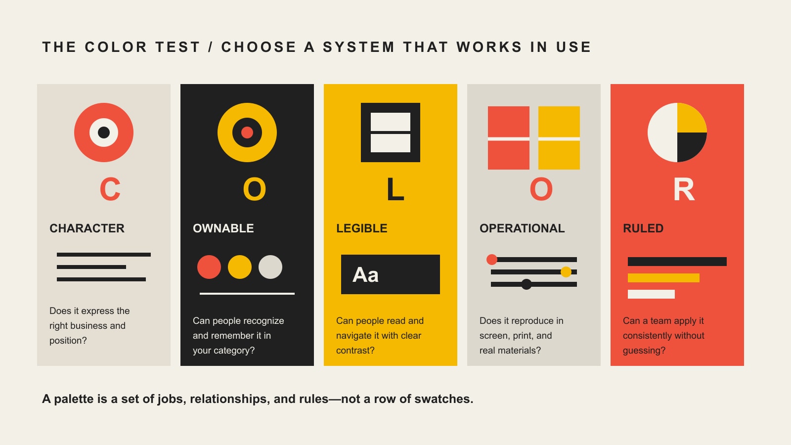
Use Scope Design’s COLOR Test instead:
- Character: Does the palette express the position and personality the business can actually support?
- Ownable: Is it distinctive in the competitive setting, or did you accidentally join the category’s blue-logo witness protection program?
- Legible: Do approved combinations meet accessibility needs and communicate without relying on color alone?
- Operational: Does the system survive websites, print, signs, clothing, slides, office printers, and one-color production?
- Ruled: Does every color have a defined role, specification, and usage rule that ordinary people can follow?
Do not choose a business color because an infographic promised it would manufacture trust. Choose a brand color system that fits, distinguishes, works, and can be governed.
In this guide
- What are brand colors?
- Does color psychology really work in branding?
- Why color-meaning charts fail
- The Scope Design COLOR Test
- How to choose brand colors
- What should a brand color palette include?
- How many brand colors should you have?
- How accessibility changes color use
- How to specify color for screen and print
- How to test a brand color palette
- Common brand-color mistakes
- Frequently asked questions
- The final decision
What are brand colors?
Brand colors are a defined set of colors and usage rules that helps a business create recognition, express its position, organize communication, and operate consistently across touchpoints. A useful system includes more than attractive swatches. It defines primary, supporting, neutral, accent, and functional roles; approved combinations; accessibility constraints; production values; templates; and governance.
That distinction matters. A palette tells you which colors exist. A color system tells you what they do.
Your signature blue may identify the brand. A darker blue may handle readable text. A warm accent may draw attention to selected actions. Neutrals may carry most backgrounds and long-form content. Separate status colors may communicate error, warning, success, and information without forcing the primary palette to perform jobs it was never built to do.
Color is one part of a larger brand identity system, not a replacement for one. The logo, typography, image language, composition, voice, and recurring graphic devices also create recognition. If the only identifiable thing about the business is “we use blue,” congratulations: so does half the internet.
Does color psychology really work in branding?
Color can influence perception, attention, association, and judgment. What it does not provide is a universal dictionary where one hue always produces one emotion and one business result.
Research by Lauren Labrecque and George Milne examined how hue, saturation, and value can shape perceived brand personality and purchase intent. Their work supports a useful point: color choices can help signal traits, but those effects operate through a complete brand and product context—not a lonely swatch floating in a vacuum. See the original study, “Exciting red and competent blue: the importance of color in marketing”, in the Journal of the Academy of Marketing Science.
Another open-access study, “Color in Context”, found that the psychological influence of red changed with the situation. That is fatal to the lazy version of color psychology. If the same color can support different responses under different conditions, “red means urgency” is not a strategy. It is a sentence missing most of its nouns.
For a business, at least six things shape how a color is interpreted:
- the product or service category;
- the other colors, typography, imagery, and language around it;
- saturation, brightness, proportion, and contrast;
- the audience’s culture, experience, and existing associations;
- the competitive environment;
- the application and moment in which the color appears.
A deep blue bank and a deep blue children’s aquarium may use the same nominal hue. The type, imagery, materials, language, and context make them different experiences. Color contributes. It does not work alone.
Why color-meaning charts fail
Color charts fail when they turn a starting hypothesis into a business verdict.
| Shortcut | What it ignores | Better question |
|---|---|---|
| Blue means trust | Category saturation, tone, contrast, and the fact that trust must be earned | Which color system feels credible for this offer and remains recognizable among alternatives? |
| Red creates urgency | Context can change whether red feels energetic, celebratory, risky, aggressive, or ordinary | What deserves attention, and how should hierarchy create it without shouting everywhere? |
| Green means natural | Green can signal finance, health, sustainability, permission, sport, or simply a competitor | Which associations already exist for this audience and product? |
| Purple means luxury | Shade, material, typography, imagery, and execution determine whether it feels premium or like a discount bath bomb | What complete visual territory supports the intended position? |
| Yellow attracts attention | Attention is not the same as comprehension, preference, accessibility, or purchase | Where is attention useful, and can the chosen yellow perform that role legibly? |
Color psychology should generate questions to test, not answers to obey.
That is especially important for small businesses. You probably do not have the media budget to hammer an arbitrary color into public memory through repetition. Your choices must do several jobs immediately: feel relevant, create useful contrast with competitors, work in the formats you can afford, and remain simple enough for staff to use correctly.
The Scope Design COLOR Test
The COLOR Test turns a subjective palette debate into five practical decisions.
| Test | Decision question | Failure signal |
|---|---|---|
| Character | Does this feel like the strategic position and business experience? | The palette is fashionable but says nothing particular about the company |
| Ownable | Can the business become recognizable with it in the real category? | It disappears into a wall of nearly identical competitors |
| Legible | Can people read, distinguish, and use it? | The “on-brand” combinations fail contrast or rely on color alone |
| Operational | Does it reproduce across actual touchpoints and constraints? | It works in a mood board and falls apart in print, signage, or office documents |
| Ruled | Are roles, values, combinations, templates, and owners defined? | Every employee invents a new tint and calls it close enough |
Character: does it express the right business?
Start with a specific strategic description, not an adjective pile.
“Modern, professional, and trustworthy” describes every mediocre brand brief ever written. Try something that can guide a decision: “seasoned experts who make a complicated purchase feel straightforward; warm but never sugary; premium because the work is thorough, not because the website whispers in beige.”
Then ask whether the proposed palette supports that position alongside the type, photography, language, and materials. Character is not personal preference disguised as strategy. The owner’s favorite color can participate, but it does not receive diplomatic immunity.
Ownable: can you become known for it?
Audit the choices customers will actually compare. Collect competitor homepages, signage, packaging, social profiles, uniforms, vehicles, proposals, marketplace thumbnails, or app icons—whatever appears in the buying environment.
Look for category conventions that help people identify the type of business. Then look for visual whitespace. You do not need to reject every convention. You need enough distinction to be recognized without becoming inappropriate for the category.
“Ownable” does not necessarily mean legally protectable by itself. It means the color system can become strongly associated with the brand through consistent, distinctive use. Trademark questions are fact-specific; use qualified counsel where legal protection matters.
Legible: can people actually use it?
Separate color choices for character from color pairings for comprehension. A bright signature yellow can be an excellent identifying color and a miserable body-text color. That is not a contradiction. Give it the right job.
For WCAG 2.2 Level AA, ordinary text generally needs a contrast ratio of at least 4.5:1, while qualifying large text may use 3:1. Meaningful graphical objects and interface components generally need 3:1 contrast against adjacent colors. The W3C contrast criteria provide the actual requirements and exceptions.
The W3C guidance on use of color also says color cannot be the only visual means of communicating information, indicating an action, or prompting a response. Pair color with text, icons, patterns, shapes, position, or another visible cue.
Accessibility does not order your brand to become boring. It requires a system intelligent enough to know where each color works.
Operational: does it survive reality?
Greg’s rule at Scope Design is blunt: taste is legitimate when it creates character and distinction; comprehension wins when people need to read, navigate, or complete something. Those decisions should be separated explicitly.
The same separation applies to production. A palette may include a vivid color that looks extraordinary on a backlit screen but shifts badly in four-color printing. Another may work in print but disappear when embroidered on a uniform. Thin reversed type may look elegant on a large monitor and become lint on a vinyl sign.
Test the palette in the business’s ugliest real conditions, not only its prettiest presentation.
Ruled: can other people use it without guessing?
A working system names every color, assigns a role, provides the correct values, lists approved combinations, shows failures, and identifies who can add or change colors.
The rule should be closer to “use Signal Coral for selected calls to action on Ink or Cream; never for paragraph text” than “use accent colors dynamically.” One can be followed. The other is an agency sentence hoping to age into wisdom.
How to choose brand colors
Choose brand colors in this order: strategy, competitive context, visual territories, system roles, real applications, accessibility, production, and audience testing.
1. Define the decision the palette must support
Clarify the audience, offer, position, desired expectation, meaningful competitors, and important touchpoints. If the business has not made those decisions, start with brand strategy and a clear brand message.
Color cannot rescue a vague position. It can only decorate one.
2. Audit the competitive color environment
Create a contact sheet of competitors as customers encounter them. Note repeated hues, dominant lightness, typical proportions, and combinations—not merely “three competitors use blue.” Navy occupying 10 percent of a white layout behaves differently from electric blue covering an entire storefront.
Classify findings:
- Category cues worth retaining: choices that help people recognize what kind of business this is.
- Category clichés worth questioning: combinations so common they erase attribution.
- Distinctive opportunities: territories that feel relevant without looking like a stunt.
- Constraints: legacy recognition, partner requirements, product materials, safety conventions, or environmental needs.
3. Build several visual territories
Do not begin by tweaking one favorite swatch until everyone becomes too tired to object. Build two or three complete directions using color, typography, imagery, texture, and composition.
Each territory should make a different strategic argument. That lets decision-makers compare consequences instead of debating whether teal is “more us” than blue.
4. Assign colors to jobs
Define roles before expanding the palette:
- signature or primary brand color;
- supporting brand colors;
- neutrals for text, backgrounds, borders, and space;
- accent colors for deliberate emphasis;
- link and interactive colors;
- status colors for error, warning, success, and information;
- chart or data-visualization colors where needed.
People should choose a role, not rummage through twelve equally approved swatches.
5. Test complete applications
Build the website header, article page, proposal, presentation, social post, sign, invoice, shirt, vehicle, package, or other high-frequency materials before approving the palette. Use real copy and realistic content density.
If the system only looks good as giant rectangles labeled with poetic names, you have selected a mood board—not a brand color system.
6. Test with the right questions
Do not ask only, “Which palette do you like?” Liking produces opinions; strategy needs evidence.
Ask intended customers or representative users:
- Which option feels most appropriate for this business and why?
- Which is easiest to distinguish from the alternatives?
- What would you expect this company to be like?
- Which details can you remember after a delay?
- Can you identify the business when the name or logo is covered?
- Can you read and use the important content comfortably?
The test is not whether everyone loves the same shade. It is whether the system creates the intended expectation, recognition, and usability.
7. Document and deploy
Publish the approved values, roles, pairings, proportions, templates, production notes, examples, and owner in one source of truth. Then make the correct choice easier than the improvised one.
Scope Design’s Branding & Graphics services connect the identity work to the websites, collateral, presentations, animation, video, and practical materials where the system has to perform.
What should a brand color palette include?
A complete brand color palette should include the colors, their roles, their technical values, approved foreground/background combinations, functional states, production guidance, examples, templates, and governance.
| System component | What to document |
|---|---|
| Core colors | Name, swatch, role, priority, and recommended proportion |
| Digital values | HEX and RGB; design tokens or CSS variables where useful |
| Print values | CMYK recipes and spot-color references when required, with proofing notes |
| Accessible pairings | Approved text/background and interface combinations with contrast ratios |
| Neutrals | Text, surface, background, border, and disabled-state roles |
| Functional colors | Link, focus, error, warning, success, and information states |
| Variants | Any approved tints, shades, dark-mode values, or constrained alternatives |
| Production fallbacks | One-color, black, white, grayscale, embroidery, vinyl, or low-quality print versions |
| Examples | Correct and incorrect applications using realistic content |
| Governance | Asset location, system owner, approval process, and version date |
The system may live inside broader brand guidelines or a design system. The format matters less than whether people can find and use it.
How many brand colors should you have?
Most small-business identities need fewer signature colors than their original mood board suggests and more functional colors than their logo designer mentioned.
A practical starting system might contain:
- one primary signature color;
- one or two supporting colors;
- one deliberate accent;
- a useful neutral scale;
- separate functional colors where the website or product requires them.
That is not a universal three-color rule, a 70/20/10 law, or numerology wearing a turtleneck. The correct number is the smallest set that covers the brand’s real communication jobs without making recognition muddy or use confusing.
Logo colors are not automatically the entire palette. A one-color logo can live inside a rich system. A multicolor logo may still require restrained layouts. The number of swatches is less important than the clarity of their roles.
How accessibility changes color use
Accessibility changes how colors are paired and assigned, not whether your company is allowed to have personality.
Create an approved-combination matrix that tells staff what works for:
- paragraph text and headings;
- buttons and their hover, active, focus, and disabled states;
- links within surrounding text;
- form labels, errors, and confirmation messages;
- charts, maps, and diagrams;
- text placed over images;
- light, dark, and colored surfaces.
Then bake the correct combinations into website components, presentation themes, document styles, and social templates. A training slide that says “remember WCAG” is not a system. A template that makes the accessible choice by default is.
For a deeper implementation guide, see Scope Design’s website accessibility and WCAG guide.
How to specify color for screen and print
HEX and RGB describe additive screen color. CMYK describes process-print ink proportions. Spot-color systems can specify a premixed ink. These values are not interchangeable promises that every monitor, printer, paper, vinyl, paint, and fabric will reproduce the same appearance.
A production-ready guide should include:
- HEX and RGB values for digital use;
- CMYK recipes tested with the intended print process;
- spot-color references where consistency justifies them;
- coated and uncoated proofing guidance when relevant;
- one-color, black, white, and grayscale alternatives;
- notes for signage, vinyl, paint, apparel, embroidery, or packaging materials;
- a responsible person who can approve production substitutions.
Proof important applications on the intended material. The screen is emitting light. Paper is reflecting it. Pretending those are identical is how the cheerful web orange becomes the unfortunate brown brochure.
How to test a brand color palette
Use a stress-test set built from the company’s real work:
- Recognition test: Cover the logo and company name. Does anything still feel attributable?
- Competitor test: Place the work beside real alternatives. Does it fit the category without vanishing into it?
- Contrast test: Check every approved text, control, and meaningful graphic combination—not just one hero pairing.
- Color-independent test: View key information in grayscale or with simulated color-vision differences. Is meaning still available?
- Scale test: Inspect a favicon, phone screen, presentation, storefront, banner, and other extremes.
- Production test: Print it on the actual stock or reproduce it in the constrained medium.
- Staff test: Give the guide and templates to a capable non-designer. Watch where they guess.
- Maintenance test: Add a new campaign, chart, or product state. Can the system expand without inventing random colors?
Every hesitation identifies a missing rule, value, example, or template. Fix the system before blaming the employee.
Common brand-color mistakes
Choosing a color meaning instead of a position
“We need blue because we want trust” skips the harder questions: why should anyone trust you, what makes your version recognizable, and what complete experience supports that claim?
Copying category leaders
Large brands can use minimal, generic assets because years of distribution have trained recognition. A growing business rarely has that luxury. Copy the category leader and you may inherit its familiarity while donating all attribution back to it.
Approving swatches instead of applications
Five colors can look gorgeous side by side and become chaos when text, photos, data, calls to action, and production constraints arrive. Approve the work people will see.
Treating the logo palette as the whole system
Logos identify. Interfaces communicate, respond, warn, organize, and enable action. They need neutral, interactive, and status roles that may not belong in the logo.
Specifying only HEX values
Businesses print signs, wrap vehicles, embroider shirts, present slides, and use office printers. A web-only color specification abandons everyone else at the exact moment money reaches production.
Ignoring governance
Without one current source, named owner, and approved templates, color drift is inevitable. Soon the company has six blues, four “official” logos, and a PowerPoint green nobody can explain.
Frequently asked questions
What colors represent what in branding?
Colors can support common associations, but no color carries one universal brand meaning. Context, culture, category, surrounding design, saturation, brightness, and prior experience all affect interpretation. Use common associations as hypotheses to test, not instructions to obey.
What colors attract customers?
There is no universally best customer-attracting color. A color attracts useful attention when it is relevant, sufficiently distinct, legible, and deployed with clear hierarchy in the right context. Attention from the wrong expectation is not a branding victory.
How do I choose colors for my brand?
Define the position, audit competitors, build multiple visual territories, assign colors to specific roles, test complete applications, verify accessibility and production behavior, test with representative users, and document the final system.
What is a good brand color palette?
A good palette fits the brand, creates useful distinction, supports readable combinations, works across actual media, and gives each color a clear job. It should remain usable when content becomes dense and production becomes inconvenient.
How many colors should a brand have?
Use the smallest set that covers the required recognition and communication roles. Many small businesses can begin with one primary color, one or two supporting colors, one accent, neutrals, and separate functional colors as needed.
What is the three-color rule?
The three-color rule is a simplifying guideline, not a law. Limiting dominant colors can create cohesion, but a complete brand system may need neutrals and functional colors beyond the three visible signature colors.
What is the 70/20/10 color rule?
It is a proportional starting point in which one color dominates, another supports, and a third accents. It can help control hierarchy, but actual proportions should follow the content, medium, accessibility requirements, and brand strategy.
Is three colors too many for a logo?
Not automatically, but every additional color increases reproduction complexity and can weaken clarity at small sizes or in one-color applications. A multicolor logo still needs reliable one-color, black, white, and constrained-production versions.
Should my logo color and website colors match?
They should belong to the same identity system, but the website needs additional neutral, interaction, status, and accessibility-safe roles. Matching does not mean forcing every logo color into every interface job.
Can a brand use a color that competitors already use?
Yes. Categories often develop useful conventions. The question is whether your complete combination of hue, proportion, typography, imagery, composition, and repeated use remains attributable rather than interchangeable.
Do brand colors need to meet WCAG contrast?
Brand swatches and logos do not all have to meet one contrast ratio in isolation. The combinations used for meaningful text, controls, and graphics must meet the applicable requirements. Document which pairings are approved for which roles.
What color formats should brand guidelines include?
Most systems should include HEX and RGB for digital use and tested CMYK values for process printing. Add spot-color, material, paint, vinyl, embroidery, or other specifications when the business regularly uses those production methods.
Should a small business hire a designer to choose brand colors?
Hire professional help when the choice affects many touchpoints, the category is crowded, accessibility or production is complex, internal opinions are stuck, or mistakes will be expensive. A useful designer should deliver a working system and rationale—not merely attractive swatches.
The final decision
The best brand colors are not the ones with the most flattering psychological biography. They are the ones your business can use consistently to create the right expectation, stand apart, communicate clearly, and survive real production.
Run the palette through the COLOR Test:
- Does it have the right Character?
- Is it meaningfully Ownable?
- Is it Legible?
- Is it Operational?
- Is it Ruled well enough for other people to use?
If yes, you have more than colors. You have a working part of the brand.
If not, do not ask what blue means. Ask which decision the system failed to make.
Need a color system that survives the website, print shop, staff PowerPoint, and the occasional terrible office printer? Explore Scope Design’s Branding & Graphics services or start with professional logo design.
Sources
- Labrecque, Lauren I., and George R. Milne. “Exciting red and competent blue: the importance of color in marketing.” Journal of the Academy of Marketing Science, 40, 711–727.
- Meier, Brian P., et al. “Color in Context: Psychological Context Moderates the Influence of Red on Approach- and Avoidance-Motivated Behavior.” PLOS ONE, 7(7), e40333.
- World Wide Web Consortium. Web Content Accessibility Guidelines (WCAG) 2.2.
- World Wide Web Consortium. Understanding Success Criterion 1.4.1: Use of Color.