Category: Branding

  • Retail Signage Design: Build a Store System People Can Use

    Retail Signage Design: Build a Store System People Can Use

    Retail signage is the physical interface of a store. It should help people recognize where they are, find what they need, understand what to do, and take the next sensible action without having to flag down an employee or decode a wall full of laminated chaos. Good retail signage does not begin with a screen, a material, or a sale banner. It begins with a decision people are trying to make in a specific place.

    That means the best retail signage is not necessarily the loudest, newest, or most digital. It is the sign customers notice at the right moment, understand quickly, and can actually use.

    TL;DR

    Treat retail signage design like interface design installed in physical space. Map the decisions people make from the parking lot to the exit, assign every sign one primary job, design for real viewing conditions, meet applicable accessibility and code requirements, connect the signs to the brand and staff language, and test whether people can complete the intended task.

    Use Scope Design’s SPACE Signage Test:

    1. Situation: Where is the decision, and what are the viewing conditions?
    2. Priority: What is the one job the sign must do first?
    3. Access: Can the people who need it perceive, understand, reach, and use it?
    4. Continuity: Does it connect the store, brand, destinations, staff language, and digital handoffs?
    5. Evidence: What behavior will prove it works, and who keeps it accurate?

    Buying a bunch of screens before answering those questions is not innovation. It is expensive wallpaper with a power cord.

    In this retail signage guide

    What is retail signage?

    Retail signage is the coordinated set of exterior, interior, informational, directional, promotional, identification, and regulatory signs that helps people recognize and use a store. It includes the storefront identifier, hours, parking and entrance information, department markers, directories, aisle and category signs, price and policy information, checkout guidance, pickup instructions, accessible-route signs, safety notices, and temporary promotions.

    The word coordinated matters. One sign can answer one question. A signage system anticipates the sequence of questions a person will have as they approach, enter, navigate, evaluate, buy, collect, return, or leave.

    Imagine a first-time customer arriving for an online pickup:

    1. Is this the right building?
    2. Where can I park?
    3. Which entrance should I use?
    4. Where is pickup?
    5. Do I wait, scan, call, or speak to somebody?
    6. How do I know the order is ready?
    7. Where do I leave?

    If the storefront looks gorgeous but the customer has to solve those seven questions through intuition and mild panic, the signage has failed. The brand has also taught them what doing business with it feels like.

    This is why retail signage belongs inside a broader brand strategy, not in a last-minute production order labeled “miscellaneous signs.” A logo identifies the business. The full environment contributes to the expectation attached to it.

    Retail signage is a system, not a collection of rectangles

    Most bad signage is not individually ugly. It is collectively incoherent.

    The permanent signs were designed during the buildout. A manager made the returns sign in a word processor. Marketing sent a promotion with a different typeface. Operations taped up a new pickup process. A vendor installed a digital display. Nobody removed last month’s notice. Soon the entrance looks like five departments arguing in public.

    A retail signage system defines:

    • the customer decisions the environment must support;
    • a stable naming system for departments, services, exits, and destinations;
    • sign families and the job assigned to each family;
    • information hierarchy and message-length rules;
    • approved type, color, icons, arrows, imagery, and layouts;
    • accessible and code-sensitive sign requirements;
    • materials, finishes, mounting, illumination, and production constraints;
    • temporary-sign templates and expiration rules;
    • ownership, approval, installation, inspection, and maintenance;
    • methods for testing comprehension and task completion.

    Those rules do not need to become a 180-page monument to design-system vocabulary. They need to be clear enough that a store manager can replace a damaged sign or launch a promotion without inventing an unrelated visual language before lunch.

    That connects signage to a usable brand identity system. The identity should include appropriate logo lockups, one-color and reversed versions, vector artwork, production color values, type specifications, spacing rules, and examples for real physical applications. Sending a sign fabricator a tiny transparent PNG and the instruction “make it bigger” is not art direction. It is a cry for help.

    What are the types of retail signage?

    There is no sacred universal number of retail sign types. Search results confidently offer three, four, five, nine, and whatever number made the headline look impressive. A more useful classification is based on the job the sign performs.

    Sign familyPrimary question it answersRetail examplesTypical failure
    IdentificationWhat is this place or thing?Storefront name, department marker, room label, checkout numberBeautiful but invisible at the intended distance
    OrientationWhere am I, and what is around me?Directory, floor map, “you are here” map, zone markerMap does not match the language used on signs or by staff
    DirectionalWhich way do I go?Arrows to pickup, fitting rooms, elevators, exits, restroomsArrow appears after the decision point or points ambiguously
    InformationalWhat do I need to know?Hours, service instructions, returns process, price explanationParagraph pasted onto a wall where nobody can stop to read it
    PromotionalWhy should I consider this offer now?Sale, new product, event, bundle, loyalty promptEvery promotion screams, so nothing has priority
    Regulatory and assuranceWhat rule, risk, or accessible route applies?Exit, occupancy, warning, accessible entrance, prohibited activityTreated as brand decoration instead of a compliance-sensitive message

    The familiar four types of wayfinding signage—identification, directional, informational, and regulatory—are useful functional buckets. Retail adds orientation and promotion because customers often need a map of the environment and a reason to consider an offer. The categories can overlap. A department sign may identify a destination and help orient someone at the same time.

    Do not get trapped debating whether a sign belongs in bucket three or four. Ask whether the person can make the decision.
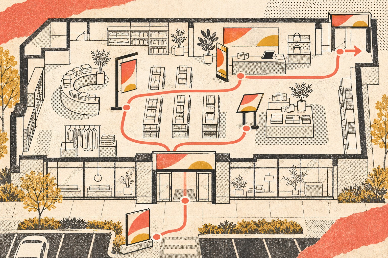
    Birds-eye retail floor plan traces the customer route from parking and entry through product choices to checkout and exit, with coordinated signs at each decision point.
    Map identification, orientation, directional, informational, promotional, and access signs to the decisions customers make.

    The SPACE Signage Test

    Scope Design uses the SPACE Signage Test to move the conversation away from “What kind of screen should we buy?” and toward “What must work here?”
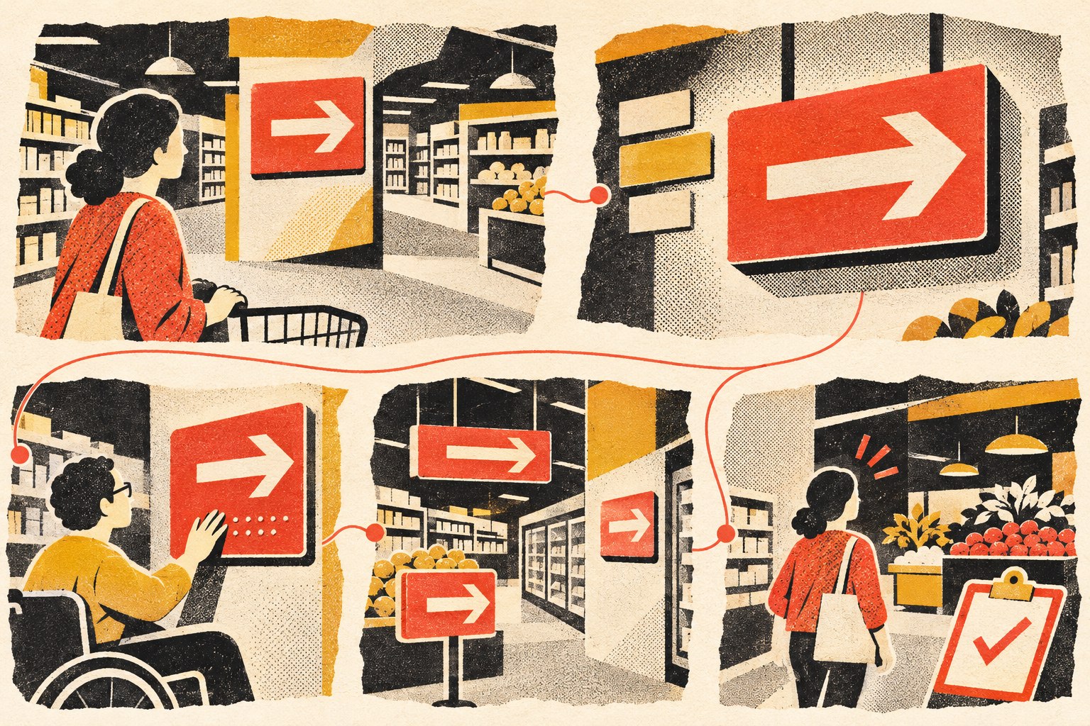
    Five store scenes show the SPACE Signage Test: situation, priority, access, continuity and evidence, including a wheelchair user reading a reachable high-contrast sign.
    The SPACE Signage Test evaluates Situation, Priority, Access, Continuity, and Evidence.

    Situation: design the moment, not the rectangle

    Document where the person is, where they came from, what they are trying to do, and what competes for attention. Record the likely viewing distance, angle, speed, lighting, glare, obstructions, crowding, and whether the person can safely stop.

    A storefront sign viewed from a moving car has a different job from a price explanation viewed at arm’s length. An overhead aisle marker must work past merchandise and other customers. A pickup instruction must be visible from the place where uncertainty begins, not from the place where an employee already explains it.

    Photograph the decision point from the customer’s approach. Do it in daylight and after dark if the store operates in both. Do it at the eye height and movement path of actual users, including people using mobility devices. The design file is not the environment.

    Priority: give every sign a first job

    Write the sign’s primary job as a verb: identify, orient, direct, explain, warn, compare, confirm, or prompt. Then rank every piece of content by whether it is necessary to complete that job.

    A useful sign can contain secondary information, but the hierarchy must remain obvious. “Pickup” should not lose a shouting match with a loyalty-program paragraph, three vendor logos, and legal copy written for a different channel.

    Start with the shortest truthful message. Use the terms customers know. If staff say “order pickup,” the website says “curbside collection,” and the sign says “omnichannel fulfillment,” the customer is not navigating a sophisticated brand ecosystem. They are playing vocabulary roulette.

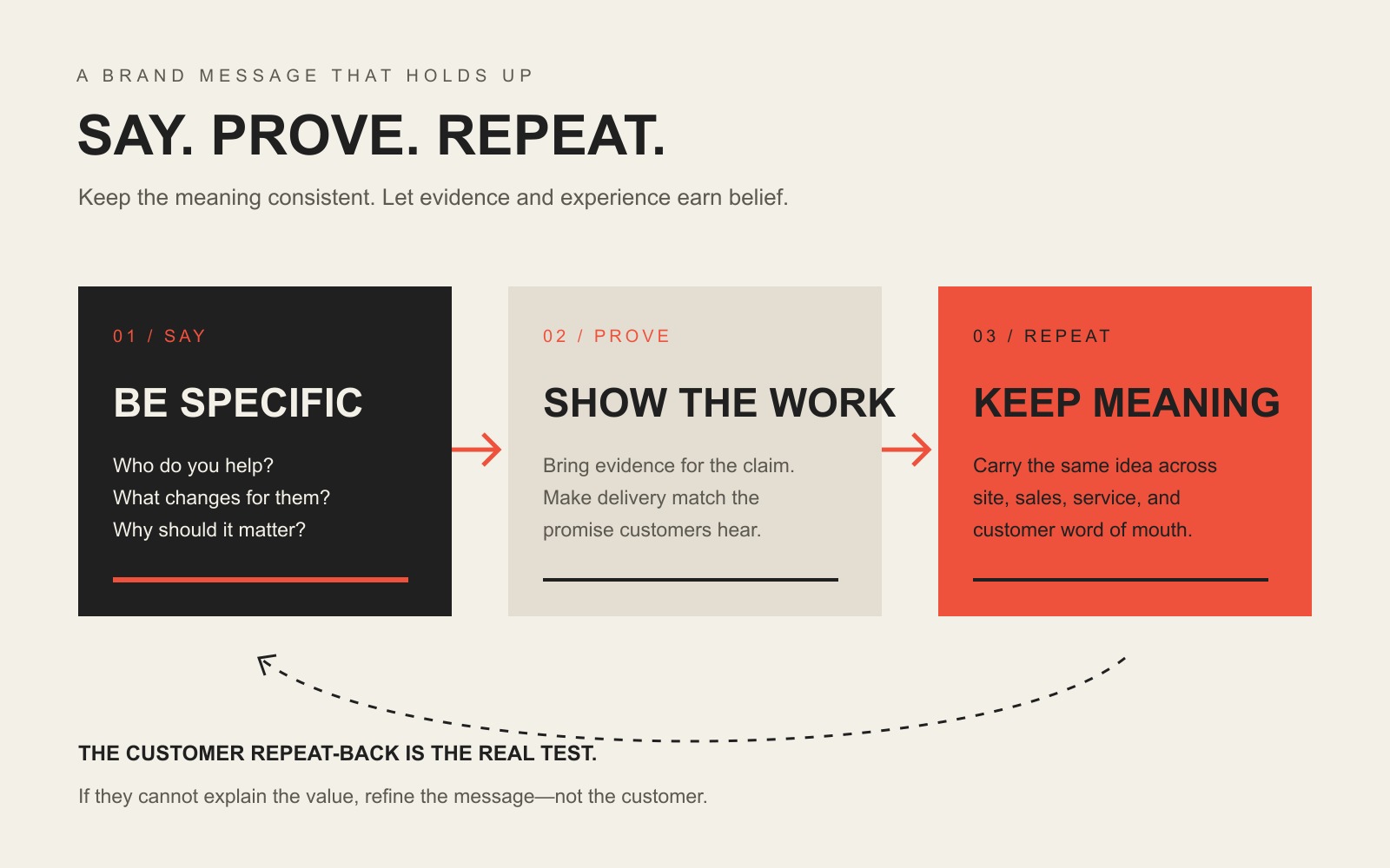
    The same clarity rules apply to a brand message and a physical sign: say what matters in language people can recognize, then provide detail where they can reasonably consume it.

    Access: make the information usable

    Access includes more than choosing a large font. Consider who must perceive and understand the information, the physical conditions, language needs, color and contrast, surface glare, character form, mounting position, tactile and Braille requirements, symbols, reach, and alternate methods of communication.

    Some requirements change with the sign’s purpose. A permanent room designation is not treated the same as a temporary sale notice. The U.S. Access Board’s signs guide explains that ADA Standards apply different visual, tactile, pictogram, and symbol requirements to different sign categories. It also notes that character height relates to viewing distance and that visual characters need light-on-dark or dark-on-light contrast and a non-glare finish where the standards apply.

    Do not copy a web contrast ratio into a physical-sign specification and declare the project accessible. Screen and environmental conditions are different. Do not declare every sign “ADA compliant” because somebody added Braille either. Exact obligations depend on the sign, facility, route, project scope, jurisdiction, and adopted codes.

    Continuity: connect the whole experience

    Continuity means customers encounter the same names, cues, routes, and expectations across the storefront, interior, staff instructions, receipts, website, maps, email, and pickup messages.

    It also means the visual identity survives production. Thin strokes may disappear when illuminated. A subtle gradient may reproduce badly on vinyl. A color combination that looks polished on a calibrated monitor may lose distinction under store lighting. A vertical logo may fit the presentation mockup and fail the available fascia.

    This is why a brand color system needs accessible pairings and production values, and why identity files need real lockups and fabrication-aware variants. Consistency does not mean forcing one precious layout onto every object. It means preserving recognition while adapting intelligently to constraints.

    Continuity also governs physical-to-digital handoffs. A QR code should lead to a mobile page that continues the exact task: product details, an accessible menu, appointment check-in, pickup confirmation, or translated information. Sending every code to the homepage is the physical equivalent of giving directions by saying “somewhere on the internet.” A proper website strategy defines that next step and how it will be measured.

    Evidence: decide what working looks like

    Define an observable outcome before production. Examples include:

    • first-time visitors find pickup without asking for help;
    • customers distinguish returns from new purchases before joining a line;
    • people locate an accessible entrance from the primary approach;
    • a promotion produces visits or purchases attributable to that placement;
    • staff receive fewer repeated questions at a specific decision point;
    • outdated temporary signs are removed by their expiration date.

    Then assign ownership. Who approves copy? Who verifies a destination name? Who checks installation? Who replaces damage? Who removes temporary messages? Who reviews analytics from a digital sign or QR destination? A sign without an owner becomes environmental spam in slow motion.

    How to plan store signage before designing it

    1. Map journeys and decision points

    Walk the site as a first-time customer, delivery driver, applicant, vendor, and person collecting an order. Start at each realistic arrival point: road, parking lot, sidewalk, transit stop, mall corridor, or elevator. Mark where someone needs to identify, choose, turn, stop, wait, pay, collect, or exit.

    Do not begin with a list of signs already on the wall. That preserves old assumptions. Begin with tasks.

    2. Audit every existing sign

    Photograph and inventory permanent, temporary, handwritten, printed, digital, vendor-supplied, safety, accessibility, and promotional signs. Record location, owner, purpose, message, condition, last update, and intended removal date.

    Handwritten signs are evidence. They often reveal a missing instruction, broken process, recurring question, or system nobody planned. Do not merely replace them with nicer acrylic. Fix the reason they appeared.

    3. Create a destination and language standard

    Choose one public name for each destination and service. Align it with the website, store map, staff scripts, receipts, messages, and search terminology. Define arrow conventions, icons, abbreviations, capitalization, numbers, and bilingual or multilingual patterns where needed.

    4. Assign sign families and templates

    Create reusable structures for identification, direction, information, promotion, and temporary operations. Specify which elements are fixed and which can change. A modular system reduces one-off design work and makes it easier to keep the environment coherent.

    This is the useful part of a design system: reusable components, rules, ownership, and maintenance. The goal is not to make the store sound like a software conference.

    5. Prototype at actual size and location

    Print or mock up critical signs at real size. Place them where they will live. View them from the actual approach, distance, height, and angle. Test competing light, glare, merchandise, open doors, queues, seasonal displays, and human bodies.

    If the sign works only in a close-up presentation slide, it does not work.

    6. Validate requirements before fabrication

    Coordinate with the property owner, architect, sign professional, accessibility specialist, fire or building officials, and other qualified parties as the project requires. Confirm permits, landlord rules, structural attachment, electrical work, illumination, life-safety content, accessibility, and local code before ordering expensive objects.

    7. Test with people who did not design it

    Give representative users a task without coaching them. Ask them to think aloud or simply observe where they look, hesitate, turn, backtrack, or ask for help. Test more than the sign: test the path between signs.

    Designers and staff know too much. Once you know the fitting rooms are behind the blue wall, the environment becomes magically obvious. Customers do not receive that software update.

    How to design readable retail signs

    Readable signage balances content, character size, spacing, contrast, surface, lighting, placement, distance, angle, and exposure time. No single font size or word count works everywhere.

    Use these practical rules as design prompts, not substitutes for applicable standards:

    • Put the decision-driving words first.
    • Use familiar, concrete nouns and verbs.
    • Keep arrows physically close to the destination label they control.
    • Avoid decorative type for essential instructions.
    • Use sufficient character size for the actual viewing distance.
    • Separate messages instead of stacking unrelated priorities.
    • Keep backgrounds quiet behind critical information.
    • Test light-on-dark and dark-on-light combinations in the installed lighting.
    • Avoid glossy surfaces where reflections compete with the message.
    • Do not communicate essential meaning with color alone.
    • Use symbols consistently and pair unfamiliar symbols with words.
    • Place signs before or at decision points, not after them.
    • Maintain clear sightlines as displays and inventory change.

    The ADA Standards’ communication chapter contains detailed requirements for covered visual and tactile characters, Braille, pictograms, mounting, finish, and contrast. Use the standard and qualified project guidance for compliance-sensitive specifications, not a marketing blog’s “perfect font size” infographic.

    Retail signage and accessibility

    Shops are among the businesses covered by ADA Title III. ADA.gov’s guidance for businesses open to the public explains that businesses serving the public generally have accessibility responsibilities, including physical access and effective participation.

    For signage, the Access Board distinguishes among permanent room or space designations, directional and informational signs, pictograms, symbols of accessibility, directories, temporary signs, logos, and other categories. Some require tactile characters and Braille. Some require visual-character criteria. Some are exempt from particular sign provisions. Required accessible elements and routes may need designated symbols.

    The responsible approach is:

    1. identify every sign’s function;
    2. determine which federal, state, local, building-code, lease, and project-specific requirements apply;
    3. design and document the applicable visual, tactile, symbol, location, and mounting specifications;
    4. review fabrication proofs and installed conditions;
    5. maintain the sign and the accessible route it describes.

    Accessibility is not a sticker added after design approval. It changes the system, content, fabrication, placement, and testing. This article provides planning guidance, not legal advice or project certification.

    When does digital signage make sense?

    Digital signage makes sense when content genuinely needs to change, when the organization can maintain it, and when the medium improves the task. Useful cases can include frequently changing queue instructions, event schedules, product availability, time-sensitive promotions, or interactive directories in complex environments.

    Before buying hardware, answer:

    • What customer decision improves because this content can change?
    • How often does it need to change?
    • Who creates, approves, schedules, and removes content?
    • What happens when the display, network, player, or data feed fails?
    • Can the essential information still be accessed another way?
    • How will motion, audio, timing, placement, and controls affect accessibility?
    • What data does the system collect, and why?
    • What result will justify its cost and maintenance?

    A printed sign may beat a digital display when the message is permanent. A staff member may beat an interactive kiosk when the task is rare and complicated. A screen that displays a static logo for three years is a very expensive rectangle accomplishing what vinyl already knew how to do.

    Be especially skeptical of camera-based demographic targeting, facial analysis, and passive device tracking sold as automatic personalization. The FTC’s policy statement on biometric information warns about foreseeable harm, covert or unexpected collection, accuracy claims, and risk controls. Its retail facial-recognition action involving Rite Aid illustrates how inaccurate systems, inadequate safeguards, poor training, and weak oversight can harm real customers.

    “The vendor said it uses AI” is not a business case, a privacy program, or a moral alibi. Require a defined purpose, data map, legal review, security controls, notice and consent analysis, accuracy evidence, human oversight, retention limits, vendor accountability, and a less invasive alternative.

    How to measure whether retail signage works

    Measure the task the sign exists to improve. Do not begin with a generic promise that digital signs lift sales by a suspiciously precise percentage. Different stores, offers, traffic, placements, messages, and measurement methods produce different results.

    Sign jobUseful evidenceWatch out for
    WayfindingTask completion, wrong turns, time to destination, requests for directionsStaff coaching users during the test
    Queue and serviceCorrect line selection, abandonment, repeated questions, processing errorsTreating longer dwell time as automatically positive
    PromotionRedemption, attributed purchases, scans, visits to a dedicated destinationClaiming causation from a sales change with no comparison
    PickupSuccessful arrivals, check-in completion, calls for help, missed handoffsMeasuring only website conversion and ignoring the parking-lot experience
    InformationComprehension, policy errors, returns confusion, staff explanationsAssuming a sign was read because it was present
    IdentificationRecognition from the intended approach and distanceTesting a cropped photograph instead of the real site

    Use simple tests when traffic is low: structured observation, first-time-user tasks, staff question logs, short intercept interviews, unique offer codes, dedicated QR destinations, or before-and-after counts at the same decision point. Record context such as staffing, inventory, promotions, season, construction, and hours.

    The goal is not to manufacture a dashboard. It is to decide whether to keep, change, move, simplify, or remove the sign.

    Common retail signage mistakes

    Starting with a product instead of a problem

    “We need digital signage” is a proposed solution. The problem may be that customers cannot find pickup, staff use inconsistent language, promotions have no hierarchy, or the store has no content owner. Diagnose first.

    Putting the sign where the answer is, not where the question begins

    A restroom marker visible only from the restroom is technically accurate and operationally useless. Map approach paths and decision points.

    Making every message urgent

    When every sign is red, bold, animated, temporary, and “important,” the environment becomes one long fire alarm. Establish levels of priority and reserve interruption for information that deserves it.

    Writing a memo on a wall

    People moving through a store scan. Put essential instructions first, shorten the message, and move detailed terms to a place where people can stop, read, and access them.

    Ignoring production until the end

    Identity assets that rely on hairline strokes, one delicate lockup, screen-only colors, or raster artwork may fail in fabrication. Test materials, scale, contrast, lighting, and installation early.

    Treating accessibility as a Braille translation service

    Sign function, visual characters, tactile content, Braille, pictograms, symbols, finish, placement, and mounting can all matter. Determine the actual requirements before design and fabrication.

    Adding technology without governance

    Screens and kiosks create content, software, security, accessibility, privacy, support, and failure-state responsibilities. If nobody owns them, customers eventually receive a frozen weather widget and last quarter’s promotion.

    Never removing temporary signs

    Every temporary sign needs an owner and expiration date. A faded notice from six months ago tells customers that nobody is minding the store—even when somebody literally is.

    Retail signage checklist

    Before approving a retail sign or system, confirm:

    • ☐ The customer decision and primary job are defined.
    • ☐ The sign appears before or at the relevant decision point.
    • ☐ Viewing distance, angle, movement, lighting, glare, and obstruction were documented.
    • ☐ The message uses the same destination and service names as staff and other channels.
    • ☐ Essential content has an obvious hierarchy.
    • ☐ Type, characters, spacing, contrast, surface, symbols, and arrows were tested in context.
    • ☐ Applicable accessibility, code, lease, permit, electrical, structural, and life-safety requirements were reviewed by qualified parties.
    • ☐ Brand assets are production-ready and appropriate for the material and scale.
    • ☐ A real-size proof was tested at the installation location.
    • ☐ Representative users completed the intended task without coaching.
    • ☐ Digital systems have content ownership, fallback behavior, security, privacy, and maintenance plans.
    • ☐ The sign has an owner, inspection schedule, and replacement process.
    • ☐ Temporary content has a removal date.
    • ☐ Success evidence and a review date are defined.

    Frequently asked questions about retail signage

    What is signage in a retail store?

    Retail signage is the coordinated set of signs that identifies a store, helps customers navigate it, explains services and policies, promotes relevant offers, and communicates required safety or accessibility information. It includes exterior and interior, permanent and temporary, printed and digital signs.

    What are the different types of retail signage?

    Useful functional categories are identification, orientation, directional, informational, promotional, and regulatory or assurance signs. A sign may perform more than one function, but it should still have one clear priority.

    What are storefront signs called?

    Common storefront sign forms include fascia or wall signs, projecting or blade signs, awnings, window graphics, monument or pylon signs, channel letters, cabinet signs, and dimensional letters. The available type depends on the building, visibility needs, landlord rules, local sign code, structure, electrical requirements, and budget.

    What are the three types of signage?

    There is no universal three-type standard. Some summaries group signs as identification, directional, and informational; others use indoor, outdoor, and digital. Classifying by the customer’s task is more useful than forcing every project into an arbitrary number.

    What are the four types of wayfinding signage?

    The four commonly cited functional types are identification, directional, informational, and regulatory. Larger wayfinding systems may also use orientation maps, landmarks, zones, color, architecture, and digital guidance.

    What is wayfinding signage?

    Wayfinding signage is part of a system that helps people understand where they are and navigate to a destination. It can include directories, maps, landmarks, department identifiers, arrows, room labels, regulatory signs, and confirmation signs along a route.

    What is an example of retail wayfinding signage?

    A complete pickup route is a good example: an exterior entrance identifier, parking or curbside marker, directional sign at the entrance, department confirmation, check-in instructions, queue guidance, and exit direction using the same destination name throughout.

    How much does retail signage cost?

    Cost depends on the number and size of signs, survey and strategy work, design, engineering, permits, landlord review, materials, fabrication, illumination, electrical service, access equipment, installation, code and accessibility requirements, software, content production, and maintenance. Get a scoped estimate after the decision points and sign schedule are defined; a generic per-sign number can hide most of the project.

    How do you design effective retail signage?

    Define the customer decision, place the sign at the relevant decision point, give it one primary job, use plain language and a strong information hierarchy, design for actual viewing conditions, validate accessibility and code requirements, prototype at full size, and test the task with people who did not design it.

    How do I make my own store sign?

    For a low-risk temporary message, begin with one short purpose, large readable type, strong contrast, an appropriate material, secure placement, and a removal date. Do not DIY structural, electrical, illuminated, life-safety, permit-sensitive, or accessibility-critical signs without qualified review.

    What are common wayfinding mistakes?

    Common mistakes include inconsistent destination names, signs installed after a turn, ambiguous arrows, missing route confirmation, poor sightlines, tiny type, glare, too many messages, inaccessible placement, maps that do not match the environment, and no maintenance owner.

    Does digital signage increase sales?

    It can support sales when the message, offer, audience, placement, timing, and customer journey are right. The screen itself does not create demand. Use attributable actions or a credible comparison to measure the actual deployment instead of borrowing a universal uplift statistic from a vendor.

    Is digital signage better than printed signage?

    Neither is universally better. Digital works well for content that changes frequently or benefits from interaction and live data. Print is often cheaper, simpler, more reliable, and better for stable messages. Choose the medium after defining the task, update frequency, environment, accessibility needs, ownership, and total cost.

    Current products emphasize digital displays, interactive directories, modular systems, dimensional letters, sustainable materials, and integrated physical-to-mobile experiences. A trend is useful only if it solves the task, survives production and maintenance, fits the brand, and can be used accessibly. Otherwise it is fashion bolted to a wall.

    How do you know if store signage is working?

    Measure the behavior tied to the sign’s job: destination completion, wrong turns, questions to staff, line-selection errors, attributed redemptions, pickup check-ins, comprehension, or recognition at the intended approach. Observe before and after under comparable conditions, then change or remove signs that do not help.

    Build a store people do not need to decode

    Retail signage should make the store easier to recognize, navigate, understand, and use. That is a strategic, operational, brand, design, accessibility, production, and maintenance problem—not a shopping list of screens and banners.

    Start with the customer decisions. Apply the SPACE Signage Test. Build the smallest coherent system that answers those decisions. Test it in the environment. Maintain it like the customer-facing infrastructure it is.

    If your store, website, operations, and brand behave like four strangers sharing a lease, Scope Design’s Impact Consulting can help diagnose the actual constraint before you order more rectangles.

    Primary sources

  • Crisis Communication for Brands: What to Say, Do, and Fix

    Crisis Communication for Brands: What to Say, Do, and Fix

    Direct answer: Good crisis communication tells affected people what happened, what is known, what is still unknown, what they should do, what the business is doing, and when the next update will arrive. It needs one accountable owner, fast fact-checking, useful action, and visible proof that the underlying problem is being corrected. A polished apology without an operating response is just expensive punctuation.

    Scope Design TL;DR: Do not begin a brand crisis by asking, “How do we make this look better?” Begin with, “Who was harmed, what is true, who owns the response, and what are we fixing?” Then communicate the facts without speculation, give people something useful to do, publish the next-update time, correct errors openly, and keep showing evidence until the behavior—not merely the conversation—has changed.

    In this guide

    What is crisis communication?

    Crisis communication is the planned process a business uses to share accurate, timely, useful information before, during, and after an event that threatens people, operations, trust, or reputation. It connects the public message to the actual response.

    That last sentence matters. Crisis communication is not a magician’s cape thrown over a smoking server, a dangerous product, a discriminatory decision, a leadership screwup, or a customer-service pileup. Communication can reduce uncertainty and help people act. It cannot make an unresolved problem disappear because the CEO used the word “deeply” four times.

    The CDC’s evidence-based Crisis and Emergency Risk Communication framework emphasizes being first, right, and credible; expressing empathy; promoting action; and showing respect. The setting is public-health response, but the principles expose what most corporate crisis advice gets backward: the audience’s need for accurate, actionable information comes before the organization’s desire to sound polished.

    For a brand, the practical definition is simpler: say what reality can support, help affected people make the next decision, and make the operating response visible.

    A brand crisis is an evidence problem made visible

    Scope Design defines a brand as the accumulated expectation attached to an identifier. The logo identifies you. The brand is what people expect will happen when they choose you.

    A crisis opens a nasty gap between that expectation and the available evidence. You claim reliability; the service goes dark. You claim safety; the product hurts someone. You claim transparency; customers learn about the problem from a reporter. You claim to value employees; the internal memo says otherwise.

    That is why “protect the brand” can be a dangerous instruction. In a weak response, it means protecting the appearance of competence. In a useful response, it means protecting people, restoring the system, and giving the public enough verified information to judge what happens next.

    The Brand Strategy pillar explains how identity, message, behavior, and governance form a recognizable system. The Brand Authority pillar explains how evidence earns belief. A crisis stress-tests both. The message has to remain recognizable, but the evidence decides whether anyone believes it.

    Is it a crisis, an issue, or an inconvenient Tuesday?

    Not every angry comment deserves a command center. Calling every complaint a crisis wastes attention and teaches the team to ignore the alarm.

    Treat an event as a potential crisis when one or more of these conditions is true:

    • people may face physical, financial, legal, privacy, employment, or emotional harm;
    • the business cannot confidently explain the scope or stop the impact;
    • normal customer-service authority is insufficient;
    • regulators, law enforcement, insurers, major partners, or the media may need to be involved;
    • misinformation is spreading faster than routine support can correct it;
    • an executive, employee, vendor, product, or system failure contradicts a central brand promise;
    • the event could materially interrupt operations or create continuing exposure.

    A single late shipment is usually a service recovery. Hundreds of unexplained late shipments, a broken tracking system, and customers being charged twice may be a crisis. One harsh review is a reputation-management issue. Evidence that reviews were fabricated is a trust crisis. A suspicious login is an incident. Confirmed exposure of customer data may create legal notification duties as well as a communication crisis.

    The label matters less than the escalation rule. If the event could harm people, expand quickly, or prevent the business from keeping a core promise, route it to a named decision-maker immediately.

    The Scope Design FACTS response

    The internet already has enough competing “5 C’s,” “5 R’s,” and “5 P’s” to fill a moderately depressing bowl of alphabet soup. There is no single universal five-letter formula for every crisis. We use FACTS as an operational check because it forces the message to follow reality.

    F — Find the facts and the affected people

    Start with impact, not optics.

    Document what happened, when it began, how it was detected, which people or systems may be affected, what has been confirmed, what remains unknown, and what could make the harm worse. Preserve records. Separate observation from assumption. Create a timestamped decision log so yesterday’s best information is not quietly rewritten as today’s certainty.

    The first useful questions are blunt:

    • Is anyone in immediate danger?
    • Is harm still occurring?
    • What must be stopped, isolated, recalled, refunded, corrected, or reported?
    • Who is affected, including people who may not know it yet?
    • What evidence do we have?
    • What are we merely guessing?
    • What expertise or legal guidance is required?

    For a suspected website compromise, this is where brand communication hands the technical work to an incident owner. Our website-hacked response guide covers containment, evidence preservation, cleanup, recovery, and breach escalation. The communication team should not invent technical certainty while the people investigating the system are still establishing scope.

    A — Assign one accountable owner

    A committee can contribute. It cannot be accountable.

    Name one response owner with the authority to convene the right people, set the operating rhythm, resolve conflicting recommendations, approve messages, and escalate decisions. Then name a backup. A crisis that occurs at 9:12 p.m. should not wait for someone to remember who has the CEO’s mobile number.

    The response group may include operations, leadership, customer support, communications, legal counsel, information security, human resources, finance, insurance, vendors, or subject-matter experts. The exact team changes with the event. The ownership rule should not.

    The UK Government Communication Service crisis-planning guide recommends a named senior communications lead, backups, explicit roles, clearance requirements, and preplanned contact information. That is not glamorous. Neither is discovering that four executives approved four different statements while the actual repair team received none of them.

    Use a simple responsibility map:

    DecisionOwnerRequired inputBackupDeadline
    Stop or isolate the harmful conditionOperations or incident leadTechnical and safety expertsNamed deputyImmediate
    Determine legal or regulatory obligationsQualified counselVerified incident factsAlternate counselAs required by the event
    Approve the public holding statementResponse ownerOperations, legal, communicationsNamed deputySet before a crisis
    Update employees and support teamsInternal communications ownerApproved facts and support scriptHR or operations backupBefore or with public release
    Publish customer updatesChannel ownerApproved message and timestampWeb or social backupOn the announced rhythm

    C — Communicate knowns, unknowns, action, and timing

    The first statement does not need to tell the whole story. It does need to tell the truth.

    A useful holding statement answers six questions:

    1. What happened?
    2. Who may be affected?
    3. What is known right now?
    4. What is not yet known?
    5. What are you doing, and what should affected people do?
    6. When and where will the next update appear?

    The government crisis guide recommends communicating what is known, what is not known, what the organization is doing, what the public should do, and when more information will be available. It also recommends setting the expectation that information may change. That is a far better structure than “We take this very seriously,” which has become corporate wallpaper.

    Here is a hypothetical first statement for a service interruption:

    At 9:20 a.m. Eastern, we identified a failure affecting online orders and account access. We have paused new checkout transactions while the technical team isolates the cause. We have not yet confirmed whether any completed payments or customer data were affected. Customers should not retry a payment until we post an update. We will update this page by 11:00 a.m. Eastern, even if the investigation is still in progress.

    Notice what is absent: blame, certainty the evidence cannot support, adjectives about commitment, and a request for trust. The statement earns a small amount of trust by being specific and useful.

    Your established brand-message system still matters, but voice is not a license to make light of harm. Scope’s normal snark works when we are punching at mediocrity. It would be wildly inappropriate while telling a customer their private information may have been exposed. Brand consistency means recognizable judgment, not using the same joke density in every context.

    T — Take corrective action

    An apology names responsibility. A response changes conditions.

    Corrective action may include stopping sales, recalling a product, fixing a system, refunding charges, preserving evidence, providing identity-protection support, changing a policy, retraining staff, removing a misleading claim, replacing a vendor, reporting to an authority, or compensating affected people. The remedy should match the actual harm rather than the communications budget.

    For data breaches, the Federal Trade Commission’s business guidance tells organizations to mobilize a response team, secure operations, fix vulnerabilities, document the investigation, determine notification obligations, avoid misleading statements, give people protective actions, and make clear answers easy to find. That sequence is instructive: secure and investigate the event, communicate without creating more risk, and help affected people protect themselves.

    Legal and regulatory obligations vary by event, industry, location, contract, and the people affected. This article is not legal advice. Bring qualified counsel into the response when safety, privacy, employment, regulated claims, financial reporting, contractual notification, or possible litigation is involved. Do not let “waiting for legal” become shorthand for saying nothing; let counsel help the team communicate accurately without compromising people, evidence, or obligations.

    S — Show the proof

    Recovery is not the moment the social mentions slow down. It is the point at which the organization can show that the harmful condition is controlled, affected people have been supported, required obligations have been handled, and the relevant process has changed.

    Publish timestamped updates in one canonical location. Correct earlier information visibly. Keep customer-facing teams supplied with the current facts. After the immediate response, publish an appropriate account of what happened, why it happened, what changed, who owns the changes, and how the business will verify that those changes work.

    Proof may include:

    • an independent investigation or audit;
    • a fixed system and completed verification;
    • a product recall or replacement program;
    • refunded charges and documented customer support;
    • a changed approval, safety, security, or training process;
    • a public correction log;
    • a measurable service-level recovery;
    • continued monitoring and a scheduled follow-up report.

    This is where crisis response reconnects to brand authority. Authority is not restored by publishing enough content to bury the event. It is rebuilt by producing credible evidence that the organization learned, corrected, and became less likely to repeat the same failure.

    Five connected actions for crisis response: verify evidence, assign one owner, communicate clearly, repair the harm, and show proof.
    The Scope Design FACTS response keeps crisis communication attached to facts, ownership, corrective action, and evidence.

    What belongs in a crisis communication plan?

    A crisis communication plan should reduce decision time without pretending every crisis will follow the script. It is a set of ready decisions, contacts, templates, channels, and escalation rules—not a 74-page binder everyone vaguely remembers seeing near the printer.

    At minimum, include:

    1. Risk scenarios and activation thresholds. Define the conditions that move an issue from routine handling into crisis response.
    2. Response owner and backups. Name who can activate the plan, who approves messages, and who substitutes after hours.
    3. Cross-functional response team. Keep current contact information for operations, communications, legal, security, HR, customer support, leadership, insurers, vendors, and outside experts.
    4. Stakeholder map. List employees, customers, families, partners, vendors, regulators, investors, media, community groups, and others who may need different information or actions.
    5. Fact and decision log. Record sources, timestamps, knowns, unknowns, decisions, approvals, and corrections.
    6. Holding-statement templates. Preapprove structure and placeholders, not fictional facts.
    7. Channel plan. Decide where the canonical update lives and how email, SMS, social, phone, support, media, and internal communications point back to it.
    8. Accessibility and language needs. Make urgent information usable by disabled people and available in the languages affected audiences actually use.
    9. Monitoring and rumor correction. Assign people to watch customer contacts, news, social channels, search results, and operational signals.
    10. First-hour, first-day, and first-week actions. Put the sequence on a one-page checklist.
    11. Exercise schedule. Test the plan and contact tree with realistic scenarios.
    12. Post-crisis review. Define how the organization will examine decisions, outcomes, customer impact, and process changes.

    Ready.gov treats crisis communication as part of business preparedness because emergencies create an immediate need to reach multiple audiences. The CDC manual similarly separates planning, audiences, spokesperson responsibilities, and media work. The common lesson is uncomplicated: build the decision infrastructure before everyone is tired, scared, and refreshing the same group chat.

    The first hour, first day, and first week

    The clock changes the job. Speed matters, but “fast” does not mean “reckless.” It means the organization has prepared enough structure to communicate verified information without waiting for perfect information.

    WindowOperating priorityCommunication priorityEvidence created
    First hourProtect people, stop continuing harm, preserve evidence, activate the response ownerAcknowledge the event if necessary, state verified facts, give immediate action, announce the next updateIncident record, owner, known/unknown list, holding statement
    First dayEstablish scope, bring in required experts, support affected people, stabilize operationsMaintain one source of truth, brief employees and support teams, correct rumors, update on scheduleDecision log, FAQs, stakeholder updates, remedy status
    First weekComplete priority remedies, meet obligations, test restored operations, identify root causesExplain what changed, maintain support, publish corrections and next milestonesVerified fixes, customer-support record, preliminary lessons
    AfterwardPrevent recurrence, monitor controls, close remaining obligationsPublish an appropriate postmortem and follow-up evidenceAction owners, due dates, audit results, updated plan

    Do not promise an update “soon.” Give a time and time zone. If nothing material has changed, say that and state what work continues. Silence creates an information vacuum, and the public will fill it with whatever explanation appears available.

    A crisis response moves from gathering facts and updating people to repairing the cause and documenting lasting recovery.
    The operating, communication, and evidence priorities change as a crisis moves from control to prevention.

    How to write a holding statement without manufacturing certainty

    Use this structure:

    At [time and time zone], we [identified/learned of/experienced] [verified description]. [People or operations] may be affected in these ways: [known impact]. We have [immediate operating action]. We are still determining [important unknowns]. [Affected people] should [specific protective action or support route]. We will publish the next update at [time] on [canonical URL or channel].

    Then apply five checks:

    • No speculation: If you do not know the cause, do not guess.
    • No passive fog: “Mistakes were made” is grammatical witness protection. Name the actor or process when the evidence supports it.
    • No empty empathy: Acknowledge actual impact, then provide actual help.
    • No premature absolution: Do not announce that the event is isolated, resolved, or harmless before the investigation can support it.
    • No disappearing deadline: Publish at the promised time, even when the update is that the work continues.

    The most common crisis communication mistakes

    Treating the crisis as a public-relations problem

    If operations, safety, security, customer support, and leadership are not connected to communications, the message will drift away from reality. That creates a second crisis: the original event plus evidence that the business is bullshitting people about it.

    Waiting for perfect information

    Perfect information rarely arrives on deadline. Communicate verified knowns, meaningful unknowns, immediate action, and the next update time. Accuracy includes being honest about uncertainty.

    Speaking before the response owner has access to operations

    The spokesperson does not need to run the repair. They do need a direct path to the people who know what is happening. Otherwise, customer-facing language becomes a lagging, polished fiction.

    Apologizing without naming the harm or remedy

    “We are sorry for any inconvenience” is not an apology when people lost money, access, privacy, safety, or time. Name what occurred, accept the appropriate responsibility, explain the remedy, and avoid centering the organization’s feelings about being criticized.

    Deleting criticism or fighting customers

    Remove threats, exposed private information, impersonation, spam, and content that violates a clearly published moderation rule. Do not erase legitimate criticism because it is uncomfortable. Preserve records, move private details to a safe channel, and answer the substance.

    Publishing different facts on different channels

    Choose one canonical update page. Let social posts, support replies, email, phone scripts, media responses, and internal messages point to the same current record. Copy-pasted fragments age badly.

    Declaring victory when attention drops

    Search results, screenshots, customer memory, contractual consequences, and damaged processes do not vanish because the trending topic changed. Crisis volume is not the same as recovery.

    How should crisis communication be measured?

    The goal is not positive sentiment by Friday. The goal is reduced harm, useful understanding, completed action, and restored operating credibility.

    Measure four layers:

    1. Response control

    • time from detection to escalation;
    • time to name an accountable owner;
    • time to stop or isolate continuing harm;
    • percentage of promised updates published on time;
    • number and severity of factual corrections.

    2. Audience usefulness

    • whether affected people can identify what happened and what to do;
    • support volume by unanswered question;
    • completion of protective or recovery actions;
    • accessibility and language coverage;
    • reach among the audiences that actually face impact.

    3. Remedy completion

    • refunds, replacements, recalls, notifications, restorations, or other promised remedies completed;
    • repeat failures after the fix;
    • unresolved cases and average resolution time;
    • independent verification or audit findings where appropriate.

    4. Trust and business consequences

    • complaint and cancellation patterns;
    • customer retention among affected groups;
    • employee confidence and turnover signals;
    • partner, regulator, insurer, or investor outcomes;
    • branded search, review, reputation, and qualified-demand changes over time.

    Sentiment can help diagnose what people believe, but it is not the scoreboard. A business can make the internet temporarily happier with a charming apology while leaving customers uncompensated. That is a communication win only if your definition of winning is broken.

    The online reputation management owner covers the ongoing monitoring and response work around reviews, mentions, listings, and public perception. Crisis communication owns the acute, escalated event. They should exchange evidence, not collapse into one endless dashboard.

    Build the plan while nobody is on fire

    You do not need to predict every possible disaster. You need to make the first important decisions before a real event makes good judgment expensive.

    Run a 90-minute scenario exercise. Pick one plausible event. Assign a response owner. Give the team incomplete information in stages. Make them decide whether to stop operations, whom to notify, what can be said, what must remain unknown, where the canonical update lives, and when the next statement is due. Then check whether the contact information, access, approvals, templates, and technical channels work outside business hours.

    The exercise will find boring failures. That is the point. The backup approver is no longer employed. The support team cannot edit the status page. Legal has never seen the holding template. The only person with social credentials is on vacation. The employee list lives in the same unavailable system as everything else. Fixing those gaps before an incident is substantially cheaper than discovering them while someone is recording your response for TikTok.

    If Scope Design helps with the communication system, we will ask inconvenient questions about ownership, evidence, channel access, accessibility, customer action, and what the business is actually prepared to do. We will not manufacture facts, impersonate legal counsel, or varnish an unresolved operational failure. That is not crisis strategy. It is crisis-themed arts and crafts.

    Frequently asked questions about crisis communication

    What is a crisis communication plan?

    A crisis communication plan is a documented set of activation rules, decision owners, contacts, stakeholder needs, message templates, channels, approval paths, and response timelines used to communicate during a disruptive event. It should help the organization respond quickly without inventing facts.

    What are the main elements of a crisis communication plan?

    The core elements are risk scenarios, escalation thresholds, one accountable owner and backups, a cross-functional response team, stakeholder lists, a fact and decision log, holding-statement templates, channel access, legal and expert escalation, first-hour/day/week actions, exercises, and a post-crisis review.

    What are the 5 C’s of crisis communication?

    There is no single universally accepted set of five C’s. Different consultants use different words, so treating one version as a standard is misleading. The more durable principles are speed with accuracy, credibility, empathy, useful action, clear ownership, and consistent updates. Scope Design’s operational FACTS model is Find, Assign, Communicate, Take action, and Show proof.

    What are the 5 R’s of crisis communication?

    There is no universal 5 R framework either. Versions commonly revolve around readiness, response, responsibility, recovery, and review, but the labels vary. Judge any framework by whether it establishes facts, protects affected people, assigns decisions, supports corrective action, and produces verifiable recovery.

    What should a company say first during a crisis?

    State what happened in verified terms, who may be affected, what is known, what remains unknown, what the organization is doing, what affected people should do, and exactly when and where the next update will appear. Do not speculate about cause or minimize impact.

    How quickly should a business respond to a crisis?

    Respond as soon as you have enough verified information to be useful. In urgent situations, that may mean acknowledging the event and giving immediate protective action before the cause is known. Preparation determines whether fast communication can also be accurate.

    What is a holding statement?

    A holding statement is a short, initial message used while an investigation is still developing. It confirms the verified event, gives known impact and immediate action, identifies important unknowns, tells affected people what to do, and commits to a specific next update.

    Should a company apologize during a crisis?

    Apologize when the business caused or contributed to harm, but match the language to verified facts and qualified legal advice where needed. A useful apology names the harm, accepts appropriate responsibility, explains the remedy, and avoids vague phrases that center the company’s embarrassment.

    What if the facts change after the first statement?

    Update the canonical record promptly. State what changed, why the earlier information was incomplete or wrong, and what the new information means for affected people. A visible correction builds more credibility than quietly editing history and hoping nobody took a screenshot.

    Should a business delete negative comments during a crisis?

    Not merely because they are negative. Remove threats, exposed personal information, impersonation, spam, or content that violates a published moderation policy. Preserve evidence and respond to legitimate criticism. Move private case details into an appropriate secure channel without hiding the public issue.

    Who should be the crisis spokesperson?

    Choose a trained person who can communicate clearly, remain credible under pressure, and obtain current facts directly from the response owner. The highest-ranking executive is not automatically the best spokesperson, but leadership should be visible when accountability requires it.

    How do you communicate when you do not know the cause?

    Say that the cause has not been confirmed. Share the verified impact, immediate containment or support actions, what is being investigated, what affected people should do, and the next update time. Uncertainty honestly described is more credible than confidence manufactured for appearance.

    What is an example of good crisis communication?

    A good initial message might say: “We identified an outage affecting checkout at 9:20 a.m. Eastern. New transactions are paused while we investigate. We have not confirmed whether completed payments were affected. Please do not retry payment. We will update this page by 11:00 a.m.” It is specific, useful, honest about uncertainty, and time-bound.

    How do you rebuild brand trust after a crisis?

    Complete the remedy, support affected people, publish appropriate findings, correct inaccurate statements, assign owners and deadlines to preventive changes, and show independent or operational evidence that the changes work. Trust is rebuilt through repeated proof, not a larger advertising budget.

    When should a business involve legal counsel or outside experts?

    Escalate when the event involves safety, personal data, regulated products or claims, employment, financial disclosure, contractual notice, insurance, law enforcement, possible litigation, or technical facts the internal team cannot establish. Communications, operations, and qualified experts should work from the same verified record.

    The brand is what happens next

    A crisis does not reveal whether the company can write a beautiful statement. It reveals whether the company can establish reality, make decisions, protect people, correct the problem, and keep its promises while the room is noisy.

    Find the facts. Assign the owner. Communicate what is known and unknown. Take corrective action. Show the proof.

    That is crisis communication. The rest is typography.

    If your organization needs a brand and website system that can carry clear, accessible, governed communication when the stakes rise, talk with Scope Design about Impact Consulting.

  • Brand Strategy: Build a System People Can Recognize and Use

    Brand Strategy: Build a System People Can Recognize and Use

    A brand strategy is the decision system that determines what your business will mean, to whom, why that position deserves preference, and how the choice must show up consistently in language, design, behavior, and experience. It connects business truth to a hard market choice, creates rules for expression, applies those rules across real touchpoints, and gives somebody the responsibility to keep the whole thing coherent.

    Digital products need another layer of shared rules. Our design-system readiness guide shows when brand foundations should become tokens, components, coded behavior, governance, and maintenance—and when a smaller library is the saner answer.

    A logo can be part of that system. It is not the damn system.

    TL;DR: Build the brand from the inside out. Start with what the business can truthfully deliver. Choose whom it serves, what problem it wants to own, and what it refuses to be. Turn those choices into verbal, visual, and behavioral rules. Apply them where customers and employees actually experience the business. Then test recognition, consistency, fit, and business consequences. Scope Design calls this the THREAD Brand System: Truth, Hard choice, Rules, Expression, Application, and Discipline.

    What is a brand strategy?

    A brand strategy is a durable set of choices that guides how a business positions itself, communicates, behaves, and becomes recognizable.

    It should answer questions such as:

    • Who is this business specifically for?
    • What important problem or aspiration does it want to be associated with?
    • What alternative is the customer choosing against?
    • What can the business credibly promise and repeatedly deliver?
    • What beliefs, behaviors, language, and assets make the position recognizable?
    • Where must the system show up first?
    • Who protects and evolves it?
    • What evidence would show that it is working?

    The word strategy matters. A strategy allocates attention and makes tradeoffs. “We want everyone to think we are innovative, friendly, premium, affordable, disruptive, timeless, playful, serious, and somehow also minimalist” is not a strategy. It is an adjective yard sale.

    Brand strategy does not control what every person thinks. It creates a coherent set of signals and experiences that make the intended meaning easier to recognize, remember, test, and trust.

    Brand strategy, branding, identity, authority, reputation, and marketing are different jobs

    These terms overlap, but treating them as synonyms creates bad briefs and even worse invoices.

    TermIts jobTypical outputs
    Brand strategyChooses the meaning, audience, position, promise, and operating rulesPosition, audience decision, promise, principles, architecture, priorities
    Brand identityMakes the strategy recognizable through verbal, visual, motion, audio, or environmental assetsName, logo, voice, typography, color, imagery, patterns, sound, motion
    BrandingApplies and reinforces the strategy and identity over timeCampaigns, website, packaging, sales material, service experience, spaces
    Brand authorityEarns belief that the business understands and can solve a particular problemEvidence, useful thinking, frameworks, proof, corroboration
    ReputationReflects the broader public pattern of experience and judgmentReviews, commentary, press, referrals, complaints, response history
    MarketingCreates, communicates, distributes, and captures demandContent, advertising, email, social, events, offers, lead paths

    The Brand Authority pillar owns the evidence that makes a position believable. This Branding pillar owns the system that makes the position recognizable and usable.

    Identity is not a decorative afterthought, either. The U.S. Patent and Trademark Office explains that a trademark can be a word, phrase, symbol, design, or combination that identifies the source of goods or services and distinguishes it from competitors. That is an important legal and recognition job. It still does not turn one logo file into a complete brand strategy. See the USPTO’s trademark explanation.

    Why does a business need a brand strategy?

    A useful brand strategy reduces expensive ambiguity.

    Without one, every new page, proposal, campaign, hire, sales deck, social post, partnership, product name, and customer complaint becomes a fresh argument about taste. The business keeps paying to answer the same questions because nobody wrote down the decisions.

    A working strategy improves five things.

    It makes the business easier to choose

    Buyers cannot prefer a difference they cannot identify. Clear positioning helps the right person understand why this business fits the situation better than a generic alternative.

    That does not mean inventing a dramatic claim. It means choosing a meaningful problem, audience, method, experience, or point of view and supporting it with reality.

    It makes the business easier to recognize

    Distinctive assets help people connect communication to the right source. Recent empirical research analyzed 1,162 distinctive assets across 21 categories, four countries, and nine years. Shape-based assets such as logos and packaging performed more strongly than color assets on the study’s fame and uniqueness measures, although results varied by industry. Read the 2026 International Journal of Advertising study.

    That is useful because it punctures a familiar branding fairy tale: choosing a trendy color does not automatically make the business memorable. Recognition is built through distinctive execution and repeated association, not a hex code horoscope.

    It makes decisions faster

    A strategy gives teams criteria. A headline, partnership, page layout, product name, or service policy can be evaluated against the intended audience, promise, voice, behavior, and priorities.

    Good rules reduce subjective debate. They do not eliminate creative judgment; they give it a job.

    It makes execution more coherent

    Customers do not experience a brand guideline PDF. They experience a website, phone call, proposal, invoice, product, handoff, support reply, sign, delivery delay, and recovery attempt.

    The system matters when those moments reinforce one another. If the marketing says “simple” while the onboarding requires nine forms and a blood oath, the operations have already won the branding argument.

    It gives change a reason

    A business should not rebrand because the owner is bored with blue. It should change when the current system no longer represents the strategy, confuses the market, fails in important applications, creates governance problems, or cannot support the next business direction.

    The useful-weirdness guide owns the deeper differentiation question. This pillar turns a defensible difference into a repeatable system.

    The Scope Design THREAD Brand System

    The THREAD Brand System connects business truth to daily execution. It is a loop, not a branding séance where everybody stares at adjectives until “bold but approachable” appears on the wall.

    Six connected parts of a brand system progress from business truth and hard choices through rules, expression, application, and ongoing discipline.

    T: Truth

    Start with the business that exists, the customers it can serve well, and the evidence available now.

    Truth includes:

    • what customers actually hire the business to solve;
    • which engagements produce strong outcomes and healthy working relationships;
    • what buyers misunderstand or fear;
    • what the company can repeatedly deliver without heroics;
    • where its offer, experience, or expertise is genuinely different;
    • which category conventions help recognition and which create sameness;
    • what employees, partners, customers, and lost prospects report; and
    • which operational constraints the brand must respect.

    Do not begin by asking what famous brand everyone admires. That tells you which companies have excellent photography and large budgets. It does not tell you what your business should mean.

    Useful discovery uses interviews, sales calls, search behavior, customer language, reviews, support issues, win/loss patterns, competitor claims, and delivery evidence. The goal is not to let research vote on the strategy. The goal is to make sure the strategy is not built on a flattering hallucination.

    H: Hard choice

    Strategy becomes real when it excludes something.

    Choose:

    • the primary audience and buying situation;
    • the painful or valuable problem the brand wants to own;
    • the alternative or status quo it competes against;
    • the promised outcome or experience;
    • the reason the business can credibly deliver it;
    • the point of view that changes how the customer sees the problem; and
    • the people, projects, behaviors, or claims that do not fit.

    “Small and midsize businesses” is usually a company-size filter, not a useful market position. “Organizations replacing fragile legacy systems that have become operational liabilities” describes a situation, a risk, and a reason to care.

    Scope Design’s Open Brain repeatedly returns to the same commercial truth: sharper positioning, stronger opinions, and clearer exclusions beat broad custom availability. Being willing to say no is not a branding flourish. It protects the offer, the delivery system, the margin, and the people doing the work.

    R: Rules

    Turn the choice into practical rules people can use without summoning the founder.

    Rules may cover:

    • message hierarchy and proof requirements;
    • voice, tone, vocabulary, and banned language;
    • claims the business can make and claims it cannot support;
    • visual priorities and distinctive assets;
    • naming and brand architecture;
    • customer-experience principles;
    • service behaviors and recovery standards;
    • accessibility and inclusion requirements;
    • partnership and sponsorship criteria; and
    • what must remain consistent versus what may adapt by channel.

    The brand-messaging guide owns the detailed verbal system. A useful message guide does more than hand writers three adjectives. It defines the customer problem, position, promise, proof, objections, message order, examples, and how the voice changes by situation without developing multiple personalities.

    Rules should enable judgment. If the guide specifies a precise button radius but says nothing about how the company responds when it screws up, it may be a design specification wearing a brand-strategy nametag.

    E: Expression

    Expression turns the strategy into recognizable assets.

    Depending on the business, that may include:

    • name and naming system;
    • logo and logotype;
    • color palette;
    • typography;
    • imagery, illustration, icons, and data visualization;
    • voice and tone;
    • message hierarchy;
    • slogans or taglines;
    • motion and interaction patterns;
    • audio cues;
    • packaging, environments, uniforms, vehicles, or signage; and
    • templates for recurring communication.

    The brand-identity owner will cover how these assets work together. The brand-color guide owns color decisions without pop-psychology certainty, while the slogan and tagline guide owns short verbal identifiers.

    Distinctiveness needs testing. A Journal of Brand Management study of 1,281 in-market identity elements across 13 categories and 19 countries found that characters, logos, and logotypes offered greater potential for unique brand ownership than several other element types. Potential is not automatic ownership. The asset still has to be executed, used, and associated with the brand. Read the original study.

    A: Application

    A brand becomes real where the business touches people.

    Prioritize applications by business consequence, not by how satisfying they look in a presentation. For many service businesses, the first set includes:

    1. website and high-intent landing pages;
    2. proposals, scopes, and sales follow-up;
    3. onboarding and expectation-setting;
    4. service delivery and progress communication;
    5. invoices, reports, and handoffs;
    6. customer support and recovery;
    7. hiring and internal communication; and
    8. recurring marketing formats.

    The Website Strategy pillar owns the website as a commercial and operational system. Brand strategy supplies the meaning and rules the website must express; it does not replace audience journeys, conversion paths, integrations, measurement, or technical planning.

    Physical applications matter too. The retail-signage guide will own how recognition, information, accessibility, and wayfinding work in a physical environment.

    Do not launch by replacing every object with a logo. Fix the touchpoints where inconsistency creates confusion, slows decisions, weakens recognition, or contradicts the promise.

    D: Discipline

    Brand consistency is not copying and pasting the same layout forever. It is making coherent decisions from the same strategic system.

    Discipline requires:

    • a named owner with decision authority;
    • a canonical, versioned source of truth;
    • controlled access to approved assets and templates;
    • training for employees, partners, vendors, and AI tools;
    • a review process proportional to risk;
    • an exception process for new situations;
    • scheduled audits of important touchpoints;
    • recognition and usability testing with relevant people; and
    • an evidence loop that updates Truth when the market or business changes.

    The design-system readiness guide will own the narrower question of reusable interface components and design governance. A product design system and a brand system should cooperate, but they are not interchangeable.

    External testing matters because teams overestimate the distinctiveness of assets they have stared at for months. A 2025 Journal of Brand Management study found that consumer data was a better basis for identity-asset management than unaided marketer judgment, while group judgment performed better than relying on one manager. See the study on marketer judgment and consumer data.

    What should a brand-strategy engagement produce?

    The deliverables should make better decisions possible after the strategist leaves.

    DeliverableDecision it should supportWarning sign
    Research synthesisWhat is true about buyers, business, category, and current perception?A persona built from stereotypes and stock photos
    Positioning decisionWho is this for, what does it solve, and why this approach?A sentence every competitor can claim
    Message hierarchyWhat must be understood first, next, and with what proof?A bag of taglines with no decision order
    Voice systemHow should the brand sound in different situations?Three adjectives and no examples
    Identity systemWhich assets create recognition and how are they used?A logo export folder with no application logic
    ArchitectureHow do company, product, service, and sub-brand names relate?Every new offer becomes its own little kingdom
    Experience principlesWhich behaviors must make the promise true?Marketing language operations cannot deliver
    Guidelines and templatesHow do people apply the system correctly and efficiently?A 90-page PDF nobody can search or update
    Rollout mapWhich touchpoints change first, by whom, and why?“Launch everywhere” with no owner or sequence
    Measurement planWhat would show recognition, fit, consistency, or business movement?Followers and vibes as the entire dashboard

    The exact package depends on the problem. A local professional service does not need the same architecture as a multinational with product lines, acquisitions, and regional naming constraints. Complexity should be earned.

    WIPO describes trademarks as a central element in a company’s marketing and branding strategy. That is a useful reminder to include legal and ownership considerations in the system, especially around names and identifiers. It is not legal clearance by a designer. Use the WIPO small-business trademark guide and qualified counsel where appropriate.

    How do you create a brand strategy?

    Use the THREAD sequence and make each stage produce a decision.

    1. Diagnose the business situation

    Clarify why the work is happening now. A launch, merger, reputation problem, growth plateau, confused market, weak offer, new audience, or fragmented portfolio creates different requirements.

    Review business goals, unit economics, sales friction, delivery reality, customer evidence, competitor positions, brand assets, touchpoints, and internal capacity. Do not diagnose a positioning problem from a logo preference survey.

    2. Choose the position

    Decide the primary audience, buying situation, problem, promise, reason to believe, alternative, and exclusions. Test whether the choice is relevant, credible, differentiating enough to guide action, and narrow enough to remember.

    3. Define verbal and behavioral rules

    Build the message hierarchy, proof map, voice, vocabulary, claims, experience principles, and high-risk behaviors. Include examples and counterexamples so people can apply the guidance.

    4. Design and test the identity

    Create identity routes from the strategy, not from whichever trend board got the loudest reaction. Test assets for recognition, usability, accessibility, technical performance, distinctiveness, and fit across priority applications.

    The graphic-design-trends article will own the question of when a trend helps and when it turns the brand into a timestamp.

    5. Apply the system to real work

    Build representative high-value applications before declaring victory. A logo can survive a presentation and still collapse on a mobile header, invoice, storefront, app icon, presentation, or accessible color combination.

    6. Assign ownership and roll out deliberately

    Name the owner, publish the source of truth, train users, distribute assets, retire conflicting material, and sequence the rollout. Create an exception path so the system can handle reality without becoming optional.

    7. Measure, learn, and evolve

    Track recognition, fit, consistency, adoption, and business consequences. Change the system when evidence or strategy demands it, not because a stakeholder discovered gradients last weekend.

    Brand architecture and governance without the corporate cosplay

    Brand architecture defines how the organization’s names and offers relate.

    A business may use:

    • one master brand across most offers;
    • a master brand with named services or products;
    • endorsed brands that retain some identity;
    • independent brands with separate audiences and equity; or
    • a hybrid built for genuine portfolio needs.

    The right model depends on audience overlap, reputation transfer, acquisition history, operating structure, legal constraints, channel strategy, and the cost of maintaining multiple systems.

    Small businesses often create unnecessary sub-brands because naming a new service feels productive. Each one creates another message, logo, domain, social account, asset library, governance burden, and explanation. If the audience does not need the distinction, the architecture may be feeding the org chart instead of helping the buyer.

    Governance answers who may create, approve, change, and retire brand assets and rules. It should match risk. A routine social crop should not require a six-person tribunal. A new company name, regulated claim, accessibility exception, or crisis response should not be improvised by an intern in Canva at 4:57 p.m.

    The crisis-branding owner will cover how the brand behaves when the stakes rise and the prepared language meets reality.

    What branding cannot fix

    Branding can clarify and express a good strategic choice. It cannot rescue contradictions the business refuses to address.

    It cannot fix:

    • an offer customers do not value;
    • poor delivery;
    • false or unsupported claims;
    • abusive policies;
    • slow follow-up;
    • inaccessible experiences;
    • broken products;
    • bad-fit customer acquisition;
    • leadership behavior that contradicts stated values;
    • pricing that cannot support the promised experience; or
    • a strategy that tries to please everyone.

    Sometimes the brand work exposes the real problem. That is not a failed branding engagement. It is the strategy doing its job before the company spends money polishing the symptom.

    How should a small business apply brand strategy?

    A small business needs fewer artifacts, not weaker decisions.

    Start with:

    1. one clear audience and buying situation;
    2. one defensible position and promise;
    3. a short message hierarchy with proof;
    4. a usable voice guide;
    5. a small set of recognizable identity assets;
    6. templates for the communication produced repeatedly;
    7. rules for the website, sales process, onboarding, and delivery; and
    8. one owner who can keep the system coherent.

    Do not build an enterprise brand portal before the business can explain what it does. Do not skip ownership because the team is small. A five-person company can produce five unrelated versions of the brand before lunch.

    The goal is leverage. The system should make good work faster, reduce rework, improve customer clarity, and let vendors or tools produce acceptable outputs without reverse-engineering the founder’s taste every time.

    How should AI be used in branding?

    AI can help organize research, compare language, generate routes, explore applications, audit consistency, tag assets, create drafts, and test whether instructions are clear enough to use.

    It should not be allowed to invent the business truth, fabricate customer evidence, declare a position distinctive, clear a trademark, or turn a generic prompt into the company’s strategic judgment.

    Give AI the brand system:

    • audience and buying context;
    • position and exclusions;
    • message hierarchy and approved evidence;
    • voice rules with examples and counterexamples;
    • visual and accessibility constraints;
    • asset library;
    • channel-specific requirements; and
    • approval rules.

    Then judge the work. Automation should increase disciplined application, not produce a thousand internally consistent pieces of beige nonsense.

    How do you measure whether the brand system works?

    Brand measurement should connect perception and recognition to behavior without pretending branding acted alone.

    QuestionUseful indicatorsInterpretation limit
    Are people recognizing us?Unaided/aided awareness, asset fame and uniqueness, branded search, direct visitsRecognition does not prove preference or purchase
    Are we attracting the right people?Qualified lead mix, right-fit inquiries, win/loss language, referral descriptionsSales process and targeting also affect the result
    Is the position understood?Message recall, five-second tests, interview language, search queries, sales confusionInternal familiarity can inflate confidence
    Is execution coherent?Touchpoint audits, template adoption, exception volume, production reworkPerfect sameness is not the goal
    Is it helping the business?Qualified conversion, price objections, sales-cycle movement, retention, margin, staff timeAttribution requires baselines and other operating data

    Choose one primary business outcome and a small set of supporting indicators. Record the baseline before the rollout. Segment by audience, source, product, or region where those differences matter.

    Do not celebrate a lift in branded search if it came from a public disaster. Do not blame a visual system for a sales team that ignores leads. Measurement needs context or it becomes spreadsheet cosplay.

    Common brand-strategy mistakes

    Starting with aesthetics

    Visual exploration is seductive because it feels concrete. Starting there forces the design to invent a strategy it was never given.

    Asking the brand to mean everything

    More values, audiences, promises, and personality traits do not create a stronger brand. They create a longer document.

    Copying a category leader

    Famous brands can use minimal context because people already know them. Copying their restraint without their recognition often produces a beautiful mystery.

    Confusing consistency with repetition

    A coherent system can adapt by audience and channel. Reusing the exact same layout and sentence everywhere is not discipline; it is a template refusing to learn.

    Letting the committee average out the point of view

    Consensus can identify risk and improve adoption. It can also sand every meaningful edge off the strategy. Decision rights must be explicit.

    Declaring assets distinctive without testing

    The team remembers the new symbol because it attended 14 presentations about it. Customers did not.

    Treating guidelines as the finish line

    A guide nobody can find, search, understand, or apply is an expensive archive file.

    Rebranding instead of repairing the business

    A new identity can make an unchanged contradiction more visible. Fix the experience the promise depends on.

    Use a trend when it improves communication or gives the brand a relevant expressive tool. Skip it when it merely proves the designer owns a browser.

    Changing recognizable assets because the team is bored

    Familiarity can feel stale internally while it is only beginning to work externally. Evolve with evidence.

    A practical 90-day brand-strategy rollout

    Days 1-30: Truth and hard choices

    • define the business problem and success measure;
    • audit current assets and priority touchpoints;
    • interview customers, sales, delivery, and leadership;
    • review search, reviews, inquiries, wins, losses, and competitors;
    • choose the audience, situation, problem, position, promise, proof, and exclusions; and
    • document unresolved operational contradictions.

    Days 31-60: Rules and expression

    • create the message hierarchy and proof map;
    • define voice, behavior, claims, and architecture rules;
    • develop identity routes from the strategy;
    • test recognition, usability, accessibility, and priority applications;
    • choose the core assets; and
    • build concise guidance with examples and counterexamples.

    Days 61-90: Application and discipline

    • update the highest-consequence touchpoints;
    • create templates for recurring work;
    • assign ownership and approvals;
    • train internal and external users;
    • archive conflicting assets;
    • capture the measurement baseline; and
    • schedule the first adoption and recognition review.

    Ninety days can establish the system and begin rollout. It does not guarantee market recognition. That is earned through disciplined use and real experience over time.

    Brand strategy FAQ

    What is brand strategy?

    Brand strategy is the set of choices that defines what a business should mean to a specific audience, why that position matters, how it differs, what it can credibly promise, and how the choice should guide communication, identity, behavior, experience, and measurement.

    What is the difference between brand strategy and branding?

    Brand strategy makes the underlying choices. Branding applies and reinforces those choices through language, design, behavior, campaigns, environments, and customer experience. Strategy is the decision system; branding is the ongoing work.

    What is the difference between brand strategy and brand identity?

    Brand strategy defines the intended position, audience, promise, principles, and priorities. Brand identity supplies recognizable verbal, visual, motion, audio, and environmental assets that express those decisions.

    What is the difference between branding and brand authority?

    Branding makes the strategic position recognizable and coherent. Brand authority is the earned belief that the business has useful expertise and can reliably act on it. Branding can present the claim; evidence and experience must carry it.

    What should a brand strategy include?

    At minimum, include the business situation, audience and buying context, category and competitor analysis, position, promise, reason to believe, exclusions, message hierarchy, voice and behavior rules, identity direction, architecture where needed, priority touchpoints, governance, rollout, and measurement plan.

    What deliverables should a brand-strategy project produce?

    Useful deliverables commonly include a research synthesis, positioning decision, message hierarchy, proof map, voice system, identity system, architecture, experience principles, guidelines, templates, rollout map, governance rules, and measurement plan. The package should fit the business, not impress it with page count.

    Does a small business need a brand strategy?

    Yes, if it needs customers or employees to understand and recognize it. A small business usually needs a leaner system: fewer audiences, assets, approval layers, and architecture decisions. It still needs a position, message, identity, application rules, and owner.

    How do you create a brand strategy?

    Research the business, buyers, category, competitors, and current experience. Choose the audience, problem, position, promise, proof, and exclusions. Define verbal, visual, and behavioral rules. Apply them to important touchpoints, assign ownership, measure the result, and update the system when evidence changes.

    How long does brand strategy take?

    It depends on research access, stakeholder complexity, portfolio size, decision speed, testing, legal review, and rollout scope. A focused small-business strategy may take weeks; a researched multi-brand corporate system may take months. Separate strategy approval from full implementation when estimating time.

    When should a business rebrand?

    Rebrand when the current system no longer represents the business strategy, creates market confusion, fails important applications, cannot support a new direction, or carries harmful associations that cannot be repaired through clearer use. Boredom is not sufficient evidence.

    What is brand architecture?

    Brand architecture defines how a company’s master brand, products, services, divisions, and sub-brands relate. It helps decide naming, endorsement, identity sharing, reputation transfer, and governance across a portfolio.

    What is brand governance?

    Brand governance is the ownership, process, tools, permissions, training, review, and version control used to keep brand decisions coherent. It defines who may change what, how exceptions are handled, and when the system should evolve.

    How do you maintain brand consistency?

    Use one versioned source of truth, accessible assets, practical templates, role-based training, clear approval thresholds, examples and counterexamples, periodic touchpoint audits, and a named owner. Consistency means coherent decisions, not identical output everywhere.

    How do you measure brand strategy?

    Measure recognition, intended associations, asset fame and uniqueness, message comprehension, qualified lead fit, branded demand, execution consistency, internal adoption, production efficiency, and relevant business outcomes. Use baselines and avoid attributing every change to branding alone.

    Is a logo the same thing as a brand?

    No. A logo is an identifier and potentially a distinctive, protectable asset. A brand includes the broader pattern of meaning, associations, experience, reputation, and expectations connected to the business. Brand strategy guides that pattern.

    Can AI create a brand strategy?

    AI can organize evidence, reveal patterns, generate routes, audit consistency, and accelerate application. It cannot independently determine what the business can truthfully promise, replace customer evidence, accept strategic tradeoffs, clear legal rights, or own the consequences. Human judgment remains responsible.

    Are there really four, five, or seven universal branding pillars?

    No universal evidence-backed number governs every brand strategy. Different frameworks group similar decisions into four, five, seven, or more labels. Judge a framework by whether it covers the real business choices, produces usable outputs, and improves decisions, not by the tidiness of its acronym.

    What is the 3-7-27 rule of branding?

    There is no widely accepted, evidence-backed 3-7-27 law of branding. If a consultant presents any numbered rule, ask for the original source, the mechanism, the context, and evidence that it applies to your business. A memorable sequence is not automatically research.

    What can branding not fix?

    Branding cannot fix an unwanted offer, false claim, broken product, poor delivery, inaccessible experience, abusive policy, bad-fit acquisition strategy, or leadership behavior that contradicts the promise. It can clarify the problem, which is useful even when the answer is uncomfortable.

    Build a system people can recognize and use

    A brand strategy should survive contact with work.

    It should help a writer choose the right claim, a designer build a recognizable asset, a salesperson explain the fit, an employee make a service decision, a partner use the materials correctly, and a leader say no to something that would dilute the position.

    Start with truth. Make the hard choice. Write the rules. Build the expression. Apply it where the business is experienced. Protect it with discipline. Then let evidence improve the next pass.

    That is a brand system.

    A logo in a shared drive named final-final-v7-use-this-one.svg is not.

    If your current branding is a collection of attractive files with no strategic spine, Scope Design’s Impact Consulting can diagnose the business, buyer, message, website, and operating constraints before another redesign starts decorating the wrong problem.

  • Graphic Design Trends: What to Use, Ignore, and Adapt

    Graphic Design Trends: What to Use, Ignore, and Adapt

    Quick answer—what graphic design trends matter right now? Current graphic design trends include tactile and deliberately imperfect work, expressive typography, collage and maximalism, nostalgia, saturated color, surreal imagery, motion and 3D, and AI-assisted production. That does not mean your business should cram all of them into a logo and call it innovation. A useful trend makes your message clearer, your brand more distinctive, or the experience more effective. If it only makes the work look temporarily fashionable, it is decoration with an expiration date.

    Trend lists are fun. They are also where judgment goes to take a little nap.

    The business question is not, “Is this style popular?” It is, “Will this choice still make sense when it leaves the mood board and has to work on a website, proposal, trade-show banner, social post, uniform, vehicle, email, tiny favicon, and whatever weird thing the sales team needs by Thursday?”

    Use trends as raw material, not marching orders.

    In this guide

    The current direction is less one tidy aesthetic than a reaction to years of frictionless templates, algorithm-friendly sameness, and increasingly easy AI production. Adobe, Canva, VistaPrint, and Behance use different names, but their current forecasts repeatedly circle the same tensions: polished versus imperfect, synthetic versus human, minimal versus excessive, and global tools versus local character.

    That makes the following families useful descriptions of what designers are exploring—not commandments from the Ministry of Taste.

    Tactile craft and human imperfection

    Hand-drawn marks, visible texture, loose collage, irregular type, scanned materials, grain, and analog production cues are being used to make digital work feel less machine-smoothed. Canva describes 2026 as “Imperfect by Design,” while VistaPrint’s forecast emphasizes tactile craft, candid imagery, and personality.

    The useful idea is not “add grain at 12 percent opacity.” It is that evidence of a human hand can create warmth, specificity, and contrast in an environment full of clinically polished output.

    The risk is fake authenticity: downloading the same distressed texture pack as everybody else and producing artisanal mass sameness.

    Expressive and exaggerated typography

    Type is increasingly being asked to carry the concept rather than politely label it. Oversized headlines, compressed forms, variable fonts, unusual pairings, custom lettering, and deliberately awkward arrangements can build unmistakable character.

    They can also turn a five-word headline into an eye exam.

    Typography used for display can be loud. Typography used for instructions, forms, pricing, and long reading still has to do its damn job. Our website typography guide covers that functional layer in more depth.

    Maximalism, collage, and structured chaos

    Dense composition, mixed media, layered photos, stickers, annotations, clashing scales, and zine-like layouts are a direct rejection of the immaculate neutral template. They can give campaigns energy and create memorable visual rhythm.

    The word structured is doing important work. Maximalism without hierarchy is not brave; it is a junk drawer. The viewer still needs to know what matters, what belongs together, and what to do next.

    Nostalgia and retro-futurism

    Designers continue to revisit folk traditions, early web interfaces, Y2K graphics, pixel art, retro technology, editorial eras, and regional visual languages. Nostalgia gives people familiar cues and can add emotional texture to an otherwise generic brand.

    Borrowing the surface without understanding the context is where it gets stupid. A visual language connected to a community, era, or subculture is not merely a bag of cute shapes. Use references with enough knowledge to avoid turning somebody else’s history into your seasonal wallpaper.

    Saturated, unexpected, and emotionally specific color

    High-chroma palettes, strange pairings, acidic accents, dark interfaces, and color used as an emotional signal continue to replace safe corporate blue-on-white sameness. Color can be an efficient distinction tool when it fits the brand and remains usable.

    But a popular palette is not automatically your palette. Color has to survive contrast requirements, reproduction shifts, materials, photography, and the company’s existing equity. The deeper decision belongs in a proper brand color strategy, not a trend roundup.

    Surreal imagery, motion, and spatial depth

    Surreal scenes, playful scale, impossible materials, sensory close-ups, motion graphics, and dimensional compositions are prominent in current creative forecasts. These tools can explain transformation, create emotion, and stop the scroll without relying on another photograph of coworkers pointing at a laptop.

    They also add production cost, page weight, accessibility considerations, and more opportunities for the visual to overpower the message. Motion should communicate or orient—not force every visitor to sit through the designer’s demo reel.

    AI-assisted visual production

    AI is changing how concepts are explored, images are generated, variations are produced, and routine production tasks are completed. That makes it a workflow shift and a creative medium, not one coherent visual style.

    The presence of AI does not make work modern, original, accurate, or legally uncomplicated. The U.S. Copyright Office’s 2025 report on AI copyrightability says copyright protection depends on sufficient human-authored expressive elements; prompts alone do not provide that authorship. Human selection, arrangement, and modification can matter, but each situation is fact-specific.

    Use AI to expand skilled judgment, not to replace the judgment and then congratulate the software.

    Accessibility is not a trend

    Readable contrast, information that does not rely on color alone, text that can resize, clear focus states, meaningful alternatives, and controllable motion are not a visual season. They are requirements for people to use what you made.

    WCAG 2.2 requires at least 4.5:1 contrast for most normal text and 3:1 for large text at Level AA. Its use-of-color guidance also explains why color cannot be the only signal for meaning or action. A low-contrast trend does not overrule the people trying to read the page.

    The practical distinction from Greg’s Scope Design interview is simple: user needs win when the disagreement concerns comprehension or completion; taste remains legitimate when the disagreement concerns character. Labels, hierarchy, contrast, form behavior, and error handling should work. Tone, imagery, palette, and personality should be distinctive. Good design separates those decisions instead of pretending one must murder the other.

    A trend report tells you what is becoming visible. It does not tell you what your customers need, what competitors already own, what your production system can support, or what the business can afford to replace later.

    Following a trend can still be strategically useful. It may:

    • signal that a campaign belongs to a particular culture or moment;
    • create contrast against a conservative category;
    • make technical material feel more human;
    • give a new offer a distinct visual chapter;
    • help content earn attention in a crowded channel; or
    • provide a productive constraint for a short creative sprint.

    But the same trend can become a liability when it:

    • makes the brand interchangeable with everyone reading the same forecast;
    • reduces readability or comprehension;
    • cannot reproduce across required formats;
    • depends on fonts, stock, or AI outputs the business cannot safely license;
    • creates slow, fragile digital experiences;
    • demands a production capability the team does not have; or
    • gets baked into expensive assets that will outlive the fashion.

    This is why the broader brand strategy system must come first. The brand defines what should remain recognizable and true. Trends are optional instruments used to express that strategy in context.

    Use the Scope Design SIFTER Test

    Before approving a fashionable design direction, sift it through six questions.

    A paper sieve separates trendy visual fragments into the few choices that fit a durable identity and work across contexts.

    S — Strategy

    What business, audience, or communication problem does the choice solve?

    Name the job in plain English. “Make it feel current” is not enough. “Help a younger buyer distinguish this new service from our established enterprise offer” is a usable objective.

    Define what the audience should understand, feel, remember, or do. Then ask whether the trend improves that outcome compared with a less fashionable alternative.

    If the answer is merely “the creative team likes it,” that is taste—not strategy. Taste can still matter, but nobody should hide it inside a fake business case.

    I — Identity

    Does the direction express this brand, or could the logo be swapped with five competitors without anyone noticing?

    Look for recognizable continuity in voice, shapes, type, color, imagery, composition, and behavior. A trend should be translated through the brand’s character, not pasted on top of it.

    Distinctiveness matters because optimized sameness carries its own cost. A brand can be perfectly legible and utterly forgettable. The goal is not bland compliance; it is a strong identity people can recognize and use.

    F — Function

    Can people still understand and complete the task?

    Test hierarchy, contrast, reading, navigation, motion, input states, errors, and responsive behavior. Separate expressive surfaces from functional controls. An eccentric campaign headline may be completely appropriate; an eccentric checkout label is how support tickets reproduce.

    For digital work, connect the decision to user-centered UX principles and inclusive design. The trend does not get a special exemption because it looked sexy in a static mockup.

    T — Transfer

    Does it survive every place the business actually has to use it?

    Test the concept across the required ecosystem:

    • responsive websites and interfaces;
    • email and social platforms;
    • sales decks and documents;
    • print at real production sizes;
    • signage, vehicles, apparel, and embroidery;
    • grayscale and one-color use;
    • animation and still frames;
    • internal templates ordinary employees must edit; and
    • small icons, favicons, and profile images.

    Greg has seen the predictable failures: thin-line marks with no embroidery plan, trend-driven typefaces without web or application licensing, palettes specified only in RGB, minimalist marks that disappear at small sizes, and rebrands that ignore uniforms, wraps, and printed stock already paid for.

    That is not a creativity problem. It is a failure to acknowledge that the design eventually has to leave the designer’s screen.

    E — Evidence

    What evidence supports the decision—and what would prove it wrong?

    Trend reports are evidence that a style is being discussed or observed. They are not evidence that it will improve your outcome. Use audience research, competitive review, production prototypes, accessibility checks, usability sessions, channel data, and real business constraints.

    Small businesses rarely have enough traffic for microscopic A/B tests to settle every visual choice. That is fine. Test the riskiest assumptions with the cheapest credible method: five-second comprehension checks, preference paired with recall questions, task testing, sales-team feedback, prototype review, preflight samples, or a limited campaign.

    Do not ask only, “Which version do you like?” Ask what people think it means, what they remember, what they trust, and what they would do next.

    R — Reversibility

    What will it cost to change when the fashion moves on?

    A social campaign can be replaced next month. A custom font license, packaging line, vehicle fleet, signage system, product interface, and registered identity cannot.

    Match the boldness of the experiment to the reversibility of the layer. The cheaper and faster a choice is to undo, the more freedom you have to play. The more expensive and embedded it becomes, the more evidence and production testing it deserves.

    SIFTER resultWhat to do
    Strong strategy and identity; functional and easy to reverseUse it boldly in a campaign or content series
    Strong strategic fit, but uncertain production transferPrototype every required format before approval
    Visually distinctive, but comprehension dropsKeep the character; redesign the functional layer
    Popular but generic in your categoryTranslate it heavily or ignore it
    Expensive to reverse and weakly evidencedDo not bake it into the core identity
    No clear job beyond “looks current”Treat it as optional decoration, not a strategic decision

    SIFTER does not tell you which aesthetic is cool. It tells you whether “cool” is about to become an expensive operational problem.

    Campaign trend or permanent brand decision?

    Not every visual decision deserves the same lifespan.

    Core identity: be conservative about fashion

    Logos, primary typography, core color relationships, naming, foundational iconography, and other high-equity assets should remain recognizable across years. Trend influence can be present, but the decision needs to survive small sizes, legal review, licensing, production, and multiple channels.

    Interface system: protect comprehension and maintenance

    Navigation, buttons, forms, data displays, reusable components, and interaction patterns need consistent behavior, accessibility, performance, and ownership. A design system can manage those recurring decisions. Do not rebuild the product around a visual novelty the team cannot maintain.

    Campaign layer: play harder

    Launches, events, seasonal promotions, reports, social series, recruitment pushes, and editorial packages are safer places to use expressive typography, collage, surreal imagery, unusual palettes, or a strong period reference. They have a defined audience, job, channel, and end date.

    Content layer: create recognizable variation

    Article graphics, presentation covers, diagrams, video packages, and social assets can borrow from current aesthetics while keeping a consistent branded spine. A modular design approach lets teams vary the expressive surface without rebuilding the foundation every time inspiration strikes.

    The useful rule: put fast fashion in fast-changing layers. Put durable decisions in durable layers.

    How to test a design trend before committing

    1. Define the decision and the risk

    Write down what is changing, why, where it will appear, how long it should last, and what failure would cost. A landing-page illustration and a corporate typeface do not deserve the same review process.

    2. Establish the non-negotiables

    List the brand, accessibility, legal, production, performance, and operational constraints before exploration. Constraints are not the enemy of creativity. They stop the team from falling in love with work the business cannot responsibly use.

    3. Create a control

    Compare the trend-led direction with a credible, less fashionable version. If the new direction cannot outperform the control on the actual objective, its novelty is doing more work in the presentation than in the business.

    4. Prototype the ugly edge cases

    Do not test only the giant desktop hero. Test mobile, slow connections, long names, localization, keyboard interaction, print proofs, grayscale, embroidery, cheap office printers, social crops, email clients, and the smallest meaningful size.

    5. Test meaning, not applause

    Ask people:

    • What do you think this company does?
    • What feels different about it?
    • What do you remember after a delay?
    • What appears trustworthy or questionable?
    • What would you do next?
    • What is hard to read, understand, or use?

    “I like version B” is not useless, but it is not a business outcome wearing a tiny beret.

    6. Document the decision

    Record where the direction can be used, where it cannot, the required assets, licensing, accessibility notes, production settings, owner, review date, and exit plan. This turns a creative choice into something the organization can repeat without slowly mangling it.

    AI, originality, and the beige sludge problem

    AI can generate enormous visual variety while producing very little meaningful difference. That is the beige sludge problem: technically polished work assembled from familiar signals, with no lived experience, informed position, or reason to belong to one organization instead of another.

    Businesses can use AI without surrendering originality by keeping humans responsible for:

    • the strategic premise;
    • cultural and factual judgment;
    • art direction;
    • selecting and rejecting outputs;
    • combining original inputs;
    • meaningful editing and arrangement;
    • rights and provenance review;
    • accessibility and production testing; and
    • the final claim the work makes.

    Maintain records of inputs, source assets, licenses, material edits, and approvals when AI-generated work becomes commercially important. Avoid asking a tool to imitate a living artist’s style. Do not use synthetic people, places, products, or results in ways that create a false impression.

    AI is excellent at creating options. A brand becomes original through constraints, choices, experience, and a defensible point of view—not through the number of options produced before lunch.

    Production questions that kill bad ideas early

    Before approving a trend-led direction, ask:

    1. Does it work at the smallest and largest required sizes?
    2. Does it remain understandable in one color and grayscale?
    3. Are all fonts, images, textures, templates, and model outputs licensed for every intended use?
    4. Will the typeface remain available if a subscription ends? Adobe’s font licensing guidance is a useful reminder that font access, editing, web use, and redistribution are different questions.
    5. Are print colors specified for the actual production method—not only RGB screens?
    6. Can it be embroidered, cut from vinyl, engraved, photocopied, compressed, and viewed on a bad projector if those uses matter?
    7. Does digital motion respect user preferences and remain understandable when paused or removed?
    8. What happens to page weight and performance?
    9. Can internal staff use the system without specialist software or heroic training?
    10. What existing assets must be replaced, and what does that cost?
    11. Who approves exceptions and maintains the files?
    12. When will the decision be reviewed or retired?

    The most expensive design mistake is often not ugly work. It is beautiful work approved before anybody asks what happens next.

    Ignore a trend when it conflicts with customer comprehension, makes the brand less distinctive, creates rights or production uncertainty, adds maintenance the team cannot support, or forces replacement of valuable assets without a credible business case.

    Also ignore it when the company is using visual novelty to avoid a harder strategic problem. A fluorescent gradient will not fix an unclear offer. A hand-drawn typeface will not repair customer distrust. A surreal AI image will not provide the proof missing from the sales argument.

    Sometimes the strongest choice is to look unlike the moment. In a maximalist category, restraint becomes contrast. In a sterile category, warmth becomes contrast. In a field of synthetic perfection, a real photograph or a blunt diagram may feel radical.

    The objective is not timelessness in the sense of having no personality. It is durability: a visual system capable of evolving without losing recognition or forcing the business to burn everything down whenever Pinterest gets bored.

    What is the latest trend in graphic design?

    There is no single latest trend. Current forecasts consistently point toward human imperfection and tactile craft, expressive typography, collage and maximalism, nostalgia, saturated color, surreal or spatial imagery, motion, and AI-assisted production. The more useful question is which of those directions fits your brand and objective.

    Major 2026 forecasts from Adobe, Canva, VistaPrint, and Behance emphasize sensory and surreal imagery, local or culturally specific character, tactile imperfection, playful experimentation, expressive type, and the tension between AI capability and visible human authorship.

    What graphic design styles are in demand?

    Demand varies by industry and medium. Businesses need designers who can build adaptable brand systems, accessible digital experiences, motion and content assets, data visualization, and AI-assisted workflows—not merely reproduce a fashionable surface.

    Will AI replace graphic designers?

    AI will replace or compress some production tasks, but businesses still need people to define the problem, direct the work, judge context, verify rights and facts, create distinction, test usability, and take responsibility for the result. Producing an image is only one part of design.

    Selectively. Trends can make campaigns and content feel current, but a small business should be especially careful about embedding short-lived styles in expensive identity, signage, packaging, website infrastructure, or other assets it cannot afford to replace frequently.

    How do you know whether a design trend fits a brand?

    Use the SIFTER Test: evaluate strategy, identity, function, transfer, evidence, and reversibility. A fitting trend supports the business goal, expresses recognizable brand character, remains usable, survives required formats, has credible evidence, and carries an acceptable cost to reverse.

    Not inherently. Trends become harmful when they overpower the brand’s distinctive assets or make it interchangeable with competitors. Translate a trend through the identity rather than replacing the identity with it.

    How long does a graphic design trend last?

    There is no reliable universal lifespan. Microtrends may fade within months, while broader movements can influence design for years. Plan around the life of the asset: a three-week campaign can take more fashion risk than a ten-year sign system.

    Yes, but it is no longer the only default presented as sophistication. Current work includes both restrained systems and louder reactions such as maximalism, collage, expressive type, and tactile imperfection. Minimalism should be chosen for clarity and character—not because removing things is easier than making decisions.

    What is the difference between a design trend and a design principle?

    A trend is a visible pattern that gains popularity in a period or context. A principle is a durable rule used to make decisions, such as prioritizing comprehension, maintaining hierarchy, or designing for accessibility. Trends change; principles help you judge the change.

    Can trendy design hurt accessibility?

    Yes. Low contrast, type used as imagery, rapid motion, chaotic hierarchy, color-only meaning, and unconventional controls can create barriers. Keep expressive choices where they add character and protect the functional layer where people must read, navigate, understand, and act.

    Should a logo use a current design trend?

    Only after the direction survives identity, distinctiveness, clearance, scale, production, and longevity tests. A logo is an expensive place to chase a short fashion because it appears across so many assets and accumulates recognition over time.

    Start with a distinctive brand premise and translate only the useful mechanism of the trend. Combine it with proprietary photography, original illustration, real customer evidence, specific language, local culture, or a recognizable composition system. Do not copy the entire visual recipe.

    Compare the trend-led version with a credible control. Test comprehension, recall, task completion, accessibility, production, channel fit, and stakeholder usability. Ask what people understood and remembered—not only which version they liked.

    What makes graphic design timeless?

    No design exists outside its era. Durable work survives because it is clear, distinctive, appropriate, producible, and capable of evolving while preserving recognition. “Timeless” should not mean neutral, bloodless, or afraid of having a point of view.

    The Scope Design take

    Graphic design trends are useful inputs. They are lousy bosses.

    Use them to make a campaign more alive, to challenge a stale category convention, or to discover a better visual language. Then make the direction earn its place through strategy, identity, function, transfer, evidence, and reversibility.

    If it passes, use it with conviction. If it fails, let somebody else staple the same trendy font to the same trendy gradient and announce that the future has arrived.

    Your brand has actual work to do.

    Sources and further reading

  • What Is a Design System—and Do You Actually Need One?

    What Is a Design System—and Do You Actually Need One?

    Quick answer—what is a design system? A design system is a maintained set of shared decisions for designing and building digital products: principles, design tokens, reusable components, usage guidance, accessibility requirements, and rules for changing the system. You need one when repeated interface decisions cross enough people, products, or platforms that inconsistency and rework cost more than the system will cost to maintain. If you have one small website and one small team, a focused style guide or component library may be the smarter answer.

    A folder full of buttons is not a design system. It is a folder full of buttons.

    The difference is not how beautifully the library is organized. The difference is whether real people use it to make real product decisions—and whether somebody owns the boring work of keeping those decisions useful after the kickoff enthusiasm wanders off.

    In this guide

    What belongs in a design system?

    A useful design system combines shared rules, reusable assets, working code, and an operating model. The exact contents vary, but a mature system often includes:

    • Principles: the decision criteria that explain what the product experience is trying to achieve;
    • Foundations: color, typography, spacing, grids, motion, iconography, elevation, and other recurring visual decisions;
    • Design tokens: named, platform-agnostic values that connect foundations to tools and code;
    • Components: reusable interface parts such as buttons, inputs, alerts, navigation, cards, tables, and dialogs;
    • Patterns: tested combinations of components used to complete tasks such as signing in, searching, filtering, checking out, or recovering from an error;
    • Content guidance: labels, error messages, button language, tone, terminology, and rules for communicating inside the interface;
    • Accessibility requirements: supported states, keyboard behavior, focus order, names, contrast, zoom, assistive-technology expectations, and testing notes;
    • Documentation: when to use something, when not to use it, examples, edge cases, implementation details, and known limitations;
    • Governance: ownership, contribution criteria, review, versioning, releases, deprecation, support, and feedback; and
    • Measurement: evidence that the system is being used, maintained, and improving product work.

    That final third is where many supposed systems quietly die. Components without guidance become guesswork. Guidance without code becomes wishful thinking. Assets without governance become a historical exhibit documenting how the interface looked before everyone ignored it.

    This is why we treat a design system as infrastructure. Like the broader brand system, it has to turn strategic intent into repeatable decisions that ordinary people can use under deadline pressure.

    Design system vs. style guide vs. component library

    These terms overlap in everyday conversation, but the practical distinctions matter because they change the investment.

    AssetWhat it answersTypical contentsWhat it does not solve by itself
    Brand guideHow should the brand look, sound, and behave?Identity, logo, color, typography, voice, imagery, applicationsProduct interaction, coded behavior, contribution, releases
    Style guideWhat visual and content conventions should we follow?Type, color, spacing, icons, editorial rules, examplesReusable production code or full operating model
    Component libraryWhat interface parts can designers or developers reuse?Components, variants, states, code, design assetsWhy to use them, patterns, governance, adoption
    Pattern libraryHow should recurring user problems be solved?Task-level patterns, flows, combinations, research notesEvery foundational rule or technical implementation
    Design systemHow do we make, govern, and improve shared product decisions?Principles, tokens, components, patterns, code, guidance, testing, governance, measurementProduct strategy, user research, or judgment magically performed for you

    A company can have a perfectly useful component library without needing a full design system. It can also have an impressive “design system” website that nobody uses and therefore possesses a very expensive style guide.

    The system should fit the coordination problem. A two-person team maintaining one marketing site does not need to cosplay as a global software platform. It may need a clear brand identity system, reusable page sections, documented colors and type, and disciplined modular website components. That can be enough.

    Keep visual fashion in its proper lane. Our SIFTER Test for graphic design trends helps teams decide which expressive choices belong in reversible campaign layers and which are durable enough to enter the shared interface system.

    Do you actually need a design system?

    You probably need one when the same design and engineering decisions are being made repeatedly across multiple teams, products, brands, markets, or platforms—and the resulting inconsistency creates real cost, delay, risk, or customer confusion.

    Common signals include:

    • teams keep rebuilding similar components;
    • the design file and production code disagree;
    • customers encounter different behavior for the same task;
    • accessibility defects recur in common controls;
    • product launches stall on routine interface decisions;
    • a rebrand requires hundreds of manual edits;
    • new team members cannot tell which component is current;
    • acquisitions or product lines need a shared foundation without becoming identical;
    • support teams repeatedly explain inconsistent experiences; or
    • nobody knows who can approve, change, or retire a pattern.

    None of those automatically means “fund a giant central team and rebuild everything.” The U.S. Web Design System explicitly recommends incremental adoption: begin with shared principles, progress into guidance, and adopt code as it becomes useful. That is a saner model than disappearing for a year to construct the Universal Button Cathedral.

    The business case is not “consistency is nice.” It is that recurring decisions are consuming more time and creating more risk than a maintained shared answer would.

    Use the Scope Design RULES Test

    Before choosing tools or naming tokens, run the proposed system through five readiness questions.

    Five checkpoints help determine whether design decisions repeat, who uses the system, what differences matter, what should stay equivalent, and who will steward it.

    R — Repetition

    Are the same meaningful interface decisions recurring often enough to standardize?

    Inventory what teams actually ship. Look for repeated buttons, forms, tables, navigation, search, filtering, notifications, account states, empty states, and content patterns. Count near-duplicates, not just exact copies.

    If nothing repeats, a reusable system has very little to reuse. If it repeats but changes for legitimate product reasons, the system may need a flexible pattern rather than one rigid component.

    The question is not “Could we componentize this?” Given enough caffeine, almost anything can become a component. Ask whether a shared answer removes recurring work without erasing necessary differences.

    U — Users

    Who will consume and contribute to the system?

    List the real users: product designers, developers, content designers, marketers, contractors, quality teams, accessibility specialists, and product managers. Identify their tools, workflow, constraints, and level of authority.

    A system built only around the central design team’s preferences will feel perfectly logical to the central design team. Everyone else will route around it.

    Talk to the teams doing the work. Ask what they rebuild, what they detach, what documentation they cannot find, what exceptions they need, and what slows releases. The system is a product; those teams are its users.

    L — Loss

    What does inconsistency currently cost?

    Look for evidence in:

    • duplicated design and development effort;
    • defects and regressions;
    • accessibility remediation;
    • delayed releases;
    • inconsistent brand experience;
    • support requests;
    • onboarding time;
    • manual theme or rebrand work; and
    • product teams waiting for routine approvals.

    Do not manufacture a heroic ROI percentage. Figma and the Design Executive Council’s 2025 research found directional evidence that mature systems can influence cost savings and revenue growth, but the report also says more research is needed to quantify average contribution and time to payoff. That is the honest version.

    Build the business case from your baseline. If teams spend 120 hours per quarter recreating and reconciling common patterns, that is a measurable problem. “Design systems improve velocity by 47 percent because a blog said so” is PowerPoint astrology.

    E — Equivalence

    Can design assets, production code, documentation, and actual behavior remain equivalent?

    A pristine design library paired with five contradictory codebases is not a shared source of truth. It is a suggestion box.

    Decide:

    • which artifact is authoritative for each kind of decision;
    • how design tokens move between design tools and code;
    • how component variants and states map across platforms;
    • how documentation stays attached to the implemented behavior;
    • how releases are synchronized; and
    • how teams discover breaking changes.

    The Design Tokens Community Group published the first stable version of its vendor-neutral token format in 2025. The specification gives teams a shared way to exchange named design decisions across tools and platforms. It is useful infrastructure, but it does not decide what your colors should be, fix bad naming, or create governance through the healing power of JSON.

    S — Stewardship

    Who owns the system after launch?

    This is the gate. If the answer is “the team,” and nobody has named time, authority, and responsibility, you do not have ownership. You have a future meeting.

    Stewardship includes:

    • triaging requests and defects;
    • reviewing contributions;
    • maintaining design assets and code;
    • publishing releases and migration guidance;
    • testing accessibility and compatibility;
    • communicating changes;
    • supporting consumers; and
    • retiring obsolete parts without breaking everything downstream.

    GOV.UK’s public contribution criteria make the point nicely: additions must be useful, unique, usable, consistent, and versatile. Community tools need a clear owner, documentation, support, and version compatibility. A system stays trustworthy because somebody does that work repeatedly—not because the launch presentation had a tasteful gradient.

    What your RULES result means

    Readiness patternBetter next step
    Repetition and loss are lowUse a brand/style guide and a small set of reusable templates
    Repetition is high, but users or stewardship are unclearAudit and consolidate a component library before promising a full system
    Several teams need shared answers, but design and code cannot stay alignedFix workflow and release ownership first
    Repetition, users, loss, equivalence, and stewardship are all clearBuild or adopt a design system around the highest-cost recurring decisions

    RULES is a decision framework, not a maturity certification. Its job is to expose the expensive assumptions before the organization buys tools and appoints a committee to name 14 shades of gray.

    Build, adopt, or adapt?

    Starting a design system does not necessarily mean inventing every component.

    Adopt an existing system when:

    • the product’s interaction needs are common;
    • speed and accessibility matter more than distinctive interface behavior;
    • the organization can accept the system’s visual and technical assumptions;
    • a credible system already supports the required framework and platforms; and
    • the team is willing to stay reasonably current with upstream releases.

    USWDS and GOV.UK are strong public examples of systems built for particular organizational and service contexts. They are evidence that principles, research, guidance, code, contribution, and governance belong together—not free skins for an unrelated commercial product.

    Adapt a system when:

    • an existing foundation solves most common needs;
    • brand expression can live in tokens, content, imagery, and selected components;
    • the team can document where it intentionally diverges; and
    • updates can be managed without creating an unmaintainable fork.

    Build custom when:

    • product behavior is genuinely distinctive;
    • multiple products or platforms need a shared language;
    • existing systems impose worse constraints than they remove;
    • the organization has evidence, skills, and maintenance capacity; and
    • ownership exists beyond the initial project.

    Do not choose custom because the login button feels emotionally special. Custom infrastructure earns its cost by solving durable product or organizational problems.

    How to start a design system

    1. Define the business and product problem

    Write down the recurring problem, affected teams, baseline cost or risk, and outcome the system should improve. “Create consistency” is too vague. “Reduce duplicate checkout components across three products and stop recurring keyboard defects” can guide decisions.

    Connect this work to the broader website and product strategy. A system cannot rescue unclear audiences, a weak offer, or an incoherent product roadmap. It standardizes decisions; it does not decide whether those decisions deserve to exist.

    2. Inventory reality

    Audit live products, not only design files. Capture components, patterns, content, tokens, technologies, versions, ownership, usage, accessibility issues, and near-duplicates.

    Include screenshots and code references. Note which version is most used, most usable, most tested, and most compatible with product needs. The prettiest example may not be the one customers successfully use.

    3. Prioritize by recurrence and consequence

    Start with components that are common, costly, risky, or blocking teams. Buttons may be visible, but forms, tables, validation, navigation, search, and complex status messaging often create more operational pain.

    Figma’s recent business-value report includes the same practical advice from design leaders: start small and evolve the system as the product evolves. USWDS similarly supports incremental adoption rather than an all-at-once replacement.

    4. Establish foundations and token strategy

    Document naming, tiers, themes, platforms, and ownership before creating hundreds of tokens. A useful architecture often separates:

    • primitive values: raw palette, type scale, spacing values;
    • semantic tokens: purpose-based names such as text-primary or surface-warning; and
    • component tokens: narrowly scoped values when a component needs controlled variation.

    Semantic names usually survive change better than names tied to a literal value. “Text-danger” can remain meaningful when the palette changes. “Red-500” cannot explain why it exists.

    Your token system should connect to the brand color strategy without confusing brand expression with interface meaning. A brand accent and an error state may both be red today. That does not mean they have the same job.

    5. Build the complete component, not the showroom version

    For each component, document and implement:

    • purpose and appropriate use;
    • anatomy;
    • variants and sizes;
    • content rules;
    • default, hover, focus, active, disabled, loading, empty, error, and success states as relevant;
    • keyboard interaction;
    • accessible name and relationship requirements;
    • responsive behavior;
    • localization and long-content behavior;
    • code examples;
    • tests; and
    • known constraints.

    A button that exists only in its cheerful default state is not finished. Neither is a form field that has never met an error message, zoom, a keyboard, or a customer with a long name.

    6. Pilot in a real product

    Use the first components in actual delivery. Observe what teams override, detach, misunderstand, or cannot accomplish. Fix the system before expanding it.

    The pilot should prove three things:

    1. consumers can find the right answer;
    2. using it is faster or safer than rebuilding; and
    3. the system team can respond when reality disagrees with the documentation.

    7. Release, support, learn, and repeat

    Publish versioned assets and code with release notes, migration guidance, and a support path. Track usage and defects. Deprecate deliberately. Add new parts because evidence shows recurring need—not because a component inventory looks more impressive with three extra badges.

    Governance without a component dictatorship

    Governance decides how the system changes. It should protect quality without turning the central team into a velvet-rope nightclub for buttons.

    A practical model defines:

    • owners: accountable for system health and priorities;
    • maintainers: able to review, merge, document, release, and support;
    • contributors: product teams and specialists who bring evidence and implementation;
    • decision criteria: recurring need, user evidence, accessibility, consistency, versatility, technical fit, and maintenance cost;
    • status labels: experimental, stable, deprecated, or retired;
    • release policy: versioning, cadence, change logs, migration, and support windows; and
    • appeal and exception paths: how teams handle a legitimate need the system does not cover.

    The contribution process should make “no” explainable. A proposed pattern may be useful to one product but not reusable enough for the shared system. That does not make it bad. It means it belongs locally until evidence shows broader need.

    Likewise, do not force every edge case into a universal component. A component with 38 booleans and a 12-page setup guide is often four components wearing a trench coat.

    Make adoption easier than going rogue

    Adoption is not a compliance email. Teams use a system when it helps them ship good work with less uncertainty.

    Make the supported path easier:

    • put components where designers and developers already work;
    • provide copyable examples for common tasks;
    • document real states and edge cases;
    • answer support questions quickly enough to matter;
    • publish reliable release notes;
    • offer migration help;
    • involve consuming teams in priorities;
    • accept contributions without making the process miserable; and
    • explain the product and business reason behind constraints.

    Then study the escape routes. Figma’s library analytics guidance specifically points to usage, detachment, and migration data as signals. A frequently detached component may be too rigid, too complex, poorly documented, or solving the wrong problem. Treat that behavior as feedback before treating it as disobedience.

    The strongest system is not the one with the highest theoretical coverage. It is the one that handles common work so well that rebuilding feels like the slower, riskier option.

    Accessibility and testing belong inside the component

    A shared component can distribute good accessibility—or replicate the same defect everywhere with industrial efficiency.

    Build accessibility into requirements, design, code, documentation, and tests. Include people with disabilities in research. Test across supported browsers, devices, screen readers, zoom levels, contrast modes, keyboard-only use, and input methods appropriate to the product.

    GOV.UK requires proposed components and patterns to be tested with representative users, including people with disabilities, and to work across browsers, assistive technologies, and devices. W3C’s WCAG guidance also emphasizes predictable behavior and consistent identification for recurring functions.

    Component tooling can help. Storybook, for example, supports isolated component states plus interaction, visual, and accessibility testing. That does not replace usability research or manual assistive-technology testing, but it can catch regressions before a defect reaches every product using the system.

    For the larger strategy, connect the system to inclusive design and user-centered UX work. Accessibility is not a box at the bottom of the component documentation. It is part of whether the component works.

    How to measure whether the design system works

    Do not report the number of components as if each one were a tiny unit of shareholder value.

    Choose measures tied to the problem the system exists to solve:

    OutcomeUseful evidence
    Reduce duplicate workTime spent recreating common patterns; duplicate variants found in audits
    Increase adoptionLibrary enablement, component usage, production coverage, migration progress
    Improve component fitDetachments, overrides, exceptions, support requests, local forks
    Improve qualityUI defects, accessibility regressions, failed tests, support issues
    Speed deliveryTime from approved design to production for comparable work; blocked days
    Improve maintenanceUpgrade lag, deprecated usage, release adoption, time to resolve defects
    Improve onboardingTime for a new team member to find and correctly implement a common pattern
    Improve customer experienceTask completion, error rates, comprehension, consistency-related complaints

    Use quantitative data with interviews and observation. A component can show high usage because teams are required to insert it and still create hours of workarounds. A low-use component may be unnecessary—or simply undiscoverable.

    Measure the system as infrastructure: Is it reducing the recurring cost or risk named in the business case? If not, investigate the mechanism instead of celebrating dashboard confetti.

    When not to build a design system

    Do not build a full design system when:

    • one small team maintains one simple product;
    • the product is temporary or still changing too rapidly to reveal stable patterns;
    • there is little meaningful repetition;
    • the organization cannot fund maintenance;
    • design and engineering cannot agree on ownership or release workflow;
    • the real problem is an outdated brand, poor product strategy, broken research practice, or unmanaged technical debt;
    • an established system already solves the need; or
    • leadership wants the appearance of operational maturity without changing how work gets made.

    Start smaller. Create a clear style guide, a modular component foundation, a token set, or a documented group of high-risk patterns. Prove use. Expand only when recurring need earns the expansion.

    The goal is not to own a design system. The goal is to make better product decisions with less repeated waste and fewer avoidable defects.

    If a smaller system does that, congratulations. You avoided building an internal software product nobody had time to maintain.

    Frequently asked questions

    What is a design system in simple terms?

    A design system is a maintained collection of shared rules, reusable components, code, and guidance that helps teams design and build digital products consistently. The maintenance and decision process are what separate it from a static library.

    What is an example of a design system?

    Well-documented public examples include the U.S. Web Design System, GOV.UK Design System, Google’s Material Design, Microsoft Fluent, IBM Carbon, and Shopify Polaris. Study how each handles guidance, code, accessibility, contribution, releases, and organizational context—not just how its buttons look.

    What are the main components of a design system?

    Most systems include principles, foundations, design tokens, reusable UI components, task-level patterns, content guidance, accessibility requirements, documentation, governance, contribution rules, versioning, and measurement. Smaller systems may start with only the pieces that solve a demonstrated recurring problem.

    What is the difference between a design system and a style guide?

    A style guide documents visual or editorial conventions. A design system adds reusable production assets, behavior, code, governance, contribution, releases, and an operating model. A style guide can be part of a design system, but it is not automatically one.

    What is the difference between a design system and a component library?

    A component library provides reusable interface parts. A design system explains why and when to use them, connects design to code, covers patterns and content, establishes quality requirements, and defines how the shared assets are maintained and changed.

    Is a design system worth the investment?

    It can be when repeated decisions, duplicate work, inconsistent behavior, or recurring defects create more cost than the system requires to build and maintain. The answer should come from your baseline—not an industry ROI percentage copied without context.

    When does a small business need a design system?

    A small business may need one when it operates multiple digital products, works with several internal and external makers, or repeatedly loses time to inconsistent components. Many small businesses need a practical brand guide and reusable website component library first, not a full product design system.

    How do you create a design system from scratch?

    Define the recurring problem, audit live products, prioritize costly patterns, establish foundations and tokens, build complete accessible components, document use and edge cases, pilot in real work, assign ownership, publish versioned releases, and improve it using adoption and product evidence.

    Should a design system start in Figma or in code?

    Start with the workflow and source-of-truth model, not a tool religion. Designers need usable assets; developers need production components; both need shared decisions and synchronized releases. If the Figma library and code disagree, document which artifact controls each decision and how changes propagate.

    What are design tokens?

    Design tokens are named values that express design decisions—such as color, spacing, typography, border, or motion—in a platform-agnostic form. They can help different tools and codebases share the same vocabulary. Tokens do not replace components, guidance, or governance.

    How long does it take to build a design system?

    There is no honest universal timeline. A focused foundation and a few high-value components may be piloted in weeks; a governed multi-product system evolves for years. Scope depends on existing consistency, platforms, component complexity, accessibility, tooling, documentation, and maintenance capacity.

    Who should own a design system?

    A named cross-functional owner or team needs authority and allocated time to maintain design assets, code, documentation, releases, contributions, testing, support, and deprecation. Product teams should contribute evidence and patterns, but distributed participation is not a substitute for accountable ownership.

    How do you get teams to adopt a design system?

    Solve frequent painful work, involve consuming teams, integrate the system into their tools, provide reliable code and practical examples, support migration, respond to feedback, and measure why people detach or build locally. Adoption improves when the supported path is genuinely easier and safer.

    How should a design system handle accessibility?

    Accessibility requirements should be built into component design, content, code, documentation, research, and automated and manual testing. Shared components can reduce repeated defects, but only when their states and real implementations are tested with disabled users and assistive technologies.

    Can AI build a design system?

    AI can help inventory interfaces, generate documentation drafts, suggest variants, transform tokens, or create test scaffolding. It cannot decide the organization’s product strategy, validate user needs, assign ownership, resolve governance, or guarantee accessible production behavior. Automating an unclear system produces unclear components faster.

    The Scope Design take

    A good design system is not a monument to design maturity. It is a working agreement between product, design, engineering, content, brand, and accessibility—expressed in assets people can actually use.

    Start with repeated pain. Build the smallest shared answer that meaningfully reduces it. Give that answer an owner, put it inside the workflow, test it with real users, and measure whether it makes product work better.

    If nobody owns the system, nobody trusts the documentation, and the coded component behaves differently from the design file, adding another button variant will not save you.

    You do not need more components. You need rules that survive contact with the work.

    Sources

  • Brand Identity: Build a System That Works Without the Designer

    Brand Identity: Build a System That Works Without the Designer

    A brand identity is the owned system of recognizable verbal, visual, and sensory assets that expresses your business across real touchpoints. It includes the logo, but it also includes the lockups, type, colors, imagery, icons, patterns, templates, production files, usage rules, and governance that let other people create on-brand work without summoning the original designer like a graphic-design séance.

    TL;DR

    A strong brand identity passes Scope Design’s READY Identity Test:

    1. Recognizable: Customers can connect its distinctive cues to the correct business.
    2. Extensible: It flexes across websites, print, signage, social media, clothing, presentations, and the awkward little favicon nobody remembered until launch day.
    3. Accessible: Its colors, typography, hierarchy, and digital applications remain readable and usable.
    4. Deployable: Staff and vendors can find the right files, understand the rules, and produce routine materials without inventing the brand again.
    5. Yours: The business owns the appropriate source files, usage rights, font licenses, accounts, and documentation.

    If the identity only works inside a beautiful presentation controlled by the designer, it is not a strong system. It is a hostage situation with tasteful typography.

    In this brand identity guide

    What is brand identity?

    Brand identity is the set of intentional cues and operating rules a business uses to identify itself and express a strategic position. Some cues are visible, such as the name, logo, type, color, composition, photography, icons, packaging, signage, and environment. Others are verbal, sonic, motion-based, or behavioral.

    The word intentional separates identity from image. You choose the identity. The market forms an image from what it sees, hears, experiences, and believes.

    The word system separates identity from a logo. A logo identifies. An identity gives that identifier a repeatable world to live in.

    The word operating matters because a business eventually has to use the damn thing. Someone will need a proposal cover, event banner, email signature, website button, video title card, invoice, uniform, social crop, or black-and-white newspaper ad. Identity decisions become valuable when they make those moments faster, clearer, and more recognizable.

    This article owns the production and recognition system. The larger strategic choices belong in our brand strategy guide, while the verbal argument belongs in our brand messaging framework. Strategy decides the position. Messaging explains it. Identity makes it recognizable.

    Why does brand identity matter?

    Brand identity matters because customers cannot choose, remember, recommend, or return to a business they cannot identify. Internally, a usable identity reduces repeated design decisions, production errors, contradictory materials, and the expensive habit of starting every new asset from a blank page.

    That does not mean a prettier logo automatically creates loyalty, premium pricing, happier employees, investor interest, and twelve other miracles before lunch. Identity is a container for meaning. The offer, service, proof, and customer experience still have to put something valuable inside it.

    Research does support the role of distinctive identity cues in recognition. A Journal of Brand Management study of 1,281 in-market identity elements across 13 categories and 19 countries found that characters, logos, and logotypes had greater potential for unique brand ownership than color, which was more heavily shared by competitors. The practical lesson is not “everyone needs a mascot.” It is that different assets do different recognition jobs, and color alone is rarely a moat.

    A strong identity should create value in two directions:

    • Outside the business: clearer attribution, recognition, differentiation, and a more coherent expectation.
    • Inside the business: faster production, fewer avoidable choices, better vendor handoffs, and less brand drift.

    If the identity gets compliments but every department still makes unrelated materials, it solved the mood-board problem and missed the business problem.

    The READY Identity Test

    Use READY to test whether an identity is merely attractive or genuinely usable.

    TestQuestionFailure signal
    RecognizableCan people connect the cues to the correct business?Everything looks polished but interchangeable with competitors
    ExtensibleDoes the identity survive different sizes, materials, channels, and content types?The logo works on a website header and falls apart everywhere else
    AccessibleCan people read, distinguish, navigate, and use its applications?Brand colors create low-contrast text and tiny type is treated as sophistication
    DeployableCan ordinary staff and vendors apply it correctly?Files are missing, rules are vague, and every asset requires the original designer
    YoursDoes the business control the assets and rights needed to operate?Raster-only logos, mystery fonts, personal accounts, or unclear ownership
    A brand identity is tested for recognition, adaptability, readability, practical use by a team, and clear ownership.

    Recognizable: does it belong to you or merely look “professional”?

    Recognition is not the same as aesthetic quality. A clean sans-serif wordmark, fashionable beige palette, and generic smiling-founder photography can be beautifully executed and still belong to any of forty businesses in the same LinkedIn scroll.

    Test the identity’s cues separately. Remove the name from a layout. Cover the logo. Show the color, typography, crop style, icon treatment, packaging shape, motion pattern, or verbal cadence. Ask the intended audience which business it suggests and what category it signals.

    The goal is not maximum weirdness. It is useful distinction. A funeral home does not need a fluorescent rave palette to prove it has courage. It needs recognizable choices appropriate to the business, audience, and situation.

    Extensible: can the system bend without breaking?

    An identity must work in the formats the business actually uses, not the formats that looked sexy in the case-study mockup.

    At minimum, test the core mark as:

    • horizontal, stacked, and icon-only lockups where appropriate;
    • full-color, one-color, black, white, and reversed versions;
    • a tiny favicon or profile image;
    • a responsive website header;
    • a low-resolution office document;
    • professional print;
    • signage viewed at the intended distance;
    • embroidery, engraving, vinyl cutting, or another constrained production method when relevant.

    Variation is not failure. A trade-show banner, invoice, phone-screen advertisement, and embroidered shirt should not use the same composition. Consistency belongs in the core cues. The system’s job is to make necessary variation safe.

    Accessible: is the identity usable by more than the art director?

    Accessibility is part of identity quality because the palette, typography, imagery, and interface rules eventually touch real people.

    For ordinary digital text, the W3C’s WCAG contrast guidance sets a 4.5:1 minimum contrast ratio, with 3:1 allowed for qualifying large text. Logos receive an exception, but the rest of the brand system does not magically inherit diplomatic immunity. Buttons, body copy, form labels, diagrams, and campaign graphics still need usable combinations.

    An accessible identity system should define:

    • approved foreground and background color pairs;
    • type sizes, weights, spacing, and fallbacks that remain legible;
    • when color needs a second cue such as text, shape, or an icon;
    • alt-text and caption expectations for meaningful imagery;
    • reduced-motion or static alternatives when motion is part of the identity;
    • templates that do not force staff to choose between “on brand” and readable.

    If your pale-gray body copy is technically elegant and practically invisible, the customer does not award partial credit for restraint.

    Deployable: can someone use it correctly at four in the afternoon?

    Deployment is where the identity stops being a design project and becomes business infrastructure.

    A deployable system gives people the right asset before they make the wrong one. It includes organized files, sensible names, approved templates, examples, quick-reference guidance, and one known source of truth. It answers routine questions without requiring a meeting:

    • Which logo goes on a dark background?
    • What is the smallest usable size?
    • Which file goes to a printer?
    • What font should Microsoft Word use if the primary family is unavailable?
    • Which color pairs are approved for text?
    • Where are the current templates?
    • Who approves a new format?

    The best test is wonderfully unglamorous: give the system to a capable non-designer and ask them to make a real asset. Watch where they hesitate. Every repeated question reveals a missing rule, file, template, or example.

    Yours: can the business legally and practically keep using it?

    The business should know who owns the source artwork, where it lives, which font and stock licenses apply, which accounts hold the assets, and what rights were transferred. “The designer has it somewhere” is not an ownership plan.

    Names, symbols, and designs may also function as trademarks. The U.S. Patent and Trademark Office explains that a trademark identifies the source of goods or services and helps distinguish them in the marketplace. Trademark rights and registration are fact-specific, so use qualified legal counsel for clearance and protection decisions rather than treating an online logo search as a legal strategy.

    Operational ownership should include:

    • editable vector source files;
    • high-resolution raster exports and transparent versions;
    • documented color values for digital and print use;
    • font files or procurement instructions consistent with licensing;
    • original illustration, icon, photography, audio, and motion rights;
    • named account ownership and recovery access;
    • a clean archive of approved and retired assets.

    What should a complete brand identity system include?

    A complete brand identity system includes the assets and rules required by the business’s real touchpoints. It does not need every deliverable ever placed in an agency proposal. Page count is not strategy wearing nicer shoes.

    System areaUseful deliverablesQuestions it should answer
    Strategic inputsPosition, audience, promise, personality, message hierarchyWhat are these assets supposed to express?
    Name and marksPrimary logo, alternate lockups, submark or icon, one-color and reversed versionsWhich mark belongs in each format and how small can it go?
    ColorPrimary, secondary, accent, neutral, accessible pairings, HEX/RGB/CMYK and print guidanceWhich combinations work for screen, print, text, and interface use? See our deeper guide to the psychology behind business colors.
    TypographyFamilies, weights, hierarchy, licensing, webfonts, office fallbacksWhat does a headline, paragraph, caption, proposal, and presentation use?
    Image languagePhotography, illustration, iconography, texture, patterns, cropping and treatmentWhat kinds of images feel like us, and which clichés do we avoid?
    Verbal expressionVoice, tone shifts, key language, naming, tagline useHow should the identity sound as well as look?
    Motion and soundAnimation behavior, pacing, transitions, sonic assets where relevantHow does the identity behave over time?
    ApplicationsWebsite components, social templates, proposals, presentations, email, signage, uniforms, packagingCan the system handle the work we actually produce?
    GuidelinesClear space, sizing, backgrounds, examples, accessibility, do/don’t rulesCan another person make a correct decision?
    Asset managementFolder structure, naming, versions, owner, licenses, archive, approval processWhere is the current source of truth and who maintains it?

    The U.S. Small Business Administration’s own visual identity system is a useful public example of breadth: it documents logo, typography, color, textures, illustrations and icons, photography, partner resources, and employee templates. Your small business may need fewer pieces, but the principle holds. Identity becomes useful through application.

    If you only need a focused mark and production-ready logo package, that can be a perfectly sensible scope. Scope Design offers professional logo design without pretending every business needs a global rebrand opera.

    How do you create a brand identity?

    Create a brand identity by translating strategic decisions into recognizable assets, testing those assets against real production conditions, documenting the rules, and deploying the system where people actually work.

    1. Define the strategic constraints

    Clarify the audience, category, desired position, customer problem, promise, personality, evidence, and meaningful alternatives. That is the job of brand strategy, while the brand message turns the strategic choice into language people can understand and repeat. If those decisions do not exist, the design process becomes a polite competition between personal tastes.

    2. Audit the competitive and production environment

    Review direct competitors for repeated category codes and opportunities for distinction. Then inventory the business’s actual touchpoints. A restaurant, industrial manufacturer, school, consultant, and software company need different identity systems because they make different things under different constraints.

    3. Choose a small set of recognition cues

    Develop a coherent name, mark, color logic, type system, composition style, image direction, icon language, verbal character, or other cues appropriate to the business. Do not depend on a giant pile of weak elements when a smaller set of well-used cues will do more work.

    Current visual fashions can be useful raw material, but they should not quietly become the strategy. Use our SIFTER Test for graphic design trends to check strategic fit, distinctiveness, function, production transfer, evidence, and the cost of changing course later.

    4. Build the production versions

    Create the lockups, formats, color variants, type hierarchy, templates, exports, and fallbacks needed for actual use. The work is not finished when the primary logo gets applause.

    5. Stress-test the identity

    Apply it to the smallest, largest, cheapest, most technical, and most frequently produced materials. Test light and dark backgrounds, one-color production, mobile screens, office software, print, signage, and the weird exception everyone swore would never happen.

    6. Document decisions where they occur

    Write rules beside examples. “Maintain visual harmony” is not a rule. “Use the white horizontal mark on dark photography with this minimum clear space” is a rule someone can follow.

    7. Deploy, train, and govern

    Put assets in one controlled location. Create templates for repeated work. Train the people who produce materials. Name an owner. Archive retired versions. Review exceptions and update the guidance when reality exposes a gap.

    Scope Design’s broader Branding & Graphics work connects identity decisions to the materials, website, animation, video, presentations, and collateral where the system has to earn its keep.

    A real Scope Design identity-system example

    A K-6 charter school needed a modern website that still felt recognizably like the school. The identity problem was not “invent one clever mark.” The site had navigation, family resources, curriculum content, announcements, learning materials, goals, and school-specific communications. A single logo could identify the institution, but it could not organize that much varied content by itself.

    Scope Design developed reusable school-themed doodles, icons for common family resources, repeated section treatments, a consistent color and type direction, and adaptable graphics for different page types. The assets gave the website a visual language that could flex without making every page a one-off composition.

    The result was a launched site with a coherent direction and a positive client response. We do not have a measured enrollment or revenue result, so we will not staple invented ROI to the story. The evidence supports a more useful production lesson:

    The useful deliverable was not one clever mark. It was a visual language the whole site could keep using.

    That is a real brand identity example: multiple recognizable cues, applied through rules and reusable assets, solving a recurring communication problem.

    How is brand identity different from a logo, strategy, or image?

    These terms overlap, but they do different jobs.

    TermWhat it doesWhat it does not do alone
    Brand strategyChooses the audience, position, promise, priorities, and operating principlesProduce recognizable assets
    Brand messagingOrganizes the verbal argument and proofSpecify visual production rules
    LogoIdentifies the business with a mark or wordmarkCreate a complete identity system
    Visual identityDefines visible cues such as mark, color, type, imagery, iconography, and compositionControl the market’s perception
    Brand identityCoordinates verbal, visual, sensory, and behavioral expression into an owned systemGuarantee a good reputation or customer experience
    Brand imageDescribes the perception held by an audienceRemain under the company’s complete control
    Brand reputationAccumulates belief from behavior, evidence, and other people’s accountsGet repaired by changing the logo
    Design systemGoverns reusable interface components, tokens, patterns, and implementation; our guide to starting a design system covers that narrower implementation layerReplace the larger business identity or strategy

    The distinction prevents expensive category errors. A reputation problem does not become an identity problem because someone suggested new colors. A positioning problem does not disappear inside a nicer logo. And a folder of logo exports is not a brand strategy, no matter how aggressively the files are named “final.”

    How much consistency is enough?

    Consistency means preserving the recognizable logic. It does not mean forcing every asset into the same layout.

    Keep the identity core stable:

    • mark and naming;
    • color roles;
    • type hierarchy;
    • verbal character;
    • image and icon principles;
    • the few distinctive cues responsible for recognition.

    Allow execution to adapt:

    • composition;
    • density;
    • crop;
    • scale;
    • channel-specific interaction;
    • content length;
    • production limitations.

    Templates should remove routine ambiguity without turning every communication into a clone. The right amount of variation keeps the system useful. The wrong amount makes it unrecognizable.

    How do you audit an existing identity?

    Audit the system with real outputs, not only the brand guide.

    Collect 20 to 30 recent materials made by different people and vendors: web pages, proposals, social graphics, presentations, forms, invoices, signage, email, ads, handouts, and internal documents. Remove the creator names. Review them against READY.

    Score each item from one to five:

    1. Recognizable: Does it feel like the same organization without relying only on the logo?
    2. Extensible: Did the identity adapt naturally to the format?
    3. Accessible: Is it readable, navigable, and understandable?
    4. Deployable: Could another person reproduce the result efficiently?
    5. Yours: Are the asset, font, image, and account rights clear?

    Then count the operational friction:

    • How often did someone ask which file to use?
    • How many assets started from scratch?
    • Which errors recur?
    • Which formats consistently look unrelated?
    • How long does routine production take?
    • Which materials still use retired assets?

    The audit should produce a repair list, not a ceremonial score. If the system is recognizable but slow, improve deployment. If it is usable but generic, strengthen distinctive cues. If it works digitally but fails in print, fix extensibility rather than burning the whole identity down.

    Should you refresh the identity or rebrand?

    Refresh when the strategic position still fits but the expression or production system needs repair. Rebrand when the business has materially changed what it is, whom it serves, how it competes, or what the existing identity signals.

    SituationLikely responseWhy
    Good recognition, inconsistent files and templatesSystem cleanupPreserve equity and fix deployment
    Strong position, dated or inaccessible applicationsIdentity refreshImprove expression without pretending the business changed
    Merger, major audience shift, new category, or strategic repositioningRebrandThe identity may be expressing the wrong business
    One executive is bored with the logoPausePersonal fatigue is weak evidence for discarding recognition
    Identity fails small sizes, signage, print, or digital interfacesTechnical redesign or extensionRepair the formats that do not work
    Reputation problem caused by poor serviceOperational correction firstNew graphics cannot out-design lived experience

    Preserve established recognition unless the new strategy genuinely requires change. Rebranding is not spring cleaning for executives.

    Common brand identity failures

    The logo is the whole system

    The business receives one mark and a few color values, then every new application becomes a fresh design problem.

    The assets only work in ideal conditions

    Thin lines disappear in embroidery. Gradients fail in one-color production. The icon becomes mush at sixteen pixels. A long horizontal mark is shoved into a square profile image. Reality was apparently not invited to the presentation.

    Color is expected to carry all recognition

    Competitors often share category colors, people perceive color differently, and many production environments reduce or remove it. Build a broader set of cues.

    The palette fails accessibility

    The brand guide specifies attractive colors without defining readable foreground and background pairings for websites, interfaces, documents, and graphics.

    Fonts are unavailable or improperly licensed

    The identity depends on typography nobody can install, use on the web, share with vendors, or replace in office documents.

    The guidelines protect assets instead of helping people

    Fifty pages explain how not to touch the logo. Three sentences address the materials staff make every week.

    Nobody owns the operating system

    Files spread across personal drives, retired logos keep resurfacing, and every vendor receives a different package. Brand drift is usually an ownership problem before it becomes a taste problem.

    The identity imitates the category too well

    Competitive research becomes competitive copying. The result follows every convention so politely that nobody can tell who made it.

    How do you measure whether the identity works?

    Measure the job the identity can actually influence. Do not hold a logo responsible for revenue while ignoring the offer, traffic, sales process, service, and reputation.

    Useful identity measures include:

    • Recognition: Can the intended audience connect debranded or partial cues to the correct business?
    • Uniqueness: Are those cues associated mainly with you or shared across the category?
    • Attribution: Do people correctly identify which brand produced an ad, post, package, or experience?
    • Production efficiency: How long does routine asset creation take before and after the system?
    • Error rate: How often do teams use wrong files, unapproved colors, missing fonts, or retired marks?
    • Adoption: What percentage of repeated materials use the approved templates and current assets?
    • Accessibility: Do tested applications meet the relevant contrast, legibility, interaction, and alternative-content requirements?
    • Experience alignment: Does the identity create an expectation the actual business can support?

    Track downstream commercial results, but keep causality honest. Better-qualified inquiries, improved conversion, stronger retention, or pricing power may follow when the identity clarifies a real position and the business delivers it. They are not automatic outputs of a new color palette.

    Frequently asked questions about brand identity

    What is meant by brand identity?

    Brand identity is the intentional system of verbal, visual, sensory, and behavioral cues a business uses to identify and express itself. It includes assets, usage rules, production files, templates, and governance.

    No. A logo is one identifier within the larger identity. The complete system can include lockups, color, typography, imagery, icons, patterns, voice, motion, sound, templates, guidelines, files, and ownership rules.

    What is the difference between brand identity and visual identity?

    Visual identity covers what the brand looks like. Brand identity can include that visual system plus verbal, sonic, motion, environmental, and behavioral expression. Teams often use the terms loosely, so define the intended scope before comparing proposals.

    What is the difference between brand identity and brand image?

    Brand identity is what the company intentionally creates and deploys. Brand image is the perception people form from that identity, the customer experience, public evidence, competitors, and other influences.

    What are the main elements of brand identity?

    Common elements include the brand name, logo and lockups, color roles, typography, imagery, iconography, patterns, composition, voice, motion, sound, templates, applications, guidelines, and asset governance. Use the elements the business needs rather than chasing a universal count.

    What are the five P’s of brand identity?

    There is no single universal five-P standard for brand identity. Different authors use different P lists. A named model can be useful when its definitions solve your problem, but the number itself is not evidence. Scope Design uses READY to test whether the identity is recognizable, extensible, accessible, deployable, and yours.

    What are the seven pillars of branding?

    There is no universally accepted set of seven branding pillars. Strategy, position, message, identity, experience, reputation, and governance are useful areas to distinguish, but your identity brief should be driven by business needs and touchpoints rather than numerology.

    What is the 3-7-27 rule of branding?

    The 3-7-27 rule is repeated online as an impression and engagement formula, but we did not find a credible universal research basis for treating it as a brand-identity law. Test recognition, comprehension, and usability with your audience instead of designing around folklore with tidy numbers.

    What is an example of a brand identity?

    A school identity might include a primary mark, school colors, a type hierarchy, reusable doodles, family-resource icons, section treatments, photography direction, website components, presentation templates, signage rules, and files staff can reuse. The combined language is the identity, not merely the logo.

    How do I create my own brand identity?

    Start with a clear audience and position, audit competitors and touchpoints, create a small set of distinctive cues, build production-ready variants, stress-test them across real formats, document the decisions, and organize the assets. Hire specialists where strategy, design craft, production, accessibility, or legal clearance exceed your internal capability.

    Can a small business use a DIY brand identity?

    Yes, when the scope and stakes are modest. A clear name, legible mark, sensible type and color system, basic templates, and organized files can be enough. Upgrade when inconsistency, poor production quality, accessibility failures, confused positioning, or repeated staff time starts costing more than the professional work.

    How much does a brand identity cost?

    Cost depends on strategy depth, research, number of assets, stakeholder complexity, applications, testing, guidelines, licensing, and rollout. A focused logo package and a multi-market identity system are different products. Compare proposals by decisions, deliverables, rights, and implementation support, not only by the number of concept pages.

    How long does a brand identity project take?

    A focused identity can take weeks; a researched system with stakeholders, testing, many applications, legal review, and rollout can take months. The schedule should reflect decision complexity and production scope rather than an arbitrary industry promise.

    What should brand guidelines include?

    Guidelines should cover the decisions people repeatedly make: which assets to use, sizing and clear space, backgrounds, color roles and accessible pairings, typography and fallbacks, imagery, voice, templates, file locations, approvals, and examples of correct adaptation. They should help someone produce work, not merely threaten them with logo violations.

    When should a business rebrand?

    Rebrand when the current identity expresses the wrong position, audience, category, architecture, or business after a material change. Refresh or extend the system when the underlying strategy remains sound but the applications, accessibility, files, or governance need repair.

    The final test: can the identity survive ordinary work?

    Do not judge a brand identity only by the launch presentation. Hand the files, rules, and templates to a staff member, freelancer, printer, web developer, and social-media manager. Ask them to make five different things with ordinary tools.

    If the results remain recognizable, usable, and correctly owned, you have an identity system. If everyone needs the designer to rescue each asset, you have a logo and a recurring invoice.

    Scope Design can help you audit, repair, or build the identity and production system your business actually needs. We will not insist on a cathedral when a sturdy room solves the problem. We will insist that whatever gets built can survive real use.

  • 15 Best Graphic Design Apps for Different Design Jobs in 2026

    15 Best Graphic Design Apps for Different Design Jobs in 2026

    Graphic design software has changed fast. AI features are now built into mainstream creative tools, browser-based editors are more capable, and several apps that belonged on an older “best tools” list no longer deserve a place. But the bigger problem with most software roundups is simpler: they act as if every designer needs the same stack.

    You do not need all 15 apps below. You need the smallest set of tools that matches the work you actually produce. Photo editing, vector logos, long-form layout, interface design, illustration, and fast social graphics are different jobs. The best graphic design app is the one that fits the job, your collaborators, your output requirements, and the brand system you have to maintain.

    Quick picks: the best graphic design apps by job

    • Photo editing and raster graphics: Adobe Photoshop; GIMP or Photopea for lower-cost and browser-based alternatives.
    • Logos, icons, and vector illustration: Adobe Illustrator; Affinity, CorelDRAW, or Inkscape depending on workflow and budget.
    • Brochures, reports, books, and multi-page print: Adobe InDesign.
    • Website and product interface design: Figma; Sketch remains a strong Mac-centered alternative.
    • Fast social and marketing graphics: Canva or Adobe Express.
    • iPad illustration: Procreate; Adobe Fresco is a strong free drawing option.
    • Free digital painting: Krita.
    • Free vector work: Inkscape.

    That is the main idea to keep in mind as you compare the full list: build a complementary stack instead of collecting apps that solve the same problem.

    15 graphic design apps worth knowing in 2026

    1. Adobe Photoshop — best for photo editing and raster-based design

    Best for: Photo compositing, image retouching, raster artwork, mockups, and pixel-level editing.

    Adobe Photoshop remains the obvious reference point for image editing because its strength is depth: selections, masks, layers, compositing, typography, smart objects, and increasingly capable AI-assisted editing live in one mature workflow. It is especially useful when photography is a major part of the final design.

    Where it falls short: Photoshop can create vector-like shapes and layouts, but it is not the best home for scalable logo systems or multi-page documents. Pair it with Illustrator or another vector tool rather than forcing it to do every job.

    2. Adobe Illustrator — best for logos, icons, and vector graphics

    Best for: Logos, icons, scalable illustrations, typography, packaging graphics, and artwork that must resize cleanly.

    Illustrator is built around vector graphics, which makes it a natural choice when artwork needs to move from a tiny app icon to a large sign without losing quality. Adobe currently positions Illustrator for logos, icons, graphics, and professional illustration, and that job definition is more useful than calling it simply “design software.”

    Where it falls short: It is not a photo editor and it is not a collaborative UI prototyping environment. If your work is mostly photos, use Photoshop; if it is mostly product interfaces, Figma may be the better daily workspace.

    3. Adobe InDesign — best for multi-page layout and print production

    Best for: Brochures, reports, books, magazines, catalogs, proposals, and other page-heavy documents.

    InDesign earns a place because page layout is its own discipline. Paragraph and character styles, master-page logic, linked assets, grids, typography, and production controls make it better suited to long documents than trying to assemble a 40-page report in Illustrator or Canva.

    Where it falls short: It is a layout environment, not your primary illustration or image-editing tool. It works best when artwork and photos are prepared elsewhere and assembled into a controlled publication system.

    4. Affinity — best for an integrated professional creative workflow outside Adobe

    Best for: Designers who want professional vector, raster, and layout capabilities in a tightly integrated creative environment.

    Affinity has continued to evolve under the Canva ecosystem and received major updates in 2026. Its appeal is not that it is a clone of any one Adobe app; it is that designers can move between vector, image, and layout work with less friction while retaining professional controls.

    Where it falls short: Team standards, client handoffs, plugin dependencies, and existing Adobe workflows may matter more than feature parity. Changing tools can create hidden costs if collaborators expect Adobe-native files or established integrations.

    5. CorelDRAW — best for vector-heavy production and sign workflows

    Best for: Vector illustration, page layout, signage, apparel graphics, print production, and shops with established Corel workflows.

    CorelDRAW Graphics Suite is actively developed in 2026 and combines vector design with layout and image-editing tools. It remains particularly relevant in production environments where sign, print, engraving, apparel, or other output workflows already revolve around CorelDRAW.

    Where it falls short: It is less likely to be the default collaboration language for product/UI teams. Choose it because the production workflow calls for it, not because a long feature list says it can technically handle many tasks.

    6. Figma — best for collaborative UI and product design

    Best for: Website interfaces, apps, product design, prototypes, design systems, team feedback, and developer handoff.

    Figma is one of the clearest examples of why “graphic design app” is too broad a category. Its real strength is collaborative product design: multiple people can work, comment, prototype, use components, and maintain shared systems in the same environment. Figma has also continued adding AI-assisted and vector/image workflows in 2026.

    Where it falls short: Figma is not a replacement for deep photo retouching, sophisticated print production, or every illustration workflow. It shines when the deliverable is a digital interface and the work needs to move among designers, stakeholders, and developers.

    7. Sketch — best for Mac-centered product design teams

    Best for: Interface design, design systems, prototyping, and developer handoff for teams that prefer a Mac-native design workflow.

    Sketch is still very much alive in 2026. Its current product covers interface creation, design systems, prototyping, collaboration, and handoff, with a native Mac app at the center of the workflow. For designers who value a desktop-first Mac experience, it remains a legitimate alternative rather than a historical footnote.

    Where it falls short: Cross-platform teams may find Figma easier to standardize around. The right choice often depends less on a missing feature and more on who needs to open, review, edit, or inspect the work.

    8. Canva — best for fast branded marketing content

    Best for: Social graphics, presentations, simple marketing materials, quick resizing, templates, and distributed teams producing routine brand content.

    Canva is strongest when speed, accessibility, and repeatability matter more than unrestricted production control. A marketer or business owner can create competent branded content without learning a professional desktop suite, while designers can build systems and templates that give non-designers useful guardrails.

    Where it falls short: A template platform can make production easier without solving the underlying brand problem. If colors, type, photography, hierarchy, and messaging are inconsistent, making content faster simply produces inconsistency faster.

    9. Adobe Express — best for fast marketing content inside the Adobe ecosystem

    Best for: Social posts, flyers, quick video and image content, branded templates, and teams already using Adobe tools.

    Adobe Express occupies a similar fast-production lane to Canva but fits naturally into Adobe-centered workflows. Adobe positions it as a quick design, photo, and video tool for branded content, making it useful when professional designers create assets and brand rules that other team members need to reuse.

    Where it falls short: It is deliberately simpler than Photoshop, Illustrator, and InDesign. That is an advantage for routine content and a limitation when the work requires precise drawing, advanced compositing, or production-heavy layout.

    10. Procreate — best for expressive iPad illustration

    Best for: Illustration, sketching, painting, concept art, hand lettering, and stylus-first creative work on iPad.

    Procreate remains a focused creative app rather than an everything-suite. That focus is the point: the drawing experience is immediate, portable, and well suited to artists who want the iPad to feel more like a sketchbook than a desktop publishing workstation.

    Where it falls short: It should not be your only tool if you need complex vector identity systems, collaborative web prototypes, or long-form page layout. Use it to make original artwork, then move that artwork into the production tool that fits the final deliverable.

    11. Adobe Fresco — best free drawing option for Adobe-oriented artists

    Best for: Drawing and painting with touch or stylus, particularly for artists who want an Adobe-connected workflow.

    Adobe Fresco is currently available free and is designed for drawing and painting on touch and stylus devices. It is worth separating from Photoshop because the interaction model is different: Fresco is made to feel like a drawing surface, while Photoshop is a broader image-editing and compositing environment.

    Where it falls short: Like Procreate, Fresco is strongest at artwork creation. You will usually finish logos, complex layouts, production files, or product interfaces in another application.

    12. Krita — best free app for digital painting

    Best for: Digital painting, illustration, concept art, and artists who want a capable open-source desktop application.

    Krita is actively maintained and is one of the strongest free options for painting-focused work. Its value is not merely that it costs nothing: it is purpose-built around creative drawing and painting workflows rather than being a generic office graphics tool.

    Where it falls short: Krita is not intended to replace a dedicated page-layout application or a collaborative product-design platform. Choose it when illustration is the job.

    13. GIMP — best free desktop option for raster image editing

    Best for: Photo editing, compositing, raster graphics, and users who want a free, open-source desktop editor.

    GIMP has received substantial modern development, including the 3.x generation, and remains a serious free alternative for image-editing tasks. If your needs revolve around layers, selections, masks, retouching, and raster output, it can cover a surprising amount of ground without a subscription.

    Where it falls short: Teams built around Adobe files, plugins, tutorials, and handoff conventions may still save time in Photoshop. “Free” is only cheaper if the workflow does not create extra training or compatibility costs.

    14. Inkscape — best free vector graphics app

    Best for: SVG, logos, icons, diagrams, scalable illustration, and designers who need a free open-source vector editor.

    Inkscape is built around vector graphics and the SVG format, making it a practical free choice for artwork that needs to scale cleanly. It is especially useful for web graphics, icons, diagrams, and designers who do not need to live inside Adobe or Corel ecosystems.

    Where it falls short: File exchange with clients and vendors can still dictate the tool. If a production partner explicitly requires native Illustrator or CorelDRAW files, interoperability matters more than whether Inkscape can create the artwork itself.

    15. Photopea — best browser-based Photoshop-style editor

    Best for: Quick raster and vector edits in a browser, opening layered files without installing desktop software, and occasional Photoshop-like work.

    Photopea describes itself as an advanced image editor that works with both raster and vector graphics. Its biggest advantage is friction: open a browser and start working. That makes it particularly useful on shared machines, lightweight setups, or for occasional edits where installing a full desktop suite is unnecessary.

    Where it falls short: Browser convenience is not automatically the best long-term production environment. Heavy daily users should compare performance, automation, collaboration, asset management, and file requirements before building an entire workflow around it.

    How to choose the right graphic design software stack

    The mistake is starting with “Which app has the most features?” Start with the deliverable and work backward.

    1. Identify the dominant kind of work

    If most of your work is photography, start with a raster editor. If it is logos and icons, start with vector software. If it is websites and apps, start with an interface-design platform. If it is reports and publications, use a layout tool. The category matters more than the brand name.

    2. Separate creation from production

    An illustrator may create artwork in Procreate or Krita and then finish vector cleanup in Illustrator. A brand designer may build assets in Illustrator but distribute controlled social templates through Canva. A web designer may edit photos in Photoshop and assemble the interface in Figma. Good stacks let each tool do the job it is actually good at.

    3. Factor in collaboration before features

    Ask who else must open the file, review it, comment on it, export from it, or maintain it after you are done. Collaboration can make Figma the better choice for a product team even if a solo designer prefers another interface. A print vendor’s file requirements can make Illustrator or CorelDRAW the practical choice even when another vector editor is capable.

    4. Protect the brand system

    Software should make a brand easier to execute consistently. Shared color styles, type rules, components, templates, and asset libraries matter because they reduce improvisation. If your organization is producing more design across more channels, a design system can matter more than adding another app.

    5. Avoid paying for three tools that solve the same problem

    A small team may only need one professional production suite, one collaborative interface tool, and one simplified template platform for non-designers. Add another app when it solves a real constraint—file compatibility, platform access, illustration, automation, collaboration—not because it appeared on a “must-have” list.

    What AI changes about graphic design apps in 2026

    AI is no longer a separate category you can cleanly bolt onto a list. Major design platforms now weave generative image tools, background removal, vectorization, layout assistance, editing, and prompt-driven workflows into the applications designers already use.

    That changes speed, especially during ideation and routine production. It does not eliminate the need to decide what the work should communicate, whether it fits the brand, whether typography and hierarchy are doing their job, whether the output is accessible, or whether generated material can be used safely in the intended context.

    The useful question is not “Can AI make this?” It is “What part of this workflow can AI accelerate without giving up the judgment that makes the result effective?” The same principle applies to templates. Tools can increase output; they cannot define a coherent identity for you. For more on the visual layer itself, see our guide to graphic design trends worth using, ignoring, or adapting.

    Frequently asked questions

    Which app is most commonly used for graphic design?

    There is no single app that owns every graphic-design workflow. Photoshop and Illustrator are common professional choices for raster and vector work, Figma is a major product/interface design platform, and Canva is widely used for fast template-based marketing content. The right answer depends on the work you mean by “graphic design.”

    What is the best graphic design app for beginners?

    For fast results, Canva or Adobe Express are approachable starting points. If you want to learn professional vector design, start with Illustrator, Affinity, or Inkscape and learn the underlying ideas—paths, nodes, typography, grids, hierarchy—instead of only learning where buttons are located.

    What is the best free graphic design software?

    It depends on the task: GIMP is a strong free raster editor, Inkscape is a strong free vector editor, Krita is excellent for digital painting, Photopea is convenient in the browser, and Adobe Fresco is currently free for drawing and painting. “Best free” becomes much easier once you define the job.

    What are the best graphic design apps for iPad?

    Procreate is an excellent starting point for illustration and painting, while Adobe Fresco is a capable free drawing option. Designers who need broader vector, layout, or interface workflows should also evaluate the iPad versions or browser access of the specific desktop tools their team already uses.

    Is AI replacing graphic designers?

    AI is replacing some repetitive steps and changing how quickly designers can explore or produce variations. That is different from replacing the full design role. Someone still has to frame the problem, choose what to communicate, direct the visual system, judge the result, maintain consistency, and take responsibility for the finished work.

    Can ChatGPT do graphic design?

    AI assistants can help brainstorm concepts, generate copy, critique directions, create or edit images when image tools are available, and speed up parts of a design workflow. They are most useful as part of a system that still includes the appropriate production app and a person making visual and strategic decisions.

    The best design app is the one that removes the right constraint

    A stronger graphic-design stack usually has fewer overlapping tools, not more. Pick the professional editor that matches your core production work, add a collaboration or template layer when the team needs it, and make sure the software supports the brand system instead of becoming the system.

    If your real problem is that the brand still looks different every time someone opens a design app, the next step is not another subscription. Start with a stronger brand identity system, then choose tools that make that system easier to execute consistently.

  • How to Define a Brand Message People Can Actually Repeat

    How to Define a Brand Message People Can Actually Repeat

    A brand message is the clearest useful explanation of who you help, what problem you solve, what better outcome you create, and why anyone should believe you. If customers cannot understand it, your team cannot use it, or your business cannot prove it, it is not a brand message. It is decorative corporate wallpaper.

    TL;DR

    Strong brand messaging does three jobs:

    1. Say something specific enough to matter.
    2. Prove the promise with evidence and actual customer experience.
    3. Repeat the same meaning across your website, sales conversations, marketing, service, and customer word of mouth.

    That is Scope Design’s Say → Prove → Repeat framework. Start with the customer and the expensive problem they need solved. Make one defensible promise. Support it with proof. Then listen to how customers describe the result. If the message they repeat is different from the one you intended, the market has handed you an edit, not a personal insult.

    In this brand messaging guide

    What is brand messaging?

    Brand messaging is the system of ideas, claims, proof, language, and priorities a business uses to explain its value. It gives your homepage, sales team, proposals, ads, emails, social posts, and customer experience a shared argument.

    The word system matters. A tagline is one line. A value proposition is one promise. A brand voice is the personality used to express that promise. Brand messaging connects those parts so the business does not sound like six unrelated companies depending on who opened the document.

    At minimum, a useful brand messaging system defines:

    • the customer you are speaking to;
    • the problem or desire that matters now;
    • the outcome you help create;
    • the meaningful alternative you stand against;
    • the reason your claim is believable;
    • the language and tone your team should use;
    • the next action you want the customer to take.

    If you are still deciding the larger strategic position, start with our brand strategy guide. This article owns the next question: once the strategic choice exists, what the hell should the business actually say?

    Your company writes the message. The market decides what it means.

    Here is the uncomfortable bit: you do not have total control over your brand message.

    You can choose the promise. You can train the team. You can build the website. You can buy enough ads to make the internet briefly sick of seeing you. Customers, employees, partners, reviewers, and actual experience still help determine what the brand means.

    That is not just agency philosophy dressed in a black turtleneck. A 2024 study in the Journal of Brand Management describes brands as dynamic, multi-actor systems. It found that brand meaning develops through interactions among the organization, customers, employees, media, partners, and others. The authors argue that brand owners increasingly act as conductors of the process rather than absolute guardians of meaning. Read the study on brand co-creation.

    Scope’s version is simpler:

    You control what you claim. You influence what people experience. You learn what the market repeats.

    That gap between claim, experience, and reputation is where most messaging problems live.

    If you say “effortless” and onboarding requires eleven emails, the onboarding wins.

    If you say “strategic partner” and immediately quote whatever deliverable a prospect requested, the order-taking behavior wins.

    If you say “premium” while every sales call starts with a discount, the discount wins.

    Customers are not being difficult. They are grading the message against reality.

    The Say → Prove → Repeat brand messaging framework

    Most brand messaging frameworks become filing cabinets full of mission statements, personas, adjectives, boilerplate, and approved phrases. Those items can be useful, but a full cabinet of language is not the same thing as a working message.

    The Say → Prove → Repeat framework is built around three tests the message has to survive in the real world.

    StageThe questionThe outputThe failure it prevents
    SayWhat specific idea should the right customer understand?A clear core promise and supporting messagesVague, interchangeable positioning
    ProveWhat makes that promise credible?Evidence, process, constraints, and customer experienceEmpty superlatives and marketing bullshit
    RepeatCan people recall and use the same meaning?Shared language across customers, staff, channels, and AI/search answersMessage drift and brand fragmentation

    The three stages form a loop. What customers repeat helps refine what you say. What the business can consistently prove determines how ambitious the claim can be. The message gets stronger through contact with reality.

    The Say Prove Repeat framework: Say something specific, prove the promise with evidence and delivery, and repeat the meaning across customer touchpoints.

    Step 1: Say something specific enough to matter

    A useful core brand message answers five questions:

    1. Who is this for?
    2. What costly problem, frustrated desire, or stalled progress do they recognize?
    3. What better state do you help create?
    4. Why is your approach meaningfully different?
    5. What should the person do next?

    You do not have to cram all five answers into one heroic sentence. You do need the answers to appear in the message hierarchy.

    Start with the decision, not your autobiography

    Prospects did not arrive hoping to admire your internal vocabulary. They are trying to make a decision.

    Replace this:

    We are a passionate, full-service team delivering innovative solutions with unmatched customer service.

    With something that helps a buyer think:

    We diagnose the business problem behind your website request, then build the strategy, content, design, and technology needed to solve it.

    The second statement is not perfect for every placement, but it has a position. It says Scope is not a pair of hands waiting for a page list. It also creates a useful expectation: discovery comes before the prescription.

    Name the customer without inventing a cardboard persona

    “Busy Brenda, 42, likes podcasts and oat milk” is not automatically useful customer insight.

    Define the customer by the situation that makes your offer relevant:

    • a service business getting traffic but poor-quality inquiries;
    • a manufacturer whose sales team cannot explain its technical advantage;
    • an organization trapped in disconnected systems and manual work;
    • a founder whose offer changed but whose website still sells the old company.

    Situations create intent. Decorative demographics mostly create slide decks.

    Name the expensive problem

    Strong messaging does not stop at a surface complaint. It explains why the problem matters to the business.

    “Our website feels dated” may actually mean:

    • qualified prospects cannot tell why the company is different;
    • the sales team keeps answering the same basic questions;
    • leads arrive expecting the wrong service or price;
    • the business cannot launch new offers without developer intervention;
    • customers do not trust the company enough to take the next step.

    The sharper message connects the visible symptom to the commercial consequence.

    Make a choice about the alternative

    Differentiation is not a pile of adjectives. It is a meaningful choice.

    Scope’s work frequently stands against deliverable-first thinking: prescribing a redesign, funnel, landing page, or feature before diagnosing the bottleneck. That point of view is more useful than saying we are “creative, strategic, and results-driven,” because every agency has apparently been issued those same three words at birth.

    If your position still sounds like the competitors you copied while researching them, read why useful weirdness can be commercially valuable. Different does not mean random. It means recognizably yours and relevant to the buyer.

    Step 2: Prove the promise before you promote it

    A claim without proof is not positioning. It is optimism with a media budget.

    The Federal Trade Commission says advertisers need a reasonable basis, meaning objective evidence, for express and implied claims before an ad runs. The FTC also evaluates the full impression an ad creates, not just the literal wording. Read the FTC advertising guidance for small businesses.

    That legal standard matters, but the commercial standard is even more immediate: skeptical buyers are already looking for the hole in your argument.

    Build a claim-and-proof ledger

    For every important message, document the evidence that supports it.

    ClaimUseful proofWeak substitute
    “We reduce implementation risk.”A defined discovery process, risk register, staged rollout, and relevant case evidence“We care about quality”
    “Our websites generate better leads.”Qualified-lead definitions, baseline data, tracked outcomes, and sales feedbackMore form submissions with no quality check
    “We make complex systems easier to manage.”Workflow maps, integrations, reduced manual steps, and staff adoptionA prettier dashboard screenshot
    “We are responsive.”Published response standards and actual service recordsOne testimonial saying “great communication”

    Proof can include:

    • specific case studies;
    • before-and-after performance data;
    • customer language and documented outcomes;
    • a visible process;
    • certifications or independently verifiable credentials;
    • product demonstrations;
    • policies, guarantees, or service standards;
    • honest constraints and right-fit criteria.

    The last item is underrated. Saying who you are not for can make the right promise more believable. Our brand authority guide goes deeper into the evidence and earned trust that make positioning credible.

    Let the experience finish the sentence

    Messaging is not confined to copy. The experience either confirms or contradicts it.

    If a brand promises simplicity, the proposal, checkout, onboarding, documentation, support, invoices, and cancellation process all become messaging.

    This is where brand identity and messaging connect without becoming the same thing. Identity provides recognizable sensory cues. Messaging provides the verbal argument. Operations provide the evidence. A strong brand aligns all three.

    Step 3: Repeat the meaning, not necessarily the exact sentence

    Consistency does not require every employee to speak like a hostage reading the same corporate script.

    The goal is semantic consistency: the same essential meaning survives different people, channels, formats, and moments.

    A salesperson can explain the message in a conversation. A homepage can compress it into a headline and proof. A proposal can expand it into scope and tradeoffs. A customer can summarize it in plain language. The words may change. The strategic meaning should not.

    Run the repeat-back test

    Ask five people separately:

    1. What does this company help customers accomplish?
    2. Who is it best suited for?
    3. Why would someone choose it instead of an alternative?
    4. What proof makes the promise believable?
    5. What should a prospect do next?

    Use a mix of leadership, sales, delivery staff, customers, and someone unfamiliar with the business.

    Do not grade them on reciting your preferred wording. Grade whether they return the same meaning.

    If every answer is different, the message is not flexible. It is missing.

    Write for scanners first and committed readers second

    Nielsen Norman Group’s eye-tracking research shows that people use several scanning patterns online and that poorly formatted walls of text encourage an F-shaped scan that can cause important content to be missed. Their recommendation is to prioritize and format the information users need. Review the web-reading research.

    That does not mean every brand must communicate in toddler fragments.

    A 2010 Journal of Consumer Psychology paper found an important nuance: difficult preference formation often leads people to defer a choice, but additional effort can improve evaluation when someone is immersed in a brand story. Read the research on preference fluency and narrative processing.

    The practical answer is not “short copy always wins.” It is:

    • make the core promise easy to find and understand;
    • make the supporting proof easy to scan;
    • give interested buyers enough depth to resolve doubt;
    • use story where it adds meaning, not where it delays the answer.

    Clarity at the top. Depth underneath. No interpretive scavenger hunt.

    A practical brand message hierarchy

    One message cannot do every job. Build a hierarchy so your team knows what belongs where.

    1. Core message

    The shortest useful explanation of the customer, problem, outcome, and difference.

    Scope working example:

    Scope Design finds the business problem behind the website request, then builds the strategy and systems needed to solve it.

    That is a strategic message, not necessarily a homepage headline or tagline.

    2. Audience-specific value messages

    Translate the core message for different buying situations without changing the position.

    • For an owner: stop guessing which digital investment will actually move the business.
    • For a marketing leader: connect message, experience, technology, and measurement instead of managing disconnected vendors.
    • For operations: remove manual work and brittle systems before adding another shiny feature.

    3. Messaging pillars

    Choose three or four themes that repeatedly support the core claim. For Scope, a working set might include:

    • diagnose before prescribing;
    • business outcomes before decorative deliverables;
    • evidence before optimization theater;
    • systems that remain useful after launch.

    These are not service categories. They are the recurring arguments that make the position believable.

    4. Proof points

    Attach evidence to every pillar. Proof belongs near the claim, not imprisoned on a testimonial page nobody visits.

    5. Voice and language rules

    Define how the business sounds and what it refuses to sound like.

    Scope’s voice is direct, irreverent, mildly profane, anti-mediocrity, and very clear about business outcomes. That does not mean adding “damn” to generic copy and calling it personality. Voice should sharpen the idea, not cosplay as confidence.

    6. Calls to action

    Decide the next step for ready buyers and the next useful step for people still evaluating.

    A message without a next action is a speech, not a sales system.

    Brand messaging example: from vague to useful

    Imagine a managed IT company whose current message is:

    Innovative technology solutions that empower your business.

    It sounds polished. It also says nearly nothing.

    The diagnosis

    • Customer: regional professional-service firms without a senior internal IT team.
    • Problem: technology failures, security uncertainty, and vendors that react after something breaks.
    • Outcome: predictable systems, faster issue resolution, and fewer operational surprises.
    • Difference: proactive planning tied to business risk, not just a help desk.
    • Proof: response standards, security reviews, documented technology roadmaps, and client retention.

    The improved core message

    We help growing professional firms prevent expensive IT surprises with proactive support, security planning, and a technology roadmap the leadership team can actually understand.

    Supporting messages

    • Know which technology risks need attention before they become emergencies.
    • Give employees one accountable support team instead of a vendor scavenger hunt.
    • Make technology decisions against a business roadmap, not this week’s loudest problem.

    What improved?

    The new message identifies a customer, names a costly problem, promises a better operating state, signals a distinct approach, and creates obvious proof requirements. It also gives the sales team something more useful than the word “innovative,” which should now be allowed a long and peaceful retirement.

    Brand messaging, positioning, voice, tagline, and copy are not interchangeable

    TermIts jobThe question it answers
    Brand strategySets the choices that organize the brandWhat do we want to be known and chosen for?
    PositioningDefines the meaningful place relative to alternativesWhy this option for this customer?
    Brand messagingOrganizes the claims, proof, and languageWhat should we consistently communicate?
    Value propositionStates the principal value exchangeWhat useful result does the customer get?
    Brand voiceGives communication a recognizable personalityHow should we sound?
    Tagline or sloganCompresses one memorable expressionWhat short line can cue the larger idea?
    CopyApplies the system to a specific page or campaignWhat should we say here, now, to move this person?

    If you need the short-line craft, use our guide to writing memorable slogans and taglines. Do not ask a tagline to carry an entire strategy on its tiny back.

    How to research the language for your brand message

    Do not begin with a thesaurus. Begin with evidence.

    Interview customers about the before and after

    Ask recent good-fit customers:

    • What was happening when you started looking for help?
    • What had you already tried?
    • What made the problem urgent?
    • What worried you about choosing a provider?
    • What nearly stopped you from choosing us?
    • What changed after the work?
    • How would you explain the value to a colleague?

    The last answer is repeat-back gold.

    Mine sales and service language

    Review:

    • discovery-call notes;
    • proposal objections;
    • lost-deal reasons;
    • support tickets;
    • reviews and testimonials;
    • search queries;
    • chat transcripts;
    • emails customers send before buying.

    Look for repeated phrases, not isolated clever lines. Pay attention to the difference between the problem customers first describe and the result they later value.

    Study competitors for sameness

    Competitor research is not an invitation to assemble a Frankenstein paragraph from everyone else’s homepage.

    Map the claims competitors repeat. Then identify:

    • claims nobody proves;
    • customer questions nobody answers;
    • tradeoffs nobody admits;
    • language so common it has become invisible;
    • a position your business can credibly own.

    Separate insight from exact wording

    Customer language should inform the message, but transcription is not strategy. Customers may describe symptoms rather than root causes. Your job is to connect their language to a useful diagnosis without replacing it with insider jargon.

    How to test a brand message without pretending opinions are data

    You do not need a laboratory. You do need a test more useful than asking the leadership team which sentence “feels elevated.”

    The five-second comprehension test

    Show the message in context, then remove it and ask:

    • What does the company do?
    • Who is it for?
    • What is the main benefit?
    • What makes it different?
    • What would you do next?

    The sales-call test

    Track whether prospects still ask basic questions the message should have answered. Listen for the phrases they use when summarizing the offer back to you.

    The lead-quality test

    Do inquiries increasingly match the customers, problems, budgets, and expectations the business is built to serve?

    More leads is not automatically better. A message that attracts fifty bad fits and exhausts the sales team is not outperforming one that attracts ten credible opportunities.

    The proof test

    Underline every factual or implied claim. For each one, ask:

    • What evidence supports this?
    • Is the evidence specific to the claim?
    • Is the proof visible near the moment of doubt?
    • Does the real customer experience agree?

    The AI-answer test

    Ask major AI search tools direct questions such as:

    • What does this company specialize in?
    • Who is this company best for?
    • How is it different from competitors?
    • What evidence supports its claims?

    AI answers are not the final authority, but inconsistent summaries can expose muddy entities, contradictory pages, and missing proof. Make the important facts explicit in crawlable text, connect them across your site, and use accurate article and organization schema. Do not hide the whole argument inside a graphic and then wonder why machines missed it.

    Common brand messaging mistakes

    Trying to say everything

    When every benefit is equally important, nothing is memorable. Choose the few ideas the business needs to own.

    Leading with the company

    “We were founded in 1998” may support credibility later. It usually is not the first answer to the customer’s current problem.

    Confusing emotion with vagueness

    Emotional messaging still needs a recognizable situation and outcome. “Unlock possibility” is not automatically profound. Sometimes it is just fog with nice typography.

    Claiming what the experience contradicts

    No rewrite can rescue a promise the operation refuses to keep.

    Using proof that proves something else

    High traffic does not prove qualified demand. More leads do not prove revenue. A beautiful launch does not prove usability. Match the evidence to the claim.

    Copying the category leader

    Large brands can use minimal language because the market already knows the backstory. Lesser-known businesses need to earn clarity before they borrow the minimalism.

    Changing the message every quarter

    Refinement is healthy. Strategic whiplash is not. Change a message when the audience, offer, evidence, market, or company direction meaningfully changes, or when testing shows the current system is misunderstood.

    Treating messaging as a marketing-only document

    Sales, delivery, support, leadership, recruiting, and operations all shape what customers hear and experience. If only the copywriter understands the message, the system has already failed.

    Brand messaging checklist

    Before approving the framework, confirm that:

    • ☐ the intended customer can recognize themselves;
    • ☐ the message names a meaningful problem or desire;
    • ☐ the outcome is clear enough to evaluate;
    • ☐ the differentiation reflects a real business choice;
    • ☐ every important claim has appropriate proof;
    • ☐ the customer experience supports the promise;
    • ☐ staff can explain the same meaning in their own words;
    • ☐ the website makes the core answer visible near the top;
    • ☐ deeper proof is available for higher-consideration buyers;
    • ☐ the language works across sales, marketing, and service;
    • ☐ the message has a clear next action;
    • ☐ testing includes comprehension and lead quality, not taste alone.

    Frequently asked questions about brand messaging

    What is an example of brand messaging?

    A strong brand message might be: “We help growing professional firms prevent expensive IT surprises with proactive support, security planning, and a technology roadmap leadership can understand.” It names the customer, problem, outcome, and approach. Supporting proof and audience-specific messages would sit underneath it.

    What does brand messaging mean?

    Brand messaging is the organized system of claims, proof, language, and priorities a business uses to communicate its value. It includes more than a tagline or voice and should guide websites, sales, marketing, service, and customer experience.

    What is a brand messaging strategy?

    A brand messaging strategy determines which audiences, problems, outcomes, differences, and proof the business will emphasize, then establishes how those ideas should appear across channels. The strategy makes communication choices; the messaging framework documents and applies them.

    What should a brand messaging framework include?

    Include a core message, audience-specific value messages, three or four supporting pillars, proof points, voice and language rules, common objections, calls to action, and examples of the message applied in real contexts.

    What are key messages for a brand?

    Key messages are the small set of ideas the business wants customers and staff to consistently understand and repeat. They normally cover the principal value, the problem solved, the meaningful difference, and the proof supporting the promise.

    What is the difference between brand messaging and brand voice?

    Brand messaging defines what the business needs to communicate. Brand voice defines how that communication sounds. The same message can be expressed in a direct, warm, technical, playful, or formal voice without changing its strategic meaning.

    What is the difference between positioning and messaging?

    Positioning defines the place a brand aims to occupy relative to alternatives for a specific customer. Messaging turns that position into claims, proof, language, and a hierarchy that people can actually use.

    Is a brand message the same as a tagline?

    No. A tagline is a short memorable expression. A brand message is the larger communication system that gives the tagline meaning and credibility. A clever tagline cannot compensate for unclear positioning or missing proof.

    How many brand messaging pillars should a business have?

    Usually three or four is enough. The right number is the smallest set that fully supports the core promise without creating overlap. If the team needs a laminated decoder ring to remember all twelve pillars, there are too many.

    How do you create brand messaging for a small business?

    Interview good customers, review sales and service language, define the most valuable customer situation, choose one defensible outcome and difference, build a claim-and-proof ledger, create the message hierarchy, and test whether customers and employees repeat the same meaning.

    How often should brand messaging be updated?

    Review it when the audience, offer, evidence, competitive environment, or business direction changes. Otherwise, improve weak applications without constantly replacing the strategic core. Consistency needs enough time to compound.

    Can brand messaging improve SEO and AI visibility?

    Yes, indirectly and sometimes substantially. Clear messaging helps a site explicitly define its audience, services, problems, outcomes, and evidence. That gives search engines and AI systems better text and relationships to interpret. It does not replace technical SEO, authority, structured data, or useful content.

    Should every channel use exactly the same brand message?

    Every channel should preserve the same strategic meaning, but the wording and depth should adapt to context. A search result, homepage, proposal, sales call, and support email have different jobs. Consistency is not copy-and-paste sameness.

    The final test: what do people repeat when you leave the room?

    Your brand message is not the sentence the leadership team approved after fourteen rounds of comments.

    It is the useful meaning that survives contact with the website, the sales call, the work, the invoice, the support request, the review, and the recommendation.

    Say something specific. Prove it in public and in practice. Listen to what people repeat. Then tighten the gap.

    That is brand messaging without the corporate incense.

    If your company has plenty to say but no shared argument, Scope Design’s Impact Consulting can help diagnose the positioning, proof, customer journey, and business systems underneath the copy before anyone starts rearranging adjectives.

  • How to Write a Slogan or Tagline That People Actually Remember

    How to Write a Slogan or Tagline That People Actually Remember

    Quick answer—how to write a slogan or tagline that works: Decide what single idea you want people to associate with your business, express it in language they can understand and repeat, then test whether they remember both the line and the right brand. Short is useful. Clever can be useful. Neither rescues a vague promise your business cannot prove.

    A slogan is not a tiny homepage. It does not need to explain your origin story, list every service, flatter the founder, carry the mission statement, and close the sale before lunch.

    It needs to do one damned job.

    The difficult part is choosing that job before everyone starts throwing “bold,” “better,” “reimagined,” and “solutions” into a word blender.

    In this guide

    What makes a good slogan or tagline?

    A good slogan or tagline is:

    • built around one strategically useful idea;
    • credible enough to survive contact with the actual customer experience;
    • easy to say, hear, scan, and repeat;
    • distinctive enough that it does not sound borrowed from the nearest five competitors; and
    • tested for meaning and brand association, not merely voted “the favorite” in a conference room.

    That last point matters because likability and memorability are not the same outcome.

    A 2023 Journal of Consumer Research paper analyzed more than 800 brand slogans and combined that work with laboratory experiments, eye tracking, and a field study. The researchers found a real tradeoff: linguistic features that made slogans easier to process tended to improve liking but reduce memory, while some less-fluent features improved memory at the cost of liking. Shorter lines, familiar words, and omitted brand names were generally liked more; longer lines, concrete or less-common words, and included brand names were more likely to be remembered.

    That does not mean every slogan should be long, awkward, or stuffed with the company name. It means “make it as short as possible” is not a strategy. First decide whether the line needs to create liking, aid recall, identify the brand, clarify the offer, or support a campaign. Then write for that job.

    If you remember the slogan but credit the wrong company, congratulations: the company bought advertising for its competitors.

    Slogan vs. tagline: what is the difference?

    There is no universally enforced marketing taxonomy. People routinely use slogan and tagline interchangeably. For practical work, this distinction is useful:

    TermPractical jobTypical lifespan
    TaglineCreates a stable association with the overall brandUsually long-term
    SloganMakes a campaign, product, or specific message easier to rememberOften temporary
    MottoStates a belief or guiding principleUsually long-term; may be internal or public
    HeadlineWins attention and communicates the point of one page, ad, email, or assetChanges with the context
    Value propositionExplains why a particular customer should choose the business or offerStable until the market, customer, or offer changes

    The distinction prevents a common mess: asking a tagline to perform the job of a value proposition.

    “Just Do It” works because decades of brand investment supply the missing context. Put an equally vague line under the logo of an unknown accounting firm and nobody knows what the hell it does.

    A small business generally needs a clear brand message before it needs a poetic tagline. The message provides the strategic substance. The tagline compresses one useful part of it into a repeatable cue.

    Do you even need a slogan?

    No. A business is not legally or strategically required to fill the little space under its logo.

    Use a tagline when it helps people:

    • understand an unfamiliar name;
    • remember a distinctive promise or point of view;
    • connect several offers to one brand idea;
    • recognize the business when the visual identity appears in different contexts; or
    • carry a stable association across campaigns.

    Use a campaign slogan when a temporary initiative needs its own repeatable message.

    Skip the line when it merely repeats the business name, says nothing specific, or makes the logo lockup harder to read. White space is cheaper than strategic lint.

    This is why slogans belong inside a broader brand strategy system. The line, visual identity, color system, behavior, proof, and customer experience should reinforce one another. Otherwise, you have six departments playing six songs and calling it harmony.

    Start with the strategic idea, not a rhyming dictionary

    Before writing options, answer five questions in plain language:

    1. Who needs to remember this? “Everyone” is not an audience. It is an avoidance tactic.
    2. What should they remember? Choose one association: speed, specialization, reassurance, rebellion, precision, access, simplicity, or another defensible idea.
    3. What should they understand without extra context? An unfamiliar company may need more explanation than an established brand.
    4. What can the business consistently prove? A tagline can sharpen a promise; it cannot make an operational fantasy true.
    5. Where will the line live? A logo lockup, storefront, radio spot, sales deck, video ending, packaging panel, and search result create different constraints.

    If those answers are fuzzy, pause. You do not have a wording problem yet. You have a positioning and brand-message problem.

    Choose one association

    The best raw material usually comes from evidence already inside the business:

    • language customers use in reviews and sales calls;
    • the objection the company resolves unusually well;
    • a process competitors cannot honestly claim;
    • a specific audience the business understands deeply;
    • an operational promise the team can consistently keep; or
    • a useful tension in the category that the brand is willing to challenge.

    “Quality service you can trust” contains no evidence and no tension. It is beige wallpaper made of words.

    “Emergency bookkeeping for restaurants” is not lyrical, but it identifies an audience, a situation, and a capability. That is valuable raw material. The final line can become more expressive after the strategic idea stops wobbling.

    Use the Scope Design ECHO Test

    We use four filters because “I like it” is not a meaningful brand criterion.

    The ECHO Test: Essential, Credible, Hearable, and Ownable, followed by a memory test that checks whether people recall both the line and the right brand.

    E — Essential

    Does the line carry one essential strategic idea?

    A slogan becomes mush when it tries to communicate quality, speed, innovation, care, heritage, affordability, and world peace in seven words. Pick the association that matters most in this context.

    Ask:

    • What should a customer repeat after seeing it once?
    • Does every word help that association?
    • Could we remove a claim without changing the idea?
    • Are we smuggling an entire mission statement into the line?

    C — Credible

    Can the business support the promise?

    This is both a trust issue and, for objective advertising claims, a substantiation issue. The Federal Trade Commission says advertisers need a reasonable basis for express and implied objective claims before the advertising runs. A happy customer quote does not magically prove a measurable performance claim.

    Ask:

    • What would a reasonable customer think this line promises?
    • Can operations deliver that expectation consistently?
    • What evidence supports any objective claim?
    • Would the line still feel honest after a bad service day?

    “The fastest delivery in Philadelphia” is not harmless enthusiasm. It is a comparative performance claim. Prove it, qualify it, or write something honest.

    H — Hearable

    Does the line survive outside the design file?

    Read it aloud. Say it on the phone. Put it at the end of a 15-second video. Show it without the logo. Ask someone to repeat it later. Check whether punctuation, spelling tricks, or visual styling are doing all the work.

    Hearable does not mean childish or bland. It means the audience can receive the idea without reverse-engineering the copywriter’s ego.

    Useful checks include:

    • natural rhythm without forced rhyme;
    • words that are difficult to mishear;
    • no acronym the audience must decode;
    • no pun that collapses when spoken;
    • no culturally specific joke presented to a market that will not share the reference; and
    • enough context for an unfamiliar listener to connect the line to the right kind of business.

    O — Ownable

    Can the audience connect the line to you, or could any competitor paste it under its logo before breakfast?

    Ownability has two parts:

    1. Strategic distinctiveness: the line reflects a point of view, capability, audience, or promise that fits this business unusually well.
    2. Practical clearance: the organization checks whether similar marks already exist before investing in signs, packaging, campaigns, and merchandise.

    The U.S. Patent and Trademark Office warns that commonly used phrases may fail to identify the source of goods or services. It also notes that a proposed mark can face problems when it is confusingly similar in appearance, sound, or meaning to an existing mark used with related goods or services.

    Searches are a screening step, not a legal opinion. Check the USPTO database, domain and social use, marketplace use, and relevant jurisdictions. For a valuable long-term line, involve a qualified trademark attorney before the expensive rollout—not after the cease-and-desist letter adds some excitement to the week.

    A practical process for writing a business slogan

    1. Write the assignment in one sentence

    Use this structure:

    We need a [tagline or campaign slogan] that helps [specific audience] associate [brand or offer] with [one strategic idea] when they encounter it in [contexts].

    Example:

    We need a brand tagline that helps independent restaurant owners associate our bookkeeping firm with calm, fast financial clarity when they see the website, proposal, or event booth.

    That is a brief. “Make it pop” is a cry for help.

    2. Build a language bank from reality

    Collect customer phrases, proof points, process language, category clichés, competitor lines, objections, sensory details, and words the brand would never use.

    Separate the language into four columns:

    Customer realityBusiness proofCategory clichésProductive tension
    What customers say and fearWhat the business can demonstrateWhat everyone else repeatsWhat the brand believes differently

    The category-cliché column is especially useful. It tells you what to delete before it sneaks into the final round wearing a blazer.

    3. Generate routes, not tiny variations

    Do not write 40 versions of “Better business, better life.” Explore different strategic routes:

    • Outcome: the result the customer values;
    • Audience: a line that signals “this is for people like me”;
    • Point of view: a belief the brand is prepared to defend;
    • Operational promise: a specific experience the company can deliver;
    • Category reframe: a better way to understand the problem; or
    • Brand character: language that expresses a recognizable attitude.

    Write freely during generation. Judge later. Early editing produces five safe lines and one pun everyone regrets.

    4. Eliminate with ECHO

    Score each serious candidate from 1 to 5 on Essential, Credible, Hearable, and Ownable. Add a short note explaining every score.

    Do not average away a fatal flaw. A line with perfect rhythm and zero credibility is still a bad line. A line that is memorable but belongs to a competitor is worse.

    5. Test behavior, not applause

    Do not show ten lines simultaneously and ask, “Which do you like?” That measures preference in an artificial comparison—not performance in the real world.

    Test finalists separately with people who resemble the audience:

    1. Comprehension: What do you think this company offers or stands for?
    2. Expectation: What would you expect the experience to be?
    3. Delayed recall: What line do you remember after a distraction or time gap?
    4. Brand linkage: Which company or category did you connect it to?
    5. Misinterpretation: Could the words imply something unintended, exclusionary, or impossible?
    6. Context: Does it work on the website, spoken aloud, at small size, and beside the actual visual identity?

    Record what people say before explaining what the line was “supposed” to mean. If it requires a presentation, the presentation is doing the work.

    6. Clear and document the finalist

    Document:

    • the intended meaning;
    • approved uses and lockups;
    • capitalization and punctuation;
    • when the brand name must accompany it;
    • translations or regional versions;
    • evidence supporting objective claims;
    • trademark-search notes and legal review; and
    • conditions that should trigger reconsideration.

    This becomes part of the brand identity system, not a sentence trapped inside an old logo file no one can open.

    7. Build memory through consistent use

    A line does not become famous because it won a brainstorm. It becomes familiar through repeated, coherent use alongside a recognizable identity and a customer experience that reinforces it.

    Use it where it has a job. Do not stamp it on every paragraph like a toddler discovering stickers. Coordinate it with the visual identity, including a usable brand color system, and keep the wording stable long enough to learn whether it is building an association.

    Should a slogan be short?

    Usually, but not according to a magic number.

    Short lines are easier to place, repeat, and integrate into visual systems. That is an operational advantage, not a universal law of memory. The 2023 research described earlier found a tradeoff: shorter, more fluent slogans were generally liked more, while longer and more concrete slogans could be remembered better.

    Use the fewest words that preserve the intended idea, brand connection, credibility, and rhythm. If removing a word makes the line generic or confusing, the deletion did not improve it.

    The correct question is not “Can we get this down to three words?” It is “What stops working when we do?”

    Common slogan mistakes

    Using words every competitor owns

    Innovative. Trusted. Quality. Solutions. Excellence. Customer-first.

    These words are not forbidden. They are merely useless without specificity or proof.

    Writing the tagline before the positioning

    Wordplay cannot rescue a business that has not chosen an audience, valuable difference, or defensible promise.

    Confusing a tagline with a homepage headline

    The homepage still needs to tell an unfamiliar visitor what the company does, who it helps, and what to do next. Do not park an ambiguous tagline above the fold and expect visitors to admire the mystery. Your website strategy has commercial work to do.

    Choosing through internal consensus

    Committees tend to reward safe language because nobody hates it. Unfortunately, nobody remembers it either.

    Copying the structure of a famous line

    Famous taglines arrive with decades of media spend, product experience, and cultural repetition. Borrowing their syntax does not transfer their equity. It mostly makes the new line sound like tribute-band branding.

    Treating a generator as strategy

    AI and slogan generators can expand a language bank or produce rough routes. They cannot decide which promise the company can operationally support, what the market already owns, or which association deserves years of investment. Use the tool for divergence. Keep judgment in the building.

    Testing immediate preference only

    The easiest line to like in a list may not be the line people remember later, understand correctly, or connect to the brand. Measure the job.

    How to evaluate slogan examples without copying them

    Famous-slogan lists are entertaining and strategically dangerous. They encourage businesses to copy surface features while ignoring context.

    When studying an example, ask:

    • What job did this line perform when it launched?
    • How familiar was the brand already?
    • Was the brand name present nearby?
    • What media repetition supported recall?
    • Did the product experience prove the promise?
    • Would the words work for an unknown company with no context?
    • Is the line remembered because of language, investment, timing, culture, or all four?

    Study the mechanism, not the costume.

    The business outcome: useful memory

    A tagline should not be judged by whether it sounds clever in a brand presentation. It should help the right people retrieve a useful association when a buying situation appears.

    That can support recognition, comprehension, preference, or campaign recall—but the line is only one part of the system. Proof builds brand authority. Positioning and behavior give the words meaning. Consistent identity makes the cue recognizable. Distribution creates repetition. The customer experience decides whether the promise becomes trusted or mocked.

    The goal is not a memorable sentence floating around the internet without an owner. The goal is a memorable, credible connection to your business.

    If your team is choosing between clever lines without agreeing on the strategic idea underneath them, Scope Design’s Impact Consulting can help diagnose the positioning and messaging problem before you spend money polishing the wrong answer.

    Frequently asked questions about slogans and taglines

    How do you write a slogan?

    Choose one association you want the audience to connect to the business, collect language from customers and proof, generate several strategic routes, filter candidates with the ECHO Test, and test comprehension, delayed recall, brand linkage, and credibility with relevant people.

    What is an example of a business slogan?

    A useful invented example for a restaurant-focused bookkeeping firm could be “Calm books. Busy tables.” It expresses an outcome and audience context without claiming to explain the entire service. Examples should be evaluated in context, not copied as formulas.

    What makes a slogan memorable?

    Memorability can come from concrete or distinctive wording, rhythm, meaningful association, brand-name linkage, repeated exposure, and a consistent experience. Research suggests the wording people like most is not automatically what they remember best, so test delayed recall rather than relying on immediate preference.

    How long should a slogan be?

    There is no universal ideal word count. Use the fewest words that preserve meaning, credibility, brand connection, and rhythm. Shorter lines can be easier to place and like; longer or more concrete lines may sometimes be easier to remember.

    Are a slogan and tagline the same thing?

    People often use the terms interchangeably. A practical distinction is that a tagline usually represents the enduring brand, while a slogan often supports a particular campaign, product, or initiative. There is no universally enforced rule.

    Is a tagline the same as a value proposition?

    No. A value proposition explains why a particular customer should choose the business or offer. A tagline is a compact memory or interpretation cue. An unknown business usually needs a clear value proposition even if it also uses a tagline.

    Does every business need a tagline?

    No. Use one only when it improves understanding, recognition, or recall. A generic line that repeats the name or clutters the visual identity is worse than no tagline.

    Should a slogan include the brand name?

    It depends on the job and context. Including the brand name may strengthen brand linkage and recall, especially when the audience is unfamiliar with the company. Omitting it may produce a smoother or more likable line. Test whether people remember the correct brand, not just the words.

    Can AI write a good business slogan?

    AI can generate options and expose language patterns quickly. It cannot independently verify positioning, operational truth, customer interpretation, competitive ownership, or legal clearance. Use it to expand possibilities, then apply human strategic judgment and real testing.

    How do you test a tagline?

    Show finalists separately and in realistic contexts. Ask what the business appears to do, what the line promises, what the person remembers after a delay, and which brand they associate with it. Record answers before explaining the intended meaning.

    Can a slogan be trademarked?

    A slogan may function as a trademark, but registration depends on factors including distinctiveness, source identification, existing similar marks, and the relevant goods or services. Common phrases may be refused. Search the USPTO database and consult a qualified trademark attorney for legal advice.

    How often should a company change its tagline?

    Do not change it merely because the team is bored. Reconsider it when positioning, audience, offer, market context, legal availability, or customer interpretation materially changes—or when credible testing shows the line is failing its assigned job.

    What is the biggest slogan-writing mistake?

    Trying to sound memorable before deciding what deserves to be remembered. That produces clever language without strategic value, or generic language nobody can connect to the business.

    Sources

  • 15 Essential Sources of Creative Inspiration for Artists

    15 Essential Sources of Creative Inspiration for Artists

    Creative inspiration is easier to find when you stop treating it like a mood and start treating it like an input system. If your work is beginning to look like everything else in your feed, the answer is usually not to scroll harder. Change what you are looking at, where you are looking, or the constraint you are working under.

    The best sources of creative inspiration for artists include personal archives, museums, historical collections, nature, architecture, books, music, film, other creative disciplines, curated design platforms, cultural archives, community spaces, creative constraints, and AI used as a brainstorming partner. The important part is variety: different inputs create different associations.

    Here are 15 sources worth rotating through when you need new ideas.

    Creative inputs from personal archives and the wider world feed observation and a chosen constraint, then become original work.

    1. Your own sketchbooks, photos, and unfinished work

    Start with material that already belongs to you. Old sketches, phone photos, abandoned concepts, notes, color studies, rejected compositions, and half-finished pieces contain decisions you made before the current project existed.

    Instead of asking, “What can I make from this?” look for fragments: a shape, crop, texture, color combination, sentence, or mistake that still has energy. Reworking your own material also helps keep your visual vocabulary rooted in your experience rather than in whatever is currently popular online.

    Try this: choose ten old images or sketches, crop each one to a small square, and make a new piece using only what appears inside those crops.

    2. Museums and galleries

    Museums are useful because they put work from different periods, cultures, media, and intentions next to one another. In person, you also get scale, surface, material, and physical context that a thumbnail cannot communicate.

    Do not limit yourself to the room that matches your medium. A painter can study furniture. A designer can study ceramics. A photographer can study sculpture. The useful question is not “Do I like this?” but “What decision did the maker make here that I would not have made?”

    When you cannot visit in person, Google Arts & Culture offers access to thousands of museum and cultural collections from around the world.

    3. Historical archives and public-domain collections

    Archives are especially valuable when contemporary feeds start to feel visually repetitive. Posters, maps, scientific illustrations, advertisements, textiles, packaging, letters, photographs, and ephemera can expose you to visual systems built for very different audiences and technologies.

    The Smithsonian Open Access collection, for example, provides millions of digitized 2D and 3D items across its museums, libraries, archives, research centers, and the National Zoo. Many assets are made available for reuse under its open-access program.

    Try this: search an archive for a subject unrelated to your current work—weather instruments, seed catalogs, transit maps, anatomical drawings—and build a small moodboard from the results.

    4. Books, magazines, catalogs, and printed ephemera

    Printed material slows you down. There is no infinite scroll, and the sequencing has been chosen for you. That makes old magazines, exhibition catalogs, field guides, typography books, record sleeves, instruction manuals, cookbooks, and mail-order catalogs surprisingly useful inspiration sources. The same close reading is useful when developing marketing collateral, where format and sequencing shape how a message is experienced.

    Pay attention to more than the artwork. Look at margins, paper, grids, captions, printing limitations, color separations, binding, image crops, and the rhythm from one page to the next.

    Used bookstores, library sales, flea markets, and your own shelves can be more productive than another hour of algorithmic recommendations.

    5. Nature and direct observation

    Nature offers structure without prescribing a style. Branching systems, erosion, cloud formations, shells, insects, shadows, reflections, decay, repetition, camouflage, and seasonal color changes can all become visual starting points.

    The key is to observe instead of collecting generic “nature inspiration.” Draw the same leaf five ways. Photograph one surface under different light. Record the colors in a roadside ditch. Notice how a pattern changes as you move closer.

    Direct observation gives you raw material that has not already been flattened into someone else’s composition.

    6. Architecture, streets, and public spaces

    A walk through a neighborhood can become a study in proportion, typography, rhythm, material, aging, wayfinding, color, and human behavior. Storefront signs, utility markings, construction barriers, tile patterns, old paint, transit maps, shadows between buildings, and improvised repairs are all design decisions—even when nobody intended them to be art.

    Change the route you normally take. Visit an industrial area, historic district, train station, campus, or unfamiliar town. Photograph details rather than landmarks.

    Try this: take 20 photos on a walk without photographing a single complete building. Look only for edges, joints, lettering, textures, and repeated shapes.

    7. Music, sound, and performance

    Not all visual ideas need a visual starting point. Music can suggest pace, density, repetition, contrast, silence, movement, and mood without giving you an image to copy.

    Choose a track and translate it into marks. Give different instruments different shapes. Let tempo determine spacing. Use a live performance as a study in gesture or lighting. Record ambient sounds and make a visual response to the rhythm you hear.

    This is especially useful when you feel trapped inside a visual reference loop.

    8. Film, photography, and cinematography

    Film gives you composition plus time. It is also a useful reference point for animation and video work, where framing and pacing have to work together. Watch how a scene changes through framing, camera distance, lighting, color, movement, props, and cuts. Freeze a frame and ask why your eye goes where it does.

    Photography can be studied in the same way: not simply for subject matter, but for viewpoint, negative space, depth, contrast, and what the photographer chose to exclude.

    Avoid building a board of images that all create the same feeling. Collect examples that solve the same problem in different ways.

    9. Science, history, maps, and other disciplines

    Cross-disciplinary inspiration is powerful because the source material was not made to solve your artistic problem. Botanical diagrams, geological strata, astronomical imagery, mathematical notation, old maps, engineering drawings, data visualization, choreography, fashion construction, and archaeological records all contain systems you can reinterpret.

    The goal is not to decorate your work with “science” or “history.” Study how another discipline organizes complexity, represents scale, categorizes information, or communicates change.

    When every art reference leads to another art reference, step outside art.

    10. Behance and curated creative platforms

    Behance can be useful when you use it as research rather than as a popularity feed. Its Discover area is built around curated projects and browsing by creative field and tools, which makes it possible to compare complete projects instead of isolated images.

    Look beyond the final hero image. Study process images, iterations, case-study structure, typography, mockups, and how a project explains its decisions.

    Set a narrow research question before you browse: “How are editorial illustrators handling limited palettes?” is far more useful than “show me cool art.”

    11. Google Arts & Culture

    Google Arts & Culture deserves its own place because it lets you move across institutions, periods, artists, places, materials, themes, and collections without limiting yourself to one museum.

    Use it for deliberate contrast. Compare portraits separated by 300 years. Look at one color across different movements. Move from fashion to architecture to folk art. Explore an unfamiliar region instead of searching for artists you already know.

    This kind of structured wandering can create connections that a tightly personalized social feed may never surface.

    12. Pinterest—used deliberately

    Pinterest can still be useful, but only if you resist letting “more like this” narrow the search until every image looks related.

    Start with a specific question, save a small number of references, then deliberately change one variable. If you begin with “blue editorial illustration,” switch to “blue ceramic glaze,” “blue stage lighting,” or “blue transit maps.”

    Treat Pinterest as a branching research tool, not as permission to reproduce somebody else’s finished solution. Save what explains a principle, not just what matches an aesthetic.

    13. Local artists, makers, shops, and community events

    Inspiration gets more specific when it has a place attached to it. Open studios, gallery openings, craft fairs, maker spaces, murals, theater sets, independent shops, libraries, community workshops, and artist talks expose you to work that may never dominate a global feed.

    Talk to people about process. Ask what material failed, what changed during the project, or why they chose a particular constraint. Those conversations reveal decisions that polished portfolio images hide.

    Local input also gives you visual and cultural details that are difficult to discover by searching from a desk.

    14. Creative constraints, prompts, and chance

    When the problem is “I can make anything,” adding a restriction is often more useful than adding another reference image.

    Limit yourself to two colors. Work with one brush. Make 20 variations in 20 minutes. Use only circles. Start with the ugliest version you can think of. Reverse your normal process. Pull a random word from a book. Use a tool such as Brian Eno and Peter Schmidt’s Oblique Strategies to introduce an unexpected instruction.

    A constraint reduces the number of decisions you have to make at once. It gives your creativity something to push against.

    15. AI as a question generator, not an art director

    AI can help when you use it to expand the problem rather than outsource the answer. Ask for unusual analogies, combinations of unrelated fields, alternative constraints, research directions, or questions you have not considered.

    For example, instead of asking an AI tool to “give me a logo idea,” ask: “What five natural systems could inspire a visual identity about resilience?” Then research those systems yourself.

    Use the response as a set of doors to open. Keep authorship, taste, source verification, and final judgment with the human making the work.

    How to turn inspiration into original work

    Collecting references is not the same as creating. A useful inspiration practice has a second step: transform what you found.

    A simple process is collect → notice → translate → combine → make:

    1. Collect: gather a small set of inputs from more than one source.
    2. Notice: name the specific principle that interests you—rhythm, crop, texture, contrast, structure, color, movement.
    3. Translate: recreate the principle in a different medium or context.
    4. Combine: pair it with a second, unrelated influence.
    5. Make: produce something before going back to collect more references.

    This prevents research from becoming procrastination and makes it harder to drift into imitation.

    If you are stuck, use a simple rule: choose one source from your own life, one source from outside your discipline, and one constraint. That is usually enough material to begin.

    A seven-day creative inspiration reset

    When your inputs have become stale, rotate them instead of bingeing on one platform.

    • Day 1: revisit your own sketchbooks, photos, and unfinished work.
    • Day 2: explore a museum, gallery, or digital collection.
    • Day 3: take a walk and document details from nature or the built environment.
    • Day 4: study a book, catalog, film, or piece of music outside your usual medium.
    • Day 5: research one unfamiliar field such as maps, science, textiles, or architecture.
    • Day 6: use a creative constraint or prompt to make fast variations.
    • Day 7: combine two discoveries into a small finished experiment.

    The goal is not seven masterpieces. It is seven days of changing the material your brain has to work with.

    Frequently asked questions about creative inspiration for artists

    Where do artists find inspiration?

    Artists can find inspiration almost anywhere, but the most useful sources usually give them something specific to observe or transform: personal experience, other art forms, nature, places, historical material, cultural collections, conversation, and constraints.

    How do I find art inspiration when I feel stuck?

    Stop searching for a finished idea. Change the input. Leave the screen, switch mediums, visit a collection, look through old work, or impose a small constraint. Then make a quick study before deciding whether the direction is good.

    What are the best websites for art inspiration?

    Behance is useful for complete creative projects and process, Google Arts & Culture is strong for museum and cultural collections, and Smithsonian Open Access is valuable for historical and public-domain material. Pinterest can also help when you search deliberately rather than relying entirely on recommendations.

    How can I use inspiration without copying another artist?

    Identify the principle you like rather than reproducing the finished form. Translate that principle into a different subject, medium, scale, palette, or context, and combine it with influences from unrelated sources. Keep reference gathering broad enough that no single finished work becomes the blueprint.

    Build a better input system

    The best source of creative inspiration is not a single website, museum, book, or tool. It is the habit of moving between different kinds of input and turning what you notice into experiments.

    If your work feels repetitive, do not automatically assume you need more talent, more software, or more time. You may simply need different material to think with.

    Scope Design works across branding, graphics, web design, animation, video, and marketing—disciplines that constantly borrow from one another. See how those disciplines connect in our Branding & Graphics services if you need a creative partner to help turn a rough direction into something usable.