Blog

  • 15 Best Graphic Design Apps for Different Design Jobs in 2026

    15 Best Graphic Design Apps for Different Design Jobs in 2026

    Graphic design software has changed fast. AI features are now built into mainstream creative tools, browser-based editors are more capable, and several apps that belonged on an older “best tools” list no longer deserve a place. But the bigger problem with most software roundups is simpler: they act as if every designer needs the same stack.

    You do not need all 15 apps below. You need the smallest set of tools that matches the work you actually produce. Photo editing, vector logos, long-form layout, interface design, illustration, and fast social graphics are different jobs. The best graphic design app is the one that fits the job, your collaborators, your output requirements, and the brand system you have to maintain.

    Quick picks: the best graphic design apps by job

    • Photo editing and raster graphics: Adobe Photoshop; GIMP or Photopea for lower-cost and browser-based alternatives.
    • Logos, icons, and vector illustration: Adobe Illustrator; Affinity, CorelDRAW, or Inkscape depending on workflow and budget.
    • Brochures, reports, books, and multi-page print: Adobe InDesign.
    • Website and product interface design: Figma; Sketch remains a strong Mac-centered alternative.
    • Fast social and marketing graphics: Canva or Adobe Express.
    • iPad illustration: Procreate; Adobe Fresco is a strong free drawing option.
    • Free digital painting: Krita.
    • Free vector work: Inkscape.

    That is the main idea to keep in mind as you compare the full list: build a complementary stack instead of collecting apps that solve the same problem.

    15 graphic design apps worth knowing in 2026

    1. Adobe Photoshop — best for photo editing and raster-based design

    Best for: Photo compositing, image retouching, raster artwork, mockups, and pixel-level editing.

    Adobe Photoshop remains the obvious reference point for image editing because its strength is depth: selections, masks, layers, compositing, typography, smart objects, and increasingly capable AI-assisted editing live in one mature workflow. It is especially useful when photography is a major part of the final design.

    Where it falls short: Photoshop can create vector-like shapes and layouts, but it is not the best home for scalable logo systems or multi-page documents. Pair it with Illustrator or another vector tool rather than forcing it to do every job.

    2. Adobe Illustrator — best for logos, icons, and vector graphics

    Best for: Logos, icons, scalable illustrations, typography, packaging graphics, and artwork that must resize cleanly.

    Illustrator is built around vector graphics, which makes it a natural choice when artwork needs to move from a tiny app icon to a large sign without losing quality. Adobe currently positions Illustrator for logos, icons, graphics, and professional illustration, and that job definition is more useful than calling it simply “design software.”

    Where it falls short: It is not a photo editor and it is not a collaborative UI prototyping environment. If your work is mostly photos, use Photoshop; if it is mostly product interfaces, Figma may be the better daily workspace.

    3. Adobe InDesign — best for multi-page layout and print production

    Best for: Brochures, reports, books, magazines, catalogs, proposals, and other page-heavy documents.

    InDesign earns a place because page layout is its own discipline. Paragraph and character styles, master-page logic, linked assets, grids, typography, and production controls make it better suited to long documents than trying to assemble a 40-page report in Illustrator or Canva.

    Where it falls short: It is a layout environment, not your primary illustration or image-editing tool. It works best when artwork and photos are prepared elsewhere and assembled into a controlled publication system.

    4. Affinity — best for an integrated professional creative workflow outside Adobe

    Best for: Designers who want professional vector, raster, and layout capabilities in a tightly integrated creative environment.

    Affinity has continued to evolve under the Canva ecosystem and received major updates in 2026. Its appeal is not that it is a clone of any one Adobe app; it is that designers can move between vector, image, and layout work with less friction while retaining professional controls.

    Where it falls short: Team standards, client handoffs, plugin dependencies, and existing Adobe workflows may matter more than feature parity. Changing tools can create hidden costs if collaborators expect Adobe-native files or established integrations.

    5. CorelDRAW — best for vector-heavy production and sign workflows

    Best for: Vector illustration, page layout, signage, apparel graphics, print production, and shops with established Corel workflows.

    CorelDRAW Graphics Suite is actively developed in 2026 and combines vector design with layout and image-editing tools. It remains particularly relevant in production environments where sign, print, engraving, apparel, or other output workflows already revolve around CorelDRAW.

    Where it falls short: It is less likely to be the default collaboration language for product/UI teams. Choose it because the production workflow calls for it, not because a long feature list says it can technically handle many tasks.

    6. Figma — best for collaborative UI and product design

    Best for: Website interfaces, apps, product design, prototypes, design systems, team feedback, and developer handoff.

    Figma is one of the clearest examples of why “graphic design app” is too broad a category. Its real strength is collaborative product design: multiple people can work, comment, prototype, use components, and maintain shared systems in the same environment. Figma has also continued adding AI-assisted and vector/image workflows in 2026.

    Where it falls short: Figma is not a replacement for deep photo retouching, sophisticated print production, or every illustration workflow. It shines when the deliverable is a digital interface and the work needs to move among designers, stakeholders, and developers.

    7. Sketch — best for Mac-centered product design teams

    Best for: Interface design, design systems, prototyping, and developer handoff for teams that prefer a Mac-native design workflow.

    Sketch is still very much alive in 2026. Its current product covers interface creation, design systems, prototyping, collaboration, and handoff, with a native Mac app at the center of the workflow. For designers who value a desktop-first Mac experience, it remains a legitimate alternative rather than a historical footnote.

    Where it falls short: Cross-platform teams may find Figma easier to standardize around. The right choice often depends less on a missing feature and more on who needs to open, review, edit, or inspect the work.

    8. Canva — best for fast branded marketing content

    Best for: Social graphics, presentations, simple marketing materials, quick resizing, templates, and distributed teams producing routine brand content.

    Canva is strongest when speed, accessibility, and repeatability matter more than unrestricted production control. A marketer or business owner can create competent branded content without learning a professional desktop suite, while designers can build systems and templates that give non-designers useful guardrails.

    Where it falls short: A template platform can make production easier without solving the underlying brand problem. If colors, type, photography, hierarchy, and messaging are inconsistent, making content faster simply produces inconsistency faster.

    9. Adobe Express — best for fast marketing content inside the Adobe ecosystem

    Best for: Social posts, flyers, quick video and image content, branded templates, and teams already using Adobe tools.

    Adobe Express occupies a similar fast-production lane to Canva but fits naturally into Adobe-centered workflows. Adobe positions it as a quick design, photo, and video tool for branded content, making it useful when professional designers create assets and brand rules that other team members need to reuse.

    Where it falls short: It is deliberately simpler than Photoshop, Illustrator, and InDesign. That is an advantage for routine content and a limitation when the work requires precise drawing, advanced compositing, or production-heavy layout.

    10. Procreate — best for expressive iPad illustration

    Best for: Illustration, sketching, painting, concept art, hand lettering, and stylus-first creative work on iPad.

    Procreate remains a focused creative app rather than an everything-suite. That focus is the point: the drawing experience is immediate, portable, and well suited to artists who want the iPad to feel more like a sketchbook than a desktop publishing workstation.

    Where it falls short: It should not be your only tool if you need complex vector identity systems, collaborative web prototypes, or long-form page layout. Use it to make original artwork, then move that artwork into the production tool that fits the final deliverable.

    11. Adobe Fresco — best free drawing option for Adobe-oriented artists

    Best for: Drawing and painting with touch or stylus, particularly for artists who want an Adobe-connected workflow.

    Adobe Fresco is currently available free and is designed for drawing and painting on touch and stylus devices. It is worth separating from Photoshop because the interaction model is different: Fresco is made to feel like a drawing surface, while Photoshop is a broader image-editing and compositing environment.

    Where it falls short: Like Procreate, Fresco is strongest at artwork creation. You will usually finish logos, complex layouts, production files, or product interfaces in another application.

    12. Krita — best free app for digital painting

    Best for: Digital painting, illustration, concept art, and artists who want a capable open-source desktop application.

    Krita is actively maintained and is one of the strongest free options for painting-focused work. Its value is not merely that it costs nothing: it is purpose-built around creative drawing and painting workflows rather than being a generic office graphics tool.

    Where it falls short: Krita is not intended to replace a dedicated page-layout application or a collaborative product-design platform. Choose it when illustration is the job.

    13. GIMP — best free desktop option for raster image editing

    Best for: Photo editing, compositing, raster graphics, and users who want a free, open-source desktop editor.

    GIMP has received substantial modern development, including the 3.x generation, and remains a serious free alternative for image-editing tasks. If your needs revolve around layers, selections, masks, retouching, and raster output, it can cover a surprising amount of ground without a subscription.

    Where it falls short: Teams built around Adobe files, plugins, tutorials, and handoff conventions may still save time in Photoshop. “Free” is only cheaper if the workflow does not create extra training or compatibility costs.

    14. Inkscape — best free vector graphics app

    Best for: SVG, logos, icons, diagrams, scalable illustration, and designers who need a free open-source vector editor.

    Inkscape is built around vector graphics and the SVG format, making it a practical free choice for artwork that needs to scale cleanly. It is especially useful for web graphics, icons, diagrams, and designers who do not need to live inside Adobe or Corel ecosystems.

    Where it falls short: File exchange with clients and vendors can still dictate the tool. If a production partner explicitly requires native Illustrator or CorelDRAW files, interoperability matters more than whether Inkscape can create the artwork itself.

    15. Photopea — best browser-based Photoshop-style editor

    Best for: Quick raster and vector edits in a browser, opening layered files without installing desktop software, and occasional Photoshop-like work.

    Photopea describes itself as an advanced image editor that works with both raster and vector graphics. Its biggest advantage is friction: open a browser and start working. That makes it particularly useful on shared machines, lightweight setups, or for occasional edits where installing a full desktop suite is unnecessary.

    Where it falls short: Browser convenience is not automatically the best long-term production environment. Heavy daily users should compare performance, automation, collaboration, asset management, and file requirements before building an entire workflow around it.

    How to choose the right graphic design software stack

    The mistake is starting with “Which app has the most features?” Start with the deliverable and work backward.

    1. Identify the dominant kind of work

    If most of your work is photography, start with a raster editor. If it is logos and icons, start with vector software. If it is websites and apps, start with an interface-design platform. If it is reports and publications, use a layout tool. The category matters more than the brand name.

    2. Separate creation from production

    An illustrator may create artwork in Procreate or Krita and then finish vector cleanup in Illustrator. A brand designer may build assets in Illustrator but distribute controlled social templates through Canva. A web designer may edit photos in Photoshop and assemble the interface in Figma. Good stacks let each tool do the job it is actually good at.

    3. Factor in collaboration before features

    Ask who else must open the file, review it, comment on it, export from it, or maintain it after you are done. Collaboration can make Figma the better choice for a product team even if a solo designer prefers another interface. A print vendor’s file requirements can make Illustrator or CorelDRAW the practical choice even when another vector editor is capable.

    4. Protect the brand system

    Software should make a brand easier to execute consistently. Shared color styles, type rules, components, templates, and asset libraries matter because they reduce improvisation. If your organization is producing more design across more channels, a design system can matter more than adding another app.

    5. Avoid paying for three tools that solve the same problem

    A small team may only need one professional production suite, one collaborative interface tool, and one simplified template platform for non-designers. Add another app when it solves a real constraint—file compatibility, platform access, illustration, automation, collaboration—not because it appeared on a “must-have” list.

    What AI changes about graphic design apps in 2026

    AI is no longer a separate category you can cleanly bolt onto a list. Major design platforms now weave generative image tools, background removal, vectorization, layout assistance, editing, and prompt-driven workflows into the applications designers already use.

    That changes speed, especially during ideation and routine production. It does not eliminate the need to decide what the work should communicate, whether it fits the brand, whether typography and hierarchy are doing their job, whether the output is accessible, or whether generated material can be used safely in the intended context.

    The useful question is not “Can AI make this?” It is “What part of this workflow can AI accelerate without giving up the judgment that makes the result effective?” The same principle applies to templates. Tools can increase output; they cannot define a coherent identity for you. For more on the visual layer itself, see our guide to graphic design trends worth using, ignoring, or adapting.

    Frequently asked questions

    Which app is most commonly used for graphic design?

    There is no single app that owns every graphic-design workflow. Photoshop and Illustrator are common professional choices for raster and vector work, Figma is a major product/interface design platform, and Canva is widely used for fast template-based marketing content. The right answer depends on the work you mean by “graphic design.”

    What is the best graphic design app for beginners?

    For fast results, Canva or Adobe Express are approachable starting points. If you want to learn professional vector design, start with Illustrator, Affinity, or Inkscape and learn the underlying ideas—paths, nodes, typography, grids, hierarchy—instead of only learning where buttons are located.

    What is the best free graphic design software?

    It depends on the task: GIMP is a strong free raster editor, Inkscape is a strong free vector editor, Krita is excellent for digital painting, Photopea is convenient in the browser, and Adobe Fresco is currently free for drawing and painting. “Best free” becomes much easier once you define the job.

    What are the best graphic design apps for iPad?

    Procreate is an excellent starting point for illustration and painting, while Adobe Fresco is a capable free drawing option. Designers who need broader vector, layout, or interface workflows should also evaluate the iPad versions or browser access of the specific desktop tools their team already uses.

    Is AI replacing graphic designers?

    AI is replacing some repetitive steps and changing how quickly designers can explore or produce variations. That is different from replacing the full design role. Someone still has to frame the problem, choose what to communicate, direct the visual system, judge the result, maintain consistency, and take responsibility for the finished work.

    Can ChatGPT do graphic design?

    AI assistants can help brainstorm concepts, generate copy, critique directions, create or edit images when image tools are available, and speed up parts of a design workflow. They are most useful as part of a system that still includes the appropriate production app and a person making visual and strategic decisions.

    The best design app is the one that removes the right constraint

    A stronger graphic-design stack usually has fewer overlapping tools, not more. Pick the professional editor that matches your core production work, add a collaboration or template layer when the team needs it, and make sure the software supports the brand system instead of becoming the system.

    If your real problem is that the brand still looks different every time someone opens a design app, the next step is not another subscription. Start with a stronger brand identity system, then choose tools that make that system easier to execute consistently.

  • UI vs. UX: What’s the Difference—and Which One Is Actually Broken?

    UI vs. UX: What’s the Difference—and Which One Is Actually Broken?

    UI is what people see and interact with. UX is what happens when they try to accomplish something. On a website, UI includes the buttons, type, colors, menus, fields, icons, and feedback states. UX includes whether the right person can find the page, understand the offer, trust the evidence, complete the task, recover from a mistake, and get the result they were promised.

    A gorgeous button is UI. Whether anyone can find it, knows what it does, can use it with a keyboard, gets an error when the form fails, and receives a response after clicking it is UX.

    That distinction matters because “we need better UI/UX” is often professional-sounding fog. Your actual problem may be strategy, content, accessibility, development, performance, or a sales process that treats qualified inquiries like decorative inbox clutter. Repainting the button will not fix any of those.

    TL;DR: UI and UX Are Related, Not Interchangeable

    • User interface (UI) is the presentation and interaction layer: layout, visual hierarchy, typography, controls, states, and feedback.
    • User experience (UX) is the broader experience of pursuing a goal across the website and the surrounding business system.
    • A site can have attractive UI and terrible UX. It can also have plain UI and work remarkably well.
    • UX is not a synonym for conversion optimization. A usable experience cannot create demand for a bad offer or close a sale your team never follows up on.
    • Accessibility overlaps with UI and UX but has distinct technical and human requirements. Calling something “good UX” does not prove it is accessible.
    • Diagnose the failing layer before commissioning a redesign. Otherwise, you are buying prettier uncertainty.

    Use the Scope Design Website Failure Stack to find the real problem: business decision, information, task path, interface, implementation, access, and evidence. UX is what a person experiences when all seven layers collide with reality.

    What Is the Difference Between UI and UX?

    What is UI?

    User interface design determines how a digital product presents information, accepts input, and communicates its state. On a business website, that includes:

    • page layout and visual hierarchy;
    • typography, color, spacing, and imagery;
    • navigation, buttons, links, forms, filters, and search;
    • hover, focus, selected, loading, success, warning, and error states;
    • responsive behavior across screen sizes;
    • patterns that make similar actions look and behave consistently.

    UI is not merely “make it pretty.” A skilled interface designer decides what deserves attention, which elements are interactive, how the system communicates cause and effect, and how much visual effort a person must spend to interpret the page.

    Graphic design contributes to the interface, but the interface also has behavior. A brand color palette is visual design. A button that visibly responds to keyboard focus, becomes disabled while a payment is processing, and clearly reports success or failure is interface design.

    What is UX?

    User experience is the broader result of interacting with the company, its services, and its products while trying to meet a need. That is close to the durable definition from the Nielsen Norman Group, which also warns that UI is only one part of the total experience.

    For a website, UX includes questions such as:

    • Did the person arrive with the problem this page solves?
    • Can they tell what the business offers and whether it is for them?
    • Is the information organized around their decision rather than the company org chart?
    • Can they compare options and resolve reasonable doubts?
    • Can they complete the intended task on their device and with the tools they use?
    • If something goes wrong, can they understand and recover?
    • Does the company deliver the response or service the website promised?

    UX therefore crosses research, strategy, information architecture, content, interface design, accessibility, development, operations, and measurement. That does not mean one “UX person” secretly performs every discipline. It means the customer experiences the combined result, including the parts your project plan politely assigned to someone else.

    The shortest useful comparison

    QuestionUIUX
    Primary concernHow the interface presents, behaves, and communicatesWhether a person can achieve the intended goal across the experience
    Typical elementsLayout, type, color, controls, states, icons, feedbackResearch, task flow, information, usability, trust, accessibility, service handoff
    Common evidenceVisual review, consistency audit, interaction states, prototype evaluationTask observation, interviews, analytics, errors, support and sales feedback, outcomes
    Typical failureAn action is hard to see, interpret, or operateThe person cannot understand, complete, trust, or recover from the journey
    RelationshipUI is an important part of UXUX is the experienced result of UI plus the rest of the system

    UI and UX Examples

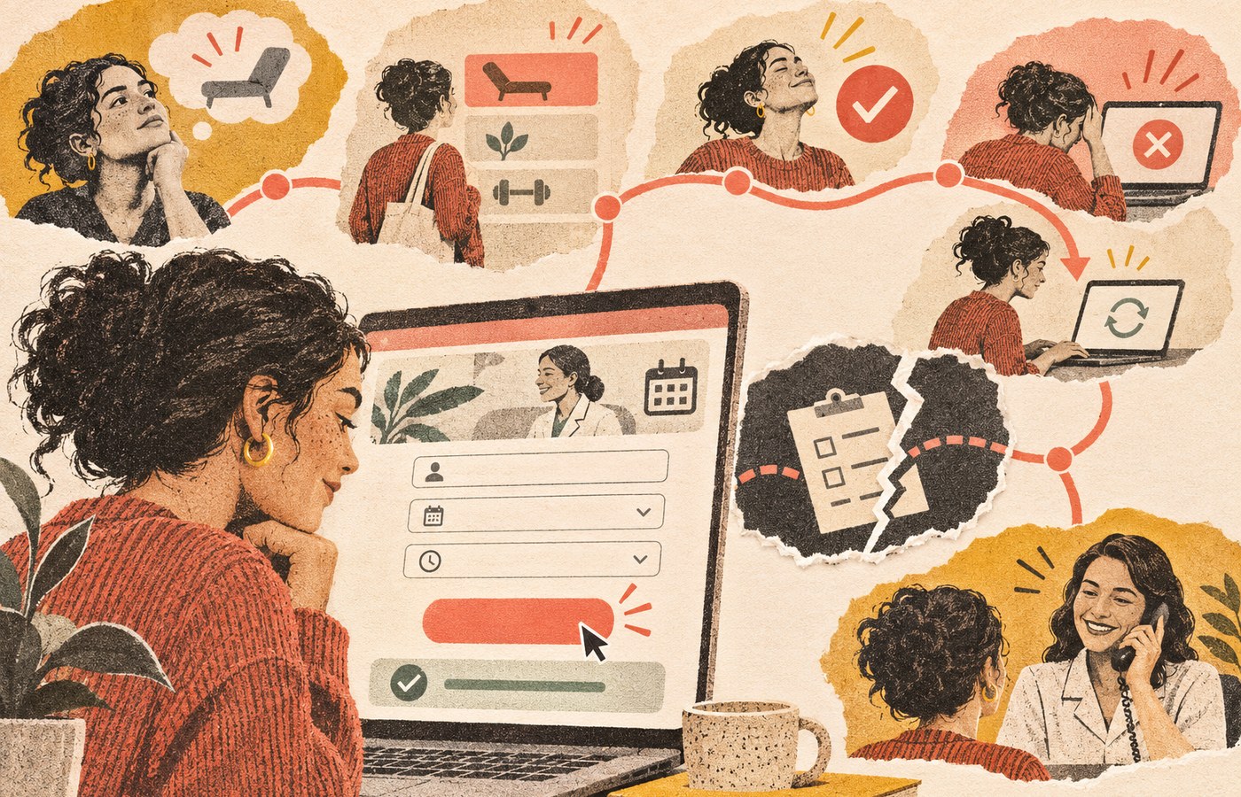
    Consider an appointment form for a professional service.

    The UI includes the calendar layout, readable labels, field spacing, selected-date state, button styling, validation messages, focus indicator, and confirmation screen.

    The UX includes whether the visitor knows which appointment type to choose, sees the information needed before committing, can find an available time, understands timezone and cancellation terms, completes the form without unnecessary questions, receives a trustworthy confirmation, and gets the promised follow-up.

    Now imagine the form is visually beautiful, but:

    • the service descriptions are vague;
    • every appointment type sounds the same;
    • the calendar has no mobile availability for six weeks;
    • an error deletes all entered information;
    • keyboard users cannot select a time;
    • the confirmation email goes to spam;
    • nobody on the business side checks the booking calendar.

    That is polished UI sitting inside a lousy experience. The gradient did its best. It was simply outnumbered.

    The reverse can also happen. A plain government or utility form may look dated but use clear labels, sensible sequencing, saved progress, specific error messages, and an immediate receipt. Its UI could use refinement while its core task experience is sound.

    The Scope Design Website Failure Stack

    When a website underperforms, teams often point at the visible layer because it is the easiest thing to see. That is how businesses end up buying a redesign when the offer, content, code, or follow-up process was broken.

    Use this stack from the top down. Upstream failures distort the evidence beneath them.

    A website journey passes through business purpose, information, task path, interface, implementation, accessibility, and evidence; a deeper break shows why visual polish alone may not fix the problem.
    The Website Failure Stack separates seven diagnostic layers. UX is what a person experiences when the whole stack meets reality.

    1. Business decision

    What is the website supposed to help which audience do, and why should that action matter to the business?

    This layer includes audience priority, positioning, offer, commercial outcome, qualification, and the role the website plays in acquisition or service. If the project has five equal audiences and nine equally urgent calls to action, the interface did not create the indecision. It inherited it.

    This is the territory of website strategy: determining the job before arguing about the curtains.

    2. Information

    What must a person understand, compare, and believe before taking the next step?

    This layer includes message, page hierarchy, explanations, evidence, pricing context, risks, objections, and readable content. If the headline says “Transforming Tomorrow Through Innovative Excellence,” the UI designer can make the type enormous, but the sentence will remain a beautifully typeset refusal to communicate.

    Our guide to design versus content explains how the message and its presentation hand work to each other. The website readability guide goes deeper on making that information understandable and scannable.

    3. Task path

    What sequence helps a person recognize the right option, understand it, choose, act, and recover?

    This is the most familiar UX-design layer: navigation, information architecture, task flows, progressive disclosure, forms, checkout, account creation, search, and recovery. A task path should reflect what the person is trying to accomplish, not the departments that attended the kickoff meeting.

    4. Interface

    How does the screen make the structure and available actions perceptible?

    This is the UI layer: visual hierarchy, layout, controls, states, typography, color, iconography, responsive patterns, and feedback. The interface should make important differences obvious without turning the page into a casino carpet.

    5. Implementation

    Does the built system faithfully and reliably perform the intended design?

    This layer includes semantic markup, responsive code, integrations, form delivery, data handling, browser behavior, reliability, and performance. A prototype can test beautifully and still become miserable when the production form times out or a script shifts the button as someone tries to click it.

    Google’s Web Vitals guidance treats loading, interactivity, and visual stability as measurable aspects of experience. Those signals matter, but they are engineering evidence—not a complete UX score. A fast page can still say nothing useful, and a perfect lab score cannot confirm that the sales team answered the inquiry.

    For the engineering side, see our web development and performance pillar.

    6. Access

    Can people with disabilities and people operating in varied real-world contexts perceive, understand, navigate, and interact with the experience?

    Accessibility overlaps with UI and UX, but it is not automatically satisfied by either label. The W3C Web Accessibility Initiative explains that accessibility includes underlying technical requirements as well as visual and interaction requirements. It also makes an important point: user involvement alone cannot cover the full diversity of disabilities and assistive technologies, while standards alone can miss the human interaction.

    That means “our designer thought it was usable” is not accessibility evidence. Neither is “the automated checker was green.” Our website accessibility guide explains the mixed evaluation required.

    Access is shown as a layer for diagnosis, but it is also a condition across every other layer. An inaccessible task is not a good experience with a minor compliance footnote. It is a task some people cannot complete.

    7. Evidence

    How will the team know where people succeed, hesitate, fail, abandon, complain, qualify, buy, or return?

    Evidence includes analytics, form errors, search queries, support questions, sales-call confusion, usability observation, accessibility evaluation, interviews, and downstream business outcomes. None is sufficient alone.

    Analytics can show where something happened, not reliably explain why. Interviews reveal perception, not always behavior. A heatmap shows that people clicked, not whether the click solved their problem. Sales feedback can expose poor fit or recurring objections, but it can also reflect a broken follow-up process. The point is triangulation, not worshipping whichever dashboard has the nicest gradient.

    How to Diagnose What Is Broken

    Start with the symptom, then identify the earliest failing layer that could produce it.

    Observed symptomLikely layer to inspect firstWhat to verify
    Visitors cannot explain what the business doesBusiness decision or informationaudience priority, offer, headline, message hierarchy
    The right people understand the offer but do not value itOffer, evidence, or sales positioningobjections, comparisons, proof, price-to-value logic
    People repeatedly get lost or choose the wrong routeTask pathnavigation labels, information architecture, sequence, recovery
    People miss actions or mistake text for controlsInterfacehierarchy, affordance, states, contrast, consistency
    A form works in a prototype but fails on real devicesImplementationvalidation, integrations, browsers, performance, delivery
    Keyboard or screen-reader users cannot complete the taskAccess and implementationsemantic structure, focus, labels, instructions, errors, testing
    The page gets little qualified trafficAcquisition or search intentquery and channel alignment, distribution, audience fit
    Leads arrive but nobody responds promptlyOperationsrouting, ownership, notifications, response process
    The team debates taste because nobody knows what happenedEvidenceoutcome definition, instrumentation, observation, feedback

    Diagnose in that order whenever possible. If almost no relevant people reach the page, conversion data will be noisy. If the form is broken, messaging tests are contaminated. If traffic is unqualified, improving completion may simply produce more efficiently processed junk.

    This is also why a broad “UX audit” can become a decorative PDF. The audit must connect observed problems to representative tasks, business consequences, and an owner who can fix the responsible layer.

    When Better UI Is the Right Fix

    UI work is likely appropriate when the structure and content are sound, but the presentation or interaction makes them difficult to perceive or operate.

    Typical UI problems include:

    • weak hierarchy makes every element look equally important;
    • interactive elements do not look interactive;
    • similar controls behave inconsistently;
    • important states such as loading, error, success, or disabled are missing;
    • typography or spacing makes useful content exhausting to read;
    • responsive layouts obscure the intended priority;
    • focus, hover, selected, and error states are unclear;
    • dense visual styling adds noise without adding meaning.

    The fix may involve a component system, clearer hierarchy, better responsive rules, explicit interaction states, more disciplined typography, or a visual redesign. But the brief should identify the specific interaction or comprehension problem. “Make it pop” is not a problem statement. It is how a meeting asks to become three more meetings.

    When UX Work Is the Right Fix

    UX work is likely appropriate when people have a meaningful goal but the structure of the experience makes success uncertain, inefficient, or frustrating.

    Typical UX problems include:

    • navigation reflects internal departments rather than customer intent;
    • important information appears after the decision that requires it;
    • forms ask for data the business does not need yet;
    • choices are difficult to compare;
    • users cannot tell what happens next;
    • error recovery forces people to start over;
    • mobile tasks require impractical precision or excessive steps;
    • support and sales repeatedly answer questions the site should address;
    • the digital handoff and the actual service contradict each other.

    Appropriate work may include research, task analysis, information architecture, journey mapping, prototypes, content design, usability testing, service-process changes, or interface changes. The deliverable depends on the diagnosed constraint.

    Our broader UX diagnosis and user-centered design guide covers how to identify and prioritize those experience failures.

    When the Problem Is Neither UI nor UX

    Sometimes the website is being blamed because it is visible and available for criticism.

    The traffic is missing or wrong

    A clear, usable page cannot convert people who never arrive. Nor can it rescue traffic generated by a misleading ad or an irrelevant search query. Segment the audience by source, landing page, and intent before rewriting the button.

    The offer is weak

    If qualified prospects understand the offer, navigate successfully, and consistently reject the value, the problem may be price, risk, timing, differentiation, or the offer itself. Better usability makes the rejection easier. That is not the lift the quarterly report had in mind.

    The content is evasive

    People cannot decide without useful information. Hiding price context, constraints, drawbacks, process, comparisons, or proof does not remove those questions. It leaves the visitor to answer them pessimistically.

    The technology is broken

    Lost form submissions, slow responses, layout shifts, failed integrations, browser bugs, and unreliable email delivery are implementation problems with UX consequences. Fix the system, not the mockup.

    The business drops the handoff

    The website produces a qualified inquiry. The notification goes to an abandoned inbox. Two days later, someone sends “just checking whether you still need help.” That is not a UI problem. It is the business mugging its own marketing in the parking lot.

    How to Evaluate UI and UX Without Making Up Certainty

    Observe representative people performing representative tasks

    The core of usability testing is gloriously unsexy: recruit people who resemble the intended audience, give them realistic tasks, and observe where they succeed or struggle without coaching them through the interface. The Nielsen Norman Group’s usability introduction frames usability through learnability, efficiency, memorability, errors, and satisfaction and recommends repeated testing throughout design.

    Do not ask, “Do you like this page?” Ask someone to determine whether a service fits their situation, find the relevant evidence, choose an option, submit the form, and explain what they expect to happen next.

    Review the built interface, not only the design file

    Check real devices and browsers. Use keyboard navigation. Enlarge text. Trigger validation errors. Use slow network conditions. Test interrupted and failed states. Confirm that form submissions arrive and confirmations are sent. A pristine design file is not the product customers use.

    Pair behavior with business evidence

    Connect page behavior to qualified outcomes:

    • Which sources produce people with the problem you solve?
    • Which tasks predict a useful sales conversation or successful self-service outcome?
    • Where do valid prospects stop?
    • What do sales and support repeatedly have to explain?
    • Which errors or questions signal confusion?
    • What happens after the website action?

    Sessions, clicks, scroll depth, bounce rate, and time on page are diagnostic signals, not business outcomes. A person who finds the phone number in ten seconds may be more successful than someone who spends six minutes trapped in your “immersive brand journey.”

    Use field and lab performance data correctly

    Lab tests help reproduce and debug performance problems under controlled conditions. Field data shows what eligible real users experienced over time. Neither tells you whether they understood the offer or trusted the business. Use performance data to diagnose the implementation layer, then combine it with task and outcome evidence.

    Prioritize by harm, reach, and leverage

    Fix failures that block important tasks, exclude people, corrupt data, or destroy trust before polishing minor inconsistencies. Then consider how many people encounter the problem, how severe the consequence is, and whether fixing an upstream issue resolves several downstream symptoms.

    Who Should You Hire: A UI Designer, UX Designer, Web Designer, or Developer?

    Hire for the diagnosed problem, not the trendiest job title.

    NeedLikely lead discipline
    Visual hierarchy, component styling, interaction states, responsive interfaceUI or product designer
    Research, task flows, information architecture, prototypes, usability testingUX designer or researcher
    Messaging, page narrative, explanations, evidence, readabilityContent strategist or web copywriter
    Positioning, audience priority, offer, conversion architectureWebsite strategist
    Semantic implementation, performance, integrations, reliabilityWeb developer or engineer
    Standards review plus disabled-user evaluationAccessibility specialist working with design and development
    A business website where all of these interactA multidisciplinary web team with clear ownership

    A capable web designer may cover UI, portions of UX, and visual communication. A capable developer may make excellent usability contributions. Titles overlap. Evidence matters more than labels: ask what the person will investigate, which decisions they own, how they test them, and what they do when the requested redesign is not the real fix.

    Our guide to what website design actually includes maps those responsibilities in more detail.

    A Better Brief Than “Improve the UI/UX”

    Replace the fog with a brief like this:

    Qualified visitors reach the service page from organic search, but many contact sales asking what the three service levels include. On mobile usability sessions, participants open multiple tabs and still cannot compare the options. We need to verify the information requirements, redesign the comparison task, implement it accessibly, and measure whether qualified visitors can choose the correct next step without assistance.

    That brief identifies the audience, observed problem, task, evidence, likely disciplines, implementation requirement, and desired outcome. It may produce content, UX, UI, accessibility, and development work. More importantly, it gives the team something better to discuss than whether the blue feels “premium enough.”

    If you need help determining which layer is actually failing, talk to Scope Design. We would rather diagnose the constraint than sell you a handsome redesign of the wrong problem.

    Frequently Asked Questions

    What is the basic difference between UI and UX?

    UI is the presentation and interaction layer of a digital product: layout, visual hierarchy, controls, and feedback. UX is the broader experience a person has while trying to achieve a goal across the interface, content, technology, and surrounding service.

    What are examples of UI and UX?

    A checkout button’s size, label, color, focus state, and loading state are UI. Whether a buyer can choose the right product, understand the total cost, complete payment, recover from an error, and receive the order confirmation is UX.

    Is web design UI or UX?

    Web design can include UI and portions of UX, but the label is broad. Some web designers focus mostly on visual presentation; others handle research, information architecture, content structure, accessibility, and testing. Ask what the actual process and responsibilities include.

    Which comes first, UI or UX?

    The business purpose, audience, information requirements, and core task should be understood before polishing the interface. UI and UX still develop iteratively: interface prototypes reveal experience problems, and testing changes both the flow and presentation.

    Can a website have good UI but bad UX?

    Yes. A site can look consistent and sophisticated while hiding important information, using a confusing task flow, failing accessibility requirements, breaking on real devices, or neglecting the customer after submission.

    Can a website have good UX but unattractive UI?

    It can have a useful core task experience despite dated or plain visual styling. However, unclear hierarchy, poor typography, weak interaction states, and inconsistent controls eventually affect usability and trust. “It works” is a baseline, not an excuse for visual neglect.

    Is accessibility part of UX or UI?

    Accessibility overlaps both and also has distinct requirements. Visual contrast and control states involve UI; task completion and error recovery involve UX; semantic code and assistive-technology support involve implementation. Accessibility needs standards-based evaluation and involvement from people with disabilities.

    Does page speed affect UX?

    Yes. Slow loading, delayed interaction, and shifting layouts can prevent or disrupt tasks. Performance is one contributor to UX, not a complete measure of it. A fast website can still be confusing, irrelevant, or inaccessible.

    Why is my attractive website not converting?

    Appearance is only one layer. The site may have the wrong traffic, an unclear offer, missing evidence, weak content, a confusing task path, technical failures, accessibility barriers, or poor sales follow-up. Diagnose the earliest failing layer before changing the visual design.

    How do you measure website UX?

    Use a combination of representative-task testing, completion and error evidence, accessibility evaluation, analytics, performance data, support and sales feedback, and downstream business outcomes. No single “UX score” explains the whole experience.

    Do small business websites need UX research?

    They need evidence from the people and tasks that matter, but not necessarily a giant research program. A few carefully chosen interviews and observed task sessions, combined with real inquiries, analytics, and support questions, can expose more than an underpowered button-color test.

    Should I redesign my website to improve UX?

    Only when the diagnosis shows that the structure or interface requires broad change. Many problems can be fixed through content, navigation, forms, accessibility, performance, or operational repairs. A redesign is a delivery option, not a diagnosis.

    Do I need both a UI designer and a UX designer?

    Not always as separate people. You need both responsibilities covered at the depth the project requires. A small site may use one multidisciplinary designer with specialist support; a complex application may require dedicated research, UX, UI, content, accessibility, and engineering roles.

    The Useful Answer

    UI and UX are not rivals, synonyms, or magic conversion dust. UI is the part of the system people see and operate. UX is what they experience while pursuing a goal through that system.

    The responsible question is not “Should we invest in UI or UX?” It is: Which layer is preventing the right person from reaching a useful outcome, what evidence proves it, and who owns fixing it?

    Answer that first. Then you can decide whether you need a clearer message, a better task path, a stronger interface, more reliable code, improved accessibility, a repaired handoff—or, occasionally, the redesign everyone had already put in the budget.

  • How to Rank Higher on Google: Fix the Seven Things Holding Your Page Back

    How to Rank Higher on Google: Fix the Seven Things Holding Your Page Back

    Direct answer: To rank higher on Google, choose a search intent worth winning, make sure Google can crawl and index the right page, answer that intent better than the current results, add evidence competitors cannot copy, make the experience easy to use, connect the page to genuine authority, and measure whether the right visitors act. You do not need 200 mystery “ranking factors.” You need to find the weakest layer in the system and fix the damn thing.

    TL;DR: Use this order:

    1. Pick a query connected to a customer and business outcome.
    2. Confirm the intended page is crawlable, indexable, canonical, and internally discoverable.
    3. Match the page format and answer to what searchers are actually trying to do.
    4. Add original expertise, proof, sources, and useful detail.
    5. Remove mobile, speed, accessibility, navigation, and conversion friction.
    6. Build relevant internal links, topic depth, and earned external authority.
    7. Track impressions, clicks, qualified actions, and business value—then improve the actual constraint.

    Ranking higher is not a single optimization task. It is the result of several conditions being true at the same time. Skip one and the rest can become expensive theater.

    First, stop trying to rank “the website”

    Google does not hand an entire website one tidy ranking. A particular page can appear for a particular query, person, place, device, and moment. The same page may rank well for one phrase, barely appear for another, and be completely wrong for a third.

    That matters because “make us rank higher” is not yet a usable strategy. Higher for what? In front of whom? On which page? And what should that person do next?

    A commercial service page attracting 80 qualified prospects can be more valuable than an article attracting 8,000 people who will never buy. Rankings help explain visibility. They are not the business outcome.

    Scope Design’s broader SEO strategy and analytics framework connects search demand to qualified action. This guide focuses on the narrower problem: what usually prevents an individual page from earning better visibility.

    The Scope Design Page-One Readiness Stack

    Most ranking guides dump a list of tactics on the table and leave the business owner to guess which one matters. The Page-One Readiness Stack is a diagnostic order: demand, eligibility, intent, evidence, experience, authority, and outcome.

    Seven layers that support search visibility: demand, eligibility, intent, evidence, experience, authority and business outcome, connected by a diagnostic path.

    Layer Question What to inspect Common waste of time
    Demand Is this a query worth winning? Search demand, buyer fit, commercial relevance, sales questions Chasing volume that attracts the wrong audience
    Eligibility Can Google reliably find, crawl, index, and select the page? Status code, robots, canonical, sitemap, rendering, internal links Rewriting a page that is accidentally noindexed
    Intent Does the page perform the job behind the search? Current results, page type, format, depth, direct answer Forcing a blog post into a query that wants a product or local result
    Evidence Is the answer useful, original, and trustworthy? First-hand expertise, examples, sources, proof, limitations Rephrasing the same ten tips already ranking
    Experience Can a person use the page without fighting it? Mobile layout, accessibility, speed, navigation, forms, interruptions Chasing a perfect lab score while the CTA is broken
    Authority Why should this page and source be believed? Topic depth, internal links, earned mentions, reputation, authorship Buying a sack of unrelated backlinks from a stranger in a Telegram group
    Outcome Did better visibility create useful business activity? Qualified inquiries, purchases, calls, pipeline, assisted conversions Celebrating traffic that creates no value

    The stack is ordered for diagnosis, not because Google publishes seven neat buckets. Google uses many automated systems and signals. The practical point is simpler: there is little value polishing a title while the page is excluded from the index, and little value winning a query that produces no useful customer action.

    1. Choose demand connected to the business

    Start with the customer, not the keyword tool.

    List the questions people ask before they become a good customer:

    • What problem are they trying to solve?
    • What options are they comparing?
    • What does it cost?
    • What can go wrong?
    • How do they choose a provider?
    • What makes them hesitate?
    • What do they need to believe before contacting you?

    Then use keyword and search-result research to learn how that demand is expressed. Volume is useful, but it is not a moral score. A lower-volume query closely connected to a profitable service may deserve more attention than a giant informational query dominated by students and tire-kickers.

    Assign each meaningful intent to one primary page. If three articles are targeting the same basic question, you probably do not have a content cluster. You have three pages elbowing each other in a hallway.

    Before creating something new, decide whether to:

    • protect an existing page that already performs;
    • expand a page whose intent is right but answer is incomplete;
    • consolidate overlapping pages;
    • redirect an obsolete duplicate; or
    • create a page because no suitable owner exists.

    Our SEO basics guide explains how to map important search intents to clear page owners without producing a beige warehouse of near-duplicates.

    2. Confirm the page is eligible to appear

    Before improving the copy, make sure Google can access and select the page.

    Check that the URL:

    • returns a successful response;
    • is not blocked by robots.txt or a noindex directive;
    • uses the intended canonical URL;
    • is included in the sitemap when appropriate;
    • can be reached through normal crawlable links;
    • renders its important content as readable text;
    • does not depend on broken scripts or resources;
    • works on the mobile version Google and customers see; and
    • is not trapped behind a redirect chain, login, error, or security warning.

    Use Google Search Console’s URL Inspection and Page Indexing reports to see what Google discovered and selected. A site: search can provide a quick clue, but it is not a replacement for Search Console diagnostics.

    Google’s SEO Starter Guide says there are no secrets that automatically rank a site first. It starts with helping search engines find, crawl, index, and understand the content. Boring? Sometimes. Also preferable to publishing twelve new articles while the template emits the wrong canonical.

    If a migration or URL change is involved, preserve intent with a permanent redirect and update internal links at their source. Our 301 redirect guide covers the mechanics and the reasons not to change established URLs for cosmetic thrills.

    3. Match the page to search intent

    A page can be technically perfect and still be the wrong answer.

    Search the target query and inspect what Google currently presents:

    • Are the leading results service pages, product pages, guides, comparison articles, videos, maps, forums, or tools?
    • Does the searcher want to learn, compare, buy, visit, calculate, or troubleshoot?
    • Is the query local, visual, transactional, or time-sensitive?
    • What follow-up questions appear in People Also Ask?
    • What information do the strongest pages make easy to find?
    • What important question do they all dodge?

    Do not copy the ranking pages. Use them to identify the job. Then build a better way to perform that job.

    For an informational article, that usually means answering the main question immediately, explaining the reasoning, covering consequential follow-ups, citing primary sources, and giving the reader a practical next step. For a service page, it may mean making the offer, fit, process, proof, cost variables, and next action painfully clear.

    Keywords belong in the page because they describe the subject, not because repeating them seven times opens a secret Google hatch. Use the language customers use in the title, H1, opening, headings, links, and body where it is natural. Google’s language systems can understand related phrasing; your reader should not have to endure an exact-match hostage note.

    4. Add evidence competitors cannot copy

    Generic advice is easy to produce and increasingly easy to summarize without citing you. A page becomes more valuable when it contains something specific enough to verify and useful enough to reuse.

    Strong evidence can include:

    • first-hand project experience;
    • an original framework or diagnostic;
    • documented examples;
    • a real process, worksheet, checklist, or calculator;
    • screenshots or demonstrations;
    • original research or analysis;
    • primary-source citations;
    • an honest comparison of tradeoffs;
    • clear limitations and cases where the advice does not apply; and
    • a named author with relevant experience and accountability.

    Google’s people-first content guidance asks whether content provides original information, substantial value, clear sourcing, and demonstrable first-hand expertise. It also explicitly says E-E-A-T is not one specific ranking factor. Treat it as a way to assess whether the page earns trust—not a seasoning to sprinkle into the footer.

    This is also where AI-assisted content often falls on its face. AI can help organize research, extract patterns, draft structures, and challenge gaps. It cannot manufacture Greg’s experience, make an unsupported statistic true, or provide permission to expose a client’s internal systems. Fluency is not evidence.

    5. Make the page easy to use

    Page experience matters because people need to read, understand, navigate, and act. It is not an excuse to turn Lighthouse into a competitive sport.

    Inspect the real page on real devices:

    • Is the answer visible without fighting a popup?
    • Is text readable and contrast sufficient?
    • Can keyboard and assistive-technology users navigate it?
    • Do headings and spacing make the page scannable?
    • Are images compressed, dimensioned, and given useful alternative text?
    • Does the page load and respond reasonably on a typical mobile connection?
    • Do menus, links, forms, filters, and booking tools work?
    • Is the primary action obvious?
    • Does anything move, flash, autoplay, or interrupt without helping?

    Google’s page-experience guidance recommends evaluating the overall experience rather than obsessing over one signal. Core Web Vitals can reveal loading, responsiveness, and stability problems, but a perfect score cannot rescue a page that answers the wrong question.

    Test the conversion path yourself. Submit the form. Check the inbox. Complete the purchase. A ranking campaign that sends more people into a broken contact workflow is not growth; it is queueing customers for disappointment.

    6. Build topical and external authority

    One strong page rarely lives alone. It should be part of a coherent body of useful knowledge.

    A legitimate topic cluster has:

    • a pillar that explains the larger system;
    • supporting pages with distinct jobs;
    • contextual links between genuinely related pages;
    • descriptive anchor text;
    • minimal duplication; and
    • a commercial path that helps the right reader take the next step.

    Internal links help people continue their research and help search systems discover and understand relationships. Google’s link guidance recommends crawlable links and descriptive anchor text.

    External authority is earned when other relevant sources have a reason to mention or link to the work. Useful ways to earn it include original research, expert commentary, public tools, genuinely good resources, partnerships, community involvement, and work worth discussing.

    Do not confuse authority with ordering 300 links from websites that appear to have been assembled during a power outage. Google’s spam policies prohibit link schemes and other tactics designed primarily to manipulate rankings.

    For local businesses, authority also includes a verified, complete Google Business Profile, accurate information, appropriate categories, useful photos, and real reviews. Google’s local ranking guidance describes relevance, distance, and prominence as the primary local factors and says there is no way to request or pay for a better local ranking. Our local SEO guide goes deeper into the local system.

    7. Measure the outcome and improve the constraint

    Track enough of the search journey to know what changed:

    • impressions and query mix;
    • clicks and click-through rate;
    • landing pages and devices;
    • indexing and technical errors;
    • qualified inquiries;
    • calls and booked appointments;
    • purchases and revenue;
    • sales-qualified opportunities and pipeline; and
    • assisted conversions for longer buying journeys.

    Average position can help diagnose visibility, but it is an average across different queries, devices, locations, and moments. It is not the score of your website’s worth as a person.

    Choose the last meaningful action the website can influence, then connect that action to downstream quality or revenue where possible. Our guide to SEO metrics that matter explains the measurement hierarchy.

    Record the date and substance of meaningful changes. Give search systems time to recrawl and reassess. Google’s Starter Guide says some changes can appear within hours while others may take several months, and recommends waiting at least a few weeks to judge many improvements. There is no universal “rank by Tuesday” switch.

    If rankings suddenly drop, do not assume the page needs more words. Use the Scope Design Search Change Triage to separate measurement, technical, demand, intent, content, and business-impact problems.

    A practical 30-day plan to improve Google rankings

    Week 1: Establish the baseline

    1. Pick one commercially relevant page and its primary intent.
    2. Record current Search Console queries, impressions, clicks, and positions.
    3. Record relevant Analytics actions and lead quality where available.
    4. Inspect the URL, canonical, robots directives, sitemap, rendering, mobile layout, and links.
    5. Test the form, booking tool, phone tracking, or purchase path.

    Do not begin with seventeen pages. Choose one page close enough to business value that an improvement would matter.

    Week 2: Fix intent and content

    1. Compare the page with the current result set.
    2. Rewrite the title and opening so the job is obvious.
    3. Put the direct answer near the top.
    4. Add the missing questions, comparisons, costs, risks, or next steps.
    5. Remove stale claims, repetition, and sections that belong on another page.

    Week 3: Add evidence and connections

    1. Add a first-hand example, framework, demonstration, or useful artifact.
    2. Cite primary sources for material factual claims.
    3. Strengthen authorship and business identity.
    4. Add contextual links from related articles, the appropriate pillar, and relevant service pages.
    5. Identify one legitimate promotion or outreach opportunity.

    Week 4: Publish, annotate, and observe

    1. Verify the live title, canonical, robots, schema, links, images, and responsive rendering.
    2. Request recrawling for an important updated URL when appropriate.
    3. Annotate the change in Analytics and the content ledger.
    4. Watch for indexing, query, click, and qualified-action changes.
    5. Avoid thrashing the page because Tuesday looked weird.

    How does this help with AI search citations?

    Google says its AI features do not require special technical markup or a separate secret optimization. Pages still need normal crawl and index eligibility, useful text, accurate structured data, internal links, and a good page experience.

    For traditional and AI-assisted discovery, make the page easy to interpret and worth citing:

    • answer the direct question early;
    • use descriptive headings;
    • name entities and relationships clearly;
    • distinguish fact, experience, and opinion;
    • link claims to authoritative sources;
    • publish original frameworks, data, examples, or tools;
    • show who created or reviewed the content;
    • keep structured data consistent with what people can see; and
    • earn relevant third-party mentions over time.

    No one can guarantee an AI citation. The DataForSEO AI-query research for this article returned plenty of confident recommendations backed by secondary agency pages and very little primary evidence. That is the opportunity: do not merely sound complete. Be the page with a clear answer, attributable expertise, and sources strong enough that another system does not have to guess where the claim came from.

    What will not reliably make a page rank higher?

    • A perfect plugin score: It checks patterns, not market fit, truth, originality, or business value.
    • More words by default: Google says there is no preferred minimum or maximum word count.
    • Keyword stuffing: It creates miserable copy and violates spam policy when used excessively.
    • Changing the date without updating the page: Cosmetic freshness is not substantive maintenance.
    • Adding every possible schema type: Structured data must describe visible content and only creates eligibility for supported features.
    • Publishing more overlapping pages: Duplicate intent fragments signals and gives readers several mediocre answers instead of one strong one.
    • Buying links: Manipulative links can create risk without creating real authority.
    • Treating E-E-A-T as a single ranking factor: Google explicitly says it is not one.
    • Guaranteeing first place: Google does not guarantee indexing, ranking, or a particular timeline. Neither can your favorite “growth hacker.”
    • Fixing the wrong layer: Better copy cannot repair a blocked page; faster hosting cannot create demand for a useless offer.

    Frequently asked questions about ranking higher on Google

    How do I improve my Google ranking?

    Choose a relevant query and page, confirm the page can be crawled and indexed, match the current search intent, provide a more useful and original answer, improve the real user experience, strengthen relevant internal and external authority, and measure whether qualified visitors act. Diagnose the weakest layer instead of applying every tactic at once.

    Can I pay Google to rank higher?

    You can pay for Google Ads placements, but advertising does not buy a higher organic ranking. Google also says businesses cannot request or pay for better local rankings. Paid and organic visibility are separate systems and should be measured separately.

    Can I do SEO myself?

    Yes. Business owners often have the customer knowledge and first-hand expertise required for the most valuable work. You can improve page titles, answer real customer questions, add proof, strengthen internal links, maintain your Business Profile, and use Search Console. Hire help when technical risk, scale, migrations, measurement, or limited capacity makes the learning curve expensive.

    How long does it take to rank higher on Google?

    There is no universal timeline. Google says some changes may appear within hours while others can take several months, and many improvements need at least a few weeks before you can judge them. Competition, crawl frequency, site history, intent, content quality, authority, and the size of the change all matter.

    Is a 75 SEO score good?

    A plugin score of 75 means the page passed some of that plugin’s checks. It does not tell you whether the query is valuable, the answer is accurate, Google indexed the intended URL, the page is better than competing results, or the traffic converts. Use the score as lint, not a quarterly objective.

    Do Google reviews help a website rank higher?

    Reviews are especially relevant to local visibility and buyer trust. Google says review count and positive ratings can contribute to local prominence. Reviews are not a universal shortcut for every organic web result, and fake or incentivized reviews create policy and reputational risk.

    Links remain useful for discovery, context, and authority, but relevance and legitimacy matter. Earn links and mentions because the work is useful, original, or newsworthy. Avoid buying manipulative links or treating a third-party authority score as Google’s private control panel.

    Does schema markup improve rankings?

    Accurate structured data helps Google understand a page and can make it eligible for supported search features. It does not guarantee a rich result or higher ranking, and it cannot rescue thin or misleading content. Markup must match the visible page.

    Can ChatGPT or another AI tool make my website rank?

    AI can assist with research organization, outlines, content review, extraction, and repetitive analysis. It cannot guarantee rankings, create genuine experience, or make unsupported claims true. Use AI to accelerate reviewable work, then apply human expertise, source verification, and accountability.

    Why is my website not ranking on Google?

    Common causes include insufficient demand, the wrong page targeting the query, crawl or index problems, mismatched intent, weak or unoriginal content, poor usability, limited authority, intense competition, or simply not allowing enough time for evaluation. Inspect those layers in order rather than guessing.

    What is the fastest way to rank on Google?

    The fastest defensible path is usually improving an established page that already receives relevant impressions but underperforms in position, clicks, usefulness, or conversion. Brand-new pages and competitive queries may take much longer. Anyone promising an instant first-place ranking is offering certainty the search engine itself does not provide.

    Rank for a reason

    Ranking higher can be valuable when the query belongs to a potential customer, the page helps them make a decision, and the website can turn that attention into a useful next step. Otherwise, first place is just a very visible way to attract the wrong crowd.

    If you need help identifying whether the constraint is demand, technical eligibility, content, authority, or measurement, review Scope Design’s SEO services or contact Scope Design to start with a diagnosis.

    Sources

  • Email Marketing Roadmap for Local Business: Build the System in the Right Order

    Email Marketing Roadmap for Local Business: Build the System in the Right Order

    An effective email marketing roadmap for a local business is not “send a newsletter every Tuesday.” Build the relationship in order: earn permission, deliver the promise that caused the signup, install one useful lifecycle flow, connect replies and clicks to a real owner, measure what changes in the business, then add segmentation, re-engagement, and more automation only when the earlier layers work.

    That order matters because email software makes it very easy to automate a mess. A beautifully designed six-email sequence is still a mess if nobody knows why it exists, where a reply goes, when a customer should stop receiving it, or whether it helped produce a booking, sale, renewal, visit, referral, or useful conversation.

    The email marketing roadmap in one sentence

    Permission → promise delivery → one stable lifecycle flow → recurring useful communication → justified segmentation → re-engagement → evidence-based refinement.

    If you need the broader strategy behind audience, lifecycle, list ownership, and message jobs, start with Scope Design’s small-business email marketing strategy. This page owns a narrower question: what should you build first, and what should wait?

    • Start with one customer relationship. “Everyone on our list” is not a relationship.
    • Make permission legible. Know where the address came from and what the person expected.
    • Deliver before you nurture. If the signup promised a guide, discount, appointment confirmation, event update, quote, or account access, complete that job first.
    • Automate repeated friction, not imagination. Build around moments that happen often enough to deserve a system.
    • Measure downstream consequences. Opens are a diagnostic. They are not revenue wearing a tiny hat.

    The Scope Design MAILER Roadmap

    We use six build-order checks to keep an email program from turning into a pile of disconnected campaigns. The sequence is called MAILER: Map, Acquire, Install, Link, Evaluate, Retire.

    Six connected steps for an email program: map the relationship, acquire permission, install one useful flow, link replies to an owner, evaluate outcomes, and retire or refine from evidence.

    M — Map one relationship and outcome

    Start with a real moment in the customer journey. A local contractor might need to acknowledge quote requests and prepare people for an estimate. A dental office might need appointment preparation and follow-up. A retailer might need first-purchase onboarding and useful product updates. A local event might need registration confirmation, reminders, and post-event follow-up.

    Write the outcome before you write the sequence: “The person receives what we promised, knows the next step, and the right staff member can see or act on the response.” That sentence is more useful than “build a five-email nurture flow.”

    A — Acquire permission and source provenance

    Know where the address came from: website form, checkout, appointment request, event registration, in-store signup, existing customer relationship, or another documented source. Then match the message to the permission and expectation created there.

    For a deeper local treatment, Scope Design’s local email marketing guide covers how to use location and customer context without turning personalization into surveillance theater.

    I — Install the smallest useful lifecycle path

    Build the smallest automation that completes a repeated job. For many businesses, that is a welcome or promised-resource flow. For others, it is inquiry acknowledgement, appointment preparation, onboarding, post-purchase education, renewal reminders, or service follow-up.

    If the first automated relationship is a welcome flow, our welcome email series guide goes deeper on what each message should accomplish. The important part here is order: prove one lifecycle path before building six more because your platform has six more templates.

    L — Link responses to a real owner

    What happens when someone replies, clicks “book,” requests a quote, changes a preference, complains, buys, or does nothing? If the answer is “the marketing platform tracks it,” you have described storage, not ownership.

    Decide which system becomes the source of truth and who owns the next action. That might be a CRM, appointment platform, help desk, ecommerce system, shared inbox, or a very boring spreadsheet that the team actually uses. Boring and reliable beats sophisticated and abandoned.

    E — Evaluate business outcomes, not just opens

    Track delivery and engagement, but connect them to a business consequence: qualified replies, booked appointments, completed registrations, first purchases, repeat purchases, renewals, referrals, support deflection, reduced no-shows, or another outcome that matches the job.

    Open data deserves special caution. Apple Mail Privacy Protection can prevent senders from learning whether protected recipients opened a message. Opens can still help diagnose patterns inside your own program, but they are a weak foundation for claiming business value.

    R — Retire, refine, or expand from evidence

    An automation should earn the right to stay. Fix stale copy, broken links, duplicate flows, bad routing, weak triggers, irrelevant segments, and messages that outlived the business process they were built around. Expand only when the current layer has a measurable job and a responsible owner.

    Build email in this order, not all at once

    The roadmap below is intentionally boring. That is a feature. Most local businesses do not need an eleven-branch automation diagram on day one. They need a reliable path from permission to useful communication to a real business outcome.

    Build layerJobReady whenDo not add yet if…
    1. Permission foundationCollect addresses with a clear promise and source recordYou know why each person is on the list and what they reasonably expectYou are importing mystery lists or mixing unrelated audiences
    2. Promise / welcomeDeliver the signup outcome and set expectationsThe promised asset, confirmation, access, or next step works reliablyReplies vanish or delivery is inconsistent
    3. Core lifecycle flowSolve one repeated customer momentTrigger, owner, stop conditions, and outcome are documentedThe underlying business process is still changing weekly
    4. Recurring communicationKeep useful continuity through newsletters or campaignsYou have something worth saying and a realistic production rhythmYou are sending only because the calendar says Tuesday
    5. SegmentationChange the message when context materially changes the decisionDifferent groups genuinely need different content, timing, or offersThe segments exist only because the software can create them
    6. Re-engagementClarify whether a dormant relationship should continueYou can define inactivity using the buying cycle and meaningful behaviorYou are labeling people “inactive” from open data alone
    7. OptimizationImprove the system from evidenceYou can compare the outcome before and after a specific changeYou are testing subject-line punctuation while routing is still broken

    What each email layer is actually for

    Different email assets have different jobs. Shoving every goal into one newsletter is how useful communication turns into a company bulletin nobody requested.

    Welcome emails complete a promise

    A welcome series should deliver what started the relationship, identify the sender, reduce uncertainty, and make the next step clear. It is not required to be three emails, five emails, or seven emails. The right length is the number of messages needed to complete the job without manufacturing filler.

    Newsletters create useful continuity

    A newsletter works when the business repeatedly has useful material worth sending: answers to customer questions, lessons from real work, relevant local updates, useful comparisons, new resources, project evidence, or a clear offer that fits the relationship. Our email newsletter strategy owns that deeper editorial question.

    Campaigns ask for a specific action

    A campaign can promote an event, seasonal service, product launch, appointment opening, deadline, maintenance window, or another real reason to act. The action should be proportionate to the relationship. A useful email can ask for a sale. It does not need to pretend every promotion is education.

    Re-engagement clarifies a fading relationship

    Do not define a dormant subscriber from one arbitrary timer. A weekly retailer and a company that replaces roofs every twenty years have different buying cycles. If inactivity is a real issue, use Scope Design’s re-engagement email framework to decide what evidence should trigger a win-back attempt, preference update, or suppression decision.

    Make local email useful without making it creepy

    “Local” is not a merge tag. A city name jammed into a subject line does not create relevance. Local context earns its place when it changes the message: a service area, store location, event, weather-driven need, appointment availability, local regulation, regional season, pickup option, community partnership, or other real difference.

    Use information the customer knowingly provided or would reasonably expect you to have. A person who selected the Corning store can reasonably receive Corning-specific hours. A person who bought a mower does not need an email announcing that your database knows where they sleep. Personalization should reduce friction, not demonstrate database ownership.

    For multi-location businesses, segment only when location changes availability, service, staffing, event details, inventory, timing, or another meaningful decision. Otherwise you are maintaining extra segments for sport.

    Deliverability and compliance are part of the product

    An email strategy fails if wanted mail cannot reach the inbox or if the business treats compliance like boilerplate added after the campaign is finished.

    For U.S. commercial email, the FTC’s CAN-SPAM guidance requires accurate sender information, non-deceptive subject lines, a valid physical postal address, a clear way to opt out, and honoring opt-out requests within 10 business days. Other countries and use cases can impose stricter requirements, so this article is not individualized legal advice. Scope Design’s email marketing laws guide goes deeper on jurisdiction and message type.

    Mailbox-provider rules matter too. Gmail’s current sender guidance requires authentication and sets additional requirements for senders who reach its bulk-sender threshold, including DMARC and one-click unsubscribe for qualifying marketing and promotional traffic. The practical small-business lesson is simpler than the protocol alphabet soup: authenticate the sending domain, send mail people actually asked for, make leaving easy, watch complaints and bounces, and do not assume your platform vendor owns the responsibility.

    If you are moving beyond ordinary customer campaigns into higher-volume sending, read our guide to sending bulk email without becoming the spam problem.

    Measure what changed in the business

    Hope is not a measurement plan, and an open-rate screenshot is not a sales report. Start with the job of the email, then choose the closest evidence that proves the job happened.

    Email jobUseful operational evidenceBusiness outcome to connect
    Deliver a promised resourceDelivery success, clicks, access completion, repliesCorrect onboarding or next-step completion
    Prepare an appointmentClicks, confirmations, replies, completed formsAttendance, fewer no-shows, staff time saved
    Promote an offerQualified clicks, coupon/code use, repliesOrders, booked work, margin, qualified leads
    Support repeat purchaseClicks, product/service interest, timing responseRepeat revenue, reorder interval, customer retention
    Re-engageClicks, preference changes, replies, unsubscribesRecovered active relationships or a cleaner sending audience

    Campaign metrics still matter. Delivery, bounce, complaint, unsubscribe, click, and reply behavior can expose problems. Use them as diagnostic layers around the business outcome. Do not promote a diagnostic to CEO because it is easier to export.

    Choose software after you know the workflow

    The “best” email marketing platform for a small business is the least complicated system that can reliably support the jobs you actually have. Start with requirements, not logos.

    • Permission and source tracking: Can you preserve how and why a person joined?
    • Authentication and deliverability controls: Can the platform support your domain setup and suppression rules?
    • Automation: Can it trigger the few lifecycle flows you genuinely need?
    • Segmentation: Can it use the customer fields that materially change a message?
    • Integrations: Does it connect cleanly to your CRM, ecommerce, POS, appointment, event, or support system?
    • Replies and handoff: Can a real person see and act on customer intent?
    • Measurement: Can you connect campaign activity to the business event you care about?
    • Portability: Can you export the audience and important history if the platform stops fitting?

    A drag-and-drop editor is convenient. It is not a strategy. If two platforms can do the job, choose the one your team can maintain without needing a part-time archaeologist six months from now.

    What auditing this exact page taught us

    We used the same evidence rule on this revision instead of protecting old copy because it had already survived on the site for a while. The previous version leaned on a long list of tidy percentages: ROI claims, open-rate benchmarks, mobile-open shares, subject-line lifts, universal send times, and revenue projections. Most were not attached to a current claim ledger.

    The page also had almost no demonstrated search or business-performance footprint to protect. For the 12 complete months ending August 19, 2026, GA4 returned no Organic Search landing rows for the exact page. Search Console returned no exact-page performance rows and currently reports Crawled – currently not indexed. Bing reports zero clicks and zero impressions. Ubersuggest returned no exact-page ranking keywords or backlink rows.

    That does not prove the topic is bad, readers disliked the page, or this revision will rank. Scope Design’s current analytics setup also has known attribution and key-event limitations. It supports a narrower decision: keep the established URL, remove numbers we cannot defend, give the article one clear job, connect it to the correct marketing cluster, and make the content more useful than the old benchmark pile.

    The larger channel context belongs in Scope Design’s small-business marketing strategy. Email is an owned relationship channel inside that system, not a magic growth machine operating in a vacuum.

    Frequently asked questions about small-business email marketing

    What is the best email marketing for a small business?

    The best setup is the simplest system that supports your permission model, one or two important lifecycle flows, the integrations your staff actually uses, reliable sending, and measurement tied to a business outcome. Do not choose a platform because a roundup put it at number one. Choose it because it fits the workflow you can maintain.

    Is email marketing still worth it in 2026?

    Yes when your business has a permissioned audience, something useful to communicate, a clear next step, and a way to connect responses to sales or service outcomes. No channel is automatically “worth it.” If the list is poor, the offer is irrelevant, follow-up is broken, or nobody can measure the result, sending more email will mostly scale the problem.

    How often should a local business send marketing email?

    Use the frequency your audience, buying cycle, and content supply can support without manufacturing messages. A restaurant with weekly specials and an annual-service contractor do not need the same cadence. Start with a sustainable rhythm, watch complaints, unsubscribes, clicks, replies, and business outcomes, then adjust.

    What is the 80/20 rule in email marketing?

    It is a rule of thumb, not a law. Depending on who is using the phrase, it may mean “mostly value, occasionally promotion” or a Pareto-style observation about customers and results. Neither interpretation should dictate your calendar. Give each email one honest job. Sometimes the useful job is education. Sometimes it is asking the right customer to buy.

    What is the 3-email rule?

    There is no universal three-email formula that fits every local business. Three messages can be perfect for a short event reminder and inadequate for a complex onboarding process. Sequence length should come from the job, the amount of uncertainty, and the customer’s next steps—not a number that photographs well in a template.

    How much is a 1,000-person email list worth?

    There is no responsible flat-dollar answer. The value depends on how the addresses were acquired, whether people still want the messages, purchase frequency, margin, retention, list concentration, deliverability, and how well email assists real customer outcomes. One thousand relevant customers can be useful. One thousand mystery addresses can be a liability with a CSV extension.

    When should a small business add segmentation?

    Add a segment when the difference changes the message, timing, offer, route, or decision. Examples include location, service type, lifecycle stage, purchase category, appointment status, or a declared preference. Do not create twelve segments to prove your software subscription has features.

    Build the next useful layer, not the biggest stack

    A strong email marketing roadmap is an operating sequence. Map the relationship. Acquire permission. Install one useful path. Link response to ownership. Evaluate the business outcome. Retire what does not earn its keep. Then build the next layer.

    If your local business already has a list but the pieces are scattered across forms, a CRM, an email platform, a booking tool, and somebody’s memory, Scope Design can help turn that pile into a maintainable system. We can audit the current path, clarify the message jobs, write the copy, connect the tools, and build only the automation the business is actually ready to own.

  • SEO Keywords and Word Choice: What Actually Drives Traffic

    SEO Keywords and Word Choice: What Actually Drives Traffic

    SEO keywords help a page earn relevant visibility when they reflect what customers ask, match the decision behind the search, and point to a page that provides a useful answer. “Power words” can make a title or sentence clearer, but they do not create rankings, traffic, or conversions by themselves.

    If the page is irrelevant, unsupported, or aimed at the wrong intent, sprinkling “ultimate,” “secret,” and “skyrocket” across it just makes the nonsense louder.

    TL;DR: How should you use SEO keywords?

    Use this sequence:

    1. Collect the language customers actually use.
    2. Identify the decision or problem behind each query.
    3. Assign one primary search job to one appropriate page.
    4. Gather the expertise, entities, examples, and evidence needed to answer it.
    5. Write an accurate title and search-result promise.
    6. Use the primary topic and related language naturally in the page.
    7. Measure relevant visibility, qualified actions, and business outcomes.

    That is the Scope Design Query-to-Outcome Language Map. The keyword tells us how demand is expressed. The page still has to deserve the visit.

    What are SEO keywords?

    SEO keywords are words and phrases used to describe the topics, questions, products, services, and problems a web page addresses. They help a business understand search demand and help search systems connect a page with relevant queries.

    A keyword is not a magic phrase that must be repeated a prescribed number of times. It is a planning signal.

    • “SEO keywords” asks for a broad explanation.
    • “how to choose SEO keywords” asks for a selection process.
    • “where to put keywords for SEO” asks for implementation.
    • “SEO keyword research service” suggests commercial evaluation.
    • “why did my rankings drop” asks for diagnosis.

    Treating all five as interchangeable creates muddled pages. The words overlap; the jobs do not.

    Google describes SEO as helping search engines understand content and helping people decide whether to visit through search. Its systems use many signals, not a secret phrase-counting slot machine. The practical value of keyword research is that it exposes the language, intent, and relationships a useful page must address.

    Our SEO basics guide explains the larger visibility system. This article focuses on one layer: choosing and using language without turning the page into search-engine fan fiction.

    Language typeActual jobExampleWhat it cannot do alone
    Primary queryDefines the page’s main search jobSEO keywordsGuarantee indexing or rankings
    Supporting queryCovers a closely related sub-questionwhere to put keywords for SEOJustify a disconnected section
    Entity and topical languageClarifies people, products, concepts, places, and relationshipsSearch Console, title link, search intentReplace evidence or expertise
    Customer languageReflects how real buyers describe a problemWhy is nobody finding my website?Supply measured demand by itself
    Power wordAdds emphasis, specificity, urgency, or emotional colorpractical, secure, fast, provenFunction as an independent ranking signal
    Hype wordMakes a claim the page has not earnedguaranteed, secret, revolutionaryManufacture trust without proof

    “Power words” are not inherently bad. “Practical checklist” is more specific than “information.” “Emergency plumbing repair” describes a real service condition. “Documented results” can be useful when the results are actually documented.

    The problem is treating a list of emotionally loaded adjectives as a traffic strategy. Power words are seasoning. If the meal is irrelevant, shouting “ULTIMATE” over it does not improve dinner.

    The Scope Design Query-to-Outcome Language Map

    A connected path from customer language and decision intent through page ownership, evidence, search promise and on-page clarity to a qualified outcome.

    The seven layers below connect search language to a page the business can defend and measure.

    1. Customer language: collect how the problem is actually described

    Start beyond the keyword tool. Useful sources include Search Console queries, sales-call notes, recorded objections, contact forms, support tickets, customer emails, on-site search terms, result pages, People Also Ask questions, and the phrases customers use before they learn the industry’s vocabulary.

    A business may call its service “digital transformation consulting” while customers ask, “Why do we enter the same information into four systems?” The internal label can be accurate and still be useless as the only entry point. Capture both languages: the plain problem helps people recognize themselves; the precise term helps explain the solution.

    Current Ubersuggest data reports roughly 3,600 monthly US searches for “SEO keywords” and about 8,100 for “power words.” But the result pages tell a different story: “SEO keywords” is a definition, tool, and selection-process query, while “power words” sprawls across headline formulas, conversion lists, resumes, vocabulary, and other uses. Bigger volume did not make “power words” the better primary job.

    DataForSEO’s AI query data reinforces that distinction. In July 2026 it reported 702 AI searches for “what are SEO keywords,” 17 for “how to choose SEO keywords,” and 12 for “where to put keywords for SEO.” Those numbers are demand evidence, not a command to stuff every variation into the page.

    That is the first rule: measure demand, then interpret it. Do not salute the largest number and march the article into the wrong result page.

    2. Decision intent: identify what the searcher needs to resolve

    Intent labels such as informational, commercial, navigational, and transactional are useful starting points. They are too broad to finish the brief. Write the decision in plain language: “I need to understand what an SEO keyword is,” “I need to choose a topic for one service page,” or “I need to fix a page that appears for irrelevant queries.”

    In August 2026, the US “SEO keywords” SERP included an AI Overview, People Also Ask, keyword tools, and explanatory guides. That is a strong signal that a useful page should define the concept and help the reader make a selection or implementation decision. By contrast, the “power words” SERP is much broader and more list-driven.

    3. Page ownership: assign one search job to one canonical URL

    Before writing, determine whether an existing page already owns the intent. For every meaningful query cluster, record the canonical page, the decision it resolves, related questions it may support, questions that belong elsewhere, internal links connecting the topics, and whether older content should be updated, consolidated, redirected, or left alone.

    This prevents keyword cannibalization from becoming a content-production hobby.

    Those pages should reinforce one another, not dress up as five versions of “how to get traffic.”

    4. Evidence and entities: gather what the page must explain accurately

    Keywords identify language. They do not supply knowledge. For an article about SEO keywords, that means accurately distinguishing a user’s query from the page’s target topic, query volume from commercial value, a title element from Google’s displayed title link, a meta description from the snippet Google may generate, natural topical language from keyword stuffing, Search Console impressions from clicks and qualified actions, and copywriting persuasion from search relevance.

    Google’s people-first guidance asks whether content offers original information, research, analysis, first-hand expertise, clear sourcing, and value beyond what other results already provide. A keyword gives the article a subject. Evidence gives it a reason to exist.

    5. Search promise: write an accurate title and snippet

    The title should make the page’s topic and value obvious without promising a circus the content cannot deliver. Google recommends descriptive, concise titles, distinct titles for different pages, and avoiding keyword stuffing. It can generate displayed title links from several sources, including the title element, visible page title, headings, and other prominent text.

    • Weak: “Words That Skyrocket Web Traffic”
    • Stuffed: “SEO Keywords, Website Keywords, SEO Words & Power Words”
    • Clear: “SEO Keywords and Word Choice: What Actually Drives Traffic”

    The meta description is a short, page-specific summary and invitation. Google primarily creates snippets from page content and may use the meta description when it better describes the page. Write it to help a person judge relevance, not as a sack for leftover keywords.

    6. On-page clarity: use keywords where they help understanding

    A primary topic commonly belongs in the SEO title, visible H1, opening answer, descriptive headings when relevant, body copy where the subject is genuinely discussed, useful internal-link anchor text, and the meta description. Image alt text should describe the image honestly; it is not a keyword parking lot.

    This is not a checklist requiring an exact-match phrase in every location. Use synonyms, related concepts, and natural pronouns where humans would. Repeat the exact phrase when precision requires it. Stop when it starts sounding like a robot was paid by the occurrence.

    Google explicitly says it does not use the keywords meta tag and identifies excessive, unnatural repetition intended to manipulate rankings as keyword stuffing. There is no published universal keyword-density target. If a plugin wants the phrase one more time but the sentence becomes worse, accept the warning. Plugin scores are lint, not divine judgment.

    7. Qualified outcome: measure whether the language attracted the right action

    Traffic is evidence of attention. It is not proof of business value.

    1. Eligibility: Can the page be crawled and indexed, and is the canonical correct?
    2. Visibility: Does it earn impressions for relevant queries in Google and Bing?
    3. Search choice: Do people click the result, and does the displayed title/snippet match the intended promise?
    4. Engagement: Do visitors use the answer and follow sensible internal paths?
    5. Qualified action: Do the right visitors inquire, book, purchase, subscribe, or use the resource?
    6. Business outcome: Can the organization connect those actions to pipeline, revenue, retention, or staff efficiency?

    Google Search Console defines click-through rate as clicks divided by impressions. That makes CTR a useful observation, not an explanation by itself. A low CTR may reflect the title, intent mismatch, position, result features, brand familiarity, or a query that did not require a click.

    Our SEO metrics guide explains how to avoid reporting attention as revenue while keeping the diagnostic signals useful.

    How do you choose SEO keywords for a page?

    Use a decision screen rather than sorting a spreadsheet by volume. Score each candidate on audience fit, intent fit, service proximity, evidence readiness, page ownership, competitive feasibility, next-step fit, and maintenance fit.

    A modest-volume query that attracts an appropriate buyer and supports a strong answer can be more valuable than a broad phrase that attracts students, job seekers, competitors, and people looking for a list of “50 positive words.”

    Keywords are demand evidence. Qualified demand is the business target.

    Do power words increase traffic or rankings?

    There is no universal evidence that adding a fixed list of power words produces a predictable traffic, CTR, conversion, or ranking increase. The effect depends on audience, context, accuracy, offer, brand, position, competing results, and what happens after the click.

    Specific language can improve communication. “Free” matters when the thing is actually free. “Same-day” matters when the service is reliably available that day. “Beginner’s guide” identifies the intended reader. “Checklist” tells the reader what format to expect. “Documented” strengthens a claim when the documentation is accessible. “Local” matters when location changes the answer.

    Manipulative language creates a different trade. “Guaranteed rankings” promises an outcome the provider does not control. “Secret Google hack” substitutes theater for substance. “Limited time” is deceptive when the deadline resets tomorrow. “Proven” is empty when no proof is shown. “Skyrocket” implies an extraordinary lift with no baseline or timeframe.

    A title may earn more clicks and worse customers. A sensational promise can lift a proxy while damaging trust, lead quality, and conversions. The honest test is not whether the word sounds powerful. It is whether the promise remains accurate after the visitor reaches the page.

    SEO keyword myths worth retiring

    Myth: Every page needs several focus keywords

    Every page needs a coherent job. A small set of closely related phrases can help document that job. A thirty-item focus-keyword field usually describes editorial indecision, not topical authority.

    Myth: Keyword density should hit a specific percentage

    Google publishes no ideal density. Write clearly, cover the topic, and remove unnatural repetition. A percentage cannot tell whether the answer is correct.

    Myth: Meta keywords help Google understand the page

    Google says it does not use the keywords meta tag. Modern SEO plugins may use focus keywords as an internal writing checklist, but that field is not the obsolete meta-keywords tag and the plugin score is not sent to Google as a grade.

    Myth: Exact-match keywords must appear everywhere

    The topic should be clear in prominent, relevant places. Forcing the exact phrase into every heading, link, image description, and sentence produces awkward copy and can become stuffing.

    Myth: Keywords in the domain create a major ranking advantage

    Google says words in a domain name or URL path alone have little ranking effect beyond their possible use in breadcrumbs. Choose a durable brand and descriptive URLs for people, organization, and clarity—not because a domain salesman promised an algorithmic jackpot.

    Myth: Better CTR automatically causes better rankings

    CTR is a performance metric, not a public universal ranking formula. Improve a misleading or weak title because it helps users choose accurately. Measure the result. Do not claim a guaranteed position change.

    Myth: A power-word list can replace customer research

    Calling a guide “epic” does not reveal what customers fear, compare, misunderstand, or need to prove internally. Interviews, queries, sales notes, and observed behavior do.

    What changed in this article—and why

    The former version of this page claimed that power words could drive 300% more traffic and increase engagement by 250%. It presented behavioral metrics as direct ranking inputs, recommended generic psychological triggers, and carried more than thirty focus keywords in Rank Math.

    We found no source that justified those percentages or a universal causal claim. Fresh measurement for the latest complete twelve-month period returned no retrievable Search Console query rows for the exact URL, 15 GA4 sessions (14 Direct and 1 Unassigned) with 1 engaged session, and Bing’s exact-page traffic response returned 0 clicks and 0 impressions while its URL record confirmed a crawl history. Those observations describe this URL’s measured performance; they do not prove the topic lacks demand.

    That performance did not justify deleting the URL, and the subject still belongs in the Analytics and SEO cluster. It justified rebuilding the page around a more useful question.

    We preserved the established URL, removed the year-dependent title, rejected the unsupported claims, reduced the focus-query list, created a distinct job within the silo, and replaced “magic words” with a query-to-outcome framework.

    Frequently asked questions about SEO keywords

    What are SEO keywords?

    SEO keywords are words and phrases used to describe the subject and search job of a web page. They help businesses research demand and organize content around the questions and decisions people express through search.

    How do I choose the best SEO keywords?

    Choose terms that fit the audience, intent, expertise, page type, evidence, competition, and business outcome. Search volume matters, but a smaller, specific query may be more commercially valuable than a broad term attracting the wrong audience.

    Where should SEO keywords be placed?

    Use the primary topic naturally in the SEO title, H1, opening answer, relevant headings, body copy, and meta description. Use descriptive anchors and image alt text when they accurately describe the linked page or image. Do not force an exact match into every location.

    How many keywords should one page target?

    One page should own one coherent search job. It may naturally address several close variants and supporting questions, but unrelated intents should be assigned to different pages rather than piled into one keyword list.

    What keyword density is best for SEO?

    There is no documented universal ideal. Google warns against unnatural repetition and keyword stuffing. Use enough precise language to make the answer clear, then edit for readability and completeness.

    What are long-tail keywords?

    Long-tail keywords are more specific, often lower-volume queries that express a narrower situation or decision. They can be valuable because specificity may reveal stronger intent, but length alone does not make a query useful.

    Do power words improve SEO?

    Power words are copywriting choices, not independent ranking signals. Accurate, specific wording may help a person understand or choose a result, but no standard list guarantees higher rankings, CTR, traffic, or conversions.

    Does Google use the meta keywords tag?

    No. Google says it does not use the keywords meta tag. A focus-keyword field inside an SEO plugin is an editorial diagnostic and should not be confused with a Google ranking input.

    Can ChatGPT choose SEO keywords?

    ChatGPT can help organize customer language, cluster supplied queries, and challenge a page map. Use live keyword, SERP, Search Console, and business evidence for the decision. A language model should not invent demand data or decide commercial relevance without context.

    Choose language that earns the next step

    The right SEO keywords connect a real customer question to the page best qualified to answer it. Good word choice makes that answer easier to understand and the promise easier to evaluate.

    Neither substitutes for expertise, evidence, a functioning website, or an offer worth considering.

    Map the query. Own the intent. Write the truth. Measure the qualified outcome. Leave “secret words that skyrocket traffic” to people selling lists of secret words.

    If your pages target overlapping phrases, attract irrelevant traffic, or carry claims nobody can substantiate, explore Scope Design’s SEO services or contact Scope Design. We will diagnose the page map before prescribing another pile of content.

    Primary sources

  • Website Design Conversion Optimization: 5 Friction Checks Before You Redesign

    Website Design Conversion Optimization: 5 Friction Checks Before You Redesign

    Website design conversion optimization is not about making a page prettier and hoping more people buy. Design affects conversion when it changes whether a qualified visitor can notice the important choice, understand it, trust it, complete it, and recover when something goes wrong. The useful question is not “Which design trick converts best?” It is “What is the first design-created obstacle in this path?”

    Short answer: yes, website design can affect conversion rates. But design is only one part of the system. Better hierarchy cannot rescue irrelevant traffic. A polished button cannot fix a weak offer. A modern layout cannot manufacture evidence that does not exist. If you are not sure which layer is failing, start with our broader guide to diagnosing why a website is not converting.

    Website Design Conversion Optimization Starts With Friction

    A conversion is any useful action you can define and measure: a qualified form submission, a scheduled consultation, a purchase, an account creation, a phone call, a donation, or another meaningful next step. Design influences that action through the interface people must use to get there.

    That distinction matters because web design and content solve different problems. Content explains the offer, the evidence, the objection, and the next step. Design changes hierarchy, attention, readability, perceived consistency, control states, navigation, form behavior, and the path through that content. A conversion problem can live in either layer—or somewhere else entirely.

    Scope Design uses five checks to keep a visual redesign from becoming the default diagnosis: Attention, Comprehension, Credibility, Ability, and Evidence.

    Five connected checks for an online task: see the main action, understand choices, trust the evidence, complete and recover from a mobile form, and measure the outcome.

    The Five Design Friction Checks

    1. Attention: Can People See What Matters?

    Visual hierarchy should make the page’s important relationships obvious. Headings, spacing, type size, contrast, placement, and restraint can help a visitor distinguish the main action from supporting information. When every element shouts, nothing leads.

    Color is one tool, not a conversion spell. The better question is whether the action is distinguishable in context and remains usable for people with different visual abilities. If your palette is doing too much work, our guide to choosing brand colors that actually work explains why hierarchy and accessibility matter more than a mythical “highest-converting” hue.

    2. Comprehension: Can They Understand the Choice?

    A page can be attractive and still make the decision harder. Long line lengths, weak heading structure, labels that disappear when a field is active, decorative type, vague buttons, dense feature grids, or competing cards can force people to decode the interface before they can evaluate the offer.

    The W3C’s designing-for-accessibility guidance recommends sufficient contrast, identifiable interactive elements, clear and consistent navigation, associated form labels, identifiable feedback, useful headings and spacing, and designs that work at different viewport sizes. Those are accessibility requirements and good interface practices; they also remove avoidable effort from ordinary task completion.

    3. Credibility: Does the Interface Support Trust?

    Trust is not a badge collection. The interface earns credibility when what it promises matches what it shows: claims are near evidence, pricing and next steps are understandable, forms ask for information that makes sense, error states explain what happened, and the visual system stays consistent enough that the site feels maintained.

    The U.S. Web Design System’s design principles frame trust as something a service has to earn through reliability, consistency, honesty, respect for people’s time and data, and continued validation with real users. That is a stronger conversion principle than “add more trust icons.”

    4. Ability: Can They Complete the Task?

    If someone understands and wants the offer but cannot complete the action, the interface has failed at the most expensive moment. Check the real path on a phone, with a keyboard, at larger text sizes, with slow connections, and through common error states. Pay special attention to menus, forms, tap targets, focus states, sticky elements, validation, confirmation messages, and anything that shifts while the page loads.

    Responsive layout belongs here because “works on mobile” is a task requirement, not a screenshot requirement. Our guide to responsive web design goes deeper into preserving the same business task across screen sizes.

    Performance can also be part of ability. One useful controlled example comes from Rakuten 24. In a mobile A/B test documented by web.dev, the two versions were visually and functionally comparable, but the optimized version finished loading 0.4 seconds earlier and recorded a 33.13% higher conversion rate and 53.37% higher revenue per visitor. That is evidence that performance can affect a real conversion path; it is one retailer’s test, not a universal promise for every website.

    5. Evidence: Did the Change Help?

    A design change is not successful because the team likes the new version. Define the behavior you are trying to improve, preserve a baseline, make a controlled change when practical, and compare the result for the relevant audience. Watch the business outcome, not only a proxy such as button clicks.

    This is also where useful friction matters. A shorter form is not automatically better if the removed fields were qualifying poor-fit leads. A louder CTA is not automatically better if it causes more low-intent submissions. Our guide to website conversion mistakes explains the difference between accidental friction that wastes effort and intentional friction that protects a useful decision.

    What Should You Test First?

    Start with the symptom closest to a qualified visitor’s failed action. Do not redesign six variables at once and then credit the new font.

    Observed symptomLikely design constraint to inspectControlled first testUseful outcome
    People reach the page but miss the main actionAttention / hierarchyReduce competing emphasis and make one primary action visually dominantQualified progression to the next step
    People start but abandon a formComprehension or abilityClarify labels, required fields, validation, error recovery, and mobile layoutCompleted qualified submissions
    People read but hesitate before committingCredibilityMove specific proof, constraints, process details, or pricing context closer to the claim it supportsQualified action rate or fewer repeated objections
    Mobile behavior is materially worseAbilityTest the full path on narrow viewports; remove overlaps, layout shifts, tiny controls, and hidden informationMobile task completion compared with its own baseline
    A redesign “looks better” but results are unclearEvidenceChoose one measurable hypothesis and compare a controlled change or time-bounded baselineBusiness outcome tied to the hypothesis

    Website Design Conversion Optimization: What Design Cannot Fix

    Design matters. It is also an easy place to hide a non-design problem. Before commissioning a full visual overhaul, ask whether the actual constraint is one of these:

    • Wrong traffic: the page attracts people who were never likely to become customers.
    • Weak or confusing offer: the visitor understands the interface but does not see enough value to act.
    • Missing evidence: the page makes claims the business has not supported with examples, proof, process detail, or relevant experience.
    • Content problem: the copy does not answer the decision, objection, or next-step question. Stronger visual treatment cannot manufacture a clear offer or point of view that does not exist.
    • Operational friction: slow follow-up, broken scheduling, inventory constraints, unclear pricing, or a poor sales handoff happens after the interface did its job.
    • Measurement failure: analytics cannot distinguish a real lead, purchase, or qualified action from noise.

    If the question is specifically whether the page needs better design or better messaging, use the design-vs-content diagnostic before replacing both.

    Do You Need a Full Website Redesign?

    Not necessarily. A full redesign makes sense when the friction is systemic: the visual hierarchy is inconsistent across important pages, the responsive system repeatedly breaks tasks, the component library makes accessibility fixes difficult, the content architecture no longer matches how people buy, or the technology prevents reasonable iteration.

    Targeted changes are usually a better first move when one path is clearly broken: a confusing form, buried CTA, poor proof placement, unreadable content block, mobile overlap, or misleading control. Fix the smallest constraint that can test the diagnosis. If it works, you learned something. If it does not, you avoided rebuilding an entire site around a guess.

    What Auditing This Exact Article Taught Us

    We used the same evidence rule on this revision. In the 12 months ending August 20, 2026, this exact URL recorded only four GA4 landing sessions, all Direct, with zero engaged sessions and zero configured key events. Google Search Console returned no exact-page performance rows and currently reports the page as “Discovered – currently not indexed.” Bing reports zero clicks and zero impressions. Ubersuggest found no exact-page ranking keywords or backlinks.

    That is not enough traffic to conclude the old article did or did not convert, and Scope Design’s configured analytics events do not capture every possible business outcome. It is enough to reject a weaker editorial habit: preserving unsupported conversion percentages because the page has been online for years. We kept the established URL, removed the statistic soup, narrowed the article’s job, and rebuilt it around a testable design-friction framework.

    Frequently Asked Questions

    Does good website design automatically increase conversions?

    No. Good design can remove barriers to seeing, understanding, trusting, and completing an action, but conversion still depends on traffic quality, the offer, content, evidence, price, follow-up, and measurement. The right design change is the one tied to a diagnosed obstacle.

    What website design change should I make first?

    Fix the first broken step in the actual conversion path. If visitors miss the action, inspect hierarchy. If they start and abandon, inspect the form and error recovery. If they hesitate, inspect proof and expectations. If mobile users struggle, test the whole task on a small viewport. Pick the symptom before the pattern.

    What color CTA button converts best?

    There is no universal highest-converting button color. A CTA needs enough contrast to be identifiable, must fit the visual hierarchy, and must remain accessible. Its wording, placement, surrounding evidence, audience, and offer can matter more than the hue.

    What is a good website conversion rate?

    A generic industry average can be a weak diagnostic because a purchase, consultation request, newsletter signup, and highly qualified B2B lead are different actions with different economics. Start with your own baseline by page, source, device, audience, and conversion definition. Improve the business outcome that matters instead of chasing somebody else’s percentage.

    Design the Next Step, Then Measure It

    Website design conversion optimization is disciplined interface work: make the important choice visible, understandable, credible, usable, and measurable. When those five checks are healthy, visual polish has a job. When one is broken, that is where the next design decision should start.

    If you cannot tell whether your bottleneck is design, content, offer, traffic, accessibility, performance, or measurement, talk with Scope Design. We can diagnose the path before prescribing a redesign.

  • Artificial Intelligence in Business: The Real Impact of AI in 2026

    Artificial Intelligence in Business: The Real Impact of AI in 2026

    Artificial intelligence in business is already normal. Mature AI operations are not. By 2025, 88% of surveyed organizations reported using AI, yet AI-agent deployment remained in the single digits across nearly every business function. That gap matters more than another breathless prediction about robots taking over the world.

    The real impact of artificial intelligence in 2026 is the shift from isolated prompts to systems that help people generate, interpret, coordinate, and eventually operate parts of real work. The companies getting lasting value are not simply “using AI.” They are connecting it to useful outcomes, trusted context, clear ownership, measurable evidence, and limits that keep one bad output from becoming an expensive problem.

    TL;DR: What is the real impact of artificial intelligence in business?

    • AI adoption is widespread. Stanford HAI reports 88% of surveyed organizations used AI in 2025, while 70% used generative AI in at least one business function.
    • Most use is still augmentation, not autonomy. A 2026 U.S. Chamber Foundation/Ipsos survey found that among small-business workers using AI, 64% primarily used it for personal productivity, 26% for recurring tasks, and only 6% for workflows with minimal human involvement.
    • The business opportunity is bigger than content generation. AI is increasingly useful for classification, extraction, forecasting, decision support, customer service, software work, and workflow coordination.
    • The hard part is not the model. Durable value depends on approved data, permissions, handoffs, monitoring, ownership, and a way to measure whether the process actually improved.
    • Human responsibility does not disappear. The more consequential, ambiguous, or relationship-sensitive the action, the stronger human control should be.

    If you only remember one idea from this guide, make it this: AI is becoming operating infrastructure. Treat it like infrastructure, not a magic trick.

    What changed by 2026? AI use became common, but maturity did not

    The conversation around AI has changed quickly. A few years ago, the question was whether businesses would use generative AI at all. Now the more useful question is what kind of work AI should own, what evidence it needs, and what happens when it is wrong.

    Stanford HAI’s 2026 AI Index reports that 88% of surveyed organizations used AI in 2025 and 70% used generative AI in at least one business function. Yet agent deployment remained in the single digits across nearly all functions. In other words: access is no longer the bottleneck. Operational maturity is.

    Small businesses show the same pattern. A Federal Reserve Bank of San Francisco analysis of the 2024 Small Business Credit Survey found that nearly 40% of respondents were using or planning to use AI. The use cases ranged from productivity and marketing to customer service, analytics, equipment and sensors, and custom AI tools. The sophistication varied dramatically.

    The U.S. Chamber of Commerce Foundation and Ipsos found an even more revealing split in 2026: half of surveyed small-business workers said they used AI, but the dominant use was personal productivity. Among AI users, 64% primarily used it for their own productivity, 26% used it for recurring tasks, and only 6% said their primary use involved workflows running with minimal human involvement.

    That is the maturity gap in one picture. Plenty of people have AI open in a browser tab. Far fewer companies have turned it into a dependable operating system for work.

    The AI Impact Ladder: from prompts to operating infrastructure

    Scope Design uses a simple four-stage model to separate casual AI use from operational impact. The point is not to rush to the top. The point is to know which rung you are actually standing on.

    Four stages of AI maturity rise from generating drafts to interpreting information, orchestrating workflow handoffs, and operating bounded work under human oversight.

    1. Generate: AI creates a first draft

    This is the most common layer: writing, summarizing, brainstorming, image generation, code suggestions, meeting notes, or first-pass analysis. It can save time, but the human still owns the entire decision. A better draft is useful. It is not yet a business system.

    2. Interpret: AI helps make sense of information

    Here AI classifies inquiries, extracts fields from documents, compares options, detects patterns, summarizes evidence, or recommends a next step. This is where AI starts to reduce cognitive load instead of only producing content. The output becomes more valuable—and more important to verify.

    3. Orchestrate: AI moves work across a real workflow

    At this stage, AI is connected to forms, databases, CRM records, email, project systems, or other software. It may classify an incoming request, pull approved context, draft the right response, route the work, and ask the right person for approval. Rules, permissions, logs, retries, exceptions, and handoffs suddenly matter a lot.

    This is the territory covered more deeply in Scope Design’s guide to AI automation for business: the model is only one component inside a workflow that still needs an owner, evidence, permissions, monitoring, and a shutdown path.

    4. Operate: AI runs bounded work with monitored autonomy

    Only at this stage does the system execute narrow, well-tested work without a human approving every routine step. That does not mean “turn the agent loose.” It means the company has earned autonomy through reliability. The process has known inputs, defined limits, monitored exceptions, clear escalation, and a person accountable for the result.

    Skipping directly from a clever prompt to autonomous execution is not innovation. It is skipping the part where you learn what can go wrong.

    How is AI being used in business right now?

    Google’s People Also Ask results for this topic repeatedly focus on real examples of business use. The useful answer is not a list of 47 tools. AI is having the biggest practical impact where work contains repeatable information patterns but still requires interpretation.

    Business areaUseful AI jobWhat humans still own
    Knowledge workSummarize, compare, research, draft, extract, and organize informationSource quality, judgment, final decisions, and factual responsibility
    Customer serviceAnswer routine questions, classify intent, draft replies, and route exceptionsEscalations, promises, refunds, conflict, and relationship repair
    OperationsForecast, detect anomalies, classify documents, and coordinate repetitive workflowsPolicy decisions, exception handling, approvals, and process ownership
    Sales and marketingAnalyze patterns, personalize drafts, score leads, summarize calls, and accelerate campaign productionPositioning, offers, claims, consent, brand judgment, and measurement
    Software and product workGenerate code, explain systems, create tests, refactor, and accelerate prototypesArchitecture, security, testing, maintainability, and production responsibility

    Customer service: faster answers without pretending every question is routine

    AI can handle a useful first layer of support when the knowledge is approved and the boundaries are clear. It can answer routine questions, gather missing information, summarize a customer’s issue, and route the conversation to the right person. But when identity, money, safety, legal issues, employment, medical concerns, or an angry customer enter the picture, the handoff matters more than the chatbot’s personality.

    Our guide to AI chatbots for business goes deeper on the hidden work behind the chat window: knowledge, permissions, tests, handoffs, cost visibility, and ownership.

    Operations and analytics: compress the evidence before a decision

    AI is useful when a person has to inspect a mountain of information before acting: support tickets, inspection notes, form submissions, logs, reports, calls, customer feedback, or inventory data. A model can cluster, summarize, compare, or flag unusual conditions so the human starts with a smaller, more relevant evidence set.

    That is different from outsourcing the decision. The best use is often: make the evidence easier to see, then let the accountable person decide.

    Marketing and sales: speed is useful, sameness is not

    AI can dramatically speed research, variations, call summaries, segmentation ideas, content assembly, and campaign analysis. But it also makes generic output cheap. If every competitor can produce a competent draft in 30 seconds, the differentiator moves toward customer knowledge, first-party evidence, point of view, offer quality, distribution, and the ability to turn what you learn into a repeatable system.

    Software and product development: faster code raises the value of verification

    AI-assisted coding can accelerate prototypes, debugging, testing, and routine implementation. That does not make architecture, security, maintainability, version control, or acceptance testing optional. In fact, cheaper code generation makes good review more important because the bottleneck shifts from typing code to deciding whether the code is the right solution.

    Scope Design’s Vibe Coding guide covers that tradeoff in detail: build faster, but keep the ability to understand, test, own, and maintain what you ship.

    AI is changing tasks faster than it is removing human ownership

    The most useful way to think about jobs and AI is at the task level. A job is a bundle of activities: gathering information, communicating, applying policy, creating deliverables, making decisions, maintaining relationships, handling exceptions, and accepting responsibility when something goes wrong.

    AI can absorb pieces of that bundle at different rates. Routine drafting may change quickly. Pricing a complex project, firing an employee, approving a refund exception, negotiating a contract, diagnosing a safety issue, or repairing a damaged client relationship is a different class of work.

    That is why the U.S. Chamber/Ipsos result is so telling. Small-business workers are already using AI widely, but the dominant use is still personal productivity rather than minimally supervised automation. The practical near-term shift is not “humans disappear.” It is “humans spend less time assembling obvious work and more time owning judgment, exceptions, and outcomes.”

    The REAL AI Test: should this use case actually scale?

    Before turning an experiment into a business dependency, run it through the REAL AI Test: Result, Evidence, Accountability, Limits.

    R — Result: what business outcome should change?

    Describe the job without mentioning AI. “Use AI in customer service” is not a result. “Answer approved routine questions instantly while routing billing, cancellation, and high-friction messages to a human within the same business day” is much closer. It names the work, the boundary, and the service expectation.

    E — Evidence: how will you know it improved?

    Record a baseline before you automate when possible. Track cycle time, staff touches, rework, errors, response time, escalation rate, adoption, and direct costs. If you never measured the manual process, you can still test reliability and observe the workflow—but you cannot honestly claim a percentage improvement you forgot to measure.

    A — Accountability: who owns the outcome?

    Every consequential AI workflow needs a named owner. That person does not need to write code, but they need enough context and authority to approve changes, resolve policy questions, review incidents, and shut the workflow down if it stops earning its keep.

    L — Limits: what is the system not allowed to do?

    Set the edges before launch. What happens with missing data? Contradictory sources? Low confidence? Sensitive information? A request outside policy? A failed integration? An angry customer? A high-dollar transaction? A destructive action?

    Limits are not pessimism. They are what make useful autonomy possible.

    What should remain human?

    The higher the consequence, ambiguity, or relationship cost, the stronger the human control should be. AI can assemble evidence, draft options, highlight missing information, prepare a transaction, or recommend a next step. That does not mean it should own every decision it can technically touch.

    • Keep qualified people responsible for pricing, scope, contracts, and promises.
    • Keep people responsible for hiring, performance, discipline, and other personnel decisions.
    • Keep people responsible for payments, refunds, credit, and meaningful financial commitments.
    • Keep people responsible for legal, medical, financial, safety, or regulated conclusions.
    • Keep people responsible for unusual exceptions, negotiation, strategy, and relationship repair.
    • Keep a human owner for deletion, publication, access changes, and other hard-to-reverse actions unless a narrowly bounded system has earned monitored autonomy.

    NIST’s AI Risk Management Framework emphasizes governance, roles, monitoring, risk identification, measurement, and ongoing management. That is more useful than the vague instruction to “keep a human in the loop.” A decorative approval button is not oversight if the reviewer lacks context, time, authority, or a reason to challenge the result.

    The risks are growing with the capability

    AI getting better does not mean risk disappears. Stanford’s 2026 responsible-AI data recorded 362 documented AI incidents in 2025, up from 233 in 2024. That does not mean every AI tool is dangerous. It means real-world use produces real-world failure modes.

    • Accuracy: fluent output can still be wrong, incomplete, or based on bad context.
    • Privacy and security: sensitive data can leak through poor tool selection, access controls, prompts, integrations, or logging.
    • Intellectual property: companies need policies for source material, confidential information, generated assets, and reuse.
    • Bias and unfairness: automated classification or recommendations can reproduce bad assumptions or uneven data.
    • Dependency: a process can become fragile when nobody remembers the manual path or when the model, API, vendor, or integration changes.
    • Accountability: “the AI did it” is not a business control.

    Resilience deserves its own plan. Our guide to AI-powered business resilience explains how to use AI without quietly turning it into a single point of failure.

    A practical 30-day AI pilot for a small business

    The U.S. Small Business Administration recommends starting small, testing whether AI adds value, and considering both benefits and risks. That is the right instinct. Do not start by buying a platform and hunting for a problem to justify it.

    Week 1: pick one measurable annoyance

    Choose a repeated task with a visible cost: triaging inquiries, summarizing calls, extracting fields from documents, drafting recurring reports, checking content against a standard, or categorizing support issues. Record the current process and baseline.

    Week 2: run AI in assist mode

    Let AI prepare drafts, classifications, or recommendations, but require human review for every output. Capture common errors, missing context, and exceptions. If the work cannot survive this stage, automation will not rescue it.

    Week 3: connect the workflow carefully

    Add only the integrations needed to remove mechanical handoffs. Define permissions, logs, alerts, failure handling, and the person responsible for exceptions. Keep destructive or high-consequence actions behind approval.

    Week 4: compare evidence and decide

    Did cycle time improve? Did staff touches fall? Did quality hold? Did rework increase? Were exceptions manageable? Did people actually use the system? Count implementation and maintenance costs too. Then choose: scale, revise, keep it as an assistant, or kill it.

    Ending a weak AI experiment is not failure. Automating a bad process for another 18 months because everyone is emotionally attached to the demo would be.

    The impact of artificial intelligence goes beyond business

    Business is only one part of the broader AI story. The same capabilities that help classify customer inquiries or analyze company data are being applied to science, medicine, education, engineering, public systems, accessibility, and creative work. The upside is faster analysis, new interfaces to knowledge, and cheaper access to capabilities that once required specialized teams.

    The tradeoff is the same at larger scale: more capable systems create more leverage, which makes data quality, access, transparency, evaluation, and human accountability more important rather than less. The social impact of AI will be uneven because access, infrastructure, skills, regulation, institutional capacity, and the quality of local data are uneven too.

    The useful question is not whether AI will affect the world. It already does. The useful question is which outcomes improve, for whom, under what conditions, and who remains responsible when the system is wrong.

    Frequently asked questions about artificial intelligence in business

    How is AI being used in business?

    Businesses use AI to draft and summarize information, classify and extract data, support customer service, forecast demand, detect patterns, personalize marketing, assist sales, analyze documents, generate and review code, and coordinate workflows. The most common small-business use remains individual productivity rather than fully autonomous operation.

    Are AI agents mainstream in business yet?

    Not in the mature operational sense. Stanford HAI reported widespread overall AI use in 2025, but agent deployment remained in the single digits across nearly all business functions. Agents are an important direction, but deployment maturity still lags the hype.

    What should a small business use AI for first?

    Start with a narrow, repeated, measurable task where a person already knows what good output looks like. Drafting, summarizing, extraction, classification, call analysis, or routine internal reporting are often safer starting points than customer-facing autonomous decisions.

    What are the biggest risks of AI in business?

    The practical risks include inaccurate output, privacy and security failures, intellectual-property problems, bias, over-automation, fragile dependencies, unclear accountability, and poor measurement. The risk rises with consequence and autonomy.

    Will AI replace jobs?

    AI is already changing tasks inside jobs, but the effect varies by occupation, workflow, and organization. The near-term pattern for many small businesses is augmentation: less time spent on mechanical assembly and more emphasis on judgment, exception handling, relationships, and accountability. Specific roles can still shrink or change materially, so broad promises in either direction are not credible.

    How should a business measure AI ROI?

    Compare the manual baseline with the AI-assisted process. Track time, staff touches, cycle time, errors, rework, exceptions, review effort, adoption, service impact, direct costs, and any attributable financial value. Include implementation, platform, maintenance, and failure costs. “We made a lot of stuff faster” is not an ROI calculation.

    AI is a business system now. Build it like one.

    The revolutionary impact of AI is not one spectacular model release. It is the steady movement of machine intelligence into ordinary work: first as a drafting assistant, then as an interpreter, then as a coordinator, and eventually as a bounded operator inside mature workflows.

    The winners will not be the companies that cram AI into the most places. They will be the companies that know where it creates a useful result, what evidence proves the result, who owns the outcome, and where the system must stop.

    If you have a workflow that is repetitive enough to be annoying but important enough to matter, that is a good place to start. Scope Design can help map the process, identify the right level of AI, build the integration, and keep the human controls where they belong.

  • Marketing to Senior Customers: How to Increase Sales by Understanding Older Adult Preferences

    Marketing to Senior Customers: How to Increase Sales by Understanding Older Adult Preferences

    Marketing to seniors should not begin with a list of things people over 65 supposedly like. It should begin with a simpler question: What is making it harder for this customer to understand, trust, use, or complete the buying process?

    That distinction matters because older adults are not a niche group living outside modern digital behavior. Pew Research Center’s 2025 U.S. data shows that 90% of adults age 65 and older use the internet. Separately, AARP’s 2026 Tech Trends research reports 90% smartphone ownership among adults age 50 and older in 2025. Those are different age groups and different measures, but they point in the same direction: treating older customers as broadly “offline” is a bad starting assumption.

    The better approach is to use age as context, then use evidence to find friction. At Scope Design, we use five checks: Clarity & Readability, Accessibility & Usability, Decision Confidence & Trust, Transaction & Support Choice, and Channel Evidence & Measurement. Fix the problems you can observe. Test the alternatives. Keep what improves the customer experience and business outcome.

    Start With Evidence, Not Age Stereotypes

    The phrase “marketing to seniors” is useful because people search for it. It is less useful as a strategy if it becomes shorthand for assumptions such as “seniors want phone calls,” “seniors do not trust websites,” or “direct mail is the best way to reach them.”

    A 66-year-old online shopper, an 82-year-old caregiver, a 58-year-old business owner, and a 71-year-old first-time smartphone user may share an age bracket in somebody’s spreadsheet while having completely different needs, abilities, motivations, budgets, and buying habits. Good target-audience research uses demographics to describe part of the market, then adds behavior, situation, needs, objections, and evidence from real customers.

    That is especially important online. Pew also reports that 17% of U.S. adults age 65+ were smartphone-dependent in 2025, meaning they had a smartphone but not traditional home broadband. A website that works beautifully on a large office monitor and poorly on a phone can therefore create the exact kind of friction a business might mistakenly blame on “senior tech resistance.”

    Use this rule: age can tell you which questions are worth investigating. It cannot answer those questions for you.

    Use the Scope Design Five Friction Checks

    The Five Friction Checks turn “make our marketing more senior-friendly” into something a team can inspect and improve without building a caricature of the customer.

    Friction checkQuestion to askEvidence to inspectFirst test
    Clarity & ReadabilityCan a customer understand the offer and next step quickly?Repeated questions, misread offers, form errors, support requestsSimplify labels, hierarchy, copy, and key instructions
    Accessibility & UsabilityCan the customer comfortably operate the page or process?Mobile behavior, abandoned forms, usability tests, accessibility checksImprove text, contrast, controls, navigation, forms, and media
    Decision Confidence & TrustCan the customer verify who you are and what happens next?Pre-sale questions, exit feedback, support logs, policy confusionClarify identity, price, fees, policies, proof, and contact options
    Transaction & Support ChoiceIs one forced path blocking people who otherwise want to buy?Checkout abandonment, call reasons, assisted-sale rate, completion rateAdd one useful alternative without weakening the primary path
    Channel Evidence & MeasurementWhere do qualified customers actually respond and convert?Campaign outcomes, source data, interviews, repeat sales, lead qualityShift budget toward measured results, not demographic folklore

    1. Clarity & Readability

    Start with the message before blaming the medium. Can someone tell what you sell, who it is for, what it costs or what affects the cost, and what to do next without decoding jargon?

    Readable design is not the same as “make everything huge.” Use a sensible base font size, strong contrast, clear hierarchy, meaningful headings, descriptive buttons and links, adequate spacing, and instructions placed where the decision happens. If a customer has to pinch-zoom a form, hunt for the phone number, or remember information from three screens ago, the interface is doing unnecessary work.

    2. Accessibility & Usability

    Age-related changes can affect vision, dexterity, hearing, concentration, and short-term memory, but not every older person experiences the same changes. The useful design lesson is broader: accessible experiences remove barriers for many kinds of customers.

    The W3C Web Accessibility Initiative says the web-accessibility needs of older users substantially overlap the needs of people with disabilities, and that existing accessibility standards address most of those needs. That means you usually do not need a special “senior version” of your site. You need a good site: readable and resizable text, sufficient contrast, clear controls, consistent navigation, accessible media, descriptive labels, and forms that explain errors and how to fix them.

    If accessibility is a weak spot, our guide to making a website more accessible and ADA-ready goes deeper into the standards and practical work.

    3. Decision Confidence & Trust

    Trust should not be treated as a personality trait assigned to an age group. It should be designed into the buying process for everyone.

    Make the business easy to verify. Show a real company identity and contact information. Explain price, recurring charges, shipping, returns, guarantees, appointment terms, and data collection before a customer has to commit. Use recognizable payment flows. Avoid countdown pressure, disguised subscriptions, vague fees, and copy that sounds like it is trying to outsmart the reader.

    There is a legitimate reason to take verification seriously without portraying older adults as gullible. The FTC reported $2.4 billion in fraud losses reported by adults 60+ in 2024, while also noting that older adults reported losing money to fraud at a lower rate than younger adults overall. The lesson for a legitimate business is not “seniors are afraid.” It is: make legitimacy easy to confirm.

    This is also where demographic shortcuts can hide the real reason a sale stalls. Our buyer psychology guide looks at the motives, uncertainty, effort, risk, and decision conditions that can matter more than age alone.

    4. Transaction & Support Choice

    Offering choice is useful. Assuming which choice an older customer wants is not.

    If your primary path is online checkout, keep it fast and clear. Then look at the evidence. Are qualified shoppers abandoning at account creation? Do people repeatedly call because they cannot answer a product-fit question? Are customers asking whether they can pay by phone, schedule an appointment, or talk to a person before committing? Those are reasons to test an assisted path.

    A phone number can be valuable. So can chat, email, a callback request, in-person help, a printable summary, or a saved cart. The right alternative depends on the purchase. Do not make customers call for a task they can complete more easily online, and do not force a digital-only path when an assisted option would resolve a real barrier.

    If ecommerce is part of the journey, fix the main transaction first. Our guide to high-converting checkout pages covers the clarity and friction issues that can hurt customers of any age.

    5. Channel Evidence & Measurement

    Email, search, social media, direct mail, phone, events, referrals, and local advertising can all work. None becomes the correct channel merely because a customer is older.

    Use your small business marketing strategy to connect channel decisions to the customer journey and the outcome you actually need. Then compare qualified responses, conversion rate, lead quality, cost per acquired customer, repeat business, and assisted-sale behavior. If a lower-tech channel wins with your audience, keep it because it works—not because a demographic rule told you it should.

    Which Marketing Channels Work Best for Older Adults?

    There is no universal ranking. Start with where your existing customers already pay attention and where the buying decision can be completed with the least unnecessary effort.

    • Email: useful when customers have opted in and the message is easy to scan. Use clear subject lines, readable layouts, descriptive links, and a single obvious next step.
    • Search: strong when the customer is actively researching a problem, service, location, price, or comparison. Make the landing page answer the query rather than forcing a generic homepage.
    • Social media: use the platforms where your real audience participates. Do not choose Facebook—or reject TikTok, YouTube, or another platform—based on a single age chart.
    • Phone: useful for complex, high-consideration, local, appointment-based, or assisted purchases when customers actually use it. Make it an option, not a mandatory detour.
    • Direct mail: worth testing when you have a reachable local or customer list, a message that benefits from a physical reminder, and a way to measure response. Age alone is not a business case.
    • In-person events or consultations: valuable when demonstration, trust, fit, community, or conversation materially improves the decision.

    AARP’s 2026 research is a useful reminder that digital use among adults 50+ is now routine while barriers such as privacy concerns, usability, perceived value, and digital confidence still exist. The practical response is not “go offline.” It is “make the useful channel easier to use and give customers a reasonable way to get help.”

    How to Learn What Your Older Customers Actually Prefer

    If older customers matter to your business, build a small evidence loop instead of another persona based on guesses.

    1. Interview recent buyers and non-buyers. Ask what nearly stopped the purchase, what information was missing, which steps felt unnecessary, and why they chose the channel they used.
    2. Read support and sales notes. Repeated questions reveal unclear pricing, terminology, policies, product fit, account setup, or checkout steps.
    3. Watch the path, not just the traffic. Compare devices, landing pages, form completion, checkout abandonment, call reasons, appointment completion, and other steps relevant to your business.
    4. Segment carefully. If you lawfully and appropriately have age or life-stage data, compare it with behavior rather than using it as a substitute for behavior. Avoid collecting sensitive data you do not need.
    5. Test one friction change at a time. Change the label, simplify the form, add the callback option, clarify the policy, or improve the mobile layout. Then measure whether the intended outcome improved.

    That process produces a more useful customer model than “our seniors prefer X.” It can tell you, for example, that customers completing a certain service purchase want a human confirmation before paying, while the same age group happily self-serves for routine reorders. The buying context can explain more than the birthday.

    A 10-Minute Age-Inclusive Marketing Audit

    Run this quick audit on the page, campaign, or sales process that matters most:

    • Can a first-time visitor explain the offer and next step after a quick scan?
    • Is important text readable without zooming, and can text be resized without the layout breaking?
    • Are links, buttons, form labels, errors, and navigation obvious and consistent?
    • Does the mobile experience make the same tasks easy as the desktop experience?
    • Are price, fees, recurring charges, shipping, returns, guarantees, and appointment terms clear before commitment?
    • Can the customer verify the business identity and reach a real support channel?
    • Is checkout or lead capture shorter than it needs to be?
    • If customers ask for an alternative way to complete the purchase, have you tested one?
    • Do you know why people call, abandon, return, cancel, or fail to complete the next step?
    • Are you choosing channels from measured customer behavior—or from assumptions about an age group?

    You do not need ten “yes” answers before you can market to older adults. You need to identify which “no” is creating the most consequential friction and fix that first.

    Frequently Asked Questions About Marketing to Seniors

    Do seniors prefer phone ordering or online checkout?

    You should not assume either preference from age alone. Online use is mainstream among older U.S. adults, while some purchases still benefit from human assistance. Keep the online path strong, then use call reasons, abandonment data, customer interviews, and assisted-sale outcomes to decide whether a phone or callback option solves a real problem.

    Is direct mail effective for older adults?

    It can be, but “older audience” is not enough evidence to make direct mail the default. Test it when you have a suitable list or geography, an offer that fits a physical reminder, and a measurable response mechanism such as a dedicated URL, code, phone number, or matched lead source.

    Is Facebook the best place to advertise to seniors?

    Not automatically. Platform demographics can tell you whether an audience is plausible; your own customer behavior and campaign economics should decide whether a platform earns budget. Compare qualified leads, sales, cost, and downstream quality—not just clicks or age distribution.

    What makes a website senior-friendly?

    A better term is age-inclusive: readable and resizable text, strong contrast, clear navigation, large enough interactive targets, understandable forms, accessible media, predictable behavior, transparent policies, mobile usability, and more than one sensible support path. Those improvements help many customers, not only older adults.

    Make Buying Easier Without Stereotyping the Buyer

    The goal of marketing to seniors is not to invent a separate version of the internet for people over a certain age. It is to make sure your marketing and sales system is not creating avoidable friction for customers you want to serve.

    Use age to ask better questions. Use accessibility to remove preventable barriers. Use clear trust signals to reduce uncertainty. Offer transaction and support choices when customers show they need them. Choose channels from outcomes. Then repeat the process as the audience, product, and technology change.

    If the friction crosses messaging, website UX, accessibility, checkout, and channel strategy, Scope Design can help you diagnose the system instead of guessing at another campaign. Start by identifying the decision or step where good customers are getting stuck; that is usually more useful than adding another “senior marketing tactic” to the list.

  • Quick Emotional Intelligence Tune-Up: 5 Science-Backed Strategies to Enhance Your EQ at Work

    Quick Emotional Intelligence Tune-Up: 5 Science-Backed Strategies to Enhance Your EQ at Work

    Emotional intelligence at work is not a personality badge, a promise to stay cheerful, or a score that proves you are “good with people.” It is the quality-control layer between a trigger and the behavior your coworkers actually experience: whether you notice what is happening, regulate your first reaction, understand the other person, and choose a response that helps rather than inflames the situation.

    That makes EQ surprisingly practical. You do not need to become a different person before your next meeting. You can practice a handful of observable habits in the moments where work gets emotionally expensive—critical feedback, a tense client call, a missed deadline, a defensive Slack reply, or a disagreement that keeps circling.

    This tune-up focuses on five: notice and name, create a response gap, listen to reproduce, audit your emotional wake, and get behavior-specific feedback. The research supports those ideas with different levels of confidence, so we will be clear about what the evidence does—and does not—show.

    What emotional intelligence at work actually means

    Emotional intelligence is an umbrella term for abilities and competencies related to recognizing, understanding, using, and regulating emotions in yourself and in interactions with other people. Different research traditions measure it differently, which is one reason you should be cautious with tidy claims that one framework, five-part list, or commercial EQ score is the universal definition.

    A useful workplace definition is simpler: Can you notice the signal, choose your behavior, and check the impact?

    Scope Design’s EQ rule: The goal is not to eliminate emotion. The goal is to create enough visibility between trigger and response that your behavior becomes a choice instead of an accident.

    That distinction matters because “high EQ” can otherwise turn into vague praise for being agreeable. Sometimes the emotionally intelligent response is calm. Sometimes it is direct. Sometimes it is saying, “I am frustrated, and I do not want to answer this badly. Give me ten minutes.” Sometimes it is naming a conflict everyone else is politely avoiding.

    Why emotional intelligence matters at work—without the hype

    There is a real research case for taking EQ seriously, but it is more nuanced than the old “EQ matters more than IQ” headlines.

    A 2011 meta-analysis in the Journal of Organizational Behavior grouped emotional-intelligence research into three measurement streams and found corrected correlations of roughly .24 to .30 with job performance. That is meaningful, but it is not evidence that EQ is the single strongest predictor of success or that technical skill, cognitive ability, role fit, conscientiousness, and good management stop mattering.

    There is also evidence that EI can improve. A 2019 meta-analysis of 58 published and unpublished adult emotional-intelligence training studies found a moderate positive effect of training on EI scores. That supports the idea that emotional intelligence is trainable. It does not prove that a two-minute exercise will transform your team by Friday.

    The practical takeaway is better: treat emotional intelligence as a set of skills you can practice under real conditions, then judge the practice by observable behavior.

    The 5-step emotional intelligence tune-up

    StepFast workplace practiceUse it when…
    1. Notice & nameName the emotion and the trigger.Your reaction feels bigger or faster than the situation.
    2. Create a response gapTake a slow breath, pause, and choose the next action.You are about to send, say, or decide something reactive.
    3. Listen to reproduceRestate the other person’s point before arguing yours.You suspect both sides are answering different problems.
    4. Audit your wakeAsk what your tone made easier or harder for others.Your mood or authority can change the room.
    5. Get behavioral feedbackAsk about one observable behavior and test one change.You need to find a blind spot you cannot see alone.
    A workplace conversation moves through noticing emotion, pausing, listening accurately, reflecting on impact and seeking specific feedback.
    The five-step EQ tune-up turns emotional intelligence into observable workplace habits rather than a personality score.

    1. Notice and name what is happening

    Self-awareness becomes useful when it is specific enough to change a decision. “I am stressed” is a start. “I am embarrassed because the client found an error before I did, and I want to defend myself” gives you something to work with.

    Try this three-question check-in:

    • What am I feeling? Frustrated, anxious, disappointed, embarrassed, threatened, impatient?
    • What triggered it? The actual event, not the story you have already built around it.
    • What am I about to do because of it? Interrupt, withdraw, over-explain, send a sharp reply, avoid the conversation?

    This is not just introspection theater. In a 2007 fMRI study on affect labeling, putting feelings into words was associated with reduced amygdala and other limbic responses to negative images and increased activity in a right ventrolateral prefrontal region. That is evidence for a plausible regulation mechanism. It is not a license to say that naming an emotion magically “turns on the logical brain.”

    Work example: You receive a message that reads, “We need to talk about the proposal.” Before filling the ambiguity with catastrophe, name the reaction: “I feel anxious because I do not know what the client means.” That one sentence separates the signal from your guess about the signal.

    2. Create a response gap

    The pause is one of the least glamorous and most useful emotional-intelligence skills. You are not trying to become emotionless. You are creating enough time to choose whether your first impulse deserves control of the next thirty seconds.

    A simple version:

    1. Stop typing or speaking for a moment.
    2. Take one slow, comfortable breath.
    3. Ask, “What outcome do I want from the next thing I say?”
    4. Respond, request more time, or move the conversation to a better channel.

    Breathing is not a neurological reset button, but there is legitimate evidence behind using deliberate breath as a regulation tool. A 2023 meta-analysis of randomized controlled breathwork trials found a small-to-medium reduction in subjective stress compared with non-breathwork controls. The authors also noted that most included studies had moderate risk of bias, so modest wording is appropriate.

    Pausing also does not mean avoiding. If the problem needs a decision, make one. If someone is unsafe, act. If a client needs a correction, own it. The skill is preventing a spike in emotion from silently choosing the tone, channel, and timing for you.

    3. Listen well enough to reproduce the other person’s point

    “Active listening” gets watered down into eye contact and nodding. A more useful test is whether you can state the other person’s concern in words they would accept before you argue your side.

    Use this sequence:

    • Hear: Let the person finish the point.
    • Check: “What I hear you saying is…”
    • Clarify: “Is the main problem the deadline, the quality, or that you were not warned?”
    • Then respond: Address the concern that was actually confirmed.

    This is especially valuable when a text thread has become an interpretation contest. Sometimes the emotionally intelligent move is to stop adding paragraphs and move the disagreement into a live conversation. Our guide to virtual meeting best practices uses the same principle: meetings earn their cost when live interaction helps a group make a decision or resolve ambiguity.

    Work example: A teammate says, “You keep changing the requirements.” Instead of replying with a list of reasons, try: “It sounds like the bigger problem is that you cannot plan your work because changes are arriving without a clear decision point. Is that right?” You may still disagree about the solution, but now you are disagreeing about the same problem.

    4. Audit your emotional wake

    Your emotion is yours. Its effects are not always contained to you.

    In a classic laboratory study of emotional contagion in managerial decision-making groups, Sigal Barsade found that moods spread among group members and influenced individual attitudes and group processes. That does not mean every team catches every leader’s mood in the same way. It does mean your visible emotional behavior can become part of the working environment.

    After a meaningful interaction, ask:

    • What did my tone make easier for people to say?
    • What did it make harder or riskier to say?
    • Did I create clarity, urgency, fear, defensiveness, or permission to challenge me?
    • If I manage the team, did my status amplify the effect?

    This is particularly important for distributed teams, where people have fewer informal cues to correct a bad interpretation. Good remote-team management needs explicit expectations, useful communication rhythms, and enough trust that a teammate can surface a problem before it becomes a surprise.

    The goal is not compulsory positivity. A leader can be disappointed, urgent, or angry and still be emotionally intelligent. The question is whether the expression serves the work—or merely exports the leader’s internal state to everyone else.

    5. Ask for behavioral feedback, then run one experiment

    Blind spots are difficult precisely because introspection cannot reveal all of them. But “How is my emotional intelligence?” is usually too vague to produce useful feedback.

    Ask about behavior instead:

    • “When I disagree in meetings, do I make it easy or hard to keep challenging the idea?”
    • “When a project slips, what do I do that helps you surface the real problem?”
    • “Is there a point where my urgency starts to feel like I have already decided?”
    • “What is one behavior you would like me to do more or less often?”

    Then choose one behavior to test for two weeks.

    That last part matters. A meta-analysis of 24 longitudinal multisource-feedback studies found that improvements in peer, direct-report, and supervisor ratings were generally small on average. Improvement was more likely under conditions that included perceiving a need to change, setting appropriate goals, and taking action. Feedback is input. The behavior experiment is the work.

    That is also why observed operating behavior matters more than personality labels when you choose people to work closely with. Our business partnership guide uses the same standard: watch how someone communicates bad news, disagrees, follows through, and behaves under real constraints.

    A two-week EQ practice plan

    If you try to improve every aspect of emotional intelligence at once, you will mostly create a complicated journal. Use a smaller loop.

    Days 1–3: Notice

    Once per workday, capture one emotionally charged moment. Write three lines: what happened, what you felt, and what you wanted to do.

    Days 4–6: Add the response gap

    Choose one recurring trigger—critical feedback, scope changes, interruptions, late work, client ambiguity—and deliberately pause before responding. Your only metric is whether you noticed the trigger early enough to choose the next action.

    Days 7–9: Listen to reproduce

    In one disagreement each day, summarize the other person’s concern and get confirmation before giving your answer. Track whether the conversation becomes clearer, not whether you “win.”

    Days 10–11: Audit your wake

    After a meeting or difficult exchange, note what your tone appeared to make easier or harder. If you are unsure, ask someone you trust.

    Days 12–14: Get one piece of feedback and test one change

    Ask one behavior-specific question. Pick one small change. Define the situation in which you will practice it. At the end of the period, ask whether the behavior was different enough for another person to notice.

    This is closer to skill development than chasing an “EQ score.” You are building a repeatable response under conditions that previously triggered autopilot.

    How to tell whether your emotional intelligence at work is improving

    Look for behavior, not self-congratulation. Useful signals include:

    • You catch a reactive impulse before sending or saying it.
    • You can name what is bothering you without turning the feeling into a fact.
    • You ask one clarifying question before assuming motive.
    • People correct you earlier because disagreement feels less dangerous.
    • You recover from a tense interaction faster instead of carrying it into the next one.
    • Your feedback requests become more specific and produce clearer actions.
    • Recurring conflict points reveal process problems—unclear roles, bad handoffs, conflicting priorities—instead of being blamed entirely on personality.

    That last signal is important. Not every “people problem” is an emotional-intelligence problem. A team cannot self-awareness its way out of contradictory priorities, undefined authority, or a workflow that forces constant interruption. When the same friction repeats across otherwise capable people, inspect the operating system around them. Scope Design’s business strategy framework starts with the actual constraint before adding another tool, training program, or initiative.

    Frequently asked questions about emotional intelligence at work

    How do you demonstrate emotional intelligence at work?

    You demonstrate it through behavior: recognizing your emotional state, regulating reactive responses, checking assumptions, listening accurately, adapting your communication to the situation, addressing conflict directly, and using feedback to change what you do. You do not need to be the calmest or most extroverted person in the room.

    Can emotional intelligence be improved?

    Yes, at least at the level measured by training research. The 2019 Mattingly and Kraiger meta-analysis of 58 adult training studies found a moderate positive effect on emotional-intelligence scores. The useful caveat is that improvement in a measured EI construct is not the same thing as guaranteed improvement in every workplace outcome.

    What are signs of low emotional intelligence at work?

    A single behavior does not diagnose someone’s EQ. Repeating patterns can still be useful clues: reacting before clarifying, treating feelings as proof of intent, becoming highly defensive around feedback, failing to notice how tone changes a room, escalating minor disagreement, or repeatedly misreading what other people are asking for. Focus on the pattern and its impact rather than assigning a label to the person.

    What are the five components or “5 C’s” of emotional intelligence?

    There is no single universal “5 C’s” taxonomy that defines emotional intelligence across the research literature. Popular frameworks often include ideas such as self-awareness, self-regulation, motivation, empathy, and social skills, while research also uses ability-based and other measurement models. Treat the framework as a map, not as proof that one mnemonic is the scientific definition.

    Is EQ more important than IQ or technical skill?

    That is the wrong horse race. Emotional intelligence, cognitive ability, personality, technical competence, experience, role design, incentives, and management systems can all affect performance. The evidence supports EI as a relevant workplace capability; it does not justify treating every other capability as secondary.

    How can customer-facing teams use emotional intelligence?

    Start by separating the customer’s emotion from the operational decision you need to make. Acknowledge the concern, clarify what outcome they need, and avoid becoming defensive just because the complaint feels unfair. The same pattern shows up in our guide to handling refund requests and service recovery: listen for the real problem, respond to the facts, and preserve the relationship when doing so is reasonable.

    What “science-backed” means in this guide

    Science-backed should not mean attaching a prestigious logo to a convenient statistic. For this revision, we removed legacy claims we could not verify at the original source and kept the evidence tied to what it actually supports.

    • EI and job performance: meaningful meta-analytic association, not “the strongest predictor.”
    • EI training: moderate positive effect on EI scores across a meta-analysis, not instant workplace transformation.
    • Affect labeling: laboratory evidence for changes in emotional-response circuitry, not a magical switch from “emotional brain” to “logical brain.”
    • Breathwork: modest evidence for lower subjective stress with important study-quality caveats, not a guaranteed reset.
    • Emotional contagion: experimental evidence that mood can spread and influence group processes, not a requirement to perform positivity.
    • Multisource feedback: average improvement generally small; goals and action matter more than collecting the feedback itself.

    Sources and further reading

    Make the next response a little more deliberate

    You do not need to “master EQ” to get value from emotional intelligence at work. Catch one trigger earlier. Name the feeling more precisely. Put one breath between impulse and response. Reproduce the other person’s concern before defending your own. Notice the emotional wake you leave behind. Ask for one piece of behavioral feedback and do something with it.

    Small repetitions are not glamorous, but they are testable. And that is a better standard for professional growth than collecting another personality label and hoping it changes what happens in the next hard conversation.

  • 7 Proven Ways to Get More Views on Your YouTube Videos in 2026

    7 Proven Ways to Get More Views on Your YouTube Videos in 2026

    Yes, you can get more YouTube views without buying views or gaming the algorithm. The practical path is to choose topics the right viewers care about, make a clear title-and-thumbnail promise, deliver on that promise, help YouTube understand the topic, connect each video to a useful next step, and use Analytics to find the weakest part of the system.

    For a small business, that last part matters. A million random views can make a screenshot look impressive and still produce nothing useful. The goal is qualified viewing: the right person discovers the video, chooses it, gets enough value to keep watching, and has a sensible reason to continue.

    TL;DR

    • Start with a real audience question, not a keyword spreadsheet.
    • Treat the title and thumbnail as one honest promise.
    • Use retention to find where the video stops delivering.
    • Use YouTube SEO for relevance, not keyword stuffing.
    • Connect related videos, but do not assume Shorts will automatically feed long-form.
    • Distribute to people who are actually likely to care.
    • Measure the bottleneck before changing everything at once.

    First, diagnose the problem with the Scope Design VIEW Test

    Most “how do I get more YouTube views?” advice skips diagnosis and jumps straight to tactics. That is how you end up changing the thumbnail, rewriting the description, posting three Shorts, adding 40 tags, and learning absolutely nothing.

    We use a simpler diagnostic: the VIEW Test. It separates the problem into four stages you can actually observe.

    VIEW stageQuestionUseful evidenceLikely next move
    V — Viewer FitIs the topic attractive to the right audience?Topic interest, audience questions, search terms, competitionChoose a better problem or angle
    I — InvitationDoes the title + thumbnail earn an honest click?Impressions, CTR, A/B test resultsImprove packaging
    E — ExperienceDoes the video deliver the promise and hold attention?Intro retention, dips, spikes, average view durationFix the opening, pacing, structure, or payoff
    W — Way ForwardDoes the view lead somewhere useful?End-screen clicks, related-video viewing, site visits, inquiriesBuild a clearer next step

    This framework lines up with YouTube’s own current creator guidance, which separates content performance into Appeal, Engagement, and Satisfaction. That is much more useful than pretending there is one magic ranking factor.

    It also fits Scope Design’s broader SEO and analytics strategy: traffic is evidence of attention. It becomes valuable when it helps the right person make progress.

    1. Choose topics real viewers already care about

    The first way to get more YouTube views is also the least glamorous: make videos about problems your intended audience actually wants solved.

    Before filming, ask three questions: Who is this for? What are they trying to do? Why would this video be worth choosing now? If the answers are “everyone,” “learn stuff,” and “because we need to post,” the topic is not ready.

    YouTube says external factors such as topic interest and competition can affect how many people see a video. Your own Audience and Trends data can also reveal what viewers are watching and searching for. For a business, sales calls, support questions, proposal objections, product comparisons, and recurring customer mistakes are often better topic sources than generic trend lists.

    That is the same principle we use when choosing durable content assets: begin with a real decision or problem, then choose the format.

    • Good topic: “How to choose the right commercial mower deck for uneven ground” — specific audience, problem, and decision.
    • Weak topic: “Our company talks about landscaping equipment” — technically a topic, functionally a hostage situation.
    • Useful check: Search YouTube for the problem, review autocomplete and current results, then compare that with questions your real customers ask.

    2. Make the title and thumbnail earn an honest click

    If a video gets impressions but very few views, the problem may be the Invitation: viewers are seeing the option and choosing something else.

    The title and thumbnail work together. Their job is not to scream louder than every other video. Their job is to make the right promise clear enough that the intended viewer can say, “That looks like the answer I need.”

    YouTube’s current guidance treats titles and thumbnails as major parts of appeal. Better yet, eligible creators can now A/B test up to three title and/or thumbnail variations in YouTube Studio. YouTube selects the winner using watch-time share, not CTR alone.

    That last detail matters. A thumbnail can win the click and lose the viewer. Clickbait is not clever packaging; it is a promise with a chargeback.

    • Make the benefit or question obvious at a glance.
    • Create visual contrast, but do not rely on a universal “bright colors + shocked face” formula.
    • Avoid duplicating the title word-for-word in thumbnail text.
    • Show the object, result, person, or situation when that helps the viewer understand the promise.
    • If impressions are healthy but CTR is weak, test packaging before re-recording the entire video.

    3. Deliver the promise quickly and use retention to find the leaks

    A click is the start of the job, not the finish.

    YouTube’s retention report breaks out the intro, top moments, spikes, and dips. Its current retention guidance specifically looks at how many viewers are still watching after the first 30 seconds and recommends making sure the opening matches the title and thumbnail promise.

    You do not need a fake “pattern interrupt every 37 seconds.” You need to remove the parts that make the viewer regret clicking.

    • Open with the answer or destination. Do not spend 45 seconds introducing the channel when the viewer came for a fix.
    • Show proof early. If the video promises a result, preview the result or explain what the viewer will be able to do.
    • Watch the dips. A sharp drop often points to confusion, repetition, a long tangent, or a mismatch between promise and delivery.
    • Study spikes. Rewatches can reveal the parts people found especially useful, surprising, or difficult.
    • Let length follow the job. YouTube says there is no universal ideal video length. Make it as long as needed to deliver value, then stop.

    The useful question is not “How long should YouTube videos be?” It is “At what point does this video stop earning the next minute?”

    4. Use YouTube SEO for relevance, not keyword stuffing

    YouTube SEO still matters because search is one of the ways viewers discover videos. But “SEO” does not mean repeating a target phrase four times in the description and whispering it into the microphone until the algorithm gives up.

    YouTube says Search evaluates relevance, engagement, and quality. Relevance can include the title, tags, description, and the video content itself. At the same time, YouTube’s separate tag guidance says tags play a minimal role for most videos and are especially useful for common misspellings.

    So use the words your audience uses, but use them to make the topic unambiguous. Our broader guide to SEO keywords and word choice makes the same distinction: keywords identify language; they do not supply knowledge.

    • Use a clear, query-aligned title when search intent is part of the strategy.
    • Write a description that explains what the video covers and gives the viewer useful context.
    • Use chapters for longer videos when navigation helps; YouTube says chapters make sections easier to revisit.
    • Add accurate captions/transcripts for accessibility and usability.
    • Use tags for genuine spelling/variation help, not as a bag of ranking confetti.
    • Review “Traffic source: YouTube Search” and the actual search terms that led viewers to the video.

    If your video does not answer the query, metadata cannot negotiate a different reality.

    5. Build connected viewing, but do not force a Shorts funnel

    One good video should make the next useful video easier to find.

    Use playlists, series, cards when relevant, pinned comments, and end screens to direct viewers toward a closely related next step. YouTube allows end screens in the final 5–20 seconds of eligible videos, where you can promote another video, playlist, subscription, or other supported element.

    But do not assume every Short is a magical top-of-funnel machine for long-form. YouTube explicitly notes that viewers often have different format preferences and that cross-format behavior is not automatic. If people enjoy your 20-second Short, that does not guarantee they want a 22-minute tutorial from the same channel.

    Use Shorts when the idea works as a Short. Use long-form when the problem deserves depth. Connect them when the audience behavior supports the connection.

    A practical approach is to create topic neighborhoods: one main video solves the central problem, and two or three related videos answer the next questions. That creates useful continuity without turning the channel into an autoplay maze.

    6. Distribute the video to qualified audiences outside YouTube

    YouTube discovery matters, but you do not have to sit quietly and wait for the recommendation system to discover your masterpiece.

    YouTube’s own promotion guidance recommends cross-promoting videos on websites, newsletters, forums, social platforms, and other relevant channels, as well as allowing embedding when appropriate.

    For a business, distribution should be specific. Put a tutorial inside the related product page. Send a comparison video to prospects who keep asking the comparison question. Embed an onboarding walkthrough in the help center. Turn a strong segment into a short social clip that points back to the source when that handoff makes sense.

    This is also where content repurposing can help. Start with something worth repurposing, then adapt the evidence to each channel instead of spraying the same caption everywhere.

    Paid promotion can also be legitimate when you need targeted reach. Just keep the measurement honest: paid views prove you bought distribution. They do not prove the video would have earned the same audience organically.

    7. Use YouTube Analytics to fix the constraint, not everything

    If you only remember one section, make it this one: diagnose before you optimize.

    YouTube’s Reach analytics shows impressions, CTR, views, watch time, traffic sources, search terms, suggested videos, and external discovery. Retention shows where attention changes. Put those reports together and the problem usually becomes less mysterious.

    What you seeMost likely VIEW problemWhat to test next
    Low impressionsViewer Fit / discoveryTopic demand, audience match, competition, search relevance, distribution
    Healthy impressions, weak CTRInvitationTitle/thumbnail promise and A/B test
    Good CTR, sharp early dropExperienceOpening, promise fulfillment, pacing
    Good watch behavior, little continued viewingWay ForwardRelated video, playlist, end screen, CTA
    Views rise, business result stays flatAudience/outcome mismatchQualified audience, offer relevance, next-step tracking

    Do not compare every video to an imaginary universal benchmark. Compare similar videos on your own channel, look for changes over time, and ask what the data can actually support.

    And do not confuse subscribers with active audience. YouTube itself recommends using Unique Viewers when you need a better picture of the people actually watching.

    A 30-day YouTube view-growth plan that actually teaches you something

    The point of a 30-day plan is not to “optimize the channel” in one heroic weekend. It is to create evidence.

    1. Days 1–3: pick one representative video. Choose a video that matters to the business and has enough impressions or viewing data to diagnose.
    2. Days 4–7: run the VIEW Test. Identify the weakest stage. Do not start with the tactic you personally enjoy doing.
    3. Week 2: change one meaningful variable. Test packaging, revise the opening on a future video, improve search relevance, or add a better next-view path. One hypothesis at a time.
    4. Week 3: distribute intentionally. Put the video in the places where the intended audience already has the problem.
    5. Week 4: review the evidence. Check Reach, retention, traffic sources, related viewing, and the business next step. Keep, revert, or form the next hypothesis.

    If the only conclusion after 30 days is “views went up,” keep digging. Which viewers? From where? What did they watch? What changed? What business action, if any, became more likely?

    Frequently asked questions about getting more YouTube views

    How can I get more YouTube views organically?

    Start with a topic your intended viewers care about, package it clearly, deliver the promise, make the topic easy for YouTube Search to understand, and distribute it to relevant audiences. Then use Analytics to diagnose whether the constraint is impressions, CTR, retention, or the next-view path. “Organic” does not mean passive; it means the view was not purchased.

    Does YouTube SEO still work in 2026?

    Yes, search relevance still matters. YouTube says Search considers relevance, engagement, and quality. Use accurate titles, descriptions, video content, and useful supporting metadata. Do not confuse YouTube SEO with keyword repetition or tag stuffing.

    Do tags help a YouTube video get more views?

    Usually not much. YouTube says tags can help when a topic is commonly misspelled, but otherwise play a minimal role in discovery. Spend your effort on the topic, title, thumbnail, video itself, description, and viewer response first.

    Should I change the title or thumbnail if a video is underperforming?

    If the video is getting meaningful impressions but people are not choosing it, packaging is a reasonable thing to test. YouTube now provides native title/thumbnail A/B testing for eligible videos. If a video is already performing well with its audience, do not change it just because an internet checklist told you to.

    Do YouTube Shorts help long-form videos get more views?

    Sometimes, but not automatically. YouTube says viewers often have different preferences across formats. A Short can introduce a topic or creator, but measure whether those viewers actually continue to long-form instead of assuming the funnel exists.

    How long should a YouTube video be?

    Long enough to do the job and no longer. YouTube says there is no universal ideal length. Use retention and viewer response to see where the content earns attention and where it starts wasting it.

    What is the best time to post a YouTube video?

    Post when your workflow and audience make sense, especially if you want early community interaction. But YouTube says publish time is not known to affect a video’s long-term viewership. Do not sacrifice quality or consistency to hit a mythical universal hour.

    Is it worth paying to promote a YouTube video?

    It can be, when you have a defined audience, objective, and measurement plan. Paid promotion buys reach; it does not prove organic demand. Treat paid and organic performance as different evidence and judge both against the business outcome you actually care about.

    More views are useful only when they move the right audience

    You do not need to outsmart YouTube. You need to make it easy for the right person to discover a relevant video, choose it, get what they were promised, and continue in a useful direction.

    That is the VIEW Test in one sentence: right Viewer, clear Invitation, satisfying Experience, useful Way Forward.

    If your channel is getting views but you cannot connect them to useful customer behavior, or if your videos are not earning enough qualified discovery to learn from, start with the broader Scope Design SEO and analytics system. We would rather diagnose the constraint than sell you more content to feed it.