Tag: UX design

  • Website Font Size Guide: Readable, Responsive Type That Works

    Website Font Size Guide: Readable, Responsive Type That Works

    Warning: truncated output (original token count: 10449)
    Total output lines: 990

    For most business websites, start body copy around 16–18 CSS pixels on smaller screens and 18–20 pixels when the reading context supports it. Then test the actual typeface, line length, line height, contrast, zoom, language, and device. There is no universally perfect website font size, and WCAG does not prescribe a minimum pixel size for ordinary web content. Sixteen pixels is a practical starting point, not a commandment delivered on a stone tablet by the Department of Fonts.

    TL;DR: practical website font-size recommendations

    • Body copy: start at 16–18px; consider 18–20px for long-form reading, older audiences, low-contrast environments, or typefaces with a small x-height.
    • Form controls and buttons: keep their text comfortably readable and give the control enough space to survive zoom and longer labels.
    • Small supporting text: avoid shrinking important instructions, prices, errors, consent language, or eligibility details into decorative dust.
    • Headings: size them by hierarchy and available space, not by copying a “perfect” scale from a design-inspiration post.
    • Line height: 1.45–1.7 is a useful body-copy starting range, adjusted for the typeface, size, measure, and language.
    • Line length: roughly 45–80 characters can be a useful working range for sustained Latin-script reading; treat it as a design range, not a criminal statute.
    • Units: use a root-relative system such as rem for most typography, while preserving browser zoom and user settings.
    • Accessibility: verify 200% text resizing, reflow at 320 CSS pixels, spacing overrides, contrast, semantic structure, and real task completion.
    • Performance: load only the font files and weights you need, use strong fallbacks, and prevent font swaps from turning the page into a furniture-moving contest.
    • Testing: inspect real content on real devices, at narrow widths, at 200% zoom, with browser text changes, and with people who actually have to read it.

    The number matters. It just does not matter alone.

    Why there is no single best font size for every website

    A CSS font size describes the em box used to lay out type. It does not tell you exactly how large the lowercase letters will look, how wide the words will run, how open the counters are, how heavy the strokes feel, or whether two similar characters can be distinguished.

    Two typefaces set to 18px can look and behave very differently. One may have a generous x-height and wide characters. Another may look delicate, compact, and noticeably smaller. Add weight, letter spacing, screen density, viewing distance, glare, language, browser settings, and a 72-year-old reader trying to use the site on a phone in a parking lot, and the fantasy of one perfect number falls apart quickly.

    Font size also interacts with the width of the text column. Eighteen-pixel text in a 620px reading column may feel calm and readable. The same text stretched across a 1,400px monitor becomes a cross-country eye-tracking exercise. Making it 22px does not fix the badly designed measure; it just creates larger words on the same terrible road.

    That is why a serious typography decision accounts for:

    • the typeface’s actual letterforms and x-height;
    • the reading task and content density;
    • the expected audience and context;
    • line length, line height, paragraph spacing, and alignment;
    • contrast and font weight;
    • responsive layouts and zoom behavior;
    • language, script, and content variation;
    • fallback fonts and loading states;
    • headings, forms, buttons, tables, captions, and error messages;
    • the user’s own browser and operating-system settings.

    The right question is not “What number looks premium?” It is “Can the intended person find, distinguish, read, understand, and use this text in the conditions that matter?”

    The Scope Design Website Type Stack

    Website typography works as a stack. A failure near the bottom contaminates everything above it.

    1. Glyph: Can the reader distinguish individual characters and symbols?
    2. Word: Do the weight, spacing, language shaping, and word forms support recognition?
    3. Line: Do font size, line length, and line height support comfortable tracking?
    4. Block: Can the reader scan, keep their place, and understand paragraph boundaries?
    5. Hierarchy: Do headings, labels, emphasis, links, lists, and captions explain the structure?
    6. System: Does the type survive devices, zoom, user settings, fallbacks, loading, localization, and real content?

    This stack prevents a common design mistake: arguing about a headline font while the body copy is too faint, the lines are 120 characters wide, the form errors are 12px gray, and the web font has not loaded yet.

    Typography is interface infrastructure. Brand character matters, but character does not get veto power over legibility, accessibility, or completion. A beautiful typeface that nobody can read is not refined. It is decorative obstruction with a licensing fee.

    A practical website font-size table

    Use these values as starting ranges for common Latin-script business websites, then test the actual implementation.

    Content role Practical starting range What to verify
    Body copy 16–20px sustained reading, x-height, line length, zoom, audience
    Compact UI or navigation 14–17px clarity, contrast, control size, localization
    Form labels and input text 16–18px zoom, errors, autocomplete, long labels, mobile input
    Buttons 16–18px clear action label, weight, spacing, full control size
    Captions and metadata 13–16px whether the text is genuinely secondary and still readable
    H3 20–28px distinction from body copy and H2
    H2 26–40px section hierarchy, wrapping, narrow screens
    H1 36–64px comprehension, line breaks, viewport fit, actual title length

    These ranges are deliberately broad. A font with a small x-height may need more size. A dense dashboard may require a tighter scale than an editorial article. A short marketing headline can tolerate a larger display size than a 14-word technical heading. A Japanese, Arabic, Devanagari, or multilingual interface cannot be treated as Latin typography with different characters pasted in.

    Start with a defensible system. Then use evidence, not vibes in a turtleneck.

    Body text: start around 16–18px and adjust the whole reading system

    Sixteen pixels remains a useful minimum starting point for many body-copy systems because it aligns with common browser defaults and gives readers a reasonable base. That does not make every 16px design readable. A thin font, faint contrast, long lines, tight leading, and tiny link differences can make 16px fail spectacularly.

    For articles, detailed service explanations, pricing guidance, instructions, and other sustained reading, 18px is often a stronger starting point. Twenty pixels can work well when the typeface, column width, and content support it. Larger text is not automatically more readable either: oversized body copy creates short, choppy lines on narrow screens and can make dense information harder to compare.

    Evaluate body copy as a package:

    • Size: Is the text visibly comfortable without requiring immediate zoom?
    • Measure: Can the eye move from the end of one line to the start of the next?
    • Line height: Do lines feel separated without floating apart?
    • Weight: Do strokes remain visible on real screens and in glare?
    • Contrast: Does the text stand apart from the actual background?
    • Paragraph rhythm: Can the reader identify blocks and changes in thought?
    • Links and emphasis: Are they distinguishable without relying only on color?
    • Content: Does the writing deserve to be read, or is typography being asked to disguise a paragraph that says nothing?

    Our content-readability guide owns the writing and structure side of that last question. Font size cannot rescue corporate fog. It can only make the fog larger.

    Headings: build hierarchy, not a monument

    Heading sizes should reveal the structure of the page. The H1 identifies the main subject. H2s divide major sections. H3s explain subsections. Their HTML levels should represent that structure even when the visual design varies.

    A useful heading system has clear steps between levels, but the ratio does not need to be mathematically identical. Display type often needs optical correction. A very bold font may look larger than the numbers imply. An all-caps label may need different spacing. A long H2 may need a lower maximum size than a short hero headline.

    Use fluid sizing when it improves the transition between narrow and wide layouts:

    :root {
      --font-body: 1.125rem;
      --font-h3: clamp(1.25rem, 1.1rem + 0.7vw, 1.75rem);
      --font-h2: clamp(1.75rem, 1.35rem + 1.6vw, 2.75rem);
      --font-h1: clamp(2.25rem, 1.6rem + 3vw, 4rem);
    }

    clamp() sets a minimum, a fluid preferred value, and a maximum. MDN’s clamp documentation explains the function and its use for font sizing. The minimum and maximum still need to work with real titles. “Our Services” and “What Separates a Basic Website From a Serious Business Website?” are not the same layout problem.

    Avoid pure viewport-unit typography such as font-size: 5vw with no floor or ceiling. It can become microscopic on small screens, absurd on large ones, and hostile to user zoom. The W3C’s Resize Text guidance specifically identifies incorrect viewport-unit resizing as a common failure risk.

    Form labels, buttons, errors, and the text businesses love to shrink

    Typography becomes operational when a person must complete something.

    Labels, required-field instructions, input values, validation messages, prices, eligibility rules, shipping details, consent text, and confirmation messages are not decorative supporting actors. They determine whether somebody can finish the task and whether the business receives usable information.

    Do not shrink legally or operationally important text because the layout “feels cleaner.” Clean for whom? The person who designed the comp at 150% scale on a 32-inch monitor?

    For forms and controls:

    • keep labels visible rather than relying on disappearing placeholder text;
    • use readable text inside inputs, selects, date pickers, and buttons;
    • give errors enough contrast and space to wrap;
    • pair color changes with text, icons, or other understandable signals;
    • allow labels and controls to grow at 200% without clipping;
    • test long names, addresses, translated labels, validation details, and autofill;
    • make the entire control appropriately sized, not just the letters inside it;
    • state what happens after submission.

    The Scope Design UX pillar places typography inside the complete decision path. People must recognize, understand, trust, choose, act, and recover. Tiny errors and clipped labels break the path even if the homepage headline is magnificent.

    Line length: control the reading distance

    Line length is also called measure. For sustained Latin-script reading, roughly 45–80 characters per line is a useful working range. Shorter lines can suit compact instructions or narrow interfaces. Longer lines may work in tables, code, or specialized layouts where two-dimensional relationships matter.

    The important test is whether readers can track the line comfortably and return to the correct starting point. The U.S. Web Design System explains that controlling line length helps attention move naturally from one line to the next. WCAG’s Visual Presentation criterion, which is Level AAA, includes a mechanism for limiting blocks of text to 80 characters or glyphs, or 40 for CJK scripts.

    Do not misstate that AAA criterion as a universal AA requirement. It is useful design guidance and an accessibility outcome to understand, not permission to write a fake legal rule.

    A practical CSS limit:

    .article-copy {
      max-inline-size: 68ch;
    }

    The ch unit is based on the advance measure of the “0” glyph, so it is an approximation rather than a precise character counter. That is fine. The goal is a readable column, not a forensic investigation into line 37.

    Line height and paragraph spacing: give the text somewhere to breathe

    Body-copy line height often lands between 1.45 and 1.7. Larger display headings commonly need tighter leading because the letters already occupy more visual space. Small text, long lines, or typefaces with tall ascenders and descenders may need more.

    Avoid fixed pixel heights on text containers. They are a reliable way to clip translated, zoomed, or user-spaced text.

    WCAG 2.2 Text Spacing does not require every website to ship with a 1.5 line height, 2em paragraph spacing, 0.12em letter spacing, and 0.16em word spacing. It requires content to survive when a user overrides the author’s presentation to those values without losing content or functionality. That distinction matters.

    Use unitless line height so it scales with the element’s font size:

    body {
      font-size: 1.125rem;
      line-height: 1.6;
    }
    
    p + p {
      margin-block-start: 1em;
    }

    Then test overrides. Do headings collide? Do buttons clip? Do cards with fixed heights eat their last line? Does a navigation label disappear? Accessibility testing is where elegant little boxes meet actual words.

    Alignment, emphasis, and scanability

    For left-to-right languages, left-aligned body text is usually easier to scan than fully justified text. Full justification changes word spacing and can create visible rivers through paragraphs. Centered text can work for short headings or compact statements; it becomes tiring for long copy because every line begins in a different place.

    Use bold weight selectively to create emphasis. If everything is bold, the page has no hierarchy; it merely sounds like it is shouting from several rooms at once.

    Avoid long passages in italics, all caps, or condensed display faces. They can work as accents, labels, or brand moments, but sustained reading needs distinguishable, familiar forms and enough spacing.

    Underline links in body copy or provide another strong, consistent cue beyond color alone. A beautiful muted blue that nobody recognizes as interactive is not subtle. It is hiding the exit.

    Accessible font size: what WCAG and the ADA actually require

    Neit…449 tokens truncated…ch as headings and lists also needs programmatic structure.

Sixteen pixels is a sensible baseline recommendation for many websites because it gives the design a fighting chance. It is not proof of conformance. A 16px sentence can still fail through weak contrast, clipping, poor reflow, inaccessible structure, or a container that breaks when the user changes spacing.

Our website-accessibility guide covers the broader evaluation process. Typography is one part of access, not the entire legal department compressed into a font-size dropdown.

Is 12px too small for a website?

For important body copy, instructions, labels, form input, prices, and error messages, 12px is usually too small to use as the default. It creates unnecessary difficulty for many readers and leaves little room for imperfect screens, viewing distance, glare, low vision, or a typeface that renders small.

Twelve pixels can appear in genuinely secondary metadata or dense specialist interfaces if the context supports it, contrast is strong, zoom works, and users are not forced to decode essential information at that size. Even then, ask why it must be 12px. “The card component is too short” is a layout confession, not a user need.

If the information changes a decision, establishes a requirement, explains an error, or protects the user, do not hide it in mouse-print and congratulate the layout on its cleanliness.

Serif, sans serif, and the myth of the morally superior typeface

Serif and sans-serif typefaces can both be highly readable. Legibility depends more on the specific design, size, weight, spacing, contrast, rendering, language, and context than on the presence of serifs alone.

Choose a body typeface with:

  • open, distinguishable letterforms;
  • clear differences among characters such as I, l, and 1;
  • enough weights for the hierarchy without loading a small family reunion;
  • useful punctuation, symbols, numerals, and language coverage;
  • strong rendering at the sizes and platforms that matter;
  • fallback metrics that can be matched reasonably;
  • a license and delivery method the organization can maintain.

Use display faces where their personality helps recognition and brand character. Keep them out of sustained reading when their novelty slows decoding.

Font psychology is often presented as a lookup table: serif equals trustworthy, geometric sans equals modern, script equals luxury. Context and learned association can influence perception, but those tables are not universal laws. The same typeface can feel established on a financial report, theatrical on a restaurant menu, or dated on a software product. Meaning comes from the complete visual and verbal system.

Do not ask the typeface to perform brand strategy alone. That is an unreasonable amount of emotional labor for a set of glyphs.

Is there a dyslexia-friendly font?

There is no single typeface guaranteed to work best for every person with dyslexia. Specialized fonts may help some readers and make little difference for others. Familiarity, letter distinction, spacing, line length, contrast, layout, language, and user control all matter.

Build flexibility instead of declaring a mascot font:

  • choose distinguishable letterforms;
  • avoid long italic or all-cap passages;
  • use clear headings and short, meaningful sections;
  • allow zoom and spacing changes;
  • avoid justified paragraphs;
  • keep line lengths manageable;
  • preserve browser and operating-system preferences;
  • test with people who use the experience.

Accessibility is not accomplished by installing a font called “Accessible” and going home early.

Responsive typography: adapt the system, not just the number

Mobile type should not automatically be smaller than desktop type. The screen is narrower, the device may be closer, the context may be shakier, and the reader may be dealing with glare or motion. Those factors push in different directions.

A responsive type system adapts:

  • font size within sensible limits;
  • column width and margins;
  • heading wrap and line breaks;
  • navigation and control layout;
  • table and code presentation;
  • spacing around sections;
  • the amount and order of secondary information.

The W3C Reflow criterion explains why people should not have to scroll back and forth to read ordinary text at the 320 CSS-pixel equivalent. A responsive layout benefits mobile users and people who zoom a desktop viewport.

Do not disable zoom. Do not use fixed heights around live text. Do not shrink headings until they technically fit while destroying the hierarchy. Let text wrap. Rewrite a bad label when necessary. Change the layout before blaming the reader’s settings.

Web-font performance: the text has to arrive

Web fonts can delay text rendering, affect Largest Contentful Paint, and create layout shifts when the fallback and final fonts occupy different space. web.dev’s font best practices covers the relationship among font loading, delivery, rendering, and Core Web Vitals.

Use a small, intentional font set:

  • load only the families, styles, weights, and character sets the site uses;
  • prefer WOFF2 for modern delivery;
  • subset carefully when language coverage is known and maintained;
  • self-host when it improves control and the licensing permits it;
  • preload only fonts needed immediately—preloading everything is just moving the traffic jam;
  • use font-display deliberately;
  • provide a fallback stack;
  • match fallback metrics where practical to reduce layout shift;
  • cache font files with appropriate versioning;
  • test the first visit, not only a warm-cache victory lap.

MDN documents font-display and its values. swap displays fallback text quickly and swaps when the web font arrives, but the swap can move the layout if metrics differ. optional can avoid a late swap under some conditions, but it may mean the custom font does not appear during that visit. Choose based on the content and brand dependency.

@font-face {
  font-family: "Scope Sans";
  src: url("/fonts/scope-sans-regular.woff2") format("woff2");
  font-style: normal;
  font-weight: 400;
  font-display: swap;
}

Our web-development and performance pillar owns the deeper delivery work. The typography rule is simple: text that remains invisible is not on brand, and text that jumps after the visitor starts reading is not particularly gracious.

A practical CSS typography foundation

This is a starting system, not drop-in proof of accessibility:

:root {
  font-size: 100%;
  --text-body: clamp(1rem, 0.95rem + 0.25vw, 1.125rem);
  --text-small: 0.875rem;
  --text-h3: clamp(1.25rem, 1.1rem + 0.7vw, 1.75rem);
  --text-h2: clamp(1.75rem, 1.35rem + 1.6vw, 2.75rem);
  --text-h1: clamp(2.25rem, 1.6rem + 3vw, 4rem);
  --measure-reading: 68ch;
}

body {
  font-family: "Scope Sans", system-ui, sans-serif;
  font-size: var(--text-body);
  line-height: 1.6;
}

main p,
main li {
  max-inline-size: var(--measure-reading);
}

h1 {
  font-size: var(--text-h1);
  line-height: 1.05;
}

h2 {
  font-size: var(--text-h2);
  line-height: 1.15;
}

h3 {
  font-size: var(--text-h3);
  line-height: 1.25;
}

small,
.meta {
  font-size: var(--text-small);
}

Why these choices:

  • 100% respects the browser’s root-size baseline.
  • rem-based values create a coherent root-relative scale.
  • clamp() lets selected sizes respond within tested limits.
  • unitless line height inherits proportionally.
  • ch constrains sustained reading measure.
  • system fallbacks make text available while the brand font loads.

Then comes the part people skip: test it with the actual theme, content, languages, browser settings, components, and devices. CSS copied from an article does not know what your navigation does in German.

How to test website typography

Use this sequence:

  1. Read the page at 100% without designer context. Can you identify the subject, hierarchy, important details, links, and next action?
  2. Check representative devices and browsers. Include a narrow phone viewport, a common laptop, and a larger display.
  3. Zoom text to 200%. Look for clipping, overlap, hidden controls, lost labels, and broken navigation.
  4. Check reflow at 320 CSS pixels. Ordinary content should not require back-and-forth scrolling.
  5. Apply WCAG text-spacing overrides. Confirm that content and controls remain available.
  6. Test contrast using the actual foreground, background, weight, and state.
  7. Turn off the web font or throttle the network. Confirm that fallback text appears and the final font does not cause disruptive shifts.
  8. Try real titles, errors, prices, addresses, names, and translations. Placeholder Latin is an unusually cooperative customer.
  9. Use keyboard and assistive technology. Visual hierarchy should align with semantic structure.
  10. Observe representative readers. Ask them to complete realistic tasks and explain where they hesitate.

The website-strategy pillar explains why the task and business context come before the deliverable. Typography testing should connect to a real job: understand a service, compare options, complete an application, read instructions, or recover from an error.

Do not declare a typography win because the homepage looks nicer in a presentation. Verify that people can use it.

Frequently asked questions about website font size

What is the best font size for a website?

Start body copy around 16–18px and increase it when the typeface, reading task, audience, or environment needs more. Evaluate size with line length, line height, weight, contrast, zoom, and device context. There is no universal best number.

Is 16px always the correct body font size?

No. Sixteen pixels is a practical baseline for many websites, not a guaranteed optimum or legal requirement. Some typefaces look small at 16px; sustained reading or older audiences may benefit from 18–20px. Dense interfaces may use smaller supporting text while preserving readability and zoom.

Is 12px too small for a website?

It is usually too small for essential body copy, labels, instructions, errors, pricing, and consent language. It may work for genuinely secondary metadata in a carefully tested context, but important information should not be hidden at 12px to protect a cramped layout.

What font size does WCAG or the ADA require?

WCAG does not specify a universal minimum pixel size for ordinary web text, and the ADA does not provide a magic website-font number. WCAG requires outcomes including sufficient contrast, 200% text resizing, reflow, and resilience to text-spacing overrides.

What is an accessible font size?

An accessible size is large enough for the intended readers and works as part of a system that supports contrast, zoom, reflow, spacing changes, clear structure, and user preferences. Sixteen pixels is a common baseline, but accessibility cannot be proved by font size alone.

Should mobile text be smaller than desktop text?

Not automatically. Mobile screens are narrower and often used in glare, motion, or distracted conditions. Body text may remain the same size while the column, spacing, headings, and layout adapt. Test the complete reading experience instead of applying a desktop-minus-two-pixels formula.

Should website font sizes use px, em, or rem?

rem is a strong default for a consistent root-relative type system, while em is useful when a component should scale from its local context. CSS pixels can still participate in accessible designs because browser zoom scales them, but fixed assumptions around text and containers can break user resizing. Test outcomes rather than treating one unit as holy.

What line height should website body text use?

About 1.45–1.7 is a useful starting range for many body typefaces. Adjust for font design, size, line length, language, and content density. Use unitless line height and verify that user spacing overrides do not clip or overlap content.

How long should a line of website text be?

Roughly 45–80 characters is a useful range for sustained Latin-script reading. The best measure depends on font size, typeface, line height, language, and task. Control the reading column and watch whether readers can return to the next line comfortably.

How many fonts should a website use?

Use as few families and weights as the hierarchy genuinely needs. One well-designed family can handle an entire site. Two can create useful contrast between display and reading roles. More families add visual complexity, files, maintenance, and opportunities for the page to resemble a ransom note.

Are serif or sans-serif fonts more readable?

Both can be readable. The specific letterforms, size, weight, spacing, contrast, rendering, familiarity, and context matter more than the category alone. Test the actual typeface with the actual audience and content.

Is there one dyslexia-friendly font?

No single font works best for everyone with dyslexia. Distinguishable letterforms, manageable line length, clear structure, spacing, alignment, zoom, and user control are more responsible than claiming a specialized font solves dyslexia universally.

Do web fonts hurt page speed or SEO?

They can delay rendering, affect Largest Contentful Paint, and create layout shifts if poorly delivered. Search visibility is affected indirectly when performance and usability suffer. Limit files and weights, use WOFF2, strong fallbacks, suitable caching, and an intentional font-display strategy.

How should headings scale?

Headings should create an obvious hierarchy and fit real content at narrow and wide widths. Use tested minimum and maximum sizes, often with clamp(), and adjust line height as headings grow. Do not rely on a universal ratio or pure viewport units.

How do I test website typography?

Test real pages at 100% and 200% zoom, at the 320 CSS-pixel reflow equivalent, with WCAG spacing overrides, real devices, slow font loading, fallback fonts, long content, translations, keyboard navigation, assistive technology, and representative users performing actual tasks.

Make the words usable before calling the site beautiful

Website typography is not a finishing touch. It decides whether the message can be perceived, scanned, understood, and used.

Start with a practical size. Build the glyphs, words, lines, blocks, hierarchy, and system around real readers. Preserve user control. Load the type responsibly. Test the ugly edge cases. Then give the brand a voice people can actually read.

If your typography looks expensive but behaves like a tiny gray obstacle course, talk with Scope Design. We will fix the reading system, not merely make the font picker feel important.


  • The Complete Web Redesign Strategy Guide: Essential Planning for 2025 Success

    The Complete Web Redesign Strategy Guide: Essential Planning for 2025 Success

    A website redesign strategy is the plan for changing your site without accidentally deleting the parts that already do their jobs. Before anyone opens Figma, picks a theme, or starts arguing about button colors, define the business outcome, diagnose the constraint, capture a baseline, inventory what must survive, map the systems the website touches, and decide how the finished redesign will be accepted and measured.

    At Scope Design, we use a simple rule: a requested redesign is evidence of dissatisfaction, not a diagnosis. Sometimes the site really is the constraint. Sometimes the actual problem is weak traffic, unclear positioning, a bad offer, broken tracking, slow lead follow-up, or one ugly piece of UX hiding inside an otherwise useful site. A redesign can be an expensive way to solve the wrong damn problem.

    This guide owns the strategy layer: what you need to decide before and around a redesign so the project improves the business without trashing search visibility, conversion paths, analytics continuity, useful content, or operational systems. If you are still trying to determine what is actually failing, start with our guide to diagnosing website UX before redesigning it.

    What a website redesign strategy actually is

    A website redesign strategy is not a mood board, a sitemap, or a list of trendy features. Those can be outputs. Strategy is the set of decisions that makes those outputs make sense.

    A useful redesign strategy answers five questions:

    1. Outcome: What meaningful business result should the website influence?
    2. Constraint: What is currently preventing that result?
    3. Preserve: Which URLs, content, proof, data, accounts, workflows, and integrations already work and must survive?
    4. Change: What exactly will change, and what evidence will prove the change is acceptable?
    5. Operate: Who owns measurement, maintenance, content, accessibility, and improvement after launch?

    That sequence matters. If you jump straight from “the site feels old” to “let’s redesign it,” you have skipped the two decisions most likely to prevent wasted work: what outcome matters and what is actually blocking it.

    First question: do you actually need a redesign?

    Do not let the requested deliverable smuggle in the diagnosis. “We need a new website” may be true, but it is still a hypothesis.

    We normally work through the constraint in roughly this order: measurement and technical integrity, sufficient relevant traffic, traffic quality, messaging clarity, UX friction, offer and positioning, then sales or operational follow-through. The order keeps a company from polishing the interface when the real failure happens before or after the interface.

    One long-established specialty auction business came to us asking for a new website and features. Discovery showed that the visual site was only part of the problem. Legacy web infrastructure and disconnected operational systems were creating the deeper constraint. The responsible plan became foundation first, features second: map how the business actually works, rebuild the system foundation, then decide which interface changes deserve to exist.

    That is why “redesign” should be a conclusion, not the opening assumption. When redesign is the right intervention, the next step is not random inspiration hunting. Use a structured readiness process. Our website redesign checklist covers the detailed operational gates; this article focuses on the strategy that tells those gates what they are protecting.

    The Scope Design Redesign Control Map

    The Redesign Control Map is our compact way to keep a website redesign strategy from turning into an uncontrolled pile of pages, preferences, and late discoveries. Every major decision should attach to one of five controls: Outcome, Constraint, Preserve, Change, or Operate.

    A renovation team diagnoses a building, preserves valuable original work, rebuilds a focused section, and prepares its ongoing care.
    Control Question Required artifact
    Outcome What business result must the site influence? One primary outcome plus a small set of diagnostic metrics
    Constraint What is actually blocking that outcome? Evidence-backed problem statement
    Preserve What already works or carries risk if lost? Preserve Register
    Change What will change, and how will we know it works? Scope map plus acceptance criteria
    Operate Who owns the site after launch? Owners, measurement cadence, maintenance plan

    1. Outcome: define success before the deliverables

    Pick the last meaningful outcome the website can reasonably control. For a service business, that may be a qualified inquiry or booked consultation. For ecommerce, it may be a completed order. For a membership organization, it may be an application or renewal. Sessions, rankings, scroll depth, and speed are useful diagnostics, but they are not automatically the business outcome.

    2. Constraint: prove what is blocking the outcome

    Write the constraint as an evidence-backed statement, not a vibe. “The homepage looks dated” is a preference. “Qualified prospects reach the service page but cannot understand the difference between our two offers” is a problem you can test.

    3. Preserve: identify the equity you refuse to lose by accident

    Preservation is not fear of change. It is change control. If a URL ranks, a form routes correctly, a product page answers the right objections, or an old integration quietly keeps the business moving, it deserves an explicit keep/change decision rather than accidental deletion.

    4. Change: turn redesign goals into testable decisions

    “Make it modern” is not acceptance criteria. “A buyer can identify the right service, understand the proof, complete the inquiry, and trigger the correct CRM/email workflow on mobile and desktop” is much closer.

    5. Operate: design the ownership model before launch

    A website that launches with no owner is already decaying. Decide who handles content, forms, analytics, updates, backups, accessibility checks, performance, search issues, and integrations. Launch is a milestone, not a retirement party.

    Build the baseline before you touch the site

    You cannot prove a redesign improved anything if you never captured what “before” looked like. The baseline also tells you what is worth preserving.

    Capture four kinds of evidence:

    • Business: qualified inquiries, bookings, orders, applications, revenue-connected outcomes, and the current sales/fulfillment process.
    • Acquisition and search: organic landing pages, paid campaign destinations, rankings that matter, indexed URLs, backlinks, branded search patterns, and traffic sources.
    • User behavior and conversion: critical paths, form completion, drop-off points, navigation failures, support questions, and known objections.
    • Technical and operational: performance, errors, accessibility findings, CMS/hosting, DNS/CDN, analytics, consent, email, CRM, payments, scheduling, search, APIs, webhooks, and ownership.

    Verify the instrumentation before trusting the numbers. Google’s current Analytics troubleshooting guidance recommends DebugView and other immediate verification methods for confirming that events and parameters are being sent correctly. Analytics that never fired correctly is not a baseline; it is a misleading spreadsheet.

    Save the baseline with a date and an owner. Screenshots are fine for context, but exports and documented definitions are better. “Conversion” should mean the same thing before and after launch.

    Create a Preserve Register: what must survive the redesign

    The Preserve Register is one of the highest-leverage redesign artifacts because it forces the team to distinguish intentional change from collateral damage. Make it before designs are approved, not the night before launch.

    • URLs and search equity: current URLs, top landing pages, inbound links, canonicals, titles, structured data, and any content with meaningful search demand.
    • Content and proof: useful copy, testimonials, case evidence, product/service details, FAQs, documentation, policies, downloads, media, and evergreen resources.
    • Conversion paths: forms, phone links, chat where it genuinely helps, booking flows, cart/checkout, payment confirmation, thank-you pages, and lead-routing logic.
    • Measurement: GA4 property/data stream, Google Tag Manager container, ad pixels, Search Console/Bing ownership, consent settings, event names, key events, and campaign conventions.
    • Operations: CRM, email delivery, automations, webhooks, scheduling, search, customer portals, inventory, subscriptions, APIs, DNS/CDN, backups, and deployment routines.
    • Control: registrar, hosting, CMS, analytics, ad accounts, payment accounts, API credentials, recovery methods, and the person responsible for each one.

    If a URL still accurately represents the content and is not creating a real technical or usability problem, changing it simply because a cleaner slug looks nicer usually creates work without creating value. When URLs do change, Google recommends an old-to-new URL mapping and server-side permanent redirects such as 301 or 308 where possible, with redirects pointing as directly as possible to the final destination. Its current site-move guidance also warns that significant moves can produce temporary ranking fluctuations while changed URLs are recrawled and reindexed.

    The redesign strategy should therefore say which URLs stay, which change, why they change, where they map, and who verifies the map. “We’ll handle redirects later” is not a strategy.

    Map redesign scope as a system, not a page list

    A sitemap tells you what pages exist. It does not tell you why those pages exist, what systems they depend on, or what breaks when they change. A redesign strategy needs a wider map.

    Layer Decisions to make Failure if ignored
    Positioning and message Audience, arrival intent, promise, differentiation, proof New design presents the same unclear argument more beautifully
    Information architecture and content Page roles, navigation, findability, content ownership, migration Useful content disappears or buyers cannot find it
    UX and conversion Tasks, decision paths, forms, qualification, checkout/booking More clicks, dead ends, or lower-quality leads
    Visual system Brand expression, hierarchy, responsive behavior, reusable components One-off pages and inconsistent experiences
    Technology CMS, hosting, performance, security, accessibility, integrations, deployment A pretty site that is fragile or impossible to maintain
    Operations CRM, email, fulfillment, ownership, analytics, content process The website succeeds technically while the business drops the handoff

    This is where project management matters. Requirements, responsibilities, approvals, content dependencies, acceptance tests, and launch decisions need named owners. Our guide to organizing a website design project goes deeper on keeping those moving parts from turning into chaos.

    Turn vague redesign goals into acceptance criteria

    Acceptance criteria answer a brutally useful question: what must be true before we call this redesign ready? They prevent “looks good to me” from becoming the only quality standard.

    Search and URL migration

    • Every changed URL has an intentional destination.
    • Permanent moves use appropriate server-side redirects where technically possible.
    • Internal links point to final destinations rather than relying on redirect chains.
    • Canonical tags, indexability, robots directives, XML sitemaps, titles, and key structured data are checked.
    • Important pre-redesign landing pages are compared against the Preserve Register.

    Google’s redirect documentation treats permanent redirects as a canonicalization signal, which is another reason redirect behavior belongs in the specification instead of the cleanup list.

    Performance

    Define measurable targets, not “fast.” Google’s current Core Web Vitals are LCP, INP, and CLS. Its published “good” thresholds are LCP at or below 2.5 seconds, INP at or below 200 milliseconds, and CLS at or below 0.1, evaluated at the 75th percentile. Those are useful web-performance targets; your project may also need page-weight, server-response, or business-specific performance budgets.

    Accessibility

    Name the accessibility target and how it will be tested. WCAG 2.2 is a W3C Recommendation with testable, technology-neutral success criteria. Use the standard as a technical target; do not turn “we ran an automated scanner” into a blanket promise of legal compliance. Automated checks are useful, but critical journeys also deserve human keyboard, focus, content, form, and assistive-technology review where appropriate. Our website accessibility monitoring guide covers the ongoing side of that work.

    Measurement

    • Analytics loads on the intended templates.
    • Critical events fire with the expected names and parameters.
    • Key events reflect the business outcomes defined in the strategy.
    • Consent behavior is tested.
    • Realtime/DebugView or equivalent verification proves the implementation is collecting what the team expects.

    Conversion and operations

    • Forms, calls, bookings, carts, checkout, account flows, and confirmations work on representative devices.
    • Leads and orders reach the correct CRM, inbox, automation, fulfillment, or payment system.
    • Error states are understandable and recoverable.
    • Every critical handoff has an owner.
    • The team knows how to update the site without rebuilding the whole damn thing six months later.

    Acceptance criteria should be written while scope is being decided. If you wait until QA, you are discovering what “done” means after most of the money has already been spent.

    Plan launch as a migration, not a reveal party

    A redesign launch is a controlled systems change. Treat it like one.

    • Freeze the moving target. Decide when content, configuration, and URL changes stop being casual edits and start going through launch control.
    • Keep a rollback path. Know what will be backed up, how restoration works, and who has authority to use it.
    • Run the redirect map. Check old URLs against their final destinations, not just the ones someone remembers.
    • Test critical journeys. Inquiry, checkout, booking, account access, search, email, CRM, analytics, consent, and payment flows deserve end-to-end tests.
    • Launch when the business can observe it. If timing is flexible, choose a lower-risk traffic/operational window and make sure the people who can fix problems are available.
    • Monitor after the change. Watch 404s, forms, integrations, analytics, performance, crawl/index behavior, and the primary business outcome against the baseline.

    Do not confuse migration volatility with failure, and do not dismiss real failures as “Google just needs time.” The baseline, Preserve Register, and acceptance criteria give you a way to tell the difference. For the operational sequence around launch, use the redesign checklist rather than improvising from a Slack thread.

    Measure the redesign against a business outcome

    Do not declare victory because the new site has better Lighthouse scores, longer sessions, more animation, or a stakeholder who finally likes the font. Those may be useful signals. They are not automatically the reason the business paid for the redesign.

    Choose one primary money-connected outcome the site can materially influence, then two or three diagnostics that help explain movement. Examples:

    • Service business: qualified inquiries as the outcome; organic landing-page quality, form completion, and lead-routing success as diagnostics.
    • Ecommerce: completed orders or contribution margin as the outcome; product discovery, checkout completion, performance, and error rate as diagnostics.
    • Membership or nonprofit: completed applications, registrations, or donations as the outcome; task completion and content findability as diagnostics.

    Compare the new site with a trustworthy baseline over enough business cycles to mean something. A one-day spike or dip is not a strategy review. The point is to learn whether the redesign relieved the diagnosed constraint, not to manufacture a “before and after” victory chart.

    Decide who owns the site after launch

    Website strategy does not end at launch because the website does not stop changing. Plugins and platforms update. Content ages. Staff changes. Integrations break. Offers evolve. Accessibility regressions appear. Analytics tags drift. Search behavior moves.

    Assign ownership for forms and integrations, uptime/security, backups, software updates, accessibility, performance, search monitoring, analytics, content, and improvement. The cadence should reflect risk and change rate, not a ritual calendar. Our website maintenance guide explains how to turn that into an operating cycle instead of emergency work.

    If your redesign partner disappears the moment the launch checklist is green, make sure the handoff leaves your team with administrative access, documentation, data ownership, and a clear path for maintenance. If you are still comparing providers, our guide to choosing a web design company includes the questions that expose those ownership gaps early.

    Website redesign strategy FAQ

    How often should a website be redesigned?

    There is no responsible universal redesign schedule. Redesign when evidence shows the current system cannot support the business objective without structural change. If the real problem is content, an offer, traffic quality, one broken flow, or maintenance debt, fix that problem instead of rebuilding on a calendar.

    How do you redesign a website without losing SEO?

    Inventory current URLs and valuable landing pages, preserve useful content and metadata where appropriate, map every intentional URL change, use proper permanent redirects, update internal links to final destinations, verify canonicals/indexability/sitemaps, and monitor Search Console and analytics after launch. SEO preservation is migration work, not a plugin setting.

    What should a website redesign plan include?

    At minimum: the business outcome, diagnosed constraint, baseline, Preserve Register, scope/change map, acceptance criteria, URL/content migration rules, launch/rollback plan, measurement plan, and post-launch owners. Budget and timeline should be built around that scope rather than guessed first.

    Should you keep the same URLs during a redesign?

    Keep a URL when it is still accurate, understandable, and not causing a real technical or information-architecture problem. Change it when the long-term benefit is worth the migration risk, then map and redirect it deliberately. Do not churn established URLs just to squeeze an exact keyword into the slug.

    How much does a website redesign cost?

    Cost is driven by uncertainty and scope: number of templates, content migration, integrations, functionality, SEO migration, accessibility/performance requirements, creative work, stakeholder complexity, training, and post-launch ownership. For the pricing decision itself, see our guide to website redesign costs and project-vs-retainer planning.

    Is there really a 3-second rule for website design?

    Not as a universal law that says every visitor decides your fate at exactly three seconds. Treat that kind of rule as a prompt to investigate, not a design standard. Performance is measurable with real metrics such as Core Web Vitals, and comprehension should be tested against the actual user, task, message, and context.

    Control the change before you decorate it

    A strong website redesign strategy does not make change slower. It makes change intentional. You know what outcome matters, what constraint you are solving, what cannot be lost by accident, what the new system must prove, and who owns it after launch.

    That gives designers and developers better constraints, gives stakeholders fewer subjective arguments, and gives the business a way to judge the investment without pretending every metric moved because the homepage got prettier.

    If you want help diagnosing the constraint and turning it into a redesign plan your team can actually build and operate, talk with Scope Design. We will start with the problem the website needs to solve—not with a pile of mockups.

  • How to Improve Your Website’s User Experience: The Complete 2025 Guide

    How to Improve Your Website’s User Experience: The Complete 2025 Guide

    If you are asking how to improve website user experience, do not start by redesigning the whole site. Start with one important visitor task, find the earliest point where a real person gets confused, delayed, blocked, or uneasy, fix that constraint, and then test the same task again. A faster page will not rescue a confusing offer. A prettier form will not fix a navigation path nobody can find. Good UX work improves the path people are already trying to use.

    Website UX includes what people understand, what they can find, what they can operate, how reliably the page responds, whether they trust the next step, and whether they can complete or recover from the task. Visual design matters, but it is only one part of the experience.

    This guide gives small and midsize businesses a practical way to improve an existing website without turning every usability problem into a redesign project.

    TL;DR: fix the earliest verified friction

    • Define the task. Pick one visitor outcome that matters to the customer and the business.
    • Run the PATH UX Check. Examine Purpose, Access, Task path, and Human evidence.
    • Fix the earliest failure. Do not optimize a later step while an earlier one is still blocking the task.
    • Keep useful friction. Qualification, safety, privacy, informed consent, and service quality can justify an extra step.
    • Measure the same outcome again. Judge useful leads, bookings, sales, applications, or successful task completion, not decorative engagement metrics.
    • Redesign only when the constraint is systemic. If a narrow responsible fix works, preserve the parts of the site that already do their job.

    What website user experience actually includes

    User experience is the quality of the path between a visitor’s goal and a successful outcome. On a business website, that path usually crosses several systems at once: message clarity, information architecture, navigation, responsive behavior, accessibility, performance, forms, trust signals, feedback, and content.

    That is why “the site looks dated” is a weak UX diagnosis. A dated-looking site can still help the right person finish a task. A beautiful site can still bury the service, hide the phone number, shift while loading, trap keyboard users, reject a form without explaining why, or make every button look equally important.

    If the larger problem is that visitors arrive but do not convert, our guide to diagnosing why a website is not converting owns that broader diagnosis. Here, the job is narrower: once you know there is friction, how do you improve it responsibly?

    Start with one real visitor task

    Pick one task that matters to both the visitor and the business. Examples include requesting a quote, booking an appointment, finding a service, checking whether you serve a location, buying a product, submitting an application, downloading a document, or calling the right department.

    If you cannot name that task, UX optimization is premature. First decide what real job the website is supposed to do. Otherwise you can spend weeks making individual components “better” while the page still asks the visitor to choose among several competing goals.

    Now run the task yourself on a phone and a desktop. Do not click like the person who built the site. Start from a realistic landing page and pretend you know only what a new visitor could know. Write down the first place where you hesitate, backtrack, zoom, wait, misread, wonder whether something is clickable, question whether the company is credible, or fail to understand what happens next.

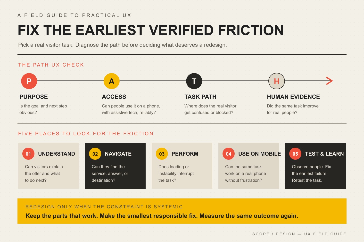
    Five common places UX improvements happen

    Most business-site UX work lands in a handful of areas: understanding the user and task, simplifying navigation, improving performance, designing for real mobile behavior, and testing what actually changed. The visual below is a useful map of those areas. It is not a priority order. The right priority depends on where the task first breaks.

    The PATH UX Check covers Purpose, Access, Task path, and Human evidence, then five improvement areas: understand, navigate, perform, use on mobile, and test and learn.
    Five common website UX improvement areas. Diagnose the failing task before deciding which area deserves the next change.

    Use the Scope Design PATH UX Check

    The PATH UX Check is a simple way to stop a UX project from becoming a pile of unrelated best practices. Start at Purpose, then check Access, then the Task path, then Human evidence. When you find a verified constraint, fix the smallest responsible thing that can remove it and test again.

    PATH stepQuestionWhat to inspect
    P: PurposeWhat useful job is the visitor trying to finish?Offer clarity, page intent, qualification, primary next step, business outcome
    A: AccessCan the visitor reliably perceive and operate the experience?Performance, mobile behavior, accessibility, technical errors, input methods
    T: Task pathCan the visitor find, understand, trust, and complete each necessary step?Navigation, content, forms, controls, proof, feedback, error recovery
    H: Human evidenceWhat do real behavior and real outcomes show?Task observation, analytics, form errors, support questions, sales feedback, qualified outcomes

    PATH is not a claim that every journey is perfectly linear. Returning customers behave differently from first-time visitors, and people jump between pages. Its job is to keep the diagnosis ordered enough that you do not polish a later step while an earlier one is still failing.

    P: make the purpose and next step obvious

    Before you change colors, animations, or card layouts, read the page without the design language in your head. Can a visitor answer three questions: What is this? Is it for me? What should I do next?

    Use descriptive headlines instead of welcome copy. Name services the way customers recognize them. Make the primary call to action visually distinct from secondary actions. Put qualification details near the decision they affect instead of hiding them in an FAQ nobody has reached yet.

    Sometimes the first constraint is not “design” at all. If the page structure is sound but visitors still cannot understand the offer, compare the evidence before choosing between a layout change and a message change. Our guide to deciding whether design or content is the real conversion constraint goes deeper on that distinction.

    A: make the experience accessible, responsive, and reliable

    Test the task on a real phone

    “Responsive” is not the same as usable. A page can technically collapse to a narrow screen while still producing tiny controls, giant sticky elements, intrusive pop-ups, awkward forms, hidden comparison information, or a call to action that disappears several screens below the content that created intent.

    Use your actual phone. Try the same representative task in portrait orientation with the on-screen keyboard open. Check whether text remains readable, controls remain operable, focus is visible, the page survives zoom, errors appear near the right field, and fixed elements do not cover what you are trying to use.

    For a deeper treatment of responsive behavior, see why mobile optimization is more than shrinking the desktop layout.

    Fix performance that interrupts the task

    Speed matters because waiting, delayed responses, and unexpected movement interrupt what the visitor is trying to do. Google’s current Core Web Vitals cover Largest Contentful Paint (LCP), Interaction to Next Paint (INP), and Cumulative Layout Shift (CLS). For field data, the current “good” thresholds are LCP at 2.5 seconds or less, INP at 200 milliseconds or less, and CLS at 0.1 or less, evaluated at the 75th percentile. Those thresholds come from the official Core Web Vitals threshold guidance.

    Those metrics are useful diagnostics, not a complete definition of UX and not a ranking guarantee. Google explicitly recommends evaluating page experience holistically rather than treating it as a single signal. Its page experience guidance for Search is a useful guardrail against turning Core Web Vitals into superstition.

    • Resize and compress images instead of sending oversized files to every device.
    • Avoid loading scripts and widgets on pages that do not need them.
    • Reserve space for images, embeds, banners, and injected content so the interface does not jump.
    • Break up expensive JavaScript work that delays interaction.
    • Use field data when enough real-user data exists and lab tests to reproduce and diagnose individual problems.

    If performance is the verified constraint, use our website speed optimization guide for the implementation work instead of bloating this UX article into a performance manual.

    Treat accessibility as core usability

    Accessibility is part of UX because a task that cannot be perceived or operated is not a successful experience. The Web Content Accessibility Guidelines (WCAG) 2.2 organize accessibility around content that is perceivable, operable, understandable, and robust, with testable success criteria underneath those principles.

    Useful checks include keyboard navigation and visible focus, meaningful labels and instructions, identifiable errors, text that can resize without losing content or functionality, sufficient contrast, text alternatives where they carry meaning, and controls that do not depend on one input method. WCAG 2.2 also includes a Level AA Target Size (Minimum) criterion of 24 by 24 CSS pixels or one of its listed spacing, inline, equivalent, user-agent, or essential exceptions. The W3C’s Target Size explanation is the better reference than repeating an arbitrary “every button must be 44 or 48 pixels” rule.

    Accessibility requirements can intersect with legal obligations, but this article is not legal advice. Our detailed guide on improving website accessibility and ADA-related readiness covers the implementation problem in more depth.

    T: improve the task path, not just the interface

    Fix navigation and information architecture

    Navigation should help people predict where information lives. Clever labels create a tax on every click. “Solutions” might make sense internally, but if the customer is looking for “Commercial Roofing,” use the language that reduces interpretation.

    Audit the path, not just the menu. A visitor can have a tidy header and still get stuck because a service page has no next step, pricing context appears after the form, a location page dead-ends, or related information is scattered across pages with no useful cross-links.

    • Use labels that describe the destination.
    • Keep important routes consistent across templates.
    • Put supporting information near the decision it supports.
    • Use clear parent-child structure when the hierarchy is deep.
    • Check search, filters, account tools, or directories when they are necessary to a primary task.

    Reduce unnecessary form friction

    Forms fail for more reasons than “too many fields.” The better question is whether each step asks for information the business needs at that point, in a way the visitor can understand and recover from.

    Remove fields that exist only because somebody once thought they might be useful. Group related questions. Use persistent labels instead of placeholder-only instructions. Explain unusual requirements before the visitor triggers an error. Preserve entered information when validation fails. Make success unmistakable, including what happens next and when.

    Do not automatically shorten a form if qualification matters. A two-field lead form can create more submissions and worse leads. The UX target is not the least effort at any cost. It is the least unnecessary friction consistent with a useful outcome.

    Put trust and feedback where decisions happen

    Visitors hesitate when the cost of being wrong feels high. The useful response is not to dump a wall of testimonials at the top of every page. Put the right reassurance near the uncertainty it resolves.

    • Place relevant proof near the claim it substantiates.
    • Explain warranties, cancellation rules, returns, response times, or process steps before commitment.
    • Use real project examples or photographs when authenticity matters.
    • Show progress when a multi-step task takes time.
    • Confirm successful actions clearly.
    • Write error messages that explain what happened and how to recover.

    Feedback is UX, too. A button that looks dead after a click, a form that silently submits, or a filter that changes results without making the state clear forces the visitor to guess whether the interface heard them.

    A first-party example: ask for what the step actually needs

    On a fleet-services application flow we reviewed, the site asked people for information the business did not need at that stage. The reflexive UX answer could have been “make the form prettier” or “cut the form in half.” Instead, the useful question was what information the business needed now to move the application forward.

    Scope simplified the request to match that stage and instrumented the intended action so the business could judge what happened next. There is no honest universal conversion percentage to attach to that lesson. The information gain is the decision rule: remove unjustified friction, preserve justified friction, and measure the downstream outcome that matters.

    That distinction matters because UX can be made worse by chasing ease as the only goal. A financing application may need informed consent. A medical or safety workflow may need confirmation. A service business may need qualification details before promising a call. Good UX removes confusion and needless effort without removing safeguards the task genuinely requires.

    H: use human evidence before declaring a win

    Before changing the interface, record a baseline for the task you care about. Then compare the same task after the change. Pick measurements that reflect the actual job rather than whatever happens to be easiest to graph.

    • Task completion: Can representative users finish the task?
    • Time and effort: Where do they hesitate, backtrack, or ask for help?
    • Form or checkout completion: Where do people stop, and what errors occur?
    • Qualified outcome: Did the change improve useful leads, bookings, sales, applications, or support resolution rather than merely clicks?
    • Technical experience: Did mobile behavior, errors, accessibility failures, or Core Web Vitals improve where they were genuine constraints?
    • Qualitative evidence: What do user tests, support questions, sales conversations, and customer feedback reveal that analytics cannot explain?

    Do not declare a win because one chart moved. A shorter form that produces more junk leads may be worse. A new navigation that increases clicks because people now need two clicks instead of one is not automatically better. Connect the proxy to the outcome.

    Use symptoms to choose the first fix

    SymptomFirst questionLikely first fix to testWhat not to assume
    Visitors land but do not actDo they understand the offer and next step?Clarify message, qualification, and primary actionThat the page needs a visual redesign
    People cannot find key informationDo labels and page structure predict where it lives?Fix navigation, hierarchy, or contextual linksThat the menu simply needs fewer items
    Mobile users struggle with formsWhat breaks with a real phone and keyboard open?Fix layout, labels, controls, validation, or sticky UIThat “responsive” means usable
    Page feels slow or unstableWhich delivery problem interrupts the task?Fix the measured performance constraintThat a single score defines UX
    People start a form but abandon itIs the request justified and understood at that stage?Remove needless fields, explain requirements, improve recoveryThat shorter is always better
    Several templates fail in the same wayIs the constraint structural across the system?Evaluate a redesign or component-system changeThat local patches will stay cheaper

    How to know whether you actually need a redesign

    A redesign is justified when the constraint is structural enough that local fixes would create more complexity than they remove. That can happen when templates make essential content impossible to prioritize, the navigation model no longer matches the business, the component system cannot support accessible interaction, the mobile layout is fundamentally broken, performance problems are embedded in the architecture, or years of patchwork have made the site unsafe to change.

    “I am bored with it” is not the same thing. Neither is “a competitor changed theirs.” Preserve what works. If a narrow fix restores the task without creating another problem, take the narrow fix. If the same constraint appears across templates, journeys, devices, and content types, the evidence for redesign becomes stronger. Use the website redesign checklist when the problem has crossed that line.

    A 90-minute website user experience audit

    You can surface useful problems without commissioning a six-week research project. Use this website user experience audit as triage, not as a substitute for deeper research when the stakes are high.

    1. Choose one task. Name the visitor, starting page, intended outcome, and business value.
    2. Run the path cold. Use a phone and desktop. Record the first hesitation or failure rather than making a wish list.
    3. Check Purpose. Can the visitor understand the offer, qualification, and next step without insider knowledge?
    4. Check Access. Test mobile behavior, keyboard access, zoom, focus, performance, forms, and technical errors.
    5. Check the Task path. Can the person find, understand, trust, operate, complete, and recover?
    6. Collect Human evidence. Compare the observation with analytics, support questions, sales feedback, and form errors.
    7. Choose one constraint. Fix the earliest verified failure with the smallest responsible change.
    8. Repeat the same task. Compare behavior and outcomes to the baseline before opening a new round of work.

    Frequently asked questions about improving website UX

    What should I improve first on my website?

    Improve the earliest verified point of friction in an important visitor task. If people do not understand what the page offers, start with Purpose. If they understand it but cannot operate the experience, check Access. If the interface works but people cannot find, trust, or complete the next step, fix the Task path. Use Human evidence to decide whether the change actually helped.

    Do I need to redesign my website to improve user experience?

    Usually not. Many UX problems can be improved through content, navigation, forms, responsive behavior, performance, accessibility, trust, or feedback changes. Redesign when the underlying templates, architecture, component system, or accumulated technical debt prevent responsible local fixes.

    Are Core Web Vitals the same as user experience?

    No. LCP, INP, and CLS measure important aspects of loading, responsiveness, and visual stability. They do not tell you whether the offer is understandable, navigation is logical, a form asks the right questions, or the visitor trusts the business. Treat them as technical evidence inside a larger UX diagnosis.

    How do you measure website user experience?

    Measure the task and the outcome together. Useful evidence can include task completion, time and errors, form completion, qualified conversions, support questions, user-test observations, accessibility findings, and Core Web Vitals. Establish a baseline before the change so you can tell whether the fix improved the real job.

    What is the 3-second rule in website design?

    There is no universal UX standard saying every visitor leaves after exactly three seconds or that every page must fully load within that number. Use current performance measures such as LCP, INP, and CLS plus task evidence instead of treating a catchy timing rule as a law. More importantly, fix the specific delay or instability that interrupts the user’s task.

    What are the key factors in website user experience?

    There is no single official seven-factor list for every website. For practical business-site work, PATH covers the useful decision areas: Purpose, Access, Task path, and Human evidence. Inside those buckets you will inspect clarity, navigation, mobile behavior, accessibility, performance, forms, trust, feedback, completion, recovery, and real outcomes.

    Are the “7 C’s of a website” an official UX standard?

    No. Different articles use different “C” lists as teaching mnemonics. They can be useful if they help a team remember a real problem, but they are not a substitute for current technical standards, task observation, or business evidence. Use a mnemonic only when it improves the diagnosis rather than turning UX into a checklist contest.

    How to improve website user experience without replacing what works

    The best UX improvement is not the change with the most pixels attached to it. It is the change that removes the most important verified friction without creating a new one.

    Define the task. Run PATH. Find the earliest failure. Make the smallest responsible fix. Test the same task again. When the constraint is structural, redesign with evidence. When it is not, keep the working parts and solve the real problem.

    If your team knows the site is creating friction but cannot isolate the constraint, Scope Design’s web services team can audit the path across strategy, content, design, development, performance, accessibility, and measurement, then turn the findings into a prioritized plan instead of a cosmetic wish list.

    Sources and methodology

    This article was researched through a monitored Scope Design workflow on August 21, 2026. We reviewed Scope Design’s current UX doctrine in Open Brain, neighboring Content Studio articles and typed relationships, the literal internal-link graph, U.S. Ubersuggest keyword and SERP evidence, DataForSEO search and AI-query evidence, and current primary technical sources. Third-party search volumes were treated as directional research, not business-outcome facts.

    Primary technical references include web.dev’s Core Web Vitals threshold guidance, Google’s page experience guidance, the W3C’s WCAG 2.2 Recommendation, and the W3C’s Target Size (Minimum) explanation. We deliberately excluded legacy percentages about abandonment, UX ROI, universal conversion lifts, mobile traffic share, and navigation limits when the recovered evidence did not provide a defensible source chain.

  • UX Web Design and Content Strategy to Boost Website Value

    UX Web Design and Content Strategy to Boost Website Value

    UX content strategy is the practice of planning what a website needs to say, how people will find and understand it, and what should happen next as one connected system. For a business website, the most useful unit is not the page. It is the decision the visitor is trying to make on that page.

    That changes the job of web design. Instead of creating a polished layout and filling it with copy later, you start with the visitor’s intent, the business objective, the evidence needed to resolve doubt, and the path to an appropriate next action. UX shapes how that path works. Content strategy determines what information belongs in it, why it exists, who owns it, and how it stays useful.

    Scope Design’s rule: A requested tactic is evidence, not a diagnosis. Before redesigning pages or rewriting copy, define the objective, identify the binding constraint, clarify the positioning, choose the strategy, then select tactics and measurement.

    What does UX content strategy actually mean?

    UX design, content strategy, and copywriting overlap, but they are not interchangeable.

    • UX design shapes the experience of completing a task: navigation, hierarchy, interaction, forms, feedback, accessibility, and the sequence of steps.
    • Content strategy decides what information should exist, what purpose it serves, how it is structured and governed, who maintains it, and how success is measured.
    • Copywriting and UX writing turn that strategy into the actual words people read and act on.

    Nielsen Norman Group’s Content Strategy 101 describes content strategy as an ongoing practice for planning the creation, delivery, governance, maintenance, and eventual retirement of useful content. Its more recent comparison of content strategy and UX writing makes the same distinction: strategy establishes goals, systems, standards, research, and measurement; writing executes within that system.

    For a marketing website, those disciplines meet everywhere. A navigation label is content and UX. A service-page heading is content and information hierarchy. A form field is both a business qualification choice and a usability choice. A case study is content, but where it appears in the decision path determines whether a visitor sees the proof when doubt actually occurs.

    If the underlying problem is simply weak, generic, company-centered writing, our guide to why website content fails goes deeper on content quality. This article is about the larger system: making content and UX work together.

    Before integrating UX and content, diagnose the real constraint

    A prettier website can still fail. Better copy can still fail. Faster pages can still fail. Each is valuable only when it addresses the constraint currently preventing the business outcome.

    Scope Design diagnoses website problems upstream to downstream:

    1. Measurement and technical integrity: Do analytics, forms, notifications, mobile behavior, speed, and tracking actually work?
    2. Sufficient relevant volume: Is there enough intent-bearing traffic to evaluate conversion behavior?
    3. Traffic quality and acquisition fit: Are the right people landing on pages that match the promise that brought them there?
    4. Messaging clarity: Can visitors understand what you do, who it is for, why it matters, and what to do next?
    5. UX friction: Are interested visitors getting lost, blocked, surprised, or forced to work too hard?
    6. Offer and positioning: Do qualified visitors understand the offer but still believe the trade is not worthwhile?
    7. Sales and operational follow-through: Does the business respond, qualify, route, and close the opportunities the site creates?

    That order matters. If your tracking is broken, a conversion-rate diagnosis is weak. If almost nobody relevant reaches the page, changing button copy is unlikely to be the highest-value move. If good-fit prospects arrive and understand the offer but do not believe it, navigation tweaks may be treating the symptom.

    If you are specifically deciding which discipline to fix first, see Web Design vs. Content: Which Should You Fix First? If the broader question is why qualified visitors are not converting, use our UX diagnosis guide. Here, we will assume the website genuinely needs UX and content to be planned together.

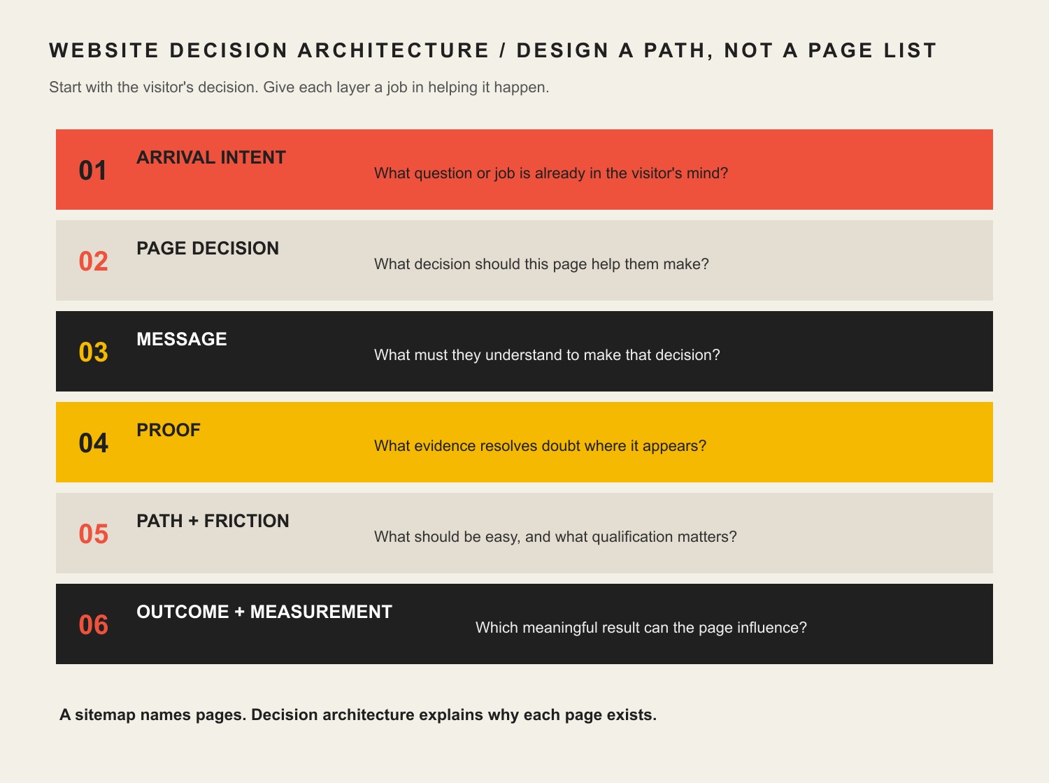
    Use a Website Decision Architecture instead of decorating a sitemap

    A sitemap tells you which pages exist. It does not tell you whether those pages deserve to exist, what decision each page supports, what evidence belongs there, or how the visitor moves from uncertainty to action.

    Six layers of website decision architecture: arrival intent, page decision, message, proof, path and friction, and outcome measurement.

    For every important page, answer six questions before polishing the visual design:

    Decision layerQuestion to answerWhat it changes
    Arrival intentWhat question or job is in the visitor’s head when they land?Page promise, search/acquisition fit, opening message
    Page decisionWhat decision should this page help them make?Scope, hierarchy, what to include or remove
    MessageWhat must they understand before they can decide?Headings, explanations, comparisons, objections
    ProofWhat evidence resolves doubt at the moment it appears?Case studies, examples, credentials, reviews, process proof
    Path + frictionWhat should be easy, and what qualification friction is intentional?Navigation, CTAs, forms, progressive disclosure
    Outcome + measurementWhat is the last meaningful outcome this page can influence?Analytics events, CRM handoff, success criteria

    The key is sequencing. Content should not merely describe what the business wants to say. UX should not merely make that content attractive. Both should help the visitor make the next reasonable decision with enough context and confidence.

    How to integrate UX design and content strategy in a website project

    1. Define the business objective and the website’s job

    Start with the outcome, not the deliverable. “Redesign the website” is a tactic. “Generate more qualified opportunities from referral and organic traffic” is an objective that can guide strategy.

    Then decide what the website can realistically control. A considered B2B site may be responsible for generating qualified conversations, not closing the sale by itself. A local service page may be responsible for booked-and-attended appointments. An ecommerce product page can be held much closer to purchase.

    2. Research arrival intent, not just demographics

    “Small-business owner, age 35–55” rarely tells a designer what to build. The useful question is what the person is trying to figure out right now.

    • A search visitor may need a direct answer before they trust the company.
    • A referral may already trust the brand but need proof of fit.
    • A paid-ad visitor needs the landing page to continue the exact promise in the ad.
    • A prospect sent by a salesperson may need pricing, process, proof, or implementation detail to reduce uncertainty.

    Design the experience for that arrival state. The same person can need different content on different visits.

    3. Give every important page a job

    Before wireframes, define the decision each page supports. A service page might help someone decide, “Is this company a fit for my problem?” A case study may answer, “Have they solved something like this before?” A pricing page may answer, “Is this option financially realistic?”

    This is where information architecture becomes strategic. Navigation, internal links, page hierarchy, and content structure should mirror the questions people need answered—not the departments on your org chart.

    4. Draft content structure and proof before polished visual design

    This does not mean every final sentence must be approved before design begins. It means the designer should know the real content requirements: the message hierarchy, likely content length, proof assets, objections, comparisons, CTAs, data, forms, media, and edge cases.

    NN/g explicitly recommends bringing content into the design process early and planning structure, information architecture, metadata, accessibility, standards, and governance before last-minute content insertion. That matches our experience: lorem ipsum can hide the very constraints the finished page must solve.

    5. Put proof where doubt occurs

    Do not dump every testimonial into one carousel and call it trust. Match the proof to the claim. If you claim a complicated migration is safe, show how you handled one. If you claim industry expertise, show relevant work or insight. If you claim a process reduces risk, explain the checkpoints.

    This is also where UX, content, and brand authority intersect. Authority is more useful as a body of evidence than as a visual costume. Good UX makes the right proof easy to encounter; good content strategy makes sure the proof exists and stays current.

    6. Design actions and forms around fit, not raw conversion volume

    Many conversion checklists say to remove fields and eliminate friction. Sometimes that is right. Sometimes it is exactly wrong.

    If a considered-service business cannot serve a certain geography, project size, or timeline, asking about that constraint may reduce total form submissions while improving the percentage that become real opportunities. The goal is not to maximize button clicks. The goal is to improve the business outcome after lead quality, staff time, no-shows, churn, and trust are counted.

    We use two ethical tests for conversion tactics: would the improvement survive if the visitor understood why the tactic was used, and does the improvement remain after downstream costs and trust are included? That rules out fake urgency, hidden costs, inaccessible design, and other mechanics that make the metric look better by making the experience worse.

    7. Test the combined experience

    Do not test content and interface as if they live in separate universes. Give people realistic tasks and watch where meaning or interaction breaks down. A participant who understands the service but cannot find the next step has a UX problem. A participant who can navigate perfectly but cannot explain the offer has a messaging problem. A participant who completes the form but is a terrible fit may expose a qualification or acquisition problem.

    Performance and accessibility are part of UX content strategy

    Content is not useful if the experience prevents people from reaching, reading, understanding, or operating it.

    Google’s current Core Web Vitals guidance measures loading performance, responsiveness, and visual stability. Google recommends aiming for Largest Contentful Paint within 2.5 seconds, Interaction to Next Paint under 200 milliseconds, and Cumulative Layout Shift under 0.1 for a good experience. Those metrics matter, but Google also makes clear that page experience is broader than any single metric.

    Accessibility has the same integrated character. WCAG 2.2 organizes accessibility around content and interfaces being perceivable, operable, understandable, and robust. At Level AA, for example, headings and labels must describe their topic or purpose. That is simultaneously a writing, hierarchy, design, and implementation responsibility.

    A fast page can deliver the wrong answer very efficiently. A beautiful page can be inaccessible. A technically compliant page can still be confusing. Treat performance, accessibility, structure, and meaning as one experience.

    Example: the requested redesign was not the real problem

    A long-established specialty auction business came to Scope Design asking for a new website and new features. Discovery showed that a prettier website was not the real constraint.

    The public site sat on top of broken or incomplete customer-facing functions, disconnected data, manual processes, legacy software, and systems that could not support where the business needed to go. Starting with visual page design would have made the surface look newer while leaving the underlying customer and operational experience fragile.

    So we mapped the business processes and rebuilt the foundation around them before treating requested features as isolated page components. The strategic lesson is bigger than that project: the requested deliverable was a symptom; discovery exposed the constraint.

    Measure the last meaningful outcome the website can influence

    Sessions, impressions, rankings, scroll depth, time on page, and button clicks are diagnostic signals. They are not automatically business success.

    Choose a primary outcome based on the website’s actual job:

    • Ecommerce: purchases, repeat purchase behavior, and average order value.
    • Considered B2B: qualified opportunities and pipeline value.
    • Local services: booked-and-attended appointments and correctly tracked calls.
    • Subscription businesses: activation, retention, and lifetime value.
    • Operational/self-service sites: staff time saved, errors reduced, or issues resolved without manual intervention.

    Then use supporting metrics to locate the bottleneck. Search visibility can diagnose acquisition. Engaged sessions can help diagnose landing-page fit. Form completion can reveal friction. Qualified-opportunity rate can reveal whether the content and form are attracting and filtering appropriately. Follow the chain far enough that optimizing one metric does not quietly damage the next one.

    What revising this exact page taught us

    We applied the same diagnosis to this article before rewriting it. The old version was about 1,300 words and contained broad UX/content advice, unsupported conversion statistics, and essentially one context-free internal CTA.

    In the latest complete 12-month analytics window ending August 19, 2026, it recorded only one organic-search session and no tracked key event. Search Console returned no page/query performance rows for either of the two 12-month comparison periods, and URL Inspection reported the live page as Discovered – currently not indexed. Bing showed zero clicks and zero impressions. Ubersuggest found zero ranking page keywords, backlinks, and referring domains.

    That does not prove the topic has no demand. Ubersuggest estimates about 170 U.S. monthly searches for “ux content strategy,” and the current Google results include an AI Overview plus high-authority articles from Nielsen Norman Group, HubSpot, and specialist UX publications. The more useful conclusion is that the old article did not earn a distinct enough job in that result set.

    This revision therefore changes the value proposition instead of merely adding words: it removes unverified statistics, makes the Constraint-First diagnosis explicit, introduces a reusable Website Decision Architecture, adds first-hand project evidence, connects the article to relevant Scope resources, and gives both search engines and readers a clearer reason this page should exist.

    UX content strategy FAQ

    What does “UX content” mean?

    UX content is the information people encounter while using a digital experience: headings, navigation labels, service explanations, buttons, instructions, forms, error messages, help content, proof, and more. The important point is not the label. The content helps people understand where they are, what something means, what choice they are making, and what happens next.

    How do UX design and content strategy work together?

    Content strategy defines the purpose, information, structure, ownership, and measurement. UX design turns those requirements into an experience people can navigate and operate. They should iterate together: real content changes layout and hierarchy, while prototypes and user testing expose missing, confusing, or badly timed content.

    Should content come before web design?

    The strategy and real content requirements should come before polished visual design, but the work should not be a rigid waterfall. Designers need enough real content to understand hierarchy, length, proof, edge cases, and interactions. Writers and strategists need prototypes to see whether the information works in context. Plan early, then iterate together.

    What are the seven pillars of UX design?

    There is no single universally accepted set of seven UX-design pillars. Different authors use different frameworks. For a business website, a more useful question is whether the experience is useful for the intended visitor, understandable, findable, operable, accessible, credible, and connected to a measurable business outcome. Do not force a numbered framework onto the project unless it improves the diagnosis.

    What is an example of a UX content strategy?

    For a B2B service page, the strategy might define the visitor as a comparison-stage buyer, the page decision as “Is this firm a fit?”, the core message as the problem and outcome, the proof as a relevant case study, the intentional friction as project-size and timeline qualification, and the primary outcome as a qualified consultation request. UX then determines how those elements are ordered, revealed, labeled, navigated, and completed on desktop and mobile.

    How do you measure whether UX content strategy is working?

    Measure the last meaningful outcome the website or page can directly influence, then use diagnostic metrics to locate problems. For a service company that may be qualified opportunities rather than raw form submissions. For ecommerce it is much closer to purchase. Tie page and traffic data to CRM or revenue data where possible so you can distinguish activity from value.

    Build the website around the decision you need to improve

    The strongest UX content strategy does not begin with “How should this page look?” or “How many words should we write?” It begins with the business objective, the visitor’s intent, and the constraint preventing the desired outcome.

    From there, design the argument, proof, navigation, interactions, qualification, and measurement as one system. That is how a website becomes more than a collection of attractive pages—it becomes an asset that helps the right people make good decisions.

    If your website looks fine but you are not sure whether the real problem is traffic, messaging, UX, content, the offer, or follow-through, contact Scope Design. We can help diagnose the constraint before you invest in the wrong fix.