Tag: Core Web Vitals

  • How to Build a Future-Proof Website: 7 Durable Upgrades That Age Well

    How to Build a Future-Proof Website: 7 Durable Upgrades That Age Well

    A future-proof website is not a website that never changes. It is a website that can change without turning every update into a redesign, migration, emergency, or expensive dependency.

    If you want to future proof your website, do not start by collecting whatever features are fashionable this year. Start by making the site easier to use, faster on real devices, more accessible, safer to operate, easier to maintain, clearer to search systems, and easier to measure. Then add new technology only when it solves a defined customer or business problem.

    That distinction matters. Progressive Web Apps, AI chat, browser APIs, headless architecture, and the next wave of design tools can all be useful. None of them is a universal requirement for a small-business website. Future-proofing is about reducing the cost and risk of change, not predicting every change before it happens.

    Start With a Baseline Before You Modernize Anything

    Before changing the site, capture what is already working. Record the pages that bring useful traffic, the forms and calls that produce real inquiries, the URLs that have links, the search queries that already earn visibility, the customer-service information people rely on, and the technical problems that are actually getting in the way.

    This is the same principle we use in our website redesign readiness process: you cannot prove an improvement without a baseline, and you cannot protect value you never inventoried. A visual refresh is not automatically an improvement. A lower maintenance burden, fewer broken customer journeys, faster important pages, better qualified inquiries, or a measurable reduction in support friction is.

    What we found before revising this exact page

    We checked this article before rewriting it rather than assuming the old copy had earned protection. Google Search Console reported the established URL as submitted and indexed, successfully fetched on mobile, and self-canonical. But our exact-page Search Console queries returned no performance rows in the current or prior 12-month windows we checked. GA4 showed only nine Direct landing-page sessions in the current 12-month window and no Organic Search row. Bing reported zero clicks and zero impressions for the exact URL.

    That evidence does not prove the topic lacks value. It tells us something narrower: there was little measurable performance in the old copy worth defending, while the indexed URL itself was worth preserving. Google URL Inspection also reported a breadcrumb structured-data error—either name or item.name is missing—which is a useful reminder that content work and template-level technical QA are separate jobs.

    The 7-Part Future-Proof Website Stack

    For most small businesses, a durable modernization plan can be organized into seven layers. They reinforce one another: clearer customer tasks make measurement more meaningful; accessibility improves component quality; a leaner stack helps performance and security; and better structure helps both people and search systems understand the site.

    Seven connected website layers support durable change: customer tasks, mobile performance, accessibility, security and recovery, ownership, useful content, and measurement.
    Future-proofing is a system: customer tasks, performance, accessibility, security, ownership, useful content, and measurement.

    1. Design Around Customer Tasks, Not Visual Trends

    A website can look current and still be difficult to use. It can also look visually conservative and work extremely well. The durable question is not, “Does this look like the newest design gallery?” It is, “Can the right person understand what we do, trust the answer, and complete the next important task?”

    List the handful of jobs your website must support: request a quote, call the business, book an appointment, buy a product, find a location, compare a service, download a form, get support, or understand what happens next. Then review those paths on a phone with fresh eyes.

    • Can a new visitor identify the business and offer quickly?
    • Does navigation reflect how customers think, not the company org chart?
    • Are important calls to action specific and easy to find?
    • Do forms ask only for information the business can actually use?
    • Can someone complete the task without guessing what a label means?

    Design systems, components, and brand styling should support those jobs. They should not become the job. When a visual trend makes the next step harder to understand, the trend loses.

    2. Make Mobile Performance a Release Criterion

    Performance is not a one-time optimization project you complete at launch. Content changes, third-party scripts, new fonts, larger images, tracking tools, plugins, embeds, and hosting changes can all move a site backward. Treat speed and responsiveness as release criteria for ongoing work.

    Google’s current Core Web Vitals are Largest Contentful Paint (LCP), Interaction to Next Paint (INP), and Cumulative Layout Shift (CLS). Google’s published “good” targets are LCP within 2.5 seconds, INP under 200 milliseconds, and CLS under 0.1. Web.dev recommends evaluating these at the 75th percentile so you are looking at real-user experience for most visits, not one lucky laboratory run.

    If an old checklist still tells you to optimize First Input Delay (FID) as a current Core Web Vital, update the checklist. INP replaced FID in the current stable set.

    Then work from evidence. Oversized hero media may be the problem. It may be a slow server, a third-party widget, a page builder loading unused code, an analytics pileup, or JavaScript doing too much work on interaction. Test representative page types on mobile and desktop, use field data when available, and use lab tools to reproduce problems during development.

    Do not turn a performance score into the only business goal. A perfectly fast page with a confusing offer is still a bad page. The point is to remove avoidable friction from the customer journey and keep performance from quietly degrading as the site evolves.

    3. Build Accessibility Into Components and Content

    Accessibility is much easier to maintain when it is part of the way the site is built, not a cleanup sprint after every redesign. Use semantic HTML, real labels, visible focus states, useful alt text, sufficient contrast, keyboard-operable controls, understandable errors, and layouts that remain usable when text is enlarged or the viewport changes.

    The W3C encourages use of the latest WCAG version. WCAG 2.2 is the current Recommendation and adds criteria while remaining backward compatible with the earlier 2.1 and 2.0 requirements it carries forward. For many organizations, Level AA is a practical engineering target, but the legal requirements that apply to a specific business depend on jurisdiction and context. A standards checklist is not a substitute for legal advice.

    Automated scans are useful for finding certain classes of problem, but they cannot prove that a site is fully accessible. Pair them with keyboard testing, form testing, zoom/reflow checks, and manual review of important customer journeys. If an accessibility tool promises to “fix” the whole site by adding a widget, treat that as a claim to verify, not a solved requirement.

    4. Make Security, Privacy, and Recovery Routine

    A site is not future-proof if a routine update can break it with no rollback path, an old account can still access production, or a backup exists only in theory. Security and recovery need owners, schedules, and verification.

    At minimum, keep the CMS, extensions, server software, and dependencies maintained; remove what is no longer needed; use strong account controls; limit administrative access; monitor for failures; and keep recoverable backups outside the live site. CISA’s baseline guidance also emphasizes multifactor authentication and prompt software updates as basic security hygiene.

    Backups deserve a verb stronger than “have.” Test restores. A backup system that has never been restored is an assumption. For meaningful changes, establish a baseline, stage when appropriate, make the change, verify the important paths, and know how to reverse it.

    Privacy belongs in the same operating layer. Know which forms, analytics tools, ad platforms, chat tools, embeds, and integrations collect data. Remove collection you do not need, keep policies accurate, and review consent or disclosure requirements for the places where you operate. Do not bolt on more tracking simply because another dashboard offers it.

    5. Own a Lean, Maintainable Stack

    One of the easiest ways to make a website fragile is to create dependencies nobody owns. The business should know who controls the domain, DNS, hosting, CMS administrator accounts, analytics, search tools, email delivery, paid licenses, source assets, integrations, and backups.

    Maintainability does not mean “never use plugins” or “never write custom code.” It means every dependency should earn its place. A well-supported tool that clearly solves a problem can be safer than custom work. Custom work can be the right choice when it removes a real constraint. The warning sign is a stack that no one can explain, update, export, or recover without calling the one person who built it.

    • Keep account ownership in a business-controlled password manager.
    • Document critical integrations and who is responsible for them.
    • Retire unused themes, plugins, scripts, pixels, and services.
    • Know how to export important content and customer data.
    • Record a rollback path for risky changes.

    Boring infrastructure is often a feature. A stack that is well understood, supported, observable, and recoverable is easier to adapt when something genuinely new becomes valuable.

    6. Structure Useful Content for Search and AI Systems

    Search is changing, but the future-proof response is not to invent a second website “for AI.” Publish useful information in a form that people and machines can both understand: clear headings, descriptive links, important facts in text, deliberate internal linking, accurate business information, crawlable pages, and structured data that matches what the visitor can actually see.

    Google’s current guidance for AI Overviews and AI Mode is unusually helpful here: normal SEO fundamentals remain relevant, eligible supporting pages need to be indexed and able to appear with a snippet, and there are no additional technical requirements. Google also says you do not need a special AI text file or special schema.org markup just to appear in those features.

    That does not mean “do nothing.” It means do the durable work first. Answer real customer questions directly. Publish specific service, product, policy, pricing, process, compatibility, or location facts when they help someone make a decision. Show where information came from. Keep facts current. Use structured data when it accurately describes visible content. Build sensible internal links so important pages are not isolated.

    For deeper work on earning citations in generative answers without chasing made-up hacks, see our guide to AI search optimization and citation readiness.

    7. Measure Outcomes and Improve Incrementally

    Future-proofing is an operating habit. Measure the outcomes the website can reasonably influence, diagnose what is getting in the way, make the smallest responsible improvement, and verify what happened.

    Your measurement stack does not need hundreds of reports. For many small businesses, a useful monthly review can fit on one page:

    • Business outcomes: qualified forms, calls, bookings, purchases, applications, or other meaningful conversions.
    • Discovery: important landing pages, useful search queries, clicks, impressions, and referral sources.
    • Customer journey: form failures, device problems, confusing exits, support questions, and pages that assist decisions.
    • Technical health: indexation, crawl problems, Core Web Vitals, uptime, broken links, accessibility findings, and security/maintenance issues.

    Our broader SEO strategy and analytics framework uses the same idea: visibility is only one layer. The point is to connect technical health and search discovery to useful business outcomes instead of optimizing whatever number happens to be easiest to screenshot.

    When Is a Full Website Redesign Actually the Future-Proof Move?

    A redesign becomes credible when the current system materially prevents the business or its customers from doing something important and a smaller change cannot responsibly solve the problem.

    Examples include a structure that no longer matches the business, a platform that cannot support required operations, pervasive mobile or accessibility failures, a content model that makes useful publishing impractical, brittle integrations, conversion paths that need architectural change, or a brand and offer that have fundamentally changed.

    By contrast, one slow template, weak copy, a broken form, missing proof, neglected maintenance, a confusing service page, or a dated color palette does not automatically justify replacing the entire system. Fix the isolated constraint first. Custom work should earn its place.

    If a rebuild is the right intervention, protect what already works: inventory URLs and content, preserve valuable destinations where practical, map real migrations, update internal links, test forms and tracking, verify accessibility and performance, and plan rollback and monitoring before launch. The full website redesign checklist covers that process in depth.

    A Practical 90-Day Website Modernization Plan

    Days 1–30: Inventory and protect

    Confirm ownership of the domain, hosting, CMS, analytics, search tools, licenses, backups, and critical integrations. Record current business outcomes, important landing pages, crawl/index status, form delivery, mobile behavior, Core Web Vitals, accessibility issues, and obvious security or maintenance debt. Do not start with a redesign mockup.

    Days 31–60: Fix the highest-risk friction

    Repair broken forms and contact paths. Address critical update or backup gaps. Improve the slowest or most important page types. Fix recurring keyboard, focus, label, contrast, and mobile usability problems in reusable components. Remove scripts, plugins, and services that no longer earn their maintenance cost.

    Days 61–90: Improve information and measurement

    Update the pages that help customers make real decisions. Clarify services, products, policies, processes, pricing or pricing logic, proof, and next steps where appropriate. Improve internal links and structured data where they accurately support the visible content. Then verify analytics, search visibility, form delivery, technical health, and the business outcome you intended to improve.

    At the end of 90 days, decide what is still structurally blocked. That is a far stronger basis for a redesign budget than “the website feels old.”

    Frequently Asked Questions About Future-Proofing a Website

    How often should a business redesign its website?

    There is no responsible universal redesign schedule. Redesign when the existing system materially blocks important customer or business work and smaller changes cannot solve the underlying constraint. A site that is maintainable, accessible, fast enough, measurable, and aligned with the business can often be improved incrementally for years.

    What should I update first on an aging website?

    Start with anything that can cause real loss or blind decision-making: broken conversion paths, security/update risk, unreliable backups, missing analytics or form delivery, severe mobile problems, and high-impact accessibility failures. Then work through performance, maintainability, content clarity, search structure, and measurement based on evidence.

    Do I need a Progressive Web App to have a modern website?

    No. A PWA can be valuable when installability, offline behavior, push notifications, or app-like workflows solve a real user need. It is not a universal future-proofing requirement. If customers simply need to understand a service, call, book, buy, or submit a form, solve those jobs first.

    Do I need AI chat or an AI assistant on my website?

    Only if it improves a defined task enough to justify the added complexity, cost, privacy considerations, maintenance, and failure modes. A clear FAQ, good site search, better navigation, or better product/service information may solve the same problem more reliably. Treat AI as a tool, not a badge that proves the website is current.

    Does AI search require a special website redesign?

    Not by default. Google’s guidance says its AI search features rely on the same foundational Search requirements and do not require special AI files or special schema solely for AI Overviews or AI Mode. Make important content indexable, useful, textual, internally linked, accurate, and well structured before inventing an AI-only optimization layer.

    Is an old-looking website automatically outdated?

    No. Visual design affects trust and usability, but age is not a diagnosis. Judge the site by whether people can complete important tasks, whether the business can maintain it safely, whether it performs well on real devices, whether it is accessible, whether the information is current, and whether you can measure what matters.

    Future-Proof for Change, Not for Prediction

    The strongest website modernization strategy is deliberately unglamorous. Make important customer tasks clear. Keep mobile performance healthy. Build accessibility into the system. Treat security, privacy, backups, and recovery as ongoing operations. Own a maintainable stack. Publish useful, structured information. Measure outcomes and improve the real constraint.

    Then, when a genuinely valuable new capability arrives, you are not starting from a fragile pile of old decisions. You have a website that can absorb change without forcing the business to start over.

  • What Affects Website Speed? 25 Performance Factors That Slow Sites Down

    What Affects Website Speed? 25 Performance Factors That Slow Sites Down

    What affects website speed? Usually not one thing. A slow business website can be held back by the server that builds the page, the amount and priority of data sent to the browser, the JavaScript and layout work the browser must perform, the way important content appears and responds, or dependencies that quietly get heavier over time.

    That is why “make the site faster” is a bad troubleshooting instruction. It invites random changes. A better approach is to identify the layer creating the delay, inspect the evidence, and fix the highest-impact constraint first. Scope Design uses a five-layer model for that job: the SPEED Factor Map.

    • S — Server & network delivery: how quickly the first useful response can reach the visitor.
    • P — Payload size & priority: how much data must move and whether the browser receives the important pieces first.
    • E — Execution work: how much code and layout work the device must perform.
    • E — Experience rendering & interaction: when useful content becomes visible, stable, and responsive.
    • D — Dependencies & drift: plugins, tags, updates, traffic patterns, and configuration changes that make a once-fast site slower.

    If you already know a page is slow and need the full testing-and-remediation process, use our guide to diagnosing and fixing a slow website. This article has a different job: showing what can make a site slow so you can narrow the search instead of optimizing everything at once.

    Website speed is a chain, not a score

    PageSpeed Insights, Lighthouse, a browser waterfall, and real-user monitoring can all tell you useful things. None of them is the business outcome by itself. Google’s PageSpeed Insights documentation distinguishes field data from real Chrome users from Lighthouse lab data generated under controlled conditions. The two can disagree because they answer different questions.

    A synthetic score can help you reproduce a problem. Field data can show what real visitors experience across devices and networks. Your analytics can show whether those visitors continue, submit forms, buy, book, or leave. A useful performance decision connects all three.

    This also means a “100” score is not the goal. A score can improve while a real sales path remains slow, an interaction still lags, or an important third-party service delays the exact page your customers use. Measure the journey that matters.

    The SPEED Factor Map: 25 website speed factors

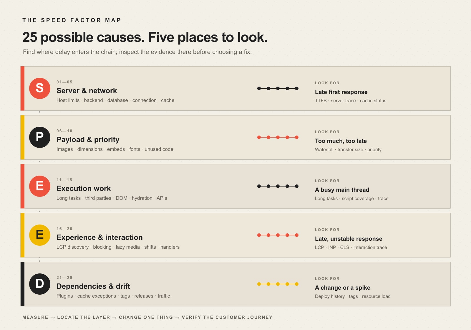
    The map below groups 25 common website performance factors by where the delay enters the delivery chain. Use it as a triage map, not a checklist you must “fix” in order.

    The SPEED Factor Map groups 25 website performance factors into server and network, payload and priority, execution, experience and interaction, and dependencies and drift, with evidence to inspect for each layer.
    The SPEED Factor Map: locate the slow layer before choosing the fix.
    LayerTypical symptomsEvidence to inspect
    Server & networkHTML starts late; uncached pages are much slowerTTFB, server timing, cache status, database/application traces
    Payload & priorityHuge transfers; hero content arrives lateNetwork waterfall, resource sizes, priority, image/font requests
    ExecutionPage downloads but feels busy or frozenMain-thread tasks, JavaScript coverage, third-party work, layout cost
    ExperienceMain content appears late, shifts, or reacts slowlyLCP, INP, CLS, element attribution, interaction traces
    Dependencies & driftPerformance worsens after changes or under loadDeploy history, plugin/tag inventory, cache rules, resource utilization

    S — Server and network delivery factors

    1. Hosting resource limits and contention

    CPU, memory, process limits, storage latency, or noisy shared resources can slow the server before the browser has much to do. This is why front-end tricks cannot rescue every slow page. If the initial document itself consistently arrives late, start at the origin.

    2. Backend application work

    WordPress, an ecommerce platform, a membership system, or a custom application may need to run expensive PHP, template, search, personalization, or API logic before sending HTML. The right question is not “Is WordPress slow?” but “What work is this request performing before it can respond?” Our broader guide to a fast, functional web-development foundation explains why architecture and maintainability matter here.

    3. Database queries and data volume

    Slow queries, missing indexes, oversized option tables, expensive product filters, or repeated lookups can make otherwise simple pages expensive to build. Database symptoms often appear only on certain templates or under concurrency, which is why page-by-page evidence beats a blanket “upgrade hosting” answer.

    4. Distance, DNS, connection, and TLS setup

    A visitor must reach the right server before the page can arrive. Geography, DNS resolution, connection establishment, and TLS all contribute to the path. For many sites these are not the biggest bottleneck, but they matter more when critical resources live on many different origins or users are far from the origin.

    5. Redirects, cache behavior, CDN, and compression configuration

    Extra hops delay useful work. Missing page caching can force the application to rebuild the same public page repeatedly. A CDN can shorten delivery paths and absorb traffic, but only when caching rules match the content. Compression can reduce transferred text resources. These are configuration decisions, not magic switches; verify what is actually cached, compressed, and served from where.

    P — Payload size and priority factors

    6. Oversized images

    Photography and hero artwork can dominate transferred bytes. Start with the images real users download, not a generic recommendation to “compress everything.” A visually important image may deserve more bytes than a decorative image; the goal is appropriate dimensions, encoding, quality, and delivery.

    7. Wrong image dimensions and responsive delivery

    Sending a 2400-pixel image into a 420-pixel mobile slot wastes transfer. Responsive image markup lets the browser select a more appropriate source. That belongs with good responsive web design: the mobile experience is not just a narrower desktop layout; it has different bandwidth, viewport, and device constraints.

    8. Heavy video, iframes, maps, and embeds

    Embedded media can add large files, new origins, scripts, and player code. A poster image, click-to-load pattern, or delayed embed can preserve the content while keeping the initial page lighter. The best choice depends on whether the media is the reason the visitor came to the page.

    9. Web-font weight and variants

    Multiple families, weights, character sets, and externally hosted files can turn typography into a critical-path dependency. Remove variants nobody uses, subset when appropriate, and choose a loading strategy that avoids both needless transfer and jarring text changes.

    10. Unused CSS and JavaScript bytes

    A bundle can be cached and still be wasteful. Site builders, themes, component libraries, and plugin assets may ship code a specific page never uses. The opportunity is not merely minification; it is reducing work and bytes that should not be there in the first place.

    E — Execution-work factors

    11. Long JavaScript tasks

    A page may download quickly and still feel slow because the main thread is parsing, compiling, or executing JavaScript. Long tasks can delay clicks, menus, filters, and form interactions. That makes JavaScript cost a responsiveness issue, not just a file-size issue.

    12. Third-party scripts

    Analytics, advertising, chat, heatmaps, testing tools, social widgets, payment components, and consent systems all compete for network and execution time. Third parties are especially important to inventory because teams often add them one campaign at a time and rarely remove them together.

    13. Large DOM, style, and layout work

    Deep wrappers, repeated components, very large menus, complex selectors, and frequent layout changes can make style calculation and rendering expensive. More markup is not automatically slow, but a complicated document gives the browser more work when styles or dimensions change.

    14. Client-side rendering and hydration

    Modern frameworks can send a page shell that needs substantial JavaScript before it becomes useful or interactive. That architecture may be justified for an application, but it should not be treated as free. Measure what the visitor sees and can do before and after the client work finishes.

    15. Slow external APIs and data dependencies

    Search, inventory, reviews, booking availability, personalization, or CRM data may depend on another service. If page rendering waits on it, that provider becomes part of your performance budget. Timeouts, caching, graceful fallbacks, and asynchronous loading can be as important as front-end optimization.

    E — Experience rendering and interaction factors

    16. Late LCP resource discovery

    The browser cannot load an important hero image early if it does not discover it until CSS or JavaScript runs. web.dev’s LCP optimization guidance recommends making the likely Largest Contentful Paint resource discoverable early and prioritizing it appropriately.

    17. Render-blocking critical-path resources

    Critical CSS and scripts can be necessary; unnecessary blocking is the problem. The browser must know what it needs to render the first useful view and should not be forced to wait on unrelated work. Waterfall order often tells you more here than the total request count.

    18. Lazy-loading above-the-fold or LCP media

    Lazy loading is valuable for offscreen content, but applying it blindly to the main hero image can delay the very resource used to judge loading performance. web.dev explicitly advises against lazy-loading the LCP image. Performance rules need context: “lazy load images” is incomplete advice without asking which images.

    19. Layout shifts, font swaps, and late space allocation

    Images without reserved dimensions, injected banners, ads, late-loading widgets, and font changes can move content after a visitor has started reading or aiming at a control. That is why visual stability belongs in performance work rather than being dismissed as a design annoyance.

    20. Slow interaction handlers

    A click can be delayed by JavaScript, synchronous work, a costly rerender, or a round trip to a server. Interaction to Next Paint (INP) exists to capture responsiveness across interactions. A page that “loads” in two seconds but makes every filter or menu feel sticky is not a fast experience.

    D — Dependencies and performance-drift factors

    21. Plugin, theme, or module bloat and conflicts

    Plugin count alone is a poor diagnosis. One inefficient extension can be worse than ten lightweight ones. What matters is the work each dependency adds: database calls, scheduled jobs, frontend assets, remote requests, or duplicate functionality. In Scope Design’s WordPress work, we prefer a lean stack because fewer unnecessary moving parts are easier to test and maintain.

    22. Cache exceptions and personalized pages

    Logged-in users, carts, account pages, geolocation, personalization, query parameters, cookies, and custom rules can bypass full-page caching. A homepage may test beautifully while the revenue-producing account or checkout path does far more server work.

    23. Tag, chat, consent, and campaign growth

    Sites accumulate tracking. A new ad platform adds a tag; a new CRM adds a form script; a new chat tool loads everywhere; a consent manager coordinates them. Over time the combined tax can become substantial. Treat third-party inventory as an ongoing governance task, not a one-time cleanup.

    24. Update and deployment regressions

    An update can change queries, asset bundles, markup, cache compatibility, image behavior, or JavaScript timing. That is why maintenance should include verification, not merely clicking “update.” Our guide to WordPress maintenance and support treats monitoring, controlled change, and continuity as part of website ownership.

    25. Traffic spikes, bots, and resource exhaustion

    A site can be fast during a quiet test and slow under real concurrency. Marketing campaigns, crawlers, malicious traffic, inventory jobs, scheduled tasks, or legitimate seasonal demand can exhaust resources. Test and monitor the conditions your business actually creates.

    Which website speed factor should you fix first?

    Start with the symptom that costs the user time, then inspect the layer most likely to produce it. Do not begin with the easiest plugin setting just because it is available.

    If you see thisCheck this layer firstWhy
    The initial HTML starts lateServer & networkThe browser cannot render a response it has not received.
    A hero image is huge or starts latePayload & priority / ExperienceBytes and discovery order both affect the critical resource.
    The page appears, then freezes during interactionExecutionMain-thread work can block responses to input.
    Content jumps after it appearsExperienceSpace allocation, fonts, ads, or injected UI may be unstable.
    The site became slow after a releaseDependencies & driftA before/after change is stronger evidence than a generic optimization list.
    Only uncached or logged-in paths are slowServer / DependenciesThose requests may bypass page caching or perform personalized work.

    Our preferred operating loop is simple: measure a baseline → change one meaningful variable → verify the user-facing result → keep the improvement or roll back the regression. Changing five systems at once can produce a better score while teaching you nothing about what actually fixed—or broke—the site.

    Core Web Vitals: the current performance targets that matter

    Google’s current Core Web Vitals are Largest Contentful Paint (LCP) for loading, Interaction to Next Paint (INP) for responsiveness, and Cumulative Layout Shift (CLS) for visual stability. PageSpeed Insights classifies a good experience at the 75th percentile as LCP at 2.5 seconds or less, INP at 200 milliseconds or less, and CLS at 0.1 or less.

    Time to First Byte (TTFB) is also useful, especially when diagnosing server and network delay, but it is not itself a Core Web Vital. Treat it as a clue. A slow TTFB can make a good LCP difficult; a fast TTFB does not guarantee the page will render or respond well.

    Use field and lab data together. Field data tells you what real Chrome users experienced over time when sufficient data exists. Lab data gives you a repeatable environment for debugging. If a low-traffic page has no URL-level field data, do not invent certainty from a single lab run.

    Does website speed affect SEO and conversions?

    Yes—but not as a universal formula. Google says Core Web Vitals are used by its ranking systems while also warning that good Core Web Vitals or tool scores do not guarantee top rankings. Relevance and the broader quality of the page still matter.

    The conversion relationship should be handled the same way. Faster, more stable, responsive experiences remove friction, and web.dev publishes case studies where organizations measured meaningful commercial improvements. For example, Rakuten 24 reported conversion and revenue-per-visitor gains in an A/B test. That is evidence that performance can matter to business outcomes—not a promise that every site will get the same percentage lift.

    For a business website, connect technical metrics to the funnel: landing-page engagement, form starts, form completions, phone clicks, bookings, orders, qualified leads, revenue per visitor, and other actions that actually matter. A 500-millisecond improvement is interesting. A measured improvement that removes a drop-off in the path to revenue is useful.

    A safer way to improve WordPress performance

    WordPress speed work often goes wrong when every recommendation becomes another plugin. A caching plugin, image plugin, script manager, database cleaner, CDN integration, and optimization suite can create overlapping behavior that is harder to understand than the original problem.

    1. Capture a baseline. Test the important page and record the user-facing symptom, field data when available, lab trace, waterfall, and business-path behavior.
    2. Name the likely SPEED layer. Server? Payload? Execution? Experience? Drift?
    3. Choose one high-impact change. Compress the actual oversized hero, fix the slow query, remove an unused third party, or correct LCP discovery.
    4. Retest the same scenario. Use the same page, device class, and meaningful interaction.
    5. Keep evidence, not superstition. If the change helps, retain it. If it causes a regression or does not solve the constraint, undo it and move to the next hypothesis.

    This approach also exposes technical development mistakes that hurt business growth instead of hiding them beneath a higher synthetic score.

    When a website speed audit is worth paying for

    A paid audit is useful when the bottleneck crosses systems: the server is slow only on certain templates, an ecommerce path bypasses caching, third-party scripts block interactions, performance regresses after updates, or the team has already installed “speed” tools without understanding what changed.

    The deliverable should not be a generic list of red and green scores. It should tell you what is slow, where the time is going, which evidence supports the diagnosis, what to change first, what risk the change creates, and how success will be verified. That is the difference between a performance report and a performance plan.

    Website speed FAQ

    What is slowing my website down?

    The most common cause families are slow server/backend response, heavy or poorly prioritized media and code, expensive JavaScript or third parties, late or unstable rendering, and dependencies that have accumulated or regressed. Use a waterfall and performance trace to locate the slow layer before choosing a fix.

    How do I improve my website speed?

    Measure the important page first, identify the biggest constraint, make one meaningful change, and retest. Fixing a giant hero image can be right on one page; fixing backend response can be right on another. There is no responsible universal order without evidence.

    Why did my website suddenly become slow?

    Look for what changed: a deployment, plugin or theme update, new marketing tag, traffic spike, cache failure, database growth, external API degradation, expired CDN rule, or hosting resource pressure. A before/after timeline is often more valuable than a generic optimization checklist.

    Is a 100 PageSpeed score necessary?

    No. A high lab score can be useful, but it is not a business KPI and does not guarantee perfect real-user Core Web Vitals, rankings, conversions, or accessibility. Prioritize good real-user experience and the journey your customers actually take.

    What Core Web Vitals should I watch?

    Watch LCP for loading, INP for responsiveness, and CLS for visual stability. Google’s current “good” thresholds at the 75th percentile are LCP ≤2.5 seconds, INP ≤200 milliseconds, and CLS ≤0.1.

    Does hosting affect website speed?

    It can, especially when server response is the bottleneck or the site exhausts CPU, memory, processes, or database resources. But faster hosting will not fix a multi-megabyte hero image, long JavaScript tasks, or a slow external widget. Diagnose the layer first.

    Do more WordPress plugins always make a site slower?

    No. Plugin count is a weak proxy. One poorly designed plugin can add more database, network, or JavaScript work than several lightweight plugins. Remove unnecessary dependencies, but evaluate the work they perform rather than counting icons in the admin screen.

    Why is mobile website speed different from desktop?

    Mobile visitors can have slower networks, higher latency, smaller screens that select different assets, and less CPU power for JavaScript and rendering. That is why desktop-only testing can miss a real customer constraint.

    Find the slow layer before you optimize

    What affects website speed is not a mystery once the delivery chain is visible. Put the symptom into the SPEED Factor Map, inspect evidence at that layer, and make the smallest change capable of removing the real constraint. Then verify the result in the customer journey.

    If your site is slow and the evidence points in several directions at once, Scope Design can help separate server, code, media, interaction, and maintenance problems into a prioritized performance plan. The goal is not to make a dashboard greener. It is to make the website work better for the people using it.

  • How to Improve Your Website’s User Experience: The Complete 2025 Guide

    How to Improve Your Website’s User Experience: The Complete 2025 Guide

    If you are asking how to improve website user experience, do not start by redesigning the whole site. Start with one important visitor task, find the earliest point where a real person gets confused, delayed, blocked, or uneasy, fix that constraint, and then test the same task again. A faster page will not rescue a confusing offer. A prettier form will not fix a navigation path nobody can find. Good UX work improves the path people are already trying to use.

    Website UX includes what people understand, what they can find, what they can operate, how reliably the page responds, whether they trust the next step, and whether they can complete or recover from the task. Visual design matters, but it is only one part of the experience.

    This guide gives small and midsize businesses a practical way to improve an existing website without turning every usability problem into a redesign project.

    TL;DR: fix the earliest verified friction

    • Define the task. Pick one visitor outcome that matters to the customer and the business.
    • Run the PATH UX Check. Examine Purpose, Access, Task path, and Human evidence.
    • Fix the earliest failure. Do not optimize a later step while an earlier one is still blocking the task.
    • Keep useful friction. Qualification, safety, privacy, informed consent, and service quality can justify an extra step.
    • Measure the same outcome again. Judge useful leads, bookings, sales, applications, or successful task completion, not decorative engagement metrics.
    • Redesign only when the constraint is systemic. If a narrow responsible fix works, preserve the parts of the site that already do their job.

    What website user experience actually includes

    User experience is the quality of the path between a visitor’s goal and a successful outcome. On a business website, that path usually crosses several systems at once: message clarity, information architecture, navigation, responsive behavior, accessibility, performance, forms, trust signals, feedback, and content.

    That is why “the site looks dated” is a weak UX diagnosis. A dated-looking site can still help the right person finish a task. A beautiful site can still bury the service, hide the phone number, shift while loading, trap keyboard users, reject a form without explaining why, or make every button look equally important.

    If the larger problem is that visitors arrive but do not convert, our guide to diagnosing why a website is not converting owns that broader diagnosis. Here, the job is narrower: once you know there is friction, how do you improve it responsibly?

    Start with one real visitor task

    Pick one task that matters to both the visitor and the business. Examples include requesting a quote, booking an appointment, finding a service, checking whether you serve a location, buying a product, submitting an application, downloading a document, or calling the right department.

    If you cannot name that task, UX optimization is premature. First decide what real job the website is supposed to do. Otherwise you can spend weeks making individual components “better” while the page still asks the visitor to choose among several competing goals.

    Now run the task yourself on a phone and a desktop. Do not click like the person who built the site. Start from a realistic landing page and pretend you know only what a new visitor could know. Write down the first place where you hesitate, backtrack, zoom, wait, misread, wonder whether something is clickable, question whether the company is credible, or fail to understand what happens next.

    Five common places UX improvements happen

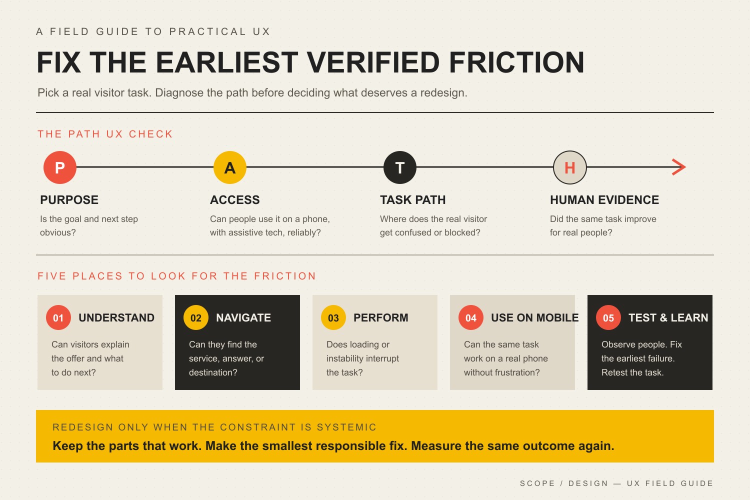
    Most business-site UX work lands in a handful of areas: understanding the user and task, simplifying navigation, improving performance, designing for real mobile behavior, and testing what actually changed. The visual below is a useful map of those areas. It is not a priority order. The right priority depends on where the task first breaks.

    The PATH UX Check covers Purpose, Access, Task path, and Human evidence, then five improvement areas: understand, navigate, perform, use on mobile, and test and learn.
    Five common website UX improvement areas. Diagnose the failing task before deciding which area deserves the next change.

    Use the Scope Design PATH UX Check

    The PATH UX Check is a simple way to stop a UX project from becoming a pile of unrelated best practices. Start at Purpose, then check Access, then the Task path, then Human evidence. When you find a verified constraint, fix the smallest responsible thing that can remove it and test again.

    PATH stepQuestionWhat to inspect
    P: PurposeWhat useful job is the visitor trying to finish?Offer clarity, page intent, qualification, primary next step, business outcome
    A: AccessCan the visitor reliably perceive and operate the experience?Performance, mobile behavior, accessibility, technical errors, input methods
    T: Task pathCan the visitor find, understand, trust, and complete each necessary step?Navigation, content, forms, controls, proof, feedback, error recovery
    H: Human evidenceWhat do real behavior and real outcomes show?Task observation, analytics, form errors, support questions, sales feedback, qualified outcomes

    PATH is not a claim that every journey is perfectly linear. Returning customers behave differently from first-time visitors, and people jump between pages. Its job is to keep the diagnosis ordered enough that you do not polish a later step while an earlier one is still failing.

    P: make the purpose and next step obvious

    Before you change colors, animations, or card layouts, read the page without the design language in your head. Can a visitor answer three questions: What is this? Is it for me? What should I do next?

    Use descriptive headlines instead of welcome copy. Name services the way customers recognize them. Make the primary call to action visually distinct from secondary actions. Put qualification details near the decision they affect instead of hiding them in an FAQ nobody has reached yet.

    Sometimes the first constraint is not “design” at all. If the page structure is sound but visitors still cannot understand the offer, compare the evidence before choosing between a layout change and a message change. Our guide to deciding whether design or content is the real conversion constraint goes deeper on that distinction.

    A: make the experience accessible, responsive, and reliable

    Test the task on a real phone

    “Responsive” is not the same as usable. A page can technically collapse to a narrow screen while still producing tiny controls, giant sticky elements, intrusive pop-ups, awkward forms, hidden comparison information, or a call to action that disappears several screens below the content that created intent.

    Use your actual phone. Try the same representative task in portrait orientation with the on-screen keyboard open. Check whether text remains readable, controls remain operable, focus is visible, the page survives zoom, errors appear near the right field, and fixed elements do not cover what you are trying to use.

    For a deeper treatment of responsive behavior, see why mobile optimization is more than shrinking the desktop layout.

    Fix performance that interrupts the task

    Speed matters because waiting, delayed responses, and unexpected movement interrupt what the visitor is trying to do. Google’s current Core Web Vitals cover Largest Contentful Paint (LCP), Interaction to Next Paint (INP), and Cumulative Layout Shift (CLS). For field data, the current “good” thresholds are LCP at 2.5 seconds or less, INP at 200 milliseconds or less, and CLS at 0.1 or less, evaluated at the 75th percentile. Those thresholds come from the official Core Web Vitals threshold guidance.

    Those metrics are useful diagnostics, not a complete definition of UX and not a ranking guarantee. Google explicitly recommends evaluating page experience holistically rather than treating it as a single signal. Its page experience guidance for Search is a useful guardrail against turning Core Web Vitals into superstition.

    • Resize and compress images instead of sending oversized files to every device.
    • Avoid loading scripts and widgets on pages that do not need them.
    • Reserve space for images, embeds, banners, and injected content so the interface does not jump.
    • Break up expensive JavaScript work that delays interaction.
    • Use field data when enough real-user data exists and lab tests to reproduce and diagnose individual problems.

    If performance is the verified constraint, use our website speed optimization guide for the implementation work instead of bloating this UX article into a performance manual.

    Treat accessibility as core usability

    Accessibility is part of UX because a task that cannot be perceived or operated is not a successful experience. The Web Content Accessibility Guidelines (WCAG) 2.2 organize accessibility around content that is perceivable, operable, understandable, and robust, with testable success criteria underneath those principles.

    Useful checks include keyboard navigation and visible focus, meaningful labels and instructions, identifiable errors, text that can resize without losing content or functionality, sufficient contrast, text alternatives where they carry meaning, and controls that do not depend on one input method. WCAG 2.2 also includes a Level AA Target Size (Minimum) criterion of 24 by 24 CSS pixels or one of its listed spacing, inline, equivalent, user-agent, or essential exceptions. The W3C’s Target Size explanation is the better reference than repeating an arbitrary “every button must be 44 or 48 pixels” rule.

    Accessibility requirements can intersect with legal obligations, but this article is not legal advice. Our detailed guide on improving website accessibility and ADA-related readiness covers the implementation problem in more depth.

    T: improve the task path, not just the interface

    Fix navigation and information architecture

    Navigation should help people predict where information lives. Clever labels create a tax on every click. “Solutions” might make sense internally, but if the customer is looking for “Commercial Roofing,” use the language that reduces interpretation.

    Audit the path, not just the menu. A visitor can have a tidy header and still get stuck because a service page has no next step, pricing context appears after the form, a location page dead-ends, or related information is scattered across pages with no useful cross-links.

    • Use labels that describe the destination.
    • Keep important routes consistent across templates.
    • Put supporting information near the decision it supports.
    • Use clear parent-child structure when the hierarchy is deep.
    • Check search, filters, account tools, or directories when they are necessary to a primary task.

    Reduce unnecessary form friction

    Forms fail for more reasons than “too many fields.” The better question is whether each step asks for information the business needs at that point, in a way the visitor can understand and recover from.

    Remove fields that exist only because somebody once thought they might be useful. Group related questions. Use persistent labels instead of placeholder-only instructions. Explain unusual requirements before the visitor triggers an error. Preserve entered information when validation fails. Make success unmistakable, including what happens next and when.

    Do not automatically shorten a form if qualification matters. A two-field lead form can create more submissions and worse leads. The UX target is not the least effort at any cost. It is the least unnecessary friction consistent with a useful outcome.

    Put trust and feedback where decisions happen

    Visitors hesitate when the cost of being wrong feels high. The useful response is not to dump a wall of testimonials at the top of every page. Put the right reassurance near the uncertainty it resolves.

    • Place relevant proof near the claim it substantiates.
    • Explain warranties, cancellation rules, returns, response times, or process steps before commitment.
    • Use real project examples or photographs when authenticity matters.
    • Show progress when a multi-step task takes time.
    • Confirm successful actions clearly.
    • Write error messages that explain what happened and how to recover.

    Feedback is UX, too. A button that looks dead after a click, a form that silently submits, or a filter that changes results without making the state clear forces the visitor to guess whether the interface heard them.

    A first-party example: ask for what the step actually needs

    On a fleet-services application flow we reviewed, the site asked people for information the business did not need at that stage. The reflexive UX answer could have been “make the form prettier” or “cut the form in half.” Instead, the useful question was what information the business needed now to move the application forward.

    Scope simplified the request to match that stage and instrumented the intended action so the business could judge what happened next. There is no honest universal conversion percentage to attach to that lesson. The information gain is the decision rule: remove unjustified friction, preserve justified friction, and measure the downstream outcome that matters.

    That distinction matters because UX can be made worse by chasing ease as the only goal. A financing application may need informed consent. A medical or safety workflow may need confirmation. A service business may need qualification details before promising a call. Good UX removes confusion and needless effort without removing safeguards the task genuinely requires.

    H: use human evidence before declaring a win

    Before changing the interface, record a baseline for the task you care about. Then compare the same task after the change. Pick measurements that reflect the actual job rather than whatever happens to be easiest to graph.

    • Task completion: Can representative users finish the task?
    • Time and effort: Where do they hesitate, backtrack, or ask for help?
    • Form or checkout completion: Where do people stop, and what errors occur?
    • Qualified outcome: Did the change improve useful leads, bookings, sales, applications, or support resolution rather than merely clicks?
    • Technical experience: Did mobile behavior, errors, accessibility failures, or Core Web Vitals improve where they were genuine constraints?
    • Qualitative evidence: What do user tests, support questions, sales conversations, and customer feedback reveal that analytics cannot explain?

    Do not declare a win because one chart moved. A shorter form that produces more junk leads may be worse. A new navigation that increases clicks because people now need two clicks instead of one is not automatically better. Connect the proxy to the outcome.

    Use symptoms to choose the first fix

    SymptomFirst questionLikely first fix to testWhat not to assume
    Visitors land but do not actDo they understand the offer and next step?Clarify message, qualification, and primary actionThat the page needs a visual redesign
    People cannot find key informationDo labels and page structure predict where it lives?Fix navigation, hierarchy, or contextual linksThat the menu simply needs fewer items
    Mobile users struggle with formsWhat breaks with a real phone and keyboard open?Fix layout, labels, controls, validation, or sticky UIThat “responsive” means usable
    Page feels slow or unstableWhich delivery problem interrupts the task?Fix the measured performance constraintThat a single score defines UX
    People start a form but abandon itIs the request justified and understood at that stage?Remove needless fields, explain requirements, improve recoveryThat shorter is always better
    Several templates fail in the same wayIs the constraint structural across the system?Evaluate a redesign or component-system changeThat local patches will stay cheaper

    How to know whether you actually need a redesign

    A redesign is justified when the constraint is structural enough that local fixes would create more complexity than they remove. That can happen when templates make essential content impossible to prioritize, the navigation model no longer matches the business, the component system cannot support accessible interaction, the mobile layout is fundamentally broken, performance problems are embedded in the architecture, or years of patchwork have made the site unsafe to change.

    “I am bored with it” is not the same thing. Neither is “a competitor changed theirs.” Preserve what works. If a narrow fix restores the task without creating another problem, take the narrow fix. If the same constraint appears across templates, journeys, devices, and content types, the evidence for redesign becomes stronger. Use the website redesign checklist when the problem has crossed that line.

    A 90-minute website user experience audit

    You can surface useful problems without commissioning a six-week research project. Use this website user experience audit as triage, not as a substitute for deeper research when the stakes are high.

    1. Choose one task. Name the visitor, starting page, intended outcome, and business value.
    2. Run the path cold. Use a phone and desktop. Record the first hesitation or failure rather than making a wish list.
    3. Check Purpose. Can the visitor understand the offer, qualification, and next step without insider knowledge?
    4. Check Access. Test mobile behavior, keyboard access, zoom, focus, performance, forms, and technical errors.
    5. Check the Task path. Can the person find, understand, trust, operate, complete, and recover?
    6. Collect Human evidence. Compare the observation with analytics, support questions, sales feedback, and form errors.
    7. Choose one constraint. Fix the earliest verified failure with the smallest responsible change.
    8. Repeat the same task. Compare behavior and outcomes to the baseline before opening a new round of work.

    Frequently asked questions about improving website UX

    What should I improve first on my website?

    Improve the earliest verified point of friction in an important visitor task. If people do not understand what the page offers, start with Purpose. If they understand it but cannot operate the experience, check Access. If the interface works but people cannot find, trust, or complete the next step, fix the Task path. Use Human evidence to decide whether the change actually helped.

    Do I need to redesign my website to improve user experience?

    Usually not. Many UX problems can be improved through content, navigation, forms, responsive behavior, performance, accessibility, trust, or feedback changes. Redesign when the underlying templates, architecture, component system, or accumulated technical debt prevent responsible local fixes.

    Are Core Web Vitals the same as user experience?

    No. LCP, INP, and CLS measure important aspects of loading, responsiveness, and visual stability. They do not tell you whether the offer is understandable, navigation is logical, a form asks the right questions, or the visitor trusts the business. Treat them as technical evidence inside a larger UX diagnosis.

    How do you measure website user experience?

    Measure the task and the outcome together. Useful evidence can include task completion, time and errors, form completion, qualified conversions, support questions, user-test observations, accessibility findings, and Core Web Vitals. Establish a baseline before the change so you can tell whether the fix improved the real job.

    What is the 3-second rule in website design?

    There is no universal UX standard saying every visitor leaves after exactly three seconds or that every page must fully load within that number. Use current performance measures such as LCP, INP, and CLS plus task evidence instead of treating a catchy timing rule as a law. More importantly, fix the specific delay or instability that interrupts the user’s task.

    What are the key factors in website user experience?

    There is no single official seven-factor list for every website. For practical business-site work, PATH covers the useful decision areas: Purpose, Access, Task path, and Human evidence. Inside those buckets you will inspect clarity, navigation, mobile behavior, accessibility, performance, forms, trust, feedback, completion, recovery, and real outcomes.

    Are the “7 C’s of a website” an official UX standard?

    No. Different articles use different “C” lists as teaching mnemonics. They can be useful if they help a team remember a real problem, but they are not a substitute for current technical standards, task observation, or business evidence. Use a mnemonic only when it improves the diagnosis rather than turning UX into a checklist contest.

    How to improve website user experience without replacing what works

    The best UX improvement is not the change with the most pixels attached to it. It is the change that removes the most important verified friction without creating a new one.

    Define the task. Run PATH. Find the earliest failure. Make the smallest responsible fix. Test the same task again. When the constraint is structural, redesign with evidence. When it is not, keep the working parts and solve the real problem.

    If your team knows the site is creating friction but cannot isolate the constraint, Scope Design’s web services team can audit the path across strategy, content, design, development, performance, accessibility, and measurement, then turn the findings into a prioritized plan instead of a cosmetic wish list.

    Sources and methodology

    This article was researched through a monitored Scope Design workflow on August 21, 2026. We reviewed Scope Design’s current UX doctrine in Open Brain, neighboring Content Studio articles and typed relationships, the literal internal-link graph, U.S. Ubersuggest keyword and SERP evidence, DataForSEO search and AI-query evidence, and current primary technical sources. Third-party search volumes were treated as directional research, not business-outcome facts.

    Primary technical references include web.dev’s Core Web Vitals threshold guidance, Google’s page experience guidance, the W3C’s WCAG 2.2 Recommendation, and the W3C’s Target Size (Minimum) explanation. We deliberately excluded legacy percentages about abandonment, UX ROI, universal conversion lifts, mobile traffic share, and navigation limits when the recovered evidence did not provide a defensible source chain.

  • 15+ Critical Web Development Mistakes Killing Your Business Growth

    15+ Critical Web Development Mistakes Killing Your Business Growth

    Bottom line: the most damaging web development mistakes are not cosmetic imperfections. They are failures that break a critical customer journey, make search or measurement unreliable, create security or accessibility risk, or leave the team unable to release and recover safely. Fix those before polishing lower-risk details.

    If you are auditing a business website, start with three questions: Can a person complete the job they came to do? Can search and measurement systems access and record the experience correctly? Can your team change the site and roll back safely? Those questions catch more consequential problems than a generic checklist of design pet peeves.

    (more…)
  • Why You Need a Mobile-Optimized Website: A Practical Guide

    Why You Need a Mobile-Optimized Website: A Practical Guide

    A mobile-optimized website is a site where someone can find what they need, understand it, take the next step, and finish the task on a phone without fighting the interface. Responsive layout is part of that job, but it is not the whole job. Mobile optimization also includes content priority, readable type, touch behavior, form usability, performance, and the complete customer path.

    If your site merely squeezes a desktop page onto a smaller screen, it may technically “fit” while still failing the person using it. A button can be visible but hard to tap. A form can be responsive but miserable to complete. A page can look fine in a browser preview but break when a real customer opens the menu, accepts a cookie notice, tries to call, books an appointment, or checks out.

    This guide gives you a practical way to judge the difference—and a short list of fixes to make first.

    What does “mobile-optimized website” actually mean?

    Three terms get mixed together:

    • Responsive website: the layout adapts to available screen space using flexible grids, images, typography, and breakpoints. If you want the implementation details, see our guide to responsive web design.
    • Mobile-friendly website: a broad description for a site that is reasonably usable on phones. It tells you the result, not how the site achieved it.
    • Mobile-optimized website: a site deliberately tuned so the important customer task works well on a phone—from arrival to completion.

    That distinction matters. A responsive layout can still have a 12-field form, a giant hero video, tiny tap targets, a sticky banner covering the main button, a navigation menu that traps the user, or a checkout flow that becomes unusable when the keyboard opens.

    So the useful question is not, “Does the page resize?” It is, “Can a real customer finish the job on a phone?”

    Why mobile optimization matters

    Google evaluates the mobile version of your content

    Google’s mobile-first indexing guidance says Google uses the mobile version of a site’s content for indexing and ranking. Google also recommends responsive web design as the easiest mobile pattern to implement and maintain, and says the primary content on mobile should be equivalent to the desktop version.

    That is a more useful rule than “hide half the page on phones.” Mobile optimization should prioritize and reorganize information, not quietly remove the content that makes the page useful.

    A small screen exposes weak priorities

    Desktop layouts can hide indecision because there is room for everything: several navigation choices, multiple calls to action, long supporting copy, sidebars, comparison tables, and decorative elements. A phone forces choices. What does the visitor need first? What action matters? What can wait?

    That constraint is healthy. If the page cannot explain the offer and next step in a narrow viewport, the underlying information hierarchy may be weak on every device.

    Performance is part of the interaction

    Mobile usability is not only visual. A page can be beautifully responsive and still feel broken if the main content arrives late, the interface ignores a tap, or elements jump while the visitor is trying to use them.

    The current Core Web Vitals give three useful field-performance thresholds: good Largest Contentful Paint (LCP) is 2.5 seconds or less, good Interaction to Next Paint (INP) is 200 milliseconds or less, and good Cumulative Layout Shift (CLS) is 0.1 or less, evaluated at the 75th percentile. Those are diagnostics—not a promise that hitting three numbers automatically creates a good mobile experience.

    If performance is the main problem, use our deeper website speed optimization guide instead of treating this article as a full performance-remediation manual.

    Touch and typing change the interface

    A mouse pointer is precise. A thumb is not. Mobile users also have an on-screen keyboard consuming space, autofill behavior, browser chrome, orientation changes, and interruptions that do not exist in a tidy desktop mockup.

    WCAG 2.2’s Target Size (Minimum) criterion uses 24 by 24 CSS pixels or qualifying spacing/exceptions at Level AA. That is a compliance floor with exceptions, not a design goal that says every button should be exactly 24 pixels. Comfortable controls need enough size and spacing to avoid accidental taps.

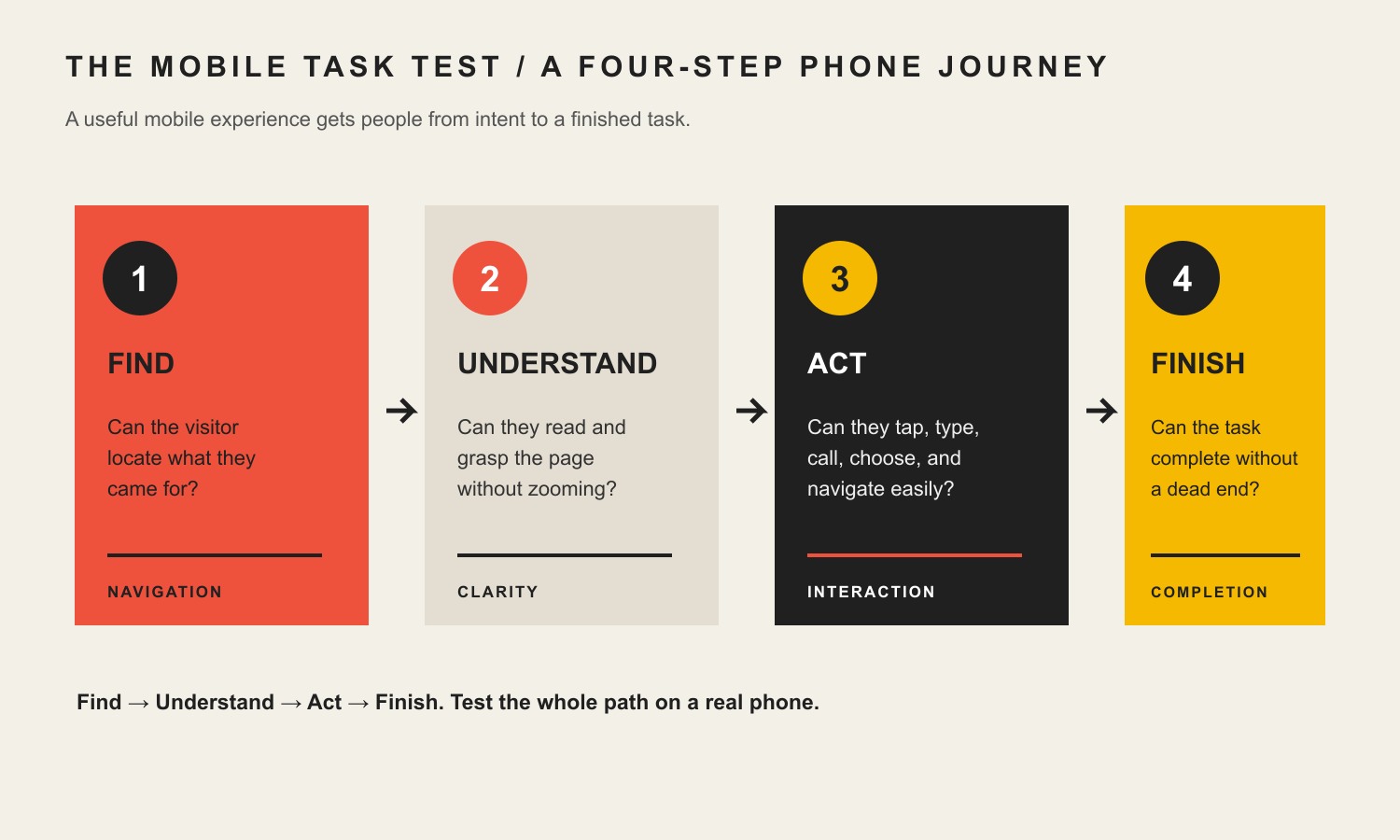
    The Scope Design Mobile Task Test: Find → Understand → Act → Finish

    Instead of judging a mobile page by a screenshot, test the customer’s task in four stages. A page is only as mobile-optimized as the weakest stage.

    Four mobile experience stages: find the right information, understand the page, act through touch-friendly controls, and finish the task.

    1. Find: Can the visitor locate what they came for?

    Start with the likely reason someone opened the page. A local-service customer may want to know whether you handle their problem, whether you serve their area, and how to call. A shopper may need price, options, shipping information, and the add-to-cart button. A prospective client may need proof, scope, and a way to start a conversation.

    • Is the page’s main promise visible without hunting?
    • Is the primary action obvious and reachable?
    • Does the navigation expose the important destinations without becoming a puzzle?
    • Do sticky banners, chat widgets, or consent notices cover critical controls?

    If a visitor cannot find the next step, shrinking the font or moving a breakpoint will not solve the real problem.

    2. Understand: Can they read and grasp the page without zooming?

    Mobile copy does not need to be dumbed down. It needs a stronger hierarchy. Put the answer before the backstory, use descriptive headings, break dense paragraphs, and keep proof close to the claim it supports.

    • Can body text be read comfortably at the default zoom?
    • Are headings distinct enough to scan quickly?
    • Are lines, cards, tables, and labels understandable without horizontal scrolling?
    • Is essential content present on mobile instead of hidden only to make the page shorter?

    Typography is one of the most common hidden mobile problems. Our website font-size guide goes deeper into readable, responsive type systems.

    3. Act: Can they tap, type, call, choose, and navigate easily?

    Now use the controls. Do not just look at them.

    • Tap the menu, accordions, tabs, sliders, filters, and close buttons.
    • Try the primary call to action with one thumb.
    • Open every form field and check the keyboard type, labels, validation, and autofill behavior.
    • Tap the phone number and email address if those are intended actions.
    • Rotate the device and make sure controls do not disappear or overlap.

    This is where many “responsive” sites fail. The layout changed, but the interaction was never designed for touch.

    4. Finish: Can the customer complete the task without a dead end?

    The last stage is the one screenshots miss. Complete the form. Book the appointment. Add the item to the cart. Select the variation. Use the payment field. Open the confirmation message. If the business goal is a phone call, tap through to the dialer and confirm the number.

    • Does the form submit successfully?
    • Does validation explain exactly what needs to change?
    • Can checkout or booking be completed with the on-screen keyboard open?
    • Does the user get a clear confirmation and next step?
    • If something fails, is there a recovery path?

    A mobile experience that looks polished but fails at “Finish” is not optimized for the business outcome.

    What auditing this exact article taught us

    We applied the same evidence rule to this revision before protecting any of the old copy. On August 21, 2026, Scope Design’s current GA4 property returned no landing-page rows for this exact path across the reviewed 2025–2026 window. Google Search Console returned no exact-page query rows and reported the URL as “Discovered – currently not indexed.” Bing recognized the exact URL but reported 0 clicks and 0 impressions. Ubersuggest returned no current page-keyword data.

    That does not prove the topic is unimportant, that nobody has ever used the page, or that mobile optimization has no business value. The sample is too weak for those conclusions, and analytics attribution is never perfect.

    It supports a narrower editorial decision: there was no demonstrated search or conversion footprint strong enough to justify preserving unsupported legacy statistics. So we kept the established URL, removed percentage-heavy claims we could not substantiate, and rebuilt the article around a diagnostic model a business owner can actually use.

    The technical baseline for a mobile-optimized site

    Use one responsive content system unless you have a strong reason not to

    For most business websites, one responsive site is simpler to maintain than separate desktop and mobile versions. Google explicitly recommends responsive design as the easiest configuration to implement and maintain. It also reduces the chance that one version gets stale, loses structured data, or serves different primary content.

    Keep primary content equivalent

    You can change presentation on mobile. You can collapse supporting detail into accordions, reorder modules, shorten labels, or replace a multi-column layout with a single column. But do not make the mobile version materially less useful by omitting the main text, links, images, or data that people and search systems need.

    Measure field performance, not just a lab score

    PageSpeed Insights is useful because it can show both lab diagnostics and, when available, Chrome user-experience field data. Use it to find problems; do not optimize the site for a vanity score while the customer task remains awkward.

    For ongoing search and performance measurement, connect technical observations to actual visibility and business outcomes. Our SEO strategy and analytics guide explains that broader measurement layer.

    Make forms phone-native

    Keep fields only when the information is genuinely needed. Use persistent labels, sensible input types, autofill-friendly fields, clear error states, and a submit button that remains reachable when the keyboard opens. If a lead form requires a long explanation, consider whether the website is asking for information the sales conversation could collect later.

    Treat overlays and sticky elements as part of the viewport budget

    A desktop popup that covers 30% of a large screen can cover most of a phone. Cookie notices, chat launchers, sticky headers, bottom bars, accessibility widgets, and promotional overlays can stack on top of one another. Test them together, not one at a time.

    What should you fix first?

    Do not start with cosmetic polish. Fix mobile problems in this order:

    1. Task blockers: broken navigation, hidden actions, unusable forms, failed checkout/booking, overlays covering controls, or device-specific errors.
    2. Performance and stability: oversized media, unnecessary third-party scripts, slow server response, render-blocking assets, interaction delay, and layout shifts.
    3. Clarity and hierarchy: vague headlines, desktop-first content order, hard-to-scan sections, tiny text, confusing tables, and competing calls to action.
    4. Touch and input friction: cramped controls, poor spacing, the wrong keyboard type, weak validation, and fields that fight autofill.
    5. Polish: animation, decorative effects, micro-interactions, and other improvements that matter only after the core task works.

    That order protects you from an expensive trap: making a broken path prettier.

    A 20-minute mobile website audit

    You do not need a full redesign meeting to find obvious mobile friction. Pick the single most valuable customer task on one important page and run this audit.

    Minutes 0–5: Find

    • Open the page from a real phone, not only a desktop browser preview.
    • Start at the same entry point a customer would use: search result, ad, email, social post, or direct URL.
    • Time how long it takes to identify the offer, essential proof, and main next step.
    • Capture anything that blocks the viewport.

    Minutes 5–10: Understand

    • Read the page at default zoom.
    • Scan every heading and ask whether the outline makes sense by itself.
    • Check whether important content disappeared on mobile.
    • Look for sideways scrolling, clipped text, broken tables, or oversized media.

    Minutes 10–15: Act

    • Use the menu and all interactive components.
    • Tap the main CTA and secondary actions.
    • Start the form, search, booking, or checkout flow.
    • Watch what happens when the keyboard opens and closes.

    Minutes 15–20: Finish

    • Complete the task using realistic test information.
    • Confirm validation, error recovery, and success messages.
    • Run the page through PageSpeed Insights and note LCP, INP, CLS, and the biggest diagnostics.
    • Write down the first three problems that directly blocked or slowed the task. Those are your first fixes.

    If you can, repeat the test on both iOS and Android and on more than one viewport size. Browser emulation is excellent for development, but it cannot reproduce every real-device keyboard, browser, network, and touch behavior.

    Mobile optimization FAQ

    Is a responsive website the same as a mobile-optimized website?

    No. Responsive design describes how the layout adapts across screen sizes. Mobile optimization is broader: the content, controls, performance, forms, and end-to-end task also need to work well on a phone. A responsive site can still provide a poor mobile experience.

    How can I tell if my website is optimized for mobile?

    Choose the most important customer task and complete it on a real phone using the Find → Understand → Act → Finish test. Then check field performance in PageSpeed Insights. If you only resize the homepage and declare victory, you are testing appearance, not the customer path.

    What screen sizes should I design for?

    Do not build around a short list of device models. Use fluid layouts and set breakpoints where the content or interaction actually stops working. Test narrow and wide phones, tablets, desktop widths, portrait and landscape, and unusually long translated or user-generated content when relevant.

    Should the mobile version have less content?

    It can have a different presentation, but Google recommends equivalent primary content across mobile and desktop. Prioritize, reorder, group, and progressively disclose supporting detail instead of deleting the information that makes the page complete.

    Do I need a separate mobile site?

    Usually not. For most business websites, responsive design gives you one URL and one content system to maintain. Google recommends responsive web design as the easiest mobile configuration to implement and maintain.

    What are good Core Web Vitals targets for mobile?

    For current Core Web Vitals, “good” means LCP at 2.5 seconds or less, INP at 200 milliseconds or less, and CLS at 0.1 or less at the 75th percentile. Treat those thresholds as a technical baseline, then test whether the actual task feels clear and responsive.

    Does WCAG require 44-by-44-pixel buttons?

    Not as a blanket WCAG 2.2 Level AA rule. Success Criterion 2.5.8 sets a 24-by-24 CSS-pixel minimum target-size rule with spacing and other exceptions. Larger controls can still be the better usability choice. The right design goal is comfortable, distinguishable controls that do not create accidental taps—not blindly shrinking every target to the minimum.

    Does mobile optimization help SEO?

    It can remove problems that affect crawling, indexing, page experience, performance, and usability, but it is not a ranking guarantee. Google uses the mobile version of content for indexing and ranking, so missing mobile content or broken mobile rendering can create real search problems. Relevance, quality, authority, technical health, and competition still matter too.

    Make the phone path work before you add more traffic

    A mobile-optimized website does not need gimmicks. It needs a clear path that survives the real constraints of a phone. If a customer can find the answer, understand the offer, act without fighting the interface, and finish the task, you have a useful foundation. If one of those stages fails, our UX and conversion diagnosis guide can help you identify whether the problem is clarity, interaction, trust, or the path itself.

    If your mobile experience is creating friction and you want help diagnosing the real constraint, Scope Design’s web design and development team can audit the path, prioritize the fixes, and build the solution without turning the project into a checklist of cosmetic tweaks.

    Sources and further reading