Tag: conversion optimization

  • How to Turn Your Website into a Lead-Generating Powerhouse

    How to Turn Your Website into a Lead-Generating Powerhouse

    Website lead generation is the process of turning the right website visitors into qualified next steps your business can actually handle and measure. That is different from collecting the largest possible pile of form submissions. A lead-generating website aligns demand, message, proof, action, and follow-up so the right prospect can recognize the fit and move forward.

    Bottom line: If your website is not generating useful leads, do not start by adding another popup, shortening every form, or buying more traffic. Find the constraint first. The problem may be traffic quality, message clarity, weak proof, the wrong call to action, broken routing, or slow sales follow-up. Fix the first broken link in the chain.

    TL;DR: How to turn a website into a lead-generating system

    • Attract relevant demand, not just more sessions.
    • Make it immediately clear who you help, what you solve, and why your approach fits.
    • Put proof where doubt appears instead of hiding it on a testimonials page.
    • Ask for the right commitment for the visitor’s stage and the economics of the sale.
    • Use qualification friction intentionally; fewer form fields are not automatically better.
    • Make form notifications, phone tracking, CRM routing, and follow-up work before obsessing over micro-conversion tests.
    • Measure the last meaningful outcome the website can influence: a qualified inquiry, booked appointment, opportunity, or another business-relevant next step.

    A lead-generating website is a system, not a brochure

    A brochure website can look polished and still fail commercially. It describes the company, lists services, and offers a contact page. A lead-generating website does more: it creates a deliberate path from a visitor’s reason for arriving to a next step that makes sense for both the visitor and the business.

    That distinction matters because a form fill is not automatically a win. Ten vague inquiries outside your service area can create more sales work and less revenue than two well-qualified conversations. If you only optimize the visitor-to-form rate, you can accidentally get very efficient at attracting the wrong people.

    Scope Design’s broader small-business marketing strategy treats acquisition as a system rather than a channel shopping list. This article picks up at the point where that demand reaches your site and asks one narrower question: how does relevant attention become a qualified lead?

    The Scope Design LEAD System for website lead generation

    We use a simple four-stage model for the acquisition-to-lead bridge:

    1. L — Land the right demand. Match the visitor’s source, query, campaign, and intent to the right page.
    2. E — Explain the fit. Make the audience, outcome, difference, proof, and important objections clear.
    3. A — Ask for the right commitment. Give the visitor an appropriate direct or transitional action and collect only the information the next step requires.
    4. D — Deliver and diagnose. Route the inquiry correctly, follow up, measure quality, and use the result to find the next constraint.

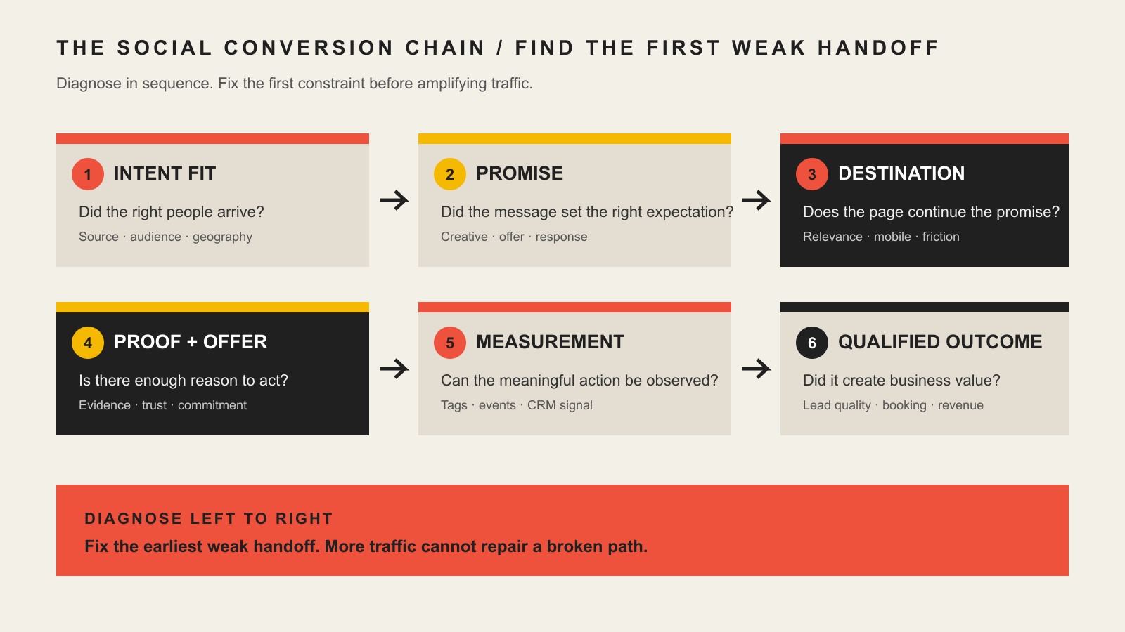
    A connected route shows the four stages of website lead generation: relevant demand, clear fit, the right commitment, and delivery with measurement.
    The Scope Design LEAD System: diagnose the broken stage before prescribing the tactic.

    The point of the framework is not the acronym. The point is sequence. If the wrong people are landing on the page, rewriting a button is not your first problem. If the offer is unclear, a faster form will not rescue it. If qualified leads are arriving but nobody responds promptly, the website may be doing its job while the follow-up system is failing.

    Diagnose the real constraint before you optimize

    A requested tactic is evidence, not a diagnosis. “We need a new homepage,” “make the form shorter,” “add a chatbot,” or “run more ads” may be reasonable requests, but none tells you what is actually broken.

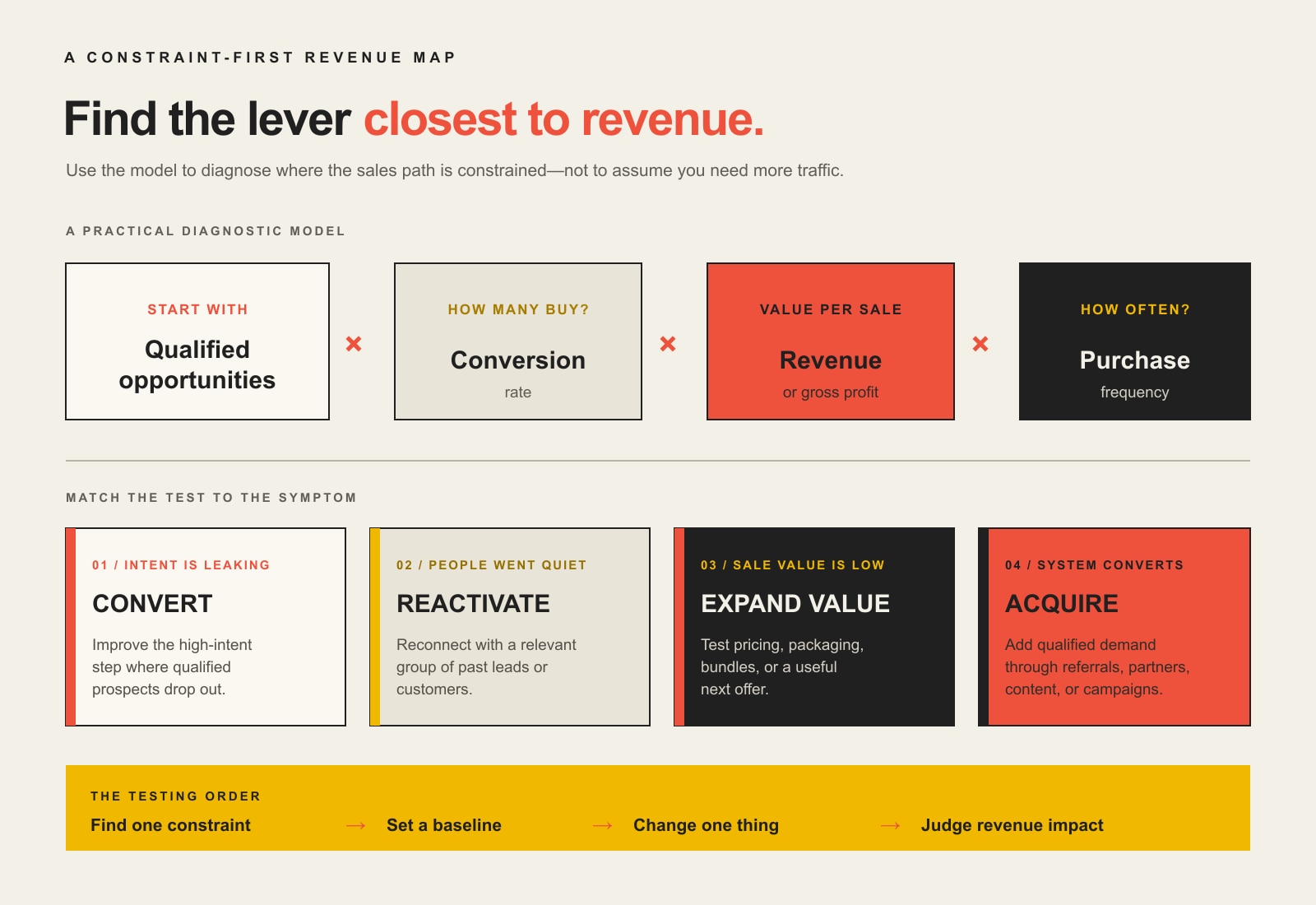
    For lead-generation problems, Scope Design’s Constraint-First approach checks the system in this order:

    1. Measurement and technical integrity: Do forms work? Do notifications arrive? Are calls trackable? Does the mobile experience function? Can you tell where inquiries came from?
    2. Sufficient relevant volume: Is enough of the right audience reaching the page to judge conversion performance at all?
    3. Traffic quality and acquisition fit: Are search queries, ads, referrals, email clicks, or social visitors arriving with intent the page can satisfy?
    4. Messaging clarity: Can the right buyer quickly tell what you do, who it is for, and what outcome you help create?
    5. UX friction: Can the visitor find the information, proof, and next step without unnecessary confusion?
    6. Offer and positioning: Is the thing being offered compelling and differentiated enough to deserve action?
    7. Sales and operational follow-through: Does the inquiry reach the right person, get an appropriate response, and enter a process the business can actually support?

    This order prevents expensive nonsense. A button-color test is not useful when the form notification is broken. More SEO traffic is not useful when the page attracts research intent but asks for a sales call. A chatbot is not useful when the business cannot answer the qualified inquiries it already receives.

    L — Land the right demand

    Website lead generation begins before the visitor reaches the page. The quality of the lead is partly determined by the promise that earned the click.

    A person searching “emergency commercial roof repair” has a different job than someone searching “how long does a commercial roof last.” A returning email subscriber has different context than a cold social visitor. Sending all of them to the same generic homepage and measuring a single conversion rate hides the real story.

    For each meaningful acquisition source, answer four questions:

    • What did the visitor see or search before clicking?
    • What problem are they probably trying to solve now?
    • Which page best continues that promise?
    • What next step is reasonable at this level of intent?

    This is where SEO and analytics measurement becomes commercially useful. Rankings, impressions, and sessions are not the finish line. They help you diagnose whether the right demand is arriving and which sources deserve more attention.

    Do not force every visitor through the homepage

    Your homepage should explain the business and route people well. It does not need to be the best destination for every campaign. High-intent ads, service-specific searches, event promotions, lead magnets, and segmented email campaigns often deserve a page built around that exact promise.

    The principle is simple: the closer the landing experience matches the reason for the click, the less translation the visitor has to do.

    E — Explain the fit

    Once the right visitor arrives, your site has to help them decide whether you are relevant. “Welcome to our website” and “we provide quality solutions” do not do that job.

    A strong lead-generation page usually answers these questions quickly:

    • Who is this for? Name the customer, situation, or problem specifically enough that the right person recognizes themselves.
    • What outcome do you help create? Lead with the business or life result, not an internal feature list.
    • Why this approach? Explain what is different, what tradeoffs you make, and where your method fits.
    • What proves it? Put relevant examples, testimonials, process evidence, certifications, numbers, or case material near the claim they support.
    • What should I expect? Reduce uncertainty around process, scope, timing, geography, pricing approach, or eligibility where those questions affect fit.

    Specificity does two jobs at once. It improves persuasion for the right prospect and creates self-selection for the wrong one. That is useful lead generation. A page that appeals vaguely to everyone often qualifies no one.

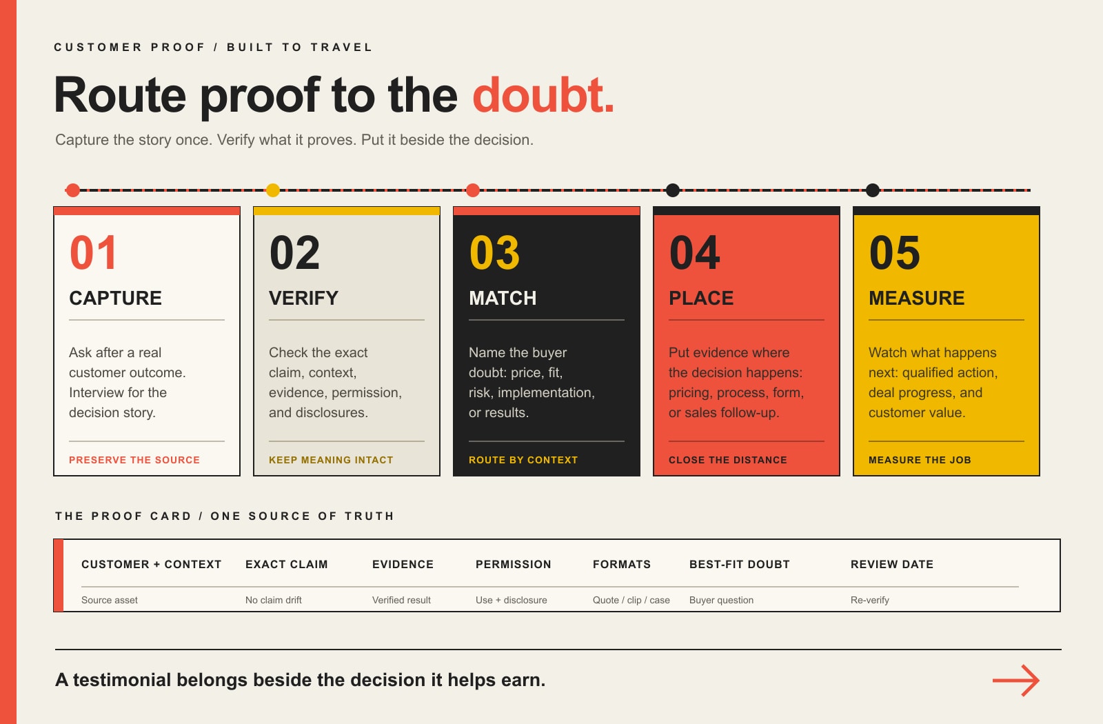
    Put proof where doubt appears

    Do not make visitors hunt through a giant “Testimonials” page to decide whether a claim is believable. If you say you understand manufacturers, place a relevant manufacturing example nearby. If you promise a smoother migration, show what that process looks like. If price is the obvious concern, explain what changes the investment instead of pretending the question does not exist.

    Proof works best as part of the argument, not as decoration after it.

    A — Ask for the right commitment

    The call to action should match the buyer’s readiness and the economics of your sale. “Contact us” is not wrong because the words are boring. It is weak when the visitor cannot tell what happens next or whether the commitment is appropriate.

    Use a direct action when someone is ready to move: request a quote, schedule a consultation, start an assessment, call now, reserve a spot. Use a transitional action when the visitor needs a lower-risk next step: compare options, download a checklist, see a sample, use a calculator, review a case study.

    Good CTA architecture gives a motivated buyer a clear path without forcing an early-stage visitor into a sales conversation they do not want. Our guide to CTA psychology and conversion language goes deeper on wording; the more important strategic question here is what commitment the page should ask for.

    Should you use fewer form fields?

    Sometimes. Not always.

    Reducing unnecessary friction is good. Removing useful qualification is not automatically good. If every inquiry requires 30 minutes of sales review, one or two high-signal questions about project type, location, timing, company size, or budget range may save both sides time. For a simple low-risk download, those same questions may be absurd.

    Choose form friction based on:

    • the value and complexity of the sale;
    • how expensive each follow-up is;
    • your capacity to serve new work;
    • what information changes eligibility or routing;
    • how much trust the visitor has built before the form;
    • whether a phone call, booking flow, or transitional offer is a better next step.

    The goal is not the shortest form. The goal is the lowest appropriate friction for a useful next step.

    D — Deliver the lead and diagnose what happens next

    A conversion does not end when someone clicks Submit. That click starts an operational process.

    Before spending serious time on conversion experiments, verify the boring plumbing:

    • Test every important form on desktop and mobile.
    • Confirm success messages and confirmation emails are accurate.
    • Make sure notifications reach a monitored inbox or CRM queue.
    • Route service, geography, budget, or product inquiries to the correct owner.
    • Track calls when phone leads matter.
    • Record original source, campaign, landing page, or other acquisition context when possible.
    • Define what happens if nobody responds within the expected window.

    This is where lead quality becomes measurable. Google supports deeper-funnel concepts such as qualified leads and converted leads, and Google Analytics provides a lead acquisition report. The tool does not create your measurement strategy for you, but the direction is right: connect acquisition to what happened after the first inquiry.

    Homepage vs. landing page: give each page one clear job

    A common lead-generation mistake is asking one page to serve every audience, channel, service, and stage of awareness.

    Page typeBest jobTypical next step
    HomepageExplain the business, establish relevance, and route visitorsChoose a service, explore proof, start a primary action
    Service pageMatch a specific problem or buying need to an offerRequest an estimate, schedule a call, review fit
    Campaign landing pageContinue one focused promise from an ad, email, event, or offerComplete the campaign-specific action
    Resource pageHelp a research-stage visitor solve a question and build trustRead next, use a tool, subscribe, or take a transitional step

    You do not need dozens of landing pages because a statistic says so. Build another page when a meaningful audience, intent, offer, or campaign needs a distinct argument and next step.

    What should a lead-generating website measure?

    Use metrics according to the decision they help you make. A diagnostic metric can be useful without being the business outcome.

    MetricWhat it tells youHow to use it
    Impressions, rankings, sessionsWhether demand exists and whether people are reaching youDiagnose visibility and traffic volume
    Source, query, campaign, landing pageWhere visitors came from and what likely shaped their intentCompare acquisition fit and lead quality by source
    CTA clicks, form starts, phone clicksWhere intent appears or friction beginsLocate page-level problems
    Form submissions and callsRaw inquiry volumeTrack the top of the lead process, not the final result
    Qualified inquiries or attended appointmentsWhether the website is producing usable next stepsPrimary accountable outcome for many service businesses
    Opportunities, close rate, revenue, churnWhether lead quality holds up downstreamValidate whether website optimization is helping the business

    For a considered B2B service, a qualified opportunity may be the best website-accountable outcome. For a local service company, it may be a booked-and-attended appointment or a tracked phone inquiry that meets service criteria. The exact metric changes. The principle does not: measure as close to real business value as your site and systems can reliably influence.

    What this article’s own data taught us

    We applied the same rule to this page before revising it in August 2026.

    For the exact URL during the 12 months ending August 20, 2026, Scope Design’s GA4 property recorded only 3 Direct sessions, 0 engaged sessions, and 0 configured key events. The prior comparison period returned no landing-page row. Google Search Console returned no exact-URL query/page rows in either 12-month period and, at the time of inspection, reported the page as Crawled – currently not indexed. Bing reported the URL as in its index but showed 0 exact-URL clicks and 0 impressions in its URL traffic view.

    That is not enough data to say the old article “did not convert.” It is not enough traffic to judge conversion performance at all, and configured analytics events may not capture every meaningful business action. It also is not evidence that the topic lacks demand: current keyword research showed meaningful commercial interest around website lead generation.

    So we did not change the established URL just to force an exact keyword into the slug. We preserved the address, removed unsupported statistic soup, clarified what the article owns, and rebuilt the content around a specific diagnostic model. That is the same constraint-first logic we recommend for a client’s website: do not claim certainty the evidence cannot support.

    Website lead-generation implementation checklist

    • Define a qualified lead. Write down the characteristics that make an inquiry worth sales attention.
    • Pick the accountable outcome. Decide whether the website should produce qualified inquiries, booked appointments, quote requests, opportunities, or another meaningful next step.
    • Test the plumbing. Submit forms, click phone links, test mobile flows, verify notifications, and check CRM routing.
    • Map acquisition intent. List your important sources, queries, campaigns, and referral paths. Make sure each lands on a page that continues the promise.
    • Rewrite for fit. Make the audience, problem, outcome, difference, proof, and process obvious.
    • Place proof near claims. Use the most relevant example at the moment doubt is likely to appear.
    • Choose a primary next step. Give ready buyers one clear direct action.
    • Add a transitional step when needed. Help research-stage visitors move forward without forcing a sales call.
    • Right-size form friction. Remove pointless fields, keep high-signal qualification fields when they improve routing or lead quality.
    • Measure source to qualified outcome. Do not stop at sessions and form submissions.
    • Fix the first constraint. Change the variable most likely to be limiting results before piling on tactics.
    • Re-measure after the change. Keep what improves the business outcome; undo what merely moves a vanity metric.

    Website lead generation FAQ

    What is a lead generation website?

    A lead generation website is designed to turn relevant visitors into a meaningful next step, such as a qualified inquiry, consultation, estimate request, booked appointment, or another action connected to the sales process. It combines acquisition fit, clear messaging, proof, conversion paths, routing, and measurement.

    Why is my website getting traffic but not leads?

    Common causes include low-intent or mismatched traffic, unclear positioning, weak proof, an inappropriate CTA, too much or too little qualification friction, broken forms, poor mobile usability, or a follow-up process that loses inquiries after submission. Segment performance by source and landing page before assuming the page design is the only problem.

    Should every page have a call to action?

    Most commercially useful pages should give the visitor a sensible next step, but that does not mean every page needs the same “Book a Call” button. The action should match the page’s purpose and the visitor’s stage. A resource page may point to a related guide or diagnostic tool; a high-intent service page may ask for an estimate.

    How many fields should a lead form have?

    There is no universal best number. Ask for the least information needed to make the next step useful. For a simple download, that may be an email address. For a high-value service with expensive sales follow-up, project type, geography, timing, or budget range may be justified qualification fields.

    Do I need a separate landing page for every campaign?

    No. Create a dedicated landing page when the audience, promise, offer, or desired action is distinct enough that a generic page creates unnecessary translation or distraction. The page should exist because it has a clear job, not because you are trying to hit an arbitrary landing-page count.

    What is the best metric for website lead generation?

    For many service businesses, the most useful metric is a qualified inquiry, booked-and-attended appointment, or qualified opportunity rather than a raw form submission. Use sessions, rankings, CTA clicks, and form starts as diagnostics, then connect them to deeper-funnel outcomes.

    Should I add a chatbot or popup to generate more leads?

    Only if it solves a diagnosed problem. A chatbot can help when visitors repeatedly need fast answers or routing. A popup can help present a relevant transitional offer. Neither fixes bad traffic, weak positioning, an uncompetitive offer, or poor follow-up by itself.

    Build the lead system before buying more attention

    A lead-generating website does not come from stacking tactics until something moves. It comes from making the chain work: Land the right demand. Explain the fit. Ask for the right commitment. Deliver and diagnose.

    If you have traffic but not enough useful inquiries, start with the constraint. If you do not have enough relevant traffic to judge the site, solve that first. If good prospects arrive but cannot tell whether you fit, fix the message. If they act but the leads disappear into an inbox nobody owns, fix the operation.

    If you want Scope Design to help diagnose the lead-generation chain before you spend money on another redesign, campaign, or conversion gadget, bring us the site, the traffic sources, and your definition of a qualified lead. That gives us something real to work with.


  • Website Design Conversion Optimization: 5 Friction Checks Before You Redesign

    Website Design Conversion Optimization: 5 Friction Checks Before You Redesign

    Website design conversion optimization is not about making a page prettier and hoping more people buy. Design affects conversion when it changes whether a qualified visitor can notice the important choice, understand it, trust it, complete it, and recover when something goes wrong. The useful question is not “Which design trick converts best?” It is “What is the first design-created obstacle in this path?”

    Short answer: yes, website design can affect conversion rates. But design is only one part of the system. Better hierarchy cannot rescue irrelevant traffic. A polished button cannot fix a weak offer. A modern layout cannot manufacture evidence that does not exist. If you are not sure which layer is failing, start with our broader guide to diagnosing why a website is not converting.

    Website Design Conversion Optimization Starts With Friction

    A conversion is any useful action you can define and measure: a qualified form submission, a scheduled consultation, a purchase, an account creation, a phone call, a donation, or another meaningful next step. Design influences that action through the interface people must use to get there.

    That distinction matters because web design and content solve different problems. Content explains the offer, the evidence, the objection, and the next step. Design changes hierarchy, attention, readability, perceived consistency, control states, navigation, form behavior, and the path through that content. A conversion problem can live in either layer—or somewhere else entirely.

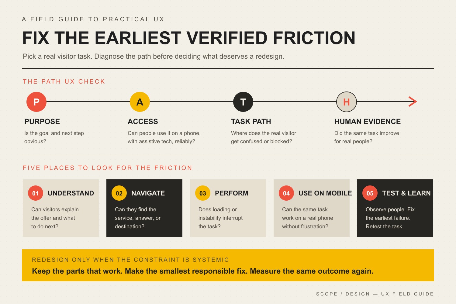
    Scope Design uses five checks to keep a visual redesign from becoming the default diagnosis: Attention, Comprehension, Credibility, Ability, and Evidence.

    Five connected checks for an online task: see the main action, understand choices, trust the evidence, complete and recover from a mobile form, and measure the outcome.

    The Five Design Friction Checks

    1. Attention: Can People See What Matters?

    Visual hierarchy should make the page’s important relationships obvious. Headings, spacing, type size, contrast, placement, and restraint can help a visitor distinguish the main action from supporting information. When every element shouts, nothing leads.

    Color is one tool, not a conversion spell. The better question is whether the action is distinguishable in context and remains usable for people with different visual abilities. If your palette is doing too much work, our guide to choosing brand colors that actually work explains why hierarchy and accessibility matter more than a mythical “highest-converting” hue.

    2. Comprehension: Can They Understand the Choice?

    A page can be attractive and still make the decision harder. Long line lengths, weak heading structure, labels that disappear when a field is active, decorative type, vague buttons, dense feature grids, or competing cards can force people to decode the interface before they can evaluate the offer.

    The W3C’s designing-for-accessibility guidance recommends sufficient contrast, identifiable interactive elements, clear and consistent navigation, associated form labels, identifiable feedback, useful headings and spacing, and designs that work at different viewport sizes. Those are accessibility requirements and good interface practices; they also remove avoidable effort from ordinary task completion.

    3. Credibility: Does the Interface Support Trust?

    Trust is not a badge collection. The interface earns credibility when what it promises matches what it shows: claims are near evidence, pricing and next steps are understandable, forms ask for information that makes sense, error states explain what happened, and the visual system stays consistent enough that the site feels maintained.

    The U.S. Web Design System’s design principles frame trust as something a service has to earn through reliability, consistency, honesty, respect for people’s time and data, and continued validation with real users. That is a stronger conversion principle than “add more trust icons.”

    4. Ability: Can They Complete the Task?

    If someone understands and wants the offer but cannot complete the action, the interface has failed at the most expensive moment. Check the real path on a phone, with a keyboard, at larger text sizes, with slow connections, and through common error states. Pay special attention to menus, forms, tap targets, focus states, sticky elements, validation, confirmation messages, and anything that shifts while the page loads.

    Responsive layout belongs here because “works on mobile” is a task requirement, not a screenshot requirement. Our guide to responsive web design goes deeper into preserving the same business task across screen sizes.

    Performance can also be part of ability. One useful controlled example comes from Rakuten 24. In a mobile A/B test documented by web.dev, the two versions were visually and functionally comparable, but the optimized version finished loading 0.4 seconds earlier and recorded a 33.13% higher conversion rate and 53.37% higher revenue per visitor. That is evidence that performance can affect a real conversion path; it is one retailer’s test, not a universal promise for every website.

    5. Evidence: Did the Change Help?

    A design change is not successful because the team likes the new version. Define the behavior you are trying to improve, preserve a baseline, make a controlled change when practical, and compare the result for the relevant audience. Watch the business outcome, not only a proxy such as button clicks.

    This is also where useful friction matters. A shorter form is not automatically better if the removed fields were qualifying poor-fit leads. A louder CTA is not automatically better if it causes more low-intent submissions. Our guide to website conversion mistakes explains the difference between accidental friction that wastes effort and intentional friction that protects a useful decision.

    What Should You Test First?

    Start with the symptom closest to a qualified visitor’s failed action. Do not redesign six variables at once and then credit the new font.

    Observed symptomLikely design constraint to inspectControlled first testUseful outcome
    People reach the page but miss the main actionAttention / hierarchyReduce competing emphasis and make one primary action visually dominantQualified progression to the next step
    People start but abandon a formComprehension or abilityClarify labels, required fields, validation, error recovery, and mobile layoutCompleted qualified submissions
    People read but hesitate before committingCredibilityMove specific proof, constraints, process details, or pricing context closer to the claim it supportsQualified action rate or fewer repeated objections
    Mobile behavior is materially worseAbilityTest the full path on narrow viewports; remove overlaps, layout shifts, tiny controls, and hidden informationMobile task completion compared with its own baseline
    A redesign “looks better” but results are unclearEvidenceChoose one measurable hypothesis and compare a controlled change or time-bounded baselineBusiness outcome tied to the hypothesis

    Website Design Conversion Optimization: What Design Cannot Fix

    Design matters. It is also an easy place to hide a non-design problem. Before commissioning a full visual overhaul, ask whether the actual constraint is one of these:

    • Wrong traffic: the page attracts people who were never likely to become customers.
    • Weak or confusing offer: the visitor understands the interface but does not see enough value to act.
    • Missing evidence: the page makes claims the business has not supported with examples, proof, process detail, or relevant experience.
    • Content problem: the copy does not answer the decision, objection, or next-step question. Stronger visual treatment cannot manufacture a clear offer or point of view that does not exist.
    • Operational friction: slow follow-up, broken scheduling, inventory constraints, unclear pricing, or a poor sales handoff happens after the interface did its job.
    • Measurement failure: analytics cannot distinguish a real lead, purchase, or qualified action from noise.

    If the question is specifically whether the page needs better design or better messaging, use the design-vs-content diagnostic before replacing both.

    Do You Need a Full Website Redesign?

    Not necessarily. A full redesign makes sense when the friction is systemic: the visual hierarchy is inconsistent across important pages, the responsive system repeatedly breaks tasks, the component library makes accessibility fixes difficult, the content architecture no longer matches how people buy, or the technology prevents reasonable iteration.

    Targeted changes are usually a better first move when one path is clearly broken: a confusing form, buried CTA, poor proof placement, unreadable content block, mobile overlap, or misleading control. Fix the smallest constraint that can test the diagnosis. If it works, you learned something. If it does not, you avoided rebuilding an entire site around a guess.

    What Auditing This Exact Article Taught Us

    We used the same evidence rule on this revision. In the 12 months ending August 20, 2026, this exact URL recorded only four GA4 landing sessions, all Direct, with zero engaged sessions and zero configured key events. Google Search Console returned no exact-page performance rows and currently reports the page as “Discovered – currently not indexed.” Bing reports zero clicks and zero impressions. Ubersuggest found no exact-page ranking keywords or backlinks.

    That is not enough traffic to conclude the old article did or did not convert, and Scope Design’s configured analytics events do not capture every possible business outcome. It is enough to reject a weaker editorial habit: preserving unsupported conversion percentages because the page has been online for years. We kept the established URL, removed the statistic soup, narrowed the article’s job, and rebuilt it around a testable design-friction framework.

    Frequently Asked Questions

    Does good website design automatically increase conversions?

    No. Good design can remove barriers to seeing, understanding, trusting, and completing an action, but conversion still depends on traffic quality, the offer, content, evidence, price, follow-up, and measurement. The right design change is the one tied to a diagnosed obstacle.

    What website design change should I make first?

    Fix the first broken step in the actual conversion path. If visitors miss the action, inspect hierarchy. If they start and abandon, inspect the form and error recovery. If they hesitate, inspect proof and expectations. If mobile users struggle, test the whole task on a small viewport. Pick the symptom before the pattern.

    What color CTA button converts best?

    There is no universal highest-converting button color. A CTA needs enough contrast to be identifiable, must fit the visual hierarchy, and must remain accessible. Its wording, placement, surrounding evidence, audience, and offer can matter more than the hue.

    What is a good website conversion rate?

    A generic industry average can be a weak diagnostic because a purchase, consultation request, newsletter signup, and highly qualified B2B lead are different actions with different economics. Start with your own baseline by page, source, device, audience, and conversion definition. Improve the business outcome that matters instead of chasing somebody else’s percentage.

    Design the Next Step, Then Measure It

    Website design conversion optimization is disciplined interface work: make the important choice visible, understandable, credible, usable, and measurable. When those five checks are healthy, visual polish has a job. When one is broken, that is where the next design decision should start.

    If you cannot tell whether your bottleneck is design, content, offer, traffic, accessibility, performance, or measurement, talk with Scope Design. We can diagnose the path before prescribing a redesign.

  • Marketing to Senior Customers: How to Increase Sales by Understanding Older Adult Preferences

    Marketing to Senior Customers: How to Increase Sales by Understanding Older Adult Preferences

    Marketing to seniors should not begin with a list of things people over 65 supposedly like. It should begin with a simpler question: What is making it harder for this customer to understand, trust, use, or complete the buying process?

    That distinction matters because older adults are not a niche group living outside modern digital behavior. Pew Research Center’s 2025 U.S. data shows that 90% of adults age 65 and older use the internet. Separately, AARP’s 2026 Tech Trends research reports 90% smartphone ownership among adults age 50 and older in 2025. Those are different age groups and different measures, but they point in the same direction: treating older customers as broadly “offline” is a bad starting assumption.

    The better approach is to use age as context, then use evidence to find friction. At Scope Design, we use five checks: Clarity & Readability, Accessibility & Usability, Decision Confidence & Trust, Transaction & Support Choice, and Channel Evidence & Measurement. Fix the problems you can observe. Test the alternatives. Keep what improves the customer experience and business outcome.

    Start With Evidence, Not Age Stereotypes

    The phrase “marketing to seniors” is useful because people search for it. It is less useful as a strategy if it becomes shorthand for assumptions such as “seniors want phone calls,” “seniors do not trust websites,” or “direct mail is the best way to reach them.”

    A 66-year-old online shopper, an 82-year-old caregiver, a 58-year-old business owner, and a 71-year-old first-time smartphone user may share an age bracket in somebody’s spreadsheet while having completely different needs, abilities, motivations, budgets, and buying habits. Good target-audience research uses demographics to describe part of the market, then adds behavior, situation, needs, objections, and evidence from real customers.

    That is especially important online. Pew also reports that 17% of U.S. adults age 65+ were smartphone-dependent in 2025, meaning they had a smartphone but not traditional home broadband. A website that works beautifully on a large office monitor and poorly on a phone can therefore create the exact kind of friction a business might mistakenly blame on “senior tech resistance.”

    Use this rule: age can tell you which questions are worth investigating. It cannot answer those questions for you.

    Use the Scope Design Five Friction Checks

    The Five Friction Checks turn “make our marketing more senior-friendly” into something a team can inspect and improve without building a caricature of the customer.

    Friction checkQuestion to askEvidence to inspectFirst test
    Clarity & ReadabilityCan a customer understand the offer and next step quickly?Repeated questions, misread offers, form errors, support requestsSimplify labels, hierarchy, copy, and key instructions
    Accessibility & UsabilityCan the customer comfortably operate the page or process?Mobile behavior, abandoned forms, usability tests, accessibility checksImprove text, contrast, controls, navigation, forms, and media
    Decision Confidence & TrustCan the customer verify who you are and what happens next?Pre-sale questions, exit feedback, support logs, policy confusionClarify identity, price, fees, policies, proof, and contact options
    Transaction & Support ChoiceIs one forced path blocking people who otherwise want to buy?Checkout abandonment, call reasons, assisted-sale rate, completion rateAdd one useful alternative without weakening the primary path
    Channel Evidence & MeasurementWhere do qualified customers actually respond and convert?Campaign outcomes, source data, interviews, repeat sales, lead qualityShift budget toward measured results, not demographic folklore

    1. Clarity & Readability

    Start with the message before blaming the medium. Can someone tell what you sell, who it is for, what it costs or what affects the cost, and what to do next without decoding jargon?

    Readable design is not the same as “make everything huge.” Use a sensible base font size, strong contrast, clear hierarchy, meaningful headings, descriptive buttons and links, adequate spacing, and instructions placed where the decision happens. If a customer has to pinch-zoom a form, hunt for the phone number, or remember information from three screens ago, the interface is doing unnecessary work.

    2. Accessibility & Usability

    Age-related changes can affect vision, dexterity, hearing, concentration, and short-term memory, but not every older person experiences the same changes. The useful design lesson is broader: accessible experiences remove barriers for many kinds of customers.

    The W3C Web Accessibility Initiative says the web-accessibility needs of older users substantially overlap the needs of people with disabilities, and that existing accessibility standards address most of those needs. That means you usually do not need a special “senior version” of your site. You need a good site: readable and resizable text, sufficient contrast, clear controls, consistent navigation, accessible media, descriptive labels, and forms that explain errors and how to fix them.

    If accessibility is a weak spot, our guide to making a website more accessible and ADA-ready goes deeper into the standards and practical work.

    3. Decision Confidence & Trust

    Trust should not be treated as a personality trait assigned to an age group. It should be designed into the buying process for everyone.

    Make the business easy to verify. Show a real company identity and contact information. Explain price, recurring charges, shipping, returns, guarantees, appointment terms, and data collection before a customer has to commit. Use recognizable payment flows. Avoid countdown pressure, disguised subscriptions, vague fees, and copy that sounds like it is trying to outsmart the reader.

    There is a legitimate reason to take verification seriously without portraying older adults as gullible. The FTC reported $2.4 billion in fraud losses reported by adults 60+ in 2024, while also noting that older adults reported losing money to fraud at a lower rate than younger adults overall. The lesson for a legitimate business is not “seniors are afraid.” It is: make legitimacy easy to confirm.

    This is also where demographic shortcuts can hide the real reason a sale stalls. Our buyer psychology guide looks at the motives, uncertainty, effort, risk, and decision conditions that can matter more than age alone.

    4. Transaction & Support Choice

    Offering choice is useful. Assuming which choice an older customer wants is not.

    If your primary path is online checkout, keep it fast and clear. Then look at the evidence. Are qualified shoppers abandoning at account creation? Do people repeatedly call because they cannot answer a product-fit question? Are customers asking whether they can pay by phone, schedule an appointment, or talk to a person before committing? Those are reasons to test an assisted path.

    A phone number can be valuable. So can chat, email, a callback request, in-person help, a printable summary, or a saved cart. The right alternative depends on the purchase. Do not make customers call for a task they can complete more easily online, and do not force a digital-only path when an assisted option would resolve a real barrier.

    If ecommerce is part of the journey, fix the main transaction first. Our guide to high-converting checkout pages covers the clarity and friction issues that can hurt customers of any age.

    5. Channel Evidence & Measurement

    Email, search, social media, direct mail, phone, events, referrals, and local advertising can all work. None becomes the correct channel merely because a customer is older.

    Use your small business marketing strategy to connect channel decisions to the customer journey and the outcome you actually need. Then compare qualified responses, conversion rate, lead quality, cost per acquired customer, repeat business, and assisted-sale behavior. If a lower-tech channel wins with your audience, keep it because it works—not because a demographic rule told you it should.

    Which Marketing Channels Work Best for Older Adults?

    There is no universal ranking. Start with where your existing customers already pay attention and where the buying decision can be completed with the least unnecessary effort.

    • Email: useful when customers have opted in and the message is easy to scan. Use clear subject lines, readable layouts, descriptive links, and a single obvious next step.
    • Search: strong when the customer is actively researching a problem, service, location, price, or comparison. Make the landing page answer the query rather than forcing a generic homepage.
    • Social media: use the platforms where your real audience participates. Do not choose Facebook—or reject TikTok, YouTube, or another platform—based on a single age chart.
    • Phone: useful for complex, high-consideration, local, appointment-based, or assisted purchases when customers actually use it. Make it an option, not a mandatory detour.
    • Direct mail: worth testing when you have a reachable local or customer list, a message that benefits from a physical reminder, and a way to measure response. Age alone is not a business case.
    • In-person events or consultations: valuable when demonstration, trust, fit, community, or conversation materially improves the decision.

    AARP’s 2026 research is a useful reminder that digital use among adults 50+ is now routine while barriers such as privacy concerns, usability, perceived value, and digital confidence still exist. The practical response is not “go offline.” It is “make the useful channel easier to use and give customers a reasonable way to get help.”

    How to Learn What Your Older Customers Actually Prefer

    If older customers matter to your business, build a small evidence loop instead of another persona based on guesses.

    1. Interview recent buyers and non-buyers. Ask what nearly stopped the purchase, what information was missing, which steps felt unnecessary, and why they chose the channel they used.
    2. Read support and sales notes. Repeated questions reveal unclear pricing, terminology, policies, product fit, account setup, or checkout steps.
    3. Watch the path, not just the traffic. Compare devices, landing pages, form completion, checkout abandonment, call reasons, appointment completion, and other steps relevant to your business.
    4. Segment carefully. If you lawfully and appropriately have age or life-stage data, compare it with behavior rather than using it as a substitute for behavior. Avoid collecting sensitive data you do not need.
    5. Test one friction change at a time. Change the label, simplify the form, add the callback option, clarify the policy, or improve the mobile layout. Then measure whether the intended outcome improved.

    That process produces a more useful customer model than “our seniors prefer X.” It can tell you, for example, that customers completing a certain service purchase want a human confirmation before paying, while the same age group happily self-serves for routine reorders. The buying context can explain more than the birthday.

    A 10-Minute Age-Inclusive Marketing Audit

    Run this quick audit on the page, campaign, or sales process that matters most:

    • Can a first-time visitor explain the offer and next step after a quick scan?
    • Is important text readable without zooming, and can text be resized without the layout breaking?
    • Are links, buttons, form labels, errors, and navigation obvious and consistent?
    • Does the mobile experience make the same tasks easy as the desktop experience?
    • Are price, fees, recurring charges, shipping, returns, guarantees, and appointment terms clear before commitment?
    • Can the customer verify the business identity and reach a real support channel?
    • Is checkout or lead capture shorter than it needs to be?
    • If customers ask for an alternative way to complete the purchase, have you tested one?
    • Do you know why people call, abandon, return, cancel, or fail to complete the next step?
    • Are you choosing channels from measured customer behavior—or from assumptions about an age group?

    You do not need ten “yes” answers before you can market to older adults. You need to identify which “no” is creating the most consequential friction and fix that first.

    Frequently Asked Questions About Marketing to Seniors

    Do seniors prefer phone ordering or online checkout?

    You should not assume either preference from age alone. Online use is mainstream among older U.S. adults, while some purchases still benefit from human assistance. Keep the online path strong, then use call reasons, abandonment data, customer interviews, and assisted-sale outcomes to decide whether a phone or callback option solves a real problem.

    Is direct mail effective for older adults?

    It can be, but “older audience” is not enough evidence to make direct mail the default. Test it when you have a suitable list or geography, an offer that fits a physical reminder, and a measurable response mechanism such as a dedicated URL, code, phone number, or matched lead source.

    Is Facebook the best place to advertise to seniors?

    Not automatically. Platform demographics can tell you whether an audience is plausible; your own customer behavior and campaign economics should decide whether a platform earns budget. Compare qualified leads, sales, cost, and downstream quality—not just clicks or age distribution.

    What makes a website senior-friendly?

    A better term is age-inclusive: readable and resizable text, strong contrast, clear navigation, large enough interactive targets, understandable forms, accessible media, predictable behavior, transparent policies, mobile usability, and more than one sensible support path. Those improvements help many customers, not only older adults.

    Make Buying Easier Without Stereotyping the Buyer

    The goal of marketing to seniors is not to invent a separate version of the internet for people over a certain age. It is to make sure your marketing and sales system is not creating avoidable friction for customers you want to serve.

    Use age to ask better questions. Use accessibility to remove preventable barriers. Use clear trust signals to reduce uncertainty. Offer transaction and support choices when customers show they need them. Choose channels from outcomes. Then repeat the process as the audience, product, and technology change.

    If the friction crosses messaging, website UX, accessibility, checkout, and channel strategy, Scope Design can help you diagnose the system instead of guessing at another campaign. Start by identifying the decision or step where good customers are getting stuck; that is usually more useful than adding another “senior marketing tactic” to the list.

  • Your Website Content Sucks and Here’s Why

    Your Website Content Sucks and Here’s Why

    Your website content sucks.

    Ouch.

    Before you fire the copywriter, feed every page to AI, or pay for a prettier redesign, define what “sucks” actually means.

    Bad website content is not simply old, short, long, boring, or missing enough keywords. It sucks when the right visitor lands on a page and has to work too hard to understand why the page fits their situation, what you do, why it matters, why they should believe you, why they should prefer you, or what to do next.

    That is a decision-path problem before it is a writing-style problem. Better sentences help, but polished sentences wrapped around the wrong page job are still the wrong content.

    If you want to improve website content, start by diagnosing the page before rewriting it. Scope Design uses the five-part SUCKS Test below to find the weak link and fix that first. For the broader planning system—what belongs on the site, how pages work together, and how content supports the business—see our website content strategy guide.

    What bad website content actually means

    A business website is not a school essay. A page has a job.

    A service page may need to help a buyer decide whether an offer fits. A homepage may need to orient several types of visitors and route them. A case study may need to reduce risk. An article may need to answer a question well enough that the reader can make the next decision.

    Content gets weak when the page stops doing that job. You can usually see the failure in one of five places: the page does not fit the visitor’s situation, the value is hard to understand, the claims lack proof, the business sounds interchangeable, or the next step makes no sense.

    Notice what is not on that list: “The page is 1,200 words instead of 1,800” or “The publish date is six months old.” Google’s current people-first content guidance says there is no preferred word count, and it specifically warns against changing dates or adding and removing content merely to make a site appear fresh. A page should be as long as its job requires and updated when something meaningful changes—not because the calendar made you nervous.

    Run the Scope Design SUCKS Test

    The SUCKS Test is our page-level triage framework. It is not marketing scripture handed down from a mountain. It is a practical way to turn “this content feels weak” into five questions you can actually answer.

    S — Situation fit: does the page match why the visitor arrived?

    Start with the visitor’s situation, not your company history.

    Someone searching “emergency furnace repair” arrives with a different level of urgency than someone comparing HVAC maintenance plans. A referral who already trusts you needs different context than a cold visitor who has never heard your name. A buyer trying to compare two services does not need the same opening as someone trying to understand the problem for the first time.

    Ask: What did this person come here to understand, decide, or do? Then look at the first screenful of content. Does it meet that situation, or does it launch into “Welcome to Acme Solutions, where we have proudly served…”?

    A page that tries to serve every audience, awareness level, and buying stage usually serves none of them particularly well. Define the page job and its likely arrival intent first. Everything else gets easier after that.

    U — Understandable value: can the visitor explain what you do and why it matters?

    Clear content does not require tiny sentences or kindergarten vocabulary. It requires a coherent argument.

    After a quick scan, the right visitor should be able to explain what you offer, who it is for, what problem or outcome it addresses, and why the page deserves another minute of attention. If the answer is buried under “innovative solutions,” “customer-centric excellence,” and “industry-leading service,” the content is making the visitor decode your positioning for you.

    This is where a strong brand message earns its keep. The language should sound like something a customer could repeat after leaving the page—not something a committee approved because nobody objected to it.

    A useful test: hide your logo and company name. Could a qualified visitor still tell what business this is, what it helps with, and why the offer matters? If not, you may have polished copy without a useful message.

    C — Credible proof: did you support the claims where doubt appears?

    “We deliver exceptional results” is not proof. It is a claim wearing a tie.

    Credible content shows the reader why a statement deserves belief. Depending on the page, proof might include a relevant case study, a specific example, a review, a screenshot, a process explanation, a demonstration, a credential, a comparison, a documented result, or a clear limitation that shows you understand where the offer does not fit.

    Placement matters. If a visitor is likely to doubt a claim about turnaround time, put the supporting process or evidence near that claim. If price creates risk, put the explanation, scope, guarantee, comparison, or expectation-setting near the price discussion. Do not make the reader remember a logo carousel from 14 scrolls ago and perform their own trust archaeology.

    Our brand authority framework goes deeper on building a body of proof instead of decorating pages with authority signals.

    K — Key difference: is there a meaningful reason to choose you?

    “Trusted.” “Full service.” “Results-driven.” “Personalized.” “Innovative.”

    They may all be true. They also appear on enough business websites to qualify as corporate oatmeal.

    A useful difference is meaningful to the buyer, credible for the business, and comparative enough to change a decision. It could come from who you serve, what you refuse to do, the way you diagnose a problem, the trade-offs you optimize for, your delivery model, your expertise, your process, your proof, or a combination competitors have not made easy to copy.

    Do not invent a fake “unique selling proposition” because a worksheet demanded one. Find the difference that changes the buyer’s choice and explain it plainly. Our guide to brand differentiation covers that work in detail.

    S — Sensible next step: does the action match the visitor’s readiness?

    The old version of this article said every page and every post needed a compelling call to action. That sounds tidy. It is also too crude.

    Every useful page should help the visitor know what comes next, but “next” does not always mean “book a sales call.” It might mean read a comparison, view a case study, check pricing, use a calculator, understand the process, see related services, contact support, request an estimate—or simply leave with the answer they came for.

    The action should continue the buyer’s work. A strong educational answer followed by an unrelated “SCHEDULE A DEMO NOW” button is not a conversion strategy. It is a jump scare.

    Match the commitment to the visitor’s situation and the page’s job. If the reader has enough information to take a commercial step, make that path obvious. If they need one more decision first, help them make that one.

    What not to fix first

    Once someone decides “the content is bad,” it is tempting to reach for the most visible tactic. That is how businesses spend money polishing the symptom.

    Do not start with freshness theater

    Update content when the facts, offer, proof, customer questions, competitive context, or page job have changed—or when performance evidence shows a section no longer does its job. Do not change the date, swap three adjectives, and call the page fresh.

    Do not add words because a competitor has more

    More copy can help when the reader needs more explanation, evidence, comparison, or objection handling. More copy can also make a weak page longer. Word count is not a strategy.

    Do not copy the competitor’s structure by reflex

    Competitor research is useful for understanding category language, common claims, missing proof, and buyer expectations. It is not an instruction sheet. If five competitors use the same vague headline and three-card feature row, building a sixth version does not create differentiation.

    Do not assume a redesign will fix a content problem

    Design changes hierarchy, attention, comprehension, credibility, and friction. It matters. But stronger visual treatment cannot manufacture a clear offer, evidence, or point of view that does not exist. If you are deciding where the real problem lives, our web design vs. content guide separates the two without pretending either works alone.

    How to improve website content in the right order

    You do not need to rewrite the entire site to make progress. Pick one important page and fix the decision path in order.

    1. Confirm the page can be measured. Make sure the page loads, forms and key interactions work, analytics are collecting what matters, and you are not diagnosing from a broken instrument panel.
    2. Define the page job. Write one sentence: “This page helps [specific visitor] decide/do [specific job].” If you cannot finish the sentence, do not start rewriting paragraphs.
    3. Match the arrival situation. Identify how the visitor likely found the page and what they already know. Adjust the opening so it meets that context.
    4. Clarify the argument. State the problem or desired outcome, what you offer, who it fits, and why it matters in language the buyer uses.
    5. Add proof where doubt appears. Support the claims most likely to trigger skepticism. Remove unsupported precision and empty superlatives.
    6. Sharpen the meaningful difference. Explain the part of your approach, expertise, fit, or trade-off that can actually change a buying decision.
    7. Fit the next action. Give the reader a logical path that matches their readiness instead of forcing the same sales CTA onto every page.
    8. Connect useful paths. Add internal links when another page genuinely answers the reader’s next question. Google recommends descriptive, relevant anchor text because link context helps people and search systems understand the relationship between pages.
    9. Measure the last meaningful outcome the page can control. That might be a qualified click to pricing, a completed form, a product view, a comparison-page visit, or another behavior tied to the page’s job—not whatever metric looks happiest in the dashboard.

    If the page is primarily intended to earn organic visibility, the deeper mechanics belong in our SEO content writing guide. Do the content job first; then optimize how search systems discover and understand it.

    What if content is not the constraint?

    This is the part most “fix your website copy” articles skip.

    Sometimes the content is fine enough and the real problem is somewhere else.

    In one anonymized Scope Design project for a specialty-auction business, the surface request looked like a redesign problem. Deeper discovery found broken forms, disconnected data, manual handoffs, and legacy systems creating larger constraints. A prettier homepage would have preserved those failures underneath it.

    The same logic applies to content. Before you blame the copy, check the system around it:

    • Measurement and technical integrity: Are forms, tracking, pages, and integrations working?
    • Relevant traffic volume: Is enough of the right audience reaching the page to judge it?
    • Traffic quality and acquisition fit: Are ads, search queries, referrals, social posts, and email promises sending people whose intent matches the page?
    • UX friction: Can visitors find, scan, compare, and act without fighting the interface?
    • Offer and positioning: Is the underlying offer compelling and appropriately priced, scoped, and differentiated?
    • Sales and operational follow-through: Do inquiries get qualified, routed, answered, and followed up well?

    If one of those is the real constraint, a rewrite may still improve the page. It just may not improve the business result you care about.

    A 20-minute website content audit

    Do this on one important page—not the entire site. The goal is to find the first meaningful failure, not to create a 73-tab audit spreadsheet nobody wants to open again.

    • Minute 1–3: Situation. Write the likely visitor, arrival source, awareness level, and page job in one sentence.
    • Minute 4–7: Understandable value. Read only the headline, subhead, headings, and first sentence of each section. Can you explain the offer and argument without filling gaps from your own company knowledge?
    • Minute 8–11: Credible proof. Circle every important claim. Mark which claims have evidence nearby and which are asking for faith.
    • Minute 12–14: Key difference. Highlight phrases a direct competitor could copy without changing a word. If most of the page survives the test, your differentiation is probably hiding.
    • Minute 15–17: Sensible next step. Trace what the visitor can do after each major decision point. Remove dead ends and aggressive jumps.
    • Minute 18–20: Constraint check. Ask whether traffic quality, technical problems, UX, the offer, or follow-up could explain the result better than the copy.

    When you finish, you should have a short repair list tied to actual decisions: rewrite the opening for a specific visitor; add proof beside a high-risk claim; replace generic category language; change the next step; fix a broken form; or leave the page alone because it is not the constraint.

    That is much more useful than “make the copy punchier.”

    Frequently asked questions about bad website content

    Does bad website content hurt SEO?

    Weak content can make a page less relevant, less useful, less differentiated, and less worthy of links or citations, but rankings can also be limited by technical access, competition, authority, search intent, internal linking, and other factors. Do not treat “SEO problem” as a synonym for “write more copy.” Diagnose which constraint is actually limiting the page.

    How often should website content be updated?

    Update it when something meaningful changes: the facts, offer, pricing, proof, audience, regulations, competitive context, customer questions, search intent, or decision path. Also update when performance evidence shows the page no longer does its job. Do not revise solely to make the date look newer.

    Should I rewrite my entire website at once?

    Usually not. Start with pages closest to meaningful business outcomes or pages with enough relevant traffic to produce useful evidence. Fix one decision path, learn from it, and carry the lessons into the next page. A site-wide rewrite can be appropriate when the underlying positioning or offer changed, but “everything feels a little stale” is not much of a brief.

    Is website content strategy the same as copywriting?

    No. Copywriting is the language that persuades, explains, and moves the reader. Content strategy decides what information is needed, where it belongs, which audience and decision it serves, how pages connect, what evidence supports them, and how the content is maintained and measured. Strong copy can improve a bad strategy, but it cannot quietly replace one.

    Should design or content come first?

    Neither should be designed in isolation. Content determines what must be communicated; design creates hierarchy, comprehension, credibility, and interaction around that communication. In practice, both should evolve from the page job, visitor situation, evidence, and desired action. If one is obviously broken, fix the constraint rather than defending a philosophical order of operations.

    Can AI fix bad website content?

    AI can help summarize interviews, reorganize evidence, test alternate explanations, draft sections, critique clarity, and produce variations. It cannot manufacture a defensible market position, genuine customer evidence, first-hand expertise, or a business decision you have not made. Generic inputs still produce generic output faster.

    Fix the reason the content sucks

    The useful question is not, “How do we make this page sound better?”

    It is, “What decision is this page supposed to help the right visitor make, and what is getting in the way?”

    Run the SUCKS Test. Fix the first real failure. Measure what the page can actually influence. If the content passes and the result is still weak, keep diagnosing instead of ordering another rewrite out of habit.

    If several parts of the test fail across important pages, that is usually a strategy problem wearing a copy problem’s name tag. Scope Design can help you diagnose the website, messaging, content, conversion path, and surrounding system before deciding what deserves to be rebuilt.

  • Neuromarketing & AI Personalization: What the Evidence Can Actually Prove

    Neuromarketing & AI Personalization: What the Evidence Can Actually Prove

    Neuromarketing can measure how people respond to marketing stimuli, but it cannot read a customer’s mind or guarantee what that person will buy. Eye tracking can show where someone looked. EEG can record electrical activity associated with a response. Physiological measures can show changes in arousal. AI can find patterns in behavioral data. The hard part is the step between the signal and the business claim.

    That distinction matters because marketing advice often skips directly from “we measured a response” to “we know what customers secretly want.” The evidence does not support that shortcut. A useful neuromarketing or AI-personalization program treats every signal as evidence to interpret, validate, and test against real customer behavior.

    TL;DR: neuromarketing is a research tool, not a mind-reading machine

    • Measure the signal honestly. Gaze, brain activity, physiological response, clicks, and model scores are not purchases.
    • Name the inference. If a researcher calls a signal “attention,” “arousal,” “preference,” or “readiness,” ask how that interpretation was validated.
    • Validate the outcome. A result from one sample, ad, product, or lab does not automatically generalize to your audience.
    • Test the business effect. Measure qualified leads, purchases, retention, refunds, margin, and other outcomes that matter to the business.
    • Protect consent and trust. Neuroscience and AI do not exempt marketers from privacy, substantiation, transparency, or ethical obligations.

    If you want the broader persuasion framework, our guide to ethical marketing psychology owns that topic. This article has a narrower job: deciding what neuroscience-style evidence and AI prediction can actually support.

    What is neuromarketing?

    Neuromarketing, often discussed alongside consumer neuroscience, applies neurological, neurophysiological, physiological, and behavioral measurement to questions about marketing response. Depending on the study, researchers may use EEG, fMRI, eye tracking, electrodermal activity, heart-rate measures, facial-expression analysis, reaction time, or conventional behavior data.

    The useful definition is not “science that discovers the buy button.” It is market research that adds signals people may not be able to report accurately through a survey or interview.

    The Neuromarketing Science & Business Association’s industry code describes neuromarketing research as the systematic collection and interpretation of neurological and neurophysiological insights about individuals using accepted scientific protocols. The same code tells practitioners not to exaggerate what scientifically accepted insights allow them to claim. That second part belongs in the definition too.

    The three layers marketers keep collapsing

    Most bad neuromarketing claims skip at least one layer. Keep these three separate:

    LayerExamplesWhat it tells youWhat it does not automatically tell you
    1. Measured signalGaze location, EEG activity, skin conductance, click sequence, model scoreSomething observable changed under defined conditionsWhy it changed or whether the person will buy
    2. Inferred constructAttention, arousal, preference, memory, hesitation, readinessA tested interpretation of one or more signalsThat the interpretation generalizes to every person or context
    3. Business outcomePurchase, qualified lead, retention, refund, profitWhat happened in the businessWhich psychological mechanism caused it without a valid test

    A pupil change is not a purchase. A click is not a motive. A high model score is not a hidden emotional state. Even a stated preference is not identical to future behavior. Good research builds evidence across those layers instead of pretending they are interchangeable.

    What common neuromarketing methods can actually measure

    Eye tracking: where attention went

    Eye tracking can help researchers see where people look, what they miss, how gaze moves through a page or package, and whether a critical element receives visual attention. That can be extremely useful for design and usability.

    It does not tell you, by itself, whether the person liked what they saw, understood it correctly, trusted it, or intends to buy. If a price receives a long fixation, the person may be interested, confused, skeptical, or simply trying to read small type. The signal needs context.

    EEG: electrical activity with useful timing and real limits

    EEG records electrical activity at the scalp and is widely used in consumer-neuroscience research. It can add information that self-report alone cannot provide, especially when researchers care about the timing of responses to stimuli.

    But “the EEG showed a response” is still not the same as “this campaign will sell.” A systematic review of EEG consumer-neuroscience studies found that EEG can complement traditional experimental methods while also noting that results were not always conclusive or easy to generalize to practical scenarios. A later systematic review of EEG research found some relatively consistent markers but mixed relationships between measures, preference, and purchase behavior.

    fMRI and physiological measures: different windows, different tradeoffs

    Brain imaging and physiological measures can reveal additional patterns under controlled conditions. They can be valuable in specialist research when the decision is important enough to justify the cost, expertise, and study design.

    The danger is reverse inference: seeing activity or arousal and assigning a complicated human meaning that the measurement did not directly establish. A review of neuromarketing and consumer neuroscience warned that commercial explanations of these methods are often overstated. Complex states and purchasing behavior cannot simply be read out of a brain image.

    Behavioral analytics: often the better first instrument

    For most small businesses, the first useful evidence is less glamorous: customer interviews, search behavior, sales objections, form completion, funnel drop-off, support questions, heatmaps, session recordings, and controlled tests. Our small-business market research process is usually a better starting point than renting lab equipment.

    That is not anti-science. It is matching the research method to the decision. If ordinary evidence can answer the question cheaply and directly, adding a brain measure does not automatically make the answer more useful.

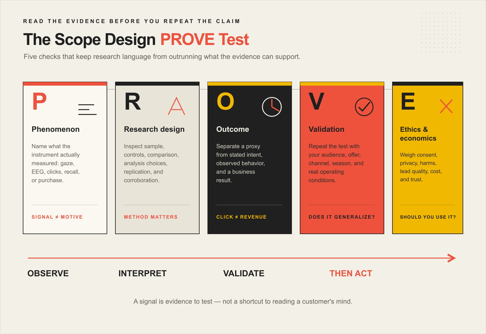
    Use the Scope Design PROVE Test before believing a neuromarketing claim

    We use the PROVE Test to keep research language from getting ahead of the evidence.

    The PROVE Test checks what was measured, how the research was designed, what outcome it supports, whether it validates in the intended context, and whether the ethics and economics justify its use.

    P — Phenomenon: what was actually measured?

    Start with the instrument, the stimulus, and the raw outcome. Was the study measuring gaze, an EEG feature, physiological arousal, stated preference, click behavior, recall, or an actual purchase? “Engagement” and “emotion” are not instruments. Ask what produced the number.

    R — Research design: how trustworthy is the comparison?

    Look at the sample, controls, stimulus, comparison group, preprocessing, model selection, and whether the analysis was decided before or after the interesting pattern appeared. Ask whether the study has been replicated or corroborated. A sophisticated instrument cannot repair a weak design.

    O — Outcome: proxy, intent, behavior, or business result?

    Classify the outcome before you repeat the claim. Attention is a proxy. Purchase intent is stated intent. Clicking “learn more” is behavior. Revenue and retained customers are business outcomes. Each can be useful, but they answer different questions.

    V — Validation: does it reproduce in your context?

    This is where AI and neuromarketing claims often get shaky. A model can perform well on the data it was trained and tested on and still fail when the audience, offer, channel, season, creative, device, or competitive context changes. NIST’s AI Risk Management Framework resources explicitly call for documenting validity, reliability, and limitations on generalizability beyond development conditions.

    E — Ethics & economics: should you use it even if it works?

    Check informed consent, privacy, data handling, accessibility, claim substantiation, customer autonomy, lead quality, downstream service cost, refunds, and trust. A personalization system that produces more clicks but worse customers is not a better marketing system. That is the same constraint-first logic we use in our small-business marketing strategy: optimize the business outcome, not the most flattering intermediate metric.

    Can neuromarketing predict what customers will buy?

    Sometimes a neuromarketing study can improve prediction for a defined task and dataset. That is not the same as reliably predicting what any individual customer will buy.

    Research can combine neural, physiological, and behavioral measures with statistical or machine-learning models. In a well-designed study, those measures may add predictive information beyond a survey or a single behavioral signal. The important phrase is in a well-designed study.

    The systematic reviews above do not support a universal prediction percentage. They show a field with promising signals, methodological variation, mixed findings, and continuing questions about generalization. That is much less exciting than “we can predict buyers with 85% accuracy,” but it is also much more useful because it tells you what must be validated next.

    If a vendor advertises a fixed accuracy number, ask: accuracy at what task, against what baseline, with what class balance, on what test set, using what outcome, and validated on whose customers? An 85% classification result can mean very different things depending on the problem.

    Where AI personalization fits, and where the psychology story goes too far

    AI personalization is not neuromarketing unless it actually uses neurological or neurophysiological research. Most AI personalization systems work from ordinary data: browsing history, purchases, content interactions, product attributes, account information, campaign responses, or other behavioral features.

    Those systems can rank content, recommend products, segment audiences, predict response likelihood, choose a message variant, or allocate attention to options. None of that means the model has discovered a person’s hidden psychological state.

    If a model sees slower scrolling, repeated visits, or a certain click sequence, it may learn that those patterns correlate with an outcome in historical data. Calling the pattern “hesitation,” “confusion,” or “emotional readiness” adds a psychological interpretation that needs independent validation.

    The safest way to use AI personalization is operational: make a bounded prediction, choose a measurable action, compare it against a credible baseline, and monitor business outcomes plus harms. The model does not need to “know the customer’s mind” to be useful.

    Do the cheaper, more direct research first

    Neuromarketing is most valuable when it answers a question that simpler evidence cannot answer well enough. For many small-business decisions, you are not there yet.

    Before specialist neuroscience, ask whether you already know:

    • which customer decision you are trying to improve;
    • what qualified customers say they are uncertain about;
    • where people abandon the current path;
    • whether the offer, proof, price, and next step are understandable;
    • what outcome defines success;
    • whether you can run a clean behavioral test first.

    A pricing page is a good example. You can study attention to the price table, but the business may first need to clarify what each option includes and which buyer each option fits. Our guide to pricing psychology treats presentation as decision design, not a trick for bypassing judgment.

    The same applies to messaging. A neuroscience-sounding claim about a headline or tagline should not outrank direct comprehension, recall, brand linkage, and behavior testing. We use that evidence boundary in our guide to what psychology and neuromarketing can actually prove about messaging.

    A practical small-business neuromarketing and AI test workflow

    1. Define one decision

    Do not begin with “we want to use neuromarketing.” Begin with a decision: Which hero message is understood faster? Which package communicates the intended hierarchy? Does a personalized recommendation improve qualified purchases rather than just clicks?

    2. Build the evidence ladder

    Start with customer language and observable behavior. Add analytics. Run a simple controlled test if possible. Add a specialist measure only when it resolves uncertainty that remains important enough to justify the cost.

    3. Predefine the outcome

    Write down the metric before seeing the result. If the goal is qualified purchases, do not let an interesting attention metric become the victory condition after the fact.

    4. Compare against a baseline

    A score without a comparison is hard to interpret. Compare the new creative, model, or experience against the current version or another credible control. If the system predicts, compare it against a simple baseline model too.

    5. Validate outside the original sample

    Do not tune the solution until it wins only on the same people, data, or creative used to build it. Test again with fresh data or a later cohort. Real marketing changes over time, so validation is a continuing responsibility.

    6. Follow the result downstream

    Watch what happens after the click or conversion. Did lead quality change? Did buyers understand what they purchased? Did refunds, churn, support burden, or sales time change? A personalization engine can improve the top of the funnel while quietly damaging the economics underneath it.

    Neuromarketing ethics: consent, privacy, and claims still matter

    Neuromarketing research involves human participants and potentially sensitive data. The NMSBA Code of Ethics calls for transparency, voluntary participation, informed consent, privacy protections, accepted scientific principles, and clear separation between key findings and interpretation.

    AI personalization adds another layer. NIST’s AI risk-management guidance emphasizes validity, reliability, transparency, accountability, explainability, privacy, and context. For marketing teams, the practical rule is simple: know what data you are using, why you are using it, what the model is allowed to decide, how you test it, and how a person can be affected.

    Claims about the technology matter too. The FTC’s advertising substantiation policy requires advertisers to have a reasonable basis for objective claims. Recent FTC AI enforcement has also challenged advertised accuracy and AI-powered targeting claims that lacked adequate support. “AI-powered” and “neuroscience-backed” are not evidence exemptions.

    When specialist neuromarketing may actually be worth it

    Specialist neuromarketing can make sense when all of these are true:

    • The decision is financially important enough to justify specialist research.
    • The research question is specific, not “tell us what customers really think.”
    • Ordinary interviews, behavioral data, and experiments leave meaningful uncertainty.
    • The chosen method measures a signal relevant to that uncertainty.
    • The provider can explain the study design, interpretation, validation, and limitations.
    • You have a plan to connect the research result to an actual business test.

    If those conditions are not present, neuroscience can become expensive decoration on a question the business has not defined.

    A 30-minute PROVE audit for any “brain-based” or AI marketing claim

    1. Write the claim in one sentence. Remove adjectives like advanced, intelligent, emotional, subconscious, or predictive unless they have a measurable definition.
    2. Name the measured phenomenon. What raw signal, behavior, or outcome produced the result?
    3. Find the comparison. What baseline or control makes the result meaningful?
    4. Classify the outcome. Proxy, stated intent, observed behavior, or business result?
    5. Check validation. Was performance tested on fresh people or data? Does it generalize to your use case?
    6. Check the incentive. Is the person interpreting the study also selling the tool or tactic?
    7. Check consent, privacy, and substantiation. Can you explain the system plainly to the people affected by it?
    8. Choose the next smallest test. Do not buy a bigger research stack when a controlled marketing test can answer the decision directly.

    Frequently asked questions about neuromarketing

    What is an example of neuromarketing?

    A practical example is eye tracking two versions of a landing page to learn whether people actually see the headline, price, proof, and call to action in the intended order. The eye-tracking result can diagnose visual attention. You would still need comprehension and behavior evidence to know whether the better gaze pattern improves the decision or business outcome.

    How does neuromarketing work?

    Researchers expose participants to defined marketing stimuli and collect neurological, physiological, or behavioral signals. They then analyze those measurements and, depending on the study, relate them to constructs such as attention, arousal, memory, preference, or later behavior. The validity of the conclusion depends on the measurement, design, analysis, and validation.

    What is the purpose of neuromarketing?

    The useful purpose is to add evidence about responses that may be difficult to capture through self-report alone. It can supplement interviews, surveys, experiments, and behavioral data. It should not be treated as a replacement for those methods or as a shortcut to a hidden truth about the customer.

    What are the limitations of neuromarketing?

    Important limitations include small or specialized samples, cost, study-design sensitivity, noisy or indirect measures, interpretation risk, mixed generalizability, privacy and consent concerns, and the gap between a laboratory response and a real purchasing decision. The right limitation depends on the method and claim.

    Is neuromarketing scientifically reliable?

    Some neuromarketing methods are established scientific measurement techniques, and peer-reviewed consumer-neuroscience research can produce useful findings. Reliability is not a property of the label “neuromarketing,” however. You have to evaluate the specific method, protocol, sample, analysis, outcome, and validation. Scientific equipment does not make every commercial interpretation scientific.

    Can neuromarketing predict purchases?

    It can contribute predictive information in some defined studies and models. The evidence does not support a universal prediction rate or the idea that a brain signal can reliably tell you what any individual customer will buy. Treat prediction as a model to validate, not a fact about the buyer.

    Is AI personalization the same as neuromarketing?

    No. Most AI personalization uses behavioral, transactional, contextual, or content data rather than brain or physiological measurements. An AI system can predict response likelihood or select a variant without knowing a person’s psychological state. If a vendor describes ordinary clickstream prediction as “neural” insight, ask what neurological data was actually collected.

    Should a small business pay for neuromarketing?

    Usually not as the first research investment. Start with customer interviews, sales and support evidence, analytics, usability observation, and controlled message or experience tests. Consider specialist neuromarketing when the decision is valuable, the question is narrow, ordinary evidence leaves important uncertainty, and the result can be validated against behavior.

    Use psychology to improve the decision, not decorate the pitch

    The useful question is not whether a tactic sounds advanced. It is whether the evidence helps you make a better marketing decision. Scope Design’s work starts with the audience, offer, constraint, measurement, and next useful test. If neuroscience or AI adds real information, use it. If a simpler experiment answers the question better, use the simpler experiment.

    That discipline is what keeps neuromarketing useful. Measure the signal. Name the inference. Validate the outcome. Protect the customer. Then decide whether the result earned another round.

    Sources and methodology

    This article was rebuilt on August 21, 2026 using Scope Design’s Content Studio and Open Brain evidence, Ubersuggest and DataForSEO keyword/SERP research, Google People Also Ask and AI Overview patterns, exact-page GA4/Search Console/Bing baselines, and independent scientific and regulatory sources. Keyword volumes are directional estimates, not traffic promises. The page-history sample is too small to support behavior or conversion conclusions. A controlled ChatGPT-with-search observation timed out and was marked unavailable rather than inferred.

  • 4 Proven Ways to Increase Sales Immediately

    4 Proven Ways to Increase Sales Immediately

    Quick answer: To increase sales without guessing, work on the constraint closest to revenue first. If qualified prospects already reach you but do not buy, improve conversion. If past leads or customers are sitting idle, reactivate them. If your sales rate is healthy but each sale is worth too little, improve pricing or packaging. Only after the sales path converts reliably should you add more qualified demand.

    Those are proven revenue levers, but “immediately” needs an honest definition. You can start the right test today. You cannot guarantee that every business will produce more revenue today, this week, or from the same tactic.

    At Scope Design, the rule is simple: a requested tactic is evidence, not a diagnosis. Our constraint-first order is Objective → Constraint → Positioning → Strategy → Tactics → Measurement. If you need the broader system behind channel and marketing decisions, see our small-business marketing strategy guide.

    The Fastest Sales Lever Is Usually the Closest Revenue Constraint

    A useful way to diagnose sales is to model revenue as four connected variables:

    Revenue ≈ qualified opportunities × conversion rate × value per sale × purchase frequency.

    This is a diagnostic model, not an accounting formula for every company. Its value is that it stops you from treating “more traffic” as the default answer. Each part of the model points to a different lever you can test.

    1. Convert: get more qualified prospects who are already in the sales path to take the next meaningful action.
    2. Reactivate: reconnect with leads and customers who already know the business.
    3. Expand value: improve revenue or gross profit per sale through better pricing, packaging, bundles, or appropriate upsells.
    4. Acquire: add new qualified demand through referrals, partnerships, affiliates, content, advertising, or other channels.
    A diagnostic model connects qualified opportunities, conversion rate, value per sale, and purchase frequency to four tests: convert, reactivate, expand value, or acquire; the testing order is find a constraint, set a baseline, change one thing, and judge revenue impact.
    Start with the symptom closest to revenue, establish a baseline, and test one lever at a time.

    If you are unsure which variable is actually constrained, our deeper guide to diagnosing why marketing is not working walks through the bottleneck before adding another tactic.

    1. Convert More of the Qualified Demand You Already Have

    This lever comes first when people are already reaching a high-intent page, requesting information, starting checkout, asking for quotes, or entering the sales process—but too few finish the next meaningful step.

    Do not begin with a sitewide redesign or a dozen simultaneous changes. Find the point where qualified intent is leaking out. Depending on the business, that might be a confusing offer, weak proof, an unclear call to action, unnecessary checkout friction, slow response time, or a sales handoff that leaves the prospect wondering what happens next.

    A bounded conversion test

    • Baseline one meaningful outcome. Use a purchase, qualified inquiry, booked consultation, accepted proposal, or another outcome tied to the sales path—not just pageviews.
    • Choose one high-intent step. Work on the page, form, checkout, quote process, or follow-up where the loss occurs.
    • Change one material thing. Clarify the offer, put proof near the decision, remove an unnecessary field, make the next step explicit, or tighten the handoff.
    • Judge the business outcome. A higher click rate is useful only if it moves more qualified people toward revenue.

    Example: if 100 qualified prospects reach a decision page and two buy, your baseline conversion is 2%. You do not need an industry-average conversion rate to know whether your own controlled change improves that baseline. The right comparison is your business before and after the test, with enough volume and time to avoid overreacting to noise.

    2. Reactivate Leads and Customers Already in Your Orbit

    Before paying to introduce yourself to strangers, look at the people who already raised a hand. Open proposals, older inquiries, previous buyers, renewal candidates, and customers with a logical next need can be closer to revenue than a brand-new visitor.

    The mistake is turning “follow up” into “email everyone more often.” There is no universal send frequency that maximizes every list. A useful cadence depends on why someone joined, what stage they are in, what you have to say, how long the buying cycle is, and whether the audience is responding.

    A better first test is one relevant message to one defined group. For example:

    • Ask stalled prospects whether the original problem still needs to be solved.
    • Show past customers a genuinely complementary service, refill, maintenance option, or next step.
    • Answer the objection that repeatedly stopped a specific class of lead.
    • Invite a segment to a useful resource or offer that matches what they originally asked about.

    Measure replies, qualified conversations, bookings, purchases, or reactivated revenue—not the number of messages sent. For the deeper system behind list ownership, lifecycle, message jobs, and sustainable cadence, use our email marketing roadmap for local business.

    3. Increase Value per Sale Without Pricing by Vibes

    If qualified customers are buying at a healthy rate but revenue or margin per sale is too low, the next lever may be value rather than volume. That can mean a price change, a clearer package, a bundle, a minimum engagement, an add-on, or an upsell that genuinely helps the buyer.

    Do not assume “raise prices” automatically means “make more profit.” Model the economics first. The U.S. Small Business Administration’s break-even guidance defines break-even as the point where total cost equals total revenue and uses fixed cost, selling price, variable cost, and projected unit sales to model the result. That is a better starting point than pricing psychology slogans.

    Use the old pricing example the right way

    Suppose a $29 offer produces seven sales per 100 qualified opportunities. That is $203 in revenue. If a $47 version produces five sales, that is $235. The second scenario generates $32 more revenue per 100 opportunities—but that does not prove the higher price is better. You still need to consider variable costs, acquisition costs, refunds, support load, retention, and what happened to the quality of the customer relationship.

    The point of the math is to show why conversion rate alone is not the business outcome. Price and volume interact. Test them deliberately. If pricing is the real constraint, our strategic guide to raising prices goes deeper into cost, value, positioning, segmentation, testing, and communication.

    4. Add Qualified Demand Through Referrals, Partners, and Affiliates

    Acquisition belongs fourth in this diagnostic—not because new demand is unimportant, but because pouring more people into a weak sales path can make the business busier without making it healthier.

    If the offer is understood, the sales path converts, the economics work, and follow-up is functional, then new qualified demand can become the right constraint to attack. Start with sources that bring context and trust, not just raw traffic.

    Three practical acquisition tests

    • Customer referrals: ask satisfied customers who else has the problem you solve, and make the introduction easy without turning the relationship into pressure.
    • Complementary partners: find businesses that serve the same customer before or after you do, then build a referral or co-marketing path that makes sense for both sides. Our guide to unexpected business partnerships explores that relationship more deeply.
    • Affiliates or creators: recruit a small number of partners whose audience and reputation fit the offer, give them a clear reason to care, and measure qualified sales rather than clicks.

    If compensation or another material relationship is involved in an endorsement, the Federal Trade Commission’s Endorsement Guides say the relationship should be disclosed clearly and conspicuously. Treat disclosure as part of the partnership design, not fine print added later.

    For acquisition, use the same discipline as the other levers: one audience, one offer, one channel, one measurable handoff, and one decision point. Our growth-hacking guide uses the same bounded-experiment idea for customer acquisition.

    How to Choose the First Sales Test This Week

    Use the symptom, not your favorite tactic, to choose the first move:

    • You have enough qualified visits, inquiries, or sales conversations, but too few become customers: test Convert.
    • You have a meaningful pool of past leads or customers who are not receiving relevant follow-up: test Reactivate.
    • Customers buy, but the economics are thin or the average sale leaves obvious value on the table: test Expand Value.
    • The sales path converts reliably and profitably, but there are not enough qualified opportunities entering it: test Acquire.

    Then write down three things before changing anything: your baseline, the single variable you are changing, and the business outcome that determines keep/change/stop. The review window should match the sales cycle. An ecommerce store may see a useful signal quickly; a consultative service with a long proposal cycle may need substantially longer.

    This prevents the most common failure mode in “increase sales” advice: changing the landing page, email schedule, price, ad creative, and partner outreach at the same time, then having no idea which change helped or hurt.

    What “Increase Sales Immediately” Should Actually Mean

    You can increase the quality of your sales process immediately. You can remove friction today. You can send a relevant follow-up today. You can model a pricing change today. You can ask for a referral today. What you should not promise is that any of those actions will create guaranteed same-day revenue.

    The useful definition of “immediate” is the shortest responsible feedback loop you can control. That keeps urgency without replacing judgment with hype.

    Frequently Asked Questions About Increasing Sales

    How can a small business increase sales quickly?

    Start with the closest revenue constraint. Improve conversion if qualified demand already exists, reactivate past leads or customers if you have dormant demand, improve pricing or packaging if value per sale is the problem, and add qualified demand only when the sales path already converts. Pick one lever and one measurable test rather than launching several tactics at once.

    Is more traffic the fastest way to increase sales?

    Not always. More traffic helps when too few qualified opportunities enter a sales system that already converts economically. If the real problem is a confusing offer, weak proof, checkout friction, poor follow-up, or thin pricing, more traffic can simply send more people into the same leak.

    Should I raise or lower prices to increase sales?

    Neither direction is automatically correct. Model contribution and break-even, understand what customers value, and test a controlled price or package change. Watch revenue and profit contribution along with conversion, customer quality, retention, and support cost.

    How often should I email leads and customers?

    There is no universal best frequency. Base cadence on audience expectations, lifecycle stage, buying cycle, the usefulness of what you have to say, and response. A relevant follow-up to a defined segment is a better first test than simply deciding everyone should receive more email.

    What sales metric should I measure first?

    Measure the last meaningful outcome the part of the system can control. For ecommerce that may be a purchase or contribution margin. For a service business it may be a qualified inquiry, booked consultation, accepted proposal, or closed sale. Use traffic, clicks, opens, and form starts as diagnostic metrics—not substitutes for the business outcome.

    Stop Collecting Tactics. Find the Constraint.

    The four ways to increase sales are not four commands every business should run at once. They are four places to look for the next constraint: convert, reactivate, expand value, and acquire. Diagnose the closest leak, run one bounded test, measure the outcome, and earn the right to move to the next lever.

    If the constraint is your website, lead path, marketing system, or measurement—and you want help diagnosing it before buying another tactic—contact Scope Design. We can help map the path from qualified attention to revenue and identify what deserves the next test.

  • 15+ Advanced Testimonial Strategies That Drive Sales – Video & Social Proof Mastery

    15+ Advanced Testimonial Strategies That Drive Sales – Video & Social Proof Mastery

    Testimonial marketing works when customer proof answers a specific buyer doubt at the moment that doubt matters. It works a lot less well when you dump fifteen glowing quotes on a page, call it “social proof,” and hope the visitor connects the dots.

    The advanced move is to treat testimonials as a routed evidence system: capture a real customer story, verify what it actually proves, match it to the right objection, place it in the right format, and measure what happens next. That is the difference between a testimonial library and a sales asset.

    TL;DR: Stop Collecting Praise. Start Routing Proof.

    • Build a Proof Card for every testimonial so you know the customer, context, claim, evidence, permission/disclosure status, usable formats, best-fit objections, and review date.
    • Put proof near the decision it supports: price proof near pricing, risk proof near forms, implementation proof near process explanations, and outcome proof near calls to action.
    • Create one strong source interview or video, then cut it into the formats each channel actually needs.
    • Keep testimonials truthful, substantiated, properly disclosed, and compliant with the rules of the platform where they appear.
    • Measure qualified downstream behavior—not the number of quotes you managed to publish.

    Testimonial Marketing Works Better as a Proof Routing System

    Most testimonial programs have a collection problem only because nobody designed the system after collection. A happy customer sends a paragraph. Someone crops it into a graphic. Another person drops it on Instagram. Six months later nobody remembers whether the customer approved the edit, what result the quote actually supports, or which page it was supposed to help.

    Scope Design’s Proof Routing System uses five decisions: Capture, Verify, Match, Place, Measure. The point is not bureaucracy. The point is stopping good proof from turning into sloppy claims.

    The proof routing system captures customer stories, verifies claims and permission, matches proof to buyer doubts, places it near the decision, and measures downstream behavior; each Proof Card records context, claim, evidence, usage, formats, best-fit doubts, and review date.

    This also keeps this advanced playbook separate from our foundational guide to customer testimonials that sell without making things up. That article owns the basics of getting credible customer language. This one is about what happens after you have the raw proof.

    Build a Proof Card Before You Reuse Anything

    A Proof Card is a small source-of-truth record attached to each usable customer story. It prevents the classic “we have a great quote somewhere” mess and gives sales, marketing, and web teams the same evidence to work from.

    Proof Card fieldWhat to recordWhy it matters
    Customer + contextWho they are, industry, situation, product/service usedLets a prospect decide whether the story is relevant
    Exact claimWhat the customer is actually saying happenedStops vague praise from becoming an inflated promise
    EvidenceNumbers, dates, screenshots, project records, or clearly labeled opinionSeparates proof from enthusiasm
    Permission + disclosureWhere it may be used, attribution allowed, incentives/material connectionsReduces legal, platform, and relationship risk
    Usable formatsFull video, short clip, quote, case study, email excerpt, sales deckMakes repurposing intentional
    Best-fit doubtsPrice, fit, risk, implementation, service, results, switchingDetermines where the proof belongs
    Review dateWhen to confirm the claim is still current and representativeKeeps old proof from outliving the facts behind it

    17 Advanced Testimonial Strategies

    1. Trigger the Ask After a Meaningful Outcome

    Do not automate the request around an arbitrary calendar date. Ask when the customer has actually experienced something worth describing: a successful launch, a resolved problem, a measurable milestone, a smooth handoff, a renewal, or a moment when the customer says some version of “that made my life easier.” Timing around evidence produces better raw material than timing around “30 days since purchase.”

    2. Interview for Decisions, Not Compliments

    “How was your experience?” invites beige praise. Better questions expose the buying decision: What were you worried about? What did you try before? Why did you choose this approach? What surprised you? What changed afterward? What would you tell somebody with the same hesitation?

    3. Capture One Rich Source Asset

    A recorded customer interview can become a full testimonial video, short clips, written quotes, a case-study section, sales-deck proof, email snippets, and social posts. Capture once at high quality, then derive. Repeatedly asking the same customer for another version of the same story is a good way to make advocacy feel like unpaid employment.

    4. Tag Proof by Situation, Not Just Customer Name

    “Acme testimonial” is a weak retrieval system. Tag proof by industry, company size, service, use case, objection, buying stage, result type, and channel. When sales needs a switching story for a skeptical manufacturer, the right proof should be findable in seconds.

    5. Set a Claim Floor Before Marketing Touches It

    Decide what the source actually proves before turning it into copy. “We launched two weeks earlier than our old process” is not permission to write “cut launch time in half” unless the underlying facts support that calculation. The testimonial is evidence; it is not a coupon for creative arithmetic.

    6. Keep the Original Beside Every Edited Version

    Editing for length and clarity is normal. Meaning drift is not. Preserve the original transcript, email, review, or recording beside the approved derivative so anyone can check whether the short version still reflects the customer’s experience. If a five-word pull quote changes the claim, it is not an edit. It is new copy wearing the customer’s name tag.

    7. Record Permission and Material Connections

    Track where the customer approved use of their name, company, image, voice, metrics, and story. Also record compensation, free products, discounts, employment, ownership, or other connections that could affect how an audience evaluates the endorsement. The operational goal is simple: nobody should have to reconstruct the disclosure story six months later from Slack archaeology.

    8. Map Every Testimonial to One Buyer Doubt

    Instead of asking “Where can we put testimonials?” ask “What doubt is slowing the decision?” Price proof can show why the investment was justified. Implementation proof can show that onboarding did not become a dumpster fire. Service proof can show what happened when something went wrong. Switching proof can explain why a customer left another provider.

    9. Match the Customer Context to the Prospect Context

    A recognizable logo can attract attention, but relevance usually does more work than fame. A local contractor may care more about another contractor’s scheduling problem than a national brand’s broad praise. Use industry, scale, geography, use case, and risk profile to decide which proof earns the slot.

    10. Build an Objection-to-Proof Matrix

    List the five or six doubts you hear most often, then identify the strongest proof asset for each. If one objection has twelve testimonials and another has zero, you do not have a “more testimonials” problem. You have a coverage problem. That gap should influence what you ask future customers to discuss.

    11. Separate Reviews, Testimonials, and Case Studies by Job

    Reviews are broad public feedback. Testimonials are selected advertising messages. Case studies are deeper evidence packages. They can share source material, but they are not interchangeable. If your main problem is generating genuine Google feedback, use a dedicated Google review generation strategy rather than forcing a testimonial workflow to do the wrong job.

    12. Put Proof Beside the Decision, Not in a Testimonial Museum

    A dedicated testimonial page can be useful as an archive, but it should not be the only place proof exists. Place relevant proof near pricing, service explanations, comparisons, forms, product details, implementation steps, and calls to action. Good placement reduces the distance between the buyer’s question and the evidence that answers it.

    13. Build a Video Master, Then Cut by Use

    Do not make a 90-second website video and shove the same file everywhere. Build one strong master interview, then create deliberate cuts for the homepage, service page, social ad, email, sales follow-up, and longer case-study context. Our guide to business video formats and when to use them helps choose the container after you know the communication job.

    14. Let Sales Trigger the Right Proof

    Store proof where sales can actually use it. A CRM field, proposal component, email snippet library, or sales-enablement page can route proof based on objection or deal stage. The goal is not more content in the CRM. It is fewer moments where a salesperson says, “I know we have a customer who talked about this somewhere.”

    15. Feed Proof Back Through the Customer Lifecycle

    The strongest testimonial systems connect delivery, customer success, sales, and marketing. Delivery knows what changed. Customer success knows when the customer recognized value. Sales knows which objections are recurring. Marketing knows which channels need proof. That is the same handoff problem we address in our customer lifecycle management framework: evidence gets stronger when the handoffs stop dropping context.

    16. Instrument the Behavior Around Proof

    Track what a visitor can do after encountering proof: open the video, continue to pricing, start a form, complete an inquiry, book a call, reply to an email, advance in the sales process, or become a qualified opportunity. A testimonial can influence a decision without being the only cause, so avoid fake precision. Measure directionally and compare similar experiences.

    17. Rotate, Retire, and Re-Verify Proof

    Customer proof can age. The product changes. The customer changes roles. The metric stops representing a typical outcome. The company gets acquired. Set a review date, re-check high-stakes claims, and retire proof that no longer fits. Reputation work is easier when monitoring and response are part of the operating system, not a panic button; our online reputation management guide goes deeper on that discipline.

    Video Testimonials: Build One Source Asset, Then Cut by Use

    A useful video testimonial gives the viewer enough context to understand who is speaking, what problem existed, why the customer chose the solution, what changed, and how confident they are in the result. Pretty lighting cannot rescue an empty story.

    There is no magic universal length. Current guidance from testimonial-video producer Wyzowl uses roughly 60–90 seconds for many standard testimonial videos, shorter 30–45 second cuts for social/paid uses, and longer 2–3 minute versions when the story needs more detail or supports a sales presentation. Treat those as production benchmarks, not conversion laws. The right length is the shortest version that preserves the context needed for the placement.

    • Homepage: one clear problem and outcome, with a route to deeper proof.
    • Service page: focus on fit, process, and the objection specific to that service.
    • Social/paid: start at the strongest relevant moment; do not burn ten seconds introducing the company if the viewer needs the customer problem first.
    • Sales follow-up: include enough context to mirror the prospect’s situation.
    • Case study: keep the detail that proves how the result happened, not just the victory lap.

    Audio matters. Captions matter too. WCAG 2.2 Success Criterion 1.2.2 requires captions for prerecorded audio content in synchronized media at Level A when you are conforming to that standard. Captions also make the story usable when sound is unavailable. Keep a transcript in the Proof Card even when the final experience is video-first.

    Testimonial Compliance: Truth, Permission, Disclosures, and Platform Rules

    In the United States, testimonial marketing is advertising. That matters because the customer’s words do not give the advertiser permission to communicate something deceptive.

    The FTC’s Consumer Reviews and Testimonials Rule took effect on October 21, 2024. Among other things, it addresses fake or false reviews and testimonials, incentives conditioned on a required positive or negative sentiment, certain insider reviews, review suppression, and fake indicators of social media influence. The FTC also makes an important distinction: when a business takes a consumer review and features it in advertising or marketing, that content can become a testimonial rather than merely a hosted review.

    The FTC’s Endorsement Guides also say endorsements must be truthful and not misleading, and material connections that could affect how people evaluate an endorsement should be disclosed. If a testimonial communicates an atypical result, advertisers may need to explain what consumers can generally expect; a vague “results may vary” line is not a magic shield.

    Platform rules can be stricter than the federal baseline. Google’s review policies, for example, prohibit incentivized reviews and selective solicitation of positive reviews. So “the FTC allows an incentive if it is not tied to positive sentiment” does not mean “pay people to leave Google reviews.” Check the policy of the platform where the review is being collected or displayed.

    This is general operational guidance, not individualized legal advice. For high-risk claims, regulated industries, unusual incentive programs, or disputes about rights and disclosures, use qualified counsel.

    How to Measure Whether Testimonials Are Actually Helping

    Do not report “we added seven testimonials” as a success metric. That is inventory. The useful question is whether the proof reduced friction around a real decision.

    PlacementUseful behavior to watchWhat not to claim
    Pricing pagePricing-to-inquiry progression, form starts/completions, qualified lead rateThat the testimonial alone caused the lead
    Service pageCTA clicks, deeper service-page engagement, inquiry qualityThat more time on page automatically means more persuasion
    VideoStarts, meaningful watch depth, clicks after viewingThat a view equals trust or purchase intent
    Email or sales follow-upReplies, meetings, stage progression, objection resolutionThat every advanced deal moved because of one proof asset
    Social/paidQualified destination behavior after the ad, not just engagementThat likes are revenue wearing a tiny hat

    Use the same discipline we recommend for customer success metrics: define the behavior, owner, denominator, and decision the metric is supposed to change. If traffic is small, run bounded tests, compare periods carefully, and be modest about causation.

    A 30-Day Testimonial Marketing Rollout

    Week 1: Inventory and Map

    Collect the existing quotes, reviews, videos, emails, case studies, screenshots, and sales stories. Build Proof Cards for the strongest material. List the top buyer doubts and mark which ones have credible proof.

    Week 2: Capture the Gaps

    Choose customers whose situations cover missing objections or segments. Ask decision-based questions. Get explicit usage permission and record any connection or incentive that may require disclosure.

    Week 3: Route and Produce

    Create the master assets, then derive channel-specific cuts. Add the strongest proof to high-intent pages, sales follow-ups, and the specific campaigns where it can answer a known doubt.

    Week 4: Instrument and Review

    Confirm tracking, establish the comparison window, and watch qualified behavior. Record what changed and what did not. Keep the proof that earns its place. Move, rewrite, or retire the rest.

    Frequently Asked Questions About Testimonial Marketing

    What is testimonial marketing?

    Testimonial marketing is the intentional use of customer endorsements or customer-derived proof in advertising, websites, sales material, email, social media, and other marketing. The advanced version does not merely display praise; it matches credible proof to a specific buyer question or objection.

    What are good examples of testimonial marketing?

    Useful examples include an ROI-focused customer quote beside pricing, an implementation story beside a process section, a short video answering a switching objection, a case-study excerpt in a proposal, and a customer clip in a retargeting campaign that mirrors the audience’s use case.

    How long should a video testimonial be?

    There is no universal ideal. A common vendor benchmark is roughly 60–90 seconds for a standard testimonial, shorter cuts for social or paid media, and longer versions for detailed sales or case-study use. Choose the shortest edit that preserves the context needed for the decision you are supporting.

    What is the best software for collecting testimonials?

    The best tool is the one that fits your collection method, consent requirements, video workflow, CRM, publishing stack, and review-platform rules. Do not buy software before defining the Proof Card fields and routing process; otherwise you automate a messy system faster.

    How many testimonials should a website show?

    There is no evidence-based universal number. Show enough relevant proof to answer the important doubts without burying the page in repetitive praise. One specific, well-matched testimonial can be more useful than a carousel of eight generic compliments.

    Can you pay or incentivize people for testimonials?

    Sometimes, but the rules depend on the context. FTC guidance does not categorically ban every incentive, but compensation cannot be conditioned on a required positive or negative sentiment under the Reviews and Testimonials Rule, and material connections may require disclosure. Specific platforms can be stricter: Google prohibits incentivized reviews. Separate testimonial advertising from third-party review-platform policy before designing an incentive.

    Can you edit a customer testimonial?

    Edit for clarity or length only when the edited version remains truthful and does not change what the customer experienced or claimed. Preserve the original, document approval when appropriate, and never turn a qualified statement into a guarantee.

    Are fake testimonials illegal?

    In the United States, the FTC’s Consumer Reviews and Testimonials Rule prohibits specified conduct involving fake or false consumer reviews and testimonials and allows civil penalties for knowing violations. The details are fact-specific, so businesses should use the FTC’s current guidance or qualified counsel for legal decisions.

    Build a Proof System, Not a Wall of Love

    The best testimonial marketing system makes customer evidence easier to trust, easier to find, and harder to misuse. Capture the story. Verify the claim. Match it to a doubt. Place it where the decision happens. Measure what changes.

    If your website, campaigns, and sales process have plenty of happy-customer material but no coherent proof architecture, Scope Design can help map the objections, content, destinations, and measurement into one system. See our Advertising & Marketing services and bring the proof you already have. We can figure out what deserves a bigger job.

  • How to Improve Your Website’s User Experience: The Complete 2025 Guide

    How to Improve Your Website’s User Experience: The Complete 2025 Guide

    If you are asking how to improve website user experience, do not start by redesigning the whole site. Start with one important visitor task, find the earliest point where a real person gets confused, delayed, blocked, or uneasy, fix that constraint, and then test the same task again. A faster page will not rescue a confusing offer. A prettier form will not fix a navigation path nobody can find. Good UX work improves the path people are already trying to use.

    Website UX includes what people understand, what they can find, what they can operate, how reliably the page responds, whether they trust the next step, and whether they can complete or recover from the task. Visual design matters, but it is only one part of the experience.

    This guide gives small and midsize businesses a practical way to improve an existing website without turning every usability problem into a redesign project.

    TL;DR: fix the earliest verified friction

    • Define the task. Pick one visitor outcome that matters to the customer and the business.
    • Run the PATH UX Check. Examine Purpose, Access, Task path, and Human evidence.
    • Fix the earliest failure. Do not optimize a later step while an earlier one is still blocking the task.
    • Keep useful friction. Qualification, safety, privacy, informed consent, and service quality can justify an extra step.
    • Measure the same outcome again. Judge useful leads, bookings, sales, applications, or successful task completion, not decorative engagement metrics.
    • Redesign only when the constraint is systemic. If a narrow responsible fix works, preserve the parts of the site that already do their job.

    What website user experience actually includes

    User experience is the quality of the path between a visitor’s goal and a successful outcome. On a business website, that path usually crosses several systems at once: message clarity, information architecture, navigation, responsive behavior, accessibility, performance, forms, trust signals, feedback, and content.

    That is why “the site looks dated” is a weak UX diagnosis. A dated-looking site can still help the right person finish a task. A beautiful site can still bury the service, hide the phone number, shift while loading, trap keyboard users, reject a form without explaining why, or make every button look equally important.

    If the larger problem is that visitors arrive but do not convert, our guide to diagnosing why a website is not converting owns that broader diagnosis. Here, the job is narrower: once you know there is friction, how do you improve it responsibly?

    Start with one real visitor task

    Pick one task that matters to both the visitor and the business. Examples include requesting a quote, booking an appointment, finding a service, checking whether you serve a location, buying a product, submitting an application, downloading a document, or calling the right department.

    If you cannot name that task, UX optimization is premature. First decide what real job the website is supposed to do. Otherwise you can spend weeks making individual components “better” while the page still asks the visitor to choose among several competing goals.

    Now run the task yourself on a phone and a desktop. Do not click like the person who built the site. Start from a realistic landing page and pretend you know only what a new visitor could know. Write down the first place where you hesitate, backtrack, zoom, wait, misread, wonder whether something is clickable, question whether the company is credible, or fail to understand what happens next.

    Five common places UX improvements happen

    Most business-site UX work lands in a handful of areas: understanding the user and task, simplifying navigation, improving performance, designing for real mobile behavior, and testing what actually changed. The visual below is a useful map of those areas. It is not a priority order. The right priority depends on where the task first breaks.

    The PATH UX Check covers Purpose, Access, Task path, and Human evidence, then five improvement areas: understand, navigate, perform, use on mobile, and test and learn.
    Five common website UX improvement areas. Diagnose the failing task before deciding which area deserves the next change.

    Use the Scope Design PATH UX Check

    The PATH UX Check is a simple way to stop a UX project from becoming a pile of unrelated best practices. Start at Purpose, then check Access, then the Task path, then Human evidence. When you find a verified constraint, fix the smallest responsible thing that can remove it and test again.

    PATH stepQuestionWhat to inspect
    P: PurposeWhat useful job is the visitor trying to finish?Offer clarity, page intent, qualification, primary next step, business outcome
    A: AccessCan the visitor reliably perceive and operate the experience?Performance, mobile behavior, accessibility, technical errors, input methods
    T: Task pathCan the visitor find, understand, trust, and complete each necessary step?Navigation, content, forms, controls, proof, feedback, error recovery
    H: Human evidenceWhat do real behavior and real outcomes show?Task observation, analytics, form errors, support questions, sales feedback, qualified outcomes

    PATH is not a claim that every journey is perfectly linear. Returning customers behave differently from first-time visitors, and people jump between pages. Its job is to keep the diagnosis ordered enough that you do not polish a later step while an earlier one is still failing.

    P: make the purpose and next step obvious

    Before you change colors, animations, or card layouts, read the page without the design language in your head. Can a visitor answer three questions: What is this? Is it for me? What should I do next?

    Use descriptive headlines instead of welcome copy. Name services the way customers recognize them. Make the primary call to action visually distinct from secondary actions. Put qualification details near the decision they affect instead of hiding them in an FAQ nobody has reached yet.

    Sometimes the first constraint is not “design” at all. If the page structure is sound but visitors still cannot understand the offer, compare the evidence before choosing between a layout change and a message change. Our guide to deciding whether design or content is the real conversion constraint goes deeper on that distinction.

    A: make the experience accessible, responsive, and reliable

    Test the task on a real phone

    “Responsive” is not the same as usable. A page can technically collapse to a narrow screen while still producing tiny controls, giant sticky elements, intrusive pop-ups, awkward forms, hidden comparison information, or a call to action that disappears several screens below the content that created intent.

    Use your actual phone. Try the same representative task in portrait orientation with the on-screen keyboard open. Check whether text remains readable, controls remain operable, focus is visible, the page survives zoom, errors appear near the right field, and fixed elements do not cover what you are trying to use.

    For a deeper treatment of responsive behavior, see why mobile optimization is more than shrinking the desktop layout.

    Fix performance that interrupts the task

    Speed matters because waiting, delayed responses, and unexpected movement interrupt what the visitor is trying to do. Google’s current Core Web Vitals cover Largest Contentful Paint (LCP), Interaction to Next Paint (INP), and Cumulative Layout Shift (CLS). For field data, the current “good” thresholds are LCP at 2.5 seconds or less, INP at 200 milliseconds or less, and CLS at 0.1 or less, evaluated at the 75th percentile. Those thresholds come from the official Core Web Vitals threshold guidance.

    Those metrics are useful diagnostics, not a complete definition of UX and not a ranking guarantee. Google explicitly recommends evaluating page experience holistically rather than treating it as a single signal. Its page experience guidance for Search is a useful guardrail against turning Core Web Vitals into superstition.

    • Resize and compress images instead of sending oversized files to every device.
    • Avoid loading scripts and widgets on pages that do not need them.
    • Reserve space for images, embeds, banners, and injected content so the interface does not jump.
    • Break up expensive JavaScript work that delays interaction.
    • Use field data when enough real-user data exists and lab tests to reproduce and diagnose individual problems.

    If performance is the verified constraint, use our website speed optimization guide for the implementation work instead of bloating this UX article into a performance manual.

    Treat accessibility as core usability

    Accessibility is part of UX because a task that cannot be perceived or operated is not a successful experience. The Web Content Accessibility Guidelines (WCAG) 2.2 organize accessibility around content that is perceivable, operable, understandable, and robust, with testable success criteria underneath those principles.

    Useful checks include keyboard navigation and visible focus, meaningful labels and instructions, identifiable errors, text that can resize without losing content or functionality, sufficient contrast, text alternatives where they carry meaning, and controls that do not depend on one input method. WCAG 2.2 also includes a Level AA Target Size (Minimum) criterion of 24 by 24 CSS pixels or one of its listed spacing, inline, equivalent, user-agent, or essential exceptions. The W3C’s Target Size explanation is the better reference than repeating an arbitrary “every button must be 44 or 48 pixels” rule.

    Accessibility requirements can intersect with legal obligations, but this article is not legal advice. Our detailed guide on improving website accessibility and ADA-related readiness covers the implementation problem in more depth.

    T: improve the task path, not just the interface

    Fix navigation and information architecture

    Navigation should help people predict where information lives. Clever labels create a tax on every click. “Solutions” might make sense internally, but if the customer is looking for “Commercial Roofing,” use the language that reduces interpretation.

    Audit the path, not just the menu. A visitor can have a tidy header and still get stuck because a service page has no next step, pricing context appears after the form, a location page dead-ends, or related information is scattered across pages with no useful cross-links.

    • Use labels that describe the destination.
    • Keep important routes consistent across templates.
    • Put supporting information near the decision it supports.
    • Use clear parent-child structure when the hierarchy is deep.
    • Check search, filters, account tools, or directories when they are necessary to a primary task.

    Reduce unnecessary form friction

    Forms fail for more reasons than “too many fields.” The better question is whether each step asks for information the business needs at that point, in a way the visitor can understand and recover from.

    Remove fields that exist only because somebody once thought they might be useful. Group related questions. Use persistent labels instead of placeholder-only instructions. Explain unusual requirements before the visitor triggers an error. Preserve entered information when validation fails. Make success unmistakable, including what happens next and when.

    Do not automatically shorten a form if qualification matters. A two-field lead form can create more submissions and worse leads. The UX target is not the least effort at any cost. It is the least unnecessary friction consistent with a useful outcome.

    Put trust and feedback where decisions happen

    Visitors hesitate when the cost of being wrong feels high. The useful response is not to dump a wall of testimonials at the top of every page. Put the right reassurance near the uncertainty it resolves.

    • Place relevant proof near the claim it substantiates.
    • Explain warranties, cancellation rules, returns, response times, or process steps before commitment.
    • Use real project examples or photographs when authenticity matters.
    • Show progress when a multi-step task takes time.
    • Confirm successful actions clearly.
    • Write error messages that explain what happened and how to recover.

    Feedback is UX, too. A button that looks dead after a click, a form that silently submits, or a filter that changes results without making the state clear forces the visitor to guess whether the interface heard them.

    A first-party example: ask for what the step actually needs

    On a fleet-services application flow we reviewed, the site asked people for information the business did not need at that stage. The reflexive UX answer could have been “make the form prettier” or “cut the form in half.” Instead, the useful question was what information the business needed now to move the application forward.

    Scope simplified the request to match that stage and instrumented the intended action so the business could judge what happened next. There is no honest universal conversion percentage to attach to that lesson. The information gain is the decision rule: remove unjustified friction, preserve justified friction, and measure the downstream outcome that matters.

    That distinction matters because UX can be made worse by chasing ease as the only goal. A financing application may need informed consent. A medical or safety workflow may need confirmation. A service business may need qualification details before promising a call. Good UX removes confusion and needless effort without removing safeguards the task genuinely requires.

    H: use human evidence before declaring a win

    Before changing the interface, record a baseline for the task you care about. Then compare the same task after the change. Pick measurements that reflect the actual job rather than whatever happens to be easiest to graph.

    • Task completion: Can representative users finish the task?
    • Time and effort: Where do they hesitate, backtrack, or ask for help?
    • Form or checkout completion: Where do people stop, and what errors occur?
    • Qualified outcome: Did the change improve useful leads, bookings, sales, applications, or support resolution rather than merely clicks?
    • Technical experience: Did mobile behavior, errors, accessibility failures, or Core Web Vitals improve where they were genuine constraints?
    • Qualitative evidence: What do user tests, support questions, sales conversations, and customer feedback reveal that analytics cannot explain?

    Do not declare a win because one chart moved. A shorter form that produces more junk leads may be worse. A new navigation that increases clicks because people now need two clicks instead of one is not automatically better. Connect the proxy to the outcome.

    Use symptoms to choose the first fix

    SymptomFirst questionLikely first fix to testWhat not to assume
    Visitors land but do not actDo they understand the offer and next step?Clarify message, qualification, and primary actionThat the page needs a visual redesign
    People cannot find key informationDo labels and page structure predict where it lives?Fix navigation, hierarchy, or contextual linksThat the menu simply needs fewer items
    Mobile users struggle with formsWhat breaks with a real phone and keyboard open?Fix layout, labels, controls, validation, or sticky UIThat “responsive” means usable
    Page feels slow or unstableWhich delivery problem interrupts the task?Fix the measured performance constraintThat a single score defines UX
    People start a form but abandon itIs the request justified and understood at that stage?Remove needless fields, explain requirements, improve recoveryThat shorter is always better
    Several templates fail in the same wayIs the constraint structural across the system?Evaluate a redesign or component-system changeThat local patches will stay cheaper

    How to know whether you actually need a redesign

    A redesign is justified when the constraint is structural enough that local fixes would create more complexity than they remove. That can happen when templates make essential content impossible to prioritize, the navigation model no longer matches the business, the component system cannot support accessible interaction, the mobile layout is fundamentally broken, performance problems are embedded in the architecture, or years of patchwork have made the site unsafe to change.

    “I am bored with it” is not the same thing. Neither is “a competitor changed theirs.” Preserve what works. If a narrow fix restores the task without creating another problem, take the narrow fix. If the same constraint appears across templates, journeys, devices, and content types, the evidence for redesign becomes stronger. Use the website redesign checklist when the problem has crossed that line.

    A 90-minute website user experience audit

    You can surface useful problems without commissioning a six-week research project. Use this website user experience audit as triage, not as a substitute for deeper research when the stakes are high.

    1. Choose one task. Name the visitor, starting page, intended outcome, and business value.
    2. Run the path cold. Use a phone and desktop. Record the first hesitation or failure rather than making a wish list.
    3. Check Purpose. Can the visitor understand the offer, qualification, and next step without insider knowledge?
    4. Check Access. Test mobile behavior, keyboard access, zoom, focus, performance, forms, and technical errors.
    5. Check the Task path. Can the person find, understand, trust, operate, complete, and recover?
    6. Collect Human evidence. Compare the observation with analytics, support questions, sales feedback, and form errors.
    7. Choose one constraint. Fix the earliest verified failure with the smallest responsible change.
    8. Repeat the same task. Compare behavior and outcomes to the baseline before opening a new round of work.

    Frequently asked questions about improving website UX

    What should I improve first on my website?

    Improve the earliest verified point of friction in an important visitor task. If people do not understand what the page offers, start with Purpose. If they understand it but cannot operate the experience, check Access. If the interface works but people cannot find, trust, or complete the next step, fix the Task path. Use Human evidence to decide whether the change actually helped.

    Do I need to redesign my website to improve user experience?

    Usually not. Many UX problems can be improved through content, navigation, forms, responsive behavior, performance, accessibility, trust, or feedback changes. Redesign when the underlying templates, architecture, component system, or accumulated technical debt prevent responsible local fixes.

    Are Core Web Vitals the same as user experience?

    No. LCP, INP, and CLS measure important aspects of loading, responsiveness, and visual stability. They do not tell you whether the offer is understandable, navigation is logical, a form asks the right questions, or the visitor trusts the business. Treat them as technical evidence inside a larger UX diagnosis.

    How do you measure website user experience?

    Measure the task and the outcome together. Useful evidence can include task completion, time and errors, form completion, qualified conversions, support questions, user-test observations, accessibility findings, and Core Web Vitals. Establish a baseline before the change so you can tell whether the fix improved the real job.

    What is the 3-second rule in website design?

    There is no universal UX standard saying every visitor leaves after exactly three seconds or that every page must fully load within that number. Use current performance measures such as LCP, INP, and CLS plus task evidence instead of treating a catchy timing rule as a law. More importantly, fix the specific delay or instability that interrupts the user’s task.

    What are the key factors in website user experience?

    There is no single official seven-factor list for every website. For practical business-site work, PATH covers the useful decision areas: Purpose, Access, Task path, and Human evidence. Inside those buckets you will inspect clarity, navigation, mobile behavior, accessibility, performance, forms, trust, feedback, completion, recovery, and real outcomes.

    Are the “7 C’s of a website” an official UX standard?

    No. Different articles use different “C” lists as teaching mnemonics. They can be useful if they help a team remember a real problem, but they are not a substitute for current technical standards, task observation, or business evidence. Use a mnemonic only when it improves the diagnosis rather than turning UX into a checklist contest.

    How to improve website user experience without replacing what works

    The best UX improvement is not the change with the most pixels attached to it. It is the change that removes the most important verified friction without creating a new one.

    Define the task. Run PATH. Find the earliest failure. Make the smallest responsible fix. Test the same task again. When the constraint is structural, redesign with evidence. When it is not, keep the working parts and solve the real problem.

    If your team knows the site is creating friction but cannot isolate the constraint, Scope Design’s web services team can audit the path across strategy, content, design, development, performance, accessibility, and measurement, then turn the findings into a prioritized plan instead of a cosmetic wish list.

    Sources and methodology

    This article was researched through a monitored Scope Design workflow on August 21, 2026. We reviewed Scope Design’s current UX doctrine in Open Brain, neighboring Content Studio articles and typed relationships, the literal internal-link graph, U.S. Ubersuggest keyword and SERP evidence, DataForSEO search and AI-query evidence, and current primary technical sources. Third-party search volumes were treated as directional research, not business-outcome facts.

    Primary technical references include web.dev’s Core Web Vitals threshold guidance, Google’s page experience guidance, the W3C’s WCAG 2.2 Recommendation, and the W3C’s Target Size (Minimum) explanation. We deliberately excluded legacy percentages about abandonment, UX ROI, universal conversion lifts, mobile traffic share, and navigation limits when the recovered evidence did not provide a defensible source chain.

  • Pricing Psychology: 15 Strategies That Make Online Prices Easier to Choose

    Pricing Psychology: 15 Strategies That Make Online Prices Easier to Choose

    Pricing psychology is the way price presentation changes how people perceive, compare, and act on an offer. On a website, that includes the reference points you show, how plans are compared, whether the full commitment is clear, where proof appears, and how much work the buyer has to do to understand the decision.

    It is not a substitute for setting a viable price. If you are still deciding what to charge, start with our guide to pricing a product or service without guessing. This article starts one step later: you have a defensible price; now the website has to make that price easier to evaluate.

    That distinction matters because a pricing page can fail in two different ways. The number itself can be wrong, or the presentation can create unnecessary friction. Changing $100 to $99 will not rescue a confusing offer, hidden fees, meaningless packages, or a page that makes buyers hunt for the terms.

    Do not make a bad price look clever. Make a defensible price easier to evaluate.

    The 15 strategies below are built around that rule. Each has a job, a fit condition, and a reason not to use it. Before reaching for any of them, run the page through the CLEAR Pricing Page Test.

    What is pricing psychology?

    Pricing psychology is the study and practical use of how price format, context, comparison, and payment framing influence buyer perception and choice. It can affect what a buyer notices first, which reference price feels relevant, how difficult alternatives are to compare, and how risky the commitment feels.

    It cannot create value that is not there. It cannot repair bad unit economics. It cannot make the wrong audience want the offer. And it should not depend on the buyer misunderstanding the transaction.

    That is why we treat pricing psychology as a branch of conversion design rather than a bag of tricks. The wider principles overlap with ethical psychological marketing, but a pricing page has a narrower job: help a qualified buyer answer What do I get? What will I pay? Which option fits me? What happens next?

    Harvard Business School research commentary on psychological pricing makes a similar point: price presentation helps customers evaluate whether a purchase feels valuable and fair, and transparency can matter as much as the tactic itself. See Harvard Business School Working Knowledge on psychological pricing.

    The ethical line is understanding

    A useful pricing tactic makes a real choice easier to understand. A manipulative one wins because the buyer misses something important. If a crossed-out price never existed, the anchor is not informative. If a “most popular” badge is invented, it is not guidance. If the annual total is hidden behind a small monthly equivalent, the page is not simplifying the decision.

    A good internal test is: Would we still use this presentation if the buyer understood exactly how it works? If the answer is no, do not ship it.

    The CLEAR Pricing Page Test

    Before changing a price ending, adding a badge, or moving a pricing card, inspect the decision itself. CLEAR is Scope Design’s five-part pricing-page diagnostic.

    CLEARQuestionWhat good looks like
    C — ContextDoes the buyer know what the price is for and what makes it meaningful?The offer, buyer, scope, outcome, or useful comparison is obvious before the number has to carry the whole sales argument.
    L — LegibilityCan the buyer understand the full financial commitment?Amount, billing unit, billing timing, meaningful limits, mandatory add-ons, renewal or term, and important price-change triggers are explicit.
    E — EvidenceIs proof placed where price creates doubt?Testimonials, examples, scope, policies, savings math, or performance evidence answer the objection created by the price.
    A — ArchitectureDo the choices map to real buyer decisions?Tiers, anchors, defaults, bundles, and comparisons reflect meaningful differences rather than arbitrary feature withholding.
    R — ReversibilityIs justified risk reduced where the business can support it?Trial, cancellation, downgrade, guarantee, phased engagement, or a clear sales process makes the next step understandable.

    CLEAR is deliberately diagnostic. It does not tell every company to use three tiers, end prices in 9, or add a free trial. It tells you where the uncertainty lives so you can choose the smallest tactic that actually addresses it.

    That follows the same constraint-first logic we use in our broader website strategy and conversion optimization framework: fix the real bottleneck before decorating the page around it.

    Complete price line = amount + billing unit + billing timing + commitment + mandatory add-ons + the condition that changes the price.

    Not every offer needs every field. A $40 one-time product does not need subscription language. A usage-based plan probably does need a unit, reset period, overage rule, and calculator. A custom service may need a starting point or range rather than a fake fixed quote.

    15 pricing psychology strategies for clearer online decisions

    1. Put value context before a naked price

    A price is easier to judge when the buyer knows what the number represents. “$2,500” alone forces the reader to invent a comparison. “Brand identity system for a new multi-location business — starting at $2,500” gives the number a job.

    Use it when: the offer is differentiated by outcome, scope, quality, risk reduction, speed, or expertise. Avoid it when: value copy becomes an excuse to hide a price that buyers are actively looking for.

    Context should precede the number by seconds, not several scrolls. The goal is not to delay price visibility; it is to help buyers understand what they are pricing.

    2. Make the complete price legible

    A visible number is not the same as transparent pricing. Buyers also need to know per what, billed when, committed for how long, and what required charges remain. “$29/month” can mean billed monthly, billed annually at $348, or an introductory rate that changes later.

    Baymard’s ongoing checkout research identifies late extra costs as a major abandonment problem and recommends showing the total or a clear estimate early. See Baymard’s cart and checkout research.

    There is also a narrow U.S. regulatory example worth understanding. The Federal Trade Commission’s Rule on Unfair or Deceptive Fees, effective May 12, 2025, requires upfront total-price presentation for covered live-event tickets and short-term lodging. It is not a universal pricing-page rule for every industry. See the FTC’s official fee-rule FAQ for the actual scope.

    Use it when: always, with the exact fields adapted to the business model. Avoid: mandatory add-ons that look optional, “from” prices that are not realistically available, and a small monthly equivalent that visually buries a larger annual charge.

    3. Use real anchors, not invented list prices

    Buyers rarely evaluate a price in isolation. They compare it with something: the previous price, a competitor, a higher plan, the cost of doing nothing, or the price they expected. That makes anchors useful—but only if the comparison is legitimate.

    Use it when: the reference point is real, relevant, and understandable. Avoid it when: the anchor exists only to manufacture a bargain impression or relies on mismatched scope.

    The best anchor is not always another price. It may be a unit, outcome, or alternative: per user, per location, per project, versus hiring internally, versus buying separate components, or versus a lower-support plan.

    4. Build tiers around different buyer jobs

    Tiered pricing works best when each plan answers a different version of “What kind of buyer is this for?” The differences should map to real usage, support, risk, capacity, or workflow needs.

    There is no scientific rule that every pricing page should have exactly three options. A 2015 meta-analysis of 99 observations (N=7,202) found that choice-overload effects depend on factors including choice-set complexity, decision difficulty, preference uncertainty, and the buyer’s goal. See Chernev, Böckenholt, and Goodman’s choice-overload meta-analysis.

    Use it when: multiple buyer types need materially different versions of the offer. Avoid it when: tiers exist only to fill a three-column layout or buyers need a spreadsheet to discover which plan is safe. The practical target is the fewest choices that cover the meaningful buying decisions.

    5. Recommend a default only when it is truly a best fit

    “Most popular” and “recommended” badges reduce comparison work because they give the buyer a starting point. That is useful if the recommendation is based on something real.

    Use it when: you can state the fit rule in one sentence. If you actually know which plan most customers choose, “Most popular” can be factual. Otherwise use defensible fit language such as “Best for teams of 5–20.” Avoid it when: the badge is simply attached to the plan with the best margin.

    6. Use decoy effects carefully

    The decoy or attraction effect has a long research history. In a classic 1982 Journal of Consumer Research study, Joel Huber, John Payne, and Christopher Puto showed that adding an asymmetrically dominated option could increase the probability of choosing the option that dominated it. See the original decoy-effect research.

    That does not mean your pricing page needs a deliberately bad plan. Use it when: each option has a real customer and the comparison clarifies tradeoffs. Avoid it when: one plan is intentionally absurd or designed solely to push buyers into a target choice.

    Our test: could you confidently sell and support every displayed plan to the right buyer? If not, the architecture needs work.

    7. Treat charm pricing as a test, not a law

    Charm pricing uses just-below numbers such as $9.99, $49, or $199. The mechanism is often explained as a left-digit effect: under certain comparison conditions, $2.99 can be encoded as meaningfully lower than $3.00 because the first digit changes.

    Thomas and Morwitz’s 2005 Journal of Consumer Research paper tested this effect across five experiments. Importantly, the effect was conditional: it was tied to leftmost-digit changes and the numerical or psychological distance between compared prices. See “Penny Wise and Pound Foolish: The Left-Digit Effect in Price Cognition”.

    Use it when: just-below pricing fits the category, brand, and comparison environment. Avoid it when: the brand competes on premium simplicity, procurement buyers expect round budget numbers, or the ending makes the price feel gimmicky.

    8. Show savings math instead of decorative discounts

    If the offer saves money, make the math inspectable. For an annual plan, show the normal monthly total, the annual charge, and the real savings. For a bundle, show the standalone baseline only if those items are actually sold separately at those prices.

    Use it when: the baseline exists and the buyer can reproduce the calculation. Avoid it when: the “regular” price is fictional or the percentage depends on an unrealistic scenario.

    9. Make billing cadence and commitment explicit

    A monthly equivalent and a monthly bill are different financial decisions. If a plan is $20 per month billed annually, the buyer may be charged $240 today. A clearer pattern is: $20/month equivalent — $240 billed annually.

    If the annual plan renews automatically, say when. If the monthly plan has no long-term contract, say that too. If usage resets each month or unused credits expire, put that information where the number is evaluated.

    Use it when: subscriptions, retainers, memberships, usage credits, financing, and any recurring or term-based offer. Avoid: making the smallest mathematical unit look like the payable amount when it is not.

    10. Bundle only when the bundle simplifies a real decision

    Bundles are most useful when buyers already see the components as one job. A website launch package that combines design, development, analytics setup, and launch support may reduce coordination work. The bundle creates value because it removes a decision or operational burden—not because the page can display a bigger crossed-out total.

    Use it when: the components are complementary, commonly bought together, and easier to evaluate as one outcome. Avoid it when: unrelated items are added to inflate perceived value or the bundle makes the core offer harder to compare.

    11. Put relevant proof close to the price

    The pricing area is where broad interest becomes financial doubt. Proof should answer that doubt. A testimonial about “great people” may build warmth but do little to justify a premium plan. A short quote about a reliable launch, fewer support escalations, or a measurable outcome can be more useful if that is what the buyer is worried about.

    Our guide to testimonials that sell goes deeper on matching proof to the claim.

    Use it when: buyers need reassurance about implementation, reliability, support, quality, risk, or the outcome behind the price. Avoid it when: logos imply endorsements you do not have or proof is so far from the price that the buyer has to remember it.

    12. Prevent price surprises at checkout

    A pricing page can be clear and still lose trust one step later. Shipping, taxes, setup charges, processing fees, required add-ons, seat minimums, or trial-to-paid transitions can change the decision after the buyer thinks the math is settled.

    This is where pricing psychology becomes checkout UX. If ecommerce checkout is the actual bottleneck, use our deeper checkout page optimization guide rather than trying to solve the whole problem with pricing-card copy.

    Use it when: there is any step between the displayed price and the final payable amount. Avoid: moving unavoidable charges downstream simply because a smaller first number improves the top-of-funnel click rate. The pricing page and checkout should tell the same financial story.

    13. Reduce justified risk with reversibility

    Sometimes the obstacle is not the amount. It is fear of being stuck. Trials, guarantees, cancellation windows, downgrade paths, pilot engagements, phased projects, or clear change-order rules can make a price easier to accept because they reduce a legitimate risk.

    Use it when: your delivery model can support the promise and the policy reflects how the offer really works. Avoid it when: a guarantee would be misleading, a trial creates expensive implementation work with no realistic recovery, or “cancel anytime” hides notice periods.

    Reversibility does not need to mean “money back.” For a complex service, it may mean a paid diagnostic before a larger project, a milestone-based scope, or an explicit decision point before the next phase.

    14. Segment offers by buyer need, not opaque manipulation

    Different buyers can legitimately need different prices. Usage, service level, geography, support burden, volume, risk, or scope may change the economics. The website should make the segmentation rule understandable enough that a buyer can see why the options differ.

    Use it when: price differences correspond to real cost, value, usage, or service differences. Avoid it when: individualized pricing is secretly based on irrelevant or exploitative signals, or the same offer changes price without an understandable rule.

    15. Test one pricing-page decision at a time

    Pricing pages are high-leverage, which makes them dangerous places to “optimize” five things at once. Start with a hypothesis tied to one friction point.

    • If buyers misunderstand annual commitment, test clearer billing language.
    • If buyers cannot tell which plan fits, test use-case labels before changing prices.
    • If premium buyers doubt implementation quality, test relevant proof near the premium plan.
    • If checkout adds surprise costs, fix cost presentation before testing button copy.

    For sites with enough traffic to experiment, our conversion optimization guide covers how to turn this into a more disciplined testing process.

    Use it when: you can define the change, primary outcome, and guardrail metrics before launch. Avoid: declaring a winner after a handful of visits, changing price and architecture simultaneously without enough traffic to separate the effects, or optimizing CTA clicks while downstream economics get worse.

    How to use pricing psychology for services when there is no fixed price

    Service businesses often use “Contact us for pricing” because every project differs. Sometimes that is unavoidable. Often it is an incomplete answer. The goal is not to invent a fixed price. It is to give the buyer the most specific truthful boundary you can support.

    Standardized service: publish the exact price

    If the deliverable, scope, and process are repeatable, an exact price reduces unnecessary sales friction. Examples include audits, consultations, maintenance plans, workshops, or fixed-scope setup services. Show what is included, the time period, major exclusions, and what triggers extra work.

    Semi-custom service: publish a starting point or range

    If most projects fall into recognizable bands, show a realistic range or “starting at” price and explain what moves the number. A range without price drivers may still leave the buyer guessing whether they are a $5,000 or $50,000 prospect.

    • Starting at $X for one location and one core workflow.
    • Typical projects range from $X–$Y depending on page count, integrations, content migration, and approval complexity.
    • Additional locations or custom integrations are scoped separately.

    Bespoke or enterprise service: publish the decision rule

    Some work genuinely cannot be priced responsibly before discovery. In that case, show the minimum engagement, the variables that affect price, and the quoting process if you can. Instead of “Contact for pricing,” explain what happens next: discovery, diagnostic, requirements review, estimate, proposal, or phased scope.

    This is pricing psychology too. Reducing uncertainty can be more valuable than making a number look smaller.

    A 30-minute pricing-page audit

    You do not need to redesign the page to find the first pricing problem. Run this short audit.

    1. Pick one buyer and one offer. Do not audit the page as a generic visitor.
    2. Trace the full financial path. Follow the price through cart, checkout, sales form, proposal, or signup.
    3. Write down every assumption. Note what the buyer must infer about scope, billing, fees, commitment, fit, support, renewal, cancellation, or next step.
    4. Score CLEAR. Mark Context, Legibility, Evidence, Architecture, and Reversibility as clear, questionable, or missing.
    5. Remove one ambiguity before adding one tactic. Fix a hidden term before adding a badge; fix plan differentiation before testing a decoy.
    6. Choose one measurable hypothesis. State what will change, for whom, and what outcome should improve.

    The audit is intentionally boring. That is a feature. Most pricing-page problems are not solved by finding a cleverer digit; they are solved by making a decision easier.

    What to measure after a pricing-page change

    The right metric depends on the business model. Use the closest downstream outcome you can measure reliably.

    Ecommerce

    Primary outcomes may include completed purchases, revenue per visitor, contribution margin, or purchase conversion rate. Guardrails can include average order value, refund rate, checkout abandonment, support contacts, and discount dependence.

    SaaS or subscriptions

    Primary outcomes may include paid starts, activation, upgrade rate, or revenue per visitor. Guardrails can include trial-to-paid quality, cancellations, downgrades, support burden, and retention.

    Services and B2B

    Primary outcomes may include qualified inquiries, booked calls that meet fit criteria, proposals, wins, or revenue per opportunity. Guardrails can include lead quality, sales-cycle length, close rate, scope mismatch, and delivery margin.

    When recurring revenue matters, connect the experiment to customer quality rather than the first transaction alone. Our guide to customer lifetime value explains why a tactic that wins the first click can still lose the longer business decision.

    If traffic is low, be careful with “winner” language. Use customer questions, sales objections, recordings, checkout behavior, and longer observation windows to find obvious friction, but do not pretend a tiny sample proves a causal lift.

    Business outcome first → buyer-quality guardrails second → page interaction metrics third.

    Clicks, scroll depth, and time on page can help diagnose behavior. They are not the business result.

    Pricing psychology FAQ

    What is pricing psychology?

    Pricing psychology is the study and use of how price format, context, comparisons, and payment framing influence how buyers perceive and choose between offers. On a website, it includes tactics such as anchoring, tiers, charm pricing, billing presentation, proof placement, and risk reduction.

    Does psychological pricing still work online?

    Some underlying effects have research support, but they are conditional. Left-digit research, for example, supports certain just-below comparisons; it does not prove that every price ending in 9 will improve sales. Online performance also depends on the offer, audience, category, page context, trust, and checkout experience. Treat tactics as hypotheses to test, not universal laws.

    Is charm pricing better than round pricing?

    Not universally. Charm pricing may fit categories where buyers expect just-below prices and compare nearby numbers. Round prices can fit premium services, high-consideration B2B purchases, or brands where simplicity matters more. Use the format that fits the decision and test when traffic allows.

    Is decoy pricing unethical?

    The decoy effect describes how choices can shift when an asymmetrically dominated option is added. Ethical use depends on implementation. If every option has a legitimate customer and the comparison clarifies tradeoffs, it can be defensible. If a plan is intentionally useless or misleading solely to push buyers into another plan, it crosses the line we use at Scope Design.

    How many pricing tiers should a page have?

    There is no universal magic number. Use the fewest tiers that cover meaningful buyer needs without forcing distinct customers into the same plan. Three or four can be easy to scan in many layouts, but choice-overload research shows that difficulty depends on context, not simply the count of options.

    Should a service business show prices on its website?

    Show as much pricing information as you can state truthfully. Standardized services can publish exact prices. Semi-custom work can use realistic starting prices or ranges plus the variables that change cost. Bespoke work can publish a minimum engagement, representative range, price drivers, or at least a transparent quoting process.

    Should annual pricing show the full annual total?

    Yes. If a smaller monthly equivalent is useful, show it, but also show the amount actually billed and the commitment. “$20/month equivalent — $240 billed annually” is clearer than a large “$20/mo” with the annual charge hidden in fine print.

    What is the first thing to test on a pricing page?

    Start with the biggest CLEAR failure. If buyers do not understand the offer, improve Context. If they cannot calculate the commitment, fix Legibility. If they doubt the value, add relevant Evidence. If tiers are confusing, fix Architecture. If risk is stopping otherwise-qualified buyers, examine Reversibility. The first test should address the strongest observed friction, not the most fashionable tactic.

    Make the price easier to evaluate before you make it look cheaper

    Pricing psychology works best as decision design. Give buyers a real reference point. Make the complete commitment legible. Let tiers map to actual needs. Put proof where price creates doubt. Reduce legitimate risk. Then test the smallest change that addresses the bottleneck.

    If the page still struggles after that, the problem may not be the pricing card at all. It may be positioning, offer design, proof, checkout UX, lead quality, analytics, or the larger website journey.

    That is the work Scope Design’s website strategy and conversion services are built to diagnose. If you want help figuring out whether pricing presentation is the constraint—or just the visible symptom—contact Scope Design and tell us what you are trying to sell, how buyers currently see the price, and where the decision breaks down.

  • Social Media Conversions: 15 Strategies to Turn Traffic Into Revenue

    Social Media Conversions: 15 Strategies to Turn Traffic Into Revenue

    Social media conversions improve when the entire path stays aligned: the right person sees a relevant promise, lands in a place that continues that promise, gets enough proof to act, completes a useful next step, and then becomes a qualified business outcome. If one handoff breaks, sending more traffic usually amplifies the waste.

    That is why this guide does not start with a universal “good conversion rate” or a list of platform tricks. A click, form fill, booked call, purchase, and qualified opportunity are different outcomes. They also come from audiences with different intent. The practical job is to find the first weak handoff between social traffic and revenue, fix it, and only then scale what is working.

    What Counts as a Social Media Conversion?

    A social media conversion is a defined action that happens after a social touchpoint and moves someone toward a business objective. Depending on the business, that could be a purchase, qualified inquiry, booked appointment, estimate request, trial signup, lead form, or another meaningful next step.

    The important distinction is that a recorded conversion is not automatically a valuable conversion. A campaign can generate cheap form submissions while sales receives people who are outside the service area, cannot afford the offer, or never respond. It can also generate fewer leads that are much more likely to buy. The dashboard alone cannot tell you which outcome is better.

    Use an outcome ladder instead: social touchpoint → visit or click → on-site action → lead → qualified lead → opportunity or booking → customer or purchase. Measure the earliest steps for diagnosis, but optimize toward the last meaningful business outcome you can reliably observe.

    The Social Conversion Chain: Find the First Broken Handoff

    Scope Design uses a constraint-first approach to conversion work. The broader website strategy and conversion framework starts with the objective, identifies the actual constraint, and only then chooses tactics. For social campaigns, that becomes a six-handoff diagnostic we call the Social Conversion Chain.

    Six social conversion handoffs from audience intent and campaign promise through the destination, proof, measurement, and qualified business outcome.
    HandoffQuestion to AskUseful Evidence
    1. Intent fitDid the right people arrive?Source, campaign, placement, geography, audience, lead quality
    2. Campaign promiseDid the creative attract the intent you wanted?Hook, offer, CTR, comments, search/DM language, audience response
    3. Destination and pathDoes the next page continue the promise and make the task easy?Landing behavior, mobile usability, form errors, abandonment, page relevance
    4. Proof and offerIs there enough reason and trust to act now?Offer clarity, objections, reviews, examples, process, pricing context
    5. Measurement signalCan the important action be observed accurately enough to manage?UTMs, key events, platform events, CRM fields, booking/order records
    6. Qualified outcomeDid the conversion create business value?Qualified leads, opportunities, booked work, customers, revenue, margin

    The order matters. If targeting is attracting the wrong people, changing a button color will not fix the campaign. If the page breaks on mobile, more retargeting just brings people back to the same broken path. If lead volume looks healthy but none of the leads qualify, reducing form friction further may make the business result worse.

    15 Strategies to Improve Social Media Conversions

    1. Define the Business Outcome Before You Pick the Tactic

    Start by naming the business outcome the campaign should influence. “Get more engagement” is not specific enough. “Generate qualified estimate requests from homeowners in our service area” is much more useful because it tells you what traffic, offer, page, fields, follow-up, and measurement actually matter.

    Then identify the last meaningful outcome the campaign and website can influence. For ecommerce, that may be a purchase. For a high-consideration service, it may be a qualified consultation or booked assessment. Revenue still matters, but blaming every upstream channel for every downstream sales variable creates bad optimization decisions.

    2. Verify Tracking Before You Optimize Performance

    If source or conversion tracking is broken, every later diagnosis gets weaker. Use a consistent naming convention for campaign URLs and verify that the important event actually fires. Google Analytics documents manual UTM tagging as a way to populate dimensions such as source, medium, campaign, term, and content. That makes campaign comparisons more useful, but it does not turn attribution into perfect truth.

    Test the full path yourself: click the tagged social link, load the correct destination, complete the conversion, confirm the event appears, and verify the source/campaign data reaches the reporting system you intend to use. For lead generation, also confirm that campaign/source data can survive into the CRM, booking tool, or sales record when that information is important to qualification.

    3. Segment Social Traffic by Source, Campaign, and Intent

    Do not blend all social traffic into one conversion rate. Paid retargeting, cold prospecting, an organic educational post, a creator mention, and a direct-message link can produce completely different intent. Combine them and you can hide both the strong segment and the broken one.

    At minimum, compare source/platform, paid versus organic, campaign, destination, and the downstream quality of the conversion. When volume allows, add audience, placement, creative, geography, or offer. The goal is not to build a beautiful dashboard; it is to discover where intent changes enough that the conversion path should change too.

    4. Match the Campaign Promise to the Destination

    A social ad or post creates a promise before the click. The destination should immediately continue it. If the creative promotes a specific service, pricing idea, checklist, product, or result, the next page should not make the visitor hunt through a generic homepage to find that context again.

    Repeat the important language, preserve the offer, and answer the next logical question. This does not mean duplicating the ad word for word. It means keeping the mental thread intact. If the destination itself needs deeper work, use our guide to landing page conversion optimization for the page-level implementation.

    5. Give Each Destination One Clear Job

    A conversion page can contain navigation, supporting information, and multiple ways to learn more, but the primary task should be obvious. A visitor should be able to answer three questions quickly: “Am I in the right place?”, “What should I do next?”, and “Why is that next step worth doing?”

    For high-intent campaign traffic, a focused service or offer page often works better than a generic destination because it can preserve the campaign context. But there is no rule that every social click needs a standalone landing page. If the homepage or product page genuinely supports the same task and intent, use it. The job determines the page—not a template.

    6. Remove Unnecessary Friction Without Removing Useful Qualification

    Friction is not automatically bad. A confusing form, broken validation, unclear CTA, forced account creation, irrelevant field, or poor mobile input is waste. A field that helps determine service area, project type, timing, budget fit, or another legitimate qualification factor may save everyone time.

    So do not shorten forms just because “fewer fields convert better.” Ask which information is necessary before the next step and which information can wait. The right form is the shortest form that still supports the business process and the visitor’s decision.

    7. Put Proof Where the Visitor Becomes Uncertain

    Proof works best when it resolves a real question. Near a service claim, show an example or result that demonstrates the capability. Near a purchase decision, show relevant reviews, guarantees you can actually honor, delivery details, or product evidence. Near a consultation CTA, explain what happens after submission so the visitor is not stepping into a mystery.

    A wall of logos or testimonials cannot rescue a weak offer by itself. Use genuine evidence, not manufactured scarcity or fake urgency. The goal is to reduce justified uncertainty, not pressure somebody into a conversion they will regret.

    8. Match the Offer to the Traffic Temperature

    Cold social traffic may recognize a problem without being ready to buy. Warm retargeting traffic may already understand the offer. Existing customers may need almost no education. Asking every audience for the same commitment can make a good campaign look broken.

    For lower-intent audiences, the best next step might be a useful comparison, diagnostic, guide, sample, calculator, or low-risk consultation. For high-intent audiences, hiding the purchase, booking, pricing, or estimate path behind unnecessary education can add friction. Match the commitment to the evidence that the visitor already has.

    9. Choose Native Lead Forms Versus Website Conversion Deliberately

    Native platform lead forms can reduce steps because the visitor does not need to leave the social app. A website destination can provide more context, qualification, proof, and control over the experience. Neither is universally better.

    Judge the choice on downstream quality, not raw cost per lead. Compare completion rate, valid contact rate, qualification rate, sales follow-up, booked opportunities, and customer value. A form that produces twice as many names is not a win if the added names never become viable prospects.

    10. Design the Conversion Path for Mobile Reality

    Social traffic frequently arrives in an in-app browser on a phone, so test the actual mobile path—not just the desktop page in a narrow browser window. Check tap targets, sticky elements, form keyboards, autofill behavior, error messages, page speed, cookie notices, payment or booking widgets, and whether the CTA remains understandable after a few swipes.

    Pay special attention to embedded tools. A booking calendar, chat widget, financing application, or form can look fine on the page while creating the real failure point on mobile. Complete the task on a real device and on the same path a social visitor would use.

    11. Measure Lead and Customer Quality After the Form

    A social conversion system becomes much more useful when marketing can see what happened after the form. For lead generation, connect campaign/source data to statuses such as valid lead, qualified lead, booked appointment, proposal, won customer, or disqualified reason. For ecommerce, connect campaign analysis to orders, revenue, returns, repeat purchase, or margin where practical.

    For Meta campaigns, Meta’s Conversions API documentation describes a direct connection between marketing data and Meta’s systems that can include website, app, offline, messaging, and CRM-related events. That can strengthen the signal available for measurement and optimization. It still does not make attribution perfect. For Meta-specific campaign implementation, see our Facebook ads optimization guide.

    If the campaign is creating healthy attention and leads but those people fail to become customers, the bottleneck may have moved downstream. That is the job of the follower-to-customer handoff, not more campaign tweaking.

    12. Judge Channel Economics Beyond CTR and CPC

    CTR and CPC are diagnostic metrics. They can tell you whether a creative is earning attention or whether a click is expensive, but neither tells you whether the campaign earns its keep. A more useful ladder is CTR → CPC → landing-page conversion → cost per lead → qualified lead rate → acquisition cost → revenue or ROAS → margin.

    Use the deepest reliable metric your business can support, and keep its limitations visible. Google Analytics defines attribution as assigning credit to touchpoints using a selected model. Google also documents that some key events may need to be modeled when they cannot be directly observed because of privacy, technical limitations, or cross-device behavior. Reporting is useful, but it is still a model of reality rather than an omniscient ledger.

    That is also why a social campaign should not be judged by one platform screenshot. Our guide to social media ROI problems goes deeper on diagnosing marketing activity that looks busy without producing enough business value.

    13. Retarget Around Unresolved Intent, Not Repetition

    Retargeting works best when the next message answers the reason a qualified visitor did not act. Someone who viewed pricing may need proof or process clarity. Someone who read an educational article may need a lower-commitment next step. Someone who abandoned a cart may need delivery, returns, stock, or payment information.

    Do not simply show the same ad more times and call it a funnel. Build audiences and messages around meaningful behavior where your privacy, consent, and platform settings allow it. Exclude people who already completed the objective when appropriate, and stop spending on repetition when the underlying offer or path is still broken.

    14. Test Bigger Hypotheses When Traffic Is Low

    Low-volume businesses often do not have enough repeated behavior to learn much from tiny page changes. If a campaign produces only a handful of meaningful conversions, a button-color test can run for a long time and still tell you almost nothing.

    Test larger hypotheses instead: a different offer, a clearer promise, a more specific audience, a dedicated destination, a different form commitment, stronger proof, or a new follow-up path. Combine quantitative evidence with sales notes, call questions, form quality, user feedback, and repeated objections. Directional learning is more valuable than fake statistical certainty.

    15. Scale Only When Quality and Economics Hold

    More budget is not the reward for a high conversion rate. Scale when the full system continues to produce the right kind of outcome at economics the business can support. Watch whether incremental spend changes audience quality, acquisition cost, sales capacity, close rate, fulfillment capacity, or margin.

    A rigid rule such as “put 60% of the budget here” ignores the business, market, platform, offer, and current constraint. Increase spend where qualified outcomes remain healthy. Reduce or redirect it when volume rises but quality, acquisition cost, or operational capacity deteriorates.

    A Practical Social Media Conversion Diagnostic

    • Outcome: What business result is this campaign supposed to influence?
    • Intent: Are the people arriving plausibly qualified for that result?
    • Promise: Does the ad or post attract the same intent the offer can satisfy?
    • Destination: Does the next page continue the promise immediately?
    • Friction: Is anything confusing, broken, slow, or needlessly difficult?
    • Proof and offer: Does the visitor have enough reason and evidence to take the next step?
    • Signal: Can you reliably see the source, key action, and downstream status?
    • Quality: Are conversions becoming qualified leads, customers, purchases, or another real business outcome?
    • Economics: Does the outcome justify the acquisition cost and operational burden?
    • Scale: Does performance remain healthy when you add spend or volume?

    Work down that list in order. The first failed handoff is usually a better place to spend your next hour than whatever metric happens to be red in the platform dashboard.

    Frequently Asked Questions About Social Media Conversions

    What is a good social media conversion rate?

    There is no universal rate that makes a social campaign good. The answer changes with the conversion definition, audience intent, platform, paid versus organic traffic, offer, price, sales cycle, and how much qualification happens before the recorded event. Compare like-for-like campaigns and then check whether the conversions become qualified business outcomes.

    How do I calculate a social media conversion rate?

    Use conversion rate = conversions ÷ the chosen eligible traffic count × 100. The denominator might be landing-page sessions, clicks, or another clearly defined audience. State the denominator every time you compare rates. A “5% conversion rate” means very little if one report uses clicks and another uses sessions.

    Why is my social media traffic not converting?

    Check the Social Conversion Chain in order: traffic intent, campaign promise, destination/path, proof and offer, measurement signal, then qualified outcome. Common failures include the wrong audience, a promise-to-page mismatch, unclear next step, avoidable mobile or form friction, weak evidence, an offer that asks for too much commitment, broken tracking, or leads that never qualify.

    How should I track social media conversions?

    Use consistent campaign tagging, configure the important analytics or platform event, test that it fires, and connect the conversion to the downstream system that records business quality. For lead generation, that is often a CRM or booking system. For ecommerce, it may be the order system and revenue data. Attribution will remain imperfect, so use multiple signals rather than pretending one dashboard observes every touchpoint.

    Should social traffic go to my homepage or a landing page?

    Send it to the page that best continues the campaign promise and supports the intended next step. A focused landing or service page is often useful for specific campaigns, but a homepage can be the right destination when it directly supports the visitor’s task. Choose by intent and message continuity, not by a blanket rule.

    When should I A/B test a social conversion page?

    Use controlled A/B testing when you have enough repeated traffic and conversions to learn from a meaningful comparison. At low volume, prioritize larger directional tests and obvious usability fixes. Changing tiny visual details without enough data often produces confidence theater rather than useful learning.

    Turn Social Activity Into a Business System You Can Diagnose

    The best social media conversion strategy is not a bag of tricks. It is a connected system: qualified intent, a credible promise, a relevant destination, useful proof, a proportionate offer, trustworthy-enough measurement, and a clear connection to business quality.

    If your social traffic is producing activity but not enough qualified business, Scope Design can help identify whether the real constraint is acquisition fit, message match, landing experience, offer, measurement, or follow-through before you spend more to amplify the problem.