
Author: scopedesign

  • WooCommerce Event Tickets: How to Sell Tickets in WordPress

    WooCommerce Event Tickets: How to Sell Tickets in WordPress

    If you already use WooCommerce, the cleanest way to sell event tickets is usually to keep WooCommerce as the transaction layer and add one dedicated ticketing layer for attendee data, ticket delivery, capacity, and check-in. The hard part is not installing a plugin. It is deciding which system owns each operational job so you do not end up with duplicate inventory, confused refunds, or a check-in process that falls apart at the door.

    This guide shows how to choose a WooCommerce event tickets setup, how to implement it, and when an external ticketing platform may be the better choice.

    n

    n

    Start with the ticketing architecture, not the plugin list

    Most articles begin by comparing features. That is backward. First decide what the system needs to do. Then choose the smallest stack that covers those needs.

    At Scope Design, we use a simple decision framework we call the TICKET Stack Check:

    • Transactions: Who owns checkout, payments, taxes, coupons, refunds, and order records?
    • Inventory: Where does capacity live? Can you support ticket tiers, sold-out states, and per-event limits?
    • Check-in: Do you need QR codes, scanners, duplicate-entry protection, or a door list?
    • Knowledge: What attendee-level information must be collected beyond the buyer’s billing details?
    • Exceptions: What happens with transfers, cancellations, recurring dates, partial refunds, or rescheduling?
    • Technical load: What must your team maintain, test, update, and support?
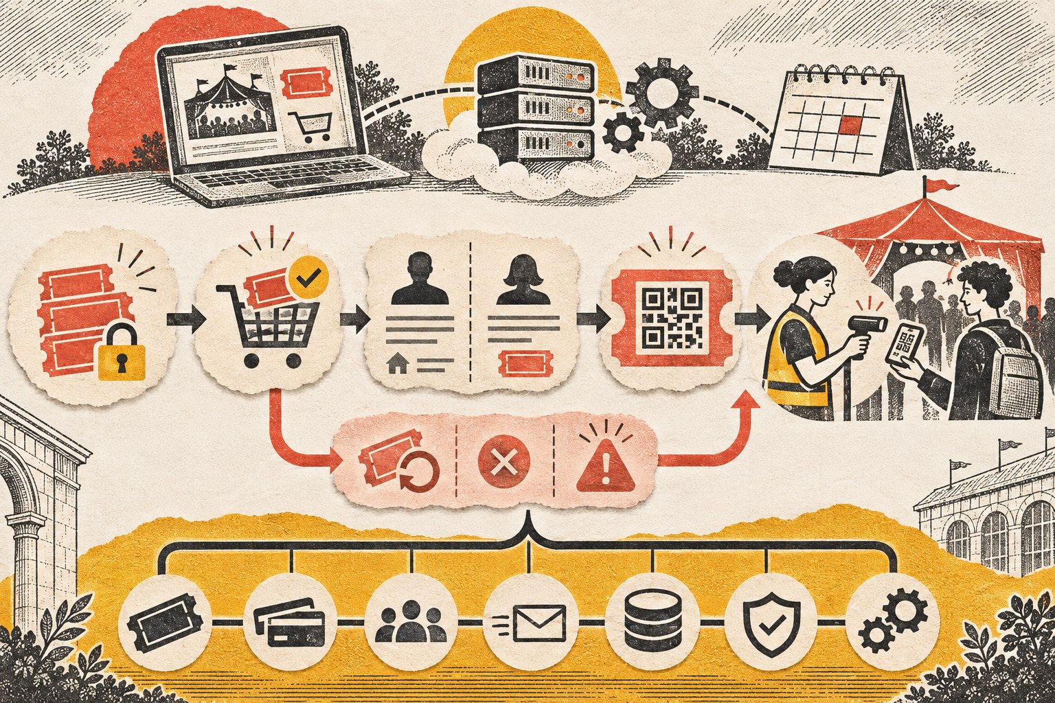
    Event ticket operations connect inventory, purchase, attendee details, entry check-in, refunds, and technical support.

    The goal is not to collect features. It is to give every responsibility one clear owner.

    Three ways to sell WooCommerce event tickets in WordPress

    1. Use a normal WooCommerce product

    For a very simple event, a ticket can sometimes be just a WooCommerce product with limited stock. This can work when you only need to sell a fixed number of admissions and the purchaser’s order information is enough.

    This is the lowest-complexity option, but it stops being a good fit as soon as you need attendee-specific fields, individual tickets, QR check-in, multiple dates, transfers, or more sophisticated event operations.

    2. Add a WooCommerce-connected ticketing extension

    This is the best fit for many businesses that already have a healthy WooCommerce store. WooCommerce remains responsible for checkout and orders while the event-ticketing extension adds the event-specific layer.

    For example, Event Tickets Plus for WooCommerce supports selling tickets through WooCommerce and can collect attendee information. The Events Calendar also documents attendee registration fields and QR-code check-in. FooEvents takes a similar WooCommerce-centered approach with ticket emails, attendee details, and QR/barcode check-in.

    The specific extension matters less than whether it covers your actual TICKET requirements cleanly.

    3. Use an external hosted ticketing platform

    Sometimes WordPress should not own the whole event operation. A hosted platform may be smarter when you need a turnkey check-in operation, complex event management, venue tooling, staff workflows, or you simply do not want your WordPress team responsible for another mission-critical subsystem.

    You give up some control and may introduce platform fees or a separate customer experience, but reduced technical ownership can be worth it. The right answer depends on the event and the organization running it.

    A practical WooCommerce ticketing architecture example

    n

    Imagine a small business already runs a stable WooCommerce store and wants to sell admission to a paid workshop. The business needs online checkout, a limited event capacity, one attendee name and email address per ticket, a ticket email, and a simple QR-code check-in process at the door.

    n

    In that case, WooCommerce can continue to own the transaction. It handles the customer’s cart, payment, taxes, coupons, order record, and refund transaction. A single ticketing extension then owns the event-specific work: ticket records, attendee fields, ticket delivery, capacity rules, and check-in status.

    n

    The important part is avoiding duplicate ownership. If capacity is controlled by the ticketing extension, staff should not maintain a second independent seat count in a spreadsheet or another plugin. If attendee information is collected per ticket, the team should know that the WooCommerce billing name is the purchaser, not necessarily every person attending.

    n

    Before sales open, run the workflow exactly as a customer and staff member will experience it. Purchase more than one ticket in a test order, enter different attendee details, confirm the order and ticket emails arrive, open the ticket on a phone, scan it with the device staff will use, and then test what happens when the same ticket is scanned again.

    n

    Next, test an exception. Refund one ticket, update an attendee if the extension supports it, or cancel the test order and confirm the ticket’s status follows the order correctly. The goal is not to prove that the happy path works. It is to make sure your checkout, attendee records, inventory, email, and check-in process continue to agree when something changes.

    n

    This is what a clean WooCommerce event tickets setup looks like: one transaction system, one event-ticketing layer, and a documented handoff between them. If the workflow requires additional systems, each one should solve a clearly defined operational problem rather than duplicate a job that another tool already owns.

    Document who is responsible for each handoff before launch. Your event staff should know where to look for an order, where to correct attendee information, how to resend a ticket, and what to do when a scan fails. That small operating note turns the software configuration into a process the team can actually run when customers are waiting.

    n

    How to add WooCommerce event tickets step by step

    1. Write down the operational requirements first

    Before installing anything, answer a few concrete questions:

    • How many ticket types do you need?
    • Is capacity global, per ticket type, or per event date?
    • Do you need one attendee record per ticket?
    • What information must be collected for each attendee?
    • Will staff scan QR codes at the door?
    • Can tickets be transferred?
    • What happens when an event is canceled or rescheduled?
    • Do you need recurring or multi-day events?

    This list will eliminate a surprising number of bad-fit plugins before you install them.

    2. Choose one system to own ticket inventory

    A common failure mode is having WooCommerce stock, an event plugin’s capacity setting, and a third system all trying to represent the same limit. Pick one source of truth for capacity and understand how the extension maps ticket sales to WooCommerce orders.

    If the event has 200 seats, your team should be able to answer one question immediately: where does the number 200 live?

    3. Configure attendee data separately from buyer data

    The purchaser and the attendee are not always the same person. One buyer may purchase four tickets for four different people. If you need names, meal preferences, age ranges, waivers, accessibility notes, or other attendee details, make sure the chosen system collects those per ticket rather than only once at checkout.

    Collect only information you actually need. Extra fields increase friction and create more personal data for your organization to manage.

    4. Build the ticket and confirmation flow

    Test the entire customer journey: event page, ticket selection, cart, checkout, order confirmation, ticket email, and any attendee-edit flow. Do not assume that a successful WooCommerce order means the ticket experience is finished.

    Use a real inbox during testing. Confirm that ticket emails arrive, links work, QR codes render correctly, and the content makes sense on a phone.

    5. Set up event-day check-in

    If you plan to scan tickets, test with the actual phones or scanners staff will use at the venue. Check login requirements, network connectivity, duplicate scans, and what staff see when a ticket has already been used.

    If the venue has unreliable Wi-Fi or cellular service, that becomes an architecture requirement, not an event-day surprise.

    6. Test refunds, cancellations, and changes

    The happy path is easy. Exceptions expose weak systems. Run test orders and then try the uncomfortable cases: refund one ticket from a multi-ticket order, change an attendee name, cancel the event, move an event date, and resend a ticket.

    Your support process should match what the software can actually do.

    7. Test WooCommerce compatibility before launch

    Ticketing extensions sit inside an ecommerce stack, so compatibility matters. WooCommerce recommends that extensions declare compatibility with current platform features such as High-Performance Order Storage and Cart/Checkout blocks.

    Do not install or update a mission-critical ticketing extension for the first time hours before ticket sales open. Use a staging site, test checkout, verify transactional email, and confirm the event-day workflow. Our guide to updating WordPress plugins safely explains why compatibility testing matters before production changes.

    Which WordPress event ticket plugin is best?

    There is no universal best event ticket plugin for WordPress. A plugin that is excellent for a small workshop can be a poor fit for a multi-day conference, assigned seating, recurring classes, or a venue with dedicated box-office staff.

    For an existing WooCommerce store, start by evaluating tools that let WooCommerce continue to own checkout and orders while the ticketing layer owns ticket generation, attendee records, and check-in. Compare them against the TICKET Stack Check rather than the length of the feature page.

    If you need a broader technical foundation around ecommerce, integrations, and site performance, see our guide to business website development and technical foundations.

    Common WooCommerce ticketing mistakes

    • Installing multiple overlapping plugins. More event plugins rarely create a better event system. They create more ownership ambiguity.
    • Using buyer data as attendee data. One order can represent several people.
    • Ignoring event-day operations. The checkout can be perfect while check-in is miserable.
    • Hard-coding a process around one edge case. Test refunds, transfers, cancellations, and rescheduling before launch.
    • Skipping email deliverability testing. A ticket that never reaches the buyer creates support work immediately.
    • Updating production without staging. Ecommerce and ticketing extensions touch orders, email, inventory, and sometimes checkout itself.

    When an external ticketing platform is the better choice

    Use a hosted ticketing platform when the operational burden matters more than keeping the transaction inside WooCommerce. That may be the case if your event team needs mature venue workflows, dedicated mobile check-in tools, extensive event operations, or vendor support that owns more of the system.

    Use WooCommerce-centered ticketing when you already have a stable store, want to keep customer/order data in WordPress, need ecommerce flexibility, and have someone who can maintain the stack responsibly.

    This is the same principle we use across web projects: the ongoing maintenance burden is part of the architecture decision. A feature is not really “included” if nobody is prepared to maintain it.

    WooCommerce event tickets launch checklist

    • Define ticket types and capacity.
    • Confirm which system owns inventory.
    • Set attendee fields and privacy requirements.
    • Run test purchases with multiple tickets.
    • Verify taxes, coupons, and refund behavior.
    • Confirm ticket emails and QR codes on mobile.
    • Test check-in with the actual staff workflow.
    • Test duplicate scans and canceled/refunded tickets.
    • Confirm compatibility with your WooCommerce setup.
    • Take a backup and test updates on staging.
    • Document the event-day support plan.

    Frequently asked questions

    Can WooCommerce sell event tickets?

    Yes. For basic admission, a normal WooCommerce product may be enough. For attendee-level data, ticket emails, event capacity, and QR check-in, most sites add a dedicated ticketing extension that integrates with WooCommerce.

    How do I generate tickets for an event in WordPress?

    Choose a ticketing extension that creates an individual ticket record when a WooCommerce order is completed. Configure the event, capacity, ticket types, attendee fields, and ticket-email template, then test the full purchase and check-in flow before launch.

    Do I need WooCommerce for WordPress event tickets?

    No. WordPress has ticketing systems that use other payment flows, and hosted event platforms can handle the process outside WordPress. WooCommerce is most attractive when you already use it and want the event purchase to share your existing checkout, payment, coupon, tax, and order-management system.

    Should I use WooCommerce or an external ticketing platform?

    Use WooCommerce-centered ticketing when control, integration with your existing store, and ownership of customer/order data matter most. Consider a hosted platform when turnkey event operations and lower WordPress maintenance responsibility matter more.

    Need help with WooCommerce event tickets?

    Event ticketing looks simple until checkout, capacity, attendee data, email, refunds, and check-in all have to work together. Scope Design can help you choose the smallest workable architecture, integrate it with WooCommerce, test the edge cases, and make sure the system is maintainable after launch.

    Contact Scope Design if you want help planning or implementing a WordPress event ticketing system.


  • Mastering Growth Marketing: Complete Guide to Data-Driven Customer Acquisition and Retention

    Mastering Growth Marketing: Complete Guide to Data-Driven Customer Acquisition and Retention

    Growth marketing is a disciplined system for improving customer acquisition, activation, retention, revenue, and referral by finding the current growth constraint, running the smallest useful experiment, and carrying what you learn into the next decision. It is not a synonym for paid ads, an AI tool stack, or a collection of “growth hacks.”

    The useful question is not, “Which growth tactic should we try?” It is, “What is keeping more of the right customers from reaching value—and what evidence would change our next decision?” That shift matters because a business can improve clicks, leads, or even first-time conversions while quietly making customer fit, margins, retention, support load, or delivery capacity worse.

    Growth marketing in 60 seconds

    • Start with the business constraint, not the channel. Growth marketing should support a real business strategy, not become a substitute for one.
    • Measure the whole customer lifecycle. Acquisition is only useful when enough of those customers activate, stay, buy profitably, and create future value.
    • Run bounded experiments. Define the decision, hypothesis, change, outcome, guardrails, observation window, and next action before launch.
    • Judge downstream quality. A local metric win is not durable growth if it creates worse-fit customers, lower contribution, more churn, more support burden, or less trust.
    • Scale learning, not noise. Widen what survives downstream scrutiny; revise or stop what does not.

    What Is Growth Marketing?

    Growth marketing is an operating approach that uses customer evidence, lifecycle measurement, and controlled experimentation to improve durable business outcomes. It connects the work that attracts a prospect with the work that helps that person experience value, remain a customer, expand the relationship, and advocate for the business.

    That makes growth marketing broader than a campaign and narrower than “everything the company does.” Marketing still has to respect product quality, sales execution, onboarding, service capacity, pricing, and the customer experience. When one of those is the binding constraint, buying more traffic can simply send more people into a broken system faster.

    The defining habit is therefore continuous, decision-oriented learning: identify what appears to limit growth, collect enough evidence to form a useful hypothesis, change something intentionally, observe the response, and decide what deserves more resources.

    Growth Marketing vs. Performance, Digital, Lifecycle, and Product Marketing

    These disciplines overlap, which is why definitions get muddy. The easiest way to separate them is by the job each one is usually trying to own.

    DisciplinePrimary jobCommon evidenceWhere growth marketing overlaps
    Growth marketingImprove durable growth across acquisition, activation, retention, revenue, and referralLifecycle progression, cohort quality, experiment outcomes, economics, guardrailsCoordinates tests across several functions when the growth constraint moves
    Performance marketingProduce measurable outcomes from paid or directly attributable mediaCost, conversion, revenue, return metricsPaid acquisition can be one growth lever, but growth must follow downstream quality too
    Digital marketingReach and persuade customers through digital channelsSearch, email, social, web, advertising, campaign metricsGrowth marketing may use these channels but is defined by the learning system, not the medium
    Lifecycle marketingCommunicate appropriately as customers move through relationship stagesActivation, engagement, retention, reactivation, expansionLifecycle work is often central when activation or retention is the constraint
    Product marketingConnect product value, positioning, market, launch, adoption, and sales enablementMessage fit, adoption, pipeline quality, win/loss evidenceGrowth tests depend on sound positioning and value; they should not invent those in a dashboard

    If your team argues about which label applies, bring the discussion back to the decision. What outcome are you trying to improve? What currently limits it? Who owns the underlying system? A name should clarify work, not create turf.

    Why Growth Marketing Fails: Teams Optimize the Wrong Constraint

    A common growth failure looks successful in the weekly dashboard. Traffic rises. Cost per lead falls. Form submissions climb. Then sales says the leads are poor, onboarding gets overloaded, repeat purchase weakens, refunds rise, or the team discovers the “efficient” channel was attracting people who were never a good fit.

    This happens when a local metric becomes the objective instead of evidence about the objective.

    • If qualified demand is scarce, the constraint may be acquisition.
    • If the right people arrive but do not take the first meaningful action, it may be activation or conversion.
    • If customers buy once and disappear, the constraint may be retention or value delivery.
    • If loyal customers never expand, it may be offer, pricing, or expansion.
    • If happy customers rarely introduce anyone, there may be a referral or advocacy opportunity.
    • If demand already exceeds what the company can deliver well, the constraint may be capacity—and more acquisition may be the wrong goal.

    This is why growth marketing starts with diagnosis. The tactic comes later.

    The Scope Design GROW Loop

    We use a simple growth-specific extension of Scope Design’s constraint-first strategy discipline: GROW. It gives every experiment four jobs.

    G — Ground the bottleneck

    Define the business outcome first. Then identify the stage most likely to constrain that outcome. Use actual evidence: source and cohort data, sales records, support themes, customer interviews, funnel progression, gross margin, renewal or repeat-purchase behavior, and operating capacity.

    Do not pick “improve conversion rate” because it is easy to graph. Ask what a better conversion would change for the business and what could make that improvement misleading.

    R — Reduce uncertainty with a bounded hypothesis

    Turn the diagnosis into a falsifiable expectation: For this audience, changing this one meaningful factor should improve this primary outcome because of this customer or market evidence.

    Predefine the comparison, guardrails, observation window, and what result would cause you to scale, revise, or stop. This is the difference between an experiment and changing six things before declaring the new version “better.” The NIST Engineering Statistics Handbook’s explanation of experimental design makes the underlying logic explicit: deliberately change factors and observe the response.

    O — Observe downstream cohort quality

    Do not stop at the first metric the test moves. Follow the affected cohort far enough to answer the business question. A campaign that lowers cost per lead but produces fewer qualified opportunities is not necessarily a winner. A checkout change that raises orders while increasing refunds may be borrowing from future value.

    Funnel analysis can help teams see where people progress or drop out; Google’s Analytics funnel reporting documentation shows how funnel reports visualize the steps users take and where they succeed or fail. The tool is not the strategy, but it can help locate the question.

    W — Widen, revise, or withdraw

    Once the observation window is sufficient for the decision, choose deliberately:

    • Widen: expose more of the appropriate audience or budget to the change because the primary outcome improved and guardrails held.
    • Revise: keep the question but change the hypothesis because the evidence revealed something useful.
    • Withdraw: stop spending time or money on a weak idea, record what was learned, and move to the next constraint.

    The point is not to win every test. The point is to make uncertainty cheaper and future decisions better.

    Diagnose Growth Across the Customer Lifecycle

    A growth funnel is useful only if each stage represents something meaningful to your business. “Visited page” and “opened email” can be diagnostic signals, but they are rarely the final outcome.

    StageDecision questionUseful outcomeMisleading substituteExample bounded test
    AcquisitionAre enough of the right people entering the system?Qualified demand by source, customer acquisition cost using a defined customerTraffic, impressions, raw leadsTest one audience-message-offer combination against the current acquisition path
    ActivationDo new prospects or customers reach the first meaningful value milestone?Qualified action or time to first agreed valuePage views, logins, generic engagementChange one onboarding step, form requirement, proof element, or call to action
    RetentionDo customers continue because they receive enough value?Renewal, repeat purchase, retained gross profit, cohort retentionEmail opens, account age, “active” without a value definitionTest a value reminder, service handoff, replenishment cue, education sequence, or friction repair
    Revenue / expansionCan the relationship create more profitable value without harming fit?Contribution, expansion revenue, repeat-order economicsAverage order value without margin or return contextTest packaging, cross-sell timing, expansion offer, pricing presentation, or qualification
    ReferralDo satisfied customers create qualified introductions?Qualified referrals and referred-customer qualityShares, generic mentions, testimonial countTest the trigger, timing, ask, incentive, or handoff into a referral or affiliate program

    Notice what this table does not do: it does not tell every business to optimize all five stages simultaneously. The stage that deserves attention depends on the bottleneck and the decision.

    Measure Growth Without Lying to Yourself

    Growth marketing needs enough measurement to make a decision—not a dashboard with 47 tiles and no owner. A useful hierarchy has four layers.

    1. Primary business outcome: the result the experiment is supposed to improve—qualified revenue, retained value, profitable repeat purchase, qualified pipeline, or another named consequence.
    2. Supporting metrics: measures that help explain movement in the primary outcome, such as activation rate, stage progression, source mix, cycle time, or repeat frequency.
    3. Diagnostic metrics: clicks, views, opens, scroll depth, form starts, and similar behaviors used to investigate why an outcome moved.
    4. Guardrails: measures that should not deteriorate while the primary metric improves—margin, refunds, churn, support burden, lead quality, customer complaints, capacity, or brand trust.

    Keep CAC and customer lifetime value definitions explicit

    Customer acquisition cost and customer lifetime value can be useful growth metrics, but they become dangerous when teams silently change the definitions. Does “customer” mean a lead, first purchase, paid subscriber, or retained account? Does lifetime value mean revenue, gross profit, contribution, or forecasted value? Which cohort and time window are included?

    Our dedicated guide to customer lifetime value goes deeper into the calculation and decision discipline. The important rule here is simple: write the definition next to the number. A universal CLV:CAC ratio copied from a benchmark is not a substitute for your economics, cash timing, capacity, and uncertainty.

    Attribution is a model, not a confession from reality

    Multi-touch attribution can organize observed touchpoints, but it should not be treated as proof that every credited channel caused the outcome. Organic search, referrals, brand familiarity, sales conversations, offline exposure, email, and paid media often interact. Use attribution for diagnosis and allocation hypotheses; use controlled experiments or other stronger evidence when the causal question is important enough.

    How to Design a Growth Marketing Experiment

    You do not need a laboratory coat. You do need a written decision rule. Before launching a growth marketing experiment, capture this brief:

    Experiment fieldWhat to write
    DecisionWhat will we do differently if the evidence supports or rejects this idea?
    BottleneckWhich lifecycle constraint are we trying to reduce?
    EvidenceWhat customer, sales, analytics, operational, or market evidence makes this worth testing?
    HypothesisFor this audience, changing X should improve Y because Z.
    ChangeWhat meaningful factor will differ from the current experience?
    Primary outcomeWhich result decides whether the test helped?
    GuardrailsWhat must not get materially worse?
    WindowHow long or how many decision-relevant observations are needed before review?
    ThresholdWhat evidence is strong enough to widen, revise, or withdraw?
    Next actionWhat will we do for each plausible result?

    Google Ads’ official experiments documentation uses control and treatment groups to compare the performance of defined changes. That same discipline—make the change explicit, preserve a comparison, and evaluate the result—is useful even when the experiment happens somewhere other than an ad platform.

    Do not change the base while the test is running

    If the landing page, offer, price, targeting, follow-up process, and sales script all change during the same observation window, you may improve results—but you will learn less about why. Sometimes an emergency repair is more important than experimental purity. Just document the confounding change instead of pretending the test remained clean.

    Growth Experimentation for Low-Traffic Small Businesses

    Small businesses are often told to A/B test everything. That advice ignores arithmetic. If a site or funnel produces only a handful of decision events, splitting the audience can make both groups too small to support a confident conclusion.

    That does not mean you should stop learning. It means you should match the evidence method to the traffic, risk, and decision.

    • Fix known defects without waiting for a test. Broken forms, misleading copy, inaccessible controls, obvious mobile friction, and tracking failures are repairs.
    • Use direct customer evidence. Interviews, sales objections, support tickets, call recordings, lost-deal reasons, and usability observation can expose the bottleneck before a split test is viable.
    • Segment before averaging. Compare source, device, geography, offer, customer type, or cohort when the segment maps to a real business difference.
    • Use bounded before/after or time-block tests carefully. Keep other major conditions stable when possible, define the window in advance, and label the evidence directional when seasonality or other changes could explain the movement.
    • Observe longer when the business outcome is delayed. Retention, repeat purchase, and referrals may need more time than a landing-page click.
    • Do not manufacture significance. A tiny sample with a dramatic percentage change is still a tiny sample.

    This is also why conversion rate optimization is larger than A/B testing. Research, repairs, message clarity, usability, offer work, analytics, and operational fixes can all reduce uncertainty before a statistically powered split test makes sense.

    Choose Channels After You Know the Constraint

    Channels are tools. Growth marketing decides when a tool is relevant.

    If the constraint is…Potential levers to investigateFirst question
    Qualified acquisitionSEO/content, paid search/social, partnerships, referrals, local visibility, outbound, positioningAre we missing reach, relevance, trust, or a compelling offer?
    Activation / conversionLanding-page clarity, proof, forms, onboarding, call handling, sales follow-up, UXWhere does a good-fit prospect fail to reach the first meaningful value step?
    RetentionService delivery, onboarding, education, replenishment, account management, reactivationWhy do customers who looked healthy fail to continue?
    ExpansionPackaging, pricing, cross-sell, upsell, service tiers, customer successWhat additional problem can we solve profitably for the right existing customer?
    ReferralReferral asks, partner systems, reviews, advocacy triggers, communityWhat moment gives a satisfied customer a natural reason to introduce someone?

    If you need ideas after you have a decision to make, our guide to innovative marketing strategies contains experiments worth adapting. The order matters: problem first, tactic second.

    A Practical 90-Day Growth Marketing Strategy

    You do not need a year-long transformation to start practicing growth marketing. You need enough structure to learn without letting the experiment backlog become another abandoned spreadsheet.

    Days 1–14: Baseline the system and choose one bottleneck

    • Define the business outcome and the customer you are trying to create or retain.
    • Map the essential lifecycle stages from first useful contact through realized value.
    • Verify tracking against sales, commerce, CRM, or operational records.
    • Segment enough to expose obvious source or cohort differences.
    • Interview customers or frontline staff where the numbers cannot explain behavior.
    • Choose one constraint and name a primary metric plus guardrails.

    Days 15–30: Run the smallest decision-changing test

    • Write the experiment brief before implementation.
    • Prefer a meaningful change to a dozen microscopic tweaks.
    • Keep the audience and experience stable enough to interpret the result.
    • Record implementation details, dates, and confounding changes.

    Days 31–60: Follow the cohort downstream

    • Check whether the primary outcome changed.
    • Check qualification, margin, retention signals, refunds, support burden, and other guardrails.
    • Compare the affected cohort with the most reasonable baseline.
    • Collect qualitative explanations from sales, support, and customers.

    Days 61–90: Reallocate and document

    • Widen the winner only if downstream evidence is healthy.
    • Revise a promising hypothesis when the mechanism looks wrong but the problem still matters.
    • Withdraw weak ideas without turning sunk cost into a strategy.
    • Record the result, confidence, unresolved questions, and next review date.
    • Revisit the growth constraint; a successful test may move it somewhere else.

    What a Small Growth Team Actually Needs

    Growth marketing is often presented as a shopping list of analytics platforms, automation systems, customer-data platforms, AI agents, personalization engines, and testing tools. That reverses the dependency.

    A small business needs five capabilities before it needs a “growth stack”:

    1. One accountable growth decision owner who can say what constraint is being worked and why.
    2. Trustworthy outcome data connected far enough downstream to distinguish activity from customer value.
    3. Customer evidence from sales, service, interviews, reviews, or behavior—not only dashboards.
    4. Execution capacity to change the relevant part of the website, campaign, offer, onboarding, or workflow.
    5. A review habit that turns results into scale, revise, or stop decisions.

    Software should make one of those capabilities easier. AI can help summarize interviews, draft variants, classify feedback, explore data, or accelerate implementation. It should not be allowed to turn a weak business assumption into 40 automated campaigns before anyone asks whether the assumption is true.

    Common Growth Marketing Mistakes

    1. Treating acquisition as growth

    More traffic and leads can hide a retention, margin, qualification, or capacity problem. Follow enough of the cohort downstream to know whether the acquisition is creating useful customers.

    2. Building composite scores nobody can act on

    A “growth velocity” or “customer health” score can be useful if its inputs, weighting, owner, and response rule are explicit. Otherwise it turns several uncertain metrics into one more-confident-looking uncertain metric. Keep the underlying outcomes visible.

    3. Declaring a winner at the first conversion

    The earliest metric is often the fastest one, not the most important one. Decide in advance how far downstream the cohort must travel before you scale.

    4. Running experiments without a stop rule

    Without a threshold and review date, weak tests linger because nobody wants to admit the result is inconclusive. Precommit the next action for win, loss, and uncertainty.

    5. Testing five variables at once

    You may get a better page or campaign, but you lose learning about the mechanism. Bundle changes only when the business needs the whole repair more than it needs isolated evidence.

    6. Letting AI choose the strategy

    AI can accelerate analysis and production. It does not know your actual constraints, customer promises, margins, sales quality, capacity, or risk tolerance unless you provide trustworthy context—and even then, the business still owns the decision.

    Growth Marketing FAQ

    What is growth marketing in simple terms?

    Growth marketing is a method for improving durable customer and business outcomes through lifecycle measurement and repeated experiments. It starts by identifying the current growth bottleneck, tests a defined change, follows the affected cohort downstream, and uses the result to decide what to scale, revise, or stop.

    How does growth marketing work?

    Start with a business outcome, diagnose whether acquisition, activation, retention, expansion, referral, or capacity is limiting it, form a hypothesis from evidence, run the smallest useful test, measure the primary outcome and guardrails, then reallocate resources based on what you learned.

    What is a growth marketing strategy?

    A growth marketing strategy is the set of choices that connects a growth objective to a specific constraint, target customer, evidence base, experiment sequence, measurement rule, resource owner, and review cadence. “Post more on social media” is a tactic. “Increase qualified pipeline by fixing the mismatch between our highest-intent search traffic and the offer on its landing page” is closer to a strategy.

    What is the difference between growth marketing and performance marketing?

    Performance marketing usually focuses on directly measurable paid-media outcomes such as acquisition, conversion, or revenue. Growth marketing can include performance marketing, but it follows the customer farther through activation, retention, expansion, and referral and can test non-media constraints such as onboarding, offers, product experience, or handoffs.

    What metrics should a growth marketer track?

    Track the metric that answers the current business decision, plus supporting diagnostics and guardrails. Depending on the constraint, that may include qualified acquisition cost, activation to first value, stage conversion, retained gross profit, cohort retention, contribution, repeat purchase, expansion, or qualified referrals. Raw traffic, clicks, opens, and form starts are often diagnostic rather than final outcomes.

    Do small businesses need A/B testing for growth marketing?

    No. A/B testing is one evidence method. Low-volume businesses can learn from direct customer research, usability observation, repairs, segmentation, carefully bounded before/after tests, and longer cohort observation. Use a randomized split test when traffic and conversion volume can support the decision; do not fake statistical certainty when they cannot.

    How much should a small business spend on growth marketing?

    There is no responsible universal percentage. Budget depends on unit economics, cash flow, capacity, the cost of learning, the maturity of the channel, and how quickly the business can observe a meaningful outcome. Fund experiments at the smallest scale that can change a real decision, then widen investment when the economics and downstream guardrails hold.

    Build a Growth System That Learns

    The advantage of growth marketing is not that it gives you more tactics. The internet already has enough tactics. The advantage is that it gives the business a repeatable way to decide which problem deserves attention, what evidence would reduce uncertainty, and when a result is healthy enough to scale.

    Ground the bottleneck. Reduce uncertainty. Observe downstream quality. Widen, revise, or withdraw. Then run the loop again because a solved constraint usually exposes the next one.

    If your marketing produces activity but you cannot tell which constraint is limiting profitable growth, talk with Scope Design. We can help connect the website, analytics, acquisition channels, conversion path, customer evidence, and automation into a growth system that has a reason for every test.

  • Master ChatGPT for Marketing: Complete Guide to AI-Powered Success

    Master ChatGPT for Marketing: Complete Guide to AI-Powered Success

    ChatGPT for marketing works best when it speeds up bounded work you already understand: research synthesis, idea development, first drafts, variations, analysis, repurposing, and marketing operations. It is not a marketing strategy, a substitute for customer knowledge, or a reliable final source of facts. The businesses that get useful results give it real context, define what a human must review, and measure whether the workflow improves something that matters.

    That is the central idea of this guide. We are not going to pretend one magic prompt turns ChatGPT into a tiny CMO living in your browser. We are going to show you where the tool earns its place, where it needs supervision, and how to use it without turning your marketing into polished beige sludge.

    TL;DR: Use ChatGPT for marketing as an assistant, not the department

    • Give it a specific marketing job. “Help with marketing” is not a job.
    • Supply approved context. Give it the audience, offer, evidence, brand rules, constraints, and source material it needs.
    • Define the review boundary. A human still owns facts, positioning, privacy, compliance, taste, and final approval.
    • Measure a real outcome. Time saved can matter, but so can error rate, campaign speed, qualified leads, pipeline, purchases, retention, or another result tied to the job.
    • Use specialist workflows when the problem gets deeper. Prompt engineering, SEO content, email marketing, repurposing, paid advertising, and customer-facing chatbots each deserve their own operating rules.

    In this ChatGPT marketing guide

    How ChatGPT for marketing should actually work

    Think of ChatGPT as a fast collaborator with broad pattern-recognition ability and no accountability. It can help you turn messy notes into a brief, compare several message directions, summarize a spreadsheet, rewrite a draft for a different audience, or challenge assumptions. What it cannot do is care whether your positioning is actually right, whether a statistic is fabricated, whether a promise creates legal risk, or whether the campaign deserves another dollar.

    OpenAI’s current marketing guidance describes use cases across writing, research, brainstorming, data analysis, campaign work, and adaptation, while still calling for human judgment on accuracy, nuance, and final approval. That division of labor is more useful than the old fantasy of “automating marketing.” If your overall marketing system is unclear, fix that first; our small business marketing strategy guide owns the broader channel-and-system decision.

    ChatGPT can help with A marketer still needs to own
    Organizing research and messy inputs Deciding what evidence is trustworthy and what matters
    Generating several directions quickly Choosing the positioning and creative direction
    Drafting and rewriting Truth, brand voice, proof, and final approval
    Summarizing campaign data Choosing the metric, interpreting causality, and deciding what to do
    Repurposing a strong idea across formats Adapting the experience to the destination and audience

    Use the Scope Design MARK Test before you ask ChatGPT to do marketing work

    The MARK Test is our four-part operating check for AI-assisted marketing. Run it before you spend time polishing prompts or automating a workflow. If one box is blank, the workflow is not ready.

    The Scope Design MARK Test keeps AI-assisted marketing tied to a real job, approved evidence, human review, and a measurable outcome.

    M — Marketing job

    Name the exact task or decision. “Create content” is still too vague. “Turn these five customer objections into three article angles for buyers comparing managed hosting options” is a job. “Review this campaign report and identify three anomalies worth investigating” is a job. The narrower the job, the easier it is to decide whether the output is useful.

    A — Approved context

    Give ChatGPT the material a competent teammate would need: who the audience is, what you sell, what you can prove, how the brand sounds, what constraints exist, and which source material is allowed. Context is not decoration. It is the difference between transforming your knowledge and asking the model to invent a plausible version of your business.

    R — Review boundary

    Decide what a person must check before the work moves forward. Common review boundaries include factual claims, citations, pricing, customer outcomes, regulated language, privacy, brand voice, positioning, and anything that creates a promise. OpenAI’s own accuracy guidance warns that ChatGPT can produce incorrect information and fabricated quotes, studies, citations, or references. Confidence is not proof.

    K — KPI or outcome

    Choose the evidence that would tell you the workflow helped. Sometimes the answer is efficiency: fewer drafting hours, a shorter campaign cycle, or fewer repetitive rewrites. Sometimes it is quality: fewer factual corrections, better message consistency, or more useful variations tested. Sometimes it is a downstream business result. If you cannot name the outcome, “we used AI more” is not a success metric.

    1. Use ChatGPT to organize research and sharpen planning

    Research is one of the strongest places to use ChatGPT because the model can help organize evidence without needing to be the evidence. Feed it customer interviews, support questions, reviews, sales-call notes, survey responses, analytics exports, competitor pages, or internal documents. Ask it to identify repeated themes, contradictions, unanswered questions, and assumptions that need validation.

    The important rule is simple: do not replace market contact with model output. If you have not talked to customers, inspected search behavior, checked analytics, or gathered first-party evidence, ChatGPT cannot magically manufacture that missing reality. Our small business market research guide goes deeper on gathering the evidence first.

    A useful research prompt is not “Who is my target customer?” Try: “Here are 40 customer questions from sales and support. Group them by decision stage, identify the language customers repeat, flag conflicting signals, and list five questions we still need to answer with real research.” Now the tool is reducing cognitive load without pretending it interviewed anyone.

    2. Create, repurpose, and improve content without manufacturing expertise

    ChatGPT is useful for outlines, first drafts, rewrites, variations, summaries, editing, and format changes. The strongest workflow starts with something the business actually knows: a customer question, a project lesson, a product decision, a sales objection, a process, a dataset, or an expert interview. Give the model that material and ask it to clarify, organize, challenge, or transform it.

    That is different from typing “write a 2,000-word thought-leadership article about AI marketing” and hoping expertise appears. Our AI content creation workflow covers the full research-to-review system. If the job is turning one proven source into multiple useful formats, use the content repurposing workflow instead of copying the same wording into every channel.

    Use ChatGPT for SEO thinking, not imaginary SEO data

    ChatGPT can help cluster a supplied keyword list, compare search-intent hypotheses, suggest questions, improve headings, draft metadata, identify gaps in an outline, or challenge whether a page actually answers the query. It should not be treated as the source of current search volume, rankings, backlink counts, crawl status, or Search Console performance unless it is connected to current tools and you verify the data.

    Google’s guidance on generative AI content does not ban AI-assisted work. It says generative AI can help with research and structure, while scaled content that adds little value can run into spam-policy problems; accuracy, quality, relevance, and usefulness still matter. If you want the full writing system, our SEO content writing guide owns that job.

    3. Adapt one strong idea for email, social media, and paid advertising

    One of ChatGPT’s practical advantages is transformation. A strong source idea can become an email, a short social post, an ad concept, a landing-page section, a video outline, or an FAQ. But adaptation should change the experience, not merely resize the words.

    Email marketing

    Give ChatGPT the offer, audience stage, objection, proof, desired action, and real examples of your voice. Ask for genuinely different approaches: direct, educational, proof-led, objection-led, or urgency-free. Then review each against the relationship you are trying to build. Our email marketing for small business guide covers the relationship system behind the copy.

    Social media

    Use ChatGPT to generate angles, turn long material into shorter formats, write alternate hooks, or adapt a point for different levels of audience awareness. Do not tell it to “make this viral.” Virality is not an instruction. Give it the audience, platform constraint, content job, and evidence; then judge the result like any other creative work.

    Paid advertising

    ChatGPT can help turn a campaign brief into ad variants, group messages by angle, rewrite copy to fit character limits, or analyze a supplied performance table for hypotheses. It cannot decide whether the channel economics make sense. Use your conversion data, margins, budget, targeting, and sales capacity. Our online advertising strategy guide covers that decision.

    4. Use ChatGPT for support analysis and marketing operations, with tighter boundaries for customer-facing automation

    Behind the scenes, ChatGPT can summarize recurring support issues, turn meeting notes into decisions and owners, standardize briefs, clean up campaign documentation, draft QA checklists, classify feedback, or explain a performance report in plain English. Those tasks are valuable because they reduce coordination work without pretending the AI owns the customer relationship.

    Customer-facing automation needs a stricter standard. A chatbot can be useful for bounded questions, routing, and retrieval, but it needs approved knowledge, escalation rules, logging, maintenance, and a clear definition of what it must never invent. If you are building that system, use our AI chatbots for business guide. A chat window is not automatically a customer-support strategy wearing a robot hat.

    A reusable ChatGPT marketing prompt built around MARK

    You do not need a 600-word incantation for every task. A reusable prompt should carry the information that changes the quality of the work.

    Marketing job: [What exact task or decision should this output improve?]
    Audience and offer: [Who is this for, and what are we trying to help them decide or do?]
    Approved context: [Paste the evidence, source material, brand guidance, constraints, and facts the model may use.]
    Review boundary: [What must be flagged, verified, or approved by a human?]
    Output: [Format, length, required sections, variants, or other constraints.]
    KPI / outcome: [What result would make this work useful?]
    
    If the evidence is missing or conflicting, say so instead of inventing an answer.

    That is enough for many everyday jobs. For reusable prompt systems, examples, source handling, and prompt testing, go to our ChatGPT prompt engineering guide. Prompt technique can improve execution; it cannot rescue a weak offer, missing evidence, or a marketing strategy nobody has decided.

    What marketers should not delegate to ChatGPT

    • Final positioning. The model can produce options. Someone accountable for the business has to choose the territory and tradeoffs.
    • Customer truth. AI can summarize interviews and behavior; it cannot replace actually observing the market.
    • Factual accountability. Verify claims, statistics, quotes, citations, product details, pricing, and competitor statements.
    • Brand taste. Competent is not the same as distinctive. Human judgment decides whether the work is worth attaching your name to.
    • Sensitive or regulated decisions. Do not make consequential decisions about people, eligibility, protected or vulnerable audiences, privacy, or regulated claims just because the output sounds confident.
    • Final approval. Someone with authority should know what is going public and why.

    For organizations using business data, plan settings matter. OpenAI says ChatGPT Business, Enterprise, Edu, and API organization data are not used to train its models by default. Personal workspaces have different data controls. Either way, your own governance rules still matter: decide what staff may paste into AI tools, what must be redacted, what requires approval, and what should stay out entirely. NIST’s Generative AI Profile is a useful cross-sector reference when the risk is larger than “this draft sounds weird.”

    How do you measure ROI from ChatGPT marketing work?

    Measure the job in layers. ChatGPT usage itself is not the KPI. Ten thousand prompts prove you typed a lot.

    Layer Example evidence What it tells you
    Efficiency Drafting hours, turnaround time, number of useful variants Whether the workflow reduced repetitive effort
    Quality Correction rate, factual errors, brand-edit passes, approval rate Whether speed created hidden rework
    Channel Engagement, CTR, reply rate, conversion rate, ranking or visibility changes Whether the marketing asset performed in its environment
    Qualified outcome Qualified leads, sales, pipeline, appointments, retention, saved staff capacity Whether the improvement mattered to the business

    Establish a baseline before changing the workflow. Then compare a reasonable sample rather than declaring victory after one good draft. If the AI version is faster but creates twice as many factual corrections, that time “saved” may be imaginary. If a campaign gets more clicks but worse leads, the marketing result did not improve just because the chart went up.

    This matters for Scope Design’s own page too. Before revising this article, we checked the exact URL across GA4, Google Search Console, Bing, Ubersuggest, public technical access, and live Google/Bing results. The existing page had almost no measurable landing-page traction, Google had crawled it but reported it as currently not indexed, Bing knew the URL but showed no current URL-level traffic, and third-party tools found no useful exact-page keyword or backlink evidence. That does not prove the topic is worthless. It proves the old version was not earning meaningful measurable visibility, while current query research showed a much clearer opportunity around “ChatGPT for marketing.”

    A 30-day plan for using ChatGPT in marketing without creating a mess

    Week 1: Choose two boring, bounded jobs

    Pick recurring tasks with clear inputs and review criteria: turning interview notes into themes, drafting first-pass campaign briefs, generating message variants from approved proof, summarizing a weekly report, or repurposing a finished article. Avoid starting with “run our whole marketing department.” Big demos are seductive. Small measurable jobs teach you where the tool actually helps.

    Week 2: Build the approved context

    Create the minimum reference pack the workflow needs: audience, offer, current messaging, approved proof, constraints, examples, and a short list of prohibited claims. Write the review boundary next to it. If staff are using business information, confirm the account type, data controls, and internal policy before the habit spreads.

    Week 3: Run repeated cycles and log failures

    Use the workflow five or ten times. Track what you fix. Did the model invent facts? Flatten the brand voice? Miss an important objection? Over-summarize? Produce variations that are not actually different? Your correction log is more valuable than a folder full of “best prompts” because it tells you how this workflow fails in your business.

    Week 4: Keep, revise, or stop

    Compare the baseline with the MARK outcome. Keep workflows that save useful time or improve useful quality without creating hidden risk. Revise workflows that are promising but sloppy. Stop workflows that create more review work than they remove. “We already built it” is not a reason to keep automation nobody trusts.

    Frequently asked questions about ChatGPT for marketing

    Is ChatGPT good for marketing?

    Yes, for bounded work such as research synthesis, brainstorming, drafts, variations, repurposing, analysis, and operations. It is less useful when the real problem is missing strategy, missing customer evidence, or a decision nobody wants to own.

    How can I use ChatGPT to promote my business?

    Start with real business material: customer questions, product information, proof, campaign goals, analytics, reviews, or existing content. Use ChatGPT to turn that material into useful angles and channel-ready drafts, then review the claims and test the result in the market. Promotion works better when AI distributes real expertise instead of manufacturing generic enthusiasm.

    What are good ChatGPT prompts for marketing?

    Good marketing prompts identify the job, audience, offer, approved evidence, constraints, review rules, output format, and desired outcome. “Write engaging social media content” is weak because the model has to invent half the brief. The MARK template above is a practical starting point.

    Which AI tool is best for marketing strategy?

    No tool removes the need to choose a strategy. The better question is which tool can work with the evidence and workflow you already have: research, documents, data, collaboration, analysis, drafting, or automation. ChatGPT can be a strong thought partner, but your customer evidence, economics, positioning, and organizational judgment still determine the strategy.

    Can ChatGPT replace a marketer?

    It can replace pieces of repetitive work. It cannot take responsibility for the market, brand, ethics, customer relationship, or business outcome. A stronger operating model is human strategy → AI exploration or execution → human review → market test → AI-assisted analysis → human decision.

    Does using ChatGPT for content hurt SEO?

    Not simply because AI assisted the work. Google’s current guidance focuses on accuracy, quality, relevance, originality, and people-first value. Using automation primarily to mass-produce low-value pages for rankings is the problem. AI can help research and structure content, but the finished page still has to earn its usefulness.

    Can I paste customer or company data into ChatGPT?

    Check the account type, current data controls, contracts, and your organization’s policy before sharing sensitive or proprietary material. OpenAI’s business offerings have different default training treatment from personal workspaces. “The AI needs context” does not mean “paste everything you have.” Use the minimum approved data needed for the job.

    How do I measure ROI from ChatGPT marketing efforts?

    Start with a baseline for the exact job. Measure efficiency and quality first, then the channel metric, then the qualified business outcome. Do not attribute every conversion change to ChatGPT simply because the tool touched the workflow.

    Do companies pay ChatGPT to advertise?

    That is a different question from using ChatGPT to do marketing work. Advertising products, eligibility, formats, and plan rules can change, so evaluate any advertising opportunity separately. The workflows in this guide are about using ChatGPT as a marketing assistant whether or not you buy media on any particular platform.

    Make the marketing system smarter before you make it faster

    ChatGPT can make a good marketing system faster. It can also help a confused team produce confusion at industrial speed. Start with one real job, feed it approved evidence, keep a human on the decisions that matter, and measure whether the result improved anything beyond prompt volume.

    If your bigger problem is the system itself—positioning, content ownership, SEO, email, paid campaigns, measurement, or how the pieces should work together—talk to Scope Design. We would rather help you build a marketing workflow that earns its automation than sell you a shiny pile of AI busywork.

  • Website Font Size Guide: Readable, Responsive Type That Works

    Website Font Size Guide: Readable, Responsive Type That Works

    Warning: truncated output (original token count: 10449)
    Total output lines: 990

    For most business websites, start body copy around 16–18 CSS pixels on smaller screens and 18–20 pixels when the reading context supports it. Then test the actual typeface, line length, line height, contrast, zoom, language, and device. There is no universally perfect website font size, and WCAG does not prescribe a minimum pixel size for ordinary web content. Sixteen pixels is a practical starting point, not a commandment delivered on a stone tablet by the Department of Fonts.

    TL;DR: practical website font-size recommendations

    • Body copy: start at 16–18px; consider 18–20px for long-form reading, older audiences, low-contrast environments, or typefaces with a small x-height.
    • Form controls and buttons: keep their text comfortably readable and give the control enough space to survive zoom and longer labels.
    • Small supporting text: avoid shrinking important instructions, prices, errors, consent language, or eligibility details into decorative dust.
    • Headings: size them by hierarchy and available space, not by copying a “perfect” scale from a design-inspiration post.
    • Line height: 1.45–1.7 is a useful body-copy starting range, adjusted for the typeface, size, measure, and language.
    • Line length: roughly 45–80 characters can be a useful working range for sustained Latin-script reading; treat it as a design range, not a criminal statute.
    • Units: use a root-relative system such as rem for most typography, while preserving browser zoom and user settings.
    • Accessibility: verify 200% text resizing, reflow at 320 CSS pixels, spacing overrides, contrast, semantic structure, and real task completion.
    • Performance: load only the font files and weights you need, use strong fallbacks, and prevent font swaps from turning the page into a furniture-moving contest.
    • Testing: inspect real content on real devices, at narrow widths, at 200% zoom, with browser text changes, and with people who actually have to read it.

    The number matters. It just does not matter alone.

    Why there is no single best font size for every website

    A CSS font size describes the em box used to lay out type. It does not tell you exactly how large the lowercase letters will look, how wide the words will run, how open the counters are, how heavy the strokes feel, or whether two similar characters can be distinguished.

    Two typefaces set to 18px can look and behave very differently. One may have a generous x-height and wide characters. Another may look delicate, compact, and noticeably smaller. Add weight, letter spacing, screen density, viewing distance, glare, language, browser settings, and a 72-year-old reader trying to use the site on a phone in a parking lot, and the fantasy of one perfect number falls apart quickly.

    Font size also interacts with the width of the text column. Eighteen-pixel text in a 620px reading column may feel calm and readable. The same text stretched across a 1,400px monitor becomes a cross-country eye-tracking exercise. Making it 22px does not fix the badly designed measure; it just creates larger words on the same terrible road.

    That is why a serious typography decision accounts for:

    • the typeface’s actual letterforms and x-height;
    • the reading task and content density;
    • the expected audience and context;
    • line length, line height, paragraph spacing, and alignment;
    • contrast and font weight;
    • responsive layouts and zoom behavior;
    • language, script, and content variation;
    • fallback fonts and loading states;
    • headings, forms, buttons, tables, captions, and error messages;
    • the user’s own browser and operating-system settings.

    The right question is not “What number looks premium?” It is “Can the intended person find, distinguish, read, understand, and use this text in the conditions that matter?”

    The Scope Design Website Type Stack

    Website typography works as a stack. A failure near the bottom contaminates everything above it.

    1. Glyph: Can the reader distinguish individual characters and symbols?
    2. Word: Do the weight, spacing, language shaping, and word forms support recognition?
    3. Line: Do font size, line length, and line height support comfortable tracking?
    4. Block: Can the reader scan, keep their place, and understand paragraph boundaries?
    5. Hierarchy: Do headings, labels, emphasis, links, lists, and captions explain the structure?
    6. System: Does the type survive devices, zoom, user settings, fallbacks, loading, localization, and real content?

    This stack prevents a common design mistake: arguing about a headline font while the body copy is too faint, the lines are 120 characters wide, the form errors are 12px gray, and the web font has not loaded yet.

    Typography is interface infrastructure. Brand character matters, but character does not get veto power over legibility, accessibility, or completion. A beautiful typeface that nobody can read is not refined. It is decorative obstruction with a licensing fee.

    A practical website font-size table

    Use these values as starting ranges for common Latin-script business websites, then test the actual implementation.

    Content role Practical starting range What to verify
    Body copy 16–20px sustained reading, x-height, line length, zoom, audience
    Compact UI or navigation 14–17px clarity, contrast, control size, localization
    Form labels and input text 16–18px zoom, errors, autocomplete, long labels, mobile input
    Buttons 16–18px clear action label, weight, spacing, full control size
    Captions and metadata 13–16px whether the text is genuinely secondary and still readable
    H3 20–28px distinction from body copy and H2
    H2 26–40px section hierarchy, wrapping, narrow screens
    H1 36–64px comprehension, line breaks, viewport fit, actual title length

    These ranges are deliberately broad. A font with a small x-height may need more size. A dense dashboard may require a tighter scale than an editorial article. A short marketing headline can tolerate a larger display size than a 14-word technical heading. A Japanese, Arabic, Devanagari, or multilingual interface cannot be treated as Latin typography with different characters pasted in.

    Start with a defensible system. Then use evidence, not vibes in a turtleneck.

    Body text: start around 16–18px and adjust the whole reading system

    Sixteen pixels remains a useful minimum starting point for many body-copy systems because it aligns with common browser defaults and gives readers a reasonable base. That does not make every 16px design readable. A thin font, faint contrast, long lines, tight leading, and tiny link differences can make 16px fail spectacularly.

    For articles, detailed service explanations, pricing guidance, instructions, and other sustained reading, 18px is often a stronger starting point. Twenty pixels can work well when the typeface, column width, and content support it. Larger text is not automatically more readable either: oversized body copy creates short, choppy lines on narrow screens and can make dense information harder to compare.

    Evaluate body copy as a package:

    • Size: Is the text visibly comfortable without requiring immediate zoom?
    • Measure: Can the eye move from the end of one line to the start of the next?
    • Line height: Do lines feel separated without floating apart?
    • Weight: Do strokes remain visible on real screens and in glare?
    • Contrast: Does the text stand apart from the actual background?
    • Paragraph rhythm: Can the reader identify blocks and changes in thought?
    • Links and emphasis: Are they distinguishable without relying only on color?
    • Content: Does the writing deserve to be read, or is typography being asked to disguise a paragraph that says nothing?

    Our content-readability guide owns the writing and structure side of that last question. Font size cannot rescue corporate fog. It can only make the fog larger.

    Headings: build hierarchy, not a monument

    Heading sizes should reveal the structure of the page. The H1 identifies the main subject. H2s divide major sections. H3s explain subsections. Their HTML levels should represent that structure even when the visual design varies.

    A useful heading system has clear steps between levels, but the ratio does not need to be mathematically identical. Display type often needs optical correction. A very bold font may look larger than the numbers imply. An all-caps label may need different spacing. A long H2 may need a lower maximum size than a short hero headline.

    Use fluid sizing when it improves the transition between narrow and wide layouts:

    :root {
      --font-body: 1.125rem;
      --font-h3: clamp(1.25rem, 1.1rem + 0.7vw, 1.75rem);
      --font-h2: clamp(1.75rem, 1.35rem + 1.6vw, 2.75rem);
      --font-h1: clamp(2.25rem, 1.6rem + 3vw, 4rem);
    }

    clamp() sets a minimum, a fluid preferred value, and a maximum. MDN’s clamp documentation explains the function and its use for font sizing. The minimum and maximum still need to work with real titles. “Our Services” and “What Separates a Basic Website From a Serious Business Website?” are not the same layout problem.

    Avoid pure viewport-unit typography such as font-size: 5vw with no floor or ceiling. It can become microscopic on small screens, absurd on large ones, and hostile to user zoom. The W3C’s Resize Text guidance specifically identifies incorrect viewport-unit resizing as a common failure risk.

    Form labels, buttons, errors, and the text businesses love to shrink

    Typography becomes operational when a person must complete something.

    Labels, required-field instructions, input values, validation messages, prices, eligibility rules, shipping details, consent text, and confirmation messages are not decorative supporting actors. They determine whether somebody can finish the task and whether the business receives usable information.

    Do not shrink legally or operationally important text because the layout “feels cleaner.” Clean for whom? The person who designed the comp at 150% scale on a 32-inch monitor?

    For forms and controls:

    • keep labels visible rather than relying on disappearing placeholder text;
    • use readable text inside inputs, selects, date pickers, and buttons;
    • give errors enough contrast and space to wrap;
    • pair color changes with text, icons, or other understandable signals;
    • allow labels and controls to grow at 200% without clipping;
    • test long names, addresses, translated labels, validation details, and autofill;
    • make the entire control appropriately sized, not just the letters inside it;
    • state what happens after submission.

    The Scope Design UX pillar places typography inside the complete decision path. People must recognize, understand, trust, choose, act, and recover. Tiny errors and clipped labels break the path even if the homepage headline is magnificent.

    Line length: control the reading distance

    Line length is also called measure. For sustained Latin-script reading, roughly 45–80 characters per line is a useful working range. Shorter lines can suit compact instructions or narrow interfaces. Longer lines may work in tables, code, or specialized layouts where two-dimensional relationships matter.

    The important test is whether readers can track the line comfortably and return to the correct starting point. The U.S. Web Design System explains that controlling line length helps attention move naturally from one line to the next. WCAG’s Visual Presentation criterion, which is Level AAA, includes a mechanism for limiting blocks of text to 80 characters or glyphs, or 40 for CJK scripts.

    Do not misstate that AAA criterion as a universal AA requirement. It is useful design guidance and an accessibility outcome to understand, not permission to write a fake legal rule.

    A practical CSS limit:

    .article-copy {
      max-inline-size: 68ch;
    }

    The ch unit is based on the advance measure of the “0” glyph, so it is an approximation rather than a precise character counter. That is fine. The goal is a readable column, not a forensic investigation into line 37.

    Line height and paragraph spacing: give the text somewhere to breathe

    Body-copy line height often lands between 1.45 and 1.7. Larger display headings commonly need tighter leading because the letters already occupy more visual space. Small text, long lines, or typefaces with tall ascenders and descenders may need more.

    Avoid fixed pixel heights on text containers. They are a reliable way to clip translated, zoomed, or user-spaced text.

    WCAG 2.2 Text Spacing does not require every website to ship with a 1.5 line height, 2em paragraph spacing, 0.12em letter spacing, and 0.16em word spacing. It requires content to survive when a user overrides the author’s presentation to those values without losing content or functionality. That distinction matters.

    Use unitless line height so it scales with the element’s font size:

    body {
      font-size: 1.125rem;
      line-height: 1.6;
    }
    
    p + p {
      margin-block-start: 1em;
    }

    Then test overrides. Do headings collide? Do buttons clip? Do cards with fixed heights eat their last line? Does a navigation label disappear? Accessibility testing is where elegant little boxes meet actual words.

    Alignment, emphasis, and scanability

    For left-to-right languages, left-aligned body text is usually easier to scan than fully justified text. Full justification changes word spacing and can create visible rivers through paragraphs. Centered text can work for short headings or compact statements; it becomes tiring for long copy because every line begins in a different place.

    Use bold weight selectively to create emphasis. If everything is bold, the page has no hierarchy; it merely sounds like it is shouting from several rooms at once.

    Avoid long passages in italics, all caps, or condensed display faces. They can work as accents, labels, or brand moments, but sustained reading needs distinguishable, familiar forms and enough spacing.

    Underline links in body copy or provide another strong, consistent cue beyond color alone. A beautiful muted blue that nobody recognizes as interactive is not subtle. It is hiding the exit.

    Accessible font size: what WCAG and the ADA actually require

    Neit…449 tokens truncated…ch as headings and lists also needs programmatic structure.

Sixteen pixels is a sensible baseline recommendation for many websites because it gives the design a fighting chance. It is not proof of conformance. A 16px sentence can still fail through weak contrast, clipping, poor reflow, inaccessible structure, or a container that breaks when the user changes spacing.

Our website-accessibility guide covers the broader evaluation process. Typography is one part of access, not the entire legal department compressed into a font-size dropdown.

Is 12px too small for a website?

For important body copy, instructions, labels, form input, prices, and error messages, 12px is usually too small to use as the default. It creates unnecessary difficulty for many readers and leaves little room for imperfect screens, viewing distance, glare, low vision, or a typeface that renders small.

Twelve pixels can appear in genuinely secondary metadata or dense specialist interfaces if the context supports it, contrast is strong, zoom works, and users are not forced to decode essential information at that size. Even then, ask why it must be 12px. “The card component is too short” is a layout confession, not a user need.

If the information changes a decision, establishes a requirement, explains an error, or protects the user, do not hide it in mouse-print and congratulate the layout on its cleanliness.

Serif, sans serif, and the myth of the morally superior typeface

Serif and sans-serif typefaces can both be highly readable. Legibility depends more on the specific design, size, weight, spacing, contrast, rendering, language, and context than on the presence of serifs alone.

Choose a body typeface with:

  • open, distinguishable letterforms;
  • clear differences among characters such as I, l, and 1;
  • enough weights for the hierarchy without loading a small family reunion;
  • useful punctuation, symbols, numerals, and language coverage;
  • strong rendering at the sizes and platforms that matter;
  • fallback metrics that can be matched reasonably;
  • a license and delivery method the organization can maintain.

Use display faces where their personality helps recognition and brand character. Keep them out of sustained reading when their novelty slows decoding.

Font psychology is often presented as a lookup table: serif equals trustworthy, geometric sans equals modern, script equals luxury. Context and learned association can influence perception, but those tables are not universal laws. The same typeface can feel established on a financial report, theatrical on a restaurant menu, or dated on a software product. Meaning comes from the complete visual and verbal system.

Do not ask the typeface to perform brand strategy alone. That is an unreasonable amount of emotional labor for a set of glyphs.

Is there a dyslexia-friendly font?

There is no single typeface guaranteed to work best for every person with dyslexia. Specialized fonts may help some readers and make little difference for others. Familiarity, letter distinction, spacing, line length, contrast, layout, language, and user control all matter.

Build flexibility instead of declaring a mascot font:

  • choose distinguishable letterforms;
  • avoid long italic or all-cap passages;
  • use clear headings and short, meaningful sections;
  • allow zoom and spacing changes;
  • avoid justified paragraphs;
  • keep line lengths manageable;
  • preserve browser and operating-system preferences;
  • test with people who use the experience.

Accessibility is not accomplished by installing a font called “Accessible” and going home early.

Responsive typography: adapt the system, not just the number

Mobile type should not automatically be smaller than desktop type. The screen is narrower, the device may be closer, the context may be shakier, and the reader may be dealing with glare or motion. Those factors push in different directions.

A responsive type system adapts:

  • font size within sensible limits;
  • column width and margins;
  • heading wrap and line breaks;
  • navigation and control layout;
  • table and code presentation;
  • spacing around sections;
  • the amount and order of secondary information.

The W3C Reflow criterion explains why people should not have to scroll back and forth to read ordinary text at the 320 CSS-pixel equivalent. A responsive layout benefits mobile users and people who zoom a desktop viewport.

Do not disable zoom. Do not use fixed heights around live text. Do not shrink headings until they technically fit while destroying the hierarchy. Let text wrap. Rewrite a bad label when necessary. Change the layout before blaming the reader’s settings.

Web-font performance: the text has to arrive

Web fonts can delay text rendering, affect Largest Contentful Paint, and create layout shifts when the fallback and final fonts occupy different space. web.dev’s font best practices covers the relationship among font loading, delivery, rendering, and Core Web Vitals.

Use a small, intentional font set:

  • load only the families, styles, weights, and character sets the site uses;
  • prefer WOFF2 for modern delivery;
  • subset carefully when language coverage is known and maintained;
  • self-host when it improves control and the licensing permits it;
  • preload only fonts needed immediately—preloading everything is just moving the traffic jam;
  • use font-display deliberately;
  • provide a fallback stack;
  • match fallback metrics where practical to reduce layout shift;
  • cache font files with appropriate versioning;
  • test the first visit, not only a warm-cache victory lap.

MDN documents font-display and its values. swap displays fallback text quickly and swaps when the web font arrives, but the swap can move the layout if metrics differ. optional can avoid a late swap under some conditions, but it may mean the custom font does not appear during that visit. Choose based on the content and brand dependency.

@font-face {
  font-family: "Scope Sans";
  src: url("/fonts/scope-sans-regular.woff2") format("woff2");
  font-style: normal;
  font-weight: 400;
  font-display: swap;
}

Our web-development and performance pillar owns the deeper delivery work. The typography rule is simple: text that remains invisible is not on brand, and text that jumps after the visitor starts reading is not particularly gracious.

A practical CSS typography foundation

This is a starting system, not drop-in proof of accessibility:

:root {
  font-size: 100%;
  --text-body: clamp(1rem, 0.95rem + 0.25vw, 1.125rem);
  --text-small: 0.875rem;
  --text-h3: clamp(1.25rem, 1.1rem + 0.7vw, 1.75rem);
  --text-h2: clamp(1.75rem, 1.35rem + 1.6vw, 2.75rem);
  --text-h1: clamp(2.25rem, 1.6rem + 3vw, 4rem);
  --measure-reading: 68ch;
}

body {
  font-family: "Scope Sans", system-ui, sans-serif;
  font-size: var(--text-body);
  line-height: 1.6;
}

main p,
main li {
  max-inline-size: var(--measure-reading);
}

h1 {
  font-size: var(--text-h1);
  line-height: 1.05;
}

h2 {
  font-size: var(--text-h2);
  line-height: 1.15;
}

h3 {
  font-size: var(--text-h3);
  line-height: 1.25;
}

small,
.meta {
  font-size: var(--text-small);
}

Why these choices:

  • 100% respects the browser’s root-size baseline.
  • rem-based values create a coherent root-relative scale.
  • clamp() lets selected sizes respond within tested limits.
  • unitless line height inherits proportionally.
  • ch constrains sustained reading measure.
  • system fallbacks make text available while the brand font loads.

Then comes the part people skip: test it with the actual theme, content, languages, browser settings, components, and devices. CSS copied from an article does not know what your navigation does in German.

How to test website typography

Use this sequence:

  1. Read the page at 100% without designer context. Can you identify the subject, hierarchy, important details, links, and next action?
  2. Check representative devices and browsers. Include a narrow phone viewport, a common laptop, and a larger display.
  3. Zoom text to 200%. Look for clipping, overlap, hidden controls, lost labels, and broken navigation.
  4. Check reflow at 320 CSS pixels. Ordinary content should not require back-and-forth scrolling.
  5. Apply WCAG text-spacing overrides. Confirm that content and controls remain available.
  6. Test contrast using the actual foreground, background, weight, and state.
  7. Turn off the web font or throttle the network. Confirm that fallback text appears and the final font does not cause disruptive shifts.
  8. Try real titles, errors, prices, addresses, names, and translations. Placeholder Latin is an unusually cooperative customer.
  9. Use keyboard and assistive technology. Visual hierarchy should align with semantic structure.
  10. Observe representative readers. Ask them to complete realistic tasks and explain where they hesitate.

The website-strategy pillar explains why the task and business context come before the deliverable. Typography testing should connect to a real job: understand a service, compare options, complete an application, read instructions, or recover from an error.

Do not declare a typography win because the homepage looks nicer in a presentation. Verify that people can use it.

Frequently asked questions about website font size

What is the best font size for a website?

Start body copy around 16–18px and increase it when the typeface, reading task, audience, or environment needs more. Evaluate size with line length, line height, weight, contrast, zoom, and device context. There is no universal best number.

Is 16px always the correct body font size?

No. Sixteen pixels is a practical baseline for many websites, not a guaranteed optimum or legal requirement. Some typefaces look small at 16px; sustained reading or older audiences may benefit from 18–20px. Dense interfaces may use smaller supporting text while preserving readability and zoom.

Is 12px too small for a website?

It is usually too small for essential body copy, labels, instructions, errors, pricing, and consent language. It may work for genuinely secondary metadata in a carefully tested context, but important information should not be hidden at 12px to protect a cramped layout.

What font size does WCAG or the ADA require?

WCAG does not specify a universal minimum pixel size for ordinary web text, and the ADA does not provide a magic website-font number. WCAG requires outcomes including sufficient contrast, 200% text resizing, reflow, and resilience to text-spacing overrides.

What is an accessible font size?

An accessible size is large enough for the intended readers and works as part of a system that supports contrast, zoom, reflow, spacing changes, clear structure, and user preferences. Sixteen pixels is a common baseline, but accessibility cannot be proved by font size alone.

Should mobile text be smaller than desktop text?

Not automatically. Mobile screens are narrower and often used in glare, motion, or distracted conditions. Body text may remain the same size while the column, spacing, headings, and layout adapt. Test the complete reading experience instead of applying a desktop-minus-two-pixels formula.

Should website font sizes use px, em, or rem?

rem is a strong default for a consistent root-relative type system, while em is useful when a component should scale from its local context. CSS pixels can still participate in accessible designs because browser zoom scales them, but fixed assumptions around text and containers can break user resizing. Test outcomes rather than treating one unit as holy.

What line height should website body text use?

About 1.45–1.7 is a useful starting range for many body typefaces. Adjust for font design, size, line length, language, and content density. Use unitless line height and verify that user spacing overrides do not clip or overlap content.

How long should a line of website text be?

Roughly 45–80 characters is a useful range for sustained Latin-script reading. The best measure depends on font size, typeface, line height, language, and task. Control the reading column and watch whether readers can return to the next line comfortably.

How many fonts should a website use?

Use as few families and weights as the hierarchy genuinely needs. One well-designed family can handle an entire site. Two can create useful contrast between display and reading roles. More families add visual complexity, files, maintenance, and opportunities for the page to resemble a ransom note.

Are serif or sans-serif fonts more readable?

Both can be readable. The specific letterforms, size, weight, spacing, contrast, rendering, familiarity, and context matter more than the category alone. Test the actual typeface with the actual audience and content.

Is there one dyslexia-friendly font?

No single font works best for everyone with dyslexia. Distinguishable letterforms, manageable line length, clear structure, spacing, alignment, zoom, and user control are more responsible than claiming a specialized font solves dyslexia universally.

Do web fonts hurt page speed or SEO?

They can delay rendering, affect Largest Contentful Paint, and create layout shifts if poorly delivered. Search visibility is affected indirectly when performance and usability suffer. Limit files and weights, use WOFF2, strong fallbacks, suitable caching, and an intentional font-display strategy.

How should headings scale?

Headings should create an obvious hierarchy and fit real content at narrow and wide widths. Use tested minimum and maximum sizes, often with clamp(), and adjust line height as headings grow. Do not rely on a universal ratio or pure viewport units.

How do I test website typography?

Test real pages at 100% and 200% zoom, at the 320 CSS-pixel reflow equivalent, with WCAG spacing overrides, real devices, slow font loading, fallback fonts, long content, translations, keyboard navigation, assistive technology, and representative users performing actual tasks.

Make the words usable before calling the site beautiful

Website typography is not a finishing touch. It decides whether the message can be perceived, scanned, understood, and used.

Start with a practical size. Build the glyphs, words, lines, blocks, hierarchy, and system around real readers. Preserve user control. Load the type responsibly. Test the ugly edge cases. Then give the brand a voice people can actually read.

If your typography looks expensive but behaves like a tiny gray obstacle course, talk with Scope Design. We will fix the reading system, not merely make the font picker feel important.

  • Homepage Design Best Practices: Build a Router, Not a Billboard

    Homepage Design Best Practices: Build a Router, Not a Billboard

    Homepage design best practices begin with one unglamorous fact: the homepage serves people whose intent is not fully known yet. Its job is to orient them, help them recognize the right path, prove the business is credible, and route them toward a more specific decision. It should not try to close every possible customer in one heroic screen. A beautiful billboard with five equally loud buttons is not conversion architecture. It is a panic attack in brand colors.

    TL;DR: Design the homepage as a wayfinding system. State what the business does and who it helps, give one business action visual priority, provide sensible routes for visitors who are not ready for that action, place relevant proof beside important claims, and send people to focused service, case-study, resource, or contact pages. The homepage wins when more of the right visitors know where to go next—not when every available thing is crammed above the fold.

    Homepage design best practices for mixed-intent visitors

    A business homepage is the primary orientation and routing page for visitors who may arrive through a brand search, referral, direct visit, shared link, or general research. It explains the business at a useful level, establishes relevance and trust, and gives different visitors clear routes into the site.

    That makes a homepage different from a service page, which resolves a narrower service decision, and different from a campaign landing page, which usually responds to a known traffic source and promise. The homepage has to handle uncertainty without becoming vague.

    The strongest current Google results agree on the basics. Nielsen Norman Group’s homepage principles emphasize easy access, clear communication of who the organization is and what it does, current content, and consistently good presentation. Scope Design takes that one step further: the homepage must not merely explain the organization. It must help a visitor choose the next useful page or action.

    Homepage vs. landing page: different traffic requires different architecture

    A homepage handles mixed intent. A landing page handles a more specific intent. Treating them as interchangeable usually produces a homepage that feels pushy or a landing page that lets the campaign leak into twelve unrelated directions.

    Decision factor Homepage Landing page
    Arrival Brand search, direct, referral, broad organic discovery, customer return Campaign, targeted email, ad, event, offer, audience, or known problem
    Visitor’s first question “What is this business, and is there something here for me?” “Does this specific promise solve the thing I clicked for?”
    Primary job Orient, differentiate, establish trust, and route Resolve one decision and prompt one appropriate action
    Navigation Full but disciplined access to important sections Only the routes needed to understand, verify, or complete the decision
    Calls to action One dominant business action plus supporting paths One primary outcome, usually repeated
    Measurement Useful next-page selection, path progression, qualified actions Completion and quality of the intended outcome

    If the visitor’s reason for arriving is known, use a focused page built around that reason. Our companion guide explains the full landing page optimization process. If their intent is broader, the homepage should help them self-select without turning the menu into a junk drawer.

    The Scope Design Homepage Wayfinding Model

    Most homepage checklists start with components: logo, headline, image, testimonials, button. Those parts matter, but a component list does not tell you why something belongs on the page or what order it should have.

    We use four jobs to judge homepage architecture:

    1. Orient: Tell visitors what the business does, whom it serves, where it operates when relevant, and what meaningful outcome it supports.
    2. Separate: Help different audiences, problems, or service needs recognize the route intended for them.
    3. Prove: Place specific evidence where a visitor is most likely to doubt a claim, the fit, or the risk.
    4. Route: Send each visitor to the page or action capable of resolving the next decision.

    Every homepage section should perform at least one of those jobs. If a section only exists because a theme shipped with a carousel and somebody felt guilty leaving it empty, delete it. Template archaeology is not strategy.

    1. Orient: make the business understandable

    The opening should answer four questions without requiring the visitor to decode agency poetry:

    • What does this business provide?
    • Who is it for?
    • What meaningful problem or outcome does it address?
    • What can the visitor do next?

    The answer does not need to fit into a slogan. A clear headline and supporting sentence are usually enough. “Transforming possibilities through connected innovation” is not enough. It could describe software, leadership coaching, kitchen cabinets, or a reasonably ambitious toaster.

    2. Separate: let visitors recognize their route

    A mixed audience needs meaningful choices, not every choice. Separate by the distinction that changes what the visitor should see next: service, problem, industry, role, location, or stage of readiness.

    A commercial contractor might route visitors by project type. A professional-services firm might route them by business problem. A school might route families, current parents, staff, and applicants differently. Those are legitimate paths because the following information changes.

    Do not split the page into audience cards merely because personalization sounds sophisticated. If every card leads to the same generic service page, the separation is decorative theater.

    3. Prove: answer doubt where it appears

    Proof works best when it supports a specific claim. Put a relevant project beside a capability claim, a process explanation beside implementation anxiety, a credential beside work where the credential matters, and transparent cost factors beside pricing uncertainty.

    A wall of client logos can establish familiarity, but it rarely explains what happened. One specific, relevant example may carry more decision value than twenty silent logos. If evidence is not available, the honest job is to create or collect it—not to invent a 247% improvement and hope nobody asks which client it belonged to.

    4. Route: make the next page earn the click

    The homepage is not the entire sales conversation. Its links should lead to pages that answer progressively narrower questions: service fit, approach, results, pricing factors, project examples, resources, or contact.

    Google says its systems analyze a site’s link structure to find useful shortcuts, and its sitelinks guidance recommends informative titles and headings, logical structure, important internal links, and concise, relevant anchor text. Those practices help search engines, but they also help the person standing on the homepage wondering where the hell to click.

    What should appear above the fold?

    The first screen should provide recognition and direction, not finish the entire argument. “Above the fold” is still useful as a priority concept, but it is not a fixed pixel measurement and it does not mean people refuse to scroll.

    For most service-business homepages, the first screen needs:

    • a recognizable logo and usable primary navigation;
    • a clear headline stating the category, problem, or outcome;
    • a supporting sentence adding audience, scope, or differentiation;
    • one visually dominant call to action;
    • an optional lower-commitment path when it serves a different readiness level;
    • a visual that clarifies the work, result, environment, or brand rather than occupying space.

    A visitor should be able to understand the page before every asset finishes loading. Do not bury the only useful sentence inside a background video, rotate three conflicting offers through a carousel, or make the visitor wait for an animation to reveal the navigation. Motion is allowed. Hostage-taking is not.

    What is the best homepage layout?

    There is no universal homepage layout because the right sequence depends on the business, buyer, evidence, and conversion path. A useful default is to move from recognition to relevance, then from proof to action.

    Homepage section Question it must answer Common failure
    Header and navigation Where am I, and what important routes exist? Clever labels, sprawling menus, hidden contact information
    Hero What do you do, who is it for, and what should I do next? Vague slogan, decorative video, five competing buttons
    Self-selection Which service, problem, or audience path fits me? Cards based on internal departments rather than visitor needs
    Outcome and differentiation Why does this matter, and why choose this approach? Feature dumping and interchangeable claims
    Proof Why should I believe the important claims? Generic testimonials detached from the claims
    Process and objections What happens, what will it require, and what risk remains? Mystery process and “contact us for everything”
    Resources or transitional path What can I learn or verify before I am ready? Random latest-post feed with no relation to the buying decision
    Final action and footer What is the sensible next step, and where are the utility links? A repeated hard sell followed by a legal-link graveyard

    This is a decision sequence, not a mandatory wireframe. Ecommerce, membership, publishing, software, local service, and complex B2B sites will arrange the parts differently. The sequence should follow the visitor’s uncertainty, not the preferences panel in the page builder.

    Should a homepage have one call to action or several?

    A homepage should usually give one business action visual priority while preserving several useful pathways. “One primary action” does not mean every other link must be removed. It means the hierarchy is obvious.

    A ready buyer may request a consultation. A skeptical buyer may inspect case studies. An early-stage visitor may compare services. An existing customer may need support. These are not equal sales goals, but they are real visitor needs.

    Use a simple hierarchy:

    • Primary action: the last meaningful outcome the homepage should directly encourage, such as requesting a diagnostic, estimate, application, or purchase.
    • Supporting routes: service, project, process, pricing, team, FAQ, and resource pages that help a visitor become ready.
    • Utility routes: login, support, careers, legal, accessibility, and account functions.

    The mistake is not having multiple links. The mistake is giving every link the same visual urgency and then blaming visitors for failing to read the designer’s mind.

    Homepage navigation should use the visitor’s language

    Navigation labels are not a branding contest. Use terms people can predict before clicking. “Services,” “Work,” “About,” and “Contact” may look ordinary because they are ordinary—and being understood is occasionally useful.

    Replace vague containers such as “Solutions,” “Capabilities,” or “Our Approach” when they conceal more than they reveal. If the business has several important services, a well-structured menu can expose them without forcing a detour through a generic overview. If it has one focused offer, a smaller menu may be better.

    The W3C page-structure guidance explains that well-structured pages improve navigation and orientation for screen-reader, keyboard, low-vision, cognitive, and mobile users. Use meaningful headings, identifiable regions, a functioning skip link, visible keyboard focus, and correctly marked navigation. Accessibility is not a final coat of compliance paint. It shapes the architecture.

    Homepage content should make an argument, not inventory the company

    A homepage does not need to mention every service, product, credential, team member, office, blog post, partnership, and award. It needs enough content to establish the business’s position and route people to the right depth.

    Build the argument in this order:

    1. The visitor’s situation: show that you understand the problem, goal, or decision.
    2. The business’s answer: explain the service or product category in plain language.
    3. The meaningful difference: state what changes in the method, ownership, outcome, or risk.
    4. The evidence: substantiate the important differences.
    5. The next decision: route to the page or action that resolves it.

    This is where the broader website strategy matters. The homepage cannot create a position the business has never chosen, proof nobody has collected, or a follow-up process nobody owns. Design can clarify the truth. It should not be hired to fabricate one.

    Homepage SEO is mostly clarity, structure, and internal linking

    The homepage often needs to rank for the business or brand name and explain the primary business entity, category, service area, and major offers. Stuffing every service-and-city combination into the first screen makes it worse for humans and does not create a coherent search strategy.

    Use a descriptive title and H1, natural entity language, organization or local-business schema when accurate, consistent contact and business information, and clear internal links to the pages that own specific service and location queries. Let those deeper pages do their jobs.

    Internal links from the homepage carry special discovery and wayfinding value because almost every visitor and crawler can reach it. Link to the pages that represent the actual business priorities—not just whichever blog posts happened to publish last.

    Performance and accessibility are part of homepage design

    A homepage that communicates clearly but arrives slowly, shifts under the pointer, or ignores keyboard access is not well designed. The visual layer and the technical layer share the same visitor.

    The current Core Web Vitals are Largest Contentful Paint, Interaction to Next Paint, and Cumulative Layout Shift. The recommended “good” thresholds are LCP at 2.5 seconds or less, INP at 200 milliseconds or less, and CLS at 0.1 or less, evaluated at the 75th percentile. Those metrics are diagnostics, not the whole user experience, but they are more useful than the old article’s obsolete FID recommendation.

    Keep the first experience lean:

    • use appropriately sized modern images;
    • avoid autoplay video unless it earns the bandwidth and attention;
    • reserve dimensions for media to prevent layout shifts;
    • limit scripts and personalization that do not improve a defined decision;
    • test real forms, menus, focus states, and tap targets on actual devices;
    • preserve readable contrast and text sizing.

    AI-powered personalization is not a homepage requirement. If traffic, content operations, data quality, consent, and measurement cannot support it, it is expensive theater with a machine-learning nametag.

    How should homepage performance be measured?

    Do not judge the homepage only by its direct form conversion rate. Many successful homepage visits continue onto a service, project, pricing, location, or contact page before the visitor acts.

    Measure the homepage as a routing system:

    • selection of primary service or audience paths;
    • movement from the homepage into high-intent pages;
    • use of the primary call to action;
    • qualified inquiries or purchases that included a homepage visit;
    • search use, navigation failures, and dead-end exits;
    • performance and error rates by device;
    • what happens after the inquiry, including response and lead quality.

    A homepage can route people correctly while another page, the offer, the form, or the sales follow-up still fails. Use the constraint-first CRO process before ordering random homepage changes from a heatmap. Hope is not an analytics strategy, and neither is changing a button color after twelve visits.

    A 30-minute homepage design audit

    1. Run the recognition test: show the first screen to someone outside the company and ask what the business does, who it helps, and what action is available.
    2. List the arrival intents: identify why prospects, customers, partners, applicants, and referrals reach the homepage.
    3. Trace each path: confirm that every important visitor can reach a relevant next page without guessing labels.
    4. Match proof to claims: move evidence beside the uncertainty it addresses and remove unsupported chest-thumping.
    5. Rank the actions: choose one primary action, supporting routes, and utility functions.
    6. Test the mechanics: check menu, forms, phone links, keyboard access, mobile layout, analytics, notifications, and page speed.
    7. Inspect the handoff: submit the form and confirm who receives it, how quickly they respond, and how the outcome is recorded.

    If the visitor understands the page but still does not act, the homepage may not be the binding constraint. Our guide to website conversion mistakes helps find the first broken promise instead of redesigning the nearest visible thing.

    Homepage design FAQ

    What should a homepage include?

    A homepage should include clear identification, a plain-language value proposition, useful navigation, one visually dominant action, routes to major services or audiences, relevant proof, objection-reducing information, contact and utility links, and an accessible footer. The exact sections depend on the visitor’s decision and the business’s evidence.

    What is the ideal homepage layout?

    The ideal homepage layout moves from orientation to self-selection, differentiation, proof, objection handling, and a useful next step. It is a decision sequence rather than a universal wireframe. Put information in the order visitors need it, not the order the organization chart suggests.

    Is a landing page the same as a homepage?

    No. A homepage serves a broad, mixed-intent audience and routes visitors into the site. A landing page usually serves a defined campaign, audience, offer, or problem and concentrates on one intended outcome.

    Should my landing page be my homepage?

    Only when the entire business effectively has one audience, one offer, and one meaningful action. Most established businesses need a homepage for exploration and separate landing pages for targeted campaigns or services.

    How many calls to action should a homepage have?

    Give one business action clear visual priority, then provide supporting routes for visitors who need services, proof, process, pricing, resources, or support before taking it. Avoid several equal-weight sales buttons competing in the same section.

    What should appear above the fold?

    The first screen should identify the business, state what it does and for whom, show one primary action, provide usable navigation, and use a relevant visual when helpful. It does not need to answer every objection before the visitor scrolls.

    How long should homepage content be?

    Long enough to orient, differentiate, prove, and route the visitor—and no longer. A simple local service may need a concise homepage. A complex organization with several audiences may need more structure and explanation. Word count is not the decision.

    Does a homepage need testimonials?

    It needs credible proof, which may include testimonials, project examples, recognizable customers, quantified results, credentials, process evidence, reviews, or transparent policies. Use the proof that addresses the buyer’s actual risk and can be substantiated.

    How often should a homepage be updated?

    Review it whenever the offer, audience, positioning, proof, navigation, business priorities, or important technical requirements change. Also schedule a substantive annual review for evergreen strategy and more frequent checks for forms, links, staff, pricing, platform behavior, and performance.

    Your homepage should make the next decision easier

    A serious homepage is neither a minimalist art poster nor the entire company stuffed into one URL. It is a clear front door with useful signs, believable evidence, and routes that lead somewhere worth going.

    If your homepage looks polished but visitors still wander, Scope Design can diagnose whether the problem is messaging, navigation, proof, traffic, the offer, technical performance, or follow-up before recommending a redesign. Talk with Scope Design about a website diagnostic. We would rather find the right constraint than sell you a prettier version of the wrong answer.

  • Inclusive Design for Websites: Find Who Your “Normal User” Leaves Out

    Inclusive Design for Websites: Find Who Your “Normal User” Leaves Out

    Inclusive design is the process of finding who your website’s idea of a “normal user” excludes, identifying the mismatch between that person and the experience, and designing with affected people before the mismatch becomes somebody else’s problem. For websites, that includes disability and accessibility, but it also includes language, literacy, age, device, connectivity, culture, confidence, environment, and temporary or situational limitations.

    The “average user” is a spreadsheet ghost. Nobody has average vision, average dexterity, average bandwidth, average language fluency, average patience, and two perfectly free hands at every moment. Design for that imaginary creature and real people get stuck.

    TL;DR: Inclusive design does not mean promising that one interface will work perfectly for every human alive. It means deliberately looking for exclusion, involving people who experience the mismatch, testing the real journey, and extending what works. Accessibility and WCAG remain non-negotiable disciplines inside that broader process; inclusion does not replace them.

    What Is Inclusive Design?

    Inclusive design is a methodology for creating products and services by recognizing exclusion, learning from human diversity, and using that insight to make better design decisions.

    Microsoft Inclusive Design describes three principles: recognize exclusion, learn from diversity, and solve for one while extending the benefit to many. The useful word here is process. Inclusive design is not a look, a color palette, a badge, or a last-minute “could we make this more inclusive?” meeting held after the expensive decisions are already fossilized.

    W3C distinguishes inclusion from accessibility and usability. Accessibility focuses specifically on equivalent access for people with disabilities. Usability asks whether specified people can complete specified goals effectively, efficiently, and satisfactorily in a particular context. Inclusion is broader and can include disability, hardware and connectivity, literacy, economics, education, geography, culture, age, and language.

    These disciplines overlap. They should work together. They should not be melted into one vague bowl of “good UX” soup, because each catches different failures.

    Inclusive Design vs. Accessibility, Usability, and Universal Design

    The terms are related, but they do different jobs.

    Discipline Primary question What it protects against What it does not replace
    Accessibility Can people with disabilities perceive, understand, navigate, interact with, and contribute through this experience? Disability-related barriers in content, design, code, and interaction Human evaluation, usability research, or broader inclusion work
    Usability Can the specified users complete the specified task effectively and with reasonable effort? Confusing flows, poor feedback, preventable errors, and inefficient interactions Accessibility standards or inclusive recruitment
    Inclusive design Who is being excluded by our assumptions, and how can we design with them? Narrow definitions of the user, context, device, language, ability, or life situation WCAG, legal analysis, or rigorous usability evaluation
    Universal design How can one solution serve the widest practical range of people without special adaptation? Unnecessarily specialized or segregated experiences The iterative research process used to discover real mismatches

    If you need the standards, testing methods, and legal distinctions, use our ADA website compliance and WCAG guide. This article owns a different question: how do you stop designing around assumptions that quietly exclude people?

    Inclusive design does not replace accessibility

    This distinction matters. Saying “we designed for everyone” is not evidence that a site works with a screen reader, keyboard, magnification, voice input, or other assistive technology. Good intentions do not create semantic HTML. Empathy does not fix a broken focus order.

    W3C recommends combining accessibility standards with real-user involvement. Standards cover a breadth of disability-related needs that no small research sample can represent. User involvement reveals whether the technically conforming experience is actually understandable and usable. You need both.

    Inclusive design does not mean one design for literally everyone

    That promise sounds generous and collapses the moment real requirements conflict. Some people need more detail; others need less cognitive load. Some need animation stopped; others benefit from motion that explains change. Some need a translated interface; others need the original technical terminology preserved.

    Inclusive design looks for flexible paths, meaningful choices, and fewer unnecessary assumptions. Sometimes one well-designed experience can serve many people. Sometimes the honest answer is multiple formats, channels, or assistance options. “Everyone gets the same thing” is equality theater if the thing still does not work.

    Exclusion Is Usually a Mismatch, Not a Defect in the Person

    Traditional project language loves labeling people as edge cases. The person is “nontechnical.” The connection is “too slow.” The name is “unusual.” The assistive technology is “unsupported.” Notice how the design gets to remain innocent in every sentence.

    Inclusive design flips the diagnosis. The problem is the mismatch between what the experience demands and what the person can or wants to do in that context.

    • A form demands a mouse, but the person uses a keyboard or voice control.
    • A video demands hearing, but the person is deaf, in a loud shop, or avoiding audio beside a sleeping child.
    • A checkout demands a stable connection, but the person is on unreliable mobile data.
    • An address field demands a United States format, but the customer lives elsewhere.
    • A login demands rapid code entry, but the person needs more time to read, switch devices, or use assistive technology.
    • A service explanation demands fluent insider vocabulary, but the buyer is new to the category or reading in a second language.
    • A date picker demands precise touch, but the person has limited dexterity, a cracked screen, or one available hand.

    The person did not fail the interface. The interface made an assumption and charged the person for being different.

    That is why inclusive design belongs early in website strategy. Once the information architecture, technology, vendor, forms, content model, and operating process are locked, inclusion becomes a retrofit tax.

    The Scope Design Exclusion Hunt

    Scope Design uses a constraint-first mindset: diagnose what blocks the outcome before prescribing a deliverable. Inclusive design applies the same discipline to human variation.

    1. Define the outcome

    Start with what the person needs to accomplish, not the screen you plan to build.

    “Complete an appointment request and know what happens next” is an outcome. “Use our beautiful five-step form” is a design decision wearing a fake mustache.

    The outcome should be observable. Can the person find the right service, understand the tradeoff, submit accurate information, recover from an error, pay, download the document, or reach a human? If the finish line is vague, the team can declare victory because the page looks polished.

    2. Expose the assumptions

    List what the journey quietly assumes about the person and their situation.

    • ability to see, hear, remember, read, speak, type, point, or hold a device;
    • fluency in the interface language and the business’s vocabulary;
    • access to current hardware, a large screen, a printer, a scanner, or a second device;
    • stable bandwidth, private space, available time, and uninterrupted attention;
    • confidence with forms, file uploads, passwords, payments, and identity checks;
    • a name, address, family, gender, income, or documentation pattern that matches the database;
    • willingness and ability to use the only channel offered.

    Do not turn this into a demographic bingo card. The goal is to challenge a decision, not to collect stereotypes about groups.

    3. Find the mismatches

    Walk the complete journey and ask where each assumption can block, delay, confuse, embarrass, or overburden someone.

    Look beyond the homepage. Exclusion hides in validation messages, cookie banners, scheduling tools, payment processors, PDFs, confirmation emails, account recovery, support handoffs, and the awkward moment when the sales team asks for the same information the website already collected.

    Severity matters. A decorative carousel that annoys someone is not the same as a medical, financial, employment, or public-service form that prevents them from completing a necessary task. Prioritize by the importance of the outcome, the harm of failure, the number of people affected, and the cost of repair.

    4. Include people who experience the mismatch

    Do not simulate someone’s life from a conference room and call it empathy. Recruit people who use different access methods, have different abilities, bring different language or literacy needs, or face the context you are investigating.

    The GOV.UK guidance on inclusive services recommends recruiting participants who represent the people using the service, testing continually, and identifying points where groups may be excluded. Its research-planning guidance also recommends including disabled users and people who need support in every round when the service has a broad audience.

    Pay participants fairly. Ask what accommodations they need. Offer accessible scheduling and consent materials. Allow the technology, assistance, and environment they normally use. One participant does not represent an entire disability, culture, age group, or language community. They represent themselves—and they can still expose an assumption your team never noticed.

    5. Test the whole journey

    Test the boring parts. They are where businesses lose people.

    Can someone start on a phone and finish later? Does the form preserve entered information after an error? Does the error explain how to fix the problem? Can the person use a keyboard, zoom, larger text, reduced motion, or a screen reader? Does a translated page lead into an English-only checkout? Does the confirmation state what happened and what comes next?

    Testing a hero section and ignoring the booking widget is like inspecting the paint while the front door is welded shut.

    6. Extend what works and keep watching

    A solution created for one mismatch can often help many people, but test the extension rather than assuming it.

    Captions are essential for many deaf and hard-of-hearing people and useful when audio cannot be played. Large, well-spaced controls support people with motor disabilities and anyone tapping a phone while moving. Plain error messages can help people with cognitive disabilities, new customers, and tired humans at 11:47 p.m.

    Record why the decision was made, add it to the design system or content rules, assign an owner, and monitor changes. Otherwise the next plugin update, campaign landing page, or “quick” content edit can reintroduce the barrier. Our guide to website accessibility monitoring and regression prevention explains how to keep that ownership alive after launch.

    Practical Inclusive Design Examples for Websites

    Inclusive design examples are most useful when they show the original assumption, the mismatch, and the better decision.

    Forms that accept real people instead of database fantasies

    Assumption: Everyone has a short first name, last name, ten-digit phone number, and domestic address.

    Mismatch: Real names, addresses, family structures, and communication preferences do not obey a developer’s convenient field length.

    Better decision: Ask only for information the business needs. Use flexible field lengths and labels. Explain why sensitive information is required. Accept international formats when the service actually serves international people. Make optional fields genuinely optional. Preserve data after validation errors and put the correction message beside the field.

    Content that works when attention and language vary

    Assumption: Every visitor will read a dense page from top to bottom and understand the industry vocabulary.

    Mismatch: People scan. They may be new to the category, reading in a second language, under stress, or using text-to-speech.

    Better decision: Lead with the answer, use descriptive headings, define necessary jargon, keep sentences direct, and put critical instructions where the action happens. Plain language is not baby talk. It is respect for the reader’s time.

    Typography also matters. Our website font-size guide covers readable base sizes, responsive scaling, line length, spacing, and zoom behavior without turning type into decorative gravel.

    Media that does not demand one sense or one environment

    Assumption: Everyone can hear the narration and see the demonstration.

    Mismatch: A person may be deaf, blind, have low vision, use the page in a noisy environment, or conserve mobile data.

    Better decision: Provide accurate captions, useful transcripts, meaningful alternative text, and controls that do not autoplay chaos. Make sure the text alternative carries the same decision-making information—not a ceremonial “image of graph” label that withholds the graph.

    Authentication that does not turn security into a hostage situation

    Assumption: Everyone can remember a complex password, switch quickly between apps, read a time-limited code, and use a particular device.

    Mismatch: Cognitive disability, low vision, limited dexterity, unreliable service, shared devices, and assistive technology can make the supposedly simple flow fail.

    Better decision: Support password managers and paste. Provide more than one secure verification method when the risk model allows it. Explain time limits. Allow recovery without forcing a phone call during narrow business hours. Security matters; needless obstacle courses do not make it stronger.

    Performance that respects limited devices and expensive data

    Assumption: Everyone has a recent phone, unlimited data, and stable broadband.

    Mismatch: Heavy video, bloated scripts, and third-party widgets can make the page unusable before the content even arrives.

    Better decision: Prioritize essential content, compress media, minimize blocking scripts, and make the core task resilient when optional enhancements fail. A website that needs perfect conditions is not sophisticated. It is fragile.

    Choice without channel abandonment

    Assumption: Every customer wants to schedule online, call, chat, or create an account—whichever single path the business prefers.

    Mismatch: The available channel may be inaccessible, unaffordable, unsafe, or simply impossible in the person’s current situation.

    Better decision: Offer meaningful alternatives where the business can support them and let people move between channels without starting over. Do not advertise a support channel that nobody owns. Fake choice is just abandonment with extra buttons.

    How to Run Inclusive User Research Without Turning It Into Theater

    Inclusive research is not “find one diverse person and ask whether the colors feel welcoming.” It is a deliberate attempt to expose risk in decisions.

    Recruit around the mismatch

    If you are testing captions, recruit people who rely on captions and people who encounter situational audio limits. If you are testing an identity flow, recruit people whose names, documents, devices, or living situations challenge its assumptions. If you are testing an international checkout, include the countries, languages, addresses, currencies, and payment methods the business actually intends to support.

    Demographics can matter, but the behavior, access method, context, and outcome should drive recruitment.

    Make the research itself inclusive

    An inaccessible consent form poisons the study before it begins. So can rigid scheduling, an unfamiliar video platform, unpaid preparation, inaccessible prototypes, or requiring participants to explain private medical details they do not need to disclose.

    Ask about accommodations without making people justify their existence. Provide instructions in advance. Let participants use their own assistive technology when possible. Test remote and real-world conditions when context affects the result.

    Observe behavior, not just preference

    “Do you like this page?” produces taste. “Show me how you would confirm whether this service fits your situation” produces evidence.

    Watch where the participant hesitates, what they misunderstand, what they expect to happen, whether they recover from errors, and what assistance they need. Ask what made the step difficult. Do not explain the interface while testing it; your future customers will not have the designer whispering clues from behind the monitor.

    Turn findings into owned decisions

    Each finding needs:

    • the affected outcome;
    • the observed mismatch;
    • who was affected and in what context;
    • evidence from the session or supporting standard;
    • the proposed design or operational change;
    • an owner and priority;
    • a way to verify the fix;
    • a place in the design system, content standard, backlog, or monitoring plan.

    Otherwise research becomes a beautiful slide deck that everybody praises and nobody implements. We have enough decorative PDFs in the world.

    What Inclusive Design Can Do for a Business

    Inclusive design can widen the number of people who can complete a useful journey, reduce preventable support friction, expose risky assumptions earlier, and make design decisions more resilient across devices and contexts.

    Those are defensible business outcomes. They are not a universal revenue percentage.

    The actual value depends on the business model and the constrained journey. For an ecommerce site, the outcome might be completed purchases and fewer payment failures. For a service business, it may be qualified inquiries that contain usable information. For a member portal, it may be successful self-service without an emergency support call. For a public-facing information site, it may be whether people can find and understand a critical instruction.

    Measure the last outcome the website genuinely controls, then track what happens afterward. A higher form-submission rate is not a win if the form is now full of junk. Fewer support calls are not a win if customers simply gave up. Inclusive design should improve the person’s outcome and the business operation—not cosmetically massage a proxy.

    This is part of a larger UX diagnosis. If your site has traffic but people do not take the next step, use our guide to diagnosing why a website is not converting before buying another redesign on vibes.

    Common Inclusive Design Mistakes

    Treating inclusion as representation alone

    Diverse photography can matter, especially when the audience needs to see that a service recognizes them. But swapping stock images while keeping an exclusionary process is branding, not inclusive design.

    Using personas as permission to stereotype

    “Older users do not understand technology” is not insight. Which task, device, prior experience, ability, motivation, and context are relevant? Personas should organize evidence, not give assumptions a cartoon face and a fake quote.

    Adding an accessibility overlay and declaring victory

    An overlay does not transform inaccessible code, content, forms, documents, or third-party systems into an inclusive experience. It also does not replace human testing or standards-based evaluation.

    Inviting people after the important decisions

    If participants are only allowed to comment on button labels after the platform, process, data requirements, and vendor are locked, they are not shaping the design. They are decorating the cage.

    Assuming one person represents a group

    Disability, culture, age, language, and economic circumstances contain enormous variation. Recruit across relevant needs and contexts, run iterative rounds, and preserve disagreement. Consensus is not the only form of insight.

    Measuring popularity instead of successful outcomes

    The most popular option can still exclude a smaller group from an essential task. Inclusive design is not majority rule. Prioritize the importance of the outcome and harm of exclusion, not just the largest bar in a survey.

    A Quick Inclusive Website Audit

    Pick one high-value journey—not the entire internet—and work through these questions:

    1. What outcome must the person accomplish?
    2. What abilities, language, device, bandwidth, environment, documentation, money, time, and confidence does the journey assume?
    3. Where could those assumptions block, delay, confuse, expose, or embarrass someone?
    4. Which exclusion points affect essential outcomes or create the greatest harm?
    5. Have people who experience those mismatches shaped the research and design?
    6. Does the flow meet the relevant accessibility standards as well as work in real use?
    7. Can someone recover from errors without losing work or surrendering to support?
    8. Are third-party tools, PDFs, emails, and handoffs included in the test?
    9. What evidence will prove the revision worked?
    10. Who owns the decision after launch, and how will regression be detected?

    If the team cannot answer those questions, it does not need a prettier mockup yet. It needs discovery.

    Frequently Asked Questions About Inclusive Design

    What is inclusive design in simple terms?

    Inclusive design is a process for finding who a product or service excludes and designing with affected people to reduce that exclusion. It treats human variation as an input to the work, not an edge case to clean up later.

    What are the three principles of inclusive design?

    Microsoft Inclusive Design summarizes them as recognizing exclusion, learning from diversity, and solving for one while extending the benefit to many. These principles guide discovery; they are not a substitute for testing or accessibility standards.

    What is an example of inclusive web design?

    A checkout that supports keyboard use, clear labels, flexible address formats, preserved data after errors, plain-language feedback, multiple payment methods, and a working assistance path is an example. The inclusive part is not one feature; it is the way the team investigated and removed mismatches across the journey.

    What is the difference between inclusive design and accessibility?

    Accessibility focuses specifically on barriers affecting people with disabilities and is supported by standards such as WCAG. Inclusive design uses a broader process to investigate exclusion related to disability and other factors such as language, literacy, device, connectivity, age, culture, and context. Inclusive design must include accessibility, not blur it into vagueness.

    Is inclusive design the same as universal design?

    They share the goal of serving a wider range of people. Universal design is commonly framed as making one solution usable by as many people as possible, while inclusive design emphasizes an ongoing process of recognizing exclusion, involving diverse people, and iterating. Terminology varies, so describe the actual method instead of fighting a vocabulary war.

    Does inclusive design replace WCAG compliance?

    No. Inclusive research can reveal barriers that a checklist misses, but it cannot cover every disability, assistive technology, or technical requirement. WCAG evaluation and knowledgeable human testing remain necessary for web accessibility.

    Does an accessible website automatically have good inclusive design?

    No. A site can satisfy many technical accessibility requirements and still be confusing, culturally narrow, language-dependent, slow on limited devices, or hostile to unusual names and addresses. Accessibility is essential, but broader inclusion and usability still need attention.

    Who should participate in inclusive design research?

    Recruit people who experience the mismatches relevant to the journey: disabled people, assistive-technology users, people who need support, different language or literacy contexts, older or younger users where relevant, and people using the devices and connections the service expects. Do not ask one person to represent an entire group.

    When should inclusive design begin?

    Begin during discovery, before the technology, content model, user flow, and operating rules are locked. Continue through design, development, launch, and maintenance because content, vendors, business rules, and user needs change.

    Is inclusive design more expensive?

    It requires research, accessible implementation, testing, and ownership. That costs time and money. Finding exclusion early is usually more controllable than retrofitting a completed system, replacing a bad vendor, or staffing a support process around preventable failures. The right investment depends on the importance and risk of the journey.

    How do you measure inclusive design?

    Measure successful completion of the relevant outcome across the users and contexts you intended to support. Add diagnostic measures such as error rate, abandonment point, assistance needed, time to complete, support contacts, device or assistive-technology issues, and qualitative evidence from research.

    Can AI or automated tools test inclusive design?

    They can help identify some technical patterns, summarize feedback, or test specific conditions. They cannot determine whether a real person understands the experience, trusts it, can recover from failure, or is excluded by a business rule. Automation is a flashlight, not an alibi.

    What should a small business do first?

    Choose the journey closest to money or service delivery—such as booking, requesting a quote, buying, applying, or getting support. Run the Exclusion Hunt on that journey, fix severe mismatches first, and assign ongoing ownership. Do not begin with a 200-item wish list nobody will maintain.

    Stop Designing for the Spreadsheet Ghost

    Inclusive design is not a promise that every design decision will delight every person. It is a commitment to stop treating preventable exclusion as somebody else’s weird edge case.

    Define the outcome. Expose the assumptions. Find the mismatch. Include people who live with it. Test the whole journey. Extend what works and keep watching.

    If your website looks polished but important customers still get stuck, talk with Scope Design. We will diagnose the journey before prescribing another expensive pile of pages. Because “make it more inclusive” is not a scope. Finding the actual constraint is.

  • User Centered Design Excellence: Psychology-Driven UX That Converts Without Dark Patterns

    User Centered Design Excellence: Psychology-Driven UX That Converts Without Dark Patterns

    User centered design means making design decisions from evidence about the people who will use the thing: what they are trying to accomplish, what they understand, what gets in their way, and what feedback helps them finish. Psychology belongs in that process when it reduces uncertainty and mental work. It stops being user-centered when the interface depends on pressure, deception, obstruction, or the hope that somebody will not notice what just happened.

    For a business website, that distinction matters. A site can be visually polished and still make the visitor decode your navigation, compare five vague service options, hunt for pricing context, fight a form, and wonder whether clicking the button commits them to something. That is not a conversion problem wearing nicer typography. It is decision friction.

    TL;DR: Use the Scope Design CHOICE Test: Context, Hierarchy, Obstacles, Integrity, Completion, Evidence. Start with the user’s real task. Make the next useful choice obvious. Remove avoidable friction. Preserve the person’s ability to make an informed choice and say no. Make completion and recovery clear. Then measure whether the design helped both the user and the business.

    What user centered design means for a business website

    User centered design is not a mood board, a persona poster, or a promise to give visitors everything they ask for. It is a way of structuring design work around people, tasks, context, requirements, solutions, and evaluation. ISO 9241-210:2019, the current international standard for human-centred design of interactive systems, explicitly includes websites and applications within its scope and treats human-centred design as a lifecycle activity rather than a final coat of interface paint.

    That is the practical difference between a company-centered website and a user-centered one. The company-centered version asks, “What do we want to say?” The user-centered version asks, “What does this person need to understand or do next, and what evidence will tell us whether we helped?” Business goals still matter. They simply do not get to erase the user’s goal.

    Discipline Primary question What it does not replace
    User centered design Can the intended user understand and complete the important task in context? Business strategy, accessibility standards, or measurement
    UX design How does the overall interaction feel and work across the journey? A clear offer or healthy traffic source
    Conversion optimization Which evidence-backed change improves a defined business action? Usability diagnosis or an honest value proposition
    Accessibility Can people with disabilities perceive, understand, navigate, and interact without barriers? User research or broader inclusion work

    If your real question is broader than this article — for example, “Why is my website getting traffic but not producing useful inquiries?” — start with our website UX and conversion diagnosis. This guide owns a narrower job: how to make psychologically informed interface decisions without turning “conversion psychology” into manipulative nonsense.

    Use the Scope Design CHOICE Test before you polish the interface

    The CHOICE Test is a six-part decision check for website UX. It is not a universal scientific model. It is Scope Design’s practical way to make user-centered design inspectable before a team spends time polishing the wrong interaction.

    The Scope Design CHOICE Test turns “make the UX better” into six questions a team can actually investigate.

    C — Context: who is trying to do what?

    Start with the task, not the screen. Who is here? What are they trying to accomplish? What do they already know? Are they on a phone in a parking lot, on a desktop comparing vendors, using a keyboard instead of a mouse, returning to finish a form, or trying to undo a purchase? Context changes what “easy” means.

    Do not substitute demographic wallpaper for task evidence. “Busy homeowner, age 35–55” tells you less than “needs to know whether you service their ZIP code before they will invest time in a quote form.” The second statement can shape a design and be tested.

    H — Hierarchy: is the next useful choice obvious?

    Hierarchy is how the interface answers, “What matters here?” A page with six equally loud buttons is not flexible. It is a tiny committee meeting. Give the primary task a clear visual and content priority, keep secondary routes available, and use labels that describe the outcome rather than internal department names.

    Familiar conventions help because users should not need to learn your private interface language before they can buy, book, compare, or contact you. Nielsen Norman Group’s usability heuristics capture useful checks here: match the real world, maintain consistency, show system status, favor recognition over recall, and prevent errors where possible.

    O — Obstacles: what friction blocks the task?

    Friction can be cognitive, visual, technical, procedural, or emotional. A visitor may not understand the difference between two services. A form may ask for information before explaining why it is needed. A mobile menu may hide the one page people actually need. A slow or jumpy interface may make the site feel broken. An accessibility barrier may make the task impossible for some users.

    Do not remove every step automatically. Some friction is useful. Confirming a destructive action, reviewing an order before payment, or asking a qualifying question can protect the user and the business. The goal is not “fewer clicks.” The goal is fewer pointless obstacles between intent and a correct outcome.

    I — Integrity: can the user still make an informed choice?

    This is where psychology-driven UX either earns its keep or turns into a bag of tricks. Honest social proof can reduce uncertainty. Clear defaults can reduce effort. Progress feedback can help someone finish a task they chose. But fake scarcity, hidden fees, disguised opt-outs, preselected data sharing, or a cancellation maze use the interface against the user’s own decision.

    The Federal Trade Commission’s dark-pattern guidance documents designs that can obscure, subvert, or impair consumer autonomy and decision-making. Scope Design’s simpler integrity question is: would we still call this good UX if the user fully understood how the interface was influencing them? If the tactic only works because the person overlooks something, misunderstands the stakes, or gives up, it is not user-centered.

    C — Completion: can the user finish, recover, or undo?

    A good path has an ending. The user should know what happened, what happens next, and how to recover from a mistake. Forms need useful validation. Submission needs a clear confirmation. Account actions need understandable status. Reversible choices should be reasonably easy to reverse.

    This sounds basic because it is basic. It is also where a surprising amount of expensive “conversion work” falls apart. A beautiful CTA does not compensate for a confirmation page that leaves the customer wondering whether the request went through.

    E — Evidence: what will prove the design helped?

    Before changing the interface, write the hypothesis. “Make the button bigger” is a task. “People who understand the service but hesitate at the form cannot tell what happens after submitting it; adding clear next-step copy should improve successful submissions without reducing lead quality” is a hypothesis.

    Measure the user outcome and the business outcome together. Task success, errors, abandonment, completion time, support questions, qualified inquiries, and downstream sales quality tell different parts of the story. Our cognitive-bias decision guide is useful when a team is in danger of cherry-picking the metric that flatters its favorite design.

    Psychology should reduce mental work, not exploit it

    “Use psychology” is terrible design advice by itself. People hear it and immediately reach for loss aversion, urgency, scarcity, social proof, reciprocity, and a collection of pop-science shortcuts. Those concepts can be relevant, but the more reliable website question is simpler: what mental work are we forcing the user to do that the interface could do instead?

    • Replace recall with recognition. Keep relevant choices, labels, previous selections, and status visible instead of making people remember them from another screen.
    • Match the user’s language. “Schedule a roof inspection” is more useful than “Initiate service engagement.” Nobody should need your org chart as a decoder ring.
    • Group related decisions. Break a complicated process into meaningful chunks without hiding important costs or consequences.
    • Show feedback. Loading, saving, submitting, approving, and failing should all produce understandable status.
    • Make comparison possible. If the user has to open five tabs and build a spreadsheet to understand your own plans, the interface is outsourcing its job.
    • Design error recovery. Prevent avoidable mistakes and preserve work when something goes wrong.

    These patterns do not guarantee conversion. They make it easier for a motivated person to understand and act. That is a more defensible goal than pretending a cognitive bias is a cheat code for revenue.

    Ethical persuasion has an easy test: can the user still say no?

    Persuasion is not automatically manipulation. A clear value proposition persuades. A testimonial can reduce uncertainty. A comparison table can make tradeoffs visible. A well-timed reminder can help someone finish what they already intended to do. The line is crossed when the design weakens a person’s ability to make an informed choice.

    Pattern User-centered use Dark-pattern warning
    Scarcity Show a real capacity limit or deadline with accurate context. Fake or resetting countdowns that manufacture urgency.
    Social proof Show truthful reviews or evidence relevant to the decision. Fabricated activity, selective proof, or numbers designed to create panic.
    Defaults Choose a sensible, reversible option that primarily helps the user. Preselect a company-benefiting choice and hide the alternative.
    Progress Show where the user is in a meaningful multi-step task. Add steps and friction to stop cancellation or opt-out.
    Pricing Make the real cost and key conditions understandable before commitment. Hide mandatory fees or material terms until late in the process.

    If your team is testing conversion changes, our broader conversion optimization guide covers experimentation and measurement. If the site is solving the wrong business problem, step back to our constraint-first website strategy framework before optimizing the interface into a very efficient wrong answer.

    Accessibility is part of user-centered design, but it is not the whole job

    Accessibility, usability, and inclusion overlap, but they are not synonyms. W3C’s Web Accessibility Initiative distinguishes accessibility as addressing barriers that affect people with disabilities, usability as effectiveness, efficiency, and satisfaction in context, and inclusion as a broader concern involving diverse people and situations.

    That distinction prevents two common mistakes. First, a site can pass many technical checks and still be confusing in real use. Second, “we tested it with users” does not replace accessibility standards, because no small research sample can represent every disability, assistive technology, and interaction need.

    WCAG 2.2 is the current W3C Recommendation. Treat it as a technical accessibility baseline, then involve real people and test important tasks. For more depth, use our guides to website accessibility and WCAG and inclusive web design.

    Performance is user experience evidence, not a UX strategy

    People cannot complete a task on a page that will not load, respond, or hold still. Google’s current Core Web Vitals measure three specific parts of real-world experience: loading with Largest Contentful Paint (LCP), responsiveness with Interaction to Next Paint (INP), and visual stability with Cumulative Layout Shift (CLS). The recommended “good” thresholds are LCP at 2.5 seconds or less, INP at 200 milliseconds or less, and CLS at 0.1 or less, evaluated at the 75th percentile.

    Those are useful technical signals. They are not a complete user-experience score. A fast page can still explain the wrong thing, hide the next step, use inaccessible controls, or demand a terrible form. For the engineering side of that work, continue with our website development and performance guide.

    A hypothetical service-site example: diagnosing decision friction

    Imagine a local service company getting reasonable traffic to a “Request an Estimate” page but seeing inconsistent form completion. This example is hypothetical. The point is the reasoning process, not an invented case-study win.

    CHOICE check What the team observes Better next move
    Context Many visitors are on mobile and first need to confirm service area and timing. Answer location and availability questions before asking for contact details.
    Hierarchy The page gives equal weight to call, chat, financing, newsletter, and estimate CTAs. Make the estimate path primary and keep genuine alternatives secondary.
    Obstacles The form asks 14 questions, including information the company can collect later. Keep only fields needed to route and qualify the first conversation.
    Integrity The CTA says “Get Price” but submitting only starts a sales call. Rename the action so it accurately describes what happens next.
    Completion After submission, the page only says “Thanks.” Confirm receipt, expected response time, and what the customer should prepare.
    Evidence The team watches form completions alone. Track successful submissions, qualified lead rate, errors, abandonment, and common questions.

    The useful insight is not “short forms always win.” Sometimes qualification protects everyone’s time. The user-centered move is to make every required step earn its place and explain enough context for the person to decide whether continuing makes sense.

    Measure successful decisions, not just button clicks

    A conversion can be a good outcome, a bad outcome, or an incomplete story. If a redesign increases form submissions but floods the sales team with poor-fit inquiries, the button metric improved while the business system got worse. If a clearer pricing page reduces raw inquiries but increases qualified conversations, fewer clicks may be the healthier result.

    Evidence layer Useful questions Example measures
    Task Can the person complete the intended job? Task success, completion time, error rate, recovery
    Behavior Where do people hesitate, abandon, or choose another path? Form abandonment, path completion, repeated clicks, search behavior
    Qualitative Why did the interface make sense or fail? Usability observations, interviews, support questions, open-text feedback
    Business Did the completed task create the right business result? Qualified inquiries, booked work, support burden, retention, revenue quality

    Start with the smallest test that can answer the important uncertainty. Our design-friction checks provide a complementary diagnostic for finding problems before redesign work expands, while the UX pillar helps determine whether UX is even the first constraint.

    What rebuilding this guide taught us about UX advice

    We audited the previous version of this article and found a common content-marketing failure: muscular-looking percentages with weak or missing provenance. The old draft claimed universal lifts in conversion, revenue, engagement, personalization performance, and inclusive-design returns. We could not support those claims from the original collectors, so they are gone.

    That cleanup changed the article for the better. Instead of promising that user centered design magically increases conversion by a tidy number, this guide tells you what to inspect, which standards support the underlying principle, where ethical boundaries sit, and what evidence would show whether a change helped your particular users and business.

    Scope Design’s editorial rule is simple: if a percentage cannot survive a source check, it does not get to rent space on the page. Hope is not an analytics strategy, and a made-up benchmark is not user research.

    Frequently asked questions about user centered design

    What is meant by user centered design?

    User centered design is an iterative approach that grounds design decisions in evidence about intended users, their goals, tasks, context, requirements, and evaluation of proposed solutions. For a website, that means organizing important journeys around what people need to understand and accomplish rather than around internal departments or visual preferences.

    What are the stages of user centered design?

    Stage counts vary because different frameworks package the work differently. Do not treat “four,” “five,” or “seven” as magic. A defensible process repeatedly covers four jobs: understand the context of use, define user and business requirements, create design solutions, and evaluate those solutions against the requirements. Then iterate as the evidence changes.

    Can you give an example of user centered design?

    A service company discovers that mobile visitors will not start its quote form until they know whether the company serves their ZIP code. Instead of simply shortening the form or enlarging the CTA, the team puts service-area confirmation before the form, explains what happens after submission, tests task completion, and measures lead quality. The design changed because of the user’s task and uncertainty, not because a trend said “forms should be shorter.”

    How is user centered design different from UX design?

    User centered design is a process orientation: involve and understand users, design around their context and requirements, evaluate, and iterate. UX design is the broader practice concerned with the quality of the experience across interactions and touchpoints. They overlap heavily, but the terms are not identical.

    How can psychology improve UX without manipulating users?

    Use psychological insight to reduce memory burden, clarify hierarchy, match familiar mental models, show progress and feedback, and explain tradeoffs. Avoid tactics that rely on deception, hidden information, fabricated urgency, obstructive opt-outs, or the user’s failure to notice a consequence. A useful ethical test is whether the design still works when the user clearly understands how it is influencing the choice.

    Does accessibility automatically make a site user-friendly?

    No. Accessibility removes barriers for people with disabilities and is essential to quality web design, but a technically compliant experience can still have confusing information architecture, weak content, poor task flow, or a mismatched offer. Combine accessibility standards with usability work and involvement from real users, including people with disabilities.

    Does user centered design increase conversions?

    It can improve the conditions that support a useful conversion by making the offer, choices, controls, feedback, and task flow easier to understand. There is no honest universal percentage. Measure your baseline, define the user and business outcome, make a testable change, and evaluate what happened. If somebody promises a guaranteed lift because they moved a button, keep your wallet in the other room.

    How do you measure whether user centered design worked?

    Use multiple evidence layers. Measure task success, errors and recovery, completion or abandonment, qualitative observations, support friction, and the downstream quality of the business action. A good result helps the intended user complete the right task and helps the business receive a valuable outcome without hiding tradeoffs.

    Build the next decision around evidence, not tricks

    Good user centered design does not ask, “Which psychological trigger will make people click?” It asks, “What is this person trying to decide or accomplish, what unnecessary work are we making them do, and what would prove that the interface helped?” That is slower than copying a list of persuasion hacks. It is also how you avoid optimizing a website into something technically clever and deeply annoying.

    If people are reaching your site but the right action still feels harder than it should, use the CHOICE Test on one important journey first. If the problem is broader and you are not sure whether UX, traffic, the offer, technology, or follow-up is the actual constraint, use our UX diagnosis guide before commissioning a redesign.

    Research reviewed: August 21, 2026, United States. Sources include ISO 9241-210:2019, W3C WAI and WCAG 2.2, Federal Trade Commission dark-pattern materials, Google/web.dev Core Web Vitals documentation, Nielsen Norman Group usability heuristics, DataForSEO, Ubersuggest, Google Search Console, Bing Webmaster Tools, Google Analytics, and Scope Design’s Content Studio/Open Brain evidence.

  • Modern Web Design Trends 2026: What’s Worth Using—and What Needs Guardrails

    Modern Web Design Trends 2026: What’s Worth Using—and What Needs Guardrails

    Modern web design trends in 2026 are moving in two directions at once: interfaces are becoming more adaptive and expressive, while the best production work is also becoming more disciplined about accessibility, performance, privacy, and maintenance. The trends most worth using now are purposeful micro-interactions, flexible typography, performance-first delivery, and inclusive responsive defaults. AI-driven interfaces, immersive 3D, and voice or conversational controls can be useful, but only in the right task. Brutalist styling and experimental navigation are better treated as visual choices than automatic business improvements.

    The useful question is not “What looks futuristic?” It is “What makes this website clearer, faster, more usable, or more capable without creating a bigger problem somewhere else?” That distinction matters because broader design-technology trends can be exciting long before they are appropriate for a production website.

    Modern Web Design Trends 2026: The Quick Decision Map

    Trend How to treat it Best use Main guardrail
    Purposeful motion and micro-interactions Use now Status, feedback, transitions, progressive disclosure Reduced-motion support and restraint
    Variable and responsive typography Use now Flexible hierarchy and reading systems Test real font payload and legibility
    Performance-first, lower-transfer design Use now Every website Measure field performance, not aesthetics alone
    Inclusive responsive defaults Use now Every critical journey Keyboard, focus, zoom, mobile, and fallback testing
    AI and adaptive interfaces Use selectively Search, recommendations, assistance, bounded personalization Privacy, consistency, human review, fallback paths
    3D, WebGL, and WebXR Use selectively Product visualization, spatial explanation, training Device support, page weight, accessibility, privacy
    Voice and conversational controls Use selectively Hands-busy tasks, support, search, guided workflows Keep standard visual/input controls available
    Brutalist or raw visual styling Treat as style Distinctive brand expression Readability, hierarchy, contrast, audience fit
    Experimental navigation Treat as style Optional exploration and storytelling Preserve a conventional route to critical tasks

    Modern Does Not Mean Novel

    A website can look current and still be difficult to use. It can also look visually restrained while using very modern engineering underneath. That is why we separate visual novelty from useful innovation.

    Useful web design innovation changes something that matters: how quickly a person understands the page, how clearly the interface communicates state, how well the experience adapts across devices and input methods, or how efficiently the site delivers media and functionality. Novelty only changes what the interface looks or feels like.

    If a website has a basic usability problem, a new visual treatment will not diagnose it. Start with the underlying experience and diagnose the UX before redesigning it. Then use trends where they solve a defined problem rather than as decoration applied after the fact.

    Use the Scope Design PACE Test Before You Ship a Trend

    At Scope Design, we use a simple production question: will this innovation survive the real website? The PACE Test turns that question into four checks.

    P — Purpose

    What real user or business task improves? “It looks modern” is not a purpose. “The animation makes a loading state understandable,” “the product can be inspected in three dimensions before purchase,” or “the interface can answer a narrow support question without hiding the normal navigation” are testable purposes.

    A — Access

    Can people still complete the task with a keyboard, a smaller screen, zoom, reduced motion, an assistive technology, a slower device, or a fallback experience? A modern interface that only works for the designer’s preferred device is not modern enough.

    C — Cost

    What does the trend add in page weight, privacy exposure, development time, support complexity, ongoing content work, and maintenance? This is where a visually impressive idea often stops being a small design choice and becomes a recurring operating commitment.

    E — Evidence

    What will prove the change belongs? Define a baseline, a metric, a success threshold, and a stop condition before implementation expands. Evidence can include task completion, error rate, support volume, user feedback, field performance, qualified leads, or another outcome tied to the original purpose. Do not substitute an animation count or plugin score for a business result.

    Four Modern Web Design Trends Worth Using Now

    1. Purposeful Motion and Micro-Interactions

    Micro-interactions are small interface responses: a button confirms an action, a progress indicator explains that something is happening, a form field shows a useful validation state, or a panel transitions so the user understands where content moved. In those cases, motion communicates meaning.

    The mistake is treating every hover, scroll, and page change as an opportunity for spectacle. Decorative motion can delay reading, create distraction, and make the interface harder for people who reduce or avoid animation. Build the no-animation or reduced-motion experience as a first-class path, then add movement where it clarifies state or sequence.

    Do not claim that micro-interactions automatically improve conversion. If the goal is conversion, first identify the actual friction. Our guide to design friction and conversion shows why hierarchy, control states, navigation, form behavior, content, and offer quality must be diagnosed together.

    2. Variable and Responsive Typography

    Modern typography is less about choosing a fashionable font and more about building a resilient reading system. Fluid type scales, responsive spacing, variable-font axes, and better language support can help one design system adapt across viewports and content lengths without creating dozens of disconnected type rules.

    Variable fonts can consolidate multiple styles into one font resource in some implementations, but “variable” does not automatically mean “lighter.” Compare the actual files you plan to ship, subset when appropriate, preload only what earns it, and keep fallback fonts predictable. The production goal is readable hierarchy with a controlled payload.

    3. Performance-First and Lower-Transfer Design

    Performance-first design is one of the least flashy modern web design trends and one of the most durable. It means making media, interaction, and layout decisions with loading, responsiveness, and visual stability in mind from the start—not trying to optimize a heavy design after everything has been approved.

    Google’s current Core Web Vitals are Largest Contentful Paint (LCP), Interaction to Next Paint (INP), and Cumulative Layout Shift (CLS). The current “good” thresholds are LCP at 2.5 seconds or less, INP at 200 milliseconds or less, and CLS at 0.1 or less at the 75th percentile. These are useful experience metrics; they are not a promise that a page will rank or convert.

    The same discipline often aligns with lower-transfer and more sustainable delivery: compress media, avoid unnecessary scripts, cache intelligently, and make the simplest version of the task work well. The W3C’s Web Sustainability Guidelines address user-centered design, performant development, infrastructure, strategy, and emerging technology. The 2026 document is a Draft Note, so it should be treated as evolving guidance rather than a final normative standard.

    For implementation depth, a strong technical website foundation still matters more than any isolated visual trend.

    4. Inclusive Responsive Defaults

    Responsive design is no longer a novelty, but the definition of “responsive” is getting broader. A production interface has to respond not only to screen width, but also to zoom, text expansion, keyboard input, touch targets, orientation, motion preferences, network conditions, and the user’s chosen assistive technology.

    That makes inclusive design a design input, not a cleanup phase. It also means testing the actual critical journey on a phone rather than assuming a responsive breakpoint solved the problem. Our mobile-optimized website guide goes deeper on that operating layer.

    Three Modern Web Design Trends to Use Selectively

    5. AI and Adaptive Interfaces

    AI can make a website more capable without making it more mysterious. Useful applications include narrow conversational assistance, smarter search, content or product recommendations, summarization, form support, or adapting a secondary interface around a clearly stated preference.

    The dangerous version is an interface that changes unpredictably, hides why something was recommended, moves primary navigation based on inferred behavior, or treats every visitor as a profiling opportunity. NIST’s Generative AI Profile is a useful reminder that AI risk has to be managed through design, development, use, and evaluation—not bolted on after launch.

    For a web implementation, keep the normal route visible, minimize the personal data required, provide a human or deterministic fallback for consequential tasks, and measure whether the AI path actually improves the defined job. Personalization is a capability, not proof of engagement or conversion.

    6. 3D, WebGL, and Immersive Web Experiences

    3D is useful when depth communicates something the flat page cannot: inspecting a product, understanding a spatial relationship, demonstrating equipment, or teaching a physical procedure. It is much less useful when a rotating object is only there to make the homepage look expensive.

    Browser-based immersive work still requires selective implementation. MDN currently marks the WebXR Device API as limited availability and experimental. The W3C’s XR Accessibility User Requirements emphasize multimodal, navigable, personalized experiences, while NIST IR 8557 treats immersive technology privacy and cybersecurity as active design concerns.

    Use progressive enhancement: the core information and task should still work without the immersive layer. If 3D is valuable enough to keep, measure its payload, device behavior, accessibility path, and task outcome separately from the rest of the page.

    7. Voice and Conversational Controls

    Voice and conversational controls make sense when they reduce real input friction: hands-busy tasks, guided troubleshooting, site search, or a constrained question-and-answer flow. They do not make sense simply because “voice is the future.”

    Do not confuse a voice option with an accessible interface. Speech can be useful for some people and impossible or undesirable for others. Keep standard controls and text alternatives available, make system state visible, and avoid putting critical actions behind a conversation that cannot be navigated another way.

    Two Trends to Treat as Style, Not Strategy

    8. Brutalist and Raw Visual Design

    Brutalist and neo-brutalist web design can be memorable: oversized type, hard edges, blunt color relationships, visible grids, and deliberately unfinished-looking elements can create a strong voice. But the style is not inherently clearer, faster, more authentic, or more accessible.

    Use it when the brand and audience can support the tension. Then check the same basics you would check in any interface: readable hierarchy, sufficient contrast, recognizable controls, usable forms, coherent responsive behavior, and a clear next action. A visual language can differentiate a brand; it does not replace strategy.

    9. Experimental Navigation

    Horizontal scrolling, spatial navigation, scroll-driven storytelling, hidden menus, and non-linear exploration can create a distinctive experience. They can also remove the orientation cues people use to understand where they are and how to get somewhere important.

    For most business websites, keep the primary route boring in the best sense of the word: recognizable navigation, visible labels, predictable backtracking, and a direct path to the critical task. If an experimental layer adds value, make it optional rather than turning the entire website into a puzzle.

    A Trend-to-Production Workflow That Prevents Expensive Novelty

    You do not need a redesign every time the web-design conversation changes. Use a small controlled implementation loop instead.

    1. Write the problem before the trend. Define the task, failure, delay, confusion, or brand requirement you are trying to improve.
    2. Capture the baseline. Measure the current task with the smallest useful set of metrics: completion, error rate, field performance, qualified inquiries, support burden, or direct user feedback.
    3. Prototype one bounded change. Test the micro-interaction, variable type system, AI assistant, 3D viewer, or visual treatment without rebuilding unrelated parts of the site.
    4. Test the ugly edge cases. Keyboard, reduced motion, phone, zoom, slower network, long content, form errors, browser/device variation, unavailable AI/3D services, and real maintenance workflows belong in the test.
    5. Compare against the simpler version. If the new implementation is not materially better at the job, the simpler interface wins.
    6. Standardize only what proves useful. Document the successful pattern, its fallback, its performance budget, and who owns it after launch.

    This is also why modern web design should be coordinated with the team responsible for development and ongoing management. The prettier option can become the worse option if nobody can maintain it six months later.

    What Auditing This Exact Article Changed

    The previous version of this page said modern design innovations could produce up to a 200% improvement in engagement and a 150% increase in conversions. We could not substantiate those figures, and this page’s own performance data does not support that kind of conclusion.

    For the 12 complete months ending August 20, 2026, the exact URL recorded seven GA4 landing sessions, all Direct, with zero engaged sessions and zero configured key events. Google Search Console returned no exact-page query rows, and Bing reported zero clicks and zero impressions. Google has successfully crawled the page and allows indexing, but URL Inspection currently reports “Crawled – currently not indexed.”

    That is not enough data to declare that the old article failed, and it is certainly not enough to claim that any particular design trend caused a business result. It is enough to reject unsupported percentage claims. We preserved the established URL, narrowed the article’s ownership, and rebuilt the guidance around testable implementation decisions.

    Frequently Asked Questions About Modern Web Design Trends

    What web design trends matter most in 2026?

    The most useful 2026 trends are purposeful motion, flexible typography, performance-first delivery, inclusive responsive behavior, and selective use of AI, 3D, and conversational interfaces. The durable pattern is not one visual style; it is designing richer experiences without giving up accessibility, speed, clarity, or maintainability.

    Which modern web design trends should a small business actually use?

    Start with the low-regret improvements: clear interaction feedback, responsive typography, optimized media, stable layouts, mobile usability, and accessible controls. Add AI, 3D, or voice only when a specific customer task justifies the extra complexity.

    Is AI personalization a web design trend worth using?

    Sometimes. It is most defensible when personalization is bounded, explainable, privacy-conscious, and easy to bypass. Keep primary navigation and essential content predictable. Measure whether personalization improves the intended task instead of assuming “personalized” means “better.”

    Are 3D and immersive websites practical for most businesses?

    Not as a default. They are practical when spatial understanding is part of the job—product inspection, training, equipment explanation, architecture, or a similar use case. For a typical service-business homepage, the performance, accessibility, and maintenance cost may be larger than the benefit.

    Do modern web design trends automatically improve SEO or conversions?

    No. A modern design can improve a specific user task or technical condition, but no trend guarantees rankings or conversions. Search visibility depends on many factors, and conversion depends on the offer, audience, content, trust, UX, technical quality, and measurement. Treat trends as hypotheses to test, not outcomes to promise.

    How do you test a web design trend before making it permanent?

    Use PACE: define the Purpose, test Access, quantify the Cost, and specify the Evidence. Prototype the smallest useful version, compare it with the simpler alternative, test edge cases, and keep it only if the result improves the job enough to justify its operating burden.

    Build a Modern Website Without Turning It Into a Trend Demo

    Modern web design is not a contest to use the newest interface effect first. It is the discipline of combining visual communication, interaction, technology, and operational reality into an experience people can understand and use.

    Scope Design can help you evaluate a current website, identify the friction worth fixing, and decide where a new interaction, visual system, performance improvement, or AI-assisted capability actually earns its place. If you are planning a redesign or a focused modernization project, contact Scope Design and bring the problem you want the website to solve—not a shopping list of trends.

    Sources and Methodology

    This revision was researched on August 21, 2026. We combined the article’s own GA4, Google Search Console, Bing Webmaster, and Ubersuggest evidence with current primary-source technical guidance. We reused equivalent source observations verified earlier the same day before running one narrower AI-search demand check.

  • Design Technology Trends: What’s Worth Piloting—and What Can Wait

    Design Technology Trends: What’s Worth Piloting—and What Can Wait

    Design technology trends matter when they improve a real task enough to justify the new complexity. The most useful trends for businesses right now are AI-assisted design and prototyping, task-specific conversational interfaces, clearer data-rich experiences, selective spatial and 3D interaction, connected experiences across devices, and stronger performance and sustainability discipline. The mistake is treating every new capability as a feature your customers must experience.

    At Scope Design, we use a simpler rule: technology has to earn its interface cost. If a normal page, form, search box, dashboard, video, or human conversation can solve the problem with less friction, that simpler option is often the better design.

    Which Design Technology Trends Matter Now?

    Instead of ranking technologies by hype, separate them by how ready they are for a measurable business pilot.

    Decision Design technology Best reason to use it What to compare it against
    Pilot now AI-assisted exploration and prototyping Reduce the cost of exploring, summarizing, drafting, classifying, or generating variants while a human still owns the decision Current manual workflow and ordinary design tools
    Pilot now Task-specific conversational interfaces Help a user retrieve, explain, route, or complete a narrow job through natural language Search, navigation, forms, filters, FAQs, or live support
    Pilot now Data visualization and useful micro-interactions Make state, change, priority, progress, or consequence easier to understand Static tables, text, or generic animation
    Pilot selectively Spatial computing, VR/AR, and progressive 3D Presence, scale, spatial relationships, embodied practice, or configuration changes the task Video, 2D interfaces, web 3D, physical mockups, or hands-on practice
    Pilot selectively Voice-first and multimodal experiences Hands or eyes are occupied, speech is a genuine convenience, or multimodality improves access Touch, keyboard, text, search, or a mixed input model
    Pilot selectively Connected and cross-device experiences Context must follow the user across a real workflow One well-designed primary interface with notifications or handoffs
    Watch Web3 without a decentralization requirement, 6G-dependent concepts, quantum UI promises, emotion-reading AI Only when a specific constraint makes the technology necessary The proven system you can operate today

    This classification is deliberately conservative. A trend can be technically impressive and still be the wrong interface for your customer, team, budget, or operating environment.

    Why a Trend List Is the Wrong Business Question

    Most trend roundups ask, “What is new?” A business has to ask something harder: what changes the outcome?

    Every new interaction model adds some combination of design work, code, content, training, governance, testing, analytics, accessibility requirements, privacy/security exposure, vendor dependence, and maintenance. That is the interface cost. The cost may be worth paying. But “people will think this is cool” is not a durable business case.

    The same principle appears elsewhere in Scope Design’s work. Our small business digital transformation framework starts by inspecting the system before buying more technology. Our deeper AI automation for business guide starts with the workflow, owner, exceptions, and evidence before granting software more autonomy. Emerging design technology deserves the same discipline.

    Use the Scope Design EARN Test Before You Build

    We use the EARN Test to decide whether a design technology deserves a pilot. It is designed to stop teams from jumping from an interesting demo to an expensive implementation without proving the middle.

    E — Existing friction

    Name the expensive, slow, confusing, inaccessible, risky, or error-prone task first. “We should add AI” is not a problem statement. “Our service team spends hours finding the same approved answer across five systems” is.

    A — Advantage over the simpler option

    Explain why the new interaction materially improves the task. Does spatial scale reveal something a flat screen hides? Does conversational input reduce a complex retrieval problem? Does AI reduce repetitive exploration while preserving human approval? If the answer is only “it feels more modern,” the advantage is not established.

    R — Real-world constraints

    Test the experience under the conditions that will actually exist: slower devices, assistive technology, poor connectivity, authentication, privacy requirements, support staffing, integrations, content updates, and a user who does not want to learn your clever interface. A concept that works only in the demo room is still a concept.

    N — Numbers before novelty

    Define the baseline, pilot metric, success threshold, and stop condition before implementation expands. Measure the job the technology was hired to do: completion time, error/rework rate, successful self-service, qualified inquiries, training performance, task success, support burden, or another outcome the business actually owns.

    Decision rule: If a technology cannot clear all four EARN tests, shrink the pilot—or use the simpler option.

    1. AI-Assisted Design Is Most Useful Before It Becomes Autonomous

    AI-assisted design earns its place fastest in exploration: summarizing research, generating alternatives, drafting interface copy, classifying feedback, prototyping flows, producing rough visual directions, checking patterns across data, or preparing variants for human review. Those uses reduce iteration cost without pretending the model owns the business decision.

    As the workflow becomes more autonomous or customer-facing, the design problem changes. Now permissions, source quality, error handling, human escalation, logs, privacy, maintenance, and shutdown paths matter as much as the prompt. NIST’s Generative AI Profile is useful here because it treats generative AI as a lifecycle risk-management problem across design, development, use, and evaluation—not as a magic productivity layer.

    For complete workflow architecture, governance, and ownership, use our AI automation framework. This article stays focused on the interface decision: where AI changes the user or design task enough to deserve a test.

    2. Conversational Interfaces Work Best When the Job Is Narrow

    A chat or voice interface can be excellent when users have many possible questions but the approved knowledge and actions are bounded. Examples include finding a policy, explaining a product difference, routing an inquiry, preparing a recommendation from known inputs, or helping a user navigate a complex catalog.

    The bad version replaces a perfectly good form, menu, or search box with a slow conversation. If users already know what they need and the input is structured, structure is a feature. Conversation is most useful when natural language reduces cognitive work—not when it adds turns to a task that used to take one click.

    Design the fallback before the personality. Users need a visible way to search, browse, correct the system, reach a person, or complete the task without conversation. Multimodal design is stronger than voice-only theater because it lets people choose the input and output mode that fits the moment.

    3. Spatial Computing and Immersive Design Need an Immersion Advantage

    Spatial computing, VR, AR, and 3D experiences become useful when space, scale, presence, movement, or safe repetition adds information that a normal screen cannot provide as well. That makes training and simulation, 3D design review, selected guided-work scenarios, and complex product/configuration experiences more credible than generic “put the website in VR” concepts.

    A 2025 systematic review and meta-analysis of 53 mixed-reality vocational-training studies found positive average effects across behavioral, cognitive, and affective outcomes, but also substantial heterogeneity. That is exactly why “VR improves learning by X%” is the wrong takeaway. The evidence supports promising and task-dependent, not guaranteed. See the peer-reviewed review for the underlying analysis.

    Immersive design also carries unusual constraints. W3C’s XR Accessibility User Requirements describes needs such as multimodal access, motion-agnostic interaction, personalization, orientation, and safe ways to pause or exit. NIST’s immersive-technology cybersecurity and privacy report documents the field’s privacy, cybersecurity, and usable-security challenges. On the web, MDN still marks the WebXR Device API as limited availability and experimental, so browser/device support must be tested rather than assumed.

    If immersive technology clears the EARN Test, our enterprise VR implementation guide goes deeper on use-case fit, platforms, lifecycle cost, accessibility, security, pilot metrics, and scale/no-scale decisions.

    4. Data Visualization and Micro-Interactions Should Explain State, Not Decorate It

    Data-rich interfaces have become easier to build, which makes it easier to build bad ones too. A useful visualization answers a decision: what changed, what matters, what is abnormal, what should happen next, or how two choices differ. More charts are not automatically more insight.

    The same is true for micro-interactions. Small motion and feedback can confirm a save, reveal progress, explain a transition, prevent an error, show that a filter changed, or make a complex control easier to understand. Animation that exists only to make the interface feel expensive often increases distraction and implementation cost without improving the task.

    This is one reason to define the success metric before designing the effect. If the goal is fewer errors, measure errors. If the goal is faster comparison, measure task time or successful choice. Do not use “engagement” as a universal substitute for usefulness.

    5. Connected and Cross-Device Experiences Need a Real Handoff

    Connected experiences are valuable when context genuinely needs to move with the user: a field technician moving between equipment and a tablet, a customer configuring a product on the web and continuing in a showroom, or a team moving from monitoring to an assigned action in another system.

    The failure mode is ambient noise: every device, dashboard, notification, wearable, and assistant demanding attention because the technology makes it possible. Good connected design is a handoff system. It should preserve useful state, reduce duplicate entry, make ownership visible, and fail safely when one connection disappears.

    Performance, Accessibility, Privacy, and Sustainability Travel With Every Trend

    These are not “cleanup” categories after the innovative part. They are part of the design technology decision.

    • Performance: Google’s current Core Web Vitals measure loading, responsiveness, and visual stability through LCP, INP, and CLS. The current “good” thresholds are LCP at 2.5 seconds or less, INP at 200 milliseconds or less, and CLS at 0.1 or less at the 75th percentile. See web.dev’s Web Vitals guidance.
    • Accessibility: New input modes need alternatives, clear focus/feedback, reduced-motion consideration, keyboard and assistive-technology paths, and usable fallbacks. Novelty does not suspend user diversity.
    • Privacy and security: AI, sensors, spatial interfaces, personalization, and connected-device experiences can collect or infer more context. Data minimization, permission boundaries, logs, retention, and human ownership belong in the design.
    • Sustainability: W3C’s 2026 Web Sustainability Guidelines are still a Draft Note, not a finalized W3C Recommendation. They are nevertheless useful as a working framework because they connect user-centered design, efficient development, infrastructure, business strategy, and measurable goals instead of reducing sustainability to one carbon badge.

    A durable web and application technical foundation gives teams more room to experiment without turning every pilot into performance debt or a maintenance trap.

    Design Technologies Most Businesses Should Watch Instead of Build Around

    Some technologies are real but do not yet create a strong default business case for most digital experiences. Watching is not the same thing as dismissing.

    • Blockchain/Web3 without a decentralization requirement: if the user does not need shared trust without a central operator, the architecture may add more burden than value.
    • 6G-dependent experience concepts: design for the networks users actually have. Better progressive loading, compression, caching, and graceful degradation usually create value sooner.
    • Quantum-computing interface promises: quantum research may transform particular computational problems, but “quantum-powered UX” is not an actionable interface strategy for an ordinary business today.
    • Emotion-reading AI as a default personalization layer: inferring emotion from faces, voices, or behavior raises accuracy, context, consent, and privacy questions. Do not build a customer experience around a confidence score the user never asked for.

    The useful question is not whether these technologies will ever matter. It is whether they solve a problem you can define, test, operate, and measure now.

    Run a Four-Week Design Technology Pilot

    You do not need a transformation program to learn whether a trend earns its place. Use a small pilot that produces a decision.

    Week 1: Baseline the problem

    Choose one task and record the current result. Who does it? How long does it take? Where do users fail or abandon? What errors, handoffs, support requests, or accessibility barriers exist? What would meaningfully improve?

    Week 2: Prototype the cheapest credible alternative

    Build only enough to test the supposed advantage. Compare the new technology with the simpler option, not with a deliberately bad baseline. A clickable prototype, bounded AI assistant, browser-based 3D proof, or instrumented workflow may be enough.

    Week 3: Test with real constraints

    Use representative people, devices, network conditions, accessibility needs, data rules, and handoffs. Capture where the system requires explanation or rescue. Those moments are part of the product, not user error.

    Week 4: Compare and decide

    Compare the pilot with the baseline. Scale when the advantage is meaningful and operational ownership is clear. Revise when the idea works but a constraint is blocking it. Stop when the simpler option produces the same outcome with less burden. A stopped pilot can be a successful decision.

    What Auditing This Exact Article Changed

    We applied the same evidence standard to this revision. The old article contained a large number of exact performance percentages and adoption claims with no saved evidence supporting them. We removed them rather than laundering old specificity into new copy.

    Signal checked Observation on August 21, 2026 What it supports
    GA4 No exact-path rows in the Scope properties checked over the available review window Traffic is too small for behavior or conversion conclusions.
    Google Search Console No exact-page query rows; URL Inspection reports “Discovered – currently not indexed” The page needs clearer usefulness and internal support; this is not evidence for changing the URL.
    Bing Webmaster Tools URL recognized; 0 current clicks and 0 impressions No Bing performance equity requires the old copy.
    Ubersuggest No ranking-keyword data for the exact page Do not preserve unsupported claims for an SEO footprint we cannot demonstrate.

    Those observations do not prove the subject is unimportant, that nobody read the page, or that this revision will rank. They support a narrower editorial decision: preserve the established address, remove claims we cannot substantiate, give the page one defensible job, and connect readers to the deeper articles that own implementation detail.

    Frequently Asked Questions About Design Technology Trends

    What design technology trends matter most right now?

    For most businesses, the most actionable design technology trends are AI-assisted exploration and prototyping, narrow conversational interfaces, better data visualization, useful micro-interactions, selective spatial/3D experiences, connected cross-device workflows, and performance/accessibility/sustainability discipline. The best choice depends on the task, not the trend’s popularity.

    How should a small business choose which design technology to test?

    Start with one costly or frustrating task and run the EARN Test: identify Existing friction, prove an Advantage over the simpler option, test Real-world constraints, and set Numbers before novelty. A small business usually gains more from one measured pilot than from adopting five technologies at once.

    Does every business need AI-assisted design?

    No. AI is useful when it reduces repetitive exploration, retrieval, drafting, classification, or variation while keeping the important decision owned. If an existing tool or process already solves the problem cheaply and reliably, adding AI may create more governance and maintenance than value.

    When is VR or spatial computing worth a pilot?

    It is strongest when presence, three-dimensional scale, embodied practice, spatial context, or safe repetition changes what a person can learn, inspect, understand, or decide. If video, ordinary web 3D, AR, or hands-on practice provides the same outcome with less friction, use the simpler medium.

    Which emerging design technologies should most businesses wait on?

    Most businesses should be cautious about architecting around Web3 without a decentralization need, experiences that depend on future 6G availability, “quantum UI” promises, or emotion-reading AI used as a default personalization layer. Watch the capability, but wait for a business problem that genuinely requires it.

    Turn the Trend Into a Testable Decision

    Design technology can create a real advantage, but the advantage rarely comes from being first to add the feature. It comes from choosing a problem where the technology changes the task, building the smallest credible test, operating it responsibly, and measuring whether it earned the extra complexity.

    If you are deciding whether AI, an interactive web experience, a custom app, a connected workflow, or an immersive interface belongs in your next project, Scope Design can help you define the use case, prototype the right level of technology, connect it to the systems you already own, and build around a measurable outcome instead of a demo.

    Sources and Further Reading

  • Business Transformation Examples: How 4 Companies Turned Ideas Into Measurable Results

    Business Transformation Examples: How 4 Companies Turned Ideas Into Measurable Results

    The strongest business transformation examples do not begin with a dramatic before-and-after story. They begin with a change you can name and an outcome you can inspect. Domino’s changed its core product and how it talked about the problem. Adobe shifted from selling perpetual software licenses toward subscriptions. Microsoft reorganized around a cloud-first strategy. DBS redesigned banking around digital customer behavior and measured the economics of that behavior.

    All four companies reported meaningful business results. But that does not mean every dollar of growth was caused by one transformation initiative. That distinction matters. A useful case study shows the change, the timeframe, the signal that moved, the source, and the limits of what the evidence can prove.

    That is the standard this article uses. The old version of this page included anonymous companies and precise percentages that could not be traced to a defensible evidence chain. Those claims are gone. What follows are four named examples with primary or first-party evidence, plus a practical way to judge transformation ROI without turning correlation into a sales story.

    Four Business Transformation Examples at a Glance

    Company What materially changed Reported outcome What the evidence supports
    Domino’s Core product, brand message, and later the ordering experience U.S. same-store sales rose 14.3% in Q1 2010; by 2019 more than half of global retail sales were digital A major product reset produced an immediate sales response, followed by years of digital-channel investment
    Adobe Perpetual-license software model shifted toward subscriptions and cloud services Subscription revenue reached $6.13B and 84% of total revenue in FY2017 The revenue mix changed structurally toward recurring subscriptions
    Microsoft Strategy and investment moved toward a mobile-first, cloud-first operating model Commercial cloud revenue reached $51.7B in FY2020, up 36% year over year The cloud business reached material scale as the strategic pivot matured
    DBS Banking processes, customer engagement, data, and operations were digitized Digital customers reached 62% in 2023 and generated about 3× the income of traditional customers DBS linked digital adoption to customer economics and ROE, not just app usage

    What “Proven ROI” Should Mean in a Transformation Case Study

    A public case study rarely gives you a laboratory-quality ROI calculation. Companies change pricing, products, teams, technology, distribution, marketing, capital allocation, and market focus at the same time. Competitors move. Economic conditions change. A transformation can be important without being the only cause of the result.

    So when we use the word ROI, we separate three levels of proof:

    • Observed result: a business metric moved after or during the change.
    • Attributed result: the company or evidence explicitly connects part of the result to the transformation.
    • Calculated ROI: attributable economic benefit and transformation cost are both known well enough to calculate a return.

    Most public transformation stories reach the first or second level. That is still useful evidence—as long as you do not quietly upgrade it to the third.

    Use the Scope Design CASE Proof Test

    Before you copy a famous company’s playbook or repeat a case-study number in a proposal, run it through the Scope Design CASE Proof Test. It is a four-part editorial and business check for deciding whether a transformation story is actually decision-useful.

    C — Change: What materially changed?

    A new logo is not automatically a business transformation. A new app is not automatically a digital transformation. Name the structural change: business model, product, pricing, channel, process, customer experience, technology platform, organization, or operating system. If you cannot state the change clearly, you are probably looking at activity rather than transformation.

    This is where broader business strategy matters. The transformation should solve a defined business problem or create a defined advantage—not exist because “transformation” sounds ambitious.

    A — Attribution: What can you responsibly credit?

    Read the source closely. Does the company say the initiative drove the result, contributed to it, coincided with it, or simply happened during the same period? Those are different claims. Also ask what else changed: pricing, acquisitions, market demand, economic conditions, product mix, store count, or distribution.

    S — Signal: What meaningful outcome moved?

    Prefer business signals over applause. Revenue mix, gross profit, recurring revenue, cost-to-serve, retention, same-store sales, qualified conversion, customer lifetime value, return on equity, and productive adoption usually tell you more than impressions, awards, press coverage, or raw traffic.

    E — Evidence: Can a reader inspect the proof?

    Use the strongest source available: annual report, SEC filing, investor release, measured first-party data, or a documented client case you are allowed to discuss. Include a timeframe and baseline where possible. If the claim traces through three agency blogs to an infographic nobody can find, do not treat it as evidence.

    1. Domino’s: Fix the Product, Tell the Truth, Then Keep Improving the Experience

    Domino’s is useful because the transformation was not merely cosmetic. The company changed its core pizza recipe and launched the “Pizza Turnaround” campaign around the problem it was trying to fix. In its first-quarter 2010 financial results, Domino’s reported that U.S. same-store sales grew 14.3%, saying increased store traffic came from the successful introduction of its new pizza. Revenue for the quarter was up 18.4% versus the prior-year period.

    That is unusually direct evidence: Domino’s itself connected the immediate sales lift to the product introduction. It still does not prove the recipe alone caused every point of growth—the campaign, pricing, media attention, and operating execution all mattered—but the evidence chain is inspectable.

    The more important lesson is that Domino’s kept transforming after the reset. By 2019, the company said more than half of global retail sales came through digital channels, with more than 65% of U.S. sales generated digitally. Product quality, brand transparency, ordering technology, loyalty, delivery operations, and digital convenience became part of the same customer system.

    CASE takeaway: the transformation was credible because the change was concrete, the immediate result was measured, and the company continued improving the experience rather than treating one campaign as the finish line.

    2. Adobe: Transform the Business Model, Not Just the Software

    Adobe’s shift toward Creative Cloud and recurring subscriptions is a clearer example of business-model transformation. In its FY2012 10-K, Adobe reported $673.2 million in subscription revenue and said it expected subscription revenue and recurring revenue as a share of the business to increase because of investments in SaaS and subscription models.

    Five years later, the model looked structurally different. Adobe’s FY2017 10-K reported $6.13 billion in subscription revenue, up 34% year over year and equal to 84% of total revenue. Product revenue had fallen to 10% of total revenue. Total company revenue was $7.30 billion for the year.

    The useful metric here is not “Adobe grew.” It is the revenue mix. The company set out to increase recurring subscription revenue, and the filings show that the way Adobe earned money changed substantially. That is stronger transformation evidence than a broad revenue chart with no connection to the intended change.

    CASE takeaway: when the transformation changes the business model, measure whether the economics of the business actually move toward the new model.

    3. Microsoft: Turn a Strategic Pivot Into a Revenue Engine

    Microsoft’s transformation is often reduced to a slogan about “the cloud.” The more useful evidence starts with the company’s stated direction. Microsoft’s 2014 Annual Report described the company as the productivity and platform company for a “mobile-first and cloud-first” world and reported a $4.4 billion commercial-cloud annual run-rate while outlining continued investment in cloud infrastructure and services.

    By FY2020, Microsoft’s Annual Report reported $51.7 billion in commercial cloud revenue, up 36% year over year. Server products and cloud services revenue reached $41.38 billion, compared with $26.13 billion two years earlier.

    Do not read that as “the 2014 strategy caused $51.7 billion.” Microsoft also benefited from market demand, acquisitions, product development, enterprise relationships, datacenter investment, and broader industry migration to cloud computing. The defensible conclusion is narrower and more useful: the strategic pivot became a material operating and revenue reality, not a mission-statement exercise.

    CASE takeaway: a strategic transformation should eventually appear in the business mix. If the strategy changes but resource allocation, customer behavior, and revenue do not, the transformation may exist mostly in presentations.

    4. DBS: Connect Digital Adoption to Customer Economics

    DBS is especially useful because the bank tried to quantify the financial value of digitalization instead of celebrating app downloads. In its 2023 CFO statement, DBS reported that digital customers in its consumer and SME businesses in Singapore and Hong Kong had reached 62% of customers and generated about three times the income of traditional customers on average.

    The same statement reported that for 2022 the overall business generated 37% ROE, with the digital segment at 39% ROE compared with 24% for the traditional segment. DBS also described digital customers as more cost-efficient to serve and tied the broader digital transformation to structural improvements in the franchise.

    This is not a universal banking benchmark. It is DBS’s own segmentation and methodology. That is precisely why it is useful: the company defined what a “digital customer” meant, compared economic behavior, and used the result to manage adoption. The measurement was part of the transformation, not a slide added afterward.

    CASE takeaway: if a transformation is supposed to change customer behavior or operating efficiency, connect adoption to economics. “More users went digital” is weaker than “digital customers generated more income at a different cost structure.”

    What These Four Transformation Success Stories Have in Common

    The companies are different, but the evidence reveals five recurring patterns.

    1. The change was structural. Domino’s changed the product and experience. Adobe changed the revenue model. Microsoft changed strategy and investment priorities. DBS changed how customers interacted with the bank and how the economics were measured.
    2. The result was connected to the intended change. Each case has a metric that logically belongs to the transformation: same-store sales, subscription mix, cloud revenue, or digital-customer economics.
    3. The transformation continued after launch. None of these stories is a one-and-done redesign. The companies kept investing, measuring, and adjusting.
    4. Measurement was part of the operating system. A transformation is easier to manage when the team can see whether the new behavior is actually happening.
    5. The public numbers still require restraint. Revenue growth and ROE are influenced by more than one initiative. Good evidence improves the decision; it does not eliminate uncertainty.

    For a smaller business, the implication is not “copy Microsoft.” It is “copy the discipline.” Before committing to a major change, run enough market research to understand the problem, and use a focused business audit to make sure you are transforming the actual constraint rather than the part of the company that is most fun to redesign.

    How to Calculate Transformation ROI Without Lying to Yourself

    If you have enough information for a literal ROI calculation, use a simple formula:

    Transformation ROI = (attributable incremental economic benefit − transformation cost) ÷ transformation cost × 100

    If a transformation costs $100,000 and you can reasonably attribute $160,000 of incremental gross profit or cost savings to it over the agreed measurement period, the calculated ROI is 60%. But the hard part is not the arithmetic. It is the word attributable.

    Build the measurement plan before the project starts:

    • Baseline: What is the current revenue mix, conversion rate, cost-to-serve, retention rate, cycle time, margin, or adoption level?
    • Transformation cost: Include software, outside help, internal time, training, migration, incentives, and opportunity cost where practical.
    • Leading signal: What new behavior should happen first—subscription adoption, digital transactions, qualified self-service, repeat purchase, or faster completion?
    • Economic outcome: What should eventually improve—gross profit, operating cost, recurring revenue, retention value, or productive capacity?
    • Attribution method: What comparison can you make? Before/after, cohort, location, holdout, phased rollout, or another reasonable baseline?
    • Review window: When is it fair to judge the result, and what evidence would make you stop, revise, or scale?

    Traffic, impressions, awards, press mentions, app-store position, or stock price can be context. They are not transformation ROI by themselves.

    What Auditing This Exact Article Taught Us

    We applied the same evidence rule to this revision. In the 12 complete months from August 20, 2025 through August 19, 2026, this URL recorded only four GA4 landing sessions: three Direct and one Referral. None was an engaged session and the page recorded zero configured key events. The prior comparison period returned no landing-page rows.

    Google Search Console returned no exact-page query rows in either 12-month period and currently reports the URL as Discovered – currently not indexed. Bing recognizes and has crawled the page but reports zero clicks, zero impressions, and zero anchor count for the exact URL. Ubersuggest returned no exact-page ranking keywords.

    That does not prove the topic is bad, that readers disliked the page, or that this rewrite will rank. The sample is too small, and Scope Design’s current analytics setup has known attribution and key-event limitations. It supports a narrower editorial decision: preserve the established URL, remove claims we cannot verify, give the page one defensible job, and make every success story inspectable.

    How to Apply These Examples to Your Own Business

    Do not begin by choosing a transformation category. Begin with a business constraint.

    1. Name the problem. What business outcome is currently limited?
    2. Find the baseline. What evidence describes the current state?
    3. Choose the smallest structural change that could matter. A pricing model, product promise, workflow, channel, customer path, or operating process may matter more than a broad “digital transformation.”
    4. Define the signal before you build. Decide what behavior should change first and what economic outcome should follow.
    5. Test the idea before scaling it. Our guide to validating a business idea before betting the business is the right next step when the transformation itself is still an assumption.
    6. Review the evidence and decide. Scale, revise, or stop based on the signal—not because the project already consumed time and money.

    Once the change is working and the business is genuinely ready to add capacity, markets, people, or offers, move to a broader growth and expansion strategy. Transformation should earn the right to scale.

    Frequently Asked Questions About Business Transformation

    What is business transformation?

    Business transformation is a material change to how a company creates, delivers, or captures value. It can involve the business model, product, customer experience, processes, technology, organization, or operating economics. The useful distinction is structural change versus routine improvement.

    What are examples of business transformation?

    Examples include Adobe moving from perpetual software licenses toward subscriptions, Microsoft building a cloud-first revenue engine, Domino’s resetting its core product and digital ordering experience, and DBS redesigning banking around digital customer behavior and economics. A strong example includes the change, baseline, timeframe, result, and evidence source.

    What is a business transformation project?

    A transformation project is a coordinated effort to change a material part of the business rather than simply maintain it. It should have a defined problem, owner, scope, baseline, target behavior, economic outcome, measurement method, and decision points for continuing, revising, or stopping.

    Why do business transformations fail?

    There is no single defensible universal failure rate. Common failure modes are easier to act on: solving the wrong problem, starting without a baseline, treating technology as the strategy, changing too many variables without a learning plan, failing to create adoption, measuring vanity metrics, and continuing after the evidence says the approach is not working.

    How do you measure transformation ROI?

    Define the transformation cost, the attributable incremental economic benefit, and the measurement period. Then calculate ROI as (benefit minus cost) divided by cost. If you cannot reasonably separate the transformation’s effect from other changes, report the observed business outcome and attribution limits instead of inventing an ROI percentage.

    Is digital transformation worth it?

    Only when digital change solves a real business constraint or creates a valuable capability. Buying software, rebuilding a website, automating a workflow, or launching an app is not automatically valuable. The case for investment should connect the proposed digital behavior to a business outcome and a measurement plan.

    The Real Lesson: Transformation Is a Measured Bet

    Domino’s, Adobe, Microsoft, and DBS did not win because they followed one universal transformation framework. They changed different things for different reasons. What makes the stories useful is that the changes became visible in business metrics that matched the work.

    For a smaller business, that is the transferable advantage. Define the constraint, make a structural bet, measure the right signal, and keep attribution honest. A transformation does not need a billion-dollar outcome to be successful. It needs to create more value than it consumes—and leave behind evidence strong enough to make the next decision better.